Internal Candle Strength [LuxAlgo]The Internal Candle Strength tool allows traders to divide each chart bar into multiple rows of custom size and inspect the strength of the lower timeframes trends located within each row.
This tool effectively helps traders in identifying the power dynamic between bulls and bears within multiple areas within each bar, providing the ability to conduct LTF analysis.
🔶 USAGE
The strength displayed within each row ranges from 0% to 100%, with 0% being the most bearish and 100% being the most bullish.
Traders should be aware of the extreme probabilities located at the higher/lower end of the bars, as this can signal a change in strength and price direction.
Traders can select the lower timeframe to pull the data from or the row size in the scale of the chart. Selecting a lower timeframe will provide more data to evaluate an area's strength.
Do note that only a timeframe lower than the chart timeframe should be selected.
🔹 Row Size
Selecting a smaller row size will increase the number of rows per bar, allowing for a more detailed analysis. A lower value will also generally mean that less data will be considered when calculating the strength of a specific area.
As we can see on the chart above (all BTCUSD 30m), by selecting a different row size, traders can control how many rows are displayed per bar.
🔶 SETTINGS
Timeframe: Lower timeframe used to calculate the candle strength.
Row Size: Size of each row on the chart scale, expressed as a fraction of the candle range.
Indicatori e strategie

MTF Candles [Fadi x MMT]MTF Candles
Overview
The MTF Candles indicator is a powerful tool designed for traders who want to visualize higher timeframe (HTF) candles directly on their current chart. Built with flexibility and precision in mind, this Pine Script indicator displays up to six higher timeframe candles, complete with customizable styling, sweeps, midpoints, fair value gaps (FVGs), volume imbalances, and trace lines. It’s perfect for multi-timeframe analysis, helping traders identify key levels, market structure, and potential trading opportunities with ease.
Key Features
- Multi-Timeframe Candles : Display up to six higher timeframe candles (e.g., 5m, 15m, 30m, 4H, 1D, 1W) on your chart, with configurable timeframes and visibility.
- Sweeps Detection : Identify liquidity sweeps (highs/lows) with customizable line styles, widths, and colors, plus optional alerts for confirmed bullish or bearish sweeps.
- Midpoint Lines : Plot the midpoint (average of high and low) of the previous HTF candle, with customizable color, width, and style for enhanced market analysis.
- Fair Value Gaps (FVGs) : Highlight gaps between non-adjacent candles, indicating potential areas of interest for price action.
- Volume Imbalances : Detect and display volume imbalances between adjacent candles, aiding in spotting significant price levels.
- Trace Lines : Connect HTF candle open, close, high, and low prices to their respective chart bars, with customizable styles and optional price labels.
- Custom Daily Open Times : Support for custom daily candle open times (Midnight, 8:30, or 9:30) to align with specific market sessions.
- Dynamic Labels : Show timeframe names, remaining time until the next HTF candle, and interval labels (e.g., day of the week for daily candles) with adjustable positions and sizes.
- Highly Customizable : Fine-tune candle appearance, spacing, padding, and visual elements to suit your trading style.
How It Works
The indicator renders HTF candles as boxes (bodies) and lines (wicks) on the right side of the chart, with each timeframe offset for clarity. It dynamically updates candles in real-time, tracks their highs and lows, and displays sweeps and midpoints when conditions are met. FVGs and volume imbalances are calculated based on candle relationships, and trace lines link HTF candle levels to their originating bars on the chart.
Sweep Logic
- A bearish sweep occurs when the current candle’s high exceeds the previous candle’s high, but the close is below it.
- A bullish sweep occurs when the current candle’s low falls below the previous candle’s low, but the close is above it.
- Sweeps are visualized as horizontal lines and can trigger alerts when confirmed on the next candle.
Midpoint Logic
- A midpoint line is drawn at the average of the previous HTF candle’s high and low, extending until the next HTF candle forms.
- Useful for identifying potential support/resistance or mean reversion levels.
Imbalance Detection
- FVGs : Identified when a candle’s low is above the next-but-one candle’s high (or vice versa), indicating a price gap.
- Volume Imbalances : Detected between adjacent candles where the body of one candle doesn’t overlap with the next, signaling potential liquidity zones.
Settings
Timeframe Settings
- HTF 1–6 : Enable/disable up to six higher timeframes (default: 5m, 15m, 30m, 4H, 1D, 1W) and set the maximum number of candles to display per timeframe (default: 4).
- Limit to Next HTFs : Restrict the number of active timeframes (1–6).
Styling
- Body, Border, Wick Colors : Customize bull and bear candle colors (default: light gray for bulls, dark gray for bears).
- Candle Width : Adjust the width of HTF candles (1–4).
- Padding and Spacing : Set the offset from the current price action and spacing between candles and timeframes.
Label Settings
- HTF Label : Show/hide timeframe labels (e.g., "15m", "4H") at the top/bottom of candle sets.
- Remaining Time : Display the countdown to the next HTF candle.
Interval Value: Show day of the week for daily candles or time for intraday candles.
- Label Position/Alignment : Choose to display labels at the top, bottom, or both, and align them with the highest/lowest candles or follow individual candle sets.
Imbalance Settings
- Fair Value Gap : Enable/disable FVGs with customizable color (default: semi-transparent gray).
- Volume Imbalance : Enable/disable volume imbalances with customizable color (default: semi-transparent red).
Trace Settings
- Trace Lines : Enable/disable lines connecting HTF candle levels to their chart bars, with customizable colors, styles (solid, dashed, dotted), and sizes.
- Price Labels : Show price levels for open, close, high, and low trace lines.
- Anchor : Choose whether trace lines anchor to the first or last enabled timeframe.
Sweep Settings
- Show Sweeps : Enable/disable sweep detection and visualization.
- Sweep Line : Customize color, width, and style (solid, dashed, dotted).
- Sweep Alert : Enable alerts for confirmed sweeps.
Midpoint Settings
- Show Midpoint : Enable/disable midpoint lines.
- Midpoint Line : Customize color (default: orange), width, and style (solid, dashed, dotted).
Custom Daily Open
Custom Daily Candle Open : Choose between Midnight, 8:30, or 9:30 (America/New_York) for daily candle opens.
Usage
- Add the indicator to your TradingView chart.
- Configure the desired higher timeframes (HTF 1–6) and enable/disable features via the settings panel.
- Adjust styling, labels, and spacing to match your chart preferences.
Use sweeps, midpoints, FVGs, and volume imbalances to identify key levels for trading decisions.
- Enable sweep alerts to receive notifications for confirmed liquidity sweeps.
Notes
Performance: The indicator is optimized for up to 500 boxes, lines, and labels, with a maximum of 5000 bars back. Can be slow at a time
Time Zone: Custom daily opens use the America/New_York time zone for consistency with major financial markets.
Compatibility: Ensure selected HTFs are valid (higher than the chart’s timeframe and divisible by it for intraday periods).

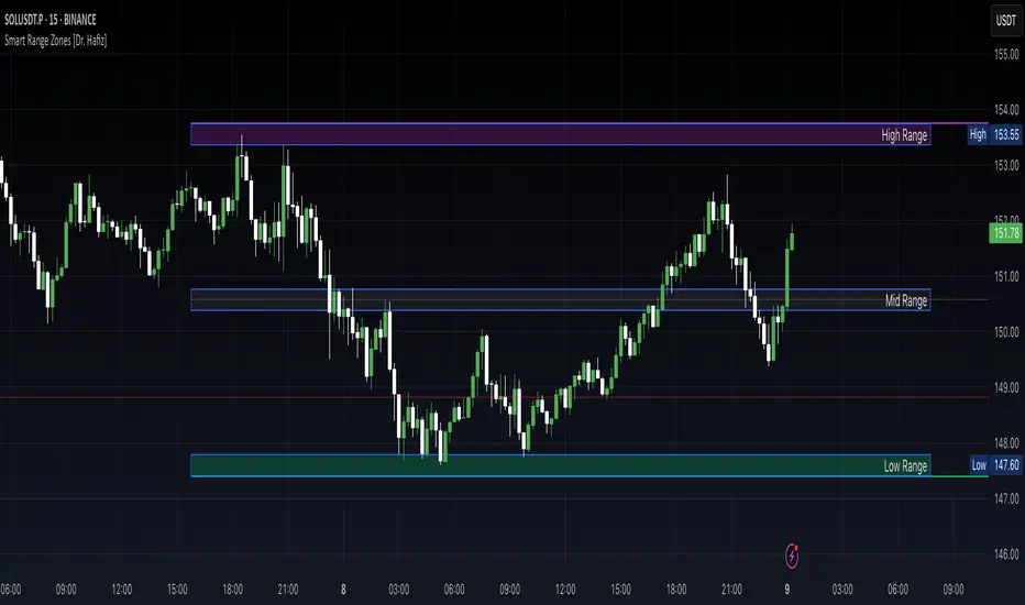
Smart Range Zones [Dr. Hafiz]Smart Range Zones
Description:
This indicator highlights key market zones — High Range, Mid Range, and Low Range — to help traders visually understand dynamic support and resistance levels.
✅ High Range: Potential supply/resistance area
✅ Mid Range: Fair value or equilibrium zone
✅ Low Range: Potential demand/support area
The zones are calculated based on the highest and lowest price over a user-defined period (default: 130 bars) and dynamically projected forward.
🔸 EMA 15 Line is included as an optional trend filter — helping confirm direction or trend alignment.
🔧 Features:
Auto-calculated High/Mid/Low zones
Real-time dynamic projections
Right-aligned zone labels inside each box
Clean visual structure
Toggle for showing/hiding EMA 15
📌 Best suited for:
Intraday & swing traders
Range breakouts and rejections
Trend confirmation with EMA
Created and published by Dr. Hafiz, modified under the MPL 2.0 license.
OA - RS HistogramOA - RS Histogram Indicator
This indicator displays a histogram representation of Relative Strength (RS) analysis, helping traders visualize the momentum relationship between a security and a reference index.
Key Features:
RS Histogram: Shows the difference between the current RS ratio and its EMA smoothed line
Customizable Reference Index: Default set to XU100, but can be changed to any index
EMA Smoothing: Adjustable EMA period (default 21) for trend analysis
Visual Clarity: Histogram bars are colored aqua for positive values and purple for negative values
Zero Line Reference: Dotted gray line for easy identification of positive/negative zones
How It Works:
The indicator calculates the relative strength by comparing the normalized percentage changes of the current security against the selected reference index. A 5-period EMA is applied to the RS ratio, and then the difference between this smoothed RS line and a longer EMA (default 21 periods) is displayed as a histogram.
Technical Calculation:
Fetches reference index data with proper gap handling
Calculates normalized percentage changes for both security and index
Computes relative strength ratio
Applies EMA smoothing to reduce noise
Displays the difference as a histogram for clear momentum visualization
Customization Options:
Reference index selection (default: XU100)
EMA length adjustment (default: 21 periods)
Color customization for positive and negative histogram bars
Alert Conditions:
Histogram crossing above zero (potential bullish momentum shift)
Histogram crossing below zero (potential bearish momentum shift)
Usage:
This tool helps traders understand relative strength concepts through visual histogram representation. The zero-line crossovers can indicate momentum shifts in the security relative to the chosen benchmark index.

Scalping Candle [Crak x MMT]The Scalping Candle is a TradingView indicator designed for scalping strategies, identifying potential bullish and bearish engulfing patterns on price charts. It overlays directly on the chart and marks specific candle patterns with visual signals, helping traders spot short-term trading opportunities. The indicator includes a customizable bias filter to focus on bullish, bearish, or neutral market conditions.
Features
Overlay Indicator : Displays bullish and bearish signals directly on the price chart.
Bias Filter : Allows users to select a market bias ('Bullish', 'Bearish', or 'Neutral') to filter signals based on their trading preference.
Visual Signals : Plots green upward triangles below bullish candles and red downward triangles above bearish candles.
Alerts : Generates alerts for bullish and bearish engulfing patterns, enabling timely notifications for trade setups.
How It Works
The indicator analyzes the relationship between the current and previous candles to detect engulfing patterns:
Bullish Engulfing : Triggered when the current candle's low is at or below the previous candle's low, and its close is at or above the previous candle's midpoint. This signal is displayed only if the bias filter is set to 'Neutral' or 'Bullish'.
Bearish Engulfing : Triggered when the current candle's high is at or above the previous candle's high, and its close is at or below the previous candle's midpoint. This signal is displayed only if the bias filter is set to 'Neutral' or 'Bearish'.
The previous candle's midpoint is calculated as the average of its high and low prices.
Usage
- Add to Chart : Apply the indicator to any TradingView chart.
- Configure Bias Filter :
Neutral : Displays both bullish and bearish signals.
Bullish : Displays only bullish signals.
Bearish : Displays only bearish signals.
- Interpret Signals :
Green upward triangle below a candle indicates a potential bullish reversal.
Red downward triangle above a candle indicates a potential bearish reversal.
- Set Alerts : Use the built-in alert conditions to receive notifications when bullish or bearish engulfing patterns are detected.
Settings
Bias Filter : Choose between 'Neutral', 'Bullish', or 'Bearish' to control which signals are displayed.
Shape Size : Signals are plotted as small triangles for minimal chart clutter.
Alert Conditions : Enable alerts for 'Bullish Engulfing Detected' or 'Bearish Engulfing Detected' to stay informed of new signals.
Ideal Use Case
This indicator is tailored for scalpers and short-term traders looking to capitalize on quick price movements driven by engulfing candle patterns. It works best on 15-minute chart and can be combined with other technical tools for confirmation.

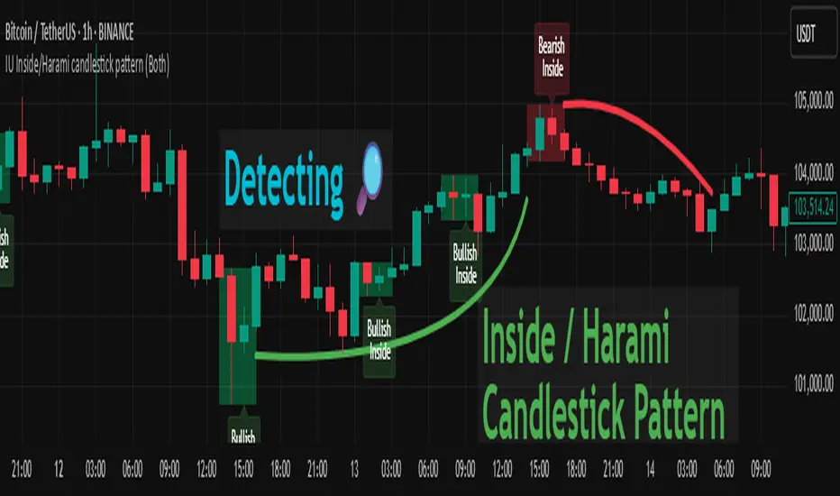
IU Inside/Harami candlestick patternDESCRIPTION
The IU Inside/Harami Candlestick Pattern indicator is designed to detect bullish and bearish inside bar formations, also known as Harami patterns. This tool gives users flexibility by allowing pattern detection based on candle wicks, bodies, or a combination of both. It highlights detected patterns using colored boxes and optional text labels on the chart, helping traders quickly identify areas of consolidation and potential reversals.
USER INPUTS :
Pattern Recognition Based on =
Choose between "Wicks", "Body", or "Both" to determine how the inside candle pattern is identified.
Show Box =
Toggle the appearance of colored boxes that highlight the pattern zone.
Show Text =
Toggle on-screen labels for "Bullish Inside" or "Bearish Inside" when patterns are detected.
INDICATOR LOGIC :
Bullish Inside Bar (Harami) is detected when:
* The current candle's high is lower and low is higher than the previous candle (wick-based),
* or the current candle’s open and close are inside the previous candle’s body (body-based),
* and the current candle is bullish while the previous is bearish.
Bearish Inside Bar (Harami) is detected when:
* The current candle's high is lower and low is higher than the previous candle (wick-based),
* or the current candle’s open and close are inside the previous candle’s body (body-based),
* and the current candle is bearish while the previous is bullish.
The user can choose wick-based, body-based, or both logics for pattern confirmation.
Boxes are drawn between the highs and lows of the pattern, and alert messages are generated upon confirmation.
Optional labels show the pattern name for quick visual identification.
WHY IT IS UNIQUE :
Offers three different logic modes: wick-based, body-based, or combined.
Highlights patterns visually with customizable boxes and labels.
Includes built-in alerts for immediate notifications.
Uses clean and transparent plotting without repainting.
HOW USER CAN BENEFIT FROM IT :
Receive real-time alerts when Inside/Harami patterns are formed.
Use the boxes and text labels to spot price compression zones and breakout potential.
Combine it with other tools like trendlines or support/resistance for enhanced accuracy.
Suitable for scalpers, swing traders, and price action traders looking to trade inside bar breakouts or reversals.
DISCLAIMER :
This indicator is not financial advice, it's for educational purposes only highlighting the power of coding( pine script) in TradingView, I am not a SEBI-registered advisor. Trading and investing involve risk, and you should consult with a qualified financial advisor before making any trading decisions. I do not guarantee profits or take responsibility for any losses you may incur.
Staccked SMA - Regime Switching & Persistance StatisticsThis indicator is designed to identify the prevailing market regime by analyzing the behavior of a "stack" of Simple Moving Averages (SMAs). It helps you understand whether the market is currently trending, mean-reverting, or moving randomly.
Core Concept: SMA Correlation
At its heart, the indicator examines the relationship between a set of nine SMAs with different lengths (3, 5, 8, 13, 21, 34, 55, 89, 144) and the lengths themselves.
In a strong trending market (either up or down), the SMAs will be neatly "stacked" in order of their length. The shortest SMA will be furthest from the longest SMA, creating a strong, almost linear visual pattern. When we measure the statistical correlation between the SMA values and their corresponding lengths, we get a value close to +1 (perfect uptrend stack) or -1 (perfect downtrend stack). The absolute value of this correlation will be very high (close to 1).
In a mean-reverting or sideways market, the SMAs will be tangled and crisscrossing each other. There is no clear order, and the relationship between an SMA's length and its price value is weak. The correlation will be close to 0.
This indicator calculates this Pearson correlation on every bar, giving a continuous measure of how ordered or "trendy" the SMAs are. An absolute correlation above 0.8 is considered strongly trending, while a value between 0.4 and 0.8 suggests a mean-reverting character. Below 0.4, the market is likely random or choppy.
Regime Classification and Statistics
The indicator doesn't just look at the current correlation; it analyzes its behavior over a user-defined lookback window (default is 252 bars) to classify the overall market "regime."
It presents its findings in a clear table:
📊 |SMA Correlation| Regime Table: This main table provides a snapshot of the current market character.
Median: Shows the median absolute correlation over the lookback period, giving a central tendency of the market's behavior.
% > 0.80: The percentage of time the market was in a strong trend during the lookback period.
% < 0.80 & > 0.40: The percentage of time the market showed mean-reverting characteristics.
🧠 Regime: The final classification. It's labeled "📈 Trend-Dominant" if the median correlation is high and it has spent a significant portion of the time trending. It's labeled "🔄 Mean-Reverting" if the median is in the middle range and it has spent significant time in that state. Otherwise, it's considered "⚖️ Random/ Choppy".
📐 Regime Significance: This tells you how statistically confident you can be in the current regime classification, using a Z-score to compare its occurrence against random chance. ⭐⭐⭐ indicates high confidence (99%), while "❌ Not Significant" means the pattern could be random.
Regime Transition Probabilities
Optionally, a second table can be displayed that shows the historical probability of the market transitioning from one regime to another over different time horizons (t+5, t+10, t+15, and t+20 bars).
📈 → 🔄 → ⚖️ Transition Table: This table answers questions like, "If the market is trending now (From: 📈), what is the probability it will be mean-reverting (→ 🔄) in 10 bars?"
This provides powerful insights into the market's cyclical nature, helping you anticipate future behavior based on past patterns. For example, you might find that after a period of strong trending, a transition to a choppy state is more likely than a direct switch to a mean-reverting
Indicator Settings
Lookback Window for Regime Classification: This sets the number of recent bars (default is 252) the script analyzes to determine the current market regime (Trending, Mean-Reverting, or Random). A larger number provides a more stable, long-term view, while a smaller number makes the classification more sensitive to recent price action.
Show Regime Transition Table: A simple toggle (on/off) to show or hide the table that displays the probabilities of the market switching from one regime to another.
Lookback Offset for Starting Regime: This determines the "starting point" in the past for calculating regime transitions. The default is 20 bars ago. The script looks at the regime at this point and then checks what it became at later points.
Step 1, 2, 3, 4 Offset (bars): These define the future time intervals (5, 10, 15, and 20 bars by default) for the transition probability table. For example, the script checks the regime at the "Lookback Offset" and then sees what it transitioned to 5, 10, 15, and 20 bars later.
Significance Filter Settings
Use Regime Significance Filter: When enabled, this filter ensures that the regime transition statistics only count transitions that were "statistically significant." This helps to filter out noise and focus on more reliable patterns.
Min Stars Required (1=90%, 2=95%, 3=99%): This sets the minimum confidence level required for a regime to be included in the transition statistics when the significance filter is on.
1 ⭐: Requires at least 90% confidence.
2 ⭐⭐: Requires at least 95% confidence (default).
3 ⭐⭐⭐: Requires at least 99% confidence.

Price Ranged FVG📌 Price Ranged FVG
Is a clean and efficient tool designed to detect Fair Value Gaps (FVGs) with adjustable filters and structural context. It’s especially useful for traders looking to filter out insignificant gaps and focus on high-probability areas, particularly around swing breaks or structural shifts.
🧠 What is a Fair Value Gap (FVG)?
A Fair Value Gap appears when there’s a price imbalance between candles — typically after a strong move — where the market skips over certain price levels without trading there. These zones can act as potential areas for price to return to (mean reversion), or serve as support/resistance depending on market structure.
🔍 FVG Detection Types
You can choose between three different detection modes under the "FVG Detection" input:
Same Type: Only detects FVGs where the last 3 candles are in the same direction (all bullish or all bearish).
All: Detects any FVG, regardless of candle direction.
Twin Close: Detects FVGs only when the last two candles are in the same direction and close accordingly — offering a stricter confirmation.
🎯 FVG % Filters
To filter out noise or insignificant gaps, this indicator includes:
Minimum FVG % Filter: Ignores FVGs smaller than your specified percentage of the current close.
Maximum FVG % Filter: Ignores overly large gaps that may be unreliable or caused by anomalies.
These filters help focus on relevant FVGs that are more likely to act as reaction zones.
🏛 Structural Context (Swing Highs and Lows)
The indicator plots swing highs and swing lows with dots to provide structure-based context:
Set Swing Strength to 3 for detecting internal structure (shorter-term moves).
Use a higher setting like 5 to focus on external structure (more significant highs/lows).
These levels can help you determine whether an FVG is forming within a consolidation, breakout, or key structural transition.
✅ Use Case (My Personal Workflow)
I personally use this indicator to:
Filter out weak or irrelevant FVGs using the % filters.
Watch for price interaction at swing breaks — especially when an FVG aligns with a break in internal or external structure.
Refine entry and exit planning in confluence with other tools or strategies.
⚠️ Disclaimer
This indicator is not financial advice. It is a technical analysis tool intended to support your own decision-making process. Always do your own research and risk management.

GalihRidha ZoneX — Adaptive MTF S&R + Smart Money AreasWelcome to ZoneX: The new frontier of Support & Resistance for modern traders!
ZoneX is more than just S&R — it’s a hybrid price map that fuses classic pivots with institutional logic, visualizing the zones that really matter.
What Makes ZoneX Different?
Multi-Timeframe S&R:
Instantly spot the true key levels from higher timeframes, not just what everyone else sees on the current chart.
Smart Money Order Blocks:
Automatically highlights supply and demand zones where institutions accumulate or distribute — find the real “trap” areas and avoid getting faked out.
VWAP Bands:
See where the liquidity is thickest — these bands act as magnets for price, great for both reversals and breakouts.
Midline Channel:
Identify the market’s equilibrium — know when you’re in value and when you’re at the edge.
Previous High/Low:
Mark institutional magnets and classic stop-hunt zones, updated in real-time.
Ultra Customizable:
One-click to enable/disable any feature. Clean for minimalists, packed for pros.
How to Use ZoneX
Breakout?
Wait for price to clear a ZoneX band or order block with momentum — enter on the retest.
Reversal?
Fade wicks and exhaustion right in the highlighted zone — confirm with price action or volume.
Range/Balance?
Trade the ping-pong between ZoneX midline and outer bands — great for scalping and mean reversion.
Who’s It For?
Active traders who want an edge beyond standard S&R.
Institutional-mindset scalpers and swing traders.
Anyone who loves a clean chart but craves real market context.
Level up your chart, see what the big players see —
and never trade blind again. This is ZoneX.

AV BTC Pi Cycle OscillatorPi Cycle Oscillator
The oscillator version of the Pi Cycle Top Indicator. While I have found great differences in scales being used for the oscillator across various sources. The shape of the oscillator line is on the other hand the same across the board. With 2 specific versions. Either using the 111 Day SMA or the 2*350 SMA for division.
We allow for both versions. It is possible to select the formula for calculation on the input tab.
Either using (111 SMA - 2*350 SMA) / 111 SMA (default) or (111 SMA - 2*350 SMA) / 2*350 SMA .
We multiply the result by -100 so that overbought conditions fall at the top of the indicator chart and oversold at the bottom. Everyone has their own idea of the value range. This is no different.
For both formulas around 0 is overbought zone, while -200 and -70 are oversold areas. Thresholds are configurable in the input tab. I made an arbitrary choice for the thresholds.
If you want to see overbought and oversold areas on the price chart: Enable the Overbought and oversold Overlay area in the style tab. It is disabled by default.
Additionally: Pi Cycle Tops are marked with a red circle. ATH tops are marked with yellow diamonds. Grey lines marks halving days.

Gaussian Volatility Adjusted Key Features:Gaussian Smoothing: Applies a Gaussian filter to smooth price data (based on EMA or raw close prices), reducing noise while preserving trend information.
Volatility Adjustment: Uses ATR and standard deviation to create dynamic upper and lower bands around the smoothed price, adapting to market volatility.
Trend Detection: Identifies bullish (price above lower band) or bearish (price below upper band) trends, with additional confirmation using standard deviation thresholds.
Momentum Analysis: Measures momentum by calculating the price difference from key levels (upper band for bullish, Gaussian + standard deviation for bearish).
EMA Confluence: Optionally integrates an EMA of the momentum difference to confirm trend signals, enhancing accuracy.
Visual Output: Plots a zero line and an EMA line colored green (bullish) or red (bearish), with bar coloring to visually indicate trend direction.

Buy Sell Magic Rework
A version of the legendary Forex indicator Buy Sell Magic for TradingView, with optional additional filtering in the settings.
A simple yet very effective trend-following tool — I personally used it for trading gold 14 years ago, and it still works great today!
✅ Subscribe to my profile to get new useful Pine Script tools soon!
💡 Want a custom version?
I can build private Pine Script indicators & strategies tailored exactly for you — scalping signals, trend or reversal strategies, custom filters for crypto, forex, stocks, or any pairs you trade.
I can also improve or fix your existing scripts.
If you want a unique, high-quality and profitable tool — contact me anytime!
📩 Telegram 👉 t.me

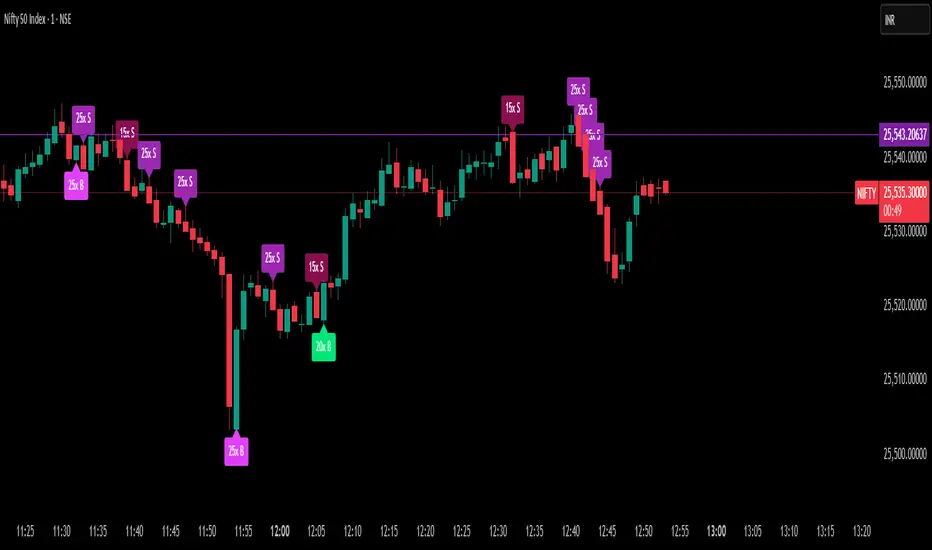
Delta Spike Detector [GSK-VIZAG-AP-INDIA]📌 Delta Spike Detector – Volume Imbalance Ratio
By GSK-VIZAG-AP-INDIA
📘 Overview
This indicator highlights aggressive buying or selling activity by analyzing the imbalance between estimated Buy and Sell volume per candle. It flags moments when one side dominates the other significantly — defined by user-selectable volume ratio thresholds (10x, 15x, 20x, 25x).
📊 How It Works
Buy/Sell Volume Estimation
Approximates buyer and seller participation using candle structure:
Buy Volume = Proximity of close to low
Sell Volume = Proximity of close to high
Delta & Delta Ratio
Delta = Buy Volume − Sell Volume
Delta Ratio = Ratio of dominant volume side to the weaker side
When this ratio exceeds a threshold, it’s classified as a spike.
Spike Labels
Labels are plotted on the chart:
10x B, 15x B, 20x B, 25x B → Buy Spike Labels (below candles)
10x S, 15x S, 20x S, 25x S → Sell Spike Labels (above candles)
The color of each label reflects the spike strength.
⚙️ User Inputs
Enable/Disable Buy or Sell Spikes
Set custom delta ratio thresholds (default: 10x, 15x, 20x, 25x)
🎯 Use Cases
Spotting sudden aggressive activity (e.g. smart money moves, traps, breakouts)
Identifying short-term market exhaustion or momentum bursts
Complementing other trend or volume-based tools
⚠️ Important Notes
The script uses approximated Buy/Sell Volume based on price position, not actual order flow.
This is not a buy/sell signal generator. It should be used in context with other confirmation indicators or market structure.
✍️ Credits
Developed by GSK-VIZAG-AP-INDIA
For educational and research use only.
ONE: PEMA, EMA, SuperTrend, CPR, VIDYAThe ONE indicator is an all-in-one TradingView Pine Script that combines multiple popular trend, momentum, and volume tools into a single overlay. It is designed for senior traders and analysts who need a comprehensive yet lightweight solution to:
1. Identify dynamic price trends (PEMA & standard EMAs)
2. Capture volatility-driven reversals (SuperTrend)
3. Define key support/resistance (Central Pivot Range)
4. Measure adaptive momentum (VIDYA)
Key Advantages
Unified InterfaceNo more juggling separate scripts—activate/deactivate each component via simple inputs.
-PEMA (Price-Embedded MAs) with color-coded trend direction.
-Standard EMAs (5/13/26) for classic crossover strategies.
-SuperTrend for volatility-based stop-and-reverse signals.
-Central Pivot Range (daily & weekly) for intraday support/resistance.
-VIDYA (Variable Index Dynamic Average) for momentum that adapts to market conditions.
Adaptive Momentum Smoothing (VIDYA)Unlike fixed-length moving averages, VIDYA adjusts its sensitivity based on Chande Momentum Oscillator (CMO) or standard deviation.
- Fixed CMO option ensures consistent smoothing when you prefer a stable lookback.
- StDev option allows reactive smoothing in high-volatility environments.
- Customizable AlertsReal-time alertcondition on VIDYA color changes—ideal for automated trade entries/exits.
- Try pairing alerts with SuperTrend cross signals for high-probability setups.
Volume-Weighted Bar ColoringB ars are shaded based on volume spikes relative to an EMA of volume.
- Quickly spot institutional activity or accumulation/distribution phases.
Professional-Grade StylingClean, corporate color palette and line widths optimized for readability on both light and dark backgrounds.
Signal Interpretation
1. PEMA Green-to-Red Fill: Confirms multi-disciplinary trend reversals when the fast PEMA crosses the slow PEMA.
2. EMA Crossovers: Traditional 5/13/26 cross signals for momentum entry/exit.
3. SuperTrend Line: Trades above the line in uptrends; short when price closes below.
4. CPR Levels: Use daily CPR pivot (CP, BC, TC) for intraday range strategies; weekly pivot for broader support/resistance.
5. VIDYA Color Change: Blue to maroon or vice versa triggers alert for momentum shift.
6. Volume Coloring: Lime/red bars highlight high-volume moves; silver/gray for normal conditions.
Alert Setup
- Right-click on chart → Add Alert → Select ONE_VIDYA → Under Condition, choose VIDYA Color Alarm.
- Configure webhook/email/popup notifications for automated trading systems.

Rubab's Buy/Sell + Reversal SignalThis indicstor helps to identify the reversal and provides entry exit signal.

Higher High Lower Low Multi-TF📊 Higher High Lower Low Multi-Timeframe Indicator
Detects market structure shifts (HH, HL, LH, LL)
Identifies trend direction (bullish / bearish / neutral)
Works across multiple timeframes (M5 to Weekly)
Displays a compact trend summary table on the chart
Customizable pivot sensitivity (Left/Right Bars)
Visual labels on chart for structure points
Ideal for structure-based trading and SMC traders

MTF Trend + SMC Structure (EMA/SMA Mix - HH/HL)Objective
To provide a quick, visual, and reliable reading of market trends and structure.
Combines dynamic moving averages and SMC (market structure) logic.
Effectively integrates into the chart via a clear table displayed in the top right corner.
📊 What the indicator displays (by timeframe: M5, M15, M30, H1, H4, D1, W1)
🟢 1. MA Trend
Based on two moving averages (short and long).
Average Type:
EMA for M5 to M30 (reactive)
SMA for H1 to Weekly (smoother)
Display:
🟢 Up if short MA > long MA
🔴 Down if short MA < long MA
Customizable lengths per timeframe
🧱 2. Structure (SMC logic)
Detects Higher High / Higher Low and Lower High / Lower Low
Based on significant pivots (pivothigh, pivotlow)
Logic inspired by SMC swing trading
Display:
🟢 Up = bullish structure (HH + HL)
🔴 Down = bearish structure (LH + LL)
⚪ Neutral = no clear structure
✅ Advantages
🔍 Instant view of the overall multi-timeframe context
📉 Combines trend by MA and SMC structure
🎯 Helps filter out bad entries Countertrend
⚡️ Very useful for intraday, swing, or SMC traders

AI Dynamic Fib Tool V1.0📌 Description
ND EĞİTİM – AI Auto Fibonacci is a next-generation Fibonacci indicator that goes beyond static levels. It automatically determines optimal lookback periods based on market conditions such as volatility, volume, trend strength, momentum, and RSI positioning. Using this data, it dynamically identifies Higher High (HH) and Lower Low (LL) levels and draws multi-layered adaptive Fibonacci levels.
Unlike traditional indicators that rely on fixed periods, this script simulates an AI-like decision engine by incorporating:
Volatility (ATR-based)
Momentum (ROC + RSI deviation)
Volume activity (volume vs. average volume)
Trend strength (EMA + MACD crossover)
Bollinger Band width
These are synthesized into a “Market Score”, which guides the system’s behavior.
🧠 AI-Like Adaptive Calculation Logic
The indicator behaves like a basic machine learning agent that adapts to changing market environments:
In low volatility, it extends the historical window for broader context.
In high-volume, high-trend scenarios, it shortens the lookback for faster reactions.
This reduces noise and increases relevancy compared to fixed-period methods.
⚙️ How It Works
Calculates Optimal Lookback Period:
A “market score” is derived from volatility, trend momentum, RSI bias, volume ratio, and BB width.
This score adjusts the lookback window between 15 and 100 bars.
Detects HH and LL:
Finds most recent Higher High and Lower Low within the optimal window.
These act as anchors for Fibonacci levels.
Draws Fibonacci Zones:
Classic levels: 0%, 23.6%, 38.2%, 50%, 61.8%, 78.6%, 100%, 127.2%, 161.8%
Dynamic extensions: -61.8%, -38.2%, 14.6%, 9.1%, depending on market score
Displays a Detailed Info Panel:
Shows current trend (Bullish, Bearish, Sideways)
Volatility rating
HH/LL levels, age in bars, and total range
Market activity commentary
🎯 Best Use Cases
Support & Resistance Mapping:
Use Fibonacci levels to identify likely zones for pullbacks, reactions, or breakouts.
Trend Analysis:
EMA, MACD, and HH/LL cross-confirm the trend direction and strength.
Alert-Based Monitoring:
Use built-in alert conditions to track price breakouts above key Fibonacci zones (e.g., 61.8%, 127.2%).
📢 User Notes
🔹 Always apply the indicator on price charts (overlay = true).
🔹 All levels and drawings update dynamically on the last bar.
🔹 Use the “Add Alert” panel to select from pre-defined crossover/crossunder conditions for Fibonacci levels.
TIP:
When the market score is high (>0.7), the system draws extended levels and reacts faster. In quiet markets, it reduces visual clutter by only showing core zones.
💡 Key Advantages
✅ AI-inspired adaptive structure
✅ Optimal lookback logic per asset condition
✅ Clean, informative labels and lines
✅ Alarm-ready setup
✅ Suitable for both swing trading and trend analysis
📈 Developed by:
This indicator was created by ND Eğitim, a Turkey-based trading education company focused on algorithmic systems and practical technical analysis.
📌 Telegram (Free Signals): @nd_bist100_signal
📌 X (Twitter): @ndegitim
📌 Web: www.ndegitim.com

EdgeXplorer - Liquidity ScopeLiquidity Scope by EdgeXplorer
Liquidity Scope is a real-time liquidity detection system developed for traders who want to track where the market is hunting stops, absorbing orders, and setting up traps — often before the average eye catches on. Built to identify the telltale behavior of liquidity sweeps and false breakouts, this tool highlights areas on the chart where price interacts with key swing points, including wicks, breaks, and retests.
⸻
🔍 What Does Liquidity Scope Do?
Liquidity Scope scans price action for swing highs and lows, tracks how price behaves around them, and visually plots zones where liquidity is likely being targeted. It tells you:
• When price wicks into a previous swing without breaking it (a liquidity probe),
• When price breaks past that level and returns (a potential retest),
• And when a sweep is complete or mitigated.
The result? A visual map of where liquidity was grabbed, where it hasn’t been yet, and where price might revisit — all drawn directly on your chart, in real time.
⸻
⚙️ How It Works – Technical Breakdown
Here’s the logic behind the engine:
1. Swing Detection
The script uses ta.pivothigh() and ta.pivotlow() to mark structural swing points, using your selected “Swings” length to define sensitivity.
2. Sweep Conditions
For each swing high or low:
• If price wicks into the level but fails to close beyond it → potential liquidity test.
• If price closes beyond the swing → it’s marked as broken.
• If price later retests the broken level from the other side → it’s tagged as a retest zone.
3. Visual Memory
Each swing level stores its own “memory state” (whether it was wicked, broken, retested, or mitigated), allowing the tool to update visuals live and avoid clutter.
4. Dynamic Zones
• When a sweep is detected, the tool draws a colored zone (box) at the sweep location, along with a supporting line.
• These zones extend forward until price clearly invalidates or mitigates them.
⸻
📈 Visual Components – What You See on the Chart
Element Meaning
Green Zones / Lines Bullish sweep: liquidity hunted below a swing low
Red Zones / Lines Bearish sweep: liquidity hunted above a swing high
Dotted Lines Wicks — price tested the level without breaking
Dashed Lines Retests — price returned to retest a broken level
Solid Lines Confirmed sweep levels with clean structure
Shaded Boxes Sweep zones extended into the future for monitoring
Faded Transparency Indicates mitigation or that the zone is cooling off
Every visual is tied to a logic branch in the code — nothing is decorative. Each shape or line has meaning tied to price behavior.
⸻
📊 Inputs & Settings Explained
Setting Description
Swings (len) Sets the pivot lookback range. Higher = fewer, stronger swing levels.
Options (opt) Controls what sweep types you want to see:
• Only Wicks → Focus on traps and fakeouts
• Only Outbreaks & Retest → Focus on confirmed moves
• Wicks + Outbreaks & Retest → See it all |
| Bull/Bear Colors | Customize how bullish vs. bearish sweeps are drawn |
| Extend Zones (extend) | When on, boxes stretch forward in time until price touches or invalidates them |
| Max Bars (maxB) | Sets how long (in bars) sweep zones will stay active before expiring |
⸻
🧠 How to Read It in Live Markets
Liquidity Scope doesn’t tell you what to do — it tells you what the market just did in relation to liquidity and structure.
Here’s how to use it:
• Green Zones (Bullish Sweeps):
Price just grabbed liquidity under a low. Watch for:
• A bounce → potential reversal
• A retest → possible long entry confirmation
• Red Zones (Bearish Sweeps):
Price swept above a high. Watch for:
• Immediate rejection → potential short zone
• Pullback and retest → trend continuation trap or fake breakout
• Wick Sweeps Only:
Often seen in range-bound markets or when market makers are testing stops.
• Retest Sweeps:
Often seen in trending markets, validating breakouts or signaling exhaustion.
⸻
🧪 Optional Use Cases & Strategy Tips
Here’s how traders on the EdgeXplorer platform use Liquidity Scope:
• 🔄 Smart Money Concepts: Use sweep zones alongside order blocks, FVGs, and breakers to confirm institutional movement.
• ⚠️ Trap Zones: Spot liquidity fakeouts where retail might be chasing early breakouts.
• 🎯 Entry/Exit Filtering: Use zones to validate entries only when price reacts cleanly around them — or exits when mitigation completes.
• 🧠 Confluence Layer: Combine with trend indicators or volume to add strength to directional bias.
⸻
🔒 Final Note on Use & Compliance
Liquidity Scope is a market behavior visualizer, not a signal generator. It helps you understand where the market might be trapping liquidity, but you are the strategy. Always pair with proper confirmation, risk management, and your own discretion.
All logic, structure, and assets in this script are © protected under ETAPX Inc. and the EdgeXplorer platform. Unauthorized sharing or monetization of this code is prohibited under company and platform policy.

TSI Indicator with Trailing StopTSI Indicator with Advanced Risk Management & Tick-Based Position Tracking
This comprehensive TSI (True Strength Index) indicator combines momentum analysis with professional risk management features, designed for active traders who need precise entry/exit signals with built-in position management.
Key Features:
🔹 Enhanced TSI Calculation - Classic TSI with customizable periods and signal line for crossover detection
🔹 Smart Signal Filtering - Threshold-based entries with momentum confirmation to reduce false signals
🔹 Tick-Based Risk Management - Stop loss and take profit levels calculated in ticks for precise position sizing
🔹 Advanced Trailing Stop - Dynamic trailing stop that activates after minimum profit threshold
🔹 Position Tracking - Real-time P&L calculation and position status monitoring
🔹 Visual Dashboard - Clean information panels showing current signals, position status, and key metrics
🔹 Background Coloring - Instant visual feedback for active positions
🔹 Comprehensive Alerts - Entry signals, trailing stop activation, and position exit notifications
Customizable Settings:
TSI periods (Long/Short/Signal lengths)
Risk parameters (Stop Loss/Take Profit in ticks)
Trailing stop configuration
Signal thresholds for entry filtering
Display options for clean chart presentation
Perfect for: Day traders, scalpers, and swing traders who need precise entries with disciplined risk management. Works on any timeframe and instrument that supports tick-based calculations.
The indicator plots all levels directly on the chart with color-coded risk zones, making it easy to visualize your trade setup at a glance. Educational tool for understanding TSI momentum patterns combined with systematic risk management principles.
Note: This is an educational indicator for analysis purposes. Past performance does not guarantee future results.

High Volume Buyers/SellersThis indicator will help you indicate wether breakout happened with high volume or not

SMA Crossover Strategy with TP/SL📊 Strategy Description: SMA Crossover Strategy with TP/SL
This is a Simple Moving Average (SMA) Crossover Strategy designed to help traders identify trend reversals and manage trades with proper risk-reward logic.
🔹 Entry Logic:
Buy Signal: When the Fast SMA crosses above the Slow SMA → indicating a bullish trend.
Sell Signal: When the Fast SMA crosses below the Slow SMA → indicating a bearish trend.
🔹 Exit Logic:
Take Profit: The strategy exits the position when price reaches a user-defined profit target.
Stop Loss: The trade is closed if price moves against the position beyond the specified stop-loss limit.
⚙️ Parameters:
Fast SMA Length: Number of candles used for fast moving average (default: 10)
Slow SMA Length: Number of candles used for slow moving average (default: 30)
Take Profit (%): Profit target in percentage (default: 0.10%)
Stop Loss (%): Maximum allowed loss per trade (default: 0.10%)
✅ Additional Features:
Strategy backtesting supported
Visual arrows for Buy/Sell signals
Bar coloring based on trend
Alert conditions for Buy/Sell crossover signals
🧠 Suggested Use:
Works best on 1 min, 5 hour, or daily timeframes.
Can be applied to stocks, crypto, forex, or indices.
Ideal for trend-following traders who want automation with risk control.

EdgeXplorer - Phantom FlowPhantom Flow by EdgeXplorer
Phantom Flow is a high-precision, visual market structure toolkit inspired by core ICT (Inner Circle Trader) concepts — including Order Blocks (OBs), Fair Value Gaps (FVGs), Market Structure Shifts (MSS), Liquidity Zones, Killzones, and Balance Price Ranges (BPRs). Designed for real-time clarity and SMC-aligned trading, this tool enhances raw ICT theory with practical execution features: extended zone logic, session filters, and pivot-sensitive rendering.
Whether you’re swing trading on HTF or scalping intraday moves in New York or London, Phantom Flow gives you a clean, structured lens through which to interpret price behavior — without clutter or noise.
⸻
🔍 What Does Phantom Flow Do?
This indicator maps out multiple price action phenomena in one system. It detects and plots:
• Order Blocks (OBs) — potential institutional footprints
• Fair Value Gaps (FVGs) — inefficiencies or imbalance zones
• Market Structure Shifts (MSS) — directional break points
• Liquidity Zones — buy-side and sell-side wick traps
• Balance Price Ranges (BPRs) — overlap zones from opposing FVGs
• Killzones (Sessions) — session-specific high-probability windows
Each element is toggleable, color-coded, and drawn directly on the chart, creating an intuitive visual environment to identify potential setups or confirm directional bias.
⸻
⚙️ How It Works – Technical Breakdown
1. Pivot Engine
Phantom Flow uses ta.pivothigh() and ta.pivotlow() with a configurable lookback period to establish reactive swing points for structure and liquidity logic.
2. Market Structure Shifts (MSS)
MSS logic checks for breaks above prior highs or below prior lows:
• If price closes above a previous pivot high, it flags a bullish MSS.
• If price closes below a previous pivot low, it flags a bearish MSS.
Each MSS is marked with a line and label at the structure break.
3. Order Blocks (OBs)
When a swing high or low is confirmed:
• A bearish OB is plotted between the open and high of the pivot bar.
• A bullish OB is plotted between the low and open of the pivot bar.
OB zones are drawn as transparent boxes that project forward several candles.
4. Fair Value Gaps (FVGs)
Imbalance zones are defined when:
• A bullish FVG occurs if the current low is above the high from two candles ago, and price closed bullish.
• A bearish FVG occurs if the current high is below the low from two candles ago, and price closed bearish.
These are visualized as boxes with “FVG” labels.
5. Balance Price Ranges (BPRs)
If both a bullish and bearish FVG overlap in the same bar:
• A gray BPR box is plotted to represent the zone where those inefficiencies cancel or compress into a range.
Useful for tracking potential accumulation or consolidation.
6. Liquidity Zones (Wick Detection)
Using ATR-based wick thresholds:
• Buy-side Liquidity is identified where long lower wicks form beneath pivot lows.
• Sell-side Liquidity is identified where long upper wicks form above pivot highs.
These zones indicate where stop hunts or liquidity grabs may occur.
7. Killzones (Sessions)
Two sessions are visualized using background colors:
• New York Killzone (default: 7:00–9:00 EST) — yellow background
• London Killzone (default: 2:00–5:00 GMT) — blue background
Sessions are dynamically aligned with your chart’s timeframe and location.
⸻
📈 What Each Visual Element Represents
Element Meaning
Green OB Box Bullish order block (potential demand zone)
Red OB Box Bearish order block (potential supply zone)
Teal FVG Box Bullish fair value gap (imbalance to the upside)
Maroon FVG Box Bearish fair value gap (imbalance to the downside)
Gray BPR Box Balance price range — compression of opposing gaps
Blue Liquidity Zone Buy-side liquidity below a swing low
Orange Liquidity Zone Sell-side liquidity above a swing high
Lime Line + Label Bullish Market Structure Shift (MSS ↑)
Fuchsia Line + Label Bearish Market Structure Shift (MSS ↓)
Yellow / Blue Background Killzone time blocks for NY or London
All shapes are bounded in time and logic — there are no arbitrary plots.
⸻
📊 Inputs & Settings Explained
Input Description
Execution Mode (Live / Backtest) Determines whether to run real-time or backtest-friendly calculations
Pivot Sensitivity (lookback) Controls how far back to look for pivots — higher values = stronger swing filters
Show MSS Toggle to display Market Structure Shift lines and labels
Show OB Toggle to display Order Block zones from swing points
Show FVG Toggle to visualize Fair Value Gaps as they appear
Show Liquidity Zones Displays wick-based buy/sell-side liquidity traps
Show BPR Zones Highlights overlapping bullish and bearish FVGs as compression zones
Show Killzones Enables session-based background highlighting for NY/London
Color Settings
Customize each visual element with transparency-controlled colors for OBs, FVGs, MSS lines, liquidity zones, and killzones.
⸻
🧠 How Traders Can Use Phantom Flow
Phantom Flow is not a signal generator. It’s a market narrative visualizer. Here’s how to integrate it into your approach:
• OB + FVG = Confluence: Look for fair value gaps forming around order blocks. These often suggest institutional entry zones.
• MSS + Liquidity = Trap Setup: Market structure shifts occurring after price taps liquidity often signal reversals or fakeouts.
• BPRs = Choke Points: If opposing FVGs compress, expect consolidation or expansion shortly after.
• Killzones = Context Windows: Use sessions to filter signal quality. For example, only trade FVGs during the London/NY overlap.
This tool works best when layered with:
• BOS/CHOCH detection
• Premium/Discount logic
• Risk-based execution models
⸻
🧪 Optional Use Case Ideas
• Intraday scalping based on NY/London killzone + MSS
• Swing trading off HTF OB + LQ zones
• Fade or trend-continuation setups using FVGs + BPR
• Combine with displacement candles or volume to validate zones
