OPEN-SOURCE SCRIPT
Aggiornato Greer Value Yields Dashboard
🧾 Greer Value Yields Dashboard – v1.0
Author: Sean Lee Greer
Release Date: June 22, 2025
🧠 Overview
The Greer Value Yields Dashboard visualizes and evaluates four powerful valuation metrics for any publicly traded company:
📘 Earnings per Share Yield
💵 Free Cash Flow Yield
💰 Revenue Yield
🏦 Book Value Yield
Each yield is measured as a percentage of current stock price and compared against its historical average. The script assigns 1 point per metric when the current yield exceeds its long-term average. The total score (0 to 4) is displayed as a color-coded column chart, helping long-term investors quickly assess fundamental valuation strength.
✅ Key Features
📊 Real-time calculation of 4 yield-based valuation metrics
⚖ Historical average tracking for each yield
🎯 Visual scoring system:
🟥 0–1 = Weak
🟨 2 = Neutral
🟩 4 = Strong (all metrics above average)
🎛️ Toggle visibility of each yield independently
🧮 Fully compatible with other Greer Financial Toolkit indicators
🛠 Ideal For
Long-term value investors
Dividend and cash-flow-focused investors
Analysts seeking clean yield visualizations
Greer Toolkit users combining with Greer Value and BuyZone
Note di rilascio
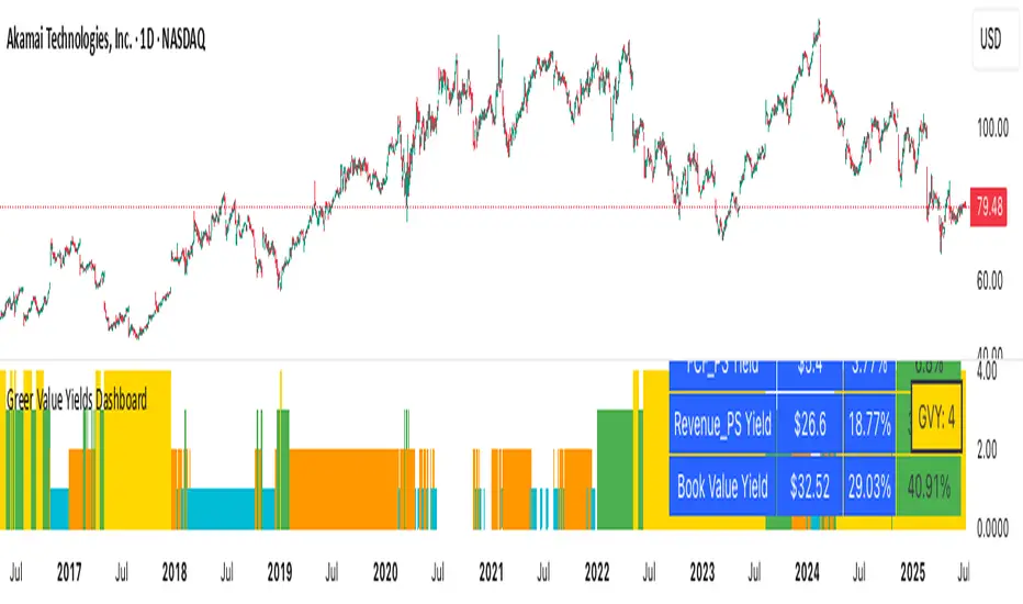
🆕 New Features📊 Yield Table Display: Added an optional, toggleable table that summarizes all four valuation-based yield metrics:
EPS Yield
Free Cash Flow Yield
Revenue Yield
Book Value Yield
📋 Table Layout:
Columns: Metric | Raw Value ($) | Avg % | Current %
Current % column is color-coded:
🟩 Green – Current yield is above average
🟥 Red – Current yield is below average
All other cells use a blue background with white text for visual clarity
💵 Improved Value Formatting:
Raw financial stats (EPS, FCF, etc.) are shown in dollars (e.g., $3.25)
All yields are formatted as percentages (e.g., 4.15%)
✅ Enhancements
🧼 Removed the redundant Above Avg? column for a cleaner layout
🎯 Table only appears on the latest candle (final bar on chart)
⚙️ New Setting: Show Yield Table toggle (default = off) so users can enable it only when needed
📌 Usage Notes
The table is optimized for readability during manual analysis
It will not appear during backtesting or across multiple bars unless manually toggled on
🔗 Part of the Greer Financial Toolkit:
📘 Greer Value – Measures year-over-year growth consistency across key financial metrics
🟢 Greer BuyZone – Identifies cyclical long-term buy conditions using technical + Fibonacci models
💵 Greer FCF Yield – Tracks free cash flow efficiency relative to price
📈 Greer Revenue Yield – Evaluates how much revenue per share is generated relative to stock price
Note di rilascio
🔄 Greer Value Yields Dashboard – v2.1 (06/26/2025)🆕 New Features
📊 Yield Table Display
Added an optional table summarizing all four valuation-based yield metrics:
EPS Yield
Free Cash Flow Yield
Revenue Yield
Book Value Yield
📋 Table Layout
Columns: Metric | Raw Value ($) | Avg % | Current %
Current % column is dynamically color-coded:
🟥 Red – Current yield is below average
🟩 Green – Current yield is above average
All other cells use a blue background with white text for clean readability
💵 Value Formatting
Raw values are shown in dollar format (e.g., $3.25)
Yields are shown as percentages with two decimal places (e.g., 4.15%)
🧮 GVY Score Color Coding (0–4)
Each of the four yield metrics earns a point when above its historical average. The total score is displayed using color-coded tiers:
⬜ 0 = None (White)
🟦 1 = Weak (Aqua)
🟧 2 = Neutral (Orange)
🟩 3 = Strong (Green)
🟨 4 = Gold Exceptional (All metrics above average)
📦 GVY Score Badge
A compact Greer Value Yields Score (GVY) label appears in the top-right corner of the chart:
Example: GVY: 3
Background color matches score tier (as shown above)
✅ Enhancements
🧼 Removed the “Above Avg?” column for a cleaner table
🎯 Yield Table and Score only render on the last bar
⚙️ Added new settings:
Show Yield Table toggle (default = off)
Show Greer Value Yields Score toggle (default = on)
🔗 Part of the Greer Financial Toolkit
📘 Greer Value – Measures YoY consistency across key fundamental metrics
🟢 Greer BuyZone – Identifies long-term buy conditions using Fibonacci + trend logic
💵 Greer FCF Yield – Measures free cash flow efficiency relative to price
📈 Greer Revenue Yield – Evaluates revenue per share vs. price for yield-like value
Note di rilascio
📊 Greer Value Yields Dashboard — v2.2🔄 Updated: July 3, 2025
This update focuses on usability and clarity with status-line-only plotting and improved color logic.
✅ What’s New in v2.2:
📈 Status Line Integration:
Key yield metrics (EPS %, FCF %, Revenue %, Book %, and GVY Score) now appear in the TradingView Data Window without cluttering the chart.
🎨 Dynamic Color Feedback:
Red/Green logic now applies consistently across the yield table and status lines for fast visual scoring.
🧼 Cleaner Charting Experience:
Removed all standard plots in favor of a fully table-driven display. Perfect for lower pane overlays or minimalist dashboards.
💡 Highlights:
0–4 GVY Score: Evaluates a company’s valuation strength based on yield metrics vs historical averages
Table + Badge (Optional): Only shown on the latest bar
Pure Data View: Use in the status pane without cluttering your chart
Script open-source
Nello spirito di TradingView, l'autore di questo script lo ha reso open source, in modo che i trader possano esaminarne e verificarne la funzionalità. Complimenti all'autore! Sebbene sia possibile utilizzarlo gratuitamente, ricordiamo che la ripubblicazione del codice è soggetta al nostro Regolamento.
Declinazione di responsabilità
Le informazioni e le pubblicazioni non sono intese come, e non costituiscono, consulenza o raccomandazioni finanziarie, di investimento, di trading o di altro tipo fornite o approvate da TradingView. Per ulteriori informazioni, consultare i Termini di utilizzo.