The Cointegration Heatmap is a powerful visual and quantitative tool designed to uncover deep, statistically meaningful relationships between assets.
Unlike traditional indicators that react to price movement, this tool analyzes the underlying statistical relationship between two time series and tracks when they diverge from their long-term equilibrium — offering actionable signals for mean-reversion trades.
What Is Cointegration?
Most traders are familiar with correlation, which measures how two assets move together in the short term. But correlation is shallow — it doesn’t imply a stable or predictable relationship over time.
Cointegration, however, is a deeper statistical concept: Two assets are cointegrated if a linear combination of their prices or returns is stationary, even if the individual series themselves are non-stationary.
Cointegration is a foundational concept in time series analysis, widely used by hedge funds, proprietary trading firms, and quantitative researchers. This indicator brings that institutional-grade concept into an easy-to-use and fully visual TradingView indicator.
This tool helps answer key questions like:
“Which stocks tend to move in sync over the long term?”
“When are two assets diverging beyond statistical norms?”
“Is now the right time to short one and long the other?”
Using a combination of regression analysis, residual modeling, and Z-score evaluation, this indicator surfaces opportunities where price relationships are stretched and likely to snap back — making it ideal for building low-risk, high-probability trade setups.
In simple terms:
Cointegrated assets drift apart temporarily, but always come back together over time. This behavior is the foundation of successful pairs trading.
How the Indicator Works
Cointegration Heatmap indicator works across any market supported on TradingView — from stocks and ETFs to cryptocurrencies and forex pairs.
You enter your list of symbols, choose a timeframe, and the indicator updates every bar with live cointegration scores, spread signals, and trade-ready insights.
Indicator Settings:
Symbol list: a customizable list of symbols separated by commas
Returns timeframe: time frame selection for return sampling (Weekly or Monthly)
Max periods: max periods to limit the data to a certain time and to control indicator performance
This indicator accomplishes three major goals in one streamlined package:
Identifies stable long-term relationships (cointegration) between assets, using a heatmap visualization.
Tracks the spread — the difference between actual prices and the predicted linear relationship — between each pair.
Generates trade signals based on Z-score deviations from the mean spread, helping traders know when a pair is statistically overextended and likely to mean revert.
The math:
Returns are calculated using spread tickers to ensure alignment in time and adjust for dividends, splits, and other inconsistencies.
For each unique pair of symbols, we perform a linear regression
Yt=α+βXt+ε
Then we compute the residuals (errors from the regression):
Spreadt=Yt−(α+βXt)
Calculate the standard deviation of the spread over a moving window (default: 100 samples) and finally, define the Cointegration Score:
S=1/Standard Deviation of Residuals
This means, the lower the deviation, the tighter the relationship, so higher scores indicate stronger cointegration.
Always remember that cointegration can break down so monitor the asset over time and over multiple different timeframes before making a decision.
How to use the indicator
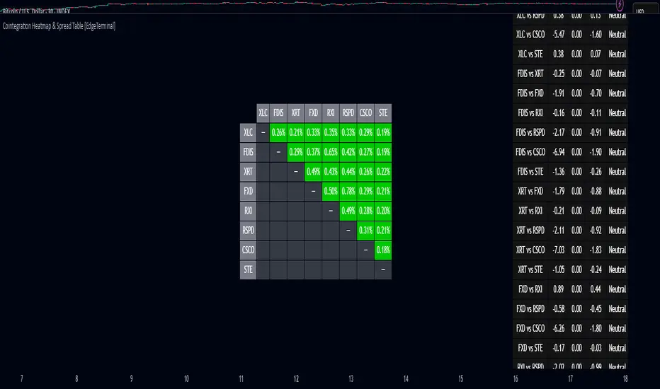
The heatmap table:
The indicator displays 2 very important tables, one in the middle and one on the right side. After entering your symbols, the first table to pay attention to is the middle heatmap table.
Any assets with a cointegration value of 25% is something to pay attention to and have a strong and stable relationship. Anything below is weak and not tradable.
Additionally, the 40% level is another important line to cross. Assets that have a cointegration score of over 40% will most likely have an extremely strong relationship.
Think about it this way, the higher the percentage, the tighter and more statistically reliable the relationship is.
The spread table:
After finding a good asset pair using heatmap, locate the same pair in the spread table (right side).
Here’s what you’ll see on the table:
Spread: Current difference between the two symbols based on the regression fit
Mean: Historical average of that spread
Z-score: How far current spread is from the mean in standard deviations
Signal: Trade suggestion: Short, Long, or Neutral
Since you’re expecting mean reversion, the idea is that the spread will return to the average. You want to take a trade when the z-score is either over +2 or below -2 and exit when z-score returns to near 0.
You will usually see the trade suggestion on the spread chart but you can make your own decision based on your risk level.
Keep in mind that the Z-score for each pair refers to how off the first asset is from the mean compared to the second one, so for example if you see STOCKA vs STOCKB with a Z-score of -1.55, we are regressing STOCKB (Y) on STOCKA (X).
In this case, STOCKB is the quoted asset and STOCKA is the base asset.
In this case, this means that STOCKB is much lower than expected relative to STOCKA, so the trade would be a long position on stock B and short position on stock A.
Unlike traditional indicators that react to price movement, this tool analyzes the underlying statistical relationship between two time series and tracks when they diverge from their long-term equilibrium — offering actionable signals for mean-reversion trades.
What Is Cointegration?
Most traders are familiar with correlation, which measures how two assets move together in the short term. But correlation is shallow — it doesn’t imply a stable or predictable relationship over time.
Cointegration, however, is a deeper statistical concept: Two assets are cointegrated if a linear combination of their prices or returns is stationary, even if the individual series themselves are non-stationary.
Cointegration is a foundational concept in time series analysis, widely used by hedge funds, proprietary trading firms, and quantitative researchers. This indicator brings that institutional-grade concept into an easy-to-use and fully visual TradingView indicator.
This tool helps answer key questions like:
“Which stocks tend to move in sync over the long term?”
“When are two assets diverging beyond statistical norms?”
“Is now the right time to short one and long the other?”
Using a combination of regression analysis, residual modeling, and Z-score evaluation, this indicator surfaces opportunities where price relationships are stretched and likely to snap back — making it ideal for building low-risk, high-probability trade setups.
In simple terms:
Cointegrated assets drift apart temporarily, but always come back together over time. This behavior is the foundation of successful pairs trading.
How the Indicator Works
Cointegration Heatmap indicator works across any market supported on TradingView — from stocks and ETFs to cryptocurrencies and forex pairs.
You enter your list of symbols, choose a timeframe, and the indicator updates every bar with live cointegration scores, spread signals, and trade-ready insights.
Indicator Settings:
Symbol list: a customizable list of symbols separated by commas
Returns timeframe: time frame selection for return sampling (Weekly or Monthly)
Max periods: max periods to limit the data to a certain time and to control indicator performance
This indicator accomplishes three major goals in one streamlined package:
Identifies stable long-term relationships (cointegration) between assets, using a heatmap visualization.
Tracks the spread — the difference between actual prices and the predicted linear relationship — between each pair.
Generates trade signals based on Z-score deviations from the mean spread, helping traders know when a pair is statistically overextended and likely to mean revert.
The math:
Returns are calculated using spread tickers to ensure alignment in time and adjust for dividends, splits, and other inconsistencies.
For each unique pair of symbols, we perform a linear regression
Yt=α+βXt+ε
Then we compute the residuals (errors from the regression):
Spreadt=Yt−(α+βXt)
Calculate the standard deviation of the spread over a moving window (default: 100 samples) and finally, define the Cointegration Score:
S=1/Standard Deviation of Residuals
This means, the lower the deviation, the tighter the relationship, so higher scores indicate stronger cointegration.
Always remember that cointegration can break down so monitor the asset over time and over multiple different timeframes before making a decision.
How to use the indicator
The heatmap table:
The indicator displays 2 very important tables, one in the middle and one on the right side. After entering your symbols, the first table to pay attention to is the middle heatmap table.
Any assets with a cointegration value of 25% is something to pay attention to and have a strong and stable relationship. Anything below is weak and not tradable.
Additionally, the 40% level is another important line to cross. Assets that have a cointegration score of over 40% will most likely have an extremely strong relationship.
Think about it this way, the higher the percentage, the tighter and more statistically reliable the relationship is.
The spread table:
After finding a good asset pair using heatmap, locate the same pair in the spread table (right side).
Here’s what you’ll see on the table:
Spread: Current difference between the two symbols based on the regression fit
Mean: Historical average of that spread
Z-score: How far current spread is from the mean in standard deviations
Signal: Trade suggestion: Short, Long, or Neutral
Since you’re expecting mean reversion, the idea is that the spread will return to the average. You want to take a trade when the z-score is either over +2 or below -2 and exit when z-score returns to near 0.
You will usually see the trade suggestion on the spread chart but you can make your own decision based on your risk level.
Keep in mind that the Z-score for each pair refers to how off the first asset is from the mean compared to the second one, so for example if you see STOCKA vs STOCKB with a Z-score of -1.55, we are regressing STOCKB (Y) on STOCKA (X).
In this case, STOCKB is the quoted asset and STOCKA is the base asset.
In this case, this means that STOCKB is much lower than expected relative to STOCKA, so the trade would be a long position on stock B and short position on stock A.
Script open-source
Nello spirito di TradingView, l'autore di questo script lo ha reso open source, in modo che i trader possano esaminarne e verificarne la funzionalità. Complimenti all'autore! Sebbene sia possibile utilizzarlo gratuitamente, ricordiamo che la ripubblicazione del codice è soggetta al nostro Regolamento.
Indicators: etlnk.co/indicators
YouTube: youtube.com/@edgeterminal/
YouTube: youtube.com/@edgeterminal/
Declinazione di responsabilità
Le informazioni e le pubblicazioni non sono intese come, e non costituiscono, consulenza o raccomandazioni finanziarie, di investimento, di trading o di altro tipo fornite o approvate da TradingView. Per ulteriori informazioni, consultare i Termini di utilizzo.