STATEMAP | QuantEdgeB
🔍 Overview
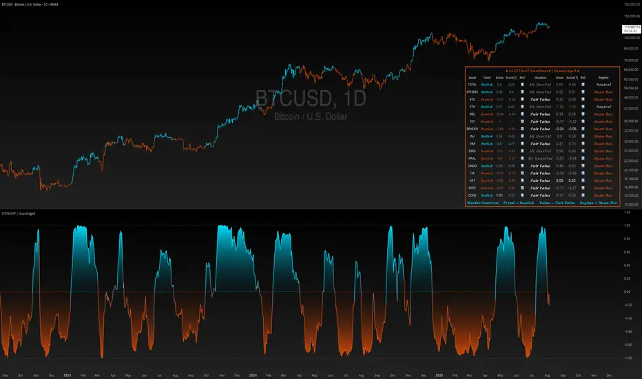
STATEMAP | QuantEdgeB is a holistic Trend & Valuation dashboard for 16 key crypto and index assets. It distills each asset’s momentum regime and valuation state into two live averages—trend average and valuation average—and presents them via color-coded candles, dynamic plots, and a comprehensive bottom-right table. Switch effortlessly between Trend and Valuation views to spot regime shifts across the market.
✨ Key Features
• 🧭 Trend vs. Valuation Toggle
Flip between viewing the overall market’s trend average or its valuation average with a single input.
• 📊 Trend Average
Aggregates each asset’s directional bias (bullish vs. bearish) into one composite gauge that flags risk-on vs. risk-off regimes.
• 💎 Valuation Average
Blends each asset’s statistical valuation score to highlight extreme under-/over-valued conditions.
• 🎨 Color-Coded Visualization
Candles turn blue for bullish, red for bearish, and gray for neutral; fills and horizontal bands reinforce regime thresholds.
• 🗺️ Live Asset Matrix
A 16×8 table shows for each symbol:
• Current Trend (Bullish/Bearish)
• Score & Prior Score with direction arrows (⬆️/⬇️/🔄)
• RoC (momentum change)
• Valuation State label (e.g. “Strong UnderValued”)
• Valuation value & prior value with change indicator
• 🚦 Market Stage Banner
A top-row line combines both averages into a concise “Market Stage” message (e.g. “Trend ⟹ Bullish Value ⟹ Sli. OverValued”).
⚙️ How It Works
• Universal Trend Assessment
Uses a library of trend-following logic to classify each asset as bullish or bearish, then averages those signals into the trend average.
• Adaptive Valuation Mapping
Evaluates each asset’s statistical valuation band, maps it into intuitive labels (under-/fair-/over-valued), and averages into the valuation average.
• Regime Thresholds
• Trend average above +0.1 ⇒ risk-on (bullish); below –0.1 ⇒ risk-off (bearish); otherwise neutral.
• Valuation average buckets assign six states from “Strong UnderValued” to “Strong OverValued.”
• Dynamic Visualization
Color-coded candlesticks and filled plot areas highlight when the market crosses key levels, making regime changes immediately apparent.
🎯 Who Should Use It
• Systematic Traders looking for a unified regime filter across multiple assets
• Portfolio Managers wanting a pulse on market momentum vs. valuation before reallocations
• Swing & Position Traders confirming cross-asset alignment or spotting divergences
• Risk Managers monitoring broad contractions (trend bearish) vs. expansions (trend bullish) alongside valuation extremes
🧬 Default Settings
• View Mode: Trend
• Bar color: Yes
• Assets Covered: TOTAL market cap, TOTAL OTHERS, BTC, ETH, SOL, FET, RNDR, INJ, VRA, ORDI, PAAL, ONDO, TIA, AKT, PEPE, DOGE
📌 Conclusion
STATEMAP | QuantEdgeB delivers a clear, emoji-tagged map of where the crypto market stands in both momentum and valuation space. With an easy toggle and a rich dashboard, it empowers you to make regime-aware trading and allocation decisions at a glance.
🔹 Disclaimer: Past performance is not indicative of future results. No trading strategy can guarantee success in financial markets.
🔹 Strategic Advice: Always backtest, optimize, and align parameters with your trading objectives and risk tolerance before live trading.
Script su invito
Solo gli utenti approvati dall'autore possono accedere a questo script. È necessario richiedere e ottenere l'autorizzazione per utilizzarlo. Tale autorizzazione viene solitamente concessa dopo il pagamento. Per ulteriori dettagli, seguire le istruzioni dell'autore riportate di seguito o contattare direttamente QuantEdgeB.
TradingView NON consiglia di acquistare o utilizzare uno script a meno che non si abbia piena fiducia nel suo autore e se ne comprenda il funzionamento. È inoltre possibile trovare alternative gratuite e open source nei nostri script della community.
Istruzioni dell'autore
whop.com/basetrustcapital 💎
🔹 Unlock our free toolbox:
tradinglibrary.carrd.co/ 🛠️
Disclaimer: All resources and indicators provided are for educational purposes only
Declinazione di responsabilità
Script su invito
Solo gli utenti approvati dall'autore possono accedere a questo script. È necessario richiedere e ottenere l'autorizzazione per utilizzarlo. Tale autorizzazione viene solitamente concessa dopo il pagamento. Per ulteriori dettagli, seguire le istruzioni dell'autore riportate di seguito o contattare direttamente QuantEdgeB.
TradingView NON consiglia di acquistare o utilizzare uno script a meno che non si abbia piena fiducia nel suo autore e se ne comprenda il funzionamento. È inoltre possibile trovare alternative gratuite e open source nei nostri script della community.
Istruzioni dell'autore
whop.com/basetrustcapital 💎
🔹 Unlock our free toolbox:
tradinglibrary.carrd.co/ 🛠️
Disclaimer: All resources and indicators provided are for educational purposes only