OPEN-SOURCE SCRIPT
Aggiornato International [interest, exchange] rates

from my blog to quantguy :
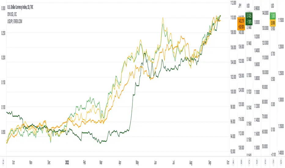
Below are links to a rapid-throw-together set of charts comparing [interest, exchange] rates internationally. There are probably millions of other graphs like this created by organisations and educationals institutes, but far more advanced and accurate. Even so, the graphs show the time relationship between [exchange, interest] rates, and are suggestive of some degree of correlation. No sense pushing this too far, it would be more fun to ferret out more of the network of inter-related factors. One possible current anomaly is the GBPUSD exchange rate?
The charts were generated using a simple PineScript (should be visible?)
// saved graphs - unfortunately, all of the colored labels on the graph were lost!!
// exchange rates are shown by darker colors, interest rates lighter similar colors
// China - green, Euro - purple, Great Britain - blue, Japan - orange (you can see this in the4 code below!)
// stable interest rates : [JP10Y, CN10Y]
// policy-manipulated interest rates : [TNX, EU10Y, GB10Y]
// maybe the "stable rates" countries do more "exchange rate" manipulation?
I haven't put in (min, max) interest rates for time periods EXCEPT for 6month & 1 year. the other periods will be erroneous (eg day, month, 3 month, 5 year, etc)
Note di rilascio
20Sep2022 - This is an update of yesterday's Pine Script. I have simply provided additional constants for the (3M, 6M) time.periods, adding to constants for (1Y, 5Y) time.periods of yesterday. I did try to implement script to automatically provide the (min, max) of del_CN10Y = v_TNX - v_CN10Y (example), but PineScript does not work on full time-period information accurately, so I abandoned that. Below are links to a rapid-throw-together set of charts comparing rates internationally. There are probably millions of other graphs like this created by organisations and educationals institutes, but far more advanced and accurate. Even so, the graphs show the time relationship between rates, and are suggestive of some degree of correlation. No sense pushing this too far, it would be more fun to ferret out more of the network of inter-related factors. One possible current anomaly is the GBPUSD exchange rate?
// All manually-provided constants for del[Min, Max]_<sym>10Y will become inaccurate with time!!
// ONLY time.periods [3M, 6M, 1Y, 5Y] work.
// time.periods [1D, 5D, 1M, ALL] do NOT work - I haven't manually provided values from charts.
// there are some errors in my manually [read, record] of the 5Y time-periods
// additionally, this Pine Script was thrown together in a day, no rigorous testing
// exchange rates are shown by darker colors, interest rates lighter similar colors
// China - green, Euro - purple, Great Britain - blue, Japan - orange (you can see this in the4 code below!)
// stable rates : [JP10Y, CN10Y]
//
// policy-manipulated rates : [TNX, EU10Y, GB10Y]
//
Script open-source
Nello spirito di TradingView, l'autore di questo script lo ha reso open source, in modo che i trader possano esaminarne e verificarne la funzionalità. Complimenti all'autore! Sebbene sia possibile utilizzarlo gratuitamente, ricordiamo che la ripubblicazione del codice è soggetta al nostro Regolamento.
Declinazione di responsabilità
Le informazioni e le pubblicazioni non sono intese come, e non costituiscono, consulenza o raccomandazioni finanziarie, di investimento, di trading o di altro tipo fornite o approvate da TradingView. Per ulteriori informazioni, consultare i Termini di utilizzo.