Filter Volume1. Indicator Name
Filter Volume
2. One-line Introduction
A regression-based trend filter that quantifies and visualizes market direction and strength using price behavior.
3. Overall Description
Filter Volume+ is a trend-detection indicator that uses linear regression to evaluate the dominant direction of price movement over a given period.
It compares historical regression values to determine whether the market is in a bullish, bearish, or neutral state.
The indicator applies a percentage threshold to filter out weak or indecisive trends, highlighting only significant movements.
Each trend state is visualized through distinct colors: bullish (greenish), bearish (reddish), and neutral (gray), with intensity reflecting trend strength.
To reduce noise and create smooth visual signals, a three-step smoothing process is applied to the raw trend intensity.
Users can customize the regression source, lookback period, and sensitivity, allowing the indicator to adapt to various assets and timeframes.
This tool is especially useful in filtering entry signals based on clear directional bias, making it suitable for trend-following or confirmation strategies.
4. Key Benefits (Title + Description)
✅ Quantified Trend Strength
Only displays trend signals when a statistically significant direction is detected using linear regression comparisons.
✅ Visual Clarity with Color Coding
Each market state (bullish, bearish, neutral) is represented with distinct colors and transparency, enabling fast interpretation.
✅ Custom Regression Source
Users can define the data input (e.g., close, open, indicator output) for regression calculation, increasing strategic flexibility.
✅ Multi-Level Smoothing
Applies three layers of smoothing (via moving averages) to eliminate noise and produce a stable, flowing trend curve.
✅ Area Fill Visualization
Plots a colored band between the trend value and zero-line, helping users quickly gauge the market's dominant force.
✅ Adjustable Sensitivity Settings
Includes tolerance and lookback controls, allowing traders to fine-tune how reactive or conservative the trend detection should be.
5. Indicator User Guide
📌 Basic Concept
Filter Volume+ assesses the direction of price by comparing regression values over a selected period.
If the percentage of upward comparisons exceeds a threshold, a bullish state is shown; if downward comparisons dominate, it shows a bearish state.
⚙️ Settings Overview
Lookback Period (n): The number of bars to compare for trend analysis
Range Tolerance (%): Minimum threshold for declaring a strong trend
Regression Source: The data used for regression (e.g., close, open)
Linear Regression Length: Number of bars used to compute each regression value
Bull/Bear Color: Custom colors for bullish and bearish trends
📈 Example Timing
When the trend line stays above zero and the green color intensity increases → trend gaining strength
After a neutral phase (gray), the color shifts quickly to greenish → early trend reversal
📉 Example Timing
When the trend line stays below zero with deepening red color → strong bearish continuation
Sudden change from bullish to bearish color with rising intensity
🧪 Recommended Use
Use as a trend confirmation filter alongside entry/exit strategies
Ideal for swing or position trades in trending markets
Combine with oscillators like RSI or MACD for improved signal validation
🔒 Cautions
In ranging (sideways) markets, the color may change frequently – avoid relying solely on this indicator in those zones.
Low-intensity colors (faded) suggest weak trends – better to stay on the sidelines.
A short lookback period may cause over-sensitivity and false signals.
When using non-price regression sources, expect the indicator to behave differently – test before deploying.
+++
Bande e canali

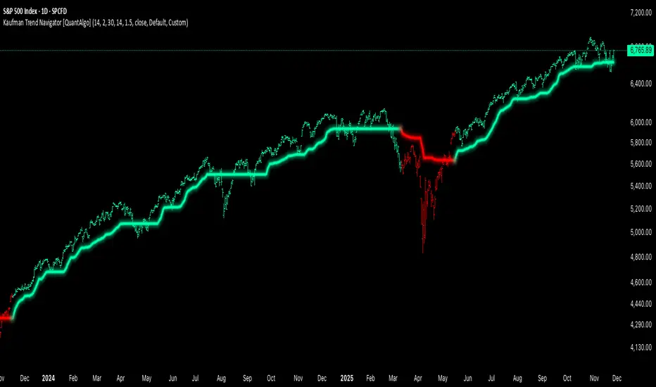
Kaufman Trend Navigator [QuantAlgo]🟢 Overview
The Kaufman Trend Navigator is an adaptive trend following system that combines efficiency-weighted price smoothing with volatility-adjusted bands to identify and track directional market movements. The indicator dynamically adjusts its sensitivity based on market conditions, becoming more responsive during trending periods and more conservative during consolidation. This dual-layer approach provides traders and investors with a systematic framework for trend identification, entry timing, and risk management across multiple timeframes and asset classes.
🟢 How It Works
The indicator employs an efficiency ratio mechanism that measures the directional movement of price relative to total price volatility over a defined lookback period. This ratio determines the adaptive response rate, allowing the system to distinguish between genuine directional moves and random market noise. When price exhibits strong directional characteristics, the internal smoothing accelerates to track the trend more closely. Conversely, during periods of low efficiency or choppy price action, the smoothing becomes more conservative to filter out false signals.
Volatility bands are constructed using normalized range measurements, creating dynamic upper and lower boundaries around the adaptive trend calculation. These bands expand and contract based on recent market volatility, providing context-dependent thresholds for trend validation. The trend line itself updates through a band-following logic where it tracks the relevant boundary based on the current directional bias, creating a stepping mechanism that maintains trend persistence while allowing for validated reversals.
The visual representation uses a gradient-weighted display to emphasize the primary trend line while maintaining clarity on price charts. Trend direction changes trigger when the internal logic confirms a boundary crossover, generating signals for potential position entries or exits. The system includes preset configurations calibrated for different trading timeframes, from responsive settings for scalping to smoother parameters suited for swing and position trading.
🟢 How to Use It
▶ Enter Long positions when the trend line transitions to Bullish (Green) coloring, which indicates upward directional bias has been established. Conversely, enter Short positions or exit Longs when the trend line shifts to Bearish (Red), which signals confirmed downward momentum.
The trend line itself can be used as dynamic support during uptrends and resistance during downtrends, providing logical areas for position management and stop placement. Price remaining above the line during bullish phases or below during bearish phases can also be used as a confirmation of trend strength and continuation probability.
▶ Built-in alert functionality provides real-time notifications for trend changes without requiring continuous chart monitoring. Configure alerts for Bullish Trend Signal to capture upward reversals, Bearish Trend Signal for downward shifts, or the general Trend Change alert to monitor both directions simultaneously. These alerts trigger only on confirmed trend transitions, reducing noise from intrabar fluctuations.
The indicator also includes six color presets (Classic, Aqua, Cosmic, Ember, Neon, Custom) to optimize visual clarity across different chart themes and lighting conditions. Select presets based on your monitor setup and background preference to ensure immediate trend recognition without visual strain. Bar coloring can be enabled to highlight trend direction directly on the price chart, eliminating the need to reference the trend line position during rapid market analysis.
🟢 Pro Tips for Trading and Investing
▶ Match the preset configuration (or your preferred settings) to your trading timeframe: use Fast Response for intraday charts (1-15 minutes), Default for swing trading (hourly to daily), and Smooth Trend for position trading (4-hour to weekly).
▶ Combine trend signals with volume analysis and market structure to filter lower-probability setups. During sideways markets, expect increased signal frequency with reduced reliability; consider waiting for the trend line to establish a clear slope before committing capital.
▶ Use the trend line as a trailing reference rather than a fixed stop level, allowing normal intrabar volatility while protecting against genuine reversals.
▶ For portfolio management, align position sizing with trend strength by observing the angle and consistency of the trend line progression.
DCA + Liquidation LevelsThe indicator combines a Dollar-Cost Averaging (DCA) strategy after downtrends with liquidation level detection, providing comprehensive market analysis.
📈 Working Principle
1. DCA Strategy Foundation
EMA 50 and EMA 200 - used as primary trend indicators
EMA-CD Histogram - difference between EMA50 and EMA200 with signal line
BHD Levels - dynamic support/resistance levels based on volatility
2. DCA Entry Logic
pinescript
// Entry Conditions
entry_condition1 = nPastCandles > entryNumber * 24 * 30 // Monthly interval
entry_condition2 = emacd < 0 and hist < 0 and hist > hist // Downtrend reversal
ENTRY_CONDITIONS = entry_condition1 and entry_condition2
Entry triggers when:
Specified time has passed since last entry (monthly intervals)
EMA-CD is negative but showing reversal signs (histogram increasing)
Market is emerging from downtrend
3. Price Zone Coloring System
pinescript
// BHD Unit Calculation
bhd_unit = ta.rma(high - low, 200) * 2
price_level = (close - ema200) / bhd_unit
Color Zones:
🔴 Red Zone: Level > 5 (Extreme Overbought)
🟠 Orange Zone: Level 4-5 (Strong Overbought)
🟡 Yellow Zone: Level 3-4 (Overbought)
🟢 Green Zone: Level 2-3 (Moderate Overbought)
🔵 Light Blue: Level 1-2 (Slightly Overbought)
🔵 Blue: Level 0-1 (Near EMA200)
🔵 Dark Blue: Level -1 to -4 (Oversold)
🔵 Extreme Blue: Level < -4 (Extreme Oversold)
4. Liquidation Levels Detection
pinescript
// Open Interest Delta Analysis
OI_delta = OI - nz(OI )
OI_delta_abs_MA = ta.sma(math.abs(OI_delta), maLength)
Liquidation Level Types:
Large Liquidation Level: OI Delta ≥ 3x MA
Middle Liquidation Level: OI Delta 2x-3x MA
Small Liquidation Level: OI Delta 1.2x-2x MA
Leverage Calculations:
5x, 10x, 25x, 50x, 100x leverage levels
Both long and short liquidation prices
⚙️ Technical Components
1. Moving Averages
EMA 50: Short-term trend direction
EMA 200: Long-term trend foundation
EMA-CD: Momentum and trend strength measurement
2. BHD Levels Calculation
pinescript
bhd_unit = ta.rma(high - low, 200) * 2
bhd_upper = ema200 + bhd_unit * N // Resistance levels
bhd_lower = ema200 - bhd_unit * N // Support levels
Where N = 1 to 5 for multiple levels
3. Open Interest Integration
Fetches Binance USDT perpetual contract OI data
Calculates OI changes to detect large position movements
Identifies potential liquidation clusters
🔔 Alert System
Zone Transition Alerts
Triggers: When price moves between different BHD zones
Customizable: Each zone alert can be enabled/disabled individually
Information: Includes exact level, price, and EMA200 value
Alert Types Available:
🔴 Red Zone Alert
🟠 Orange Zone Alert
🟡 Yellow Zone Alert
🟢 Green Zone Alert
🔵 Light Blue Zone Alert
🔵 Blue Zone Alert
🔵 Dark Blue Zone Alert
🔵 Extreme Blue Zone Alert
🎨 Visual Features
1. Candle Coloring
Real-time color coding based on price position relative to EMA200
Immediate visual identification of market conditions
2. Level Displays
EMA lines (50 & 200)
BHD support/resistance levels
Liquidation level lines with different styles based on significance
3. Entry Markers
Green upward labels below bars indicating DCA entry points
Numbered sequentially for tracking
📊 Input Parameters
DCA Settings
Start/End dates for backtesting
EMA periods customization
Liquidation Levels Settings
MA Length for OI Delta
Threshold multipliers for different liquidation levels
Display toggles for lines and histogram
Alert Settings
Individual zone alert enable/disable
Customizable sensitivity
🔧 Usage Recommendations
For DCA Strategy:
Enter positions at marked DCA points after downtrends
Use BHD levels for position sizing and take-profit targets
Monitor zone transitions for market condition changes
For Liquidation Analysis:
Watch for price approaches to liquidation levels
Use histogram for density of liquidation clusters
Combine with zone analysis for entry/exit timing
⚠️ Limitations
Data Dependency: Requires Binance OI data availability
Market Specific: Optimized for cryptocurrency markets
Timeframe: Works best on 1H+ timeframes for reliable signals
Volatility: BHD levels may need adjustment for different volatility regimes
🔄 Updates and Maintenance
Regular compatibility checks with TradingView updates
Performance optimization for different market conditions
User feedback incorporation for feature improvements
This indicator provides institutional-grade market analysis combined with systematic DCA strategy implementation, suitable for both manual trading and algorithmic strategy development.

ORB 15min: Break & ConfirmUsing the 15-minute opening candle range, this generates an alert when a 5-minute candle breaks the range and another 5-minute candle closes above the breakout candle's high or the high of any other candle that attempted to break the range.

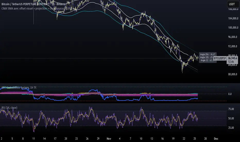
CMA SMA avec offset visuel + projection + choix sourceCMA Channels are a set of bands built around a Centered Moving Average (CMA), a tool often used in market cycle analysis (e.g., Hurst).
Unlike a regular moving average, the CMA is shifted forward in time to remove lag and reveal the underlying cyclical structure of price.
NW Envelope + Hull Safe & Professional:No repainting — everything uses (previous closed bar)
Signals only appear after bar close
Built-in cooldown (10 bars) to avoid spam
Loud customizable sound alerts that actually play
Works perfectly on all timeframes (especially 15m, 1h, 4h)

VWAP Bands ProDisclaimer: This script is for educational purposes only and is not financial advice. Trading involves risk, and users are responsible for their own decisions.
VWAP Bands Pro is a professional volatility tool that anchors the Volume Weighted Average Price to a chosen timeframe and projects standard deviation bands to reveal stretched price zones.
Key Features
Anchored Precision : Calculates VWAP from a fixed anchor period (default: Daily) for a clean institutional reference point.
Standard Deviation Bands : Plots 1s, 2s, and 3s bands to show volatility. Moves into the outer bands often point to exhaustion or possible reversal areas.
Glowing Gradient Design : Uses a premium multi step gradient that fades outward, making extreme zones easy to spot.
Clean Visuals : Prioritizes smooth gradient fills instead of crowding the chart with heavy lines.
How to Use
Anchor Period : Select the timeframe you want the tool to follow. Daily works well for intraday setups, while Weekly or Monthly suits swing trades.
Strategy : Watch for mean reversion setups when price moves into the 2s to 3s outer zones and starts to reject, aiming for a return toward the central VWAP.

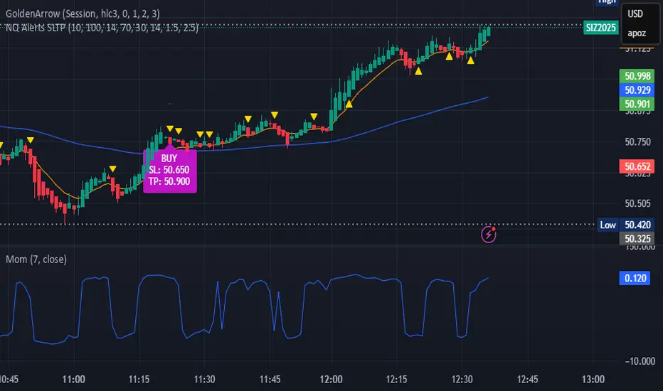
bows//@version=5
indicator("NQ EMA+RSI+ATR Alerts with SL/TP", overlay=true, shorttitle="NQ Alerts SLTP")
// === Inputs ===a
fastLen = input.int(9, "Fast EMA", minval=1)
slowLen = input.int(21, "Slow EMA", minval=1)
rsiLen = input.int(14, "RSI Length", minval=1)
rsiLongMax = input.int(70, "Max RSI to allow LONG", minval=50, maxval=90)
rsiShortMin = input.int(30, "Min RSI to allow SHORT", minval=10, maxval=50)
atrLen = input.int(14, "ATR Length", minval=1)
atrMultSL = input.float(1.5, "ATR Stop-Loss Multiplier", step=0.1)
atrMultTP = input.float(2.5, "ATR Take-Profit Multiplier", step=0.1)
// === Indicator calculations ===
price = close
fastEMA = ta.ema(price, fastLen)
slowEMA = ta.ema(price, slowLen)
rsiVal = ta.rsi(price, rsiLen)
atr = ta.atr(atrLen)
// === Entry signals ===
longSignal = ta.crossover(fastEMA, slowEMA) and rsiVal < rsiLongMax
shortSignal = ta.crossunder(fastEMA, slowEMA) and rsiVal > rsiShortMin
// === SL/TP Levels ===
longSL = price - atr * atrMultSL
longTP = price + atr * atrMultTP
shortSL = price + atr * atrMultSL
shortTP = price - atr * atrMultTP
// === Plotting ===
plot(fastEMA, color=color.orange, title="Fast EMA")
plot(slowEMA, color=color.blue, title="Slow EMA")
plotshape(longSignal, title="Buy Signal", style=shape.triangleup, color=color.new(color.green, 0), location=location.belowbar, size=size.tiny)
plotshape(shortSignal, title="Sell Signal", style=shape.triangledown, color=color.new(color.red, 0), location=location.abovebar, size=size.tiny)
// Optional visualization of SL/TP
plot(longSignal ? longSL : na, "Long Stop-Loss", color=color.new(color.red, 50), style=plot.style_linebr)
plot(longSignal ? longTP : na, "Long Take-Profit", color=color.new(color.green, 50), style=plot.style_linebr)
plot(shortSignal ? shortSL : na, "Short Stop-Loss", color=color.new(color.red, 50), style=plot.style_linebr)
plot(shortSignal ? shortTP : na, "Short Take-Profit", color=color.new(color.green, 50), style=plot.style_linebr)
// === Alerts with SL/TP info ===
alertcondition(longSignal, title="BUY Signal",
message="BUY Alert — NQ LONG: Entry @ {{close}} | SL: {{plot_1}} | TP: {{plot_2}} | {{ticker}}")
alertcondition(shortSignal, title="SELL Signal",
message="SELL Alert — NQ SHORT: Entry @ {{close}} | SL: {{plot_3}} | TP: {{plot_4}} | {{ticker}}")
// === Visual labels ===
if (longSignal)
label.new(bar_index, low, "BUY SL: " + str.tostring(longSL, format.mintick) + " TP: " + str.tostring(longTP, format.mintick),
style=label.style_label_up, color=color.new(#be14c4, 0), textcolor=color.white)
if (shortSignal)
label.new(bar_index, high, "SELL SL: " + str.tostring(shortSL, format.mintick) + " TP: " + str.tostring(shortTP, format.mintick),
style=label.style_label_down, color=color.new(color.red, 0), textcolor=color.white)
Raja_Intraday: Bull/Bear Logic SetupBased on Candle high low/PDH-PDL break out, in combination with other indicators.
Focus is more on accuracy than on higher frequency of trades. Enjoy!!

Structural Liquidity ZonesTitle: Structural Liquidity Zones
Description:
This script is a technical analysis system designed to map market structure (Liquidity) using dynamic, volatility-adjusted zones, while offering an optional Trend Confluence filter to assist with trade timing.
Concept & Originality:
Standard support and resistance indicators often clutter the chart with historical lines that are no longer relevant. This script solves that issue by utilizing Pine Script Arrays and User-Defined Types to manage the "Lifecycle" of a zone. It automatically detects when a structure is broken by price action and removes it from the chart, ensuring traders only see valid, fresh levels.
By combining this structural mapping with an optional EMA Trend Filter, the script serves as a complete "Confluence System," helping traders answer both "Where to trade?" (Structure) and "When to trade?" (Trend).
Key Features:
1. Dynamic Structure (The Array Engine)
Pivot Logic: The script identifies major turning points using a customizable lookback period.
Volatility Zones: Instead of thin lines, zones are projected using the ATR (Average True Range). This creates a "breathing room" for price, visualizing potential invalidation areas.
Active Management: The script maintains a memory of active zones. As new bars form, the zones extend forward. If price closes beyond a zone, the script's garbage collection logic removes the level, keeping the chart clean.
2. Trend Confluence (Optional)
EMA System: Includes a Fast (9) and Slow (21) Exponential Moving Average module.
Signals: Visual Buy/Sell labels appear on crossover events.
Purpose: This allows for "Filter-based Trading." For example, a trader can choose to take a "Buy" bounce from a Support Zone only if the EMA Trend is also bullish.
Settings:
Structure Lookback: Controls the sensitivity of the pivot detection.
Max Active Zones: Limits the number of lines to optimize performance.
ATR Settings: Adjusts the width of the zones based on volatility.
Enable Trend Filter: Toggles the EMA lines and signals on/off.
Usage:
This tool is intended for structural analysis and educational purposes. It visualizes the relationship between price action pivots and momentum trends.

deKoder | Ultra High Timeframe Moving Average & Log StDev BandsdeKoder | Ultra High Timeframe Moving Average & Log StDev Bands
Identify long-term statistical extremes and map the core trend with the deKoder | uHTF MA indicator. Designed for macro analysis, this tool uses ultra high timeframe moving averages and logarithmic standard deviation bands to frame price action, providing clear signals for when an asset is statistically cheap, fairly priced, or expensive.
KEY FEATURES
• Ultra High Timeframe (uHTF) Moving Average:
• Acts as a dynamic long term fair value equilibrium line. Choose from periods like 1-Year, 2-Year, or 'Long Time'.
• Select your MA type: SMA, EMA, Hull MA, or a Rolling VWAP .
• Automatically fetches optimal data (4H/D) for smoother plotting on lower timeframes.
• Probabilistic Logarithmic Bands:
• The bands are calculated using log-standard deviation , creating a framework that adapts to exponential growth. As such, your chart price scale should be set to log.
• ~68% of price action typically occurs between the ±1σ bands (fair value zone).
• Trading in the ±1σ to ±2σ channel is typical in a strongly trending market. Moves towards the ±3σ bands can indicate that the market is becoming overextended. Expect strong price moves here and pay attention for signs of reversal.
• Bitcoin Halving Timeline:
• Integrated vertical lines and labels for all Bitcoin halvings.
• Correlates technical extremes with fundamental scarcity events.
• 4-Year Cycle Visual Aid:
• The background color cycle highlights yearly changes.
• Red years have historically aligned with bear markets, while the subsequent green zone has marked accumulation phases.
• Note: The bands provide the primary information - the background color is a contextual guide based on historical patterns around the BTC 4 year halving cycle that may not persist in future. It's quite possible that the market will act differently going forward considering the new types participants such as ETFs and government reserve funds.
HOW TO USE & INTERPRET
• Fair Value & Extremes:
• Price between ±1σ Bands: The asset is trading within a statistically fair value range.
• Price at +2σ / +3σ Bands: The asset is statistically expensive. Statistically, the price is overextended in this region, although you do NOT want to fade it based only upon this information.
• Price at -2σ / -3σ Bands: The asset is statistically cheap. These zones have frequently coincided with the end of bear markets and profound long-term buying opportunities.
• Dynamic Support & Resistance:
• The uHTF MA and its bands tend to act as support and resistance areas of interest on daily, weekly and monthly charts.
INPUTS & CUSTOMIZATION
• Toggles : Master switch for the MA, Bands, and Halving markers.
• uHTF Moving Average Filter : Select instrument (default: BITSTAMP:BTCUSD), price source, MA length, and type.
• Colours : Fine-tune the appearance of all elements.
PRO TIPS
• While created for Bitcoin, this principle will work well on other high-growth assets and major indices.
• The most reliable signals occur on the Daily, Weekly and Monthly timeframes.
• This is a lagging, macro-filter indicator. It is not for timing short-term entries but for confirming the long-term trend and cycle phase.
"Be Fearful When Others Are Greedy and Greedy When Others Are Fearful." - The deKoder | uHTF MA is here to help you quantify that greed and fear on a macro scale.


Felix-Style Breakout ScannerThis stock scanner will scan stocks back on the 50MA, heartbeat pattern and buy volume to detect a good buying opportunity.


YenCarry IndexA risk gauge that signals when USD/JPY is moving fast enough to make yen intervention likely by Ministry of Finance.

🌊 QUANTUM FLOW PRO - Ultimate Trading System🌊 QUANTUM FLOW PRO - Ultimate Trading System
Description:
QUANTUM FLOW PRO (QFP) is a comprehensive, all-in-one professional trading ecosystem designed for Crypto, Forex, and Stock markets. Unlike simple indicators that rely on a single metric, QFP combines Trend Analysis, Volume Profiles, Order Flow, and Institutional Accumulation logic into a single, powerful decision-making engine.
This system calculates a "Signal Score" (0-100) for every potential trade by analyzing over 10 different technical factors simultaneously.
🚀 KEY FEATURES
1. 🧠 Smart Signal Scoring System Every Buy or Sell signal is not just a guess; it is the result of a complex calculation. The system evaluates:
Trend: SuperTrend & EMA confluence.
Momentum: RSI, MACD, and Stochastic levels.
Volume: Money Flow, OBV, and Volume Z-Score.
Multi-Timeframe (HTF): Checks 4H and Daily trends for confirmation.
Result: You get a score (e.g., 85/100) indicating the probability of success.
2. 🐋 Whale & Accumulation Detection Identify where big players are positioning themselves before the move happens.
Purple Zones: High Accumulation areas (potential explosive breakouts).
Whale Activity: Detects unusual volume spikes often associated with institutional entries.
Consolidation: Measures volatility contraction to predict expansion.
3. 🔵 Order Flow & Pressure Visualize the battle between buyers and sellers directly on the chart.
Green/Red Dots: Show real-time Buying or Selling pressure based on price-volume divergence.
Order Walls: Identifies potential liquidity zones where price might stall or reverse.
4. 💰 Advanced Risk Management Stop guessing your exits. QFP provides dynamic levels automatically:
Entry, Stop Loss, and 3 Take Profit Levels.
Methods: Choose between ATR-based (Volatility), Fibonacci-based, or a Hybrid calculation.
Win Probability: Shows the statistical probability of reaching the next target (DN1, DN2, DN3).
5. 📊 Professional Dashboard A sleek, non-intrusive panel displaying:
Current Trend & Strength.
HTF Status.
RSI, MACD, VWAP status.
Accumulation Score & Volume Health.
🛠️ HOW TO USE
Select your Mode:
Conservative: Best for beginners. Fewer signals, higher confirmation (Wait 30 bars).
Balanced: Standard approach for day trading.
Aggressive: For scalping and volatile markets.
Wait for a Signal:
Look for the "STRONG BUY" (Green Triangle) or "STRONG SELL" (Red Triangle) labels.
Check the Score on the label (e.g., Score: 75/60). Higher is better.
Confirm with Dashboard:
Ensure the "Trend" and "HTF" (Higher Timeframe) match the signal direction.
Look for "Healthy" volume.
Execute & Manage:
Enter the trade.
Place your Stop Loss at the suggested SL line.
Take partial profits at TP1 and TP2.
Move SL to Breakeven after TP1 is hit (the script suggests this visually).
⚙️ SETTINGS OVERVIEW
Market Type: Optimize calculations for Crypto, Forex, or Stocks (BIST).
Risk Level: Low, Medium, High (Adjusts the signal threshold score).
TP Method: Hybrid (Recommended) blends ATR and Fib levels for precision.
⚠️ DISCLAIMER
This tool is for educational and analytical purposes only. Trading involves significant risk. Always perform your own due diligence and never trade with money you cannot afford to lose

Live Bollinger Buy/Sell Signal + Custom EMA by RAJU📌 DESCRIPTION
Live Bollinger Buy/Sell Signal is a price-action-based entry system built on Bollinger Bands. This indicator automatically detects high-probability reversal points when price interacts with the outer Bollinger Bands and provides instant Buy & Sell signals directly on the chart. It is designed for traders who want clean and fast signals without complex settings.
________________________________________
🧠 LOGIC OF INDICATOR
The indicator uses a standard Bollinger Band setup (SMA + Standard deviation).
A Buy or Sell signal is triggered when a candle forms outside or near the Bollinger Band extremes and then reverses direction. This behaviour often indicates a potential trend reversal or strong bounce from volatility exhaustion.
________________________________________
⚙ USER INPUT
Setting Description
Bollinger Band Length SMA period length used to form Bollinger Bands (Default: 20)
Std.Dev Multiplier Standard deviation multiplier for upper/lower bands (Default: 2.0)
________________________________________
🟩 LONG CONDITION (Buy Signal)
A Buy signal is plotted when:
• The candle closes bullish (close > open)
• The candle opens below the lower Bollinger Band
• The candle closes back above the lower Bollinger Band
• The next candle must trade above signal candle
• If a candle before or after signal candle closes without touching 5 EMA then probability of reversal is high (optional)
This indicates a strong price rejection from oversold levels.
________________________________________
🟥 SHORT CONDITION (Sell Signal)
A Sell signal is plotted when:
• The candle closes bearish (close < open)
• The candle opens above the upper Bollinger Band
• The candle closes back below the upper Bollinger Band
• The next candle must trade below signal candle
• If a candle before or after signal candle closes without touching 5 EMA then probability of reversal is high (optional)
This indicates a strong rejection from overbought levels.
________________________________________
📤 LONG EXIT
Users may exit long trades when:
• A Sell signal appears and signal candle closes without touching 5 EMA, or
• Price reaches the middle SMA line, or
• Personal trailing stop or resistance level is reached
________________________________________
📥 SHORT EXIT
Users may exit short trades when:
• A Buy signal appears and signal candle closes without touching 5 EMA, or
• Price reaches the middle SMA line, or
• Personal trailing stop or support level is reached
________________________________________
🌟 WHY IT IS UNIQUE
• Extremely simple yet powerful price-action confirmation mechanism
• No repainting — signals appear only after candle close
• Works across all timeframes and markets (Crypto, Forex, Stocks, Indices)
• Built-in signal level plotting to verify correct candle positioning
• Fast visual signal markers without clutter
________________________________________
💹 HOW USER CAN BE BENEFITED FROM THIS
• Helps traders catch early reversal entries with high probability
• Reduces emotional decision-making with visual Buy/Sell arrows
• Ideal for scalping, intraday, and swing strategies
• Can be used as an entry confirmation with other indicators like RSI, MACD, or trend filters
• Helps avoid false breakouts by confirming rejection from volatility extremes
________________________________________
⚠ DISCLAIMER: This tool is for educational purposes only and not trading advice. Always use proper risk management.

jg ndog/nwogthis is an indicator for new week opening gaps along with daily opening gaps marking out potential liq zones

Sniper BB + VWAP System (with SMT Divergence Arrows)STEP 1: Load two correlated futures charts.
Example: CL + RB/SI+GC/ NQ+ES
STEP 2: Add Bollinger Bands (20, 2.0) on both.
Optional add (20, 3.0).
STEP 3: Watch for a BB tag on one chart but not the other.
STEP 4: Wait for a reclaim candle back inside the band.
STEP 5: Enter with stop below/above the wick + 3.0 BB.
STEP 6: Scale out midline, then opposite band.
STEP 7: Hold partials when both pairs confirm trend.
*You can take the vwap bands off the chart if it is too cluttered.

Mizan v5 - L-Score (Minimal)DESCRIPTION:
The Architecture of Market Probability
Mizan v5 is not just another technical indicator; it is a quantitative implementation of the "Ontological Probability" philosophy. It is designed to decipher the market's hidden intent by analyzing the relationship between Balance, Order, and Harmony (DDU Principles).
Unlike standard oscillators that blindly follow price action, Mizan v5 operates on a multi-dimensional logic structure to separate "Market Noise" from "True Momentum."
CORE LOGIC & FEATURES
1. The L-Score Engine (Composite Momentum)
The heart of this algorithm is the "L-Score," a weighted composite index that answers the question: "Is the move supported by energy and mass?"
It fuses three distinct market dimensions into a single actionable score (0-100):
Volume Flow (45% Weight): Uses customized Chaikin Money Flow (CMF) logic to detect "Smart Money" accumulation before price reacts.
Velocity (35% Weight): Uses CCI to measure the speed of the breakout.
Saturation (20% Weight): Uses RSI as a limiter to identify overextended conditions.
2. Adaptive Regime Detection (The Histogram Logic)
Markets are not linear; they switch between "Global" and "Local" realities. Mizan v5 calculates statistical Price Density Zones (similar to Market Profile logic) to find the "Fair Value."
Global Mode: Analyzes the long-term balance (70 bars).
Local Mode: Automatically switches focus to short-term volatility (20 bars) when a "Regime Change" (high deviation) is detected.
HOW TO USE
1. The L-Score Line (Signal):
🟢 GREEN Line (> 65): Bullish Phase. Volume and Momentum are aligned. High probability of continuation.
🔴 RED Line (< 45): Bearish/Neutral Phase. Lack of energy. Avoid long positions ("Don't catch a falling knife").
🟠 ORANGE Line: Indecision/Transition zone.
2. Background Zones (Valuation):
🟩 Green Background: "Statistical Cheap Zone." Price is below the density band. Potential for Mean Reversion (Dip Buying).
🟥 Red Background: "Statistical Expensive Zone." Price is extended above the density band. High risk of Distribution (Selling).
PHILOSOPHY
"Chaos is merely order waiting to be deciphered." This tool is the visual manifestation of the "Cosmic Architect" project, aiming to bridge the gap between abstract philosophy and algorithmic trading.
Disclaimer: This tool is for educational and analytical purposes only. It is not financial advice.
© MuratKavak | Idea Architect

EMA CloudSimple EMA cloud using a fast, a slow and an optinal middle EMA.
It has EMA, EMA cloud and candle coloring depending on whether it's a downtrend or an uptrend.
It has a dashboard also with 4 customizable time frames that tells you if they are bullish or bearish and tells you the strength of the trend for the timeframe you are viewing.

6 EMA - 6 SMA This indicator will allow you to place on the chart at the same time 6 EMAs and 6 SMAs if you want — a total of 12 EMAs/SMAs!

Gold Thai CompassGold Thai Compass Indicator
Calculates Thai Gold Price (96.5%) by converting XAU/USD with the USD/THB exchange rate in real time
Displays the calculated gold_price_thb directly on the chart with a clean right-aligned label for easy price reading
Includes customizable reference lines — add, remove, rename, recolor, and adjust each line independently
Supports multiple editable lines (e.g., 4 levels) with price labels displayed beside each line
Provides user-friendly input settings (e.g., custom price sources, spread/adjustment options)
Updates dynamically with live market data — suitable for trading, analysis, and Thai gold price tracking
Designed for TradingView (Pine Script) and optimized for clarity and usability
Optional visibility controls to show/hide labels and reference lines for a cleaner chart layout
