Combined Bitcoin CME Gaps and Weekend DaysScript Description: Combined Bitcoin CME Gaps and Weekend Days
Author: NeoButane (Bitcoin CME Gaps), JohnIsTrading (Day of Week),
Contributor : MikeTheRuleTA (Combined and optimizations)
This Pine Script indicator provides a combined view of Bitcoin CME gaps and customizable weekend day backgrounds on your chart. It’s designed to help traders visualize CME gaps along with customizable weekend day highlights.
Features:
CME Gaps Visualization:
Enable CME Gaps: Toggle the display of CME gaps on your chart.
Show Real vs. CME Price: Choose whether to display chart prices or CME prices for gap analysis.
Weekend Gaps Only: Filter to show only weekend gaps for a cleaner view (note: this may miss holidays).
CME Gaps Styling:
Weekend Background Highlighting:
Enable Weekend Background: Toggle the weekend day background highlight on or off.
Timezone Selection: Choose the relevant timezone for accurate weekend highlighting.
Customizable Weekend Colors: Define colors for Saturday and Sunday backgrounds.
How It Works:
CME Gaps: The script identifies gaps between CME and chart prices when the CME session is closed. It plots these gaps with customizable colors and line widths.
You can choose to see gaps based on CME prices or chart prices and decide whether to include only weekends.
Weekend Backgrounds: The script allows for background highlighting of weekends (Saturday and Sunday) on your chart. This can be enabled or disabled and customized with specific colors.
The timezone setting ensures that the background highlights match your local time settings.
Inputs:
CME Gaps Settings:
Enable CME Gaps
Show Real vs. CME Price
Only Show Weekend Gaps
CME Gaps Style:
Gap Fill Color Up
Gap Fill Color Down
Gap Fill Transparency
Weekend Settings:
Enable Weekend Background
Timezone
Enable Saturday
Saturday Color
Enable Sunday
Sunday Color
Usage:
Add this script to your TradingView chart to overlay CME gaps and weekend highlights.
Adjust the settings according to your preferences for a clearer view of gaps and customized weekend backgrounds.
This indicator provides a comprehensive tool for tracking CME gaps and understanding weekend market behaviors through visual enhancements on your trading charts.
Btc!
BTC Coinbase PremiumThis script is designed to compare the price of Bitcoin on two major exchanges: Coinbase and Binance. It helps you see if there’s a difference in the price of Bitcoin between these two exchanges, which is known as a “premium” or “discount.”
Here’s how it works in simple terms:
Getting the Prices:
The script first fetches the current price of Bitcoin from Coinbase and Binance. It looks at the closing price, which is the price at the end of the selected time period on your chart.
Calculating the Difference:
It then calculates the difference between these two prices. If Bitcoin is more expensive on Coinbase than on Binance, this difference will be positive, indicating a “premium.” If it’s cheaper on Coinbase, the difference will be negative, indicating a “discount.”
Visualizing the Difference:
The script creates a visual chart that shows this price difference over time. It uses green bars to show when there’s a premium (Coinbase is more expensive) and red bars to show when there’s a discount (Coinbase is cheaper).
Optional Table Display:
If you choose to, the script can also show this price difference in a small table at the top right corner of your chart. The table displays the words “Coinbase Premium” and the exact dollar amount of the premium or discount.
Why does it matter?
Traders and investors have spotted a correlation between bullish strength on BTC and a strong Coinbase premium along with the inverse of a strong Coinbase discount and BTC price weakness.

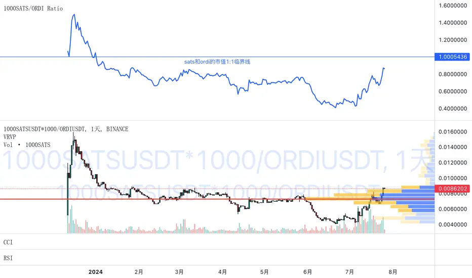
1000SATS and ORDI Market Cap RatioSure! Here is a detailed description and usage guide for your TradingView indicator:
### Indicator Description
**Title**: 1000SATS/ORDI Market Cap Ratio
**Description**: The "1000SATS/ORDI Market Cap Ratio" indicator calculates and visualizes the market capitalization ratio between 1000SATS and ORDI. This indicator allows traders and investors to analyze the relative market strength and valuation trends of 1000SATS compared to ORDI over time. By tracking this ratio, users can gain insights into market dynamics and potential trading opportunities between these two assets.
### Indicator Usage
**Purpose**:
- To compare the market capitalizations of 1000SATS and ORDI.
- To identify potential undervaluation or overvaluation of 1000SATS relative to ORDI.
- To assist in making informed trading and investment decisions based on market cap trends.
**How to Use**:
1. **Add the Indicator to Your Chart**:
- Open TradingView and navigate to your chart.
- Click on the "Indicators" button at the top of the chart.
- Select "Pine Editor" and paste the provided script.
- Click "Add to Chart" to apply the indicator.
2. **Interpret the Ratio**:
- The indicator will plot a line representing the ratio of the market capitalization of 1000SATS to ORDI.
- A rising ratio indicates that the market cap of 1000SATS is increasing relative to ORDI, suggesting stronger market performance or higher valuation of 1000SATS.
- A falling ratio indicates that the market cap of 1000SATS is decreasing relative to ORDI, suggesting weaker market performance or lower valuation of 1000SATS.
3. **Analyze Trends**:
- Use the indicator to spot trends and potential reversal points in the market cap ratio.
- Combine the ratio analysis with other technical indicators and chart patterns to enhance your trading strategy.
4. **Set Alerts**:
- Set custom alerts on the ratio to notify you of significant changes or specific thresholds being reached, enabling timely decision-making.
**Example**:
- If the ratio is consistently rising, it may indicate a good opportunity to consider 1000SATS as a stronger investment relative to ORDI.
- Conversely, if the ratio is falling, it may be a signal to reevaluate the strength of 1000SATS compared to ORDI.
**Note**: Always conduct thorough analysis and consider other market factors before making trading decisions based on this indicator.
### Script
```pinescript
//@version=4
study("1000SATS and ORDI Market Cap Ratio", shorttitle="1000SATS/ORDI Ratio", overlay=true)
// Define the circulating supply for ORDI and 1000SATS
ORDI_supply = 21000000 // Circulating supply of ORDI
SATS_1000_supply = 2100000000000 // Circulating supply of 1000SATS
// Fetch the price data for ORDI
ordi_price = security("BINANCE:ORDIUSDT", timeframe.period, close)
// Fetch the price data for 1000SATS
sats_1000_price = security("BINANCE:1000SATSUSDT", timeframe.period, close)
// Calculate the market capitalizations
ordi_market_cap = ordi_price * ORDI_supply
sats_1000_market_cap = sats_1000_price * SATS_1000_supply
// Calculate the market cap ratio
ratio = sats_1000_market_cap / ordi_market_cap
// Plot the ratio
plot(ratio, title="1000SATS/ORDI Market Cap Ratio", color=color.blue, linewidth=2)
```
This description and usage guide should help users understand the purpose and functionality of your indicator, as well as how to effectively apply it in their trading activities on TradingView.
SOL & BTC EMA with BTC/SOL Price Difference % and BTC Dom EMAThis script is designed to provide traders with a comprehensive analysis of Solana (SOL) and Bitcoin (BTC) by incorporating Exponential Moving Averages (EMAs) and price difference percentages. It also includes the BTC Dominance EMA to offer insights into the overall market dominance of Bitcoin.
Features:
SOL EMA: Plots the Exponential Moving Average (EMA) for Solana (SOL) based on a customizable period length.
BTC EMA: Plots the Exponential Moving Average (EMA) for Bitcoin (BTC) based on a customizable period length.
BTC Dominance EMA: Plots the Exponential Moving Average (EMA) for BTC Dominance, which helps in understanding Bitcoin's market share relative to other cryptocurrencies.
BTC/SOL Price Difference %: Calculates and plots the percentage difference between BTC and SOL prices, adjusted for their respective EMAs. This helps in identifying relative strength or weakness between the two assets.
Background Highlight: Colors the background to visually indicate whether the BTC/SOL price difference percentage is positive (green) or negative (red), aiding in quick decision-making.
Inputs:
SOL Ticker: Symbol for Solana (default: BINANCE
).
BTC Ticker: Symbol for Bitcoin (default: BINANCE
).
BTC Dominance Ticker: Symbol for Bitcoin Dominance (default: CRYPTOCAP
.D).
EMA Length: The length of the EMA (default: 20 periods).
Usage:
This script is intended for traders looking to analyze the relationship between SOL and BTC, using EMAs to smooth out price data and highlight trends. The BTC/SOL price difference percentage can help traders identify potential trading opportunities based on the relative movements of SOL and BTC.
Note: Leverage trading involves significant risk and may not be suitable for all investors. Ensure you have a good understanding of the market conditions and employ proper risk management techniques.

Buy Sell Trend MonitorDescription
The purpose of this indicator is to create symbols that try to show the most accurate positions possible for trading. The formation of BUY/SELL symbols is based on the intersection of SYMBOL(Himself), BTC.D, BTC and DXY indices. The resulting signals take values between 0 and 16. These values represent the strength of the signal, and the higher its numerical value, the stronger the signal. Here, 2 different calculation methods are followed for BTC and Altcoins. In BTC, calculations are made according to the direction of BTC Market value and DXY averages, while in Altcoins, calculations are made according to the direction of BTC, BTC.D and DXY averages. If DXY for BTC is trending downwards and the BTC market value is trending upwards, the BUY symbol is formed depending on the level at which the trend occurs. For altcoins, if DXY is trending down, BTC is trending up and BTC.D is trending down, the BUY symbol is formed depending on the level at which the trend occurs. For the SELL signal, the opposite is true.
Symbols are drawn according to standard ticker and OHLC4 values.
The averages of the 1-length RSI value of these symbols are taken as the 6-length SMA.
Symbols
The symbols are explained one by one below.
Orange Line: Bitcoin Marketcap line.
White Line: DXY line.
Red Line: Bitcoin Dominance line.
Aqua Line: Current Symbol line.
Best Use
This indicator should be used for SPOT trades. Regardless, since it is not possible to know exactly the direction of the market, it should be considered to buy gradually at buy signals and sell gradually at sell signals.
It should be followed for at least a 4-hour period. We do not recommend its use as the margin of error will increase in shorter time periods.
Since the signals are not guaranteed to work 100%, we do not recommend you to trade with all your money.
No Repainting
Repainting is definitely not done. After the symbols appear, the closing should be expected. Once the closing occurs, the symbol will now be permanent.
Disclaimer
This indicator is for informational purposes only and should be used for educational purposes only. You may lose money if you rely on this to trade without additional information. Use at your own risk.
Version
v1.0

Bitcoin Puell Multiple (BPM)The Bitcoin Puell Multiple is a key indicator for evaluating buying and selling opportunities based on the profitability of Bitcoin miners.
The Idea
The Bitcoin Puell Multiple is a ratio that measures the daily profitability of Bitcoin miners in relation to the historical annual average of this profitability. It is calculated by dividing the amount of newly issued Bitcoins (in USD) each day by the 365-day moving average of that same amount. This indicator provides valuable information on Bitcoin's market cycles, helping investors to identify periods when Bitcoin is potentially undervalued or overvalued.
How to Use
To use the Bitcoin Puell Multiple, investors watch for extreme levels of the indicator. A high Puell Multiple suggests that miners are making exceptionally high profits compared to the previous year, which could indicate an overvaluation of Bitcoin and a selling opportunity (red zones). Conversely, a low Puell Multiple indicates that miners' earnings are low relative to history, suggesting an undervaluation of Bitcoin and a potential buying opportunity (green zones). The trigger thresholds for these zones can be configured in the tool's parameters.
What makes this tool different from the other "Puell Multiple" scripts available is that it is up to date in terms of its data sources, with a more precise calculation, and allows you to view the entire history.
Zone trigger limits and their visualization, as well as colors, are all configurable via the tool parameters.
Here, for example, is a configuration with more sensitive trigger levels and a different color:

Bitcoin Trend Indicator█ Overview
The Trend Indicator script is designed to help traders identify the direction and strength of momentum in the price of a digital asset. By using historical price data, it calculates and provides daily signals indicating whether the asset is in an uptrend, downtrend, or no trend at all. The script can be applied to various cryptocurrencies, such as Bitcoin and Ether, using their respective price charts.
█ Key Concepts and Calculation Methodology
For calculations, the script uses the 180 most recent candles.
The Trend Indicator is calculated based on four moving average pairs (MAPs), which compare shorter-term and longer-term moving averages of the asset's price.
The moving averages are exponentially weighted, meaning more recent prices have a greater impact on the average than older prices. The half-life of the moving averages determines the weight decay.
The script uses the following moving average pairs:
1-day vs. 5-day
2.5-day vs. 10-day
5-day vs. 20-day
10-day vs. 40-day
█ Calculation Steps
Exponentially Weighted Moving Averages (EWMA):
Each moving average is calculated using an exponential decay factor and a normalization factor to adjust for the fixed window of 180 observations.
Component Inputs:
For each moving average pair, the script compares the shorter-term moving average to the longer-term moving average. If the shorter-term average is greater than or equal to the longer-term average, the component input is +1 (indicating an uptrend). If it is less, the input is -1 (indicating a downtrend).
Trend Indicator Value:
The script averages the four component inputs to produce a final value ranging from -1 to +1, representing the trend's direction and strength:
+1: Significant uptrend
+0.5: Uptrend
0: No trend
-0.5: Downtrend
-1: Significant downtrend
█ Learn More
For more information about the Bitcoin Trend Indicator and other trading tools, please visit my TradingView profile. Feel free to reach out with any questions or feedback.

Bitcoin Fundamentals - Bitcoin Block RewardThe Bitcoin Block Reward is the batch of new Bitcoins generated by the miners after solving each block.
The Block Reward is set as a basic rule and cannot be changed without agreement between the entire Bitcoin network. It started at 50 BTC during the first period. Afterwards the Block Reward gets adjusted to half of it value (Halving Event) on each cycle of 210000 blocks mined.
This is the only way that new bitcoins are created. It creates an incentive for miners to secure the network.
Over time the Block Reward will decreases to a value that might not cover the mining costs. At that point, the use of the Bitcoin Network might have increased sufficiently as to generate enough transaction fees to cover the mining costs.
MOTIVATION
Even though this is a very simple indicator, I'm currently missing a data source to compute the Block Reward value within Tradingview. Therefore, I created this indicator and its associated library function to enable its visualization and (eventually) for coders to make use of the source function to power more elaborate scripts related to the Halving Events.
Hope that helps!

Intellect_city - Halvings Bitcoin CycleWhat is halving?
The halving timer shows when the next Bitcoin halving will occur, as well as the dates of past halvings. This event occurs every 210,000 blocks, which is approximately every 4 years. Halving reduces the emission reward by half. The original Bitcoin reward was 50 BTC per block found.
Why is halving necessary?
Halving allows you to maintain an algorithmically specified emission level. Anyone can verify that no more than 21 million bitcoins can be issued using this algorithm. Moreover, everyone can see how much was issued earlier, at what speed the emission is happening now, and how many bitcoins remain to be mined in the future. Even a sharp increase or decrease in mining capacity will not significantly affect this process. In this case, during the next difficulty recalculation, which occurs every 2014 blocks, the mining difficulty will be recalculated so that blocks are still found approximately once every ten minutes.
How does halving work in Bitcoin blocks?
The miner who collects the block adds a so-called coinbase transaction. This transaction has no entry, only exit with the receipt of emission coins to your address. If the miner's block wins, then the entire network will consider these coins to have been obtained through legitimate means. The maximum reward size is determined by the algorithm; the miner can specify the maximum reward size for the current period or less. If he puts the reward higher than possible, the network will reject such a block and the miner will not receive anything. After each halving, miners have to halve the reward they assign to themselves, otherwise their blocks will be rejected and will not make it to the main branch of the blockchain.
The impact of halving on the price of Bitcoin
It is believed that with constant demand, a halving of supply should double the value of the asset. In practice, the market knows when the halving will occur and prepares for this event in advance. Typically, the Bitcoin rate begins to rise about six months before the halving, and during the halving itself it does not change much. On average for past periods, the upper peak of the rate can be observed more than a year after the halving. It is almost impossible to predict future periods because, in addition to the reduction in emissions, many other factors influence the exchange rate. For example, major hacks or bankruptcies of crypto companies, the situation on the stock market, manipulation of “whales,” or changes in legislative regulation.
---------------------------------------------
Table - Past and future Bitcoin halvings:
---------------------------------------------
Date: Number of blocks: Award:
0 - 03-01-2009 - 0 block - 50 BTC
1 - 28-11-2012 - 210000 block - 25 BTC
2 - 09-07-2016 - 420000 block - 12.5 BTC
3 - 11-05-2020 - 630000 block - 6.25 BTC
4 - 20-04-2024 - 840000 block - 3.125 BTC
5 - 24-03-2028 - 1050000 block - 1.5625 BTC
6 - 26-02-2032 - 1260000 block - 0.78125 BTC
7 - 30-01-2036 - 1470000 block - 0.390625 BTC
8 - 03-01-2040 - 1680000 block - 0.1953125 BTC
9 - 07-12-2043 - 1890000 block - 0.09765625 BTC
10 - 10-11-2047 - 2100000 block - 0.04882813 BTC
11 - 14-10-2051 - 2310000 block - 0.02441406 BTC
12 - 17-09-2055 - 2520000 block - 0.01220703 BTC
13 - 21-08-2059 - 2730000 block - 0.00610352 BTC
14 - 25-07-2063 - 2940000 block - 0.00305176 BTC
15 - 28-06-2067 - 3150000 block - 0.00152588 BTC
16 - 01-06-2071 - 3360000 block - 0.00076294 BTC
17 - 05-05-2075 - 3570000 block - 0.00038147 BTC
18 - 08-04-2079 - 3780000 block - 0.00019073 BTC
19 - 12-03-2083 - 3990000 block - 0.00009537 BTC
20 - 13-02-2087 - 4200000 block - 0.00004768 BTC
21 - 17-01-2091 - 4410000 block - 0.00002384 BTC
22 - 21-12-2094 - 4620000 block - 0.00001192 BTC
23 - 24-11-2098 - 4830000 block - 0.00000596 BTC
24 - 29-10-2102 - 5040000 block - 0.00000298 BTC
25 - 02-10-2106 - 5250000 block - 0.00000149 BTC
26 - 05-09-2110 - 5460000 block - 0.00000075 BTC
27 - 09-08-2114 - 5670000 block - 0.00000037 BTC
28 - 13-07-2118 - 5880000 block - 0.00000019 BTC
29 - 16-06-2122 - 6090000 block - 0.00000009 BTC
30 - 20-05-2126 - 6300000 block - 0.00000005 BTC
31 - 23-04-2130 - 6510000 block - 0.00000002 BTC
32 - 27-03-2134 - 6720000 block - 0.00000001 BTC

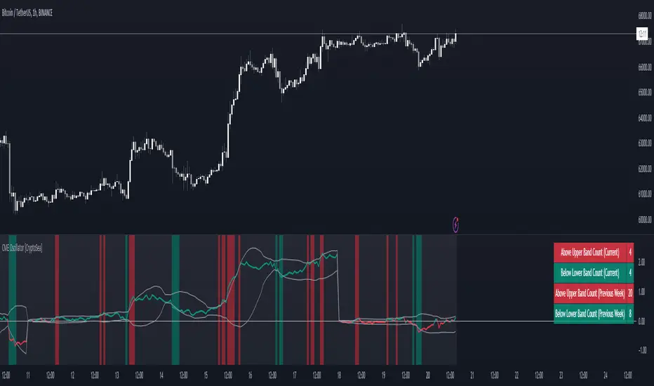
CME Gap Oscillator [CryptoSea]Introducing the CME Gap Oscillator , a pioneering tool designed to illuminate the significance of market gaps through the lens of the Chicago Mercantile Exchange (CME). By leveraging gap sizes in relation to the Average True Range (ATR), this indicator offers a unique perspective on market dynamics, particularly around the critical weekly close periods.
Key Features
Gap Measurement : At its core, the CME Oscillator quantifies the size of weekend gaps in the context of the market's volatility, using the ATR to standardize this measurement.
Dynamic Levels : Incorporating a dynamic extreme level calculation, the tool adapts to current market conditions, providing real-time insights into significant gap sizes and their implications.
Band Analysis : Through the introduction of upper and lower bands, based on standard deviations, traders can visually assess the oscillator's position relative to typical market ranges.
Enhanced Insights : A built-in table tracks the frequency of the oscillator's breaches beyond these bands within the latest CME week, offering a snapshot of recent market extremities.
Settings & Customisation
ATR-Based Measurement : Choose to measure gap sizes directly or in terms of ATR for a volatility-adjusted view.
Band Period Adjustability : Tailor the oscillator's sensitivity by modifying the band calculation period.
Dynamic Level Multipliers : Adjust the multiplier for dynamic levels to suit your analysis needs.
Visual Preferences : Customise the oscillator, bands, and table visuals, including color schemes and line styles.
In the example below, it demonstrates that the CME will want to return to the 0 value, this would be considered a reset or gap fill.
Application & Strategy
Deploy the CME Oscillator to enhance your market analysis
Market Sentiment : Gauge weekend market sentiment shifts through gap analysis, refining your strategy for the week ahead.
Volatility Insights : Use the oscillator's ATR-based measurements to understand the volatility context of gaps, aiding in risk management.
Trend Identification : Identify potential trend continuations or reversals based on the frequency and magnitude of gaps exceeding dynamic levels.
The CME Oscillator stands out as a strategic tool for traders focusing on gap analysis and volatility assessment. By offering a detailed breakdown of market gaps in relation to volatility, it empowers users with actionable insights, enabling more informed trading decisions across a range of markets and timeframes.
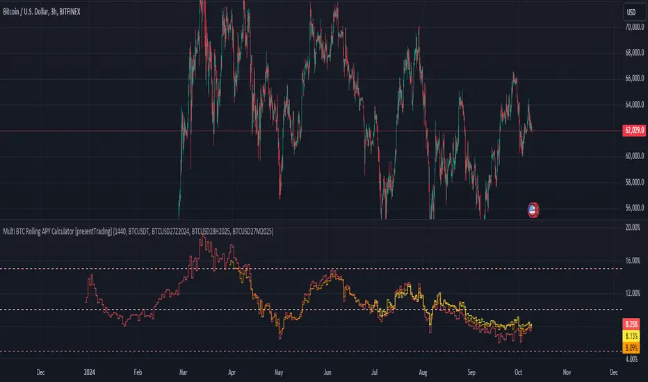
Multi BTC Rolling APY Calculator [presentTrading]█ Introduction and How it is Different
The "Multi BTC Rolling APY Calculator " is an innovative Pine Script indicator tailored for cryptocurrency traders, providing insights into arbitrage opportunities and market sentiment by calculating the Rolling Annual Percentage Yield (APY) between spot and futures prices of Bitcoin. Unlike traditional APY calculators, this tool specializes in capturing the nuances of the highly volatile and less efficient cryptocurrency markets. Rolling APY is derived from traditional market basis arbitrage but adapted to highlight significant discrepancies that frequently occur between derivative and underlying asset prices in crypto markets.
Historical backtesting has revealed that Bitcoin's Rolling APY can serve as a robust indicator of market sentiment:
- Below 0%: Often indicates panic or 'end-of-world' scenarios.
- 0-5%: Signifies extreme market fear.
- 5-10%: Reflects a calm market environment.
- 10-15%: Suggests a moderately warm market.
- 15-20%: Indicates an overheated market.
- **Above 20%: Signals FOMO (fear of missing out).
This nuanced understanding of Rolling APY helps investors not only spot arbitrage opportunities but also gauge the emotional state of the market, providing a dual function that enhances trading strategies in the volatile realm of cryptocurrencies.
█ Strategy: How It Works – Detailed Explanation
🔶 Rolling APY Calculation
The Rolling APY calculation is crucial for understanding the annualized potential returns from arbitrage strategies, given by the formula:
APY = ((Future Price - Spot Price) / Spot Price) * (365 / Days Until Expiration) * 100
This annualizes the observed premium or discount on futures contracts relative to the spot price, providing a year-over-year expectation of returns if one were to engage in arbitrage over the specified period.
🔶 Days Calculation
The accuracy of APY is contingent upon the precise calculation of days until each contract expires:
Days = (Expiration Timestamp - Current Timestamp) / 86400000
This calculation ensures the APY reflects true market dynamics for each futures contract's duration.
█ Trade Direction
While this tool does not provide direct trading signals, it informs traders about potential arbitrage opportunities and the prevailing market sentiment. Traders can leverage this data to make strategic decisions, aligning long or short positions with the anticipated market movements and arbitrage conditions.
█ Usage
By inputting specific parameters related to their market analysis, traders can monitor discrepancies in Bitcoin’s pricing across different timelines, which is especially beneficial for those involved in derivatives trading, arbitrage, and sentiment analysis.
█ Default Settings
- Resolution: Controls the frequency of data (default is daily).
- Show numbers in annual: Determines whether APY is displayed on an annual basis.
- Base Symbol and Future Symbols: Specify the spot and futures markets for analysis.
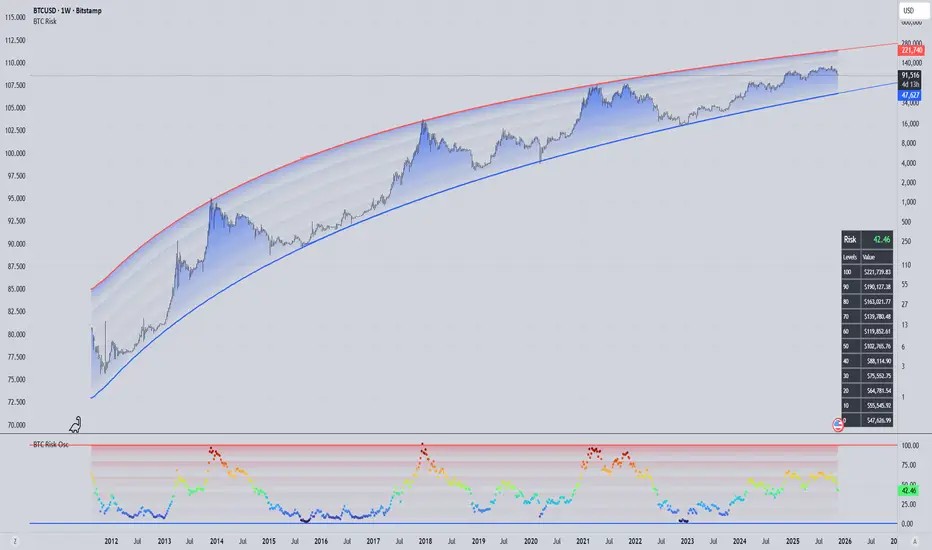
panpanXBT BTC Risk Metric OscillatorThis is the Bitcoin Risk Metric. Inspired by many power law analysts, this script assigns a risk value to the price of Bitcoin. The model uses regression of 'fair value' data to assign risk values and residual analysis to account for diminishing returns as time goes on. This indicator is for long-term investors looking to maximise their returns by highlighting periods of under and overvaluation for Bitcoin.
This is a companion script for panpanXBT BTC Risk Metric . Use this indicator in tandem to achieve the view shown in the chart above.
Please note, this indicator will only work on BTCUSD charts but will work on any timeframe.
DISCLAIMER: The product on offer presents a novel way to view the price history of Bitcoin. It should not be relied upon solely to inform financial decisions. What you do with the information is entirely up to you. Please thoroughly consider your decisions and consult many different sources to make sure you're making the most well-informed decision.
### How to Interpret
The risk scale goes from 0 to 100,
Blue - 0 being low risk, and
Red - 100 being high risk.
Low risk values represent periods of historical undervaluation, while high values represent overvaluation. These periods are marked by a colourscale from blue to red.
### Use Cases and Best Practice
A dynamic DCA strategy would work best with this indicator, whereby an amount of capital is deployed/retired on a regular basis. This amount deployed grows or shrinks depending on the proximity of the risk level to the extremes (0 and 100).
Let's say you have a maximum of $500 to deploy per month.
When risk is between 0 and 10, you could deploy the full $500.
When risk is between 10 and 20, you could deploy $400.
When risk is between 20 and 30, you could deploy $300.
When risk is between 30 and 40, you could deploy $200.
When risk is between 40 and 50, you could deploy $100.
Conversely, when risk is above 50, you could:
Sell 1/15th of your BTC stack when risk is between 50 and 60.
Sell 2/15th of your BTC stack when risk is between 60 and 70.
Sell 3/15th of your BTC stack when risk is between 70 and 80.
Sell 4/15th of your BTC stack when risk is between 80 and 90.
Sell 5/15th of your BTC stack when risk is between 90 and 100.
This framework allows the user to accumulate during periods of undervaluation and derisk during periods of overvaluation, capturing returns in the process.
In contrast, simply setting limit orders at 0 and 100 would yield the absolute maximum returns, however there is no guarantee price will reach these levels (see 2018 where the bear market bottomed out at 20 risk, or 2021 where price topped out at 97 risk).
### Caveats
"All models are wrong, some are useful"
No model is perfect. No model can predict exactly what price will do as there are too many factors at play that determine the outcome. We use models as a guide to make better-informed decisions, as opposed to shooting in the dark. This model is not a get rich quick scheme, but rather a tool to help inform decisions should you consider investing. This model serves to highlight price extremities, which could present opportune times to invest.
### Conclusion
This indicator aims to highlight periods of extreme values for Bitcoin, which may provide an edge in the market for long-term investors.
Thank you for your interest in this indicator. If you have any questions, recommendations or feedback, please leave a comment or drop me a message on TV or twitter. I aim to be as transparent as possible with this project, so please seek clarification if you are unsure about anything.

panpanXBT BTC Risk MetricThis is the Bitcoin Risk Metric. Inspired by many power law analysts, this script assigns a risk value to the price of Bitcoin. The model uses regression of 'fair value' data to assign risk values and residual analysis to account for diminishing returns as time goes on. This indicator is for long-term investors looking to maximise their returns by highlighting periods of under and overvaluation for Bitcoin.
This is a companion script for panpanXBT BTC Risk Metric Oscillator . Use this indicator in tandem to achieve the view shown in the chart above.
Please note, this indicator will only work on BTCUSD charts but will work on any timeframe.
DISCLAIMER: The product on offer presents a novel way to view the price history of Bitcoin. It should not be relied upon solely to inform financial decisions. What you do with the information is entirely up to you. Please thoroughly consider your decisions and consult many different sources to make sure you're making the most well-informed decision.
### How to Interpret
The risk scale goes from 0 to 100,
Blue - 0 being low risk, and
Red - 100 being high risk.
Low risk values represent periods of historical undervaluation, while high values represent overvaluation. These periods are marked by a colourscale from blue to red.
### Use Cases and Best Practice
A dynamic DCA strategy would work best with this indicator, whereby an amount of capital is deployed/retired on a regular basis. This amount deployed grows or shrinks depending on the proximity of the risk level to the extremes (0 and 100).
Let's say you have a maximum of $500 to deploy per month.
When risk is between 0 and 10, you could deploy the full $500.
When risk is between 10 and 20, you could deploy $400.
When risk is between 20 and 30, you could deploy $300.
When risk is between 30 and 40, you could deploy $200.
When risk is between 40 and 50, you could deploy $100.
Conversely, when risk is above 50, you could:
Sell 1/15th of your BTC stack when risk is between 50 and 60.
Sell 2/15th of your BTC stack when risk is between 60 and 70.
Sell 3/15th of your BTC stack when risk is between 70 and 80.
Sell 4/15th of your BTC stack when risk is between 80 and 90.
Sell 5/15th of your BTC stack when risk is between 90 and 100.
This framework allows the user to accumulate during periods of undervaluation and derisk during periods of overvaluation, capturing returns in the process.
In contrast, simply setting limit orders at 0 and 100 would yield the absolute maximum returns, however there is no guarantee price will reach these levels (see 2018 where the bear market bottomed out at 20 risk, or 2021 where price topped out at 97 risk).
### Caveats
"All models are wrong, some are useful"
No model is perfect. No model can predict exactly what price will do as there are too many factors at play that determine the outcome. We use models as a guide to make better-informed decisions, as opposed to shooting in the dark. This model is not a get rich quick scheme, but rather a tool to help inform decisions should you consider investing. This model serves to highlight price extremities, which could present opportune times to invest.
### Conclusion
This indicator aims to highlight periods of extreme values for Bitcoin, which may provide an edge in the market for long-term investors.
Thank you for your interest in this indicator. If you have any questions, recommendations or feedback, please leave a comment or drop me a message on TV or twitter. I aim to be as transparent as possible with this project, so please seek clarification if you are unsure about anything.
[MAD] BTC ETF Volume In/OutflowThe " BTC ETF Volume In/Outflows" indicator is designed to analyze and visualize the volume data of various Bitcoin Exchange-Traded Funds (ETFs) across different exchanges. This indicator helps traders and analysts observe the inflows and outflows of trading volume in a structured and comparative manner.
Features
Multi-Ticker Support: The indicator is capable of handling volume data from multiple ETFs simultaneously, making it versatile for comparative analysis.
Volume Adjustments: Provides an option to view volume data either as the number of pieces (shares) traded or as monetary flow (value traded).
Compression Factor: Includes a volume compression factor setting that helps in emphasizing smaller volume changes or smoothing out volume spikes.
Data Calculation
Volume data is processed using a custom function that adjusts the data based on user settings for piece or monetary representation and applies a logarithmic compression factor.
This processed data is then fetched for each ticker.
Visualization
Volume data is visualized on the chart using column plots where each ETF's volume data is stacked and offset to provide a clear visual representation of in/outflows. Horizontal lines indicate the zero level for reference.
Usage Scenario
This indicator is particularly useful for traders who track multiple ETFs and need to compare their volume activities simultaneously. It provides insights into market trends, potentially indicating bullish or bearish shifts based on volume inflows and outflows across different instruments.
have fun :-)

True Market Mean BandsIntroducing the "True Market Mean Bands" (TMMB) , a technical analysis tool designed for Bitcoin. TMMB provides a model of market valuation by integrating the concept of Vaulted Realized Price with dynamic volatility bands, offering traders insights into potential market movements.
Core Concept and Utility:
The TMMB centers around the Vaulted Realized Price, an advanced metric that refines the realized price by accounting for Bitcoin that is "vaulted" - or held out of active circulation. This metric offers a deeper understanding of market valuation by considering not just the last transaction prices but also the long-term holding behaviors of investors.
Innovative Bands:
Building on this core concept, the TMMB introduces multiple bands that reflect market volatility and supply dynamics. These bands are derived using a combination of statistical analysis and customizable multipliers, allowing for adaptation to varying market conditions. The bands include:
Standard Deviation Bands: Adjusted for market volatility, providing a dynamic measure of overbought and oversold conditions.
Vaulted Realized Price Multiplier Bands: These bands use multipliers inspired by the price distribution around the mean, aligning with key psychological and mathematical levels in the market.
Technical Insight:
At the heart of TMMB lies a robust calculation framework that leverages:
Security Function: To fetch relevant market data, ensuring real-time accuracy and relevance.
Customizable Multipliers: Allowing users to adjust the sensitivity of the bands according to their trading strategies.
Statistical Analysis: Utilizing standard deviation and mean calculations to dynamically adapt the bands to market conditions.
Originality and Usefulness:
The TMMB stands out by offering a unique perspective on Bitcoin's market valuation, taking into account long-term holding patterns which are often overlooked in traditional indicators. This approach not only enriches market analysis but also provides traders with actionable insights, potentially enhancing trading strategies.
Application and Value:
TMMB is especially useful for traders and analysts looking for a deeper understanding of market dynamics, beyond surface-level price movements. It offers a valuable tool for identifying potential entry and exit points, assessing market sentiment, and making informed trading decisions.

BTC Purchasing Power 2009-20XX! Hello, today I'm going to show you something that shifts our perspective on Bitcoin's value, not just in nominal terms, but adjusted for the real buying power over the years. This Pine Script TAS developed for TradingView does exactly that by taking into account inflation rates from 2009 to the present.
As you know, inflation erodes the purchasing power of money. That $100 in 2009 does not buy you the same amount in goods or services today. The same concept applies to Bitcoin. While we often look at its price in terms of dollars, pounds, or euros, it's crucial to understand what that price really means in terms of purchasing power.
What this script does is adjust the price of Bitcoin for cumulative inflation since 2009, allowing us to see not just how the nominal price has changed, but how its value as a means of purchasing goods and services has evolved.
For example, if we see Bitcoin's price at $60,000 today, that number might seem high compared to its early years. However, when we adjust this price for inflation, we might find that in terms of 2009's purchasing power, the effective price might be somewhat lower. This adjusted price gives us a more accurate reflection of Bitcoin's true value over time.
This script plots two lines on the chart:
The Original BTC Price: This is the unadjusted price of Bitcoin as we typically see it.
BTC Purchasing Power: This line shows Bitcoin's price adjusted for inflation, reflecting how many goods or services Bitcoin could buy at that point in time compared to 2009.
By comparing these lines, we can observe periods where Bitcoin's purchasing power significantly increased, even if the nominal price was not at its peak. This can help us identify moments when Bitcoin was undervalued or overvalued in real terms.
This analysis is crucial for long-term investors and traders who want to understand Bitcoin's value beyond the surface-level price movements. It helps us appreciate Bitcoin's potential as a store of value, especially in contexts where traditional currencies are losing purchasing power due to inflation.
Remember, investing is not just about riding price waves; it's about understanding the underlying value. And that's precisely what this script helps us to uncover

(mab) Dynamic Bitcoin NVT SignalBitcoin`s NVT is calculated by dividing the Network Value (market cap) by the USD volume transmitted through the blockchain daily. Note this equivalent of the bitcoin token supply divided by the daily BTC value transmitted through the blockchain, NVT is technically inverse monetary velocity.
Credits go to Willy Woo for creating the Network Value Transaction Ratio (NVT). Credits go also to Dimitry Kalichkin improving NVT and creating the NVT Signal (NVTS).
According to its creator, the NVT Ratio is somewhat similar to the PE Ratio used in equity markets. When Bitcoin`s NVT is high, it indicates that its network valuation is outstripping the value being transmitted on its payment network, this can happen when the network is in high growth and investors are valuing it as a high return investment, or alternatively when the price is in an unsustainable bubble.
I created this indicator because the NVT indicator I was using suddenly stopped working. I tried a number of other NVT indicators, but all of them seem to have the same problem and stopped updating after a certain date. The cause is that the data feed from 'Quandl' that is used by most NVT indicators is no longer updated through the previous API.
Instead TradingView created a special API to access 'Quandl" data. This indicator not only uses the new API for 'Quandl', it can also access data from other providers like 'Glassnode', 'CoinMetrics' and 'IntoTheBlock'. However, the 'Quandl' data feed seems to produce the best results with this indicator.
The indicator provides dynamically adjusting overbought and oversold thresholds based on a two year moving average and standard devition with adjustable multipliers. It also implements alerts for NVT going into overbought, oversold or crossing the moving average.
Version 1.0
--
Version history
0.1 Beta
- Initial version
1.0
- First release

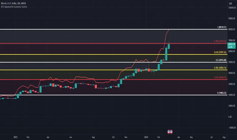
BTC/USD Inflation priced in! ~Period 2009 - 2023 (by TAS)The script creates a custom indicator titled "BTC Adjusted for Economic Factors.
Adjusted BTC Price is plotted in red, making it more prominent. The adjusted price is Bitcoin's historical closing prices adjusted for cumulative inflation over time, based on the Core Consumer Price Index (CPI) annual inflation rates from 2009 onwards.
The script calculates the adjusted price of Bitcoin by taking into account the effect of inflation on its value. It uses annual CPI rates for each year from 2009 to 2022 to calculate a cumulative inflation factor. The script assumes a placeholder inflation rate of 2.5% for 2023, indicating that this value should be updated when the actual rate is available. The script suggests adding CPI rates for additional years as they become available to maintain the accuracy of the adjustment.
Here's a breakdown of how the script works:
Core CPI Annual Inflation Rates: It starts by defining the annual inflation rates for each year from 2009 to 2022, expressed as a percentage divided by 100 to convert to a decimal.
Cumulative Inflation Calculation: The script calculates cumulative inflation starting from the year 2009 up to the current year. For each year that has passed since 2009, it multiplies the cumulative inflation factor by (1 + cpiRate), where cpiRate is the inflation rate for that year. This effectively compounds the inflation rate over time.
Adjusting Bitcoin's Price: The script then adjusts Bitcoin's closing price (close) for the calculated cumulative inflation to get the adjusted price (adjustedPrice).
Plotting the Prices: Finally, it plots both the original and the adjusted Bitcoin prices on the chart, allowing users to visually compare how inflation has theoretically impacted Bitcoin's value over time.
--------------------------------------------------------------------------------------------------
Important to notice, Fib. Retracements from the 2017 cycle top to the recent top (¬80K) doesn't look invalidated.
--------------------------------------------------------------------------------------------------
Inputs and feedback are welcome!
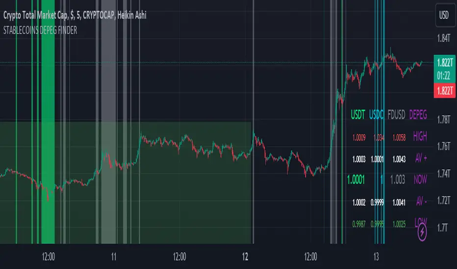
STABLECOINS DEPEG FINDERSTABLECOINS DEPEG FINDER
With this script, you will be able to understand how DePeg in stablecoins USDT, USDC, and FDUSD can influence the TOTAL Market Cap.
WHAT IS DEPEG?
DePeg occurs when a stablecoin loses its peg. It can't maintain the $1.00 price for a while (or anymore). Traders can use DePeg for high-quality trading both in Crypto and Stablecoins. Usually, a Negative DePeg (e.g., 0.98%) means you can buy Stablecoins at a 2% discount. This translates to a 2% gain when the Stablecoin returns to its peg. Additionally, a Positive DePeg could be a good moment for selling or withdrawal.
WHY DEPEG MATTERS IN THE CRYPTO SPACE
Depeg in Crypto markets is primarily a matter of "earning from small differences in peg." If well understood, it can help traders and analysts to spot whales' next moves. Usually, when a negative DePeg (below $1) occurs, it means whales are in a hurry to sell their Stablecoin tokens for Crypto Tokens. In this hurry, they sell Stablecoins at a discount. In the short term, a Crypto pump is likely planned, and they buy the next x100 token.
On the other hand, a positive DePeg (above $1) means whales are in a hurry to convert tokens into Stablecoins because they are heavily selling Crypto Tokens. This leads to them paying more for Stablecoins. Positive Depeg is more interesting than Negative DePeg. Usually, it signifies an important sell-off in the crypto environment, creating high tension to safeguard your hard-earned money. Whales hurry to convert altcoins and tokens into stablecoins, causing a Positive Depeg (they are willing to pay more to be safe). Positive DePeg is plotted as Intense Background Color.
Identifying 'areas' where this occurs could help traders and analysts understand this highly manipulative market better and take positions.
THE SCRIPT
This script will help traders and analysts understand when USDT, USDC, and FDUSD depegged and how the crypto market reacted. It comes with the possibility to check and plot backgrounds when there's Positive DePeg or Negative DePeg for USDT, USDC, or FDUSD.
It's pretty useful for data analysis. In the bottom-right part, you can check the actual stablecoin peg for the three Stablecoins:
- Highest Positive DePeg in a given BackTrace
- Average Positive DePeg in a given BackTrace
- Actual Peg for USDT, USDC, FDUSD
- Average Negative DePeg in a given BackTrace
- Lowest Negative DePeg in a given BackTrace
UNDERSTANDING THE BACKGROUND PLOT
NEGATIVE DEPEG
For each Stablecoin, negative DePeg is plotted as Translucent Background Color: USDT lime, USDC aqua, FDUSD grey. You can choose from settings whether it needs to be enabled or disabled for each token.
POSITIVE DEPEG
For each Stablecoin, positive DePeg is plotted as Intense Background Color: USDT lime, USDC aqua, FDUSD grey. You can choose from settings whether it needs to be enabled or disabled for each token.
USE CASE EXAMPLES
With this script you can plan to be alerted WHEN one of those stablecoin are depegging over a threesold. Than you can act accordingly.
BUY OPPORTUNITY
Let' suppose you want to see how USDC can influence Crypto Price when deppeged
I've setup signal to be plotted only for negative Depeg when USDC goes below 0.998. As you can see it was a very good and nice buy area for the entire crypto market
SELL OPPORTUNITY
Spot a selling point could be harder. In the example below let's see how USDC positive DePeg can show signal of Crypto dump earlier in daily TF
ATH Gain PotentialThe indicator quantifies the relative position of a symbol's current closing price in relation to its historical all-time high (ATH).
By evaluating the ratio between the ATH and the present closing price, it provides an analytical framework to estimate the potential gains that could accrue if the symbol were to revert to its ATH from a specified reference point. The ratio serves as a quantitative measure for assessing the distance between the current market value and the symbol's historical peak, enabling investors to gauge the prospective profitability of a return to the ATH.

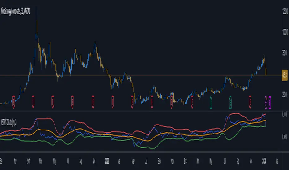
MicroStrategy / Bitcoin Market Cap RatioThis indicator offers a unique analytical perspective by comparing the market capitalization of MicroStrategy (MSTR) with that of Bitcoin (BTC) . Designed for investors and analysts interested in the correlation between MicroStrategy's financial performance and the Bitcoin market, the script calculates and visualizes the ratio of MSTR's market capitalization to Bitcoin's market capitalization.
Key Features:
Start Date: The script considers data starting from July 28, 2020, aligning with MicroStrategy's initial announcement to invest in Bitcoin.
Data Sources: It retrieves real-time data for MSTR's total shares outstanding, MSTR's stock price, and BTC's market capitalization.
Market Cap Calculations: The script calculates MicroStrategy's market cap by multiplying its stock price with the total shares outstanding. It then forms a ratio of MSTR's market cap to BTC's market cap.
Bollinger Bands: To add a layer of analysis, the script includes Bollinger Bands around the ratio, with customizable parameters for length and multiplier. These bands can help identify overbought or oversold conditions in the relationship between MSTR's and BTC's market values.
The indicator plots the MSTR/BTC market cap ratio and the Bollinger Bands, providing a clear visual representation of the relationship between these two market values over time.
This indicator is ideal for users who are tracking the impact of Bitcoin's market movements on MicroStrategy's valuation or vice versa. It provides a novel way to visualize and analyze the interconnectedness of a leading cryptocurrency asset and a major corporate investor in the space.
BTC ETF Premium IndicatorThe "BTC ETF Premium Indicator" (BEPI) is a sophisticated tool designed for investors and traders who seek to analyze the performance of Bitcoin ETFs relative to the actual market price of Bitcoin. This indicator provides a comprehensive visualization of the premium or discount at which each ETF is trading compared to its Net Asset Value (NAV).
Functionality:
ETF Selection: Users can toggle the visibility of individual ETFs to customize their view, focusing on the ETFs most relevant to their trading or analysis strategies.
Premium Computation: BEPI calculates the premium of each selected ETF by comparing its market share price to its NAV, expressed as a percentage. A positive percentage indicates a premium, while a negative percentage suggests a discount.
Aggregate View: The indicator can plot an average premium based on the selection, providing a consolidated perspective of the overall market sentiment across the chosen ETFs.
Customizable Display: With the option to display only the average or individual ETF premiums, the BEPI offers flexibility in data presentation, ensuring that users can quickly glean the insights that matter most to them.
Visual Clarity: Premiums are visualized with color-coded columns, making it easy to distinguish between ETFs performing above or below their NAV. A zero baseline is included for reference, indicating no premium or discount.
Dynamic Labels: For real-time analysis, dynamic labels present the latest premium values for each ETF, ensuring users have up-to-date information at their fingertips.
Currently, BEPI supports Blackrock, ARK 21Shares, and Valkyrie ETFs, reflecting the most active segments of the market. As the landscape of Bitcoin ETFs evolves, there are plans to expand the indicator's capabilities to include a broader range of ETFs, enhancing its utility for a wider audience.
Whether you're looking for arbitrage opportunities, assessing ETF performance, or simply keeping an eye on the market, BEPI is the go-to indicator for a clear and concise overview of Bitcoin ETF premiums.

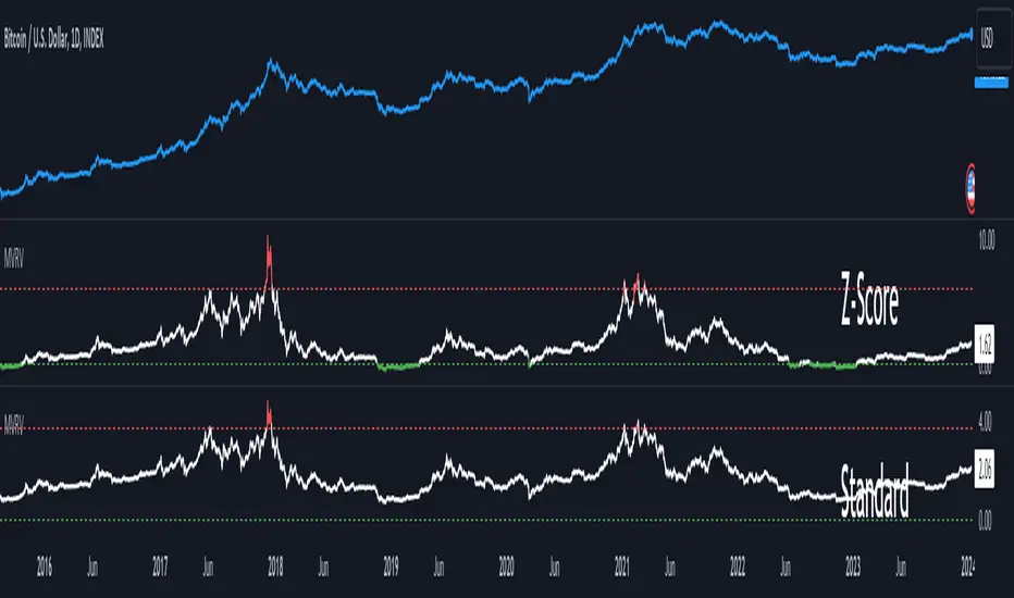
MVRV Z-ScoreThe MVRV ratio was created by Murad Mahmudov & David Puell. It simply compares Market Cap to Realised Cap, presenting a ratio (MVRV = Market Cap / Realised Cap). The MVRV Z-Score is a later version, refining the metric by normalising the peaks and troughs of the data.