Entry Scanner Conservative Option AKeeping it simple,
Trend,
RSI,
Stoch RSI,
MACD, checked.
Do not have entry where there is noise on selection, look for cluster of same entry signals.
If you can show enough discipline, you will be profitable.
CT
Educational

ATR + True RangeOne indicator for ATR & TR its a common indictor which can be used as one
instead of 2 different its is trial mode only not to be used with out other references

Fixed $200 Risk Futures Position Sizer (2R Target)This indicator is designed for traders who want to follow a strict, professional-style risk model identical to the rules used in funded futures trading programs. Instead of risking a percentage of the account, the indicator always risks a fixed $200 per trade, regardless of contract or market volatility. This allows traders to simulate evaluation accounts and maintain perfect risk discipline.
The tool works across a wide range of futures markets — including micro, mini, and continuous contracts (MES, MNQ, MNQ1!, MYM, M2K, MCL, MGC, ES1!, NQ1!, GC1!) — and automatically loads the correct tick size and tick value for each contract. This ensures that stop distance and risk calculations are always accurate, even when switching between index futures, metals, or energy markets.
You simply enter your Entry Price and Stop Loss Price, and the indicator calculates:
The stop distance in points and ticks
The exact dollar risk per contract
The maximum number of contracts allowed while staying under a fixed $200 risk
A fully automated 2R take-profit target (equivalent to $400 profit per trade)
Expected profit per contract
Total projected profit based on allowed size
Full long/short direction detection
This makes position sizing effortless and completely rule-based. If the chosen stop-loss distance requires more than $200 of risk per contract, the indicator will automatically show 0 contracts allowed, preventing invalid trades and helping maintain consistency.
For clarity and execution, the indicator also plots:
A green Entry Line
A red Stop-Loss Line
A blue 2R Take-Profit Line
This produces a visual, easy-to-understand risk-to-reward layout directly on the chart.
This tool is ideal for traders preparing for funded account challenges, traders practicing mechanical risk systems, or anyone who wants to enforce a strict, repeatable risk framework. It eliminates guesswork, improves consistency, and helps traders build discipline by sizing every trade according to a fixed dollar risk with a precise 2R reward objective.


RTH Gap & Stdev [Sword & Shield]Dynamic RTH Gap & Stdev - Technical Description
Description
This script implements a specialized methodology for analyzing the Regular Trading Hours (RTH) Opening Gap, focusing on the "void" created between the previous session's RTH Close and the current session's RTH Open. Unlike standard gap indicators that may reference the Settlement or pre-market range, this tool isolates the specific liquidity gap formed by the primary session auction.
The script is designed to help traders identify:
The Gap Zone: The precise price range where no RTH trading occurred.
Internal Quartiles: Key harmonic subdivisions (25%, 50%, 75%) within the gap, often serving as intraday support/resistance.
Expansion Targets: Projected volatility levels (Standard Deviations) above and below the gap.
Mitigation State: Real-time tracking of how much of the gap has been "filled" by price action.
Underlying Concepts & Calculations
1. RTH Session Detection
The indicator strictly follows asset-specific timetables (e.g., Indices 09:30-16:00 ET). It detects the RTH Close of the previous day (closing print of the last RTH bar) and the RTH Open of the current day.
Gap High: Max(PrevClose, CurOpen)
Gap Low: Min(PrevClose, CurOpen)
2. Quartile & Harmonic Levels
We divide the gap range (GapHigh - GapLow) into quartiles. The 50% level (Consequent Encroachment) is a widely recognized equilibrium point in gap trading.
Formula: Level(x) = GapLow + (GapRange * x) where x is 0.25, 0.50, 0.75.
3. Volatility Projections (Standard Deviations)
The script offers two distinct volatility models for projecting targets:
Gap Range Basis: A harmonic expansion model where 1.0σ (Standard Deviation) is rigidly defined as 100% of the Gap Range. This assumes the market often expands in multiples of the initial opening impulse.
Calculation: +1.0σ Level = GapHigh + GapRange
VWAP Bands Basis: A statistical model estimating daily volatility using the deviation of price from the VWAP (Volume Weighted Average Price) from the previous session. This allows the bands to adapt to the broader market volatility rather than just the gap size.
4. Dynamic Extension & Clamping
Uniquely, this script uses a forward-projection bar-loop. Lines and labels are instantiated at the Open and extended incrementally with each new bar.
Clamping: The script calculates the precise timestamp of the RTH Close and clamps all drawing objects to this time. This prevents lines from extending into the post-market or next day, ensuring a clean chart layout.
5. Mitigation Tracking
The dashboard calculates the Unmitigated Percentage of the gap:
Logic: It tracks the session's Highest High and Lowest Low.
Calculation: FilledRange = PriceExtreme - GapBoundary.
Status: displayed as "Unmitigated, 100% rem" or "Mitigated XX%", providing a precise metric for gap-fill strategies.
Usage
Traders can use this tool to:
Target the 50% fill described as "Consequent Encroachment".
Fade extremes at +1.0σ gap expansions.
Monitor the "Mitigation %" to gauge trend strength (e.g., a gap that remains <20% filled often indicates a strong trend day).

XXMonk Sequence Price Grid (Manual Origin + U)⭐ XXMonk Sequence Grid – Harmony Price Levels (1–144 Sequence Engine)
Algorithmic Sequence Mapping for Price Displacement
The XXMonk Sequence Grid is a precision mapping tool designed to project algorithmic price levels using harmonic numerical sequences derived from the ICT-inspired time/price symmetry concept.
This indicator takes a user-defined Origin (EQ level) and generates symmetrical expansion bands above and below price using any combination of the following sequence values:
These levels act as algorithmic rails that price frequently reacts to, respects, or expands toward — providing traders with a structural framework to interpret displacement, liquidity objectives, and sequence-based expansions.
🔷 Core Features
✔ Manual Origin (EQ Level)
Set any midpoint — daily open, session equilibrium, dealing range midpoint, your own anchor, etc.
✔ Manual U Value (Unit Size)
No restrictions. Enter any point value (ex: 0.25, 1, 5, 12.5, 25…) to scale the sequence to your instrument.
✔ Full Sequence Control
Toggle ON/OFF each individual harmonic sequence:
Micro ranges → 1, 3, 5
Intermediate → 8, 13, 21
Macro ranges → 34, 55, 89, 144
✔ Individual Line Colors
Every sequence level has its own color input for full customization.
✔ Static Lines (Do Not Move With Cursor)
Lines anchor from the first bar and extend infinitely to the right.
✔ Automatic Labels on Right Side
These levels often align with:
Liquidity pools
Displacement endpoints
PD array boundaries
Algorithmic expansion levels
Reversal zones
Session highs/lows
Volatility-based fractals
Price frequently travels sequence-to-sequence, creating a predictable harmonic structure.

Alloyz Traders_RSI by Sagar BRSI for Intraday purpose with moving average and volume weightage price added in RSI.

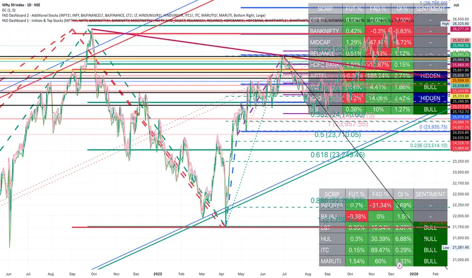
FAD Dashboard 3 - Additional Stocks ( With Alerts )Inspired by ideas of Ram Sir & Wealthcon
Features:
Auto-Timeframe: Values update based on the chart you are looking at (5m, 15m, 1H, etc.).
4 Data Columns:
Future %: Future Price Change (Red/Green).
FAD %: Change in FAD difference (Red/Green).
OI %: Change in Open Interest (Red/Green).
Sentiment Analysis : The specific Bullish/Hidden Bullish logic Strict Colour Logic:
Deep Green( REGULAR LONG BUILD UP): Future ⬆️ + FAD ⬆️ + OI ⬆️
Deep Blue (HIDDEN LONG BUILD UP ): Future ⬇️ + FAD ⬆️ + OI ⬆️
Additionally , auto alerts of Regular or Hidden build up at hourly & daily time frame .
Only for Educational purpose

FAD Dashboard 2 - Top Nifty 50 Stocks ( With Alerts )Inspired by ideas of Ram Sir & Wealthcon
Features:
Auto-Timeframe: Values update based on the chart you are looking at (5m, 15m, 1H, etc.).
4 Data Columns:
Future %: Future Price Change (Red/Green).
FAD %: Change in FAD difference (Red/Green).
OI %: Change in Open Interest (Red/Green).
Sentiment Analysis : The specific Bullish/Hidden Bullish logic Strict Colour Logic:
Deep Green( REGULAR LONG BUILD UP): Future ⬆️ + FAD ⬆️ + OI ⬆️
Deep Blue (HIDDEN LONG BUILD UP ): Future ⬇️ + FAD ⬆️ + OI ⬆️
Additionally , auto alerts of Regular or Hidden build up at hourly & daily time frame .
Only for Educational purpose
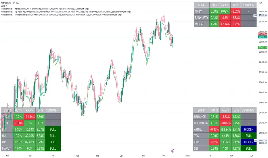
FAD Dashboard 1 - Indices ( With Alerts )Inspired by ideas of Ram Sir & Wealthcon
Features:
Auto-Timeframe: Values update based on the chart you are looking at (5m, 15m, 1H, etc.).
4 Data Columns:
Future %: Future Price Change (Red/Green).
FAD %: Change in FAD difference (Red/Green).
OI %: Change in Open Interest (Red/Green).
Sentiment Analysis : The specific Bullish/Hidden Bullish logic Strict Colour Logic:
Deep Green( REGULAR LONG BUILD UP): Future ⬆️ + FAD ⬆️ + OI ⬆️
Deep Blue (HIDDEN LONG BUILD UP ): Future ⬇️ + FAD ⬆️ + OI ⬆️
Additionally , auto alerts of Regular or Hidden build up at hourly & daily time frame .
Only for Educational purpose

FAD Dashboard 2 - Additional StocksInspired by Ideas of Ram Sir & WEALTHCON
Features:
Auto-Timeframe: Values update based on the chart you are looking at (5m, 15m, 1H, Daily etc.).
4 Data Columns:
Future %: Future Price Change (Red/Green).
FAD %: Change in FAD difference (Red/Green).
OI %: Change in Open Interest (Red/Green).
Sentiment Analysis : The specific Bullish/Hidden Bullish logic Strict Colour Logic:
Deep Green( REGULAR LONG BUILD UP): Future ⬆️ + FAD ⬆️ + OI ⬆️
Deep Blue (HIDDEN LONG BUILD UP ): Future ⬇️ + FAD ⬆️ + OI ⬆️
Only for Educational Purpose
FAD Dashboard 1 - Indices & Top StocksInspired by Ideas of Ram Sir & WEALTHCON
Features:
Auto-Timeframe: Values update based on the chart you are looking at (5m, 15m, 1H, Daily etc.).
4 Data Columns:
Future %: Future Price Change (Red/Green).
FAD %: Change in FAD difference (Red/Green).
OI %: Change in Open Interest (Red/Green).
Sentiment Analysis : The specific Bullish/Hidden Bullish logic Strict Colour Logic:
Deep Green( REGULAR LONG BUILD UP): Future ⬆️ + FAD ⬆️ + OI ⬆️
Deep Blue (HIDDEN LONG BUILD UP ): Future ⬇️ + FAD ⬆️ + OI ⬆️
Only for Educational Purpose

Scalping EMA9/15 This indicator is designed for high-accuracy intraday scalping based on a refined version of the popular EMA9–EMA15 trend-following technique.
It filters weak or premature entries by requiring a retest of the EMA zone before generating a Buy/Sell signal — drastically reducing false breakouts.

Killzones (EST)Asian Range
19:00 – 00:00 EST
Consolidation, liquidity build
London Open
02:00 – 05:00 EST
Initial expansion, Judas Swing
New York Open
07:00 – 10:00 EST
Main move, SMT, MSS setups
NY Lunch/Reversal
11:30 – 13:00 EST
Rebalancing, exit window

Dynamic Trend Channel - Adaptive Support & Resistance SystemA powerful trend-following indicator that adapts to market conditions in real-time. The Dynamic Trend Channel uses ATR-based volatility measurements to create intelligent support and resistance zones that adjust automatically to price action.
Key Features:
✓ Adaptive channel width based on market volatility (ATR)
✓ Color-coded trend identification (Green = Bullish, Red = Bearish)
✓ Smooth, flowing bands that reduce noise
✓ Breakout signals for high-probability entries
✓ Real-time info table showing trend status and price positioning
✓ Customizable settings for all timeframes

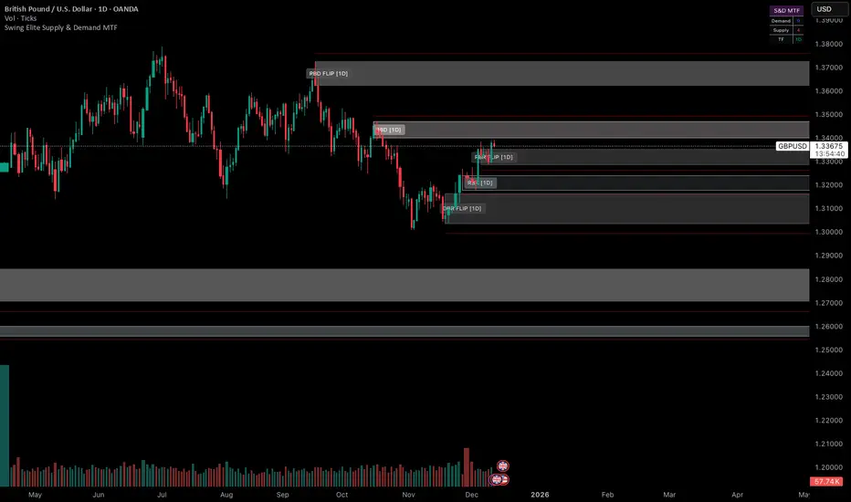
Swing Elite Supply & Demand MTFSwing Elite Supply & Demand MTF
Institutional-grade multi-timeframe Supply & Demand system with FLIP logic, Level-on-Level detection, stop-loss padding, and advanced zone mitigation.
This tool automatically detects RBR / DBR / RBD / DBD patterns on any timeframe and plots refined demand & supply zones based on explosive candles, base structure, and smart-money logic.
🔥 Core Features
• Multi-Timeframe Zone Detection
Detect supply/demand zones from any higher timeframe (HTF) and project them onto your chart.
Perfect for aligning low-timeframe entries with institutional HTF levels.
• Preferred vs Wider Zone Width
Switch between:
Preferred → body-based, tighter zones (institutional quality)
Wider → wick+body zones for more tolerance
• Level-on-Level (LOL) Zones
Automatically merges overlapping zones and builds stronger multi-layered zones, indicating repeated institutional accumulation or distribution.
• FLIP Zones (Support → Resistance / Resistance → Support)
FLIP zones are detected when the market breaks a key swing and returns to retest the zone.
These are premium continuation levels.
• Automatic Mitigation Logic
Zones are removed when:
price mitigates enough (% based)
LOL zones get fully closed through
price travels too far away after touch (invalidates the setup)
• Stop-Loss Padding System
Auto-calculates SL levels (optional) based on zone height and custom padding %.
• Clean HTF Visualization
Displays:
zone type (RBR, DBR, RBD, DBD)
LOL / FLIP
timeframe source (e.g., 4H, 1D)
automatic color coding
📊 Alerts Included
Price entering a Demand Zone
Price entering a Supply Zone
Use them for automation or high-probability entries.
🎯 Best For
SMC / ICT style trading
Order block & zone traders
Intraday HTF bias alignment
Swing trading
Algorithmic filtering (EA/strategy integration)
🚀 Why It Works
This indicator is built on institutional logic:
explosive displacement
indecisive bases
mitigation and market structure
multi-zone stacking (LOL)
HTF contextual zones
swing high/low breaks (FLIP logic)
It produces clean, high-probability zones with no repainting of the explosive candle signal.
RS Rating Vietnam - IBD Style (AlphaStock Edition)Description: This implies the Relative Strength (RS) Rating specifically optimization for the Vietnam Stock Market, inspired by Investor's Business Daily (IBD) methodology.
How it works: Unlike the standard RSI (which measures internal momentum), this RS Rating compares a stock's performance against a benchmark index (Reference Index: VNMIDCAP or VNINDEX) over the last 12 months.
Calculation Formula: The rating is based on weighted performance (ROC):
40% weight: Latest 3 months (1 Quarter)
20% weight: 6 months
20% weight: 9 months
20% weight: 12 months
Features:
Auto-Scaling RS Line: The line automatically adjusts to fit the price chart, removing the need for manual fixed scales.
Benchmark Comparison: Compares stock Alpha vs. VNMIDCAP (default) to detect leaders even when the general market is skewed by large-cap stocks.
Color Coded:
Purple: Rating > 90 (Strong Buy/Leader)
Green: Rating > 80
Yellow: Rating > 60
Red: Rating < 60
Smart Display: Shows historical Rating values in the Data Window when hovering over past candles.
Credits: Designed by Admin AlphaStock.
SMC-Math by Thomas v1📌 SMC-Math by Thomas v1 — Description
SMC-Math by Thomas v1 is a complete Smart Money Concepts toolkit designed for traders who want a clean, mathematical, and structured view of market mechanics.
Rather than relying on abstract concepts or subjective drawings, this indicator focuses on rules-based detection of:
✔ Order Blocks (OB)
✔ Fair Value Gaps (FVG)
✔ Market Structure shifts (BoS / CHoCH)
✔ HTF trend confirmation
✔ Premium / Discount arrays
✔ Equal High & Equal Low Liquidity Zones (no hinting — expiry only)
This version is engineered for stability, clarity, and performance — with fully optimized array management, timestamp-based cleanup, and a clean visual presentation suitable for both discretionary and systematic trading.
📌 Key Features
🔹 1. Order Blocks (Bullish & Bearish)
Auto-detected using fractal swing highs/lows
Optional displacement + high volume filters
Midline display option
HTF trend alignment filter
Smart expiry + broken OB cleanup
Custom opacity, buffer, and extension controls
🔹 2. Fair Value Gaps (FVG)
Bullish and bearish gap detection
HTF confirmation-based dimming
No border for a clean ICT-style visuals
Auto remove when filled
Fully rule-based
🔹 3. Market Structure (BoS / CHoCH)
Based on fractal highs/lows
Automatic labeling (small, unobtrusive)
Direction validated by HTF option
Each structure level plotted with a projected line
Smooth, clean BOS/CHOCH flow
🔹 4. Premium / Discount Zones
Auto-calculated from most recent swing high & swing low
Box shading dynamically updates each bar
Helps identify optimal trade areas (OB → FVG → PD array)
🔹 5. Liquidity Zones (Equal Highs & Equal Lows)
This tool highlights where liquidity is likely resting:
Detects Equal Highs and Equal Lows using your tolerance or max difference
Auto-creates borderless shaded boxes
Adjustable box height and extension
NO hinting logic — the box remains for exactly cleanupDelay bars, then expires
Clean and predictable behavior, ideal for rule-based setups
This is especially useful for:
identifying buy-side and sell-side liquidity pools
anticipating runs on liquidity
targeting sweeps
🔹 6. HTF Status Panel
Shows higher-timeframe trend status on the live bar:
Bullish
Bearish
Or “HTF Not Required”
Useful for aligning entries with larger market flow.
📌 How to Use SMC-Math by Thomas v1
1️⃣ Identifying Direction
Start by reading:
HTF Trend Label
BOS & CHOCH reactions
Bullish: look for HL → HH structure + bullish OBs + bullish FVGs
Bearish: look for LH → LL structure + bearish OBs + bearish FVGs
This creates your directional bias.
2️⃣ Using Order Blocks
An OB is valid when:
It appears in line with structure
HTF alignment supports it (optional toggle)
Price returns after a displacement
OB is not “broken” (indicator handles this visually)
Use OBs as:
Rebalance targets
Entry areas
Stop placement logic
3️⃣ Fair Value Gaps
FVGs appear when price dislocates and leaves inefficiency.
Use them to:
Refine entries inside OBs
Project premium/discount zones
Identify continuation zones
The indicator auto-removes FVGs when filled.
4️⃣ Liquidity Zones
Liquidity zones identify resting orders at equal highs/lows.
This version uses simple expiry logic:
Box is created when EQH/EQL forms
It remains visible for 20 bars (default)
It disappears automatically after expiry
No hint/confirmation triggers deletion
Usage tips:
Expect price to run toward these zones
Use them as targets or continuation markers
Combine with OB/FVG for confluence
5️⃣ Premium / Discount Zones
Use PD arrays to gauge:
Premium = optimal shorting zones
Discount = optimal long zones
Not trade “in the middle” unless a clear BOS or CHoCH happens
📌 Recommended Workflow
HTF Bias → Check the HTF panel
Market Structure → Identify trend continuation or reversal
Liquidity → Mark where price is likely to target
FVG → Identify imbalance zones
OB → Confirm institutional origin points
PD Arrays → Determine optimal trade location
Execute with confluence
📌 Who Is This Indicator For?
✔ Traders using ICT / SMC logic
✔ Traders wanting rule-based, non-subjective markups
✔ Traders who want automated detection without repainting
✔ Anyone who uses OB, FVG, liquidity sweeps, and structure shifts

RS Rating Viet Nam by Admin AlphaStockSo sanh vs VNMIDCAP
Bạn có thể thay đổi BenchMark trong Code thành VNINDEX hay bất kỳ chỉ số nào

FAD Dashboard B (Next 7 Stocks)nspired by Wealthcon
This dashboard ( B ) shows Real Time sentiment change of Future Asset Difference with Future price of next 7 Most Heavy Weight Nifty 50 stocks in
1.Last 15 minutes ,
2.Last 1 hour and
3.daily timeframe.
But the list is user customisable.
Future Up + FAD Up (Deep Green)
Future Down + FAD Up (Deep Blue)
Future Up + FAD Down (Yellow)
Future Down + FAD Down (Red)
Only for Educational purpose.
FAD Dashboard A (Indices + Top 5)Inspired by Wealthcon
This dashboard( A ) shows Real Time sentiment change of Future Asset Difference with Future price of 3 Main Index & 5 Most Heavy Weight Nifty 50 stocks in
1.Last 15 minutes ,
2.Last 1 hour and
3.daily timeframe.
But the list is user customisable.
Future Up + FAD Up (Deep Green)
Future Down + FAD Up (Deep Blue)
Future Up + FAD Down (Yellow)
Future Down + FAD Down (Red)
Only for Educational purpose.

VCAI Volume & Liquidity Map LiteVCAI Volume & Liquidity Map Lite visualises recent market participation using a horizontal liquidity/volume histogram plotted beside current price.
It shows where trading activity has clustered, where the chart is thin, and how much of that activity came from buying vs selling pressure.
This Lite edition keeps the tool simple and fast:
Yellow = buy-side volume (aggressive buyers / upward pressure)
Purple = sell-side volume (aggressive sellers / downward pressure)
Thicker sections = higher traded volume at that price
POC line (purple) marks the price with the highest volume concentration
Value Area lines (yellow dashed) mark where ~70% of volume has traded
Bars extend outward to the right of price for a clean, unobstructed chart
Lookback setting controls how many candles the map is built from
Use it to quickly identify:
high-interest price zones
low-liquidity areas where price can move fast
likely reaction levels
where momentum may slow, reverse, or break through
Designed as a lightweight, open-source tool for anyone wanting a clean liquidity/volume map without complex settings.
Part of the VCAI Lite Series.

Breakout Scanner (Screener)Breakout Scanner (Screener style — single indicator to drop in Screener tab)
