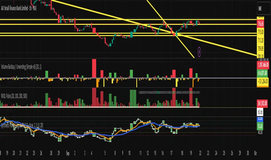
Synthetic Point & Figure on RSIHere is a detailed description and user guide for the Synthetic Point & Figure RSI indicator, including how to use it for long and short trade considerations:
*
## Synthetic Point & Figure RSI Indicator – User Guide
### What It Is
This indicator applies classic Point & Figure (P&F) charting logic to the Relative Strength Index (RSI) instead of price. It transforms the RSI into synthetic “P&F candles” that filter out noise and highlight significant momentum moves and reversals based on configurable box size and reversal settings.
### How It Works
- The RSI is calculated normally over the selected length.
- The P&F engine tracks movements in the RSI above or below a defined “box size,” creating columns that switch direction only after a larger reversal.
- The synthetic candles connect these filtered RSI values visually, reducing false noise and emphasizing strong RSI trends.
- Optional EMA and SMA overlays on the synthetic P&F RSI allow smoother trend signals.
- Reference RSI levels at 33, 40, 50, 60, and 66 provide further context for momentum strength.
### How to Use for Trading
#### Long (Buy) Considerations
- The synthetic P&F RSI candle direction flips to *up (green candles)* indicating strength in momentum.
- Look for the RSI P&F value moving above the *40 or 50 level*, suggesting increasing bullish momentum.
- Confirmation is stronger if the synthetic RSI is above the EMA or SMA overlays.
- Ideal entries are after a reversal from a synthetic P&F downtrend (red candles) to an uptrend (green candles) near or above these levels.
#### Short (Sell) Considerations
- The candle direction flips to *down (red candles)*, showing weakening momentum or bearish reversal.
- Monitor if the synthetic RSI falls below the *60 or 50 level*, signaling momentum loss.
- Confirm bearish bias if the price is below the EMA or SMA overlays.
- Exit or short positions are signaled when the synthetic candle reverses from green to red near or below these threshold levels.
### Important RSI Levels to Watch
- *Level 33*: Lower bound indicating deep oversold conditions.
- *Level 40*: Early bullish zone suggesting momentum improvement.
- *Level 50*: Neutral midpoint; crossing above often signals bullish strength, below signals weakness.
- *Level 60*: Advanced bullish momentum; breaking below signals potential reversal.
- *Level 66*: Strong overbought area warning of possible pullback.
### Tips
- Use in conjunction with price action analysis and other volume/trend indicators for higher conviction.
- Adjust box size and reversal settings based on instrument volatility and timeframe for ideal filtering.
- The P&F RSI is best for identifying sustained momentum trends and avoiding false RSI whipsaws.
- Combine this indicator’s signals with stop-loss and risk management strategies.
*
This indicator converts RSI momentum analysis into a simplified, noise-filtered P&F chart format, helping traders better visualize and trade momentum shifts. It is especially useful when RSI signal noise can cause confusion in volatile markets.
Let me know if you want me to generate a shorter summary or code alerts based on these levels!
Sources
Relative Strength Index (RSI) — Indicators and Strategies in.tradingview.com
Indicators and strategies in.tradingview.com
Relative Strength Index (RSI) Indicator: Tutorial www.youtube.com
Stochastic RSI (STOCH RSI) in.tradingview.com
RSI Strategy docs.algotest.in
Stochastic RSI Indicator: Tutorial www.youtube.com
Relative Strength Index (RSI): What It Is, How It Works, and ... www.investopedia.com
rsi — Indicators and Strategies in.tradingview.com
Relative Strength Index (RSI) in.tradingview.com
Relative Strength Index (RSI) — Indicators and Strategies www.tradingview.com
Figure
Periodic EllipsesThe following script periodically plot ellipses to the chart, where the maximum height of the ellipses is determined by the price high of the user-selected time frame while the price low determines the minimum height of the ellipses.
The selected time frame affects the frequency at which the ellipses are plotted, for example, a selected time frame of 1 week will plot an ellipse every week
Note that time frames that are close to the one used in the main chart can return noncircular shapes
Here the main time frame is 15 minutes, while the time frame in the script is 1 hour.
By default the script uses future data, and as such repaint which makes it only useful in offline (non-real time) situations, you can make the script use only past data by deselecting the "repaint" option.
Interpretation And Construction
In terms of usages and interpretation ellipses are similar to bands indicators, as such we can use ellipses in a breakout methodology, where a closing price crossing over the upper bound indicating an uptrend and a closing price crossing under the lower bound indicating a downtrend.
By default, the color of the plots are based on a gradient determined by the position of the closing price relative to the ellipse, with a closing price closer to the upper bound of the ellipse returning a blue color and a closing price closer to the lower bound returning a red color, the intermediate color is violet. When repainting mode is deactivated a blue color indicates an up-trend, while a red color indicates a down-trend, violet colors on the other hand indicate a ranging market.
The ellipses can also determine possible retracements, as such the upper bound of the ellipse can act as a support in an uptrend while the lower bound can act as a resistance in a downtrend.
Construction
Peoples might be interested in the construction of ellipses, this task is not complicated. We can construct circular shapes by using the equation of a semi-circle described as follows:
C = √(1 - x*x)
with 1 ≥ x ≥ -1 , values of x greater than 1 or lower than -1 will return na . In the script, the variable basis creates a line starting at -1 and ending at 1, we then only need to apply the previous equation to this line to have a semi-circle. This semi-circle is in a range of (0,1), so we need to rescale it in a useful range, let's define the highest high of the selected time frame as H and the lowest low as L , the upper and lower bound of the ellipse are calculated as follows:
upper = avg(H,L) + C*(H - avg(H,L))
lower = avg(H,L) - C*(avg(H,L) - L)
Summary
A script plotting ellipses has been proposed, we have seen that the signals that can be generated are similar to the one generated by band indicators, note however that the script has not been made to be a serious indicator, it would be more advisable to use regular band indicators instead.
Thx to @freds_view for the question.

[RESEARCH] Point-and-Figure (P&F) Chart Identifier(Republishing of the hidden script)
A heuristic approach to identify P&F chart type. Catches all variations.
Works correctly with other chart types:
Classic Candles
Heikin-Ashi
Line Break
Kagi
ATR Renko
Traditional Renko
Range Bars

