Future 8 AM MarkerThis simple script marks the 8:00 AM New York open on the chart each day. It’s especially useful in Replay Mode to track price reactions and practice setups around this key time.Indicatore Pine Script®di theodorectodd3
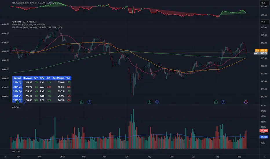
Mykung's Financial Table (Revenue, EPS, Net margin)A compact fundamentals dashboard that displays the last **8 fiscal quarters** for the current symbol. It’s designed for clarity (minimal decimals) and flexible presentation, with a dynamic column layout and accurate quarter labels. ## What it shows **Columns (left → right):** `Quarter | Revenue | YoY % | QoQ % | EPS | YoY % | QoQ % | ` * **Quarter** — formatted as `YYYY Q#` (e.g., `2025 Q2`). Labels are derived from **fiscal period end dates** for accuracy. * **Revenue** — compact notation (K/M/B/T), **no decimals**. * **EPS** — uses **Diluted EPS** by default and falls back to **Basic EPS** if Diluted is unavailable. Displayed with **2 decimals**. * **Net Margin** — displayed with **1 decimal**. *Note:* Its YoY/QoQ columns represent **percentage-point** changes (absolute differences), not relative percent changes. * **YoY % and QoQ %** — shown as **integers** (no decimals). Positive values are colored green; negative values red. ## Key features * **Accurate quarter labels** from fundamentals (`FISCAL_PERIOD_END_DATE` → fallback `FINANCIAL_END_TIME`). * **Dynamic layout:** * Show all 10 columns (include Net Margin group), or * Hide Net Margin to render a **7-column** table automatically. * **Row order:** **Oldest at top → Latest at bottom** (chronological reading). * **Customization:** * Table position (nine presets: corners/centers). * Text size. * Table background color. * **Header colors** (text & background) — also applied to the **Quarter** column cells for visual grouping. * **Body text color** for data cells. ## Inputs (Settings) * **Table Position** — place the table anywhere on the chart. * **Text Size** — auto/tiny/small/normal/large/huge. * **Table Background** — overall table BG color. * **Header Background Color** — header & Quarter column background. * **Header Text Color** — header & Quarter column text color. * **Body Text Color** — data cells text color. * **Show Net Margin Group (Cols 7–9)** — toggle between 10-col or 7-col layout. ## Calculations * **QoQ %** = $(Current − Previous) / |Previous|$ × 100 * **YoY %** = $(Current − 4Q Ago) / |4Q Ago|$ × 100 * **Net Margin YoY / QoQ** = **difference in percentage points** (e.g., 12.4% → 10.9% = −1.5pp) ## Notes & limitations * Requires symbols with **quarterly fundamentals** on TradingView. If a field is unavailable, it shows **N/A**. * Fundamentals are updated by TradingView; values may refresh after earnings filings. * Works on any chart timeframe; data comes from **fundamentals**, not price bars. * Colors are indicative only and not investment advice. **Built for readability**: minimal decimals (EPS 2dp, Net Margin 1dp), integer percentages, and compact revenue formatting—so you can scan eight quarters at a glance. Indicatore Pine Script®di mykungAggiornato 8
Big Mo’s Glaskugel — Macro Drawdown Risk (v1.1.2)What it does / what you see An at-a-glance drawdown-risk oscillator that blends several macro US signals. • A smooth, color-blended line (green→orange→red) shows the scaled risk score (0–100). • Subtle shading marks “re-steepen warning windows” (starts when the yield curve re-steepens after an inversion; ends on normalization/cool-down). • A compact status table summarizes: overall risk level, Yield Curve (10y–3m), Credit Stress (Baa–10y), Economy (LEI), and Valuation (CAPE). Data used & why Yield Curve (10y–3m) — FRED:T10Y3M. Inversions and subsequent re-steepens often precede recessions/equity drawdowns. Credit Stress — FRED:BAA10Y vs its 1-year average (deviation in bps). Widening credit spreads flag tightening financial conditions. Economy (LEI) — ECONOMICS:USLEI. 6-month annualized growth below a cutoff highlights macro deterioration. Valuation (CAPE) — SHILLER_PE_RATIO_MONTH. Elevated valuations can amplify downside risk. VIX spikes — optional boost that recognizes sudden risk repricings. Important disclaimer This is not a reliable or predictive indicator in all regimes. No guarantees or warranties of any kind are provided. It is not financial advice. Signals can be early, late, or wrong. That said, it leans on well-studied warning factors (yield-curve dynamics, credit spreads, LEI weakness, valuation extremes) that have flagged major market downturns in the past. Key customization / tweaks Weights for each component (Yield, Credit, LEI, VIX, CAPE). Thresholds: yield inversion months, re-steepen lookback, credit-stress bps, LEI cutoff, CAPE level, VIX spike levels. Re-steepen boost: enable/disable, base points, half-life decay. Shading behavior: cool-down bars to “unwarn,” max warning duration, only shade when risk ≠ green. Scaling & smoothing: dynamic rolling max, EMA length, yellow/red thresholds. Status table: position, and a snapshot mode to view values at a chosen historical time. Indicatore Pine Script®di BigMo_GQAggiornato 77
The Debasement IndexOVERVIEW The Debasement Index measures asset prices relative to monetary debasement, providing a currency-neutral view of underlying economic fundamentals. Unlike traditional inflation metrics, it captures the sole impact of money supply expansion on asset valuations across different monetary regimes. Key Innovation: Divides any asset by the ratio of Broad Money Supply (M2/M3) to Real GDP, reducing the impact of excess money creation on asset prices. HOW IT WORKS • Input 1: Select any symbol/asset for analysis (default: close price) • Region: Choose country/currency for debasement calculation • Display: Purple line overlay on main chart Formula: Asset Price ÷ Debasement Index i.e. Formula: Asset Price ÷ (Money Supply / Real Output / last result (to rebased the index)) The indicator calculates neutralised security prices for each supported region: • Numerator: M2/M3 money supply data • Denominator: Real GDP (inflation-adjusted economic output) • Number: rebases the index to the last updated value of the selected security Supported Regions: US, UK etc. (regions may change based on availability) DATA SOURCES FRED (Federal Reserve Economic Data), TradingView Economics data feeds INTERPRETATION Rising Ratio: Asset outperforming monetary debasement (genuine value creation) Falling Ratio: Asset underperforming relative to currency dilution (fundamental value loss) Trend Analysis: Long-term slopes reveal whether assets maintain purchasing power against monetary expansion The purple line represents the performance of the selected security after filtering out monetary noise, exposing fundamental economic trends that raw prices often obscure. Take special note that most indices do not provide the total return, and the total return is necessary to understand actual value gains and losses. APPLICATIONS • Asset Allocation: Compare real returns across different monetary environments • Cross-Country Analysis: Evaluate assets in countries with varying monetary policies • Regime Identification: Spot asset price transitions that raw price measurements might obfuscate • Value Assessment: Distinguish between monetary-driven and fundamental price movements THEORETICAL FOUNDATION Inspired by Anna Schwartz's monetary framework, the index attempts to measure currency dilution and remove that impact on the selected asset prices. It is a systematic attempt to filter out ‘monetary noise’ from financial data. The index addresses limitations of traditional inflation measures by: 1. Using real GDP (not nominal) to avoid circular causation of money creation 2. Capturing asset price effects beyond goods and services 3. Providing regime-aware analysis across monetary systems LIMITATIONS • Requires reliable M2/M3 and GDP data (scope and quality vary by country) • Rebasing factors need periodic adjustment • Most effective for medium to long-term analysis • Not suitable for short-term trading signals Note: This indicator reveals trends rather than providing entry/exit signals. Combining debasement-adjusted indices with comprehensive fundamental analysis can reframe and enhance your insights, providing a more complete understanding of price developments over time. Indicatore Pine Script®di VinceBuhlerAggiornato 3
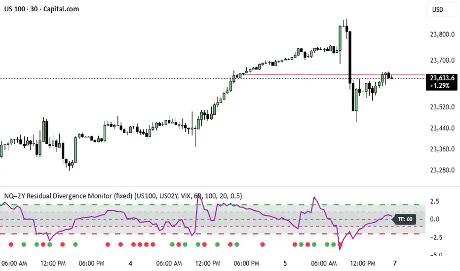
NQ–2Y CorrelationThis indicator tracks the relationship between the Nasdaq futures (NQ) and the US 2-Year Treasury yield (US02Y). The two typically move in opposite directions. This tool highlights when that relationship breaks down, and when moves become stretched to extremes. This can be useful for traders to find inflection points in price representing either overbought or oversold extremes. Key Features Residual Z-Score: Shows how far NQ’s returns deviate from what would be expected given moves in the 2Y. Useful for spotting stretched conditions (+/- 2σ bands). Correlation Tracking: Fast and slow correlations between NQ and inverted 2Y returns. Helps identify regime shifts in the relationship. Same-Direction Signals: Green dots mark when NQ and 2Y both move strongly in the same direction (rare alignment). Red dots mark strong opposing moves. Alerts: Triggers available for residual stretches, correlation flips, and significant same-direction or opposite moves. Usage Monitor Z-Score to identify when the equity–rates linkage is stretched beyond typical bounds. I typically use this on the H1 or H4 timeframe. Watch for correlation regime shifts to spot changing market dynamics. Typically price falling into support or moving into resistance as there is a false correlation or a flip. Same-direction dots help flag unusual synchronized moves between risk assets and yields - these are especially useful for identifying false moves.Indicatore Pine Script®di dcoul002Aggiornato 11
FX 2Y Spread AutoWhat it does Plots the 2-year government bond yield spread for the current FX pair and timeframe you’re viewing. Spread = Yield(Base currency) − Yield(Quote currency), shown in percentage points (pp). How it works Display & own scale If you overlay it on price, pin the indicator to its own scale so it doesn’t flatten against the FX price scale. Where to find it: Hover the indicator’s label, click More (⋯) → Pin to scale → choose Left or Right. Automatically maps each currency to its 2Y benchmark: USD→US02Y, EUR→DE02Y, CAD→CA02Y, CHF→CH02Y, GBP→GB02Y, AUD→AU02Y, NZD→NZ02Y, JPY→JP02Y (EUR is represented by Germany’s 2Y Schatz: DE02Y.) Pulls yields from TVC: symbols (e.g., TVC:US02Y, TVC:DE02Y) using the chart’s timeframe. Many yield series are daily; on intraday charts the script forward-fills the last daily value so you always see a continuous line. Interpretation (rule of thumb) Spread ↑ (Base yields rising relative to Quote) → supports pair up (base currency appreciation). Spread ↓ → supports pair down. Short-end spreads (2Y) mainly reflect policy expectations; price can still diverge short-term due to risk sentiment, commodities (e.g., oil for CAD), positioning, or different maturities driving the move. Examples EURUSD → DE02Y − US02Y USDJPY → US02Y − JP02Y EURCAD → DE02Y − CA02Y ⚠️ Disclaimer This indicator is for informational and analytical purposes only. It does not constitute financial advice, a trading signal, or a guarantee of future performance. Always perform your own research and consult with a qualified financial advisor before making trading decisions.Indicatore Pine Script®di MacroXTraderAggiornato 8
Beta Zones [MMT]Beta Zones Overview The Beta Zones indicator is a multi-timeframe analysis tool designed to identify and visualize price ranges (zones) across different timeframes on a TradingView chart. It draws boxes to represent high and low price levels for each enabled timeframe, helping traders spot key support and resistance zones, track price movements, and assess market signals relative to these zones. The indicator is highly customizable, allowing users to toggle timeframes, adjust colors, and control historical visibility. Features Multi-Timeframe Support : Tracks up to five user-defined timeframes (default: 15m, 1H, 4H, 1D, 1W) to display price zones. Dynamic Price Boxes : Draws boxes on the chart to represent the high and low prices for each timeframe, updating dynamically as new bars form. Signal Indicators : Provides directional signals (▲, ▼, →) based on the previous close relative to the current box's top and bottom. Customizable Display : Includes options to show or hide historical boxes, adjust box colors, and configure a summary table. Summary Table : Displays a table with timeframe status, price range, and signal information for quick reference. Settings Timeframes Enable/Disable : Toggle each timeframe (e.g., 15m, 1H, 4H, 1D, 1W) to display or hide its respective zones. Timeframe Selection : Choose custom timeframes for each of the five slots. Color Customization : Set unique fill and border colors for each timeframe's boxes (default colors: green, blue, orange, purple, red). Display Max Historical Boxes : Limit the number of historical boxes per timeframe (default: 1, max: 50). Show History : Toggle visibility of historical boxes (default: false, showing only the latest box). Min Box Height : Ensures boxes have a minimum height in ticks (default: 1.0, currently hardcoded). Table Show Table : Enable or disable the summary table (default: true). Background Color : Customize the table's background color. Header Color : Set the color for the table's header row. Text Color : Adjust the text color for table content. Table Columns Timeframe : Displays the selected timeframe (e.g., 15m, 1H). Color : Shows the color associated with the timeframe's boxes. Status : Indicates if the timeframe is "Active" (valid and lower than the chart's timeframe), "Invalid" (enabled but not lower), or "Disabled". Range : Shows the price range (high - low) of the current box. Signal : Displays ▲ (price above box), ▼ (price below box), or → (price within box) based on the previous close. How to Use Add to Chart : Apply the indicator to your TradingView chart. Configure Timeframes : Enable desired timeframes and adjust their settings (e.g., 15m, 1H) to match your trading strategy. Analyze Zones : Use the boxes to identify key price levels for support, resistance, or breakout opportunities. Monitor Signals : Check the table's "Signal" column to gauge price direction relative to each timeframe's zone. Customize Appearance : Adjust colors and historical box visibility to suit your preferences. Ideal For Swing Traders : Identify key price zones across multiple timeframes for entry/exit points. Day Traders : Monitor short-term price movements relative to higher timeframe zones. Technical Analysts : Combine with other indicators to confirm support/resistance levels. Indicatore Pine Script®di isthattyler33501
MSMT _ Position Size CalculatorFor apes who don't wanna do math. This is a position size calculator in USD value. You enter how much you want to risk per trade in dollars. It automatically shows your USD position size, in real time on the candle your watching or the previous candle position. Indicatore Pine Script®di THEREGEN7
Economic Profit (Fixed & Labeled) — Rated + PeersFRAC (Fundamental-Rated-Asset-Calculate) FRAC is a fundamentals-driven tool designed to measure whether a company is creating or destroying shareholder value. Unlike surface ratios, FRAC uses Economic Profit (ROIC – WACC) as its engine, showing whether a business truly outperforms its cost of capital. 🔹 What FRAC Does Calculates ROIC (Return on Invested Capital) vs. WACC (Weighted Average Cost of Capital). Shows whether a company is creating or destroying shareholder value. Uses tiered color coding for clarity: 🔵 Superior (Aqua Blue) → Top tier; best of the best. 🟣 Elite (Purple) → Strong value creation. 🟢 Positive (Green) → Solid, creating shareholder value. 🟡 Marginal (Yellow) → Barely covering cost of capital. 🔴 Negative (Red) → Value destruction. 🔹 Composite Ranking System (1–4) FRAC also assigns each company a Composite Rank so you can compare multiple names side by side. The rank works like this: Rank 1 → Superior (🔵 Aqua Blue) Best possible rating; wide gap between ROIC and WACC. Rank 2 → Elite (🟣 Purple) Strongly positive; above-average capital efficiency. Rank 3 → Positive (🟢 Green) Creating value but only moderately; not a top compounder. Rank 4 → Marginal/Negative (🟡/🔴) Weak or destructive; either barely covering WACC or losing money on capital. ✅ How to Use the Ranks When comparing a set of peers (e.g., NVDA, AMD, INTC): FRAC will display each company’s color rating + composite rank (1–4). You can instantly see who is strongest vs. weakest in the group. Best decisions = overweight Rank 1 & 2 companies, avoid Rank 4 names. 🔹 Key Inputs Explained Risk-Free Asset → Typically the 10-Year US Treasury yield (US10Y). Corporate Tax Rate → Effective tax rate for the company’s country (e.g., USCTR). Expected Market Return → Historical average ~8–10%, adjustable. Beta Lookback Period → Controls how far back Beta is calculated (longer = more stable, shorter = more reactive). 👉 These must be set correctly for FRAC to calculate WACC accurately. 🔹 Example Comparison NVDA: ROIC 25% – WACC 7% = +18% → 🔵 Superior → Rank 1 AMD: ROIC 17% – WACC 8% = +9% → 🟣 Elite → Rank 2 INTC: ROIC 11% – WACC 9% = +2% → 🟢 Positive → Rank 3 FSLY: ROIC 5% – WACC 10% = –5% → 🔴 Negative → Rank 4 🔹 Why It Matters Buffett said: “The best businesses are those that can consistently generate returns on capital above their cost of capital.” FRAC turns that into a visual + numeric rating system (1–4), making comparisons across peers simple and actionable. 🔹 Credit FRAC was created by Hunter Hammond (Elite x FineFir), inspired by corporate finance models of Economic Profit and Economic Value Added (EVA). ⚠️ Disclaimer: FRAC is a research framework, not financial advice. Always pair with full due diligence.Indicatore Pine Script®di ElitexFineFir36
RoyalGold TRW Indicator | Oxford+ (Adaptive)Update version of the original Oxford with some new features and new updatesIndicatore Pine Script®di RoyalGold_TRW12
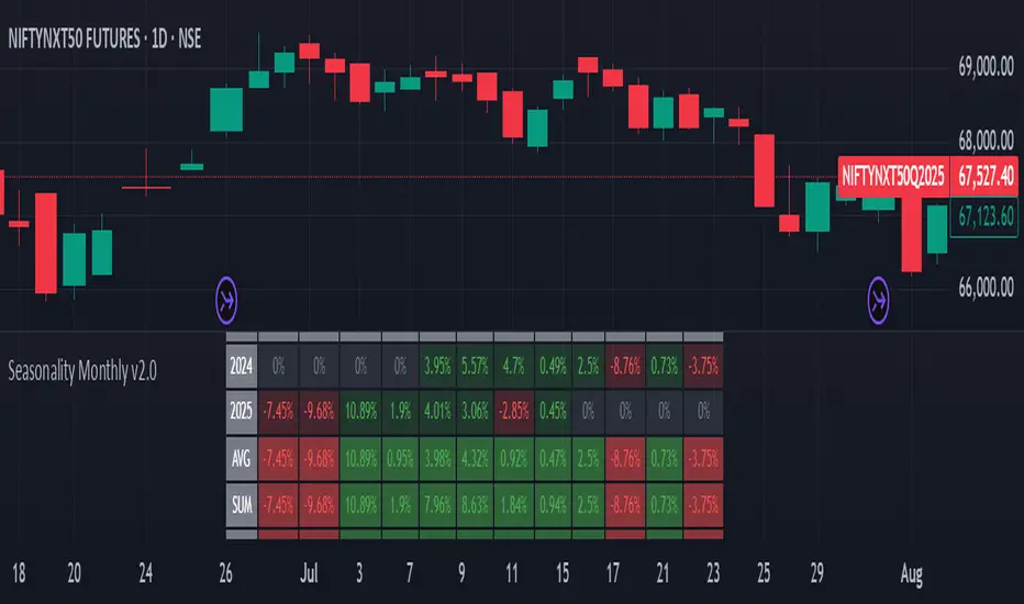
A best Seasonality Monthly IndicatorSeasonality Monthly is a custom indicator designed for TradingView that calculates and displays monthly seasonality performance as a table overlay on the chart. Key aspects and functionality: It requires the timeframe to be either monthly or daily; otherwise, it throws an error. The user can set the starting year (default 2015) from which the seasonality statistics begin. It collects monthly percentage change data (close to close returns) for each month and year dynamically using request.security. Data is stored in a two-dimensional matrix representing years by months, accumulating returns for each month over the years. The table is drawn on the chart showing monthly returns for each year, with cells colored green for positive returns and red for negatives. The bottom rows of the table show summary statistics per month: AVG: Average monthly returns SUM: Sum of returns +ive: Count of months with positive returns over total counts WR: Win rate (ratio of positive months) Text sizes and colors are customizable via inputs. Uses Pine Script v5 features like matrix, table API, and new runtime error handling. This script is useful for visualizing historical monthly seasonality patterns for any symbol on TradingView. ------------------ The Seasonality Monthly Pine Script indicator is a powerful tool designed for TradingView that enables traders to analyze and visualize the historical seasonal performance of an asset on a monthly basis. This script focuses on identifying recurring monthly patterns by accumulating monthly percentage returns over multiple years, providing insights that help traders understand when certain months tend to perform better or worse historically. The script requires the chart to be set to either a daily or monthly timeframe to ensure accurate calculations and data retrieval. It uses the request. security function to fetch monthly data, extracting each bar's year, month, and monthly price change percent based on close-to-close returns. These returns are then accumulated into a matrix data structure, organizing the percentage changes for each year and month to build a comprehensive historical dataset. A dynamic table is constructed and displayed on the chart, showing a detailed breakdown of percentage changes each month for every year starting from a customizable start year (default is 2015). Each cell in the table is color-coded—green for positive monthly returns and red for negative—making it visually easy to interpret seasonal trends. This immediate visual feedback is valuable for traders looking to identify strong or weak months historically. Beyond just the yearly data, the script calculates aggregate statistics for each month, which are displayed in summary rows at the bottom of the table. These include the average monthly return, the sum of returns, the count of positive-return months versus total months ("+ive"), and the win rate (WR), which is the proportion of positive months over the total number of months observed. These statistics assist traders in quantifying the strength and consistency of monthly seasonal effects. The script also includes user customization options such as the starting year for seasonality analysis and adjustable text size for better readability. It incorporates modern Pine Script v5 features like runtime error handling, matrix operations, and the enhanced table API for efficient and clear display. Overall, This is a practical indicator that helps traders incorporate seasonality insights into their decision-making process, potentially improving timing entries and exits by leveraging historical monthly market behaviors. It is particularly useful for spotting cyclic tendencies and planning strategies around historically strong or weak months, adding a valuable dimension to technical analysis. ---------------------------------------------- #Seasonality #TradingView #PineScript #TechnicalAnalysis #StockMarket #MonthlyPerformance #SeasonalTrends #MarketAnalysis #TradingStrategy #PricePatterns #Charting #DataVisualization #AlgorithmicTrading #FinancialMarkets #TradingIndicators #InvestmentStrategy #QuantitativeAnalysis #MarketSeasonality #StockTrading #TradingTools Indicatore Pine Script®di appzandgame118
TOTAL3ES/ETH Ratio Total market capitalization of altcoins excluding ETH and BTC divided by ETHIndicatore Pine Script®di gaojinpeng7
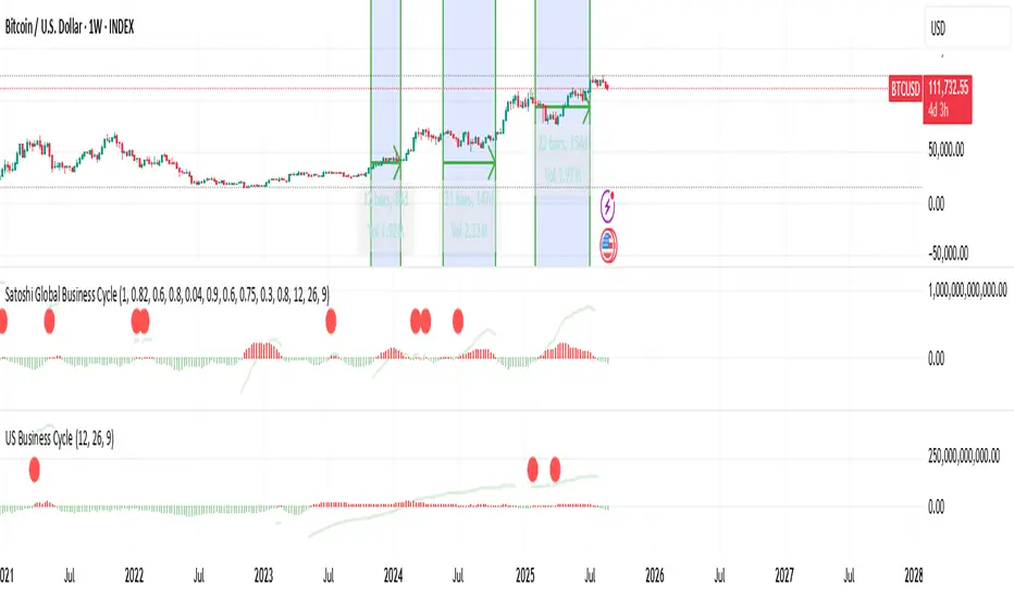
US Liquidity-Weighted Business Cycle📈 BTC Liquidity-Weighted Business Cycle This indicator models the Bitcoin macro cycle by comparing its logarithmic price against a log-transformed liquidity proxy (e.g., US M2 Money Supply). It helps visualize cyclical tops and bottoms by measuring the relative expansion of Bitcoin price versus fiat liquidity. 🧠 How It Works: Transforms both BTC and M2 using natural logarithms. Computes a liquidity ratio: log(BTC) – log(M2) (i.e., log(BTC/M2)). Runs MACD on this ratio to extract business cycle momentum. Plots: 🔴 Histogram bars showing cyclical growth or contraction. 🟢 Top line to track the relative price-to-liquidity trend. 🔴 Cycle peak markers to flag historical market tops. ⚙️ Inputs: Adjustable MACD lengths Toggle for liquidity trend line overlay 🔍 Use Cases: Identifying macro cycle tops and bottoms Timing long-term Bitcoin accumulation or de-risking Confirming global liquidity's influence on BTC price movement Note: This version currently uses US M2 (FRED:M2SL) as the liquidity base. You can easily expand it with other global M2 sources or adjust the weights.Indicatore Pine Script®di TheGoldphoenixAggiornato 20
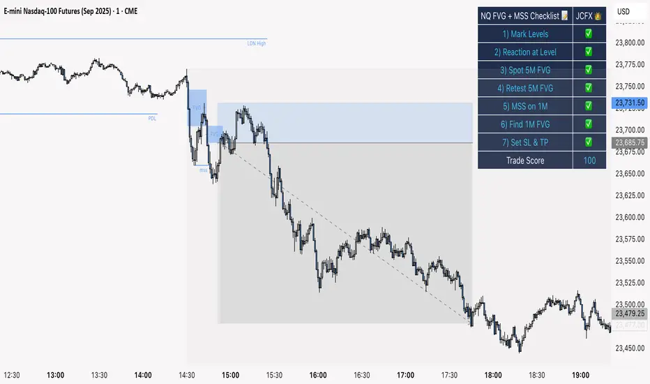
NQ FVG + MSS ChecklistThe NQ FVG + MSS Quick Checklist is a visual trading HUD for Nasdaq 100 (NQ) futures. It helps traders quickly track key setup elements: session & previous day levels, 5M FVG, retests, 1M MSS, and 1M FVG inside MSS. Each step can be manually ticked, and a Trade Score shows setup strength at a glance. The checklist table sits on top of all chart elements for easy reference without interfering with your analysis. Features: Step-by-step NQ trading checklist Manual inputs with visual ✅/❌ Trade Score for quick setup confirmation Table overlay always on top of the chartIndicatore Pine Script®di FXNotes22302
Earnings & Fundamentals TableShows the Earnings Comparison and Other important data. Will keep updatingIndicatore Pine Script®di smartbyketavAggiornato 2258
Credit Spread Alpha SignalCredit Spread Alpha Signal: Complete Description Introduction and Purpose The Credit Spread Alpha Signal is a custom indicator developed for TradingView, designed to monitor the credit spread between High Yield (HY) bond yields and the 10-Year US Treasury yield (US10Y). This indicator serves as an advanced macroeconomic tool for traders and investors, helping to identify shifts in risk sentiment, monetary policy adjustments, or financial stress in the economy. It combines credit market data with statistical analysis to generate inverted buy and sell signals, where wider spreads (deteriorated conditions) are seen as buy opportunities (green), and tight spreads (risk-on) as sell opportunities (red). The script is original, inspired by macroeconomic concepts, and visualizes data intuitively with histograms, background colors, and signal arrows. It is particularly useful for portfolio traders seeking confirmation signals or early warnings, integrating seamlessly into charts of stocks, bonds, or crypto assets. Key Concepts - HY Spread : Calculated as the difference between the High Yield Corporate Effective Yield (symbol: BAMLH0A0HYM2EY) and the US10Y Yield. Wider spreads indicate higher credit risk and economic deterioration (buy opportunity in the inverted logic). Tight spreads reflect market optimism (risk-on, sell opportunity). - Inverted Signal Logic : Unlike traditional interpretation, here widening spreads (stress) trigger green and buy arrows (↑ below the chart), suggesting entry into long positions during panics. Compressing spreads trigger red and sell arrows (↓ above the chart), indicating exit during optimism peaks. - Visual Highlights : Green for spread > +2.2σ (financial stress, buy); Red for spread < low threshold (risk-on, sell); Optional orange for recession risk (inverted curve + high spread, strong buy). The indicator uses statistics like simple moving average (SMA) and standard deviation for dynamic thresholds, making it adaptable to different market periods. How It Works: Internal Calculations 1. Data Sources : Uses `request.security` to fetch daily data ("D") from US10Y, US02Y (for inverted curve), and HY Yield. 2. Spread Calculation : `spread_hy = hy_yield - us10y`. 3. Statistics : - Average (SMA) of the spread over the last `sma_length` days (default: 120). - Standard deviation (stdev) over the same period. - High threshold: `avg_spread_hy + std_mult * std_spread_hy` (default: multiplier 2.2). - Low threshold: Editable value (default: 1.5%). 4. Conditions : - High stress (green/buy): `spread_hy > high_threshold`. - Compression (red/sell): `spread_hy < low_threshold`. - Recession risk (orange/strong buy, optional): Inverted curve (`us10y < us2y`) + spread > `recession_spread_threshold`. 5. Crossings for Signals : - Buy (green ↑ below): Crossover above high threshold (`ta.crossover`). - Sell (red ↓ above): Crossunder below low threshold (`ta.crossunder`). These calculations are processed bar by bar, ensuring real-time updates. Visual Elements - Histogram : Plots the spread as columns (`plot.style_columns`), dynamically colored: Light green (90% transparency) for stress/buy; Light red (90%) for compression/sell; Gray for neutral; Orange for recession. - Reference Line : Horizontal red line at zero for benchmark. - Background Coloring : Applies color to the main chart (overlay=true via force_overlay): Light green for buy, Light red for sell, Orange for recession, no color for neutral. - Signal Arrows : ↑ Green below the bar for buy (widening_cross); ↓ Red above the bar for sell (compressed_cross). - Floating Legend : Label in the lower panel explaining thresholds and conditions, dynamically updated with editable values. Editable Settings (Inputs) - SMA Period (days) : Default 120; adjusts the horizon for average and standard deviation. - Standard Deviation Multiplier : Default 2.2; sets sensitivity of the high threshold (e.g., 2.2σ for moderate alerts). - Low Threshold for Compression (%) : Default 1.5; level to detect risk-on/sell. - Enable Recession Risk? : Default false; activates combined condition of inverted curve + high spread. - Spread Threshold for Recession (%) : Default 2.0; level for recession (visible if enabled). These inputs allow customization via the TradingView interface, without editing the code. Integrated Alerts The indicator includes alert conditions (`alertcondition`) for notifications in TradingView: - "ALERT: HY Spread High": Spread exceeds threshold - financial stress (Buy). - "ALERT: HY Spread Compressed": Spread compressed - risk-on conditions (Sell). - "ALERT: HY Spread Widening (Buy)": Crossover above - buy opportunity in stress. - "ALERT: HY Spread Compressed (Sell)": Crossunder below - sell opportunity in risk-on. - "ALERT: Recession Risk (Strong Buy)": Inverted curve + high spread - high recession risk, consider buy (if enabled). Set up alerts for email, SMS, or webhook notifications. Usage Tips and Considerations - Recommended Timeframe : Daily ("D"), but works on others; data is forced to daily for consistency. - Practical Application : Add to charts of indices like SPY or QQQ to correlate with market moves. Test on historical periods (e.g., 2020 for widening, 2021 for compressing) to validate signals. - Limitations : Relies on external data (US10Y, HY Yield), which may have delays; spreads are typically positive. Not financial advice – use with complementary analysis. - Advanced Customization : Adjust thresholds for volatile markets; enable recession for more robust macro signals. This indicator transforms credit data into actionable alpha, helping navigate economic cycles with visual precision. For support or modifications, refer to the source code or TradingView community.Indicatore Pine Script®di hernandesnogueira13
EMA Vision – MTF InsightEMA Calculation Timeframe: Compute the EMA on any timeframe (e.g. Chart, 1H, 4H, 1D) while viewing on your chart’s timeframe. Confirmed or “Developing” EMA: Choose between plotting EMA values only after the higher timeframe bar closes (no repaint) or allowing real-time updates mid-bar, mirroring the “Wait for timeframe closes” behavior. Clean Multi-TF Overlays: Visualize EMAs from up to three higher timeframes (1H, 4H, 1D) on any chart—each using native plots to stay anchored and accurate, just like built-in EMAs. Optional Visual Smoothing Line: Add a secondary “smoothing” MA line (using SMA, EMA, SMMA, WMA, or VWMA) without altering the core EMA—keeps you visually aligned with built-in styling. Superior Accuracy: No repainting, no misalignment—just clean EMA values that reflect exactly what you’d see in TradingView’s standard EMA with the same settings.Indicatore Pine Script®di MrZoonAggiornato 1112
Quarterly Theory —Q1,Q2,Q3,Q4The Quarterly Theory Indicator is a trading tool designed to visualize the natural time-based cycles of the market, based on the principles of Quarterly Theory, popularized by the Inner Circle Trader (ICT). The indicator divides market sessions into four equal “quarters” to help traders identify potential accumulation, manipulation, and distribution phases (AMD model) and improve the timing of entries and exits. Key Features: Quarter Divisions (Q1–Q4): Each market session (e.g., NY AM, London, Asia) is divided into four quarters. Vertical lines mark the beginning of each quarter, making it easy to track session structure. Optional labels show Q1, Q2, Q3, and Q4 directly on the chart. True Open (Q2 Open): The True Open is the opening price of Q2, considered a key reference point in Quarterly Theory. A horizontal red line is drawn at the True Open price with a label showing the exact value. This line helps traders filter bullish and bearish setups: Buy below the True Open if the market is bullish. Sell above the True Open if the market is bearish. Session Awareness: The indicator can automatically detect market sessions and reset lines and labels for each new session. Ensures that only the current session’s True Open and quarter lines are displayed, reducing chart clutter. Timeframe Flexibility: Works on any chart timeframe (1-minute to daily). Maintains accurate alignment of quarters and True Open regardless of the timeframe used. Purpose of Quarterly Theory: Quarterly Theory is based on the idea that market behavior is fractal and time-driven. By dividing sessions into four quarters, traders can anticipate potential market phases: Q1: Initial price discovery and setup for the session. Q2: Accumulation or manipulation phase, where the True Open is established. Q3: Manipulation or Judas Swing phase designed to trap traders. Q4: Distribution or trend continuation/reversal. By visualizing these quarters and the True Open, traders can reduce ambiguity, identify high-probability setups, and improve their timing in line with the ICT AMD (Accumulation, Manipulation, Distribution) framework.Indicatore Pine Script®di samgarratt272114
ETH Valuation Indicator╔═══════════════════════ RUBIXCUBE ════════════════════════════╗ This indicator combines multiple on-chain and market-based metrics into a single valuation score for Ethereum. It highlights periods of relative undervaluation (green zones) and overvaluation (red zones) by normalising several metrics into a 0–1 range and averaging them. Price chart signals (top panel): Green arrows mark points where the indicator flagged historically attractive buying opportunities. Valuation oscillator (bottom panel): Shows the combined score over time, cycling between undervalued and overvalued extremes. Metric breakdown (side panel): Displays the contribution of each metric, their rate of change, and their current score. This tool is designed for macro insight, not short-term trading. It helps contextualise Ethereum’s position in the market cycle and provides a data-driven framework for long-term investors. ╚═══════════════════════════════════════════════════════════╝Indicatore Pine Script®di Rubixcube0262Aggiornato 6
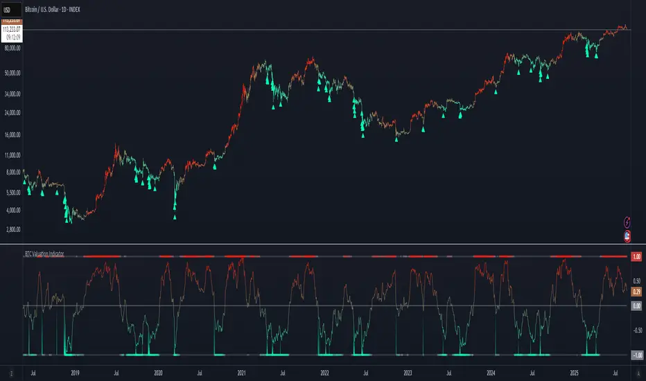
BTC Valuation Indicator╔═══════════════════ RUBIXCUBE ══════════════════════╗ This indicator combines multiple on-chain and market-based metrics into a single valuation score for Bitcoin. It highlights periods of relative undervaluation (green zones) and overvaluation (red zones) by normalising several metrics into a 0–1 range and averaging them. - Price chart signals (top panel): Green arrows mark points where the indicator flagged historically attractive buying opportunities. - Valuation oscillator (bottom panel): Shows the combined score over time, cycling between undervalued and overvalued extremes. - Metric breakdown (side panel): Displays the contribution of each metric, their rate of change, and their current score. This tool is designed for macro insight, not short-term trading. It helps contextualise Bitcoin’s position in the market cycle and provides a data-driven framework for long-term investors. ╚═════════════════════════════════════════════════╝Indicatore Pine Script®di Rubixcube026212
Forward P/E CalculatorI could not find a forward P/E indicator that gave me proper results. So here is mine.Indicatore Pine Script®di tschindler21Aggiornato 2284
Locked 5m 13 EMA & 15m 20 EMA with Mid EMA & SignalsThis indicator overlays the 5-minute 13 EMA and the 15-minute 20 EMA on any chart timeframe up to 15 minutes, along with a mid EMA (5-minute 36-period) for reference. Features include: EMA Cross Detection: Shows bullish and bearish cross arrows when the 5m 13 EMA crosses the 15m 20 EMA. EMA Fill: Highlights the area between the EMAs in green (bullish) or red (bearish). Mid EMA Buy/Sell Signals: Generates buy signals when price touches the mid EMA in a bullish stack and sell signals in a bearish stack. Custom Alerts: Alerts for EMA crosses, EMA stack direction, and mid EMA buy/sell triggers. Timeframe Safety Warning: Alerts if applied on timeframes higher than 15 minutes. Ideal For: Traders who want a locked, non-repainting EMA setup for multi-timeframe analysis and clear entry/exit signals based on mid-range EMA interaction. Inputs: Show/Hide arrows for EMA crosses Show/Hide fill between EMAs Show/Hide mid EMA line Show/Hide buy/sell signals Fill transparency adjustmentIndicatore Pine Script®di glapougbaegarmondehAggiornato 42
SPX → NQ Levels ConverterSPX → NQ Levels Converter is a Pine Script indicator that projects key S&P 500 (SPX) levels onto the NASDAQ 100 (NQ) chart using a configurable conversion ratio. • Dynamic ratio: calculates the live SPX/NQ ratio in real time. • Static ratio: allows manual input of a fixed ratio. • Supports up to 10 custom SPX levels, automatically converted into their equivalent NQ values. • Each level is displayed with a line and label (SPX → NQ) with independent color settings. • Advanced visualization controls: • line extension (right, left, both, or fixed) • line length & placement • label side & offset. • Lines and labels auto-update on every bar to stay accurate over time. Use case: particularly useful for traders who track SPX option levels or support/resistance zones but execute trades on the NQ.Indicatore Pine Script®di marcodinardo0876