.BXBT IndexThe current .BXBT index weighted as close as possible to BitMEX's with updates as BitMEX refreshes their index.
Difference between this and the script titled '2020 March 27 .BXBT Index': this one will receive updates because it doesn't have a date in its title.
Methodology
www.bitmex.com
"BitMEX Index Weights, assuming no constituent exchanges have been excluded due to Index Protection Rules, last updated 27 December 2019 at 12:00:05 UTC."
Binance: -
Bitstamp: 10.61%
Bittrex: 2.53%
Coinbase: 52.30%
Gemini: 6.89%
Huobi: -
Itbit: 4.21%
Kraken: 23.46%
Poloniex: -
ItBit's weight is combined with Gemini's due to ItBit not being on TradingView as of now. BITTREX:BTCUSD substituted with BITTREX:BTCUSDT*POLONIEX:USDTUSD to backfill because Bittrex only recently (late 2018) started to offer a fiat BTC/USD pair. Not that it matters since the index used in 2018 didn't include Bittrex if I remember correctly.
What is actually used for 27/12/2019 to 27/03/2020:
Binance: -
Bitstamp: 10.61%
Bittrex: 2.53%
Coinbase: 52.30%
Gemini: 11.10%
Huobi: -
Itbit: -
Kraken: 23.46%
Poloniex: -
Options:
Toggle candlesticks or close line
Change price source to be used for indicators
To be added: Change quarter to show indexes for different times, with labels that apply to the appropriate index used
Reasons to use this vs. the index itself: (not many)
It is helpful as a reference for other indicators or creation of an index.
Index

FTX Index Advance Decline LineAs of publishing, all the tickers from FTX with the word "index" in it, plus bitcoin.
This is your regular ADL except instead of hundreds in the basket you've got them condensed into 7 (for now) and in open/close candle form instead of a line.
I'm a bit disappointed because I thought I'd lever more utility from indexes. It may just need some tweaking.
Doesn't it look like Renko?
Some notes:
Reason why it expands:
Total number of constituents is a static 7, to fix that use time to change the total variable based on dates of introduction.
Reallly looks like Renko:
Renko with ATR, length 14, hourly chart.

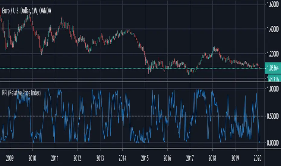
RPI (Relative Price Index)This is a free indicator created by Stormpike Group that displays the relative price of an underlying for the given period.
Congestion Index by KatsanosCONGESTION INDEX
Market movements can be characterized by two distinct types or phases. In the first, the market shows trending movements which have a directional bias over a period of time. The second type of market behavior is periodic or cyclic motion, where the market shows no consistent directional bias and trades between two levels. This type of market results in the failure of trend-following indicators and the success of overbought/oversold oscillators. Both phases of the market require the use of different types of indicator. Trending markets need trend-following indicators such as moving averages, moving average convergence/divergence (MACD), and so on. Trading range markets need oscillators such as the relative strength index (RSI) and stochastics, which use overbought and oversold levels. The age-old problem for many trading systems is their inability to determine if a trending or trading range market is at hand. Trend-following indicators, such as the MACD or moving averages, tend to be whipsawed as markets enter a nontrending congestion phase. On the other hand, oscillators (which work well during trading range markets) are often too early to buy or sell in a trending market. Thus, identifying the market phase and selecting the appropriate indicators is critical to a system’s success. The congestion index attempts to identify the market’s character by dividing the actual percentage that the market has changed in the past x days by the extreme range according to the following formula:
Readings between+20 and−20indicate congestion or oscillating mode. Crossing over the 20 line from below indicates the start of a rising trend. Conversely, the start of a down turn is indicated by crossing under−20 from above. The CI can also be used as an overbought/oversold oscillator.
It was taken from İntermarket Trading Strategies book of by Markos Katsanos.Read the book.
D1:=Input(“DAYS IN CONGESTION”,1,500,15);
CI:=ROC(C,D1-1,%)/((HHV(H,D1)-LLV(L,D1))/(LLV(L,D1)+.01)+.000001);
Mov ( CI ,3,E)
(Copyright Markos Katsanos 2008)

Volatility IndexThis is a composite volatility index to show percentile of current volatility compared to that of the last 52 bars. As this is a weekly chart (and this script is intended for usage on weekly charts) we can see the yearly percentile rank of volatility.
As shown when volatility is in the lower 25%tile (viewed on weekly) the market is calm and likes to rise; when the volatility is above the 25%tile you can see that the market tends to have larger and 'choppier' moves.
This is /not/ 'just the vix' this takes into consideration the volatility of all major US indexes including the SPX500, Dow 30, Nasdaq 100, and Russel 2000.
Please remember that this is just plotting:( volatility index - lowest(index,52) )/( highest(index,52)-lowest(index,52) ) so for 'yearly percentile' check the weekly chart (52 weeks = 1yr)

Bar Strength Index (BSI) by CryptorhythmsBar Strength Index (BSI) by Cryptorhythms
Intro
BSI is an totaly new and original indicator derived from Internal Bar Strength. It can be classified as similar to an RSI, but its method of calculation is very different so it sometimes gives an edge where RSI does not.
In the chart I have included RSI (red line) as a comparison for you to contrast BSI with.
Description
The formula for Internal Bar Strength is:
IBS = (close - low) / (high - low) * 100
The original IBS and thus this derivitive (BSI) are meant for higher timeframe analysis. Working best on daily, weekly or monthly charts. I take that original IBS formula and create something smoother and easier to understand - The Bar Strength Index !
Options
💠There is an option for smoothing which I recommend using.
💠Also options to make the scaling adaptive, or to leave it static.
💠A normalization option is available to create a bounded oscillator (easier for alerts/algos).
💠You can choose an MA type and length to create a signal line for it as well.
💠Lastly I also included the ability to setup overbought and oversold zones for better alert creation possibilities (crossovers / crossunders).
👍 We hope you enjoyed this indicator and find it useful! We post free crypto analysis, strategies and indicators regularly. This is our 77th script on Tradingview!

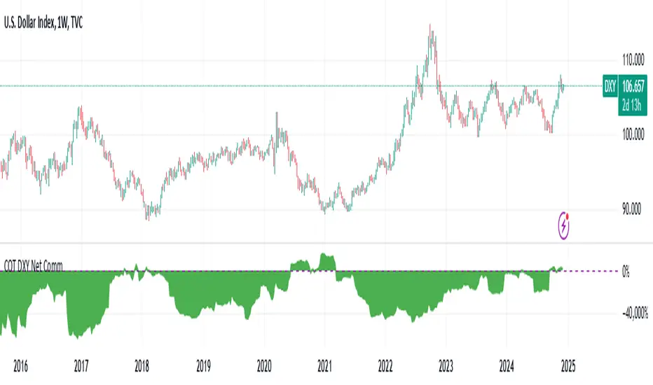
DXY COT Commercial Net PositionsThis script was created due to the lack of position of US Dollar Index Futures (DXY).
It is designed to perform a much more liquid and inclusive position analysis.
As the exponential ratios do not mean anything to positions, weights are used as multipliers instead of exponential functions.
Swedish Krona (SEK) Futures are not directly quoted in Quandl, therefore weighted in Euro / dollar parity.
By perceiving these positions as inverse correlations, you can also identify where the world economy is doing well.
COT Commercial Net Positions are calculated as (Short - Long) because of Commercials act according to the reverse of the market.
In this way, you can follow up normally instead of reverse correlation.
Because except in extreme cases, in which case capitals usually shift to Gold.
This is not the case, since there is no capital inflow to other currencies, it is not a strong sell position to the dollar index.
When there is a shift in bonds, we see the effect of the dollar in general.
I created for the Dollar Index in order not to deviate from the concept.
I wanted to share it with everyone as I thought that you have important clues about how investors take positions.
Modified currency weights :
Euro : % 61.8
Japanese Yen : % 13.6
British Pound : %11.9
Canadian Dollar : % 9.1
Swiss Franc : % 3.6
NOTE : You can use it for all instruments except crypto coins, especially US Dollar Index (DXY).
Since the COT data is taken, it will not repaint in 1 week (1W) timeframe.
The log can also be repaint according to the time of data publication.
It will repaint in lower time frames.
I hope it will help your analysis and your scripts,regards.
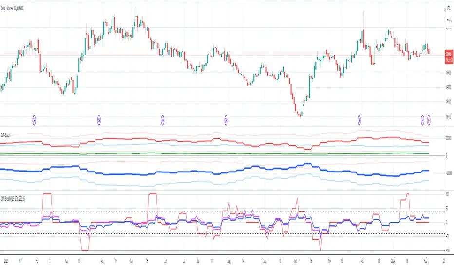
Commercial Movement Index-BuschiEnglish
Inspired by the book "The Commitments of Traders Bible" by Stephen Briese, this indicator is a follow-up of my already published "Commercial Index-Buschi".
Here, the Commercial Index isn't shown in values from 0 to 100, but in how far the value changed from a given timeframe (default Movement Reference: 6 weeks). Therefore it ranges from 100 (bullish move from the Commercials during the last weeks) to -100 (bearish move).
Deutsch
Inspiriert durch das Buch "The Commitments of Traders Bible" by Stephen Briese, ist dieser Indikator eine Weiterentwicklung meines bereits veröffentlichten Skriptes "Commercial Index-Buschi".
Hier wird der Commercial Index nicht in Werten von 0 bis 100 angezeigt, sondern in wieweit er sich innerhalb eines vorgegebenen Zeitfensters (Standard: Movement Reference: 6 Wochen) verändert hat. Daher schwankt er zwischen 100 (bullishe Bewegung der Commercials innerhalb der letzten Wochen) und -100 (bearishe Bewegung).
🧬dRSI Signals Internal Beta Test by Cryptorthyhms🧬dRSI Signals Internal Beta Test by Cryptorthyhms
Test release, for internal testing only. Debut release soon!
Thank you all for your patience!

MKAST-IndexThis is one of my free for all Indicators.
The TJ-Index is something I have been working on for quite a while and always was wanting to have on my charts, yet it took me longer than expected to finally finish it.
Now it is done and you can simply favourite this script and add it to your chart.
It is made out of 2 main parts.
Part 1:
15 Indicators and conditions like
-Delta MACD,
-Crypto Indicator,
-RSI,
-MACD,
-Momentum,
-CCI,
-OBV,
-Stochastic,
-CMF,
-Raw Buy and Sell Volume Domination,
-Super Guppy,
-Ichimoku,
-DIOSC,
-Volume Weighted MACD,
-Golden cross/Death Cross
Part 2:
The white line - the index itself.
So how this works is, you see 15 horizontal lines in green and red alternating, mentioned in that order above, if a bullish condition islet the horizontal line turn green, if it is a bearish condition, it is red.
The white index line, is basically depicting the number of bullish conditions at the same time.
I have seen that it is extremely powerful for divergences and especially thinking to take any position, checking if the index is high or low at the time.
An extra feature is that if ALL bullish or bearish conditions are met, the background of the oscillator will color itself green or red.
You can also turn on and off the horizontal lines for the easier user of the TJ-Index.
For now, the code will remain hidden, since I still have some important parts of this Index in my main Invite Only Indicator.
I will be publishing an open version of the TJ-Index soy ou can incorporate it in your own indicators.
Should you be interested in my main indicator or scripting work, feel free to DM me.

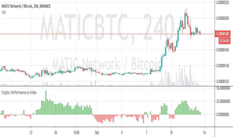
Crypto Performance vs IndexQuickly shows you if an altcoin is outperforming or underperforming it's peers. You can compare again indexes of high cap, mid cap and low cap indexes, which are provided by FTX.com. I intend to add some more features but am currently a bit busy so wanted to get it published as I've been finding it useful
MPI‴ | Money Pressure IndexThe MPI‴ or Money Pressure Index is a great indicator to measure the buy/sell money pressure over the asset once it allows you to have a better understanding and interpretation of its behavior once you are able to see it through an histrogram. Using its histogram, will allow you to have a gradual view of its force over the asset and the end of the line oscilation will allow you to see the most up to date indicator behaviour.
What is the best is that you can use it with any kind of graphic that it will always considere the real open, close, high and low trading values.
To have access to this indicator, please contact me at: contato @ moneywise . com . br
Believe me, this indicator will make your life much easier!


Coinbase ALT/USD IndexA simple ALT/USD pair index of all the altcoins currently trading on Coinbase.


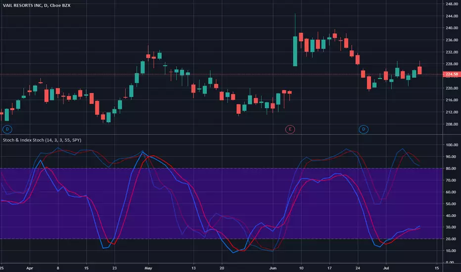
Stochastic & Index StochasticUsing this indicator you will be able to use the standard stochastic of a stock ticker as well as the stochastic of a stock market index simultaneously and without changing charts - both stochastics combined in only one indicator.
The stock market index stochastic can be changed in the indicator settings and is displayed with higher transparency. The degree of transparency and default color settings can also be adjusted.
For special analysis purposes, it is possible to display only the stochastic of the selected stock ticker or only the stochastic of the selected stock market index.
If you would like to test or use this indicator please drop me a line and send a request for it.
Combo Strategy 123 Reversal & CCI This is combo strategies for get a cumulative signal.
First strategy
This System was created from the Book "How I Tripled My Money In The
Futures Market" by Ulf Jensen, Page 183. This is reverse type of strategies.
The strategy buys at market, if close price is higher than the previous close
during 2 days and the meaning of 9-days Stochastic Slow Oscillator is lower than 50.
The strategy sells at market, if close price is lower than the previous close price
during 2 days and the meaning of 9-days Stochastic Fast Oscillator is higher than 50.
Second strategy
The Commodity Channel Index (CCI) is best used with markets that display cyclical or
seasonal characteristics, and is formulated to detect the beginning and ending of these
cycles by incorporating a moving average together with a divisor that reflects both possible
and actual trading ranges. The final index measures the deviation from normal, which indicates
major changes in market trend.
To put it simply, the Commodity Channel Index (CCI) value shows how the instrument is trading
relative to its mean (average) price. When the CCI value is high, it means that the prices are
high compared to the average price; when the CCI value is down, it means that the prices are low
compared to the average price. The CCI value usually does not fall outside the -300 to 300 range
and, in fact, is usually in the -100 to 100 range.
WARNING:
- For purpose educate only
- This script to change bars colors.

.BADAXBT Cardano Price Index - for BitMEX - Gyro.BADAXBT script as seen on the BitMEX built-in chart.
This is not created by, authorized by or in any type of affiliation with BitMEX whatsoever.
This is not financial advice. Use at your own risk.
Tips are appreciated if you find this useful:
3BMEXty68scwEPfGGb4zkS23JdBCi3vtkh
See my other scripts for .BXBT and .BETH!
Thanks

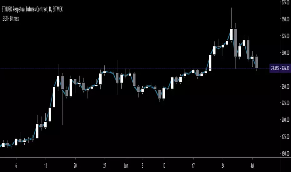
.BETH Ethereum Price Index - for BitMEX - Gyro.BETH script as seen on the BitMEX built-in chart.
This is not created by, authorized by or in any type of affiliation with BitMEX whatsoever.
This is not financial advice. Use at your own risk.
Tips are appreciated if you find this useful:
3BMEXty68scwEPfGGb4zkS23JdBCi3vtkh
See my other scripts for .BXBT!
Thanks


Smoothed RWI(Random Walk Index)Smoothed Random Walk Index.
It gives slightly slower but less false signal than stochastic.
If it draws double bottom with higher low, long entry is considered.
If it draws double with lower high, short entry is considered.
For more accuracy, another smoothed RWI with slower setting is needed.
If fast setting RWI draws lower high AND slower setting RWI is also going down(red color),
short entry is considered with more confidence.
