AI Bot Regime Feed (v6) — stableThis indicator generates real-time, structured JSON alerts for external trading bots or automation systems.
It combines multiple technical layers to identify market regimes and high-probability buy/sell events, and sends them to any webhook endpoint (e.g., a FastAPI or Zapier listener).
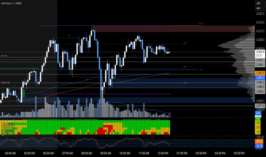
M-oscillator
Short-Term Capitulation Oscillator (STCO, Diodato 2019)Description:
This script is a faithful implementation of the Short-Term Capitulation Oscillator (STCO) from Chris Diodato's 2019 CMT paper, "Making The Most Of Panic". It's a tactical breadth and volume oscillator designed to "fish for market bottoms" by identifying short-term investor capitulation.
What It Is
The STCO combines the 10-day moving averages of NYSE up-volume and advancing issues. It measures the ratio of advancing momentum (in both volume and number of issues) relative to the total traded momentum. The result is a raw, un-normalized oscillator that typically ranges from 0 to 200.
How to Interpret
The STCO is a tactical tool for identifying near-term oversold conditions and potential bounces.
Low Readings: Indicate that sellers have likely exhausted themselves in the short term, creating a potential entry point for a bounce. The paper found that readings below 90, 85, and 80 were often followed by strong market performance over the next 5-20 days.
Overbought/Oversold Lines: Use the customizable overbought/oversold lines to define your own capitulation zones and potential entry areas.
Settings
Data Sources: Allows toggling the use of "Unchanged" issues/volume data.
Thresholds: You can set the overbought and oversold levels based on the paper's research or your own testing.
Long-Term Capitulation Oscillator (LTCO, Diodato 2019)Description:
This script is a faithful implementation of the Long-Term Capitulation Oscillator (LTCO) from Chris Diodato's award-winning 2019 CMT paper, "Making The Most Of Panic". It is a strategic, market-wide breadth and volume oscillator designed to identify major, long-term market bottoms.
What It Is
The LTCO combines long-term moving averages (34, 55, 89, 144, and 233-day) of NYSE advancing/declining issues and up/down volume. It uses a unique "average of averages" method to create a responsive yet strategic long-term indicator. This script plots the raw, un-normalized value as described in the paper, which typically oscillates in the 700-1100 range.
How to Interpret
The LTCO is a strategic tool for identifying potentially significant market turning points.
Extremely Low Readings: Suggest that a long-term period of selling has reached a point of exhaustion, potentially marking a major bear market low or a generational buying opportunity. The paper backtested various thresholds, with values below 950, 925, and especially 875 showing historically strong forward returns over the next 6-24 months.
Overbought/Oversold Lines: The script includes customizable overbought/oversold lines to help you visually identify these critical zones.
Settings
Data Sources: Allows toggling the use of "Unchanged" issues/volume data for the calculation.
Thresholds: You can set the overbought and oversold levels to your preference, based on the paper's findings or your own research.

Diodato 'All Stars Align' SignalDescription:
This indicator is an overlay that plots the "All Stars Align" buy signal from Chris Diodato's 2019 CMT paper, "Making The Most Of Panic." It is designed to identify high-conviction, short-term buying opportunities by requiring a confluence of both price-based momentum and market-internal weakness.
What It Is
This script works entirely in the background, calculating three separate indicators: the 14-day Slow Stochastic, the Short-Term Capitulation Oscillator (STCO), and the 3-DMA of % Declining Issues. It then plots a signal directly on the main price chart only when the specific "All Stars Align" conditions are met.
How to Interpret
A green cross (+) appears below a price bar when a high-conviction buy signal is generated. This signal triggers only when two primary conditions are true:
The 14-day Slow Stochastic is in "oversold" territory (e.g., below 20).
AND at least one of the market internal indicators shows a state of panic:
Either the STCO is oversold (e.g., below 140).
Or the 3-DMA % Declines shows a panic spike (e.g., above 65).
This confluence signifies a potential exhaustion of sellers and can mark an opportune moment to look for entries.
Settings
Trigger Thresholds: You can customize the exact levels that define an "oversold" or "panic" state for each of the three underlying indicators.
Data Sources: Allows toggling the use of "Unchanged" data for the background calculations.
Stochastic Settings: You can adjust the parameters for the Slow Stochastic calculation.
Alarm Pack (MA14/21 - MACD - CU-RSI - Pivot PP) - SigmorAlgoA clean alarm/confirmation pack by SigmorAlgo.
4 MAs (14/21/50/100) with selectable type (EMA/SMA/SMMA), CU-RSI (22/66) crosses, MACD confirmations, and optional Daily Pivot PP.
Built for clarity: trend filter (MA50/MA100), real-time alerts, and minimal visuals.
Suggested RSI preset: Fast 22, Slow 66 (balanced). For faster signals try 14/42; for slower 28/84.
Dual RSI TL (AI Trend Mapper) - SigmorAlgoDual RSI TL (AI Trend Mapper) — an intelligent momentum and trendline mapping system built to give traders clarity, structure, and precision.
It merges a dual-layer RSI framework (fast & slow) with automatic RSI trendlines to identify strength, exhaustion, and reversals in real time.
⚙️ Main Features:
• Dual RSI system (fast & slow) with fully adjustable lengths
• Automatic RSI trendline mapping (AI-driven slope detection)
• Real-time crossover and confirmation alerts
• Clean visual markers for entry & exit points
• Compatible with EMA, SMA, and Pivot-based systems
💡 Recommended Settings:
• Default: Fast = 25, Slow = 75 (1:3 ratio) — ideal balance for 15m–1D traders
• Faster reaction: 12/36 or 14/42
• Slower/long-term: 28/84 or 30/90
Whether you trade scalps, intraday setups, or daily swings, Dual RSI TL adapts dynamically to price behavior — giving you a visual edge without noise.
Created by SigmorAlgo — for traders who value clarity over clutter.

OG Indicators - EnhancedA simple effort to combine William's % R, MACD & Stochastic into single script

Wilder's ADX/DIワイルダー氏が作ったトレンドの強弱を計るインジケーターです。証券会社のものは微妙に計算式が違うため、ワイルダー氏のオリジナルの計算式で作りました。
It’s an indicator created by Mr. Wilder to measure the strength of a trend.
Since the calculation formulas used by brokerage firms vary slightly, this version is built using Mr. Wilder’s original formula.

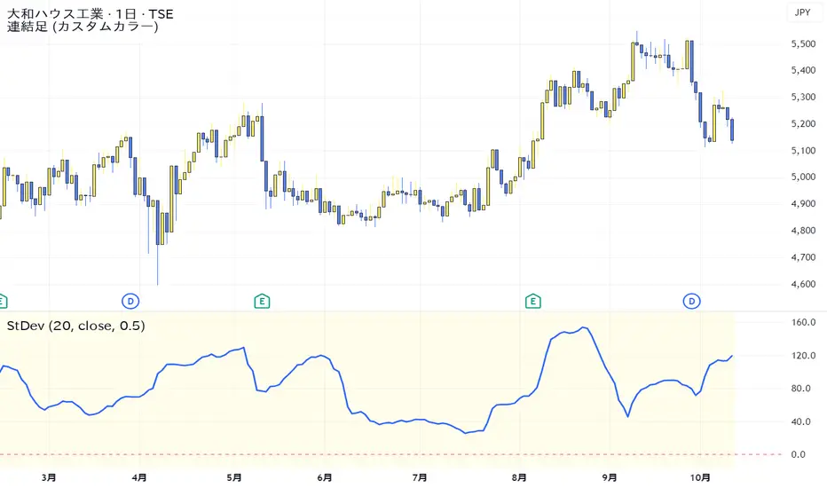
Standard Deviation VolatilityThe Standard Deviation (StDev) measures the volatility or dispersion of price from its historical average. Higher values suggest greater price fluctuation and potentially a trending market. Lower values indicate lower volatility, often found during consolidation or ranging markets.
標準偏差(Standard Deviation)は、価格の過去の平均からの**ばらつき(ボラティリティ)**を測る指標です。値が高いほど価格変動が激しく、トレンド相場であることを示唆します。値が低いほど、レンジ相場または保ち合いであることを示します。
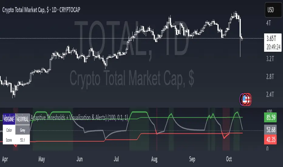
Market Regime (w/ Adaptive Thresholds)Logic Behind This Indicator
This indicator identifies market regimes (trending vs. mean-reverting) using adaptive thresholds that adjust to recent market conditions.
Core Components
1. Regime Score Calculation (0-100 scale)
Starts at 50 (neutral) and adjusts based on two factors:
A. Trend Strength
Compares fast EMA (5) vs. slow EMA (10)
If fast > slow by >1% → +60 points (strong uptrend)
If fast < slow by >1% → -60 points (strong downtrend)
B. RSI Momentum
Uses 7-period RSI smoothed with 3-period EMA
RSI > 70 → +20 points (overbought/trending)
RSI < 30 → -20 points (oversold/mean-reverting)
The score is then smoothed and clamped between 0-100.
2. Adaptive Thresholds
Instead of fixed levels, thresholds adjust to recent market behavior:
Looks back 100 bars to find the min/max regime score
High threshold = 80% of the range (trending regime)
Low threshold = 20% of the range (mean-reverting regime)
This prevents false signals in different volatility environments.
3. Regime Classification
Regime Score Classification Meaning
Above high threshold STRONG TREND Market is trending strongly (follow momentum)
Below low threshold STRONG MEAN REVERSION Market is choppy/oversold (fade moves)
Between thresholds NEUTRAL No clear regime (stay out or wait)
4. Regime Persistence Filter
Requires the regime to hold for a minimum number of bars (default: 1) before confirming
Prevents whipsaws from brief score fluctuations
What It Aims to Detect
When to use trend-following strategies (green = buy breakouts, ride momentum)
When to use mean-reversion strategies (red = buy dips, sell rallies)
When to stay out (gray = unclear conditions, high risk of false signals)
Visual Cues
Green background = Strong trend (momentum strategies work)
Red background = Strong mean reversion (contrarian strategies work)
Table = Shows current regime, color, and score
Alerts = Notifies when regime changes

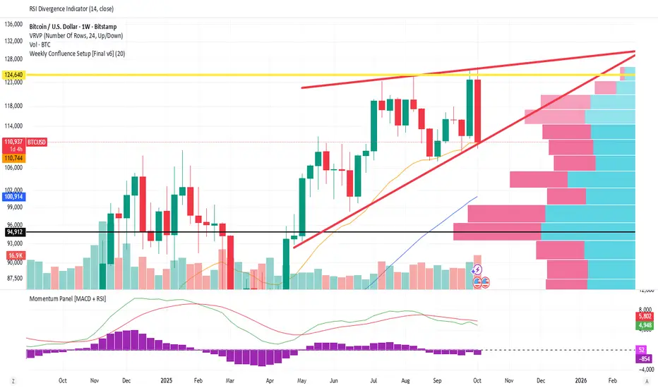
Weekly Confluence Setup [Final v6]Trend: EMA 21 and SMA 50
Momentum: MACD and RSI in a separate pane
Volume: Anchored VWAP from recent swing low
Confluence Signals: Clear triangle markers with optional alerts to the chart timeframe


Stochastic Arrows Crossover with Alerts [TED]This indicator highlights key Stochastic %K and %D crossovers, helping traders identify potential buy and sell signals with visual triangle arrows and custom alerts. It uses the Stochastic Oscillator, which is a momentum indicator that compares the closing price to the price range over a given period.
Key Features:
Visual Arrows: The indicator plots green triangle-up arrows for bullish crossovers and red triangle-down arrows for bearish crossovers on the chart.
Customizable Parameters: You can adjust the period for %K, %D, and the smoothing factor to fit your trading strategy.
Overbought/Oversold Zones: The background color fills between the 80 (Overbought) and 20 (Oversold) levels, helping you visualize potential reversal areas.
Alerts: Set up dynamic alerts based on the crossover events, including:
Bullish and Bearish Crossovers
Crossover Events from the Previous Bar
How to Use:
Bullish Signal: When the %K line crosses above the %D line, it signals a potential buying opportunity. This is visually represented with a green triangle-up arrow on the chart.
Bearish Signal: When the %K line crosses below the %D line, it signals a potential selling opportunity, indicated by a red triangle-down arrow on the chart.
Overbought/Oversold Zones: The background color fill helps identify overbought or oversold market conditions, which may indicate a potential reversal.
Custom Alerts:
You can set alerts for:
Bullish Crossover: When the %K line crosses above the %D line.
Bearish Crossover: When the %K line crosses below the %D line.
Previous Bar Crossovers: Alerts for crossovers from one bar ago (helpful for backtesting).
Instructions:
Add the Indicator: Apply this Stochastic Arrows Crossover indicator to your chart from the public library.
Customize Settings: Adjust the input parameters like K period, D period, and Smoothing to match your preferred settings.
Enable Alerts:
Once added to your chart, you can set up alerts from the Alert Panel on TradingView.
Choose from the available alert conditions (Bullish Crossover, Bearish Crossover, or Crossover from the Previous Bar).
Set your desired timeframe and alert message to receive notifications for the crossovers.
Monitor the Chart: Keep an eye on the arrows and background color fill to interpret potential trade setups based on the Stochastic Oscillator's behavior.
MILLION MEN - Peaks & Dips MeterWhat it is
The MILLION MEN — Peaks & Dips Meter is a dynamic momentum visualization tool designed to identify extreme strength and exhaustion zones. It uses two selectable engines:
RSI Meter (ZS Core) for classic strength analysis.
OB/OS Multi-Length (ZS Quick Core) for adaptive readings that reflect multi-period sentiment shifts.
How it works
The script computes normalized momentum values (0–100) from price dynamics, builds a smooth gradient representation, and displays it as a fixed right-bottom table. The meter color scales between fuchsia and green, with optional candle coloring and percentage labels.
It can also highlight overbought (peaks) and oversold (dips) moments directly on candles with adjustable ATR offsets and label styles.
How to use
Values near 90–100% → potential short-term exhaustion (watch for reversals).
Values near 0–10% → potential accumulation zones (possible bounces).
Use together with structure, volume, or trend filters for confirmation.
Originality
Unlike standard RSI tools, this script merges multi-length OB/OS detection with a real-time visual meter, optimized for scalpers and visual traders. It does not repaint and maintains a lightweight structure for fast responsiveness.
Limitations
This indicator is for analysis purposes only and should not be considered financial advice. Past readings do not guarantee future performance.
Liquidity ROC Z-Score (Composite) — kWhDealer_Developed by @kWhDealer_, this indicator tracks the rate-of-change and standard-deviation momentum of U.S. system liquidity by combining key Federal Reserve and Treasury data:
Composite Liquidity
=
WALCL
−
WTREGEN
−
RRPONTSYD
+
MTSDS133FMS
Composite Liquidity=WALCL−WTREGEN−RRPONTSYD+MTSDS133FMS
It measures the flow of liquidity available to markets—integrating monetary policy (Fed balance sheet, reverse repo, TGA) with fiscal policy (Treasury deficit spending).
The script converts this composite into a Rate-of-Change (ROC) oscillator and expresses it as a Z-Score, with ±1 σ / ±2 σ bands to highlight over- and under-injection regimes.
Z > +1 σ → expanding liquidity → risk-on bias
Z < –1 σ → contracting liquidity → risk-off bias
Crosses of 0 often precede equity index inflections by ~1–2 months
This oscillator serves as a leading macro gauge for shifts in liquidity-driven risk appetite across equities, credit, and crypto.
ADX-DEMA-KAMA StrategyThis is a trend-following indicator that combines three technical tools:
DEMA (Double Exponential Moving Average) - Fast-responding trend line
KAMA (Kaufman's Adaptive Moving Average) - Adaptive trend line that adjusts to market volatility
ADX (Average Directional Index) with DI+/DI- - Measures trend strength and direction
How it works:
Buy Signal: DEMA crosses above KAMA when ADX is rising and DI+ > DI-
Sell Signal: DEMA crosses below KAMA when ADX is rising and DI- > DI+
The indicator displays both moving averages on the chart, plots buy/sell arrows, and shows a status table with current values. It only triggers trades when there's strong trend confirmation from all three components.RetryClaude can make mistakes. Please double-check responses.

Sentiment NavigatorFREE|SuperFundedSentiment Navigator — Momentum × Volatility Heatmap
What it is
Sentiment Navigator blends momentum (RSI) with volatility (ATR normalized by price) to visualize market psychology using a background heatmap and a lower oscillator.
・Background: quick read of the market’s “temperature” → Extreme Greed / Greed / Neutral / Fear / Extreme Fear.
・Oscillator: a bounded sentiment score from -100 to +100 showing bias strength and potential extremes.
Why this is not a simple mashup
Instead of showing RSI and ATR separately, this tool integrates them into a single, weighted score and a state machine:
・Context-aware weighting: When volatility is high (ATR vs its SMA baseline), the score is amplified, reflecting that momentum matters more in turbulent regimes.
・Unified states: RSI thresholds classify regimes (Greed/Fear) and are conditioned by volatility to promote Extreme states only when justified.
・Actionable cues: Reversal labels appear at the extreme levels with candle confirmation to reduce noise.
How it works (concise)
1. Momentum: RSI(len) (default 21).
2. Volatility: ATR(len)/close*100 (default ATR=14), smoothed by SMA(volSmaLen) and compared using volMultiplier.
3. Sentiment score: transform RSI to (-100..+100) via (RSI-50)*2, then amplify ×1.5 when high volatility. Finally clamp to .
4. States:
・RSI > greedLevel → Greed (upgraded to Extreme Greed if high vol)
・RSI < fearLevel → Fear (upgraded to Extreme Fear if high vol)
・else Neutral
5. Plotting:
・Oscillator (area) with 0-line and dotted extreme bands.
・Background color by state (greens for Greed, reds for Fear, gray for Neutral).
6. Signals (optional):
・Buy: crossover(score, -extremeGreedLevel) and close > open → prints ▲ at -extremeGreedLevel
・Sell: crossunder(score, extremeGreedLevel) and close < open → prints ▼ at +extremeGreedLevel
Parameters (UI mapping)
Core
・RSI Length (rsiLen)
・ATR Length (atrLen)
・Volatility SMA Length (volSmaLen)
・High-Vol Multiplier (volMultiplier)
State thresholds
・Extreme Greed (extremeGreedLevel)
・Greed (greedLevel)
・Fear (fearLevel)
・Extreme Fear (extremeFearLevel)
Display
・Show Background (showBgColor)
・Show Reversal Signals (showSignals)
Practical usage
・Regime read: Treat greens as risk-on bias, reds as risk-off, gray as indecision.
・Entries: Use ▲/▼ as triggers, not commands—wait for price action (wicks/engulfings) at structure.
・Extreme management: At Extreme states, favor mean-reversion tactics; in plain Greed/Fear with low vol, trends may persist longer.
・Tuning:
・Raise greedLevel/fearLevel to reduce signals.
・Increase volMultiplier to demand stronger vol for “Extreme” states.
Repainting & confirmation
Signals rely on cross events of the oscillator; judge on bar close for stricter rules. Background/state can change intrabar as RSI/ATR evolve.
Disclaimer
No indicator guarantees outcomes. News/liquidity can override signals. Trade responsibly with proper risk controls.
Sentiment Navigator — クイックガイド(日本語)
概要
本インジは RSI(モメンタム) と ATR/価格(ボラティリティ) を統合し、背景のヒートマップと下部オシレーターで市場心理を可視化します。
・背景色:極度の強欲 / 強欲 / 中立 / 恐怖 / 極度の恐怖 を直感表示。
・オシレーター:-100〜+100 のスコアでバイアスの強さと過熱を示します。
独自性・新規性
・高ボラ状態ではスコアを増幅し、同じRSIでも環境次第で体感インパクトを反映。
・RSIしきい値×ボラで極端ゾーンの発生を制御し、意義のあるExtremeのみ点灯。
・反転ラベルは極端レベルのクロス+ローソク条件で点灯し、ノイズを抑制。
仕組み(要点)
1. RSI を算出。
2. ATR/close*100 を SMA と比較し、しきい値倍率で高ボラを判定。
3. score = (RSI-50)*2 を 高ボラで×1.5、 にクランプ。
4. 状態:RSI>Greed → Greed/Extreme Greed、RSI
Reversal Probability Meter PRO [optimized for Xau/Usd m5]🎯 Reversal Probability Meter PRO
A powerful multi-factor reversal probability detector that calculates the likelihood of bullish or bearish reversals using RSI, EMA bias, ATR spikes, candle patterns, volume spikes, and higher timeframe (HTF) trend alignment.
🧩 MAIN FEATURES
1. Reversal Probability (Bullish & Bearish)
Displays two key metrics:
Bull % — probability of bullish reversal
Bear % — probability of bearish reversal
These are computed using RSI, EMAs, ATR, demand/supply zones, candle confirmations, and volume spikes.
📊 Interpretation:
Bull % > 70% → Buying pressure building up
Bull % > 85% → Strong bullish reversal confirmed
Bear % > 70% → Selling pressure building up
Bear % > 85% → Strong bearish reversal confirmed
2. Alert Probability Threshold
Adjustable via alertThreshold (default = 85%).
Alerts trigger only when probability ≥ threshold, and confirmed by zone + volume spike + candle pattern.
🔔 Alerts Available:
✅ Bullish Smart Reversal
🔻 Bearish Smart Reversal
To activate: Right-click chart → “Add alert” → choose the alert condition from the indicator.
3. Demand / Supply Zone Detection
The script determines the price position within the last zoneLook (default 30) bars:
🟢 DEMAND → Lower 35% of range (potential bounce zone)
🔴 SUPPLY → Upper 35% of range (potential rejection zone)
⚪ MID → Neutral area
📘 Purpose: Validates reversals based on context:
Bullish only valid in Demand zones
Bearish only valid in Supply zones
4. Higher Timeframe (HTF) Trend Alignment
Reads EMA bias from a higher timeframe (default = 15m) for trend confirmation.
Reversals against HTF trend are automatically weighted down prevents false countertrend signals.
📈 Example:
M5 chart under M15 downtrend → Bullish probability is reduced.
5. Candle Confirmation Patterns
Two key price action confirmations:
Bullish: Engulfing or Pin Bar
Bearish: Engulfing or Pin Bar
A valid reversal requires both a candle confirmation and a volume spike.
6. Volume & ATR Spike Filters
Volume Spike: volume > SMA(20) × 1.3
ATR Spike: ATR > SMA(ATR, 50) × volMult
🎯 Ensures that only strong market moves with real energy are considered valid reversals.
7. Reversal Momentum Histogram
A color-gradient oscillator showing the momentum difference:
Green = bullish dominance
Red = bearish dominance
Flat near 0 = neutral
Controlled by showOscillator toggle.
8. Smart Info Panel
A compact dashboard displayed on the top-right with 4 rows:
Row Info Description
1 Bull % Bullish reversal probability
2 Bear % Bearish reversal probability
3 Zone Market context (DEMAND / SUPPLY / MID)
4 Signal Strength Current signal intensity (probability %)
Dynamic Colors:
90% → Bright (strong signal)
75–90% → Yellow/Orange (medium)
<75% → Gray (weak)
9. Sensitivity Mode
Fine-tunes indicator reactivity:
🟥 Aggressive: Detects reversals early (more signals, less accurate)
🟨 Normal: Balanced, default mode
🟩 Conservative: Filters only strongest reversals (fewer but more reliable)
10. Custom Color Options
Customize bullish and bearish colors via bullBaseColor and bearBaseColor inputs for your preferred chart theme.
⚙️ HOW TO USE
Add to Chart
→ Paste the script into Pine Editor → “Add to chart”.
Select Timeframe
→ Best for M5–M30 (scalping/intraday).
→ H1–H4 for swing trading.
Monitor the Info Panel:
Bull % ≥ 85% + Zone = Demand → Strong bullish reversal signal
Bear % ≥ 85% + Zone = Supply → Strong bearish reversal signal
Watch the Histogram:
Rising green bars = bullish momentum gaining
Deep red bars = bearish momentum gaining
Enable Alerts:
Right-click chart → “Add alert”
Choose Bullish Smart Reversal or Bearish Smart Reversal
🧠 TRADING TIPS
Use Conservative mode for noisy lower timeframes (M5–M15).
Use Aggressive mode for higher timeframes (H1–H4).
Combine with manual support/resistance or zone boxes for precision entries. Personally i use Order Block.
Best reversal setups occur when all align:
Bull % > 85%
Zone = DEMAND
Volume spike present
Candle = Bullish engulfing
HTF trend supportive

MTF RSI Heatmap)# MTF RSI Heatmap — v2.7.2
**Hybrid Higher-TF Trend + Intraday Impulse Detection + Smart Counters & Alerts**
Turn your lower pane into a **multi-timeframe market bias dashboard**. This heatmap blends classic RSI momentum with a **hybrid Daily/Weekly MA-stack trend** and an **intraday impulse override** that flags fast moves *as they happen*. Clean, configurable, and built for real trading flow.
---
## What it shows
* **6 stacked rows = 6 timeframes** (bottom → top).
* **Colors**: Green = Bull, Red = Bear, Yellow = Neutral.
* **Header counter**: `Bull X/6 | Bear Y/6` = live agreement across visible rows.
* **Impulse markers** ▲/▼ on intraday rows (5m/15m/60m/240m) when a shock move triggers.
* **Signal bar**: A thin column above the top row when at least **N of 6** rows align (configurable).
---
## Why it’s different
* **Impulse Override (intraday)**
Detects sharp moves using % change over the last *N* bars, optionally gated by **volume > SMA × multiplier**. This catches dumps/pops earlier than RSI alone.
* **Hybrid D/W (structure over noise)**
Daily/Weekly rows can use an **MA stack (8/21/55)** instead of RSI for a more stable higher-timeframe trend read. Optional **price > fast MA** filter for stricter confirmation.
* **Intrabar option**
Flip rows **during the bar** for early reads (accepting repaint on TF close), or keep it close-only for no surprises.
---
## Key features
* 🌈 **Theme**: Classic or High-Contrast colors.
* 🧠 **RSI thresholds**: Bull above 55, Bear below 45 (editable).
* 🧲 **RSI smoothing** (EMA) for intraday rows to reduce flicker.
* 🧰 **Compact left legend** with adjustable text size & opacity.
* 🚨 **Alerts**:
* **Impulse-only** (per TF and “any intraday”)
* **N-of-6 confirmation** (bull/bear)
---
## Recommended settings (fast opens & news)
* **Impulse**: `Bars = 1–2`, `Threshold = 0.25–0.35%`, `Vol confirm = ON`, `Multiplier = 1.3–1.5`.
* **Hybrid D/W**: `ON`, `EMA 8/21/55`, `Price filter = ON`.
* **Intrabar**: `ON` if you want intra-bar updates (repaints at TF close).
---
## How to read it
1. **Row scan**: Are the bottom (fast) rows aligning first? That’s early momentum.
2. **Header counter**: Look for 4+/6 agreement as momentum broadens.
3. **Signal bar**: Acts as a “go/no-go” confirmation when your threshold is met.
4. **Impulse ▲/▼**: Use as a **heads-up** for acceleration; then watch if rows cascade in that direction.
---
## Alerts (exact names)
Create alerts with these built-ins:
* **Impulse UP — any intraday**
* **Impulse DOWN — any intraday**
* **Impulse UP — TF1 / TF2 / TF3 / TF4**
* **Impulse DOWN — TF1 / TF2 / TF3 / TF4**
* **Bull confirmation** (N-of-6)
* **Bear confirmation** (N-of-6)
Tip: Use **Once per bar** or **Once per bar close** depending on whether you enabled *Intrabar*.
---
## Inputs overview
* **Timeframes & visibility** per row.
* **RSI**: length, bull/bear thresholds, optional EMA smoothing (intraday only).
* **Impulse**: bars, %, volume confirm, SMA length, multiplier, markers.
* **Hybrid D/W**: MA type (EMA/SMA/HMA), 8/21/55 lengths, price filter.
* **Theme & Legend**: color theme, label size (Tiny/Small/Normal), legend opacity.
* **Signal**: N required for confirmation (default 4).
---
## Pro tips
* Combine with **session opens**, **VWAP**, and **liquidity levels**.
* If you trade breakouts, let **impulse triggers** cue attention, then wait for **N-of-6** confirmation.
* For swing bias, lean on **Hybrid D/W**—it changes slower, but with intent.
---
## Notes & limitations
* **Intrabar = repaint expected** on higher-TF closes—by design for earlier context.
* Colors/thresholds are general guidance, not signals by themselves.
* Past performance ≠ future results; **this is not financial advice**.
---
If you enjoy this, drop a ⭐ and tell me what you want next: background shading on confirmation, tooltips with RSI/ROC per row, or a MACD/RSI hybrid mode. Trade sharp! ✨