Snapfront Coherence Engine (Entropy + Resonance) LiteSnapfront Coherence Engine (SCE) — Lite
The SCE Lite measures when markets shift from chaotic noise into coherent, tradable phases. It blends entropy (Shannon + Tsallis), WCTφ stability, and resonance into a single clarity score.
What it does:
Tracks disorder vs order using entropy math
Highlights trend stability via WCTφ
Detects resonance in market structure
Provides a composite Coherence Score (0–100)
✅ Use it to spot when noise collapses into tradeable clarity.
⚡ Upgrade to SCE Pro (invite-only) for deeper regime filters, custom phase diagnostics, and advanced HUD analytics.
M-oscillator

Confluence StackPlease read the instructions below. The code was mostly written using AI so may contain errors. Happy trading all and good luck. ATB Richard
INTENDED USE
This indicator is designed for technical traders who want to move beyond simple buy/sell signals and gain a deeper understanding of the underlying market dynamics. It is ideal for trend followers, swing traders, and anyone looking to confirm the quality of a trend.
WHO IS THIS FOR?
Traders who want to differentiate between strong, sustainable trends and weak, unreliable moves.
Analysts looking to identify high-conviction setups backed by multiple factors (e.g., momentum confirmed by volume).
Discretionary traders who need a quick, visual tool to gauge market sentiment and avoid choppy conditions.
WHY USE IT?
Traditional indicators often give conflicting signals. The Confluence Stack solves this by aggregating multiple perspectives into one clear visual. It helps you answer not just "Is the market going up?" but "WHY is it going up, and how strong is the conviction?". This allows for more informed decision-making and helps filter out low-probability trades.
DISCLAIMER AND LICENSE
This script is for educational purposes only and is not a recommendation to buy or sell any financial instrument. All trading and investment decisions are the sole responsibility of the user. Trading involves significant risk.
This source code is subject to the terms of the Mozilla Public License 2.0 at www.mozilla.org
HOW TO USE THIS INDICATOR
This indicator is designed to show the 'character' of a market move by grouping signals into distinct categories. Instead of seeing many individual signals, you see the strength of the underlying forces driving the price.
1. READ THE HEIGHT (Strength of Confluence)
The total height of the stack shows the strength of agreement. A tall stack means many signals are aligned, indicating a high-conviction move. A short stack means weak agreement and a choppy, indecisive market.
2. READ THE COLOR (Character of the Move)
The colors tell you WHY the market is moving.
BLUE (Momentum): A stack of mostly blue shades indicates a trend driven by pure momentum. This is the 'speed' of the market.
RSI (Relative Strength Index): Measures the magnitude of recent price gains versus losses. A smooth measure of trend strength.
Stochastic Oscillator: Measures the current closing price's position within the recent high-low range. More sensitive to immediate price action.
CCI (Commodity Channel Index): Measures the price's deviation from its moving average. Excels at identifying cyclical turns.
MACD (Moving Average Convergence Divergence): A trend-following momentum indicator showing the relationship between two moving averages. Excellent for identifying the start and end of trends.
YELLOW (Volume): The appearance of yellow shades confirms the move is supported by high market participation. This is the 'fuel' for the trend.
Volume Ratio: A custom signal that triggers when buy or sell volume is unusually high compared to its recent average.
CRV (Candle Range Volume): A custom signal that looks for candles with significant price range and volume.
OBV (On-Balance Volume): A cumulative indicator that adds volume on up days and subtracts it on down days. It shows the long-term flow of money.
FUCHSIA (Volatility): A fuchsia block signals a volatility breakout. This adds a sense of urgency and confirms the price is moving with exceptional force.
Bollinger Bands: A signal triggers when the price closes outside of the upper or lower standard deviation bands.
ORANGE (Price Action): An orange block is a pure price structure signal. It's a raw statement of intent from the market.
Price Gap: A signal that triggers when there's a gap up or gap down between candles.
3. READ THE TRANSITION (Shift in Sentiment)
The most important signal from the stacks is the flip from one side of the zero line to the other.
Flipping from Negative to Positive: A bearish stack disappears and is replaced by a bullish stack. This indicates market sentiment is shifting from bearish to bullish.
Flipping from Positive to Negative: A bullish stack disappears and is replaced by a bearish stack. This warns of a potential top or the start of a new downtrend.
4. FILTER FOR NOISE (Plot Threshold)
In choppy markets, the stack can flicker with low signal counts (e.g., +1 or -1). To focus only on high-conviction moves, go to the indicator settings and increase the "Plot Threshold". A setting of 2 or 3 will hide all stacks that don't have at least 2 or 3 agreeing signals, effectively filtering out market noise and keeping your chart clean.
5. CUSTOMIZE YOUR SIGNALS (Enable/Disable)
This indicator is fully customizable. In the settings, you can enable or disable each of the 9 indicators individually. For example, if you are a pure momentum trader, you could disable all Volume, Volatility, and Price Action signals to focus only on the blue stacks. Tailor it to fit your specific trading style.
EXAMPLE INTERPRETATIONS
Strong, Confirmed Trend: A tall stack of mostly blue (Momentum) and yellow (Volume) indicates a high-quality trend backed by both speed and market participation.
Momentum-Only Trend: A tall stack of only blue is a strong momentum move, but the lack of yellow (Volume) is a warning that the move may lack the "fuel" to be sustained.
Choppy/Indecisive Market: A short, mixed-color stack flickering around the zero line means the market is choppy with no clear conviction. It's often best to stay out.
Volatility Breakout: A new stack that appears suddenly with a fuchsia (Bollinger Bands) block on its first bar suggests a volatility-driven breakout is initiating.
Exhaustion Move: An orange (Price Gap) block appearing at the peak of a tall, long-standing stack can signal an exhaustion gap, potentially marking the end of the trend.
Weakening Conviction (Divergence): If price makes a new high but the positive stack is visibly shorter than the stack at the previous price high, it suggests underlying conviction is weakening.

Snapfront Funding Stress IndexThe Funding Stress Index (FSI Lite) transforms raw funding rate data into a clear, intuitive stress gauge for crypto perpetual markets.
🔹 What it does:
Normalizes funding rates against their rolling baseline
Highlights extreme positive/negative funding as “stress zones”
Uses φ²-based coherence mapping for a sharper, sentiment-driven signal
Helps detect periods where traders are overpaying to stay long or short
🔹 How to use:
Add a Funding Rate feed (Bybit, Binance, OKX, etc.) to your chart.
Apply FSI Lite on top of it (Indicator on Indicator).
Watch stress levels as they enter:
🟢 High stress (positive funding) → longs paying shorts heavily, often overheated market.
🔴 Low stress (negative funding) → shorts paying longs, capitulation signals.
🟠 Neutral zone → balanced, less directional pressure.
🔹 Best for:
Identifying overheated long/short positioning
Timing entries around liquidation clusters
Adding funding context to your trading strategy
⚠️ Note: This is the Lite (free) version. It is educational only and not financial advice.
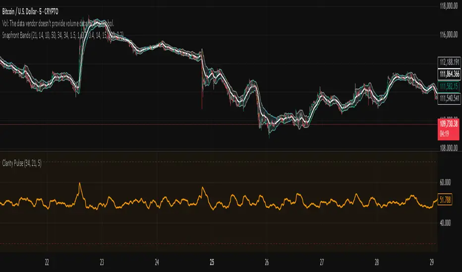
Snapfront Clarity PulseThe Clarity Pulse is a lightweight Snapfront oscillator that highlights when markets move from noisy and chaotic into clean, tradable clarity zones. It combines simple return, drift, and volume dynamics, then maps them through a φ²-based sigmoid for smooth, intuitive signals.
Features:
📊 Clean 0–100 clarity scale
🌈 Color-coded line + background shading (green = high clarity, red = noise)
📈 Alert conditions when crossing into high or low clarity regimes
⚡ Minimalist design, optimized for speed and simplicity
How to Use:
✅ When the Pulse enters the high clarity zone, trends are stronger and signals are more reliable.
❌ When it drops into the low clarity zone, conditions are noisy and prone to chop.
Use as a filter alongside your existing strategy or as a quick market condition gauge.
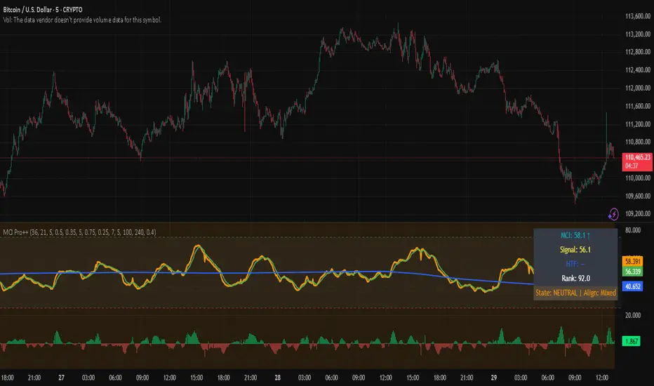
Market Clarity Index (MCI) — ProThe MCI Pro++ expands on the Lite version with deeper controls, higher-timeframe blending, slope analysis, and clarity ranking. It captures the balance between trend coherence vs. noise using entropy, drift, and volume dynamics mapped through a φ²-based sigmoid.
Key Features:
Fully adjustable weights (drift, volume shocks, entropy)
Higher-timeframe blending with adjustable weighting
Clarity slope + histogram for momentum tracking
Range rank (0–100) to spot relative extremes
Bull/Bear markers + HTF alignment markers
Optional status table with live clarity state
Trading Logic:
✅ High-clarity regime when MCI > high threshold
❌ Low-clarity regime when MCI < low threshold
Neutral otherwise; use slope, HTF alignment, and range rank as context filters.
⚠️ Invite-Only Access:
This Pro version is available by subscription through SnapfrontTech.
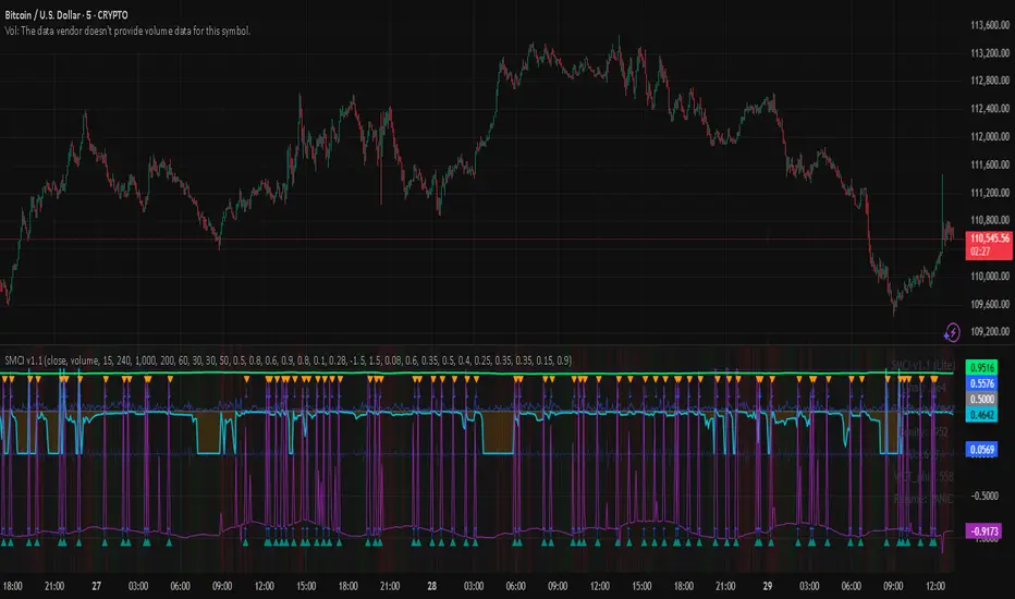
SCI - Snapfront Coherence IndicatorThe SMCI is an advanced, invite-only indicator designed to measure market coherence, volatility regimes, and trend stability. It combines entropy-based features, φ-cycle phase drivers, and custom exposure scaling into a single probabilistic framework.
Core outputs:
📈 I_hat (probability of upward drift) — coherence-weighted probability score.
📊 Exposure (scaled proxy) — dynamic sizing aligned with volatility and drawdown control.
💰 Equity curve (proxy) — running performance simulation.
🔎 WCTφ + dWCTφ — entropy-based coherence metrics.
⚠️ Regime detection — classifies conditions as Trend / Chop / Panic.
Signal Logic:
✅ Long bias when I_hat crosses above 0.5.
❌ Short bias when I_hat crosses below 0.5.
HUD overlay shows live coherence stats, exposure, and regime classification.
⚠️ Invite-Only Notice:
This script is restricted to approved users. Access requires subscription from Snapfront Technologies.
snapjames.gumroad.com
📌 Disclaimer:
For educational use only. This is not financial advice and should not be considered a trading recommendation.
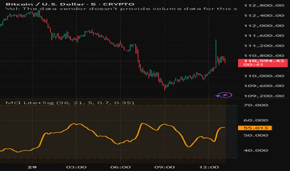
Snapfront Market Clarity Index (MCI) — LiteMarket Clarity Index (MCI) — Lite + Signals
The Market Clarity Index (MCI) measures trend clarity vs. noise using returns, drift, and volume shock dynamics. Values are normalized through a φ²-based sigmoid for smooth, interpretable signals.
Features:
Clear 0–100 scale (Lite version)
Heatmap background for clarity regimes
Bull/Bear signal arrows with EMA filter
High/Low threshold lines for easy context
Trading Logic:
✅ Bull signal when MCI crosses into the high zone with price above EMA
❌ Bear signal when MCI crosses into the low zone with price below EMA
Use MCI as a trend filter, entry trigger, or market condition gauge across any timeframe or asset.

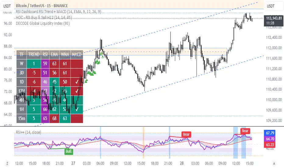
Multi Time Frame RSI [Horizonn Wealth]Multi-Time Frame Analysis: A key feature is the ability to choose a time frame for each of the four RSI lines from a predefined list (Chart, 1 day, 1 week, 1 month). The script uses the request.security() function with lookahead enabled to ensure the most accurate, real-time data is used for each calculation, eliminating look-ahead bias and calculation errors.
Visual Levels: The indicator plots standard RSI levels at 30, 50, and 70, with a shaded background between the oversold (30) and overbought (70) zones to provide a clear visual reference.
Momentum Alignment Signals: The script includes an optional feature that highlights the chart's background with a red or green color when all four RSIs simultaneously enter an overbought or oversold state. This serves as an immediate visual alert for a strong, multi-time frame momentum condition.
This indicator is a robust tool for technical analysis, suitable for traders who use a top-down approach to their market analysis.

WAE SHK Teyla 3MDesigned to detect high-pressure market moments, where momentum and volume converge to trigger explosive moves. Ideal as an entry trigger in scalping strategies, especially when paired with STC and ST-MA.
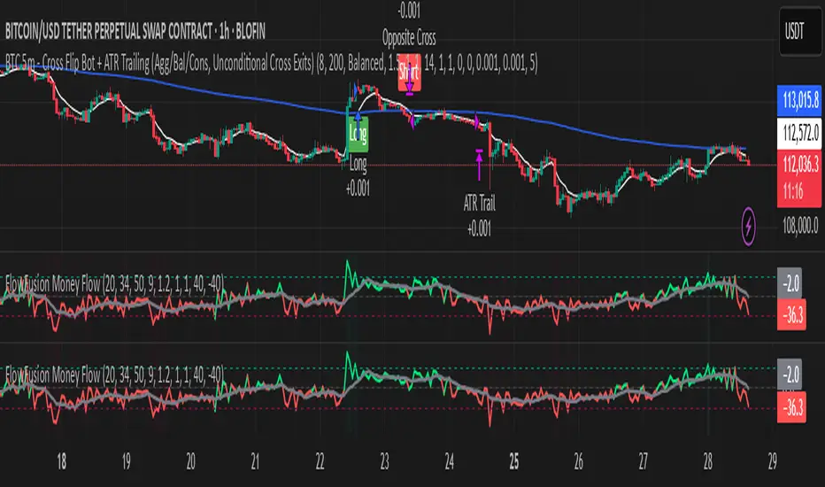
FlowFusion Money Flow — FP + VWAP Drift + PVT (−100..+100)Title (ASCII only)
FlowFusion Money Flow — Flow Pressure + Rolling VWAP Drift + PVT (Normalized −100..+100)
Short Description
Original money-flow oscillator combining Flow Pressure, Rolling VWAP Drift, and PVT Momentum into one normalized score (−100..+100) with a signal line, thresholds, optional component plots, and ready-made alerts.
Full Description (meets “originality & usefulness”)
What’s original
FlowFusion Money Flow is not a generic mashup. It builds a single score from three complementary, volume-aware components that target different facets of order flow:
Flow Pressure (FP) — In-bar directional drive scaled by relative volume.
Drive
=
close
−
open
max
(
high
−
low
,
tick
)
∈
=
max(high−low, tick)
close−open
∈ .
Relative Volume
=
volume
average volume over
𝑓
𝑝
𝐿
𝑒
𝑛
=
average volume over fpLen
volume
.
𝐹
𝑃
𝑟
𝑎
𝑤
=
Drive
×
RelVol
FP
raw
=Drive×RelVol then squashed (softsign) to
.
Why it belongs: distinguishes real pushes (big body and big volume) from noise.
Rolling VWAP Drift — Direction of VWAP itself over a rolling window, normalized by ATR.
𝑉
𝑊
𝐴
𝑃
𝑡
=
∑
(
𝑇
𝑃
×
𝑉
𝑜
𝑙
)
∑
𝑉
𝑜
𝑙
VWAP
t
=
∑Vol
∑(TP×Vol)
over vwapLen.
Drift
=
𝑉
𝑊
𝐴
𝑃
𝑡
−
𝑉
𝑊
𝐴
𝑃
𝑡
−
1
𝐴
𝑇
𝑅
=
ATR
VWAP
t
−VWAP
t−1
→ squashed to
.
Why it belongs: persistent VWAP movement signals sustained accumulation/distribution.
PVT Momentum — Price-Volume Trend standardized (z-score) and squashed.
𝑃
𝑉
𝑇
𝑡
=
𝑃
𝑉
𝑇
𝑡
−
1
+
𝑉
𝑜
𝑙
×
Δ
𝐶
𝑙
𝑜
𝑠
𝑒
𝐶
𝑙
𝑜
𝑠
𝑒
𝑡
−
1
PVT
t
=PVT
t−1
+Vol×
Close
t−1
ΔClose
.
𝑧
=
𝑃
𝑉
𝑇
−
SMA
(
𝑃
𝑉
𝑇
)
StDev
(
𝑃
𝑉
𝑇
)
z=
StDev(PVT)
PVT−SMA(PVT)
→ squashed to
.
Why it belongs: captures volume-weighted trend pressure without relying on price alone.
Composite score:
Score
=
𝑤
𝐹
𝑃
⋅
𝐹
𝑃
+
𝑤
𝑉
𝑊
𝐴
𝑃
⋅
𝑉
𝑊
𝐴
𝑃
_
𝐷
𝑟
𝑖
𝑓
𝑡
+
𝑤
𝑃
𝑉
𝑇
⋅
𝑃
𝑉
𝑇
_
𝑀
𝑜
𝑚
𝑤
𝐹
𝑃
+
𝑤
𝑉
𝑊
𝐴
𝑃
+
𝑤
𝑃
𝑉
𝑇
Score=
w
FP
+w
VWAP
+w
PVT
w
FP
⋅FP+w
VWAP
⋅VWAP_Drift+w
PVT
⋅PVT_Mom
with a Signal = SMA(Score, sigLen). Thresholds mark strong accumulation/distribution zones.
How it works (step-by-step)
Compute FP, VWAP Drift, PVT Momentum.
Normalize each to the same
scale.
Weighted average → FlowFusion Score.
Smooth with a Signal line to reduce whipsaw.
Optional background shading when Score exceeds thresholds.
How to use
Direction filter:
Score > 0 favors longs; Score < 0 favors shorts.
Momentum turns:
Score crosses above Signal → setup for long; below → setup for short.
Strength zones:
Above Upper Threshold (default +40) = strong buy pressure; below Lower (−40) = strong sell pressure.
Confluence:
Best near S/R, trendlines, or HTF bias. For scalping on 1–5m, consider sigLen 9–13 and thresholds ±40 to ±50.
Alerts included: zero cross, zone entries, and Score/Signal crossovers.
Inputs (key)
fpLen (20): relative-volume lookback for Flow Pressure.
vwapLen (34): rolling VWAP window.
pvtLen (50): PVT z-score window.
sigLen (9): Signal smoothing.
Weights: wFP, wVWAP, wPVT to bias the blend.
Thresholds: upperBand / lowerBand (defaults +40/−40).
Display: toggle component plots and background shading.
Best practices
Trending markets: increase wVWAP (VWAP Drift) or widen thresholds.
Ranging markets: increase wFP and wPVT; take quicker profits.
News: wait for bar close confirmation or reduce size.
Data quality: use consistent volume feeds (especially in crypto).
Limitations
Oscillators can stay extreme in strong trends; use structure/trend filters.
Volume anomalies (illiquid pairs, API glitches) can distort signals—sanity-check with another venue when possible.
Disclaimer
This indicator is for educational purposes only and is not financial advice. Trading involves risk; past performance does not guarantee future results. Always paper-trade first and use appropriate risk controls.
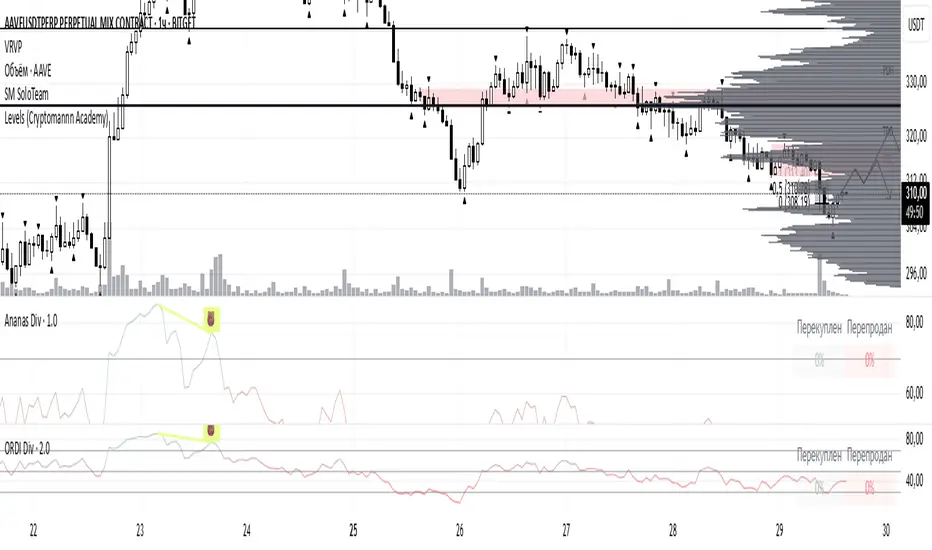
SMC Zones & Confirmations with Filters [PersianDev]these zones filtered by confirmations. confirmations are with filters.

MACD_magistraturaCustom Indicator "MACD Magistratura" — Precision in Momentum, Clarity in Structure
🔹 Why trade with outdated MACD settings?
— Classic MACD is useful, but limited:
→ One timeframe, one signal, one view,
→ Often noisy, lagging, and hard to contextualize.
— Most traders use it blind — without knowing when it works, and when it misleads.
🔹 What is MACD Magistratura?
— A custom-built evolution of the classic MACD,
— Engineered for multi-timeframe clarity,
— Designed to show not just momentum — but its hierarchy across timeframes.
🔹 Key advantages:
✅ No more clutter — one indicator replaces 2+ classic MACDs,
✅ No repaint — values are stable, based on closed candles,
✅ Clear divergence detection — compare price vs. multi-TF MACD perpendicularly,
✅ Perfect for trend confirmation — especially when combined with SMA Magistratura.

RSI_magistratura⚜️ Custom Indicator "RSI_Magistratura" — Combining the Best Oscillators in One Tool
🔹 What we’re learning:
— The difference between classic oscillators (MACD, RSI, Stochastic) and our custom RSI Magistratura indicator,
— Why using three indicators is inefficient,
— How one single tool can replace an entire arsenal.
🔹 Classic indicators: what do they show?
— MACD — convergence/divergence of moving averages,
— RSI — relative strength of price movement,
— Stochastic — price level within the current range.
📌 Common features:
→ All three show similar dynamics:
Smoothed lines,
Divergences,
Crossovers.
→ But each has its own nuances.
🔹 Why do traders combine them?
— Some use:
MACD + Stochastic → to confirm signals,
RSI + Stochastic → to assess overbought/oversold conditions,
Or all three at once — to "not miss" a signal.
📌 The problem:
— The more indicators you add — the more noise you get,
— Less space left for the actual price chart,
— Decisions become emotional, not systematic.
🔹 How many indicators are needed?
— Just for trend analysis:
→ 3–4 Moving Averages (SMA),
— Plus 3 oscillators: MACD, RSI, Stochastic,
→ Total: 7 indicators.
📌 This clutters the chart and makes it hard to see the real picture.
And it often requires a paid TradingView subscription.
🔹 How did we solve this?
— We created the custom RSI Magistratura indicator,
— It combines:
Key features of MACD, RSI, and Stochastic,
Data from all timeframes in one place.
🔹 Advantage #1: Color-coded system
— Colors match those in SMA Magistratura:
1 hour — purple,
4 hours — black/white,
1 day — aqua,
1 week — peach,
1 month — maroon,
3 months — brown.
→ Easy to remember, easy to navigate.
🔹 Advantage #2: Universality
— On any timeframe, you see:
Current,
Higher,
And up to 5 higher timeframes.
→ For example: on 15-minute chart — you see 1H, 4H, 1D,
→ On 1H — you see 4H, 1D, 1W,
→ No need to switch between multiple indicators.
🔹 Advantage #3: Precision and speed
— You see simultaneously:
Short-term fluctuations,
Mid-term trends,
Long-term context,
→ Without switching charts or timeframes.
🔹 Example: RSI across timeframes
— On Daily — RSI moves slowly,
— On 4H — faster,
— On 1H — even more responsive,
→ But crossovers and divergences remain consistent — just scaled.
📌 Important:
— You don’t need all timeframes at once,
— Enough to track: current, senior, and next one,
→ This is the perfect balance between information and clarity.
🔹 Conclusion:
— Classic indicators are good — but inefficient when used in bulk,
— The RSI Magistratura is:
A system, not a toolkit,
Simplification, not clutter,
Quality analysis, not guesswork.
💡 Use it — and you’ll see the market clearer, make decisions with more confidence.

Matts Moving Average's The 50,62,100moving average's
I use them for direction and strength also trend is easy to see
waiting for them to cross offer the best opportunities

RSI Plus – Divergence + EMA/WMARSI Plus – Divergence + EMA/WMA
This is an advanced RSI indicator designed for traders who want to maximize the power of RSI.
Beyond the standard RSI plot, this tool adds extra features to help analyze trends and identify better entry signals.
Key Features:
Standard RSI with highlighted zones (20–30, 30–40, 40–60, 60–70, 70–80)
Multiple smoothing options: SMA, EMA, SMMA, WMA, VWMA
Bullish/Bearish divergence detection with labels and alerts
WMA(45) on RSI for mid-term trend confirmation
EMA vs WMA45 color-fill (green for bullish, red for bearish)
Multi-timeframe support (Daily, H4, H1)
How to use:
Spot potential reversals with RSI divergence
Confirm trend direction when RSI EMA > WMA45 (bullish) or EMA < WMA45 (bearish)

RSI Plus – Divergence + EMA/WMAThis is an advanced RSI indicator with multi-timeframe dashboard support.
Features:
Customizable Moving Averages (EMA, WMA, SMA, VWMA, SMMA)
Divergence detection
RSI zones with background highlights
Clear buy/sell signals with visual alerts
Perfect for traders who want both classic RSI analysis and cross-timeframe confirmation in one tool.
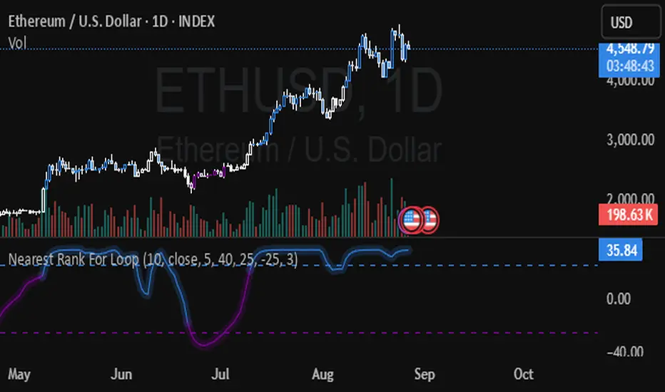
Nearest Rank For Loop - [JTCAPITAL]Nearest Rank For Loop is used for trend-following using the median of the data.
The indicator works by calculating in the following steps:
1. The median is calculated using the ranking length of the source and using "percentile nearest rank" to determine the middle value. This is done with the original length and the length devided by 3, averaged out to eliminate false signals from extremely fast and temporary market movements.
2. Over the length of the loop values get added based on the median being higher than the previous median.
3. The results of the for loop segment get smoothed out using an EMA.
--Buy and sell conditions--
-When the for loop values get above the long threshold we enter a buying condition, we dont exit the buying condition until the for loop values get below the short condition. Which signals a short.
-When the values stay between the thresholds the signal doesnt change. This and smoothing out the for loop values is used to eliminate false signals as much as possible.
--Features and Parameters--
-Allows the changing of the length of the ranking (median)
-Allows the usage of different sources
-Allows changing of the paramaters over the start and end of the for loop segment
-Allows changing the thresholds for longs and shorts
-Allows changing the parameter for the smoothing using an EMA
--Details--
Both the wide thresholds and the use of an EMA over the for loop values are used to eliminate as much false signals as possible. Aswell as deviding the length by 3 and taking the average from the medians. From testing this indicator we have found that using a very small value for the shorting gives the overall best performance. Since a fast market move wont immediately trigger a false signal, but it also wont massively delay entries and exits.
It is recommended to change the parameter settings for different asset classes and timeframes based off volatility and fast and confusing market movements.
Enjoy!
Big Mo’s Glaskugel — Macro Drawdown Risk (v1.1.2)What it does / what you see
An at-a-glance drawdown-risk oscillator that blends several macro US signals.
• A smooth, color-blended line (green→orange→red) shows the scaled risk score (0–100).
• Subtle shading marks “re-steepen warning windows” (starts when the yield curve re-steepens after an inversion; ends on normalization/cool-down).
• A compact status table summarizes: overall risk level, Yield Curve (10y–3m), Credit Stress (Baa–10y), Economy (LEI), and Valuation (CAPE).
Data used & why
Yield Curve (10y–3m) — FRED:T10Y3M. Inversions and subsequent re-steepens often precede recessions/equity drawdowns.
Credit Stress — FRED:BAA10Y vs its 1-year average (deviation in bps). Widening credit spreads flag tightening financial conditions.
Economy (LEI) — ECONOMICS:USLEI. 6-month annualized growth below a cutoff highlights macro deterioration.
Valuation (CAPE) — SHILLER_PE_RATIO_MONTH. Elevated valuations can amplify downside risk.
VIX spikes — optional boost that recognizes sudden risk repricings.
Important disclaimer
This is not a reliable or predictive indicator in all regimes. No guarantees or warranties of any kind are provided. It is not financial advice. Signals can be early, late, or wrong.
That said, it leans on well-studied warning factors (yield-curve dynamics, credit spreads, LEI weakness, valuation extremes) that have flagged major market downturns in the past.
Key customization / tweaks
Weights for each component (Yield, Credit, LEI, VIX, CAPE).
Thresholds: yield inversion months, re-steepen lookback, credit-stress bps, LEI cutoff, CAPE level, VIX spike levels.
Re-steepen boost: enable/disable, base points, half-life decay.
Shading behavior: cool-down bars to “unwarn,” max warning duration, only shade when risk ≠ green.
Scaling & smoothing: dynamic rolling max, EMA length, yellow/red thresholds.
Status table: position, and a snapshot mode to view values at a chosen historical time.

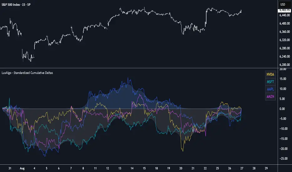
Standardized Cumulative Deltas [LuxAlgo]The Standardized Cumulative Deltas tool allows traders to compare the cumulative standardized open-close difference for up to 10 different tickers, allowing them to visualize the general sentiment for all selected tickers.
These results allow the construction of two areas showing the average or extreme bullish and bearish cumulative change for all enabled tickers, providing a summarized view of the overall ticker group sentiment.
🔶 USAGE
This tool is meant to give a full picture of the individuals and/or overall selected tickers, and unlike classical indicators, the displayed series of values is not meant to be directly interpreted over time.
Given the selected lookback period, a majority of observations being above 0 indicate an overall bullish market for the asset.
By default, the auto lookback period feature is enabled, allowing the tool to use all the visible bars for its calculations. Traders can also set the lookback period manually. The above chart uses a fixed lookback period of 500.
Up to 10 tickers can be used. While major cryptocurrencies are set by default, the users can set a specific basket of assets, such as US equities, forex pairs, commodities, etc.
🔹 Densities
The provided areas, here called densities, can be used to get an overall sentiment of the selected tickers. The upper density (bullish) processes positive deltas, while the lower one (bearish) processes negative ones.
Interpretation is subject to the selected "Density Mode".
Average: Densities track the average bullish/bearish cumulative deltas for the selected tickers. For example, a more prominent bullish density would indicate that, on average, cumulative deltas were positive across the tickers.
Envelope: Densities track the extreme values made by bullish/bearish cumulative deltas for the selected tickers. Here, a more prominent density would indicate more volatile bullish/bearish movements, depending on the density.
🔹 Dashboard
The tool features a dashboard with active tickers and their respective colors for traders' convenience.
🔶 DETAILS
🔹 Densities
Densities are obtained by applying a forward-backward exponential moving average on the average, or the highest/lowest cumulative series, depending on the selected Density Mode.
The resulting densities are smoothed by the "Smoothing" parameter located in the Settings panel, with higher values returning smoother envelopes with less variability.
Do note that the smoothing method used here is subject to repainting.
🔶 SETTINGS
Lookback: Select the lookback period and enable/disable the Auto Lookback feature
Tickers: Enable/disable and select up to 10 tickers and their colors
Density Mode: Determine how densities are calculated
🔹 Dashboard
Show Dashboard: Enable/disable the dashboard
Position: Select the dashboard position
Size: Select the dashboard size
🔹 Style
Density: Enable/disable the density areas
Bullish Density: Select the color of the top density area
Bearish Density: Select the color of the bottom density area
Smoothing: Select the smoothing constant for the EMA calculation
Adaptive Valuation [BackQuant]Adaptive Valuation
What this is
A composite, zero-centered oscillator that standardizes several classic indicators and blends them into one “valuation” line. It computes RSI, CCI, Demarker, and the Price Zone Oscillator, converts each to a rolling z-score, then forms a weighted average. Optional smoothing, dynamic overbought and oversold bands, and an on-chart table make the inputs and the final score easy to inspect.
How it works
Components
• RSI with its own lookback.
• CCI with its own lookback.
• DM (Demarker) with its own lookback.
• PZO (Price Zone Oscillator) with its own lookback.
Standardization via z-score
Each component is transformed using a rolling z-score over lookback bars:
z = (value − mean) ÷ stdev , where the mean is an EMA and the stdev is rolling.
This puts all inputs on a comparable scale measured in standard deviations.
Weighted blend
The z-scores are combined with user weights w_rsi, w_cci, w_dm, w_pzo to produce a single valuation series. If desired, it is then smoothed with a selected moving average (SMA, EMA, WMA, HMA, RMA, DEMA, TEMA, LINREG, ALMA, T3). ALMA’s sigma input shapes its curve.
Dynamic thresholds (optional)
Two ways to set overbought and oversold:
• Static : fixed levels at ob_thres and os_thres .
• Dynamic : ±k·σ bands, where σ is the rolling standard deviation of the valuation over dynLen .
Bands can be centered at zero or around the valuation’s rolling mean ( centerZero ).
Visualization and UI
• Zero line at 0 with gradient fill that darkens as the valuation moves away from 0.
• Optional plotting of band lines and background highlights when OB or OS is active.
• Optional candle and background coloring driven by the valuation.
• Summary table showing each component’s current z-score, the final score, and a compact status.
How it can be used
• Bias filter : treat crosses above 0 as bullish bias and below 0 as bearish bias.
• Mean-reversion context : look for exhaustion when the valuation enters the OB or OS region, then watch for exits from those regions or a return toward 0.
• Signal confirmation : use the final score to confirm setups from structure or price action.
• Adaptive banding : with dynamic thresholds, OB and OS adjust to prevailing variability rather than relying on fixed lines.
• Component tuning : change weights to emphasize trend (raise DM, reduce RSI/CCI) or range behavior (raise RSI/CCI, reduce DM). PZO can help in swing environments.
Why z-score blending helps
Indicators often live on different scales. Z-scoring places them on a common, unitless axis, so a one-sigma move in RSI has comparable influence to a one-sigma move in CCI. This reduces scale bias and allows transparent weighting. It also facilitates regime-aware thresholds because the dynamic bands scale with recent dispersion.
Inputs to know
• Component lookbacks : rsilb, ccilb, dmlb, pzolb control each raw signal.
• Standardization window : lookback sets the z-score memory. Longer smooths, shorter reacts.
• Weights : w_rsi, w_cci, w_dm, w_pzo determine each component’s influence.
• Smoothing : maType, smoothP, sig govern optional post-blend smoothing.
• Dynamic bands : dyn_thres, dynLen, thres_k, centerZero configure the adaptive OB/OS logic.
• UI : toggle the plot, table, candle coloring, and threshold lines.
Reading the plot
• Above 0 : composite pressure is positive.
• Below 0 : composite pressure is negative.
• OB region : valuation above the chosen OB line. Risk of mean reversion rises and momentum continuation needs evidence.
• OS region : mirror logic on the downside.
• Band exits : leaving OB or OS can serve as a normalization cue.
Strengths
• Normalizes heterogeneous signals into one interpretable series.
• Adjustable component weights to match instrument behavior.
• Dynamic thresholds adapt to changing volatility and drift.
• Transparent diagnostics from the on-chart table.
• Flexible smoothing choices, including ALMA and T3.
Limitations and cautions
• Z-scores assume a reasonably stationary window. Sharp regime shifts can make recent bands unrepresentative.
• Highly correlated components can overweight the same effect. Consider adjusting weights to avoid double counting.
• More smoothing adds lag. Less smoothing adds noise.
• Dynamic bands recalibrate with dynLen ; if set too short, bands may swing excessively. If too long, bands can be slow to adapt.
Practical tuning tips
• Trending symbols: increase w_dm , use a modest smoother like EMA or T3, and use centerZero dynamic bands.
• Choppy symbols: increase w_rsi and w_cci , consider ALMA with a higher sigma , and widen bands with a larger thres_k .
• Multiday swing charts: lengthen lookback and dynLen to stabilize the scale.
• Lower timeframes: shorten component lookbacks slightly and reduce smoothing to keep signals timely.
Alerts
• Enter and exit of Overbought and Oversold, based on the active band choice.
• Bullish and bearish zero crosses.
Use alerts as prompts to review context rather than as stand-alone trade commands.
Final Remarks
We created this to show people a different way of making indicators & trading.
You can process normal indicators in multiple ways to enhance or change the signal, especially with this you can utilise machine learning to optimise the weights, then trade accordingly.
All of the different components were selected to give some sort of signal, its made out of simple components yet is effective. As long as the user calibrates it to their Trading/ investing style you can find good results. Do not use anything standalone, ensure you are backtesting and creating a proper system.

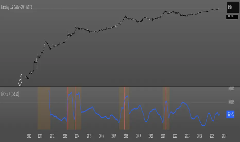
Pi Cycle OscillatorThis oscillator combines the Pi Cycle Top indicator with a percentile-based approach to create a more precise and easy to read market timing tool.
Instead of waiting for moving average crossovers, it shows you exactly how close you are to a potential market top.
Orange background means you should start preparing for a potential top and look into taking profits.
Red background means that the crossover has happened on the original Pi Cycle Indicator and that you should have already sold everything. (Crossover of the gray line aka 100)
Thank you
Bollinger Band Width Percentile - The_Caretaker
Pi Cycle Top - megasyl20