ABC Pro Ultimate S/RABC Pro Ultimate is a high-precision trading tool designed to identify harmonic ABC (Zigzag) patterns and combine them with institutional Support & Resistance levels. Unlike standard indicators that clutter your chart with noise, this script filters for high-relevance pivot points from the distant past to provide truly meaningful trade setups.
Indicatori e strategie

Body Close Continuity & failure Backtesting @MaxMaseratiThis indicator, is a highly advanced institutional-grade tool designed to track the "lifespan" of a trend based on Body Close (BC) sequences.
Unlike basic indicators that just show direction, this script analyzes the structural integrity of a trend by monitoring how many candles continue the move before a "Touch" (retest) or a "Break" (failure) occurs.
The Continuity & Failure Stats indicator tracks sequences of Bullish Body Closes (BuBC) and Bearish Body Closes (BeBC). It measures three critical phases: Building (pure momentum), Touching (price retesting the low/high of the sequence), and Resumption (price continuing the trend after a retest). It provides a statistical distribution of how long these "buildings" typically last before failing, allowing traders to know exactly when a trend is overextended.
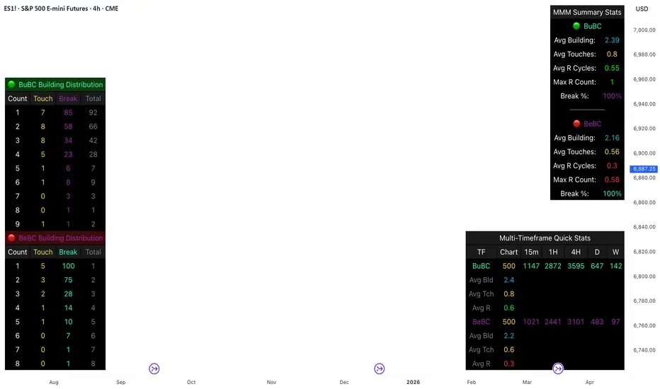
This comprehensive analysis blends the statistical breakdown of the Continuity & Failure Stats indicator to provide a deep understanding of the structural momentum for the S&P 500 E-mini (ES1!) on a 4-hour timeframe.
1. Extensive Table Breakdown
A. Building Distribution (Left Table): The Fatigue Gauge
This table acts as a histogram of momentum, tracking the "Building Count"—the number of consecutive candles closing in a trend without price returning to its origin.
Count Column: Represents the streak length (e.g., 1, 2, or 3 candles).
Touch Column: Shows how many times a streak was interrupted by a retest ("touch") but remained structurally intact.
Break Column: Counts total structural failures where price closed beyond the sequence's anchor.
Data Insight: For BuBC, 92 sequences reached Count 1, but only 28 remained by Count 4. This reveals a steep momentum decay after the 3rd candle, establishing a "Statistical Wall" where only 2 sequences in history reached a count of 9.
B. MMM Summary Stats (Top Right): The Mathematical DNA
This table provides the "Expected Value" and behavior of a trend over the lookback period.
Avg Building (2.39 for BuBC): On average, a bullish move lasts ~2.4 candles of pure momentum before a retest or reversal occurs.
Avg Touches (0.8): This low number indicates "clean" trends that rarely wobble back to retest levels multiple times before reaching a conclusion.
Avg R Cycles (0.55): This suggests that once a bullish trend is interrupted, it only successfully resumes its momentum about half the time.
Max R Count (1): Typically, once a trend is "touched," it only manages one more push before failing.
C. Multi-Timeframe (MTF) Quick Stats (Bottom Right): Trend Weight
This compares the 4H chart against other layers of the market to identify "global" alignment.
Sample Comparison: There are 3,594 tracked BuBC sequences on the 4H compared to only 142 on the Weekly chart.
Fractal Law: The Avg Building (2.4) is consistent across several timeframes, implying that the "Rule of Three" (momentum fading after 3 candles) is a fractal characteristic of this asset.
2. Table Comparison: Synthesizing the Data
To trade effectively, you must compare Distribution (timing) against Summary Stats (averages):
Continuity vs. Failure: The Summary Stats show an average building of 2.39. When checking the Distribution table at Count 2, the "Break" count (58) is already high relative to the "Total". This confirms that the risk of failure increases exponentially the moment you exceed the average.
Momentum vs. Mean Reversion: Distribution tells you when a trend is "tired". If the 4H is at a "Building Count 4" (statistically overextended) while the Weekly chart is at "Building Count 1" (fresh momentum), you may choose to prioritize the higher timeframe's strength despite the local overextension.
3. Strategic Summary & Application
This indicator proves that market momentum follows a predictable "Building" cycle rather than an infinite streak.
The "Rule of Three" for ES1! 4H:
The Entry Zone (Momentum Start): The most profitable entries occur at Building Count 1. Statistically, you have a high probability of reaching a count of 2 or 3.
The Exit Zone (Momentum Limit): Take profits or tighten stops at Count 3. The data shows the sample size drops by nearly 50% between Count 3 and Count 4.
The "Touch" Rule (Retest Reliability): If price returns to the sequence low (a "Touch"), do not expect a massive continuation. The Max R Count of 1 tells us that resumptions are usually short-lived.
Danger Zone: Entering at Building Count 4 or higher is statistically dangerous, as the "Break" probability significantly outweighs the "Touch" or continuation probability.
Kira Buy Sell EMA & VWAP Trend IndicatorThis indicator provides buy and sell signals based on short-term
momentum shifts while aligning trades with the broader market
trend.
Core logic:
• Fast and slow EMAs are used to identify short-term momentum
changes
• VWAP is applied to confirm price acceptance in the trade
direction
• A higher-period EMA is used as a trend filter to reduce
counter-trend signals
Buy signals are generated when bullish momentum aligns with
VWAP positioning and the prevailing trend. Sell signals are
generated when bearish momentum aligns with VWAP and the
broader trend direction.
This approach keeps the logic simple and responsive while
helping to avoid signals during unfavorable market conditions.
Best suited for liquid stocks and indices on intraday
timeframes such as 5-minute to 1-hour charts.
This script does not repaint and is intended as a
decision-support indicator, not a standalone trading system.

Volume And ROC Surge DetectorSharing this indicator I made for myself.
Volume and ROC are early indicators of long moves. When ROC + Volume happens together, it's BOOM.
This indicator called, Volume + ROC Surge Detector is a real-time momentum alert indicator designed to spot early institutional activity and explosive price moves. It combines Volume Surge analysis with Price Rate of Change (ROC) to identify when price and participation align.
The script monitors abnormal volume relative to a moving average and confirms direction using ROC strength. When both volume expansion and directional momentum occur together, it triggers high-confidence “Boom” signals for bullish or bearish moves.
To avoid noise, the indicator includes state-based alert control, ensuring each signal fires only once per condition change and only in real-time, not on historical bars.
Key Features
1. Detects bullish and bearish ROC momentum shifts
2. Identifies positive and negative volume anomalies
3. Flags combined Volume + ROC “Boom” events
4. Real-time alerts only (no repaint, no bar-close spam)
5. Duplicate alert prevention using internal state tracking
6. Clean on-chart visual markers for instant recognition. Disable visuals for cleaner chart.
Best Use Cases:
1. Catching breakouts and breakdowns early
2. Spotting smart money participation
3. Momentum confirmation for trend, intraday, and swing trading
4. Works across stocks, crypto, and indices
Alerts:
1. ROC Bullish Alert
When it fires:
Price Rate of Change (ROC) crosses above the positive ROC threshold
Alert messages:
🟢 ROC Change Bullish → TICKER @ price
What it means: Price momentum has turned strongly bullish. Early sign of upside acceleration
2. ROC Bearish Alert
When it fires:
Price ROC crosses below the negative ROC threshold
Alert message:
🔴 ROC Change Bearish → TICKER @ price
What it means:
Price momentum has turned strongly bearish. Early sign of downside acceleration
3. Positive Volume Surge Alert
When it fires:
Current volume exceeds
Average Volume × Volume Surge Multiplier
Alert message:
📈 +Ve Vol Change → TICKER @ volume
What it means:
Unusual participation / smart money activity. Strength entering the move
4. Negative Volume Alert (Volume Dry-Up)
When it fires:
Current volume drops below
Average Volume ÷ Volume Surge Multiplier
Alert message:
📉 -Ve Vol Change → TICKER @ volume
What it means:
Participation is fading. Trend exhaustion or consolidation risk
5. Boom Bull Alert (High-Conviction Signal)
When it fires:
Both conditions occur together:
Bullish ROC AND Volume Surge (high participation)
Alert message:
💥 Boom Volume + ROC Bull → TICKER @ price
What it means: Momentum + volume alignment. Strong breakout / continuation probability
6. Boom Bear Alert (High-Conviction Signal)
When it fires:
Both conditions occur together: Bearish ROC AND Volume Surge (high participation)
Alert message:
💣 Boom Volume + ROC Bear → TICKER @ price
What it means: Momentum + volume alignment to the downside. Strong breakdown / continuation probability
This indicator is built for traders who want clarity, speed, and signal discipline—not lagging confirmations or noisy alerts.

Daytrading Suite: Neon TPO + FVG v6.1Here is the summary of the code and the trading guide in English.
---
### 1. Code Summary: What does the chart show?
The script combines three dimensions of trading into a single chart:
* **The Context (TPO / Market Profile - Yesterday):**
* **Gold Zone (Center):** Yesterday's **POC (Point of Control)**. This was the "fairest price". It often acts as a magnet.
* **White Dashed Lines:** The **VAH (Value Area High)** and **VAL (Value Area Low)**. Yesterday, 70% of all trading volume happened between these lines. This is the area of "Balance".
* **The Structure (HTF - 1 Hour+):**
* **Red/Green Boxes (Right Edge):** Automatic **Supply & Demand Zones** based on the 1-hour chart (or your setting). They indicate major resistance and support levels.
* **The Timing (Entries):**
* **Neon FVG Boxes (Small):** "Fair Value Gaps". These represent imbalances in price. If price revisits these, it is often your **entry signal**.
* **Lines (VWAP, EMA, PDH/PDL):** Act as dynamic support and trend indicators.
---
### 2. Trading Strategy: How to use it
Do not just trade every colored spot. You must combine **Location (TPO)** with **Signal (FVG)**.
#### Step A: The Open (Where are we?)
In the morning (or at the US Open), check where the price is relative to the **white TPO lines**.
1. **Inside the White Lines (In Balance):**
* The market is undecided. Expect ranging/choppy behavior.
* **Strategy:** Buy at the bottom edge (VAL), Sell at the top edge (VAH). The target is often the Gold Zone (POC) in the middle.
2. **Outside the White Lines (Imbalance):**
* The market is seeking new prices. Danger of a Trend!
* **Strategy:** If price breaks above VAH and tests it from above -> **Long**. If it breaks below VAL -> **Short**.
#### Step B: The Setup (The High Probability Scenario)
Here is the "Rejection" Setup (Long Example):
1. Price drops to the lower white line (**VAL**) or into a green **Demand Zone**.
2. It bounces (shows a wick).
3. In the process, a small **green Neon FVG** is formed.
4. **Entry:** Limit Order at the top of the Neon FVG.
5. **Target:** The Gold Zone (POC) or the upper white line (VAH).
6. **Stop Loss:** Below the recent swing low.
#### Step C: Warning Signals (When NOT to trade)
* **In "No Man's Land":** If the price is sitting right in the middle between Gold (POC) and White (VAH/VAL), do nothing. The risk is 50/50. Wait until price hits an edge.
* **Against the Flow:** If EMA 9 and 21 are pointing steeply downwards, do not buy blindly at the VAL just because the line is there. Wait for confirmation (FVG).
### Pre-Trade Checklist:
1. **Level:** Am I at a white line (VAH/VAL) or the Gold Zone (POC)?
2. **Structure:** Do I have an HTF Demand/Supply Zone backing me up?
3. **Trigger:** Do I see a Neon FVG pointing in my direction?


Gann VooDoo Lines [NPR21]GANN VooDoo Lines
Gann Square of 9 - TOS Scale Edition is a high-precision conversion of the classic ThinkOrSwim (TOS) Gann Square of 9 tool, specifically rebuilt for Pine Script v6. It is designed for traders who rely on mathematical price rotations to identify hidden support and resistance levels.
Unlike standard horizontal line tools, this version is specifically engineered to "handshake" with the TradingView price scale, ensuring that every mathematical rotation is clearly labeled on your Y-axis for instant reference.
How to Use This Script
Define Your Anchor Point:
Find a major swing high or swing low on your chart.
Open the script Settings (gear icon) and enter this value into the Manual Anchor Price field.
Select Market Direction:
Down (Support): Use this if your anchor is a Swing High. The script will calculate support levels below that price.
Up (Resistance): Use this if your anchor is a Swing Low. The script will calculate resistance levels above that price.
Adjust the Visual Scope:
Use the Extend Right and Extend Left toggles. If both are checked, the Gann levels will act as infinite "Voodoo Lines" across your entire chart history.
The "TOS Scale" Final Step (Crucial):
To see the colored price boxes on your vertical axis, Right-click the Price Scale (the numbers on the right of your chart).
Hover over Labels and ensure Indicator Value Labels is Checked.
IMPORTANT: Uncheck the option "No Overlapping Labels." Since Gann levels are mathematically precise, they can sometimes be close together; unchecking this forces TradingView to show every single level simultaneously, just like ThinkOrSwim.

Fundamental Dashboard [Standalone]Overview
The Fundamental Strength Dashboard is a streamlined utility designed to evaluate the fundamental health of a stock directly on your chart. Instead of relying solely on price action, this indicator fetches real-time financial data to assess profitability, valuation, and financial stability.
It aggregates five core financial metrics into a single "Fundamental Score" (0-5) and displays a clear rating (Strong Buy, Buy, Neutral, or Weak/Sell) in a customizable dashboard table.
How It Works
The script analyzes the following 5 Key Fundamental Metrics. For a stock to receive a "point" for a specific metric, it must meet the criteria defined in your settings:
Net Income (Profitability): Checks if the company is actually profitable (Net Income > 0).
EPS (Earnings Per Share): Ensures the company has positive Earnings Per Share (TTM).
P/E Ratio (Valuation): Checks if the stock is valued reasonably compared to your maximum threshold (default: < 45).
Debt-to-Equity (Leverage): Analyzes financial risk. Lower is better (default: < 0.5).
ROE (Efficiency): Measures how effectively management uses equity to generate profit (default: > 15%).
The Scoring System
The indicator calculates a cumulative score based on how many of the above criteria are met:
Score 5/5 → STRONG BUY: The stock meets all profitability, valuation, and stability criteria.
Score 4/5 → BUY: The stock misses only one criterion but is otherwise fundamentally sound.
Score 0-3 → WEAK / SELL: The stock fails multiple fundamental checks (e.g., negative earnings, high debt, or overvaluation).
Features & Customization
Every trader has different risk appetites and sector preferences. You can fully customize the thresholds in the Settings menu:
Max P/E Threshold: Adjust this based on the sector (e.g., Tech stocks typically have higher P/Es than Utilities).
Min ROE %: Set your requirement for management efficiency.
Max Debt/Equity: Tighten or loosen leverage requirements.
Visuals: Change the table position (Top Right, Bottom Right, etc.) and color scheme to match your chart theme.
How to Use
Add the indicator to your chart.
Open the Settings (Gear icon).
Adjust the Dynamic Thresholds to fit the sector you are trading.
Look at the dashboard on the chart to see a snapshot of the stock's fundamental health.
Disclaimer
This script is for educational and informational purposes only. It relies on third-party financial data provided by TradingView, which may occasionally be missing or delayed. Always do your own research (DYOR) before making investment decisions.

UT Bot Decimal + HA Signals + HA VWAP (Bold White Labels)Custom UT Bot with Built in VWAP and ability to use decimal sensitivity and signals fire off of Heikin Ashi candle

Minervini Template + Powerplay detectorMinervini Template + PowerPlay Detector
This indicator implements a rule-based Minervini trend template to identify stocks in strong, institutionally supported uptrends, combined with a Power Play momentum detector for explosive leadership moves.
Minervini Model (MM) Rules
The MM dashboard turns GREEN only when all of the following rules are met:
Close ≥ 150-day SMA
Close ≥ 200-day SMA
50-day SMA > 150-day SMA
50-day SMA > 200-day SMA
150-day SMA ≥ 200-day SMA
200-day SMA is rising (current value higher than ~1 month ago)
Close is at least 30% above the 52-week low
Close is within 25% of the 52-week high
Close is not more than 8% below the 50-day SMA
These rules ensure:
Proper long-term trend structure
Institutional accumulation alignment
Strength near highs, not extended weakness
When MM is red, hovering over it shows exactly which rules failed, allowing quick diagnosis of why a stock does not qualify.
POWERPLAY Logic
POWERPLAY highlights rare, high-velocity leadership moves:
Triggers when a stock gains 90% or more within any rolling window of up to 60 trading sessions
Remains active as long as the condition continues to hold
Hover tooltip displays:
Start date of the move
Current date
Total percentage gain so far
This captures fast institutional momentum, even if the move occurs in fewer than 60 sessions.
Dashboard Features
Moveable to any corner of the chart
Adjustable size
Adjustable opacity
Designed for trend followers and momentum traders seeking true market leaders, not short-term noise or late-stage breakouts.

RSI Divergences KittenRSI Divergences + Adjustable RSI σ-Bands + Band Pierce Signals (with optional US weekend filter)
Description:
This indicator combines three RSI tools into one clean workflow:
1. RSI σ-Bands (mean ± k·σ)
It builds dynamic upper/lower bands around RSI using a moving mean and standard deviation. These bands adapt to regime changes (expanding in volatile periods, contracting in quiet periods). Bands can be clipped to RSI’s natural 0–100 range and optionally filled for readability.
2. Band “Pierce” Signals
It prints a marker when RSI crosses outside the upper band (overextension) or outside the lower band (underextension). These pierces are useful as timing signals for mean-reversion setups, especially when you expect price to revert back toward a reference mean (e.g., VWAP). Optional “re-entry” markers show when RSI crosses back inside the bands.
3. Proper RSI Divergences (Regular + Hidden)
Divergences are detected using RSI pivots (not price pivots). At each RSI pivot, the script samples the corresponding price high/low on that pivot bar and compares it to the previous pivot within a configurable bar-distance window.
• Bullish divergence: price lower low + RSI higher low
• Hidden bullish: price higher low + RSI lower low
• Bearish divergence: price higher high + RSI lower high
• Hidden bearish: price lower high + RSI higher high
Line width is configurable for visibility.
Manual Band Adjustment (Near-Miss Control):
If your best reversals “nearly” tag the band, you can manually tune sensitivity without rewriting the math:
• Band offset (RSI points): nudges trigger levels
• Band width scale: tightens/widens the σ-band envelope
US Weekend Filter (Optional):
You can optionally suppress pierce/divergence signals during US weekend hours (Fri 17:00 ET → Sun 17:00 ET) and optionally shade those periods to help isolate low-liquidity behavior.
Notes / Intended Use:
This is designed as a mean-reversion timing tool, not a standalone trading system. For best results, combine signals with a market “mean” (e.g., rolling VWAP) and basic risk controls.

ATR Volatility FilterA Basic Volatility Filter
3 Modes
1- Absolute ATR filter
2- Filter Based on ATR threshold relative percentage of the price
3- ATR Threshold relative to its moving average

XAUUSD M15 FINALDetects when xausd enters a healthy directional phase during the NY session, and only flags entries with real momentum and controlled volatility.

Maestro 4hThis indicator is designed to help traders analyze market trends and identify potential trading opportunities.
It provides clear visual signals based on price behavior and technical calculations, allowing traders to better understand market structure, momentum, and direction.
The indicator can be used on any market and timeframe, making it suitable for both intraday and swing trading.
It is intended as a decision-support tool and should be used in combination with proper risk management and other forms of analysis.

Mass Sentiment & Contrarian (Only Signals)
________________________________________
📘 Contrarian Mass Sentiment Indicator Manual
This indicator is designed to identify moments of psychological exhaustion in the market. Its philosophy is "buy panic and sell euphoria."
1. Where and how is the data taken from?
The indicator analyzes three real-time data sources to filter the signals:
• Psychology (RSI): We use the Relative Strength Index (RSI) to measure the speed and change in price movements.
• If the RSI is very high (>70-75), the "mass" is overbuying (greed).
• If the RSI is very low (<25-30), the "mass" is overselling (panic).
• Price Action (Candlesticks): It is not enough for the RSI to be at an extreme. The indicator looks for reversal patterns (Hammer, Shooting Star, or Engulfing candlesticks). This confirms that the price has indeed found a top or bottom.
• Price Action (Candlesticks): It is not enough for the RSI to be at an extreme. The indicator looks for reversal patterns (Hammer, Shooting Star, or Engulfing candlesticks). This confirms that the price has actually found a top or bottom.
• Price Action (Candlesticks): • Market Effort (Volume): At "Strong" levels, the indicator requires volume to exceed its 20-period moving average. This identifies a volume climax, which typically marks the end of a move.
________________________________________
2. User Manual: Signal Interpretation
The indicator classifies opportunities according to their probability of success:
A. Intensity Levels
Label Strength Meaning Suggested Action
F-VTA / F-CPA Strong Maximum euphoria/panic + Volume + Reversal candle. High probability signal. Look for immediate entry.
M-VTA / M-CPA Medium Standard overload level + Reversal candle. Solid technical confirmation. Trade in favor of the structure.
D-VTA / D-CPA Weak The RSI is just beginning to reverse from moderate levels. Early warning. Do not enter without confirmation using other tools.
B. Trade Execution (Contrarian)
1. Location: Wait for a label to appear. The best are the Strong (F) or Medium (M) lines.
2. Stop Loss: Always place it a few pips/points above the high of the signal candle (for selling) or below the low (for buying).
3. Take Profit: * Target 1: The mid-RSI level (50).
or Target 2: The opposite RSI band (if you sold at 70, aim to close at 30).
________________________________________
3. Golden Tips
• Avoid sideways markets: In very narrow ranges, the RSI can give false signals ("wobbling"). Look for signals that occur after a clear and extended trend.
• Timeframes: The indicator is most reliable on 15-minute, 1-hour, and 4-hour timeframes. On the 1-minute timeframe, market "noise" can generate constant weak signals.
• Confluence: If you see an F-VTA (Strong Sell) signal right at a historical price resistance, the probability of success increases dramatically.

HMA Direction Scalping + Liquidity Zones + Metricsuses hma to determine buy and sell using 9hma for direction.

NeuralFlow Forecast Levels - User InputsThis is a companion indicator that plots AI-adaptive market equilibrium and expansion mapping levels directly on the SPY chart.
NeuralFlow Forecast Levels are generated through a Artificial Intelligence framework trained to identify:
Where price is statistically inclined to re-balance
Where expansion zones historically exhaust rather than extend
This is structure mapping, not prediction.
......................................................................................
What the Bands Represent?
AI Equilibrium (white core)
Primary weekly balance zone where price is most likely to mean-revert.
Predictive Rails (aqua / purple)
High-confidence corridor of institutional flow containment.
Outer Zones (green / red)
Expansion limits where continuation historically begins to decay.
Extreme Zones (top / bottom)
Rare deviation envelope where auction completion is statistically favored.
.The engine updates only when underlying structure changes —
not when candles fluctuate intraday.
.................................................................................................................
Usage Context
These levels are contextual reference zones, not entry signals. They are designed to answer:
Where does price matter?
Where does continuation weaken?
Where does balance statistically reassert itself?
Risk Disclaimer
Educational and analytical use only. Not financial advice.

Supply-Demand Dominance & Energy RibbonOverview:
This indicator is specifically fine-tuned for the Nasdaq (NAS100) market. It combines volume-based Delta analysis (Supply-Demand) with price kinetic energy (Slope) to identify high-probability reversal points and trend strength.
Key Features & Usage:
Supply-Demand Dominance (Top-Right Label):
Analyzes volume spikes over a 50-period lookback to determine market control.
Displays "매수 우위" (Bullish Dominance) or "매도 우위" (Bearish Dominance) in real-time.
Energy Ribbon (Bottom Visualization):
Calculates the slope of the TCI oscillator to visualize momentum intensity.
Solid Green/Red: Strong momentum.
Faded Green/Red: Weakening momentum or minor trend.
Momentum Combo Signals (Circle Shapes):
Triggered when WaveTrend and TCI oscillators cross in extreme zones (Overbought 70 / Oversold 30).
Smart Filter: Signals are only shown when they align with the current Supply-Demand dominance, reducing "market noise."
Volume Spikes (Arrow Symbols):
Indicates abnormal volume activity (1.5x average delta). These arrows (↑/↓) help identify potential breakout points or the climax of a move even when a full combo signal isn't present.

Continuation Failure Engine 2-F2 (A+ Only)Continuation Failure – High-Prob 2-F2 (A+ Only)
Best Timeframe: 15-minute chart
Usage:
Designed to detect high-probability 2-bar continuation failures (Failed 2 setups) graded A+. Works best when combined with the Strat Structure Engine 3-F2 Tiered. You will also find the same high-probability failures occurring in the 3-F2 setups, providing complementary confirmation.
Key Areas for Setup Identification:
Session highs and lows from Sessions & ICT Killzones (0xCryptoVince)
Fair Value Gap Extend FVG to 300
Strat Assistant
30-minute Opening Range Breakout (ORB)
VWAP
Signal Logic:
Failed 2-Up (red label): Price attempted upward continuation but reversed — potential short.
Failed 2-Down (green label): Price attempted downward continuation but reversed — potential long.
A+ Grade Criteria: Strong ATR range, close against trend, large body, above-average volume.
Alerts: Configurable for all A+ setups, triggers at bar close when a 2→F2 occurs.
Notes: Use this script to identify high-probability failures at the defined key zones. Works best in conjunction with the 3-F2 structure for a complete Strat analysis and to locate overlapping failure setups.
Supplementary Information / Facts:
What a Failed 2 actually represents (fact)
In The Strat, a Failed 2 is objectively defined as:
Price attempts continuation in one direction (breaks a prior high or low),
Fails to follow through, and
Closes back inside / opposite.
That is not just a candle pattern — it is failed acceptance of price, which aligns with auction market theory:
Markets probe for value
If participation is weak → rejection occurs
Source: CME Group – Understanding Market Profile & Auction Theory
Why session highs/lows matter (fact)
Asia / London / NY highs & lows are:
Liquidity pools
Areas where resting stop orders accumulate
Known reference points for both discretionary and systematic traders
Large participants expect liquidity there. When price breaks a session high/low:
Stops trigger
Liquidity is accessed
If no higher-timeframe acceptance appears → price snaps back
That snapback is exactly what your Failed 2 is capturing.
Source: CME Group – Liquidity, Stops, and Market Structure
Why VWAP keeps lining up (fact)
VWAP is not mystical — it is:
The average price weighted by volume, used institutionally as a fair-value benchmark.
Institutions actively defend VWAP:
Above VWAP = favorable for longs
Below VWAP = favorable for shorts
When price:
Extends away from VWAP,
Attempts continuation,
Fails and reclaims VWAP,
You often get a Failed 2 reversal because the auction rejected “unfair” price.
Source: Berkowitz et al., VWAP Trading Strategies (Journal of Trading); CME Group – VWAP as Institutional Benchmark
Why Fair Value Gaps are magnets for Failed 2s (fact + interpretation)
Fact: A Fair Value Gap (FVG) represents:
Inefficient price discovery
One-sided aggressive order flow
Thin participation
Markets statistically revisit inefficiencies.
What happens at an FVG:
Price returns
Liquidity is tested
Either acceptance or rejection occurs
When price:
Tags an FVG,
Attempts continuation,
Immediately fails,
You get a textbook Failed 2 at an inefficiency — the market saying:
“We checked — no agreement here.”
Source: ICT Concepts (FVG definition); CME Market Microstructure Research on inefficiencies
Concise, Factual Summary / Market Logic:
Liquidity Concentration: Session highs/lows and VWAP are key points where liquidity (orders) naturally accumulates. Price reacting there creates conditions for patterns like your Failed 2 setups.
Market Efficiency: VWAP represents fair value in the session, so price churn near it can trigger imbalance formations or pattern failures.
Imbalance Correction: FVGs are inefficiencies — when price interacts with them after an impulsive move, setups often occur because unfilled orders and market makers revisit those prices.
Confluence = Higher Probability: The strongest reactions happen when FVGs overlap session highs/lows or interact with VWAP, because confluence magnifies where market structure and liquidity converge.

Long Short Trading System With TableSmart Trading System Pro is an advanced TradingView indicator designed for precision and clarity.
It combines Order Blocks, Liquidity Zones, EMA trend alignment, MACD, RSI, Volume, and ATR-based risk management to generate high-quality LONG / SHORT signals.
🔹 Clear trade direction
🔹 Smart entry, stop-loss & multi-level take-profit
🔹 Automatic risk/reward & leverage calculation
🔹 Clean visual dashboard for fast decision-making
Built for traders who value structure, confirmation, and risk control.
Best suited for crypto, forex, and indices on all timeframes.
Disclaimer:
This indicator is for educational and informational purposes only and does not constitute financial advice.
Trading involves risk, and past performance does not guarantee future results.
You are solely responsible for your trading decisions and outcomes.

Witch-Fire ALMA signals: Dynamic Liquidity & Trend GlowThe Witch-Fire ALMA is a high-precision trend bias and liquidity mapping tool designed for price action traders and Smart Money practitioners. Unlike traditional indicators that clutter your chart with lagging signals, this script provides a "clean-yet-powerful" visual anchor to help you stay on the right side of the market while identifying key Points of Interest (POIs).
At its core, the script utilizes an optimized Arnaud Legoux Moving Average (ALMA). Known for its superior ability to balance smoothness and responsiveness, the ALMA effectively filters out market noise and "whipsaws" that often plague standard EMAs.
Key Features:
The Witch-Fire Glow: A neon-styled ALMA line that shifts between Bullish Green and Bearish Red. The white core provides surgical precision for price intersection, while the outer glow visualizes the strength and dominance of the current trend.
Scaled Liquidity Levels: Automatically maps Buy Side Liquidity (BSL) and Sell Side Liquidity (SSL). These levels are dynamic—they scale proportionally with your ALMA settings. This ensures that the liquidity zones you see are always relevant to the trend cycle you are analyzing.
Strategic Bias Background: A subtle background tint provides an instant psychological filter. Only look for Longs in the green zone and Shorts in the red zone to maintain a high-probability strike rate.
How to Trade with Witch-Fire:
Identify the Bias: Look at the Fire ALMA. If the "fire" is red and the price is below the line, your bias is strictly bearish.
Watch the Sweeps: Wait for the price to "sweep" (pierce with a wick) the horizontal SSL (Green) or BSL (Red) lines.
Execution: Look for a strong rejection candle (long wick, small body) at these levels that closes back towards the ALMA line.
Best Used On: 15m, 1H, and 4H timeframes. Works exceptionally well for Crypto, Forex, and Indices.

Cantillon Risk Calculator [Free]Overview Stop guessing your position size. The Cantillon Risk Calculator is a lightweight utility that instantly tells you exactly how many units (Contracts/Coins) to buy based on your account size and risk percentage.
How to Use
Open Settings.
Enter your Account Size (e.g., $10,000) and Risk % (e.g., 1%).
Type in your Stop Loss price.
The table instantly shows your Position Size.
Looking for High Probability Setups? Risk management is only half the battle. To find where to enter using Institutional Order Blocks and Sigma Bands, you need the Cantillon Terminal .

VWAP Extreme Zones (Elite Style)Short Description
VWAP Extreme Zones (Elite Style) highlights statistically stretched price areas above and below VWAP, helping traders identify potential overextension, mean-reversion zones, and high-risk breakout areas during intraday sessions.
Disclaimer
This indicator is provided for educational and analytical purposes only.
It does not constitute financial advice or trade signals.
All trading involves risk. Always confirm with price action, market context, and proper risk management before taking any trade.
