Quarterly Financials on Chart with Estimates by SpeedEdge)# Quarterly Financials on Chart with Estimates
## WHAT THIS SCRIPT DOES
This indicator displays comprehensive quarterly financial data directly on your trading chart, eliminating the need to switch between charting and fundamental analysis platforms. The script automatically fetches and organizes key financial metrics including earnings per share (EPS), revenue, operating margins, depreciation & amortization, and quarterly estimates alongside actual results for comparative analysis.
## WHY THIS COMBINATION IS ORIGINAL AND USEFUL
**The Problem Solved:** Traders conducting fundamental analysis typically need to toggle between trading charts and separate financial platforms to view quarterly results, estimates, and year-over-year comparisons. This workflow is inefficient and makes it difficult to correlate price movements with earnings announcements.
**The Solution:** This script integrates fundamental financial data directly into the price chart environment, providing:
- Side-by-side comparison of quarterly estimates versus actual results
- Automatic calculation of Quarter-over-Quarter (QoQ) and Year-over-Year (YoY) growth rates
- Color-coded visualization of financial performance trends
- Regional number formatting (Indian Crores or Global Billions/Millions)
- Key valuation metrics (Market Cap, Free Float, PEG Ratio, CFO/EBITDA) in header
**Unique Features:**
1. **Dual Number Format System**: Automatically formats financial figures in Indian Crores (Cr, K Cr, L Cr) or Global formats (M, B, T) based on user preference
2. **Estimate Integration**: Shows analyst estimates for upcoming quarters alongside historical actuals for beat/miss analysis
3. **Intelligent Growth Analysis**: Automatically calculates and color-codes quarterly and yearly growth comparisons with smart handling of missing data
4. **Context-Aware Color Coding**: Green/red visualization adapts based on metric type - growth metrics, cash flow quality indicators, and expense trends each use appropriate color logic
5. **Configurable History**: Display 4 to 20 previous quarters based on analysis needs
## HOW THE SCRIPT WORKS TECHNICALLY
### Core Methodology:
**1. Financial Data Integration:**
The script accesses quarterly and annual financial statement data from public company filings, including:
- **Earnings Estimates**: Analyst consensus forecasts for upcoming quarters
- **Quarterly Actuals**: Reported earnings per share, revenue, margins, and operating expenses
- **Key Ratios**: Shares outstanding data, valuation multiples, and cash flow metrics
All data is sourced from TradingView's fundamental database, which aggregates information from official regulatory filings (10-Q, 10-K, annual reports) filed by publicly traded companies.
**2. Historical Data Organization:**
The script employs a sophisticated data structure system that:
- Detects when new quarterly results are released by monitoring data changes
- Automatically indexes financial data by quarters relative to the current date
- Creates a chronological timeline of financial performance
- Maintains historical records for comparison calculations
- Updates dynamically as new earnings are reported
**3. Intelligent Number Formatting:**
**Indian Regional Format:**
- Converts absolute values to Crore denomination (1 Crore = 10 Million)
- Scales to Thousand Crores (K Cr) for mid-size companies
- Scales to Lakh Crores (L Cr) for large corporations
- Appropriate for analyzing Indian market stocks
**Global Standard Format:**
- Uses Million (M) for smaller companies
- Scales to Billion (B) for mid-cap and large-cap stocks
- Uses Trillion (T) for mega-cap corporations
- Thousands (K) for smaller financial figures
- Standard across US and international markets
**4. Comparative Growth Analysis:**
**Quarter-over-Quarter (QoQ) Calculations:**
The script compares each quarter's performance against the immediately preceding quarter to identify:
- Sequential growth trends
- Momentum acceleration or deceleration
- Short-term business trajectory
- Seasonal pattern changes
**Year-over-Year (YoY) Calculations:**
Compares each quarter against the same quarter from the previous year to:
- Eliminate seasonal effects
- Identify sustainable growth trends
- Normalize for business cycles
- Provide apples-to-apples comparison
Both calculations automatically handle edge cases like missing data, account for different fiscal year conventions, and provide meaningful "N/A" indicators when comparative data is unavailable.
**5. Adaptive Color Coding System:**
**Growth Metrics (EPS, Revenue):**
- Positive growth → Green shading indicates improving performance
- Negative growth → Red shading signals declining performance
- Missing data → Gray indicates insufficient information
**Quality Indicators (Free Float %):**
- Lower float (<40%) → Green indicates potentially better supply-demand dynamics
- Higher float (≥40%) → Red suggests more diluted ownership
**Cash Flow Quality (CFO/EBITDA):**
- Strong cash conversion (≥50%) → Green shows quality earnings
- Weak cash conversion (<50%) → Red flags potential accounting concerns
**Expense Trends (Depreciation & Amortization):**
- Decreasing D&A → Green indicates improving cash flow characteristics
- Increasing D&A → Red suggests rising capital intensity
- Stable D&A → Default color shows consistency
**Future Estimates:**
- Yellow coloring clearly distinguishes forward-looking estimates from historical actuals
**6. Date and Quarter Intelligence:**
The script automatically:
- Determines the current financial quarter based on real-time date
- Maps calendar months to fiscal quarters (Q1-Q4)
- Handles different fiscal year conventions globally
- Calculates quarter differentials for accurate historical lookback
- Formats display labels showing quarter-end months and years (e.g., "Mar 24", "Dec 23")
### Advanced Calculations:
**Free Float Percentage:**
Calculates the proportion of shares available for public trading relative to total shares outstanding. Lower percentages indicate more concentrated ownership, which can affect volatility and liquidity.
**Market Capitalization:**
Real-time calculation using total shares outstanding multiplied by current market price, automatically updated with each price tick and formatted according to regional preferences.
**CFO/EBITDA Cash Quality Ratio:**
Measures what percentage of accounting earnings converts to actual operating cash flow. Higher ratios indicate better earnings quality and less aggressive accounting. Industry standards vary, but 60-100% typically signals strong cash generation.
**Operating Profit Margin Tracking:**
Monitors the percentage of revenue retained as operating profit after deducting operating expenses, providing insight into operational efficiency and pricing power trends.
## HOW TO USE THIS SCRIPT
### Initial Setup:
**1. Region Configuration:**
- **India**: Select for Indian stocks - formats numbers in Crores (₹10M = 1 Cr)
- **Global**: Select for international stocks - formats in Millions/Billions
**2. Display Settings:**
- **Position**: Choose table location on chart (Top Right recommended)
- **Table Size**: Adjust based on screen resolution (Normal is default)
- **Short Labels**: Enable to condense industry/sector names for space saving
- **Lookback Quarters**: Set how many previous quarters to display (4-20, default 5)
**3. Visual Customization:**
- **Background Color**: Customize table background color and transparency
- **Text Color**: Adjust text color for visibility
- **Border/Frame Colors**: Modify table borders for preferred appearance
### Reading the Dashboard:
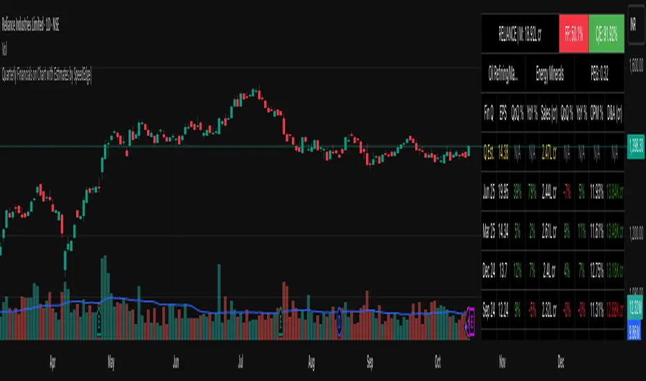
**Header Section (Top 3 Rows):**
**Row 1:**
- **Ticker | Mcap**: Company symbol and current market capitalization
- **FF (Free Float)**: Percentage of freely traded shares (Green < 40% is positive, Red ≥ 40%)
- **CFO/EBITDA**: Cash flow quality ratio (Green ≥ 50% is positive, Red < 50%)
**Row 2:**
- **Industry**: Company's specific industry classification
- **Sector**: Broader sector classification
- **PEG Ratio**: Price/Earnings to Growth ratio (< 1 traditionally considered undervalued)
**Data Section:**
**Column Explanations:**
1. **Fin Q**: Financial quarter (format: "Mar 24" = Q4 FY2024 ending March)
2. **EPS**: Earnings Per Share in reporting currency
3. **QoQ %**: EPS growth versus previous quarter (Green = increase, Red = decrease)
4. **YoY %**: EPS growth versus same quarter last year
5. **Sales**: Total revenue (formatted in Cr or M/B based on region)
6. **QoQ %**: Revenue growth versus previous quarter
7. **YoY %**: Revenue growth versus same quarter last year
8. **OPM %**: Operating Profit Margin percentage
9. **D&A**: Depreciation & Amortization (Green if decreasing = cash flow positive)
**Estimates Row (Yellow Text):**
- Shows "Q Est." for upcoming quarter
- Displays analyst consensus estimates for EPS and Sales
- Compare actuals against estimates after earnings release to identify beats/misses
### Trading Applications:
**Fundamental Analysis:**
- **Earnings Quality Check**: Look for consistent QoQ and YoY growth in both EPS and Sales
- **Margin Trend Analysis**: Monitor OPM % changes to assess operational efficiency
- **Estimate Comparison**: Identify stocks that consistently beat or miss estimates
- **Cash Flow Validation**: Use CFO/EBITDA ratio to verify earnings quality
**Entry/Exit Timing:**
- **Post-Earnings Analysis**: Check if stock beat estimates and by what margin
- **Trend Confirmation**: Strong YoY growth + improving margins = positive fundamentals
- **Warning Signs**: Declining margins, negative growth, or deteriorating CFO/EBITDA
**Portfolio Screening:**
- **Growth Stocks**: Look for consistent QoQ and YoY EPS/Sales growth
- **Value Stocks**: Low PEG ratios combined with positive fundamentals
- **Quality Filter**: High CFO/EBITDA ratios (>75%) indicate superior cash generation
### Interpretation Guidelines:
**Strong Fundamental Setup:**
- YoY growth > 15% in both EPS and Sales
- QoQ growth positive for 2+ consecutive quarters
- OPM % stable or improving
- CFO/EBITDA > 60%
- Actual results exceed estimates
**Concerning Signals:**
- Declining YoY growth rates
- Shrinking operating margins
- Consistently missing estimates
- CFO/EBITDA < 40%
- Increasing D&A as percentage of revenue
## IMPORTANT USAGE NOTES
**Data Limitations:**
- Financial data depends on official company filings and reporting schedules
- Some stocks may have incomplete historical data depending on listing history
- Estimates may not be available for all companies, especially smaller-cap stocks
- Data updates occur after official earnings releases, not in real-time during announcements
**Realistic Expectations:**
- This tool displays historical fundamental data for analysis - not predictive signals
- Always verify critical financial data with official company filings when making investment decisions
- Fundamental analysis should complement technical analysis, not replace it
- Past financial performance does not guarantee future results
- Earnings estimates are analyst opinions, not certainties
**Best Practices:**
- Cross-reference important data points with company investor relations pages
- Consider industry-specific metrics beyond the displayed general figures
- Use in conjunction with technical indicators for comprehensive analysis
- Monitor for data anomalies (stock splits, accounting changes, restatements) that may affect comparisons
- Understand that different accounting standards (GAAP vs IFRS) may affect international comparisons
**Regional Considerations:**
- Indian stocks: Numbers in Crores (1 Cr = 10 Million Rupees)
- Global stocks: Numbers in standard M/B/T format
- Currency conversions are not performed - data shown in reporting currency
- Fiscal year conventions vary by region (India typically uses Apr-Mar fiscal year, US uses Jan-Dec or custom fiscal years)
- Different markets have different reporting timelines and requirements
## CONFIGURATION RECOMMENDATIONS
**For Indian Stocks:**
- Region: India
- Lookback: 5-8 quarters (recommended)
- Focus on YoY growth due to seasonal business patterns in many Indian companies
**For US/Global Stocks:**
- Region: Global
- Lookback: 4-6 quarters for tech/growth stocks
- Lookback: 8-12 quarters for cyclical/industrial stocks
- Monitor QoQ trends closely for rapid-growth sectors
**For Long-term Investors:**
- Increase lookback to 12-20 quarters to see multi-year trends
- Focus on consistency rather than individual quarter volatility
- Pay close attention to CFO/EBITDA quality metric for sustainable businesses
- Look for stable or improving margins over extended periods
**For Active Traders:**
- Use 4-6 quarter lookback for recent trend focus
- Concentrate on latest QoQ trends and estimate beats/misses
- Monitor table closely before/after earnings announcements
- Compare estimate versus actual immediately post-earnings for trading opportunities
**For Swing Traders:**
- 6-8 quarter lookback provides good balance
- Focus on acceleration/deceleration in growth rates
- Use margin trends to identify operational inflection points
- Combine with technical analysis for optimal entry/exit timing
This script serves as a comprehensive fundamental analysis tool for traders and investors who want seamless chart integration of financial data without workflow interruption, enabling faster and more informed decision-making.
Revenue
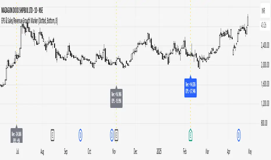
EPS, Revenue & NPM Growth Marker v2This indicator visually tracks fundamental growth by plotting smart labels on earnings dates, showing three key metrics:
EPS (Earnings Per Share)
Revenue (Sales)
Net Profit Margin (NPM)
It overlays compact, readable labels on the chart allowing you to evaluate a company's financial performance — both sequentially (QoQ) and annually (YoY).
EPS, Revenue & NPM Growth Marker v2 uses both official earnings data and fallback logic (EPS/Revenue/NPM changes) to ensure consistent detection of earnings events.
⭐ Key Features
Three Metrics: Displays EPS, Revenue, and Net Profit Margin
Growth Breakdown: Shows Absolute, Quarter-over-Quarter %, and Year-over-Year % change
Smart Arrows: Trend direction shown with emoji arrows (🡩🡫)
Earnings Detection: Aligns labels to official earnings events or fallback data
Highly Customizable: Full control over visible metrics, growth types, label style, placement, and max label count
Clean Display: Keeps the chart clean with a limit on max labels
⚙️ Customization Options
You can personalize the indicator to match your charting style:
Select metrics to display: EPS, Revenue, NPM
Toggle row types: Absolute, QoQ %, YoY %
Choose label position: Above Bar, Below Bar, Top, or Bottom
Customize line style, colors, and label text color
Set the maximum number of labels shown on chart
🧠How It Works
Absolute Value: Latest reported figure for each metric (e.g., EPS = ₹3.20)
QoQ % Change: (Current - Previous Quarter) / |Previous| * 100
YoY % Change: (Current - Same Quarter Last Year) / |Previous Year| * 100
The script uses TradingView’s request.earnings() data when available. If official earnings data is missing, it intelligently detects earnings events based on changes in EPS, Revenue, or NPM figures.
This is a major update to EPS & Sales/Revenue Growth Marker script, with expanded metrics, enhanced logic, and greater customization.
Developed & Published by: @learningvitals

Greer Value📈 Greer Value
This indicator evaluates the year-over-year (YoY) growth consistency of five key fundamental metrics for any stock:
Book Value Per Share
Free Cash Flow
Operating Margin
Total Revenue
Net Income
The script tracks whether each metric increases annually based on financial statement data (FY), then calculates both individual and aggregate increase percentages over time. A color-coded table is displayed on the most recent bar showing:
Raw counts of increases vs. checks per metric
Percentage of years with growth
Overall "Greer Value" score indicating total consistency across all five metrics
✅ Green = Strong YoY growth
❌ Red = Weak or inconsistent growth
Use this tool to help identify fundamentally improving companies with long-term value creation potential.

EPS & Sales/Revenue Growth MarkerThis script plots the Revenue Growth and EPS Growth % on Earnings Date.
Idea Credit: Special thanks to @dharmeshrbhatt for inspiring the concept behind this tool.
Developed and Published by learningvitals.
Plots Revenue Growth % and EPS Growth % on earnings date.
Choose label position: Above Bar, Below Bar, Top, or Bottom.
Customizable growth colors based on combined EPS and Revenue performance.
Customizable line style and colors.
Controls max number of labels to keep the chart clean.
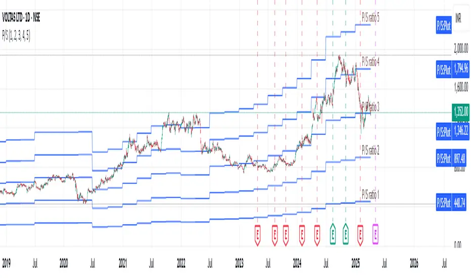
Revenue GridDescription:
The Revenue Grid indicator helps traders and investors visualize a stock’s valuation by plotting horizontal lines based on its price-to-sales (P/S) ratio. This tool displays how the stock price compares to multiples of its total revenue per share, giving a clear perspective on valuation benchmarks.
Fundamental Concept:
The price-to-sales ratio compares a company’s stock price to its revenue per share. It’s used to evaluate whether a stock is overvalued or undervalued based on its revenue.
This indicator offers a unique way to view this ratio by applying Fibonacci multiples to the revenue per share. It plots lines at these multiples to show how the stock price measures up against different valuation levels.
How It Works:
Data Inputs:
Total Revenue (TR): The company’s revenue over the past twelve months.
Total Shares Outstanding (TSO): The total number of shares in circulation.
Calculation:
Calculates the revenue per share (TR/TSO).
Plots lines at fixed Fibonacci multiples (e.g., 1x, 2x, 3x, 5x, 8x, 13x) of the revenue per share value.
How to Use:
1. Add the "Revenue Grid" indicator to your chart by searching for it in the indicator library and applying it.
2. Observe the lines plotted on the chart. If these lines are trending upwards, it indicates that the revenue is increasing.
3. Analyze how historical prices trend relative to these lines. Look for periods where the stock price supports around specific multiples, you can easily get a sense of overvaluation or undervaluation in certain periods.
Use this information to guide further analysis and investment decisions.
Benefits:
1. Clear Valuation View: Easily see how the company’s revenue translates into stock price levels.
2. Investment Insight: Identify if the stock price is lagging behind revenue growth, which might signal a buying opportunity.
3. Historical Context: Understand how the market has historically valued the company and assess the current valuation.
Do let me know your feedbacks in comments. Happy Investing :)
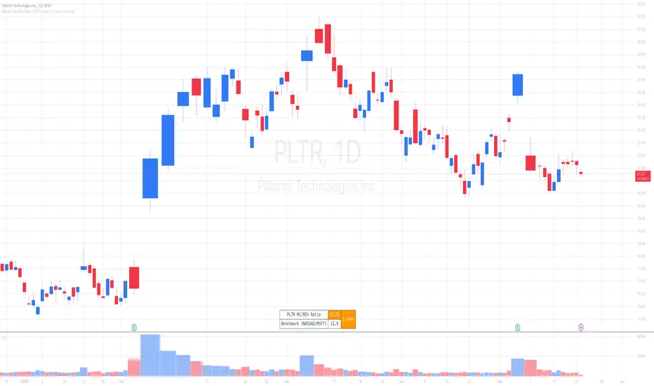
Market Cap / Revenue RatioA variation of the P/S ratio, this script takes the future estimated revenue of the current stock versus it's Market Cap. It then compares the aforementioned Market Cap:Revenue ratio against a market bellwether's corresponding ratio (MSFT by default) to determine the following:
- Light green when the ratio is extremely low (Stock is very undervalued)
- Green when the ratio is low (Stock's multiple is lower by 20-50%)
- Blue when the ratio is close to the benchmark (Stock is fairly valued to benchmark multiple)
- Red when the ratio is high (Stock's mulitple is higher by 50% or more)
- Dark red when the ratio is extremely high (Stock is very overvalued)
CONFIGURABLE
- Full Table: Show the entire calculation table
- Minimalist: Go minimal and show only the ratio and color code
- Show Benchmark Multiple: Show the multiple ratio calculated between the current stock and the benchmark stock (MSFT by default)
NOTES
- When calculating the Market Cap, TradingView sometimes under-reports the number of shares and thus skews the Market Cap too low. This seems to happen for stocks with multiple share classes like GOOGL so be mindful that the data can be wrong for these kinds of stocks. You can check on this by going into the Indicator's Settings and select Show Full Table which will show the number of shares outstanding reported by TradingView.
- For certain stocks such as foreign ADRs, there won't be a future revenue estimate so the script will automatically use the Total Revenue for the most recent Quarter in these cases
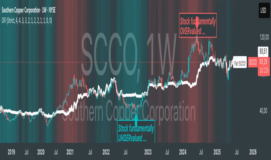
Oster's Fair Index (OFI)Note : Excitingly, this indicator is optimized to work exclusively with weekly candles (1W) ! Because fundamental analyses, with their longer-term outlook, thrive on the broader perspective provided by weekly data.
Overview:
Oster's Fair Index (OFI) stands out as a sophisticated indicator to offer traders a comprehensive assessment of a stock's fundamental valuation. Unlike many conventional indicators that focus solely on technical analysis, OFI places a strong emphasis on fundamental metrics, providing traders with a deeper understanding of a stock's intrinsic worth. It applies Oster's method (explained below) to determine the fundamental fair price of a stock.
Innovative Approach to Fundamental Analysis:
OFI employs a unique approach to fundamental analysis, integrating multiple key metrics including Yield , P/S (Price-to-Sales) ratio , P/E (Price-to-Earnings) ratio , Debt/Asset ratio , and P/FCF (Price-to-Free-Cash-Flow) ratio . These metrics collectively offer a holistic view of a company's financial health, allowing traders to gauge its potential for growth and profitability. Notably, the fundamental metrics included in OFI are regarded as the most crucial indicators for fundamental stock evaluation according to Oster's method. Dividend yield and P/S ratio are prioritized as the most significant, followed by the P/E ratio, with supplementary consideration given to the debt-to-asset ratio and price-to-free cash flow ratio. This weighting reflects their importance in determining a stock's fair value according to the methodology, which is integrated into OFI's calculation process.
Customizable Parameters for Tailored Analysis:
One of OFI's standout features is its flexibility, allowing users to customize the fundamental parameters based on their specific investment strategy or preferences. Traders can selectively include or exclude metrics , adjust weighting factors , and set alarm thresholds to align with their unique trading objectives. This customization empowers traders to tailor OFI according to their individual preferences and market perspectives. Although a default value has been set for the weighting of the parameters, traders still have the option to customize it based on their own trading strategy and preference, ensuring that OFI remains adaptable to diverse trading styles and objectives.
Sophisticated Calculation Methodology:
Behind the scenes, OFI employs a sophisticated calculation methodology to derive its insights. It retrieves fundamental data for the selected stock, such as total revenue, earnings per share, debt-to-asset ratio, free cash flow per share, and dividend yield. However, these metrics are not viewed in isolation; rather, they are considered in relation to historical trends . For instance, while a low debt-to-asset ratio may indicate fundamental strength for a company, it must be interpreted in the context of its historical performance. If the debt-to-asset ratio has historically been consistently lower, it may suggest weaker performance despite the seemingly favorable current ratio. Furthermore, OFI goes beyond mere fundamental metrics by incorporating the stock price itself into its analysis . A low debt-to-asset ratio becomes even more attractive for the company if the stock price is also historically low, indicating undervaluation. OFI takes all these aspects into account, providing traders with a comprehensive and nuanced evaluation of a stock's fundamental attractiveness, considering all these aspects in relation to each of the fundamental metrics mentioned above.
Normalized Fairness Differentials for Standardized Comparison:
OFI employs a method where the aforementioned fundamental metrics interact as described earlier. These metrics are combined into a fundamental, normalized value using weighting factors. This value is then normalized by the moving price range of the last 12 months. The result provides insights not only into when the stock price was undervalued, overvalued, or fair, but also enables traders to estimate potential price movements based on the fundamental health of the company. Additionally, a dashed fair price line simply represents the sum of the current stock price and the OFI value. This line illustrates the fair price level of the stock derived from the methodology.
Interpretation:
A negative OFI indicates that the stock may be undervalued based on fundamental metrics. Conversely, a positive OFI suggests that the stock may be overvalued according to fundamental analysis. A zero OFI implies that the stock is trading at a fair price relative to its fundamentals, indicating a balanced valuation scenario. The values of OFI are not arbitrary; they represent the degree of overvaluation or undervaluation in the currency set in the chart settings. This means traders can discern, for example, how many USD the stock is undervalued or overvalued by . Additionally, a dashed fair price line simply represents the sum of the current stock price and the OFI value, illustrating the fair price levels of the stock derived from the methodology.
Dynamic Color Coding for Visual Clarity:
To enhance usability, OFI features dynamic color coding that visually highlights the fair price differentials. Green signifies potential undervaluation , red indicates potential overvaluation , and neutral colors represent fair valuation . This intuitive visual feedback enables traders to quickly identify opportunities and risks.
Alerts:
OFI generates alerts based on these interpretations to assist traders in making informed decisions. An Undervalued Signal (BUY) is triggered when the OFI is below zero and meets the buy threshold criteria. This indicates that the stock is fundamentally undervalued, prompting a BUY alert. Conversely, an Overvalued Signal (SELL) is generated when the OFI surpasses zero and meets the sell threshold criteria. This signals that the stock is fundamentally overvalued, prompting a SELL alert. When OFI hovers around zero, suggesting that the stock is trading at a fair price, a Fair Price Reached (FAIR) alert is generated. This encourages traders to consider profit-taking strategies given the balanced valuation.
Justification of Originality and Value:
In a landscape saturated with technical indicators, OFI distinguishes itself by offering traders a refreshingly simple yet powerful approach to fundamental analysis. While traditional methods often involve laborious scrutiny of financial metrics or even poring over entire company balance sheets, OFI streamlines this process, providing traders with a swift overview of a stock's fundamental health. Its strength lies in seamlessly integrating fundamental analysis with stock price movements, offering insights into how price correlates with fundamental metrics.
One could say we marry the simplicity of technical analysis with the depth of fundamental analysis. This unique combination empowers traders to make informed decisions with ease, leveraging the best of both worlds to navigate the markets effectively.
Conclusion:
In conclusion, Oster's Fair Index (OFI) represents a pioneering advancement in the realm of fundamental analysis, offering both sophisticated calculation methodologies and intuitive, user-friendly features. By marrying these elements with customizable parameters and intuitive visuals, OFI equips traders with a powerful tool for evaluating the fundamental valuation of stocks. Whether you're a seasoned investor or a novice trader, OFI offers invaluable insights that can inform and enrich your trading journey.
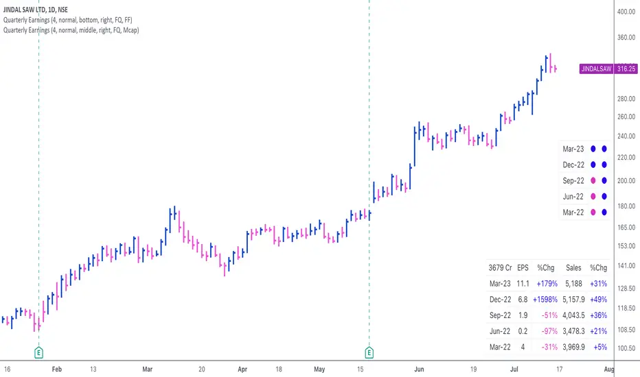
Quarterly EarningsThis script displays quarterly earnings per share (EPS) and sales data, and their year-on-year percentage change.
The script builds upon the Volume Price and Fundamentals script by Mohit_Kakkar08 and improves upon the array functions to keep the code light-weight & the output as accurate as possible. This script uses diluted EPS data for calculating the quarterly earnings. New quarters are auto-generated by the script as the earnings data gets updated in Tradingview every quarter.
Features:
⦿ View quarterly earnings per share (EPS) and sales data.
⦿ The percentage change is a YoY (year on year) comparison of the current quarter to the same quarter of the previous year.
⦿ Option to change the data from Quarterly (FQ) to Yearly (FY) .
⦿ Long mode : Option to increase the number of previous quarters displayed in the table (default is the past 4 quarters) to any number.
⦿ Location & size of the table can be changed.
⦿ Option for a 1-click dark mode
⦿ Option for a ' Mini mode ' where the values are replaced by traffic lights for a quick visual:
🟢 or 🔵 YoY increase in earnings/sales
🔴 or 🟣 YoY decrease in earnings/sales
🟡 or 🟠 YoY earnings/sales unchanged
⚪️ No data available
⦿ The top-left cell has the option to display either the free float (FF) or the marketcap (Mcap) of the stock.
Please note that sometimes the Tradingview data reflected in the script output might differ a bit from MarketSmith. Also make sure you are viewing the 'consolidated' data there.
This script was developed as a collaboration between me & @EquityCraze .
(CF|DB) Caruso Financial DashboardThe Caruso Financial Dashboard brings a rich amount of company financial data straight to your TradingView chart along with additional vital stock-related information. At a glance, you can see EPS (Diluted), Sales, growth rates, and EPS/Sales surprises either quarter by quarter on the daily chart or for Fiscal Years on the weekly chart.
On the daily chart, the financial table also has helpful highlights to visually display if a quarter’s EPS or Sales are higher than the same quarter a year ago. Also, EPS and Sales data has a helpful green shading when a new record high number has been achieved for the metric. Additional stock-based metrics include the stock’s Up/Down volume ratio, Beta, Average Daily Volume in terms of shares traded or dollar value traded, the percentage distance to a moving average of choice, as well as the stock’s 52-week high and low.
The weekly chart shows financial data for fiscal years. It also has additional stock-based metrics from those available on the daily chart. These include; Market Cap, Shares in Float and the Float as a percentage of all shares outstanding, the distance from the stock’s 52-week high, the distance to a moving average of choice (10 sma by default), the P/E and P/S ratios.
To further help an investor understand a company’s growth rates, the CF|DB allows a user to hide all or part of the table and plot EPS, EPS TTM (Trailing Twelve Months), and Sales TTM lines on the chart. This can be applied to either the daily or weekly chart.
The CF|DB provides financial and market data for international markets (US, EU, Canada, Australia, Hong Kong, Japan, and more), making its applicability global.
Features On Daily Chart
· Quarterly EPS
· Quarterly EPS growth rate YoY
· Quarterly EPS Surprise vs consensus estimate
· Quarterly Sales
· Quarterly Sales growth rate YoY
· Quarterly Sales Surprise vs consensus estimate
· Green/Red dot highlighting YoY growth or decline
· EPS/Sales green highlight for 8 quarter high or record high numbers
· Up/Down Volume Ratio
· Beta
· Average Daily Volume (shares trade). Period for the average can be configured
· Average Daily Volume (dollar value traded). Period for the average can be configured
· Distance to a moving average. The average can be configured. 21 ema by default
· 52-week high and low
· New 52-week highs and lows are highlighted by a red or green box shading
· Ability to plot EPS, EPS TTM, Sales lines
· Ability to hide part or all of the financial data table
Features On Weekly Chart
· FY EPS
· FY EPS growth rate YoY
· FY EPS Surprise vs consensus estimate
· FY Sales
· FY Sales growth rate YoY
· FY Sales Surprise vs consensus estimate
· EPS/Sales green highlight for 8-year high or record high numbers
· Market Cap
· Shares in float
· Share in float as a percentage of all shares outstanding
· Distance to new 52-week highs
· Distance to a moving average. The average can be configured. 10 sma by default
· Ability to plot EPS, EPS TTM, Sales lines
· Ability to hide part or all of the financial data table

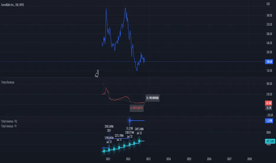
Times-Revenue (Fundamental Metric)Times-revenue is calculated by dividing the selling price of a company by the prior 12 months revenue of the company. The result indicates how many times of annual income a buyer was willing to pay for a company.
In color Red: it shows the last annual metric calculated
In color Gray: it shows the last 4 quarters annualized results
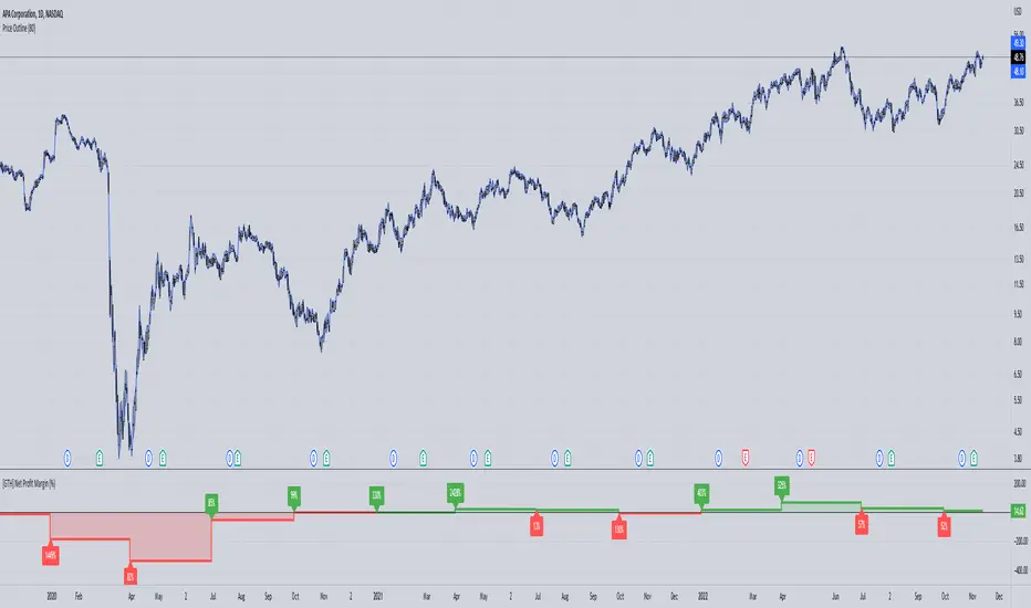
[GTH] Net Profit Margin (%)Displays the Net Profit Margin in a more "readable" fashion than the built-in TV Indicator.
This indicator concludes the series of 'Minervini-indicators', consisting of "GTH Earnings", "GTH Revenues" and "GTH Net Profit Margin (%)".
Famous trader Mark Minervini repeately describes rising earnings, revenues and net profit margin as the most important financials for finding superperformers.
In case of reporting a malfunction: Please be specific. Statements like "does not work" are useless. Thanks.
[GTH] RevenueVisually similar to the GTH Earnings indicator, this indicator plots
Reported Revenue (black line)
Difference to Estimated Revenue (colored bars)
Percentage change to the previous Reported Revenue (tags)
Note 1: Although in Tradingview the 'E' tags on the time line display Revenues alongside with Earnings , there is a difference in timing. Revenues are reported quarterly; Earnings reporting dates differ with each stock. Hence, the tags in this indicator are not necessarily aligned with the Earnings reporting dates.
Note 2: It should be obvious that this indicator can only report data provided by Tradingview. Even more obviousy, it can not display revenues of anything else but stocks.
If you find a malfunction, please provide examples. "Does not work" is not helpful.

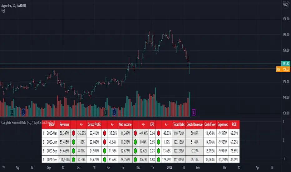
[TG] Complete Financial DataHISTORY & CREDITS
Complete Financial Data is basic, yet very effective tool, that will show the most important information from the company's latest financial statements at a glance.
WHAT IT DOES
The table is designed to show comprehensive financial data about the selected ticker.
Revenue - often referred to as sales or the top line, is the money received from normal business operations.
Gross profit , also called gross income, is calculated by subtracting the cost of goods sold from revenue.
Net income , also called net earnings, is calculated as sales minus cost of goods sold, selling, general and administrative expenses, operating expenses, depreciation, interest, taxes, and other expenses.
Earnings per share (EPS) is calculated as a company's profit divided by the outstanding shares of its common stock. The resulting number serves as an indicator of a company's profitability.
Total debt includes long-term liabilities, such as mortgages and other loans that do not mature for several years, as well as short-term obligations, including loan payments and accounts payable balances.
The debt-to-revenue ratio is a financial measure that compares a company's monthly debt payment to its monthly gross income.
The term cash flow refers to the net amount of cash and cash equivalents being transferred in and out of a company. Cash received represents inflows, while money spent represents outflows.
An expense is the cost of operations that a company incurs to generate revenue. As the popular saying goes, “it costs money to make money.”
Return on equity (ROE) is a measure of financial performance calculated by dividing net income by shareholders' equity.
HOW TO USE IT
Even if you are entirely a technical analyst, it's always a good practice to take a look at the company's fundamentals, in order to understand more about the heath of the business. Look for companies that beat expectations and show positive growth numbers.
Silen's Financials Debt & EquityThis Script shows Debt (red) & Equity (green), as well as Total Equity and Net Income in a preformatted way for a symbol. Total revenue's and Net income's visibility is turned off by default and can be activated in the indicator settings. 🍳
Disclaimer: Any content in this script can be completely replicated by using Tradingview's Build-In Financial Indicators: Total debt, Total equity, Net income and Total revenue. It requires a lot of formatting work to get them to this state though. 👌
However, you are going to need 4 Financial Indicators clogging 🚽 your screen. With this indicator you have them preformatted as an overlay on your chart so you know exactly what's going on with your ticker's financials. 💰
I recommend only using Debt & Equity OR Total Equity & Net Income together. Although displaying all 4 indicators together is possible, it will make your chart quite messy.
This is how the indicator looks like for Total equity and Net Income:
This Script (2) is part of a Series that will contain 3 scripts to help you easily evaluate if a stock is trading in harmony with its fundamentals or not. ☯
Script 1 already exists:
Script 3 will be a Fair Value Indicator. 📣
Script 1 and 2 combined will look like this: 🌄
If you have any questions, let me know! 🙂

HASHRATE and MINER REVENUEThis script uses daily data points from Quandl which measure Bitcoin mining hashrate, and miner revenue, and averages the two. The two data sets are fairly zigzaggy, so to smooth the data I am use a John Ehlers' filter to reduce the noise. Why did I combine the two? Both have correlation to BTC price action, and by combining hashrate and revenue, I believe it produces a stronger and more accurate signal. At times when the background is green (also displayed with a green square at the bottom), conditions are good in Bitcoinland with miner revenue/hashrate going up. No color in the background and no dot, means the combined miner revenue and hashrate indicator is dropping, but nothing to get worried about. Seeing red dots on the bottom along with a red background signals a rapidly dropping rate of hashrate/miner revenue, and with a fairly strong correlation to the Bitcoin price. Not every red zone foretells a drop in the Bitcoin price, but a significant number of them do. I wrote this script as an early warning system for when to move out of Bitcoin. Use at your own risk. Feel free to modify this code to suit your personal needs. Please only use on BTC /USD pairs with 1D bars. Since there is only one data point per day published by Quandl, it will not give accurate data for shorter timeframes. Enjoy.

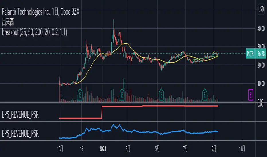
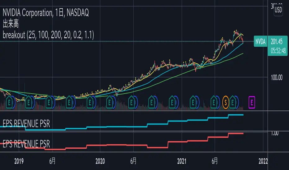
EPS_REVENUE_PSR indicatorQuarterly EPS, PER, total revenue(FQ) (in million unit), PSR can be shown as an indicator.
Check only one indicator for the chart visibility.
四半期毎のEPS, PER, 年間売上, PSRをインジケーターとして表示することができます。
チャートを見やすくするために1つのインジケーターを選択してください。
EPS and PER indicatorThis indicator shows quarterly EPS and PER.
Uncheck EPS or PER for the chart visibility.
"standard" and "diluted" mode can be selected for EPS setting.
このインジケーターは四半期のEPSとPERを表示します。
チャートを見やすくするためにはEPSまたはPERのチェックをオフにしてください。
EPSの設定として「通常」と「希薄化後」のモードを選択することができます。
3CCI & 3RSI for botsThis script is for trading grid bots. Only CCI and RSI are used, but there are three different timeframes available for each. When using it, you must select a chart with a period equal to or less than the minimum in the indicator settings. For example, the following periods are selected in the settings: 1 hour, 15 minutes, 5 minutes, so we use a 5-minute chart. A buy or sell signal will be received if the settings of all 6 indicators match. The default settings do not carry any information, use your own. The code is quite simple and may be of interest to a beginner like me.

Earnings DashboardThe Earnings Dashboard Indicator is a fast way to check the most recent quarterly earnings growth on TradingView.
Colors
The colors should help you get an easy overview of the quarters that are particularly outstanding.
- Earnings /Sales Growth & Surprise >= 20% -> Green
- Earnings /Sales Growth & Surprise <= -20% -> Red
- Net Margin < 5% -> Red
- Net Margin >15% -> Green
Indicator Configuration
- Not available at the moment. Feel free to leave us a comment on TradingView with your idea and we will see what we can do.
Planned Future Update
- Extension with annual (FY) financial data
Happy Trading 📈😎
Important : All data is retrieved using the variables provided by TradingView.

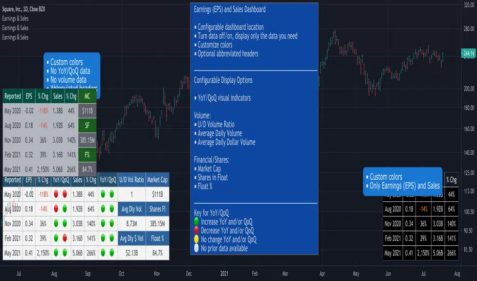
Earnings, Sales & Volume Dashboard [LevelUp]View quarterly earnings per share (EPS) and sales data. Optional visual icons can be shown comparing data on a Year-over-Year (YoY) and/or Quarter-on-Quarter (QoQ) basis.
YoY: quarterly earnings/sales compared to the value in the same quarter of the previous year.
QoQ: quarterly earnings/sales compared to the value of the previous quarter.
Earnings Calculation - Basic EPS vs Diluted
This indicator uses basic EPS data to calculate earnings. For relatively new issues (IPOs, etc), some platforms/tools may use diluted EPS data as a means to account for outstanding stock options, convertible preferred shares, etc. In this scenario, you will notice differences in the earnings information.
Features
■ View quarterly earnings per share (EPS) and sales data.
■ Configure colors for dashboard header and rows.
■ Change location of dashboard.
■ Choose which charts display the dashboard (daily, weekly or monthly).
Pro Tip: Show the dashboard on top of other chart elements:
- Right click on the indicator
- Select 'Visual Order'
- Select 'Bring to Front'
Bot go_up strategyHello. This strategy is based on go_up alerts.
Our task is to find the local minimum. The trade is entered on the basis of RSI and SMA according to a specific formula, which is embedded in the code. When the RSI crosses the SMA upside down, a long position is entered. You can change the length of the RSI . The longer the length, the less frequent, but more accurate the entrance, and vice versa. You can use a different time frame.
The settings have:
1) RSI length, the lower the length, the more often the entry.
2) Testing results for any period of time
3) Take profit for any percentage
4) Stop order for any percentage
5) If there is a check mark ✅, then purchases will always be made, and if not, then purchases will be made, BUT, if the next payback is lower than the previous one, it does not matter by what percentage.
6) If there is a check mark ✅, then each trace of the purchase will be made provided that it is lower by the percentage specified, even if the conditions of the purchase are triggered.
7) The filled area is made for visual display of consolidation zones
Default settings:
RSI length 15, step 1.5, take profit 15, stop order 30.
Also in the settings there is a pyramid of the order, keep this in mind. Enter a deal for a small part of the deposit, and not for all the money at once! You can remove pyramiding and see the results with one entry.
For a more visual understanding, overlay the go_up script.
You can choose a strategy for yourself based on history! If you need examples of strategies, then write to me, my contacts are in the column: instructions from the author.
Successful trades, dear friends, I am glad that you trust me!

[5F] Bitcoin Hash Rate + Miners revenue-═════════════════════════-
📋 Description :
This script display the Bitcoin' Hash Rate and the Miners revenue based on the data provided by Quandl.
Hashrate is displayed in TH/s : trillion hashes per second with an moving average.
Miners revenue is calculated by : (the number of bitcoins mined per day + transaction fees) * market price
The dates of previous halving are also displayed.
🛠 Note :
There is a multiplier on the miners revenue that you can configurate. It's only used to bring the 2 curves closer together for better visibility but the multiplier don't affect the revenue's data.
You can choose between different types of moving average for the hashrate's signal : SMA, EMA, DEMA, TEMA, WMA, VWMA or TMA.
You can show and hide each elements of the indicator
Thanks to all Pinecoders who share their work with the community.
-═════════════════════════-

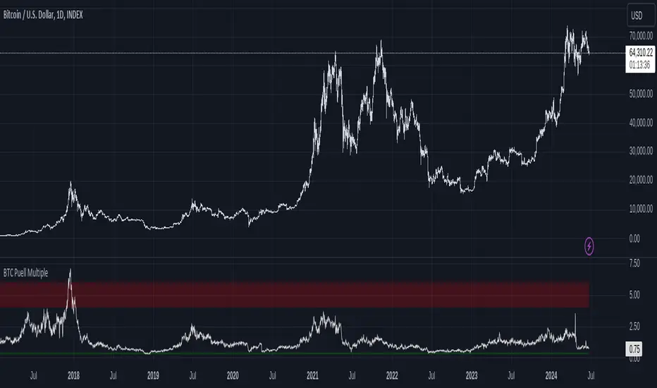
Bitcoin Fundamentals - Puell MultipleThis is an indicator that derives from Bitcoin Mining daily generated Income.
It does show a perfect track record on calling Bitcoin cycle tops and cycle bottoms.
For those of you willing to experiment, I've enabled the ability to set custom periods (365 by default).
The indicator includes custom alerts to notify the entry and the exit from OverBought (OB) & OverSold (OS) bands.
Credits: David Puell twitter.com