Marubozu SignalsThis Pine Script code is designed to identify and plot Marubozu candlestick patterns on a trading chart. Marubozu candles are characterized by having very small or non-existent wicks (shadows) and a large body, indicating strong buying or selling pressure.
The script first calculates the body size and wick size for both red (bearish) and green (bullish) Marubozu candles. It then defines thresholds for both body and wick sizes based on a percentage of the body size. For example, a red Marubozu candle is identified if its body size is at least 90% of the calculated threshold, and both upper and lower wick sizes are smaller than 5% of the body size.
Similarly, green Marubozu candles are identified using the same logic. If a Marubozu candle of either color is detected, a corresponding label is plotted on the chart indicating the occurrence of the pattern. A "Sell" label is placed above the candle for red Marubozu patterns, while a "Buy" label is placed below the candle for green Marubozu patterns.
This script provides visual cues to traders, helping them quickly identify potential buying or selling opportunities based on Marubozu candlestick patterns. Traders can use these signals as part of their technical analysis to make informed trading decisions.
Cerca negli script per "Candlestick"
MGR Inside 2The inside bar pattern is characterised by two consecutive candlesticks that often suggest a period of consolidation or indecision in the market. Traders and analysts can find value in identifying the setup as it can provide insights into potential future price movements.

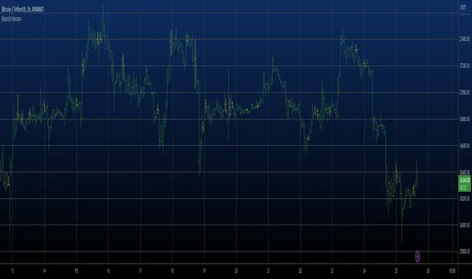
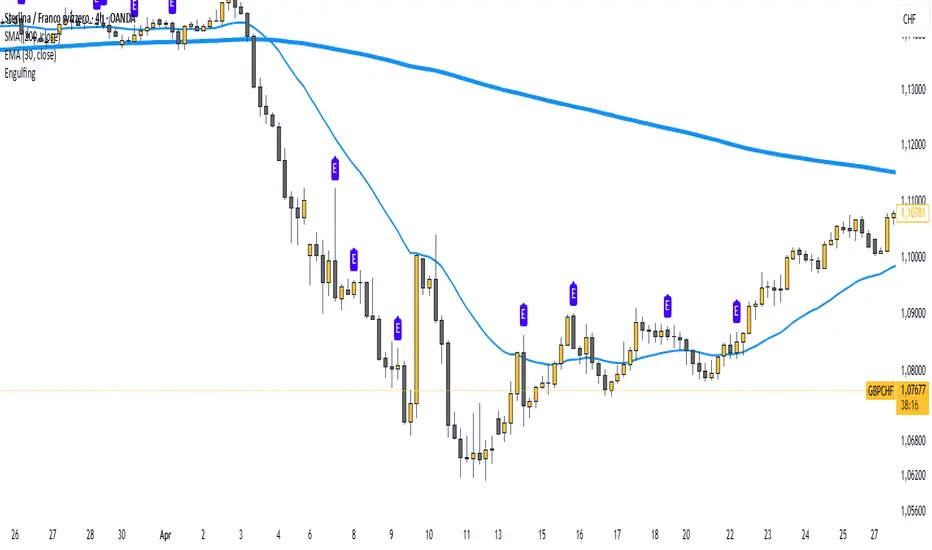
Bearish Harami automatic finding scriptHi
Let me introduce my Bearish Harami automatic finding script.
This is a bearish reversal pattern formed by two candlesticks in which a short
real body is contained within the prior session's long real body. Usually the
second real body is the opposite color of the first real body. The Harami pattern
is the reverse of the Engulfing pattern.
This pattern marked as yellow.
ICT Order Block [KTY]ICT Order Block Indicator
Overview
This indicator automatically detects and displays Order Blocks (OB) based on ICT (Inner Circle Trader) methodology.
Order Blocks are price zones where Smart Money (institutions, banks) executed large buy/sell orders. These zones often act as strong support and resistance levels, making them valuable for identifying high-probability entry points.
Key Features
Multi-Timeframe Support
Display OBs from two different timeframes simultaneously (LTF & HTF)
HTF Order Blocks provide stronger, more reliable levels
Bullish & Bearish Order Blocks
Bullish OB: Last bearish candle before a significant up move → Acts as support
Bearish OB: Last bullish candle before a significant down move → Acts as resistance
Breaker Block Detection
When an OB is broken, it converts to a Breaker Block (BB)
Role reverses: Former support becomes resistance, and vice versa
Volume Analysis
Displays volume at OB formation
Shows upper/lower volume balance ratio (%)
Lower percentage = stronger one-sided order flow = more significant zone
OB Body Lines
Dotted lines showing the candle body (open/close) within the OB
Useful for precise entry points
How to Use
Identify the trend on higher timeframes
Wait for price to re-enter an Order Block zone
Look for confirmation (candlestick patterns, lower timeframe structure break)
Enter within the OB, set stop loss below/above the OB
Pro Tips:
OBs that overlap with FVG (Fair Value Gap) or OTE (Optimal Trade Entry) have higher probability
HTF Order Blocks are more reliable than LTF
Fresh (untested) OBs tend to have stronger reactions
Settings
SettingDescriptionLTF / HTFEnable and select timeframes for Order Block detectionBullish OB CountNumber of Bullish Order Blocks to display (1-10)Bearish OB CountNumber of Bearish Order Blocks to display (1-10)Show Breaker BlocksToggle Breaker Block displayShow OB Body LinesToggle candle body lines within OBLabel ColorCustomize text color inside OB boxes
Alerts
🟢 Bullish OB Detected
🔴 Bearish OB Detected
🟢 Bullish OB Touched
🔴 Bearish OB Touched
🟢 Bullish BB Touched
🔴 Bearish BB Touched
💥 Bullish OB → BB Conversion
💥 Bearish OB → BB Conversion
Notes
This indicator is designed for educational purposes
Always combine with proper risk management
Past performance does not guarantee future results
If you find this indicator helpful, please leave a like and follow for more ICT-based tools!

Price Action Patterns + Style Filter by danyPrice Action Patterns + Style Filter by dany
✅ Purpose
This indicator is designed to identify high-probability price action patterns and trend structure across different trading styles.
It displays clear labels attached directly to candles, allowing traders to:
Detect reversal patterns
Confirm pullbacks within strong trends
Avoid false signals from indecision candles
Trade using a structured style (Scalping, Intraday, Swing)
🔥 Key Features
1️⃣ Multi-Style Trading Structure
The indicator supports three trading styles:
Style Structure Timeframe Description
Scalping 5m / 15m structure Uses higher timeframe structure to confirm trend while trading 1m
Intraday 1H / 2H / 4H structure Best for day traders who trade in short swings
Swing Daily / Weekly / Monthly structure Best for longer-term swing trading
This helps the indicator understand trend direction and avoid trading against market structure.
🧠 How Trend is Detected
The indicator determines the trend using higher timeframe structure:
🔺 Uptrend
When the higher timeframe shows:
Higher Highs
Higher Lows
🔻 Downtrend
When the higher timeframe shows:
Lower Highs
Lower Lows
➖ Flat
If neither condition is true.
🕯️ Candlestick Patterns Detected
This indicator identifies the following patterns:
✅ 1. Dragonfly Doji
📌 Bullish Reversal Pattern
A candle with:
Long lower wick
Small body at top
Minimal upper wick
📌 Meaning: Buyers step in after sellers push price down.
❌ 2. Gravestone Doji
📌 Bearish Reversal Pattern
A candle with:
Long upper wick
Small body at bottom
Minimal lower wick
📌 Meaning: Sellers take control after buyers push price up.
🔥 3. Morning Star
📌 Bullish 3-candle reversal pattern
Sequence:
Big red candle
Small indecision candle (Doji)
Big green candle
📌 Meaning: Buyers overpower sellers.
🔥 4. Evening Star
📌 Bearish 3-candle reversal pattern
Sequence:
Big green candle
Small indecision candle (Doji)
Big red candle
📌 Meaning: Sellers overpower buyers.
🔁 5. Harami (Mother & Baby)
📌 Reversal pattern
A large candle followed by a smaller candle contained within its range.
Bullish Harami: Red candle followed by small green candle
Bearish Harami: Green candle followed by small red candle
🔁 6. Tweezers
📌 Double top / double bottom pattern
Tweezer Top: Green candle followed by equal-sized red candle
Tweezer Bottom: Red candle followed by equal-sized green candle
🧠 Psychology-Based Filtering
This indicator filters signals using price psychology:
🚫 Ignored Signals
It ignores standard indecision dojis because they often lead to false signals in sideways markets.
🔁 Pullback Confirmation
During strong trends, the indicator does not signal reversal unless a pullback happens.
✅ Bullish pullback entry
Uptrend structure
Price pulls back below EMA(50)
Dragonfly Doji or Tweezer Bottom appears
✅ Bearish pullback entry
Downtrend structure
Price pulls back above EMA(50)
Gravestone Doji appears


Scalp PRO Visual momentum through the candlestick pattern. Gradients to show acceleration and deceleration to assist with entry and exits. Different color settings and optimizations. Enjoy!

Candle Statistics | by beidou_123Script Description
Candle Statistics is a quantitative market analysis indicator that provides a structured statistical overview of recent price behavior using candlestick classification.
The script analyzes historical candles over four user-defined lookback periods and classifies each candle into one of three categories:
Bullish candles (close > open)
Bearish candles (close < open)
Doji candles , defined as candles whose real body is less than or equal to 10% of the total candle range
Key Features
Fully customizable lookback periods
Users can define four independent candle windows (e.g., 15, 60, 240, 480 bars).
Standardized Doji definition
A Doji is identified when the candle body is small relative to total price range, ensuring consistency across instruments and timeframes.
Directional dominance calculation
For each lookback period, the script computes the Bullish Percentage, defined as:
Bullish % = Bullish Candles ÷ (Bullish + Bearish Candles)
Doji candles are intentionally excluded from this calculation to avoid diluting directional bias.
Visual dominance highlighting
If Bullish % > 50%, the value is displayed using a user-defined bullish dominance color
If Bullish % ≤ 50%, the value is displayed using a user-defined bearish dominance color
On-chart statistics table
All results are presented in a compact, non-intrusive table displayed directly on the main chart.
Table position is fully configurable.
Intended Use
This indicator is designed for:
Market structure analysis
Trend bias evaluation
Volatility and indecision studies
Systematic filtering in discretionary or rule-based trading systems
It is not a signal generator, but a statistical context tool that helps traders assess whether recent price action is dominated by bullish pressure, bearish pressure, or indecision.
Disclaimer
This indicator is provided for educational and analytical purposes only and does not constitute financial or investment advice.

Marubozu Detector**Marubozu Detector (v6)**
This indicator identifies **Marubozu candles** — powerful candlestick patterns indicating strong directional momentum with minimal or no shadows (wicks).
A **Bullish Marubozu** (green) shows buyers dominated the session: open ≈ low, close ≈ high.
A **Bearish Marubozu** (red) shows sellers in control: open ≈ high, close ≈ low.
Unlike strict detectors, this version allows customizable tolerance for tiny shadows, making it practical for real markets where perfect Marubozu are rare.
**Key Features**
- **Adjustable tolerance**: Max shadow % of candle range (default 5%).
- **Minimum body size**: Requires body ≥ % of range (default 90%) to filter small candles.
- **Clear labels**: "BULL MARU" below bullish, "BEAR MARU" above bearish.
- **Alerts**: Built-in conditions for Bullish/Bearish Marubozu on any timeframe.
- **Pine Script v6**: Fully compatible with the latest version for optimal performance.
**How to Use**
1. Add to chart via Indicators > Community Scripts.
2. Customize inputs: Lower tolerance for stricter detection, higher for more signals.
3. Combine with trend tools (e.g., EMA, support/resistance) for better entries/exits.
- Bullish Marubozu in uptrend → potential continuation long.
- Bearish Marubozu in downtrend → potential short.
**Why Marubozu?**
These candles signal strong conviction and often precede continuations or reversals. This detector helps spot them quickly without manual scanning.
Open-source under Mozilla Public License 2.0. Feel free to modify!
If you find it useful, please like/boost/favorite! Feedback welcome.
© toppermost

FPT - Harami FPT – Harami (Wick Included) is a clean and minimalist candlestick pattern indicator that highlights Harami reversal formations using full candle ranges (wicks included).
This version follows a strict and objective definition of Harami by requiring the entire range of the second candle (high–low) to be fully contained within the range of the first candle.
🔹 Patterns Detected
Bullish Harami
First candle: Bearish
Second candle: Bullish
Second candle’s high and low are completely inside the first candle’s range
Bearish Harami
First candle: Bullish
Second candle: Bearish
Second candle’s high and low are completely inside the first candle’s range
Only the pattern-forming candle (second candle) is highlighted to keep the chart clean and focused.
🎨 Customization
Highlight Bullish, Bearish, or Both Harami patterns
Separate and fully customizable colors for bullish and bearish patterns via Inputs → Colors
Style tab colors are intentionally not used
🎯 Design Philosophy
No indicators
No filters
No assumptions about trend or volatility
This tool is designed for traders who prefer pure price action and want to identify Harami patterns in combination with:
Key levels
Support & resistance
Market structure
Session-based or discretionary analysis
⚠️ This indicator is for visual analysis only and does not provide trade signals.
Always apply proper risk management.

Jiangnan_BTC_Compare将个别虚拟币走势与BTC的走势进行比较。打开个别币的K线,添加在下方的panel里添加本指标即可。Compare the price movement of individual cryptocurrencies with that of BTC.
Open the candlestick chart of the selected coin and simply add this indicator in the lower panel.

Perfect Opens Perfect BoxesThis approach combines two methods of chart denoising:
1. The underlying chart uses the previous close as the open price for the next candle, which makes candlestick patterns easier to read.
2. The overlay reduces the visual noise of a line chart by representing the price range over a given interval as a box; the “wicks” on this chart are purely cosmetic, indicating that closing prices lay outside the range of the previous interval.

chanlun缠论 - 笔与中枢Overview
The Chanlun (缠论) Strokes & Central Zones indicator is an advanced technical analysis tool based on Chinese Chan Theory (Chanlun Theory). It automatically identifies market structure through "strokes" (笔) and "central hubs" (中枢), providing traders with a systematic framework for understanding price movements, trend structure, and potential reversal zones.
Theoretical Foundation
Chan Theory is a sophisticated price action methodology that breaks down market movements into hierarchical structures:
Local Extremes: Swing highs and lows identified through lookback periods
Strokes (笔): Valid price movements between opposite extremes that meet specific criteria
Central Hubs (中枢): Consolidation zones formed by overlapping strokes, representing key support/resistance areas
Key Components
1. Local Extreme Detection
Identifies swing highs and lows using a configurable lookback period (default: 5 bars)
Only considers extremes within the specified calculation range
Forms the foundation for stroke construction
2. Stroke (笔) Identification
The indicator applies a multi-stage filtering process to identify valid strokes:
Stage 1 - Extreme Consolidation:
Merges consecutive extremes of the same type (high or low)
Keeps only the most extreme value (highest high or lowest low)
Stage 2 - Stroke Validation:
Ensures minimum bar gap between strokes (default: 4 bars)
Alternative validation: 2+ bars with >1% price change
Eliminates noise and insignificant price movements
Color Coding:
White Lines: Regular up/down strokes
Yellow Lines: Strokes that form part of a central hub
Customizable width and colors for different stroke types
3. Central Hub (中枢) Formation
A central hub forms when at least 3 consecutive strokes have overlapping price ranges:
Formation Rules:
Stroke 1:
Stroke 2:
Stroke 3:
Hub Upper = MIN(High1, High2, High3)
Hub Lower = MAX(Low1, Low2, Low3)
Valid if: Hub Upper > Hub Lower
Hub Extension:
Subsequent strokes that overlap with the hub extend it
Hub ends when a stroke no longer overlaps
Creates rectangular zones on the chart
Visual Representation:
Green rectangular boxes: Mark the time and price range of each central hub
Dashed extension lines: Show the latest hub boundaries extending to the right
Price labels on axis: Display exact hub upper and lower boundary values
4. Extreme Point Markers (Optional)
Red markers for tops (▼)
Green markers for bottoms (▲)
Marks every validated stroke extreme point
Useful for detailed structure analysis
5. Information Table (Optional)
Displays real-time statistics:
Symbol name
Current timeframe
Lookback period setting
Minimum gap setting
Total stroke count
Parameter Settings
Performance Settings
Max Bars to Calculate (3600): Limits historical calculation to improve performance
Local Extreme Lookback Period (5): Bars used to identify swing highs/lows
Min Gap Bars (4): Minimum bars required between valid strokes
Display Settings
Show Strokes: Toggle stroke line visibility
Show Central Hub: Toggle hub box visibility
Show Hub Extension Lines: Toggle dashed boundary lines
Show Extreme Point Marks: Toggle top/bottom markers
Show Info Table: Toggle statistics table
Color Settings
Full customization of:
Up/down stroke colors and widths
Hub stroke colors and widths
Hub border and background colors
Extension line colors
Trading Applications
Trend Structure Analysis
Uptrend: Series of higher highs and higher lows connected by strokes
Downtrend: Series of lower highs and lower lows connected by strokes
Consolidation: Formation of central hubs indicating range-bound movement
Support and Resistance Identification
Central Hub Zones: Act as strong support/resistance areas
Hub Upper Boundary: Resistance level in consolidation, support after breakout
Hub Lower Boundary: Support level in consolidation, resistance after breakdown
Price tends to react at these levels due to market structure memory
Breakout Trading
Bullish Breakout: Price closes above hub upper boundary
Previous resistance becomes support
Entry on retest of upper boundary
Stop loss below hub zone
Bearish Breakdown: Price closes below hub lower boundary
Previous support becomes resistance
Entry on retest of lower boundary
Stop loss above hub zone
Reversal Detection
Hub Formation After Trend: Signals potential trend exhaustion
Multiple Hub Levels: Create probability zones for reversals
Stroke Count: Excessive strokes within hub suggest weakening momentum
Position Management
Use hub boundaries for stop loss placement
Scale out positions at hub edges
Re-enter on retests of broken hub levels
Interpretation Guide
Strong Trending Market
Long, clear strokes with minimal overlap
Few or no central hubs forming
Strokes consistently in same direction
Wide spacing between extremes
Consolidating Market
Multiple central hubs forming
Short, overlapping strokes
Yellow hub strokes dominate the chart
Narrow price range
Trend Transition
Hub formation after extended trend
Stroke direction changes frequently
Hub boundaries being tested repeatedly
Potential reversal zone
Advanced Usage Techniques
Multi-Timeframe Analysis
Higher Timeframe: Identify major hub zones for overall market structure
Lower Timeframe: Find precise entry points within larger structure
Alignment: Trade when lower timeframe strokes align with higher timeframe hub breaks
Hub Quality Assessment
Wide Hubs: Strong consolidation, higher probability support/resistance
Narrow Hubs: Weak consolidation, may break easily
Extended Hubs: More strokes = stronger zone
Isolated Hubs: Single hub = potential pivot point
Stroke Analysis
Stroke Length: Longer strokes = stronger momentum
Stroke Speed: Fewer bars per stroke = explosive moves
Stroke Clustering: Many short strokes = indecision
Best Practices
Parameter Optimization
Adjust lookback period based on timeframe and volatility
Lower periods (3-4): More strokes, more noise, faster signals
Higher periods (7-10): Fewer strokes, cleaner structure, slower signals
Confirmation Strategy
Don't trade on strokes alone
Combine with volume analysis
Use candlestick patterns at hub boundaries
Wait for breakout confirmation
Risk Management
Always place stops outside hub zones
Use hub width to size positions (wider hub = smaller position)
Exit if price re-enters broken hub from wrong direction
Avoid Common Pitfalls
Don't trade within central hubs (range-bound, unpredictable)
Don't ignore higher timeframe hub structures
Don't chase strokes after they've extended far from hub
Don't trust single-stroke hubs (need 3+ strokes for validity)
Performance Considerations
Max Bars Limit: Set to 3600 to balance detail with performance
Safe Distance Calculation: Only draws objects within 2000 bars of current price
Object Cleanup: Automatically removes old drawing objects to prevent memory issues
Efficient Arrays: Uses indexed arrays for fast lookup and processing
Ideal Market Conditions
Best Performance:
Liquid markets with clear structure (major forex pairs, indices, large-cap stocks)
Trending markets with periodic consolidations
Medium to high volatility for clear stroke formation
Less Effective:
Extremely choppy, directionless markets
Very low timeframes (< 5 minutes) with excessive noise
Illiquid instruments with erratic price action
Integration with Other Indicators
Complementary Tools:
Volume Profile: Confirm hub significance with volume nodes
Moving Averages: Use for trend bias within stroke structure
RSI/MACD: Momentum confirmation at hub boundaries
Fibonacci Retracements: Hub levels often align with Fib levels
Advantages
✓ Objective Structure: Removes subjectivity from market structure analysis
✓ Visual Clarity: Color-coded strokes and clear hub zones
✓ Multi-Timeframe Applicable: Works on all timeframes from minutes to months
✓ Complete Framework: Provides entry, exit, and risk management levels
✓ Theoretical Foundation: Based on proven Chan Theory methodology
✓ Customizable: Extensive parameter and visual customization options
Limitations
⚠ Learning Curve: Requires understanding of Chan Theory principles
⚠ Lag Factor: Strokes confirm after price movements complete
⚠ Parameter Sensitivity: Different settings produce significantly different results
⚠ Choppy Market Struggles: Can generate excessive hubs in range-bound conditions
⚠ Computation Intensive: May slow down on lower-end systems with max bars setting
Optimization Tips
Timeframe Selection
Scalping: 5-15 minute charts, lookback period 3-4
Day Trading: 15-60 minute charts, lookback period 4-5
Swing Trading: 4-hour to daily charts, lookback period 5-7
Position Trading: Daily to weekly charts, lookback period 7-10
Volatility Adjustment
High volatility: Increase minimum gap bars to reduce noise
Low volatility: Decrease lookback period to capture smaller moves
Visual Optimization
Use contrasting colors for different market conditions
Adjust line widths based on chart resolution
Toggle markers off for cleaner appearance once familiar with structure
Quick Start Guide
For Beginners:
Start with default settings (5 lookback, 4 min gap)
Enable "Show Info Table" to track stroke count
Focus on identifying clear hub formations
Practice waiting for price to break hub boundaries before trading
For Advanced Users:
Optimize lookback and gap parameters for your instrument
Use hub strokes (yellow) to identify key consolidation zones
Combine with multiple timeframes for confirmation
Develop entry rules based on hub breakout/retest patterns
This indicator provides a complete structural framework for understanding market behavior through the lens of Chan Theory, offering traders a systematic approach to identifying high-probability trading opportunities.

HTF Candle Overlay - PO3HTF Candle Overlay Script Description
This Pine Script indicator creates a visual overlay of higher timeframe (HTF) candles on your chart. It's a useful tool for multi-timeframe analysis that allows you to see higher timeframe price action context directly on your current chart without having to switch between timeframes.
Main Purpose
The primary purpose of this indicator is to display candles from a higher timeframe (like daily or weekly) directly on your lower timeframe chart (like 5-minute or hourly). This provides crucial context about the larger market structure while you're analyzing shorter-term price movements.
Key Features
Higher Timeframe Selection: You can choose any higher timeframe from the available options (1-minute to monthly), allowing you to view price action from any timeframe higher than your current chart.
Customizable Appearance:
Control the number of HTF candles displayed (1-10)
Adjust the spacing between the candles and current price
Modify candle width for better visibility
Customize colors for bullish and bearish candles, wicks, and borders
Real-time Updates: The current (ongoing) HTF candle updates in real-time as new price data comes in, showing you how the higher timeframe candle is developing.
Time Remaining Display: An optional label shows the current HTF period and how much time remains until the candle closes, helping you time your entries and exits.
Visual Warnings: The script warns you if you select a timeframe that matches your current chart timeframe.
How It Works
Data Retrieval: The script fetches both the current developing candle and historical candles from the selected higher timeframe using request.security() calls.
Candle Processing:
It stores candle data (open, high, low, close, and time) in arrays
Handles both the current developing candle and past completed candles
Updates the current candle in real-time as new price data comes in
Visual Rendering:
Draws candle bodies as boxes with appropriate bullish/bearish colors
Creates wicks as lines extending from the candle bodies
Places candles horizontally on your chart with proper spacing
Timing Information:
Calculates and displays the remaining time until the current higher timeframe candle closes
Formats the time remaining in a user-friendly way (days, hours, minutes)
Practical Applications
Context for Trading Decisions: See where price is in relation to higher timeframe support/resistance levels.
Entry and Exit Timing: Time your entries and exits based on higher timeframe candle closings.
Trend Alignment: Ensure your trades align with the higher timeframe trend direction.
Support/Resistance Identification: Easily identify key price levels from higher timeframes.
Candle Pattern Recognition: Spot important higher timeframe candlestick patterns without switching timeframes.
This indicator essentially brings the higher timeframe context directly to your current chart, allowing for more informed trading decisions that consider both short-term and long-term market structures simultaneously.

EMA 24/50/70/99 聚合指标(raysun)Key Features
Multiple EMAs in One Script: Displays EMA 24, EMA 50, EMA 70, and EMA 99 simultaneously.
Customizable Visibility: You can turn each EMA line on or off in the indicator settings.
Color-Coded Lines: Each EMA is assigned a unique color (orange, blue, green, red) for easier visual distinction.
Overlay on Price Chart: Plots directly on the candlestick chart to help identify market trends and momentum shifts.
Usage
Trend Identification:
Shorter EMAs (like EMA 24) are more sensitive to price action, while longer EMAs (like EMA 99) represent broader trends.
Crossovers:
Watching how EMAs cross each other can help spot potential bullish or bearish signals. For example:
EMA 24 crossing above EMA 50/70/99 may suggest an uptrend.
EMA 24 crossing below EMA 50/70/99 may indicate a downtrend.
Support and Resistance:
EMAs often act as dynamic support and resistance levels, especially in trending markets.
Ideal For
Traders who prefer using EMA clusters for decision-making.
Swing traders and intraday traders who monitor multiple timeframes.
Anyone wanting a cleaner setup without cluttering the chart with multiple separate EMA indicators.

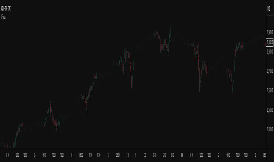
X FocusDesigned to help traders reduce distractions by de-emphasizing specific time ranges on the chart. Instead of highlighting high-activity zones, this tool intentionally applies a muted overlay to selected sessions, allowing traders to concentrate on price action that occurs outside those designated ranges.
Core Purpose
The primary goal of this indicator is to combat the “noise” that often arises during certain periods, such as overnight sessions or pre-market trading. By visually softening those areas, traders can focus on the more relevant trading windows WITHOUT losing any time-based context. Unlike traditional tools that remove data entirely, X Focus preserves all candlestick and price information—ensuring that key levels, gaps, or reference values are still visible.
Key Features
Custom Session Filtering
Users can define up to three time ranges depending on preference. This flexibility allows for tailoring the indicator to different market strategies.
De-Emphasis by Design
Instead of masking or deleting data, the indicator overlays a semi-transparent shading box over the chosen sessions. This ensures traders remain aware of the data while maintaining visual focus on the price action outside of the selected time blocks.
Dual Utility – Highlight or Suppress
While built on the principle of minimizing distractions, the same framework can also be used in reverse to highlight specific areas of interest. This versatility makes it suitable for both noise-reduction and spotlighting critical ranges.
Dark Mode / Light Mode
Adjustable color schemes allow seamless integration into any chart setup, whether the user prefers dark or light backgrounds.
Non-Intrusive Visualization
The shading effect is applied without altering price bars, indicators, or other overlays. This ensures compatibility with existing technical tools and strategies.
Use Case
Traders who find themselves reacting too strongly to inconsequential movements during certain times (such as after-hours or low-volume sessions) can benefit from the X Focus indicator. It helps maintain clarity and discipline by visually guiding attention toward the periods that matter most—without erasing or ignoring potentially useful price references.
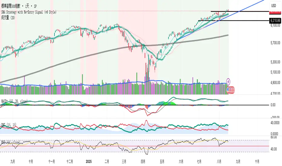
SMA Strategy with Re-Entry Signal (v6 Style)*SMA Trend Strategy with Re-Entry Signal (v6 Edition)*
This indicator is based on a classic moving average trend-following system, enhanced with re-entry signals designed for medium to short-term traders.
---
### 📈 Key Features:
1. *Trend Detection Logic:*
- The 30-period SMA (SMA30) is used as the trend filter.
- When the closing price is above the SMA30, the market is considered to be in an uptrend.
2. *Re-Entry Signal:*
- While in an uptrend, if the closing price crosses above the SMA20, a re-entry (add position) signal is triggered.
- These signals are shown with green upward arrows below the bars.
3. *Background Highlighting:*
- Green background: indicates an uptrend.
- Red background: indicates a break below SMA30, suggesting weakening momentum.
4. *Multi-SMA Visualization:*
- Five SMAs are displayed: SMA10, SMA20, SMA30, SMA60, and SMA250.
- This helps visualize both short-term and long-term trend structures.
---
### 🔍 Usage Tips:
- Use this script directly on your main chart to monitor trend direction and wait for re-entry signals during pullbacks.
- Combine with other tools like volume, price action, or candlestick patterns to confirm entries.
---
### ⚠️ Disclaimer:
- This indicator is for educational and informational purposes only. It does not constitute financial advice or a buy/sell signal.
- Avoid relying solely on this script for trading decisions. Always manage your own risk.
---
👨💻 *Developer’s Note:*
This script is 100% manually developed, not copied or auto-generated. It is an original implementation based on my personal trading logic. Suggestions and feedback are welcome!
Engulfing & Pin Bar Breakout StrategyOverview
This strategy automates a classic, powerful trading methodology based on identifying key candlestick reversal patterns and trading the subsequent price breakout. It is designed to be a complete, "set-and-go" system with built-in risk and position size management.
The core logic operates on the 1-Hour timeframe, scanning for four distinct high-probability reversal signals: two bullish and two bearish. An entry is only triggered when the market confirms the signal by breaking a key price level, aiming to capture momentum following a potential shift in market sentiment.
The Strategy Logic
The system is composed of two distinct modules: Bullish (Long) and Bearish (Short).
🐂 Bullish (Long) Setup
The script initiates a long trade based on the following strict criteria:
Signal: Identifies either a Hammer or a Bullish Engulfing pattern. These patterns often indicate that sellers are losing control and buyers are stepping in.
Confirmation: Waits for the very next candle after the signal.
Entry Trigger: A long position is automatically opened as soon as the price breaks above the high of the signal candle.
Stop Loss: Immediately set just below the low of the signal candle.
Take Profit: A fixed target is placed at a 1:5 Risk/Reward Ratio.
🐻 Bearish (Short) Setup
The script initiates a short trade based on the following strict criteria:
Signal: Identifies either a Shooting Star or a Bearish Engulfing pattern. These patterns suggest buying pressure is fading and sellers are taking over.
Confirmation: Waits for the very next candle after the signal.
Entry Trigger: A short position is automatically opened as soon as the price breaks below the low of the signal candle.
Stop Loss: Immediately set just above the high of the signal candle.
Take Profit: A fixed target is placed at a 1:4 Risk/Reward Ratio.
Key Feature: Automated Risk Management
This strategy is designed for disciplined trading. You do not need to calculate position sizes manually.
Fixed Risk: The script automatically calculates the correct position size to risk exactly 2% of your total account equity on every single trade.
Dynamic Sizing: The position size will adjust based on the distance between your entry price and your stop loss for each specific setup, ensuring a consistent risk profile.
How To Use
Apply the script to your chosen chart (e.g., BTC/USD).
Crucially, set your chart's timeframe to 1-Hour (H1). The strategy is specifically calibrated for this interval.
Navigate to the "Strategy Tester" tab below your chart to view backtest results, including net profit, win rate, and individual trades.
Disclaimer: This script is provided for educational and informational purposes only. It is not financial advice. All trading involves substantial risk, and past performance is not indicative of future results. Please use this tool responsibly and at your own risk.

Volume ChartThis Pine Script indicator, written in TradingView’s version 6, visualizes trading volume as a custom candlestick chart instead of a standard histogram. Rather than plotting volume bars, it constructs synthetic candles where each candle’s "open" is set to the previous candle’s "close" (stored in prevClose). The "close" of the synthetic candle moves upward by the volume value if the actual price candle was bullish (close > open) and downward by the volume value if it was bearish, with the "high" and "low" both fixed to the open to create a flat candle body line. This transforms volume into a price-like cumulative visual flow, color-coded green for bullish and red for bearish periods, allowing traders to intuitively track whether volume pressure is accumulating upward or downward over time, as though volume itself were moving like a market price series.
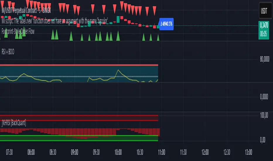
Footprint-Style Order Flow by Kalibea📊 Indicator: "Footprint-Style Order Flow by Kalibea"
Simplified Order Flow Analysis for TradingView
This indicator was created by Kalibea to bring you the power of Order Flow analysis in a clear, practical way—without technical complexity and fully compatible with TradingView.
While TradingView doesn’t support traditional footprint charts, this tool simulates institutional market reading using a smart calculation of estimated volume delta, helping you make more informed trading decisions.
🔍 What does this indicator do?
Estimated Delta: Calculates the difference between buying and selling pressure per candle, based on price movement and volume.
Smart Visual Signals:
🔼 Green Triangle: Potential buy entry (buyer dominance).
🔽 Red Triangle: Potential sell entry (seller dominance).
Delta Histogram: Displays whether each candle was driven more by buyers or sellers.
Live Labels: Shows real-time delta values above each candle for quick interpretation.
🧠 How does it help your trading?
Detects real-time market imbalances (who's in control: buyers or sellers).
Improves entry and exit timing, especially on lower timeframes.
Helps you confirm other strategies such as supply/demand zones, support/resistance, or candlestick patterns.
Provides an institutional-style reading simplified for use within TradingView.
⚙️ Fully Customizable to Your Style
Adjust the delta sensitivity to suit any market: Forex, Crypto, Indices, and more.
Turn on/off visual signals and histogram as needed.
🔑 Recommended by Kalibea for:
✅ Intraday traders and scalpers
✅ Traders looking to take the next step into institutional-style analysis
✅ Those seeking precise entries without overcomplicating their charts
💬 “Order Flow is the market’s internal voice. This indicator helps you hear it—no expensive footprint software required.”
— Kalibea
Body Engulfing Detector🔶 Body Engulfing Detector
This simple but effective indicator identifies candlestick patterns where the entire body of the current candle engulfs the body of the previous one — a classic signal of a potential reversal or momentum continuation.
🔍 What It Does:
Detects when the body (open-close range) of the current candle completely covers the body of the previous candle.
Triggers a visual signal on the chart once the candle is closed, avoiding premature alerts.
Includes a generic alert you can enable from the TradingView alert system, so you’ll be notified as soon as a body engulfing pattern occurs.
📈 Use Case:
This pattern can be interpreted as a shift in market sentiment and may signal a possible entry point depending on the context:
Use it as part of your price action strategy.
Combine it with trend analysis, volume, or other confirmation tools.
⚠️ This indicator focuses only on body engulfing and does not require the candle to be bullish or bearish specifically. If you'd like a version that distinguishes between bullish and bearish engulfing, feel free to request it.
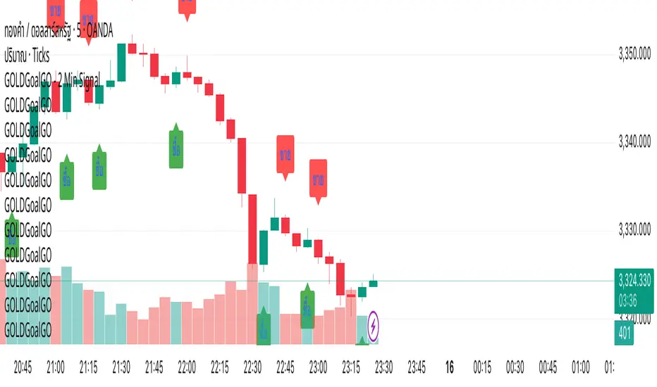
GOLDGoalGO - 2 Min SignalGOLDGoalGO" Indicator for TradingView
Introduction
The "GOLDGoalGO" indicator is designed to assist traders in analyzing short-term price movements of gold (XAUUSD). It provides buy and sell signals every 5 minutes, helping traders identify optimal entry and exit points based on recent price changes.
Concept and Functionality
Primary Goal: To offer clear and timely trading signals by analyzing short-term price trends, specifically tailored for 2-minute intervals.
How It Works: The indicator calculates the change in closing prices compared to the previous bar to generate buy and sell signals. These signals are only active during 2-minute timeframes, ensuring precision in short-term trading.
Signals Provided:
A buy signal (represented by an upward shape) appears when prices show upward momentum.
A sell signal (represented by a downward shape) appears when prices show downward momentum.
Visual Cues: The signals are displayed directly on the chart with intuitive shapes for quick recognition. Additionally, alert notifications are configured to inform you immediately when new signals occur.
How the Indicator Works in Detail
Timeframe Check: It activates only during 2-minute candlestick intervals to ensure signals are relevant for short-term trading.
Price Change Calculation: It compares the current close with the previous close to detect the direction of market movement.
Signal Generation:
If the price is increasing (positive change), a buy signal is generated.
If the price is decreasing (negative change), a sell signal is generated.
Chart Annotations: When a signal occurs, a shape appears on the chart indicating the optimal point for entering a trade.
Automated Alerts: The system sends a Thai-language notification every 2 minutes to alert you of new signals, enabling timely actions even when you're away from the screen.
How to Use
Paste this script into the Pine Editor in TradingView.
Click "Add to Chart" to activate the indicator.
Set up Alert rules:
Choose the alert condition for "Buy Signal" or "Sell Signal".
Select webhook or notification options to receive real-time alerts (for example, to Telegram).
The indicator provides real-time notifications every 2 minutes whenever new signals are generated.
Why Use This Indicator?
Simplicity: Designed for traders who prefer short-term, momentum-based trading strategies.
Timely Alerts: Signals are provided precisely every 2 minutes, helping you capitalize on short-term price movements.
Flexibility: Easily adaptable to other assets by adjusting the script if needed.