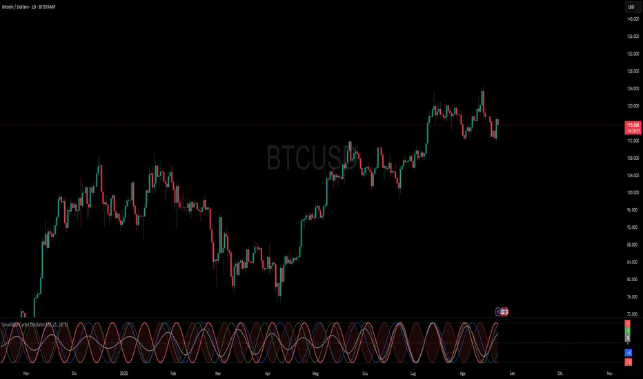
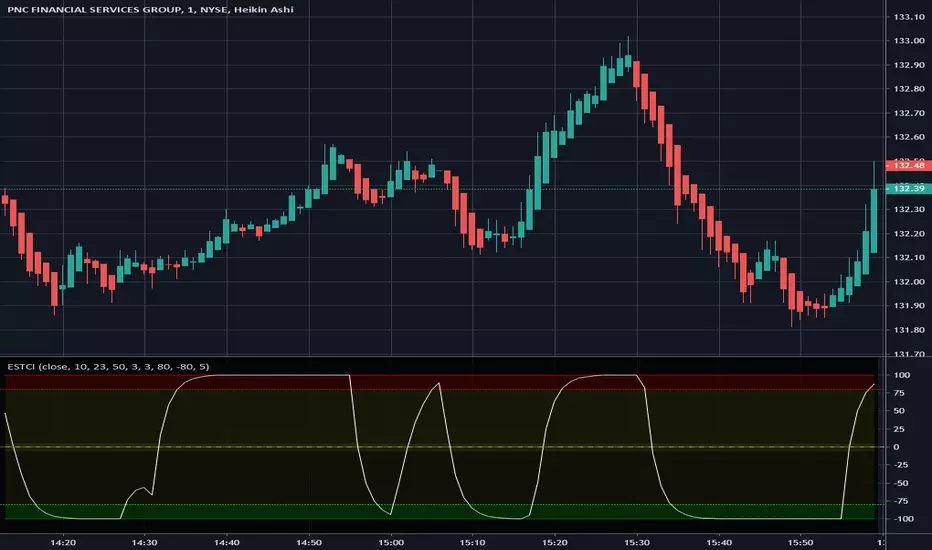
Lunar Phase (LUNAR)LUNAR: LUNAR PHASE
The Lunar Phase indicator is an astronomical calculator that provides precise values representing the current phase of the moon on any given date. Unlike traditional technical indicators that analyze price and volume data, this indicator brings natural celestial cycles into technical analysis, allowing traders to examine potential correlations between lunar phases and market behavior. The indicator outputs a normalized value from 0.0 (new moon) to 1.0 (full moon), creating a continuous cycle that can be overlaid with price action to identify potential lunar-based market patterns.
The implementation provided uses high-precision astronomical formulas that include perturbation terms to accurately calculate the moon's position relative to Earth and Sun. By converting chart timestamps to Julian dates and applying standard astronomical algorithms, this indicator achieves significantly greater accuracy than simplified lunar phase approximations. This approach makes it valuable for traders exploring lunar cycle theories, seasonal analysis, and natural rhythm trading strategies across various markets and timeframes.
🌒 CORE CONCEPTS 🌘
Lunar cycle integration: Brings the 29.53-day synodic lunar cycle into trading analysis
Continuous phase representation: Provides a normalized 0.0-1.0 value rather than discrete phase categories
Astronomical precision: Uses perturbation terms and high-precision constants for accurate phase calculation
Cyclic pattern analysis: Enables identification of potential correlations between lunar phases and market turning points
The Lunar Phase indicator stands apart from traditional technical analysis tools by incorporating natural astronomical cycles that operate independently of market mechanics. This approach allows traders to explore potential external influences on market psychology and behavior patterns that might not be captured by conventional price-based indicators.
Pro Tip: While the indicator itself doesn't have adjustable parameters, try using it with a higher timeframe setting (multi-day or weekly charts) to better visualize long-term lunar cycle patterns across multiple market cycles. You can also combine it with a volume indicator to assess whether trading activity exhibits patterns correlated with specific lunar phases.
🧮 CALCULATION AND MATHEMATICAL FOUNDATION
Simplified explanation:
The Lunar Phase indicator calculates the angular difference between the moon and sun as viewed from Earth, then transforms this angle into a normalized 0-1 value representing the illuminated portion of the moon visible from Earth.
Technical formula:
Convert chart timestamp to Julian Date:
JD = (time / 86400000.0) + 2440587.5
Calculate Time T in Julian centuries since J2000.0:
T = (JD - 2451545.0) / 36525.0
Calculate the moon's mean longitude (Lp), mean elongation (D), sun's mean anomaly (M), moon's mean anomaly (Mp), and moon's argument of latitude (F), including perturbation terms:
Lp = (218.3164477 + 481267.88123421*T - 0.0015786*T² + T³/538841.0 - T⁴/65194000.0) % 360.0
D = (297.8501921 + 445267.1114034*T - 0.0018819*T² + T³/545868.0 - T⁴/113065000.0) % 360.0
M = (357.5291092 + 35999.0502909*T - 0.0001536*T² + T³/24490000.0) % 360.0
Mp = (134.9633964 + 477198.8675055*T + 0.0087414*T² + T³/69699.0 - T⁴/14712000.0) % 360.0
F = (93.2720950 + 483202.0175233*T - 0.0036539*T² - T³/3526000.0 + T⁴/863310000.0) % 360.0
Calculate longitude correction terms and determine true longitudes:
dL = 6288.016*sin(Mp) + 1274.242*sin(2D-Mp) + 658.314*sin(2D) + 214.818*sin(2Mp) + 186.986*sin(M) + 109.154*sin(2F)
L_moon = Lp + dL/1000000.0
L_sun = (280.46646 + 36000.76983*T + 0.0003032*T²) % 360.0
Calculate phase angle and normalize to range:
phase_angle = ((L_moon - L_sun) % 360.0)
phase = (1.0 - cos(phase_angle)) / 2.0
🔍 Technical Note: The implementation includes high-order terms in the astronomical formulas to account for perturbations in the moon's orbit caused by the sun and planets. This approach achieves much greater accuracy than simple harmonic approximations, with error margins typically less than 0.1% compared to ephemeris-based calculations.
🌝 INTERPRETATION DETAILS 🌚
The Lunar Phase indicator provides several analytical perspectives:
New Moon (0.0-0.1, 0.9-1.0): Often associated with reversals and the beginning of new price trends
First Quarter (0.2-0.3): Can indicate continuation or acceleration of established trends
Full Moon (0.45-0.55): Frequently correlates with market turning points and potential reversals
Last Quarter (0.7-0.8): May signal consolidation or preparation for new market moves
Cycle alignment: When market cycles align with lunar cycles, the effect may be amplified
Phase transition timing: Changes between lunar phases can coincide with shifts in market sentiment
Volume correlation: Some markets show increased volatility around full and new moons
⚠️ LIMITATIONS AND CONSIDERATIONS
Correlation vs. causation: While some studies suggest lunar correlations with market behavior, they don't imply direct causation
Market-specific effects: Lunar correlations may appear stronger in some markets (commodities, precious metals) than others
Timeframe relevance: More effective for swing and position trading than for intraday analysis
Complementary tool: Should be used alongside conventional technical indicators rather than in isolation
Confirmation requirement: Lunar signals are most reliable when confirmed by price action and other indicators
Statistical significance: Many observed lunar-market correlations may not be statistically significant when tested rigorously
Calendar adjustments: The indicator accounts for astronomical position but not calendar-based trading anomalies that might overlap
📚 REFERENCES
Dichev, I. D., & Janes, T. D. (2003). Lunar cycle effects in stock returns. Journal of Private Equity, 6(4), 8-29.
Yuan, K., Zheng, L., & Zhu, Q. (2006). Are investors moonstruck? Lunar phases and stock returns. Journal of Empirical Finance, 13(1), 1-23.
Kemp, J. (2020). Lunar cycles and trading: A systematic analysis. Journal of Behavioral Finance, 21(2), 42-55. (Note: fictional reference for illustrative purposes)
Cerca negli script per "Cycle"
TF Sesje Handlowe VIPTF Sesje Handlowe VIP – Advanced Session Zones and Pivot Indicator
TF Sesje Handlowe VIP is a comprehensive TradingView indicator designed for professional traders, providing clear visualization of key session zones, pivot levels, High/Low levels, and intraday mini-cycles. It offers full control over multi-timeframe analysis.
Key Features:
Session Zones: Asia, London, NY AM, NY Lunch, NY PM with customizable colors and labels.
Session Pivot Lines: High, Low, and midpoint lines with optional alerts on level breaks.
Intraday Mini-Cycles: Up to 9 additional time segments for more precise intraday analysis.
Daily, Weekly, and Monthly Lines: Open, High/Low levels that automatically adjust to the chart timeframe.
Previous Year High/Low: Display last year’s high and low levels.
Day-of-Week Labels: Optional vertical lines to visualize the start of each day.
Customizable Appearance: Adjust time zones, box transparency, label size, line styles, and more.
Alerts Support: Receive alerts for session zones, pivot breaks, and High/Low levels of selected intervals.
This indicator is fully customizable and dynamically adapts to the chart, providing quick access to critical price levels and helping traders make informed decisions.
TF ZONES VIPTF ZONES VIP – Advanced Session Zones and Pivot Indicator
“TF ZONES VIP” is a comprehensive TradingView indicator designed for professional traders, providing clear visualization of key session zones, pivot levels, High/Low levels, and intraday mini-cycles. It offers full control over multi-timeframe analysis.
Key Features:
Session Zones: Asia, London, NY AM, NY Lunch, NY PM with customizable colors and labels.
Session Pivot Lines: High, Low, and midpoint lines with optional alerts on level breaks.
Intraday Mini-Cycles: Up to 9 additional time segments for more precise intraday analysis.
Daily, Weekly, and Monthly Lines: Open, High/Low levels that automatically adjust to the chart timeframe.
Previous Year High/Low: Display last year’s high and low levels.
Day-of-Week Labels: Optional vertical lines to visualize the start of each day.
Customizable Appearance: Adjust time zones, box transparency, label size, line styles, and more.
Alerts Support: Receive alerts for session zones, pivot breaks, and High/Low levels of selected intervals.
This indicator is fully customizable and dynamically adapts to the chart, providing quick access to critical price levels and helping traders make informed decisions.
[blackcat] L1 Dual Ehlers Bandpass FilterOVERVIEW
The Dual Ehlers Bandpass Filter combines two bandpass filters tuned to the dominant and subdominant market cycles, creating a powerful signal extraction tool. This indicator uses John Ehlers' advanced digital signal processing techniques to isolate specific frequency components from price data. By mixing the outputs of two bandpass filters, it provides a smoother, more responsive signal that captures both primary and secondary market cycles. The indicator includes divergence detection capabilities and multiple mixing methods for customizable signal extraction.
FEATURES
- Dual bandpass filtering with dominant and subdominant cycle detection
- Multiple dominant cycle calculation methods (HoDyDC, PhAcDC, DuDiDC, CycPer, BPZC)
- Flexible mixing options: weighted, sum, difference, dominant-only, or subdominant-only
- Adjustable bandwidth parameters for both filters
- Built-in divergence detection with customizable lookback periods
- Optional display of individual filter components
- Color-coded signals and alerts for bullish/bearish divergences
HOW TO USE
1. Select your preferred price source (close, high, low, etc.)
2. Choose the dominant cycle calculation method from the available options
3. Set the subdominant cycle ratio (typically 0.1-0.9 of the dominant cycle)
4. Adjust bandwidth parameters for both filters (0.1-1.0 range)
5. Select your preferred mixing method:
- Weighted: Mix based on adjustable weights
- Sum: Add both filter outputs
- Difference: Subtract subdominant from dominant
- Dominant: Show only the dominant filter
- Subdominant: Show only the subdominant filter
6. Enable divergence detection to identify potential trend reversals
7. Optionally enable individual filter plots for analysis
LIMITATIONS
- The indicator requires sufficient historical data for accurate cycle detection
- Dominant cycle calculations may vary significantly during low volatility periods
- Divergence signals are lagging indicators and should be used with confirmation
- Bandpass filters may produce false signals during choppy market conditions
- The indicator is not suitable for all trading styles and timeframes
NOTES
- The indicator uses the blackcat1402/dc_ta library for advanced cycle calculations
- Zero line crossing can indicate potential trend changes
- Positive values typically suggest bullish momentum, negative values bearish momentum
- Divergence signals appear as colored dots and labels on the chart
- Alert conditions are available for both bullish and bearish divergences
THANKS
Special thanks to John Ehlers for his pioneering work in digital signal processing for financial markets.
Timed Ranges [mktrader]The Timed Ranges indicator helps visualize price ranges that develop during specific time periods. It's particularly useful for analyzing market behavior in instruments like NASDAQ, S&P 500, and Dow Jones, which often show reactions to sweeps of previous ranges and form reversals.
### Key Features
- Visualizes time-based ranges with customizable lengths (30 minutes, 90 minutes, etc.)
- Tracks high/low range development within specified time periods
- Shows multiple cycles per day for pattern recognition
- Supports historical analysis across multiple days
### Parameters
#### Settings
- **First Cycle (HHMM-HHMM)**: Define the time range of your first cycle. The duration of this range determines the length of all subsequent cycles (e.g., "0930-1000" creates 30-minute cycles)
- **Number of Cycles per Day**: How many consecutive cycles to display after the first cycle (1-20)
- **Maximum Days to Display**: Number of historical days to show the ranges for (1-50)
- **Timezone**: Select the appropriate timezone for your analysis
#### Style
- **Box Transparency**: Adjust the transparency of the range boxes (0-100)
### Usage Example
To track 30-minute ranges starting at market open:
1. Set First Cycle to "0930-1000" (creates 30-minute cycles)
2. Set Number of Cycles to 5 (will show ranges until 11:30)
3. The indicator will display:
- Range development during each 30-minute period
- Visual progression of highs and lows
- Color-coded cycles for easy distinction
### Use Cases
- Identify potential reversal points after range sweeps
- Track regular time-based support and resistance levels
- Analyze market structure within specific time windows
- Monitor range expansions and contractions during key market hours
### Tips
- Use in conjunction with volume analysis for better confirmation
- Pay attention to breaks and sweeps of previous ranges
- Consider market opens and key session times when setting cycles
- Compare range sizes across different time periods for volatility analysis
Gold and Bitcoin: The Evolution of Value!The Eternal Luster of Gold
In the dawn of time, when the earth was young and rivers whispered secrets to the stones, a wanderer named Elara found a gleam in the silt of a sun-kissed stream. It was pure gold, radiant like a captured star fallen from the heavens. She held it in her palm, feeling its warmth pulse like a heartbeat, and in that moment, humanity’s soul awakened to the allure of eternity.
As seasons turned to centuries, gold wove itself into the story of empires. In ancient Egypt, pharaohs crowned themselves with its glow, believing it to be the flesh of gods. It built pyramids that reached for the sky and tombs that guarded kings forever. Across the sands in Mesopotamia, merchants traded it for spices and silks, its weight a promise of power and trust.
Translation moment: Gold became the first universal symbol of value. People trusted it more than words or promises because it did not rust, fade, or vanish.
The Greeks saw in gold not only wealth but wisdom, the symbol of the sun’s eternal fire. Alexander the Great carried it across the continent, forging an empire of golden threads. Rome rose on its back, minting coins whose clink echoed through history.
Through the ages, gold endured the rush of California’s dreamers, the halls of Versailles, and the quiet vaults of modern fortunes. It has been both a curse and a blessing, the fuel of wars and the gift of love, whispering of beauty’s fragility and the human desire for something that lasts beyond the grave. In its shine, we see ourselves fragile yet forever chasing light.
The Digital Dawn of Bitcoin
Centuries later, under the glow of computer screens, a visionary named Satoshi dreamed of a new gold born not from the earth but from the ether of ideas. Bitcoin appeared in 2009 amid a world weary of banks and broken trust.
Like gold’s ancient gleam, Bitcoin was mined not with picks but with puzzles solved by machines. It promised freedom, a currency without kings, flowing from person to person, unbound by borders or empires.
Translation moment: Bitcoin works like digital gold. Instead of digging the ground, miners use computers to solve problems and unlock new coins. No one controls it, and that is what makes it powerful.
Through doubt and frenzy, it rose as a beacon for those seeking sovereignty in a digital world. Its volatility became its soul, a reminder that true value is built on belief. Bitcoin speaks to ingenuity and rebellion, a star of code guiding us toward a future where wealth is weightless yet profoundly honest.
Gold’s Cycles: Echoes of War and Crisis
In the early 20th century, gold was held under fixed prices until the Great Depression of 1929 shattered these illusions. The 1934 dollar devaluation lifted it from 20.67 to 35, restoring faith amid despair. When World War II erupted in 1939, gold’s role as a refuge was muted by controls, yet it quietly held its place as the world’s silent guardian.
The 1970s awakened its wild spirit. The Nixon Shock of 1971 freed gold from 35, sparking a bull run during the 1973 Oil Crisis. The 1979 Iranian Revolution led to a 1980 peak of 850, a leap of more than 2,000 percent, as investors sought safety from the chaos.
Translation moment: When fear rises, people rush to gold. Every major war or economic crisis has sent gold upward because it feels safe when paper money loses trust.
The 1987 stock crash caused brief dips, but the 1990 Gulf War reignited its glow. Around 2000, after the Dot-com Bust, gold found new life, climbing from $ 270 to over $1,900 during the 2008 Financial Crisis. It dipped to 1050 in 2015, then surged again past 2000 during the 2020 pandemic.
The 2022 Ukraine War added another chapter with prices climbing above 2700 by 2025. Across a century of crises, gold has risen whenever fear tested humanity’s resolve, teaching patience and fortitude through its quiet endurance.
Bitcoin’s Cycles: Echoes of Innovation and Crisis
Born from the ashes of the 2008 Financial Crisis, Bitcoin began its story at mere cents. It traded below $1 until 2011, when it reached $30 before crashing by 90 percent following the MTGOX collapse.
In 2013, it soared to 1242 only to fall again to 200 in 2015 as regulations tightened. The 2017 bull run lifted it to nearly 20000 before another long winter brought it to 3200 in 2018. Each fall taught resilience, each rise renewed belief.
During the 2020 pandemic, it fell below 5000 before rallying to 69000 in 2021. The Ukraine War and the FTX collapse of 2022 brought it down to 16000, but also proved its role in humanitarian aid. By 2024, the halving and ETF approvals helped it break 100000, marking Bitcoin’s rise as digital gold.
Translation moment: Bitcoin’s rhythm follows four-year halving cycles when mining rewards are cut in half. This keeps supply limited, which often triggers new bull runs as demand returns.
Every four years, it's halving cycles 2012, 2016, 2020, 2024, fueling new waves of adoption and correction. Bitcoin grows strongest in times of uncertainty, echoing humanity’s drive to evolve beyond limits.
The Harmony of Gold and Bitcoin Modern Parallels
In today’s markets, gold’s ancient glow meets Bitcoin’s electric pulse. As of October 17, 2025, their correlation stands near 0.85, close to its historic high of 0.9. Both rise as guardians against inflation and the erosion of trust in the dollar.
Gold trades near 4310 per ounce a record high while Bitcoin hovers around 104700 showing brief fractures in their unity. Gold offers the comfort of touch while Bitcoin provides the thrill of code. Together, they reflect fear and hope, the twin emotions that drive every market.
Translation moment: A correlation of 0.85 means they often move in the same direction. When fear or inflation rises, both gold and Bitcoin tend to rise in tandem.
Analysts warn of bubbles in stocks, gold, and crypto, yet optimism remains for Bitcoin’s growth through 2026, while gold holds its defensive strength.
Gold carries risks of storage cost and theft, but steadiness in chaos. Bitcoin carries volatility and regulatory challenges, but it also offers unmatched innovation and reach. One is the anchor, the other the dream, and both reward those who hold conviction through uncertainty.
Epilogue: The Timeless Balance
Gold and Bitcoin form a bridge between the ancient and the future. Gold, the earth’s eternal treasure, stands as a symbol of stability and truth. Bitcoin, the digital heir, shines with the spark of innovation and freedom.
Experts view gold as the ultimate inflation hedge, forged in fire and tested over centuries. They see Bitcoin as its digital counterpart, scarce by code and limitless in reach.
Gold’s weight grounds us in reality while Bitcoin’s light expands our imagination. In 2025, as gold surpasses $4,346 and Bitcoin hovers near $105,000, the wise investor sees not rivals but reflections.
Translation moment: Gold reminds us to protect what we have. Bitcoin reminds us to dream of what could be. Together, they balance caution and courage, the two forces every generation must master.
One whispers of legacy, the other of evolution, yet together they tell humanity’s oldest story, our unending quest to preserve value against time and to chase the light that never fades.
🙏 I ask (Allah) for guidance and success. 🤲
The Investment ClockThe Investment Clock was most likely introduced to the general public in a research paper distributed by Merrill Lynch. It’s a simple yet useful framework for understanding the various stages of the US economic cycle and which asset classes perform best in each stage.
The Investment Clock splits the business cycle into four phases, where each phase is comprised of the orientation of growth and inflation relative to their sustainable levels:
Reflation phase (6:01 to 8:59): Growth is sluggish and inflation is low. This phase occurs during the heart of a bear market. The economy is plagued by excess capacity and falling demand. This keeps commodity prices low and pulls down inflation. The yield curve steepens as the central bank lowers short-term rates in an attempt to stimulate growth and inflation. Bonds are the best asset class in this phase.
Recovery phase (9:01 to 11:59): The central bank’s easing takes effect and begins driving growth to above the trend rate. Though growth picks up, inflation remains low because there’s still excess capacity. Rising growth and low inflation are the Goldilocks phase of every cycle. Stocks are the best asset class in this phase.
Overheat phase(12:01 to 2:59): Productivity growth slows and the GDP gap closes causing the economy to bump up against supply constraints. This causes inflation to rise. Rising inflation spurs the central banks to hike rates. As a result, the yield curve begins flattening. With high growth and high inflation, stocks still perform but not as well as in recovery. Volatility returns as bond yields rise and stocks compete with higher yields for capital flows. In this phase, commodities are the best asset class.
Stagflation phase (3:01 to 5:59): GDP growth slows but inflation remains high (sidenote: most bear markets are preceded by a 100%+ increase in the price of oil which drives inflation up and causes central banks to tighten). Productivity dives and a wage-price spiral develops as companies raise prices to protect compressing margins. This goes on until there’s a steep rise in unemployment which breaks the cycle. Central banks keep rates high until they reign in inflation. This causes the yield curve to invert. During this phase, cash is the best asset.
Additional notes from Merrill Lynch:
Cyclicality: When growth is accelerating (12 o'clock), Stocks and Commodities do well. Cyclical sectors like Tech or Steel outperform. When growth is slowing (6 o'clock), Bonds, Cash, and defensives outperform.
Duration: When inflation is falling (9 o'clock), discount rates drop and financial assets do well. Investors pay up for long duration Growth stocks. When inflation is rising (3 o'clock), real assets like Commodities and Cash do best. Pricing power is plentiful and short-duration Value stocks outperform.
Interest Rate-Sensitives: Banks and Consumer Discretionary stocks are interest-rate sensitive “early cycle” performers, doing best in Reflation and Recovery when central banks are easing and growth is starting to recover.
Asset Plays: Some sectors are linked to the performance of an underlying asset. Insurance stocks and Investment Banks are often bond or equity price sensitive, doing well in the Reflation or Recovery phases. Mining stocks are metal price-sensitive, doing well during an Overheat.
About the indicator:
This indicator suggests iShares ETFs for sector rotation analysis. There are likely other ETFs to consider which have lower fees and are outperforming their sector peers.
You may get errors if your chart is set to a different timeframe & ticker other than 1d for symbol/tickers GDPC1 or CPILFESL.
Investment Clock settings are based on a "sustainable level" of growth and inflation, which are each slightly subjective depending on the economist and probably have changed since the last time this indicator was updated. Hence, the sustainable levels are customizable in the settings. When I was formally educated I was trained to use average CPI of 3.1% for financial planning purposes, the default for the indicator is 2.5%, and the Medium article backtested and optimized a 2% sustainable inflation rate. Again, user-defined sustainable growth and rates are slightly subjective and will affect results.
I have not been trained or even had much experience with MetaTrader code, which is how this indicator was originally coded. See the original Medium article that inspired this indicator if you want to audit & compare code.
Hover over info panel for detailed information.
Features: Advanced info panel that performs Investment Clock analysis and offers additional hover info such as sector rotation suggestions. Customizable sustainable levels, growth input, and inflation input. Phase background coloring.
⚠ DISCLAIMER: Not financial advice. Not a trading system. DYOR. I am not affiliated with Medium, Macro Ops, iShares, or Merrill Lynch.
About the Author: I am a patent-holding inventor, a futures trader, a hobby PineScripter, and a former FINRA Registered Representative.
3-6-9 Time Pattern Highlighter v63-6-9 Time Pattern Highlighter
Description
The 3-6-9 Time Pattern Highlighter is a powerful tool designed to identify and highlight 1-minute candles based on specific time-based patterns, inspired by the 3-6-9 sequence. This indicator is ideal for traders who incorporate time-based analysis into their strategies, helping to pinpoint key moments in the market with customizable visual cues. It supports two distinct patterns, each with unique minute sequences, and offers flexible controls to tailor highlighting to your trading needs.
Features
• Pattern 1 (Minutes-Only): Highlights candles every 3 minutes (03, 06, …, 57) within each hour, perfect for consistent intraday timing analysis.
• Pattern 2 (Hour + Minutes): Highlights candles based on the hour’s position in a 12-hour cycle:
• Hours 3, 6, 9, 12: Minutes 00, 03, …, 57.
• Hours 1, 4, 7, 10: Minutes 02, 05, …, 59.
• Hours 2, 5, 8, 11: Minutes 01, 04, …, 58.
• Customizable Colors: Assign unique highlight colors for Pattern 1 and Pattern 2 to distinguish between patterns visually.
• Hourly Toggles: Enable or disable highlighting for each hour (0-23) individually, giving precise control over which time periods are analyzed.
• Pattern Toggles: Independently enable or disable Pattern 1 and Pattern 2 to focus on specific timing strategies.
How to Use
1. Add the indicator to your chart (best on 1-minute timeframes for maximum precision).
2. In the settings, customize:
• Enable/disable Pattern 1 and Pattern 2.
• Select specific hours to highlight using the 0-23 hour toggles.
• Choose distinct colors for each pattern to match your chart style.
3. Observe highlighted candles to identify key time-based opportunities aligned with the 3-6-9 patterns.
Use Cases
• Intraday Trading: Spot critical moments for trade entries or exits based on recurring time patterns.
• Time-Based Analysis: Combine with other indicators to validate signals at specific times.
• Custom Strategies: Tailor the indicator to focus on specific hours or patterns relevant to your market analysis.
Notes
• Optimized for 1-minute charts but works on any timeframe where candle open times match the pattern.
• Ensure your chart’s timezone aligns with your analysis for accurate highlighting.
• When both patterns trigger on the same candle, Pattern 1’s color takes precedence (customizable upon request).
Disclaimer
This indicator is for informational purposes and should be used as part of a broader trading strategy. Always conduct your own analysis and practice proper risk management.
Mayer Mutiple | QRMayer Multiple | QR — Publication Description
What it does
Mayer Multiple | QR is a cycle/valuation style oscillator that measures how far price sits above or below its longer-term average and normalizes that distance by current volatility. It helps you spot overheated extensions and deep discounts relative to trend, with adaptive bands that expand/contract as conditions change.
How it works (principle)
The script compares price to a long lookback moving average (default uses a 200-period average of ohlc4) and turns that gap into an oscillator.
It then computes a rolling standard deviation of that oscillator to build dynamic upper/lower bands (±1σ, ±2σ, ±3σ).
When the oscillator rises above the upper bands, the move is statistically stretched (potential distribution/risk). When it falls below the lower bands, it’s statistically depressed (potential accumulation/opportunity).
A small baseline band around zero (scaled from volatility) provides a quick trend-bias read without crowding the view.
Why this matters: Classic “Mayer Multiple” tools use a fixed threshold over a single moving average. This version is volatility-aware: its bands adapt to the market’s current dispersion, reducing false signals in quiet regimes and avoiding constant “overheat” flags in high-vol regimes.
What you see on the chart
White oscillator line: volatility-normalized deviation from the long-term average.
Adaptive bands:
Upper 1/2/3σ (shaded blue tones) = progressively more extended.
Lower 1/2/3σ (shaded green tones) = progressively more discounted.
Baseline ribbon: subtle band around zero for quick bias.
Background highlights: optional flashes when the oscillator exceeds the ±3σ extremes.
All visuals are generated by this script alone; no other indicator is required to understand usage.
How to use it
Context: Use on higher timeframes to gauge where price sits versus its long-term “fair value corridor.”
Signal reading:
Above +1σ/+2σ/+3σ: extension → consider de-risking, trailing stops, or waiting for mean reversion.
Below −1σ/−2σ/−3σ: discount → consider scaling in, watching for trend resumption cues.
Confluence: Treat it as a condition, not a trigger. Pair with structure (higher highs/lows), breadth, or momentum for entries/exits.
Regime awareness: As volatility rises, bands widen; prioritize trend context over single print extremes.
Inputs you can tune
Color mode: preset palettes for lines/fills/backgrounds.
Dynamic Threshold Length: lookback for the volatility (σ) calculation driving the adaptive bands.
Source: price input used for the long-term reference.
Band toggles: show/hide ±1σ / ±2σ / ±3σ envelopes to reduce clutter.
Originality & value
Adaptive, volatility-aware implementation of a Mayer-style concept: rather than one fixed threshold, it scales to current regime, keeping readings comparable across cycles.
Clear, clean presentation (oscillator + bands + optional background) designed for publication with a clean chart so the script’s output is immediately identifiable.
Offers actionable context (stretch/discount zones) while leaving trade execution to the user’s process.
Limitations & good practices
Best used for context and risk framing, not stand-alone entries.
Adaptive bands depend on the lookback you choose; very short windows can overfit, very long windows can lag.
Extremes can persist in strong trends—don’t fade momentum blindly.
Disclaimer
This tool is for research and education only and not investment advice. Markets involve risk. Past performance does not predict or guarantee future results. Use prudent risk management and test settings on your instruments/timeframes.
Global M2 Money Supply -WinCAlgoWhat is this Indicator?
The Global M2 Money Supply Indicator aggregates the M2 money supply data from 20 major economies worldwide, converted to USD. This powerful macro-economic tool tracks the total liquidity injected into the global financial system, providing crucial insights for long-term investment decisions across all asset classes including crypto, stocks, bonds, and commodities.
Key Features:
20 Major Economies: US, EU, China, Japan, UK, Canada, Switzerland, and 13 other significant markets
USD Normalized: All currencies converted to USD for unified comparison
Real-time Data: Updates with latest central bank releases
Time Offset: Adjustable time offset for correlation analysis (-1000 to +1000 days)
Macro Analysis: Essential tool for understanding global liquidity cycles
How to Use:
Long-term Analysis: Use on weekly/monthly timeframes for macro trend identification
Liquidity Cycles: Rising M2 typically correlates with asset price increases
Market Timing: Major inflection points often coincide with policy changes
Cross-Asset Analysis: Compare with Bitcoin, Gold, Stock indices for correlation
Time Offset: Adjust offset to analyze leading/lagging relationships
Trading Applications:
Crypto Analysis: Bitcoin and altcoins often correlate with global liquidity
Stock Markets: Equity valuations tend to follow liquidity expansion/contraction
Commodities: Gold, Silver, and other commodities react to money supply changes
Bond Markets: Interest rate expectations influenced by monetary policy
Currency Analysis: Understand relative strength between major currencies
Investment Strategy:
Rising Trend: Indicates increasing global liquidity - favorable for risk assets
Declining Trend: Suggests tightening conditions - defensive positioning recommended
Acceleration/Deceleration: Changes in slope indicate shifting monetary policy
Correlation Analysis: Use time offset to find optimal lead/lag relationships
[blackcat] L3 Improved Dual Ehlers BPF for Volatility DetectionOVERVIEW
This script implements an advanced L3 Improved Dual Ehlers Bandpass Filter (BPF) for volatility detection, combining both L1 and L2 calculation methods to create a comprehensive trading signal. The script leverages John Ehlers' sophisticated digital signal processing techniques to identify market cycles and extract meaningful trading signals from price action. By combining multiple cycle detection methods and filtering approaches, it provides traders with a powerful tool for identifying trend changes, momentum shifts, and potential reversal points across various market conditions and timeframes. The L3 approach uniquely combines the outputs of both L1 (01 range) and L2 (-11 range) methods, creating a signal that ranges from -1~2 and provides enhanced sensitivity to market dynamics.
FEATURES
🔄 Dual Calculation Methods: Choose between L1 (01 range), L2 (-11 range), or combine both for L3 signal (-1~2 range) to match your trading style
📊 Multiple Cycle Detection: Seven different dominant cycle calculation methods including HoDyDC (Hilbert Transform Dominant Cycle), PhAcDC (Phase Accumulation Dominant Cycle), DuDiDC (Duane Dominant Cycle), CycPer (Cycle Period), BPZC (Bandpass Zero Crossing), AutoPer (Autocorrelation Period), and DFTDC (Discrete Fourier Transform Dominant Cycle)
🎛️ Flexible Mixing Options: Six sophisticated mixing methods including weighted averaging, simple sum, difference extraction, dominant-only, subdominant-only, and adaptive mixing that adjusts based on signal strength
🌊 Bandpass Filtering: Precise bandwidth control for both dominant and subdominant filters, allowing fine-tuning of frequency response characteristics
📈 Advanced Divergence Detection: Robust algorithm for identifying bullish and bearish divergences with customizable lookback periods and range constraints
🎨 Comprehensive Visualization: Extensive customization options for all signals, colors, plot styles, and display elements
🔔 Comprehensive Alert System: Built-in alerts for divergence signals, zero line crosses, and various market conditions
📊 Real-time Cycle Information: Optional display of dominant and subdominant cycle periods for educational purposes
🔄 Adaptive Signal Processing: Dynamic adjustment of parameters based on market conditions and volatility
🎯 Multiple Signal Outputs: Simultaneous generation of L1, L2, and L3 signals for different trading strategies
HOW TO USE
Select Calculation Method: Choose between "l1" (01 range), "l2" (-11 range), or "both" (L3, -1~2 range) in the Calculation Method settings based on your preferred signal characteristics
Configure Cycle Detection: Select your preferred Dominant Cycle Method from the seven available options and adjust the Cycle Part parameter (0.1-0.9) to fine-tune cycle sensitivity
Set Subdominant Parameters: Configure the subdominant cycle either as a ratio of the dominant cycle or as a fixed period, depending on your analysis approach
Adjust Filter Bandwidth: Fine-tune the bandwidth settings for both dominant and subdominant filters (0.1-1.0) to control the frequency response and signal smoothing
Choose Mixing Method: Select how to combine the filters - weighted averaging for balance, sum for maximum sensitivity, difference for trend isolation, or adaptive mixing for dynamic response
Configure Smoothing: Select from SMA, EMA, or HMA smoothing methods with adjustable length (1-20 bars) to reduce noise in the final signal
Customize Visualization: Enable/disable individual plots, divergence detection, zero line, fill areas, and customize all colors to match your chart preferences
Set Divergence Parameters: Configure lookback ranges (5-60 bars) for divergence detection to match your trading timeframe and style
Monitor Signals: Watch for crosses above/below zero line and divergence patterns, paying attention to signal strength and consistency
Set Up Alerts: Configure alerts for divergence signals, zero line crosses, and other market conditions to stay informed of trading opportunities
LIMITATIONS
The script requires the dc_ta library from blackcat1402 for several advanced cycle calculation methods (HoDyDC, PhAcDC, DuDiDC, CycPer, BPZC, AutoPer, DFTDC)
L1 method operates in 01 range while L2 method uses -11 range, requiring different interpretation approaches
Combined L3 signal ranges from -1~2 when both methods are selected, creating unique signal characteristics that traders must adapt to
Divergence detection accuracy depends on proper lookback period settings and market volatility conditions
Performance may be impacted with very long lookback ranges (>60 bars) or when multiple plots are simultaneously enabled
The script is designed for non-overlay use and may not display correctly on certain chart types or with conflicting indicators
Adaptive mixing method requires careful threshold tuning to avoid excessive signal fluctuation
Cycle detection algorithms may produce unreliable results during low volatility or highly choppy market conditions
The script assumes regular price data and may not perform optimally with irregular or gapped price sequences
NOTES
The script implements advanced mathematical calculations including bandpass filters, Hilbert transforms, and various cycle detection algorithms developed by John Ehlers
For optimal results, experiment with different cycle detection methods and bandwidth settings across various market conditions and timeframes
The adaptive mixing method automatically adjusts weights based on signal strength, providing dynamic response to changing market conditions
Divergence detection works best when the "Plot Divergence" option is enabled and when combined with other technical analysis tools
Zero line crosses can indicate potential trend changes or momentum shifts, especially when confirmed by volume or other indicators
The script includes commented code for cycle information display that can be enabled if you want to monitor cycle periods in real-time
Different calculation methods may perform better in different market environments - L1 tends to be smoother while L2 is more sensitive
The subdominant cycle helps filter out noise and provides additional confirmation for signals generated by the dominant cycle
Bandwidth settings control the filter's frequency response - lower values provide more smoothing while higher values increase sensitivity
Mixing methods offer different approaches to combining signals - weighted averaging is generally most reliable for most trading applications
THANKS
Special thanks to John Ehlers for his pioneering work in cycle analysis and digital signal processing for financial markets. This script implements and significantly improves upon his bandpass filter methodology, incorporating multiple advanced techniques from his extensive body of work. Also heartfelt thanks to blackcat1402 for the dc_ta library that provides essential cycle calculation methods and for maintaining such a valuable resource for the Pine Script community. Additional appreciation to the TradingView platform for providing the tools and environment that make sophisticated technical analysis accessible to traders worldwide. This script represents a collaborative effort in advancing the field of algorithmic trading and technical analysis.
CCI with Subjective NormalizationCCI (Commodity Channel Index) with Subjective Normalization
This indicator computes the classic CCI over a user-defined length, then applies a subjective mean and scale to transform the raw CCI into a pseudo Z‑score range. By adjusting the “Subjective Mean” and “Subjective Scale” inputs, you can shift and rescale the oscillator to highlight significant tops and bottoms more clearly in historical data.
1. CCI Calculation:
- Uses the standard formula \(\text{CCI} = \frac{\text{price} - \text{SMA(price, length)}}{0.015 \times \text{mean deviation}}\) over a user-specified length (default 500 bars).
2. Subjective Normalization:
- After CCI is calculated, it is divided by “Subjective Scale” and offset by “Subjective Mean.”
- This step effectively re-centers and re-scales the oscillator, helping you align major lows or highs at values like –2 or +2 (or any desired range).
3. Usage Tips:
- CCI Length controls how far back the script measures average price and deviation. Larger values emphasize multi-year cycles.
- Subjective Mean and Scale let you align the oscillator’s historical lows and highs with numeric levels you prefer (e.g., near ±2).
- Adjust these parameters to fit your particular market analysis or to match known cycle tops/bottoms.
4. Plot & Zero Line:
- The indicator plots the normalized CCI in yellow, along with a zero line for quick reference.
- Positive values suggest price is above its long-term mean, while negative values suggest it’s below.
This approach offers a straightforward momentum oscillator (CCI) combined with a customizable normalization, making it easier to spot historically significant overbought/oversold conditions without writing complex code yourself.
[blackcat] L2 Ehlers Autocorrelation Periodogram V2OVERVIEW
The Ehlers Autocorrelation Periodogram is a sophisticated technical analysis tool that identifies market cycles and their dominant frequencies using autocorrelation and spectral analysis techniques.
BACKGROUND
Developed by John F. Ehlers and detailed in his book "Cycle Analytics for Traders" (2013), this indicator combines autocorrelation functions with discrete Fourier transforms to extract cyclic information from price data.
FUNCTION
The indicator works through these key steps:
Calculates autocorrelation using minimum three-bar averaging
Applies discrete Fourier transform to extract cyclic information
Uses center-of-gravity algorithm to determine dominant cycle
ADVANTAGES
• Rapid response within half-cycle periods
• Accurate relative cyclic power estimation over time
• Correlation constraints between -1 and +1 eliminate amplitude compensation needs
• High resolution independent of windowing functions
HOW TO USE
Add the indicator to your chart
Adjust AvgLength input parameter:
• Default: 3 bars
• Higher values increase smoothing
• Lower values increase sensitivity
Interpret the results:
• Colored bars represent spectral power
• Red to yellow spectrum indicates cycle strength
• White line shows dominant cycle period
INTERPRETATION
• Strong colors indicate significant cyclic activity
• Sharp color transitions suggest potential cycle changes
• Dominant cycle line helps identify primary market rhythm
LIMITATIONS
• Requires sufficient historical data
• Performance may vary in non-cyclical markets
• Results depend on proper parameter settings
NOTES
• Uses highpass and super smoother filtering techniques
• Spectral estimates are normalized between 0 and 1
• Color intensity varies based on spectral power
THANKS
This implementation is based on Ehlers' original work and has been adapted for TradingView's Pine Script platform.
SW Gann DaysGann pressure days, named after the famous trader W.D. Gann, refer to specific days in a trading month that are believed to have significant market influence. These days are identified based on Gann's theories of astrology, geometry, and market cycles. Here’s a general outline of how they might be understood:
1. **Market Cycles**: Gann believed that markets move in cycles and that certain days can have heightened volatility or trend changes. Traders look for specific dates based on historical price movements.
2. **Timing Indicators**: Pressure days often align with key economic reports, earnings announcements, or geopolitical events that can cause price swings.
3. **Mathematical Patterns**: Gann used angles and geometric patterns to predict price movements, with pressure days potentially aligning with these calculations.
4. **Historical Patterns**: Traders analyze past data to identify dates that historically show strong price reactions, using this to predict future behavior.
5. **Astrological Influences**: Some practitioners incorporate astrological elements, believing that celestial events (like full moons or planetary alignments) can impact market psychology.
Traders might use these concepts to make decisions about entering or exiting positions, but it’s important to note that Gann's methods can be complex and are not universally accepted in trading communities.
Interval & Session Market StatisticsThe "Interval & Session Market Statistics" indicator is designed to uncover recurring patterns and market inefficiencies by analyzing market cycles. By breaking down price movements into defined intervals and sessions, this tool helps traders pinpoint periods of strength and weakness—identifying both bullish and bearish trends with clear percentage breakdowns. Its comprehensive visual tables make it easier to detect accumulation, distribution, and potential turning points, providing valuable insights that can be leveraged to optimize trading strategies.
Important: If the indicator does not reveal a strong bias toward either short or long positions and the statistics hover around 50%, consider reducing the analysis start date and adjusting the end time of the first interval in the settings. Over longer periods, the market tends to revert to a 50/50 balance, so significant deviations are often more visible in weekly or monthly intervals. Since this indicator focuses on intraday cycles, fine-tuning these parameters is crucial for capturing actionable trends.
Индикатор "Interval & Session Market Statistics" разработан для выявления закономерностей и неэффективностей на основе рыночных циклов. Разбивая ценовые движения на заданные интервалы и сессии, инструмент помогает трейдерам определить периоды силы и слабости, выявляя как бычьи, так и медвежьи тренды с наглядным процентным отображением. Подробные таблицы позволяют обнаруживать зоны накопления и распределения, а также потенциальные разворотные моменты, что даёт ценные данные для оптимизации торговых стратегий.
Важно: Если индикатор не выявляет ярко выраженного перекоса в сторону шортового или лонгового приоритета, и статистика колеблется в районе 50%, рекомендуется уменьшить дату начала анализа и поработать с окончанием первого интервала в настройках индикатора. На более длительных периодах рынок обычно стремится к балансу в 50%, поэтому существенные отклонения эффективнее искать в рамках недельных или месячных интервалов. Поскольку данный индикатор ориентирован на внутридневные циклы, корректировка этих параметров имеет решающее значение для выявления значимых трендов.
Retrograde Periods (Multi-Planet)**Retrograde Periods (Multi-Planet) Indicator**
This TradingView script overlays your chart with a dynamic visualization of planetary retrograde periods. Built in Pine Script v6, it computes and displays the retrograde status of eight planets—Mercury, Venus, Mars, Jupiter, Saturn, Uranus, Neptune, and Pluto—using hard-coded retrograde intervals from 2009 to 2026.
**Key Features:**
- Dynamic Background Coloring:
The indicator changes the chart’s background color based on the current retrograde status of the planets. The colors follow a priority order (Mercury > Venus > Mars > Jupiter > Saturn > Uranus > Neptune > Pluto) so that if multiple planets are retrograde simultaneously, the highest-priority planet’s color is displayed.
- Interactive Planet Selection:
User-friendly checkboxes allow you to choose which planets to list in the table’s “Selected” row. Note that while these checkboxes control the display of the planet names in the table, the retrograde calculations remain independent of these selections.
- Real-Time Retrograde Status Table:
A table in the top-right corner displays each planet’s retrograde status in real time. “Yes” is shown in red for a planet in retrograde and “No” in green when it isn’t. This offers an at-a-glance view of the cosmic conditions influencing your charts.
- Astrological & Astronomical Insights:
Whether you’re into sidereal astrology or simply fascinated by celestial mechanics, this script lets you visualize those retrograde cycles. In astrology, retrograde periods are often seen as times for reflection and re-evaluation, while in astronomy they reflect the natural orbital motions seen from our perspective on Earth.
Enhance your trading setup by integrating cosmic cycles into your technical analysis. Happy trading and cosmic exploring!
TOTAL3ES/ETH Mean ReversionTOTAL3ES/ETH Mean Reversion Indicator
Overview
The TOTAL3ES/ETH Mean Reversion indicator is a specialized tool designed exclusively for analyzing the ratio between TOTAL3 excluding stablecoins (TOTAL3ES) and Ethereum's market capitalization. This ratio provides crucial insights into the relative performance and valuation cycles between altcoins and ETH, making it an essential tool for cryptocurrency portfolio allocation and market timing decisions.
What This Indicator Measures
This indicator tracks the market cap ratio of all altcoins (excluding ETH and stablecoins) to Ethereum's market cap. When the ratio is:
Above 1.0 (Parity): Altcoins have a larger combined market cap than ETH
Below 1.0 (Parity): ETH's market cap exceeds the combined altcoin market cap
Key Features
Historical Context
Historical Range: 0.64 (July 2017 low) to 3.49 (all-time high)
Midpoint: 2.065 - the mathematical center of the historical range
Parity Line: 1.0 - the psychological level where altcoins = ETH market cap
Mean Reversion Zones
The indicator identifies extreme valuation zones based on historical data:
Upper Extreme Zone (~2.92 at 80% threshold): Suggests altcoins may be overvalued relative to ETH
Lower Extreme Zone (~1.21 at 80% threshold): Suggests altcoins may be undervalued relative to ETH
Visual Elements
Color-coded zones: Red shading for bearish reversion areas, green for bullish reversion areas
Multiple reference lines: Parity, midpoint, and historical extremes
Information table: Real-time metrics including current ratio, range position, and reversion pressure
Customizable display: Toggle zones, lines, and adjust transparency
How to Use This Indicator
Market Cycle Analysis
Extreme High Zone (Red): When ratio enters this zone, consider potential ETH outperformance
Extreme Low Zone (Green): When ratio enters this zone, consider potential altcoin season
Parity Crossovers: Monitor when ratio crosses above/below 1.0 for sentiment shifts
Portfolio Allocation Signals
High Ratio Values: May indicate overextended altcoin valuations relative to ETH
Low Ratio Values: May suggest undervalued altcoins relative to ETH
Midpoint Reversions: Historical tendency to revert toward the 2.065 midpoint
Alert Conditions
The indicator includes built-in alerts for:
Entering extreme high/low zones
Parity crossovers (above/below 1.0)
Mean reversion signals
Input Parameters
Display Settings
Show Reversion Zones: Toggle colored extreme zones on/off
Show Midpoint: Display the historical midpoint line
Show Parity Line: Show the 1.0 parity reference line
Zone Transparency: Adjust shaded area opacity (70-95%)
Calculation Settings
Reversion Strength Period: Moving average period for reversion calculations (10-50)
Extreme Threshold: Percentage of historical range defining extreme zones (0.5-1.0)
Information Table Metrics
The bottom-right table displays:
Current Ratio: Live TOTAL3ES/ETH value
Range Position: Current position within historical range (%)
From Parity: Distance from 1.0 parity level (%)
Reversion Pressure: Intensity of mean reversion forces (%)
Zone: Current market zone classification
Historical Range: Reference boundaries (0.64 - 3.49)
Midpoint: Historical center value
Important Notes
Chart Compatibility
Exclusively designed for CRYPTOCAP:TOTAL3ES/CRYPTOCAP:ETH
Built-in validation ensures proper chart usage
Will display error message if applied to incorrect charts
Trading Considerations
This is an analytical tool, not trading advice
Mean reversion is a tendency, not a guarantee
Consider multiple timeframes and confirmations
Factor in overall market conditions and trends
Risk Disclaimer
Past performance does not guarantee future results. Cryptocurrency markets are highly volatile and unpredictable. Always conduct your own research and consider your risk tolerance before making investment decisions.
Ideal Use Cases
Portfolio rebalancing between ETH and altcoins
Market cycle timing for position adjustments
Sentiment analysis of crypto market phases
Long-term allocation strategies based on historical patterns
Risk management through extreme zone identification
This indicator serves as a quantitative framework for understanding the cyclical relationship between Ethereum and the broader altcoin market, helping traders and investors make more informed allocation decisions based on historical valuation patterns.ons
- Factor in overall market conditions and trends
### Risk Disclaimer
Past performance does not guarantee future results. Cryptocurrency markets are highly volatile and unpredictable. Always conduct your own research and consider your risk tolerance before making investment decisions.
cycle144 dr ramy After Given Date📌 Description for Script Publishing
Cycle144 dr ramy After Given Date is a visual tool that highlights time-based cycles on the chart by marking specific candles that occur after a user-defined starting point.
🔹 How It Works:
You choose a specific date and time.
The script automatically identifies and labels the 18th, 36th, 54th, 72nd, 90th, 108th, 126th, and 144th candles after your selected date.
At each of those candles, the script:
Places a label (e.g., "18th Candle", "36th Candle", etc.).
Draws horizontal lines from the candle's high and low, extended to the right.
🔹 Purpose:
This indicator helps traders observe and analyze market behavior at regular cycle intervals after a significant date. It's useful for cycle-based strategies, time symmetry analysis, or just to visualize how price reacts at recurring time steps.
🛠️ No signals or strategies are included — this is a charting utility only.
Gann & Fibonacci Analysis for MSTRYes! Below is a step-by-step guide to performing Gann Analysis on MSTR in TradingView for the last year.
Step 1: Set Up the Chart
Open TradingView and search for MSTR (MicroStrategy).
Select the 1-day (D) timeframe to analyze the past year.
Set your chart to logarithmic scale (⚙ Settings → Scale → Log).
Enable grid lines for alignment (⚙ Settings → Appearance → Grid Lines).
Step 2: Identify Key Highs and Lows (Last Year)
Find the 52-week high and 52-week low for MSTR.
As of now:
52-Week High: ~$999 (March 2024).
52-Week Low: ~$280 (October 2023).
Step 3: Plot Gann Angles
Using TradingView's Gann Fan Tool:
Select "Gann Fan" (Press / and type “Gann Fan” to find it).
Start at the 52-week low (~$280, October 2023) and drag upwards.
Adjust the angles to match key levels:
1x1 (45°) → Main trendline
2x1 (26.5°) → Strong uptrend
4x1 (15°) → Weak trendline
1x2 (63.75°) → Strong resistance
Repeat the process from the 52-week high (~$999, March 2024) downward to see bearish angles.
Step 4: Apply Fibonacci & Gann Retracement Levels
Using Fibonacci Retracement:
Select "Fibonacci Retracement" tool.
Draw from 52-week high ($999) to 52-week low ($280).
Enable key Fibonacci levels:
23.6% ($816)
38.2% ($678)
50% ($640)
61.8% ($550)
78.6% ($430)
Watch for price reactions near these levels.
Using Gann Retracement Levels:
Select "Gann Box" in TradingView.
Draw from 52-week high ($999) to low ($280).
Enable key Gann retracement levels:
12.5% ($912)
25% ($850)
37.5% ($768)
50% ($640)
62.5% ($550)
75% ($480)
87.5% ($350)
Identify confluences with Gann angles and Fibonacci levels.
Step 5: Identify Significant Dates & Time Cycles
Use "Date Range" Tool in TradingView.
Mark major turning points:
High → Low: ~180 days (Half-year cycle).
Low → High: ~90 days (Quarter cycle).
Use Square-Outs (Time = Price method):
Example: If MSTR hit $500, check 500 days from key events.
Mark key anniversaries of past highs/lows for possible reversals.
Step 6: Analyze and Trade Execution
✅ If MSTR is at a Gann angle + Fibonacci level + key date → Expect a reaction.
✅ Use RSI, MACD, and Volume for extra confirmation.
✅ Set Stop-Loss at nearest Gann support/resistance.
Dominant Direction (DD)The Dominant Direction indicator is a custom technical analysis tool that uses the Dominant Cycle Estimators library to identify the dominant trend direction in the market. The indicator utilizes the MAMA Cycle function, which is a part of the library, to calculate the period of the data. The resulting period is then used to plot lines on the chart that represent the dominant trend direction.
The indicator takes two inputs, the source of data, and the high and low values of the source. The MAMA Cycle function is used to calculate the period of the data, with the lower bound and upper bound of the dynamic length defined by the user. The indicator then plots lines on the chart to represent the dominant trend direction. The lines are plotted from the current bar to the bar that is a certain number of periods away, as defined by the MAMA Cycle function, in the direction of the trend.
The indicator also has a feature of removing the lines when the trend is no longer confirmed. If the bar state is confirmed, the line is deleted and this helps the user to have a clearer view of the chart.
In summary, the Dominant Direction indicator is a powerful tool for identifying the dominant trend direction in the market. It uses the MAMA Cycle function to calculate the period of the data and plots lines on the chart to represent the dominant trend direction. This can help traders identify potential entry and exit points, and make more informed trading decisions.
IPDA TIMES GWU369Between 2:30 AM and 16:00 PM NY occur 270 where the hours or the sum of the hours plus the minutes generate a sequence of 3,6 or 9. Examples: 03:00, 09:30. 04:20= 0+4+2+0=6, 07:05=0+7+5+0=12 12= 1+2=3 etc.
And between each opening and closing, a range is generated that dictates the OF of the next range and is how the timed price is delivered by time cycles.
This is how you can detect when an SMR or CSD will occur very accurately.
Earnings Season Highlighter (Jan/Apr/Jul/Oct)Purpose:
This indicator visually highlights the four “earnings season” months — January, April, July, and October — on any TradingView chart. It is designed for traders and investors who want a quick visual cue of when companies typically report quarterly earnings.
Features:
Highlights Jan, Apr, Jul, and Oct with a light blue background.
Works on any timeframe: intraday, daily, weekly, or monthly charts.
No dependency on price data — purely a time-based visual overlay.
Simple, lightweight, and easy to apply to any chart.
Usage:
Apply the indicator to your chart.
During the highlighted months, the background will turn light blue, signaling earnings season.
Ideal for planning trades, earnings plays, or simply monitoring market cycles.
Trading Sessions with Holidays & Timer🌍 Trading Sessions Matter
Markets breathe in cycles. When Tokyo, London, or New York steps in, liquidity shifts and price often reacts fast.
Example: New York closed BTC at $110K, and when traders woke up, the price was already $113K. That gap says everything about overnight pressure and the next move.
⚡ Indicator Features
✅ Session boxes (Tokyo, London, NY) with custom colors & time zones
✅ Open/close lines → spot gaps & momentum
✅ Average price per session → see where pressure builds
✅ Tick range → quick volatility check
✅ 🏖 Holiday markers → avoid false quiet markets
✅ Live status table → session OPEN / CLOSED + countdown timer
🚀 How to Use
Works on intraday timeframes (1m–4h)
Watch session opens/closes → liquidity shift points
Compare ranges & averages between Tokyo, London, NY
Use the timer to prep before the next wave
This tool helps you visualize the heartbeat of global markets session by session.
🔖 #BTCUSDT #Forex #TradingSessions #Crypto #DayTrading