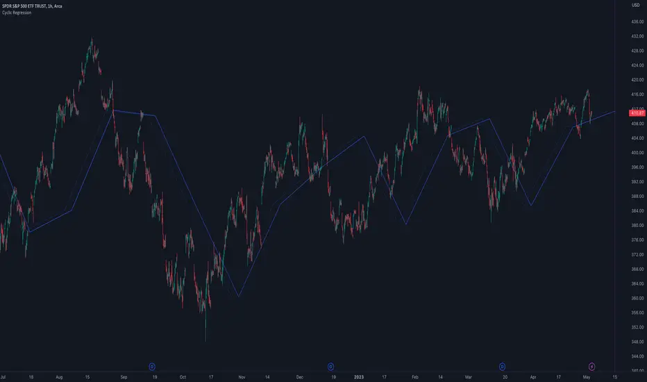
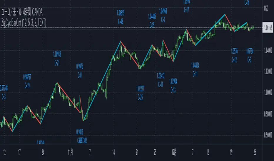
Cyclic RegressionCyclic Regression is a new concept that uses Digital Signal Processing (DSP) to determine the regression of past and future cycles. This is a unique method of regression which has the ability to forecast into the future.
There are several ways to use this tool.
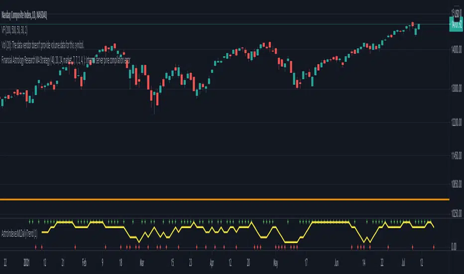
Firstly, it follows similar rules to moving averages and can be used to filter entries. Long entries should be considered when price action is above the line or the line direction is upwards. The opposite is applied for shorts, a downward direction or price action is below.
The regression line is also a strong SR (Support and Resistance) or trend line so traders can expect big moves when this line is broken or a pullback is made after the break.
Each new direction of regression signifies a new cycle so traders can plan for a possible big move when reaching the end of the line.
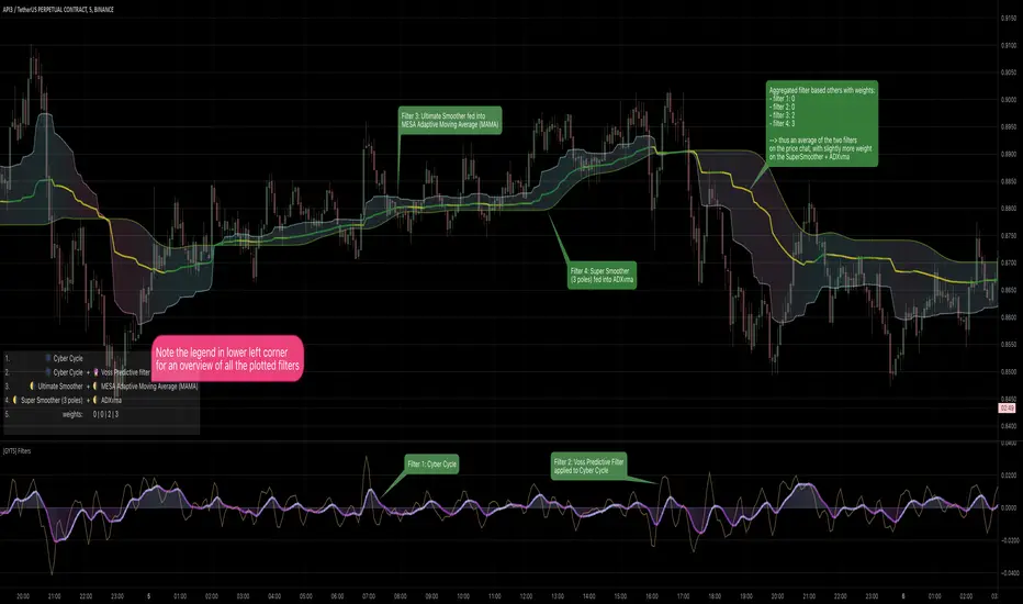
The Settings are not your typical length or lookback options:
The main modifier is the "Response" input, with this the frequency response for the signal processing can be adjusted. By default it is set at 5000 but this can be boosted to something like 10000 to tune it to bigger cycles.
The other modifiers include sensitivity which will fine tune the response, this can be use with in conjunction with threshold option which adjusts the threshold of the useable response.
There is also the ability to add an external sources to the signal using the source input box. This allows traders to include other sources of data such as volume or RSI.
Indicatore Pine Script®