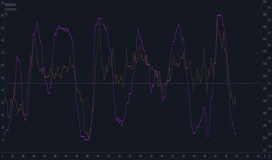
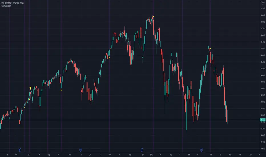
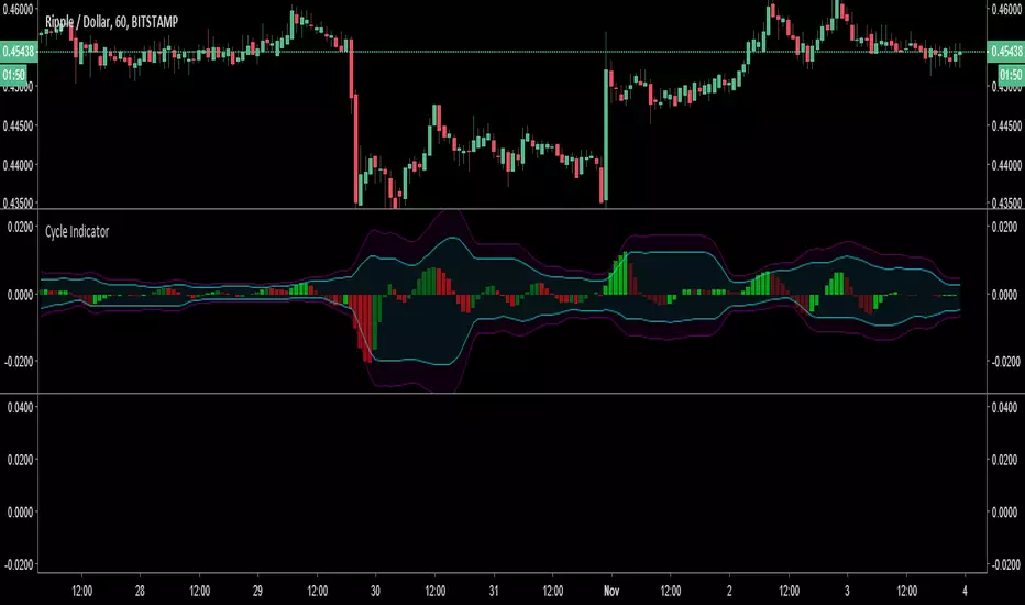
Tare's Multi-Timeframe Market Heatmap
Tare's Multi-Timeframe Market Heatmap is a powerful tool designed to help traders quickly gauge market sentiment across multiple timeframes using a combination of RSI (Relative Strength Index) and MACD (Moving Average Convergence Divergence) indicators. This indicator analyzes four customizable timeframes to determine whether the market is bullish or bearish, providing a visual heatmap to indicate the overall market direction and strength.
Key Features:
Multi-Timeframe Analysis: The indicator allows you to select up to four different timeframes (e.g., 5 minutes, 15 minutes, 30 minutes, 1 hour) to analyze the market's behavior comprehensively.
RSI and MACD Integration: By combining RSI and MACD indicators, the heatmap provides a more robust analysis, taking into account both momentum (RSI) and trend (MACD) indicators. This dual approach helps in identifying stronger and more reliable signals.
Visual Heatmap: The indicator plots a histogram that changes color and intensity based on the combined bullish or bearish strength across the selected timeframes:
Green: Indicates bullish strength, with a darker shade representing stronger bullish signals across multiple timeframes.
Red: Indicates bearish strength, with a darker shade representing stronger bearish signals across multiple timeframes.
Customizable Settings: You can customize the length settings for RSI and MACD, including the RSI period, MACD fast and slow lengths, and signal length, allowing for tailored analysis based on your trading strategy.
Signal Exposure for Other Strategies: The indicator exposes both bullish and bearish signals, which can be used as inputs for other custom strategies within TradingView. This feature allows seamless integration and enhances the versatility of your trading approach.
How to Use:
Adjust the timeframes and indicator settings in the indicator's input menu to match your trading style.
Observe the color and intensity of the histogram to understand the current market sentiment across the selected timeframes.
Utilize the exposed signals (bullish and bearish) in conjunction with other strategies or indicators for a more comprehensive trading system.
Tare's Multi-Timeframe Market Heatmap provides traders with a clear, concise, and customizable overview of market conditions, making it an essential tool for multi-timeframe analysis and decision-making.
Cerca negli script per "Cycle"
Catastrophe DistanceCatastrophe Distance is a tool to visually explore the time between catastrophic price moves.
Catastrophes are defined with 2 variables:
drawdown_threshold: the amount of percent the price has to fall
lookback_period = the amount of last candles in which drawdown_threshold was reached.
Drawdown_threshold per default is 25% and lookback_period is 5, meaning per default if price moves -25% in the last 5 candles you have a catastrophe.
Feel free to play around with this values to fit all the events you consider a catastrophe.
This indicator does not provide signals. It however implies caution if the time since the last catastrophe is higher then the average time between catastrophes (of last x catastrophes).
This is marked by the label over the current price showing the actual and average time since last catastrophe turning from green to black.
Given that the distance between catastrophes is somewhat cyclical:
Maybe now is a good time to start phishing for low limit orders and reduce leverage?
Day-of-Week PerformanceThis Pine Script indicator calculates and displays the average performance for each weekday over a specified lookback period on a chart. The performance is computed based on the percentage change from the open to the close price of each day.
Features:
Lookback Period:
Input field to specify the number of days to look back for calculating performance. The default is set to 756 days.
Performance Calculation:
Calculates the average percentage change from open to close for each weekday (Monday through Friday) within the specified lookback period.
Histogram Plots:
Displays histograms on the chart for each weekday. Each histogram represents the average performance of that day of the week.
Histograms are plotted with distinct colors:
Monday: Blue
Tuesday: Red
Wednesday: Green
Thursday: Orange
Friday: Purple
Performance Table:
A table is displayed in the top-right corner of the chart showing the average percentage performance for each weekday.
The table updates with the lookback period and the calculated average performance values for each weekday.
Positive performance values are shown in green, and negative values are shown in red.
This indicator helps visualize day-of-the-week performance trends, providing insights into which days typically perform better or worse over the specified period.
Macro Times [Blu_Ju]About ICT Macro Times:
The Inner Circle Trader (ICT) has taught that there are certain time sessions when the Interbank Price Delivery Algorithm (IPDA) is running a macro. The macro itself could be a repricing macro, a consolidation macro, etc. - this depends on where price currently is in relation to its draw. The times the macro is active do not change however, and are always the following (in New York local time):
8:50-9:10 (premarket macro)
9:50-10:10 (AM macro 1)
10:50-11:10 (AM macro 2)
11:50-12:10 (lunch macro)
13:10-13:40 (PM macro)
15:15-15:45 (final hour macro)
Because these times are fixed, traders can anticipate a setup is likely to form in or around these sessions. Setups may involve sweeps of liquidity (highs/lows), repricing to inefficiencies (e.g., fair value gaps), breaker setups, etc. (The specific setup involved is beyond the scope of this script; this script is concerned with visually marking the time sessions only.)
About this Script:
The scope of this script is to visually identify the macro active time sessions. This script draws vertical lines to mark the start and end of the macro time sessions. Optionally, the user can use a background color for the macro session with or without the vertical lines. The user can also toggle on or off any of the macro sessions, if he or she is only interested in certain ones. The user also has the freedom to change the times of the macro sessions if he or she is interested in a different time.
What makes this script unique is that it plots the macro time sessions after midnight for each day, before the real-time bar reaches the macro times. This is advantageous to the trader, as it gives the trader a visual cue that the macro times are approaching. When watching price it is easy to lose track of time, and the purpose of this script is to help the trader maintain where price is in relation to the macro time sessions in a simple, visual way.
Timing - Fx MGKWhat You See:
Session Boxes:
As you observe, the larger purple box represents the Asian Session, spanning from around 22:00 to 06:00 UTC. You notice how it captures the overnight market activity.
The smaller, greyish box marks the London Session, from about 08:00 to 12:00 UTC. You can see how the price action changes during this session.
The New York Session is also indicated, with vertical lines possibly marking the open and close, helping you track movements as the U.S. markets come into play.
High and Low Levels:
Horizontal lines are drawn at the high and low of each session. You can use these as potential support or resistance levels, aiding in your decision-making process.
Vertical Lines:
These lines likely correspond to specific key times, such as session opens or closes. You can quickly identify the transition between sessions, which is crucial for your timing.
Color Coding:
Each session is color-coded, making it easier for you to distinguish between them at a glance. The purple, grey, and additional lines offer a clear visual distinction.
How You Use It:
This indicator is your go-to for understanding how different market sessions affect price action. You’ll use it to:
Recognize important price levels within each session.
Identify potential entry and exit points based on session highs and lows.
Observe how the market transitions from one session to another, giving you insight into the best times to trade.
Customization:
You have the flexibility to adjust the settings. You can change session times to suit your trading hours, modify colors to match your chart theme, and even choose which sessions to display or hide based on your focus.
This tool is designed to enhance your analysis, providing you with a structured view of market sessions. With this indicator, you’re well-equipped to navigate the global markets with greater precision and confidence.
10-2 Treasury Yield SpreadThe 10-2 Year Treasury Yield Spread is a crucial indicator in the financial realm. Here’s the lowdown:
What Is It?
The 10-2 Treasury Yield Spread represents the difference between the 10-year Treasury rate and the 2-year Treasury rate.
Essentially, it captures the gap between long-term and short-term interest rates.
Why Does It Matter?
A flattening yield curve occurs when the 10-2 spread approaches zero. This suggests that long-term and short-term rates are converging.
A negative 10-2 yield spread has historically been a red flag. It often precedes recessionary periods.
Conversely, a widening yield curve (positive spread) indicates optimism about future economic growth.
Multi-Timeframe Period Separator [CHE]Multi-Timeframe Period Separator
Introduction
- Purpose: This TradingView script is designed to help traders by automatically drawing period separators on the chart based on various timeframes.
- Benefits: Enhances chart readability, provides better visualization of time periods, and supports multiple timeframe types.
Features
1. Timeframe Selection:
- Auto Timeframe
- Multiplier
- Manual
2. Customization Options:
- Separator color
- Separator style
- Separator width
3. Display Options:
- Time period information box
- Customizable size and position of the info box
Code Breakdown
1. Timeframe Type Selection
- Options: Users can choose between "Auto Timeframe," "Multiplier," and "Manual." A multiplier can be set for the alternate resolution.
2. Resolution Calculation
- Automatic, Multiplier, and Manual Resolution Calculation: The resolution is calculated based on the selected timeframe type.
3. Automatic Timeframe Function
- Dynamic Timeframe Calculation: A function for automatically calculating the appropriate timeframe based on the current chart resolution.
4. Drawing the Separators
- Drawing Separators on the Chart: Separators are drawn based on the selected timeframe and the user's customization options.
5. Display of the Time Period
- Information Box Settings: Users can enable the display of an information box showing the current timeframe. The size, position, and colors of the box can be customized.
- Displaying the Time Period in the Information Box: If enabled, the information box shows the current time period.
Usage
1. Loading the Script: Add the script to your TradingView chart.
2. Setting Timeframe Type: Choose from Auto, Multiplier, or Manual.
3. Customizing Separators: Adjust the color, style, and width of the separators to your preference.
4. Displaying the Time Period: Enable the information box to show the current timeframe.
Conclusion
- Summary: This script provides a robust solution for traders who need clear visual separation of different time periods on their charts.
- Customization: Flexible options allow you to tailor the appearance and functionality to suit your trading style.
New day started with DSTNew Day Started with DST Indicator
Description:
The "New Day Started with DST" indicator is designed for intraday charts and highlights the first bar of each new trading day, accounting for Germany's timezone and daylight saving time (DST) adjustments. This is particularly useful for traders who follow the German market or need precise day start indications based on Central European Time (CET) and Central European Summer Time (CEST).
Features:
- Timezone Adjustment: Automatically adjusts the time to CET (UTC+1) during standard time and CEST (UTC+2) during daylight saving time.
- Daylight Saving Time (DST) Handling: Correctly identifies the start and end of DST based on the last Sunday in March and October.
- New Day Highlight: Highlights the first bar of each new day, allowing traders to easily identify the start of a new trading day.
How It Works:
- Timezone Calculation: The script calculates the current time in Germany by adding the appropriate timezone offset to the UTC time.
- DST Rules: The script manually checks the conditions to determine if the current date falls within the DST period.
- New Day Detection: By checking the hour and minute of the corrected German time, the script determines if a new day has started and highlights the first bar accordingly.
Benefits:
- Enhanced Accuracy: Ensures that the start of a new day is accurately reflected according to German trading hours, considering both CET and CEST.
- Visual Aid: Provides a clear visual indication of the start of a new trading day, improving chart readability and trading precision.
- Customizable: Can be easily modified to adjust for other timezones and DST rules if needed.
Usage:
Apply this indicator to your intraday charts to automatically highlight the first bar of each new trading day, taking into account the timezone and DST adjustments for Germany. This tool is essential for traders operating in or tracking the German market, offering a reliable and precise method to monitor daily trading activity.
Example:
! (URL-to-your-screenshot)
This indicator ensures that you never miss the start of a new trading day, helping you to make timely and informed trading decisions.
---
How the Script Works:
1. Timezone Offset Calculation:
- The script begins by setting the base offset to 1 hour (CET is UTC+1).
- It initializes the DST offset to 0.
2. Determining the Current Month and Day:
- It retrieves the current month and day of the month from the `time` variable.
3. Checking DST Conditions:
- For months between April and September (inclusive), the DST offset is set to 1 hour (CEST is UTC+2).
- For March, it checks if the current date is after the last Sunday of March and if the time is past 2:00 AM to determine if DST should start.
- For October, it checks if the current date is before the last Sunday of October and if the time is before 2:00 AM to determine if DST should end.
4. Adjusting the Time for Germany:
- The script calculates the corrected German time by adding the base offset and DST offset to the UTC time.
5. Detecting the Start of a New Day:
- It checks if the hour and minute of the corrected German time are both zero (00:00), indicating the start of a new day.
6. Highlighting the First Bar:
- If the script detects a new day, it highlights the first bar of the new day with a green background color.
This approach ensures that the script accurately reflects the start of a new trading day according to German trading hours, including adjustments for daylight saving time.
Daye's Quarterly TheoryDaye's Quarterly Theory Indicator
Description
The Daye's Quarterly Theory Indicator divides trading time into smaller units to help traders identify potential accumulation, manipulation, distribution, and reversal/continuation phases within a day. It applies these time divisions to your charts, offering visual guidance aligned with ICT's PO3 concept:
Accumulation (A): The phase where positions are accumulated.
Manipulation (M): The phase where the market moves against the prevailing trend to trap traders.
Distribution (D): The phase where accumulated positions are distributed.
Reversal/Continuation (X): The phase indicating either a reversal or continuation of the trend.
This indicator breaks down time into quarters at different levels:
Daily Quarters:
Q1: 18:00 - 00:00 (Asia)
Q2: 00:00 - 06:00 (London)
Q3: 06:00 - 12:00 (NY AM)
Q4: 12:00 - 18:00 (NY PM)
90-Minute Quarters:
Q1: 18:00 - 19:30
Q2: 19:30 - 21:00
Q3: 21:00 - 22:30
Q4: 22:30 - 00:00
Micro Quarters (22.5 minutes) (Displayed on 7-minute TF or lower):
Q1: 18:00 - 18:22:30
Q2: 18:22:30 - 18:45
Q3: 18:45 - 19:07:30
Q4: 19:07:30 - 19:30
Features
Time Box Visualization: Highlights different quarters of the trading day to help visualize market phases.
Customizable Colors: Allows users to set different colors for daily, 90-minute, and micro quarters.
Flexible Settings: Designed to work out-of-the-box on both light and dark background charts.
ICT PO3 Alignment: Helps traders align their strategies with ICT's Accumulation, Manipulation, Distribution, and Reversal/Continuation phases.
Usage
Apply this indicator to your NQ1! or ES1! charts and observe the confluence with ICT's macro times. Use it to predict potential market phases and optimize your trading strategy by buying after manipulation down or selling after manipulation up.
Note: The indicator's display may vary based on the timeframe viewed and broker feeds. Back-test and research for best results on your preferred assets.
Master Accumulation Weekly Buy SignalsMaster Accumulation Weekly Buy Signals
The Master Accumulation Weekly Buy Signals indicator is designed to help traders identify potential buy opportunities based on the accumulation and distribution of volume, with a primary focus on weekly timeframes. This indicator combines the On Balance Volume (OBV) and the Accumulation/Distribution (AD) indicators to generate buy signals when both metrics show a decline.
Key Features:
Percentage Change Calculation: Calculates the percentage change in OBV and AD over a specified length tailored to weekly timeframes.
Timeframe Adaptability: While optimized for weekly timeframes, the indicator can also adjust to daily and monthly charts.
Volume Validation: Ensures that volume data is available and valid for accurate calculations.
Buy Signals: Generates buy signals when both OBV and AD percentage changes are negative, indicating potential accumulation by informed traders.
Visual Alerts: Plots buy signal triangles below the price bars on the main chart for easy identification.
How It Works:
On Balance Volume (OBV): Tracks the cumulative volume, considering the direction of price changes, and calculates the percentage change over the specified period, primarily for weekly analysis.
Accumulation/Distribution (AD): Measures the flow of volume into or out of a security, considering the relationship between the closing price and the high-low range, and calculates the percentage change over the specified period, primarily for weekly analysis.
Buy Signal Generation: A buy signal is generated when both OBV and AD show a negative percentage change, suggesting a potential buying opportunity.
How to Use:
Apply the indicator to your chart and select the weekly timeframe for optimal performance.
Look for buy signal triangles that appear below the price bars on the main chart.
Use the buy signals as part of your broader trading strategy, confirming them with other technical analysis tools and indicators.
Important Note:
This indicator is a tool to assist in identifying potential buy signals based on volume accumulation patterns. It is primarily designed for weekly timeframes and should not be used as a standalone trading strategy. Always perform comprehensive analysis and consider risk management practices before making any trading decisions.
This description highlights the indicator's primary focus on weekly timeframes while providing comprehensive information about its features and usage.
THIS IS TEST ONLY*******
Sessions [UkutaLabs]█ OVERVIEW
Sessions is a trading toolkit that displays the different trading sessions on your chart during a trading day. By default, Sessions displays the four standard trading sessions; New York, Tokyo, London, and Sydney.
Each of the four sessions can be toggled, and the Sessions indicator is completely customizable, allowing users to define their own sessions to be generated by the script.
The aim of this script is to improve the trading experience of users by automatically displaying information about each default or custom session to the user.
█ USAGE
This script will automatically detect and label different market sessions. By default, the script will identify the four standard trading sessions, but each of these can be toggled off in the settings.
However, users are not limited to these four trading sessions and have the ability to define their own sessions to be identified by the script. When a session begins, the script will automatically start outlining the market data of that session, including the high and low of the period that is represented by the session.
If the market is within two or more sessions at the same time, then each session will be treated individually and will overlap with each other.
The sessions will be identified as a colored box surrounding the market data of the period that it represents, and a label will be displayed above the box to identify the session that it represents. The label, color and period of each session is completely customizable.
The user can also adjust all sessions at once to account for timezones in the settings.
█ SETTINGS
Session 1
• Session 1: Determines whether or not this session will be drawn by the script.
• A string field to determine the name of the session that will be displayed above the session range.
• Two time fields representing the start and finish of the session.
• A color field to determine the color of the range and label.
Session 2
• Session 2: Determines whether or not this session will be drawn by the script.
• A string field to determine the name of the session that will be displayed above the session range.
• Two time fields representing the start and finish of the session.
• A color field to determine the color of the range and label.
Session 3
• Session 3: Determines whether or not this session will be drawn by the script.
• A string field to determine the name of the session that will be displayed above the session range.
• Two time fields representing the start and finish of the session.
• A color field to determine the color of the range and label.
Session 4
• Session 4: Determines whether or not this session will be drawn by the script.
• A string field to determine the name of the session that will be displayed above the session range.
• Two time fields representing the start and finish of the session.
• A color field to determine the color of the range and label.
Time Zones
• UTC +/-: Determines the offset of each session. Enter - before the number to represent a negative offset.
Event on charts**Event on Charts Indicator**
This indicator visually marks significant events on your chart. It is highly customizable, allowing you to activate or deactivate different groups of events and choose whether to display the event text directly on the chart or only when hovered over. Each group of events can be configured with distinct settings such as height mode, color, and label style.
### Key Features:
- **Group Activation:** Enable or disable different groups of events based on your analysis needs.
- **Text Display Options:** Choose to display event texts directly on the chart or only on hover.
- **Customizable Appearance:** Adjust the height mode, offset multiplier, bubble color, text color, and label shape for each group.
- **Predefined Events:** Includes predefined events for major crashes, FED rate changes, SPX tops and bottoms, geopolitical conflicts, economic events, disasters, and significant Bitcoin events.
### Groups Included:
1. **Crash Events:** Marks major market crashes.
2. **FED Rate Events:** Indicates changes in the Federal Reserve rates.
3. **SPX Top Events:** Highlights market tops for the S&P 500.
4. **Geopolitical Conflicts:** Marks significant geopolitical events.
5. **Economic Events:** Highlights important economic events such as bankruptcies and crises.
6. **Disaster and Cyber Events:** Indicates major disasters and cyber attacks.
7. **Bitcoin Events:** Marks significant events in the Bitcoin market.
8. **SPX Bottom Events:** Highlights market bottoms for the S&P 500.
### Usage:
This indicator is useful for traders and analysts who want to keep track of historical events that could impact market behavior. By visualizing these events on the chart, you can better understand market reactions and make informed decisions.
Session Statistical Mapping° [Pro+] (Joshuuu)Introduction:
Dive into the dynamic world of statistical market analysis with Session Statistical Mapping Pro+, an advanced tool designed for intraday traders of all asset classes.
Description:
This indicator offers a detailed algorithmic statistical measurement of Time and price, integrating the principles of Inner Circle Trader (ICT) to analyze the market behaviours such as Manipulation, and Distribution. This tool supercharges your trading strategies with data-driven insights.
ICT traders classify manipulation as a movement to trap market participants in the "wrong" direction. This allows analysts to anticipate the intended real direction of the distribution phase.
On the other hand, when price distributes, it's looking to expand for higher – or lower – prices. Analysts can therefore note distribution levels for a draw on liquidity, retracement, or reversal.
These levels and the Time at which they are reached during the selected session, will provide important information about orderflow when price trades through them and the sequence in which the delivery occurs.
Additionally, to amplify the price mapping, this tool plots the average Time at which its manipulation and distribution phases should complete. This feature allows traders to utilize historical Timings in conjunction with the price levels of manipulation and distribution.
As with any historical data driven tool, analysts should not expect past behaviour to match future performance. This tool was created with a data driven edge to bring attention to when sessions are likely to turn after their manipulations, or retrace after completing set distributions.
Key Features:
Algorithmic Measurement of Price: Leverage algorithmic theory to measure price movements with precision. This tool calculates average session manipulation and distribution price levels, providing traders with actionable insights based on historical data – key manipulation and distribution levels.
Algorithmic Measurement of Time: Utilize algorithmic theory to measure time-based movements within specific sessions. This tool calculates the projected average Time at which the manipulation and distribution phases are completed during a given session. This feature enhances traders' ability to interpret market movements and align their strategies with Time data.
Four Sessions Times: Customize up to four Time ranges to focus on specific trading sessions, such as the European, US, or Asian market sessions. This allows traders to align their analysis with the operational hours of major market participants, capturing the most relevant price movements. Traders can also create unique sessions based on their trading Time to study market behaviour when they usually operate in the markets – unlocking a level of understanding towards their personal backtested model and strategies.
Flexible Calculation: The sample size of the sessions can be set to a specific number – the default is 1000. This allows traders to adjust the depth of historical data used in their analysis, balancing detail and performance.
Further Customization:
Custom Appearance: Adjust the style of session lines with options like dotted, solid, and various colors. This helps traders visually distinguish between different types of market activities (e.g., Open, Manipulation, Distribution) on their charts.
Lookback Periods: Option to show available lookback periods for a deeper historical analysis, providing context and historical benchmarks for current market conditions.
Extended Visualization: Pre-extend lines until session close for better visualization of market phases. This helps traders see the continuation of trends and market behaviours beyond the immediate session.
Clean Chart Layout: Options to delete old labels and abbreviate labels maintain a clean and organized chart, enhancing readability and focus.
Conclusion
By incorporating algorithmic theory Time and price measurements, historical data insights, and the principles of Inner Circle Trader (ICT), this indicator offers a comprehensive approach to understanding market behaviour. Whether you're analyzing price patterns, timing market movements, or combining both, Session Statistical Mapping Pro+ equips you with the potential roadmap of an asset, allowing you to navigate the complexities of the market’s volatility.
Usage Guidance:
Add Session Statistical Mapping Pro to your Tradingview chart.
Choose up to 4 sessions for the mapping to plot on your chart, be sure to adjust your style and visual preferences to differentiate the sessions’ levels.
Observe how calculated manipulation, distributions, and delivery times align together with predetermined analysis.
Leverage this information with other models and insights to create a stronger narrative for your analysis.
These tools are available ONLY on the TradingView platform.
Terms and Conditions
Our charting tools are products provided for informational and educational purposes only and do not constitute financial, investment, or trading advice. Our charting tools are not designed to predict market movements or provide specific recommendations. Users should be aware that past performance is not indicative of future results and should not be relied upon for making financial decisions. By using our charting tools, the purchaser agrees that the seller and the creator are not responsible for any decisions made based on the information provided by these charting tools. The purchaser assumes full responsibility and liability for any actions taken and the consequences thereof, including any loss of money or investments that may occur as a result of using these products. Hence, by purchasing these charting tools, the customer accepts and acknowledges that the seller and the creator are not liable nor responsible for any unwanted outcome that arises from the development, the sale, or the use of these products. Finally, the purchaser indemnifies the seller from any and all liability. If the purchaser was invited through the Friends and Family Program, they acknowledge that the provided discount code only applies to the first initial purchase of the Toodegrees Premium Suite subscription. The purchaser is therefore responsible for cancelling – or requesting to cancel – their subscription in the event that they do not wish to continue using the product at full retail price. If the purchaser no longer wishes to use the products, they must unsubscribe from the membership service, if applicable. We hold no reimbursement, refund, or chargeback policy. Once these Terms and Conditions are accepted by the Customer, before purchase, no reimbursements, refunds or chargebacks will be provided under any circumstances.
By continuing to use these charting tools, the user acknowledges and agrees to the Terms and Conditions outlined in this legal disclaimer.
Olegorov: Volume + EMAThis script creates an indicator that displays the volume of each interval along with two Exponential Moving Averages (EMAs). Here's how the code works:
Interval Length and EMA Lengths: Users can specify the length of each interval in candles and the lengths of two EMAs (EMA 1 and EMA 2) using input parameters.
Calculating EMAs: The script calculates two EMAs (ema1 and ema2) based on the closing prices of the candles. The lengths of these EMAs are determined by the user inputs.
Calculating Interval Volume: The calcIntervalVolume() function calculates the total volume for the current interval by summing up the volume of the past intervalLength candles.
Plotting Volume: The script plots the total volume of the current interval on the chart using plot(). The volume is displayed as an area plot with the specified color and transparency.
Comparing Current and Previous Intervals: The script compares the total volume of the current interval with that of the previous interval. If the current interval's volume is less than the previous interval's volume, it sets a boolean variable isCurrentLessThanPrevious to true; otherwise, it sets it to false.
Comparing EMAs: It compares the values of ema1 and ema2. If ema1 is greater than ema2, it sets the boolean variable isEMA1GreaterThanEMA2 to true; otherwise, it sets it to false.
Coloring the Background: Based on the comparison results, the script colors the background of the chart. If the current interval's volume is less than the previous interval's volume and ema1 is greater than ema2, it colors the background green. If the current interval's volume is less than the previous interval's volume and ema1 is less than ema2, it colors the background red. Otherwise, it colors the background gray.
This indicator can be useful for identifying periods of high and low volume relative to the previous interval, along with the relationship between two EMAs. It can be used in various trading strategies, such as trend following or momentum trading, where volume and moving averages play important roles in decision-making. For example, traders might look for bullish signals when the current interval's volume is higher than the previous interval's volume and ema1 is above ema2, indicating potential upward momentum. Conversely, bearish signals might be considered when the current interval's volume is lower than the previous interval's volume and ema1 is below ema2, suggesting potential downward momentum.
Volume Profile / Order Blocks + Demandas e Ofertas FortesThis indicator combines two powerful technical analysis tools into one: the Volume Profile Bar-Magnified Order Blocks and Strong Demands and Offers.
The Volume Profile Bar-Magnified Order Blocks identifies and highlights significant areas of volume and price on the chart, helping traders identify zones of high liquidity and potential trend reversal areas. With advanced customization features such as choice of mitigation method and grid adjustments, traders can tailor the indicator to their individual preferences.
Alongside the Volume Profile, Strong Demands and Offers add an additional layer of analysis, highlighting points of interest where buying or selling pressure is strongest. This helps traders identify key areas where the balance of power may shift, providing potential entry or exit signals.
Key Features:
Automatic identification of significant volume areas.
Highlighting of zones of high liquidity and potential trend reversal areas.
Advanced customization, including choice of mitigation method and grid adjustments.
Highlighting of strong demands and offers to identify key areas of buying or selling pressure.
How to Use:
Add the indicator to your chart.
Adjust the parameters according to your preferences.
Observe the highlighted areas of volume and price on the chart.
Look for entry or exit signals based on the identified areas of interest.
This indicator is a valuable tool for traders looking to enhance their technical analysis based on volume and market dynamics. Try it out in your trading strategy and discover how it can help you make more informed and accurate decisions.
Dynamic RTH Gap [Pro+] (TheEngineer)Description:
Elevate your trading expertise with the Dynamic RTH Gap , specifically designed for day traders and intraday analysts. Built to serve functionality, it enables traders to dissect and leverage Regular Trading Hour gaps with unparalleled precision and customization. This tool is built based on the methods and experience of TheEngineer who has refined these concepts over Time, creating a stronger framework for intraday analysis.
The difference between the price at market close and the open price at market open defines the RTH gap. These Times vary across different markets and countries, for example for US markets, the gap is defined between 16:15 and 9:30 of the following day.
In futures contracts, traders can use Electronic Trading Hours (ETH), or Regular Trading Hours (RTH). ETH includes the overnight session and pre-market, where majority of market participants are inactive.
When the new day RTH Opens, the Inner Circle Trader teaches how influential the gap created from the previous day's close and the next day's open is to futures contract analysis. Using RTH gap midpoints and projections can aid day traders in interpreting price action with higher context, contributing to higher probability ideas.
Key Features:
Selective Day Analysis: Optimize your trading strategy and templates by focusing on specific days of the week. This tool provides checkboxes for Monday through Friday, allowing for granular analysis on the days that matter most to your trading regimen.
Tuesday Gap extended throughout the week serves as a compass and, in this case, supports price:
RTH Gap Visualization: Engage with the markets through a dynamic visual display of RTH gaps. Benefit from our 'Show RTH Gap' option with an 'Auto Color' feature that automatically adjusts to reflect the bullish or bearish significance of the gap, enhancing your chart analysis with an intuitive color scheme.
Historical CE: This feature is a dedicated component of the Dynamic RTH Gap that integrates the concept of Consequent Encroachment (CE) from the ICT Inner Circle Trader methodology. CE is noted as the 50% of the RTH Gap. Historical CEs may act as key market pivots and or display imbalances away from such level.
Gap Grades Flexibility: Choose from various styles such as 'Dashed', 'Solid', or 'Dotted' to categorize gap grades. An additional option to 'Show Quarters' divides the Regular Trading Hours Gap into quarters for more detailed analysis.
Proactive Gap Projections: Activate 'Show Projections' to display standard deviations of the Regular Trading Hours Gap with an 'Auto' or manual setting. This is complimented with a a visual selection for projection style, providing clearer lines per Tradingview layouts.
Projection Gap Threshold: The 'Proj. Gap Threshold' slider is an innovative feature within the Dynamic RTH Gap , designed to empower traders’ control for gap projections. This feature allows one to display larger or smaller gaps to their back tested values.
Smaller RTH Gaps are less insightful, notice this small gap's projections being hit in the first few candles after the gap is established:
Data Table Integration: With the 'Show Data Table' toggle, access a neatly organized table that compiles and presents relevant gap data. Enhance your data analysis with 'Color Coding', distinguishing data points for quick identification and comparison. Lastly, monitor the % fill of the RTH gaps, up to five gaps in the past.
Automated Gap and Deviation Alerts: This tool is equipped with real-time alerts for immediate notification when gaps fill or when specific deviation levels are reached. Tailor your alerts to your strategy, and stay informed with minimizing chart time. With this feature, traders can maintain a competitive edge on multiple instruments by setting alerts, providing additional trading opportunities.
These tools are available ONLY on the TradingView platform.
Terms and Conditions
Our charting tools are products provided for informational and educational purposes only and do not constitute financial, investment, or trading advice. Our charting tools are not designed to predict market movements or provide specific recommendations. Users should be aware that past performance is not indicative of future results and should not be relied upon for making financial decisions. By using our charting tools, the purchaser agrees that the seller and the creator are not responsible for any decisions made based on the information provided by these charting tools. The purchaser assumes full responsibility and liability for any actions taken and the consequences thereof, including any loss of money or investments that may occur as a result of using these products. Hence, by purchasing these charting tools, the customer accepts and acknowledges that the seller and the creator are not liable nor responsible for any unwanted outcome that arises from the development, the sale, or the use of these products. Finally, the purchaser indemnifies the seller from any and all liability. If the purchaser was invited through the Friends and Family Program, they acknowledge that the provided discount code only applies to the first initial purchase of the Toodegrees Premium Suite subscription. The purchaser is therefore responsible for cancelling – or requesting to cancel – their subscription in the event that they do not wish to continue using the product at full retail price. If the purchaser no longer wishes to use the products, they must unsubscribe from the membership service, if applicable. We hold no reimbursement, refund, or chargeback policy. Once these Terms and Conditions are accepted by the Customer, before purchase, no reimbursements, refunds or chargebacks will be provided under any circumstances.
By continuing to use these charting tools, the user acknowledges and agrees to the Terms and Conditions outlined in this legal disclaimer.
Chethan's Price Change AlertsThis Script will alert when the stock price crosses range from 1% to 20%.
Bitcoin Halving Dates + CountdownBitcoin Halving Dates + Countdown Indicator
This unique TradingView Indicator is designed to provide traders and cryptocurrency enthusiasts with critical information about the Bitcoin halving events directly on their charts. Bitcoin halving is a significant event that reduces the reward for mining Bitcoin transactions by half, an occurrence that happens approximately every four years and is known to impact Bitcoin's price significantly.
Features:
▪ Halving Date Lines: The indicator plots vertical lines on the chart at the dates of past and the upcoming Bitcoin halving events.
Customizable Appearance: Users can personalize the look of the indicator with options to change the color of the halving lines, label background, and text for better visibility against their chart theme.
▪ Halving Event Labels: Each halving event is marked with a label indicating its sequence (e.g., 1st Halving) and the exact date it occurred or is expected to occur.
Countdown to Next Halving: For the upcoming halving event, the indicator displays a countdown in days, hours, minutes, and seconds, helping users anticipate the event with precise timing.
▪ User-friendly Options: Toggle the visibility of labels for a cleaner chart appearance and customize color schemes to match personal preferences or chart themes.
Usage:
This indicator is invaluable for those looking to understand Bitcoin's historical halving events and their timing in relation to price movements. It's also perfect for preparing for the next halving event, as the countdown feature provides a clear and timely reminder.
Customization Options:
▪ Show Labels: Toggle on/off the visibility of halving event labels.
Line Color: Choose the color of the vertical lines marking each halving event.
Label Background Color & Text Color: Customize the background and text color of the labels for better readability.
▪ Countdown Label Colors: Separate customization options for the countdown label's background and text colors, allowing for clear visibility and distinction from other chart elements.
Enhance your chart with this indicator and trade with more context and anticipation towards the future of Bitcoin.
TcTrendThis script using 4 moving averages to indicate if the current pair is in an up or downtrend. The middle 2 moving averages are used to indicate an upcoming trend flip.
Optionally also shows the trend of current main symbol against BTC, ETH and SOL, and a configurable pair.
Also shows if BTC.D and CURRENT.D are in an up or downtrend.
All above settings are configurable.
Cast ForwardThis indicator will not forecast price action. It will not predict price movement nor will it in any way predict the outcome of any trade you may take. This is not a signal for buying or selling. You must do your own back testing and analysis for trading.
Time and price are the two most important components of market data. Where was price at what time? To help visualize this question I created this indicator. It allows for the previous session data to be overlayed onto the chart offset forward 24 hours. What this means is that you have the high, (high/low)/2, and low of each candle plotted on top of your chart for the time frame of the current chart, but offset so that the data from the current candle has the data from the corresponding candle 24 hours prior lined up on the x-axis.
SMA Logic: I used the SMA (Simple Moving Average) function with a length of 1 to plot the data points without any smoothing to give the true values of the data.
For Intraday Charting
For Electronic Trading Hours:
In order to line up the data correctly, for intraday charts, I used the current chart timeframe and divided it into 1380 (number of minutes in the 23 hour futures market trading day) to set the data offset. Using the same math logic, this indicator also gives the correct correlated data on the 30 second time frame. If the chart time frame that is currently being used does not allow for correct data correlation (not a factor of 1380) it will not plot the data.
For Regular Trading Hours:
In order to line up the data correctly, for intraday charts, I used the current chart timeframe and divided it into 405 (number of minutes in the 6 hour 45 minutes New York regular session trading day, including the 15 minute settlement time) to set the data offset. This indicator also gives the correct correlated data on the 30 second time frame. If the chart time frame that is currently being used does not allow for correct data correlation (not a factor of 405) it will not plot the data.
For the Daily Chart:
This indicator plots a visualization of the 20-40-60 day IPDA data range; (The IPDA data range helps traders identify liquidity, price gaps, and equilibrium points in the market, providing insights for optimal trade entries and market structure shifts). It does this using the same SMA logic as the intraday plot. What this means is it offsets the historical data of the daily chart 20, 40, or 60 bars forward. You can plot any combination of the three on the chart at one time, but these will not show on the intraday chart. This allows for visualization of where the market will possibly seek liquidity, seek to rebalance, or seek equilibrium in the future.
Sunday Vertical Lines (00:00 NY)Short Description:
Experience enhanced chart clarity with our "Sunday Midnight Vertical Lines" indicator. This tool elegantly marks every Sunday at 00:00 New York time, providing traders with a clear reference point for weekly market resets and potential strategy adjustments.
Detailed Description:
Purpose:
The "Sunday Midnight Vertical Lines" indicator is designed to help traders and market analysts visually segment their charts based on weeks. By clearly demarcating the start of each trading week, this tool aids in performing weekly analyses, understanding market rhythms, and preparing for the week ahead.
Key Features:
Automatic Time Zone Adjustment: The indicator adjusts for New York time, ensuring accuracy regardless of the user's local time zone.
Visual Clarity: Draws a distinct red vertical line at 00:00 each Sunday, offering a stark contrast against typical chart elements.
Performance Optimized: Efficiently coded to maintain chart performance, even on data-rich interfaces.
User-Friendly: No complex settings required. The tool works immediately upon addition to the chart, facilitating ease of use for traders of all skill levels.
Use Cases:
Weekly Market Analysis: Ideal for traders who conduct weekly market reviews, as it visually segments the chart at the beginning of each trading week.
Strategic Planning: Useful for planning and adjusting weekly trading strategies.
Historical Reference: Assists in historical market analysis by providing clear reference points for the start of each week.
Conclusion:
Whether you're a day trader, swing trader, or long-term investor, the "Sunday Midnight Vertical Lines" indicator is a simple yet powerful tool to enhance your chart analysis. It offers a clear, visual reference point for the start of each trading week, aiding in strategy development and market understanding.
X% Drop in X Days, sold X Days afterIt identifies potential buy signals based on a specified percentage drop in price over a set number of days and calculates the total profit or loss (P/L) over a predefined period. Here's a breakdown of the script and its key parameters:
Script Description:
Indicator Name: "X% Drop in X Days, sold X Days after"
Functionality:
The script signals a buy opportunity when the price of an asset drops by a certain percentage (percentage_drop) within a specified length (length) in days.
It calculates the profit or loss percentage after a set number of days (hold_days) from the buy signal.
The script also displays the cumulative total profit or loss over a specified time frame, from a start date (start_period) to an end date (end_period), which is by default set to the current date.
Display:
Buy signals are marked on the chart.
The profit or loss for each trade after the hold period is displayed.
A label showing the total cumulative profit or loss, along with the start and end dates, is displayed on the chart.
Key Parameters:
percentage_drop (10.0% by default) : The percentage decrease in price that triggers a buy signal. It represents the threshold for the price drop to consider a buying opportunity.
length (3 days by default): The period over which the drop in price is considered. It's the timeframe used to evaluate the percentage drop.
hold_days (30 days by default) : The duration for holding the asset after the buy signal before selling. This parameter defines the time after which the profit or loss is calculated.
start_period (Set to "2022-11-21" by default): The beginning date for calculating the cumulative total profit or loss. This parameter allows the user to define a specific starting point for the analysis.
end_period (Set to the current date by default): The end date for the cumulative total profit or loss calculation. It defaults to the current date but can be set to a specific date for backtesting purposes.
Script Mechanics:
Buy Signal Logic: A buy signal is generated when the closing price is below the highest price of the last 'length' days, adjusted by the 'percentage_drop'.
Profit/Loss Calculation: For each buy signal, the script calculates the profit or loss percentage after 'hold_days' from the purchase. This is displayed on the chart for each trade.
Total P/L Display: The script calculates and displays the cumulative total profit or loss in the defined period (from 'start_period' to 'end_period') in a label on the chart.
Usage:
This script is useful for traders who follow a strategy based on buying assets after significant price drops and holding for a predetermined period. It automates the detection of potential buy opportunities and the calculation of profit or loss, aiding in decision-making and performance analysis.
Re8bile's Vertical Lines atThis indicator draws vertical lines at 9.30 am, 11.00 am, 1 pm and 4 pm EST.