Cerca negli script per "Cycle"

Advantage RSI PredictorThe Relative Strength Index (RSI) is a widely used momentum oscillator that measures the speed and change of price movements, typically on a scale from 0 to 100, to identify overbought (above 70) or oversold (below 30) conditions. However, its reliance on historical data limits its ability to predict future price movements. To overcome this, an advanced indicator—termed the Advanced RSI Predictor (ARP)—can be developed to provide predictive bands for RSI levels, enhancing its forecasting potential.The ARP leverages machine learning techniques, such as Long Short-Term Memory (LSTM) networks, combined with traditional RSI calculations to forecast future RSI values and establish confidence intervals or bands. These bands represent a range within which the RSI is likely to fluctuate over a specified period, offering traders a probabilistic perspective on momentum shifts. The indicator starts with the standard RSI computation, using a 14-period lookback as a foundation, but enriches this by incorporating additional inputs like moving averages, volatility measures (e.g., Bollinger Bands width), and trading volume. These features are processed through an LSTM model trained on historical price and RSI data to predict future RSI trajectories.The output includes upper and lower predictive bands, typically set at a 95% confidence level, surrounding a central forecasted RSI line. For example, if the current RSI is 45, the ARP might project a band from 40 to 50 over the next five days, indicating potential momentum stability or a range for overbought/oversold thresholds. The bands adapt dynamically to market conditions—narrowing during stable trends and widening during volatile periods—using real-time data updates. This adaptability allows traders to anticipate breakouts or reversals before they manifest on the price chart.Validation can be strengthened through backtesting against historical data, ensuring the ARP’s bands align with significant market turns. This indicator proves especially valuable in trending markets, where traditional RSI levels (e.g., 70 or 30) may falter, offering a sophisticated tool for informed trading or investment decisions.


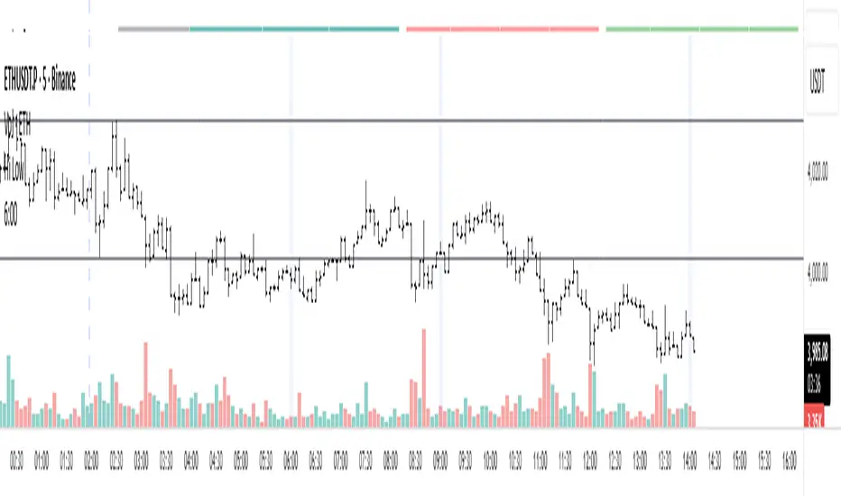
Vertical Lines at 10:00 & 11:30Sales-Style Description
This script is a simple but powerful TradingView add-on that automatically marks your chart with clear, bold vertical lines at exactly 10:00 AM and 11:30 AM every day. No more manually drawing lines or setting reminders — it does the work for you.
Always on time: It tracks the market clock in real-time and drops a line the moment your chart hits those times.
Clean visibility : The lines are bright blue (#2962FF), solid, and drawn with thickness level 3, so they stand out against any background or chart theme.
Automatic housekeeping: It keeps your workspace clean by automatically deleting old lines once you reach a set limit, so your chart never gets cluttered.
Customizable : You can change the time zone, thickness, and the number of days’ worth of lines to keep.
Set it and forget it: Once added to your chart, it runs quietly in the background — you’ll always know when the 10:00 and 11:30 sessions hit without lifting a finger.

Уровни SL/TP и значение ATR первого часаSession Range SL/TP Levels with Advanced ATR
Overview
The Session Range SL/TP Levels indicator is a comprehensive tool designed for session-based trading strategies, particularly for breakouts. It identifies the high and low of a user-defined time range (e.g., the Asian session) and uses a sophisticated, customizable Average True Range (ATR) calculation to project key Stop Loss (SL) and Take Profit (TP) levels.
This indicator helps traders visualize potential entry and exit points based on the volatility of a specific trading session, with all crucial data presented in a clean on-screen table.
Key Features
Customizable Trading Session: Define any time range to establish your core trading zone. The indicator will automatically find the high and low of this period.
Advanced ATR Calculation: The indicator uses an ATR calculated on a 5-minute timeframe for higher precision. You can customize:
The ATR length and smoothing method (RMA, SMA, EMA, WMA).
A unique percentage reduction from the ATR to create a more conservative volatility buffer.
Volatility-Based SL/TP Levels: Automatically calculates and plots multiple SL and TP levels for both long and short scenarios based on user-defined multipliers of the modified ATR.
Comprehensive On-Screen Display: A detailed on-screen table provides all critical data at a glance, including:
The original 5-min ATR value.
The modified ATR after the percentage reduction.
Three custom ATR-multiple values for quick reference.
All calculated SL and TP price levels for both Long and Short setups.
Copy-Friendly Data Logging: With a single click in the settings, you can print all calculated values into the Pine Logs panel, allowing for easy copying and pasting into other applications or trading journals.
How to Use
Define Your Session: In the settings, enter the time for the trading session you want to analyze (e.g., "0200-0300" for a part of the Asian session).
Identify the Range: The indicator will draw the high and low of this session once the time period is complete.
Plan Your Trade: The calculated levels provide potential targets for breakout trades.
For a Long Trade: If the price breaks above the session high, the green Take Profit lines (TP1, TP2, TP3) serve as potential exit points, while the Stop Loss (Long) level serves as a volatility-based stop.
For a Short Trade: If the price breaks below the session low, the red Take Profit lines serve as potential targets, with the Stop Loss (Short) level as the corresponding stop.
Reference the Table: Use the on-screen table to see the exact price levels and ATR values without needing to hover over the lines.
4 Stages of StockThis script uses 40Weekly MA to baseline larges trends in the stock. This is based on Puru's idea of 4 Stage of Stock.
Stage 1 (Basing)
Stage 2 (Advancing)
Stage 3 (Topping)
Stage 4 (Declining)
This is best viewed and understood on weekly charts.

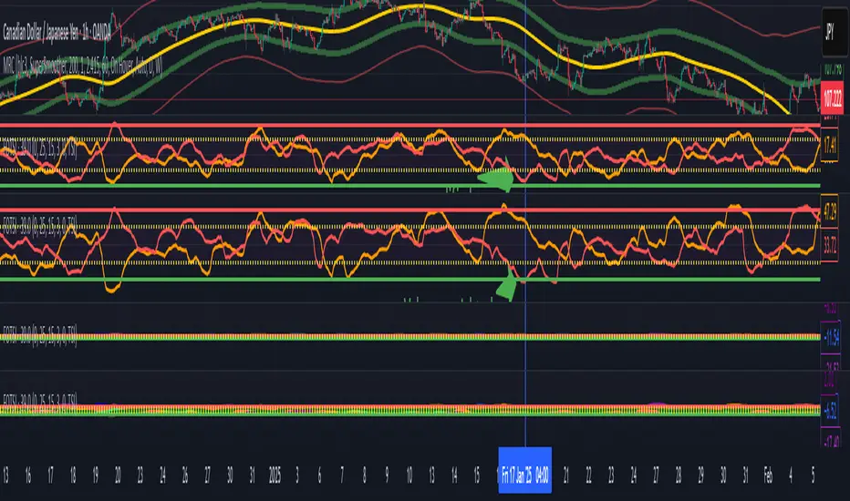
Volume weighted Forex Overwiew True Strenght IndexAdding volume weighting to the FOTSI strategy improves its effectiveness by making the indicator more sensitive to periods of high market activity. Here’s how:
Market Relevance: Futures volume reflects institutional and large trader participation. When volume is high, price moves are more likely to be meaningful and less likely to be noise.
Dynamic Weighting: By multiplying each currency’s momentum by its normalized futures volume, the indicator gives more weight to currencies that are actively traded at that moment, making signals more robust.
Filtering Out Noise: Low-volume periods are down-weighted, reducing the impact of illiquid or less relevant price changes.
Better Timing: Signals generated during high-volume periods are more likely to coincide with real market moves, improving entry and exit timing.
Highlight Selected WeekdaysThis indicator allows you to highlight selected trading days of the week directly on the chart with customizable colors.
Features:
Choose which weekdays to highlight (Sunday through Saturday).
Assign a different background color to each selected day.
Option to calculate the weekday based on the daily close or the active bar’s time.

ShadowCorp ICT Extended Macros (Original by toodegrees)Based on “ICT Algorithmic Macro Tracker° (Open-Source) by toodegrees” (MPL-2.0), this version simply extends the original macro logic: it keeps the same left/right verticals and dynamic horizontal cap. In short, it’s just an extended macro compared to TooDegree’s

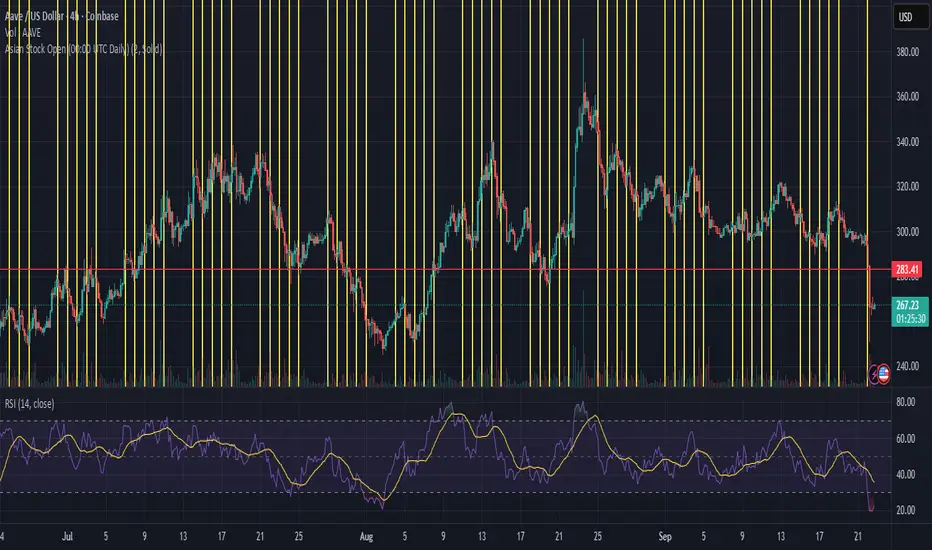
Asian Stock Open (00:00 UTC Daily)Simple TSE daily open indicator, 500 line history, to help prepare for potential weekly open volatility from Asia trading
eksOr - Charm + Vanna Window (Monthly OPEX)What This Does
This indicator highlights the monthly “Charm + Vanna window” around standard monthly options expiration (the 3rd Friday, i.e., monthly OPEX). It’s a time-based overlay that shades either:
Pre-OPEX: from the first calendar day of the month through the day before OPEX, or
Post-OPEX: from OPEX (3rd Friday) through month-end.
Use it to quickly see periods when index/stock flows are often influenced by charm (delta change from time decay) and vanna (delta change from IV moves), which can impact intramonth behavior.
How It Works
Automatically computes the third Friday each month (monthly OPEX) in your chosen timezone.
Lets you nudge the default window with Start/End calendar-day offsets (±10) to match your playbook.
Optionally draws vertical dotted lines and S/E labels on the bars where the window starts/ends.
Shows a compact table (top-right) with the current mode and the Start/End dates of the active month.
Triggers alerts on the exact bars where the window STARTS and ENDS.
Inputs
Window Mode: Pre-OPEX (start → OPEX-1) or Post-OPEX (OPEX → month end)
Timezone: Select from common exchanges/regions
Start/End Offsets: Shift boundaries by calendar days (e.g., start +2, end −1)
Style: Toggle shading, transparency, color, and start/end lines/labels
Why it’s useful
Many traders track the pre-OPEX build-up and post-OPEX reset for potential flow-driven behavior.
This tool doesn’t predict direction; it frames time so you can align other signals (price, breadth, vol, dealer positioning, etc.) within a consistent monthly structure.
Notes & limitations
This is not a signal or guarantee of charm/vanna effects—just a calendar window commonly associated with them.
OPEX logic uses the standard 3rd Friday (monthly equity/index options). It does not account for special exchange holidays or instrument-specific settlement quirks.
For best results, combine with your own vol/positioning dashboards (IV, skew, gamma exposure, open interest changes, etc.).
Tips
Use Pre-OPEX mode to visualize potential decay/roll dynamics into OPEX.
Use Post-OPEX mode to frame potential position resets into month-end.
Adjust offsets to match how your market/instrument tends to behave (e.g., start earlier if flows show up sooner).

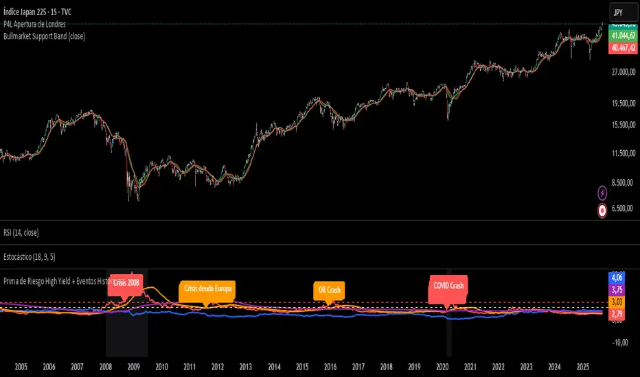
Prima de Riesgo High Yield + Eventos HistóricosPrima de risgo de los bonos basura. Muetra los periodos de recesión económica en las bolsas.
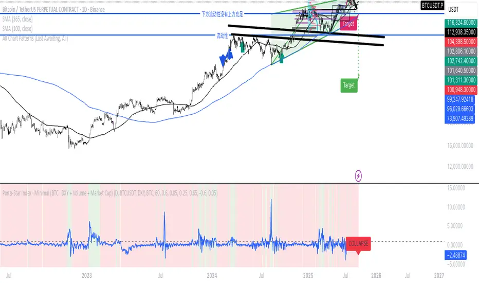
Ponzi-Star Index · Minimal (BTC · DXY + Volume + Market Cap)If we think of the U.S. Dollar Index as the speed of light,
market cap as the mass of a star,
and trading volume as the energy of cataclysmic change—
then can we imagine the market as a star:
entering during its expansion phase,
and exiting before its collapse?
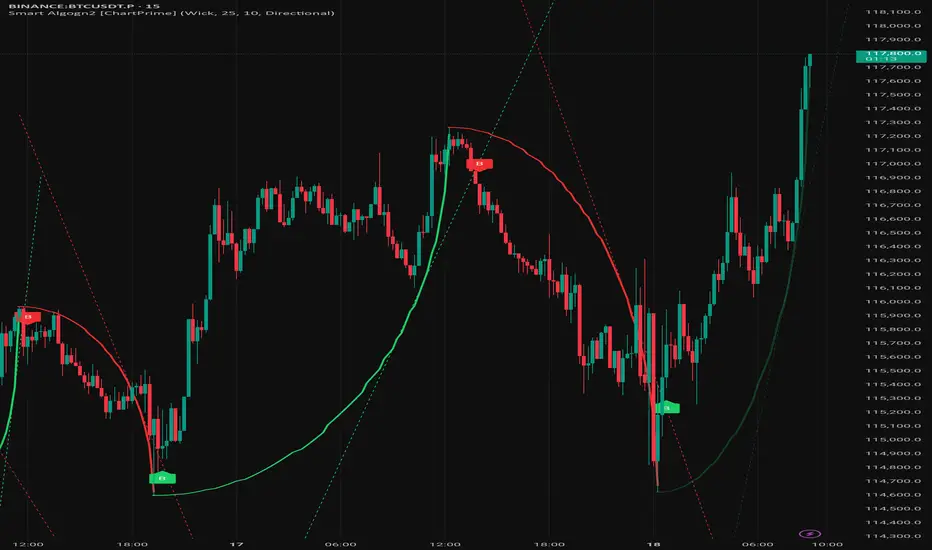
Smart Algogn2 [ChartPrime]Smart Algo indicator with buy/sell signals, optimized for crypto intraday trading.
Front Contract Roll Detector (TV-mapped 1!)This script looks at the security.instrument and finds the current best matching price for the current instrument on a front loaded contract.
This is very useful for detecting when TradingView rolls over contracts and an alert can be put in place for this.

Period Separator + Future LinesDescription
This indicator draws vertical separator lines for each selected timeframe (e.g., daily or hourly) and also projects additional separator lines into the future.
It helps traders visually divide the chart into consistent time periods and see upcoming period boundaries in advance.
Features
- Draws vertical lines at the start of each chosen period (daily by default).
- Extends several separator lines into the future so you can anticipate upcoming sessions.
- Fully customizable: color, style (solid/dashed/dotted), line width, and timeframe can be adjusted from the settings.
- Lines are plotted without distorting auto-scaling, so the chart view remains clean.
Use Case
Ideal for intraday and swing traders who want clear visual time markers and the ability to prepare for upcoming trading sessions.

SCTR - AbsoluteIndicator for showing Absolute Value of SCTR - StockCharts Technical Rank.
Uses the calculations from Stock Charts based on the following:
Long-Term Indicators (weighting)
--------------------------------
* Percent above/below 200-day EMA (30%)
* 125-Day Rate-of-Change (30%)
Medium-Term Indicators (weighting)
----------------------------------
* Percent above/below 50-day EMA (15%)
* 20-day Rate-of-Change (15%)
Short-Term Indicators (weighting)
---------------------------------
* 3-day slope of PPO(12,26,9) Histogram/3 (5%)
* 14-day RSI (5%)

Stock FundamentalsOverview
A comprehensive fundamental analysis tool for TradingView that displays key financial metrics from company financial statements in an easy-to-understand visual format.
Key Features
- Revenue & Earnings Analysis: Track company sales, gross profit, EBITDA, operating expenses, and free cash flow
- EPS & Dividend Metrics: Monitor earnings per share, dividend payments, and payout ratios
- Debt and Equity Structure: Analyze total debt, equity levels, and cash positions
- Profitability Ratios: Evaluate return on equity (ROE), return on assets (ROA), and return on invested capital (ROIC)
- Visual Color Coding: Each metric has a distinct color for easy identification
- Interactive Legend: Comprehensive reference table showing all acronyms and their corresponding colors
How to Use
1. Select Output Type:
- Per Share: Values normalized per share
- % of mcap: Values as percentage of market capitalization
- Actual: Raw financial values
2. Choose Period:
- FQ: Fiscal Quarter data
- FY: Fiscal Year data
3. Toggle Metric Groups:
- Use the input options to show/hide different categories:
- Revenue & Earnings
- EPS & DPS
- Debt metrics
- Return ratios
4. Read the Chart:
- Each colored line represents a different financial metric
- Hover over data points to see exact values
- Use the legend (top-right corner) to identify each metric
5. Interpret the Data:
- Look for consistent upward trends in revenue and earnings
- Monitor debt levels relative to equity and cash positions
- Compare profitability ratios (ROE, ROIC, ROA) over time
- The orange horizontal line indicates the 20% ROE target (excellent performance)
Color Guide
- Purple: Revenue
- Blue: Gross Profit, EPS, Total Equity, ROE
- Aqua: EBITDA
- Orange: Operating Expenses, DPS
- Lime: Free Cash Flow, Cash & Equivalents
- Teal: EPS Estimate, ROIC
- Red: Dividend Payout Ratio, Total Debt
- Green: R&D to Revenue Ratio
Tips
- Compare multiple quarters to identify trends
- Watch for improving profit margins over time
- Monitor cash flow generation relative to earnings
- Use the 20% ROE line as a benchmark for exceptional performance
- Combine with technical analysis for comprehensive investment decisions
Data Source: Company fundamental data from financial statements

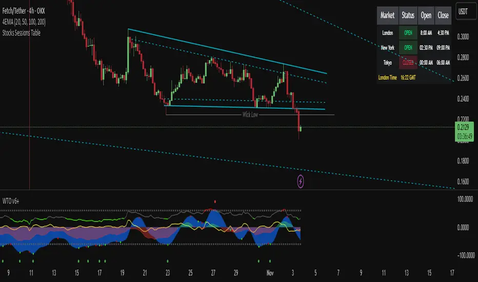
Stocks Sessions TableThe stock market open session table is a great way to keep an eye on the market's open and close. This is aimed at the UK traders working with the BST timezone
Forex Session HighlighterSet the session start and stop time for one single session. Allows a trader to easily see their preferred trading times at a glance. Especially helpful during bar replay.

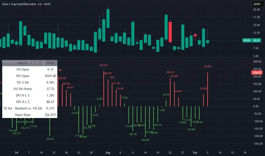
HOPE(EMA) ROPE(IC)Confucius say: Man at end of rope finds hope; man drunk on hope soon finds rope
-HaggisZero
Bot Analyzer📌 Script Name: Bot Analyzer
This TradingView Pine Script v5 indicator creates a dashboard table on the chart that helps you analyze any asset for running a martingale grid bot on futures.
🔧 User Inputs
TP % (tpPct): Take Profit percentage.
SO step % (soStepPct): Step size between safety orders.
SO n (soCount): Number of safety orders.
M mult (martMult): Martingale multiplier (how much each next order increases in size).
Lev (leverage): Leverage used in futures.
BB len / BB mult: Bollinger Bands settings for measuring channel width.
ATR len: ATR period for volatility.
HV days: Lookback window (days) for Historical Volatility calculation.
📐 Calculations
ATR % (atrPct): Normalized ATR relative to price.
Bollinger Band width % (bbPct): Market channel width as percentage of basis.
Historical Volatility (hvAnn): Annualized volatility, calculated from daily log returns.
Dynamic Step % (dynStepPct): Step size for safety orders, automatically adjusted from ATR and clamped between 0.3% and 5%.
Covered Move % (coveredPct): Total percentage move the bot can withstand before last safety order.
Martingale Size Factor (sizeFactor): Total position size multiplier after all safety orders, based on martingale multiplier.
Risk Score (riskLabel): Simple risk estimate:
Low if risk < 30
Mid if risk < 60
High if risk ≥ 60
📊 Output (Table on Chart)
At the top-right of the chart, the script draws a table with 9 rows:
Metric Value
BB % Bollinger Band width in %
HV % Historical Volatility (annualized %)
TP % Take profit setting
SO step % Safety order step size
SO n Number of safety orders
M mult Martingale multiplier
Dyn step % Dynamic step based on ATR
Size x Total position size factor (e.g., 4.5x)
Risk Risk label (Low / Mid / High)
⚙️ Use Case
Helps choose coins for a martingale bot:
If BB% is wide and HV% is high → the asset is volatile enough.
If Risk shows "High" → parameters are aggressive, you may need to adjust step size, SO count, or leverage.
The dashboard lets you compare assets quickly without switching between multiple indicators.
