Simple DCA Strategy----
### 📌 **Simple DCA Strategy with Backtest Date Filter**
This strategy implements a **Dollar-Cost Averaging (DCA)** approach for long positions, including:
* ✅ **Base Order Entry:** Starts a position with a fixed dollar amount when no position is open.
* 🔁 **Safety Orders:** Buys additional positions when the price drops by a defined percentage, increasing position size with each new entry using a multiplier.
* 🎯 **Take Profit Exit:** Closes all positions when the price reaches a profit target (in % above average entry).
* 🗓️ **Backtest Date Range:** Allows users to specify a custom start and optional end date to run the strategy only within that time window.
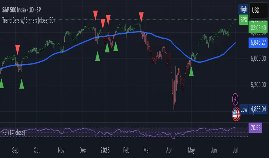
* 📊 **Plots:** Visualizes average entry, take profit level, and safety order trigger line.
#### ⚙️ Customizable Inputs:
* Base Order Size (\$)
* Price Deviation for Safety Orders (%)
* Maximum Safety Orders
* Order Size Multiplier
* Take Profit Target (%)
* Start and End Dates for Backtesting
This is a **long-only strategy** and is best used for backtesting performance of DCA-style accumulation under different market conditions.
----
Strategia Pine Script®