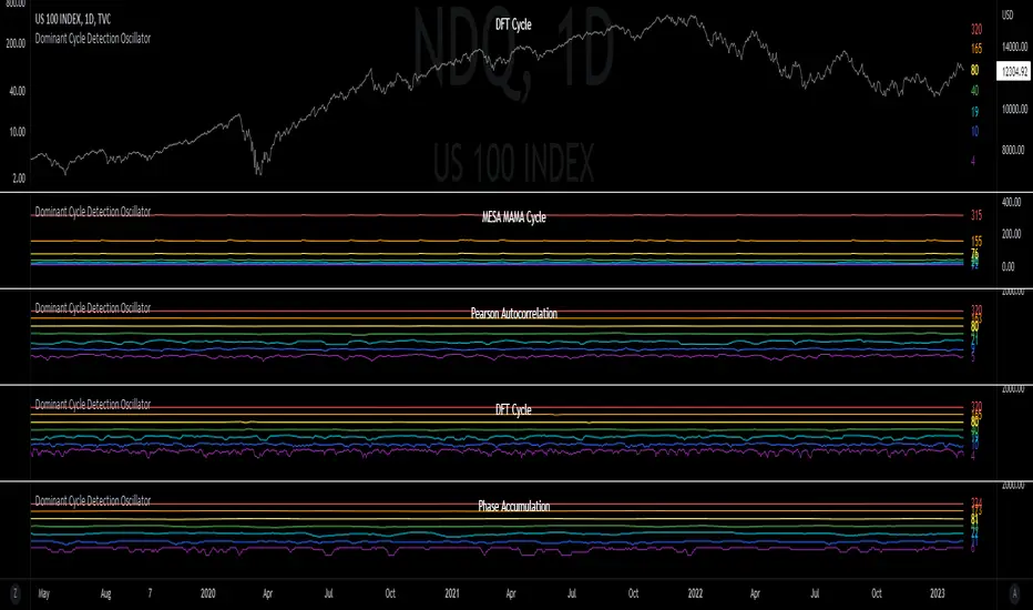
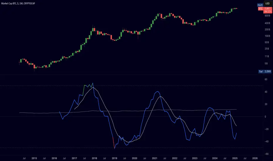
Pi Cycle Indicator Low and High
The Pi Cycle Indicator is a technical analysis tool used in finance, particularly within cryptocurrency markets, to identify potential market tops or bottoms. It is based on two moving averages: the 111-day moving average and the 350-day moving average of Bitcoin's price. The indicator suggests that when these two moving averages converge or cross each other, it may signal significant market turning points. The name "Pi Cycle" comes from the mathematical relationship between these two moving averages, roughly equivalent to the mathematical constant Pi (3.14). Traders and analysts use this indicator to gauge potential trend reversals and make informed decisions regarding their trading strategies. However, like any technical analysis tool, it should be used in conjunction with other indicators and fundamental analysis for a comprehensive understanding of market conditions.
Cerca negli script per "Cycle"
30MIN CYCLE█ HOW DOES IT WORK?
The known 90 min cycle is used as one killzone. But actually all 18 min are relevant to search for a trade. All 18 min when a new box starts only then is the placement of an order valid. If the entry candle isn't in a box then it will probably fail. The boxes should only be used in the M1 or M5 timeframe. The best hitrate is in the M1 timeframe. Included are the last 48 "Mini-Killzones" für intraday trading and backtesting. These "Mini-Killzones" can be used with the "Liquidity Inducement Strategy".
█ WHAT MAKES IT UNIQUE?
This is the first indicator on tradingview that shows all mini-killzones for trading and backtesting a whole tradingday. The well-known killzones of ICT are from 08:00-11:00 and 14:00 - 17:00 (UTC+1) but with this indicator there is finally a refinement of the ICT Smart Money Concept killzones.
█ HOW TO USE IT?
For a proper use of this indicator we suggest to know already at least SMC or better Liquidity Indcuement Trading. This indicator is a further confluence before placing an order. After you made your setup you will have these mini-killzones as a confluence. We don't suggest to open a trade only according to this indicator.
█ ADDITIONAL INFO
This indicator is free to use for all tradingview users.
█ DISCLAIMER
This is not financial advice.
Pi CycleImplementation of Pi Cycle Top and Pi Cycle Bottom with clear visualization
Pi Circle Top is slightly modified to be closer to Pi sma 113 & sma (355) * 2)
Pi Circle Bottom is ISO sma 571 & ema 150
Script will adapt to timeframe but under hourly it might not work due to the high amount of candles to take into account.
[SM] Bitcoin cycles bull market
An indicator to determine the seasonality / cyclicality of bitcoin for long trades.
Application
- For traders: Identification of zones with lower risk of entering long positions
- For swing traders and investors: customizable calendar of entries into long position
Indicator structure
1. Vertical zones (green and red) of time ranges. Only for historical bars. The range width is adjustable in the indicator settings.
2. Table (in the form of a calendar) for determining the time of entering a trade in the future. The table is not editable. It displays the result of the configured zones on the historical bars.
General settings
- choose the color of the Tradingview theme (light or dark)
Table settings
- Turn table display on / off
- Set the number of months to be displayed in the table
Settings of vertical zones (green and red)
Each cycle (1 month summer, 1 month autumn, ...) has four dates
- start date of the green zone (day and month)
- date of the end of the green zone
- start date of the red zone
- date of the end of the red zone
Bitcoin Halving Cycle - 560This script is an idea from Bitcoin Halving Cycle Profit by Kevin Svenson that explicitly marks key timeframes relative to Bitcoin halving events, including profit-taking and dollar-cost averaging zones.
40 weeks (about 280 days) post-halving: Start of optimal profit-taking zone
80 weeks (about 560 days) post-halving: Last call for profit-taking before bear market
125 weeks (about 875 days) post-halving: Optimal time to begin dollar-cost averaging
This timeline effectively covers a window starting before and extending well beyond 500 days after halving.
Lunar Cycles Projected Forward; Moon phases into futureProjecting Lunar Cycles/ half-cycles forward in time
User sets the recent Full moon in history to anchor from; Indicator projects 1/2 cycles forward in time
//inputs//
-input number of full lunar cycles to project forward from input full moon time
-choose color/opacity/border color/text display
Quick scan for cycles🙏🏻
The followup for
As I told before, ML based algorading is all about detecting any kind of non-randomness & exploiting it (cuz allegedly u cant trade randomness), and cycles are legit patterns that can be leveraged
But bro would u really apply Fourier / Wavelets / 'whatever else heavy' on every update of thousands of datasets, esp in real time on HFT / nearly HFT data? That's why this metric. It works much faster & eats hell of a less electicity, will do initial rough filtering of time series that might contain any kind of cyclic behaviour. And then, only on these filtered datasets u gonna put Periodograms / Autocorrelograms and see what's going there for real. Better to do it 10x times less a day on 10x less datasets, right?
I ended up with 2 methods / formulas, I called em 'type 0' and 'type 1':
- type 0: takes sum of abs deviations from drift line, scales it by max abs deviation from the same drift line;
- type 1: takes sum of abs deviations from drift line, scales it by range of non-abs deviations from the same drift line.
Finnaly I've chosen type 0 , both logically (sum of abs dev divided by max abs dev makes more sense) and experimentally. About that actually, here are both formulas put on sine waves with uniform noise:
^^ generated sine wave with uniform noise
^^ both formulas on that wave
^^ both formulas on real data
As you can see type 0 is less affected by noise and shows higher values on synthetic data, but I decided to put type 1 inside as well, in case my analysis was not complete and on real data type 1 can actually be better since it has a lil higher info gain / info content (still not sure). But I can assure u that out of all other ways I've designed & tested for quite a time I tell you, these 2 are really the only ones who got there.
Now about dem thresholds and how to use it.
Both type 0 and type 1 can be modelled with Beta distribution, and based on it and on some obvious & tho non mainstream statistical modelling techniques, I got these thresholds, so these are not optimized overfitted values, but natural ones. Each type has 3 thresholds (from lowest to highest):
- typical value (turned off by default). aka basis ;
- typical deviation from typical value, aka deviation ;
- maximum modelled deviation from typical value (idk whow to call it properly for now, this is my own R&D), aka extension .
So when the metric is above one of these thresholds (which one is up to you, you'll read about it in a sec), it means that there might be a strong enough periodic signal inside the data, and the data got to be put through proper spectral analysis tools to confirm / deny it.
If you look at the pictures above again, you'll see gray signal, that's uniform noise. Take a look at it and see where does it sit comparing to the thresholds. Now you just undertand that picking up a threshold is all about the amount of false positives you care to withstand.
If you take basis as threshold, you'll get tons of false positives (that's why it's even turned off by default), but you'll almost never miss a true positive. If you take deviation as threshold, it's gonna be kinda balanced approach. If you take extension as threshold, you gonna miss some cycles, and gonna get only the strongest ones.
More true positives -> more false positives, less false positives -> less true positives, can't go around that mane
Just to be clear again, I am not completely sure yet, but I def lean towards type 0 as metric, and deviation as threshold.
Live Long and Prosper
P.S.: That was actually the main R&D of the last month, that script I've released earlier came out as derivative.
P.S.: These 2 are the first R&Ds made completely in " art-space", St. Petersburg. Come and see me, say wassup🤘🏻
Sacred: Cycles"Cycles offer freedom to those who see them, and fate to those who don't."
Following liquidity cycles is one of the most useful tools of making in financial markets. Over the longer term, it helps you get in at the beginning of plenty and out before the droughts. This script aims to simplify that for the average trader by displaying tree types of information:
Currents
More often than you might imagine, prices are interacting with moving averages across various timeframes. Zoom in or out enough and you'll probably find a moving average that intersects any given price turn/pause. But how to find them? It turns out if you take a fractal approach and scale up or down common time periods, you can generate surprisingly useful support and resistance levels you wouldn't otherwise plot. I call these moving averages "currents". By changing time intervals, you'll be able to find which current is affecting your charts price. (Note: Only works with tickers that have volume data.)
Financial Conditions
Proper technical analysis will give you an idea of which price levels are important and when a pattern is likely to resolve. But how to decide which direction you should bet on? That's where liquidity comes into play. For those tickers that are sensitive to broader liquidity conditions, these markers will tell you if you're in a bearish or bullish regime. After a bearish marker, it's time to sell rips. In a bearish one, buy the dip.
Recessions
Waiting for recessions to be announced by the NBER is a waste of time. You need to know today if recessionary conditions exist. That's where following coincident growth indicators instead of lagging ones helps. This script adds a red background to indicate weakening US growth.
Quarterly Cycle Theory with DST time AdjustedThe Quarterly Theory removes ambiguity, as it gives specific time-based reference points to look for when entering trades. Before being able to apply this theory to trading, one must first understand that time is fractal:
Yearly Quarters = 4 quarters of three months each.
Monthly Quarters = 4 quarters of one week each.
Weekly Quarters = 4 quarters of one day each (Monday - Thursday). Friday has its own specific function.
Daily Quarters = 4 quarters of 6 hours each = 4 trading sessions of a trading day.
Sessions Quarters = 4 quarters of 90 minutes each.
90 Minute Quarters = 4 quarters of 22.5 minutes each.
Yearly Cycle: Analogously to financial quarters, the year is divided in four sections of three months each:
Q1 - January, February, March.
Q2 - April, May, June (True Open, April Open).
Q3 - July, August, September.
Q4 - October, November, December.
S&P 500 E-mini Futures (daily candles) — Monthly Cycle.
Monthly Cycle: Considering that we have four weeks in a month, we start the cycle on the first month’s Monday (regardless of the calendar Day):
Q1 - Week 1: first Monday of the month.
Q2 - Week 2: second Monday of the month (True Open, Daily Candle Open Price).
Q3 - Week 3: third Monday of the month.
Q4 - Week 4: fourth Monday of the month.
S&P 500 E-mini Futures (4 hour candles) — Weekly Cycle.
Weekly Cycle: Daye determined that although the trading week is composed by 5 trading days, we should ignore Friday, and the small portion of Sunday’s price action:
Q1 - Monday.
Q2 - Tuesday (True Open, Daily Candle Open Price).
Q3 - Wednesday.
Q4 - Thursday.
S&P 500 E-mini Futures (1 hour candles) — Daily Cycle.
Daily Cycle: The Day can be broken down into 6 hour quarters. These times roughly define the sessions of the trading day, reinforcing the theory’s validity:
Q1 - 18:00 - 00:00 Asia.
Q2 - 00:00 - 06:00 London (True Open).
Q3 - 06:00 - 12:00 NY AM.
Q4 - 12:00 - 18:00 NY PM.
S&P 500 E-mini Futures (15 minute candles) — 6 Hour Cycle.
6 Hour Quarters or 90 Minute Cycle / Sessions divided into four sections of 90 minutes each (EST/EDT):
Asian Session
Q1 - 18:00 - 19:30
Q2 - 19:30 - 21:00 (True Open)
Q3 - 21:00 - 22:30
Q4 - 22:30 - 00:00
London Session
Q1 - 00:00 - 01:30
Q2 - 01:30 - 03:00 (True Open)
Q3 - 03:00 - 04:30
Q4 - 04:30 - 06:00
NY AM Session
Q1 - 06:00 - 07:30
Q2 - 07:30 - 09:00 (True Open)
Q3 - 09:00 - 10:30
Q4 - 10:30 - 12:00
NY PM Session
Q1 - 12:00 - 13:30
Q2 - 13:30 - 15:00 (True Open)
Q3 - 15:00 - 16:30
Q4 - 16:30 - 18:00
S&P 500 E-mini Futures (5 minute candles) — 90 Minute Cycle.
Micro Cycles: Dividing the 90 Minute Cycle yields 22.5 Minute Quarters, also known as Micro Sessions or Micro Quarters:
Asian Session
Q1/1 18:00:00 - 18:22:30
Q2 18:22:30 - 18:45:00
Q3 18:45:00 - 19:07:30
Q4 19:07:30 - 19:30:00
Q2/1 19:30:00 - 19:52:30 (True Session Open)
Q2/2 19:52:30 - 20:15:00
Q2/3 20:15:00 - 20:37:30
Q2/4 20:37:30 - 21:00:00
Q3/1 21:00:00 - 21:23:30
etc. 21:23:30 - 21:45:00
London Session
00:00:00 - 00:22:30 (True Daily Open)
00:22:30 - 00:45:00
00:45:00 - 01:07:30
01:07:30 - 01:30:00
01:30:00 - 01:52:30 (True Session Open)
01:52:30 - 02:15:00
02:15:00 - 02:37:30
02:37:30 - 03:00:00
03:00:00 - 03:22:30
03:22:30 - 03:45:00
03:45:00 - 04:07:30
04:07:30 - 04:30:00
04:30:00 - 04:52:30
04:52:30 - 05:15:00
05:15:00 - 05:37:30
05:37:30 - 06:00:00
New York AM Session
06:00:00 - 06:22:30
06:22:30 - 06:45:00
06:45:00 - 07:07:30
07:07:30 - 07:30:00
07:30:00 - 07:52:30 (True Session Open)
07:52:30 - 08:15:00
08:15:00 - 08:37:30
08:37:30 - 09:00:00
09:00:00 - 09:22:30
09:22:30 - 09:45:00
09:45:00 - 10:07:30
10:07:30 - 10:30:00
10:30:00 - 10:52:30
10:52:30 - 11:15:00
11:15:00 - 11:37:30
11:37:30 - 12:00:00
New York PM Session
12:00:00 - 12:22:30
12:22:30 - 12:45:00
12:45:00 - 13:07:30
13:07:30 - 13:30:00
13:30:00 - 13:52:30 (True Session Open)
13:52:30 - 14:15:00
14:15:00 - 14:37:30
14:37:30 - 15:00:00
15:00:00 - 15:22:30
15:22:30 - 15:45:00
15:45:00 - 15:37:30
15:37:30 - 16:00:00
16:00:00 - 16:22:30
16:22:30 - 16:45:00
16:45:00 - 17:07:30
17:07:30 - 18:00:00
S&P 500 E-mini Futures (30 second candles) — 22.5 Minute Cycle.
MÈGAS ALGO : ZIG-ZAG CYCLE INSIGTH [INDICATOR]Overview
The Zig-Zag Cycle Insigth is a revisited version of the classic Zig Zag indicator, designed to provide traders with a more comprehensive and actionable view of price movements.
This advanced tool not only highlights significant price swings but also incorporates additional features such as cycle analysis, real-time data tracking, and Fibonacci retracement levels. These enhancements make it an invaluable resource for identifying trends, potential reversal points, and market structure.
This indicator adheres to TradingView's guidelines and is optimized for both technical analysts and active traders who seek deeper insights into market dynamics.
Key Features:
1. Customizable Thresholds for Price Movements:
- Users can set personalized thresholds for price movement percentages and time periods.
This ensures that only significant price swings are plotted, reducing noise and increasing
clarity.
- Straight lines connect swing highs and lows, providing a cleaner visual representation of
the trend.
2. Cycle Analysis Table:
- A dynamic table is included to analyze price cycles based on three key factors:
- Price Change: Measures the magnitude of each swing (high-to-low or low-to-high).
- Time Duration (Bar Count): Tracks the number of bars elapsed between consecutive swings,
offering precise timing insights.
- Volume: Analyzes trading volume during each segment of the cycle.
- The indicator calculates the **maximum**, **minimum**, and **mean** values for each
parameter across all completed cycles, providing deeper statistical insights into market
behavior.
- This table updates in real-time, offering traders a quantitative understanding of how price
behaves over different cycles.
3. Real-Time Data Integration:
- The indicator displays live updates of current price action relative to the last identified
swing high/low. This includes:
- Current distance from the last pivot point.
- Percentage change since the last pivot.
- Volume traded since the last pivot.
4. Fibonacci Retracement Levels:
- Integrated Fibonacci retracement levels are dynamically calculated based on the most
recent significant swing high and low.
- Key retracement levels (23.6%, 38.2%, 50%, 61.8%, and 78.6%) are plotted alongside the Zig
Zag lines, helping traders identify potential support/resistance zones.
- Extension levels (100%, 161.8%, etc.) are also included to anticipate possible breakout
targets.
5. Customizable Alerts:
- Users can configure alerts for specific real-time conditions, such as:
- Price Change
- Duration
- Volume
- Fibonacci Retracement Levels
How It Works:
1. Zig Zag Identification:
- The indicator scans historical price data to identify significant turning points where the
price moves by at least the user-defined percentage threshold.
- These turning points are connected by straight lines to form the Zig Zag pattern.
2. Cycle Analysis:
For each completed cycle (from one swing high/low to the next), the indicator calculates:
- Price Change: Difference between the start and end prices of the cycle.
- Maximum Price Change: The largest price difference observed across all cycles.
- Minimum Price Change: The smallest price difference observed across all cycles.
- Mean Price Change: The average price difference across all cycles.
- Time Duration (Bar Count): Number of bars elapsed between consecutive swings.
- Maximum Duration: The longest cycle in terms of bar count.
- Minimum Duration: The shortest cycle in terms of bar count.
- Mean Duration: The average cycle length in terms of bar count.
- Volume: Total volume traded during the cycle.
- Maximum Volume: The highest volume traded during any single cycle.
- Minimum Volume: The lowest volume traded during any single cycle.
- Mean Volume: The average volume traded across all cycles.
- These calculations provide traders with a statistical overview of market behavior, enabling
them to identify patterns and anomalies in price, time, and volume.
3. Fibonacci Integration:
- Once a new swing high or low is identified, the indicator automatically calculates Fibonacci
retracement and extension levels.
- These levels serve as reference points for potential entry/exit opportunities.
4. Real-Time Updates:
- As the market evolves, the indicator continuously monitors the relationship between the
current price and the last identified swing point.
- Real-time metrics, such as percentage change and volume, are updated dynamically.
5. Alerts Based on Real-Time Parameters:
- The indicator allows users to set customizable alerts based on real-time conditions:
- Price Change Alert: Triggered when the real-time price change is less or greater than a
predefined percentage threshold (e.g., > or < fixed value).
- Duration Alert: Triggered when the cycle duration (in bars) is less or greater than a
predefined
bar count threshold (e.g., > or < fixed value).
- Volume Alert: Triggered when the trading volume during the current cycle is less or greater
than a predefined volume threshold (e.g., > or < fixed value).
Advantages of Zig-Zag Cycle Insigth
- Comprehensive Insights: Combining cycle analysis, Fibonacci retracements, and real-time data
provides a holistic view of market conditions.
- Statistical Analysis: The inclusion of maximum, minimum, and mean values for price change,
duration, and volume offers deeper insights into market behavior.
- Actionable Signals: Customizable alerts ensure traders never miss critical market events based
on real-time price, duration, and volume parameters.
- User-Friendly Design: Clear visuals and intuitive controls make it accessible for traders of all
skill levels.
Reference:
TradingView/ZigZag
TradingView/AutofibRetracement
Please Note:
This indicator is provided for informational and educational purposes only. It is not financial advice, and it should not be considered a recommendation to buy, sell, or trade any financial instrument. Trading involves significant risks, including the potential loss of your entire investment. Always conduct your own research and consult with a licensed financial advisor before making any trading decisions.
The results and images provided are based on algorithms and historical/paid real-time market data but do not guarantee future results or accuracy. Use this tool at your own risk, and understand that past performance is not indicative of future outcomes.
Gann Cycle IndicatorVersion "Beta 1.0.0"
The "Gann Cycle Indicator" helps you analyze market cycles, from the smaller ones to the bigger ones. It requires you to know how Gann used market cycles to trade efficently. It helps predict where to expect a minum or a maximum and where to expect the start of a new cycle. It works with any market and can be set up as you prefer. It takes some inputs to work properly:
1) Starting X: this is the offset on the X axis where all the cycles start from. Once you applied this indicator on your graph, you must adjust the starting position to match the start of the cycle you found on the graph.
2) Cycles (1 to 4). These are the period, expressed in candles number, of each cycles. "Cycle 1" (i.e 3,25 days) should be the smaller of the 4 while "Cycle 4" the bigger one (i.e 15 days).
In this example, we trade BTCUSD on the 15 days cycle, so 15 days on the graph is composed of 360 candles. Our bigger cycle (Cycle 4) take 360 as period. For simplicity, "Cycle 3 to 1" take each time half of the period so: Cycle 3 -> 180, Cycle 2-> 90, Cycle 1 (smaller) -> 45.
3) Trend. 0 to a rectangle trend, -1 for bearish trend and 1 for a bullish trend .
4) Trend strength. From 0 to 2, step 0.1
This parameter expresses the strength of the trend. In a bullish market (Trend set to 1) you can set Trend strength from 0 to 2 to allow the indicator to follow the current market trend
Note:
This indicator must be put in a separate Y axis so it can overaly the graph.
60-Day Cycle Long-Only IndicatorThe following indicator generates ‘Buy’ signals based on rotating 60-day cycles. The general theory is that when buying strong, growth-oriented assets, 60-day micro-cycles culminate into larger macro-cycles.
Summary:
Explaining the Upper and Lower Bounds in the 60-Day Cycle Strategy:
1. Cycle High (Upper Bound):
The cycle high is the highest closing price of the asset over the past 60 days. This value acts as the upper boundary of the 60-day cycle, indicating the peak price level during this period. When the current closing price is above this boundary, it suggests a potential distribution phase, where the asset might be overbought, and larger players may be selling off their positions. In the strategy, the cycle high is plotted as a red line on the chart, helping traders visually identify the upper limit of the 60-day trading range.
2. Cycle Low (Lower Bound):
The cycle low is the lowest closing price of the asset over the past 60 days. This value acts as the lower boundary of the 60-day cycle, indicating the trough price level during this period. When the current closing price is below this boundary, it suggests a potential accumulation phase, where the asset might be oversold, and larger players may be accumulating positions at lower prices. In the strategy, the cycle low is plotted as an orange line on the chart, helping traders visually identify the lower limit of the 60-day trading range.
How These Bounds Are Calculated:
• Cycle High: Calculated using the highest closing price over the last 60 trading days. In Pine Script, this is achieved with the function ta.highest(close, cycle_length), where cycle_length is set to 60 days.
• Cycle Low: Calculated using the lowest closing price over the last 60 trading days. In Pine Script, this is achieved with the function ta.lowest(close, cycle_length), where cycle_length is set to 60 days.
Interpretation and Application:
• Buy Signal: A buy signal is generated when the closing price crosses above the cycle low. This indicates a potential end to the bearish phase and the start of a bullish trend.
• Distribution Phase: When the closing price crosses above the cycle high, it suggests the market is in a distribution phase, potentially signaling a bearish trend or a sell-off period.
Example:
On a trading chart, the cycle high and cycle low are plotted as horizontal lines, with their colors distinguishing them (red for cycle high and orange for cycle low). These lines create a visual range within which the asset's price has moved over the last 60 days, helping traders quickly assess whether the current price is near the upper or lower bound.
By identifying and plotting these upper and lower bounds, traders can better understand the current market phase and make more informed trading decisions based on the 60-day cycle strategy. This indicator can be used across various assets.
G. Santostasi Power Law Cycle Comparison
G. Santostasi Power Law Cycle Comparison Indicator
The "G. Santostasi Power Law Cycle Comparison" indicator is a revolutionary tool designed to provide deep insights into Bitcoin's historical price behavior, based on the renowned G. Santostasi power law model. This indicator goes beyond simple trend analysis, leveraging the power law model to analyze Bitcoin's cyclical patterns by shifting and superimposing past cycles onto the current price action.
Key Features and Insights:
Cycle-Based Comparison:
The indicator divides each Bitcoin cycle into three distinct phases:
Exponential Growth Phase (Year 1): A year of near-exponential price appreciation, often associated with the post-halving effect and the inflow of new market participants.
Exponential Correction Phase (Year 2): A sharp, quasi-exponential price decline as the market corrects from speculative highs.
Power Law Growth Phase (Years 3 and 4): A steady and predictable price increase along the power law support line, representing Bitcoin’s intrinsic long-term value trajectory.
Visual Clarity:
By overlaying past cycles onto the current cycle, the indicator highlights recurring patterns, making it easy for investors to identify similarities and deviations in price behavior. This visual comparison helps pinpoint where we are within the current cycle.
Orientation Tool for Investors:
Provides a "map" of Bitcoin's price action across cycles, enabling investors to orient themselves and make more informed decisions.
Helps distinguish between short-term noise and long-term trends, offering a broader perspective on Bitcoin’s price trajectory.
Consistency and Coherence:
The indicator’s ability to show how Bitcoin cycles adhere to a consistent framework underscores its robustness and reliability. The distinct phases of growth, correction, and stabilization align perfectly with the power law model, offering a coherent narrative of Bitcoin’s market dynamics.
Utility for Risk Management and Strategy:
Investors can use this indicator to anticipate major price movements, identify overbought or oversold conditions within the context of the cycle, and plan entry or exit points based on historical patterns.
Uniqueness of the Indicator:
Unlike traditional indicators that focus solely on momentum or trend, the G. Santostasi Power Law Cycle Comparison is rooted in a scientific approach. By applying the power law model to Bitcoin's cyclical behavior, this tool offers unparalleled insights into the underlying mechanics of price action. The ability to compare current price dynamics with past cycles provides a unique perspective, revealing patterns that are often missed by conventional technical analysis.
Who Should Use This Indicator?
Long-Term Investors: Gain confidence in understanding Bitcoin’s price action over its multi-year cycles.
Active Traders: Identify key phases within the cycle to time market entries and exits.
Analysts and Researchers: Explore the fundamental consistency of Bitcoin’s power law behavior across cycles.
The "G. Santostasi Power Law Cycle Comparison" indicator is not just a tool; it’s a lens through which Bitcoin’s intricate market cycles can be viewed, understood, and navigated. By aligning historical context with current price action, this indicator empowers investors with clarity, foresight, and actionable insights.
Pulse DPO: Major Cycle Tops and Bottoms█ OVERVIEW
Pulse DPO is an oscillator designed to highlight Major Cycle Tops and Bottoms .
It works on any market driven by cycles. It operates by removing the short-term noise from the price action and focuses on the market's cyclical nature.
This indicator uses a Normalized version of the Detrended Price Oscillator (DPO) on a 0-100 scale, making it easier to identify major tops and bottoms.
Credit: The DPO was first developed by William Blau in 1991.
█ HOW TO READ IT
Pulse DPO oscillates in the range between 0 and 100. A value in the upper section signals an OverBought (OB) condition, while a value in the lower section signals an OverSold (OS) condition.
Generally, the triggering of OB and OS conditions don't necessarily translate into swing tops and bottoms, but rather suggest caution on approaching a market that might be overextended.
Nevertheless, this indicator has been customized to trigger the signal only during remarkable top and bottom events.
I suggest using it on the Daily Time Frame , but you're free to experiment with this indicator on other time frames.
The indicator has Built-in Alerts to signal the crossing of the Thresholds. Please don't act on an isolated signal, but rather integrate it to work in conjunction with the indicators present in your Trading Plan.
█ OB SIGNAL ON: ENTERING OVERBOUGHT CONDITION
When Pulse DPO crosses Above the Top Threshold it Triggers ON the OB signal. At this point the oscillator line shifts to OB color.
When Pulse DPO enters the OB Zone, please beware! In this Area the Major Players usually become Active Sellers to the Public. While the OB signal is On, it might be wise to Consider Selling a portion or the whole Long Position.
Please note that even though this indicator aims to focus on major tops and bottoms, a strong trending market might trigger the OB signal and stay with it for a long time. That's especially true on young markets and on bubble-mode markets.
█ OB SIGNAL OFF: EXITING OVERBOUGHT CONDITION
When Pulse DPO crosses Below the Top Threshold it Triggers OFF the OB signal. At this point the oscillator line shifts to its normal color.
When Pulse DPO exits the OB Zone, please beware because a Major Top might just have occurred. In this Area the Major Players usually become Aggressive Sellers. They might wind up any remaining Long Positions and Open new Short Positions.
This might be a good area to Open Shorts or to Close/Reverse any remaining Long Position. Whatever you choose to do, it's usually best to act quickly because the market is prone to enter into panic mode.
█ OS SIGNAL ON: ENTERING OVERSOLD CONDITION
When Pulse DPO crosses Below the Bottom Threshold it Triggers ON the OS signal. At this point the oscillator line shifts to OS color.
When Pulse DPO enters the OS Zone, please beware because in this Area the Major Players usually become Active Buyers accumulating Long Positions from the desperate Public.
While the OS signal is On, it might be wise to Consider becoming a Buyer or to implement a Dollar-Cost Averaging (DCA) Strategy to build a Long Position towards the next Cycle. In contrast to the tops, the OS state usually takes longer to resolve a major bottom.
█ OS SIGNAL OFF: EXITING OVERSOLD CONDITION
When Pulse DPO crosses Above the Bottom Threshold it Triggers OFF the OS signal. At this point the oscillator line shifts to its normal color.
When Pulse DPO exits the OS Zone, please beware because a Major Bottom might already be in place. In this Area the Major Players become Aggresive Buyers. They might wind up any remaining Short Positions and Open new Long Positions.
This might be a good area to Open Longs or to Close/Reverse any remaining Short Positions.
█ WHY WOULD YOU BE INTERESTED IN THIS INDICATOR?
This indicator is built over a solid foundation capable of signaling Major Cycle Tops and Bottoms across many markets. Let's see some examples:
Early Bitcoin Years: From 0 to 1242
This chart is in logarithmic mode in order to properly display various exponential cycles. Pulse DPO is properly signaling the major early highs from 9-Jun-2011 at 31.50, to the next one on 9-Apr-2013 at 240 and the epic top from 29-Nov-2013 at 1242.
Due to the massive price movements, the OB condition stays pinned during most of the exponential price action. But as you can see, the OB condition quickly vanishes once the Cycle Top has been reached. As the market matures, the OB condition becomes more exceptional and triggers much closer from the Cycle Top.
With regards to Cycle Bottoms, the early bottom of 2 after having peaked at 31.50 doesn’t get captured by the indicator. That is the only cycle bottom that escapes the Pulse DPO when the bottom threshold is set at a value of 5. In that event, the oscillator low reached 6.95.
Bitcoin Adoption Spreading: From 257 to 73k
This chart is in logarithmic mode in order to properly display various exponential cycles. Pulse DPO is properly signaling all the major highs from 17-Dec-2017 at 19k, to the next one on 14-Apr-2021 at 64k and the most recent top from 9-Nov-2021 at 68k.
During the massive run of 2017, the OB condition still stayed triggered for a few weeks on each swing top. But on the next cycles it started to signal only for a few days before each swing top actually happened. The OB condition during the last cycle top triggered only for 3 days. Therefore the signal grows in focus as the market matures.
At the time of publishing this indicator, Bitcoin printed a new All Time High (ATH) on 13-Mar-2024 at 73k. That run didn’t trigger the OB condition. Therefore, if the indicator is correct the Bitcoin market still has some way to grow during the next months.
With regards to Cycle Bottoms, the bottom of 3k after having peaked at19k got captured within the wide OS zone. The bottom of 15k after having peaked at 68k got captured too within the OS accumulation area.
Gold
Pulse DPO behaves surprisingly well on a long standing market such as Gold. Moving back to the 197x years it’s been signaling most Cycle Tops and Bottoms with precision. During the last cycle, it shows topping at 2k and bottoming at 1.6k.
The current price action is signaling OB condition in the range of 2.5k to 2.7k. Looking at past cycles, it tends to trigger on and off at multiple swing tops until reaching the final cycle top. Therefore this might indicate the first wave within a potential gold run.
Oil
On the Oil market, we can see that most of the cycle tops and bottoms since the 80s got signaled. The only exception being the low from 2020 which didn’t trigger.
EURUSD
On Forex markets the Pulse DPO also behaves as expected. Looking back at EURUSD we can see the marketing triggering OB and OS conditions during major cycle tops and bottoms from recent times until the 80s.
S&P 500
On the S&P 500 the Pulse DPO catched the lows from 2016 and 2020. Looking at present price action, the recent ATH didn’t trigger the OB condition. Therefore, the indicator is allowing room for another leg up during the next months.
Amazon
On the Amazon chart the Pulse DPO is mirroring pretty accurately the major swings. Scrolling back to the early 2000s, this chart resembles early exponential swings in the crypto space.
Tesla
Moving onto a younger tech stock, Pulse DPO captures pretty accurately the major tops and bottoms. The chart is shown in logarithmic scale to better display the magnitude of the moves.
█ SETTINGS
This indicator is ideal for identifying major market turning points while filtering out short-term noise. You are free to adjust the parameters to align with your preferred trading style.
Parameters : This section allows you to customize any of the Parameters that shape the Oscillator.
Oscillator Length: Defines the period for calculating the Oscillator.
Offset: Shifts the oscillator calculation by a certain number of periods, which is typically half the Oscillator Length.
Lookback Period: Specifies how many bars to look back to find tops and bottoms for normalization.
Smoothing Length: Determines the length of the moving average used to smooth the oscillator.
Thresholds : This section allows you to customize the Thresholds that trigger the OB and OS conditions.
Top: Defines the value of the Top Threshold.
Bottom: Defines the value of the Bottom Threshold.
Vicious Cycle by Cryptorhythms [CR]Vicious Cycle by Cryptorhythms
Intro
I have been working on this one for a few months now, bringing our flagship indicator Bull Bear Filter up to date with new ideas and algorithms to clarify cyclical trend components in any time series data.
Description
This indicator has no settings that the user needs to change. It is completely adaptive and dynamic to any market, timeframe, or time series data. The goal was to create a tool that isolated cyclical waveforms, making it easier to follow a noisy market. Keep in mind, its not RSI, Stoch, Ehlers or anything else - its a completely new DSP method that I created myself. You can only get the Vicious Cycle from CR!
Private
This indicator is reserved for our members only to prevent the alpha decay as long as possible. You can view my signature at the bottom of this post for more information on membership.
Examples
Here I will list a number of examples screenshots across markets and timeframes. Remember, NO SETTINGS WERE CHANGED at all for these screenshots. As you can see its quite a versatile tool!
BITCOIN
XBTUSD 20Min
XBTUSD 4H
XBTUSD 6H
GOLD
XAUUSD 2D
XAUUSD 4H
FOREX
EURUSD 3 Min
EURUSD 30 Min
GBPJPY 1H
USDJPY 12H
STOCKS
TSLA 1D
AMD 1D
SPY 1D
VIX 12H
OIL
USDWTI 3D
USDWTI 2H
USOIL 15 Min
NCTA Cycle FinderCycle Finder
The NCTA Cycle Finder is one of three technical indicators that are part of the Profit Flow Analytics.
New Cycle Trading and Analytics is a group of traders creating market analytics for traders. The objective is to take complex combinations of multiple technical pattern indicators and present to the trader a simple, single entry signal.
The NCTA Cycle Finder is designed to identify the beginning of new, trending cycles. It is excellent in short 1, 3, and 5 minute timeframes for futures traders and short term options traders. Longer timeframes such as the 5, 10, and 30 minute timeframes work well for options traders.
This indicator consists of a simple, single entry indicator designed to provide an entry very close to the shift on the intra-day cycle. It provides a warning that a cycle shift may be coming by printing a grey bar. Bars above the zero line imply a possible new long cycle developing. Grey bars below the zero line imply a possible new short cycle is developing.
Once the indicator has confirmed a new cycle is developing, a dark blue or red bar will print. Dark blue above the zero line is the trader’s signal to go long. A dark red signal below the zero line is the traders signal to go short. The indicator is designed to filter out false signals and provide the trader with an optimum timing of capturing an entry/exit very close to the beginning / ending of a cycle.
Using the NCTA Cycle Finder, the Profit Flow Oscillator, and Trend Consensus indicators together, offers traders an opportunity to lock in profits and enter the same trending cycle more than one time. This is an excellent opportunity to open trend continuation trades. The NCTA Cycle Finder is excellent when used across more than one timeframe to confirm alignment. For example, monitoring the 5 minute signals and confirming alignment with the 1 minute chart improves the probability of entering a profitable trade.
HOW TO USE: Use the grey bar prints to be ready for a signal and the possible direction. Go long when a blue bar appears and go short when a red bar appears. The print of these signals very closely identify the beginning of a new cycle
The NCTA Cycle Finder, which is part of the Profit Flow Analytics set of indicators, is traded in a live trading room every market day, hosted by our friends at Options Money Maker.
To learn more about the NCTA Cycle Finder and the other two indicators, which are part of Profit Flow Analytics, use the following link:
www.newcycletrading.com
NQZ2019
SP:SPX
Ehlers Cyber Cycle [CC]The Cyber Cycle was created by John Ehlers (Cybernetic Analysis For Stocks And Futures pg 34) and this is one of my favorite Ehlers indicators. I use it personally for exits but it has several uses. It gives great entry and exit signals when you enter when it is at the bottom or at the very top during a cycle. When it is above 0 then the stock is in a strong uptrend and when it is below 0 then the stock is in a strong downtrend. It is also very reactive as well with zero lag according to Ehlers. Buy when the indicator line is green and sell when it is red.
Let me know if there are other scripts you would like to see me publish or if you want something custom done!
Moving Average CyclesMoving Average Cycles Indicator
Description:
The Moving Average Cycles indicator is a versatile tool designed to help traders identify and analyze bullish and bearish cycles based on price movements relative to a moving average. This indicator offers valuable insights into market trends and potential reversal points.
Key Features:
Customizable Moving Average: Users can adjust the MA period and resolution (Daily, Weekly, Monthly) to suit their trading style.
Cycle Identification: The indicator tracks bull and bear cycles, providing visual cues through color-coded histograms.
Comprehensive Metrics: A detailed table displays crucial cycle statistics, including:
Current cycle information (candles and % distance from MA)
Maximum and average cycle lengths (in candles)
Maximum and average percentage distances from the MA
How to Use:
Apply the indicator to your chart and adjust the MA period and resolution as needed.
Green histograms represent bullish cycles, while red histograms indicate bearish cycles.
Use the metrics table to gain insights into historical cycle behavior and current market positioning.
This indicator is designed to complement your existing trading strategy by providing a clear visual representation of market cycles and detailed statistical information. It can be particularly useful for identifying potential trend reversals and gauging the strength of current trends compared to the past.
Note: Past performance does not guarantee future results. This indicator is meant for informational purposes only and should not be considered as financial advice. Always combine multiple analysis tools and conduct your own research before making trading decisions.
This script is published as open-source under the Mozilla Public License 2.0. Feel free to use and modify it, but please provide appropriate credit if you build upon this work.
I hope you find this Moving Average Cycles indicator helpful in your trading journey. If you have any questions or suggestions for improvement, please feel free to leave a comment below.
AnarchoEconomy 9-11 Weeks CyclesThis script is, with pleasure, written for the @AnarchoEconomy with his logic and strategy.
TO BE USED ONLY ON 1 WEEK TIMEFRAME!
1. Set the date in the settings to choose the all-time high on your pair.
2. The indicator divides price action into cycles.
3. A bullish cycle lasts 9 weeks.
4. A bearish cycle lasts 11 weeks.
5. A table displays the current symbol, trend, and week count.
For every next closed bullish cycle, you should know that the next two weeks could turn it into the bearish. If not, the new cycle will restart after 9 weeks of bullish close.
Leonid's Bitcoin Full Cycle Simple SMA IndicatorThis is a straight-forward and customizable indicator to track Bitcoin cycles, specifically used for helping investors understand where to buy and sell. This is done by using a two year SMA period as the base calculation. With that calculation you create lower and upper bounds for bull market peaks and bear market bottoms.
The novel idea here is that you can customize the SMA "strength" for both the upper and lower bounds as alpha decays over time and price get's less volatile with adoption increasing. The multiples are customizable for both the upper and lower bounds along with a mid-line that will adjust based on the settings input.
Indicators don't always have to rely on crazy math or outlandish ideas to be useful, sometimes even the simplest of inputs can give investors (especially those that are new) a great base case for their strategy. Something being simple does not diminish the idea or strength behind the data.
How to use this indicator: This script must be used on INDEX:BTCUSD (Bitcoin All-Time History Index) with the y-axis being set to Logarithmic scale.
Details & how to interpret: The price is colored green when Bitcoin enters a "value zone" meaning it is heavily oversold and likely near a bottom for the bear market cycle. The price is colored red when Bitcoin enters an "overbought zone" meaning it is heavily overbought and is likely near a top for the bull market cycle.
Along with the upper and lower bound I have plotted a mid-line (in orange) to establish a neutral zone which helps depict what phase of the cycle we're in (under mid-line = bearish/accumulation phase, over mid-line = bullish/distribution phase).
The inputs for the upper and lower bound are customizable and will need to be adjusted over time as alpha decay will occur as time goes on. Currently the numbers are as follows:
0.2 for the lower bound
4.675 for the upper bound
Both inputs can be modified depending on your risk tolerance. Mathematically it is safe to assume these numbers will decrease as time goes on and volatility during cycle peaks & troughs is reduced.
I've also plotted an upper bound "heat zone" which is shaded in green, this area is great for signaling when you should be preparing to begin taking profits. It takes the upper bound and subtracts the lower bound to derive the band.
All the colors are customizable and this indicator is best used on a line chart but can be customized to use on a bar chart/candlestick as well.
Simple Moving Averages are a very basic indicator but are often extremely powerful because the majority of traders/investors are looking at such levels which creates a psychological/herd effect. Another good example is the law of round numbers.
Regardless this script can be adapted with EMAs or additional standard deviations if necessary. If you have any questions or concerns please don't hesitate to message me.
Ehlers Adaptive Cyber Cycle [CC]The Adaptive Cyber Cycle was created by John Ehlers and this is a cycle based indicator which you don't find too many of these days. Each stock goes through cycles which are repeating patterns of price movement and cycle indicators help you find the timing of the cycle to capitalize on the underlying cycle. That is an extremely simple explanation but most importantly don't interpret these indicators as the same as other indicators because it may seem like there are very many false signals but that is because of the different cycles the stock is undergoing. Buy when the line turns green and sell when it turns red.
Let me know if there are any other indicators you would like to see me publish.
TopTenAlgo 8. Elliottwave Cycle EN: The Elliottwaves Cycle Oscillator is an indicator that allows the detection of impulsive (impulsive / ascend) or corrective (correction / fall) waves, ie each cycle (cycle) in Elliott Waves . The aim is to measure the speed of a real trend and to predict returns. In the uptrend or impulsive movement, Cycle continues its movement in the upper band after the price is set on a certain band, while in the downtrend or corrective move, the Cycle continues its movement in the lower band.
This algorithm is prepared with @Top10Algo ...
TR: Elliottwaves Cycle Osilatörü Elliott Dalgalarında ki impulsive (itkisel/yükseliş) yada corrective (düzeltme/düşüş) dalgaların yani her bir siklus’ un (cycle) önceden tespit edilmesini sağlayan bir göstergedir. Amaç gerçek bir trendin hızını ölçmek ve geri dönüşleri önceden tespit etmektir. Yükseliş trendi içinde yada impulsive bir harekette fiyat belli bir banda oturduktan sonra Cycle üst band’ da hareketine devam ederken, düşüş trendi içinde yada corrective bir harekette fiyat belli bir banda oturduktan sonra Cycle alt bandda hareketine devam eder.
Bu algoritma @Top10Algo ile beraber hazırlanmıştır...