SPX DivergenceScript plots divergence of SPX sectors and world markets based on 3 months return of various ETF's.
Excessive divergence in returns typically preceeds strong market downturns 1-2 weeks ahead of time.
Cerca negli script per "Divergence"

RSI DINGUE - 3³ DivergenceThis is the updated version for PineScript V5
3x RSI indicator into 1. You can turn on or off all of them.
Each RSI has 2 individual Moving Averages that can also be changed to be "Full RSI" in the settings.
This makes 3x3 = 9 indicators on screen at the same time. (you can turn them on or off)
It has Bullish and Bearish divergence and hidden divergence as well.
Several visual options to show crosses between RSIs and or MAs fill in colors, background colors, midline. Overbought and Oversold levels with signals when entry and exit.
---------------------
In closing, no indicator can give perfect signals, you need to use them in conjunction with other information to make better decisions.
I hope you like my indicators and that they help your trading.
If you have any questions please ask.
Thank you.

Binary ComboThis script combines Stochastic Divergence and WaveTrend Crosses.
Stochastic Divergence may be useful for seeing a shift in momentum before the price action reflects it.
WaveTrend gives us context to the short term trend.
You can combine these together to find good entries.

+ JMA KDJ with RSI OB/OS SignalsSo, what is the KDJ indicator? If you're familiar with the Stochastic, then you'll know that the two oscillating lines are called the 'K' and 'D' lines. Now you know that this is some sort of implementation of the Stochastic. But, then, what is the J? The 'J' is simply the measure of convergence/divergence of the 'K' and 'D' lines, and the 'J' crossing the 'K' and 'D' lines is representational of the 'K' and 'D' lines themselves crossing. Is this an improvement over simply using the Stochastic as it is? Beats me. I don't use the Stochastic. I stumbled upon the KDJ while surfing around the web, and it sounded cool, so I thought I'd look at it. I do like it a bit more as the 'J' line being far overextended from the other two (usually into overbought/sold territory) does give a clear visual representation of the divergence of the 'K' and 'D' lines, which you might not notice otherwise. So, from that perspective I suppose it is nicer.
But let's get to the good stuff now, shall we? What did I do here?
Well, first thing you're wondering is why there are only two lines when based on my explanation (or your previous experience with the indicator) there should be three. I found this script here on TV, by x4random, who took the 'K' and 'D' lines and made an average of them, so there is only one line instead of the two. So, fewer lines on the indicator, but still the same usefulness. It was in older TV code, so I took it to version4 and cleaned up the code slightly. His indicator included the RSI ob/os plots, and I thought this was neat (even though the RSI being os/ob doesn't tell you much except that the trend is strong, and you should be buying pullback or selling rallies) so I kept them in. His indicator was also the most visually appealing one that I saw on here, so that attracted me too. Credit to x4random for the indicator, though.
Aside from code cleanup and adding the usual bells and whistles (which I will get to) the big thing I did here was change is RMA that he was using for the 'K' and 'D' lines to a Jurik MA's, which smooth a lot of the noise of other moving averages while maintaining responsiveness. This eliminates noise (false signals) while keeping the signals of significance. It took me a while to figure out how to substitute the JMA for the RMA, but thanks to QuantTherapy's "Jurik PPO" indicator I was able to nail down the implementation. One thing you might notice is that there is no input to change signal length. I fiddled with this for a time before sticking to using the period, instead of the signal (thus eliminating the use of the signal input altogether), length to generate the 'K' and 'D' calculations. To make any adjustments other than the period length use the Jurik Power input. You can use the phase input as well, but it has much less of an effect.
Everything else I changed is pretty much cosmetic.
Candle coloring with the option to color candles based on either the 'J' line or the 'KD' line.
color.from_gradients with color inputs to make it beautiful (this is probably my best looking indicator, imo)
plots for when crosses occur (really wish there was a way to plot these over candlesticks! If anyone has any suggestions I'd love to see!)
I think that's about it. Alerts of course.
Enjoy!
Below is a comparison chart of my JMA implementation to the original RMA script.
You can see how much smoother the JMA version is. Both of these had the default period of 55 set, and the JMA version is using the default settings, while the original version is using a length of 3 for the signal line.

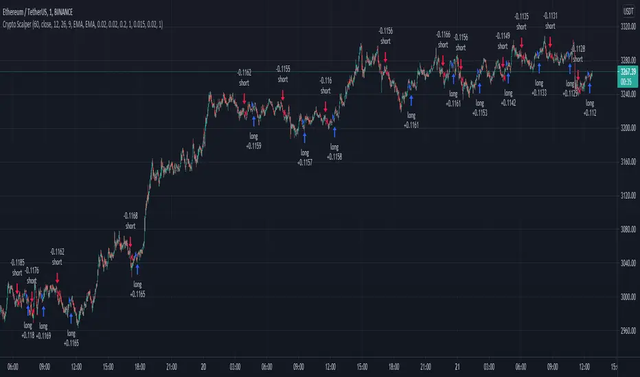
Crypto Scalper Divergence Macd Psar Ema 200This is a very efficient crypto scalper adapted to very short timeframes, however it can be optimized for other timeframes and assests as well.
Its components are
MACD
P SAR
EMA 200
Risk management
Rules for entry:
For short : we have an uptrend on PSAR , histogram is positive (divergence MACD) and close of a candle is below EMA 200
For long : we dont have an uptrend on PSAR, histogram is negative(divergence MACD) and close of a candle is above EMA 200
Rules for exit:
We exit when we either find a reverse condition than the entry one, or based on stop loss/take profit that are calculated on % movements of the price.
If you have any questions, let me know !
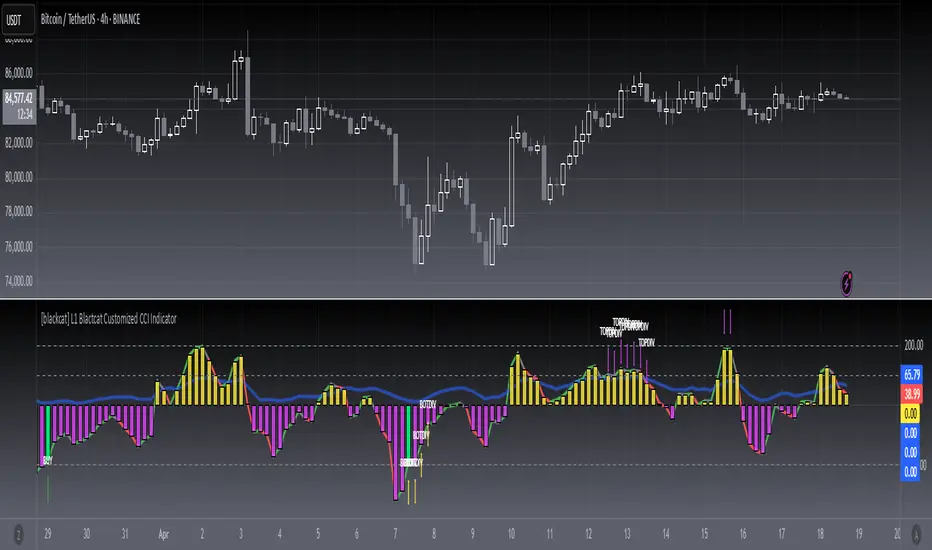
[blackcat] L1 Blackcat Customized CCI IndicatorLevel: 1
Background
This CCI indicator is blackcat customized version with enhanced features.
Function
This CCI use green line to indicate strong long trend with cci values > 0 and red line to indicate weak long trend with cci values <0. It also use yellow and fuchsia candles to present the strong and weak long trend. A green candle is used to indicate long entry, while a red candle is usded to indicate long flatten signal.
Key Signal
green line --> strong long trend
red line --> weak long trend
blue line --> trend strength indicator
SELL label --> flatten long or short entry
BUY label --> long entry
TOPDIV label --> top divergence indicator
BOTDIV label --> bottom divergence indicator
Remarks
Feedbacks are appreciated.
Readme
In real life, I am a prolific inventor. I have successfully applied for more than 60 international and regional patents in the past 12 years. But in the past two years or so, I have tried to transfer my creativity to the development of trading strategies. Tradingview is the ideal platform for me. I am selecting and contributing some of the hundreds of scripts to publish in Tradingview community. Welcome everyone to interact with me to discuss these interesting pine scripts.
The scripts posted are categorized into 5 levels according to my efforts or manhours put into these works.
Level 1 : interesting script snippets or distinctive improvement from classic indicators or strategy. Level 1 scripts can usually appear in more complex indicators as a function module or element.
Level 2 : composite indicator/strategy. By selecting or combining several independent or dependent functions or sub indicators in proper way, the composite script exhibits a resonance phenomenon which can filter out noise or fake trading signal to enhance trading confidence level.
Level 3 : comprehensive indicator/strategy. They are simple trading systems based on my strategies. They are commonly containing several or all of entry signal, close signal, stop loss, take profit, re-entry, risk management, and position sizing techniques. Even some interesting fundamental and mass psychological aspects are incorporated.
Level 4 : script snippets or functions that do not disclose source code. Interesting element that can reveal market laws and work as raw material for indicators and strategies. If you find Level 1~2 scripts are helpful, Level 4 is a private version that took me far more efforts to develop.
Level 5 : indicator/strategy that do not disclose source code. private version of Level 3 script with my accumulated script processing skills or a large number of custom functions. I had a private function library built in past two years. Level 5 scripts use many of them to achieve private trading strategy.
Macd Divergence with higher timeframe trendThis script Uses Ma`s for Trend confluence and looks for macd divergence where the macd is below the Zero line on a long and doesnt cross back up before the divergence happens.
Also added Tp as preeset 2:1RR in green. SL in red and 1:1 RR in orange.
Alerts are included too.
Volume MA Convergence and DivergenceGreetings, I imagine there is already some similar scripts as this one but I couldn't find one so I decided to add something.
We are looking at convergence and divergence signals of moving-average values of 3 different volume time frames. The time frames can of course be tweaked to ones liking, I set up Vol-MA8, 20 and 50. A strong enough divergence in at least 2 of the MAs may perhaps signal an exhausting trend or the beginning of a new one. Convergence of all three to a single point, or close enough to, may signal impending volatility potentially. The latter would best be complimented with another volatility predicative indicator or correlating impending price change data. There are more signals to be studied within this single indicator such as a converging occurrence above OR below the mean, etc, etc.
@OptiSean on Twitter
Enjoy, Cheers
RSI Tops and BottomsHello Traders
This script finds Tops when RSI is in overbought area or Bottoms when RSI is in oversold area and checks the divergence between them. it checks divergence at tops/bottoms after RSI exited from OB/OS areas.
You can change overbought / oversold levels.
You can limit the time that RSI is in OB/OS area with the option "Max Number of Bars in OB/OS"
you can set the minimum/maximum distances between Tops/Bottoms with the options "Min Number of Bars between Tops/Bottoms" and "Max Number of Bars between Topss/Bottoms"
and you can set the color and line widths as you wish.
These tops or bottom must be sequential, means there mustn't be another top while checking tops or bottom while checking bottoms between them.
in next example you can see valid and invalid bottoms:
After you got signal then you better use Stop Order, a few pips higher than the high of colored candle for long positions, ( vise versa in short positions ). so you may escape from traps. ("Stop order" is filled when the price reached a pre-specified price. for example the price is now 10.0 and you set Buy Stop Order at 11.0 then if price reaches 11.0 then your buy order get filled. you can put stoploss a few pips lower than the low of colored candle or you can use ATR to decice stoploss level. how you wish)
For example in following screenshot you can see that buy stop order was not filled and you didn't take long position.
Enjoy!

TMsignal - RSI Divergence V1.0TMsignal - RSI Divergence V1.0: It automatically shows RSI Divergence, being much useful for detecting future changes in the tendency of the current stock, and weakness in the actual tendency.
Different timeframes can be set up to meet your needs.
We hope you like it! Contact us any question or improvement suggestions.

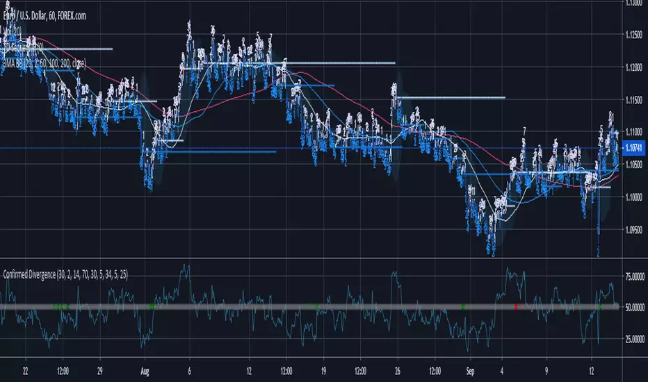
Confirmed DivergenceThis indicator paints the middle dots green when a bullish divergence is found on both the RSI and the Awesome Oscillator and red when bearish divergence is found
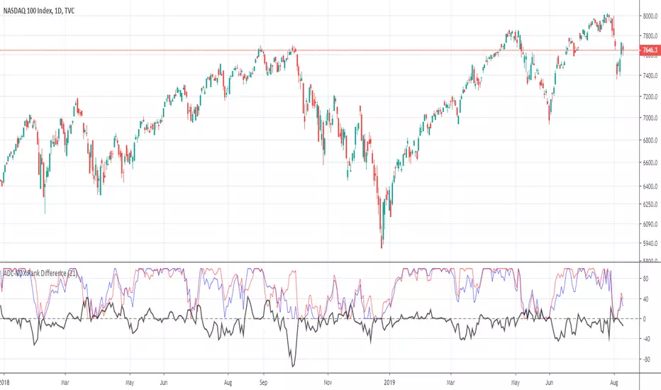
ADL-NDX Rank Difference-Buschi
English:
An expansion of the Advance Decline Line of the NASDAQ. It can be interesting to compare the Advance Decline Line with the corresponding benchmark index. I therefore made a ranking (0 to 100) based on the performance over the last days (default: 21 days). The difference is the target figure and ranges between -100 (bearish divergence) to +100 (bullish divergence).
Deutsch:
Eine Erweiterung der Advance Decline Line der NASDAQ. Oft möchte man den Verlauf der Advance Decline Line mit dem zugehörigen Leitindex vergleichen. Daher habe ich für beide ein Ranking (0 bis 100) erstellt auf Basis des Verlaufs über die letzten Tage (Standardwert: 21 Tage). Die Differenz stellt dabei die Zielgröße dar und schwankt zwischen -100 (bärische Divergenz) und +100 (bullische Divergenz).
ADL-SPX Rank Difference-Buschi
English:
An expansion of the Advance Decline Line of the NYSE. It can be interesting to compare the Advance Decline Line with the corresponding benchmark index. I therefore made a ranking (0 to 100) based on the performance over the last days (default: 21 days). The difference is the target figure and ranges between -100 (bearish divergence) to +100 (bullish divergence).
Deutsch:
Eine Erweiterung der Advance Decline Line der NYSE. Oft möchte man den Verlauf der Advance Decline Line mit dem zugehörigen Leitindex vergleichen. Daher habe ich für beide ein Ranking (0 bis 100) erstellt auf Basis des Verlaufs über die letzten Tage (Standardwert: 21 Tage). Die Differenz stellt dabei die Zielgröße dar und schwankt zwischen -100 (bärische Divergenz) und +100 (bullische Divergenz).

MACD percentage price oscillatorMACD Percentage Price Oscillator is a variation of the MACD indicator. Signal line crossovers are almost identical. The major difference is the MACD Percentage scale which enables comparison between stocks at different prices.
MACD Percentage Price Oscillator's trading signals are the same as for the MACD indicator. The MACD indicator is primarily used to trade trends and should not be used in a ranging market. Signals are taken when MACD crosses its signal line, calculated as a 9 day exponential moving average of MACD.
First check whether price is trending. If the MACD indicator is flat or stays close to the zero line, the market is ranging and signals are unreliable.
Signals are far stronger if there is either:
- a divergence on the MACD indicator; or
- a large swing above or below the zero line.
- Unless there is a divergence, do not go long if the signal is above the zero line, nor go short if the signal is below zero. Place stop-losses below the last minor Low when long, or the last minor High when short.
The main advantage of MACD Percentage over MACD is the ability to compare indicator values across stocks.
The only difference with MACD Percentage Price Oscillator is that the difference between the fast and slow moving averages is calculated as a percentage of the slow moving average: MACD = (12 Day EMA - 26 Day EMA) / 26 Day EMA

Awesome Oscillator and MACD HistogramThis is a quick script that combines two standard indicators, the Awesome Oscillator and MACD histogram, to highlight the beginnings of periods of fast price movement (divergence between the two). Since MACD's EMA responds more quickly than AO's SMA, look for periods of green over gold as a bullish signal, and red under blue as a bearish signal.
Of course both indicators are lagging in nature, but the presence of this divergence often leads larger, continued movement in the same direction.
Bullish Signals
Change from red to green below 0 with either blue or gold above 0 (strengthened on second green bar):
Rising green above 0 with gold below 0:
Bearish Signals
Change from green to red above 0 with either blue or gold below 0 (strengthened on second red bar):
Deepening red below 0 with blue above 0:


SMT DivergencePlots "SMT Divergence" labels.
Mouse over the label to display additional information.

Neeson RSI Divergence DetectorIntegrating Multi-Indicator Strategies: A Rational Approach to Technical Analysis Tools
Introduction
The integration of multiple technical indicators into a unified trading script represents a sophisticated approach to market analysis, combining complementary analytical methods to enhance decision-making. This article outlines the rational basis for combining specific indicators, explains their synergistic operation, and provides practical guidance for users seeking to understand the functional utility, operational mechanics, and unique value proposition of integrated technical analysis tools.
Functional Purpose and Rational Integration Basis
Integrated technical scripts are designed to address the inherent limitations of single-indicator analysis by combining multiple analytical perspectives. The rational basis for integration typically follows these principles:
Complementary Signal Validation: Different indicators measure distinct market characteristics (momentum, volatility, trend strength, etc.). Their combination allows cross-validation of signals, reducing false positives inherent in single-indicator systems.
Multi-Timeframe Confirmation: Integrated scripts often incorporate elements that analyze price action across different temporal dimensions, providing a more comprehensive market perspective.
Risk Management Enhancement: By combining overbought/oversold indicators with trend confirmation tools, these scripts help identify not only entry opportunities but also potential risk zones.
Market Phase Adaptation: Different market conditions (trending, ranging, volatile) favor different indicator types. Integrated approaches maintain relevance across varying market environments.
Synergistic Operational Mechanism
The components of well-designed integrated scripts operate through several synergistic mechanisms:
Primary Trend Identification: Core trend-following indicators establish the dominant market direction, serving as a filter for other signals. This prevents counter-trend entries that might otherwise be generated by oscillators or momentum indicators.
Momentum Confirmation: Oscillator-based components (like RSI or Stochastic) validate the strength of the identified trend, distinguishing between healthy retracements and potential reversals.
Divergence Detection: By comparing price action with momentum indicators, these scripts identify subtle shifts in market dynamics that often precede trend changes.
Volatility Adjustment: Volatility-based components dynamically adjust signal thresholds and position sizing recommendations based on current market conditions.
Multi-Layer Filtering: Each signal passes through successive validation layers, with only the strongest, most confirmed signals triggering alerts or visual markers.
Practical Application Guidance
Users can maximize the utility of integrated scripts through these practical approaches:
Parameter Customization: Adjust indicator periods and thresholds to match the characteristics of specific trading instruments and timeframes. Historical testing can identify optimal settings for particular markets.
Signal Hierarchy Interpretation: Learn to distinguish between primary signals (strongly confirmed across multiple indicators) and secondary signals (weaker confirmation) for appropriate position sizing.
Contextual Analysis: Consider integrated signals within the broader market context, including support/resistance levels, volume patterns, and fundamental developments.
Performance Correlation: Monitor how different market conditions affect script performance. Some configurations may excel in trending markets while others perform better in ranging conditions.
Risk Calibration: Use the multi-indicator confirmation to calibrate stop-loss and take-profit levels, with tighter parameters for strongly confirmed signals and wider parameters for weaker ones.
Originality and Value Proposition
The originality of well-designed integrated scripts manifests in several dimensions:
Unique Combination Logic: The specific selection and weighting of indicators, along with their integration methodology, represents intellectual value distinct from simple indicator stacking.
Innovative Signal Processing: Advanced scripts often incorporate proprietary algorithms for signal filtering, noise reduction, or probability weighting not found in standard indicators.
Adaptive Framework: Some scripts dynamically adjust their analytical approach based on changing market conditions, representing a form of artificial market intelligence.
Visualization Innovation: The presentation of complex multi-indicator data in an intuitive, actionable format constitutes significant user interface originality.
Empirical Limitations and Responsible Use
It is crucial to maintain realistic expectations regarding integrated technical scripts:
No Predictive Certainty: These tools analyze probabilities, not certainties. No combination of historical price indicators can guarantee future price movements.
Market Efficiency Limitations: All technical analysis operates within the constraints of market efficiency, with script effectiveness varying across different market conditions and time periods.
Complementary Role: Integrated scripts should complement, not replace, comprehensive trading strategies including risk management, fundamental analysis, and market knowledge.
Continuous Evaluation: Regular performance assessment against established benchmarks helps maintain realistic expectations and identifies when script adjustments may be necessary.
Conclusion
The thoughtful integration of multiple technical indicators represents a logical evolution in analytical methodology, addressing the limitations of single-indicator approaches through complementary validation and multi-dimensional analysis. By understanding the rational basis for integration, the synergistic operation of components, and the practical application parameters, users can employ these tools as valuable components within broader, disciplined trading approaches. The true value emerges not from predictive accuracy but from structured decision support that helps traders navigate complex market environments with greater consistency and insight.

Pradip's MACD Divergence ProThis is where the "magic" happens, Pradip. MACD Divergence is one of the most powerful concepts because it acts like an early-warning system. It tells you when the market is "lying"—when the price is moving up or down, but the energy (momentum) behind it is dying.

HTB Reversal Pattern - RSI DivergenceHow this Script Works
Pivot Points: The script looks for "peaks" and "valleys" in the RSI indicator.
Divergence Logic: * Bullish: If the current price low is lower than the previous low, but the RSI low is higher than the previous RSI low, it indicates the selling pressure is fading despite the price drop.
Bearish: If the current price high is higher than the previous high, but the RSI high is lower than the previous RSI high, it suggests buying momentum is weakening.
The "Lookback" Offset: Because pivot points require a few bars to the right to be confirmed (defined by lbR), the labels will appear on the chart with a small delay (default is 5 bars). This is necessary to prevent "repainting" (signals that disappear after they appear).

RSI Divergence Indicator (Multi-Time Frame Confirmation)This custom-built RSI indicator blends traditional divergence detection with multi-timeframe trend confirmation, offering traders a smarter way to spot meaningful momentum shifts.

RSI Divergence Overlay with BGRSI Divergence Overlay with Bullish (Green) and Bearish (Red) notations

Capital Rotational Event (CRE)What is a Capital Rotational Event (CRE)?
A Capital Rotational Event is when money shifts from one asset to another — e.g., rotation from stocks into bonds, from tech into commodities, or from one sector into another.
In technical terms it typically shows:
✔ Divergence between two asset price series
✔ Relative strength switching direction
✔ Volume/flow confirming rotation
✔ Often precedes trend acceleration in the “receiver” asset
