Variation from Opening📈 Purpose: This script provides traders with a clear visualization of the percentage variation from the opening price for two major futures contracts: ES1! (S&P 500 futures) and NQ1! (Nasdaq 100 futures).
🔑 Key Features:
Real-Time Price Retrieval: Fetches the latest opening prices for ES1! and NQ1! contracts.
Percentage Variation Computation: Determines the percentage change from the opening price, offering traders an immediate view of market dynamics.
Clear Visualization: Plots the percentage variation for both contracts in distinct colors (red for ES1! and blue for NQ1!) for easy differentiation.
💡 Benefits:
Informed Trading: Understand intraday price movements to make better trading decisions.
Versatility: While tailored for ES1! and NQ1!, the script can be adapted for other securities.
Clean Display: A focused, clutter-free chart ensures traders can quickly gauge market movements.
🎯 Ideal For: Traders looking to monitor intraday price shifts of major futures contracts.
Equip yourself with the "Variation from Opening" script and enhance your trading insights!
Cerca negli script per "Futures"

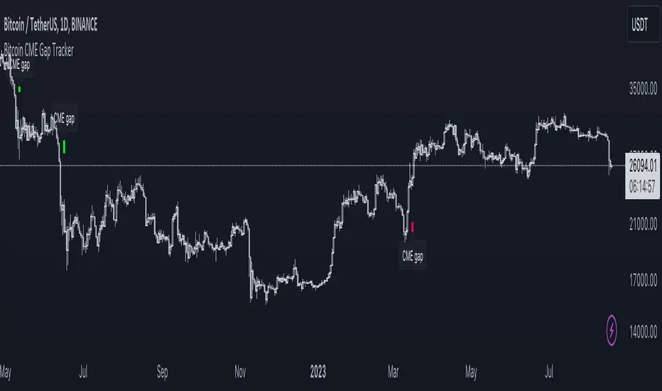
Bitcoin CME Gap TrackerCME Bitcoin Futures Gaps: What Are They and Why Are They Important?
Gaps are breaks between price candles on charts, illustrating the intervals between the closing price of the previous period and the opening price of the next. For Bitcoin on CME, these gaps arise due to the particular workings of this market.
Bitcoin and other cryptocurrencies trade 24/7 without breaks. However, CME Bitcoin Futures, like many other financial instruments on traditional exchanges, have weekends and trading pauses. When the Bitcoin market continues to move during weekends or CME closures, and then CME opens on the subsequent trading day, a price disparity can occur, perceived as a gap.
Several studies suggest that in most cases (approximately 70% and more), the market reverts to "close" these gaps. This phenomenon is observed because large liquidity is concentrated at these gap points. There are many unfilled orders in gap zones, placed at specific prices. When the price reaches these levels, it can swiftly react to this "clustering" of orders, potentially leading to the gap's closure.
Therefore, CME Bitcoin Futures gaps not only reflect crucial psychological moments in the market but can also serve as potential entry or exit points, considering the high liquidity in these zones.
Technical Description:
The script is designed to identify gaps in the Bitcoin Futures chart on CME. It automatically detects gaps that appear on Mondays (since CME is closed on weekends) and are larger than the user-specified percentage.
Key Features:
Identification of the weekday to detect gaps that arose on Monday.
Calculation of positive and negative gaps by comparing the highs and lows of the previous candles with the current ones.
Graphical representation of the gaps using lines and labels on the chart.
User Guide:
Add this script to your TradingView chart.
You can adjust the "Show gaps larger than %" parameter to determine the minimum gap size of interest.
Gaps will be automatically displayed on your chart with lines and labels.
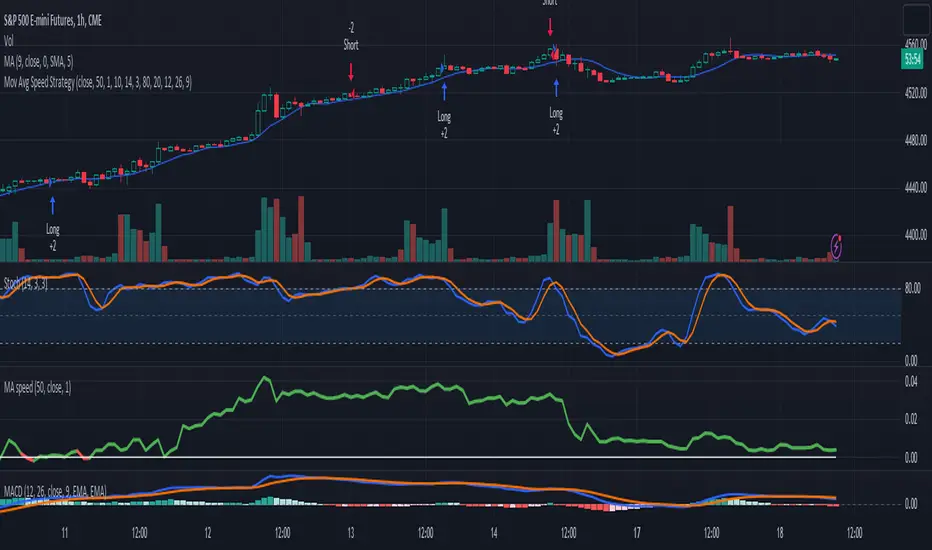
3-Signal Directional Trend Strategy for E-MinisThis is a conceptual strategy intended for E-mini S&P 500 futures with hourly bars.
It uses three signals, going long or short when two or more change in the same direction.
First is MACD. A positive oscillator is considered a bullish signal and a falling oscillator is interpreted bearishly.
Next, stochastics are used as an overbought/oversold indicator. Overbought conditions are considered bearish and oversold readings are viewed as bullish.
Third is a custom indicator based on our Moving Average Speed script. It takes the rate of change of the 50-hour simple moving average (SMA), and then smooths it using a 10-period average. This provides a directional signal.
Traders may want to experiment with different settings for moving average speed.
Note: This is intended for use with stock index futures, which have round-the clock price data to populate the data in the indicators. It may not yield good results with stocks or ETFs.
TradeStation has, for decades, advanced the trading industry, providing access to stocks, options, futures and cryptocurrencies. See our Overview for more.
Important Information
TradeStation Securities, Inc., TradeStation Crypto, Inc., and TradeStation Technologies, Inc. are each wholly owned subsidiaries of TradeStation Group, Inc., all operating, and providing products and services, under the TradeStation brand and trademark. TradeStation Crypto, Inc. offers to self-directed investors and traders cryptocurrency brokerage services. It is neither licensed with the SEC or the CFTC nor is it a Member of NFA. When applying for, or purchasing, accounts, subscriptions, products, and services, it is important that you know which company you will be dealing with. Please click here for further important information explaining what this means.
This content is for informational and educational purposes only. This is not a recommendation regarding any investment or investment strategy. Any opinions expressed herein are those of the author and do not represent the views or opinions of TradeStation or any of its affiliates.
Investing involves risks. Past performance, whether actual or indicated by historical tests of strategies, is no guarantee of future performance or success. There is a possibility that you may sustain a loss equal to or greater than your entire investment regardless of which asset class you trade (equities, options, futures, or digital assets); therefore, you should not invest or risk money that you cannot afford to lose. Before trading any asset class, first read the relevant risk disclosure statements on the Important Documents page, found here: www.tradestation.com .
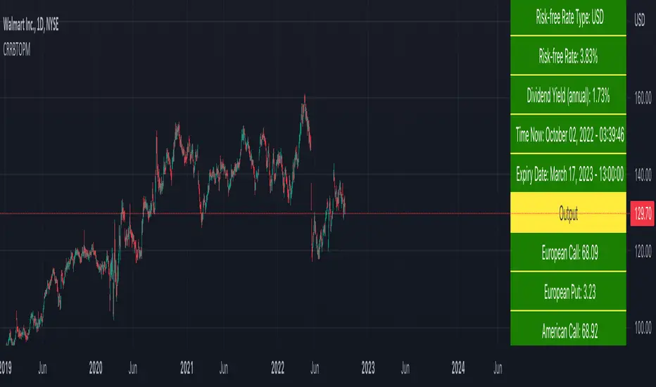
BSM OPM 1973 w/ Continuous Dividend Yield [Loxx]Generalized Black-Scholes-Merton w/ Analytical Greeks is an adaptation of the Black-Scholes-Merton Option Pricing Model including Analytical Greeks and implied volatility calculations. The following information is an excerpt from Espen Gaarder Haug's book "Option Pricing Formulas". The options sensitivities (Greeks) are the partial derivatives of the Black-Scholes-Merton ( BSM ) formula. Analytical Greeks for our purposes here are broken down into various categories:
Delta Greeks: Delta, DDeltaDvol, Elasticity
Gamma Greeks: Gamma, GammaP, DGammaDSpot/speed, DGammaDvol/Zomma
Vega Greeks: Vega , DVegaDvol/Vomma, VegaP
Theta Greeks: Theta
Rate/Carry Greeks: Rho, Rho futures option, Carry Rho, Phi/Rho2
Probability Greeks: StrikeDelta, Risk Neutral Density
(See the code for more details)
Black-Scholes-Merton Option Pricing
The Black-Scholes-Merton model can be "generalized" by incorporating a cost-of-carry rate b. This model can be used to price European options on stocks, stocks paying a continuous dividend yield, options on futures, and currency options:
c = S * e^((b - r) * T) * N(d1) - X * e^(-r * T) * N(d2)
p = X * e^(-r * T) * N(-d2) - S * e^((b - r) * T) * N(-d1)
where
d1 = (log(S / X) + (b + v^2 / 2) * T) / (v * T^0.5)
d2 = d1 - v * T^0.5
b = r ... gives the Black and Scholes (1973) stock option model.
b = r — q ... gives the Merton (1973) stock option model with continuous dividend yield q. <== this is the one used for this indicator!
b = 0 ... gives the Black (1976) futures option model.
b = 0 and r = 0 ... gives the Asay (1982) margined futures option model.
b = r — rf ... gives the Garman and Kohlhagen (1983) currency option model.
Inputs
S = Stock price.
X = Strike price of option.
T = Time to expiration in years.
r = Risk-free rate
d = dividend yield
v = Volatility of the underlying asset price
cnd (x) = The cumulative normal distribution function
nd(x) = The standard normal density function
convertingToCCRate(r, cmp ) = Rate compounder
gImpliedVolatilityNR(string CallPutFlag, float S, float x, float T, float r, float b, float cm , float epsilon) = Implied volatility via Newton Raphson
gBlackScholesImpVolBisection(string CallPutFlag, float S, float x, float T, float r, float b, float cm ) = implied volatility via bisection
Implied Volatility: The Bisection Method
The Newton-Raphson method requires knowledge of the partial derivative of the option pricing formula with respect to volatility ( vega ) when searching for the implied volatility . For some options (exotic and American options in particular), vega is not known analytically. The bisection method is an even simpler method to estimate implied volatility when vega is unknown. The bisection method requires two initial volatility estimates (seed values):
1. A "low" estimate of the implied volatility , al, corresponding to an option value, CL
2. A "high" volatility estimate, aH, corresponding to an option value, CH
The option market price, Cm , lies between CL and cH . The bisection estimate is given as the linear interpolation between the two estimates:
v(i + 1) = v(L) + (c(m) - c(L)) * (v(H) - v(L)) / (c(H) - c(L))
Replace v(L) with v(i + 1) if c(v(i + 1)) < c(m), or else replace v(H) with v(i + 1) if c(v(i + 1)) > c(m) until |c(m) - c(v(i + 1))| <= E, at which point v(i + 1) is the implied volatility and E is the desired degree of accuracy.
Implied Volatility: Newton-Raphson Method
The Newton-Raphson method is an efficient way to find the implied volatility of an option contract. It is nothing more than a simple iteration technique for solving one-dimensional nonlinear equations (any introductory textbook in calculus will offer an intuitive explanation). The method seldom uses more than two to three iterations before it converges to the implied volatility . Let
v(i + 1) = v(i) + (c(v(i)) - c(m)) / (dc / dv (i))
until |c(m) - c(v(i + 1))| <= E at which point v(i + 1) is the implied volatility , E is the desired degree of accuracy, c(m) is the market price of the option, and dc/ dv (i) is the vega of the option evaluaated at v(i) (the sensitivity of the option value for a small change in volatility ).
Things to know
Only works on the daily timeframe and for the current source price.
You can adjust the text size to fit the screen

Cox-Ross-Rubinstein Binomial Tree Options Pricing Model [Loxx]Cox-Ross-Rubinstein Binomial Tree Options Pricing Model is an options pricing panel calculated using an N-iteration (limited to 300 in Pine Script due to matrices size limits) "discrete-time" (lattice based) method to approximate the closed-form Black–Scholes formula. Joshi (2008) outlined varying binomial options pricing model furnishes a numerical approach for the valuation of options. Significantly, the American analogue can be estimated using the binomial tree. This indicator is the complex calculation for Binomial option pricing. Most folks take a shortcut and only calculate 2 iterations. I've coded this to allow for up to 300 iterations. This can be used to price American Puts/Calls and European Puts/Calls. I'll be updating this indicator will be updated with additional features over time. If you would like to learn more about options, I suggest you check out the book textbook Options, Futures and other Derivative by John C Hull.
***This indicator only works on the daily timeframe!***
A quick graphic of what this all means:
In the graphic, "n" are the steps, in this case we can do up to 300, in production we'd need to do 5-15K. That's a lot of steps! You can see here how the binomial tree fans out. As I said previously, most folks only calculate 2 steps, here we are calculating up to 300.
Want to learn more about Simple Introduction to Cox, Ross Rubinstein (1979) ?
Watch this short series "Introduction to Basic Cox, Ross and Rubinstein (1979) model."
Limitations of Black Scholes options pricing model
This is a widely used and well-known options pricing model, factors in current stock price, options strike price, time until expiration (denoted as a percent of a year), and risk-free interest rates. The Black-Scholes Model is quick in calculating any number of option prices. But the model cannot accurately calculate American options, since it only considers the price at an option's expiration date. American options are those that the owner may exercise at any time up to and including the expiration day.
What are Binomial Trees in options pricing?
A useful and very popular technique for pricing an option involves constructing a binomial tree. This is a diagram representing different possible paths that might be followed by the stock price over the life of an option. The underlying assumption is that the stock price follows a random walk. In each time step, it has a certain probability of moving up by a certain percentage amount and a certain probability of moving down by a certain percentage amount. In the limit, as the time step becomes smaller, this model is the same as the Black–Scholes–Merton model.
What is the Binomial options pricing model ?
This model uses a tree diagram with volatility factored in at each level to show all possible paths an option's price can take, then works backward to determine one price. The benefit of the Binomial Model is that you can revisit it at any point for the possibility of early exercise. Early exercise is executing the contract's actions at its strike price before the contract's expiration. Early exercise only happens in American-style options. However, the calculations involved in this model take a long time to determine, so this model isn't the best in rushed situations.
What is the Cox-Ross-Rubinstein Model?
The Cox-Ross-Rubinstein binomial model can be used to price European and American options on stocks without dividends, stocks and stock indexes paying a continuous dividend yield, futures, and currency options. Option pricing is done by working backwards, starting at the terminal date. Here we know all the possible values of the underlying price. For each of these, we calculate the payoffs from the derivative, and find what the set of possible derivative prices is one period before. Given these, we can find the option one period before this again, and so on. Working ones way down to the root of the tree, the option price is found as the derivative price in the first node.
Inputs
Spot price: select from 33 different types of price inputs
Calculation Steps: how many iterations to be used in the Binomial model. In practice, this number would be anywhere from 5000 to 15000, for our purposes here, this is limited to 300
Strike Price: the strike price of the option you're wishing to model
% Implied Volatility: here you can manually enter implied volatility
Historical Volatility Period: the input period for historical volatility; historical volatility isn't used in the CRRBT process, this is to serve as a sort of benchmark for the implied volatility,
Historical Volatility Type: choose from various types of implied volatility, search my indicators for details on each of these
Option Base Currency: this is to calculate the risk-free rate, this is used if you wish to automatically calculate the risk-free rate instead of using the manual input. this uses the 10 year bold yield of the corresponding country
% Manual Risk-free Rate: here you can manually enter the risk-free rate
Use manual input for Risk-free Rate? : choose manual or automatic for risk-free rate
% Manual Yearly Dividend Yield: here you can manually enter the yearly dividend yield
Adjust for Dividends?: choose if you even want to use use dividends
Automatically Calculate Yearly Dividend Yield? choose if you want to use automatic vs manual dividend yield calculation
Time Now Type: choose how you want to calculate time right now, see the tool tip
Days in Year: choose how many days in the year, 365 for all days, 252 for trading days, etc
Hours Per Day: how many hours per day? 24, 8 working hours, or 6.5 trading hours
Expiry date settings: here you can specify the exact time the option expires
Take notes:
Futures don't risk free yields. If you are pricing options of futures, then the risk-free rate is zero.
Dividend yields are calculated using TradingView's internal dividend values
This indicator only works on the daily timeframe
Included
Option pricing panel
Loxx's Expanded Source Types
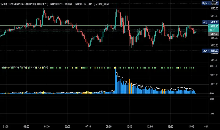
Advanced Volume ProfileTHIS SCRIPT CURRENTLY ONLY WORKS FOR ASSETS THAT TRADE 24/7 OR CBOE FUTURES HOURS!
This script plots volume relative to an asset's historical volume profile.
Usage:
As a companion to my "Unusual Time Frame Volume" (UTF Volume) script, this plots volume against the same historical volume profile used for UTF Volume.
The same high volume (relative to historical) threshold alert is available (yellow bar).
Likewise, if the volume exceeds the historical threshold, but is below the alert threshold, the bar color is orange.
At the top of the chart is an indicator which is green if a bar has higher volume than the previous bar.
You can also set a threshold for this such that if the volume of a bar exceeds the previous bar by a certain multiplier which will turn the indicator yellow.
For example, if the threshold is set to "1.5", then the indicator will be yellow (instead of green) on an increase in volume over the previous bar of 1.5x.
NOTES:
Again, this script currently only works for assets that trade 24/7 or CBOE Futures hours!
Make sure you set the "Asset Mode" and "Time Frame (minutes)" to values that match your asset and chart setting.
For example, if you are trading Futures on a 2m chart, set the Asset Mode to Futures and Time Frame to 2m.
If you are trading crypto on a 5m chart, set the Asset Mode to 24/7 and Time Frame to 5m.
If the settings are not set appropriately, the output will be incorrect/invalid.
If you choose a "Look-back (Days)" setting that is too far back given the time frame, the script will produce an error.
I suggest playing with settings from "1" (compares volume to the previous day's volume) to the highest number that doesn't break the script.
For example, at a 2m time frame, the maximum look-back will be "6" or "7" depending on which mode you are using.
Longer chart time settings allow larger look-back values.
I find that the default value ("6") does a decent job in general.
Please feel free to reuse or further develop this script.
I would greatly appreciate it if you would send me a message below if you find it useful.
Waindrops [Makit0]█ OVERALL
Plot waindrops (custom volume profiles) on user defined periods, for each period you get high and low, it slices each period in half to get independent vwap, volume profile and the volume traded per price at each half.
It works on intraday charts only, up to 720m (12H). It can plot balanced or unbalanced waindrops, and volume profiles up to 24H sessions.
As example you can setup unbalanced periods to get independent volume profiles for the overnight and cash sessions on the futures market, or 24H periods to get the full session volume profile of EURUSD
The purpose of this indicator is twofold:
1 — from a Chartist point of view, to have an indicator which displays the volume in a more readable way
2 — from a Pine Coder point of view, to have an example of use for two very powerful tools on Pine Script:
• the recently updated drawing limit to 500 (from 50)
• the recently ability to use drawings arrays (lines and labels)
If you are new to Pine Script and you are learning how to code, I hope you read all the code and comments on this indicator, all is designed for you,
the variables and functions names, the sometimes too big explanations, the overall structure of the code, all is intended as an example on how to code
in Pine Script a specific indicator from a very good specification in form of white paper
If you wanna learn Pine Script form scratch just start HERE
In case you have any kind of problem with Pine Script please use some of the awesome resources at our disposal: USRMAN , REFMAN , AWESOMENESS , MAGIC
█ FEATURES
Waindrops are a different way of seeing the volume and price plotted in a chart, its a volume profile indicator where you can see the volume of each price level
plotted as a vertical histogram for each half of a custom period. By default the period is 60 so it plots an independent volume profile each 30m
You can think of each waindrop as an user defined candlestick or bar with four key values:
• high of the period
• low of the period
• left vwap (volume weighted average price of the first half period)
• right vwap (volume weighted average price of the second half period)
The waindrop can have 3 different colors (configurable by the user):
• GREEN: when the right vwap is higher than the left vwap (bullish sentiment )
• RED: when the right vwap is lower than the left vwap (bearish sentiment )
• BLUE: when the right vwap is equal than the left vwap ( neutral sentiment )
KEY FEATURES
• Help menu
• Custom periods
• Central bars
• Left/Right VWAPs
• Custom central bars and vwaps: color and pixels
• Highly configurable volume histogram: execution window, ticks, pixels, color, update frequency and fine tuning the neutral meaning
• Volume labels with custom size and color
• Tracking price dot to be able to see the current price when you hide your default candlesticks or bars
█ SETTINGS
Click here or set any impar period to see the HELP INFO : show the HELP INFO, if it is activated the indicator will not plot
PERIOD SIZE (max 2880 min) : waindrop size in minutes, default 60, max 2880 to allow the first half of a 48H period as a full session volume profile
BARS : show the central and vwap bars, default true
Central bars : show the central bars, default true
VWAP bars : show the left and right vwap bars, default true
Bars pixels : width of the bars in pixels, default 2
Bars color mode : bars color behavior
• BARS : gets the color from the 'Bars color' option on the settings panel
• HISTOGRAM : gets the color from the Bearish/Bullish/Neutral Histogram color options from the settings panel
Bars color : color for the central and vwap bars, default white
HISTOGRAM show the volume histogram, default true
Execution window (x24H) : last 24H periods where the volume funcionality will be plotted, default 5
Ticks per bar (max 50) : width in ticks of each histogram bar, default 2
Updates per period : number of times the histogram will update
• ONE : update at the last bar of the period
• TWO : update at the last bar of each half period
• FOUR : slice the period in 4 quarters and updates at the last bar of each of them
• EACH BAR : updates at the close of each bar
Pixels per bar : width in pixels of each histogram bar, default 4
Neutral Treshold (ticks) : delta in ticks between left and right vwaps to identify a waindrop as neutral, default 0
Bearish Histogram color : histogram color when right vwap is lower than left vwap, default red
Bullish Histogram color : histogram color when right vwap is higher than left vwap, default green
Neutral Histogram color : histogram color when the delta between right and left vwaps is equal or lower than the Neutral treshold, default blue
VOLUME LABELS : show volume labels
Volume labels color : color for the volume labels, default white
Volume Labels size : text size for the volume labels, choose between AUTO, TINY, SMALL, NORMAL or LARGE, default TINY
TRACK PRICE : show a yellow ball tracking the last price, default true
█ LIMITS
This indicator only works on intraday charts (minutes only) up to 12H (720m), the lower chart timeframe you can use is 1m
This indicator needs price, time and volume to work, it will not work on an index (there is no volume), the execution will not be allowed
The histogram (volume profile) can be plotted on 24H sessions as limit but you can plot several 24H sessions
█ ERRORS AND PERFORMANCE
Depending on the choosed settings, the script performance will be highly affected and it will experience errors
Two of the more common errors it can throw are:
• Calculation takes too long to execute
• Loop takes too long
The indicator performance is highly related to the underlying volatility (tick wise), the script takes each candlestick or bar and for each tick in it stores the price and volume, if the ticker in your chart has thousands and thousands of ticks per bar the indicator will throw an error for sure, it can not calculate in time such amount of ticks.
What all of that means? Simply put, this will throw error on the BITCOIN pair BTCUSD (high volatility with tick size 0.01) because it has too many ticks per bar, but lucky you it will work just fine on the futures contract BTC1! (tick size 5) because it has a lot less ticks per bar
There are some options you can fine tune to boost the script performance, the more demanding option in terms of resources consumption is Updates per period , by default is maxed out so lowering this setting will improve the performance in a high way.
If you wanna know more about how to improve the script performance, read the HELP INFO accessible from the settings panel
█ HOW-TO SETUP
The basic parameters to adjust are Period size , Ticks per bar and Pixels per bar
• Period size is the main setting, defines the waindrop size, to get a better looking histogram set bigger period and smaller chart timeframe
• Ticks per bar is the tricky one, adjust it differently for each underlying (ticker) volatility wise, for some you will need a low value, for others a high one.
To get a more accurate histogram set it as lower as you can (min value is 1)
• Pixels per bar allows you to adjust the width of each histogram bar, with it you can adjust the blank space between them or allow overlaping
You must play with these three parameters until you obtain the desired histogram: smoother, sharper, etc...
These are some of the different kind of charts you can setup thru the settings:
• Balanced Waindrops (default): charts with waindrops where the two halfs are of same size.
This is the default chart, just select a period (30m, 60m, 120m, 240m, pick your poison), adjust the histogram ticks and pixels and watch
• Unbalanced Waindrops: chart with waindrops where the two halfs are of different sizes.
Do you trade futures and want to plot a waindrop with the first half for the overnight session and the second half for the cash session? you got it;
just adjust the period to 1860 for any CME ticker (like ES1! for example) adjust the histogram ticks and pixels and watch
• Full Session Volume Profile: chart with waindrops where only the first half plots.
Do you use Volume profile to analize the market? Lucky you, now you can trick this one to plot it, just try a period of 780 on SPY, 2760 on ES1!, or 2880 on EURUSD
remember to adjust the histogram ticks and pixels for each underlying
• Only Bars: charts with only central and vwap bars plotted, simply deactivate the histogram and volume labels
• Only Histogram: charts with only the histogram plotted (volume profile charts), simply deactivate the bars and volume labels
• Only Volume: charts with only the raw volume numbers plotted, simply deactivate the bars and histogram
If you wanna know more about custom full session periods for different asset classes, read the HELP INFO accessible from the settings panel
EXAMPLES
Full Session Volume Profile on MES 5m chart:
Full Session Unbalanced Waindrop on MNQ 2m chart (left side Overnight session, right side Cash Session):
The following examples will have the exact same charts but on four different tickers representing a futures contract, a forex pair, an etf and a stock.
We are doing this to be able to see the different parameters we need for plotting the same kind of chart on different assets
The chart composition is as follows:
• Left side: Volume Labels chart (period 10)
• Upper Right side: Waindrops (period 60)
• Lower Right side: Full Session Volume Profile
The first example will specify the main parameters, the rest of the charts will have only the differences
MES :
• Left: Period size: 10, Bars: uncheck, Histogram: uncheck, Execution window: 1, Ticks per bar: 2, Updates per period: EACH BAR,
Pixels per bar: 4, Volume labels: check, Track price: check
• Upper Right: Period size: 60, Bars: check, Bars color mode: HISTOGRAM, Histogram: check, Execution window: 2, Ticks per bar: 2,
Updates per period: EACH BAR, Pixels per bar: 4, Volume labels: uncheck, Track price: check
• Lower Right: Period size: 2760, Bars: uncheck, Histogram: check, Execution window: 1, Ticks per bar: 1, Updates per period: EACH BAR,
Pixels per bar: 2, Volume labels: uncheck, Track price: check
EURUSD :
• Upper Right: Ticks per bar: 10
• Lower Right: Period size: 2880, Ticks per bar: 1, Pixels per bar: 1
SPY :
• Left: Ticks per bar: 3
• Upper Right: Ticks per bar: 5, Pixels per bar: 3
• Lower Right: Period size: 780, Ticks per bar: 2, Pixels per bar: 2
AAPL :
• Left: Ticks per bar: 2
• Upper Right: Ticks per bar: 6, Pixels per bar: 3
• Lower Right: Period size: 780, Ticks per bar: 1, Pixels per bar: 2
█ THANKS TO
PineCoders for all they do, all the tools and help they provide and their involvement in making a better community
scarf for the idea of coding a waindrops like indicator, I did not know something like that existed at all
All the Pine Coders, Pine Pros and Pine Wizards, people who share their work and knowledge for the sake of it and helping others, I'm very grateful indeed
I'm learning at each step of the way from you all, thanks for this awesome community;
Opensource and shared knowledge: this is the way! (said with canned voice from inside my helmet :D)
█ NOTE
This description was formatted following THIS guidelines
═════════════════════════════════════════════════════════════════════════
I sincerely hope you enjoy reading and using this work as much as I enjoyed developing it :D
GOOD LUCK AND HAPPY TRADING!

Dynamically Adjustable Moving AverageIntroduction
The Dynamically Adjustable Moving Average (AMA) is an adaptive moving average proposed by Jacinta Chan Phooi M’ng (1) originally provided to forecast Asian Tiger's futures markets. AMA adjust to market condition in order to avoid whipsaw trades as well as entering the trending market earlier. This moving average showed better results than classical methods (SMA20, EMA20, MAC, MACD, KAMA, OptSMA) using a classical crossover/under strategy in Asian Tiger's futures from 2014 to 2015.
Dynamically Adjustable Moving Average
AMA adjust to market condition using a non-exponential method, which in itself is not common, AMA is described as follow :
1/v * sum(close,v)
where v = σ/√σ
σ is the price standard deviation.
v is defined as the Efficacy Ratio (not be confounded with the Efficiency Ratio) . As you can see v determine the moving average period, you could resume the formula in pine with sma(close,v) but in pine its not possible to use the function sma with variables for length, however you can derive sma using cumulation.
sma ≈ d/length where d = c - c_length and c = cum(close)
So a moving average can be expressed as the difference of the cumulated price by the cumulated price length period back, this difference is then divided by length. The length period of the indicator should be short since rounded version of v tend to become less variables thus providing less adaptive results.
AMA in Forex Market
In 2014/2015 Major Forex currencies where more persistent than Asian Tiger's Futures (2) , also most traded currency pairs tend to have a strong long-term positive autocorrelation so AMA could have in theory provided good results if we only focus on the long term dependency. AMA has been tested with ASEAN-5 Currencies (3) and still showed good results, however forex is still a tricky market, also there is zero proof that switching to a long term moving average during ranging market avoid whipsaw trades (if you have a paper who prove it please pm me) .
Conclusion
An interesting indicator, however the idea behind it is far from being optimal, so far most adaptive methods tend to focus more in adapting themselves to market complexity than volatility. An interesting approach would have been to determine the validity of a signal by checking the efficacy ratio at time t . Backtesting could be a good way to see if the indicator is still performing well.
References
(1) J.C.P. M’ng, Dynamically adjustable moving average (AMA’) technical
analysis indicator to forecast Asian Tigers’ futures markets, Physica A (2018),
doi.org
(2) www.researchgate.net
(3) www.ncbi.nlm.nih.gov
Peak Trading Activity Graphs [LuxAlgo]The Peak Trading Activity Graphs displays four graphs that allow traders to see at a glance the times of the highest and lowest volume and volatility for any month, day of the month, day of the week, or hour of the day. By default, it plots the median values of the selected data for each period. Traders can enable the Median Delta feature to further highlight differences in the data. The graphs are customizable in width and height and feature gradient colors by default.
🔶 USAGE
The tool is simple yet powerful. Using the three main parameters on the settings panel, traders can display up to four different graphs and up to 16 different configurations.
There are two main types of data: volume and volatility. There are also four different time periods: months, days of the month, days of the week, and hours of the day. There is also the possibility of displaying the raw medians or the delta between them.
Understanding which time periods have the most and least volume and volatility is essential for any trader. From avoiding trading during periods of low volume to properly sizing positions during periods of high volatility, there are multiple use cases directly related to improving execution and risk management.
🔹 Months
This chart shows the monthly volume and volatility of NQ as medians at the top and as the delta of medians at the bottom.
As we can see on the left-hand chart, the volume is fairly consistent throughout the year. January, March, and October have the highest volume, and December has the lowest volume for obvious reasons. Note the bottom chart with the delta feature enabled, which clearly shows the top and bottom periods.
On the right, we have volatility, which is also evenly distributed throughout most months. October is the most volatile month, and March is the least volatile month. The differences are also very clear on the bottom chart with delta enabled.
Traders may want to compare median volatility and volume by month to size positions and favor exposure during historically high-activity months.
🔹 Days of Month
The same NQ charts are shown, but in this case, the Days of Month period has been selected. As you can see, this displays a calendar-like graph. The volume is on the left, the volatility is on the right, and the delta feature is enabled on the bottom charts. This feature allows for stronger differences in gradient.
The top charts show that the raw medians of both volume and volatility are evenly distributed. We need to enable the delta feature on the bottom charts to see where the most and least volume and volatility are.
Traders can use median activity by calendar day to anticipate liquidity expansions or contractions and adjust trade frequency.
🔹 Days of Week
In this case, we have BTC charts with the same layout as before. Notably, the difference in volume on weekends is not as pronounced from a volatility perspective on those same days.
A practical use case can be differentiate high-risk, high-participation weekdays from low-activity sessions to select trend or range-based strategies.
🔹 Hours of Day
This shows the volume and volatility of each hour of the day for gold futures. As we can see, the most volume and volatility occur during the three hours around the RTH open at 8:00, 9:00, and 10:00 a.m.
Traders may want to isolate hours with the highest median volatility and volume to concentrate execution and avoid low-liquidity periods.
🔹 Assets Comparison
This tool allows us to compare different assets over the same period. In this case, we are comparing the hours of the day for 10-year notes, the S&P 500, silver, and the yen. Each asset has a different volatility profile throughout the day.
With the Delta feature enabled, we can clearly see the differences. The 10Y Notes move from 7:00 to 9:00 and from 2:00 to 9:00. The Yen moves from 7:00 to 9:00 and from 2:00 to 9:00. Silver moves from 8:00 to 10:00. The S&P 500 moves from 8:00 to 9:00 and from 14:00 to 15:00. All times are in exchange time.
🔹 Sizing & Coloring Graphs
Traders can adjust the width and height of the graphs, as well as the text size, at will.
Traders can choose from four different color configurations in the settings panel.
🔶 SETTINGS
Data: Select the type of data to display: Volume or Volatility.
Period: Select the time period to display: Month, Day of Month, Day of Week, or Hours.
Display delta between medians. Display the difference between the medians as a percentage. The smaller median is 0 and the larger median is 100. Enabling this feature highlights the differences between values.
🔹 Graph
Graph: Select the graph location.
Size: Select the graph size.
Width: Select the graph width.
Height: Select the height of the graph.
🔹 Style
Colors: Select a color map: Viridis, Plasma, Magma, or Custom.
Custom Cold: Select a custom color for cold (low values).
Custom Lukewarm: Select a custom color for lukewarm (medium values).
Custom Hot: Select a custom color for hot (high values).

Kevin J. Davey EURO Night StrategyEuro Night Strategy is a time‑filtered, volatility‑aware system originally built for Euro FX futures. Still, your adaptation to XAL and BTC on 1h bars makes sense because both markets show overnight drift patterns that the strategy can exploit.

Monthly Seasonality AnalyzerThis indicator analyzes historical performance/seasonality of a chosen month, from date of inception to present. Users can choose any calendar month via dropdown menu.
For each historical month selected, it will calculate the monthly percentage gain/loss, range(volatility), and average gain/loss percentage, average range percentage across all recorded years. Positive returns are colored green and negative returns are red. Also, calculates if the selected month was bullish(open>close) or bearish.
When current chart month matches the selected month, it shows the in-progress range as well.
Data is collected from 1930 to present. Results are shown in vertical and horizontal tables. If the vertical table exceeds a 36 years, the script automatically switches to horizontal table to display all the data, with option to change table position.
Overall this tool is valuable for seasonality research, such as Santa Rally, May Go Away and swing trading/ position trading to capture the monthly PO3 range.
Most seasonality indicators show all 12 months at once or use daily bars. This one zooms in deeply on one month only, providing detailed per-year breakdowns, accurate completed-month stats, and a practical live range display.
The script uses arrays to store years, gains, and ranges. Uses table.new(), table.cell(), table.merge_cells() for easily readable result display. Code handles the current in-progress month separately (shows live range without including it in historical averages).
**Script will not run on any timeframe other than monthly and displays error otherwise. Script is best used on spot and not futures.

RTH Volume Candle DeltaOverview
This indicator is designed specifically for RTH (Regular Trading Hours) intraday traders who scalp the E-mini S&P 500 (ES), Nasdaq (NQ), and other high-liquidity futures. It solves a major flaw in time-based charts: the inability to see the "Speed of the Tape." By using a unique Transparency Heatmap, it simulates MotiveWave-style Constant Volume Bars while keeping your candles fixed to the time-based X-axis to maintain alignment with indicators like VWAP and EMAs.
The Power of RTH (Regular Trading Hours)
This script is optimized for the high-liquidity environment of the US Regular Session.
During RTH: The volume distribution is statistically significant, allowing the script to accurately identify institutional "sweeps."
During ETH (Overnight): Volume is often too thin for reliable delta analysis. I have included a "Hide Overnight" toggle to keep your chart clean and focused on the liquidity that matters.
Core Logic 1: Volume Partitioning (The Heatmap)
The script partitions volume into two visual states based on your target (Default: 1000V):
Normal Volume (< Target): These candles are dimmed (High Transparency). They represent background noise where the volume target has not yet been reached within that time slice.
Burst Volume (> Target): These candles become solid (Opaque). If a single 15s bar exceeds 1000V, it highlights a Velocity Peak—this is where institutional "Big Money" is actively consuming liquidity.
Core Logic 2: Effort-Based Delta (1s Precision)This is the "engine" of the script. Rather than using simple Close-Open delta, it fetches 1-second sub-bar data (the highest precision available without tick data) and applies an Effort vs. Result formula:$ SET:DELTA = Volume \times \frac{(Close - Low) - (High - Close)}{High - Low}$$Buyer Effort: $(Close - Low)$ — How effectively buyers lifted price from the floor before the close.Seller Effort: $(High - Close)$ — How effectively sellers pushed price down from the ceiling.Adaptive Light-Up: The candle "Lights Up" (White/Yellow) only when the Delta is 1.5x greater than the MA 20 of recent deltas. This filters out standard two-way trade and highlights aggressive initiative.
How to Trade with this Indicator
Spotting Absorption: If you see a Solid (Burst) candle with a small body and "Normal" color, a limit order "Wall" is likely absorbing the market orders.
Confirming the Drive: A Solid White/Yellow candle at a key level (VWAP, PDH, or Opening Range) is a high-probability signal that aggressive money is driving the breakout.
Multiplier Labels: The labels provide an "x Multiplier" (e.g., x4.2), telling you exactly how many 1000V rotations occurred within that single time-bar.
Final Recommendations for Users
ES (S&P 500): 1000V is the standard. On a 1m chart, set it to 4000V.
NQ (Nasdaq): 400V - 500V is recommended due to thinner liquidity.
Setup: For the best experience, hide the default TradingView candle bodies in your chart settings.

GEX Walls + Market Open Shading### Overview
This Pine Script (version 6) creates a TradingView indicator called **"GEX Walls + Market Open Shading"**. It overlays directly on the price chart and is designed for intraday trading, particularly for indices like SPX or ES futures. The script combines two main features:
- **GEX Walls**: Visual boxes and labels highlighting "Gamma Exposure" (GEX) levels—key support (Put Wall) and resistance (Call Wall) zones based on options gamma. It includes approach alerts.
- **Market Open Shading**: A semi-transparent background shade during a customizable post-market-open session (e.g., first 2 hours after 9:30 AM EST).
It uses up to 20 boxes and 20 labels, with right-scale positioning for better visibility on the price axis. The script detects new trading days to reset visuals dynamically.
### Key Inputs
The script is highly customizable via inputs grouped into sections:
#### GEX Walls Inputs
- **Call Wall** (default: 6900.0): Upper resistance level.
- **Put Wall** (default: 6850.0): Lower support level.
- **Buffer** (default: 3.0 points): Vertical padding around each wall for box thickness.
- **Alert Distance** (default: 10.0 points): Threshold for triggering "approach" alerts.
- **Colors**: Semi-transparent yellow for Call Wall boxes (#ffeb3b at 80% opacity), orange for Put Wall (#ff9800 at 80%).
- **Toggles**: Show/hide boxes; enable/disable alerts; restrict alerts to shaded session only.
- **Labels**: Text color (white), offset (bars to the right, default -2), size (tiny/small/normal/large).
#### Market Open Shading Inputs
- **Shade Color** (default: white at 90% transparency): Background fill during session.
- **Transparency** (0-100, default: 90): Opacity level.
- **Open Time** (default: 9:30 EST): Hour/minute for session start.
- **Duration**: Dropdown with pre-formatted options (e.g., "120 min: 11:30a EST / 8:30a PST" up to 195 min), showing both EST and PST end times for convenience.
- **Toggle**: Show/hide shading.
### How It Works
#### 1. Market Open Shading
- Calculates end time from open hour/minute + selected duration (e.g., 120 minutes from 9:30 AM EST = 11:30 AM EST).
- Builds a session string (e.g., "0930-1130") for TradingView's `time()` function.
- Detects if the current bar is within the session using `not na(time("", sessionString))`.
- Applies `bgcolor()` with the user-defined color/transparency only during the session.
- Helper functions format times in 12-hour AM/PM style (e.g., "11:30a") for labels, with EST/PST variants.
#### 2. Day Detection
- Uses `time("D")` to track daily changes (`ta.change(dayTime) != 0` signals a new day).
- Maintains variables for the current day's start bar index (`todayStartIndex`) and previous day's start (`prevStartIndex`).
- This ensures boxes span exactly from yesterday's open to today (intraday reset on new days).
#### 3. GEX Walls Visualization
- **Boxes**: Drawn once `prevStartIndex` is known (i.e., on the second day onward).
- Left edge: Previous day's start bar.
- Right edge: Current bar (extends live).
- Height: Wall level ± buffer (e.g., Call Wall box from 6900-3 to 6900+3).
- Updated dynamically with `box.set_*` functions; hidden (100% transparent) if toggled off.
- **Labels**: Placed at exact wall levels, offset to the right (e.g., 2 bars ahead for readability).
- Text: "CALL WALL: 6900.0" or "PUT WALL: 6850.0".
- Style: Right-aligned, black background (transparent), user-defined text color/size.
- Deleted if toggled off.
- All visuals use `xloc.bar_index` for bar-based positioning.
#### 4. Alerts
- **Call Wall Approach**: Triggers when close enters within `alertDistance` below the wall, but prior bar was further away (rising toward resistance). Message: "Price approaching Call Wall at from below (within points)".
- **Put Wall Approach**: Symmetric for falling toward support (within distance above wall).
- Filtered optionally to shaded session only.
- Uses `alertcondition()` with hidden plots (`display=display.none`) for dynamic message placeholders (e.g., `{{plot_0}}` inserts wall level).
### Notable Features & Behaviors
- **Intraday Focus**: Boxes/labels reset daily, making it ideal for day trading without historical clutter.
- **Time Zone Handling**: Defaults to EST for market open but shows PST equivalents in dropdowns (subtracts 3 hours).
- **Efficiency**: Uses `var` declarations for persistent objects (boxes/labels) to avoid recreation on every bar.
- **Edge Cases**: Handles label offsets (clamped -10 to 50 bars); session wrapping (e.g., overnight via %24); new chart loads (initializes on first bar).
- **Customization Depth**: 20+ inputs allow fine-tuning without code edits. Alerts integrate seamlessly with TradingView's system.
- **Limitations**: Relies on bar_index for historical spanning (best on lower timeframes like 1-5 min); no historical backfill for walls (live-only).
This script is a practical tool for options-aware traders monitoring gamma squeezes or pinning levels during market open volatility. To use it, paste into TradingView's Pine Editor, adjust inputs for your asset (e.g., update walls for current GEX data), and add to chart.

EMA + VWAP Strategy# EMA + VWAP Crossover Strategy
## Overview
This is a trend-following intraday strategy that combines fast and slow EMAs with VWAP to identify high-probability entries. It's designed primarily for 5-15 minute charts and includes a smart filter to avoid trading when VWAP is ranging flat.
## How It Works
### Core Concept
The strategy uses three main components working together:
- **Fast EMA (9)** - Responds quickly to price changes and generates entry signals
- **Slow EMA (21)** - Acts as a trend filter to keep you on the right side of the market
- **VWAP** - Serves as a dynamic support/resistance level and the primary trigger for entries
### Entry Rules
**Long Entry:**
- EMA 9 crosses above VWAP (bullish momentum)
- EMA 9 is above EMA 21 (confirming uptrend)
- VWAP has a clear directional slope (not flat/ranging)
- Only during weekdays (Monday-Friday)
**Short Entry:**
- EMA 9 crosses below VWAP (bearish momentum)
- EMA 9 is below EMA 21 (confirming downtrend)
- VWAP has a clear directional slope (not flat/ranging)
- Only during weekdays (Monday-Friday)
### The VWAP Flat Filter
One of the key features is the VWAP slope filter. When VWAP is moving sideways (flat), it indicates the market is likely consolidating or ranging. The strategy skips these periods because crossover signals tend to be less reliable in choppy conditions. You'll see small gray diamonds at the top of the chart when VWAP is considered flat.
### Risk Management
The strategy uses a proper risk-reward approach with multiple stop loss options:
1. **ATR-Based (Recommended)** - Adapts to market volatility automatically. Default is 1.5x ATR(14), which gives your trades room to breathe while protecting capital.
2. **Swing Low/High** - Places stops at recent price structure points for a more technical approach.
3. **Slow EMA** - Uses the trend-defining EMA as your stop level, good for trend-following with wider stops.
4. **Fixed Percentage** - Simple percentage-based stops if you prefer consistency.
Take profits are automatically calculated based on your risk-reward ratio (default 2:1), meaning if you risk $100, you're aiming to make $200.
### Weekday Trading Filter
The strategy includes an option to trade only Monday through Friday. This is particularly useful for crypto markets where weekend liquidity can be thin and price action more erratic. You can toggle this on/off to test whether avoiding weekends improves your results.
### Visual Features
- **Color-coded background** - Green tint when EMA 9 is above EMA 21 (bullish bias), red tint when below (bearish bias)
- **ATR bands** - Dotted lines showing where stops would be placed (when using ATR stops)
- **Active trade levels** - Solid red line for your stop loss, green line for your take profit when you're in a position
- **Weekend highlighting** - Gray background on Saturdays and Sundays when weekday filter is active
## Best Practices
**Timeframe:** Designed for 5-minute charts but can be adapted to other intraday timeframes.
**Markets:** Works on any liquid market - stocks, forex, crypto, futures. Just make sure there's enough volume.
**Position Sizing:** The strategy uses percentage of equity by default. Adjust based on your risk tolerance.
**Backtesting Tips:**
- Test with and without the weekday filter to see which performs better on your instrument
- Try different ATR multipliers (1.0-2.5) to find the sweet spot between stop-outs and letting profits run
- Experiment with risk-reward ratios (1.5R, 2R, 3R) to optimize for your win rate
**What to Watch:**
- Win rate vs. profit factor balance
- How many trades are filtered out by the VWAP flat condition
- Performance difference between weekdays and weekends
- Whether the trend filter (EMA 21) is keeping you out of bad trades
## Parameters You Can Adjust
- Fast EMA length (default 9)
- Slow EMA length (default 21)
- VWAP flat threshold (default 0.01%)
- Stop loss type and parameters
- Risk-reward ratio
- Weekday trading on/off
- ATR length and multiplier
## Disclaimer
This strategy is for educational purposes. Past performance doesn't guarantee future results. Always test thoroughly on historical data and paper trade before risking real money. Use proper position sizing and never risk more than you can afford to lose.
---
*Built with Pine Script v5 for TradingView*

MA 6hour line green redUse the 6-hour chart for futures.
If the chart is above this line, go long.
Do not go long while it's below.
It's simple, but please follow this rule.

Sessions with Opening/Closing, Multi timeframeSessions with Opening & Closing is a simple and lightweight TradingView indicator that automatically marks the opening and closing moments of the major trading sessions directly on your chart.
It visually highlights:
Asian Session
European Session
U.S. Session
Each session opening and closing is shown with:
A vertical line on the exact candle where the session starts or ends
A label showing the session name and whether it is an Open or Close
This helps traders easily identify session transitions, which are often associated with changes in liquidity, volatility, and market behavior.
How It Works
The script checks whether the current candle falls inside a predefined session time range based on a selected time zone.
When the session state changes:
From inactive → active → it draws an Open marker
From active → inactive → it draws a Close marker
This is done for each session independently (Asia, Europe, USA), so you can clearly see when one session starts or ends relative to the others.
The indicator does not repaint and uses only confirmed candle information.
Sessions Used (default)
These are the default session times (you can change them in the code):
Asia: 19:00 – 01:00
Europe: 02:00 – 10:00
USA: 09:30 – 16:00
All times are interpreted according to the selected time zone.
How to Change the Time Zone
At the top of the script you will find this line:
tz = "America/La_Paz"
To change the time zone, simply replace "America/La_Paz" with your desired zone.
Examples:
tz = "America/New_York" // New York
tz = "Europe/London" // London
tz = "Asia/Tokyo" // Tokyo
tz = "Australia/Sydney" // Sydney
tz = "UTC" // Coordinated Universal Time
TradingView uses standard IANA time zone names.
You can find the full list here: en.wikipedia.org
Who Is This Indicator For?
This indicator is useful for:
Session-based traders
Liquidity traders
Forex, indices, and crypto traders
Anyone who wants to understand when major market sessions begin and end
Final Notes
Works on all timeframes.
Does not repaint.
Can be used on Forex, Crypto, Indices, and Futures.
Fully customizable (sessions, colors, labels, and time zone).
If you like this indicator or find it useful, feel free to like it or leave feedback — and happy trading! 🚀📈

GEOFF LONG/SHORT ENTRY + STOP + TP / FINALIZED + ALERT / EMA
This professional-grade scalper is engineered specifically for the Micro E-mini S&P 500 (MES) and focuses exclusively on high-probability "A+" setups. By stripping away secondary noise, the indicator identifies surgical entries where momentum, trend, and institutional value converge.
### THE "PERFECT SETUP" LOGIC (4-LAYER FILTER)
To ensure the highest strike rate, a trade is only triggered when all four of the following conditions align:
1. TREND: 8 EMA crossing the 21 EMA (Short-term momentum shift).
2. VALUE: Price must be above VWAP for Longs or below VWAP for Shorts (Institutional bias).
3. MOMENTUM: RSI must be > 55 for Longs or < 45 for Shorts (Confirming the "Flush").
4. VOLATILITY: The entry candle must close outside the EMA spread to confirm strength.
### KEY FEATURES
* IRON-CLAD ANCHORING: Uses Pine Script v6 'chart.point' math to mathematically weld boxes and labels to the price bars. Drawings will NOT drift or lag when zooming or panning.
* DYNAMIC RISK CALCULATOR: Automatically calculates Take Profit and Stop Loss levels based on your input points. It displays the real-time dollar gain/loss ($5 per point for MES) directly on the chart.
* SURGICAL VISUALS: Features a 3-label system (Entry Price, Target Price, and Stop Price) positioned externally to keep the candlestick price action clear and visible.
* COLOR-SYNC LOGIC: Intuitively designed so that the Profit Target is ALWAYS Lime/Green and the Risk/Stop is ALWAYS Red, regardless of whether you are in a Long or Short position.
* INTEGRATED ALERTS: Includes built-in alert conditions for "Perfect Long" and "Perfect Short" to sync with phone or browser notifications.
### BEST USED ON:
Optimized for the 1m, 2m, and 5m timeframes for MES Futures.

HTF Pivots SignalsIntroduction :
HPS (HTF Pivot Signals) provides traders with a systematic approach to Higher Timeframe structure analysis and signal confirmation. Designed for traders seeking to identify confirmed structure changes, this indicator detects HTF pivot interactions and generates entry signals when price confirms beyond chart timeframe pivot levels. The indicator helps analysts identify key structure breaks, momentum shifts, and high-probability entry points based on confirmed pivot interactions.
Description :
HPS is rooted in the principle that Higher Timeframe structure changes provide context for lower timeframe price action. When an HTF pivot is interacted with (mitigated), it signals a potential opportunity for a mean reversal. The indicator then waits for confirmation on the chart timeframe before generating a signal, ensuring only confirmed setups are highlighted.
Main indicator screenshot showing HTF pivots and confirmation signals
The system operates by detecting pivot highs and lows on a higher timeframe, tracking when these pivots are interacted with, and confirming signals when price closes beyond chart timeframe pivot levels. This two-step process—interaction followed by confirmation—filters out false signals and provides only actionable setups.
HPS automatically calculates the optimal higher timeframe pairing (typically 15-16x the chart timeframe) or allows manual selection. The indicator remains stable and non-repainting, offering traders reliable, unchanged levels within the given time period. Pivot cleanup is managed by mitigation order rather than age, ensuring the most recent interactions remain visible while older ones are removed systematically.
Key Features:
Automatic HTF Selection: The indicator automatically calculates the optimal higher timeframe pairing based on your chart timeframe, typically using 15-16x multiples (e.g., 5m → 1h, 15m → 4h, 1h → 1D). For a more dynamic experience, the Automatic feature autonomously adjusts the higher timeframe pairing based on the current chart timeframe, ensuring accurate alignment with structure analysis. Manual override is available for custom timeframe selection.
Confirmed Pivot Detection: HPS only displays confirmed HTF pivots that have been interacted with. Unlike basic pivot indicators that show all pivots, HPS requires pivot interaction before displaying, eliminating noise and focusing on actionable structure changes. Pivots are marked with PH (Pivot High) and PL (Pivot Low) labels when enabled.
Signal Confirmation System: When an HTF pivot is interacted with, a pending signal is created signaling a potential mean reversal opportunity. The signal confirms when price closes beyond the chart timeframe pivot level—pivot low for bearish signals, pivot high for bullish signals. Confirmed signals display with OB+ (bullish) or OB- (bearish) labels and extending confirmation lines that mark the entry level.
Mitigation-Based Cleanup: Pivot cleanup is managed by mitigation order rather than age. The system maintains the latest mitigated pivots while removing older ones based on interaction time. This ensures recent interactions remain visible while preventing chart clutter. The maximum number of mitigated pivots displayed is configurable based on the max pivots setting.
Customizable Display: Full control over visual elements including pivot highs/lows visibility, pivot labels (PH/PL), confirmation lines, colors, and line width. Confirmation line labels (OB+/OB-) always display regardless of label toggle settings, ensuring signal visibility. Adjust the maximum number of pivots displayed to match your charting style and analysis needs.
Stop Level Calculation: Automatically calculates stop levels based on the maximum price (for bearish signals) or minimum price (for bullish signals) from signal creation to confirmation. These levels represent the risk point for each confirmed signal, providing clear risk management reference points.
Stop level calculation visualization
Multi-Timeframe Compatibility: Works across all TradingView timeframes and market types including Forex, Crypto, Stocks, and Futures. The automatic HTF selection adapts to any chart timeframe, providing consistent structure analysis regardless of the trading instrument or timeframe selected.
Multi-timeframe compatibility example
Usage Guidance :
Add HPS (HTF Pivot Signals) to your TradingView chart.
Select your preferred HTF pairing (Automatic or Manual) and adjust display settings to match your visual preferences.
Monitor for HTF pivot interactions—when price mitigates an HTF pivot, a pending signal is created signaling a potential mean reversal opportunity. Wait for confirmation when price closes beyond the chart timeframe pivot level, indicated by OB+ or OB- labels.
Use the confirmation lines and stop levels to identify entry points and manage risk. Combine with your existing analysis methods to enhance structure-based trading decisions.
Step-by-step usage guide
Terms and Conditions
Our charting tools are products provided for informational and educational purposes only and do not constitute financial, investment, or trading advice. Our charting tools are not designed to predict market movements or provide specific recommendations. Users should be aware that past performance is not indicative of future results and should not be relied upon for making financial decisions. By using our charting tools, the purchaser agrees that the seller and the creator are not responsible for any decisions made based on the information provided by these charting tools. The purchaser assumes full responsibility and liability for any actions taken and the consequences thereof, including any loss of money or investments that may occur as a result of using these products. Hence, by purchasing these charting tools, the customer accepts and acknowledges that the seller and the creator are not liable nor responsible for any unwanted outcome that arises from the development, the sale, or the use of these products. Finally, the purchaser indemnifies the seller from any and all liability. If the purchaser was invited through the Friends and Family Program, they acknowledge that the provided discount code only applies to the first initial purchase. The purchaser is therefore responsible for cancelling – or requesting to cancel – their subscription in the event that they do not wish to continue using the product at full retail price. If the purchaser no longer wishes to use the products, they must unsubscribe from the membership service, if applicable. We hold no reimbursement, refund, or chargeback policy. Once these Terms and Conditions are accepted by the Customer, before purchase, no reimbursements, refunds or chargebacks will be provided under any circumstances.
By continuing to use these charting tools, the user acknowledges and agrees to the Terms and Conditions outlined in this legal disclaimer.

Master Strategy: BTC W1 Mean Reversion [Institutional SOP]Overview This is an institutional-grade Mean Reversion and Range Rotation strategy designed specifically for Bitcoin (BTC/USDT) Perpetual Futures. It operates on the philosophy that liquidity resides at the extremes of the previous week's range (Previous Week High/Low). The strategy looks for false breakouts (Sweeps) followed by a confirmed return to the range (Reclaim), targeting the weekly equilibrium (EQ).
Core Logic: The Deviation Play Unlike standard breakout strategies, this indicator hunts for trapped liquidity.
Weekly Levels (Fixed): It calculates PWH (Previous Week High) and PWL (Previous Week Low) based on confirmed, closed weekly data. These levels act as the "Box" for the current week.
The Sweep: We wait for price to pierce the PWH or PWL (taking liquidity/stops). The script uses a dynamic ATR-based threshold to filter out noise (micro-pokes).
The Reclaim (4H Close): A signal is generated ONLY if a 4H candle closes back inside the weekly range shortly after the sweep. This confirms rejection of higher/lower prices.
The Entry: The script suggests a Limit Order at the retested level (PWH/PWL) to maximize R:R.
Institutional Quality Filters ("Kill Switches") To prevent trading in unfavorable conditions, the script includes strict SOP (Standard Operating Procedure) filters:
Trend Filter (ADX): Blocks mean reversion signals if the daily trend is too strong (ADX > 25).
Expansion Filter: Blocks signals if price accepted levels outside the range for too long (prevents fighting a true breakout).
Weekly Range Filter: Filters out weeks that are statistically too tight (chop) or too wide (expansion).
Time Filter: A reclaim must happen within a set number of 4H bars after the sweep (default: 3).
Key Features
Zero Repainting: Logic is based strictly on closed candles ( , , ).
State Machine Logic: Uses internal memory to track sweeps regardless of chart timeframe glitches.
Operational Dashboard: Displays current status, countdown to next decision candle (4H close), and exact parameters for the last valid signal (Entry, SL, TP).
Unified Alerting: A single "Any function call" alert handles both Long and Short scenarios dynamically.
Clean Visuals: Levels are plotted with line breaks to avoid visual clutter between weeks.
How to Use
Timeframe: Set your chart to 4H. This is crucial as the logic relies on 4H closes.
Signals: Wait for the "4H RECLAIM" label.
Execution: Place a Limit Order at the suggested Level (PWH/PWL).
Stop Loss: Use the calculated SL provided by the indicator (Swing extreme + ATR buffer).
Target: TP1 is always the EQ (Equilibrium/Mid-range).

Long-term KST (Know Sure Thing)Description
Long-term Know Sure Thing (KST) oscillator, specifically adapted for non-24h markets such as stocks, indices, ETFs and futures.
This version correctly scales the weekly ROC periods based on the actual trading week length and daily session duration of the instrument — making it accurate across different asset classes (European indices, US equities, crypto, etc.).
Key features:
• Fully customizable trading week (5 days for most stock markets, 7 days for crypto/24h markets)
• Customizable daily session length (8.5h for FTSE MIB/DAX, 6.5h for US equities, 24h for crypto/forex)
• Automatically adjusts bar count per week on any chart timeframe (including Weekly)
• Classic Martin Pring KST parameters (10/13/15/20 ROC weeks, 10/13/15/20 SMA weeks, 1-2-3-4 weighting)
• Includes signal line (SMA of KST) and visual fill between KST and signal (green/red)
What is the Long-term KST used for?
The KST (Know Sure Thing) is a momentum oscillator created by Martin Pring to detect major trend changes, confirm the primary trend direction, and identify significant reversals in medium- to long-term cycles (weeks to months).
Main practical uses:
• Major trend reversals: KST crossing above/below signal line
• Primary trend confirmation: KST above/below zero line
• Classic divergences: Price vs KST divergences often precede important tops/bottoms
• Cycle identification: Helps spot the end of multi-month corrections or the start of new bull/bear phases
• Trend-following filter: Stay long when KST > 0 and rising, stay short when KST < 0 and falling
It is especially powerful on major indices (FTSE MIB, DAX, SPX, NDX, RUT, CAC40, Nikkei…) because it captures institutional money flow with fewer, higher-quality signals compared to faster oscillators.
Best used on:
• Daily, 4H, Weekly charts
• European indices (FTSE MIB, DAX, IBEX…)
• US indices/ETFs (SPX, NDX, RUT…)
• Crypto pairs (set week_length=7, session_duration=24h)
Enjoy trading the big-picture momentum!

Williams %RDescription
This is a modified version of the classic Williams %R oscillator, adapted for markets with defined trading sessions (e.g., FTSEMIB, DAX, US stocks, etc.). It adjusts the lookback period based on the actual trading session length, making it more accurate on intraday timeframes.
Key Features
Session Adjustment:
Automatically scales the period to trading days (default: 8.5 hours for FTSEMIB, DAX, CAC; customizable for any market).
Formula (classic Williams %R):
%R = 100 × (Close - Highest High) / (Highest High - Lowest Low)
over a user-defined period (default 14 days).
Standard Levels:
-20 (overbought)
-50 (middle line)
-80 (oversold)
Visual Enhancements:
- Customizable colors for the line, levels, and background fill
- Shaded overbought/oversold zone
How to Use:
Overbought (above -20):
Potential sell signal or reversal (especially after a prolonged uptrend).
Oversold (below -80):
Potential buy signal or reversal (especially after a downtrend).
Divergences:
Look for bullish/bearish divergences between price and %R for early reversal warnings.
Best Markets:
Indices (FTSEMIB, DAX, SPX), stocks, futures. For 24/7 markets (crypto), set session duration to 24 hours.
Timeframes:
Works on intraday (15m, 1h, etc.) and daily charts.
Customization Tips:
- Adjust the period (shorter = more sensitive, longer = smoother).
- Change session duration for different markets.
- Customize colors to match your chart theme.
Note: Williams %R is a momentum oscillator and should be used in combination with other tools (trendlines, support/resistance, volume). Always practice proper risk management.

Daily 9 SMA S/R with Std DevThis indicator plots the Daily 9 Simple Moving Average as dynamic support/resistance on any timeframe, with standard deviation bands to measure trend strength and identify overextended price action.
━━━━━━━━━━━━━━━━━━━━━━
HOW IT WORKS
━━━━━━━━━━━━━━━━━━━━━━
The Daily 9 SMA acts as a key level institutions watch. When price is above it, bullish bias. Below it, bearish bias. Simple.
Standard deviation bands show you:
- 1 StdDev = Strong trend territory
- 2 StdDev = Extreme/overextended - potential reversal zone
━━━━━━━━━━━━━━━━━━━━━━
FEATURES
━━━━━━━━━━━━━━━━━━━━━━
- Daily 9 SMA plotted on any timeframe
- 1 & 2 Standard Deviation bands
- Trend strength scoring (-3 to +3)
- Info table showing current values and trend status
- Visual signals for MA reclaims, losses, and trend entries
━━━━━━━━━━━━━━━━━━━━━━
ALERTS
━━━━━━━━━━━━━━━━━━━━━━
- Price Reclaims Daily 9 SMA
- Price Loses Daily 9 SMA
- Enter Strong Bullish Zone (>1 StdDev)
- Enter Strong Bearish Zone (<1 StdDev)
- Extreme Extension Alerts (2 StdDev)
- Bounce/Rejection at MA
━━━━━━━━━━━━━━━━━━━━━━
HOW TO USE
━━━━━━━━━━━━━━━━━━━━━━
1. Use on lower timeframes (5m, 15m, 1H) to see Daily levels
2. Look for bounces off the Daily 9 SMA for entries
3. Avoid longs when price loses the MA, avoid shorts when price reclaims
4. Use StdDev bands to gauge when price is overextended
━━━━━━━━━━━━━━━━━━━━━━
SETTINGS
━━━━━━━━━━━━━━━━━━━━━━
- MA Length - Default 9
- StdDev Multipliers - Default 1.0 and 2.0
- StdDev Lookback - Default 20
- Customizable colors
Works on any market - Forex, Crypto, Stocks, Futures.

6-9 session & levels6-9 Session & Levels - Customizable Range Analysis Indicator
Description:
This indicator provides comprehensive session-based range analysis designed for intraday traders. It calculates and displays key levels based on a customizable session period (default 6:00-9:00 AM ET).
Core Features:
Session Tracking
Monitors user-defined session times with timezone support
Displays session open, high, and low levels
Highlights session range with optional box visualization
Shows previous day RTH (Regular Trading Hours: 9:30 AM - 4:00 PM) levels
Range Levels
25%, 50%, and 75% range levels within the session
Range deviations at 0.5x, 1.0x, and 2.0x multiples
Fibonacci extension levels (customizable, default 1.33x and 1.66x)
Optional fill zones between Fibonacci levels
Time Zone Highlighting
Marks the 9:40-9:50 AM period as a potential reversal zone
Vertical lines with shading to identify key time windows
Statistical Analysis
Calculates mean and median extension levels based on historical sessions
Displays statistics table showing current range, average range, range difference, and z-score
Customizable sample size (1-100 sessions) for statistical calculations
Option to anchor extensions from either session open or high/low points
Input Settings Explained:
Session Settings
Levels Session Time: Define your session window in HHMM-HHMM format (default: 0600-0900)
Time Zone: Choose from UTC, America/New_York, America/Chicago, America/Los_Angeles, Europe/London, or Asia/Tokyo
Anchor Settings
Show Session Anchor: Toggle the session anchor line (marks session open price at 6:00 AM)
Anchor Style/Color/Width: Customize appearance (Solid/Dashed/Dotted, color, 1-4 width)
Show Anchor Label: Display price label for the anchor
Session Open Line: Similar options for the session open reference line
Range Box Settings
Show Range Box: Display a shaded rectangle highlighting the session high-to-low range
Range Box Color: Set the box background color and transparency
Range Levels (25%/50%/75%)
Show Range Levels: Toggle all three intermediate levels on/off
Individual Level Styling: Each level (25%, 50%, 75%) has its own color, style, and width settings
Show Range Level Labels: Display price labels for each level
Range Deviations
Show Range Deviations: Toggle deviation levels on/off
0.5x/1.0x/2.0x Settings: Each deviation multiplier can be customized with its own color, line style (Solid/Dashed/Dotted), and width
Show Range Deviation Labels: Display labels showing the deviation price levels
Previous Day RTH Levels
Show Previous RTH Levels: Display yesterday's regular trading hours high and low
RTH High/Low Styling: Separate color, style, and width settings for each level
Show Previous RTH Labels: Toggle price labels for RTH levels
Time Zones
Show 9:40-9:50 AM Zone: Highlight this specific time period with vertical lines and shading
Zone Color: Set the background fill color for the time zone
Zone Label Color/Text: Customize the label appearance and text
Fibonacci Extension Settings
Show Fibonacci Extensions: Toggle Fib levels on/off
Fib Extension Color/Style/Width: Customize line appearance
Show Fib Extension Labels: Display price labels
Fib Ext Level 1/2: Set custom multipliers (default 1.33 and 1.66, range 0-5 in 0.1 increments)
Show Fibonacci Fills: Display shaded zones between Fib levels
Fib Fill Color: Customize the fill color and transparency
Session High/Low Settings
Show Session High/Low Lines: Display the actual session extremes
Style/Color/Width: Customize line appearance
Show Labels: Toggle price labels for high/low levels
Extension Stats Settings
Show Statistical Levels on Chart: Display mean and median extension levels based on historical data
Extension Anchor Point: Choose whether to anchor from "Open" or "High/Low" of the session
Number of Sessions for Statistics: Set sample size (1-100, default 60) for calculating averages
Mean/Median High Extension: Separate styling for each statistical level (color, style, width)
Mean/Median Low Extension: Separate styling for downside statistical levels
Tables
Show Statistics Table: Display a summary table with current range, average range, difference, z-score, and sample size
Table Position: Choose from 9 positions (Bottom/Middle/Top + Center/Left/Right)
Table Text Size: Select from Auto, Tiny, Small, Normal, Large, or Huge
Display Settings
Projection Offset: Number of bars to extend lines forward (default 24)
Label Size: Choose from Tiny, Small, Normal, or Large
Price Decimal Precision: Set decimal places for price labels (0-6)
How It Works:
The indicator tracks the specified session period and calculates the session's open, high, low, and range. At the end of the session (9:00 AM by default), it projects all configured levels forward for the trading day. The statistical features analyze the last N sessions (you choose the number) to calculate typical extension behavior from either the session open or the session high/low points.
The z-score calculation helps identify whether the current session's range is normal, expanded, or contracted compared to recent history, allowing traders to adjust expectations for the rest of the day.
Use Case:
This indicator helps traders identify key support and resistance levels based on early session price action, understand current range context relative to historical averages, and spot potential reversal zones during specific time periods.
Note: This indicator is for informational purposes only and does not constitute investment advice. Always perform your own analysis before making trading decisions.
