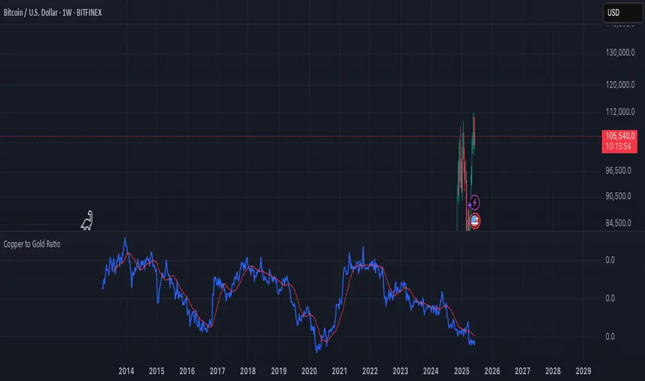
Copper to Gold Ratioratio = copper / gold: Calculates the ratio by dividing copper price by gold price.
plot(ratio): Plots the ratio as a blue line.
ma = ta.sma(ratio, 20): Adds a 20-period simple moving average (optional) to smooth the ratio, plotted as a red line.
A rising Copper/Gold ratio often signals economic expansion (strong copper demand relative to gold), while a falling ratio may indicate economic uncertainty or recession fears, as gold outperforms copper.
The ratio is also used as a leading indicator for 10-year U.S. Treasury yields, with a rising ratio often correlating with higher yields.
Cerca negli script per "GOLD"
Sabbz Golden indicatorIndicator Name: Sabbz Golden Indicator
Short Title: Sabbz
Purpose: A comprehensive trading indicator designed for multiple trading styles (scalping, day trading, and trend following) by combining technical analysis tools such as EMAs, VWAP, support/resistance levels, order blocks, supply/demand zones, RSI, MACD, and volume analysis. It provides visual signals, trend analysis, and a dashboard for real-time decision-making.
Key Features
Exponential Moving Averages (EMAs):
Calculates four EMAs (Fast: 9, Medium: 21, Slow: 50, Trend: 200) to assess short, medium, and long-term trends.
Dynamic coloring based on trend direction:
Fast EMA: Lime (bullish), Red (bearish), Yellow (neutral).
Medium EMA: Blue (bullish), Orange (bearish), Gray (neutral).
Slow EMA: Green (bullish), Red (bearish), Purple (neutral).
Trend EMA: Green (bullish), Red (bearish).
Volume-Weighted Average Price (VWAP):
Plots VWAP with ±1σ deviation bands to identify dynamic support/resistance.
VWAP trend direction (bullish if close > VWAP and VWAP rising, bearish if close < VWAP and VWAP falling) informs trading signals.
Multi-Timeframe Analysis:
Incorporates 5-minute and 15-minute EMA (9 and 21) data to confirm trends across timeframes, enhancing signal reliability.
Support and Resistance Levels:
Detects key support/resistance levels using fractal-based pivot points (5-bar left/right lookback).
Tracks touches of levels (minimum 3 touches required) within a 50-bar lookback.
Levels are filtered to stay within ±0.5% of the current price to avoid clutter.
Break of structure (BoS) signals are generated when price breaks key levels by a user-defined threshold (default: 0.1%).
Order Blocks:
Identifies bullish and bearish order blocks based on strong price reversals with high volume.
Visualized as green (bullish) or red (bearish) boxes on the chart.
Supply and Demand Zones:
Detects fresh demand zones (price drops to a 10-bar low, bounces with high volume) and supply zones (price reaches a 10-bar high, reverses with high volume).
Plotted as blue (demand) or orange (supply) boxes, adjusted by ±0.5 ATR for width.
Scalping Signals:
Generates scalp long/short signals for 1-5 minute timeframes based on:
Short-term EMA trend (9 > 21 for long, 9 < 21 for short).
RSI oversold (<30, rising) for longs or overbought (>70, falling) for shorts.
MACD momentum (histogram positive and rising for longs, negative and falling for shorts).
Volume spike (volume > 1.5x 20-period SMA).
Price above/below VWAP.
Day Trading Signals:
Generates day trading long/short signals for 5-15 minute timeframes based on:
Medium-term trend (EMA 9 > 21 and 21 > 50 for long, opposite for short).
Break of key resistance (long) or support (short).
Multi-timeframe EMA confirmation (5m and 15m).
Volume spike.
Trend Following Signals:
Generates swing/position trading signals based on:
Strong trend (short, medium, long-term EMAs aligned, VWAP trend, and multi-timeframe confirmation).
Presence of fresh demand/supply zones or order blocks.
RSI not overextended (<60 for longs, >40 for shorts).
Volume Analysis:
Uses a 20-period SMA of volume to detect spikes (>1.5x SMA) and high volume (>2x SMA) for signal confirmation.
Dashboard:
Displays real-time data in a top-right table with:
Timeframe: Scalping, Day Trading, Trend Following.
Trend: Bullish, Bearish, Neutral, or Strong Bull/Bear based on EMA and VWAP conditions.
Signal: Long, Short, or Wait based on entry conditions.
Levels: Key support, resistance, VWAP, and RSI values with status (Overbought, Oversold, Neutral).
Color-coded for quick interpretation.
Visual Elements:
Plots EMAs, VWAP, support/resistance levels, order blocks, and supply/demand zones.
Entry signals are marked with triangles (up for long, down for short) of varying sizes (small for scalping, normal for day trading, large for trend following) and colors (e.g., aqua for scalp long, purple for scalp short).
Background coloring indicates trend strength (green for bullish, red for bearish, gray for neutral).
Alerts:
Configurable alerts for:
Scalping Long/Short entries.
Day Trading Long/Short entries.
Trend Following Long/Short entries.
Resistance/Support breaks.
Input Parameters
EMAs:
Fast EMA (default: 9), Medium EMA (21), Slow EMA (50), Trend EMA (200).
Support/Resistance:
Lookback (50 bars), Minimum Touches (3), Break Threshold (0.1%).
Scalping:
RSI Length (14), Overbought (70), Oversold (30), Volume MA (20).
Display Options:
Toggle signals, support/resistance levels, supply/demand zones, and order blocks (all default to true).
Usage
Scalping: Use on 1-5 minute charts for quick entries/exits based on scalp signals.
Day Trading: Use on 5-15 minute charts for break-of-structure trades with multi-timeframe confirmation.
Trend Following: Use on higher timeframes (e.g., 1H, 4H) for swing/position trades aligned with strong trends.
Dashboard: Monitor trend and signal status for all timeframes in real-time.
Alerts: Set up alerts to automate trade notifications.
Notes
Performance: The indicator is computationally intensive due to multi-timeframe calculations and array-based support/resistance logic. Test on your platform to ensure smooth performance.
Customization: Adjust input parameters (e.g., EMA lengths, RSI thresholds) to suit specific markets or trading styles.
Limitations: Signals are based on historical data and technical conditions; always combine with risk management and market context.

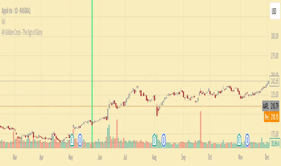
4H Golden Cross - The Sign of GloryCalculates the golden cross on the 4-hour timeframe
Displays the result on any timeframe
Draws a green vertical beam (a vertical line or background stripe) on the bar where the golden cross happened, so it’s clearly visible regardless of your chart timeframe
This is used to see the effectiveness of the 4h golden cross without having to change timeframes continually
GCM Supreme Trading System Pro (With Golden Zone)Okay, bro! Here are some notes on your "GCM Supreme Trading System Pro (Dashboard + RSI)" indicator based on the Pine Script code you provided. Think of this as a breakdown of its components, logic, and how you might use it, along with some things to consider.
GCM Supreme Trading System Pro (Dashboard + RSI) - Notes
Overall Concept:
This indicator aims to provide an "all-in-one" visual dashboard and signal system by combining several technical analysis concepts:
Short-Term Trend: Using a fast EMA.
Volatility/Channel: High/Low plot with fill.
Sentiment: Background color based on price vs. EMA.
Price Structure/Pattern: Highlighting potential AMD phases.
Key Price Level: Previous day's specific Fibonacci zone (Golden Zone).
Momentum: RSI Overbought/Oversold status.
Volume Analysis: Identifying volume spikes.
Risk Assessment: Based on ATR volatility.
Signal Generation: Based on EMA direction change confirmed by candle color.
Centralized Summary: A dashboard showing the status of key components.
Key Components & How They Work:
Trend EMA (Length: 3 by default):
What: A very fast Exponential Moving Average of the specified source (close by default).
How: Plots the EMA line. Colors the line green if the EMA is moving up, red if moving down, gray if flat.
Usage: Provides a very quick view of the immediate price direction and momentum.
High/Low Channel Lines & Fill:
What: Plots the current bar's high and low.
How: The area between the high and low is filled. The fill color changes based on whether the Trend EMA is moving up (green fill), down (red fill), or is neutral (gray fill).
Usage: Visualizes the recent price range/volatility and ties it to the immediate trend direction.
Sentiment Background:
What: Colors the chart background.
How: Background is lightly colored green if the close is above the Trend EMA, and red if the close is below the Trend EMA.
Usage: Reinforces the current short-term bias based on price's position relative to the fast EMA.
AMD Pattern Candles:
What: Highlights specific candle patterns often associated with Accumulation, Manipulation, and Distribution phases.
How:
Accumulation (Aqua): Previous candle was Red, current candle is Green (Red -> Green).
Manipulation (Yellow): Previous candle was Green, current candle is Red (Green -> Red).
Distribution (Fuchsia): Two consecutive Red candles where the candle before the first Red was Not Red (Not Red -> Red -> Red).
Usage: Helps visually spot potential shifts in market behavior according to the AMD concept.
Previous Day's Fib Golden Zone (0.55-0.66):
What: Calculates a specific Fibonacci zone (between 55% and 66%) based on the previous day's range (High-Low).
How: Plots a horizontal box on the chart covering the calculated zone level. Uses the previous day's range direction (Green/Red candle) to determine if the zone is calculated up from the low (Green day) or down from the high (Red day).
Usage: Identifies a potential key retracement or support/resistance zone from the previous day's price action that may be relevant for the current day.
RSI (Relative Strength Index):
What: A classic momentum oscillator.
How: Calculates the RSI value based on the specified length and source. The dashboard shows the current value and flags it as Overbought (> OB level), Oversold (< OS level), or Neutral.
Usage: Provides context on momentum extremes. High RSI suggests strong upward momentum (potentially overextended), low RSI suggests strong downward momentum (potentially oversold).
Volume Spike Confirmation:
What: Compares current volume to its Moving Average.
How: Calculates a simple moving average of volume. Identifies a "Spike" if the current volume is significantly higher (multiplied by a factor) than the MA.
Usage: Provides a contextual check for increased activity accompanying price moves. (Note: In the current script, this is calculated and shown on the dashboard but not directly used in the signal label logic, though it could be added).
Risk Assessment (ATR):
What: Uses the Average True Range.
How: Calculates the ATR for the specified length. Compares the current ATR to a longer-term average ATR. Flags "High Risk" if the current ATR is significantly higher than the average.
Usage: Gives an indication of current volatility relative to recent history, which can inform stop-loss placement or position sizing.
Signals (Buy/Sell Labels):
What: Plots "BUY" or "SELL" labels on the chart.
How:
BUY Signal: Triggers when the Trend EMA starts moving Up on the previous bar AND the current bar is Green (close > open).
SELL Signal: Triggers when the Trend EMA starts moving Down on the previous bar AND the current bar is Red (close < open).
Usage: These are your potential entry triggers. They indicate that the fast EMA trend has just changed direction and the current candle is confirming that move with its color.
Dashboard:
What: A 2x5 table displayed on the chart (bottom right by default).
How: Shows the current status of:
Trend (Bull/Bear/Neutral)
Volume (Spike/Normal)
Last Signal (🟢 BUY, 🔴 SELL, or None)
Risk (High/Normal based on ATR)
RSI (Overbought/Oversold/Neutral + Current Value)
Usage: Provides a quick, centralized summary of multiple indicator components without having to visually check every detail on the chart or separate panes.
How to Potentially Use It (Example Interpretation):
Look for a BUY signal (Green label) when:
The dashboard shows "🟢 BUY" as the Last Signal.
Consider additional confirmation: Is Volume status "Spike"? Is Risk "Normal"? Is RSI not "Overbought" (or perhaps just coming out of "Oversold" territory)? Is the price above/interacting positively with the Golden Zone?
Look for a SELL signal (Red label) when:
The dashboard shows "🔴 SELL" as the Last Signal.
Consider additional confirmation: Is Volume status "Spike"? Is Risk "Normal"? Is RSI not "Oversold" (or perhaps just coming out of "Overbought" territory)? Is the price below/interacting negatively with the Golden Zone?
Use the Sentiment Background and High/Low Channel Fill to quickly see the immediate trend and volatility context.
Watch AMD candles around key levels (like the Golden Zone or signal triggers) for potential pattern confirmation.
Check the Dashboard frequently for a summary of all these factors, even without a specific signal.
Strengths & Potential Benefits:
Comprehensive View: Integrates multiple popular trading concepts into a single indicator.
Visual Clarity: Uses colors, fills, labels, and a dashboard for easy interpretation.
Customizable: Inputs allow tuning the sensitivity of the EMA, Volume, ATR, and RSI to different assets/timeframes.
Dashboard Efficiency: Saves time by consolidating key status points.
Non-Repainting Signals: The buy/sell labels trigger and stay based on closed bar data.
Important Considerations & Limitations:
Fast EMA Sensitivity: An EMA length of 3 is very fast and prone to whipsaws, especially in choppy or ranging markets. Signals based solely on this could be frequent and unreliable in non-trending conditions.
Signal Logic: The core signal is only based on EMA direction change + candle color. While simple, it might miss opportunities or generate signals without broader market confirmation (like strong volume, favorable RSI position, or reaction at key levels). The dashboard provides these other factors as context, but they aren't required for the signal label in the current code.
Golden Zone Reliance: The previous day's Fib zone is just one potential level. It won't always be respected, and its relevance might vary significantly across different markets and timeframes.
AMD Patterns: The defined AMD patterns are specific. The market's "real" accumulation/manipulation/distribution might manifest in more complex ways.
Dashboard as Summary, Not Signal: Remember the dashboard shows the current status of all components on the last bar, but the BUY/SELL signal labels are based on a specific historical event (previous bar's EMA turn). You need to look at both: the label for the trigger, and the dashboard for the confluence of other factors right now.
Not a Standalone System: While called a "Trading System," no single indicator guarantees profitability. This tool provides signals and context, but requires a robust trading plan including stop losses, profit targets, position sizing, and potentially confluence with other analysis methods.
Timeframe Dependency: The ideal settings (EMA length, RSI length, etc.) will likely differ significantly between timeframes (e.g., 1-minute vs. 4-hour). Testing and optimization are crucial.
In Summary:
The "GCM Supreme Trading System Pro (Dashboard + RSI)" is a well-designed indicator that consolidates several useful analysis tools into a single view. Its strength lies in providing quick visual context and a clear signal trigger based on short-term trend shifts. However, like any indicator, it's not perfect. Its effectiveness will largely depend on the market conditions, the chosen settings, and how it's integrated into a comprehensive trading strategy, using the dashboard components as essential confirmation and risk assessment tools alongside the primary signal labels.

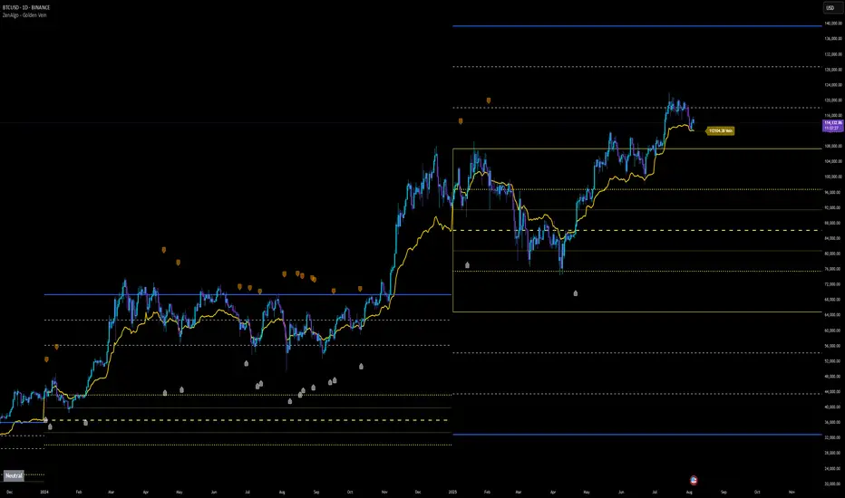
ZenAlgo - Golden VeinOverview and Motivation
This indicator combines multiple volume-weighted average price (VWAP) calculations from different timeframes and then merges them into a single composite line called “the Vein”. It begins by pulling a user-defined source (for instance, a typical price) and then anchors a VWAP on daily, weekly, monthly, quarterly, semiannual, and yearly intervals. By viewing all these timeframes together, the script captures multi-period trends in a way that stands apart from simpler, single-timeframe VWAP indicators. This comprehensive perspective is designed to offer practical benefits to those who monitor both short- and long-term VWAP behavior within a single tool.
Because it tracks many timeframes simultaneously, it can highlight instances when short-term and long-term VWAPs converge or diverge. Traders who need multi-timeframe validation may find this approach particularly helpful. Other free indicators typically restrict themselves to one or two timeframes, so the built-in multi-timeframe data in this script can save effort for those who rely heavily on VWAP analysis.
Core Inputs and Offsets
At the start, the script takes a single price input (e.g., the average of high, low, and close) and uses it to compute multiple VWAP lines. Users can also choose a distance factor (based on an ATR calculation) to control how far labels are placed from any crossover events. This distance sets how clearly the chart will display labels without overcrowding.
Beyond giving a cleaner visual, having a user-defined distance for labels means the script can adapt to any ticker’s volatility. If one trades assets with large intraday swings, the script leaves enough space for labels to remain readable. This flexibility is something that simpler free VWAP scripts might lack.
Multi-Timeframe VWAP Computations
The script calculates distinct VWAP lines: Daily, Weekly, Monthly, Quarterly (3-Month), Semiannual (6-Month), and Yearly (12-Month). Each line resets whenever it detects a new period has started, ensuring that each timeframe’s VWAP properly anchors to its own session window. This allows the indicator to track how the market perceives fair value (through VWAP) on multiple horizons, all at once.
Simultaneously checking these various intervals can offer added clarity to traders who want to compare immediate market conditions (e.g., daily) to broader contexts (e.g., quarterly or yearly). Tools that only show one or two timeframes may miss the nuances that arise when, say, daily VWAP aligns with monthly VWAP at a turning point.
Crossover Detection and Labeling
Whenever two different VWAP lines intersect, the script generates an internal crossover signal. It then draws small labels (e.g., D↑W or M↓Q) to highlight that a lower timeframe VWAP has moved above or below a higher timeframe VWAP. These labels use color-coding and an ATR-based offset to remain visible.
An additional subtle feature is how daily VWAP crossovers can optionally be displayed only on a specific weekday and hour. That allows users who only want to track daily crossovers under certain conditions (for example, a fixed point in the weekly cycle) to filter out other signals. This adaptability can be worth paying for if one needs advanced filtering—an area where simpler free VWAP cross indicators typically do not offer such granular control.
The “Golden VWAP” (Composite Calculation)
All six VWAP lines (daily, weekly, monthly, quarterly, semiannual, yearly) feed into a central average called “the Vein”. The script takes the midpoint of these six values on each bar, effectively combining short-, medium-, and long-term VWAP data into one. This composite serves as a reference line for overall market direction.
A volatility band (either a standard-deviation-based range or a user-defined percentage) wraps around this composite. The script thereby creates an upper and a lower boundary around the Golden VWAP, called “Resistance” and “Support.” Traders may interpret price moves beyond these levels as higher-probability expansions or contractions, but there is no guarantee of outcome. In choppier markets, breakouts above or below these bands might not lead to follow-through, so interpretation should always be combined with other evidence.
Simplified Market State Logic
By checking how price and the Golden VWAP behave from one bar to the next, the script tags the market state with labels like Bullish, Bearish, Super Bullish, or Super Bearish. These classifications hinge on whether the Golden VWAP is rising or falling, and whether price has crossed above or below the composite band. An optional table in the lower-left corner of the chart displays this label.
While such classification is convenient for scanning changing conditions quickly, it should be interpreted with caution. If the market is sideways or if volume patterns are erratic, the script can produce signals that do not align with real momentum. Treat these states as indications of potential bias rather than automatic buy or sell triggers.
Added Value
By gathering VWAP lines across multiple timeframes, generating alerts on all possible combinations of crossovers, and overlaying a composite VWAP with adjustable volatility bands, this script goes beyond typical single-timeframe VWAP indicators. It aims to let users track short-term shifts (e.g., daily crossing weekly) in the context of longer-term trends (e.g., yearly). This granularity and automation can reduce the need for multiple charts or manual recalculations of different VWAP windows.
Why It Can Be Worth Paying For
The capability to simultaneously anchor VWAP to multiple timeframes, detect crossovers, filter out daily signals by weekday/hour, and visualize a composite “Vein” with adjustable ranges represents a comprehensive feature set that free scripts often do not bundle together. For those who rely on multi-timeframe VWAP analysis, the time saved and clarity gained may justify a paid solution.
Interpreting Values
Crossover labels: Identify points where one timeframe’s VWAP moves above or below another. The direction (up or down) suggests potential momentum shifts.
Golden VWAP line: Treat it as the average “fair value” across all anchored periods. Large price moves above or below this line’s surrounding band might signal increased directional conviction—or false breakouts if volume is deceptive.
Market states: Use the Bullish/Super Bullish/Bearish/Super Bearish labels to gauge how price interacts with the composite’s slope and band.
How to Use It Best
Combine these signals with other risk-management methods.
Monitor multiple crossovers in tandem: for example, daily crossing weekly plus monthly crossing quarterly may offer stronger confluence.
Use the optional daily-label toggle to stay focused on selected higher-confidence signals if you find too many crossovers distracting.
Remember that every alert or label should be evaluated in broader market context and your own trading strategy.
Potential Shortcomings
As with any technical study, VWAP lines and crossovers are not foolproof predictors. The script can be less reliable in low-volume or fast-moving conditions. Large price shocks can cause abrupt changes that do not fit the typical patterns this indicator looks for.
In short, this script’s distinct advantage is showing multiple anchored VWAPs and a composite perspective in one place, offering fine control of alerts and appearance settings. Those who benefit most are chartists who want deeper VWAP insights across various timescales without juggling multiple separate indicators. However, like any technical tool, it should be understood as an aid rather than a guarantee of outcomes.
Kynjal Golden LevelsKynjal Golden Levels is a dynamic grid indicator designed for traders who demand a continuously updated and visually clear set of key price levels. Unlike static support/resistance lines, this indicator recalculates and repositions its levels on every new bar, ensuring that the grid always stays near the current price—whether the markets are open or closed.
Key Features:
• Dynamic Level Calculation:
The indicator computes a base level derived from the current bar’s open price and calculates additional levels using a pip-based interval. This ensures that the entire grid adjusts in real time with price movements.
• Customizable Grid:
Users can selectively disable display of major, half, and quarter levels via simple toggle inputs. This flexibility allows you to tailor the grid to your specific trading strategy.
• Persistent Horizontal Lines:
Utilizing TradingView’s drawing functions, the indicator creates extended horizontal lines that continuously span the chart, providing constant visual reference for support and resistance.
• All Market Conditions:
Whether during live trading sessions or when the market is closed, Kynjal Golden Levels remains visible, offering a robust tool for end-of-day analysis or weekend planning.

Daily Movement AnalysisDaily Volatility Explorer: 7-Day Market Pulse Indicator
Unlock the hidden rhythms of market movements with this powerful analytical tool designed for both traditional and crypto traders. This indicator meticulously tracks and analyzes price volatility patterns across all seven days of the week, giving you a strategic edge in planning your trades.
🎯 Key Features:
• Dynamic 3-month rolling analysis of daily price movements
• Real-time volatility comparison across all trading days
• Clear visual representation through color-coded bar charts
• Detailed statistical table with exact pip movements
• Sample size tracking for statistical reliability
• Works seamlessly on both traditional and crypto markets
💡 Why Traders Need This:
1. Optimal Trade Timing
- Identify the most volatile trading days for maximum opportunity
- Discover the quietest days to avoid choppy markets
- Perfect for swing traders and day traders alike
2. Risk Management Enhancement
- Set smarter stop-losses based on typical daily ranges
- Adjust position sizes according to daily volatility patterns
- Avoid overtrading during historically low-volatility periods
3. Strategic Planning
- Plan your trading week around peak volatility days
- Optimize entry and exit points based on historical movements
- Better time management by focusing on the most active days
4. Market Psychology Insights
- Understand weekly market rhythm and institutional patterns
- Identify how weekend gaps affect crypto markets
- Spot changes in market behavior across different days
🔍 Perfect For:
• Forex traders tracking major currency pairs
• Crypto traders navigating 24/7 markets
• Gold and commodity traders
• Day traders optimizing their trading schedule
• Swing traders planning optimal entry/exit days
📊 Data-Driven Decisions:
The indicator maintains a rolling 3-month window of data, providing fresh, relevant insights while filtering out outdated patterns. Each day's analysis is based on actual market movements, giving you reliable, actionable intelligence for your trading decisions.
⚡ Pro Tip: Use this indicator alongside your existing strategy to enhance your trading plan and improve your timing. The color-coded visual system makes it easy to spot patterns at a glance, while the detailed statistics table provides the hard numbers you need for precise planning.
Remember: Markets evolve, and this indicator helps you stay on top of changing patterns in real-time. Whether you're trading traditional markets or crypto, understanding daily volatility patterns is crucial for consistent trading success.

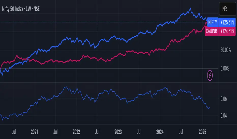
Nifty/Gold RatioPrice of NIFTY in GOLD. Highs indicate that Gold is getting cheaper, Lows indicate Nifty is getting cheaper.
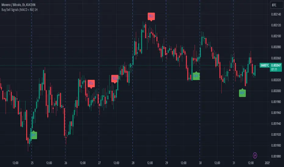
Buy/Sell Signals (MACD + RSI) 1HThis is a Pine Script indicator for TradingView that plots Buy/Sell signals based on the combination of MACD and RSI indicators on a 1-hour chart.
Description of the Code:
Indicator Setup:
The script is set to overlay the Buy/Sell signals directly on the price chart (using overlay=true).
The indicator is named "Buy/Sell Signals (MACD + RSI) 1H".
MACD Settings:
The MACD (Moving Average Convergence Divergence) uses standard settings of:
Fast Length: 12
Slow Length: 26
Signal Line Smoothing: 9
The MACD line and the Signal line are calculated using the ta.macd() function.
RSI Settings:
The RSI (Relative Strength Index) is calculated with a 14-period setting using the ta.rsi() function.
Buy/Sell Conditions:
Buy Signal:
Triggered when the MACD line crosses above the Signal line (Golden Cross).
RSI value is below 50.
Sell Signal:
Triggered when the MACD line crosses below the Signal line (Dead Cross).
RSI value is above 50.
Signal Visualization:
Buy Signals:
Green "BUY" labels are plotted below the price bars where the Buy conditions are met.
Sell Signals:
Red "SELL" labels are plotted above the price bars where the Sell conditions are met.
Chart Timeframe:
While the code itself doesn't enforce a specific timeframe, the name indicates that this indicator is intended to be used on a 1-hour chart.
To use it effectively, apply the script on a 1-hour chart in TradingView.
How It Works:
This indicator combines MACD and RSI to generate Buy/Sell signals:
The MACD identifies potential trend changes or momentum shifts (via crossovers).
The RSI ensures that Buy/Sell signals align with broader momentum (e.g., Buy when RSI < 50 to avoid overbought conditions).
When the defined conditions for Buy or Sell are met, visual signals (labels) are plotted on the chart.
How to Use:
Copy the code into the Pine Script editor in TradingView.
Save and apply the script to your 1-hour chart.
Look for:
"BUY" signals (green): Indicating potential upward trends or buying opportunities.
"SELL" signals (red): Indicating potential downward trends or selling opportunities.
This script is simple and focuses purely on providing actionable Buy/Sell signals based on two powerful indicators, making it ideal for traders who prefer a clean chart without clutter. Let me know if you need further customization!
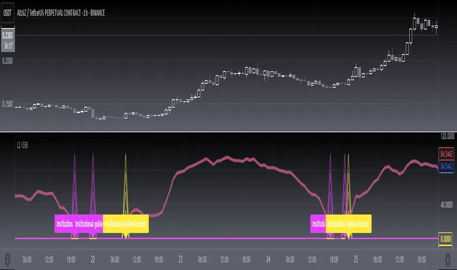
[blackcat] L1 Institutional Golden Bottom Indicator█ OVERVIEW
The script " L1 Institutional Golden Bottom Indicator" is an indicator designed to identify potential institutional buying interest or a "golden bottom" in the market. It calculates a series of values based on price movements and plots them on a chart to help traders make informed decisions.
█ LOGICAL FRAMEWORK
The script is structured into several main sections:
1 — Function Definitions: Custom functions xsa and calculate_institutional_golden_bottom are defined.
2 — Input Parameters: The user can set a threshold value for institutional interest.
3 — Calculations: The script calculates various indicators and conditions, including the institutional buy signal.
4 — Plotting: The results of the calculations are plotted on the chart.
5 — Labeling: When a golden bottom is detected, a label is placed on the chart.
The flow of data starts with the input parameters, proceeds through the calculation functions, and finally results in plotted outputs and labels.
█ CUSTOM FUNCTIONS
1 — xsa(src, len, wei)
• Purpose: To calculate a weighted moving average.
• Parameters:
– src: Source data (e.g., price).
– len: Length of the moving average.
– wei: Weighting factor.
• Return Value: The calculated weighted moving average.
2 — calculate_institutional_golden_bottom(close, high, low, threshold)
• Purpose: To determine the institutional golden bottom indicator.
• Parameters:
– close: Closing price.
– high: Highest price.
– low: Lowest price.
– threshold: User-defined threshold for institutional interest. By tuning the threshold value the user can properly identify the institutional golden bottom of the instrument. So, I can say this parameter is used to tune the "sensitivity" of this indicator.
• Return Value: An array containing the institutional indicator, golden bottom signal, and additional values (a1, b1, c1, d1).
█ KEY POINTS AND TECHNIQUES
• Weighted Moving Average (WMA): The xsa function implements a weighted moving average, which is useful for smoothing price data.
• Crossover Detection: The script uses a crossover condition to detect when the institutional indicator crosses above the threshold, indicating a potential buying opportunity.
• Conditional Logic: The script includes conditional statements to control the output of certain values only when specific conditions are met.
• Plotting and Labeling: The script uses plot and label.new functions to visualize the indicator and highlight significant events on the chart.
█ EXTENDED KNOWLEDGE AND APPLICATIONS
• Modifications: The script could be enhanced by adding more customizable parameters, such as different lengths for the moving averages or additional conditions for the golden bottom signal.
• Extensions: Similar techniques could be applied to other types of indicators, such as momentum oscillators or trend-following systems to identify market turning points.
• Related Concepts: Understanding weighted moving averages, crossover signals, and conditional plotting in Pine Script would be beneficial for enhancing this script and applying similar logic to other trading strategies.
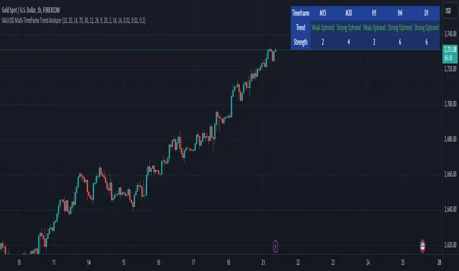
XAUUSD Multi-Timeframe Trend AnalyzerOverview
The "XAUUSD Multi-Timeframe Trend Analyzer" is an advanced script designed to provide a comprehensive analysis of the XAUUSD (Gold/US Dollar) trend across multiple timeframes simultaneously. By combining several key technical indicators, this tool helps traders quickly assess the market direction and trend strength for M15, M30, H1, H4, and D1 timeframes.
Multi-Timeframe Analysis: Displays the trend direction and strength across M15, M30, H1, H4, and D1 timeframes, allowing for a complete overview in a single glance.
Comprehensive Indicator Blend: Utilizes six popular technical indicators to determine the trend—Moving Averages, RSI, MACD, Bollinger Bands, DMI, and Parabolic SAR.
Trend Strength Scoring: Provides a numerical trend strength score (from -6 to 6) based on the alignment of the indicators, with positive values indicating uptrends and negative values for downtrends.
Visual Table Display: Displays results in a color-coded table (green for uptrend, red for downtrend, yellow for neutral) with a strength score for each timeframe, helping traders quickly assess market conditions.
How It Works
This script calculates the overall trend and its strength for each selected timeframe by analyzing six widely-used technical indicators:
Moving Averages (MA): The script uses a Fast and a Slow Moving Average. When the Fast MA crosses above the Slow MA, it indicates an uptrend. When the Fast MA crosses below, it signals a downtrend.
Relative Strength Index (RSI): The RSI is used to assess momentum. An RSI value above 50 suggests bullish momentum, while a value below 50 suggests bearish momentum.
Moving Average Convergence Divergence (MACD): MACD measures momentum and trend direction. When the MACD line crosses above the signal line, it signals bullish momentum; when it crosses below, it signals bearish momentum.
Bollinger Bands: These measure price volatility. When the price is above the middle Bollinger Band, the script considers the trend to be bullish, and when it's below, bearish.
Directional Movement Index (DMI): The DMI compares positive directional movement (DI+) and negative directional movement (DI-). A stronger DI+ over DI- signals an uptrend and vice versa.
Parabolic SAR: This indicator is used for determining potential trend reversals and setting stop-loss levels. If the price is above the Parabolic SAR, it indicates an uptrend, and if below, a downtrend.
Trend Strength Calculation
The script calculates a trend strength score for each timeframe:
Each indicator adds or subtracts 1 to the score based on whether it aligns with an uptrend or a downtrend.
A score of 6 indicates a Strong Uptrend, with all indicators aligned bullishly.
A score of -6 indicates a Strong Downtrend, with all indicators aligned bearishly.
Intermediate scores (e.g., 2 or -2) indicate Weak Uptrend or Weak Downtrend, suggesting that not all indicators are in agreement.
A score between 1 and -1 indicates a Neutral trend, suggesting uncertainty in the market.
How to Use
Assess Trend Direction and Strength: The table provides an easy-to-read summary of the trend and its strength on different timeframes. Look for timeframes where the strength is high (either 6 for a strong uptrend or -6 for a strong downtrend) to confirm the market’s overall direction.
Use in Conjunction with Other Strategies: This indicator is designed to provide a comprehensive view of the market. Traders should combine it with other strategies, such as price action analysis or candlestick patterns, to further confirm their trades.
Trend Reversal or Continuation: A weak trend (e.g., a strength of 2 or -2) could signal a possible reversal or a trend that has lost momentum. Strong trends (with a strength of 6 or -6) indicate higher confidence in trend continuation.
Multiple Timeframe Confirmation: Look for alignment across multiple timeframes to confirm the strength and direction of the trend before entering trades. For example, if M15, M30, and H1 are all showing a strong uptrend, it suggests a higher probability of the trend continuing.
Customization Options
- Adjustable Indicators: Users can modify the length and parameters of the Moving Averages, RSI, MACD, Bollinger Bands, DMI, and Parabolic SAR to suit their trading style.
- Flexible Timeframes: You can toggle between different timeframes (M15, M30, H1, H4, D1) to focus on the intervals most relevant to your strategy.
Ideal For
- Traders looking for a detailed, multi-timeframe trend analysis tool for XAUUSD.
- Traders who rely on trend-following strategies and need confirmation across multiple timeframes.
- Those who prefer a multi-indicator approach to avoid false signals and improve the accuracy of their trades.
Disclaimer
This indicator is for informational and educational purposes only. It is recommended to combine this with proper risk management strategies and your own analysis. Past performance does not guarantee future results. Always perform your own due diligence before making trading decisions.
Auto Fib GOLDEN ENTRY WITH PROFIT ZONE TARGETAuto Fib "GOLDEN ENTRY ZONE WITH TARGET PROFIT TAKING" Indicator Review
Overview
The Auto Fib "GOLDEN ENTRY ZONE WITH TARGET PROFIT TAKING" is a sophisticated TradingView indicator designed to enhance Fibonacci analysis by combining entry signals with predefined profit-taking targets. This tool automates the identification of Fibonacci retracement levels and integrates target profit zones, aiming to streamline the trading process and improve overall trading efficiency.
Features
Automatic Fibonacci Levels: This feature automatically plots Fibonacci retracement levels based on recent price swings, removing the need for manual level setting. This ensures consistency and accuracy in identifying key support and resistance levels.
Golden Entry Zone: The indicator highlights the "Golden Entry Zone," a critical area around significant Fibonacci levels such as the 38.2% and 61.8% retracement levels. This zone helps traders identify potential entry points where the price is likely to reverse or find support.
Target Profit Taking Zones: In addition to identifying entry points, the indicator sets predefined profit-taking targets. These targets are derived from Fibonacci extension levels and are visually marked on the chart, guiding traders on where to consider exiting their positions for optimal gains.
Customizable Settings: Users can tailor the indicator’s settings to fit their trading style, including adjusting Fibonacci levels, entry zone parameters, and profit-taking targets. This flexibility ensures that the indicator aligns with various trading strategies and preferences.
Visual Enhancements: The indicator features clear and customizable visual elements, including color-coded entry zones and profit targets. This visual clarity helps traders quickly interpret and act on the signals provided.
Alerts and Notifications: Traders can set up alerts to be notified when the price approaches the "Golden Entry Zone" or reaches the profit-taking targets. This functionality ensures that traders can act swiftly and capitalize on trading opportunities.
Pros
Streamlined Fibonacci Analysis: By automating Fibonacci level plotting, the indicator eliminates manual errors and saves time, allowing traders to focus on strategy execution.
Enhanced Entry and Exit Points: The combination of the "Golden Entry Zone" and predefined profit-taking targets provides a comprehensive approach to trading, helping traders identify both optimal entry points and strategic exit levels.
Customizable and Flexible: The ability to adjust settings allows traders to adapt the indicator to various market conditions and personal trading styles, making it a versatile tool.
Visual Clarity: The clear graphical representation of entry zones and profit targets improves decision-making and reduces the likelihood of missing key trading opportunities.
Cons
Market Conditions Dependence: The effectiveness of the indicator may vary depending on market volatility and trends. In highly dynamic markets, the predefined profit targets may need adjustments or additional analysis.
Lagging Nature: As with any tool based on historical data, there can be a lag in signal accuracy. Traders should use the indicator in conjunction with other analysis methods to validate signals.
Potential Over-Reliance: Relying solely on the indicator without considering broader market conditions or additional technical factors may lead to suboptimal trading decisions.
Conclusion
The Auto Fib "GOLDEN ENTRY ZONE WITH TARGET PROFIT TAKING" indicator is a powerful tool for traders who utilize Fibonacci retracement and extension levels. By automating the identification of entry points and integrating profit-taking targets, it simplifies the trading process and helps traders make more informed decisions. While the indicator offers significant advantages in terms of ease of use and visual clarity, it is important to use it as part of a broader trading strategy and to consider additional market factors.
For traders looking to enhance their Fibonacci analysis and streamline their trading approach, the Auto Fib "GOLDEN ENTRY ZONE WITH TARGET PROFIT TAKING" provides a valuable and effective solution.
Feel free to modify or expand upon this review based on your specific experiences or additional features of the indicator!

Auto Fib GOLDEN ENTRYAuto Fib "GOLDEN ENTRY ZONE" Indicator Review
Overview
The Auto Fib "GOLDEN ENTRY ZONE" is a TradingView indicator designed to streamline the Fibonacci retracement process for traders. By automatically identifying key Fibonacci levels and highlighting a "golden entry zone," this tool aims to simplify the trading process and enhance decision-making.
Features
Automatic Fibonacci Levels: The indicator automatically plots Fibonacci re-tracement levels on the chart based on recent price swings. This removes the need for manual Fibonacci drawing, which can be subjective and prone to errors.
Golden Entry Zone: The core feature is the "Golden Entry Zone," a highlighted area on the chart where the indicator suggests that the price is likely to reverse or find support/resistance. This zone is typically centered around key Fibonacci levels such as the 38.2% and 61.8% retracement levels, which are considered significant by many traders.
Customizable Settings: Users can adjust the indicator’s settings to fit their trading style. Options include modifying the Fibonacci levels used, the appearance of the zones, and the sensitivity of the automatic level detection.
Visual Enhancements: The indicator features clear and visually appealing graphics, with customizable colors and line styles to match user preferences and enhance readability.
Alerts and Notifications: The indicator can be set up to send alerts when price action enters the "Golden Entry Zone" or when specific Fibonacci levels are approached, allowing traders to act quickly.
Pros
Ease of Use: The automatic plotting of Fibonacci levels is a significant advantage, especially for traders who are new to Fibonacci analysis or those who prefer not to spend time drawing levels manually.
Strategic Entry Points: By highlighting the "Golden Entry Zone," the indicator helps traders identify potentially lucrative entry points with less guesswork involved.
Customization: The ability to customize settings ensures that the indicator can be tailored to fit different trading strategies and preferences.
Visual Clarity: The graphical representation of the Fibonacci levels and the entry zone is well-designed, making it easy to interpret and act on the signals provided.
Cons
Dependence on Recent Price Action: The accuracy of the Fibonacci levels and the "Golden Entry Zone" relies heavily on recent price swings. In highly volatile or trending markets, the indicator may need to be adjusted or supplemented with other tools.
Lagging Indicator: Like most indicators based on historical data, there can be a lag in the signal provided. Traders should use it in conjunction with other analysis methods to confirm signals.
Over-reliance Risk: Relying solely on the indicator without considering broader market context, fundamental analysis, or additional technical indicators can be risky.
Conclusion
The Auto Fib "GOLDEN ENTRY ZONE" indicator is a robust tool for traders who use Fibonacci retracement levels to inform their trading decisions. Its automatic plotting feature and focus on key entry zones simplify the process of identifying potential trading opportunities. However, as with any trading tool, it’s essential to use it as part of a broader strategy and consider additional market factors to enhance trading success.
For traders seeking a reliable and visually intuitive way to apply Fibonacci analysis, the Auto Fib "GOLDEN ENTRY ZONE" is a valuable addition to their TradingView toolkit.
Feel free to adjust or expand on any sections based on your specific experience with the indicator or additional details you’d like to include!

Smart Money Analysis with Golden/Death Cross [YourTradingSensei]Description of the script "Smart Money Analysis with Golden/Death Cross":
This TradingView script is designed for market analysis based on the concept of "Smart Money" and includes the detection of Golden Cross and Death Cross signals.
Key features of the script:
Moving Averages (SMA):
Two moving averages are calculated: a short-term (50 periods) and a long-term (200 periods).
The intersections of these moving averages are used to determine Golden Cross and Death Cross signals.
High Volume:
The current trading volume is analyzed.
Periods of high volume are identified when the current volume exceeds the average volume by a specified multiplier.
Support and Resistance Levels:
Key support and resistance levels are determined based on the highest and lowest prices over a specified period.
Buy and Sell Signals:
Buy and sell signals are generated based on moving average crossovers, high volume, and the closing price relative to key levels.
Golden Cross and Death Cross:
A Golden Cross occurs when the short-term moving average crosses above the long-term moving average.
A Death Cross occurs when the short-term moving average crosses below the long-term moving average.
These signals are displayed on the chart with text color changes for better visualization.
Using the script:
The script helps traders visualize key signals and levels, aiding in making informed trading decisions based on the behavior of major market players and technical analysis.
Custom candle lighting(CCL) © 2024 by YourTradingSensei is licensed under CC BY-NC-SA 4.0. To view a copy of this license.

Death Cross and Golden Cross HighlighterOverview
The script is designed to visually indicate the occurrence of Death Cross and Golden Cross events on a TradingView chart. It achieves this by calculating two moving averages (short-term and long-term) and plotting them on the chart. It then detects when these moving averages cross and highlights these points with labels and background colors.
Inputs
The script begins by defining input parameters:
- Short Moving Average Length: This is set to 50 by default, representing the short-term moving average period.
- Long Moving Average Length: This is set to 200 by default, representing the long-term moving average period.
These inputs allow users to customize the lengths of the moving averages according to their trading strategy.
Moving Averages Calculation
The script calculates two simple moving averages (SMAs) based on the closing prices:
- Short Moving Average (shortMA): Calculated over the short-term period specified by the user.
- Long Moving Average (longMA): Calculated over the long-term period specified by the user.
Plotting the Moving Averages
The moving averages are then plotted on the chart:
- The short-term moving average is plotted in blue.
- The long-term moving average is plotted in red.
These lines help users visually track the trends and potential crossover points.
Identifying Crossovers
The script identifies two key events:
- Golden Cross: Occurs when the short-term moving average crosses above the long-term moving average. This is typically considered a bullish signal, indicating a potential upward trend.
- Death Cross: Occurs when the short-term moving average crosses below the long-term moving average. This is typically considered a bearish signal, indicating a potential downward trend.
Highlighting Crossovers
To make the crossover events more noticeable, the script adds visual cues:
- Golden Cross: When a Golden Cross is detected, a green label with an upward arrow is plotted below the bar where the crossover occurs.
- Death Cross: When a Death Cross is detected, a red label with a downward arrow is plotted above the bar where the crossover occurs.
Background Coloring
Additionally, the script highlights the background of the chart:
- When a Golden Cross occurs, the background color is changed to a translucent green.
- When a Death Cross occurs, the background color is changed to a translucent red.
These background colors help emphasize the crossover events, making them easier to spot.
Usage
To use this script, a user would:
1. Copy the script and paste it into the Pine Script editor on TradingView.
2. Save the script and apply it to their chart.
By doing so, the user will see the moving averages plotted, and any Golden Cross or Death Cross events will be highlighted with labels and background colors. This visual aid helps traders quickly identify significant crossover events, which can inform their trading decisions.

Total Death and Golden Crosses Calculator The Indicator calculates the total number of the death and golden crosses in the total chart which can help the moving average user to compare the number of signals generated by the moving average pair in the given timeframe.
All you need is to plot any two moving average then change the source of the indicator to get the total number of crosses.
If Indicator is not plotting anything then right click on the indicator's scale and click on "Auto(data fits the screen" option.

Zigzag Fibonacci Golden Zone [UAlgo]🔶 Description:
The "Zigzag Fibonacci Golden Zone" aims to identify potential trend pullback points by utilizing a combination of zigzag patterns and Fibonacci "Golden Zone (0.618 - 0.786)" retracement levels. It plots zigzag lines on the price chart, highlighting significant swing highs and swing lows, and overlays Fibonacci retracement levels to indicate potential support and resistance zones. Additionally, it provides options to display buy and sell signals based on specific criteria.
🔶 Key Features:
Zigzag Lines: The indicator plots zigzag lines on the price chart, marking significant swing highs and swing lows. These lines help traders visualize the direction and magnitude of price swings.
Fibonacci Retracement Levels: The indicator overlays Fibonacci retracement levels on the chart, indicating potential support and resistance levels. These levels are derived from the Fibonacci sequence and are commonly used by traders to identify reversal points.
Fibonacci occurs again when a new zigzag low or high is created :
Before new zigzag low pivot appears,
After new Zigzag low pivot appears,
As you see new fibonacci created after new pivot found also price bounced from retracement zone.
Customization Options: Traders can customize various parameters of the indicator, such as the length of the zigzag pattern, color preferences for different elements, and visibility of price labels and buy/sell signals.
Buy/Sell Signals: The indicator generates buy and sell signals based on predefined criteria, such as price movements relative to Fibonacci levels and other market conditions. These signals can help traders identify potential entry and exit points in the market.
Example :
Disclaimer :
Please note that trading involves significant risk, and past performance is not indicative of future results. The "Zigzag Fibonacci Golden Zone" indicator is provided for informational purposes only and should not be considered financial advice. Traders should conduct their own research and analysis before making any investment decisions. Additionally, the indicator's performance may vary depending on market conditions and other factors. Users are encouraged to use the indicator as part of a comprehensive trading strategy and to exercise caution when trading in the financial markets.

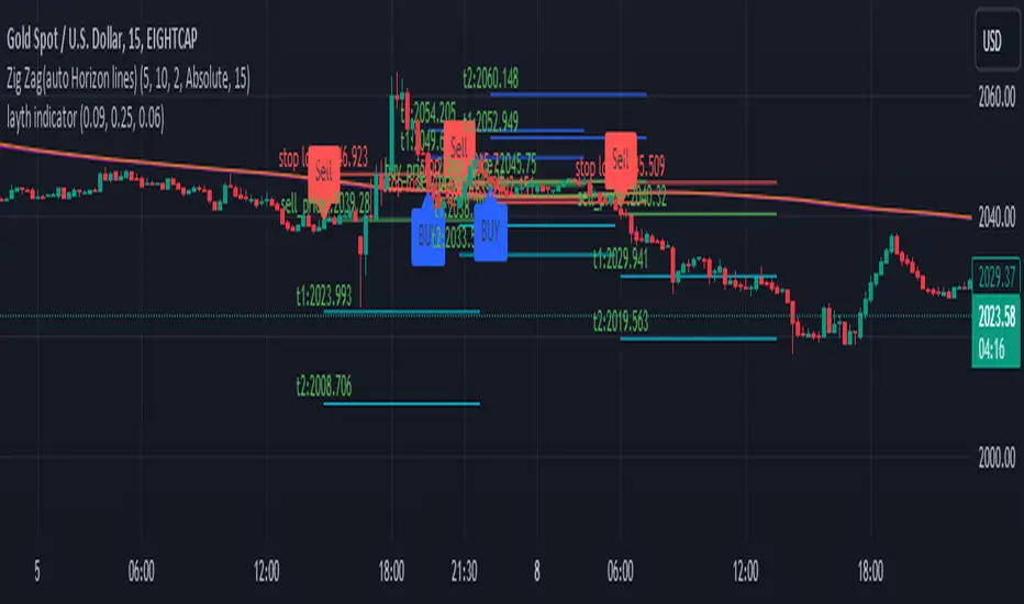
LYFX-GOLD-15MIndicator Operation Method:
The indicator provides a buy signal when the price stabilizes above the moving averages. It should be close to the averages at the same time to ensure a close stop loss.
When the conditions are met, a long trade is opened, and the buy signal appears on the indicator. The stop loss is placed with the red line, and the targets are indicated with the blue balloons. Usually, the first target is twice the stop loss, and the second target is three times the stop loss.
This indicator is one of the most powerful indicators for monitoring price explosions in gold.
For clarification, this indicator is used (according to its default settings) exclusively for gold and only on the 15-minute timeframe. The indicator is created by Mr. Layth Al-Muhandis:
The indicator provides a very close stop loss compared to the first and second targets. I recommend adhering strictly to the stop loss and securing the trade after achieving profits.
This is a simple explanation of how the indicator works.
طريقة عمل المؤشر:
يوفر المؤشر إشارة شراء عند استقرار السعر فوق المتوسطات المتحركة. يجب أن يكون السعر قريبًا من المتوسطات في نفس الوقت لضمان وجود استوب لوس قريب.
عند تحقيق الشروط، يتم فتح صفقة شراء، وتظهر إشارة الشراء على المؤشر. يتم وضع الاستوب لوس بالخط الأحمر، وتوضح البالونات الزرقاء الأهداف. عادةً، يكون الهدف الأول ضعف الاستوب لوس، والهدف الثاني ثلاثة أضعاف الاستوب.
هذا المؤشر من بين أقوى المؤشرات لرصد انفجارات الأسعار في الذهب.
للتنويه، يُستخدم هذا المؤشر (وفقًا لإعداداته الافتراضية) حصريًا للذهب وعلى فاصل زمني 15 دقيقة فقط. تم إنشاء المؤشر بواسطة السيد ليث المهندس.
يوفر المؤشر استوب لوس قريب جداً مقارنة بالهدف الأول والهدف الثاني. أنصح بالالتزام الصارم بالاستوب لوس وتأمين الصفقة بعد تحقيق الأرباح.
XAUXXXThis simple script is meant to get around the limitations some data providers have, in terms of the length of historical data they choose to provide traders. Inspired by OANDA's XAUCAD pair only having data as far back as 2005, whereas XAUUSD has data back to to the 19th century.
By taking the OHLC data from XAUUSD and multiplying it by the price of USD in a desired currency you are able to see further back in time, the limitation now being the length of FX data available instead of the price of Precious metal / currency pair. As shown in the chart you can now see the price of Gold in CAD as far back as the late 1960s, a nearly half century of data uncovered for all to see!

The Golden Candlestick PatternThe Golden pattern is a three-candlestick configuration based on a variation of the golden ratio (2.618) from the Fibonacci sequence.
The bullish Golden pattern is composed of a normal bullish candlestick with any type of body, followed by a bigger bullish candlestick with a close price that is at least 2.618 times the size of the first candlestick (high to low). Finally, there must be an important condition that is, a third candlestick that comes back to test the open of the second candlestick from where the entry is given.
The bearish Golden pattern is composed of a normal bearish candlestick with any type of body, followed by a bigger bearish candlestick with a close price that is at least 2.618 times the size of the first candlestick (high to low). Finally, there must be an important condition that is, a third candlestick that comes back to test the open of the second candlestick from where the entry is given.

Multi-Symbol Cross Indicator Template - Unleash Your Potential!Unlock your full trading potential with this powerful and versatile Multi-Symbol Cross Indicator Template! This script is designed to make you stand out from the crowd by enabling you to monitor multiple symbols on a single chart for specific events, such as a Golden Cross or Death Cross. With its high adaptability to include various technical indicators, you're in complete control of your trading decisions and market analysis.
By using the built-in request.security function, this template fetches data for your chosen symbols from the selected exchange and calculates the conditions (e.g., moving average crossovers) for each symbol. Although the current implementation focuses on Golden Crosses and Death Crosses, the sky is the limit when it comes to modifying the script to incorporate other technical indicators such as RSI, MACD, or Bollinger Bands.
You, as a discerning trader, can easily customize the script by selecting your preferred exchange and symbols through input options. This flexibility allows you to monitor your favorite markets without the need for any direct code modification, giving you the ultimate adaptability for various trading strategies and market analysis purposes.
Remember, this script is more than just an example or template; it's the key to unleashing your inner trading genius. While it's not intended to be a standalone trading strategy, it serves as the foundation for you to build upon and create your own customized multi-symbol indicators or strategies. You are awesome, and with this Multi-Symbol Cross Indicator Template, there's no doubt that you're on the path to achieving great success in your trading journey!

Recession Warning Traffic LightThis is an indicator that uses 6 different metrics to determine the combined probability of a recession and compares the high probability warning periods against actual historical periods of recession.
GREEN tells us that the referenced recession indicators are not exhibiting any warning. Observe the long stretches of “all-green” in between recessionary periods in the chart above.
RED will show a full-on warning level for that particular recession indicator, signaling that monitoring of this sector is clearly showing a problem – which has in the past, reliably exhibited itself as a forewarning of recessions.
Adding green and red together can help determine a combined probability of recession.
IMPORTANT: Your chart should be on 1d and set to SPX , DJI ,or NDQ indices
Precious metals: This indicator calculates the relative prices of Gold & rhodium. Gold is a flight-to-quality asset. Rhodium is the rarest of precious industrial metals and prices spike when the economy is heating up. In front of a recession, the upper relative movement of rhodium precedes gold.
Stock markets: This indicator compares closing prices to growth rate curves of the SPX. This indication is the noisiest but tells us very well when the recession has ended. Stock market indices, which respond to “smart money” moving out of markets when the other indicators begin to warn of recession, or when markets become overheated and rise to historically unsustainable levels.
Yield curve: This indicator compares the 3m & 10y treasuries and detects yield curve inversions. Interest rates are controlled by the Federal Reserve and by the purchasers in the Federal Treasury auction markets, which together create the treasury yield curve. This inversion is the most reliable recession indicator. These happen during a flight to quality.
Federal Reserve: This indicator measures GDP and detects contraction which is technically a recession. This is usually one of the last indicators to enter a Warning state, and it could be 6 months delayed simply confirming what may have already been projected.
Money Supply. This indicator measures the M2 money supply, which typically grows about 1% per calendar quarter. When this shrinks, it's tapping the brakes on the economy. This can also lead to yield curve inversion. This is also a measure of inflation and its effects on the aggregate money supply (liquid capital) available for short-term economic activity, or which can be directed into the purchase of long-term, less liquid assets.
Leading Economic factors: There is a whole basket of leading economic indicators that, as collections, reflect overall growth or contraction of economic activity. These indicators include measures of level and growth in productivity, employment, housing, consumer confidence, industrial purchasing confidence, and much more. These indicators may or may not be detached from the broader economy, and often provide up to 6 months of foresight. For more information please visit www.conference-board.org
Actual Recession: Central Bank indicators are published by the Federal Reserve and reflect their own analysis of national and regional economic health, as well as their calculations of the likelihood of a recession. The Federal Reserve has a recession ticker which is used to plot periods of actual recessions on this indicator for comparison.

iChi Masters Regular GoldSignalThis indicator is based on the Ichimoku code, and by combining the Ichimoku code with special source codes and improving the colors and signals that you can see on chart with information such as stop,target and leverage for your trades, we made the IMR indicator so that it is easier for traders to understand the Ichimoku strategy, I hope you enjoy it :)
The Buy and Sell labels on chart is based on ichimoku lines:
when the conversion and base line cross up each other and in distance of 9 candle the ichimoku cloud has green switch too,then we have a Buy label on chart and the opposite is for the Sell labels
This indicator has no backtest and you can only see the signals and the information of that
- The Risk% is the percentage of your risk on your balance so indicator gives you the proper leverage
- In Box Mode you can specify where your box should be drawn :
1 : Cr sets the box on conversion and base cross
2 : Perfect Cross sets the box on a cross which has no cross before until 26 candles
3 : Buy_Sell sets the box on Buy or Sell labels on chart
4 : Divergence Box sets the box on Divergence triangles on chart
-The C/S Distance is the distance between cross and switch for Buy and Sell labels
-The Long and Short check boxes is for showing you the information of Buy or Sell position such as stop,target and leverage.
-The Divergence section is based on ichimoku too:
In Lead divergence, we calculate the difference between lead 1 and lead 2, and a graph is formed from their difference, by comparing the obtained graph and the candles, we find the divergence between them, and they are displayed as green arrows on the chart,And in total, three types of divergence can be seen in the chart, R1, R2 and HD
In Base divergence, we calculate the difference between Conversion and Base, and a graph is formed from their difference, by comparing the obtained graph and the candles, we find the divergence between them, and they are displayed as white arrows on the chart,And in total, three types of divergence can be seen in the chart, R1, R2 and HD
-The Switch Filter means that our Lead Divergence and Base Divergence should be close to ichimoku cloud switch
-The All High means that for long arrow of Divergences The lowest price of the previous 26 candles should be equal to the lowest price of the previous 52 candles and the opposite for sell arrow of Divergence
-In the Ichi Elements section, you can choose the visible sections on the chart:
The Cloud tick is on the chart to see the Ichi Moko cloud
The Offset tick is to move the cloud to 26 candles ahead
The Conv tick is to see the Conversion line
The Base tick is on the indicator to see the Base line
The Chiko tick is there to see the Chiko Span line on the chart
Qline tick to see the Base line which has advanced 26 candles
Buy_Sell tick to see buy and sell labels
The Ready tick is used to see the label ready for buying and selling on the chart
The Cross tick is to see the moment of the cross between the conv line and Base
The PC tick is for seeing crosses that do not have a cross until the previous 26 candles
The FakeCloud tick is used to see clouds that contain less than 26 candles
-The Super Trend Goldsignal is a combination of two atr with numbers 1.6 and 0.8
The signals that are displayed on the chart are the points where both atr signaled at the same time.
-The HigherTimeFrame tick will show you Conv, Base and Lead lines multiplied by Multiply
-The C, B, and L boxes are used to specify the numbers of Conv, Base, and Lead lines, respectively
-The Conv Box tick is for plotting the highest price in 9 candles and the lowest price in 9 candles
-The Lead2 Box ticker is for drawing the highest price in 52 candles and the lowest price in 52 candles
-The Yellow Line tick 26-52 is to indicate the places where either the highest price of 52 candles and 26 candles were equal or their lowest prices.
-Purple Line ticked 52-26 is to specify the places where the highest price of 26 and 52 and the lowest price of 26 and 52 are equal.
-The Blue Line 26-9 tick is for specifying the places where the highest price of 26 and 9 and the lowest price of 26 and 9 are equal.
