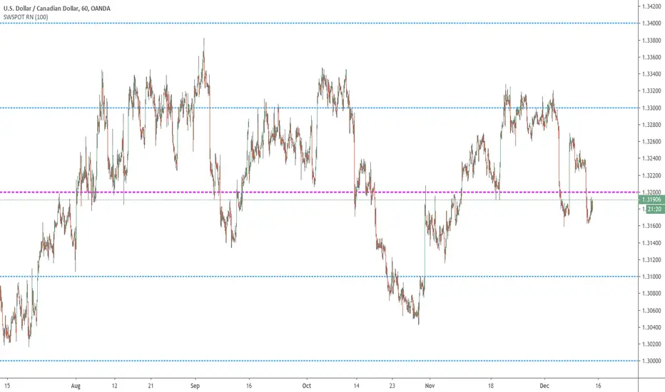
Sweetspot Gold RN - by JustUncleLThis is an alternate version of "Sweetspot Gold R4" that does not use sublevels. Removing the sublevels allows more efficient use of the plots (TV script has a limit of 64 plot calls).
This works well for all currency pairs I've tested, most commodities, and most stocks.
The indicator plots the so called "round price levels" or "00" levels. For example, 1.4000, 1.4400, 1.4500.
It automatically calculates the levels for each chart time frame. Optionally you can manually select main level size (in pips)
Use this indicator as a guidance to a better mapping of Support/Resistance levels on the chart. Next time you draw Support/Resistance lines, if they coincide with round price levels, you have got a excellent S/R level to work with!
Cerca negli script per "GOLD"
Generation 6 Massive Trend Following for Gold (Note at bottom!)Making this one an open script for you people.
Commission_value = 0.02 is the same as a 50 pip gold spread.
Start capital $10,000.
1.00 lots = 1 contract on this.
Trend establishment with the 600 period moving average, trend continuation with the crossover/crossunder.
This strategy is great for finding trends on XAUUSD.
Side note: if anyone knows MQL4 coding language for MT4, please let me know, I would like to see the results of this strategy over a period of several years rather than the several months of data that Tradingview Provides. Please PM me, I want to see how profitable this code is over a long period of time. Thank you, and enjoy.
15 Minute Gold Trend-Following StrategyThis is the main strategy that I will be forward testing on demo for a month or two, then making it an EA in MetaTrader4
You can see the code for yourself this time, all the strategy is, is a crossover of various moving averages.
Commission included, $10,000 account.
Results over the past 3 months, beginning in January 2017.

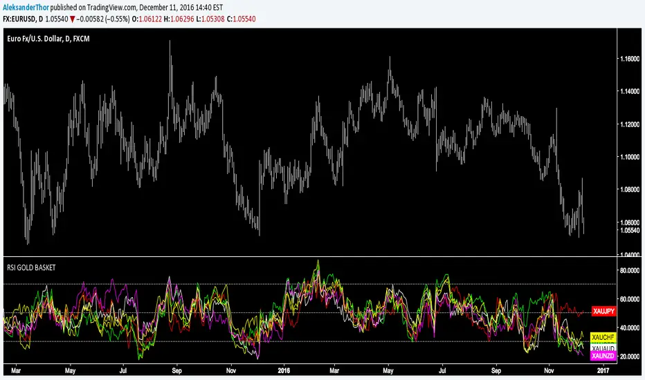
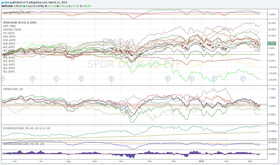
RSI Gold Basket"Using gold as a common denominator measure of a group of currencies enables one to rank these different currencies by order of performance" - Currency Trading and Intermarket Analysis by Ashraf Laïdi
Correlation of chart symbol to different Index-ETF-currencyScript plots correlation of chart symbol to a variety of indexes, symbols, equities. ** Original idea was to find Bitcoin correlation, which I did not. Built in correlations are: Nikie, DAX, SPY, AAPL, US Dollar, Gold, EURUSD, USDCNY, EEM, QQQ, XLK, XLF, USDJPY, EURGBP

[LAVA] Early Warning IndicatorCombined the RSI inverse of gold to USD with the Dollar index (or whatever stock symbol that may be inverted/complementary) with another asset/currency, like bitcoin, you can basically be well informed when a potential move is on the horizon. Settings allow for inverse settings and de-combining the two pairs as well as a nice cloud look if all the lines get annoying.
Williams FractalsBoaBias Fractals High & Lows is an indicator based on Bill Williams' fractals that helps identify key support and resistance levels on the chart. It displays horizontal lines at fractal highs (red) and lows (green), which extend to the current bar. Lines automatically disappear if the price breaks through them, leaving only the relevant levels. Additionally, the indicator shows the price values of active fractals on the price scale for convenient monitoring.
Key Features:
Customizable Fractals: Choose between 3-bar or 5-bar fractals (default: 3-bar).
Period: Adjust the number of periods for calculation
Visualization: Red lines for highs (resistance), green for lows (support). Lines are fixed on the chart and persist during scrolling or scaling changes.
Alert System: Notifications for the formation of a new fractal high/low and for level breaks (Fractal High Formed, Fractal Low Formed, Fractal High Broken, Fractal Low Broken).
How to Use:
Add the indicator to the chart.
Configure parameters: select the fractal type (3 or 5 bars) and period.
Set up alerts in TradingView to receive notifications about new fractals or breaks.
Use the lines as levels for entry/exit positions, stop-losses, or take-profits in fractal-based strategies.
Troubleshooting: If Levels Are Not Fixed on the Chart
If the levels (fractal lines) do not stay fixed on the chart and fail to move with it during scrolling or scaling (e.g., they remain stationary while the chart shifts), this is typically due to the indicator's scale settings in TradingView. The indicator may be set to "No scale," causing the lines to desynchronize from the chart's price scale.
What to Do:
Locate the Indicator Label: On the chart, find the indicator label in the top-left corner of the pane (or where "BoaBias Fractals High & Lows" is displayed).
Right-Click the Label: Click the right mouse button on this label.
Adjust the Scale:
In the context menu, look for the "Scale" or "Pin to scale" option.
If it shows "Pin to scale (now no scale)" or similar, select "Pin to right scale" (or "Pin to left scale," depending on your chart's main price scale—usually the right).
Refresh the Chart: After changing the setting, refresh the chart (press F5 or reload the page), or toggle the indicator off and on again to apply the changes.
After this, the lines should move and scale with the chart during scrolling (horizontal or vertical) or zooming. If the issue persists, check:
TradingView Limits: The indicator may draw too many lines (maximum ~500 per script). If there are many historical fractals, older lines might not display.
Chart Settings: Ensure the chart is not in logarithmic scale (if applicable) or that auto-scaling is enabled.
Indicator Version: Verify you are using the latest script version (Pine Script v6) and check for errors in the TradingView console.
This indicator is ideal for traders working with Bill Williams' chaos theory or those seeking dynamic support/resistance levels. It is based on standard fractals but with enhancements for convenience: automatic removal of broken levels and integration with the price scale.
Note: The indicator does not provide trading signals on its own — use it in combination with other tools. Test on historical data before real trading.
Code written in Pine Script v6. Original template: Mit Nayi.

Gold Trap Hunter (Auto-Structure & Liquidity Sweeps)The Concept: Stop Getting Trapped Have you ever bought a breakout, only to watch the price immediately reverse and hit your stop loss? This is called a Liquidity Trap (or "Sweep"). Institutional algorithms often push price slightly above a key High or below a key Low to trigger retail stop losses before moving the market in the real direction.
The Universal Trap Hunter is designed to visualize this market structure automatically. It helps you avoid "Fake Breakouts" and identifies high-probability Reversal points where the "Smart Money" is active.
How It Works (The Logic)
1. The Structure Boxes (The Battlefield) The indicator draws a shaded box representing the Higher Timeframe Structure.
Green Box: The market structure is Bullish (Making Higher Highs). We are looking for longs.
Red Box: The market structure is Bearish (Making Lower Lows). We are looking for shorts.
Feature: This is Universal. If you are on the 15-minute chart, it automatically calculates the 4-Hour structure for you. You are always trading with the bigger trend.
2. The "SWEEP" Signal (The Entry Trigger) A "Sweep" is the most powerful signal in this system.
What is it? Price breaks a previous structure High/Low but fails to close there. It grabs the liquidity and reverses.
⚔️ Green Sweep: Price broke the previous Low (trapping sellers), then closed back UP inside the range. This is a bullish reversal signal.
⚔️ Red Sweep: Price broke the previous High (trapping buyers), then closed back DOWN inside the range. This is a bearish reversal signal.
3. The Noise Filter (Gray Candles) Trading is about knowing when NOT to trade.
Gray Candles: These indicate "Noise." The price action is choppy or conflicting with the trend.
Colored Candles: The candles only turn Green or Red when the Trend, Momentum, and Structure all align. If you see color, the move is valid.
Settings & Customization
Structure Mode (Auto vs Manual):
Auto (Recommended): The script automatically selects the best Higher Timeframe for you.
Scalping 1m? → It looks at 1H Structure.
Trading 15m? → It looks at 4H Structure.
Manual: You can lock it to a specific timeframe (e.g., always show Daily structure).
Colors: Fully customizable to fit your dark/light theme.
How to Trade This Strategy
Identify the Trend: Look at the background Box color (Green = Bullish, Red = Bearish).
Wait for the Trap: Do not chase the price. Wait for price to challenge the edge of the box.
The Signal: Look for the "⚔️ SWEEP" label.
If the box is Green and you see a Green Sweep at the bottom: Strong Buy.
If the box is Red and you see a Red Sweep at the top: Strong Sell.
Disclaimer: This tool is for educational purposes and market analysis only. It helps visualize market structure and liquidity traps but does not guarantee future results. Always manage your risk.

Golder/Silter SetupsGolden/Silver Strategy
Overview
The Tony Rago Golden/Silver Strategy is a high-precision mean-reversion system specifically engineered for the Nasdaq (NQ/MNQ). It leverages the psychological 100-point price blocks to identify institutional exhaustion and reversal points.
Unlike standard "grid" bots, this strategy uses a sophisticated "Arm & Fire" logic: it requires a specific price "touch" to arm the setup, followed by a retracement to a "Golden" entry level to execute.
Key Logic: The 100-Point Grid
The strategy divides price action into 100-point blocks (e.g., 19500 to 19600).
Golden Setup (Long): Triggered when price touches the 50 level (mid-point). The order is placed at the 26 level on the retracement.
Silver Setup (Short): Triggered when price touches the 00 or 100 levels (block boundaries). The order is placed at the 77 or 26 levels on the retracement.
Professional Risk Management
This edition features a Dual-Contract Management system designed for Prop Firm consistency:
Contract 1 (The Scalp): Aims for a quick 24-point target (TP1) to secure realized gains and cover costs.
Contract 2 (The Runner): Stays in the trade for an extended 51-point target (TP2).
Automated Break-Even (BE): The moment TP1 is hit, the Stop Loss for the Runner is automatically moved to the entry price (plus a small offset). This ensures a "risk-free" environment for the remainder of the trade.
Independent Stop Losses: The Scalp and the Runner use different SL distances to account for Nasdaq volatility, preventing a single "noise" wick from wiping out the entire position.
Intelligent Filters
ADX Range Filter: The strategy monitors market trend strength. It only allows trades when the ADX is below a user-defined threshold (default 25), ensuring you only play mean-reversion during ranging or "choppy" markets.
MA Visual Semaphor: The 50 EMA changes color dynamically based on ADX (Lime/Green for Range, Orange/Red for Trend), giving you an instant visual "Go/No-Go" signal.
Time-Session Filtering: Optimized for three custom sessions (NY Open, Mid-Day Reversal, and Late Night). Outside these sessions, the strategy can "Arm" setups in memory but will not "Fire" orders.
How to Use
Timeframe: Optimized for 1-Minute or 2-Minute charts for precision entry.
Asset: Nasdaq 100 (NQ, MNQ) or similar high-volatility indices.
Setup: * Enable Session Filters to avoid news volatility.
Adjust TP/SL in Points (1 Point = 4 Ticks) to suit your specific risk appetite.
Watch for the "Armados" labels—these indicate the system is ready and waiting for the Golden/Silver entry.
Visual Interface
Dynamic Boxes: Real-time visual representation of your TP1, TP2, and SL levels.
Activation Labels: Clear indications of when a Long or Short setup has been "Armed" in memory.
Status Dashboard: A clean top-right table showing current ADX values, Session status, and Risk settings.
Disclaimer
Trading involves significant risk. This strategy is a tool for decision support and backtesting. Past performance does not guarantee future results. Always test on a demo account before risking live capital.

Goldbach Timing Model This indicator is designed as a simple visual framework rather than a rigid signal system. It highlights time-based structure and key alignment zones to help identify when price behavior is more likely to be active or responsive. The logic is intentionally flexible, allowing the user to apply their own discretion instead of relying on strict conditions. Its primary value is visual clarity and context, not automatic entries or exits.

PriceLevels GBGoldbach Price Levels – Identify Algorithmic Key Zones
This open-source indicator is designed to help traders identify potential algorithmic key zones by highlighting price levels ending with specific numbers such as 03, 11, 29, 35, 65, and 71. These levels may act as inflection points or hesitation areas based on observed behavioral patterns in price movement.
What It Does:
📌 Scans and plots horizontal price levels where the price ends with one of the selected number combinations
🎯 Toggle on/off visibility for each number ending
🎨 Customize color and thickness for each level
🏷️ Shows price labels at the end of each line
🌗 Label styles (color/transparency) are adjustable for both dark and light chart themes
🧠 Why Use It:
This tool is ideal for discretionary traders who study market structure through static price anchors. It provides a visual reference for recurring numerical levels that may be used in algorithmic trading models or serve as psychological price zones.
⚠️ Disclaimer:
This script is open-source and intended for educational and analytical purposes only. No trading signals or performance guarantees are provided. Please use your own judgment when applying this tool in a trading context.
Gold 2-Week Futures LevelsYou may change the color at bottom of script and i used 1h to mark out my levels, you may change it to fit your time frame.

Gold Scalp//@version=5
indicator("scalp strategy (Boxed)", overlay=true)
// Ensure 5-minute chart
isFiveMin = timeframe.isminutes and timeframe.multiplier == 5
// New York time (EST/EDT auto)
nyHour = hour(time, "America/New_York")
nyMinute = minute(time, "America/New_York")
// Target times (exact candle close)
triggerTime =
(nyHour == 11 and nyMinute == 0) or
(nyHour == 19 and nyMinute == 0) or
(nyHour == 14 and nyMinute == 0) or
(nyHour == 6 and nyMinute == 0) or
(nyHour == 8 and nyMinute == 0) or
(nyHour == 21 and nyMinute == 0) or
(nyHour == 00 and nyMinute == 0)
// Final trigger
trigger = isFiveMin and triggerTime and barstate.isconfirmed
// Draw box + label
if trigger
box.new(bar_index - -5, high, bar_index, low, bgcolor=color.new(#0e06eb, 76), border_color=color.rgb(4, 252, 136))
label.new(bar_index, high, "", style=label.style_label_down, color=color.rgb(11, 48, 3), textcolor=color.white, size=size.small)
// Alert
alertcondition(trigger, title="LETS GO", message="5-minute candle CLOSED at key EST time")

GOLD TERTIUM estrategiaThis indicator is a visual tool for TradingView designed to help you read trend structure using EMAs and highlight potential long and short entries on the MGC 1‑minute chart, while filtering pullbacks and avoiding trades when the 200 EMA is flat.
It calculates five EMAs (32, 50, 110, 200, 250) and plots them in different colors so you can clearly see the moving‑average stack and overall direction. The main trend is defined by the 200 EMA: bullish when price and the fast EMAs (32 and 50) are above it with a positive slope, and bearish when they are below it with a negative slope; if the 200 EMA is almost flat, signals are blocked to reduce trading in choppy markets.

GOLD TERTIUM MGC 1mThis indicator is a visual tool for TradingView designed to help you read trend structure using EMAs and highlight potential long and short entries on the MGC 1‑minute chart, while filtering pullbacks and avoiding trades when the 200 EMA is flat.
It calculates five EMAs (32, 50, 110, 200, 250) and plots them in different colors so you can clearly see the moving‑average stack and overall direction. The main trend is defined by the 200 EMA: bullish when price and the fast EMAs (32 and 50) are above it with a positive slope, and bearish when they are below it with a negative slope; if the 200 EMA is almost flat, signals are blocked to reduce trading in choppy markets.
Entry logic looks for a pullback into the 32–50 EMA zone on the previous candle, then requires a trend‑aligned candle to trigger a signal: long when the trend is up, the previous bar retested the EMA zone, and the current bar closes above EMA 32 with a bullish body; short when the trend is down, there was a valid retest, the current bar closes below EMA 32 with a bearish body and EMA 32 is below EMA 50. On the chart, you will see colored EMAs plus green “L” triangles under bars for potential long entries and red “S” triangles above bars for potential short entries, which are meant as visual cues rather than automatic trade instructions

Gold Bullish Order Blocks - 3 Candle Confirmation after the OBBest Order blocks finder created by Marky using claude AI.

GOLDEN RSI (70-50-30)The fluctuation range has been expanded. Theoriginal author only set it between 40 and 60, but arange of 30 to 70 would be more reasonableAdditionally, a 50 median line has been added withinthe fluctuation range


GOLD EMA Crossover Strategy This EMA Crossover Strategy is designed for intraday trading on the 5-minute chart.
It uses three EMAs (fast, mid, slow) to identify momentum shifts and trigger long or short entries. Risk management is dollar-based, with default settings of $100 risk per trade and $300 profit target. Entries are taken when the fast EMA crosses above/below the mid or slow EMA, with stops and targets calculated dynamically. The strategy runs across all hours and uses fixed position sizing (default 3 contracts). It is intended as a framework for traders to adapt and optimize to their own instruments and risk preferences.

Gold Master: Swing + Daily Scalp (Fixed & Working)How to use it correctly
Daily chart → Focus only on big green/red triangles (Swing trades)
5m / 15m / 1H chart → Focus on small circles (Scalp trades)
You can turn each system on/off independently in the settings
Works perfectly on XAUUSD, GLD, GC futures, and even DXY (inverse signals).
