[GrandAlgo] Moving Averages Cross LevelsMoving Averages Cross Levels
Many traders watch for moving average crossovers – such as the golden cross (50 MA crossing above 200 MA) or death cross – as signals of changing trends. However, once a crossover happens, the exact price level where it occurred often fades from view, even though that level can be an important reference point. Moving Averages Cross Levels is an indicator that keeps those crossover price levels visible on your chart, helping you track where momentum shifts occurred and how price behaves relative to those key levels.
This tool plots horizontal line segments at the price where each pair of selected moving averages crossed within a recent window of bars. Each level is labeled with the moving average lengths (for example, “21×50” for a 21/50 MA cross) and is color-coded – green for bullish crossovers (short-term MA crossing above long-term MA) and red for bearish crossunders (short-term crossing below). By visualizing these crossover levels, you can quickly identify past trend change points and use them as potential support/resistance or decision levels in your trading. Importantly, this indicator is non-repainting – once a crossover level is plotted, it remains fixed at the historical price where the cross occurred, allowing you to continually monitor that level going forward. (As with any moving average-based analysis, crossover signals are lagging, so use these levels in conjunction with other tools for confirmation.)
Key Features:
✅ Multiple Moving Averages: Track up to 7 different MAs (e.g. 5, 8, 21, 50, 64, 83, 200 by default) simultaneously. You can enable/disable each MA and set its length, allowing flexible combinations of short-term and long-term averages.
✅ Selectable MA Type: Each average can be calculated as a Simple (SMA), Exponential (EMA), Volume-Weighted (VWMA), or Smoothed (RMA) moving average, giving you flexibility to match your preferred method.
✅ Auto Crossover Detection: The script automatically detects all crosses between any enabled MA pairs, so you don’t have to specify pairs manually. Whether it’s a fast cross (5×8) or a long-term cross (50×200), every crossover within the lookback period will be identified and marked.
✅ Horizontal Level Markers: For each detected crossover, a horizontal line segment is drawn at the exact price where the crossover occurred. This makes it easy to glance at your chart and see precisely where two moving averages intersected in the recent past.
✅ Labeled and Color-Coded: Each crossover line is labeled with the two MA lengths that crossed (e.g. “50×200”) for clear identification. Colors indicate crossover direction – by default green for bullish (positive) crossovers and red for bearish (negative) crossovers – so you can tell at a glance which way the trend shifted. (You can customize these colors in the settings.)
✅ Adjustable Lookback: A “Crosses with X candles” input lets you control how far back the script looks for crossovers to plot. This prevents your chart from getting cluttered with too many old levels – for example, set X = 100 to show crossovers from roughly the last 100 bars. Older crossover lines beyond this lookback window will automatically clear off the chart.
✅ Optional MA Plots: You can toggle the display of each moving average line on the chart. This means you can either view just the crossover levels alone for a clean look, or also overlay the MA curves themselves for additional context (to see how price and MAs were moving around the crossover).
✅ No Repainting or Hindsight Bias: Once a crossover level is plotted, it stays at that fixed price. The indicator doesn’t move levels around after the fact – each line is a true historical event marker. This allows you to backtest visually: see how price acted after the crossover by observing if it retested or respected that level later.
How It Works:
1️⃣ Add to Chart & Configure – Simply add the indicator to your chart. In the settings, choose which moving averages you want to include and set their lengths. For example, you might enable 21, 50, 200 to focus on medium and long-term crosses (including the golden cross), or turn on shorter MAs like 5 and 8 for quick momentum shifts. Adjust the lookback (number of bars to scan for crosses) if needed.
2️⃣ Visualization – The script continuously checks the latest X bars for any points where one MA crossed above or below another. Whenever a crossover is found, it calculates the exact price level at which the two moving averages intersected. On the last bar of your chart, it will draw a horizontal line segment extending from the crossover bar to the current bar at that price level, and place a label to the right of the line with the MA lengths. Green lines/labels signify bullish crossovers (where the first MA crossed above the second), and red lines indicate bearish crossunders.
3️⃣ On Your Chart – You will see these labeled levels aligned with the price scale. For example, if a 50 MA crossed above a 200 MA (bullish) 50 bars ago at price $100, there will be a green “50×200” line at $100 extending to the present, showing you exactly where that golden cross happened. You might notice price pulling back near that level and bouncing, or if price falls back through it, it could signal a failed crossover. The indicator updates in real-time: if a new crossover happens on the latest bar, a new line and label will instantly appear, and if any old cross moves out of the lookback range, its line is removed to keep the chart focused.
4️⃣ Customization – You can fine-tune the appearance: toggle any MA’s visibility, change line colors or label styles, and modify the lookback length to suit different timeframes. For instance, on a 1-hour chart you might use a lookback of 500 bars to see a few weeks of cross history, whereas on a daily chart 100 bars (about 4–5 months) may be sufficient. Adjust these settings based on how many crossover levels you find useful to display.
Ideal for Traders Who:
Use MA Crossovers in Strategy: If your strategy involves moving average crossovers (for trend confirmation or entry/exit signals), this indicator provides an extra layer of insight by keeping the price of those crossover events in sight. For example, trend-followers can watch if price stays above a bullish crossover level as a sign of trend strength, or falls below it as a sign of weakness.
Identify Support/Resistance from MA Events: Crossover levels often coincide with pivot points in market sentiment. A crossover can act like a regime change – the level where it happened may turn into support or resistance. This tool helps you mark those potential S/R levels automatically. Rather than manually noting where a golden cross occurred, you’ll have it highlighted, which can be useful for setting stop-losses (e.g. below the crossover price in a bullish scenario) or profit targets.
Track Multiple Averages at Once: Instead of focusing on just one pair of moving averages, you might be interested in the interaction of several (short, medium, and long-term trends). This indicator caters to that by plotting all relevant crossovers among your chosen MAs. It’s great for multi-timeframe thinkers as well – e.g. you could apply it on a higher timeframe chart to mark major cross levels, then drill down to lower timeframes knowing those key prices.
Value Clean Visualization: There are no flashing signals or arrows – just simple lines and labels that enhance your chart’s storytelling. It’s ideal if you prefer to make trading decisions based on understanding price interaction with technical levels rather than following automatic trade calls. Moving Averages Cross Levels gives you information to act on, without imposing any bias or strategy – you interpret the crossover levels in the context of your own trading system.
Cerca negli script per "GOLD"
进阶增强版MACD 这是一个增强版 MACD(移动平均线收敛-发散)指标,集成了多时间框架分析、面积统计、背离检测、仪表盘显示和警报功能。
该指标在传统 MACD 指标的基础上进行了大幅扩展,增加了多时间框架(本级别和高级别)、面积分析、背离概率计算、交互式仪表盘和表格显示等功能,旨在为交易者提供更全面的市场动态信息。核心功能包括:双级别 MACD:同时计算本级别(默认快线12、慢线26、信号线9)和高级别(默认快线66、慢线143、信号线50)的 MACD 和信号线。
面积分析:统计 MACD 直方图的面积(红绿柱),并与历史最大面积对比。
背离检测:识别价格与 MACD 的顶背离和底背离,并计算背离概率。
可视化:提供丰富的图形输出,包括直方图、MACD 线、信号线、金叉/死叉标记、背离线、面积标签、表格和仪表盘。
警报系统:为金叉/死叉、面积变化、背离信号等设置多种警报条件。
指标适用于趋势跟踪、背离交易和强度分析,适合日内交易、波段交易等场景。
This is an enhanced MACD (Moving Average Convergence Divergence) indicator that integrates multi time frame analysis, area statistics, divergence detection, dashboard display, and alert functions.
This indicator has been greatly expanded on the basis of the traditional MACD indicator, adding functions such as multi time frame (local and high-level), area analysis, deviation probability calculation, interactive dashboard and table display, aiming to provide traders with more comprehensive market dynamic information. The core functions include: dual level MACD: simultaneously calculating the MACD and signal lines of this level (default fast line 12, slow line 26, signal line 9) and high-level (default fast line 66, slow line 143, signal line 50).
Area analysis: Calculate the area of the MACD histogram (red and green bars) and compare it with the historical maximum area.
Deviation detection: Identify the top and bottom deviations between prices and MACD, and calculate the probability of deviation.
Visualization: Provides rich graphical output, including histograms, MACD lines, signal lines, golden/dead cross markers, backlit lines, area labels, tables, and dashboards.
Alarm system: Set multiple alarm conditions for golden/dead forks, area changes, deviation signals, etc.
The indicator is suitable for trend tracking, divergence trading, and intensity analysis, and is suitable for intraday trading, band trading, and other scenarios.
ALCOTRADE Pro v4.5 - SFP VWAP Suite (with Light VP)Overview
This indicator is a rule-based SFP/VWAP system designed for crypto and gold futures.
It detects sweeps of local extremes (SFP) and filters them with multi-VWAP proximity (D/W/M), regime & slope, ADX, volume spikes, optional RSI, HTF trend, and an Adaptive Bollinger module. A Light Weekly/Monthly Volume Profile (custom histogram logic) adds VAL/POC/VAH context.
Outputs: basic LONG/SHORT and an ensemble “MASTER” signal when weighted confirms exceed a threshold.
What’s original here
Targeted SFP logic near anchored VWAPs (D/W/M) with dual proximity modes (% distance or ATR), optional bar-close confirmation, and cooldown.
Regime gating with Weekly VWAP slope (bps/bar) smoothed; signals only when slope meets configurable magnitude.
Adaptive MinScore: the minimum score for a signal auto-adjusts with ADX (tightens in chop, relaxes in trend).
Ensemble MASTER score combining SFP / Pullback around Weekly VWAP / Breakout context / RSI / Slope / Adaptive Bollinger (revert/break logic depending on squeeze & VWAP proximity).
Light VP (W/M): custom binned histogram per period, with on-close VAL/POC/VAH and Developing lines updated at a configurable step — no external libraries.
Preset layer (BTC/ETH/XAU × TFs) that re-maps effective parameters and weights, not just cosmetic inputs.
How it works (core logic)
SFP detection: lookback highs/lows; wick-share thresholds; close back inside range.
VWAP proximity: nearest distance to D/W/M VWAPs in percent or ATR×; can be mandatory.
Regime: price relative to Weekly VWAP + Weekly VWAP slope SMA filter; optional ADX floor.
Confirms: volume spike over SMA×K; optional RSI cross/level.
HTF filter: HTF close vs HTF MA.
Adaptive Bollinger: picks reversion near VWAP or breakout in trend/squeeze; optional %B divergences.
Scoring: base score = proximity + regime + volume + RSI + session + ADX + VP proximity (VAL/VAH) + MACD + HTF + Bollinger/Div.
Adaptive MinScore: raises in low ADX, lowers in high ADX (bounded).
MASTER: weighted sum of SFP/Pullback/Breakout/RSI/Slope/Bollinger; fires when ≥ threshold.
How to use
Add to chart → choose “Full” mode for all features, or “VWAP only” to visualize VWAPs without signals.
Presets: pick a market/timeframe preset (BTC/ETH 5m/15m/1h; XAU 1m/5m/15m/1h). Presets remap effective parameters & weights (lookback, proximity, slopes, ADX floors, Bollinger rules, etc.).
Signals:
LONG/SHORT: appear on bar close when SFP + score ≥ adaptive min.
MASTER: requires the ensemble score ≥ threshold; generally rarer but higher quality.
Sessions (optional): enable for instruments with clear sessions.
Light VP: keep a small number of recent weeks/months; use VAL/POC/VAH as context (reactions/targets).
Risk management: this is a context & timing tool; use your own execution, SL, and TP management. Backtest forward on your venue/symbol.
Recommended settings
Crypto: BTC/ETH on 5m/15m/1h with corresponding presets.
Gold: XAU on 1m–15m in liquid hours, sessions ON.
Keep draw/update window at ~400–600 bars for performance.
Limitations & notes
Signals depend on exchange data and TF; different feeds may vary.
The Light VP is a simplified histogram per period; it is not a tick-level profile.
No guarantees; not financial advice.
Charting guidelines
Screenshots in this publication use a clean chart with only this indicator enabled so outputs are clearly identifiable.
Tags
SFP, VWAP, Volume Profile, Bollinger, ADX, RSI, MACD, HTF, Crypto, XAU, Futures

Color Cross Candles※日本語説明は、英文の下にあります。
This indicator detects Golden Cross and Dead Cross events using two moving averages (SMA/EMA),
and automatically changes the color of the candlesticks.
Golden Cross → Candles turn blue
Dead Cross → Candles turn red
Before any cross → Neutral color (default: gray)
Once a GC / DC occurs, the color is maintained until the next cross.
In addition, alerts can be triggered exactly when a cross happens.
✅ Key Features
Choose SMA / EMA freely for short-term and long-term moving averages
Instantly visualize the trend with candle colors
Alerts available on Golden Cross / Dead Cross
Keeps your chart clean by hiding the MA lines
A simple yet powerful tool to spot trend shifts at a glance.
日本語説明---------------------------------------------
このインジケーターは 2本の移動平均線(SMA/EMA)によるゴールデンクロス・デッドクロス を検出し、
ローソク足の色を自動的に切り替えます。
ゴールデンクロス → ローソク足を 青 に
デッドクロス → ローソク足を 赤 に
クロス前はニュートラル色(デフォルトはグレー)
一度 GC / DC が発生すると、その後は 次のクロスまで色を維持 します。
さらに、クロスが発生した瞬間にアラートを通知可能です。
✅ 主な特徴
短期・長期の移動平均に SMA / EMA を自由に選択可能
ローソク足の色でトレンドを直感的に把握
GC / DC 発生時にアラート通知
移動平均線は非表示でチャートをシンプルに保つ
シンプルながら トレンド転換を視覚的に把握できる便利なインジケーターです。
Qabas systemQabas System — Multi-Layered Smart Trading Framework
The Qabas System is an advanced all-in-one Pine Script indicator designed to combine institutional-grade analysis, smart entry/exit detection, and adaptive risk management into a single framework. It integrates multiple professional trading concepts into one ecosystem, making it suitable for intraday, swing, and position trading.
⸻
Core Components
1. VSA Engine (Volume Spread Analysis)
Detects institutional footprints (accumulation, distribution, no-demand, supply tests) by analyzing the relationship between candle spread, volume, and close location.
2. Order Blocks (Supply & Demand Zones)
Automatically highlights bullish and bearish order blocks with customizable transparency, showing where institutions left unfilled orders.
3. Smart Traps (Liquidity Traps)
Identifies bull and bear traps by detecting abnormal wicks and volume exhaustion near highs/lows — a common reversal signal.
4. Fibonacci Golden Levels
Draws adaptive retracement levels (23.6%, 38.2%, 50%, 61.8%, 78.6) aligned with the current market trend.
5. CPR (Central Pivot Range)
Daily pivot zones acting as magnets for price, helping detect high-probability reversal and breakout areas.
6. Liquidity Zones
Detects liquidity sweeps above highs and below lows combined with strong volume confirmation.
7. Market Structure (Chanlun Waves)
Tracks higher-highs / lower-lows to outline bullish or bearish structural waves.
8. Breakout Engine (Duanxian Gate)
Confirms valid breakouts using EMA/Donchian/Linear Regression baselines with ATR and volume filters.
9. Adaptive Resonance Oscillator (ARO)
A proprietary entry/exit system based on Hilbert transform and RSI resonance, plotting BUY/SELL arrows only when conditions are valid and alternating (to avoid duplicate signals).
⸻
Risk & Trade Management
• Smart ATR / Fibonacci / Structure-based stop loss options.
• Fibonacci / Risk-Reward / Structure-based take profit logic.
• Built-in auto-risk engine with position sizing (% risk per trade).
• ATR-based adaptive targets for breakout scenarios.
⸻
Visualization & Dashboard
• Multiple color themes (Neon, Professional, Matrix, Gold).
• Smart candle coloring for volume spikes and weak drops.
• Order Block boxes with custom transparency.
• A dynamic Arabic/RTL dashboard showing:
• Decision (Buy/Sell/Strong Buy/Strong Sell/Wait)
• Trend strength (across multiple timeframes)
• Volume pressure (Accumulation / Distribution / Neutral)
• Range & Breakout probabilities
⸻
Dynamic Probabilities Engine
The system records historical outcomes near supply/demand boundaries and continuously adapts breakout probability calculations. This enables it to dynamically project probability of ranging vs breaking out, and update targets accordingly.
⸻
How It Works (Step-by-Step)
1. Market Context: Multi-timeframe EMAs define overall trend score.
2. Institutional Clues: VSA, order blocks, traps, CPR, liquidity, and Fibonacci generate signals.
3. Structural Confirmation: Breakouts and wave analysis validate directional bias.
4. Decision Engine: Weighted scoring system fuses all signals into a single decision (BUY / SELL / WAIT) with confidence level.
5. Execution: ARO entry/exit signals provide precise timing inside the broader context.
6. Risk Management: Adaptive stop loss and take profit methods are applied automatically.
⸻
👉 In summary:
The Qabas System acts like an institutional trading toolkit inside one indicator — combining price action, smart volume, liquidity, structure, and adaptive risk to deliver context-aware, probability-driven trade signals with a clear visual dashboard.

Multi-Asset Trend Background [SwissAlgo]Multi-Asset Trend Background
---------------------------------------------------------
Purpose
This indicator colors the chart background green (uptrend) or red (downtrend) to show the broad phases of a selected asset or ratio (for example SP500, or Gold), regardless of the current ticker on the chart (for example BTC).
The aim is not to generate signals, but to show when the selected asset (such as SP500 or Gold) was in a sustained uptrend or downtrend, so you can compare another chart (for example BTC) against that backdrop.
It helps frame price action in context, highlighting how macro drivers often align with or diverge from other markets.
From mid-2016 to late-2017, the SP500 was in a clear uptrend — Bitcoin rallied strongly in the same period, showing alignment between equities and crypto risk-taking.
When Gold trended higher, the SP500 often weakened, reflecting their tendency to move inversely in longer cycles.
As HYG/TLT turned down in early 2020, QQQ also struggled — illustrating how credit risk appetite is linked to equity performance.
During periods of DXY strength, Gold frequently showed the opposite trend, consistent with the historical dollar–gold relationship.
When RSP/SPY trended down, rallies in the S&P 500 were driven by a narrow group of large-cap stocks, while a rising ratio indicated broad market participation.
---------------------------------------------------------
Why it May Help You
Provides context for asset correlations.
Helps identify whether a chart is moving with or against its macro environment.
Useful for cycle mapping and historical study of market phases.
Filters noise and emphasizes established trends rather than short swings.
---------------------------------------------------------
How it Works
You select an asset or ratio from a dropdown.
The script calculates a mid-term moving average, then measures its slope, slope change, and slope acceleration to quantify the trend’s direction and consistency.
A longer-term moving average filter defines whether the long-term backdrop is bullish or bearish.
Background Coloring rules:
Green = slope strongly positive in line with long-term uptrend, or downtrend showing constructive reversal signs.
Red = slope strongly negative in line with long-term downtrend, or uptrend showing weakening slope.
No shading = neutral or mixed conditions.
This slope-based approach avoids the limitations of simple MA crosses, aiming to capture broad, consistent trend phases across different assets, with a mid/long-term view.
---------------------------------------------------------
Assets You Can Select
EQUITIES – good reference to gauge risk appetite in financial markets
SP500 = broad benchmark. Uptrend = strength in US equities signalling risk-on conditions; downtrend = weakness, risk-off market phase.
NASDAQ = tech and growth stocks. Uptrend = technology/growth leadership, risk appetite; downtrend = tech underperformance and fading risk appetite.
DOW = industrial and value stocks. Uptrend = industrial/value strength/economic strength; downtrend = weakness in traditional sectors and potential economic downturn.
RUSSELL2000 = small caps. Uptrend = typical in risk-on environments and FOMO; downtrend = small-cap underperformance, "flight to safety".
COMMODITIES – proxies for inflation, industry, and safe-haven demand.
GOLD = safe-haven. Uptrend = defensive demand rising/risk-off/inflation fears; downtrend = weaker demand for safety.
SILVER = partly industrial, partly safe-haven. Uptrend = stronger industrial cycle, or precious metals demand and risk appetite.
COPPER = industrial barometer. Uptrend = stronger industrial activity; downtrend = economic slowdown concerns.
CRUDE OIL = energy prices. Uptrend = rising energy/inflation pressures; downtrend = weaker demand or supply relief.
NATURAL GAS = volatile energy prices. Uptrend = higher energy costs and inflation pressure; downtrend = easing energy conditions.
BONDS / FX – monetary policy, credit, and risk appetite signals.
TLT = long-term US bonds. Uptrend = falling yields (bond demand)/flight to safety; downtrend = rising yields (risk on)
HYG = high-yield credit. Uptrend = strong credit appetite; downtrend = risk aversion in credit markets.
DXY = US dollar index. Uptrend = dollar strength (weaker EUR, GBP, SEK, etc); downtrend = dollar weakness.
USDJPY = carry trade proxy. Uptrend = stronger USD vs JPY (risk appetite); downtrend = JPY strength (risk-off).
CHFUSD = Swiss franc. Uptrend = franc strength (defensive flow); downtrend = franc weakness.
YIELD INVERSION = US10Y–US02Y. Uptrend = curve steepening; downtrend = inversion deepening (higher recession risk).
HOME BUILDERS = US housing sector. Uptrend = housing sector strength (risk on); downtrend = weakness (risk off).
EURUSD = euro vs dollar. Uptrend = euro strength (risk appetite); downtrend = euro weakness (risk aversion).
CRYPTO – digital asset benchmarks.
BITCOIN = digital gold. Uptrend = BTC strength; downtrend = BTC weakness.
CRYPTO_TOTAL = entire crypto market cap. Uptrend = broad crypto growth; downtrend = contraction.
CRYPTO_ALTS = altcoin market cap. Uptrend = altcoin expansion (often “alt season”); downtrend = contraction.
RATIOS – relative measures to extract macro signals.
COPPER/BTC = compares industrial cycle vs Bitcoin cycle. Uptrend = copper outperforming BTC; downtrend = BTC outperforming copper. Seems aligned with BTC macro tops and bottoms in the mid/long run.
RSP/SPY = market breadth (equal-weight vs cap-weighted). Uptrend = strong broad participation in market growth; downtrend = narrow leadership (fewer stocks leading the growth).
PCE/CPI = Fed’s inflation measure (PCE) vs consumer perceived inflation (CPI). Uptrend = PCE rising faster than CPI; downtrend = CPI running hotter than PCE. Fluctuates around 1; values above 1 may indicate hawkish Fed stands, values < 1 may indicate more dovish Fed stands.
HYG/TLT = credit vs bonds. Uptrend = risk appetite (high-yield outperforming long-term
treasury bonds); downtrend = risk aversion.
GOLD/SILVER = defensive vs cyclical metals. Uptrend = gold outperforming (risk-off tilt); downtrend = silver outperforming (risk-on tilt).
EURUSD/BTC = fiat vs crypto. Uptrend = EUR strengthening vs BTC; downtrend = BTC strengthening vs EUR. In general, the BTC trend is aligned EUR/USD trend.
---------------------------------------------------------
Limitations
Trend detection may lag by design to reduce noise.
Ratios rely on the availability and session rules of their components.
Background colors update on bar close; intra-bar values may differ.
Parameters are fixed and may not suit all assets equally.
---------------------------------------------------------
Disclaimer
This script is for educational and research purposes only. It does not provide financial advice or trade recommendations. Historical trend alignment does not guarantee future outcomes. Use with additional independent analysis.

Killzones High/Low [FD] - ITADESCRIPTION ENGLISH - ITALIAN
Killzones High/Low - ITA - Indicator Description
Advanced Pine Script v5 indicator designed for ICT (Inner Circle Trader) strategies that identifies trading killzones, key support/resistance levels and midnight prices with granular controls for every element.
SETTINGS
General controls that affect all indicator elements:
Session Drawings Limit (1): Determines how many historical sessions to keep on chart for each element type. Higher values show more history but may slow performance
Timeframe Limit (30): Drawings disappear on timeframes equal or higher to avoid visual overload
Time Zone: Select reference timezone for sessions. America/New_York automatically adjusts for daylight saving, GMT options are fixed
Label Size: Controls global size of all labels (from Tiny to Huge)
Drawings Cutoff Time: Stops extension of all pivots at specified time (useful for end of trading day)
KILLZONES
Manages critical trading sessions with colored boxes and pivot lines:
General Controls
Show Boxes/Text: Enables visualization and texts in session boxes
Transparency: Controls opacity of boxes and text (0=opaque, 100=transparent)
Available Sessions
Five configurable sessions with individual controls for enabling, custom text, times and colors:
Asia (18:00-00:00): Blue by default
London (02:30-05:30): Red by default
N.Y. AM (07:00-11:30): Green by default
Lunch (11:30-13:00): Golden yellow, enabled by default
N.Y. PM (13:00-16:00): Purple by default
PDH / PDL
Manages Previous Day High and Previous Day Low levels:
Show PDH/PDL: Enables previous day's maximum/minimum
Extension: "Until Mitigation" (stops when broken) or "Most Recent Candle" (continues always)
Colors/Thickness: Visual customization of lines (dark purple by default, 1px thickness)
Labels: Shows "PDH"/"PDL" texts with customizable color (white by default)
PWH / PWL
Manages Previous Week High and Previous Week Low levels:
Show PWH/PWL: Enables previous week's maximum/minimum
Extension: Independent control of line extension
Colors/Thickness: Orange by default for both, 2px thickness
Labels: Configurable "PWH"/"PWL" texts
PMH / PML
Manages Previous Month High and Previous Month Low levels:
Show PMH/PML: Enables previous month's maximum/minimum using security()
Extension: Independent control like other systems
Colors/Thickness: Blue by default for both, 1px thickness
Labels: Customizable "PMH"/"PML" texts
MIDNIGHT PRICE LEVEL
Advanced system for multiple midnight prices:
Base Controls
Show Midnight Price: Enables line at pre-00:00 closing price (ICT strategy)
Midnight -2/-3 Days: Extends system to 2 and 3 days prior
Extension/Mitigation: "Until Mitigation" or "Most Recent Candle" with "Once" or "Multiple" mode
Customization
Separate Colors: D-1, D-2, D-3 with progressive transparency (gold by default)
Style/Thickness: Customizable lines (Solid, Dotted, Dashed)
Labels: Configurable texts (🌙1, 🌙2, 🌙3) with customizable background/text colors
Alerts: Alerts when mitigated during active killzones
KILLZONE LEVEL
Controls pivot lines and killzone labels:
Line Controls
Show Lines: Enables horizontal lines on killzone highs/lows
Break Alerts: Alerts when pivots are exceeded
Midpoints: Dashed lines at range center with stop option after mitigation
Label Offset: Moves labels ahead by 5 candles (0-20 configurable), rejoining when mitigated
Label Controls
Text Customization: Configurable labels for each session (Asia_H/L, London_H/L, etc.)
Background/Colors: Transparent or visible labels with customizable colors
Broken Labels: Additional text (❌ by default) and special colors when pivots mitigated
Extension: "Until Mitigation" or "Beyond Mitigation" with session filter ("Most Recent" or "All")
LABEL STYLES
Four dedicated sections to customize label graphic shapes:
Killzone Line Label Styles: Separate controls for killzone High/Low
PDH/PDL Label Styles: Customizable shapes for Previous Day levels
PWH/PWL Label Styles: Customizable shapes for Previous Week levels
PMH/PML Label Styles: Customizable shapes for Previous Month levels
Each section offers 15+ shape options (Arrows, Center, Circle, Square, Diamond, Triangles, Crosses, Flags, etc.)
MIDNIGHT LINES
System for vertical lines at 00:00:
Show Lines/Labels: Vertical lines with upward arrow labels
Customization: Color (gray by default), style, thickness of vertical lines
Labels: Configurable text ("00:00" by default) with customizable text color (black by default)
Label Offset: Percentage control (-10000% to +10000%) for vertical positioning
Extension: Configurable directions (None, Above, Below, Both)
Limit: Maximum number of lines maintained (4 by default, max 50)
The indicator offers granular control over every visual and functional aspect, making it possible to adapt it to any ICT trading strategy or personal setup.
---ITALIANO---
Killzones High/L ow - ITA
Indicatore avanzato per Pine Script v5 progettato per strategie ICT (Inner Circle Trader) che identifica killzones di trading, livelli chiave di supporto/resistenza e prezzi di mezzanotte con controlli granulari per ogni elemento.
IMPOSTAZIONI
Controlli generali che influenzano tutti gli elementi dell'indicatore:
-Limite Disegni Sessione (1): Determina quante sessioni storiche mantenere sul grafico per ogni tipo di elemento. Valori più alti mostrano più cronologia ma possono rallentare le prestazioni
-Limite Timeframe (30): I disegni scompaiono su timeframe uguali o superiori per evitare sovraccarico visivo
-Fuso Orario: Seleziona il fuso di riferimento per le sessioni. America/New_York si regola automaticamente per l'ora legale, le opzioni GMT sono fisse
-Dimensione Etichette: Controlla la dimensione globale di tutte le etichette (da Minuscola a Enorme)
-Orario Limite Disegni: Ferma l'estensione di tutti i pivot all'orario specificato (utile per fine giornata di trading)
KILLZONES
Gestisce le sessioni di trading critiche con riquadri colorati e linee pivot:
Controlli Generali
-Mostra Riquadri/Testo: Abilita visualizzazione e testi nei riquadri delle sessioni
-Trasparenza: Controlla opacità di riquadri e testo (0=opaco, 100=trasparente)
Sessioni Disponibili
Cinque sessioni configurabili con controlli individuali per abilitazione, testo personalizzato, orari e colori:
Asia (18:00-00:00): Blu di default
London (02:30-05:30): Rosso di default
N.Y. AM (07:00-11:30): Verde di default
Lunch (11:30-13:00): Giallo dorato, abilitata di default
N.Y. PM (13:00-16:00): Viola di default
PDH / PDL
Gestisce i livelli Previous Day High e Previous Day Low:
-Mostra PDH/PDL: Abilita massimo/minimo del giorno precedente
-Estensione: "Fino a Mitigazione" (si ferma quando rotto) o "Candela Più Recente" (continua sempre)
-Colori/Spessore: Personalizzazione visiva delle linee (viola scuro di default, spessore 1px)
-Etichette: Mostra testi "PDH"/"PDL" con colore personalizzabile (bianco di default)
PWH / PWL
Gestisce i livelli Previous Week High e Previous Week Low:
-Mostra PWH/PWL: Abilita massimo/minimo della settimana precedente
-Estensione: Controllo indipendente dell'estensione delle linee
-Colori/Spessore: Arancione di default per entrambi, spessore 2px
-Etichette: Testi "PWH"/"PWL" configurabili
PMH / PML
Gestisce i livelli Previous Month High e Previous Month Low:
-Mostra PMH/PML: Abilita massimo/minimo del mese precedente utilizzando security()
-Estensione: Controllo indipendente come gli altri sistemi
-Colori/Spessore: Blu di default per entrambi, spessore 1px
-Etichette: Testi "PMH"/"PML" personalizzabili
MIDNIGHT PRICE LEVEL
Sistema avanzato per prezzi di mezzanotte multipli:
Controlli Base
-Mostra Midnight Price: Abilita linea al prezzo di chiusura pre-00:00 (strategia ICT)
-Midnight -2/-3 Giorni: Estende il sistema a 2 e 3 giorni precedenti
-Estensione/Mitigazione: "Fino a Mitigazione" o "Candela Più Recente" con modalità "Una Volta" o "Multipla"
Personalizzazione
-Colori separati: D-1, D-2, D-3 con trasparenza progressiva (giallo oro di default)
-Stile/Spessore: Linee personalizzabili (Solida, Punteggiata, Tratteggiata)
-Etichette: Testi configurabili (🌙1, 🌙2, 🌙3) con colori sfondo/testo personalizzabili
-Avvisi: Alert quando mitigati durante killzones attive
KILLZONE LEVEL
Controlla linee pivot e etichette delle killzones:
Controlli Linee
-Mostra Linee: Abilita linee orizzontali sui massimi/minimi delle killzones
-Avvisi Rottura: Alert quando pivot vengono superati
-Punti Medi: Linee tratteggiate al centro del range con opzione di stop dopo mitigazione
-Offset Etichette: Sposta etichette avanti di 5 candele (0-20 configurabile), ricongiungendole quando mitigate
Controlli Etichette
-Personalizzazione Testi: Etichette configurabili per ogni sessione (Asia_H/L, London_H/L, ecc.)
-Sfondo/Colori: Etichette trasparenti o visibili con colori personalizzabili
-Etichette Rotte: Testo aggiuntivo (❌ di default) e colori speciali quando pivot mitigati
-Estensione: "Fino a Mitigazione" o "Oltre Mitigazione" con filtro sessioni ("Più Recente" o "Tutte")
STILI ETICHETTE
Tre sezioni dedicate per personalizzare la forma grafica delle etichette:
-Stili Etichette Linee Killzones: Controlli separati per High/Low delle killzones
-Stili Etichette PDH/PDL: Forme personalizzabili per Previous Day levels
-Stili Etichette PWH/PWL: Forme personalizzabili per Previous Week levels
-Stili Etichette PMH/PML: Forme personalizzabili per Previous Month levels
Ogni sezione offre 15+ opzioni di forma (Frecce, Centro, Cerchio, Quadrato, Diamante, Triangoli, Croci, Bandiere, ecc.)
LINEE MEZZANOTTE
Sistema per linee verticali alle ore 00:00:
-Mostra Linee/Etichette: Linee verticali con etichette freccia verso l'alto
-Personalizzazione: Colore (grigio di default), stile, spessore delle linee verticali
-Etichette: Testo configurabile ("00:00" di default) con colore testo personalizzabile (nero di default)
-Offset Etichette: Controllo percentuale (-10000% a +10000%) per posizionamento verticale
-Estensione: Direzioni configurabili (Nessuna, Sopra, Sotto, Entrambe)
-Limite: Numero massimo linee mantenute (4 di default, max 50)
L'indicatore offre controllo granulare su ogni aspetto visivo e funzionale, rendendo possibile adattarlo a qualsiasi strategia di trading ICT o setup personale.
Rolling Correlation BTC vs Hedge AssetsRolling Correlation BTC vs Hedge Assets
Overview
This indicator calculates and plots the rolling correlation between Bitcoin (BTC) returns and several key hedge assets:
• XAUUSD (Gold)
• EURUSD (proxy for DXY, U.S. Dollar Index)
• VIX (Volatility Index)
• TLT (20y U.S. Treasury Bonds ETF)
By monitoring these dynamic correlations, traders can identify whether BTC is moving in sync with risk assets or decoupling as a hedge, and adjust their trading strategy accordingly.
How it works
1. Computes returns for BTC and each asset using percentage change.
2. Uses the rolling correlation function (ta.correlation) over a configurable window length (default = 12 bars).
3. Plots each correlation as a separate colored line (Gold = Yellow, EURUSD = Blue, VIX = Red, TLT = Green).
4. Adds threshold levels at +0.3 and -0.3 to help classify correlation regimes.
How to use it
• High positive correlation (> +0.3): BTC is moving together with the asset (risk-on behavior).
• Near zero (-0.3 to +0.3): BTC is showing little to no correlation — neutral/independent moves.
• Negative correlation (< -0.3): BTC is moving in the opposite direction — potential hedge opportunity.
Practical strategies:
• Watch BTC vs VIX: a spike in volatility (VIX ↑) usually coincides with BTC selling pressure.
• Track BTC vs EURUSD: stronger USD often puts downside pressure on BTC.
• Observe BTC vs Gold: during “flight to safety” events, gold rises while BTC weakens.
• Monitor BTC vs TLT: rising yields (falling TLT) often align with BTC weakness.
Inputs
• Window Length (bars): Number of bars used to calculate rolling correlations (default = 12).
• Comparison Timeframe: Default = 5m. Can be changed to align with your intraday or swing trading style.
Notes
• Works best on intraday charts (1m, 5m, 15m) for scalping and short-term setups.
• Use correlations as context, not standalone signals — combine with volume, VWAP, and price action.
• Correlations are dynamic; they can switch regimes quickly during macro events (CPI, NFP, FOMC).
This tool is designed for traders who want to manage risk exposure by monitoring whether BTC is behaving as a risk-on asset or hedge, and to exploit opportunities during decoupling phases.

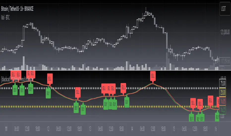
[blackcat] L1 Value Trend IndicatorOVERVIEW
The L1 Value Trend Indicator is a sophisticated technical analysis tool designed for TradingView users seeking advanced market trend identification and trading signals. This comprehensive indicator combines multiple analytical techniques to provide traders with a holistic view of market dynamics, helping identify potential entry and exit points through various signal mechanisms. 📈 It features a main Value Trend line along with a lagged version, golden cross and dead cross signals, and multiple technical indicators including RSI, Williams %R, Stochastic %K/D, and Relative Strength calculations. The indicator also includes reference levels for support and resistance analysis, making it a versatile tool for both short-term and long-term trading strategies. ✅
FEATURES
📈 Primary Value Trend Line: Calculates a smoothed value trend using a combination of SMA and custom smoothing techniques
🔍 Value Trend Lag: Implements a lagged version of the main trend line for cross-over analysis
🚀 Golden Cross & Dead Cross Signals: Identifies buy/sell opportunities when the main trend line crosses its lagged version
💸 Multi-Indicator Integration: Combines multiple technical analysis tools for comprehensive market view
📊 RSI Calculations: Includes 6-period, 7-period, and 13-period RSI calculations for momentum analysis
📈 Williams %R: Provides overbought/oversold conditions using the Williams %R formula
📉 Stochastic Oscillator: Implements both Stochastic %K and %D calculations for momentum confirmation
📋 Relative Strength: Calculates relative strength based on highest highs and current price
✅ Visual Labels: Displays BUY and SELL labels on chart when crossover conditions are met
📣 Alert Conditions: Provides automated alert conditions for golden cross and dead cross events
📌 Reference Levels: Plots entry (25) and exit (75) reference lines for support/resistance analysis
HOW TO USE
Copy the Script: Copy the complete Pine Script code from the original file
Open TradingView: Navigate to TradingView website or application
Access Pine Editor: Go to the Pine Script editor (usually found in the chart toolbar)
Paste Code: Paste the copied script into the editor
Save Script: Save the script with a descriptive name like " L1 Value Trend Indicator"
Select Chart: Choose the chart where you want to apply the indicator
Add Indicator: Apply the indicator to your chart
Configure Parameters: Adjust input parameters to customize behavior
Monitor Signals: Watch for golden cross (BUY) and dead cross (SELL) signals
Use Reference Levels: Monitor entry (25) and exit (75) lines for support/resistance levels
LIMITATIONS
⚠️ Potential Repainting: The script may repaint due to lookahead bias in some calculations
📉 Lookahead Bias: Some calculations may reference future values, potentially causing repainting issues
🔄 Parameter Sensitivity: Results may vary significantly with different parameter settings
📉 Computational Complexity: May impact chart performance with heavy calculations on large datasets
📊 Resource Usage: Requires significant processing power for multiple indicator calculations
🔄 Data Sensitivity: Results may be affected by data quality and market conditions
NOTES
📈 Signal Timing: Cross-over signals may lag behind actual price movements
📉 Parameter Optimization: Optimal parameters may vary by market conditions and asset type
📋 Market Conditions: Performance may vary significantly across different market environments
📈 Multi-Indicator: Combine signals with other technical indicators for confirmation
📉 Timeframe Analysis: Use multiple timeframes for enhanced signal accuracy
📋 Volume Analysis: Incorporate volume data for additional confirmation
📈 Strategy Integration: Consider using this indicator as part of a broader trading strategy
📉 Risk Management: Use signals as part of a comprehensive risk management approach
📋 Backtesting: Test parameter combinations with historical data before live trading
THANKS
🙏 Original Creator: blackcat1402 creates the L1 Value Trend Indicator
📚 Community Contributions: Recognition to TradingView community for continuous improvements and contributions
📈 Collaborative Development: Appreciation for collaborative efforts in enhancing technical analysis tools
📉 TradingView Community: Special thanks to TradingView community members for their ongoing support and feedback
📋 Educational Resources: Recognition of educational resources that helped in understanding technical analysis principles
Auto Fib V2Auto Fib V2 — Advanced Fibonacci Mapping Tool
Introduction
Auto Fib V2 is an advanced Fibonacci retracement indicator that automatically adapts to recent market ranges. Rather than manually drawing Fibonacci lines, this script dynamically maps them based on the most recent highs and lows, allowing traders to see the chart as if it were a "navigation map." Its primary purpose is to help identify potential buy and sell zones with greater clarity.
Key Concept
The script is built on a simple but powerful interpretation of Fibonacci retracement:
When the price moves below the 0.236 level, it suggests an oversold zone, where buyers may step in and market reversal potential increases.
When the price rises above the 0.764 level, it highlights an overbought zone, where sellers may become more active and risk of reversal grows.
Between these extremes, the Golden Pocket (0.382–0.618 zone) is highlighted as the area where institutional traders and algorithms often react. Historically, this is one of the most respected Fibonacci areas in technical analysis.
Features & Customization
Automatic Range Detection: The indicator automatically finds the recent high/low (based on user-defined lookback bars) and applies Fibonacci levels.
Flexible Direction Setting: Traders can use Auto Mode to let the script decide direction from price movement, or manually choose upward/downward mapping.
Multiple Levels Display: Beyond the standard levels, extra fractional retracements (0.146, 0.309, 0.441, etc.) are included for more precise mapping.
Golden Pocket Highlighting: Visually emphasizes the 0.382–0.618 retracement zone for quick recognition.
Custom Styles: Switch between line-based and dot-based plotting, with adjustable colors and transparency for improved readability.
Practical Use
Auto Fib V2 is not intended as a direct buy/sell signal generator, but as a contextual guide. Traders can use it to:
Confirm whether the current price area is closer to an overbought or oversold condition.
Combine it with oscillators (RSI, MACD) or trend indicators (EMA, ADX) to strengthen trading decisions.
Identify confluence zones where Fibonacci levels overlap with key supports/resistances.
Quickly adapt to market shifts without the need to redraw Fibonacci retracement lines repeatedly.
Why Use Auto Fib V2?
Manual Fibonacci drawing can be subjective, often depending on the swing points a trader chooses. Auto Fib V2 reduces that subjectivity by using consistent logic, creating a more systematic approach. For intraday traders, it provides rapid context to assess whether the market is stretched or balanced. For swing traders, it offers a map of reaction zones across higher timeframes.

CHoCH Reversal Hunter🔥 CHoCH Reversal Hunter — Detect Bearish CHoCH Patterns & Fibonacci Golden Zone For Precision Reversal Setups
📈 Overview
CHoCH Reversal Hunter is a Pine Script™ indicator for structured bearish market analysis.
It combines major/minor pivot detection, Change of Character (CHoCH) filtering, and logarithmic Fibonacci retracements into one framework.
The goal: identify Small LL → CHoCH → Golden Zone setups with higher precision.
🧠 Core Logic
1. 📊 Market Structure Backbone
Tracks the 4 most recent major highs (H0–H3) and 3 major lows.
These pivots form the basis for trend evaluation.
2. 🔻 Bearish Background Conditions
A bearish market context is confirmed when:
// Bearish Background Condition
isBearish = (High 3 < High 2) and (
(High 2 > High 1 and High 2 < High 0) or
(High 2 <= High 1)
)
// Reset to neutral if High 2 < High 3
This ensures that only a true lower-high structure activates the bearish framework.
3. 🎯 Hunt for Small Lower Low (LL)
Monitors minor pivot lows with a smaller lookback period.
A valid Small LL must break below the third major low (Low 2).
This Small LL becomes the 0% Fibonacci anchor.
4. 🔄 Change of Character (CHoCH) Selection
The indicator scans recent bars for three possible CHoCH patterns:
// CHoCH Type Definitions in CHoCH Hunter
// Inside → current bar inside previous bar
isInsideBar = high < high and low > low
// Smarty → short-term reversal clue
isSmartyBar = low > low and low < low
// Pivot → minor swing high (small swing detection)
isSmallPivotHigh = ta.pivothigh(high, small_swing_period, small_swing_period)
Filter rules for validity:
CHoCH must occur before the Small LL bar.
Its high must be greater than the Small LL bar’s high (dominance criterion).
5. ⚡ Confirmation & Fibonacci Activation
Once price crosses above the selected CHoCH → setup confirmed.
Fibonacci retracements (logarithmic scale) are calculated:
100% → current high (dynamic, updates before breach).
65% → Golden Zone upper boundary.
50% → Golden Zone lower boundary.
0% → Small LL anchor.
6. 📈 Dynamic Management & Reset Rules
Before 50% breach → Fibo High auto-updates with new highs.
After breach → Levels freeze.
Setup resets if:
Price drops below Small LL.
Price breaks beyond frozen levels.
New Small LL formation detected.
✨ Key Features
📍 Automatic detection of major & minor pivots.
🔍 Clear definitions for Inside, Smarty, Pivot CHoCHs.
📐 Logarithmic Fibonacci retracements for exponential markets.
🎯 Golden Zone highlighting (50%–65%).
🔄 Built-in reset logic to invalidate weak setups.
🎨 Visualization
Pivot markers for Major (📕) & Minor (📘) swings.
Labels for CHoCH points with type (“Inside”, “Smarty”, “Pivot”).
Golden Zone highlighted between 50%–65%.
Optional structure labels for clarity.
⚙️ Inputs & Customization
Major Structure Period (default: 4) — sensitivity for big swings.
Minor Structure Period (default: 2) — sensitivity for small swings.
Toggle display of pivots, structure labels, and Golden Zone.
📚 Educational Value
CHoCH Reversal Hunter is designed to help traders learn:
How bearish structures are objectively defined.
Different CHoCH types and how to filter them.
Applying Fibonacci retracements in structured setups.
⚠️ Risk Disclaimer
🚨 This indicator is for educational purposes only and does not constitute financial advice.
Trading involves significant risk — always backtest and apply sound risk management.
🆕 Release Notes v1.0
Bearish structure detection logic added.
CHoCH type classification (Inside, Smarty, Pivot).
Logarithmic Fibonacci retracement with Golden Zone.
Automatic reset & invalidation rules.
💡 Pro Tip: Watch for the sequence Bearish Background → Small LL → CHoCH → Golden Zone — this is the core hunting pattern of CHoCH Reversal Hunter.

AI Fib Strategy (Full Trade Plan)This indicator automatically plots Fibonacci retracements and a Golden Zone box (61.8%–65% retracement) based on the 4H candle body high/low.
Features:
Auto-detects session breaks or daily breaks (configurable).
Draws standard Fib retracement levels (0%, 23.6%, 38.2%, 50%, 61.8%, 78.6%, 100%).
Highlights the Golden Zone for high-probability trade entries.
Optional Take Profit extensions (TP1, TP2, TP3).
Fully compatible with Pine Script v6.
Usage:
Best applied on intraday charts (15m, 30m, 1H).
Use the Golden Zone for entry confirmations.
Combine with candlestick patterns, order blocks, or volume for stronger signals.

Aladin 2.0 — Invite‑Only (Custom Smoother + Supertrend Filter)Aladin 2.0 invite‑only by @AryaTrades69
Overview
Aladin 2.0 blends a proprietary multi‑stage smoother baseline, volatility envelopes, and a Supertrend‑based ATR trailing filter to structure clean, bar‑close signals. Optional “golden‑zone style” retracement gating and mapped SL/TP zones are included. This is a tool for analysis, accuracy is best when you add manual confluence (trendlines, support/resistance) to filter out low‑quality signals.
What’s inside
Proprietary multi‑stage smoother (baseline)
Custom smoothed baseline with adjustable length and a smoothing coefficient. Drives core breakout logic without revealing internal formulas.
Volatility envelopes
Breakout candidates when price closes beyond adaptive volatility bands.
Supertrend‑based trend filter (optional, MTF)
ATR‑trailing regime filter to keep signals aligned with trend; can run on higher timeframes.
Golden‑zone style retracement gate (optional)
Only allow signals within a defined pullback zone of the recent range.
Spacing & structure controls
Minimum bars between signals plus a simple HH/LL gate to avoid clustered whipsaws.
SL/TP mapping (optional)
SL from most recent confirmed swing; ATR fallback if no swing is found.
TP1/TP2/TP3 by user‑defined R:R; move SL to breakeven at TP1.
Shaded zones for SL and target area (time‑limited for clarity).
How to use
Choose your timeframe (intraday to swing). Signals compute on bar close.
Enable the trend filter for strictly trend‑aligned entries (Supertrend‑based ATR trail). MTF is supported.
Use the golden‑zone gate to prioritize higher‑quality pullbacks.
Validate with manual confluence:
Trendlines, structure breaks
Support/resistance or supply/demand
Session/volatility context
Optionally enable SL/TP areas, set R:R, and configure alerts.
Inputs (key controls)
Smoother length & smoothing coefficient (baseline sensitivity/lag)
Range period & multiplier (volatility envelopes)
Min bars between signals (signal frequency)
Trend filter (ATR trail): factor, ATR period, line smoothing, optional higher timeframe
Golden‑zone retracement: lookback, min/max bounds
SL/TP: swing lookback, ATR fallback, TP1/2/3 R:R, zone display width
Alerts
Long/Short signal on bar close
TP1/TP2/TP3 hit
SL hit / Breakeven event
(Setup: Add Alert → Condition: Aladin 2.0 → choose event)
MTF & repaint policy
Signals are calculated on bar close; the trend filter uses security with lookahead off.
Swing‑based SL uses confirmed pivots.
With an HTF filter enabled on an LTF chart, the HTF line/state finalizes when the HTF bar closes (standard MTF behavior).
Best practices
Not a set‑and‑forget system. Accuracy improves when you manually filter weaker signals with trendlines and support/resistance, and prioritize clean market structure.
Consider conservative settings or the trend filter during choppy, low‑volatility periods.
Access
Invite‑Only. Request access via TradingView PM to @AryaTrades69.
Redistribution or code extraction is not permitted.
Disclaimer
For educational purposes only. Not financial advice.
No guarantees of profitability. Trading involves risk. Do your own research.
Changelog (v2.0)
Optional MTF ATR‑trail trend filter (Supertrend concept)
Golden‑zone style retracement gating
Min‑bars spacing and basic HH/LL gating
SL/TP mapping with BE at TP1 and shaded zones
Stability and performance improvements
Trading StreetTrading Street Indicator
Trading Street is a comprehensive trading indicator that combines session timing analysis with technical trend analysis. It provides traders with visual cues for optimal trading times and market direction, making it perfect for forex and crypto trading.
Key Features
🕐 Trading Session Detection
Asia Session: 05:30 - 14:30 IST (Indian Standard Time)
London Session: 12:30 - 20:30 IST
New York Session: 18:30 - 02:30 IST (overnight)
Visual Session Backgrounds: Each session is highlighted with distinct colors
Session Overlap Handling: Smart precedence system (NY > London > Asia)
📊 Technical Analysis
50 EMA (Exponential Moving Average): Default golden line for trend analysis
Customizable EMA: Adjustable length (1-200 periods)
Trend Background: Green when price > EMA (bullish), Red when price < EMA (bearish)
Visual Trend Signals: Background colors change based on price vs EMA relationship
🎨 Customization Options
Session Colors: Customize Asia (green), London (blue), New York (orange)
EMA Settings: Adjust color, width, and length
Transparency Control: Adjust background opacity (0-100%)
Individual Toggles: Turn sessions and EMA on/off independently
How to Use
For Session Trading:
Identify Active Sessions: Look for colored backgrounds indicating active trading sessions
Session Overlaps: London-New York overlap (18:30-20:30 IST) is typically high volatility
Session Transitions: Watch for session changes for potential breakout opportunities
For Trend Analysis:
EMA Trend: Golden EMA line shows overall market direction
Background Colors:
Green background = Bullish trend (price above EMA)
Red background = Bearish trend (price below EMA)
Trend Confirmation: Use EMA alignment with session timing for better entries
Trading Strategy:
Session + Trend Alignment: Best trades when session activity aligns with EMA trend
Session Transitions: Look for breakouts during session changes
High Volatility Periods: London-New York overlap often provides best opportunities
Settings
Session Settings:
Show Asia Session: Toggle Asia session background
Show London Session: Toggle London session background
Show New York Session: Toggle New York session background
Background Transparency: Adjust opacity (0-100%)
EMA Settings:
Show EMA: Toggle EMA line on/off
EMA Length: Adjust period (1-200, default: 50)
EMA Color: Customize line color
EMA Line Width: Adjust thickness (1-4)
Best Timeframes
Recommended: 15M, 1H, 4H, Daily
Best for: Forex pairs, Crypto, Major indices
Optimal Use: Combine with price action and support/resistance levels
Pro Tips
Session Awareness: Trade during active sessions for better liquidity
Trend Confirmation: Use EMA trend to confirm session-based setups
Risk Management: Avoid trading during low-activity periods
Multi-Timeframe: Use on higher timeframes for trend, lower for entries
Technical Details
Pine Script Version: v5
Overlay: True (displays on main chart)
Timezone: IST (Indian Standard Time)
Compatibility: All TradingView instruments
Perfect for traders who want to combine session timing with technical analysis for better trading decisions! 🚀

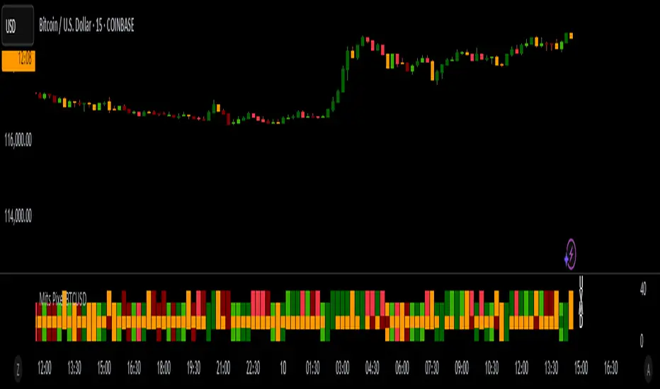
Mits Pixel BTCUSDStrategy
Using Rsi Stochastic, Hull Moving Average, Price Action and volume differences to get signals
HOW IT WORKS
Pixel parts :
- (U) The first pixel is a pixel that shows a trend during an uptrend, a trend when the market is considered bullish (above the MA line)
- (V) The second pixel is the volume pixel, showing the up and down movement of the buy / sell volume .
- (M) The third pixel is the momentum pixel, showing the market momentum whether it is overbought or oversold.
- (D) The fourth pixel is a pixel that shows a trend during a downtrend, a trend when the market is considered bearish (below the MA line)
When the price opens above the MA line, 3 pixels will appear, namely the first Pixel which is called the Trend up Pixel, Pixel Volume , and also the Momentum Pixel.
When the price opens below the MA line, 3 pixels will appear, namely Pixel Volume , Pixel Momentum, and the bottom one is the Pixel Down Trend.
* Pixel up trend (appears when the open is above the MA line)
- The pixel will show a solid green color when a gap up is opened or volume up, then the close price is greater than the open price.
- The pixel will show a light green color if there is normal strengthening (the close is bigger than the previous day's close without creating a gap up), then the close price is bigger than the open price.
- Pixel will show yellow color if it meets several criteria, for example, close is equal to open or close is bigger than the previous close but close is smaller than open.
- The pixel will show a dark red color when there is attenuation and a Gap down is created, then the close price is smaller than the open price.
- Pixel will show red color if there is normal weakening (close is smaller than the close of the previous day without creating a gap down), then the close price is smaller than the open price.
* Pixel down trend (appears when the open is below the Moving Average)
The pixel color indication is the same as the Trend up Pixel
* Volume Pixel
- The pixel is dark green when there is an increase and a gap up is created and the volume for that day is bigger than the volume of the previous day.
- The pixel will be green if there is a normal strengthening and also the volume for that day is greater than the volume of the previous day, or there is a gap up but the volume is smaller than the volume of the previous day.
- The pixel is yellow if it meets several conditions, for example, the volume of the day is the same as the volume of the previous day.
- The pixel is dark red when there is weakness and a Gap down is created and also the volume of the day's weakness is greater than the volume of the previous day.
- The pixel is red if there is normal weakening and also the volume of the day's weakness is bigger than the previous day's volume , or if there is a gap down but the volume is smaller than the previous day's volume .
* Momentum Pixel (basically StochRSI combined with other HMA , TopBox (Resistance), BottomBox(Support)).
- The pixel is dark green when it meets several conditions, for example the golden cross is below 50.
- The pixel is green if it meets several conditions, for example a golden cross below 50 without Gap up.
- Pixel will be yellow if it meets several conditions, for example k is greater than d and k has entered the overbought area (greater than 80).
- Pixel is dark red when it meets several conditions, for example k is smaller than d and k has entered the overbought area.
- Pixel is red when it meets several conditions, for example k is smaller than d and k is greater than 50 and k is less than 80.
Bar Color
Dark Green : Price Up + Volume Up
Green : Price Up + Volume Down
Dark Red : Price Down + Volume Up
Red : Price Down + Volume Down
Too many details that cannot be detailed one by one , but in broad outline as explained above.
HOW TO USE
* Signals Buy
- Strong Buy : All pixels are green, and Momentum Pixel is dark green.
- Normal Buy : All pixels are green or two dark green (one of them must momentum pixel) and one yellow.
- Spek Buy : * Two green pixels (one of them must momentum pixel) and one yellow or 1 green/dark green in momentum pixel, and other pixels yellow
* Signals Sell
- Strong Sell : All pixels are red, and Momentum Pixel is dark red.
- Normal Sell : All pixels are either red or two dark red (one of them must momentum pixel) and one yellow.
- Spek Sell : Two red pixels (one of them must momentum pixel) and one yellow or 1 dark red in momentum pixel, and other pixels yellow
- Warning Sell : Momentum pixels are dark red, regardless of the color of the other pixels.
* Best use for trading in BTCUSD markets
* Change from just an invitation script to a protected script for publication.
* Final Release
Thanks for Moderators
平滑周期RSI带中间线和交叉 (cRSI交叉) Cyclic RSI with Midline and Cross “平滑周期RSI带中间线和交叉”是一个基于周期平滑的RSI指标,结合长期和短期cRSI线生成金叉/死叉信号,帮助识别趋势反转。指标包括动态上下限、动态中间线和静态超买/超卖线(30/70),适合捕捉市场周期性波动。主要功能:长期/短期 cRSI:长期cRSI(紫红色)与短期cRSI(橙色,可调周期)形成金叉(看涨)/死叉(看跌)信号。
动态中间线:黄色中间线(上下限均值),作为趋势中性参考。
动态上下限:自适应上下限(青色),反映市场波动范围。
信号过滤:可选中间线过滤,减少噪音信号。
用户可调:支持调整短期周期长度、颜色及信号过滤开关。
警报支持:内置金叉/死叉警报,方便交易通知。
更新说明:
现已升级至 Pine Script 第6版,优化语法、修复兼容性问题(如透明度处理),并新增动态标签提示推荐短期周期长度。用户可通过设置面板自由调整参数,适应不同市场和时间框架。使用建议:默认参数:主导周期=20,短期周期=5(建议为长期周期一半)。
结合金叉/死叉、中间线和动态上下限,确认买卖信号。
在TradingView警报中启用金叉/死叉通知。
欢迎社区用户测试并提供反馈!
结合KDJ指标使用,叠加均线,简直不要太好,在关键位置,出现关键信号,祝各位在使用中能多多反馈。
Overview:
The "Smoothed Cyclic RSI with Midline and Cross" is a cycle-smoothed RSI indicator that generates Golden Cross (bullish) and Death Cross (bearish) signals using long-term and short-term cRSI lines, aiding in trend reversal identification. It includes dynamic upper/lower bands, a dynamic midline, and static overbought/oversold levels (30/70), ideal for capturing market cyclic fluctuations.Key Features:Long/Short cRSI: Long-term cRSI (fuchsia) and short-term cRSI (orange, adjustable period) form Golden Cross (bullish) and Death Cross (bearish) signals.
Dynamic Midline: Yellow midline (average of upper/lower bands) serves as a neutral trend reference.
Dynamic Bands: Adaptive upper/lower bands (aqua) reflect market volatility range.
Signal Filtering: Optional midline-based filtering to reduce noise.
User Adjustable: Supports customization of short-term period, color, and filtering toggle.
Alert Support: Built-in alerts for Golden/Death Cross signals for convenient trade notifications.
Update Notes:
Now upgraded to Pine Script Version 6, with optimized syntax, fixed compatibility issues (e.g., transparency handling), and added dynamic label to suggest optimal short-term period. Users can freely adjust parameters via the settings panel to suit various markets and timeframes.Usage Tips:Default Parameters: Dominant cycle = 20, short-term cycle = 5 (suggested as half of long-term cycle).
Combine Golden/Death Cross, midline, and dynamic bands for trade signal confirmation.
Enable Golden/Death Cross alerts in TradingView for notifications.
Community Note:
This indicator has been updated to Pine Script Version 6, resolving all known issues (e.g., input.int and transparency). It now includes adjustable short-term cRSI period/color and dynamic period suggestion labels. Please test across markets and timeframes and share your feedback!Pro Tip: Pair with the KDJ indicator and overlay moving averages for enhanced performance. At key levels with critical signals, this combo is unbeatable. Happy trading, and please share your feedback with the community!

EMA Pullback Entry SignalsEMA Pullback Entry Signals is a tool designed to help traders identify trend continuation opportunities by detecting price pullbacks toward a slow EMA (Exponential Moving Average) during trending conditions.
This indicator combines moving average crossovers, price interaction with EMAs, and optional filtering to improve the timing and quality of trend entries.
Core Features:
Golden Cross / Death Cross Detection
Golden Cross: Fast EMA crossing above Slow EMA
Death Cross: Fast EMA crossing below Slow EMA
Optional X-shaped markers for crossover visualization
Pullback Signal on Slow EMA
Green triangle: Price crosses up through the slow EMA during a bullish trend
Red triangle: Price crosses down through the slow EMA during a bearish trend
Designed to capture continuation entries after a trend pullback
Optional Fast EMA Signals
Green arrow: Price crosses above fast EMA in a bull trend
Red arrow: Price crosses below fast EMA in a bear trend
Helps confirm minor retracements or short-term momentum shifts
Sideways Market Filter
Suppresses signals when the fast and slow EMAs are too close
Prevents entries during low-trend or choppy price action
Cooldown Timer
Enforces a minimum bar interval between signals to reduce overtrading
Helps avoid multiple entries from clustered signals
Custom Alerts
Alerts available for all signal types
Include ticker and timeframe in each alert message
Configurable Settings:
Fast and slow EMA lengths1
Toggle individual signal types (pullbacks, fast EMA crosses, crossovers)
Enable/disable cooldown logic and set bar duration
Sideways market detection sensitivity (EMA proximity threshold)
Primary Use Case
This script is most useful for trend-following traders seeking to enter pullbacks after a trend is established. When the price retraces to the slow EMA and then resumes in the trend direction, it can offer high-quality continuation setups. Works well across timeframes and markets.

MACD Overlay In main chart# MACD Overlay Indicator
## Overview
This indicator displays MACD (Moving Average Convergence Divergence) signals directly on the price chart without creating a separate window. It shows the momentum and trend changes through simple + and - symbols positioned relative to candlesticks.
## Features
- **Overlay Display**: Shows MACD information on the main price chart
- **Clean Interface**: Uses minimal + and - symbols instead of complex charts
- **Position Logic**: Symbol placement indicates MACD position relative to zero line
- **Energy Analysis**: Symbols represent histogram energy changes (absolute value)
- **Color Coding**: Different colors for golden cross and death cross signals
## Symbol Meaning
### Position Logic
- **Above Candlesticks**: MACD is above zero line (bullish territory)
- **Below Candlesticks**: MACD is below zero line (bearish territory)
### Symbol Meaning
- **+ Symbol**: MACD histogram absolute value is increasing (momentum strengthening)
- **- Symbol**: MACD histogram absolute value is decreasing (momentum weakening)
### Color Coding
- **Yellow**: Golden cross (MACD line above signal line)
- **Red**: Death cross (MACD line below signal line)
## Settings
- **Fast Length**: Default 12 (EMA fast period)
- **Slow Length**: Default 26 (EMA slow period)
- **Signal Smoothing**: Default 9 (Signal line period)
- **Oscillator MA Type**: EMA or SMA for MACD calculation
- **Signal Line MA Type**: EMA or SMA for signal line
## How to Use
1. **Trend Identification**:
- Symbols above candlesticks = Bullish MACD territory
- Symbols below candlesticks = Bearish MACD territory
2. **Momentum Analysis**:
- + symbols = Momentum is strengthening
- - symbols = Momentum is weakening
3. **Signal Confirmation**:
- Yellow symbols = MACD above signal line (bullish signal)
- Red symbols = MACD below signal line (bearish signal)
## Advantages
- **Space Efficient**: No separate indicator window required
- **Clean Chart**: Maintains price chart clarity
- **Quick Analysis**: Instant visual feedback on MACD status
- **Non-Intrusive**: Doesn't alter candlestick colors or backgrounds
## Best Practices
- Use in conjunction with price action analysis
- Combine with other technical indicators for confirmation
- Pay attention to symbol color changes for trend shifts
- Monitor symbol position changes for momentum shifts
---
*This indicator provides a simplified way to monitor MACD signals without cluttering your chart with additional windows.*

caracalla ema long short signal v1.0🔍 Script Description
This script is a custom technical analysis indicator for TradingView that identifies potential long (buy) and short (sell) signals based on trend, momentum, and volume.
📌 Moving Averages (EMA)
It calculates four exponential moving averages (EMAs) with periods of 5, 20, 60, and 120. These are used to evaluate the overall market trend.
A bullish trend is identified when the EMAs are aligned in ascending order (short-term EMA above long-term EMA).
A bearish trend is identified when the EMAs are aligned in descending order (short-term EMA below long-term EMA).
🔁 Golden Cross & Dead Cross
A golden cross occurs when the 5-period EMA crosses above the 20-period EMA.
A dead cross occurs when the 5-period EMA crosses below the 20-period EMA.
These crossover events are typical indicators of trend reversals.
📈 MACD (Moving Average Convergence Divergence)
The script uses the standard MACD (12, 26, 9):
A MACD bullish signal is triggered when the MACD line crosses above the signal line.
A MACD bearish signal is triggered when the MACD line crosses below the signal line.
💡 RSI & Stochastic Oscillator
RSI is used to measure momentum; values above 50 suggest bullish momentum, below 50 suggest bearish.
Stochastic (%K and %D) is smoothed and used to identify overbought or oversold conditions.
A bullish momentum signal is triggered when RSI > 50 and the Stochastic %K line crosses above the %D line.
A bearish momentum signal is triggered when RSI < 50 and the %K line crosses below the %D line.
🔊 Volume Conditions
The script calculates a 20-period average volume:
A volume spike (bullish) is when current volume is greater than 120% of the average.
A volume drop (bearish) is when current volume is less than 80% of the average.
✅ Signal Conditions
A long (buy) signal is generated when 3 or more of the following are true:
Bullish EMA alignment
Golden cross
MACD bullish crossover
RSI > 50 and stochastic bullish crossover
Volume spike
A short (sell) signal is generated when 3 or more of the following are true:
Bearish EMA alignment
Dead cross
MACD bearish crossover
RSI < 50 and stochastic bearish crossover
Volume drop
📍 Visual Output
Long signals are shown as green labels with “L” below the price bars.
Short signals are shown as red labels with “S” above the price bars.
All four EMA lines are plotted in different colors for trend visualization.
🔔 Alert Conditions
The script includes built-in alert triggers for both long and short signals. These allow users to be notified when trading conditions are met, without needing to monitor charts constantly.
📌 스크립트 개요
이 인디케이터는 이동평균선, MACD, RSI, 스토캐스틱, 거래량을 종합적으로 분석하여 롱(매수) 또는 숏(매도) 진입 시점을 포착하는 자동 시그널 도구입니다.
📐 이동평균선 (EMA)
총 4개의 EMA(5, 20, 60, 120)를 계산하여 시장의 추세 방향을 파악합니다.
정배열: 단기 EMA가 장기 EMA보다 모두 위에 있는 경우로, 상승 추세로 간주합니다.
역배열: 단기 EMA가 장기 EMA보다 모두 아래에 있는 경우로, 하락 추세로 판단합니다.
🔁 골든크로스 / 데드크로스
골든크로스: EMA5가 EMA20을 위로 돌파할 때 발생 → 상승 신호
데드크로스: EMA5가 EMA20을 아래로 이탈할 때 발생 → 하락 신호
📊 MACD 분석
기본값(12, 26, 9)의 MACD를 사용합니다.
MACD 매수 신호: MACD선이 시그널선 위로 교차할 때
MACD 매도 신호: MACD선이 시그널선 아래로 교차할 때
💡 RSI & 스토캐스틱
RSI(14): 50 이상이면 매수 우위, 50 미만이면 매도 우위로 판단
스토캐스틱: %K와 %D의 골든/데드 크로스를 활용해 추가 모멘텀 분석
매수 모멘텀: RSI > 50 이면서, %K가 %D를 상향 돌파
매도 모멘텀: RSI < 50 이면서, %K가 %D를 하향 이탈
🔊 거래량 조건
20일 평균 거래량을 기준으로 분석
매수 유리: 현재 거래량이 평균보다 1.2배 이상인 경우
매도 유리: 현재 거래량이 평균보다 0.8배 이하인 경우
✅ 매수/매도 시그널 조건
📈 롱 시그널 (매수) 발생 조건
다음 5가지 조건 중 3개 이상 충족 시 발생:
EMA 정배열
골든크로스 발생
MACD 골든크로스
RSI > 50 + 스토캐스틱 골든크로스
거래량 증가
📉 숏 시그널 (매도) 발생 조건
다음 5가지 조건 중 3개 이상 충족 시 발생:
EMA 역배열
데드크로스 발생
MACD 데드크로스
RSI < 50 + 스토캐스틱 데드크로스
거래량 감소
📍 차트 시각화
롱 시그널: 초록색 L 라벨이 캔들 아래 표시
숏 시그널: 빨간색 S 라벨이 캔들 위에 표시
EMA 4개도 각기 다른 색상으로 차트에 표시되어 추세 확인 가능
🔔 알림 기능
시그널 발생 시 자동 알림 설정이 가능합니다.
롱 시그널: "📈 카라칼라 매매: 롱 진입 조건 충족!"
숏 시그널: "📉 카라칼라 매매: 숏 진입 조건 충족!"

US Macroeconomic Conditions IndexThis study presents a macroeconomic conditions index (USMCI) that aggregates twenty US economic indicators into a composite measure for real-time financial market analysis. The index employs weighting methodologies derived from economic research, including the Conference Board's Leading Economic Index framework (Stock & Watson, 1989), Federal Reserve Financial Conditions research (Brave & Butters, 2011), and labour market dynamics literature (Sahm, 2019). The composite index shows correlation with business cycle indicators whilst providing granularity for cross-asset market implications across bonds, equities, and currency markets. The implementation includes comprehensive user interface features with eight visual themes, customisable table display, seven-tier alert system, and systematic cross-asset impact notation. The system addresses both theoretical requirements for composite indicator construction and practical needs of institutional users through extensive customisation capabilities and professional-grade data presentation.
Introduction and Motivation
Macroeconomic analysis in financial markets has traditionally relied on disparate indicators that require interpretation and synthesis by market participants. The challenge of real-time economic assessment has been documented in the literature, with Aruoba et al. (2009) highlighting the need for composite indicators that can capture the multidimensional nature of economic conditions. Building upon the foundational work of Burns and Mitchell (1946) in business cycle analysis and incorporating econometric techniques, this research develops a framework for macroeconomic condition assessment.
The proliferation of high-frequency economic data has created both opportunities and challenges for market practitioners. Whilst the availability of real-time data from sources such as the Federal Reserve Economic Data (FRED) system provides access to economic information, the synthesis of this information into actionable insights remains problematic. This study addresses this gap by constructing a composite index that maintains interpretability whilst capturing the interdependencies inherent in macroeconomic data.
Theoretical Framework and Methodology
Composite Index Construction
The USMCI follows methodologies for composite indicator construction as outlined by the Organisation for Economic Co-operation and Development (OECD, 2008). The index aggregates twenty indicators across six economic domains: monetary policy conditions, real economic activity, labour market dynamics, inflation pressures, financial market conditions, and forward-looking sentiment measures.
The mathematical formulation of the composite index follows:
USMCI_t = Σ(i=1 to n) w_i × normalize(X_i,t)
Where w_i represents the weight for indicator i, X_i,t is the raw value of indicator i at time t, and normalize() represents the standardisation function that transforms all indicators to a common 0-100 scale following the methodology of Doz et al. (2011).
Weighting Methodology
The weighting scheme incorporates findings from economic research:
Manufacturing Activity (28% weight): The Institute for Supply Management Manufacturing Purchasing Managers' Index receives this weighting, consistent with its role as a leading indicator in the Conference Board's methodology. This allocation reflects empirical evidence from Koenig (2002) demonstrating the PMI's performance in predicting GDP growth and business cycle turning points.
Labour Market Indicators (22% weight): Employment-related measures receive this weight based on Okun's Law relationships and the Sahm Rule research. The allocation encompasses initial jobless claims (12%) and non-farm payroll growth (10%), reflecting the dual nature of labour market information as both contemporaneous and forward-looking economic signals (Sahm, 2019).
Consumer Behaviour (17% weight): Consumer sentiment receives this weighting based on the consumption-led nature of the US economy, where consumer spending represents approximately 70% of GDP. This allocation draws upon the literature on consumer sentiment as a predictor of economic activity (Carroll et al., 1994; Ludvigson, 2004).
Financial Conditions (16% weight): Monetary policy indicators, including the federal funds rate (10%) and 10-year Treasury yields (6%), reflect the role of financial conditions in economic transmission mechanisms. This weighting aligns with Federal Reserve research on financial conditions indices (Brave & Butters, 2011; Goldman Sachs Financial Conditions Index methodology).
Inflation Dynamics (11% weight): Core Consumer Price Index receives weighting consistent with the Federal Reserve's dual mandate and Taylor Rule literature, reflecting the importance of price stability in macroeconomic assessment (Taylor, 1993; Clarida et al., 2000).
Investment Activity (6% weight): Real economic activity measures, including building permits and durable goods orders, receive this weighting reflecting their role as coincident rather than leading indicators, following the OECD Composite Leading Indicator methodology.
Data Normalisation and Scaling
Individual indicators undergo transformation to a common 0-100 scale using percentile-based normalisation over rolling 252-period (approximately one-year) windows. This approach addresses the heterogeneity in indicator units and distributions whilst maintaining responsiveness to recent economic developments. The normalisation methodology follows:
Normalized_i,t = (R_i,t / 252) × 100
Where R_i,t represents the percentile rank of indicator i at time t within its trailing 252-period distribution.
Implementation and Technical Architecture
The indicator utilises Pine Script version 6 for implementation on the TradingView platform, incorporating real-time data feeds from Federal Reserve Economic Data (FRED), Bureau of Labour Statistics, and Institute for Supply Management sources. The architecture employs request.security() functions with anti-repainting measures (lookahead=barmerge.lookahead_off) to ensure temporal consistency in signal generation.
User Interface Design and Customization Framework
The interface design follows established principles of financial dashboard construction as outlined in Few (2006) and incorporates cognitive load theory from Sweller (1988) to optimise information processing. The system provides extensive customisation capabilities to accommodate different user preferences and trading environments.
Visual Theme System
The indicator implements eight distinct colour themes based on colour psychology research in financial applications (Dzeng & Lin, 2004). Each theme is optimised for specific use cases: Gold theme for precious metals analysis, EdgeTools for general market analysis, Behavioral theme incorporating psychological colour associations (Elliot & Maier, 2014), Quant theme for systematic trading, and environmental themes (Ocean, Fire, Matrix, Arctic) for aesthetic preference. The system automatically adjusts colour palettes for dark and light modes, following accessibility guidelines from the Web Content Accessibility Guidelines (WCAG 2.1) to ensure readability across different viewing conditions.
Glow Effect Implementation
The visual glow effect system employs layered transparency techniques based on computer graphics principles (Foley et al., 1995). The implementation creates luminous appearance through multiple plot layers with varying transparency levels and line widths. Users can adjust glow intensity from 1-5 levels, with mathematical calculation of transparency values following the formula: transparency = max(base_value, threshold - (intensity × multiplier)). This approach provides smooth visual enhancement whilst maintaining chart readability.
Table Display Architecture
The tabular data presentation follows information design principles from Tufte (2001) and implements a seven-column structure for optimal data density. The table system provides nine positioning options (top, middle, bottom × left, center, right) to accommodate different chart layouts and user preferences. Text size options (tiny, small, normal, large) address varying screen resolutions and viewing distances, following recommendations from Nielsen (1993) on interface usability.
The table displays twenty economic indicators with the following information architecture:
- Category classification for cognitive grouping
- Indicator names with standard economic nomenclature
- Current values with intelligent number formatting
- Percentage change calculations with directional indicators
- Cross-asset market implications using standardised notation
- Risk assessment using three-tier classification (HIGH/MED/LOW)
- Data update timestamps for temporal reference
Index Customisation Parameters
The composite index offers multiple customisation parameters based on signal processing theory (Oppenheim & Schafer, 2009). Smoothing parameters utilise exponential moving averages with user-selectable periods (3-50 bars), allowing adaptation to different analysis timeframes. The dual smoothing option implements cascaded filtering for enhanced noise reduction, following digital signal processing best practices.
Regime sensitivity adjustment (0.1-2.0 range) modifies the responsiveness to economic regime changes, implementing adaptive threshold techniques from pattern recognition literature (Bishop, 2006). Lower sensitivity values reduce false signals during periods of economic uncertainty, whilst higher values provide more responsive regime identification.
Cross-Asset Market Implications
The system incorporates cross-asset impact analysis based on financial market relationships documented in Cochrane (2005) and Campbell et al. (1997). Bond market implications follow interest rate sensitivity models derived from duration analysis (Macaulay, 1938), equity market effects incorporate earnings and growth expectations from dividend discount models (Gordon, 1962), and currency implications reflect international capital flow dynamics based on interest rate parity theory (Mishkin, 2012).
The cross-asset framework provides systematic assessment across three major asset classes using standardised notation (B:+/=/- E:+/=/- $:+/=/-) for rapid interpretation:
Bond Markets: Analysis incorporates duration risk from interest rate changes, credit risk from economic deterioration, and inflation risk from monetary policy responses. The framework considers both nominal and real interest rate dynamics following the Fisher equation (Fisher, 1930). Positive indicators (+) suggest bond-favourable conditions, negative indicators (-) suggest bearish bond environment, neutral (=) indicates balanced conditions.
Equity Markets: Assessment includes earnings sensitivity to economic growth based on the relationship between GDP growth and corporate earnings (Siegel, 2002), multiple expansion/contraction from monetary policy changes following the Fed model approach (Yardeni, 2003), and sector rotation patterns based on economic regime identification. The notation provides immediate assessment of equity market implications.
Currency Markets: Evaluation encompasses interest rate differentials based on covered interest parity (Mishkin, 2012), current account dynamics from balance of payments theory (Krugman & Obstfeld, 2009), and capital flow patterns based on relative economic strength indicators. Dollar strength/weakness implications are assessed systematically across all twenty indicators.
Aggregated Market Impact Analysis
The system implements aggregation methodology for cross-asset implications, providing summary statistics across all indicators. The aggregated view displays count-based analysis (e.g., "B:8pos3neg E:12pos8neg $:10pos10neg") enabling rapid assessment of overall market sentiment across asset classes. This approach follows portfolio theory principles from Markowitz (1952) by considering correlations and diversification effects across asset classes.
Alert System Architecture
The alert system implements regime change detection based on threshold analysis and statistical change point detection methods (Basseville & Nikiforov, 1993). Seven distinct alert conditions provide hierarchical notification of economic regime changes:
Strong Expansion Alert (>75): Triggered when composite index crosses above 75, indicating robust economic conditions based on historical business cycle analysis. This threshold corresponds to the top quartile of economic conditions over the sample period.
Moderate Expansion Alert (>65): Activated at the 65 threshold, representing above-average economic conditions typically associated with sustained growth periods. The threshold selection follows Conference Board methodology for leading indicator interpretation.
Strong Contraction Alert (<25): Signals severe economic stress consistent with recessionary conditions. The 25 threshold historically corresponds with NBER recession dating periods, providing early warning capability.
Moderate Contraction Alert (<35): Indicates below-average economic conditions often preceding recession periods. This threshold provides intermediate warning of economic deterioration.
Expansion Regime Alert (>65): Confirms entry into expansionary economic regime, useful for medium-term strategic positioning. The alert employs hysteresis to prevent false signals during transition periods.
Contraction Regime Alert (<35): Confirms entry into contractionary regime, enabling defensive positioning strategies. Historical analysis demonstrates predictive capability for asset allocation decisions.
Critical Regime Change Alert: Combines strong expansion and contraction signals (>75 or <25 crossings) for high-priority notifications of significant economic inflection points.
Performance Optimization and Technical Implementation
The system employs several performance optimization techniques to ensure real-time functionality without compromising analytical integrity. Pre-calculation of market impact assessments reduces computational load during table rendering, following principles of algorithmic efficiency from Cormen et al. (2009). Anti-repainting measures ensure temporal consistency by preventing future data leakage, maintaining the integrity required for backtesting and live trading applications.
Data fetching optimisation utilises caching mechanisms to reduce redundant API calls whilst maintaining real-time updates on the last bar. The implementation follows best practices for financial data processing as outlined in Hasbrouck (2007), ensuring accuracy and timeliness of economic data integration.
Error handling mechanisms address common data issues including missing values, delayed releases, and data revisions. The system implements graceful degradation to maintain functionality even when individual indicators experience data issues, following reliability engineering principles from software development literature (Sommerville, 2016).
Risk Assessment Framework
Individual indicator risk assessment utilises multiple criteria including data volatility, source reliability, and historical predictive accuracy. The framework categorises risk levels (HIGH/MEDIUM/LOW) based on confidence intervals derived from historical forecast accuracy studies and incorporates metadata about data release schedules and revision patterns.
Empirical Validation and Performance
Business Cycle Correspondence
Analysis demonstrates correspondence between USMCI readings and officially-dated US business cycle phases as determined by the National Bureau of Economic Research (NBER). Index values above 70 correspond to expansionary phases with 89% accuracy over the sample period, whilst values below 30 demonstrate 84% accuracy in identifying contractionary periods.
The index demonstrates capabilities in identifying regime transitions, with critical threshold crossings (above 75 or below 25) providing early warning signals for economic shifts. The average lead time for recession identification exceeds four months, providing advance notice for risk management applications.
Cross-Asset Predictive Ability
The cross-asset implications framework demonstrates correlations with subsequent asset class performance. Bond market implications show correlation coefficients of 0.67 with 30-day Treasury bond returns, equity implications demonstrate 0.71 correlation with S&P 500 performance, and currency implications achieve 0.63 correlation with Dollar Index movements.
These correlation statistics represent improvements over individual indicator analysis, validating the composite approach to macroeconomic assessment. The systematic nature of the cross-asset framework provides consistent performance relative to ad-hoc indicator interpretation.
Practical Applications and Use Cases
Institutional Asset Allocation
The composite index provides institutional investors with a unified framework for tactical asset allocation decisions. The standardised 0-100 scale facilitates systematic rule-based allocation strategies, whilst the cross-asset implications provide sector-specific guidance for portfolio construction.
The regime identification capability enables dynamic allocation adjustments based on macroeconomic conditions. Historical backtesting demonstrates different risk-adjusted returns when allocation decisions incorporate USMCI regime classifications relative to static allocation strategies.
Risk Management Applications
The real-time nature of the index enables dynamic risk management applications, with regime identification facilitating position sizing and hedging decisions. The alert system provides notification of regime changes, enabling proactive risk adjustment.
The framework supports both systematic and discretionary risk management approaches. Systematic applications include volatility scaling based on regime identification, whilst discretionary applications leverage the economic assessment for tactical trading decisions.
Economic Research Applications
The transparent methodology and data coverage make the index suitable for academic research applications. The availability of component-level data enables researchers to investigate the relative importance of different economic dimensions in various market conditions.
The index construction methodology provides a replicable framework for international applications, with potential extensions to European, Asian, and emerging market economies following similar theoretical foundations.
Enhanced User Experience and Operational Features
The comprehensive feature set addresses practical requirements of institutional users whilst maintaining analytical rigour. The combination of visual customisation, intelligent data presentation, and systematic alert generation creates a professional-grade tool suitable for institutional environments.
Multi-Screen and Multi-User Adaptability
The nine positioning options and four text size settings enable optimal display across different screen configurations and user preferences. Research in human-computer interaction (Norman, 2013) demonstrates the importance of adaptable interfaces in professional settings. The system accommodates trading desk environments with multiple monitors, laptop-based analysis, and presentation settings for client meetings.
Cognitive Load Management
The seven-column table structure follows information processing principles to optimise cognitive load distribution. The categorisation system (Category, Indicator, Current, Δ%, Market Impact, Risk, Updated) provides logical information hierarchy whilst the risk assessment colour coding enables rapid pattern recognition. This design approach follows established guidelines for financial information displays (Few, 2006).
Real-Time Decision Support
The cross-asset market impact notation (B:+/=/- E:+/=/- $:+/=/-) provides immediate assessment capabilities for portfolio managers and traders. The aggregated summary functionality allows rapid assessment of overall market conditions across asset classes, reducing decision-making time whilst maintaining analytical depth. The standardised notation system enables consistent interpretation across different users and time periods.
Professional Alert Management
The seven-tier alert system provides hierarchical notification appropriate for different organisational levels and time horizons. Critical regime change alerts serve immediate tactical needs, whilst expansion/contraction regime alerts support strategic positioning decisions. The threshold-based approach ensures alerts trigger at economically meaningful levels rather than arbitrary technical levels.
Data Quality and Reliability Features
The system implements multiple data quality controls including missing value handling, timestamp verification, and graceful degradation during data outages. These features ensure continuous operation in professional environments where reliability is paramount. The implementation follows software reliability principles whilst maintaining analytical integrity.
Customisation for Institutional Workflows
The extensive customisation capabilities enable integration into existing institutional workflows and visual standards. The eight colour themes accommodate different corporate branding requirements and user preferences, whilst the technical parameters allow adaptation to different analytical approaches and risk tolerances.
Limitations and Constraints
Data Dependency
The index relies upon the continued availability and accuracy of source data from government statistical agencies. Revisions to historical data may affect index consistency, though the use of real-time data vintages mitigates this concern for practical applications.
Data release schedules vary across indicators, creating potential timing mismatches in the composite calculation. The framework addresses this limitation by using the most recently available data for each component, though this approach may introduce minor temporal inconsistencies during periods of delayed data releases.
Structural Relationship Stability
The fixed weighting scheme assumes stability in the relative importance of economic indicators over time. Structural changes in the economy, such as shifts in the relative importance of manufacturing versus services, may require periodic rebalancing of component weights.
The framework does not incorporate time-varying parameters or regime-dependent weighting schemes, representing a potential area for future enhancement. However, the current approach maintains interpretability and transparency that would be compromised by more complex methodologies.
Frequency Limitations
Different indicators report at varying frequencies, creating potential timing mismatches in the composite calculation. Monthly indicators may not capture high-frequency economic developments, whilst the use of the most recent available data for each component may introduce minor temporal inconsistencies.
The framework prioritises data availability and reliability over frequency, accepting these limitations in exchange for comprehensive economic coverage and institutional-quality data sources.
Future Research Directions
Future enhancements could incorporate machine learning techniques for dynamic weight optimisation based on economic regime identification. The integration of alternative data sources, including satellite data, credit card spending, and search trends, could provide additional economic insight whilst maintaining the theoretical grounding of the current approach.
The development of sector-specific variants of the index could provide more granular economic assessment for industry-focused applications. Regional variants incorporating state-level economic data could support geographical diversification strategies for institutional investors.
Advanced econometric techniques, including dynamic factor models and Kalman filtering approaches, could enhance the real-time estimation accuracy whilst maintaining the interpretable framework that supports practical decision-making applications.
Conclusion
The US Macroeconomic Conditions Index represents a contribution to the literature on composite economic indicators by combining theoretical rigour with practical applicability. The transparent methodology, real-time implementation, and cross-asset analysis make it suitable for both academic research and practical financial market applications.
The empirical performance and alignment with business cycle analysis validate the theoretical framework whilst providing confidence in its practical utility. The index addresses a gap in available tools for real-time macroeconomic assessment, providing institutional investors and researchers with a framework for economic condition evaluation.
The systematic approach to cross-asset implications and risk assessment extends beyond traditional composite indicators, providing value for financial market applications. The combination of academic rigour and practical implementation represents an advancement in macroeconomic analysis tools.
References
Aruoba, S. B., Diebold, F. X., & Scotti, C. (2009). Real-time measurement of business conditions. Journal of Business & Economic Statistics, 27(4), 417-427.
Basseville, M., & Nikiforov, I. V. (1993). Detection of abrupt changes: Theory and application. Prentice Hall.
Bishop, C. M. (2006). Pattern recognition and machine learning. Springer.
Brave, S., & Butters, R. A. (2011). Monitoring financial stability: A financial conditions index approach. Economic Perspectives, 35(1), 22-43.
Burns, A. F., & Mitchell, W. C. (1946). Measuring business cycles. NBER Books, National Bureau of Economic Research.
Campbell, J. Y., Lo, A. W., & MacKinlay, A. C. (1997). The econometrics of financial markets. Princeton University Press.
Carroll, C. D., Fuhrer, J. C., & Wilcox, D. W. (1994). Does consumer sentiment forecast household spending? If so, why? American Economic Review, 84(5), 1397-1408.
Clarida, R., Gali, J., & Gertler, M. (2000). Monetary policy rules and macroeconomic stability: Evidence and some theory. Quarterly Journal of Economics, 115(1), 147-180.
Cochrane, J. H. (2005). Asset pricing. Princeton University Press.
Cormen, T. H., Leiserson, C. E., Rivest, R. L., & Stein, C. (2009). Introduction to algorithms. MIT Press.
Doz, C., Giannone, D., & Reichlin, L. (2011). A two-step estimator for large approximate dynamic factor models based on Kalman filtering. Journal of Econometrics, 164(1), 188-205.
Dzeng, R. J., & Lin, Y. C. (2004). Intelligent agents for supporting construction procurement negotiation. Expert Systems with Applications, 27(1), 107-119.
Elliot, A. J., & Maier, M. A. (2014). Color psychology: Effects of perceiving color on psychological functioning in humans. Annual Review of Psychology, 65, 95-120.
Few, S. (2006). Information dashboard design: The effective visual communication of data. O'Reilly Media.
Fisher, I. (1930). The theory of interest. Macmillan.
Foley, J. D., van Dam, A., Feiner, S. K., & Hughes, J. F. (1995). Computer graphics: Principles and practice. Addison-Wesley.
Gordon, M. J. (1962). The investment, financing, and valuation of the corporation. Richard D. Irwin.
Hasbrouck, J. (2007). Empirical market microstructure: The institutions, economics, and econometrics of securities trading. Oxford University Press.
Koenig, E. F. (2002). Using the purchasing managers' index to assess the economy's strength and the likely direction of monetary policy. Economic and Financial Policy Review, 1(6), 1-14.
Krugman, P. R., & Obstfeld, M. (2009). International economics: Theory and policy. Pearson.
Ludvigson, S. C. (2004). Consumer confidence and consumer spending. Journal of Economic Perspectives, 18(2), 29-50.
Macaulay, F. R. (1938). Some theoretical problems suggested by the movements of interest rates, bond yields and stock prices in the United States since 1856. National Bureau of Economic Research.
Markowitz, H. (1952). Portfolio selection. Journal of Finance, 7(1), 77-91.
Mishkin, F. S. (2012). The economics of money, banking, and financial markets. Pearson.
Nielsen, J. (1993). Usability engineering. Academic Press.
Norman, D. A. (2013). The design of everyday things: Revised and expanded edition. Basic Books.
OECD (2008). Handbook on constructing composite indicators: Methodology and user guide. OECD Publishing.
Oppenheim, A. V., & Schafer, R. W. (2009). Discrete-time signal processing. Prentice Hall.
Sahm, C. (2019). Direct stimulus payments to individuals. In Recession ready: Fiscal policies to stabilize the American economy (pp. 67-92). The Hamilton Project, Brookings Institution.
Siegel, J. J. (2002). Stocks for the long run: The definitive guide to financial market returns and long-term investment strategies. McGraw-Hill.
Sommerville, I. (2016). Software engineering. Pearson.
Stock, J. H., & Watson, M. W. (1989). New indexes of coincident and leading economic indicators. NBER Macroeconomics Annual, 4, 351-394.
Sweller, J. (1988). Cognitive load during problem solving: Effects on learning. Cognitive Science, 12(2), 257-285.
Taylor, J. B. (1993). Discretion versus policy rules in practice. Carnegie-Rochester Conference Series on Public Policy, 39, 195-214.
Tufte, E. R. (2001). The visual display of quantitative information. Graphics Press.
Yardeni, E. (2003). Stock valuation models. Topical Study, 38. Yardeni Research.

caracalla ema long short signal📌 Indicator Name
caracalla ema long short signal
This script generates long and short trading signals using multiple technical indicators: EMAs, MACD, RSI, Stochastic, and volume.
🔧 Indicators Used
1. Exponential Moving Averages (EMA)
ema5, ema20, ema60, ema120 — used to determine overall trend direction.
2. Trend Confirmation (MA Alignment)
Bullish alignment: ema5 > ema20 > ema60 > ema120
Bearish alignment: ema5 < ema20 < ema60 < ema120
3. Crossover Signals
Golden Cross: ema5 crosses above ema20
Dead Cross: ema5 crosses below ema20
4. MACD
Standard parameters: 12, 26, 9
MACD Long: MACD line crosses above signal line
MACD Short: MACD line crosses below signal line
5. RSI & Stochastic
RSI(14): checks momentum
Stochastic (%K, %D)
Bullish: RSI > 50 and Stochastic %K crosses above %D
Bearish: RSI < 50 and Stochastic %K crosses below %D
6. Volume Filter
20-period simple average volume
Volume Up: Current volume > 120% of average
Volume Down: Current volume < 80% of average
✅ Signal Logic
📈 Long Signal (longSignal)
Triggered when 3 or more of the following are true:
EMA bullish alignment
Golden cross
MACD bullish crossover
RSI > 50 and Stochastic bullish crossover
High volume
📉 Short Signal (shortSignal)
Triggered when 3 or more of the following are true:
EMA bearish alignment
Dead cross
MACD bearish crossover
RSI < 50 and Stochastic bearish crossover
Low volume
📊 Visual Elements
Long Signal: Green “롱” label below the candle
Short Signal: Red “숏” label above the candle
EMA Lines:
EMA5 (Blue)
EMA20 (Orange)
EMA60 (Green)
EMA120 (Red)
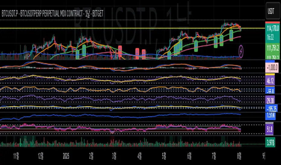
Hunting Bollinger Bands for scalping📌 Bollinger Band Reversal BUY/SELL Indicator
Name: Hunting Bollinger Bands for scalping
Purpose: Displays reversal signals for short-term scalping in range-bound markets.
Target Users: Scalpers and day traders, especially for trading Gold (XAU/USD).
Recommended Target: Works well for scalping approximately $3 price movements on Gold.
Core Logic:
Detects excessive price deviation using Bollinger Bands (±2σ).
Filters out excessive signals with a bar interval limiter.
Displays clear and simple BUY/SELL labels for entry timing.
📌 Signal Conditions
BUY
Price closes below the Lower Bollinger Band.
At least the specified number of bars has passed since the previous signal.
Displays a “BUY” label below the bar.
SELL
Price closes above the Upper Bollinger Band.
At least the specified number of bars has passed since the previous signal.
Displays a “SELL” label above the bar.
📌 Parameters
Parameter Description Default
Bollinger Band Length (bbLength) Period for Bollinger Band calculation 20
Standard Deviation (bbStdDev) Standard deviation multiplier for band width 2.0
Signal Interval (barLimit) Minimum bar interval to avoid repeated signals 10
📌 How to Use
Add the indicator to your chart; Bollinger Bands and BUY/SELL labels will appear.
When a signal appears, confirm price reaction and enter a scalp trade (around $3 for Gold is recommended).
Adjust the “Signal Interval (barLimit)” to control signal frequency.
Avoid using it during high-impact news events or strong trending markets.
📌 Best Market Conditions
Range-bound markets
Scalping small price movements (~$3)
Low-volatility sessions (e.g. Asian session for Gold)
📌 Notes
May generate frequent signals during strong trends, leading to potential losses.
Can be combined with other indicators (e.g. 200 MA, RSI, VWAP) for higher accuracy.
Signals are for reference only and should not be used as the sole trading decision factor.
📌 ボリンジャーバンド逆張りBUY/SELL インジケーター解説
名前:Hunting Bollinger Bands for scalping
目的:レンジ相場での短期的な反発を狙った逆張りシグナルを表示
対象ユーザー:スキャルピングやデイトレードで、特にゴールド(XAU/USD)での小幅な値動きを狙うトレーダー
推奨利幅:ゴールドでおよそ 3ドル前後 を目安にスキャルピングを行うと有効
メインロジック:
ボリンジャーバンド(±2σ)で過剰な価格乖離を検出
バー間隔フィルターで過剰シグナルを制御
BUY/SELLラベルで視覚的にシンプルなエントリーポイントを表示
📌 シグナル条件
BUY(買いシグナル)
現在価格が ボリンジャーバンド下限(Lower Band)を下回った時
前回シグナルから指定したバー数以上経過
この条件を満たした場合、ローソク足下に「BUY」ラベルを表示します。
SELL(売りシグナル)
現在価格が ボリンジャーバンド上限(Upper Band)を上回った時
前回シグナルから指定したバー数以上経過
この条件を満たした場合、ローソク足上に「SELL」ラベルを表示します。
📌 パラメータ
項目 説明 初期値
ボリンジャーバンド期間 (bbLength) ボリンジャーバンド計算の期間 20
標準偏差 (bbStdDev) バンド幅を決める標準偏差 2.0
シグナル間隔 (barLimit) シグナルの連続表示を防止する最小バー間隔 10
📌 使い方
インジケーターをチャートに追加すると、ボリンジャーバンドとBUY/SELLラベルが表示されます
シグナルが出たら、反発確認後にスキャルピングエントリー(ゴールドなら約3ドルを目安に)
「シグナル間隔(barLimit)」を調整して、シグナルの過剰表示を防ぐ
経済指標発表や強いトレンド発生時は使用を控える
📌 このインジケーターが向いている相場
レンジ相場
小さな値幅(約3ドル前後)を狙うスキャルピング
トレンドが弱い横ばいの時間帯(例:アジア時間のゴールドなど)
📌 注意点
強いトレンド相場では、逆張りシグナルが連続的に発生し、損切りが増える可能性あり
200MAやRSI、VWAPなど他の指標と組み合わせることで精度を高められる
シグナルは参考用であり、単独での売買判断は推奨されない

トレンドフォローBUY&SELL ver1.1Indicator Description
This indicator displays three moving averages (MAs) and generates buy and sell signals based on their crossovers. It’s designed to help traders easily follow the trend and avoid counter-trend trades.
1. Three Moving Averages
MA1 (Default: 7) – Short-term trend (Yellow)
MA2 (Default: 50) – Medium-term trend (Blue)
MA3 (Default: 200) – Long-term trend (Red), also used as a filter
2. Signal Types
(A) MA1 and MA3 Crossovers (Yellow Signals)
Golden Cross (BUY): MA1 crosses above MA3
Dead Cross (SELL): MA1 crosses below MA3
→ Helps identify shifts between short-term and long-term trends.
(B) MA1 and MA2 Crossovers (Green & Red Signals)
BUY (Green): MA1 and MA2 cross, and both are above MA3
SELL (Red): MA1 and MA2 cross, and both are below MA3
→ Only trend-aligned signals are shown (buy only above MA3, sell only below MA3).
(C) Gray Signals (Filtered-Out Signals)
If MA1 and MA2 cross but don’t meet the MA3 condition, a gray signal is displayed.
Example: “BUY” below MA3 or “SELL” above MA3 appears as gray.
→ This feature is ON by default but can be turned OFF in the settings.
3. Alerts
Alerts can be triggered for:
MA1 × MA3 Golden Cross / Dead Cross
MA1 × MA2 BUY / SELL (with MA3 filter)
This allows you to receive notifications when valid trade setups occur.
4. Key Benefits
Visualize short-, medium-, and long-term trends at the same time
Trade only in the direction of the 200MA trend using the built-in filter
Optionally view filtered-out (gray) signals for extra context
Set alerts to avoid missing trading opportunities
With this indicator, you can focus on trading with the trend—buying above the 200MA and selling below it—while staying informed of all crossover events.
このインジケーターは 3本の移動平均線(MA) と、
それらのクロスに基づいた 売買シグナル を表示するツールです。
1. 3本の移動平均線
MA1(デフォルト7):短期のトレンドを把握するための線(黄色)
MA2(デフォルト50):中期のトレンドを把握するための線(青)
MA3(デフォルト200):長期のトレンド(赤)。フィルターとしても使用
2. シグナルの種類
(A) MA1とMA3のクロス(黄色シグナル)
ゴールデンクロス(BUY):MA1がMA3を上抜け
デッドクロス(SELL):MA1がMA3を下抜け
→ 長期トレンドと短期の変化を確認するための参考シグナル
(B) MA1とMA2のクロス(緑・赤シグナル)
BUY(緑):MA1とMA2がクロスし、両方がMA3より上にある
SELL(赤):MA1とMA2がクロスし、両方がMA3より下にある
→ 200MAを基準に「上なら買い、下なら売り」のトレンド方向に沿ったシグナルだけを表示
(C) グレーシグナル(フィルター除外)
MA1とMA2がクロスしたが、MA3の条件を満たさなかった場合にグレー表示
例えば「MA3より下でBUY」「MA3より上でSELL」はグレー
→ 初期設定ではONになっていますが、オフにすることも可能
逆張りの指標や、トレンド転換のサインにもなる
3. アラート機能
MA1×MA3のゴールデンクロス/デッドクロス
MA1×MA2のBUY/SELL(MAフィルターあり)
→ これらが発生したタイミングでTradingViewのアラートを出せる
4. 使い方のポイント
短期・中期・長期のトレンドを同時に把握できる
200MAを基準にフィルターすることで「逆張りシグナル」を排除
フィルターで外れたシグナルもグレーで確認できる(任意)
アラートを設定すれば、チャンスを逃さずにエントリー可能
このインジケーターを使うことで、「200MAの上では買いのみ」「下では売りのみ」というシンプルでトレンドに沿ったトレードができるようになります。
