IV/HV ratio 1.0 [dime]This script compares the implied volatility to the historic volatility as a ratio.
The plot indicates how high the current implied volatility for the next 30 days is relative to the actual volatility realized over the set period. This is most useful for options traders as it may show when the premiums paid on options are over valued relative to the historic risk.
The default is set to one year (252 bars) however any number of bars can be set for the lookback period for HV.
The default is set to VIX for the IV on SPX or SPY but other CBOE implied volatility indexes may be used. For /CL you have OVX/HV and for /GC you have GVX/HV.
Note that the CBOE data for these indexes may be delayed and updated EOD
and may not be suitable for intraday information. (Future versions of this script may be developed to provide a realtime intraday study. )
There is a list of many volatility indexes from CBOE listed at:
www.cboe.com
(Some may not yet be available on Tradingview)
RVX Russell 2000
VXN NASDAQ
VXO S&P 100
VXD DJIA
GVX Gold
OVX OIL
VIX3M 3-Month
VIX6M S&P 500 6-Month
VIX1Y 1-Year
VXEFA Cboe EFA ETF
VXEEM Cboe Emerging Markets ETF
VXFXI Cboe China ETF
VXEWZ Cboe Brazil ETF
VXSLV Cboe Silver ETF
VXGDX Cboe Gold Miners ETF
VXXLE Cboe Energy Sector ETF
EUVIX FX Euro
JYVIX FX Yen
BPVIX FX British Pound
EVZ Cboe EuroCurrency ETF Volatility Index
Amazon VXAZN
Apple VXAPL
Goldman Sachs VXGS
Google VXGOG
IBM VXIBM
Cerca negli script per "Implied volatility"

Institutional MF-Vol Compression Scanner v4.0 [BIG]═══════════════════════════════════════════════════════════════════════════════
BIG COMPRESSION SCANNER v4.0
═══════════════════════════════════════════════════════════════════════════════
OVERVIEW
The BIG Compression Scanner v4.0 is a proprietary volatility regime detection system designed for systematic Daily options deployment. This framework identifies pre-expansion volatility compression zones through multi-dimensional market structure analysis, combining institutional positioning patterns with hierarchical timeframe confirmation and options market structure to generate high-conviction directional signals for premium strategies.
The methodology synthesizes volatility dynamics, liquidity flow patterns, and cross-timeframe regime alignment into a probabilistic scoring system that isolates asymmetric risk-reward setups characteristic of compression-to-expansion transitions. The framework is calibrated specifically for 30-45 DTE options strategies where timing precision and volatility environment assessment are critical to edge generation.
═══════════════════════════════════════════════════════════════════════════════
CORE METHODOLOGY
═══════════════════════════════════════════════════════════════════════════════
• Proprietary Compression Detection
The system employs a multi-factor compression identification framework that monitors volatility regime transitions across price dispersion metrics and range contraction patterns. Unlike single-indicator squeeze systems, this methodology uses weighted ensemble logic to distinguish true pre-expansion compression from random consolidation noise.
Compression strength is quantified through a proprietary scoring algorithm (0-100%) that evaluates:
- Statistical volatility contraction relative to historical norms
- Price range compression within dynamic envelope systems
- Institutional volume signature analysis during low-volatility periods
- Cross-timeframe compression alignment (Daily/Weekly/Monthly hierarchy)
The framework filters compression events based on minimum strength thresholds and multi-bar confirmation to eliminate premature signals characteristic of retail squeeze indicators.
• Hierarchical Multi-Timeframe Architecture
The indicator integrates a three-tier temporal analysis structure where higher timeframes constrain and validate lower timeframe signals:
Strategic Layer (Monthly) – Establishes macro directional bias and identifies structural market positioning. This layer determines whether intermediate trends align with or counter dominant regime dynamics.
Structural Layer (Weekly) – Provides tactical context through key price levels, momentum assessment, and volatility regime confirmation. Weekly analysis filters signals that would occur in unfavorable proximity to structural inflection zones.
Execution Layer (Daily) – Generates precise entry timing through intraday regime shift detection, momentum confluence analysis, and institutional flow pattern recognition.
Each layer contributes weighted influence to the composite directional probability model, with recalibration logic that adjusts timeframe importance based on current market regime characteristics. The exact weighting algorithm is proprietary and adapts to volatility environment dynamics.
• Options Market Structure Integration
Version 4.0 incorporates options-specific market intelligence not available in standard technical analysis frameworks:
Volatility Environment Assessment – The system continuously monitors implied volatility regime characteristics through proprietary estimation models. These models identify whether current premium levels favor buying or selling strategies, adjusting signal generation accordingly.
Temporal Decay Awareness – Built-in expiration cycle logic ensures signals only trigger when sufficient time value remains for thesis development. The framework approximates days-to-expiration and applies minimum threshold filters to prevent entries in high theta decay regimes.
Greeks-Aware Targeting – Price targets are dynamically calibrated based on volatility expansion expectations and estimated leverage characteristics. Target multipliers adjust to current options market structure rather than using fixed risk-reward ratios.
Premium Environment Classification – Signals are enhanced with real-time assessment of whether current volatility levels favor long premium, short premium, or spread strategies based on historical percentile analysis.
• Probabilistic Directional Scoring System
Rather than binary bullish/bearish classification, the framework generates probability-weighted directional bias through a proprietary multi-factor model. This model synthesizes trend alignment metrics, momentum characteristics, structural positioning, and institutional flow signatures into normalized probability distributions.
The scoring system evaluates dozens of market structure variables across multiple timeframes, applies regime-dependent weighting, and produces directional probabilities that reflect actual edge rather than arbitrary technical indicator thresholds. Signal generation occurs only when directional probability exceeds user-defined conviction thresholds (55-65% depending on sensitivity setting).
This probabilistic approach allows traders to calibrate position sizing and strategy selection (outright vs. spreads) to the strength of directional conviction rather than treating all signals as equal weight.
• Institutional Flow Detection
The framework monitors volume and price interaction patterns characteristic of institutional accumulation or distribution during compression phases. This analysis identifies whether compression zones contain building directional positions (high probability of sustained move post-breakout) versus thin, choppy consolidation (high false breakout risk).
Flow detection employs proprietary algorithms that distinguish genuine institutional activity from retail volume spikes, providing critical context for signal validation.
═══════════════════════════════════════════════════════════════════════════════
SIGNAL ARCHITECTURE
═══════════════════════════════════════════════════════════════════════════════
Call Option Signals trigger when compression strength, directional probability, timeframe alignment, options market structure, and institutional flow patterns simultaneously satisfy proprietary threshold criteria. Signals are filtered against weekly structural levels to avoid low-probability entries near major resistance zones.
Put Option Signals follow equivalent logic with inverse directional parameters, ensuring symmetrical framework application across bull and bear setups.
All signals include:
- Directional conviction probability (percentage)
- Current volatility environment assessment (IV Rank proxy)
- Dynamic price target based on expansion expectations
- Multi-timeframe alignment status
Signal cooldown logic prevents excessive signal generation during extended consolidation periods, maintaining signal quality over quantity.
═══════════════════════════════════════════════════════════════════════════════
VISUAL INTELLIGENCE
═══════════════════════════════════════════════════════════════════════════════
Real-Time Multi-Timeframe Dashboard
The top-right panel provides continuous visibility into:
- Trend alignment across Daily/Weekly/Monthly timeframes
- Current compression status at each temporal layer
- Momentum regime characteristics (RSI values)
- Options environment assessment (IV Rank, optimal strategy)
- Composite signal readiness (compression strength percentage)
This dashboard enables rapid regime assessment without manual multi-timeframe chart analysis.
Chart Integration
Visual overlays include:
- Volatility envelope systems (dynamic bands)
- Weekly structural price levels (pivot, resistance, support)
- Compression zone highlighting (background shading)
- Active squeeze indicators (Daily and Weekly differentiation)
Signal Labels
When setups trigger, comprehensive labels display:
📈 CALL OPTION
Prob: XX%
IV Rank: XX%
Target: $XXX.XX
Labels provide all critical execution information without requiring dashboard consultation.
═══════════════════════════════════════════════════════════════════════════════
KEY CAPABILITIES
═══════════════════════════════════════════════════════════════════════════════
- Proprietary multi-factor compression detection with adaptive thresholds
- Hierarchical multi-timeframe confirmation (Daily/Weekly/Monthly)
- Options-specific filters (IV regime, DTE requirements, Greeks awareness)
- Probabilistic directional scoring (0-100% conviction levels)
- Institutional flow pattern recognition during compression
- Weekly structural level integration with proximity filters
- Dynamic target calibration based on volatility expansion expectations
- Real-time multi-timeframe regime dashboard
- Customizable sensitivity and threshold parameters
- Non-repainting signal architecture (bar close confirmation)
- Comprehensive alert system for proactive monitoring
═══════════════════════════════════════════════════════════════════════════════
APPLICATION GUIDELINES
═══════════════════════════════════════════════════════════════════════════════
1. Timeframe Selection
Apply to Daily (D1) charts only. Framework calibration is timeframe-specific; other intervals produce suboptimal results.
2. Options Mode Activation
Enable Options Trading Mode for premium strategy optimization. This activates IV filtering, DTE thresholds, and Greeks-aware targeting.
3. Strategy Calibration
- Premium Buying: Set IV threshold to 50th percentile, DTE minimum 30+ days, target multiplier 2.5-3.0×
- Premium Selling: Set IV threshold to 70th+ percentile, DTE minimum 20-30 days, target multiplier 1.5-2.0×
4. MTF Dashboard Monitoring
Verify multi-timeframe alignment before execution:
- Ideal setup: Daily + Weekly compression both active
- Confirm trend alignment across timeframes
- Check IV Rank for premium environment assessment
- Wait for "READY" status (green) indicating threshold satisfaction
5. Signal Execution
When labels appear:
- Review directional probability (target >65% for high conviction)
- Assess IV environment (low IV favors buying, high IV favors selling)
- Use price target for strike selection and profit objectives
- Consider 30-45 DTE options for thesis development time
6. Risk Management
- Position size: 2-5% options capital per signal
- Stop loss: Exit if compression breaks opposite direction without follow-through
- Time stop: Reassess if position stagnant after 5-7 days
- Profit taking: Scale out at provided targets or weekly pivot levels
7. Sensitivity Adjustment
- High (55%): More signals, lower conviction, diversified approach
- Medium (60%): Balanced, default setting (2-4 signals/month typical)
- Low (65%): Fewer signals, higher conviction, concentrated positions
═══════════════════════════════════════════════════════════════════════════════
FRAMEWORK LIMITATIONS
═══════════════════════════════════════════════════════════════════════════════
- Optimized exclusively for Daily timeframe analysis
- Compression development requires patience (2-4 weeks typical)
- IV metrics are proprietary proxies, not direct exchange data
- Greeks estimations approximate actual options contract characteristics
- DTE calculations simplified vs. precise monthly expiration dates
- Multi-timeframe filtering reduces but cannot eliminate false breakouts
- Requires liquid options markets (tight spreads, adequate open interest)
- Not designed for earnings-driven volatility events (IV crush risk)
- Framework identifies timing, not specific strike or expiration selection
═══════════════════════════════════════════════════════════════════════════════
TECHNICAL SPECIFICATIONS
═══════════════════════════════════════════════════════════════════════════════
- Pine Script v5 architecture
- Non-repainting signal confirmation (bar close validation)
- Multi-security data integration (Weekly/Monthly via request.security)
- Real-time multi-timeframe analysis dashboard
- 4 alert conditions (Call/Put options, directional generic)
- Fully customizable parameters (compression, scoring, filters, visuals)
- Professional-grade visual hierarchy and information density
═══════════════════════════════════════════════════════════════════════════════
PROFESSIONAL CONTEXT
═══════════════════════════════════════════════════════════════════════════════
This framework is designed for systematic options traders with working knowledge of:
- Volatility regime dynamics and expansion/contraction cycles
- Options Greeks and their impact on P&L across various market conditions
- Implied Volatility Rank interpretation and premium pricing assessment
- Multi-timeframe analysis methodology and trend hierarchy
- Risk-adjusted position sizing and portfolio construction principles
The system identifies when market structure favors options deployment but does not prescribe how to construct positions. Strike selection, expiration choice, spread architecture, and position sizing require independent trader judgment based on account parameters and risk tolerance.
Optimal deployment combines this framework with:
- Options analytics platform (actual IV, Greeks, probability calculations)
- Earnings calendar awareness (pre-earnings IV inflation vs. post-earnings crush)
- Broader market regime context (VIX, correlation, sector rotation)
- Portfolio-level risk management (concentration limits, correlation analysis)
═══════════════════════════════════════════════════════════════════════════════
Proprietary compression-to-expansion framework for systematic Daily options deployment. Methodology incorporates multi-dimensional volatility analysis, hierarchical timeframe confirmation, and options market structure intelligence.

TVB - Thomas Volatility Bands v2.0TVB – Thomas Volatility Bands v2.0
Author: Thomas Aaroon
Concept: CIV-Driven Volatility Bands with Adaptive Vomma Scaling
Overview
TVB – Thomas Volatility Bands v2.0 is an advanced volatility-adaptive band system built on two core elements:
CIV (Composite Implied Volatility) – manually provided or proxied using an external IV index
Dynamic Vomma Scaling – a higher-order volatility response factor that adjusts band width based on the convexity of implied volatility changes
Together, these components create a continuously adapting volatility envelope that reacts smoothly to market regime shifts.
Key Features
1. Flexible CIV Input
Manual CIV mode: Enter your own CIV value (decimal or %)
Proxy CIV mode: Pulls IV data from INDIA_VIX or any custom IV symbol
Weighted blending: Adjustable α-weight for proxy influence
Automatic normalization ensures stable and bounded CIV values.
2. Adaptive Volatility Engine
CIV is smoothed using EMA for intraday and SMA for higher-timeframes
Vomma coefficient dynamically adjusts based on CIV percentile and short-term CIV volatility
Produces a volatility surface that expands during stress and contracts during calm periods.
3. Time-Scaled Band Construction
Bands automatically scale their width according to:
Timeframe multiplier
Estimated bars-per-day
Annualized volatility normalization (√252 rule)
This ensures consistent volatility geometry across all chart timeframes.
4. Dual-Layer Volatility Bands
Inner Bands (±3σ): Tactical mean-reversion boundaries
Outer Bands (±4σ): Structural deviation zones for extreme price dislocations
Smooth color-coded volatility regimes (low/moderate/high CIV).
5. Re-Entry Logic (34% Rule)
A clean, rule-based mechanism inspired by distributional penetration depth:
Tracks bars that break the ±4σ outer band
Looks for 34% penetration back toward the ±3σ region
Generates optional visual markers (buy/sell re-entry)
Designed to highlight volatility compression opportunities after extreme expansions.
6. Optional CIV Diagnostic Label
Shows:
CIV and smooth CIV
Vomma coefficient
Effective band width
Useful for strategy development and volatility research.
Intended Use
TVB v2.0 is designed for:
Volatility-based trading models
Mean-reversion and re-entry systems
Volatility regime identification
Institutional-grade market structure research
This indicator does not repaint and does not generate trade signals by default (signals can be enabled via optional shapes).
Disclaimer
This tool is for educational and analytical purposes only.
It is not financial advice, and the author is not responsible for any trading outcomes.

VIX HeatmapVIX HeatMap
Instructions:
- To be used with the S&P500 index (ES, SPX, SPY, any S&P ETF) as that's the input from where the CBOE calculates and measures the VIX. Can also be used with the Dow Jones, Nasdaq, & Nasdaq100.
Description:
- Expected Implied Volatility regime simplified & visualized. Know if we are in a high, medium, or low volatility regime, instantly.
- Ranges from Hot to Cold: The hotter the heat-map, the higher the implied volatility and fear & vice versa.
- The VIX HeatMap, color-maps important VIX levels (7 in this case) in measuring volatility for day trading & swing trading.
Using the VIX HeatMap:
- A LOW level volatility environment: Represented by "cooler" colors (Blue & White) depicts that the level of volatility and fear is low. Percentage moves on the index level are going to be tame and less volatile more often than not. Low fear = low perceived risk.
- A MEDIUM level volatility environment: Represented by "warmer" colors (Green & Yellow) depicts that the markets are transitioning from a calmer period or from a more fearful period. Market volatility here will be higher and provide more volatile swings in price.
- A HIGH level volatility environment: Represented by "hotter" colors (Orange, Red, & Purple) depicts that the markets are very fearful at the moment and will have big swings in both directions. Historically, extreme VIX levels tend to coincide with bottoms but are in no way predictive of the exact timing as the volatile moves can continue for an extended period of time.
- Transitioning between the 7 VIX Zones: Each and every one of these specific VIX zone levels is important.
1. Extreme low: <16
2. Low: 16 to 20
3. Normal: 20 to 24
4. Medium: 24 to 28
5. Med-High: 28 to 32
6. High: 32 to 36
7. Extreme high: >36
- These VIX levels in particular measure volatility changes that have a major impact on switching between smaller time frames and measuring depths of a sell move and vice versa. Each level also behaves as its own support & resistance level in terms of taking a bit of effort to switch regimes, and aids in identifying and measuring the potential depth of pullbacks in bull markets and bounces in bear markets to reveal reversal points.
- Examples of VIX level supports depicted on the chart marked with arrows. From left to right:
1. March 10th: Markets jumped 2 volatility levels in 2 days. The fluctuations from blue to yellow to green where a sign that price action would reverse from the selloff.
2. March 28th: As soon as we move from green to the blue VIX level (<20), markets began to rally and only ended when the volatility level moved sub VIX 16 (white).
3. May 4th & 24th: Next we see the 2 dips where volatility levels went from blue to green (VIX > 20), marked bottoms and reversed higher.
4. June 1st: We see a change in VIX regime yet again into lower VIX level and markets rocket higher.
Knowing the current VIX regime is a very important tool and aid in trading, now easily visualized.

Macro Risk Trinity [OAS|VIX|MOVE]The Obsolescence of Single-Metric Risk Models
For decades, the CBOE VIX served as the undisputed "fear gauge" of Wall Street. However, the modern financial market structure has evolved to a point where relying on a single univariate indicator is not only insufficient but potentially dangerous. Two structural shifts have fundamentally altered the predictive power of the VIX:
The 0DTE Blind Spot: The VIX calculates implied volatility based on options expiring in 23 to 37 days. Today, massive institutional hedging flows occur intraday via 0DTE (Zero Days to Expiration) options. This creates a "Gamma Suppression" effect: Market makers hedging these short-term flows often dampen realized volatility intraday, effectively bypassing the VIX calculation window. This leads to a suppression of the index, masking risk even during fragile market phases (Bandi et al., 2023).
Goodhart’s Law: "When a measure becomes a target, it ceases to be a good measure." Because algorithmic volatility targeting strategies and risk-parity funds use the VIX as a mechanical trigger to deleverage, market participants have developed an incentive to suppress implied volatility via short-volatility strategies to prevent triggering cascading margin calls.
The Theoretical Framework: Why this Model Works
To accurately navigate this complex environment, the Macro Risk Trinity moves beyond simple price action. It employs a multivariate analysis of the financial system's three core pillars: Rates, Credit, and Equity. The logic is derived from three specific areas of financial research:
1. The Origin of Shock: Volatility Spillover Theory
Macroeconomic shocks typically do not start in the stock market; they originate in the US Treasury market. The MOVE Index acts as the "VIX for Bonds." Research by Choi et al. (2022) demonstrates that bond variance risk premiums are a leading indicator for equity distress. Since the "Risk-Free Rate" is the denominator in every Discounted Cash Flow (DCF) model, instability here forces a repricing of all risk assets downstream.
2. The Foundation: Structural Credit Models (Merton)
While stock prices are often driven by sentiment and liquidity, corporate bond spreads ( High Yield Option Adjusted Spread ) are driven by balance sheets and math. Based on the seminal Merton Model (1974), equity can be viewed as a call option on a firm's assets, while debt carries a short put option risk.
The Thesis: If the VIX (Equity) is low, but OAS (Credit) is widening, a divergence occurs. Mathematically, credit spreads cannot widen indefinitely without eventually pulling equity valuations down. This indicator identifies that specific divergence.
3. The Fragility: Knightian Uncertainty
By monitoring the VVIX (Volatility of Volatility), we detect demand for tail-risk protection. When the VIX is suppressed (low) but VVIX is rising, it signals that "Smart Money" is buying Out-of-the-Money crash protection despite calm waters. This is often a precursor to liquidity events where the VIX "uncoils" violently.
The Solution: Dual Z-Score Normalization
You cannot simply overlay the VIX (an index) with a Credit Spread (a percentage). To make them comparable, this script utilizes a Dual Z-Score Engine.
It calculates the statistical deviation from both a Fast (Quarterly/63-day) and a Slow (Yearly/252-day) mean. This standardizes all data into a single "Stress Unit," allowing us to see exactly when Credit Stress exceeds Equity Fear.
Decoding the Macro Regimes
The indicator aggregates these data streams to visualize the current market regime via the chart's background color:
Systemic Shock (Red Background): The critical convergence. Both Credit Spreads (Solvency) and Equity Volatility (Fear) spike simultaneously beyond extreme statistical thresholds (> 2.0 Sigma). Correlations approach 1, and liquidity evaporates.
Macro Risk / Rates Shock (Yellow Background): Equities are calm, but the MOVE Index is panicking. A warning signal from the plumbing of the financial system regarding inflation or Fed policy errors.
Credit Stress (Maroon Background): The "Silent Killer." The VIX is low (often suppressed), but Credit Spreads (OAS) are widening. This signals a deterioration of the real economy ("Slow Bleed") while the stock market is in denial.
Structural Fragility (Purple Background): VIX is low, but VVIX is rising. A sign of excessive leverage and "Volmageddon" risk (Gamma Squeeze).
Bull Cycle (Green Background): The "Buy the Dip" signal. Even if prices fall and VIX spikes, the background remains green as long as Corporate Credit (OAS) remains stable. This indicates the sell-off is technical, not fundamental.
Technical Specifications
Engineered for the Daily (1D) timeframe.
Institutional Lookbacks: 63 Days (Quarterly) / 252 Days (Yearly).
OAS Lag Buffer: Includes logic to handle the ~24h reporting delay of Federal Reserve (FRED) data to prevent signal flickering.
Scientific Bibliography
This tool is not based on heuristics but on peer-reviewed financial literature:
Bandi, F. M., et al. (2023). The spectral properties of 0DTE options and their impact on VIX. Journal of Econometrics.
Choi, J., Mueller, P., & Vedolin, A. (2022). Bond Variance Risk Premiums. Review of Finance.
Cremers, M., et al. (2008). Explaining the Level and Time-Variation of Credit Spreads. Review of Financial Studies.
Griffin, J. M., & Shams, A. (2018). Manipulation in the VIX? The Review of Financial Studies.
Merton, R. C. (1974). On the Pricing of Corporate Debt. The Journal of Finance.
Author's Note: The Reality of Markets & Overfitting
While this tool is built on robust academic principles, we must address the reality of quantitative modeling: There is no Holy Grail.
This indicator relies on Z-Scores, which assume that future volatility distributions will somewhat resemble the past (Mean Reversion). In data science, calibrating lookback periods (like 63/252 days) always carries a risk of Overfitting to past cycles.
Markets are adaptive systems. If the correlation between Credit Spreads and Equity Volatility breaks (e.g., due to massive fiscal intervention/QE or new derivative products), signals may temporarily diverge. This tool is designed to identify stress, not to predict the future price. It will rhyme with the market, but it will not always repeat it perfectly.
Use it as a compass to gauge the environment, not as an autopilot for your trading.
Use responsibly and always manage your risk.
Disclaimer: This indicator relies on external data feeds from FRED and CBOE. Data availability is subject to TradingView providers.

Option CalculatorOption Calculator – Comprehensive Feature Guide
The aiTrendview Option Calculator is a feature-rich options trading dashboard built using Pine Script, designed for real-time market interpretation and strategy selection. It integrates Black-Scholes-based pricing models with dynamic market inputs to help traders evaluate directional bias, volatility, risk, and potential profitability in a structured, intuitive format. The tool supports both beginner and experienced options traders in making data-driven decisions.
Core Inputs and Pricing Foundations
Users can input the strike price, days to expiration, implied volatility (IV), interest rate, and option type (call or put). These values feed directly into calculations for the option's theoretical price, Greeks, and expected move. For example:
• Strike Price helps define moneyness, impacting delta and risk/reward balance.
• Days to Expiry determines the speed of time decay (theta).
• Risk-Free Rate adjusts for time value and interest rate impact (rho).
• Implied Volatility affects premium pricing and vega exposure.
• Option Type sets the directional foundation for strategy analysis.
Live Market Data Integration
The script pulls current underlying price, price change, and volume comparison against a moving average (e.g., current volume vs. 20-day average). This helps identify unusual trading activity or volume spikes. Volatility readings are also incorporated using ATR or external volatility indexes to enhance the realism of IV assessments.
Greek Calculations
The dashboard provides visual and numerical values for all five major Greeks:
• Delta shows directional sensitivity and is plotted with a visual bar.
• Gamma represents the rate of delta change, especially critical near-the-money.
• Theta measures time decay and is most impactful in the final weeks before expiration.
• Vega tracks sensitivity to volatility shifts, crucial for premium-selling strategies.
• Rho reflects sensitivity to interest rates, primarily relevant in long-dated options.
Each Greek is calculated based on real-time inputs, providing a statistical framework for assessing risk and return.
Market Sentiment & Risk Environment
A sentiment scoring system interprets the put-call ratio (PCR), volume trends, and price momentum (e.g., RSI). IV levels are color-coded (e.g., low, medium, high) to identify whether options are relatively cheap or expensive. These values support better timing decisions and help identify whether to be a buyer or seller of premium.
Strategy Recommendation Engine
The script dynamically evaluates six core strategies based on current data:
1. Long Call
2. Short Put
3. Long Put
4. Bull Call Spread
5. Long Straddle
6. Iron Butterfly
Each strategy is assigned a confidence score (0–100%) and updated in real-time. This system is designed to match the appropriate strategy to market conditions such as trend, volatility, and time to expiration.
Risk-Adjusted Trading Insights
The dashboard helps traders evaluate whether to initiate trades, reduce exposure, or wait:
• High Confidence (80%+): Favorable environment; standard sizing recommended.
• Moderate Confidence (60–80%): Trade with caution and reduced risk.
• Low Confidence (<60%): Consider avoiding the trade or waiting for better setup.
It also supports risk mitigation through defined-risk strategies and provides guidance on stop-loss, profit targets, and time-based exits (e.g., managing options with <21 days to expiry).
Real-Time Monitoring
The script continuously tracks:
• Changes in Greeks as price, volatility, or time evolve.
• Profit probability estimates using expected move and breakeven pricing.
• Volume activity and IV rank to spot institutional behavior.
This empowers traders to manage trades proactively, adjust exposure, or lock in profits based on changing market conditions.
Practical Use Case Flow
Step 1: Input Setup
Enter option-specific parameters (strike, expiry days, IV, etc.) and let the dashboard auto-calculate risk metrics.
Step 2: Analyze Market
Use sentiment analysis, IV level, and volume data to understand the environment.
Step 3: Select Strategy
Rely on the confidence score and recommendation engine to choose a suitable options strategy.
Step 4: Manage Risk
Apply size rules based on signal strength, adjust based on exposure, and set alerts if needed.
Step 5: Monitor Outcomes
Track Greeks, probability, and progress metrics to stay informed throughout the trade.
Trading Environment Adaptation
• Low IV: Favor long premium strategies (e.g., long straddles, long calls).
• High IV: Favor premium selling strategies (e.g., iron condors, credit spreads).
• Bullish Markets: Focus on call-based trades or bullish spreads.
• Sideways Markets: Use neutral setups like iron butterflies or calendar spreads.
Position sizing and stop-loss logic are aligned with industry practices (e.g., risk no more than 2% per trade, take profit at 50%, and cut losses at double the premium received).
Dashboard Interpretation Guide
• Green: High confidence strategy, favourable IV, and strong volume confirmation.
• Yellow: Mixed signals or moderate conviction – proceed with caution.
• Red: Low confidence, poor conditions – better to wait for clearer opportunities.
Disclaimer from aiTrendview
This script is intended for educational and informational use only. It does not offer financial advice or trading signals, nor does it guarantee results. aiTrendview and its affiliates are not responsible for any financial loss or decision made using this tool. Options trading involves substantial risk and is not suitable for all investors. Past performance of any strategy or metric does not guarantee future results. Users are encouraged to consult with a certified financial advisor and conduct independent research before making trading decisions.

IV PercentileIV Percentile Indicator - Brief Description
What It Does
The IV Percentile Indicator measures where current implied volatility ranks compared to the past year, showing what percentage of time volatility was lower than today's level.
How It Works
Data Collection:
Tracks implied volatility (or historical volatility as proxy) for each trading day
Stores the last 252 days (1 year) of volatility readings
Uses VIX data for SPY/SPX, historical volatility for other stocks
Calculation:
IV Percentile = (Days with IV below current level) ÷ (Total days) × 100
Example: If IV Percentile = 75%, it means current volatility is higher than 75% of the past year's readings.
Visual Output
Main Display:
Blue line showing percentile (0-100%)
Reference lines at key levels (20%, 30%, 50%, 70%, 80%)
Color-coded backgrounds for quick identification
Info table with current readings
Key Levels:
80%+ (Red): Very high IV → Sell premium
70-79% (Orange): High IV → Consider selling
30-20% (Green): Low IV → Consider buying
<20% (Bright Green): Very low IV → Buy premium
Trading Application
When IV Percentile is HIGH (70%+):
Options are expensive relative to recent history
Good time to sell premium (iron condors, credit spreads)
Expect volatility to decrease toward normal levels
When IV Percentile is LOW (30%-):
Options are cheap relative to recent history
Good time to buy premium (straddles, long options)
Expect volatility to increase from compressed levels
Core Logic
The indicator helps answer: "Is this a good time to buy or sell options based on how expensive/cheap they are compared to recent history?" It removes the guesswork from volatility timing by providing historical context for current option prices.

Black–Scholes model - Options premium calculatorBlack-Scholes Options Pricing Calculator in Pine Script Introduction
The Black-Scholes model is one of the most widely used mathematical models for pricing options. It provides a theoretical estimate of the price of European-style options based on factors such as the underlying asset price, strike price, time to expiration, volatility, risk-free rate, and option type.
This Pine Script implementation of the Black-Scholes options pricing model enables traders to calculate call and put option prices directly within TradingView, helping them assess potential trades more efficiently.
What Does This Script Do?
This script allows traders to input essential option parameters and instantly calculate both call and put option prices using the Black-Scholes formula. It provides:
• A user-friendly interface for inputting option parameters.
• Automatic computation of option prices.
• Real-time updates as market data changes.
Key Features:
• Uses the Black-Scholes formula to compute European call and put option prices.
• User-defined inputs for stock price, strike price, time to expiration, volatility, and risk-free rate.
• Displays calculated option prices on the TradingView chart.
Understanding the Black-Scholes Formula:
The Black-Scholes model is given by the following equations:
C=S0N(d1)−Xe−rtN(d2)C = S_0 N(d_1) - Xe^{-rt} N(d_2) P=Xe−rtN(−d2)−S0N(−d1)P = Xe^{-rt} N(-d_2) - S_0 N(-d_1)
Where:
• CC = Call option price
• PP = Put option price
• S0S_0 = Current stock price
• XX = Strike price
• rr = Risk-free interest rate
• tt = Time to expiration (in years)
• σ\sigma = Volatility of the stock (annualized)
• N(x)N(x) = Cumulative standard normal distribution
• d1d_1 and d2d_2 are given by:
d1=ln(S0/X)+(r+σ2/2)tσtd_1 = \frac{ \ln(S_0/X) + (r + \sigma^2/2)t }{ \sigma \sqrt{t} } d2=d1−σtd_2 = d_1 - \sigma \sqrt{t}
This script implements these calculations efficiently in Pine Script to help traders quickly determine fair values for options based on current market conditions.
Example Calculation:
(The following example values were true at the time of publishing this script. Option prices fluctuate constantly, so actual values may vary.)
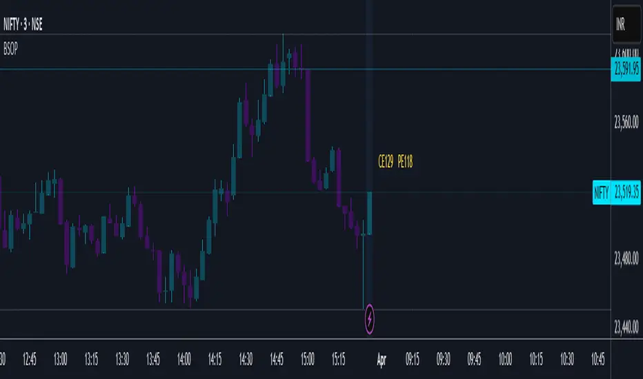
• Underlying asset price (NIFTY): 23,519.35
• ATM Call Strike Price: 23,500
• ATM Put Strike Price: 23,550
• IV (Implied Volatility) for Call Option: 8.1%
• IV (Implied Volatility) for Put Option: 10.1%
• Expiry Date: April 3, 2025
Using the Black-Scholes model, the calculated theoretical prices are:
• Theoretical ATM CE price: ₹129
• Theoretical ATM PE price: ₹118
For comparison, the actual option prices from the option chain table at the time of writing were:
• Actual ATM CE price: ₹139.70
• Actual ATM PE price: ₹120.30
As we can see, there is a larger difference between the theoretical price and actual market price for the ATM Call option compared to the ATM Put option.
If you're an experienced trader, you likely know how to use this kind of information to identify potential market inefficiencies or trading opportunities.
How to Use This Script:
1. Add the script to your TradingView chart.
2. Input the necessary parameters such as stock price, strike price, volatility, risk-free rate, and time to expiration.
3. View the calculated call and put option prices directly on the chart.
This Black-Scholes options pricing calculator provides a convenient way to compute theoretical option prices within TradingView. It helps traders analyse whether an option is fairly priced based on market conditions.
While the Black-Scholes model has its limitations (e.g., it does not account for early exercise of American options or dividend payments), it remains a powerful tool for European-style options pricing and a foundational concept in financial markets.
A handy little tool! Unfortunately, this script requires manual data entry since automatic data capture is currently not possible. If this ever becomes feasible in the future, an updated version will be released.
Try it out and let me know your feedback!
Disclaimer:
Please note that this is only for study/educational purpose and is just one of the many tools a trader may use.
Use it at your own risk.
Regards!
HV/IV Options IndicatorThe Options HV/IV indicator helps in comparing the Scripts Historic Volatility with Implied Volatility (provided by user). The Indicator creates 5 zones, starting from the bottom
Zone 1 - Very Cheap
Zone 2 - Cheap
Zone 3 - Fair
Zone 4 - Expensive
Zone 5 - Very Expensive
The location of the Implied Volatility (Blue line) in the corresponding zone helps in understanding the options pricing as very cheap, cheap, fair, expensive or very expensive. This analysis helps in choosing the correct option strategy when planning options trades.
Use the link below to obtain access to this indicator.

RV − IV Spread Alert (SPY vs VIX)Realized vs Implied Volatility Spread (RV − IV) for the S&P 500 / SPY.
Plots the daily difference between 30-day realized volatility (SPY) and implied volatility (VIX) in basis points.
Key insight from the research: when the spread turns and stays above ≈ +50 bps, forward returns historically degrade and volatility of returns rises sharply — a useful early-warning regime flag.
Features:
- Clean daily plot of RV − IV in bps
- Horizontal lines at 0, −50 bps and +50 bps
- Red background when spread > +50 bps
- Built-in alert condition that fires once per bar close when spread closes above +50 bps
- Optional “all-clear” alert when it drops back below
Use on SPY or ES1! daily chart. Perfect for anyone wanting a simple notification when the market enters the “risk-on” volatility regime highlighted by Machina Quanta and the original Bali & Hovakimian (2007) paper.

GSR BandsGSR Bands is an indicator designed to analyze the dynamics of an implied volatility index based on opening gaps. The model builds an accumulated series of gaps and generates additional offset bands derived from Fibonacci numbers and prime numbers (+10, +20, +30, +50, +70, +80, +110, +125).
The result is a set of cumulative gap curves that help visualize relevant zones in the evolution of the volatility index (potential areas of maximum volatility). Users can customize the offset values displayed on the chart, making it easier to explore different analytical scenarios.
The indicator can be applied to volatility indices such as VIX or VDAX-NEWS, and may serve as a complementary tool when studying the relationship between implied volatility and equity markets.
Note : This indicator does not constitute an investment recommendation. It is intended solely as a technical analysis tool.

VIX Implied Move Bands for ES/Emini futuresThis script uses the close of the VIX on a daily resolution to provide the 'implied move' for the E-mini SP500 futures. While it can be applied to any equity index, it's crucial to know that the VIX is calculated using SPX options, and may not reflect the implied volatility of other indices. The user can adjust the length of the moving average used to calculate the bands, the window of days used to calculate the implied move, and the multiplier that effects the width of the bands.

IV/HV Ratio's [Nic]IV is implied volatility
HV is historic realized volatility
Seneca teaches that we often suffer more in our minds than in reality, and the same is true with the stock market. This indicator can help identify when people are over paying for implied volatility relative to real volatility . This means that short sellers are over paying for puts and can be squeezed into covering their positions, resulting in a massive rally.
The indicator can track this spread over many time frames, when the short time frame is much higher than the lower time frames, consider it a signal-of-interest.

Implied minus Historical VolatilityJust a simple comparison of 30 day historical volatility versus 30 day implied volatility(VIX). In general, when VIX is way above realized or historical Vol, in general that is quite bullish. Backtest will be available soon.
Calm before the StormCalm before the Storm - Bollinger Bands Volatility Indicator
What It Does
This indicator identifies and highlights periods of extremely low market volatility by analyzing Bollinger Bands distance. It uses percentile-based analysis to find the "quietest" market periods and highlights them with a gradient background, operating on the premise that low volatility periods often precede significant price movements.
How It Works
Volatility Measurement: Calculates the distance between Bollinger Bands upper and lower boundaries
Percentile Analysis: Analyzes the lowest X% of volatility periods over a configurable lookback period (default: lowest 40% over 200 bars)
Visual Highlighting: Uses gradient opacity to show volatility levels - the lower the volatility, the more opaque the background highlighting
Adaptive Threshold: Automatically calculates what constitutes "low volatility" based on recent market conditions
Who Should Use It
Primary Users:
Breakout Traders: Looking for consolidation periods that may precede significant moves
Options Traders: Seeking low implied volatility periods before volatility expansion
Swing Traders: Identifying accumulation/distribution phases before trend continuation or reversal
Range Traders: Spotting tight trading ranges for mean reversion strategies
Trading Styles:
Volatility-based strategies
Breakout and momentum trading
Options strategies (volatility plays)
Market timing approaches
When to Use It
Market Conditions:
Consolidation Phases: When price is moving sideways with decreasing volatility
Pre-Announcement Periods: Before earnings, economic data, or major events
Market Transitions: During shifts between trending and ranging markets
Low Volume Periods: When institutional participation is reduced
Strategic Applications:
Entry Timing: Wait for volatility compression before positioning for breakouts
Risk Management: Reduce position sizes during highlighted periods (anticipating volatility expansion)
Options Strategy: Sell premium during low volatility, buy during expansion
Multi-Timeframe Analysis: Combine with higher timeframe trends for confluence
Key Benefits
Objective Volatility Measurement: Removes subjectivity from identifying "quiet" markets
Adaptive Analysis: Automatically adjusts to current market conditions
Visual Clarity: Easy-to-interpret gradient highlighting
Customizable Sensitivity: Adjustable percentile thresholds for different trading styles
Best Used In Combination With:
Trend analysis tools
Support/resistance levels
Volume indicators
Momentum oscillators
This indicator is particularly valuable for traders who understand that periods of low volatility are often followed by periods of high volatility, allowing them to position ahead of potential significant price movements.
VIX Implied MovesKey Features:
Three Timeframe Bands:
Daily: Blue bands showing ±1σ expected move
Weekly: Green bands showing ±1σ expected move
30-Day: Red bands showing ±1σ expected move
Calculation Methodology:
Uses VIX's annualized volatility converted to specific timeframes using square root of time rule
Trading day convention (252 days/year)
Band width = Price × (VIX/100) ÷ √(number of periods)
Visual Features:
Colored semi-transparent backgrounds between bands
Progressive line thickness (thinner for shorter timeframes)
Real-time updates as VIX and ES prices change
Example Calculation (VIX=20, ES=5000):
Daily move = 5000 × (20/100)/√252 ≈ ±63 points
Weekly move = 5000 × (20/100)/√50 ≈ ±141 points
Monthly move = 5000 × (20/100)/√21 ≈ ±218 points
This indicator helps visualize expected price ranges based on current volatility conditions, with wider bands indicating higher market uncertainty. The probabilistic ranges represent 68% confidence levels (1 standard deviation) derived from options pricing.

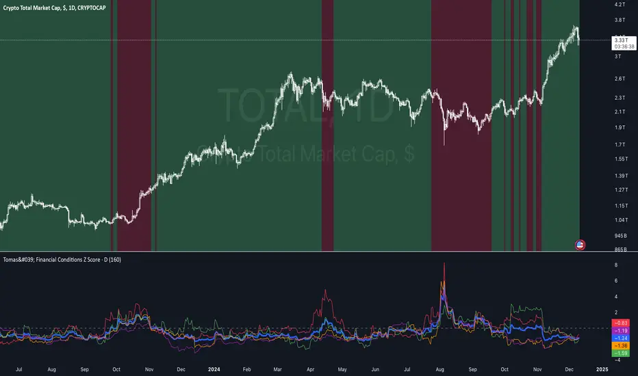
Tomas' Financial Conditions Z Score"The indicator is a composite z-score comprised of the following four components (equally-weighted):
Credit spreads - ICE BofA High Yield Option Adjusted Spread (BAMLH0A0HYM2) and ICE BofA Corporate Index Option Adjusted Spread (BAMLC0A0CM)
Volatility indexes - VIX (S&P 500 implied volatility) and MOVE (US Treasury bond implied volatility)
I've got it set to a 160-day lookback period, which I think is roughly the best setting after some tinkering.
When the z-score is above zero, it throws a red signal - and when the z-score is below zero, it throws a green signal.
This indicator is a follow-on from the "traffic light financial conditions indicator" that I wrote a thread about a couple of months ago.
I moved on from that previous indicator because it is based on the Federal Reserve's NFCI, which is regularly revised, but I didn't take that into account at the time.
So not a great real-time indicator, if the signal can be subsequently revised in the opposite direction weeks later.
This new indicator is based on real-time market data, so there's no revisions, and it also updates daily, as opposed to weekly for the NFCI"
IV Rank/Percentile with Williams VIX FixDisplay IV Rank / IV Percentile
This indicator is based on William's VixFix, which replicates the VIX—a measure of the implied volatility of the S&P 500 Index (SPX). The key advantage of the VixFix is that it can be applied to any security, not just the SPX.
IV Rank is calculated by identifying the highest and lowest implied volatility (IV) values over a selected number of past periods. It then determines where the current IV lies as a percentage between these two extremes. For example, if over the past five periods the highest IV was 30%, the lowest was 10%, and the current IV is 20%, the IV Rank would be 50%, since 20% is halfway between 10% and 30%.
IV Percentile, on the other hand, considers all past IV values—not just the highest and lowest—and calculates the percentage of these values that are below the current IV. For instance, if the past five IV values were 30%, 10%, 11%, 15%, and 17%, and the current IV is 20%, the IV Rank remains at 50%. However, the IV Percentile is 80% because 4 out of the 5 past values (80%) are below the current IV of 20%.
IV Rank & IV PercentileThis indicator is meant to be a substitute for Implied Volatility Rank and Percentile for traders who do not have access to readily available options data. This indicator is based on the William's VixFix which is an indicator that mirrors the VIX, which charts the implied volatility of the SPX. The great thing about the VixFix is that it can be applied to any security, not just the SPX.
IV Rank is calculated by taking the highest and lowest values over the past however many periods you choose, and seeing what percentage of the way between those values the current IV value is. For example if over the past 5 periods the highest IV value was 30 and the lowest IV value was 10, and the current is 20; then the IV Rank would be 50% because 20 is 50% of the way between 10 & 30.
IV Percentile is calculated by looking at all of the past values, not just the highest and lowest, and seeing how many of those values were below the current. For example lets say over the past five periods the IV values were : 30,10,11,15, & 17; while the current IV value is 20. As stated before the IV Rank would be 50%, while the IV Percentile would be 80%, given that 4/5 of the values were below the current IV value of 20.
IV Rank and IV Percentile are often wrongly used interchangeably, but as shown here they are very different. Most people use IV Rank as their main options tool; while IV percentile is a great way to give IV Rank context. Whichever you choose to use, or even both, does not really matter as long as you use either one or both consistently.
IV Rank and IV Percentile are mainly used in this way: when IVR/IVP <50, buy options, when IVR/IVP >50 sell options. The reason that you buy options when IVR/IVP is low is because IV is mean reverting, so you would expect IV to eventually start increasing towards the mean, causing prices to move. The reason you would sell options when IVR/IVP is high is because IV is mean reverting and you would expect IV to decrease towards the mean, causing prices to move sideways.
In this script there are two lines, one denoting IVR and one denoting IVP. IVR is the line which is green when it's above 50 and red when below 50. IVP is the line which is aqua when above 50 and orange when below 50.

SPY Daily Expected Move • Manual VIXSPY Daily Expected Move • Manual VIX — Description 📈🔥
This indicator calculates the daily expected move (EM) for SPY using a manual VIX input, then draws the projected high and low boundaries for the trading session.
It automatically retrieves the previous day’s closing price (or today’s open if you choose), then applies a volatility-based formula to estimate the range SPY is statistically likely to remain within. 📊
How the Expected Move Is Calculated 🧮
This indicator uses a simplified institutional volatility model:
\text{Expected % Move} = \frac{\text{VIX}}{\sqrt{252}}
This daily percentage is multiplied by your chosen baseline price:
📘 Previous Close (recommended — most accurate)
🌅 Today’s Open
✏️ Custom Price
And the script automatically plots:
🔼 Expected High
🔽 Expected Low
🏷️ Optional labels + info panel
Choosing the Correct Baseline 🎯
The baseline is one of the most important components of the expected move calculation.
Previous Day’s Close (Strongly Recommended) ✔️
Used by:
🏦 Market makers
🎛️ Options market makers
📐 Institutional volatility models
Expected move represents full-day implied volatility, making the previous close the mathematically correct anchor for SPY.
Using the VIX Input 🌡️
Enter the current VIX, taken from /VX futures or the ^VIX index.
⬆️ Higher VIX = larger expected move
⬇️ Lower VIX = tighter expected move
This lets you align SPY’s session range with real-time volatility conditions.
Recommended VIX-Based Multiplier Adjustments 🔧
The multiplier input allows you to fine-tune the expected move in different volatility regimes.
VIX Level Market Condition Recommended Multiplier
🟦 < 13 Very low volatility 0.9 — tight EM
🟩 13–18 Normal conditions 1.0 (default)
🟨 18–25 Elevated volatility 1.05 – 1.1
🟧 25–35 High volatility 1.2 – 1.3
🟥 > 35 Extreme volatility 1.4 – 1.6
These adjustments reflect how SPY’s actual intraday range stretches during higher volatility periods.
Why This Indicator Matters for SPY Traders 🚀
SPY is the most heavily traded ETF in the world, and market makers heavily rely on expected move to price options.
Because of that:
🧲 EM levels often act as dynamic support/resistance
📛 Breaks above/below EM can trigger gamma-driven trend days
🔄 Sweeps around EM frequently produce high-probability reversal zones
This indicator provides a statistically grounded framework that helps traders anticipate where SPY is most likely to:
move
stall
reverse
expand beyond expected range
All with clean, auto-updating levels that adjust daily based on your input of previous close price and the current VIX opening price.⚡📘

SPX Realized Volatility & Expected MoveRealized Volatility & Expected Move Dashboard
This indicator provides a sophisticated, multi-horizon view of an asset's historical volatility and projects the corresponding expected move (EM) in price points. Unlike indicators that rely on implied volatility (VIX), this tool uses the asset's own historical price action (Realized Volatility) to forecast future range potential.
Key Features & Calculations
Multi-Horizon Realized Volatility (RV): Calculates the annualized Realized Volatility based on log returns for three critical lookback periods:
30 Days (Long-Term): Measures structural volatility (default lookback).
9 Days (Short-Term): Captures recent market temperament.
1 Day (Immediate): Highly reactive to the previous day's movement.
Daily Timeframe Independence (Critical): The RV calculation is performed exclusively on Daily price data (via request.security), ensuring that the 30-day lookback is always 30 calendar days, regardless of whether you view the indicator on a 1-minute or 4-hour chart.
Expected Move Projection: Projects the calculated RV onto the price using the standard financial formula:
$$\text{EM}_{\text{H}} = \text{Price} \times \frac{\text{RV}_{\text{Annual}}}{100} \times \sqrt{\frac{\text{Horizon Days}}{252}}$$
Visual Bands: Plots the Upper and Lower Expected Move bands centered around the current price for all three horizons, providing clear targets for range expansion or contraction.
Comprehensive Table Output: A dashboard summarizes the key metrics, displaying:
Realized Vol (Annualized %): The raw volatility percentage.
Full Horizon Expected Move: The calculated price point move over the full 30-day, 9-day, or 1-day horizon.
Daily Equivalent Expected Move: The daily expected move derived from that RV, making it the most useful target for intraday trading (e.g., the $\pm 1\sigma$ move for today).
Interpretation & Usage
Identify Regime Changes: Compare the short-term RV (9D) against the long-term RV (30D). If 9D > 30D, volatility is accelerating; if 9D < 30D, volatility is contracting.
Set Intraday Targets: Use the 1 Day EM or the Daily Equivalent EM derived from the 9D/30D bands as dynamic support and resistance levels for the trading session.
Analyze Over-Extension: If the price trades outside the 30 Day EM bands, the move is historically extreme and may signal a sharp reversal or momentum exhaustion.

VWAP and IVP Volatility Screener AlertVWAP and IVP Volatility Screener Alert is a multi-asset, institutional-grade market scanner that combines Auto-Anchored VWAP, Implied Volatility Percentile (IVP), Choppiness Index, Strike Price Structure, and Volume Profile (POC / Value Area) to generate high-probability trade signals across multiple symbols.
Designed for traders who rely on volatility regimes, VWAP interactions, trend confirmation, and strike-based price behavior, this tool automatically evaluates up to 10 assets simultaneously and displays actionable BUY/SELL conditions in a unified dashboard and screener panel.
Key Features
1. Multi-Asset Screener (10 Symbols)
Scans FX, indices, commodities, and metals. Displays RSI, ADX, trend, score, volatility regime, VWAP/POC/Value Area position, IVP, and Choppiness. Custom strike increments per asset.
2. Auto-Anchored VWAP System
Auto anchors by Session, Day, Week, Month, or Auto. Includes VWAP bands and bounce detection to show when price is Above, Below, or interacting with VWAP.
3. Volume Profile + POC / Value Area
Generates intraday/session POC, VAH, and VAL. Detects breaks, retests, and bounce signals.
4. IV Percentile (IVP) Engine
Converts realized volatility into IVP and classifies regimes (EXT.HI → EXT.LO). Supports Favorable, Extreme, and High-Volatility modes for different trading styles.
5. Choppiness Index (CHOP)
Identifies trending vs ranging conditions and feeds directly into scoring and alerts.
6. 11-Criteria Alert System
Alert logic includes RSI, ADX, trend, volume, VWAP, POC/VA, strike proximity, std-dev breaks, IVP, CHOP, and score thresholds. Supports Score-Based or Multi-Criteria modes.
7. Price-to-Strike Mapping
Rounds price to the correct strike ladder, detecting reversals, continuation, breakout levels, and helping frame stop-loss/TP zones.
8. Session-Aware Filtering
Filters signals for Asian, London, and NY sessions with custom timezone support.

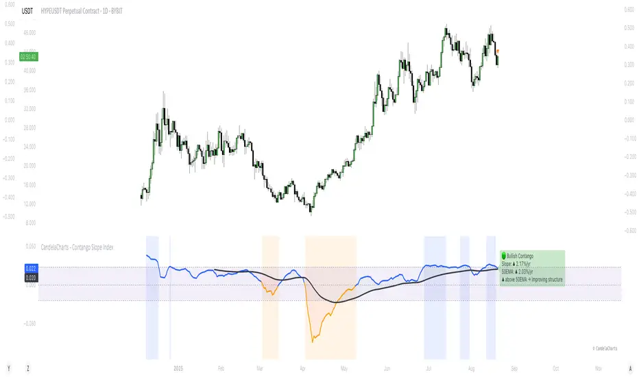
CandelaCharts - Contango Slope Index 📝 Overview
The Contango Slope Index (CSI) is a volatility term structure analysis tool designed to quantify the slope of the VIX futures curve over time.
By measuring the rate of change in implied volatility across multiple tenors—such as VIX1D, VIX (1M), VIX3M, VIX6M, and VIX1Y—the CSI provides traders and analysts with real-time insights into market sentiment, risk appetite, and potential turning points in equity markets.
Developed by CandelaCharts, the CSI draws from established financial research on volatility term structures, particularly focusing on how contango (upward-sloping curve) and backwardation (downward-sloping curve) regimes correlate with future market behavior.
The index computes a normalized slope using linear regression across available VIX futures, offering a dynamic view of evolving market expectations. The core output a slope value expressed in annualized percentage points per year (%/yr)—represents the steepness of the volatility curve:
Positive slope: Contango regime, typically associated with market stability and complacency.
Negative slope: Backwardation, historically linked to fear, near-term uncertainty, and often preceding market rallies.
Slope crossing zero or key thresholds: Generates regime shifts and alert conditions.
📦 Features
The Contango Slope Index offers a comprehensive set of features for analyzing volatility dynamics:
Multi-Tenor Volatility Input: Users can select which VIX futures contracts to include in the slope calculation: VIX, VIX1D, etc
Dynamic Slope Calculation: The indicator calculates the slope of the VIX term structure using linear regression on time-to-maturity (TTM) vs. volatility levels.
Moving Average Overlay: A configurable moving average (SMA, EMA, RMA, WMA, VWMA) is applied to the smoothed slope to identify trend direction and momentum shifts.
Regime Classification: Based on the slope value and its relationship to the moving average, the CSI classifies current market conditions into distinct regimes.
Visual Enhancements: Color-coded slope line, background shading, etc
Real-Time Label & Tooltip: On the last bar, a dynamic label displays: Current regime, Slope value and direction, etc
⚙️ Settings
VIX: Toggles use of spot VIX index (CBOE_DLY:VIX).
VIX1D: Toggles use of 1-day VIX futures (CBOE_DLY:VIX1D).
VIX3M: Toggles use of 3-month VIX futures (CBOE_DLY:VIX3M).
VIX6M: Toggles use of 6-month VIX futures (CBOE_DLY:VIX6M).
VIX1Y: Toggles use of 1-year VIX futures (CBOE_DLY:VIX1Y).
MA: Enables moving average filter; options include type (SMA, etc.) and period length.
Slope: Defines slope calculation line thickness and colors.
Bg: Enables background shading with customizable colors.
⚡️ Showcase
Slope Line
Customizable Moving Average
Regime Shift Zones
📒 Usage
The CSI is plotted as a standalone oscillator beneath the price chart (non-overlay mode). Key interpretation guidelines:
Slope Direction
Slope < 0 - Backwardation: Indicates near-term volatility is higher than long-term expectations. Historically, this has preceded equity market rallies, as panic subsides and fear peaks.
Slope > 0 - Contango: Reflects normal market conditions where longer-dated volatility is priced higher. Persistent high contango may signal complacency.
Magnitude of Slope
Slope > 0.0232 (%/yr) - Elevated complacency: The term structure is steeper than historical average—caution advised ahead of potential corrections.
Slope near 0 - Neutral or transitioning regime: Markets may be at inflection points.
Slope vs. MA Crossover
Slope crosses above MA: Improving confidence, potential upside acceleration
Slope crosses below MA: Deteriorating structure, rising stress
🚨 Alerts
Six pre-configured alerts are available for integration into trading systems:
🚨 Backwardation Detected – Slope turns negative
🔚 Exit Backwardation – Slope crosses above zero
⚠️ Elevated Complacency – Slope exceeds 2.32%/yr
📈 Potential Bullish Setup – Slope crosses below zero
✅ Slope Crosses Above MA – Momentum improves
⚠️ Slope Crosses Below MA – Momentum deteriorates
⚠️ Disclaimer
These tools are exclusively available on the TradingView platform.
Our charting tools are intended solely for informational and educational purposes and should not be regarded as financial, investment, or trading advice. They are not designed to predict market movements or offer specific recommendations. Users should be aware that past performance is not indicative of future results and should not rely on these tools for financial decisions. By using these charting tools, the purchaser agrees that the seller and creator hold no responsibility for any decisions made based on information provided by the tools. The purchaser assumes full responsibility and liability for any actions taken and their consequences, including potential financial losses or investment outcomes that may result from the use of these products.
By purchasing, the customer acknowledges and accepts that neither the seller nor the creator is liable for any undesired outcomes stemming from the development, sale, or use of these products. Additionally, the purchaser agrees to indemnify the seller from any liability. If invited through the Friends and Family Program, the purchaser understands that any provided discount code applies only to the initial purchase of Candela's subscription. The purchaser is responsible for canceling or requesting cancellation of their subscription if they choose not to continue at the full retail price. In the event the purchaser no longer wishes to use the products, they must unsubscribe from the membership service, if applicable.
We do not offer reimbursements, refunds, or chargebacks. Once these Terms are accepted at the time of purchase, no reimbursements, refunds, or chargebacks will be issued under any circumstances.
By continuing to use these charting tools, the user confirms their understanding and acceptance of these Terms as outlined in this disclaimer.