Relative StrengthThis indicator is called Relative Strength and is no way related to RSI ( Relative strength indicator).
It is simply a ratio of asset A to asset B plotted. Usually it is used to look for strength vs a particular index. Since it is a ratio, all the trendlines work on it. The default index is NIFTY. You can change it any index/script you want to compare:
1. Script vs Index
2. Index vs Index
Cerca negli script per "Relative"

Relative Strength Scatter PlotThis is a modication to the indicator ably coded by LOAMEX but with some minor modifications and uses Australian Stock Exchange indices instead of US. This makes it easier for those to use in other countries becasue it has the template for adding indices and the benchmark.
Refer to the LOAMEX indicator for information or the text in this open source pinescript.
The plot shows the relative strength of various indices to a benchmark index, in this case, the ASX XJO200. Indices or sectors located close to the top right hand quadrant are showing the best out performance and thus make up the best source to create your watchlist.
Similarly, you can put stocks in your portfolio into the indicator and see which ones are closest to the upper right of the plot. Those residing in the bottom left quadrant need to be pruned from your portfolio or watched more carefully with closer stop losses.

Relative Performance vs XAO (Histogram)RSC Relative Strength Comparison is used to compare performance of a Sector Index or Stock against a Benchmark (Index). The Benchmark used is the Australian All Ordinaries Index with a look back period of 63 days (3 months). Both the benchmark and look back period may be changed in the code to suit.

Relative Sector Index Benchmarking by QuantxQuantX Relative Strength helps traders identify whether a stock is outperforming or underperforming NIFTY. It uses a clean histogram with background highlights and a trend line to spot market leaders, laggards, and strength reversals quickly.

Relative Volume Table with PressureDisplay relative Volume as a table in the top right corner. Turns green when volume is high and price is increasing and red when volume is high and price is decreasing. I use this on D timeframe at the open to screen for stocks breaking out.
Relative Volume (RVOL) + Average Volume [AZ]The script helps you instantly see whether today’s volume is unusual compared to the past (relative volume). It’s built for breakout/fakeout filters, like the 15-minute ORB strategy you’re running.
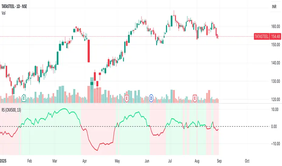
Relative Strength with CNX500This indicator compares the relative strength of the stock with respect to a wider benchmark index Nifty 500
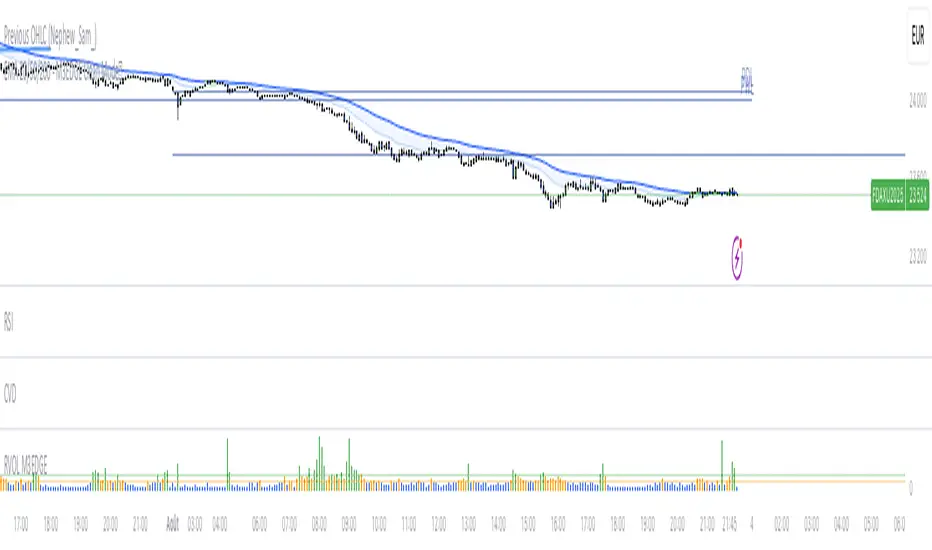
M3EDGE™ Relative Volume (RVOL)Relative Volume (RVOL) compares the current volume to its historical average.
🎯 Goal: Spot abnormal flows and anticipate impulsive moves.
🔍 M3EDGE™ Key Reading:
• RVOL > 2.0 → Likely institutional activity.
• RVOL > 1.5 → Heightened surveillance: potential move building.
• Price falling + high RVOL → Stealth accumulation / sell-side absorption.
• Price rising + high RVOL → Confirmed breakout with real flows.
💡 In the M3EDGE™ method, RVOL filters out false signals and validates setups by aligning flow + structure + momentum.
Applied to ETFs or stocks, it reveals what price action alone won’t show
Relative StrengthDescription:
This indicator provides a simplified yet powerful method for measuring a stock's momentum based on its proximity to its recent high. It is a direct implementation of a trading concept discussed in a lecture from the New York Institute of Finance.
Core Concept
The underlying theory, supported by academic research, is that a stock making a new high is one of the most bullish signals possible. Such stocks have a statistical tendency to continue making new highs in the near term.
Instead of requiring complex relative strength calculations against a universe of stocks, this indicator uses a simple and elegant ratio to act as a proxy for momentum:
Indicator Value = Current Close / Highest High of Lookback Period
A value approaching 1.0 indicates the stock is strong and nearing a new high. A value at 1.0 means a new high has just been made.
How to Use This Indicator
The indicator consists of two primary components:
RS Line (Teal): The core momentum calculation (Close / High).
Signal MA (Orange): A moving average of the NHRS Line, which acts as the trigger for signals.
The signals are generated based on the crossover between these two lines:
BUY Signal: When the RS Line crosses ABOVE its moving average. This suggests that short-term momentum is accelerating and a new uptrend may be starting. The background will turn green.
SELL Signal: When the RS Line crosses BELOW its moving average. This indicates that momentum is fading and it may be prudent to exit the position to avoid a decline. The background will turn red.
Indicator Settings
You can customize the indicator to fit your trading style and the timeframe you are analyzing:
High Lookback Period: Choose the period for the "Highest High" calculation. Options range from 1 Month to 12 Months (52 weeks), allowing you to measure short-term or long-term strength.
Moving Average Length: Adjust the length of the signal line's moving average. The lecturer defaults to 26 weeks for a six-month view.
Moving Average Type: Select the type of moving average for the signal line (SMA, EMA, WMA, HMA).
Credits and Inspiration
Proper credit is essential. This script is a practical application of a concept that builds upon foundational academic work.
The core idea that a stock's proximity to its 52-week high is an investable anomaly was detailed in the 2004 Journal of Finance paper:
"The 52 Week High and Momentum Investing" by Thomas J. George and Chuan-Yang Hwang.
The lecturer's contribution, which this script implements, was to simplify this concept into an actionable trading tool by applying a moving average crossover to generate clear and objective buy and sell signals.
Disclaimer: This tool is for educational and informational purposes only. It is not financial advice. All trading involves risk, and you should always perform your own research and backtesting before making any trading decisions.
Relative Volume CandlesVisualizes candlesticks with transparency based on volume relative to a moving average. Higher-than-average volume makes candles more opaque, while lower volume increases transparency—helping you spot significant price movements at a glance!
Features:
Customizable up/down candle colors (default: green/red)
Adjustable lookback period for volume averaging (default: 21)
Fine-tune transparency with base transparency (default: 80) and scale (default: 2.0)
Overlay directly on your chart for seamless analysis

Relative ATRThis indicator enhances the standard Average True Range (ATR) by providing context about current volatility relative to its recent historical average. It highlights periods where ATR is significantly higher or lower than its own recent norm.

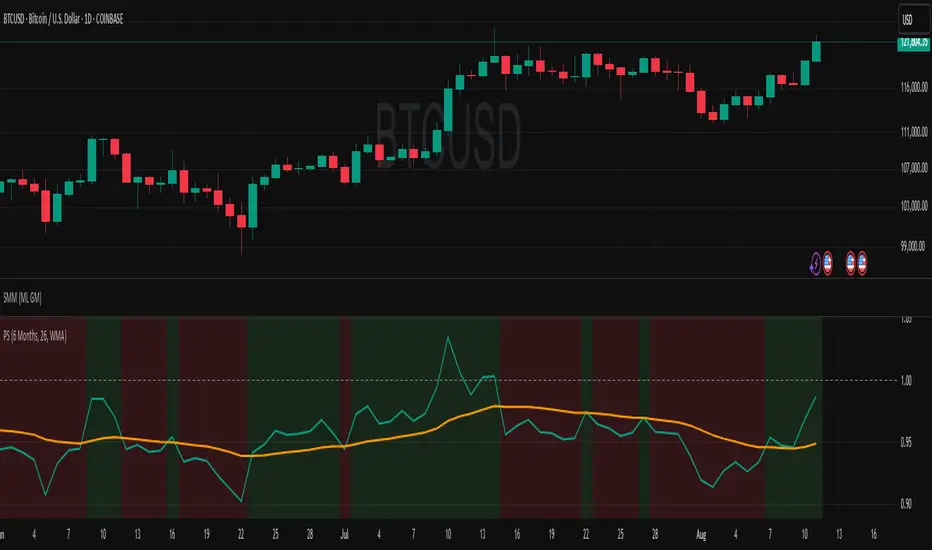
Relative PerformanceSimple relative performance of a token compared to BTC, with display of normalized performance velocity line.

Relative PPP for USDBRLThis indicator calculates the USDBRL exchange rate using the Relative Purchasing Power Parity method, which considers that the variation in the exchange rate is equal to the variation in inflation in Brazil minus the variation in inflation in the US. It is derived from the Law of One Price, which states that an identical good should have the same price in different markets when adjusted for exchange rates, assuming the absence of arbitrage barriers such as transaction costs or trade restrictions.
The indicator is calculated starting from June 1994, at the launch of the Real Plan, which equalized the value of the Brazilian Real and the US Dollar at that time. This indicator is useful for providing an idea of the long-term trend of the Dollar exchange rate (months or years), acting similarly to a moving average, around which the exchange rate gravitates.
It's useful for analysts who have to forecast the USDBRL in the long term.

Relative Volume Candles [QuantVue]In the words of Dan Zanger, "Trying to trade without using volume is like trying to drive a few hundred miles without putting gas in your tank. Trying to trade without chart patterns is like leaving without having an idea how to get there!"
Volume tends to show up at the beginning and the end of trends. As a general rule, when a stock goes up on low volume, it's seen as negative because it means buyers aren't committed. When a stock goes down on low volume, it means that not many people are trying to sell it, which is positive.
The Relative Volume Candles indicator is based on the Zanger Volume Ratio and designed to help identify key volume patterns effortlessly, with color coded candles and wicks.
The indicator is designed to be used on charts less than 1 Day and calculates the average volume for the user selected lookback period at the given time of day. From there a ratio of the current volume vs the average volume is used to determine the candle’s colors.
The candles wicks are color coded based on whether or not the volume ratio is rising or falling.
So when is it most important to have volume? When prices break out of a consolidation pattern like a bull flag or cup and handle pattern, volume plays a role. When a stock moves out of a range, volume shows how committed buyers are to that move.
Note in order to see this indicator you will need to change the visual order. This is done by selecting the the 3 dots next to the indicator name, scrolling down to visual order and selecting bring to front.
Indicator Features
🔹Selectable candle colors
🔹Selectable ratio levels
🔹Custom lookback period***
***TradingView has a maximum 5,000 bar lookback for most plans. If you are on a lower time frame chart and you select a lookback period larger than 5,000 bars the indicator will not show and you will need to select a shorter lookback period or move to a higher time frame chart.
Give this indicator a BOOST and COMMENT your thoughts!
We hope you enjoy.
Cheers!

Relative Volume Force IndexThis indicator can anticipate the market movements. Its posible because it calculates how much force (volume) it's necessary to move the price up or down. If it's necessary a lot of volume to move the price a little it's a reversion signal, but if a little volume could change the price whit elevate volatility, it's signal of reversion too. The indicator plots red if the market is down, and green if it's up, the size and the color of the bars cand demonstrate the movement relative force. Does it by the configurable averages. Not works well whit poor liquidity.

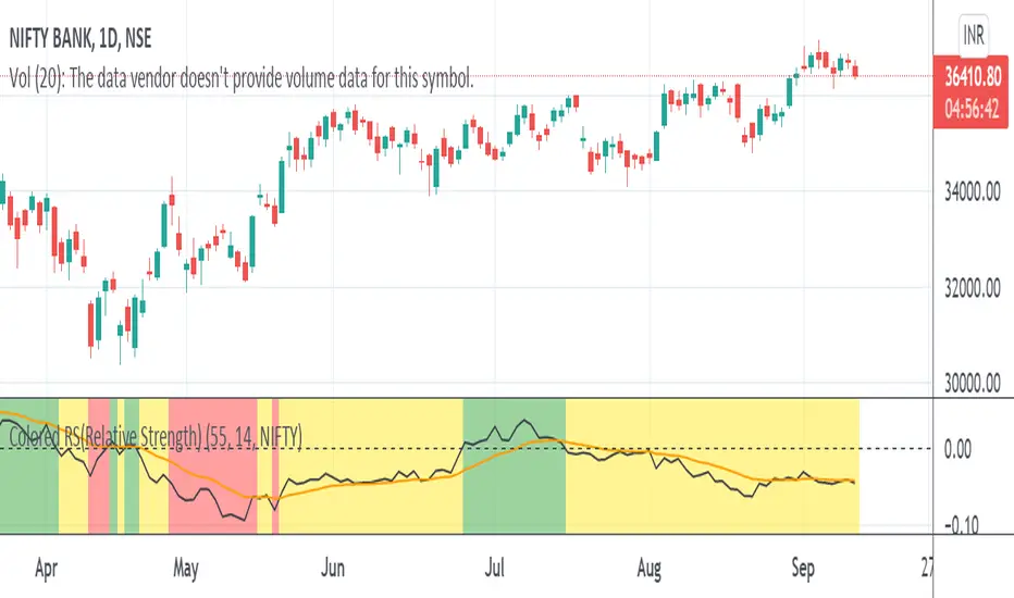
Colored RS(Relative Strength)Relative strength is a calculation of the price trend of a stock or a financial instrument in comparison to another instrument, stock, or industry.
Color indication
Red :: Benchmark returns is -ve and the RS_Value is below 0.
Yellow :: Benchmark returns is +ve and RS_Value is below 0.
Green :: Becnhmark returns is +ve and RS_Value is above 0.
Blue :: Benchmark returns is -ve and RS_Value is above 0.
Relative Strength Index 2x maThe relative strength index, represented as two moving averages with periods, one of which will be a multiple of the longer moving average by the amount you set.
The indicator can work both in automatic and manual mode. In automatic mode, the optimal periods are selected, in my opinion, depending on which timeframe is being analyzed at the current moment. In manual mode, you can set the required period yourself.
You can also set the method of smoothing the moving averages yourself and apply them to the opening or closing, the minimum of the bar, etc.
An important point: it is possible to enable/disable graphical functions that may not be required - just check the box next to the function that you want to see on your indicator.
Show ConDiv? - enabling / disabling the convergence/divergence function of the moving averages of the RSI indicator (not to be confused with the MACD for the asset price chart)
Show ma? - enabling/disabling the graphical display of the moving averages of the RSI indicator
Show RSI? - enabling / disabling the standard RSI indicator (if you want to see only it, check the box opposite; in this case, you need to remove the other two checkboxes)
I wish you good luck in building your trading plans, and remember: such indicators do not predict the future price movement on the chart, they only determine the characteristics of the price movement at the current time, taking into account historical data.

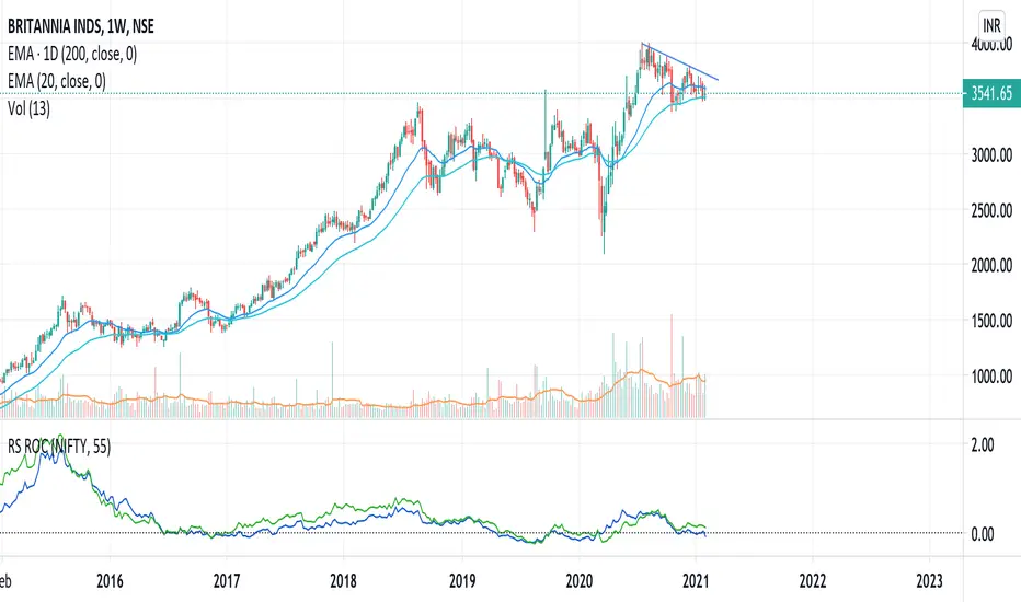
Relative Strength (RS) and Rate of Change (ROC) Combined in oneThis indicator combines Relative Strength and Rate of Change (ROC) in one plot. Change the period and comparative symbol (defaulted to NSE:NIFTY) in settings.
Relative Returns StrategyLooks like an ultimate strategy for buy and hold investors.
This is designed based on the indicator :
Converting that into strategy with little optimization yield this. One change here is, instead of using the return percentage directly, we are using moving averages on both of them.
Buy condition : Moving Average on stock return crosses over that of index return.
Sell condition : Moving Average on stock return crosses under that of index return.

Relative Currency StrengthThis indicator shows the relative strength of the majors and crosses compared to each other. So, if you are taking a EURUSD long, are you taking it because the Euro is strong or the USD is weak or both? How do you know? This indicator will show you how strong a current is compared to the other majors and crosses. So in the EURUSD example, you will know how strong the EUR is compared to NZD, AUD, JPY, CHF, GBP, CAD and USD and how strong the USD is compared to the NZD, AUD, JPY, CHF, EUR, GBP and CAD. You can then make an informed choice as to whether the trade makes sense.
Notice in the examples below how the indicator clearly shows how CHF was weak all day and GBP was strong in the morning but then collapsed in the afternoon.
The indicator functions by taking a set point in the day and comparing how price compares to it for the rest of the day. I set it to Europe open and then take context of how a currency is comparing to that price (verses the other currencies) over the course of the day.
You can use the indicator in 2 ways - you set a currency as a baseline and see how other currencies fluctuate about it or you can see how all the currencies strengths compare to each other.
If you have the full tradingview membership you can have 8 screens and see how each currency compares. if you set the indicator to automatic it will automatically default to the base currency that you compare to OANDA gold.
The general strength is useful as a general overview as to where strength and weakness is in the charts. It works by using gold as the baseline which is a reliable way to compare strengths.
REMEMBER, THIS GIVES SUMMARY DATA. USE IT TO GET MARKET CONTEXT IN ORDER TO IDENTIFY WHERE STRENGTH AND WEAKNESS IS - YOU CANT JUST TRADE FROM IT. It's extremely useful in fast moving markets to easily stay aware of what is happening.


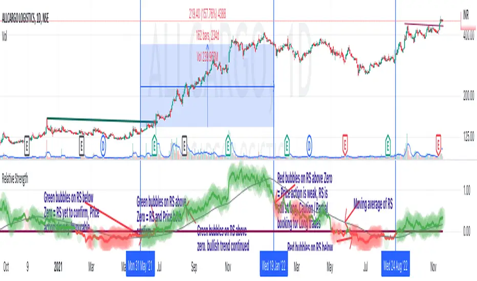
Relative Strength of a stockDetermine the relative strength of a stock vis-a-vis a larger benchmark. Default is NIFTY50.
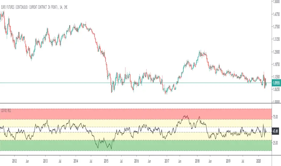
Relative Strength Index for COT System V2Standard Relative Strenght Indicator with coloured value areas. The red area shows a strong overbought level, what can be used as an warning signal for a trend reversal into downtrend.
The green area shows a strong oversold level, what can be used as an warning signal for a trend reversal into uptrend. The yellow areas are only warning areas.