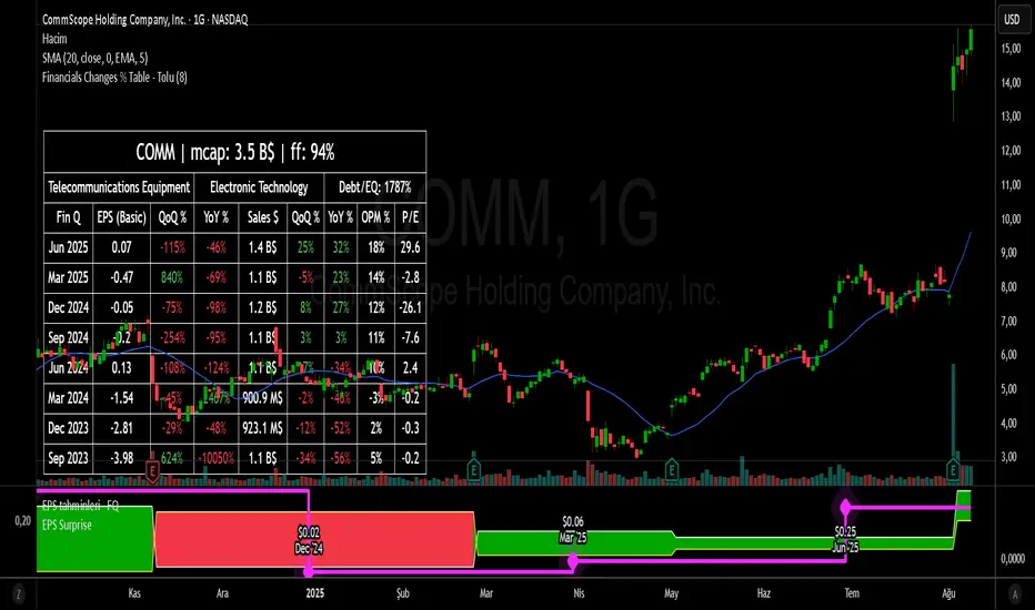
Financial Change % Table - ToluFinancial Change % Table which includes revenue , operating profit and earning per share . compares the financial data with previous quarter QoQ and previous year YoY . and shows the change in %.
Cerca negli script per "Table"
Position Sizing Risk TablePosition Sizing Risk Table - swing trading. Allowing for a 0,25; 0,5 and 1% risk based on NAV

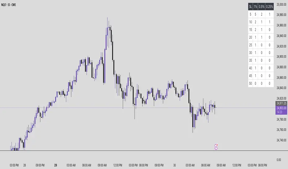
Futures Risk Contract TableFutures risk table for NQ MNQ YM MYM ES and MES
changeable capital and risk percentage along with points.
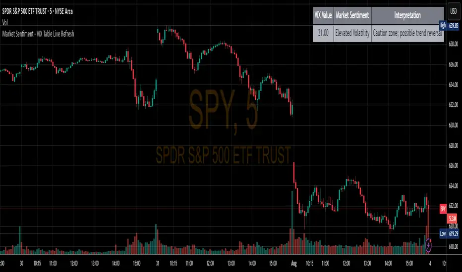
Market Sentiment - VIX Table Live RefreshProvides Market sentiment visual representation for easy understanding - using CBOE:VIX values
The VIX Sentiment Table provides an at-a-glance assessment of market mood by visualizing live data from the CBOE Volatility Index (VIX). Updated in sync with your chart’s resolution, this intuitive tool breaks down the current VIX level into clear sentiment zones—ranging from “Complacency” to “Panic”—paired with concise interpretations to guide your trading decisions.
EMA Ribbon with TableThis indicator plots multiple EMAs (5, 8, 13, 21, 34, 55, 89, 144, 233, 377) based on Fibonacci levels. Each line has a distinct color, and a clean table displays their real-time values. Great for spotting trend direction, crossovers, and momentum at a glance.

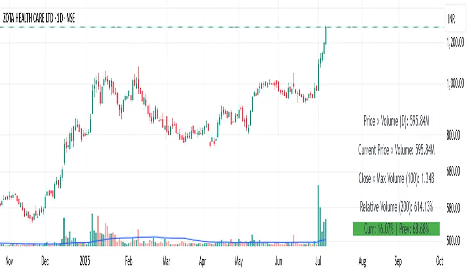
Price × Volume TableIt creates a table showing:
1- Daily Close × Daily Volume
2- Current Close × Current Volume
3- Close × Highest Volume (last 360 candles)
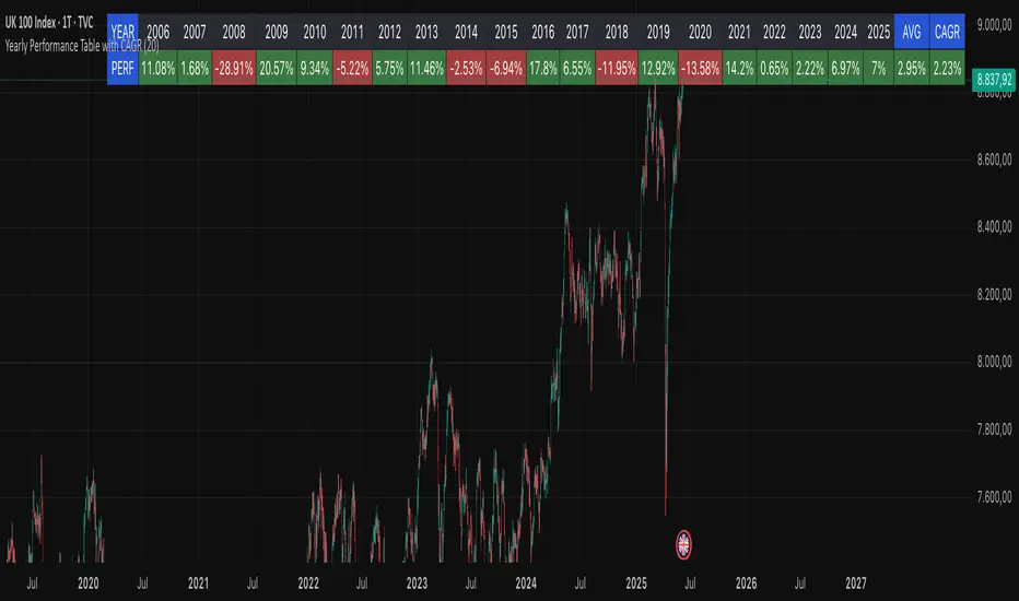
Yearly Performance Table with CAGROverview
This Pine Script indicator provides a clear table displaying the annual performance of an asset, along with two different average metrics: the arithmetic mean and the geometric mean (CAGR).
Core Features
Annual Performance Calculation:
Automatically detects the first trading day of each calendar year.
Calculates the percentage return for each full calendar year.
Based on closing prices from the first to the last trading day of the respective year.
Flexible Display:
Adjustable Period: Displays data for 1-50 years (default: 10 years).
Daily Timeframe Only: Functions exclusively on daily charts.
Automatic Update: Always shows the latest available years.
Two Average Metrics:
AVG (Arithmetic Mean)
A simple average of all annual returns. (Formula: (R₁ + R₂ + ... + Rₙ) ÷ n)
Important: Can be misleading in the presence of volatile returns.
GEO (Geometric Mean / CAGR)
Compound Annual Growth Rate. (Formula: ^(1/n) - 1)
Represents the true average annual growth rate.
Fully accounts for the compounding effect.
Limitations
Daily Charts Only: Does not work on intraday or weekly/monthly timeframes.
Calendar Year Basis: Calculations are based on calendar years, not rolling 12-month periods.
Historical Data: Dependent on the availability of historical data from the broker/data provider.
Interpretation of Results
CAGR as Benchmark: The geometric mean is more suitable for performance comparisons.
Annual Patterns: Individual year figures can reveal seasonal or cyclical trends.
Symbol vs Benchmark Performance & Volatility TableThis tool puts the current symbol’s performance and volatility side-by-side with any benchmark —NASDAQ, S&P 500, NIFTY or a custom index of your choice.
A quick glance shows whether the stock is outperforming, lagging, or just moving with the market.
⸻
Features
• ✅ Returns over 1W, 1M, 3M, 6M, 12M
• 🔄 Benchmark comparison with optional difference row
• ⚡ Volatility snapshot (20D, 60D, or 252D)
• 🎛️ Fully customizable:
• Show/hide rows and timeframes
• Switch between default or custom benchmarks
• Pick position, size, and colors
Built to answer a simple, everyday question — “How’s this really doing compared to the broader market?”
Thanks to @BeeHolder, whose performance table originally inspired this.
Hope it makes your analysis a little easier and quicker.
Abusuhil Bullish Candles (Label + Table)Abusuhil Bullish Candles is a pattern recognition indicator designed to identify key bullish reversal candlestick formations including Hammer, Bullish Engulfing, Morning Star, Piercing Line, Three White Soldiers, and Three Inside Up.
The script includes optional filters such as Stochastic and Volume Confirmation, providing more precise signal detection.
Each pattern and filter is fully customizable via settings. Alerts are also included to support active trading workflows.
This script was written originally and does not copy open-source indicators. It's ideal for traders seeking visual clarity on bullish opportunities with professional-grade logic.
مؤشر الشموع الصعودية هو مؤشر احترافي يكتشف أبرز نماذج الانعكاس الصعودي في الشموع اليابانية مثل: Hammer، Bullish Engulfing، Morning Star، Piercing Line، Three White Soldiers، و Three Inside Up.
يوفر المؤشر فلاتر إضافية مثل فلتر Stochastic وفلتر الفوليوم لتعزيز دقة الإشارات. جميع الإعدادات قابلة للتعديل بما يتناسب مع احتياج كل متداول.
يحتوي المؤشر أيضًا على تنبيهات تلقائية لدعم استراتيجيات التداول اللحظي. تمت برمجة المؤشر من الصفر ويعتمد على منطق خاص غير منسوخ من سكربتات مفتوحة المصدر.
--------------------------------------------------------------------------------------------------------------------
🇸🇦 التحديثات – النسخة الجديدة (Abusuhil Bullish Candles)
✅ تم تغيير الملصقات بشكل أوضح: باستخدام دوائر ملونة أسفل الشموع بدلًا من المربعات لتفادي التراكب.
🟦 إضافة جدول تفاعلي على الشارت يعرض أسماء النماذج وألوانها المخصصة.
🎨 إمكانية تغيير ألوان كل نموذج من الإعدادات حسب رغبة المستخدم.
🧩 تفعيل/تعطيل كل نموذج على حدة من خلال إعدادات منفصلة.
🔔 إضافة تنبيه احترافي واحد يتم تفعيله عند تحقق أي نموذج نشط من النماذج المحددة.
📋 توافق كامل مع سياسة TradingView:
لا يحتوي على أكواد منسوخة أو مبنية على مؤشرات داخلية.
لا تكرار للوظائف أو العناوين.
وصف واضح مع تحكم كامل للمستخدم.
🇬🇧 Updates – Latest Version (Abusuhil Bullish Candles)
✅ Clearer Signal Labels: Now uses colored circles under candles instead of labels to avoid overlapping.
🟦 Interactive Table showing pattern names and user-defined colors.
🎨 Customizable colors for each candlestick pattern from the settings menu.
🧩 Toggle each pattern independently using dedicated checkboxes.
🔔 Single professional alert condition that triggers only when any enabled pattern is detected.
📋 Fully compliant with TradingView's publishing policy:
No reused or built-in indicator code.
No duplicated logic or misleading titles.
Clean and modular design with full user customization.

ATR Percentage TableSimple ATR shows the average price change per candle. In order to enter a trade, I need to know how much percent I will win.
I should enter the game for the cross with the highest percentage change. I created a table by entering a cross name in each line in the list and made it possible to follow the changes in the active window.
I sorted the ATR change percentages from largest to smallest. Being able to see the highest percentage change is an answer to the question of which crosses I should choose to open a trade.

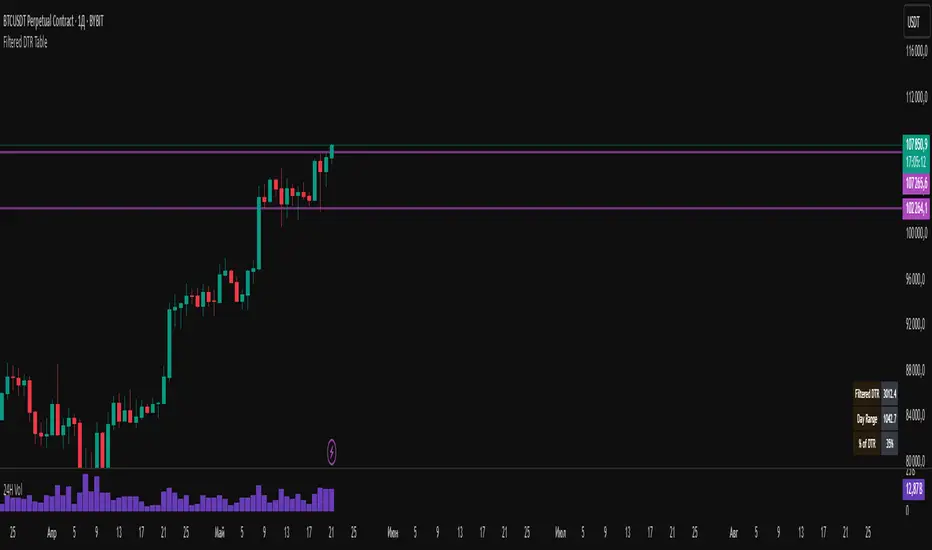
Filtered DTR Table📊 Filtered Daily True Range (DTR) Indicator
This indicator calculates and displays a filtered version of the Daily True Range (DTR) over the last 14 trading days, using high and low prices of each day.
It filters out extreme values by excluding any daily range that is:
Less than 0.5× the average range
Greater than 2× the average range
The indicator shows a table in the bottom-right corner of the main chart, containing:
Filtered ATR – The average of valid (filtered) daily ranges over the past 14 days, based on the high-low difference.
Current Day's Range – The high-low range of the current trading day.
% of ATR – How much of the filtered ATR has been covered by today's range, expressed as a whole number percentage.
Trend Table ZeeZeeMonMulti-Timeframe Trend Indicator
Overview
This indicator identifies trends across multiple higher timeframes and displays them in a widget on the right side of the chart. It serves as an alternative trend-filtering tool, helping traders align with the dominant market direction. Unlike traditional moving average-based trend detection (e.g., price above/below a 200 MA), this indicator assesses whether higher timeframes are genuinely trending by analyzing swing highs and lows.
Trend Definition
Uptrend: Higher highs and higher lows.
Downtrend: Lower highs and lower lows.
A trend reversal occurs when a prior high/low is breached (e.g., in a downtrend, breaking the last high signals an uptrend).
Customization Options
Lookback Period: Adjusts the sensitivity for identifying swing highs/lows (pivot points). A shorter lookback detects more frequent pivots.
Historical Pivot Visibility: Toggle to display past swing highs/lows for verification.
Support/Resistance Lines: Show dynamic levels from recent pivots on higher timeframes. Breaching these lines indicates potential trend changes.
Purpose
Helps traders:
Confirm higher timeframe trends before entering trades.
Monitor proximity to trend reversals.
Fine-tune pivot sensitivity for optimal trend detection.
Note: Works best as a supplementary trend filter alongside other trading strategies.

Gap Day Stats TableDescription:
This Pine Script helps you analyze gap up and gap down days using a user-defined gap percentage threshold. It generates a real-time statistics table that tracks:
📈 Number of Gap Up Days
🔻 How many of those days closed lower (Open > Close)
🧮 Total points lost on such gap up days (Open - Close)
📉 Number of Gap Down Days
🔺 How many of those days closed higher (Close > Open)
🧮 Total points gained on such gap down days (Close - Open)
🔧 Customization:
Gap threshold is adjustable via input
Automatically updates stats daily
Ideal for spotting behavioral edge in gaps
This tool is useful for traders building gap trading systems, mean reversion models, or studying post-gap behavior in equities and indices.

ATR Table with Average [filatovlx]ATR indicator with advanced analytics
Description:
The ATR (Average True Range) indicator is a powerful tool for analyzing market volatility. Our indicator not only calculates the classic ATR, but also provides additional metrics that will help traders make more informed decisions. The indicator displays key values in a convenient table, which makes it ideal for trading in any market: stocks, forex, cryptocurrencies and others.
Main functions:
Current ATR value:
Current ATR (Points) — the current ATR value in points. It shows the absolute level of volatility.
Current ATR (%) — the current ATR value as a percentage of the price. It helps to estimate the volatility relative to the current price of an asset.
The ATR value on the previous bar:
ATR 1 Bar Ago (Points) — the ATR value on the previous bar in points. Allows you to compare the current volatility with the previous one.
ATR 1 Bar Ago (%) — the ATR value on the previous bar as a percentage. It is convenient for analyzing changes in volatility
Индикатор ATR с расширенной аналитикой
Описание:
Индикатор ATR (Average True Range) — это мощный инструмент для анализа волатильности рынка. Наш индикатор не только рассчитывает классический ATR, но и предоставляет дополнительные метрики, которые помогут трейдерам принимать более обоснованные решения. Индикатор отображает ключевые значения в удобной таблице, что делает его идеальным для использования в торговле на любых рынках: акции, форекс, криптовалюты и другие.
Основные функции:
Текущее значение ATR:
Current ATR (Points) — текущее значение ATR в пунктах. Показывает абсолютный уровень волатильности.
Current ATR (%) — текущее значение ATR в процентах от цены. Помогает оценить волатильность относительно текущей цены актива.
Значение ATR на предыдущем баре:
ATR 1 Bar Ago (Points) — значение ATR на предыдущем баре в пунктах. Позволяет сравнить текущую волатильность с предыдущей.
ATR 1 Bar Ago (%) — значение ATR на предыдущем баре в процентах. Удобно для анализа изменения волатильности.
Среднее значение ATR за последние 5 баров:
ATR Avg (5 Bars) (Points) — среднее значение ATR за последние 5 баров в пунктах. Показывает сглаженный уровень волатильности.
ATR Avg (5 Bars) (%) — среднее значение ATR за последние 5 баров в процентах. Помогает оценить общий тренд волатильности.
Преимущества индикатора:
Удобство использования: Все ключевые значения выводятся в компактной таблице, что экономит время на анализ.
Гибкость: Возможность настройки периода ATR и длины скользящего среднего под ваши торговые стратегии.
Универсальность: Подходит для любых рынков и таймфреймов.
Наглядность: Процентные значения ATR помогают быстро оценить уровень волатильности относительно цены актива.
Повышение точности: Дополнительные метрики (например, среднее значение ATR) позволяют лучше понимать текущую рыночную ситуацию.
Для кого этот индикатор?
Трейдеры, которые хотят лучше понимать волатильность рынка.
Скальперы и внутридневные трейдеры, которым важно быстро оценивать изменения волатильности.
Инвесторы, которые используют ATR для определения стоп-лоссов и тейк-профитов.
Разработчики торговых стратегий, которым нужны точные данные для тестирования и оптимизации.
Как это работает?
Индикатор автоматически рассчитывает все значения и выводит их в таблицу на графике. Вам не нужно вручную считать или анализировать данные — просто добавьте индикатор на график, и вся информация будет перед вами.

Timeframe Display Table with CustomizationsPlaces a single cell table in the top right of the chart to display the currently viewed timeframe at all times on the chart.

Custom Trend TableManual input of trend starting with Daily Time frame, then H4 and H1.
If Daily and H4 are the same trend we can ignore H1 trend (N/A).
M15 Buy or Sell comes automatically depending on what the higher time frame trends are.
If Daily and H4 are bearish, then we look for Selling opportunities on M15.
If Daily and H4 are bullish, then we look for Buying opportunities on M15.
If Daily and H4 are different trends, then H1 trend will determine M15 Buy or Sell.
Works for up to 4 pairs / Symbols. If you need more, just add the indicator twice and on the second settings, move the placement of the table to a different location (Eg: Top, Middle) so you can see up to 8 Symbols. Repeat this process if required.

UM VIX status table and Roll Yield with EMA
Description :
This oscillator indicator gives you a quick snapshot of VIX, VIX futures prices, and the related VIX roll yield at a glance. When the roll yield is greater than 0, The front-month VX1 future contract is less than the next-month VX2 contract. This is called Contango and is typical for the majority of the time. If the roll yield falls below zero. This is considered backwardation where the front-month VX1 contract is higher than the value of the next-month VX2 contract. Contango is most common. When Backwardation occurs, there is usually high volatility present.
Features :
The red and green fill indicate the current roll yield with the gray line being zero.
An Exponential moving average is overlaid on the roll yield. It is red when trending down and green when trending up. If you right-click the indicator, you can set alerts for roll yield EMA color transitions green to red or red to green.
Suggested uses:
The author suggests a one hour chart using the 55 period EMA with a 60 minute setting in the indicator. This gives you a visual idea of whether the roll yield is rising or falling. The roll yield will often change directions at market turning points. For example if the roll yield EMA changes from red to green, this indicates a rising roll yield and volatility is subsiding. This could be considered bullish. If the roll yield begins falling, this indicates volatility is rising. This may be negative for stocks and indexes.
I look for short volatility positions (SVIX) when the roll yield is rising. I look for long volatility positions (VXX, UVXY, UVIX) when the roll yield begins falling. The indicator can be added to any chart. I suggest using the VX1, SPY, VIX, or other major stock index.
Set the time frame to your trading style. The default is 60 minutes. Note, the timeframe of the indicator does NOT utilize the current chart timeframe, it must be set to the desired timeframe. I manually input text on the chart indicator for understanding periods of Long and Short Volatility.
Settings and Defaults
The EMA is set to 55 by default and the table location is set to the lower right. The default time frame is 60 minutes. These features are all user configurable.
Other considerations
Sometimes the Tradingview data when a VX contract expires and another contract begins, may not transition cleanly and appear as a break on the chart. Tradingview is working on this as stated from my last request. This VX contract from one expiring contract to the next can be fixed on the price chart manually: ( Chart settings, Symbol, check the "Adjust for contract changes" box)
Observations
Pull up a one-hour chart of VX1 or SPY. Add this indicator. roll it back in time to see how the market and volatility reacts when the EMA changes from red to green and green to red. Adjust the EMA to your trading style and time frame. Use this for added confirmation of your long and short volatility trades with the Volatility ETFs SVIX, SVXY, VXX, UVXY, UVIX. or use it for long/short indexes such as SPY.

ADX and DI Trend meter and status table IndicatorThis ADX (Average Directional Index) and DI (Directional Indicator) indicator helps identify:
Trend Direction & Strength:
LONG: +DI above -DI with ADX > 20
SHORT: -DI above +DI with ADX > 20
RANGE: ADX < 20 indicates choppy/sideways market
Trading Signals:
Bullish: +DI crosses above -DI (green triangle)
Bearish: -DI crosses below +DI (red triangle)
ADX Strength Levels:
Strong: ADX ≥ 50
Moderate: ADX 30-49
Weak: ADX 20-29
No Trend: ADX < 20
Best Uses:
Trend confirmation before entering trades
Identifying ranging vs trending markets
Exit signal when trend weakens
Works well on multiple timeframes
Most effective in combination with other indicators
The table displays current trend direction and ADX strength in real-time
Good Candles with Risk TableThis custom Pine Script indicator highlights bullish and bearish candles based on the highest and lowest close prices over the past specified number of candles (look-back period).
Bullish candles are marked with an orange color when the close is higher than the highest close from the previous candle.
Bearish candles are marked with a purple color when the close is lower than the lowest close from the previous candle.
The indicator also draws two lines for each colored candle:
Midline: A horizontal line drawn at the midpoint between the open and close of the candle, which helps visualize the candle's body.
Open line: A horizontal line drawn at the open price, offering an additional reference point for market action.
Lines are visible for the last 5 colored candles (either bullish or bearish), with old lines being removed to avoid clutter on the chart.
Additionally, the Risk Table at the top right of the chart shows the calculated units to buy for the specified risk amount (default value of $0.1), based on the distance between the candle’s close and its midpoint. This allows users to manage their risk effectively by knowing how many units they should purchase to match their desired risk level.

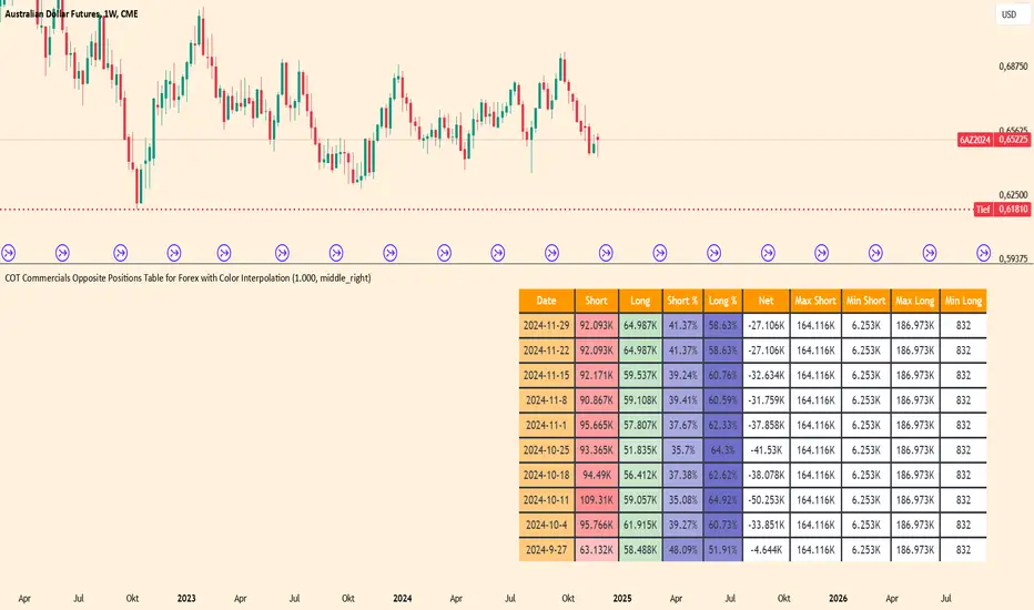
COT Commercials Positions Table Der COT Commercials Opposite Positions Table for Forex ist ein umfangreicher TradingView-Indikator, der die Positionen der kommerziellen Marktteilnehmer (Commercials) im Rahmen des Commitments of Traders (COT)-Berichts darstellt. Er zeigt Long-, Short-, und Netto-Positionen sowie deren prozentuale Anteile für ausgewählte Märkte an.
Hauptmerkmale:
Datenquellenwahl: Unterstützt "Futures Only" und "Futures and Options".
Marktabdeckung: Umfasst Währungen, Rohstoffe, Indizes und Kryptowährungen.
Farbkodierung: Dynamische Farbverläufe zur Hervorhebung von Extremen bei Long-/Short-Positionen und Prozentsätzen.
Historische Daten: Zeigt Positionsdaten der letzten 10 Wochen an.
Anpassbare Tabelle: Klar strukturiert mit wichtigen Kennzahlen wie max./min. Positionen und Netto-Positionen.
Der Indikator ist besonders für Trader nützlich, die Marktstimmungen analysieren und Positionierungen großer Marktteilnehmer in ihre Handelsentscheidungen einbeziehen möchten.
Der Indikator ist hauptsächlich für Futures gedacht und funktioniert nur im 1 Woche Chart.
52 Week High/Low Tracking TableThis Indicator helps the User to Quickly view Current Closing Price Compared to the Mentioned Period High and Low.
"Bars Back" indicate the period you need to look back. In case of Daily charts 260 Bars Back usually indicate 52 Weeks/1 year. This is set a default. But you can change it as well.
The Indicator will show the data for below:-
1) High - Highest Close price for the Mentioned Period
2) % from High - The Percentage difference between the Current Close Price Vs Highest Close price for the Mentioned Period. (-) indicate that the current close price is lesser then then High Price.
3) Low - Lowest Close price for the Mentioned Period
4) % from Low - The Percentage difference between the Current Close Price Vs Highest Close price for the Mentioned Period. (-) indicate that the current close price is lesser then then High Price.
You can add this indicator to Quickly Scan multiple stocks to see were they stand.

Japan Stock Market Indices Performance TableYou can display the performance of the Nikkei 225 Futures and major indices of the Japanese stock market for the day in a table format on your chart.
The 5-Minute Change Rate shows the change from the opening price of the most recent 5-minute candlestick.
The Daily Change Rate displays the change from the opening price at 09:00 GMT+9 on the current trading day.
Since the Japanese stock market opens at 09:00 GMT+9 , the values for Nikkei 225 Futures, USD/JPY, and EUR/JPY are also calculated based on their opening prices at that time. This script was created because, while brokerage apps allow you to see the comparison to the previous day's close for each index, they do not display the rate of change from the current day's opening price.
Notes:
All values are reset each trading day at 09:00 GMT+9.
If you have not purchased real-time market data from the Tokyo Stock Exchange and Osaka Exchange, data may be delayed by 20 minutes and may not display correctly.
The Tokyo Stock Exchange sector indices are distributed in real-time at 15-second intervals from the TSE, so this script aligns with that timing.
当日の日経225先物と日本株式市場の主要指数のパフォーマンスを表形式でチャート上に表示することができます。
5分変化率は直近の5分足の始値からの変化率、当日変化率は当日09:00の始値からの変化率を表示しています。
日本株式市場が開くのが GMT+9 09:00 のため、それに合わせて日経225先物、ドル円、ユーロ円も GMT+9 09:00 時点の始値を元に各値を算出しています。
各指数の前日比は証券会社のアプリで見れるものの、当日始値からの変化率が見れないため作成しました。
補足
各営業日の朝(GMT+9 09:00)に各値はリセットされます。
Tokyo Stock ExchangeとOsaka Exchangeのreal-time market dataを購入していない場合、データが20分遅れになるため正常に表示されない可能性があります。
東証業種別株価指数は東証から配信されるのが15秒間隔でのリアルタイムになるため、このスクリプトもそれに準ずる形となっています。

Volume Performance Table (Weekdays Only)This is a volume performance table that compares the volume from the previous trading day to the average daily volume from the previous week, month, 3-month, 6-month, and 12-month period in order to show where the rate of change of volume is contributing to the price trend.
For example, if the price trend is bullish and volume is accelerating, that is a bullish confirmation.
If the price is bearish and volume is accelerating, that is a bearish confirmation.
If the price is bullish and volume is decelerating, that is a bearish divergence.
If the price is bearish and volume is decelerating, that is a bullish divergence.
This does not include weekend trading when applied to digital assets such as cryptocurrencies.
