Cerca negli script per "Volatility"
Volatility ArbitrageDescription:
This indicator uses rate of change (ROC) indicator and its standard deviations.
ROC values are cycling around zero, i.e. around the mean.
Two standard deviations of the ROC draw the upper and the lower bounds that serve as thresholds.
These capture outliers that can be used as signals.

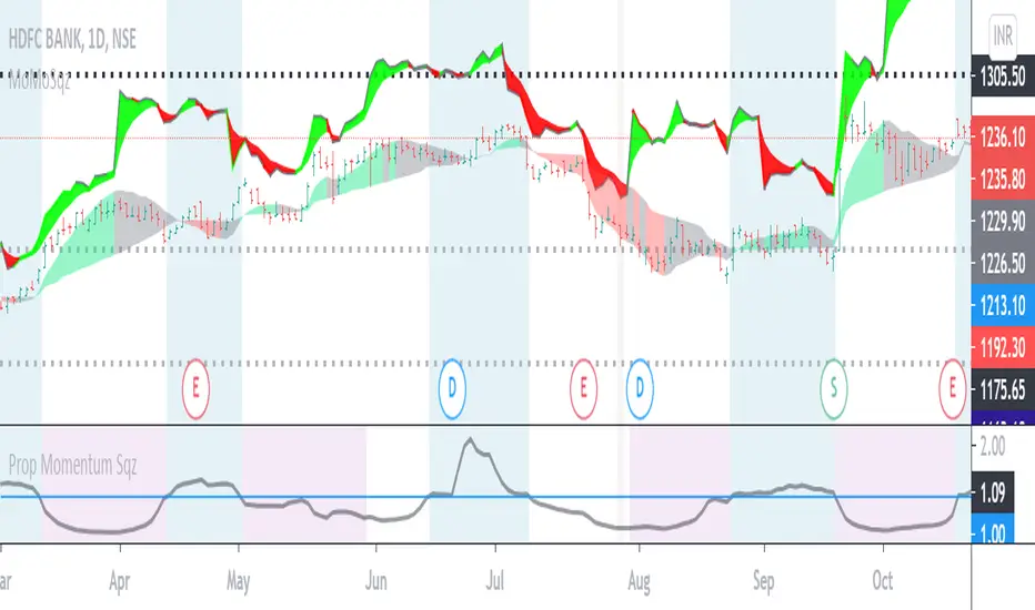
Volatility Squeeze Region IndicatorVolatility Squeeze Indicator conditions based on lowest ATR ,proportion of Bollinger and keltner channel upper and lower bands. Usage to identify and highlight Squeeze region when if indicator value <1 means Squeeze On and >1 means Squeeze off .
Additionally Background Highlights for Daily(Blue), Weekly(Brown) and Monthly(purple) Squeeze regimes for confluence check. For Breakouts and trades use appropriate Price Action and in conjunction other indicators.
Volatility InfoThis indicator is an information panel. It shows 4 hours, daily and weekly price changes.
Lookback period and all three resolutions can be change in indicator settings.
It is very easy to add more symbols in the script.
Happy trading.

Volatility based Standarde Deviation and Fib. Pivot PointsThis indicator plots Standard deviation levels and Fib. Pivot Points. I prefer to use only SD levels but Fib. levels also come handy in providing support and resistance.
How to use this indicator:
You have to manually enter instrument's Closing Price / Settlement Price and VIX closing price to draw each day's levels.
For NQ, I use VXN closign price and for ES or RTY, I use VIX closing price.
This indicator can be used on individual stocks and forex pairs.

MMDVZ 1.0 - Moving Multi-Day VWAP ZonesVolatility adjusted moving multi-day VWAP zones
Directionality, trend and support/resistance levels at a glance
Useful for trading practically all kinds of stocks and futures.
Works well with many timeframes.
More updates to come, stay tuned


Volatility Index by Kiwato Always adjust settings!
Support the development of new indicators:
BTC: 1LRHrA9wChPyZgCtWj3vBxv8FwHKWKmmmU
LTC: Lfw6FfeZhJofLJSackJ5uDam2BnDqh8Acp
ETH: 0xeE7abEc3303D5Ca4c05b876B2cE8E2406481365a
ZCASH: t1gSCHrcRN1GcCP2YWGh6xG9hSxSkxMoofF


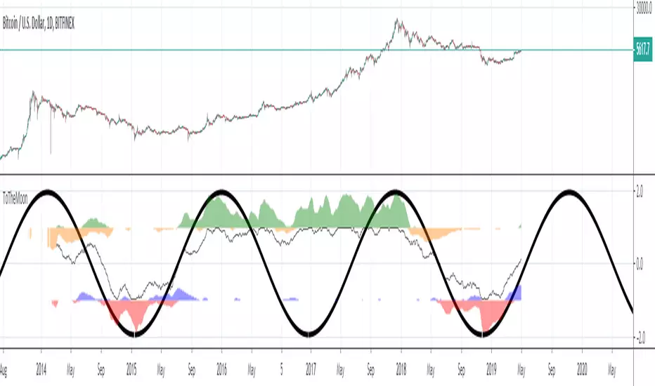
ToTheMoonVolatility direction and strength, normalized oscillator.
200 candles moving average analysis. Always zoom out and examine the neighboring waves.


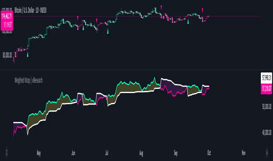
Weighted Vstop | viResearchWeighted Vstop | viResearch
Conceptual Foundation and Innovation
The "Weighted Vstop" indicator from viResearch is a volatility-based stop-loss system that enhances the accuracy of trend-following strategies by incorporating weighted price calculations. The innovation lies in its use of a weighted closing price, combined with the Average True Range (ATR) to account for volatility. By emphasizing recent data through a weighted price, the indicator becomes more responsive to market changes, providing a dynamic tool for setting stop-losses and identifying potential trend shifts.
This weighted approach helps traders manage risk more effectively, reducing the likelihood of false signals caused by sudden market fluctuations, making it ideal for traders seeking to stay aligned with market trends.
Technical Composition and Calculation
The "Weighted Vstop" script starts by calculating a weighted closing price, assigning 90% weight to the current close and 10% weight to the previous close. This produces a smoother price series, minimizing noise. The core component, the volatility stop (Vstop), is calculated using the ATR and a user-defined multiplier. The ATR measures market volatility over a specified length, while the multiplier adjusts the Vstop's sensitivity to these changes in volatility.
Two key variables—the maximum and minimum values of the weighted closing price—are maintained throughout. When the price moves above the Vstop, an uptrend is signaled, causing the stop to adjust upward. If the price falls below the Vstop, the stop moves downward, indicating a potential downtrend. This dynamic adjustment mechanism helps traders lock in profits during trends and minimize losses during reversals.
Features and User Inputs
The "Weighted Vstop" script offers various customizable inputs for traders to fine-tune the indicator based on their strategies. Traders can adjust:
Vstop Length, which defines the period used to calculate the ATR, determining how sensitive the stop-loss levels are to volatility.
Multiplier, which modifies the ATR’s influence on the Vstop, allowing traders to widen or tighten the stop-loss levels.
Bar Color Settings, enabling traders to visually distinguish trend shifts by coloring bars according to the current trend direction. Practical Applications
The "Weighted Vstop" indicator is designed for traders seeking a dynamic method to set stop-losses and identify trends. The weighted price series helps reduce false signals during volatile conditions, while the ATR-based Vstop ensures that stop-loss levels adjust based on market volatility. This makes it particularly effective for:
Risk Management, allowing traders to adapt their strategy by tightening stops during low volatility and widening them in high-volatility environments.
Trend-Following, providing clear signals for when trends continue or reverse, helping traders stay in profitable trades longer while avoiding premature exits.
Reducing False Signals, where the weighted price calculation helps minimize the noise that could trigger unnecessary stop-losses in conventional systems. Advantages and Strategic Value
The "Weighted Vstop" script is valuable for its integration of a volatility-based stop-loss with a weighted price calculation. The ATR-based stop-loss dynamically adapts to market conditions, offering a more refined approach to risk management. Customizable Vstop length and multiplier settings allow traders to adjust the indicator based on their timeframes and trading preferences.
This adaptability makes the "Weighted Vstop" a key tool for optimizing risk management, providing accurate stop-loss levels that respond to market volatility without overreacting to short-term fluctuations.
Alerts and Visual Cues
The script includes alert conditions to notify traders of significant trend changes. A "Weighted Vstop Long" alert triggers when the weighted price moves above the Vstop, indicating a potential upward trend. Conversely, the "Weighted Vstop Short" alert signals a possible downward trend when the price falls below the Vstop. Color-coded bar plots offer clear visual cues to indicate the current trend, helping traders interpret real-time market conditions effectively.
Summary and Usage Tips
The "Weighted Vstop | viResearch" indicator provides an adaptable and powerful solution for traders who want to use volatility-based stop-losses to identify trend shifts. By integrating a weighted closing price with an ATR-based Vstop, this script helps traders remain aligned with trends while managing risk efficiently. Incorporating this tool into your trading strategy can improve your ability to capture trends and minimize losses during market reversals, offering a reliable and customizable option for traders at all levels.
Note: Backtests are based on past results and are not indicative of future performance.
Trailing Stop Loss SuperTrendThe Trailing Stop Loss SuperTrend indicator is a popular technical analysis tool used by traders to identify trends and determine optimal entry and exit points in financial markets. This indicator combines elements of the SuperTrend indicator and trailing stop loss orders to provide valuable insights into market trends and potential reversals. By incorporating Average True Range (ATR) calculations, it adapts to market volatility, making it suitable for various trading strategies. Let's explore the key use cases and benefits of the Trailing Stop Loss SuperTrend indicator:
Trend Identification:
The primary purpose of the Trailing Stop Loss SuperTrend indicator is to identify market trends. It plots two lines on the chart: an upper band (referred to as the "up" line) and a lower band (referred to as the "dn" line). The direction of these bands helps traders determine the prevailing trend. When the price is above the upper band, it suggests a bullish trend, and when it is below the lower band, it indicates a bearish trend.
Entry and Exit Signals:
The Trailing Stop Loss SuperTrend indicator generates entry and exit signals based on trend changes. When the trend changes from bearish to bullish, a buy signal is triggered, indicating a potential entry point. Conversely, when the trend changes from bullish to bearish, a sell signal is generated, suggesting a possible exit or short-selling opportunity. These signals can be used in conjunction with other trading strategies or indicators to enhance trading decisions.
Trailing Stop Loss Orders:
One of the distinguishing features of the Trailing Stop Loss SuperTrend indicator is its ability to incorporate trailing stop loss orders. Traders can use the indicator's upper and lower bands as trailing stop levels to protect profits and manage risk. For example, in a bullish trend, the stop loss level can be set at the lower band, and as the price rises, the stop loss level trails along with it, locking in profits and reducing potential losses.
Volatility Adaptation:
By incorporating the ATR (Average True Range) calculation, the Trailing Stop Loss SuperTrend indicator adjusts its sensitivity to market volatility. A higher ATR multiplier widens the distance between the price and the bands, accommodating higher volatility, while a lower multiplier tightens the bands during periods of lower volatility. This adaptability makes the indicator versatile and suitable for various market conditions.
Alerts and Notifications:
The Trailing Stop Loss SuperTrend indicator provides the ability to set alerts for specific events, such as trend changes, buy signals, and sell signals. Traders can receive real-time notifications via email, SMS, or on-platform alerts, ensuring they stay informed about potential trading opportunities and important market developments.
Conclusion:
The Trailing Stop Loss SuperTrend indicator is a valuable tool for traders seeking to identify trends, generate entry and exit signals, and effectively manage risk. Its ability to adapt to market volatility and incorporate trailing stop loss orders enhances trading strategies and decision-making. By combining the SuperTrend concept with trailing stop loss functionality, this indicator provides traders with a comprehensive approach to trend analysis and risk management. Whether used in isolation or in conjunction with other indicators, the Trailing Stop Loss SuperTrend indicator offers a powerful tool for navigating the dynamic world of financial markets.

TraderJoe's Vol ScreenerA professional-grade volatility indicator that displays real-time volatility calculations as a clean overlay on your chart. Features multiple volatility calculation methods, multi-symbol screening capabilities, and extensive customization options. Perfect for volatility-based trading strategies, risk management, and market analysis.
Key Features:
4 Volatility Calculation Methods: Choose from Close-to-Close, Parkinson, Garman-Klass, or ATR-based volatility
Multi-Symbol Screener: Monitor volatility across up to 5 symbols simultaneously
Fixed Chart Overlay: Clean, non-intrusive display that doesn't interfere with price action
Lookback Period Highlighting: Visualize exactly which price data is being analyzed
Debug Mode: Deep dive into volatility components with detailed statistics
Fully Customizable: Colors, positions, text size, and display options
Volatility Methods Explained
Close-to-Close (Traditional)
Uses only closing prices
Standard deviation of logarithmic returns
Most common but ignores intraday movement
Parkinson (Default)
Uses high-low range
More efficient than close-to-close
Better captures intraday volatility
Ideal for trending markets
Garman-Klass
Uses OHLC data
Most efficient estimator
Captures overnight gaps and intraday movement
Best for 24/7 markets like crypto
ATR-Based
Uses Average True Range
Intuitive for traders familiar with ATR
Includes gaps between periods
Shown as percentage of price
Instructions
Basic Setup:
Add the indicator to your chart
The volatility will display in the top-right corner by default
Default settings use Parkinson volatility with 20-period lookback
Configuration Options:
Volatility Settings:
Lookback Period: Number of bars to calculate volatility (2-500)
Volatility Method: Choose your preferred calculation method
Annualize Volatility: Toggle to show annualized volatility
Decimal Places: Precision of volatility display (0-4)
Display Settings:
Text Size: From tiny to huge
Text/Background Colors: Customize appearance
Table Position: 9 positions available (corners, edges, center)
Highlight Lookback: Shows shaded area for calculation period
Screener Settings:
Show Volatility Screener: Enable multi-symbol monitoring
Screener Symbols: Enter up to 5 comma-separated symbols
Screener Position: Independent positioning from main display
Debug Mode:
Shows calculation method
Average, max, and min returns
Total price range over lookback period
Use Cases:
For Day Traders:
Use 10-20 period lookback on 5-15 minute charts
Parkinson or Garman-Klass methods recommended
Monitor volatility spikes for breakout opportunities
For Swing Traders:
Use 20-50 period lookback on hourly/daily charts
Compare volatility across correlated assets
Identify low volatility consolidations
For Options Traders:
Enable annualized volatility
Compare implied vs. historical volatility
Use screener to find high/low volatility assets
For Risk Management:
Scale position sizes based on volatility
Set stops using volatility multiples
Monitor portfolio volatility exposure
Tips & Best Practices:
Timeframe Matters: The indicator automatically adjusts calculations for your chart timeframe
Annualized vs. Raw:
Annualized: Compare across different timeframes
Raw: Actual volatility for the specific period
Method Selection:
Crypto/Forex (24/7): Use Garman-Klass
Stocks (with gaps): Use Parkinson or ATR-based
Quick analysis: Use default Parkinson
Screener Usage:
Enter symbols without exchange suffix for some brokers
All symbols use the same timeframe as your main chart
Great for finding relative volatility leaders/laggards
Common Questions:
Q: Why does volatility seem low during strong trends?
A: Volatility measures price variability, not direction. Steady trends can have low volatility.
Q: What's a "normal" volatility reading?
A: Varies by asset class:
Major forex pairs: 5-15% annualized
Large-cap stocks: 15-30% annualized
Cryptocurrencies: 50-100%+ annualized
Meme coins: 100-200%+ annualized
Q: How do I add more symbols to the screener?
A: Currently supports 5 symbols. Add them as comma-separated values (e.g., "BTCUSDT,ETHUSDT,SOLUSDT").
Example Setups:
Crypto Volatility Dashboard:
Method: Garman-Klass
Lookback: 24 (for hourly = 1 day)
Screener: Top cryptos
Position both tables on left side
Stock Market Scanner:
Method: ATR-Based
Lookback: 20
Annualized: On
Highlight lookback period
Forex Precision:
Method: Parkinson
Lookback: 50
Decimal places: 3
Debug mode for deep analysis

ATR > VXN Alert (5m)ATR > VXN Volatility Divergence Indicator
This custom TradingView indicator monitors real-time volatility divergence between realized volatility (via Average True Range, ATR) and implied volatility (via the CBOE NASDAQ Volatility Index, VXN). It is inspired by the GJR-GARCH (Glosten-Jagannathan-Runkle Generalized Autoregressive Conditional Heteroskedasticity) model, which captures asymmetric volatility dynamics—particularly how markets respond more sharply to negative shocks than to positive ones.
Core Logic:
Chart on NQ (5 minute timeframe)
ATR (5-min) reflects realized intraday volatility of the Nasdaq 100 futures (NQ).
VXN (5-min, delayed) represents forward-looking implied volatility.
The indicator highlights regime shifts in volatility:
ATR < VXN: Volatility compression → potential energy building up (market coiling).
ATR > VXN: Volatility expansion → real movement exceeds expectations → potential breakout zone.
Visuals & Alerts:
Background turns green when ATR crosses above VXN, signaling a bullish expansion regime.
Background turns red when ATR drops below VXN, signaling compression or risk-off environment.
Custom alerts trigger on volatility regime shifts for breakout traders.
Application (Manual GJR-GARCH Strategy):
Similar to how the GJR-GARCH model captures volatility clustering and asymmetry, this indicator identifies when actual price volatility (ATR) begins to spike beyond implied forecasts (VXN), often after periods of contraction—mirroring a conditional variance shock in the GARCH framework.
Traders can align with directional bias using technical confluence (order flow, structure breaks, liquidity zones) once expansion is confirmed.

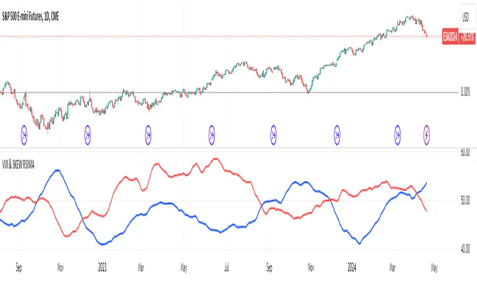
VIX and SKEW RSI Moving AveragesSKEW and VIX are both indicators of market volatility and risk, but they represent different aspects.
VIX (CBOE Volatility Index) :.
The VIX is a well-known indicator for predicting future market volatility. It is calculated primarily based on S&P 500 options premiums and indicates the degree of market instability and risk.
Typically, when the VIX is high, market participants view the future as highly uncertain and expect sharp volatility in stock prices. It is generally considered an indicator of market fear.
SKEW Index :.
The SKEW is a measure of how much market participants estimate the risk of future declines in stock prices, calculated by the CBOE (Chicago Board Options Exchange) and derived from the premium on S&P 500 options.
If the SKEW is high, market participants consider the risk of future declines in stock prices to be high. This generally indicates a "fat tail at the base" of the market and suggests that the market perceives it as very risky.
These indicators are used by market participants to indicate their concerns and expectations about future stock price volatility. In general, when the VIX is high and the SKEW is high, the market is considered volatile and risky. Conversely, when the VIX is low and the SKEW is low, the market is considered relatively stable and low risk.
Inverse Relationship between SKEW and VIX
It is often observed that there is an inverse correlation between SKEW and VIX. In general, the relationship is as follows
High VIX and low SKEW: When the VIX is high and the SKEW is low, the market is considered volatile while the risk of future stock price declines is low. This indicates that the market is exposed to sharp volatility, but market participants do not expect a major decline.
Low VIX and High SKEW: A low VIX and high SKEW indicates that the market is relatively stable, while the risk of future declines in stock prices is considered high. This indicates that the market is calm, but market participants are wary of a sharp future decline.
This inverse correlation is believed to be the result of market participants' psychology and expectations affecting the movements of the VIX and SKEW. For example, when the VIX is high, it is evident that the market is volatile, and under such circumstances, people tend to view the risk of a sharp decline in stock prices as low. Conversely, when the VIX is low, the market is considered relatively stable and the risk of future declines is likely to be higher.
SKEWVIX RSIMACROSS
In order to compare the trends of the SKEW and VIX, the 50-period moving average of the Relative Strength Index (RSI) was used for verification. the RSI is an indicator of market overheating or overcooling, and the 50-period moving average can be used to determine the medium- to long-term trend. This analysis reveals how the inverse correlation between the SKEW and the VIX relates to the long-term moving average of the RSI.
how to use
Moving Average Direction
Rising blue for VIXRSI indicates increased uncertainty in the market
Rising red for SKEWRSI indicates optimism and beyond
RSI moving average crossing
When the SKEW is dominant, market participants are considered less concerned about a black swan event (significant unexpected price volatility). This suggests that the market is stable and willing to take risks. On the other hand, when the VIX is dominant, it indicates increased market volatility. Investors are more concerned about market uncertainty and tend to take more conservative positions to avoid risk. The direction of the moving averages and the crossing of the moving averages of the two indicators can give an indication of the state of the market.
SKEW>VIX Optimistic/Goldilocks
VIX>SKEW Uncertainty/turbulence
The market can be judged as follows.
BestRegards
Expansion/Contraction Indicator (ECI) [Angel Algo]INTRODUCTION
The Expansion/Contraction Indicator (ECI) is a custom indicator designed to measure the expansion or contraction of price ranges between the open and close of each bar. It helps traders identify periods of increased or decreased volatility in the market. Since trading is most fruitful during volatile market conditions, this indicator provides valuable insights into when volatility increases, signaling the opportune moments to take action.
HOW TO USE
Expansion: When the ECI value is in the green zone, it suggests an expansion in price ranges, indicating increased volatility. This may be a potential signal for traders to expect trend movements or breakouts.
Contraction: When the ECI value falls outside the green zone, it indicates a contraction in price ranges, implying reduced volatility. This may signal potential consolidation or ranging periods in the market.
During contraction periods, it is advisable to exercise patience and await clear signals. Market cycles dictate that low-volatility contractions are often followed by high-volatility expansion periods, presenting opportunities for significant price movements.
Visualization:
Expansion Area: the area on the indicator chart filled with green. It has duller and brighter parts that indicate the level of expansion. The duller part corresponds to a low or beginning expansion.
ECI Dots: The ECI dots are plotted as circles on the chart. The dots are colored green if the ECI value is above the lower threshold, indicating an expansion. If the ECI value is below the lower threshold, the dots are colored red to indicate a contraction.
Alerts (Optional): The ECI indicator can generate alerts for expansions and contractions. By default, alerts are enabled. An expansion alert is triggered when the ECI value crosses above the upper threshold. A contraction alert is triggered when the ECI value crosses below the lower threshold.
SETTINGS
Period: determines the number of bars used to calculate the exponential moving average (EMA) of the price range. The default value is 14, but it can be set between 1 and 200. Higher values smooth out the indicator but may delay signals.
Lower Threshold: defines the level below which the ECI value indicates a contraction in price ranges, implying reduced volatility. The default value is 0.5.
CALCULATION
The indicator calculates the range between the open and close of each bar (ocRange). It then calculates the EMA of the range (emaRange) using the specified period. The ECI value is obtained by dividing the ocRange by the emaRange. Threshold Levels: The indicator includes two threshold levels for identifying expansions and contractions: a. Upper Threshold: Default value is 3.0. b. Lower Threshold: Default value is 0.5. The middle line (mL) represents the ECI value of 1.0, which indicates a neutral state, when the volatility in the market corresponds to its average value.

Simple Trend Strength & MomentumThis indicator will show a combination of Trend Strength, Volatility using an Adaptive Moving Average (AMA), and Market Momentum.
You can use this indicator to identify trends, volatility, and momentum shifts in real-time, making it an excellent tool for both trend-following and breakout strategies.
The three main features of this indicator are:
Adaptive Moving Average (AMA): Tracks the trend direction with a dynamic smoothing factor that adjusts based on market volatility. The AMA line changes color based on trend strength (green for bullish, red for bearish). I manually compute the Adaptive Moving Average (AMA) using a smoothing factor derived from the market's efficiency ratio. I have used fastLength and slowLength to control the responsiveness of the AMA.
Volatility Bands: Plots upper and lower bands around the AMA line, indicating price volatility. These bands dynamically adjust based on ATR, with a color gradient that changes intensity based on market volatility.
Momentum Circles: Positive momentum (ROC above the threshold) is shown as a green circle below the bar, while negative momentum is marked by a red circle above the bar. This makes it easy to spot momentum shifts.
The green dots in the indicator represent positive momentum. Specifically, they are displayed when the Rate of Change (ROC) of the price exceeds a predefined threshold (set as threshold in the input). This indicates that the market is experiencing upward price movement at a rate faster than the defined threshold.
How it works:
Rate of Change (ROC) measures the percentage change in price over a specified period (in this case, 14 periods).
When the ROC is greater than the set threshold (1.5 by default), a green circle (dot) is plotted below the price bar to signal that there is significant positive momentum.
This can be seen as an indicator of bullish momentum, where price is increasing at a relatively fast pace compared to previous periods.
The green dots help you spot when the price is moving upward rapidly, potentially signaling a good time to enter a long position or watch for further price action.
NOTE: It is vice versa for red dots.
ATR-Normalized MACD w/ Visual BackgroundChatGPT said:
Absolutely! Let’s break down the YON MACD indicator in detail so you understand what it does, how it works, and how to use it.
1. Purpose
The YON MACD is a volatility-adjusted version of the classic MACD. Instead of just using EMA differences, it normalizes the MACD by the Average True Range (ATR), which means:
High-volatility markets → the MACD signal is scaled down.
Low-volatility markets → the MACD signal is scaled up.
This gives a more consistent momentum signal across different market conditions, avoiding false spikes during high volatility.
2. Components
a. Fast and Slow EMAs
fastEMA → Typically 12-period EMA of price.
slowEMA → Typically 26-period EMA of price.
The difference between them measures short-term momentum.
b. ATR Normalization
atr → Average True Range over a specified period (default 26).
Formula:
YON MACD=fastEMA - slowEMAATR×100
YON MACD=
ATR
fastEMA - slowEMA
×100
This adjusts the MACD for market volatility.
c. Signal Line
EMA of the YON MACD (default 9 periods).
Acts like a trigger line for crossovers.
d. Histogram
hist = YON MACD - Signal Line
Visualizes divergence: how far the MACD is from the signal line.
Positive histogram → bullish momentum, negative → bearish momentum.
3. Visual Features
Plot Lines
YON MACD → colored green (rising), red (falling), gray (unchanged).
Signal line → always blue.
Histogram → columns: green (positive), red (negative).
Background Coloring
Green → MACD rising + histogram positive (bullish momentum).
Red → MACD falling + histogram negative (bearish momentum).
Yellow/Orange → histogram flips (early momentum change).
This makes trend and momentum immediately visible without having to study the panel in detail.
4. Alerts
MACD Cross Alerts
YON MACD crosses above the signal → potential buy.
YON MACD crosses below the signal → potential sell.
Histogram Flip Alerts
Histogram flips from negative → positive → early bullish signal.
Histogram flips from positive → negative → early bearish signal.
This allows automation or notifications for momentum changes.
5. How to Use
Trend Confirmation
Green background + MACD above signal → trend is bullish.
Red background + MACD below signal → trend is bearish.
Entry/Exit Signals
Buy: MACD crosses above signal or histogram flips positive.
Sell: MACD crosses below signal or histogram flips negative.
Volatility Adjustment
Since the MACD is ATR-normalized, it avoids overreacting in volatile conditions and highlights true momentum shifts.
Summary
The YON MACD is a trend-following and momentum indicator with:
Volatility normalization (ATR)
MACD cross signals
Histogram divergence visualization
Background colors for instant momentum reading
Alerts for crossovers and early momentum flips
It’s a powerful all-in-one momentum tool that can work for day trading, swing trading, or even longer-term analysis.
