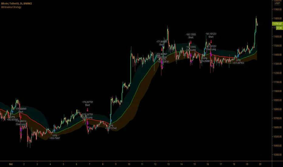
Bollinger Bands Breakout StrategyBollinger Bands Breakout Strategy is the strategy version of Bollinger Bands Filter study version, which can be found under my scripts page. The strategy goes long when price closes above the upper band and goes short signal when price closes below the lower band.
Bollinger Bands is a classic indicator that uses a simple moving average of 20 periods, along with plots of upper and lower bands that are 2 standard deviations away from the basis line. These bands help visualize price volatility and trend based on where the price is, in relation to the bands.
The strategy doesn't take into account any other parameters such as Volume / RSI / Fundamentals etc, so user must use discretion based on confirmations from another indicator or based on fundamentals. The strategy results are based on purely long and short trades and doesn't take into account any user defined targets or stop losses.
The strategy works great when the price closes above/below upper/lower bands with continuation on next bar. It is definitely useful to have this strategy or the Bollinger Bands filter along with other indicators to get early glimpse of breach/fail of bands on candle close during BB squeeze or based on volatility .
This can be used on Heikin Ashi candles for spotting trends, but HA candles are not recommended for trade entries as they don't reflect true price of the asset.
The strategy settings default is 55 SMA and 1 standard deviation for Bollinger Bands filter, but these can be changed from settings.
It is definitely worth reading the 22 rules of Bollinger Bands written by John Bollinger if interested in trading Bollinger Bands successfully.
Cerca negli script per "Volatility"
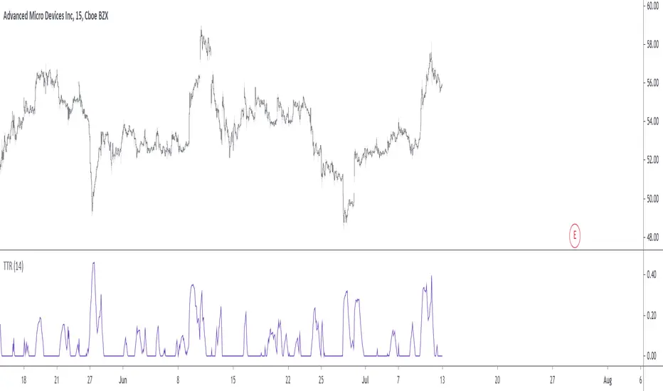
Trending True RangeDisplay a smoothed true range during trending markets, thus filtering any measurement occurring during ranging markets. Whether the market is trending or ranging is determined by the position of the efficiency ratio relative to its Wilder moving average.
Settings
Resolution : resolution of the indicator
Length : period of the efficiency ratio and the Wilder moving averages used in the script
Usage
If you are not interested in volatility during ranging markets, this indicator might result useful to you. An interesting aspect is that it both measures volatility, but also determine whether the market is trending or ranging, with a zero value indicating a ranging market.
Indicator against Atr, with both length = 14, our indicator might be easier to interpret.
Note
Thx to my twitter followers for their suggestions regarding this indicator. I apologize if it's a bit short, the original code was longer and included more options, but forcing a script to be lengthy is a really bad idea, so I stayed with something less flashy but certainly more practical, "classic Grover" some might say.
Thx for reading!
BTC and ETH Long strategy - version 1I will start with a small introduction about myself. I'm now trading cryto currencies manually for almost 2 years. I decided to start after watching a documentary on the TV showing people who made big money during the Bitcoin pump which happened at the end of 2017.
The next day, I asked myself "Why should I not give it a try and learn how to trade".
This was in February 2018 and the price of Bitcoin was around 11500USD.
I didn't know how to trade. In fact, I didn't know the trading industry at all.
So, my first step into trading was to open an account with a broken. Then I directly bought 200$ worst of BTC . At that time, I saw the graph and thought "This can only go back in the upward direction!" :)
I didn't know anything about Stop loss, Take profit and Risk management.
Today, almost 2 years after, I think that I know how to trade and can also confirm that I still hold this bag of 200$ of bitcoin from 2018 :)
I did spend the 2 last years to learn technical analysis , risk management and leverage trading.
Today (14/05/2020), I know what I'm doing and I'm happy to see that the 2 last years have been positive in terms of gains. Of course, I did not make crazy money with my saving but at least I made more than if I would have kept it in my bank account.
Even if I like trading, I have a full time job which requires my full energy and lots of focus, so, the biggest problem I had is that I didn't have enough time to look at the charts.
Also, I realized that sometimes, neither technical analysis , nor fundamentals worked with crypto currency (at least for short time trading). So, as I have a developer background I decided to try to have a look at algo trading.
The goal for me was neither to make complex algos nor to beat the market but just to automate my trading with simple bot catching the big waves.
I then started to take a look at TV pine script and played with it.
I did my first LONG script in February 2020 to Long the BTC Market. It has some limitations but works well enough for me for the time being. Even if the real trades will bring me half of what the back testing shows, this will still be a lot more than what I was used to win during the last 2 years with my manual trading.
So, here we are! Below you will find some details about my first LONG script. I'm happy to share it with you.
Feel free to play with it, give your comments and bring improvements to it.
But please note that it only works fine with the candle size and crypto pair that I have mentioned below. If you use other settings this algo might loose money!
- Crypto pairs : XBTUSD and ETHXBT
- Candle size: 2 Hours
- Indicator used: Volatility , MACD (12, 26, 7), SMA (100), SMA (200), EMA (20)
- Default StopLoss: -1.5%
- Entry in position if: Volatility < 2%
AND MACD moving up
AND AME (20) moving up
AND SMA (100) moving up
AND SMA (200) moving up
AND EMA (20) > SAM (100)
AND SMA (100) > SMA (200)
- Exit the postion if: Stoploss is reached
OR EMA (20) crossUnder SMA (100)
Here is a summary of the results for this script:
XBTUSD : 01/01/2019 --> 14/05/2020 = +107%
ETHXBT : 01/01/2019 --> 14/05/2020 = +39%
ETHUSD : 01/01/2019 --> 14/05/2020 = +112%
It is far away from being perfect. There are still plenty of things which can be done to improve it but I just wanted to share it :) .
Enjoy playing with it....

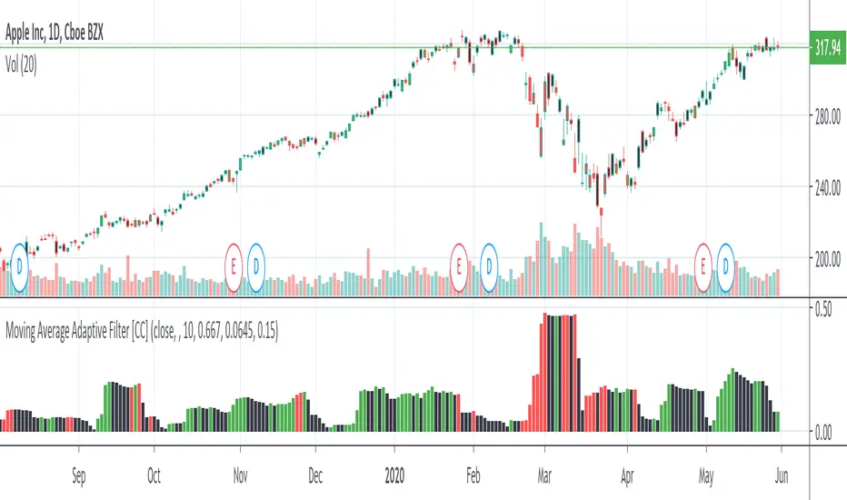
Moving Average Adaptive FilterThe Moving Avg Adaptive Filter (MAAF) was authored by Perry Kaufman in the Stocks and Commodities Magazine 03/1998
This is a volatility based indicator so when this indicator goes up, sell in the direction of how that stock is going. In other words go short when it is rising and the stock price is below the ema or go long when it is rising and the stock price is above the ema. Lower volatility means it is trading sideways or the current price action is about to reverse.
Send me a message and let me know what other indicators you would like to see!
Bermaui BandsHow the Bermaui Bands work
Red = Bear Trend
Blue = Bull Trend
Bands Expanded = Low Volatility
Bands Constricted = High Volatility

Trading Public School ST1This is a derivative of Trading Public School "TTM Squeeze" volatility indicator, as discussed in his book "Mastering the Trade" (chapter 11).
Black crosses on the midline show that the market just entered a squeeze ( Bollinger Bands are with in Keltner Channel). This signifies low volatility , market preparing itself for an explosive move (up or down). Gray crosses signify "Squeeze release".
Mr.Carter suggests waiting till the first gray after a black cross, and taking a position in the direction of the momentum (for ex., if momentum value is above zero, go long). Exit the position when the momentum changes (increase or decrease --- signified by a color change). My (limited) experience with this shows, an additional indicator like ADX / WaveTrend, is needed to not miss good entry points. Also, Mr.Carter uses simple momentum indicator , while I have used a different method (linreg based) to plot the histogram. 100% Profit & loss 10% Only

MS MONEY CCI SQUEEZEAbout
I have used this indicator to find many lucrative opportunities. This indicator takes the moving average of CCI in custom, volatility-specific conditions. CCI measures "overbought" in the red-shaded region and "Oversold" in the green-shaded region. The shaded regions do not constitute a buy/sell signal alone, the MS CCI Squeeze is best used when market conditions agree and is best used when the user has fundamental reasoning for "reversal-like" situations to align. The MS CCI Squeeze will soon have a synergistic partner called "MS RSI Squeeze" indicator that will look similar to help better measure volatility and strength trend.
About the Commodity Channel Index (CCI)
The commodity channel index (CCI) is an oscillator originally introduced by Donald Lambert in 1980. Since its introduction, the indicator has grown in popularity and is now a very common tool for traders in identifying cyclical trends not only in commodities, but also equities (stocks) and currency trading.
How to set an Alert
If the user wants to set an alert , click on one of the support/ resistance lines (black-dashed) near the zero mark. Clicking on the horizontal line above or below the zero line will populate a yellow arrow which will allow you to set alerts when wanted.
Please Read For Better Efficiency
When using this indicator, keep an eye out for harmonic patterns, both bullish and bearish head and shoulders patterns for "HIDDEN" breakout opportunities.
Please like, follow and share and I will continue building better indicators.

IO_ATR_MAThis is an ATR+MA indicator.. the general idea is:
- when ATR is higher than MA, volatility is high
- when ATR is lower than MA, volatility is low
IO_Volatility Quality Zero LineThis is the Volatility Quality Zero Line Indicator. This indicator measures volatility strength.

Kirshenbaum BandsThis indicator was originally developed by Paul Kirshenbaum, a mathematician with a Ph.D. in economics from New York University.
It uses the standard error of linear regression lines of the closing price to determine band width. This has the effect of measuring volatility around the current trend, rather than measuring volatility for changes in trend.
Good luck!

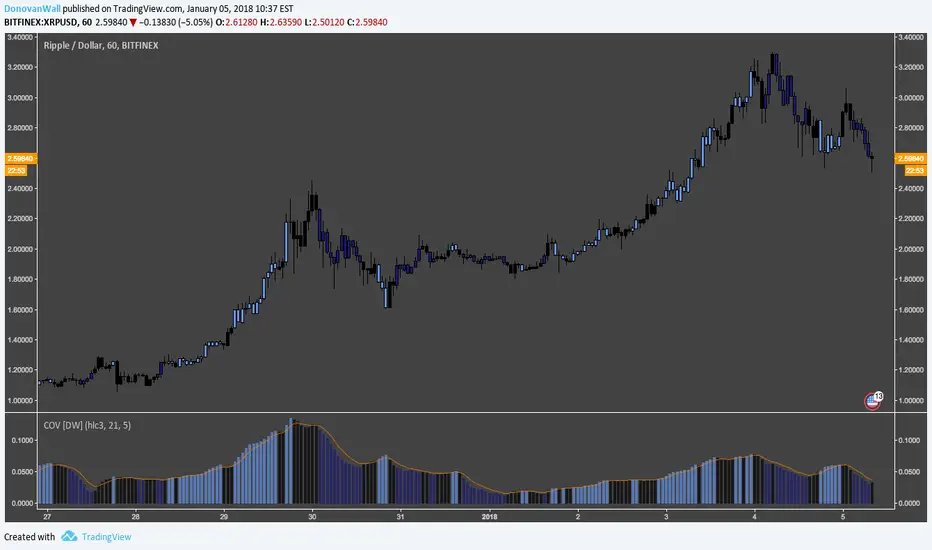
Coefficient of Variation [DW]This is a simple gauge of volatility using the Coefficient of Variation.
COV is calculated by dividing standard deviation of price by the expected (average) price.
Custom color scheme indicates increases and decreases in volatility, which is indicated when the COV forms new half period highs and lows.
SuperTrend AI + PVSRA Full DashboardI tried to combine various indicators already created in a single version that can also guarantee a certain customization on colors, intensity of tables, etc. etc. The functioning, the operation is similar to the previous ones, I won't go into detail, at most take a look at the previous versions.
1. The "AI" Component: Multi-SuperTrend Clustering
Instead of using a single SuperTrend with a fixed multiplier, this script:
Simultaneously runs multiple SuperTrends with different sensitivities (multipliers).
Evaluates Performance: It tracks which multiplier would have been most profitable in recent bars.
K-Means Clustering: It uses an AI algorithm to group these multipliers into "Best," "Average," and "Worst" clusters.
Adaptive Trailing Stop: It automatically selects the "Best" multiplier to plot the AI Trailing Stop line on your chart, making it more responsive to changing market volatility than a standard indicator.
2. PVSRA Logic (Institutional Volumes)
PVSRA stands for Price Volume Support Resistance Analysis. The script re-colors candles based on volume intensity:
Climax Bull (Bright Green): Extremely high volume on a bullish candle. Usually indicates institutional buying or a trend climax.
Climax Bear (Magenta/Purple): Extremely high volume on a bearish candle. Usually indicates institutional selling or a panic bottom.
Rising (Grey/Silver): Above-average volume, showing increasing interest.
3. The "Super Confluence" Signal
This is the "Golden Signal" of the script. It triggers a BUY or SELL label only when several conditions align:
AI Trend Switch: The AI Trailing Stop flips direction.
SMA 20 Cross: The AI line crosses the 20-period Simple Moving Average.
Volume Confirmation: A PVSRA Climax or Rising volume must occur on that specific bar.
Directional Alignment: The candle color must match the trend direction.
4. Summary Dashboard (Top Right)
The dashboard provides a "Quick Glance" at the market structure:
AI Trend: Shows if the machine learning model is currently Bullish or Bearish.
PVSRA Vol: Identifies the current volume signature (Normal vs. Climax).
SMA 20/50: Shows medium-term momentum (Bullish if 20 > 50).
Trend 200: Shows the macro trend. ABOVE means long-term bullish; BELOW means long-term bearish.
How to Trade with This Script
Signal Strategy
"SUPER CONFLUENCE BUY" Look for entries. High probability if Trend 200 is "ABOVE".
"SUPER CONFLUENCE SELL" Look for shorts. High probability if Trend 200 is "BELOW".
Magenta/Green Candles Caution: These are "Stop Hunts" or "Institutional Entries." Do not
trade against these candles without a clear reversal pattern.
Technical Tip
The variable target_f is the "AI-optimized multiplier." If you see this value changing frequently in the dashboard, it means the market is volatile, and the AI is struggling to find a stable trend. If it stays consistent, the trend is likely solid.
Thanks everyone and happy trading

STOP_TRADING_MODE📘 Release Notes
STOP_TRADING_MODE — Stable Release
Version: 1.0.0
Status: Stable / Production-ready
⸻
🎯 Purpose
This indicator is designed to identify market regimes, not to generate constant trade signals.
Its primary goal is to protect the trader from low-quality environments and highlight rare, high-quality interaction points with equilibrium.
⸻
🧠 Core Concepts
• STOP Mode — identifies impulsive, dangerous, or one-sided market conditions
• Equilibrium (MID / EQ) — represents the auction balance, not a trend level
• MAGNET vs SPRING — distinguishes range behavior from trend behavior
• EQ_HOLD — highlights valid reactions at equilibrium only in a range-friendly environment
⸻
✅ What’s Included
🔴 STOP Mode (Background Only)
• Red background marks:
• volatility spikes (ATR expansion)
• impulsive candles
• one-directional movement
• No entry signals
• Used strictly as a risk-environment filter
🟨 MID (Equilibrium Line)
• Calculated as SMA of HL2
• Acts as:
• Magnet in ranging markets
• Spring in trending markets
• Not a trade trigger by itself
🔁 MAGNET / SPRING Regime Detection
• Based on:
• frequency of MID crossings
• time spent near equilibrium
• market “trendiness” ratio
• Regime labels appear only when the regime changes
• Prevents constant label repainting or noise
🟢 EQ_HOLD Signal (Rare by Design)
• Triggered only when:
• STOP mode is OFF
• MID behaves as MAGNET
• price reacts cleanly at equilibrium
• Designed for micro-scaling / position management, not aggressive entries
• Low frequency = high informational value
⸻
🚫 What Was Removed (By Design)
• No STOP / STOP_OFF labels on chart (alerts only)
• No constant signal spam
• No reliance on trend prediction
• No “buy/sell” prompts
⸻
🎛 UI & Usability Improvements
• Clean, minimal visual layout
• Color logic aligned with meaning:
• 🔴 Risk / danger
• 🟨 Balance / structure
• 🟢 Action-permitted condition
• Optional toggles for regime and EQ_HOLD labels
⸻
🧪 Known Behavior (Not Bugs)
• MID crossing does not immediately change regime
• STOP may activate after entry — this signals risk management mode, not exit
• EQ_HOLD appears infrequently by intention
⸻
🧩 Intended Usage
• Best suited for:
• range-aware traders
• scale-in / scale-out strategies
• discretionary decision support
• Not intended for:
• high-frequency trading
• signal-following automation
• prediction-based entries
⸻
🧠 Design Philosophy
“Silence is a feature.”
If the indicator does nothing —
the market likely offers nothing worth doing.

[codapro] Confirmed Supertrend Flags
Confirmed Supertrend Flags — Delayed Flip Confirmation
Description:
This script enhances the classic Supertrend by adding a confirmation delay after trend flips, helping traders filter noise and avoid premature entries in volatile environments.
Key Features:
ATR-based Supertrend stop level calculation
Confirmation logic: buy/sell flags appear only after N full bars confirm the new direction
Optional Supertrend stop line for visual tracking
Fully adjustable flag size, color, label, and placement
This is ideal for swing traders, trend followers, or anyone building a system that prefers confirmation over early guessing.
How It Works:
A trend flip is detected when price closes beyond the Supertrend stop level.
The indicator waits for a set number of bars to close in the new direction.
After confirmation, a visual flag is plotted: buy below bar, short above bar.
How to Extend with Risk Management:
While this script focuses on trend confirmation visualization, you can enhance your decision-making by combining it with risk rules:
Stop Loss: Set SL just beyond the last Supertrend level before confirmation
ATR-Based Sizing: Use the same ATR value to dynamically size your position based on volatility
Fixed % Rule: Risk a fixed % of capital per confirmed flip (e.g., 1–2%)
Time-Based Exit: Exit trades that don’t follow through within N bars post confirmation
Stack with Strategy: Use this confirmation logic to trigger entries in a separate strategy script where strategy.entry() and strategy.exit() can be defined with precise risk parameters
Want a full example of how to integrate that? Let me know and I’ll turn this into a plug-and-play strategy version.
Disclaimer:
This tool was developed as part of the codapro AI engine — a modular signal and automation layer for trading systems.
It is for educational and informational purposes only and is not financial advice. Always backtest and verify before live deployment.

Session Anchored OIWAP [Arjo]The Session Anchored OIWAP (Open Interest Weighted Average Price) indicator shows you a weighted average price that uses Open Interest (OI) changes during different trading sessions . It divides the day into four clear sessions: Opening Hour , Morning Session , Mid-Day Session , and Closing Session .
For each session , it calculates a weighted average price using both market price and open interest data from futures . This line updates as the session progresses and resets when a new session starts .
You can also see optional deviation bands that you visually compare to how far the market price is moving away from the session’s weighted average. This indicator also helps you watch how Open Interest changes connect with price movements during specific market hours.
Concepts
This tool works on a few simple ideas:
Session anchoring
Each session starts fresh. The indicator resets and begins a new calculation when a new time block begins. This allows users to visually study each session independently.
Open-interest weighting
Instead of treating all price moves equally, price changes linked to higher open-interest activity have more influence on the OIWAP. This gives a weighted reflection of where the market has been trading during the session.
Averaging and smoothing
The OIWAP line blends many price data points into one smooth curve, making it easier to follow than raw price movement.
Volatility display with bands
The upper and lower bands are placed at ±0.5 standard deviation from the OIWAP line. These bands simply help you see when price stretches further away than usual from the session average.
Features
Four Independent Session Calculations: Shows separate OIWAP lines for Opening Hour (default: 09:15-10:15), Morning (10:15-11:30), Mid-Day (11:30-14:00), and Closing (14:00-15:30) sessions
Open Interest Weighting: Uses absolute OI change as the weight instead of traditional volume
Customizable Session Times: You can change the time ranges for each session to match your market or what you need
Optional Deviation Bands: You can turn ±0.5 standard deviation bands on or off around each OIWAP line
Color-Coded Sessions: Each session has its own color so you can tell them apart easily
Selective Display: You can turn individual sessions and bands on or off
Data Availability Check: Shows you a notification when Open Interest data isn't available for your symbol
Adjustable Position Timeframe: You can calculate OI changes on different timeframes (Chart, Daily, 15min, 30min, 60min, 120min)
How to use
Add this indicator to a chart of any symbol that has Open Interest data ( from futures or derivatives contracts). Once you add it, you'll see colored lines showing the OIWAP for each session you enable, along with optional deviation bands.
Adjusting Settings:
Turn individual sessions on or off using the checkboxes in the " Sessions " section
Change session colors to match your chart or what looks good to you
Turn deviation bands on or off using the " Show Bands " option in the Display settings
Change session time ranges in the " Session Times " section to match your market hours or what you want to analyze
Change the Position Timeframe if you want to see OI changes calculated on a different time period
Visual Interpretation:
Each OIWAP line shows you the OI-weighted average price for that session
The deviation bands show you how much prices spread out, weighted by OI changes
You can watch how price interacts with these levels to see where significant OI activity happened
Different sessions may show different OIWAP levels, showing you how the OI-price relationship changes throughout the trading day
Note:
This indicator needs Open Interest data to work. If OI data isn't available for your symbol, you'll see a message in the center of your chart. This indicator works only with derivatives markets like futures and options in the Indian Market where OI data is publicly available.
Conclusion
The Session Anchored OIWAP indicator is designed to support structured market observation by combining price, open interest, and session anchoring into a clear visual format. It helps users study market behavior during different parts of the day without generating trading instructions or outcomes.
Disclaimer
This indicator is for educational and visual-analysis purposes only. It does not provide trading signals , financial advice, or guaranteed outcomes . You should perform your own research and consult a licensed financial professional when needed. All trading decisions are solely the responsibility of the user.
Happy Trading

MoBo Bands - Momentum Breakout IndicatorDESCRIPTION
MoBo Bands (Momentum Breakout Bands) is a volatility-based breakout detection indicator that helps traders identify potential momentum shifts in the market. The indicator uses dynamic bands calculated from standard deviation to signal when price breaks above or below established ranges, indicating potential bullish or bearish momentum changes.
═════════════════════════════════════════════════════════════
KEY FEATURES
═════════════════════════════════════════════════════════════
- Dynamic upper and lower bands based on standard deviation
- Color-coded bands that change based on breakout direction (green for bullish, red for bearish)
- Visual breakout arrows marking entry points above/below bands
- Optional colored fill zones between bands showing current momentum state
- Customizable displacement for band projection
- Built-in alert system for breakout and breakdown signals
═════════════════════════════════════════════════════════════
HOW IT WORKS
═════════════════════════════════════════════════════════════
The indicator calculates a middle line using a Simple Moving Average (SMA) with upper and lower bands positioned using standard deviation multipliers. When price closes above the upper band, a bullish breakout (green) is signaled. When price closes below the lower band, a bearish breakdown (red) is signaled. The bands and fill zones remain colored until the opposite signal occurs, providing clear visual confirmation of the current momentum state.
═════════════════════════════════════════════════════════════
CUSTOMIZABLE INPUTS
═════════════════════════════════════════════════════════════
CALCULATION PARAMETERS:
- Price Source - Select which price data to use (default: close)
- Length - Period for SMA and standard deviation calculation (default: 10)
- Num Dev Up - Standard deviation multiplier for upper band (default: 0.8)
- Num Dev Down - Standard deviation multiplier for lower band (default: -0.8)
- Displace - Shift bands forward for projection analysis (default: 0)
DISPLAY OPTIONS:
- Colored Mobo - Enable/disable color-coded bands
- Colored Fill - Enable/disable fill zones between bands
- Break Arrows - Show/hide breakout and breakdown arrows
ALERT OPTIONS:
- Show Alerts - Enable/disable alert conditions
═════════════════════════════════════════════════════════════
USAGE GUIDE
═════════════════════════════════════════════════════════════
Watch for price to close outside the bands as potential breakout signals:
BULLISH BREAKOUT: Green arrow appears below the lower band when price closes above the upper band, indicating upward momentum shift.
BEARISH BREAKDOWN: Red arrow appears above the upper band when price closes below the lower band, indicating downward momentum shift.
The bands also serve as dynamic support and resistance levels. When bands are green, momentum is bullish. When bands are red, momentum is bearish.
═════════════════════════════════════════════════════════════
BEST PRACTICES
═════════════════════════════════════════════════════════════
- This indicator works well on liquid futures contracts (MNQ, MES, MYM, MGC, MCL) and major
currency pairs across multiple timeframes
- Lower deviation values (0.5-1.0) produce more frequent signals suitable for scalping
- Higher deviation values (1.5-2.5) filter for stronger breakouts ideal for swing trading
- Combine with volume indicators for additional confirmation
- Use with momentum oscillators to validate breakout strength
- Best results in trending market conditions
- Consider the overall market context and trend direction
════════════════════════════════════════════════════════════
ALERT CONFIGURATION
═════════════════════════════════════════════════════════════
Configure custom alerts for automated notifications:
- "MoBo BreakOUT" - Triggers on bullish breakout signals
- "MoBo BreakDOWN" - Triggers on bearish breakdown signals
Set alerts to "Once Per Bar Close" for confirmed signals and avoid false triggers during bar development.
═════════════════════════════════════════════════════════════
IDEAL FOR
═════════════════════════════════════════════════════════════
- Day traders and scalpers on futures markets
- Swing traders looking for momentum shifts
- Breakout trading strategies
- Trend following systems
- Works on stocks, forex, crypto, and commodities
- Effective across multiple timeframes (1min to daily)
═════════════════════════════════════════════════════════════
Perfect for traders seeking clear visual breakout signals with minimal lag. The color-coded system and arrow markers make it easy to identify momentum changes at a glance.
© 2024 NPR21 | Mozilla Public License 2.0
Open-source script
NPR21
Disclaimer
The information and publications are not meant to be, and do not constitute, financial, investment, trading, or other types of advice or recommendations supplied or endorsed by

Open Interest Weighted Average Price [Arjo]Open Interest Weighted Average Price , or OIWAP , is a simple visual indicator that shows the average price of an asset based on changes in open interest .
Instead of using trading volume like VWAP, this indicator gives more weight to prices where new futures contracts are being added or removed . This helps highlight the price levels where traders are actively building or closing positions.
The indicator shows:
A main line that represents the average price weighted by open interest changes.
Upper and lower bands (standard deviation bands) that show how far the price moves away from this average.
OIWAP is mainly useful for NSE futures markets , where open interest data is available. It helps traders visually understand where most market participation and positioning are taking place relative to price .
Concepts:
Applies statistical concepts, including weighted averaging and standard deviation, to open interest data
Uses the absolute change in open interest as a weighting factor for each price point
Creates a dynamic average that reflects where significant open interest activity has occurred during a given period
Standard deviation bands are computed from this weighted average to show the statistical spread of prices around the OIWAP line
Resets calculations based on user-selected time periods (daily, weekly, monthly, or session-based)
Allows for fresh analysis at regular intervals
Similar concept to volume-weighted average price (VWAP) indicators, but uses open interest changes as the weighting component
Features:
Weighted Average: Calculates a central line based on contract activity.
Flexible Anchors: Allows users to choose the reset period for the calculation.
Volatility Bands: Displays outer and mid-bands to visualize price stretches.
Data Check: Built-in alerts notify you if Open Interest data is missing for a symbol.
Visual Zones: Color-coded areas help identify price location at a glance.
How To Use
When you add the indicator to your chart, you will see:
A main OIWAP line — the open-interest-weighted price level
Mid-bands around the line (±0.5 standard deviations)
Outer bands farther away (±2.0 standard deviations)
Shaded background zones between these lines
You can:
Change the reset period to see how the average behaves over different time ranges
Adjust the timeframe for open-interest data
Turn mid-bands on or off
Adjust colors and styles to improve readability
Conclusion
The OIWAP indicator serves as an educational tool for visualizing the relationship between price movements and open interest activity in futures markets
Presents a weighted average price line along with statistical deviation bands
Offers a structured framework for chart analysis
Customizable settings allow users to adapt the display to their analytical preferences
Maintains focus on visual interpretation rather than directional predictions
Functions as a supplementary charting overlay that may complement other forms of technical and fundamental analysis
Disclaimer
This indicator is for educational and visual-analysis purposes only. It does not provide trading signals, financial advice, or guaranteed outcomes . You should perform your own research and consult a licensed financial professional when needed. All trading decisions are solely the responsibility of the user.

Swing Traders Panel: Beta RVOL ATR Market Sector FnG ImtiazHA compact decision-support panel for swing traders combining volatility, relative volume, market & sector regime, and a 3-zone Fear/Greed filter to improve trade context and risk management.

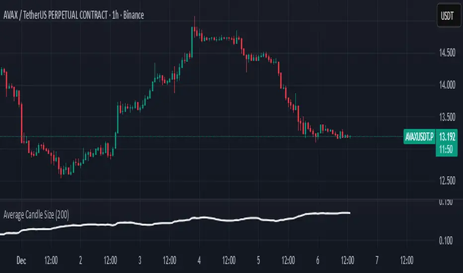
Average Candle SizeI created this indicator because I couldn't find a simple tool that calculates just the average candle size without additional complexity. Built for traders who want a straightforward volatility measure they can fully understand. How it works:
1. Calculate high-low for each candle
2. Sum all results
3. Divide by the total number of candles
Simple math to get the average candle size of the period specified in Length.
able MACD Overview
Purpose: The indicator combines the traditional MACD (Moving Average Convergence Divergence) with a short-term “forecast” (projection) of MACD/histogram values to give early warning of momentum changes.
Typical outputs:
MACD line (fastEMA − slowEMA)
Signal line (EMA of MACD)
Histogram (MACD − signal)
Forecasted MACD or histogram projected N bars ahead
Optional buy/sell markers and alert conditions
Add the indicator to TradingView (Installation)
Open TradingView and the chart you want to apply the indicator to.
Click “Pine Editor” at the bottom of the chart.
Copy the contents of able_macd_forecast.pine into the Pine Editor window.
Click “Add to chart” (or Save then Add to chart). If it’s a study, it will appear on the chart below price.
If you plan to re-use the script, click Save and give it a meaningful name.
Inputs / Parameters (typical) Note: exact input names may differ in your script. Replace the names below with the script’s input labels when you inspect it.
Source: price source for calculations (close, hl2, etc.).
Fast Length: length for the fast EMA (commonly 12).
Slow Length: length for the slow EMA (commonly 26).
Signal Length: length for the MACD signal EMA (commonly 9).
Forecast Length / Horizon: how many bars ahead the script projects the MACD/histogram (e.g., 1–5).
Forecast Method / Smoothing: choice of projection method (linear regression, EMA extrapolation, simple slope * N, etc.) if available.
Histogram Thresholds: numeric thresholds to emphasize significant momentum (optional).
Show Forecast: toggle on/off the forecast plot.
Alerts On/Off toggles: enable or disable alert conditions baked into the indicator.
Visual / Style settings: colors, plot thickness, histogram style (columns/areas), show labels, show buy/sell arrows.
How the indicator is typically calculated (summary)
MACD line = EMA(source, fast) − EMA(source, slow)
Signal line = EMA(MACD line, signal length)
Histogram = MACD − Signal
Forecast = method-specific short-term projection of MACD or histogram (for example: extend the last slope forward, apply linear regression to MACD values and extrapolate N bars, or apply an additional smoothing and extend that value) Note: For exact math, I need to inspect the script; this is the typical approach.
How to read the indicator (signals & interpretation)
Bullish signal:
MACD line crossing above the signal line (MACD cross up).
Histogram turns positive (cross above zero).
Forecast shows MACD/histogram moving higher in the next N bars (if forecast is positive or trending up).
Bearish signal:
MACD line crossing below the signal line (MACD cross down).
Histogram turns negative (cross below zero).
Forecast shows MACD/histogram moving lower ahead.
Confirmations:
Use price action (higher highs/lows for bullish, lower highs/lows for bearish).
Volume or other momentum/confluence indicators (RSI, ADX).
Divergences:
Bullish divergence: price makes lower low while MACD histogram makes higher low.
Bearish divergence: price makes higher high while MACD histogram makes lower high.
Forecast behavior:
If the forecast leads the MACD cross (forecast crosses before the current MACD does), it’s an early warning.
Use caution: forecasts are prone to false signals; always confirm.
Common trading setups using this indicator
Conservative:
Wait for MACD to cross signal + histogram above zero + forecast already trending same direction.
Use stop below recent swing low (for long) or above recent swing high (for short).
Aggressive (early entry):
Enter when forecast turns positive while MACD still below signal (anticipating cross).
Use tighter stops and smaller position sizes.
Exit rules:
Opposite MACD cross, histogram flipping sign, or a target based on risk-reward.
Use trailing stop based on ATR or structure.
Example settings for different timeframes (starting points)
Scalping / 5–15 min:
Fast 8, Slow 21, Signal 5, Forecast 1–2
Intraday / 1H:
Fast 12, Slow 26, Signal 9, Forecast 2–3
Swing / 4H–Daily:
Fast 12, Slow 26, Signal 9, Forecast 3–5 Adjust based on the asset volatility and backtests.
Adding alerts (TradingView)
Click the “Alerts” button (clock icon) or press Alt + A.
In the Condition dropdown, select the indicator name (able_macd_forecast) and choose a plotted series or built-in alert condition (if the script uses alertcondition).
Common alert types:
MACD crosses Signal (Crossing)
Histogram crosses 0 (Crossing)
Forecast crosses 0 or Forecast trend change (if provided)
Message templates:
“{{ticker}}: MACD crossed above signal on {{interval}}”
“{{ticker}} Forecast positive: MACD forecast shows upward momentum”
Customize the message for your trade automation or notifications.
Configure frequency (Only once, Once per bar, or Once per bar close) — for signals like crossovers, “Once per bar close” is usually safer to avoid repainting issues. Note: If the script includes alertcondition() calls with explicit IDs/messages, use those directly — they are the most reliable for automation.
Backtesting / Strategy conversion
If this script is a study (indicator), you can:
Convert it to a strategy by adding strategy.* order calls (strategy.entry, strategy.close) using the entry/exit logic you prefer, or
Use TradingView’s “Bar Replay” to manually test signals across different markets/timeframes.
If you want, I can help convert or write a strategy wrapper that uses the indicator’s signals to place backtest trades (I’ll need the code).
Practical tips & best practices
Use higher timeframe confirmation for lower-timeframe entries (e.g., check daily MACD momentum before trading 15m signals).
Beware of choppy markets; MACD / forecast may produce whipsaws. Combine with trend filters (moving average direction, ADX).
If you rely on forecasted values, prefer alerts “on bar close” when possible to reduce false alerts from intra-bar noise.
Tune parameters for the specific asset (FX, crypto, stocks have different behavior).
Record each signal and outcome for a sample period (20–100 trades) to evaluate performance.
Troubleshooting
Indicator won’t add: verify Pine version in script header (//@version=4 or //@version=5). TradingView may reject scripts with unsupported version syntax.
Plots missing: check script inputs (Some scripts hide plots if toggles are off).
Alerts firing too often: change alert frequency to “Once per bar close” or adjust threshold values.
Forecast seems to repaint: some forecast methods can repaint (use “bar_index” or store values only on closed bars, or use non-repainting forecast methods). Ask me to inspect the script for repainting logic.
What I can do next (recommended)
If you paste the content of able_macd_forecast.pine here, I will:
Produce a precise, line-by-line usage guide mapping to the exact input names and default values.
Show the exact plotted series names and how to reference them for alerts.
Point out any repainting risks and suggest fixes.
Provide example alert messages that match the script’s alertcondition IDs (if any).
Optionally convert it into a strategy for backtesting, or add non-repainting forecast logic if needed.

Hindenburg OmenThe Hindenburg Omen highlights periods of internal market stress — when both new 52-week highs and new lows expand while the NYSE remains in an uptrend.
This condition often precedes major corrections or volatility spikes by revealing divergence beneath the surface of an advancing market.
The indicator triggers when four classic breadth rules align: elevated highs and lows, a positive trend, a negative McClellan Oscillator, and a highs-to-lows ratio under 2:1.
Use it on broad indices (NYSE, S&P 500) as an early-warning context tool, NOT a standalone sell signal.

SMC ORB vs Pre-Market SPY/IWMStacks institutional confluences such as Smart Money Concepts, Inner Circle Trading, volatility, and structure.
Plots Premarket high/low and 15 minute Opening range
Plots the first sweep of Premarket high/low and any subsequent orb breaks

SMC ORB vs PM ALPHADesigned to stack institutional confluences such as Smart Money Concepts, Inner Circle Trading, volatility, and market structure.
Plots pre-market high/low and 15 Opening Range.
Plots first sweep of Pre-market high/low as well as orb break/holds.
TP of Previous high/low & SL optional
