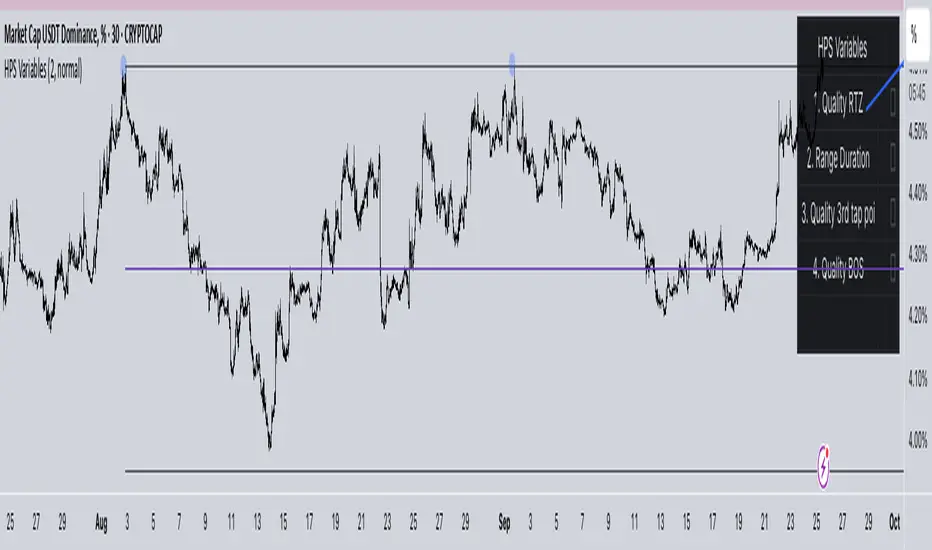
HPS VariablesThis script will provide a chart with a list of the 4 HPS variables for trading TCT models.
Cerca negli script per "Wyckoff"
Phoenix Ascending 2.201Hi Everyone!
It's time to make this indicator public to relieve myself of replying to requests for access. There has been an update to this indicator; in which a Stochastic RSI was added to this indicator. Please follow the directions to SETUP the indicator in the SETUP VIDEO provided below.
Phoenix Ascending 2.201 and Bollinger Bands Setup Video.
The following are BASIC rules for the Phoenix 2.201 Indicator. More advanced rules and the requirements for those rules can be found in my publications in my public profile. Unfortunately, I do not have organized videos created on how to use this indicator in full but will be available in the future.
IMPORTANT: The BASIC rules below are beneficial but these are NOT all the rules. More rules and requirements for those rules will be available in the future.
RULE NO. 1
We PREFER the Blue LSMA to be at 80% or higher for SAFE EXIT (SHORT) bets.
We PREFER the Blue LSMA to be at 20% or lower for SAFE ENTRY (LONG) bets.
Rule No. 2
ANY time the red line is approaching a green line that’s moving UPWARD,
Be prepared to make an ENTRY (LONG) when the red line is about to touch the green line that’s moving upward.
One can look at a lower time frame to get a better idea of how much longer you may have
To wait for the red line to touch the green line. In many cases, you may make ENTRY (LONG)
Just before the red line actually touches the green line that’s moving up in that higher time frame
You were initially using as your COMPASS. I currently have the 1-Month TF as a compass for EURUSD.
Rule No. 3
ANY time the red line is approaching a green line that’s moving DOWNWARD,
Be prepared to make an EXIT (SHORT) when the red line is about to touch the green line that’s moving downward.
One can look at a lower time frame to get a better idea of how much longer you may have
To wait for the red line to touch the green line. In many cases, you may make your EXIT (SHORT)
Just before the red line actually touches the green line that’s moving downward in that higher time frame
You were initially using as your COMPASS. I currently have the 1-Month TF as a compass for EURUSD.
Rule No. 4
The Green Line and/or Ghost Line can often help one determine when an upward or downward move in a particular time frame
Is nearly exhausted and about to reverse.
Example for Upside Exhaustion about to reverse to the Downside:
When the Green Line and/or Ghost line is at 80% level or higher, this is a good indicator to inform
Us the current upside move may be approaching exhaustion. You can look at a higher time frame to try to gain
More insight as to whether this will only be a brief dip down in the lower time frame IF the higher time frame you
Went to reveals there is a lot more room remaining for the Green and/or Ghost Lines to reach the 80% or higher level.
Example for Downside Exhaustion about to reverse to the Upside:
When the Green Line and/or Ghost line is at 20% level or lower, this is a good indicator to inform
Us the current downside move may be approaching exhaustion. You can look at a higher time frame to try to gain
More insight as to whether this will only be a brief dip up in the lower time frame IF the higher time frame you
Went to reveals there is a lot more room remaining for the Green and/or Ghost Lines to reach the 20% or lower level.
Rule No. 5
The same rules you see in Rule No. 4 also apply to the Stochastic RSI. Keep in mind I changed the colors of the
Stochastic RSI to the following: Red default changed to Purple and Blue changed changed to Black to avoid confusing
Them with the lines in Godmode.
When the Stochastic RSI is at 80% or higher level, we need to be on guard for a reversal to the downside.
When the Stochastic RSI is at 20% or lower level, we need to be on guard for a reversal to the upside.
EXTREMELY IMPORTANT to apply these rules in GROUPS OF TIME FRAMES.
"TYPES" OF TIME FRAME GROUP TRADING SIGNALS
Scalping Group Signals: Signals provided for this group involve analyzing the following two groups of time frames. Short Term Group as a compass and Scalping Group for confirmation and more precise entry/exit.
Scalping Group: 6min. 12min. 23min & 45min.
Short Term Group: 90min. 3hr. 6hr. & 12hr.
Short Term Group Signals: Signals provided for this group involve analyzing the following two groups of time frames. NearTerm Group as a compass and Short Term Group for confirmation and more precise entry/exit.
Short Term Group: 90min. 3hr. 6hr. & 12hr.
Near Term Group: 24hr. 2-Day, 3-Day & 4-Day
Near Term Group Signals: Signals provided for this group involve analyzing the following two groups of time frames. Mid Term Group as a compass and Near Term Group for confirmation and more precise entry/exit.
Near Term Group: 24hr. 2-Day, 3-Day & 4-Day
Mid Term Group: 3-Day, 6-Day, 9-Day & 12-Day
Mid Term Group Signals: Signals provided for this group involve analyzing the following two groups of time frames. Long Term Group as a compass and Mid Term Group for confirmation and more precise entry/exit.
Mid Term Group: 3-Day, 6-Day, 9-Day & 12-Day
Long Term Group: 1-Week, 2-Week, 3-Week & 4-Week
Long Term Group Signals: Signals provided for this group involve analyzing the following two groups of time frames. Macro Term Group as a compass and Long Term Group for confirmation and more precise entry/exit.
Long Term Group: 1-Week, 2-Week, 3-Week & 4-Week
Macro Term Group: 1-Month, 2-Month, 3-Month & 4-Month
Macro Term Group Signals: Signals provided for this group involve analyzing the following two groups of time frames. Macro Term Group as a compass and Long Term Group for confirmation and more precise entry/exit.
Macro Term Group: 1-Month, 2-Month, 3-Month & 4-Month
Super Macro Group: 3-Month , 6-Month, 12-Month & 24-Month

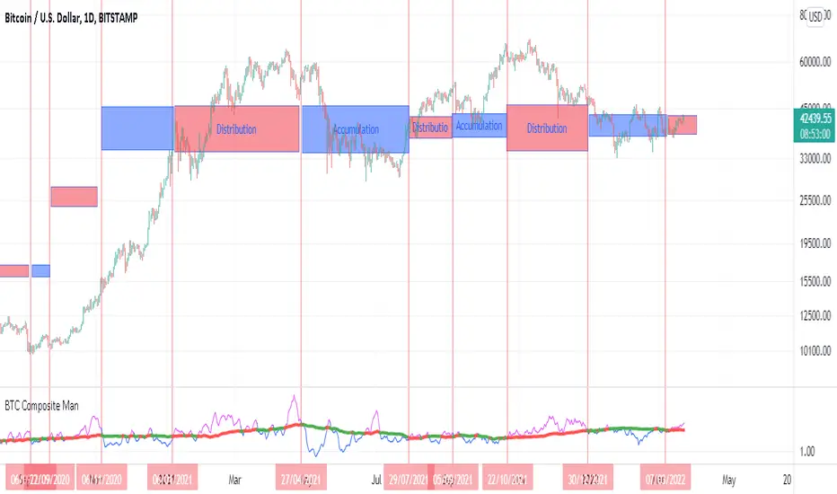
BTC Composite Man V.1Wyckoff's theory t is one of the most influential theories of market expression, and the most important components of which are lateral movement areas and trends. This theory turns the graph into something like Dots and lines (stations and paths).
After getting acquainted with Wyckoff's theory, I read several books on the subject, hoping that they could help me identify this area of lateral movement, the area of accumulation, or distribution. But there was a fundamental drawback. It is challenging to diagnose this issue. The rules discussed in these books are highly interpretive and subjective, and two different individual traders may come to exactly opposite conclusions based on their interpretation.
But as I became more familiar with the onchain analysis, an idea came to my mind that might be useful for more objectively recognizing charts based on Wyckoff's theory.
Composite Man: Wyckoff proposed a theory to help understand stock price movements. this is the “Composite Man” theory. (The same concept of whales or strong hands.)
he said: “…all the fluctuations in the market and all the various stocks should be studied as if they were the result of one man’s operations. Let us call him the Composite Man, who, in theory, sits behind the scenes and manipulates the stocks to your disadvantage if you do not understand the game as he plays it; and to your great profit if you do understand it.” (The Richard D. Wyckoff Course in Stock Market Science and Technique, section 9, p. 1-2)
Composite Man is a hypothetical man who has so much money and stocks that when he wants he can gradually increase the price by buying stocks and creating demand, and when the price goes high enough he sells his stock and lower the price. The composite man is the main player in the market. Wyckoff says that if you want to make a good profit from the market, figure out what a composite man game is.
Having a way of showing us where the Composite Man is in the market, can help us understand future trends
Who are the strong hands in the cryptocurrency market? (I use the strong hand word here instead of the composite man)
Some buy or sell more per capita than other market participants (retailers).
To understand this in the bitcoin market, I have used 3 charts and concepts:
1- Sending Addresses: The number of coins addresses making inflow transactions to the exchange.
Indicates the number of sellers' wallets (number of sellers)
2- buyers Addresses: The number of coins addresses making outflow transactions from the exchange.
Indicates the number of buyers' wallets (number of buyers)
3- Pay attention to this issue: the volume of transactions shows both the volume of sales and the buy ( Volume of buy and sale is equal in the market)
The Composite Man indicator is created by dividing the Receiving Addresses of bitcoin by the Sending Addresses. After dividing these addresses, the moving average of Alma was calculated for them and compared with the moving average of 100 days.
Considering the above 3 issues, it can be concluded:
- If the number of Receiving Addresses is higher than the Sending Addresses (the number of people who bought compared to the number of those who sold), it indicates that more people bought and fewer people sold (given that the volume of sales and buys are the same) So the sellers were stronger hands. In such a situation, the composite man is on the sales side.
- If the number of Sending Addresses is higher than the Receiving Addresses (number of people who have sold more than the number of people who have bought), it indicates that more people have been sellers and fewer people have been buyers (given that the volume of sales and buys are the same) so the buyers were stronger hands. In such a situation, the Composite man is on the buying side.
Accordingly, if the swing line is above the 100-day moving average line, it indicates that stronger addresses are being sold and retailers are buying, and vice versa.
Wyckoff Entry Times @jqrmThis indicator visually marks two custom time zones on your TradingView chart by drawing vertical lines at the start and end of each zone. The first time zone spans from 9:27 AM to 9:33 AM, highlighted in red, and the second spans from 9:50 AM to 10:10 AM, highlighted in blue. You can enable or disable each zone's lines using the indicator inputs. This helps to quickly spot important intraday sessions or time ranges on your chart.

Wyckoff Trading Strategy for XAU/USD by KAIZVIETNAMXAU/USD TF M15 TP SL 20-30 pip
- Volume: Calculates the average volume based on the SMA to compare with the current trading volume.
- ATR (Average True Range): Calculated to determine price volatility.
- Support and Resistance Levels: Identifies support and resistance levels over the last 10 trading sessions.
Specific Point Identification
- A series of functions are defined to detect critical phases in the market structure, such as:
- Finding Preliminary Support: Recognizing signals of accumulation near support levels.
- Finding Selling Climax: Detecting signals of profit-taking near resistance levels.
- Finding Last Point of Support: Identifying points that provide stability for the price.
- Finding Preliminary Supply: Recognizing supply signals near resistance levels.
- Finding Buying Climax: Identifying strong buy signals accompanied by high trading volume.
- Finding Sign of Weakness: Determining instances of price adjustments that could lead to declines.
Market State Identification
- Accumulation: When the closing price is situated between the support and resistance levels.
- Distribution: When the closing price approaches the highest level of the previous few sessions.
- Sideways: When there is no clear bias toward either an upward or downward trend.
Buy and Sell Signals
- Buy Signals: Determined through finding preliminary support, selling climax, and last point of support.
- Sell Signals: Determined through finding preliminary supply, buying climax, and signs of weakness.

Wyckoff Selection Method SP500RSI(Asset) - RSI(Index)
Useful to know if Asset is outperforming market in relative strength

Fractal Market Geometry [JOAT]
Fractal Market Geometry
Overview
Fractal Market Geometry is an open-source overlay indicator that combines fractal analysis with harmonic pattern detection, Fibonacci retracements and extensions, Elliott Wave concepts, and Wyckoff phase identification. It provides traders with a geometric framework for understanding market structure and identifying potential reversal patterns with multi-factor signal confirmation.
What This Indicator Does
The indicator calculates and displays:
Fractal Detection - Identifies fractal highs and lows using Williams-style pivot analysis with configurable period
Fractal Dimension - Calculates market complexity using range-based dimension estimation
Harmonic Patterns - Detects Gartley, Butterfly, Bat, Crab, Shark, Cypher, and ABCD patterns using Fibonacci ratios
Fibonacci Retracements - Key levels at 38.2%, 50%, and 61.8%
Fibonacci Extensions - Projection level at 161.8%
Elliott Wave Count - Simplified wave counting based on pivot detection (1-5)
Wyckoff Phase - Volume-based phase identification (Accumulation, Markup, Distribution, Neutral)
Golden Spiral Levels - ATR-based support and resistance levels using phi (1.618) ratio
Trend Detection - EMA crossover trend identification (20/50 EMA)
How It Works
Fractal detection uses a configurable period to identify swing points:
detectFractalHigh(simple int period) =>
bool result = true
float centerVal = high
for i = 0 to period - 1
if high >= centerVal or high >= centerVal
result := false
break
Harmonic pattern detection uses Fibonacci ratio analysis between swing points. Each pattern has specific ratio requirements:
Gartley: AB 0.382-0.618, BC 0.382-0.886, CD 1.27-1.618
Butterfly: AB 0.382-0.5, BC 0.382-0.886, CD 1.618-2.24
Bat: AB 0.5-0.618, BC 1.13-1.618, CD 1.618-2.24
Crab: AB 0.382-0.618, BC 0.382-0.886, CD 2.24-3.618
Shark: AB 0.382-0.618, BC 1.13-1.618, CD 1.618-2.24
Cypher: AB 0.382-0.618, BC 1.13-1.414, CD 0.786-0.886
Wyckoff phase detection analyzes volume relative to price movement:
wyckoffPhase(simple int period) =>
float avgVol = ta.sma(volume, period)
float priceChg = ta.change(close, period)
string phase = "NEUTRAL"
if volume > avgVol * 1.5 and math.abs(priceChg) < close * 0.02
phase := "ACCUMULATION"
else if volume > avgVol * 1.5 and math.abs(priceChg) > close * 0.05
phase := "MARKUP"
else if volume < avgVol * 0.7
phase := "DISTRIBUTION"
phase
Signal Generation
Signals use multi-factor confirmation for accuracy:
BUY Signal: Fractal low + Uptrend (EMA20 > EMA50) + RSI 30-55 + Bullish candle + Volume confirmation
SELL Signal: Fractal high + Downtrend (EMA20 < EMA50) + RSI 45-70 + Bearish candle + Volume confirmation
Pattern Detection: Label appears when harmonic pattern completes at current bar
Dashboard Panel (Top-Right)
Dimension - Fractal dimension value (market complexity measure)
Last High - Most recent fractal high price
Last Low - Most recent fractal low price
Pattern - Current harmonic pattern name or NONE
Elliott Wave - Current wave count (Wave 1-5) or OFF
Wyckoff - Current market phase or OFF
Trend - BULLISH, BEARISH, or NEUTRAL based on EMA crossover
Signal - BUY, SELL, or WAIT status
Visual Elements
Fractal Markers - Small triangles at fractal highs (down arrow) and lows (up arrow)
Geometry Lines - Dashed lines connecting the most recent fractal high and low
Fibonacci Levels - Clean horizontal lines at 38.2%, 50%, and 61.8% retracement levels
Fibonacci Extension - Horizontal line at 161.8% extension level
Golden Spiral Levels - Support and resistance lines based on ATR x 1.618
3D Fractal Field - Optional depth layers around swing levels (OFF by default)
Harmonic Pattern Markers - Small diamond shapes when Crab, Shark, or Cypher patterns detected
Pattern Labels - Text label showing pattern name when detected
Signal Labels - BUY/SELL labels on confirmed multi-factor signals
Input Parameters
Fractal Period (default: 5) - Bars on each side for fractal detection
Geometry Depth (default: 3) - Complexity of geometric calculations
Pattern Sensitivity (default: 0.8) - Tolerance for pattern ratio matching
Show Fibonacci Levels (default: true) - Display retracement levels
Show Fibonacci Extensions (default: true) - Display extension level
Elliott Wave Detection (default: true) - Enable wave counting
Wyckoff Analysis (default: true) - Enable phase detection
Golden Spiral Levels (default: true) - Display spiral support/resistance
Show Fractal Points (default: true) - Display fractal markers
Show Geometry Lines (default: true) - Display connecting lines
Show Pattern Labels (default: true) - Display pattern name labels
Show 3D Fractal Field (default: false) - Display depth layers
Show Harmonic Patterns (default: true) - Display pattern markers
Show Buy/Sell Signals (default: true) - Display signal labels
Suggested Use Cases
Identify potential reversal zones using harmonic pattern completion
Use Fibonacci levels for entry, stop-loss, and target planning
Monitor Wyckoff phases for accumulation/distribution awareness
Track Elliott Wave counts for trend structure analysis
Use fractal dimension to gauge market complexity
Wait for multi-factor signal confirmation before entering trades
Timeframe Recommendations
Best on 1H to Daily charts. Lower timeframes produce more fractals but with less significance. Higher timeframes provide stronger levels and more reliable signals.
Limitations
Harmonic pattern detection uses simplified ratio ranges and may not match all textbook definitions
Elliott Wave counting is basic and does not include all wave rules
Wyckoff phase detection is volume-based approximation
Fractal dimension calculation is simplified
Signals require fractal confirmation which has inherent lag equal to the fractal period
Open-Source and Disclaimer
This script is published as open-source under the Mozilla Public License 2.0 for educational purposes. It does not constitute financial advice. Past performance does not guarantee future results. Always use proper risk management.
- Made with passion by officialjackofalltrades

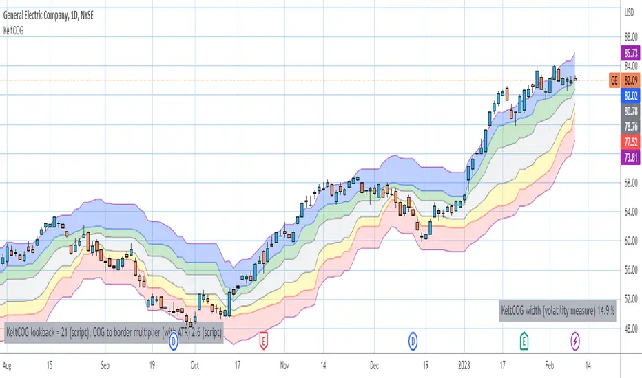
Keltner Center Of Gravity Channel ( KeltCOG )I have the ambition to create a ‘landscape’ which enables the user to see the ‘mood’ of the market about the price of an instrument, simply by looking where the candles go. Prices are a simple phenomenon , they go up or down or stay the same. This is represented quite well for the short term by a candle. I recommend to study candle patterns. Prices not only fluctuate but also trend up, down or go sideways. The user should analyze this by determining the COG (Center Of Gravity) and the ‘normal’ current range by using the historical data in a lookback period.
As a COG the center line of a Donchian Channel is often used. I.m.o. a COG should be a zone, in this channel I use the gray zone of my Donchian Fibonacci Channel, The ‘normal’ range is a multiple of Average True Range, as used in a Keltner Channel. Combining the two can give a cumbersome result, as one can see in my Keltner Fibonacci Channel. In this KeltCOG channel I solved this by not using all Fibonacci levels and by making the Keltner lines strictly parallel to the nearest COG line. To do this, I use the fact that the COG lines have horizontal stretches, there I make the Keltner lines horizontal too. Only where the COG lines change value, the Keltner lines are recalculated. This way the channel gets a very regular shape with three clear zones.
Interpretation of a chart by using the KeltCOG channel.
Overbought: If the candles go higher then the blue zone, the market is hyper enthusiast, creating an overbought situation. This is often followed by a reversion to the COG.
Uptrend: If the candles form in the blue zone, the market is enthusiast and willing to pay more.
Hopeful: If the candles form in or near the upper uncolored zone, the market is hopeful and is thinking about paying more. Sometimes prices go a little up.
Content: If the candles form in the gray zone, which represents COG, the market is happy with the current prices, so these move sideways
Disappointed: If the candles form in or near the lower uncolored zone, the market is disappointed and contemplates paying less, sometimes prices go a little down.
Downtrend: If the candles form in red zone, the market doesn’t like the instrument at all, rejects the current price and is only prepared to pay less.
Oversold: If the candles form below the red zone, the market overdoes its disgust, creating an oversold situation, often followed by a reversion to the COG.
Candle Microstructure ClassifierCandle Microstructure Classifier
Public Description
The Candle Microstructure Classifier is a visual study designed to highlight meaningful single-candle behaviors based purely on price geometry. It classifies candles according to body size and wick structure, helping traders visually identify moments of aggression, commitment, failed pushes, and rejection directly on the price chart.
This script is a study only. It does not generate trade signals, entries, exits, or forecasts. Its purpose is to provide structural context that can be combined with other tools such as trend, volume, or volatility analysis.
Quantitative Description
Each candle is decomposed into its geometric components relative to its total range (high − low). All classifications are based on normalized fractions to remain scale‑independent across instruments and timeframes.
Definitions:
1. Candle Range (R):
R = High − Low
2. Body Size (B):
B = |Close − Open|
Body Fraction = B / R
3. Upper Wick (UW):
UW = High − max(Open, Close)
Upper Wick Fraction = UW / R
4. Lower Wick (LW):
LW = min(Open, Close) − Low
Lower Wick Fraction = LW / R
Candle Classifications:
• Commitment Candle:
Body Fraction ≥ Large Body Threshold
Upper Wick Fraction ≤ Tiny Wick Threshold
Lower Wick Fraction ≤ Tiny Wick Threshold
Interpretation: Strong directional acceptance with minimal intrabar rejection.
• Marubozu (Aggression):
Body Fraction ≥ Large Body Threshold
One wick effectively absent (near zero)
Interpretation: Pure directional aggression with no meaningful counter‑pressure.
• Trend Attempt Failure:
Body Fraction ≥ Large Body Threshold
One wick large, opposite wick small
Interpretation: Strong push followed by immediate rejection on one side.
• Rejection Candle:
Body Fraction ≤ Small Body Threshold
Upper Wick Fraction ≥ Large Wick Threshold
Lower Wick Fraction ≥ Large Wick Threshold
Interpretation: Two‑sided rejection indicating price discovery or balance.
• Pin Rejection (optional):
Body Fraction ≤ Small Body Threshold
Only one wick large
Interpretation: One‑sided rejection often occurring near support or resistance.
Notes and Context
This classifier intentionally avoids pattern names tied to prediction. Each classification describes observed auction behavior inside a single bar, not an expectation of future movement.
Sources and Further Reading
Candle structure and wick interpretation:
• Investopedia – Candlestick Patterns and Anatomy
www.investopedia.com
Volume and volatility context examples:
• Wyckoff Method – Effort vs Result (Volume + Price Structure)
school.stockcharts.com
• CME Group – Using Volume and Volatility Together
www.cmegroup.com
Example Applications:
1. A commitment candle occurring simultaneously with a volume spike may indicate institutional participation and acceptance at that price level.
2. A rejection candle forming during elevated volatility (ATR expansion) may signal failed price discovery and potential mean reversion zones.

efficiency of bulls and bears for VSA(Google translation from Russian.)
This indicator shows the effectiveness of selling or buying.
It is calculated as follows: using percentrank, the volume and the value of the spread are estimated (momentum = 1)
the resulting estimate of the volume value is divided by the estimate of the spread (momentum = 1) and thus we obtain the value. The larger it is, the more efficient and easier the price movement was.
If the indicator value is small, then this means that the movement was ineffective, because the volume (money) was invested. but no result.
The color of the volume bars is assigned as follows:
Buyers:
If the volume is large - Blue - green
If middle, then blue
Small - light blue
Sellers:
If the volume is large - Burgundy color
If middle, then purple
Small volume - light purple
Indicator parameters:
Comparison period - the period at which the volumes and spread are compared with each other - by default it is 50, selected as the most universal period suitable for different timeframes. But for daytime ones. Weekly and monthly timeframes may need to be shortened. This is true after significant spikes in volume that are exceptional over the long term.
Period spread - Bars from close to close - or in other words, it is momentum - defaults to 1
sensitivity of increased volumes - according to the percentrank indicator - the limit above which the volume will be considered large, the same as in the Volume on bar VSA - indicator V2 - for clarity, I recommend looking at it.
The default is 85, which means. that if the current value of the volume is greater than 85% of the remaining values in this period, then such a value of the volume will be considered high.
medium volume sensitivity - the same sensitivity of increased volumes but for medium volumes.
multiplier of increased volumes - this is an empirical factor to emphasize the importance of increased volumes - default = 20
multiplier of average volumes - the same. As above, but for medium volumes - the default is 10
reduced volume multiplier - Default is 1.
Knowledge of VSA is required to read this indicator
This indicator is recommended for use with indicators:
Volume on bar VSA - indicator V2
BAR for VSA
Russian language
Этот индикатор показывает эффективность продаж или покупок.
Рассчитывается следующим образом: с помощью percentrank оценивается величина объема и велечина спреда (momentum = 1)
полученная оценка велечины объема делится на оценку спреда (momentum = 1) и таким образом получаем значение. Чем оно больше, тем движение цены было эффективнее и легче.
Если значение индикатора маленькое, то это означает, что движение было неэффективным, поскольку объем (деньги) вложили. а результата нет.
Цвет барам объемов присваиваются следующим образом:
У покупателей:
Если объем большой - Сине – зелёный цвет
Если средний – то голубой
Маленький – свело-голубой
У продавцов:
Если объем большой - Бордовый цвет
Если средний – то пурпурный
Маленький объем – светло-пурпурный
Параметры индикатора:
Comparison period (период для сравнения) – период на котором между собой сравниваются объемы и спред – по умолчанию равно 50 , выбрано как наиболее универсальный период подходящий для различных таймфреймов. Но для дневных. Недельных и месячных таймфреймов может потребоваться уменьшить период. Это актуально после значительных всплесков объемов, которые являются исключительными на длительном периоде.
Period spread - Bars from close to close (Период спреда - Баров от закрытия до закрытия) – или другими словами это momentum – по умолчанию равно 1
sensitivity of increased volumes (чувствительность повышенных объемов) – согласно индикатору percentrank – граница выше которой объем будет считаться большим, то же самое, что в индикаторе Volume on bar VSA - indicator V2 – для наглядности как это работает рекомендую посмотреть его.
По умолчанию задано 85 – это означает. что если текущее значение объема больше, чем 85% остальных значений на этом периоде, то такое значение объема будет считаться высоким.
medium volume sensitivity (чувствительность средних объемов) – то же самое sensitivity of increased volumes но для средних объемов.
multiplier of increased volumes (множитель (вес) повышенных объемов) – это эмперический коэффициент для придания особой важности повышенным объемам- по умолчанию = 20
multiplier of average volumes (множитель (вес) средних объемов) – то же самое. Что и выше, но для средних объемов – по умолчанию равно 10
reduced volume multiplier (множитель (вес) пониженных объемов) – по умолчанию равно 1.
Для чтения данного индикатора необходимо знание VSA
Этот индикатор рекомендуется использовать с индикаторами:
Volume on bar VSA - indicator V2
BAR for VSA
[Dipiers] Phoenix MTF v2.1This indicator is a modified (Multi Timeframe) version of the Phoenix Ascending that you can find between the @WyckoffMode scripts and it follows the same rules at the moment of the pubblication.
A special thanks to @Neuromantic that did a great part of the MTF coding and to @HedgeMode for the "real-time" idea to make the ongoing candle visibly different to always remember that it hasn't closed yet.
The chart TF must be the lowest between all the ones analysed.
The value of the higher TFs candles are the ones at the last close so to avoid repainting.
It is best used applying no more than a couple of TFs each chart so to have a better view of the races, you can apply the indicator multiple times to have a good view of the different TFs.
If you are using the code remember to give credit to the persons have worked on it.
Momentum Squeeze Candle [Darwinian]# Momentum Squeeze Candle
Professional squeeze detection indicator with Wyckoff accumulation/distribution analysis and multi-method momentum signals.
## Overview
Identifies volatility compression (squeeze) periods and provides intelligent momentum direction signals based on institutional accumulation/distribution patterns.
## Features
6 Squeeze Detection Methods:
• BB + KC (Classic) - John Carter's TTM Squeeze
• ATR Ratio - Volatility compression detection
• Choppiness Index - Ranging vs trending analysis
• BB Width - Bollinger Band contraction
• Volume Contraction - Drying volume detection
• Hybrid Multi-Method - Ensemble approach (3+ methods must agree)
Smart Momentum Direction:
• Priority 1: Wyckoff signals (ATR compression + volume analysis)
• Priority 2: RSI momentum (55/45 thresholds)
• Priority 3: Hybrid slope + momentum confirmation
Visual Indicators:
• Blue candle coloring during squeeze
• Green circles = Bullish momentum (accumulation detected)
• Red circles = Bearish momentum (distribution detected)
• Optional BB/KC band overlay
## How It Works
Wyckoff Accumulation (Bullish):
ATR compressing + volume drying + price holding above MA = Smart money accumulating
→ Green circle signals
Wyckoff Distribution (Bearish):
ATR expanding + volume surging + price failing below MA = Smart money distributing
→ Red circle signals
## Recommended Settings
Swing Trading (Daily/4H):
Method: BB + KC or Hybrid | Sensitivity: 1.2-1.5
Day Trading (15m-1H):
Method: ATR Ratio or BB Width | Sensitivity: 0.8-1.0
Scalping (1m-5m):
Method: Volume Contraction | Sensitivity: 0.7-0.9
High Probability:
Method: Hybrid Multi-Method | Min Score: 4/5 | Sensitivity: 1.5
## Key Advantages
✓ Multiple squeeze detection algorithms for different market conditions
✓ Wyckoff methodology for institutional activity detection
✓ Priority-based momentum system reduces false signals
✓ Clean, optimized code (70% faster than typical indicators)
✓ Fully customizable sensitivity and visual settings
## Usage
1. Choose squeeze detection method based on your trading style
2. Watch for blue candles (squeeze active)
3. Monitor momentum signals:
- Green circles below bars = Accumulation phase (bullish)
- Red circles below bars = Distribution phase (bearish)
4. Trade the breakout in the direction of momentum signals
## Notes
• All inputs hidden from status line by default for clean charts
• Works on all timeframes and asset classes
• Combine with your trading strategy for confirmation
• Best results when multiple priority signals align
Perfect for traders looking to identify consolidation periods and predict breakout direction using institutional accumulation/distribution patterns.

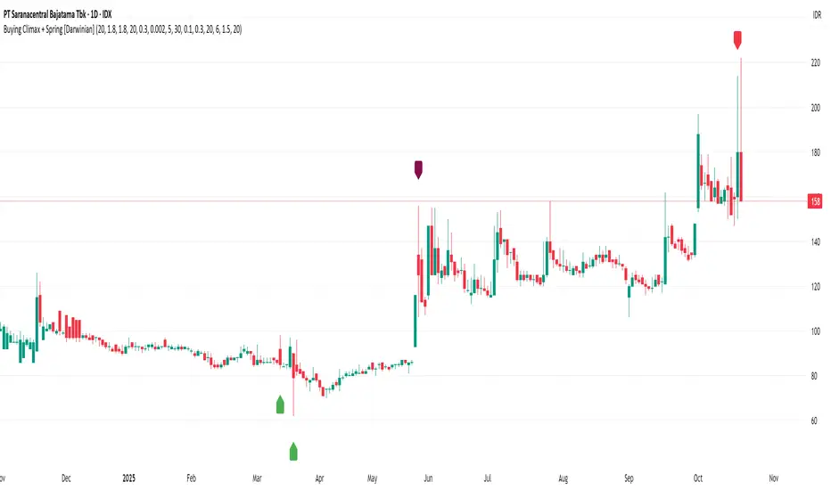
Buying Climax + Spring [Darwinian]Buying Climax + Spring Indicator
Overview
Advanced Wyckoff-based indicator that identifies potential market reversals through **Buying Climax** patterns (exhaustion tops) and **Spring** patterns (accumulation bottoms). Designed for traders seeking high-probability reversal signals with strict uptrend validation.
---
Method
🔴 Buying Climax Detection
Identifies exhaustion patterns at market tops using multi-condition analysis:
**Base Buying Climax (Red Triangle)**
- Volume spike > 1.8x average
- Range expansion > 1.8x average
- New 20-bar high reached
- Close finishes in lower 30% of bar range
- **Strict uptrend validation**: Price must be 30%+ above 20-day low
**Enhanced Buying Climax (Maroon Triangle)**
- All Base BC conditions PLUS:
- Gap up from previous high
- Intraday fade (close < open and below midpoint)
- **Higher confidence reversal signal**
🟢 Wyckoff Spring Detection
Identifies accumulation patterns at support levels:
- Price breaks below recent pivot low (false breakdown)
- Close recovers above pivot level (rejection)
- Occurs at trading range low
- Optional volume confirmation (1.5x+ average)
- Limited to 3 attempts per pivot (prevents over-signaling)
✅ Uptrend Validation Filter
**Four-condition composite filter** prevents false signals in sideways/downtrending markets:
1. Close-to-close rise ≥ 5% over lookback period
2. Price structure: Close > MA(10) > MA(20)
3. Swing low significantly below current price
4. **Primary requirement**: Current high ≥ 30% above 20-day low
---
Input Tuning Guide
Buying Climax Settings:
**Volume & Range Thresholds**
- `Volume Spike Threshold`: Default 1.8x
- Lower (1.5x) = More signals, more noise
- Higher (2.0-2.5x) = Fewer but stronger exhaustion signals
- `Range Spike Threshold`: Default 1.8x
- Adjust parallel to volume threshold
- Higher values = extreme volatility required
**Pattern Detection**
- `New High Lookback`: Default 20 bars
- Shorter (10-15) = Recent highs only
- Longer (30-50) = Major breakout detection
- `Close Off High Fraction`: Default 0.3 (30%)
- Lower (0.2) = Stricter rejection requirement
- Higher (0.4-0.5) = Allow weaker intraday fades
- `Gap Threshold`: Default 0.002 (0.2%)
- Increase (0.005-0.01) for stocks with wider spreads
- Decrease (0.001) for tight-spread instruments
- `Confirmation Window`: Default 5 bars
- Shorter (3) = Faster confirmation, more false positives
- Longer (7-10) = Wait for deeper automatic reaction
Uptrend Filter Settings
**Critical for Signal Quality**
- `Minimum Rise from 20-day Low`: Default 0.30 (30%)
- **Most important parameter**
- Lower (0.20-0.25) = More signals in moderate uptrends
- Higher (0.40-0.50) = Only extreme parabolic moves
- `Pole Lookback`: Default 30 bars
- Shorter (20) = Recent momentum focus
- Longer (40-50) = Longer-term trend validation
- `Minimum Rise % for Pole`: Default 0.05 (5%)
- Adjust based on market volatility
- Higher in strong bull markets (7-10%)
Wyckoff Spring Settings
- `Pivot Length`: Default 6 bars
- Shorter (3-4) = More frequent pivots, more signals
- Longer (8-10) = Major support/resistance only
- `Volume Threshold`: Default 1.5x
- Higher (1.8-2.0x) = Stronger conviction required
- Disable volume requirement for low-volume stocks
- `Trading Range Period`: Default 20 bars
- Match to consolidation timeframe being traded
- Shorter (10-15) for intraday patterns
- Longer (30-40) for weekly consolidations
---
Recommended Workflow
1. **Start with defaults** on daily timeframe
2. **Adjust uptrend filter** first (30% rise parameter)
- Too many signals? Increase to 35-40%
- Too few? Decrease to 25%
3. **Fine-tune volume/range multipliers** based on instrument volatility
4. **Enable alerts** for real-time monitoring:
- Base BC → Initial warning
- Enhanced BC → High-priority reversal
- Confirmed BC (AR) → Strong follow-through
- Spring → Accumulation opportunity
---
Alert System
- **Base Buying Climax**: Standard exhaustion pattern detected
- **Enhanced BC (Gap+Fade)**: Higher confidence reversal setup
- **Confirmed BC (AR)**: Automatic reaction validated (price drops below BC midline)
- **Wyckoff Spring**: Accumulation pattern at support
---
Best Practices
- Combine with support/resistance analysis
- Watch for BC clusters (multiple timeframes)
- Spring patterns work best after Buying Climax distribution
- Backtest parameters on your specific instruments
- Higher timeframes (daily/weekly) = higher reliability
---
Technical Notes
- Built with Pine Script v6
- No repainting (signals finalize on bar close)
- Minimal CPU usage (optimized calculations)
- Works on all timeframes and instruments
- Overlay indicator (displays on price chart)
---
*Indicator follows classical Wyckoff methodology with modern volatility filters*
Linh's Anomaly Radar v2What this script does
It’s an event detector for price/volume anomalies that often precede or confirm moves.
It watches a bunch of patterns (Wyckoff tests, squeezes, failed breakouts, turnover bursts, etc.), applies robust z-scores, optional trend filters, cooldowns (to avoid spam), and then fires:
A shape/label on the bar,
A row in the mini panel (top-right),
A ready-made alertcondition you can hook into.
How to add & set up (TradingView)
Paste the script → Save → Add to chart on Daily first (works on any TF).
Open Settings → Inputs:
General
• Use Robust Z (MAD): more outlier-resistant; keep on.
• Z Lookback: 60 bars is ~3 months; bump to 120 for slower regimes.
• Cooldown: min bars to wait before the same signal can fire again (default 5).
• Use trend filter: if on, “bullish” signals only fire above SMA(tfLen), “bearish” below.
Thresholds: fine-tune sensitivity (defaults are sane).
To create alerts: Right-click chart → Add alert
Condition: Linh’s Anomaly Radar v2 → choose a specific signal or Composite (Σ).
Options: “Once per bar close” (recommended).
Customize message if you want ticker/timeframe in your phone push.
The mini panel (top-right)
Signal column: short code (see cheat sheet below).
Fired column: a dot “•” means that on the latest bar this signal fired.
Score (right column): total count of signals that fired this bar.
Σ≥N shows your composite threshold (how many must fire to trigger the “Composite” alert).
Shapes & codes (what’s what)
Code Name (category) What it’s looking for Why it matters
STL Stealth Volume z(volume)>5 & ** z(return)
EVR Effort vs Result squeeze z(vol)>3 & z(TR)<−0.5 Heavy effort, tiny spread → absorption
TGV Tight+Heavy (HL/ATR)<0.6 & z(vol)>3 Tight bar + heavy tape → pro activity
CLS Accumulation cluster ≥3 of last 5 bars: up, vol↑, close near high Classic accumulation footprint
GAP Open drive failure Big gap not filled (≥80%) & vol↑ One-sided open stalls → fade risk
BB↑ BB squeeze breakout Squeeze (z(BBWidth)<−1.3) → close > upperBB & vol↑ Regime shift with confirmation
ER↑ Effort→Result inversion Down day on vol then next bar > prior high Demand overwhelms supply
OBV OBV divergence OBV slope up & ** z(ret20)
WER Wide Effort, Opposite Result z(vol)>3, close+1 Selling into strength / distribution
NS No-Supply (Wyckoff) Down bar, HL<0.6·ATR, vol << avg Sellers absent into weakness
ND No-Demand (Wyckoff) Up bar, HL<0.6·ATR, vol << avg Buyers absent into strength
VAC Liquidity Vacuum z(vol)<−1.5 & ** z(ret)
UTD UTAD (failed breakout) Breaks swing-high, closes back below, vol↑ Stop-run, reversal risk
SPR Spring (failed breakdown) Breaks swing-low, closes back above, vol↑ Bear trap, reversal risk
PIV Pocket Pivot Up bar; vol > max down-vol in lookback Quiet base → sudden demand
NR7 Narrow Range 7 + Vol HL is 7-bar low & z(vol)>2 Coiled spring with participation
52W 52-wk breakout quality New 52-wk close high + squeeze + vol↑ High-quality breakouts
VvK Vol-of-Vol kink z(ATR20,200)>0.5 & z(ATR5,60)<0 Long-vol wakes up, short-vol compresses
TAC Turnover acceleration SMA3 vol / SMA20 vol > 1.8 & muted return Participation surging before move
RBd RSI Bullish div Price LL, RSI HL, vol z>1 Exhaustion of sellers
RS↑ RSI Bearish div Price HH, RSI LH, vol z>1 Exhaustion of buyers
Σ Composite Count of all fired signals ≥ threshold High-conviction bar
Placement:
Triangles up (below bar) → bullish-leaning events.
Triangles down (above bar) → bearish-leaning events.
Circles → neutral context (VAC, VvK, Composite).
Key inputs (quick reference)
General
Use Robust Z (MAD): keep on for noisy tickers.
Z Lookback (lenZ): 60 default; 120 if you want fewer alerts.
Trend filter: when on, bullish signals require close > SMA(tfLen), bearish require <.
Cooldown: prevents repeated firing of the same signal within N bars.
Phase-1 thresholds (core)
Stealth: vol z > 5, |ret z| < 1.
EVR: vol z > 3, TR z < −0.5.
Tight+Heavy: (HL/ATR) < 0.6, vol z > 3.
Cluster: window=5, min=3 strong bars.
GapFail: gap/ATR ≥1.5, fill <80%, vol z > 2.
BB Squeeze: z(BBWidth)<−1.3 then breakout with vol z > 2.
Eff→Res Up: prev bar heavy down → current bar > prior high.
OBV Div: OBV uptrend + |z(ret20)|<0.3.
Phase-2 thresholds (extras)
WER: vol z > 3, close1.
No-Supply/No-Demand: tight bar & very light volume vs SMA20.
Vacuum: vol z < −1.5, |ret z|>1.5.
UTAD/Spring: swing lookback N (default 20), vol z > 2.
Pocket Pivot: lookback for prior down-vol max (default 10).
NR7: 7-bar narrowest range + vol z > 2.
52W Quality: new 52-wk high + squeeze + vol z > 2.
VoV Kink: z(ATR20,200)>0.5 AND z(ATR5,60)<0.
Turnover Accel: SMA3/SMA20 > 1.8 and |ret z|<1.
RSI Divergences: compare to n bars back (default 14).
How to use it (playbooks)
A) Daily scan workflow
Run on Daily for your VN watchlist.
Turn Composite (Σ) alert on with Σ≥2 or ≥3 to reduce noise.
When a bar fires Σ (or a fav combo like STL + BB↑), drop to 60-min to time entries.
B) Breakout quality check
Look for 52W together with BB↑, TAC, and OBV.
If WER/ND appear near highs → downgrade the breakout.
C) Spring/UTAD reversals
If SPR fires near major support and RBd confirms → long bias with stop below spring low.
If UTD + WER/RS↑ near resistance → short/fade with stop above UTAD high.
D) Accumulation basing
During bases, you want CLS, OBV, TGV, STL, NR7.
A pocket pivot (PIV) can be your early add; manage risk below base lows.
Tuning tips
Too many signals? Raise stealthVolZ to 5.5–6, evrVolZ to 3.5, use Σ≥3.
Fast movers? Lower bbwZthr to −1.0 (less strict squeeze), keep trend filter on.
Illiquid tickers? Keep MAD z-scores on, increase lookbacks (e.g., lenZ=120).
Limitations & good habits
First lenZ bars on a new symbol are less reliable (incomplete z-window).
Some ideas (VWAP magnet, close auction spikes, ETF/foreign flows, options skew) need intraday/external feeds — not included here.
Pine can’t “screen” across the whole market; set alerts or cycle your watchlist.
Quick troubleshooting
Compilation errors: make sure you’re on Pine v6; don’t nest functions in if blocks; each var int must be declared on its own line.
No shapes firing: check trend filter (maybe price is below SMA and you’re waiting for bullish signals), and verify thresholds aren’t too strict.

RSI with Swing Trade by Kelvin_VAlgorithm Description: "RSI with Swing Trade by Kelvin_V"
1. Introduction:
This algorithm uses the RSI (Relative Strength Index) and optional Moving Averages (MA) to detect potential uptrends and downtrends in the market. The key feature of this script is that it visually changes the candle colors based on the market conditions, making it easier for users to identify potential trend swings or wave patterns.
The strategy offers flexibility by allowing users to enable or disable the MA condition. When the MA condition is enabled, the strategy will confirm trends using two moving averages. When disabled, the strategy will only use RSI to detect potential market swings.
2. Key Features of the Algorithm:
RSI (Relative Strength Index):
The RSI is used to identify potential market turning points based on overbought and oversold conditions.
When the RSI exceeds a predefined upper threshold (e.g., 60), it suggests a potential uptrend.
When the RSI drops below a lower threshold (e.g., 40), it suggests a potential downtrend.
Moving Averages (MA) - Optional:
Two Moving Averages (Short MA and Long MA) are used to confirm trends.
If the Short MA crosses above the Long MA, it indicates an uptrend.
If the Short MA crosses below the Long MA, it indicates a downtrend.
Users have the option to enable or disable this MA condition.
Visual Candle Coloring:
Green candles represent a potential uptrend, indicating a bullish move based on RSI (and MA if enabled).
Red candles represent a potential downtrend, indicating a bearish move based on RSI (and MA if enabled).
3. How the Algorithm Works:
RSI Levels:
The user can set RSI upper and lower bands to represent potential overbought and oversold levels. For example:
RSI > 60: Indicates a potential uptrend (bullish move).
RSI < 40: Indicates a potential downtrend (bearish move).
Optional MA Condition:
The algorithm also allows the user to apply the MA condition to further confirm the trend:
Short MA > Long MA: Confirms an uptrend, reinforcing a bullish signal.
Short MA < Long MA: Confirms a downtrend, reinforcing a bearish signal.
This condition can be disabled, allowing the user to focus solely on RSI signals if desired.
Swing Trade Logic:
Uptrend: If the RSI exceeds the upper threshold (e.g., 60) and (optionally) the Short MA is above the Long MA, the candles will turn green to signal a potential uptrend.
Downtrend: If the RSI falls below the lower threshold (e.g., 40) and (optionally) the Short MA is below the Long MA, the candles will turn red to signal a potential downtrend.
Visual Representation:
The candle colors change dynamically based on the RSI values and moving average conditions, making it easier for traders to visually identify potential trend swings or wave patterns without relying on complex chart analysis.
4. User Customization:
The algorithm provides multiple customization options:
RSI Length: Users can adjust the period for RSI calculation (default is 4).
RSI Upper Band (Potential Uptrend): Users can customize the upper RSI level (default is 60) to indicate a potential bullish move.
RSI Lower Band (Potential Downtrend): Users can customize the lower RSI level (default is 40) to indicate a potential bearish move.
MA Type: Users can choose between SMA (Simple Moving Average) and EMA (Exponential Moving Average) for moving average calculations.
Enable/Disable MA Condition: Users can toggle the MA condition on or off, depending on whether they want to add moving averages to the trend confirmation process.
5. Benefits of the Algorithm:
Easy Identification of Trends: By changing candle colors based on RSI and MA conditions, the algorithm makes it easy for users to visually detect potential trend reversals and trend swings.
Flexible Conditions: The user has full control over the RSI and MA settings, allowing them to adapt the strategy to different market conditions and timeframes.
Clear Visualization: With the candle color changes, users can quickly recognize when a potential uptrend or downtrend is forming, enabling faster decision-making in their trading.
6. Example Usage:
Day traders: Can apply this strategy on short timeframes such as 5 minutes or 15 minutes to detect quick trends or reversals.
Swing traders: Can use this strategy on longer timeframes like 1 hour or 4 hours to identify and follow larger market swings.

Accumulation/DistributionAccumulation/Distribution explains when the big players buy or sell, according to Wyckoff.
I added some colors to make it more visibly, to get a hint when (not) to invest.
A/D is a lagging indicator.
When the MA is above A/D line, this should reflect distribution time, and big players are selling.
The oppsite is when MA is below the A/D line, then this should be an accumulation phase, and big players are buying.
For example, my preference is a TEMA20 for crypto, this gives me good results.
But I added a bunch of moving averages to choose from.
Depending on preferences/marked you can choose a moving average, set its length, and you can choose all the colors too.
I recommend the Volume indicator to setup the MA line, and this will get much better results!
I hope this script will help some people to do some better decisions.
And I am pleased to get some advice to make this script even better!
There is only one similar-sounding script in the public section.
Kudos go to jbneto with his Accum/ Dist + 200 EMA which gave me the inspiration.
It has a EMA200, and its focus is on the daily pivot price.
RedK EVEREX - Effort Versus Results ExplorerRedK EVEREX is an experimental indicator that explores "Volume Price Analysis" basic concepts and Wyckoff law "Effort versus Result" - by inspecting the relative volume (effort) and the associated (relative) price action (result) for each bar - showing the analysis as an easy to read "stacked bands" visual. From that analysis, we calculate a "Relative Rate of Flow" - an easy to use +100/-100 oscilator that can be used to trigger a signal when a bullish or bearish mode is detected for a certain user-selected length of bars.
Basic Concepts of VPA
-------------------------------
(The topics of VPA & Wyckoff Effort vs Results law are too comprehensive to cover here - So here's just a very basic summary - please review these topics in detail in various sources available here in TradingView or on the web)
* Volume Price Analysis (VPA) is the examination of the number of shares or contracts of a security that have been traded in a given period, and the associated price movement. By analyzing trends in volume in conjunction with price movements, traders can determine the significance of changes in price and what may unfold in the near future.
* Oftentimes, high volumes of trading can infer a lot about investors’ outlook on a market or security. A significant price increase along with a significant volume increase, for example, could be a credible sign of a continued bullish trend or a bullish reversal. Adversely, a significant price decrease with a significant volume increase can point to a continued bearish trend or a bearish trend reversal.
* Incorporating volume into a trading decision can help an investor to have a more balanced view of all the broad market factors that could be influencing a security’s price, which helps an investor to make a more informed decision.
* Wyckoff's law "Effort versus results" dictates that large effort is expected to be accompanied with big results - which means that we should expect to see a big price move (result) associated with a large relative volume (effort) for a certain trading period (bar).
* The way traders use this concept in chart analysis is to mainly look for imbalances or invalidation. for example, when we observe a large relative volume that is associated with very limited price change - that should trigger an early flag/warning sign that the current price trend is facing challenges and may be an early sign of "reversal" - this applies in both bearish and bullish conditions. on the other hand, when price starts to trend in a certain direction and that's associated with increasing volume, that can act as kind of validation, or a confirmation that the market supports that move.
How does EVEREX work
---------------------------------
* EVEREX inspects each bar and calculates a relative value for volume (effort) and "strength of price movement" (result) compared to a specified lookback period. The results are then visualized as stacked bands - the lower band represents the relative volume, the upper band represents the relative price strength - with clear color coding for easier analysis.
* The scale of the band is initially set to 100 (each band can occupy up to 50) - and that can be changed in the settings to 200 or 400 - mainly to allow a "zoom in" on the bands.
* Reading the resulting stacked bands makes it easier to see "balanced" volume/price action (where both bands are either equally strong, or equally weak), or when there's imbalance between volume and price (for example, a compression bar will show with high volume band and very small/tiny price action band) - another favorite pattern in VPA is the "Ease of Move", which will show as a relatively small volume band associated with a large "price action band" (either bullish or bearish) .. and so on.
* a bit of a techie piece: why the use of a custom "Normalize()" function to calculate "relative" values in EVEREX?
When we evaluate a certain value against an average (for example, volume) we need a mechanism to deal with "super high" values that largely exceed that average - I also needed a mechanism that mimics how a trader looks at a volume bar and decides that this volume value is super low, low, average, above average, high or super high -- the issue with using a stoch() function, which is the usual technique for comparing a data point against a lookback average, is that this function will produce a "zero" for low values, and cause a large distortion of the next few "ratios" when super large values occur in the data series - i researched multiple techniques here and decided to use the custom Normalize() function - and what i found is, as long as we're applying the same formula consistently to the data series, since it's all relative to itself, we can confidently use the result. Please feel free to play around with this part further if you like - the code is commented for those who would like to research this further.
* Overall, the hope is to make the bar-by-bar analysis easier and faster for traders who apply VPA concepts in their trading
What is RROF?
--------------------------
* Once we have the values of relative volume and relative price strength, it's easy from there to combine these values into a moving index that can be used to track overall strength and detect reversals in market direction - if you think about it this a very similar concept to a volume-weighted RSI. I call that index the "Relative Rate of Flow" - or RROF (cause we're not using the direct volume and price values in the calculation, but rather relative values that we calculated with the proprietary "Normalize" function in the script.
* You can show RROF as a single or double-period - and you can customize it in terms of smoothing, and signal line - and also utilize the basic alerts to get notified when a change in strength from one side to the other (bullish vs bearish) is detected
* In the chart above, you can see how the RROF was able to detect change in market condition from Bearsh to Bullish - then from Bullish to Bearish for TSLA with good accuracy.
Other Usage Options in EVEREX
------------------------------------
* I wrote EVEREX with a lot of flexibility and utilization in mind, while focusing on a clean and easy to use visual - EVEREX should work with any time frame and any instrument - in instruments with no volume data, only price data will be used.
* You can completely hide the "EVEREX bands" and use EVEREX as a single or dual period strength indicator (by exposing the Bias/Sentiment plot which is hidden by default) -
here's how this setup would look like - in this mode, you will basically be using EVEREX the same way you're using a volume-weighted RSI
* or you can hide the bias/sentiment, and expose the Bulls & Bears plots (using the indicator's "Style" tab), and trade it like a Bull/Bear Pressure Index like this
* you can choose Moving Average type for most plot elements in EVEREX, including how to deal with the Lookback averaging
* you can set EVEREX to a different time frame than the chart
* did i mention basic alerts in this v1.0 ?? There's room to add more VPA-specific alerts in future version (for example, when Ease-of-Move or Compression bars are detected...etc) - let me know if the comments what you want to see
Final Thoughts
--------------------
* EVEREX can be used for bar-by-bar VPA analysis - There are so much literature out there about VPA and it's highly recommended that traders read more about what VPA is and how it works - as it adds an interesting (and critical) dimension to technical analysis and will improve decision making
* RROF is a "strength indicator" - it does not track price values (levels) or momentum - as you will see when you use it, the price can be moving up, while the RROF signal line starts moving down, reflecting decreasing strength (or otherwise, increasing bear strength) - So if you incorporate EVEREX in your trading you will need to use it alongside other momentum and price value indicators (like MACD, MA's, Trend Channels, Support & Resistance Lines, Fib / Donchian..etc) - to use for trade confirmation

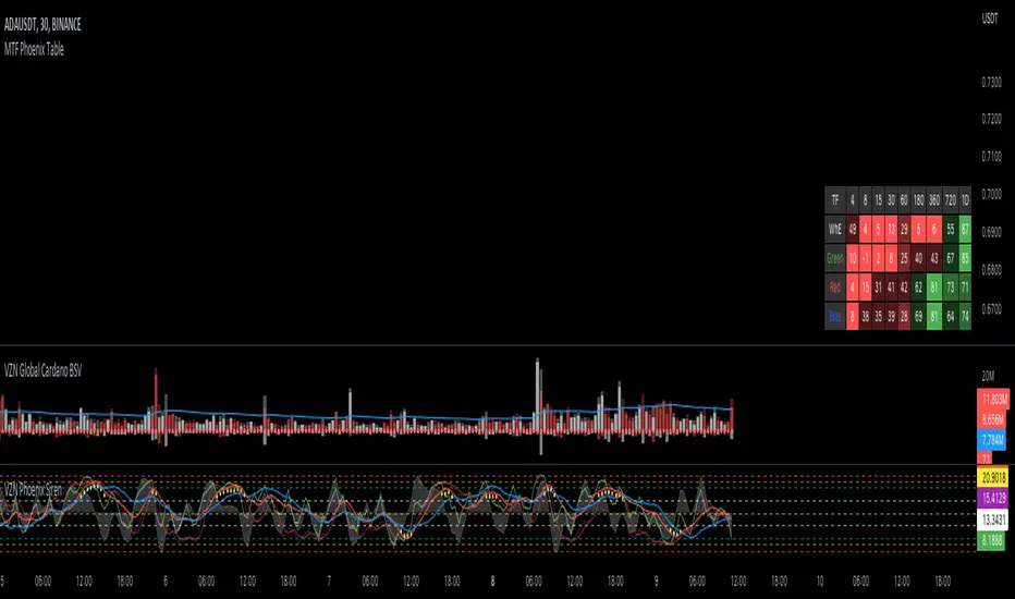
MTF Phoenix TableThis is a MTF heatmap companion for the Phoenix Ascending indicator by WyckoffMode. It aims to make MTF analysis easier at a quick glance.
The row headings are color coordinated for easy visual recognition.
deKoder | Structural Flow [SF]deKoder | SF | Structural Flow - Swing/Pivot Structure Charting
Strips away the noise of standard candlestick charts and reveals the true underlying swing structure through clean, connected pivot lines.
Beneath the storm of wicks / Silent structure whispers truth
Extreme Noise Reduction
Replaces cluttered price action with a minimalist pivot based line chart. The user-defined Window length lets you control sensitivity: shorter for more detail on lower timeframes, longer for cleaner structure on higher timeframes.
Accurate Swing Detection
Only stronger pivots are accepted. Weaker same side pivots are ignored, preserving the true extreme highs and lows without distortion.
Real Time Extension
The final incomplete leg dynamically follows the current close until the next confirmed pivot forms.
Optional Directional Colouring
Enable Directional Colouring to automatically colour confirmed legs with the user defined bull and bear colours on upward and downward swings.
Adjustable Background Candles
Candles with adjustable transparency may be displayed on the chart. Adjust the visibility setting to find the perfect balance between full raw candle data and clean structure
Practical Uses
Instantly reveals classic chart patterns — head & shoulders, double tops/bottoms, triangles, flags with unmistakable clarity
Becomes simple to spot Wyckoff springs, upthrusts, and phase transitions inside trading ranges
Provides a clean foundation for manual Elliott Wave counting . Clear swing structure makes labeling impulses and corrections much easier
Makes trend changes and potential reversals stand out without second-guessing every wick
Excellent for higher-timeframe structural analysis — the longer window setting produces exceptionally clean swing views
Ideal for creating clean educational screenshots and annotated posts - the chart speaks for itself
Reduces emotional noise by shifting focus from every candle to meaningful swing structure
Well suited for swing and price action traders, Wyckoff and Elliott Wave analysis, and anyone who prefers calm, uncluttered charts over constant visual chaos.
Clean charts. Clear sight.
☠ FR33FA11 | deKoder ☠
Released January 2025 | Open Source
If this open-source script (or any of its free companions) has saved you time or helped you read the market better, a coffee or a few sats helps to keep the Pine coming ❤️
Solana: 2N8HWPAHSC7Z8SLyneMrZp234UAP9HCtQX7wNXw7LKQC
Ethereum: 0xE770D254DC579d1db7bA2fe74376b7009527356B
Bitcoin: bc1qd8j3awht5yrjtnvt5dagxldzhaesc83sftype3
Polygon: 0xE770D254DC579d1db7bA2fe74376b7009527356B
Hype: 0xE770D254DC579d1db7bA2fe74376b7009527356B

Weis Wave Volume MTF 🎯 Indicator Name
Weis Wave Volume (Multi‑Timeframe) — adapted from the original “Weis Wave Volume by LazyBear.”
This version adds multi‑timeframe (MTF) readings, configurable colors, font size, and screen position for clear dashboard‑style display.
🧠 Concept Background — What is Weis Wave Volume (WWV)?
The Weis Wave Volume indicator originates from Wyckoff and David Weis’ techniques.
Its purpose is to link price movement “waves” with the amount of traded volume to reveal how strong or weak each wave is.
Instead of showing bars one by one, WWV accumulates the total volume while price keeps moving in the same direction.
When price direction changes (up → down or down → up), it:
Finishes the previous wave volume total.
Starts a new wave and begins accumulating again.
Those wave volumes help traders see:
Effort vs Result: Big volume with small price move ⇒ absorption; low volume with big move ⇒ weak participation.
Trend confirmation or exhaustion: High volume waves in trend direction strengthen it, while low‑volume waves hint exhaustion.
⚙️ How this Script Works
Trend & Wave Detection
Compares close with the previous bar to determine up or down movement (mov).
Detects trend reversals (when mov direction changes).
Builds “waves,” each representing a continuous run of bars in one direction.
Volume Accumulation
While price keeps the same direction, the script adds each bar’s volume to the running total (vol).
When direction flips, it resets that total and starts a new wave.
Multi‑Timeframe Computation
Calculates these wave volumes on three timeframes at once, chosen dynamically:
Active Chart Timeframe Displays WWV for:
1 min 1 min
5 min 5 min
15 min 15 min
Any other Chart TF
It uses request.security() to pull each timeframe’s latest WWV value and current wave direction.
Visual Output
Instead of plotting histogram bars, it shows a table with three numeric values:
WWV (1): 25.3 M | (15): 312 M | (240): 2.46 B
Each value is color‑coded:
user‑selected Uptrend Color when price wave = up
user‑selected Downtrend Color when wave = down
You can position this small table in any corner/center (top / bottom × left / center / right).
Font size is user‑adjustable (Tiny → Huge).
📈 How Traders Use It
Quickly gauge buying vs selling effort across multiple horizons.
Compare short‑term wave volume to higher‑timeframe waves to spot:
Alignment → all up and big volumes = strong trend
Divergence → small or opposite‑colored higher‑TF wave = potential reversal or pause
Combine with Wyckoff, VSA, or standard trend analysis to judge if a breakout or pullback has real participation.
🧩 Key Features of This Version
Feature Description
Multi‑Timeframe Panel Displays WWV values for 3 selected TFs at once
Dynamic TF Mapping Auto‑adjusts which TFs to use based on chart
Up/Down Color Coding Customizable colors for wave direction
Adjustable Font and Placement Set font size (Tiny→Huge) and screen corner/center
No Histograms Keeps chart clean; acts as a compact WWV dashboard

No Supply (Low-Volume Down Bars) — IdoThis indicator flags classic Wyckoff/VSA “No Supply (NS)” events—down bars that print on unusually low volume, suggesting a lack of sellers rather than strong selling pressure. NS often appears near support, LPS, or within re-accumulation ranges as a test before continuation higher.
Signal definition (configurable):
Down bar: choose Close < PrevClose or Close < Open.
Low volume: Volume < SMA(Volume, len) × threshold (e.g., 0.7).
Optional volume lower than the prior two bars (reduces noise).
Optional narrow spread: range (H–L) below its average.
Optional close position: close in the upper half of the bar.
Optional trend filter: only mark NS above or below an EMA (or any).
Optional wide-bar exclusion: skip unusually wide bars.
Visuals & outputs
Blue dot below each NS bar (optional bar tint).
Separate pane showing Relative Volume (vol / volSMA) to gauge effort.
Built-in alertcondition to trigger notifications when NS prints.
Inputs (high level)
lenVol: Volume SMA length.
ratioVol: Volume threshold vs. average (e.g., 0.7 = 70%).
usePrev2: Require volume below each of the prior two bars.
useNarrow + lenRange + ratioRange: Narrow-bar filter.
useClosePos + minClosePos: Close in upper portion of the bar.
downBarMode: Define “down bar” logic.
trendFiltOn, trendLen, trendSide: EMA trend filter.
useWideFilter, lenRangeWide, wideThreshold: Skip wide bars.
How to use (Wyckoff/VSA context)
Treat NS as a test of supply: price dips, but volume is light and close holds up.
Stronger when it prints near support/LPS within a re-accumulation structure.
Confirmation (recommended): within 1–3 bars, see demand—e.g., break above the NS high with expanding volume (above average or above the prior two bars). Many traders place a buy-stop just above the NS high; common stops are below the NS low or the most recent swing low.
Scanning tip
TradingView’s stock screener can’t consume Pine directly.
Use a Watchlist Custom Column that reports “bars since NS” to sort symbols (0 = NS on the latest bar). A companion column script is provided separately.
Notes & limitations
Works on any timeframe (intraday/daily/weekly), but context matters.
Expect false positives around news, gaps, or illiquid symbols—combine with structure (trend, S/R, phases) and risk management.
© moshel — Educational use only; not financial advice.

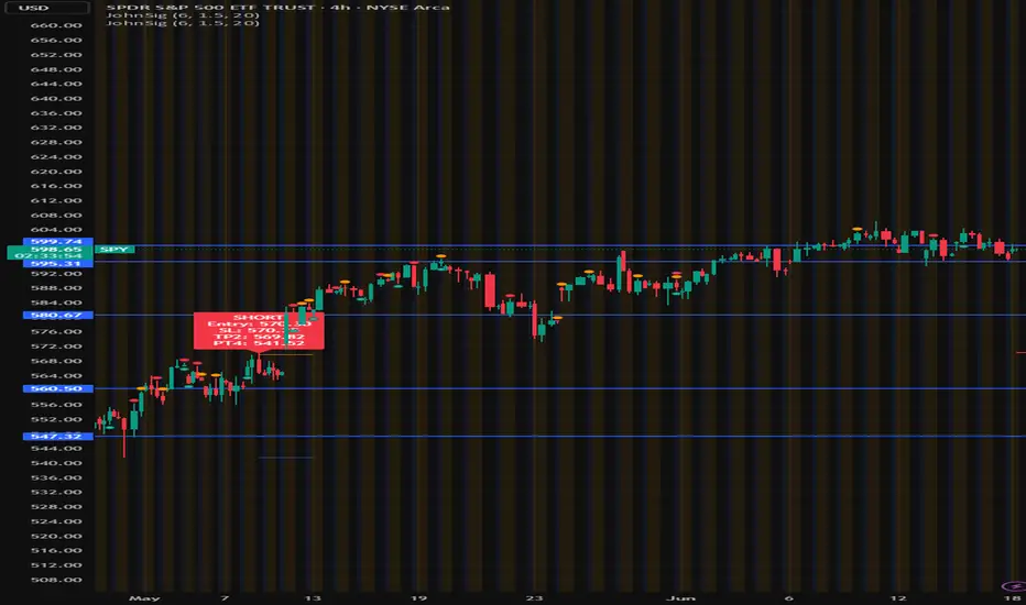
John's Sig PROJohn's Sig PRO is a powerful Wyckoff-style trade detection tool that identifies potential long and short setups based on pivot formations, trading range analysis, and optional confluence filters.
🔹 Core Features:
Pivot-Based Springs and Upthrusts (customizable "Loose" or "Strict" setups)
Dynamic Risk Management:
Static % Risk OR ATR-based stops
2 Risk/Reward Targets (Target 1 and Target 2)
Volume Confirmation (optional)
Dynamic Range Monitoring: Highest high/Lowest low over user-defined periods
🔹 Optional Setup Filters (for higher probability entries):
✅ EMA Filter (Price above/below EMA)
✅ RSI Oversold/Overbought Confirmation
✅ MACD Cross Confirmation
✅ VWAP Filter (Price above/below VWAP)
✅ SuperTrend Direction Confirmation
🔹 Visual Highlights:
Entry, Stoploss, Target 1, Target 2 auto-plotted with lines
Setup labels colored based on strength (Loose/Strict)
Real-time alert generation (LONG/SHORT)
🔹 How to Use:
Enable Loose Springs for more aggressive setups or keep strict validation.
Customize risk settings: ATR-based dynamic stops or static pivot % risk.
Turn on optional filters to tighten your entry criteria.
Watch for plotted signals and set alerts!
⚡ Ideal For:
Intraday Traders
Swing Traders
Wyckoff Enthusiasts
Traders wanting automated pivot-based signals + multi-filter confluence
Created with ❤️ by John.
Trade smart, not hard!
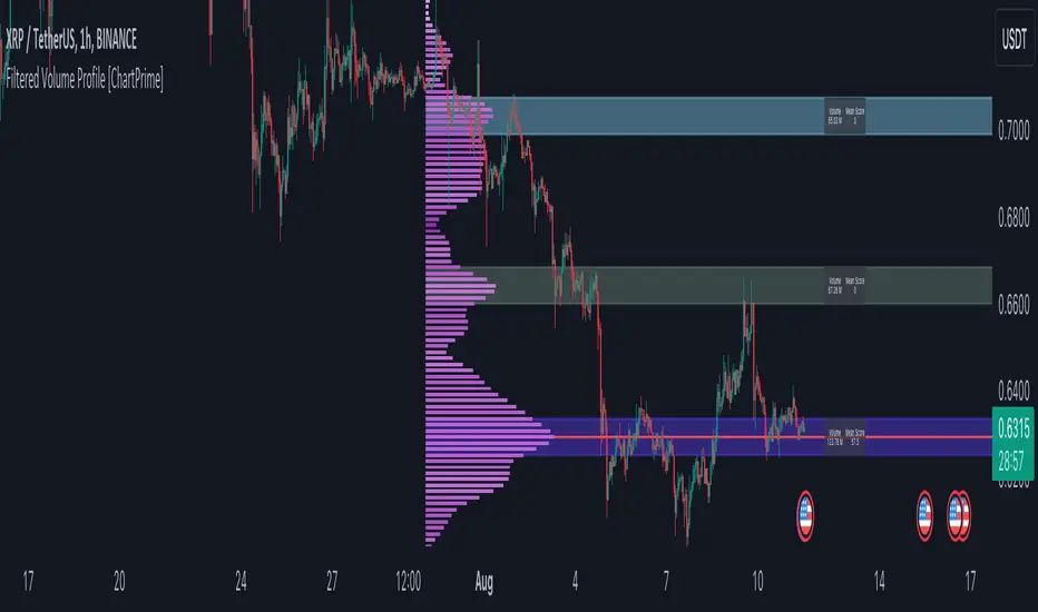
Filtered Volume Profile [ChartPrime]The "Filtered Volume Profile" is a powerful tool that offers insights into market activity. It's a technical analysis tool used to understand the behavior of financial markets. It uses a fixed range volume profile to provide a histogram representing how much volume occurred at distinct price levels.
Profile in action with various significant levels displayed
How to Use
The script is designed to analyze cumulative trading volumes in different price bins over a certain period, also known as `'lookback'`. This lookback period can be defined by the user and it represents the number of bars to look back for calculating levels of support and resistance.
The `'Smoothing'` input determines the degree to which the output is smoothed. Higher values lead to smoother results but may impede the responsiveness of the indicator to rapid changes in volatility.
The `'Peak Sensitivity'` input is used to adjust the sensitivity of the script's peak detection algorithm. Setting this to a lower value makes the algorithm more sensitive to local changes in trading volume and may result in "noisier" outputs.
The `'Peak Threshold'` input specifies the number of bins that the peak detection mechanism should account for. Larger numbers imply that more volume bins are taken into account, and the resultant peaks are based on wider intervals.
The `'Mean Score Length'` input is used for scaling the mean score range. This is particularly important in defining the length of lookback bars that will be used to calculate the average close price.
Sinc Filter
The application of the sinc-filter to the Filtered Volume Profile reduces the risk of viewing artefacts that may misrepresent the underlying market behavior. Sinc filtering is a high-quality and sharp filter that doesn't manifest any ringing effects, making it an optimal choice for such volume profiling.
Histogram
On the histogram, the volume profile is colored based on the balance of bullish to bearish volume. If a particular bar is more intense in color, it represents a larger than usual volume during a single price bar. This is a clear signal of a strong buying or selling pressure at a particular price level.
Threshold for Peaks
The `peak_thresh` input determines the number of bins the algorithm takes in account for the peak detection feature. The 'peak' represents the level where a significant amount of volume trading has occurred, and usually is of interest as an indicative of support or resistance level.
By increasing the `peak_thresh`, you're raising the bar for what the algorithm perceives as a peak. This could result in fewer, but more significant peaks being identified.
History of Volume Profiles and Evolution into Sinc Filtering
Volume profiling has a rich history in market analysis, dating back to the 1950s when Richard D. Wyckoff, a legendary trader, introduced the concept of volume studies. He understood the critical significance of volume and its relationship with market price movement. The core of Wyckoff's technical analysis suite was the relationship between prices and volume, often termed as "Effort vs Results".
Moving forward, in the early 1800s, the esteemed mathematician J. R. Carson made key improvements to the sinc function, which formed the basis for sinc filtering application in time series data. Following these contributions, trading studies continued to create and integrate more advanced statistical measures into market analysis.
This culminated in the 1980s with J. Peter Steidlmayer’s introduction of Market Profile. He suggested that markets were a function of continuous two-way auction processes thus introducing the concept of viewing markets in price/time continuum and price distribution forms. Steidlmayer's Market Profile was the first wide-scale operation of organized volume and price data.
However, despite the introduction of such features, challenges in the analysis persisted, especially due to noise that could misinform trading decisions. This gap has given rise to the need for smoothing functions to help eliminate the noise and better interpret the data. Among such techniques, the sinc filter has become widely recognized within the trading community.
The sinc filter, because of its properties of constructing a smooth passing through all data points precisely and its ability to eliminate high-frequency noise, has been considered a natural transition in the evolution of volume profile strategies. The superior ability of the sinc filter to reduce noise and shield against over-fitting makes it an ideal choice for smoothing purposes in trading scripts, particularly where volume profiling forms the crux of the market analysis strategy, such as in Filtered Volume Profile.
Moving ahead, the use of volume-based studies seems likely to remain a core part of technical analysis. As long as markets operate based on supply and demand principles, understanding volume will remain key to discerning the intent behind price movements. And with the incorporation of advanced methods like sinc filtering, the accuracy and insight provided by these methodologies will only improve.
Mean Score
The mean score in the Filtered Volume Profile script plays an important role in probabilistic inferences regarding future price direction. This score essentially characterizes the statistical likelihood of price trends based on historical data.
The mean score is calculated over a configurable `'Mean Score Length'`. This variable sets the window or the timeframe for calculation of the mean score of the closing prices.
Statistically, this score takes advantage of the concept of z-scores and probabilities associated with the t-distribution (a type of probability distribution that is symmetric and bell-shaped, just like the standard normal distribution, but has heavier tails).
The z-score represents how many standard deviations an element is from the mean. In this case, the "element" is the price level (Point of Control).
The mean score section of the script calculates standard errors for the root mean squared error (RMSE) and addresses the uncertainty in the prediction of the future value of a random variable.
The RMSE of a model prediction concerning observed values is used to measure the differences between values predicted by a model and the values observed.
The lower the RMSE, the better the model is able to predict. A zero RMSE means a perfect fit to the data. In essence, it's a measure of how concentrated the data is around the line of best fit.
Through the mean score, the script effectively predicts the likelihood of the future close price being above or below our identified price level.
Summary
Filtered Volume Profile is a comprehensive trading view indicator which utilizes volume profiling, peak detection, mean score computations, and sinc-filter smoothing, altogether providing the finer details of market behavior.
It offers a customizable look back period, smoothing options, and peak sensitivity setting along with a uniquely set peak threshold. The application of the Sinc Filter ensures a high level of accuracy and noise reduction in volume profiling, making this script a reliable tool for gaining market insights.
Furthermore, the use of mean score calculations provides probabilistic insights into price movements, thus providing traders with a statistically sound foundation for their trading decisions. As trading markets advance, the use of such methodologies plays a pivotal role in formulating effective trading strategies and the Filtered Volume Profile is a successful embodiment of such advancements in the field of market analysis.