Planetary Retrograde Periods█ PLANETARY RETROGRADE PERIODS
Visualize when planets appear to move backward through the zodiac. This indicator detects and displays retrograde motion for all 8 planets that exhibit apparent retrograde motion from Earth's perspective: Mercury, Venus, Mars, Jupiter, Saturn, Uranus, Neptune, and Pluto.
Powered by the BlueprintResearch lib_ephemeris library.
█ FEATURES
• 8 Planets Supported — Mercury, Venus, Mars, Jupiter, Saturn, Uranus, Neptune, and Pluto
• Two-Phase Visualization — Distinguishes first half (speed increasing in retrograde direction) from second half (speed decreasing toward direct motion) with different transparency levels
• Future Projections — Projects upcoming retrograde periods up to 500 bars ahead on any timeframe
• Station Markers — Clear labels for Station Retrograde (℞), Midpoint (½), and Station Direct (D)
• Timezone-Aware Labels — Future date/time labels display in your selected timezone
• Alert Conditions — Set alerts for station retrograde, station direct, or any station point
• Per-Planet Colors — Customize colors for each planet individually
• Speed-Based Detection — More accurate than longitude-based methods
█ HOW TO USE
1. Select a Planet — Choose which planet to track from the dropdown (Mercury through Pluto)
2. Enable Two-Phase Display — Toggle "Show Retrograde Halves" to see first half vs. second half shading
3. Configure Future Projections — Set how many bars ahead to scan (1-500) and enable/disable date labels
4. Set Your Timezone — Choose your timezone for accurate future date/time display
5. Customize Colors — Adjust planet colors, transparency levels, and label text color to match your chart theme
6. Create Alerts — Use TradingView's alert system with the built-in conditions for station points
█ UNDERSTANDING THE DISPLAY
Background Colors:
• First Half of the Planet’s retrograde (lighter shade)
• Second Half of the Planet’s retrograde period (darker shade)
Future Projection Lines:
• ℞ (Station Retrograde) — Yellow dotted line marking when the planet will station retrograde
• ½ (Midpoint) — Shorter line in planet color marking the halfway point of the retrograde period
• D (Station Direct) — Green dotted line marking when the planet will station direct
Labels:
• Top label shows planet symbol and station type
• Bottom label shows projected date and time (optional)
█ ACCURACY
This indicator uses speed-based detection
Timing Accuracy:
• All planets (Mercury through Pluto): Within hours to ±1 day
• Future projections maintain accuracy up to 500 bars on any timeframe
• Spot tested on Daily and Weekly charts with excellent results
For Critical Applications:
Cross-reference with professional ephemeris tools such as JPL Horizons or Swiss Ephemeris for mission-critical timing.
█ TECHNICAL DETAILS
Theory: VSOP87 (Mercury through Neptune), Meeus algorithms (Pluto)
█ REFERENCES
• Meeus, Jean. "Astronomical Algorithms" (2nd Edition, 1998)
• Bretagnon & Francou. "VSOP87 Solutions" — Astronomy and Astrophysics 202 (1988)
Cerca negli script per "algo"

Auction Session Ranges (AMT Edition) [ Alerts] Auction Session Ranges (AMT Edition)
► Overview
The Session Ranges ( AMT Edition) is a session-based market structure and auction analysis tool designed to visually reveal acceptance, rejection, imbalance, and continuation across the Asia, London, and New York CME trading sessions.
Unlike typical indicators, this script is grounded in Auction Market Theory (AMT) and session-based structure, focusing on how price behaves at session extremes rather than relying on lagging calculations, oscillators, or predictive algorithms. Its purpose is to highlight areas where the market has earned the right to be traded, providing traders with a clear, rules-based framework for high-probability directional trades.
Important for backtesting: To properly backtest session extremes, Interaction Lines, and Closest Opposite Extreme Lines, you must use TradingView’s replay mode, as real-time bar-by-bar progression is required to observe how the market interacts with session extremes over time.
► Key Innovations
This is not a conventional session high/low indicator. Its originality comes from several unique design elements:
Differentiates interaction from true acceptance: Price touching an extreme does not automatically indicate directional intent.
Separates directional confirmation from range-bound indecision: Only confirmed crossings beyond the Interaction Line signal actionable bias.
Tracks failed auctions and partial acceptance: No volume profile or order book data required.
Visual, rule-based trade permission: Signals are objective, minimizing subjective interpretation.
Interaction & Closest Opposite Extreme Lines: Together, these lines map how far an auction progresses after an extreme is tested, highlighting continuation, partial acceptance, or failed auctions.
► Core Concepts Explained
1. Session Highs & Lows (Solid Lines)
Plotted continuously for each CME session (Asia, London, New York).
Represent the current auction boundaries for that session.
2. True Interaction Lines (Thick Dotted Lines)
Drawn when price touches or breaks a session extreme:
Touching session high → dotted line at the low of that candle
Touching session low → dotted line at the high of that candle
Auction context:
Touching alone ≠ acceptance
Acceptance occurs only when price moves beyond the Interaction Line and holds
Trading principle:
Price has not crossed → no directional bias → do not trade
Price crosses and holds → directional bias established
3. Acceptance vs Rejection
Accepted direction: Price crosses and holds beyond the Interaction Line
Rejected direction: Price crosses the line but immediately reverses
Neutral / No-Trade: Price trapped between extreme and Interaction Line
Important: Acceptance is conditional and dynamic. Each time price crosses back over the Interaction Line, acceptance is lost.
4. New Extremes = Continuation
Once an Interaction Line is crossed, each new session extreme in that direction reinforces the trend.
Traders should only look for continuation setups along the established directional bias.
AMT interpretation:
Repeated new extremes → directional imbalance
Failure to make new extremes → potential balance or rotation
5. Closest Opposite Extreme Lines (Thin Dotted Lines)
After acceptance, the script tracks price progress toward the opposite session extreme.
Plotted only if price reaches a user-defined percentage of the session range.
Helps identify:
Full acceptance (price reaches opposite extreme)
Partial acceptance (price stalls)
Failed auctions (price cannot progress meaningfully)
Trading guidance once Closest Lines appear:
Partial acceptance: Price stalls near the Closest Line but does not fully reach the opposite extreme → bias remains valid, but the move may be weakening; consider scaling out or tightening stops.
Full acceptance: Price reaches the opposite extreme → directional auction fully confirmed; bias continues, but expect potential rotation or balance afterward.
Failed auction (cannot progress meaningfully): Price reverses before reaching the Closest Line → signals exhaustion; avoid chasing the move and treat as potential trend failure.
Note: Only relevant after Interaction Line is crossed; if price never crosses the Interaction Line, Closest Lines have no trading significance.
► Step-by-Step Usage
Wait for a session extreme
Let price interact with the session high or low.
Observe the Interaction Line
No cross → do not trade
Cross and hold → directional bias established
Trade in the direction of new extremes only
Ignore counter-trend trades unless the Interaction Line is lost
Manage risk using structure
Interaction Line acts as a dynamic invalidation level
Use Closest Lines for context
Partial acceptance → bias valid, watch for weakening
Full acceptance → bias strong, continuation likely
Failed attempt → potential exhaustion, do not chase
Useful for trade management, scaling, and expectation setting
► Price Retests & Pullbacks
Scenario:
Price crosses above the Interaction Line (e.g., from a low interaction).
Over the next 3–4 15-minute bars, price dips back toward the Interaction Line, with wicks touching it but no decisive close below.
Interpretation:
Initial Acceptance Confirmed: Bias remains valid while price holds above/below the line.
Temporary Pullback / Retest: Market is re-evaluating the auction; testing participant agreement.
Wicks Touching the Line: Partial probing or liquidity sweep; market still respects original acceptance.
Trading Implication:
Continuation bias remains intact.
Pullbacks near the Interaction Line offer lower-risk entries.
Decisive close below → acceptance lost, signaling trend failure or invalidation.
Market Psychology:
Healthy auction behavior: extreme tested → acceptance confirmed → boundary retested for liquidity → continuation.
Failure to hold above signals weak acceptance or exhaustion.
✅ Key Takeaways:
Holding above Interaction Line → bias intact, pullback = opportunity
Closing below Interaction Line → acceptance lost, bias invalidated
Wicks touching only → normal retest, still valid
► No-Trade Conditions
Avoid trading when:
Price never crosses the Interaction Line
Price remains trapped between the extreme and the Interaction Line
Market rotates without forming new extremes
These indicate balance, not directional opportunity.
► Alerts
Optional alerts trigger when price crosses an Interaction Line for:
Asia session
London session
New York session
Alerts signal possible acceptance, not automatic trade entries.
► Who This Script Is For
Best suited for traders who:
Trade session structure in futures, indices, or FX
Follow Auction Market Theory principles
Prefer objective, rules-based confirmation
Want fewer but higher-quality trade opportunities
Not intended for:
Indicator stacking
Predictive trading
High-frequency scalping without structure
► Final Notes
This script does not tell you when to buy or sell.
It shows where the market has earned the right to be traded.
Use it as a decision filter, not a prediction engine.

TAN Omni-Dash v50: Dividend Payout for Jan 2026 TradableJust a simple Momentum swing algo. It's mainly for keeping an eye out for Jan 2026 ex-divedent payouts list. This code contains top 100 most profitable payouts.

Webhook Candle Sender (OHLCV)This indicator sends OHLCV (Open, High, Low, Close, Volume) candle data via webhook on every confirmed bar close.
It is designed to integrate TradingView with an external trading or analytics system (e.g. a local Flask server, paper trading engine, or algorithmic agent).
Features:
• Sends data only on bar close (no repainting)
• Works on any symbol (stocks, crypto, forex)
• Works on any timeframe
• Outputs structured JSON suitable for APIs and bots
• Uses TradingView alert() function for webhook delivery
Typical use cases:
• Algorithmic trading research
• Paper trading systems
• Backtesting external strategies
• Educational and learning purposes
This script does NOT place trades, manage risk, or provide trading signals.
It only transmits candle data.
No financial advice is provided.

TGS By ShadTGS Levels — Tesla–W.D. Gann Strategy
TGS Levels is a price-geometry indicator designed to map algorithmic decision zones on the chart using principles inspired by W.D. Gann price geometry and Tesla 3-6-9 harmonic structure.
This indicator is not a signal generator.
It provides a structured price map to help traders understand where reactions or breakouts are statistically more likely to occur.
🔹 Core Concept
Markets do not move randomly.
They rotate and expand around harmonic price cycles.
TGS Levels automatically plots a 100-unit price cycle framework (ideal for XAUUSD / Gold) and divides each cycle into hierarchical angles used by institutional and algorithmic trading models.
🔹 Level Hierarchy (Very Important)
TGS uses four types of levels, each with a different purpose:
🔴 SUPER ANGLE (+45)
Primary decision level
Price often shows strong rejection or explosive breakout
Highest importance level
🟥 MAIN ANGLES (+27, +63, +81)
High-probability reaction zones
Used for structured pullbacks, rejections, or continuation confirmation
🟠 SECONDARY ANGLES (+18, +36, +54, +72, +90)
Context & management levels
Expect hesitation, partial profit zones, or stop-tightening areas
Not recommended for direct entries
🟡 MICRO LEVELS (+3, +6, +9)
Liquidity & compression map
Help visualize absorption, stop hunts, and consolidation
For structure awareness only
🔹 What This Indicator Is Used For
✔ Identifying where price is likely to react
✔ Understanding market structure and rotation
✔ Distinguishing rejection vs breakout zones
✔ Improving trade timing when combined with:
Volatility (ATR)
Market structure (HL / LH / BOS)
Session timing (London / New York)
🔹 What This Indicator Is NOT
❌ Not a buy/sell signal
❌ Not a prediction tool
❌ Not based on indicators like RSI or MACD
TGS Levels is a price-first framework, designed to be used with price action, volatility, and structure.
🔹 Best Use Case
Asset: XAUUSD (Gold)
Execution Timeframe: M5
Sessions: London & New York
Style: Scalping / Intraday structure trading
The same logic can be adapted to other instruments by adjusting the cycle size.
🔹 How to Trade With TGS (High-Level)
When volatility is low or falling → expect rejections at main/super angles
When volatility is expanding → expect breakouts through angles
Use oscillators (like Stochastic) only for timing, not direction
Always confirm with price behavior at the level
🔹 Final Note
TGS Levels provides a clean, non-repainting price map that stays aligned when zooming or scrolling the chart.
All levels are calculated automatically and update dynamically with price.
Levels explain behavior — reactions create opportunity.

TGS by Shad TGS Levels — Tesla–W.D. Gann Strategy
TGS Levels is a price-geometry indicator designed to map algorithmic decision zones on the chart using principles inspired by W.D. Gann price geometry and Tesla 3-6-9 harmonic structure.
This indicator is not a signal generator.
It provides a structured price map to help traders understand where reactions or breakouts are statistically more likely to occur.
🔹 Core Concept
Markets do not move randomly.
They rotate and expand around harmonic price cycles.
TGS Levels automatically plots a 100-unit price cycle framework (ideal for XAUUSD / Gold) and divides each cycle into hierarchical angles used by institutional and algorithmic trading models.
🔹 Level Hierarchy (Very Important)
TGS uses four types of levels, each with a different purpose:
🔴 SUPER ANGLE (+45)
Primary decision level
Price often shows strong rejection or explosive breakout
Highest importance level
🟥 MAIN ANGLES (+27, +63, +81)
High-probability reaction zones
Used for structured pullbacks, rejections, or continuation confirmation
🟠 SECONDARY ANGLES (+18, +36, +54, +72, +90)
Context & management levels
Expect hesitation, partial profit zones, or stop-tightening areas
Not recommended for direct entries
🟡 MICRO LEVELS (+3, +6, +9)
Liquidity & compression map
Help visualize absorption, stop hunts, and consolidation
For structure awareness only
🔹 What This Indicator Is Used For
✔ Identifying where price is likely to react
✔ Understanding market structure and rotation
✔ Distinguishing rejection vs breakout zones
✔ Improving trade timing when combined with:
Volatility (ATR)
Market structure (HL / LH / BOS)
Session timing (London / New York)
🔹 What This Indicator Is NOT
❌ Not a buy/sell signal
❌ Not a prediction tool
❌ Not based on indicators like RSI or MACD
TGS Levels is a price-first framework, designed to be used with price action, volatility, and structure.
🔹 Best Use Case
Asset: XAUUSD (Gold)
Execution Timeframe: M5
Sessions: London & New York
Style: Scalping / Intraday structure trading
The same logic can be adapted to other instruments by adjusting the cycle size.
🔹 How to Trade With TGS (High-Level)
When volatility is low or falling → expect rejections at main/super angles
When volatility is expanding → expect breakouts through angles
Use oscillators (like Stochastic) only for timing, not direction
Always confirm with price behavior at the level
🔹 Final Note
TGS Levels provides a clean, non-repainting price map that stays aligned when zooming or scrolling the chart.
All levels are calculated automatically and update dynamically with price.
Levels explain behavior — reactions create opportunity.

Quant-Action Pro: Triple Confluence EngineQuant-Action Pro: Triple Confluence Engine
Systematic Framework for Structural Price Action Analysis
Quant-Action Pro is a high-performance analytical engine designed to synchronize institutional liquidity flow with market geometry. Instead of traditional "signals," this framework identifies Structural States where three independent algorithmic layers align, providing a objective roadmap for the current price action context.
1. Core Algorithmic Matrix
The engine operates by monitoring the interaction between price and three proprietary logic layers:
A. Institutional Flow Node (SP2L) —
Logic: Monitors "Passive Liquidity Absorption" at the 20-period EMA.
Function: Identifies zones where institutional buyers/sellers are defending the trend's equilibrium. This is not a simple touch; it requires a validated "Touch-and-Hold" sequence.
B. Structural Flip Scanner (BTB) —
Logic: Detects the transition from old supply to new demand (S/R Flip).
Function: Uses a 3-phase Break-Test-Break verification to confirm that a structural breakout is backed by volume, reducing the risk of "Fake-outs."
C. Liquidity Compression Monitor (Micro Map) —
Logic: Statistical range-contraction analysis (Volatility Squeeze).
Function: Signals a High-Density State where price is coiling for an expansion move.
2. The Golden State: Triple Confluence Logic
The GOLD label represents the "Apex" of this engine. It is triggered only when the SP2L, BTB, and Micro Map layers synchronize on a single candle. In structural terms, this means:
Trend Defense (SP2L) is active.
Structural Breakout (BTB) is confirmed.
Volatility Expansion (MM) is imminent.
This Triple-Layer filtering ensures that Golden Signals only appear during periods of maximum market conviction.
3. Professional Implementation (Structural View)
MTF Trend Matrix: A built-in dashboard provides a 1H, 4H, and 1D diagnosis to ensure local setups align with the Macro Trend.
Smart Invalidation (Adaptive Trendlines): The engine draws dynamic geometry to define the current "Structural Floor/Ceiling." A decisive close beyond these lines acts as a clear Invalidation Point for the current thesis.
Mean Reversion: The system uses the 200-EMA as the primary directional filter, defining whether the market is in a "Bullish Expansion" or "Bearish Correction" state.
⚠️ Risk Disclaimer
Trading financial instruments involves significant risk. Quant-Action Pro is an educational tool designed for research and structural analysis. It does not provide financial advice. Past performance is not indicative of future results. Always use strict risk management.

Max Pain Options [QuantLabs] v5 (Balanced)Institutional Grade Options Analysis: Max Pain, Gamma & Pin Risk
For years, TradingView users have been flying blind without access to Options Chain data. QuantLabs: Max Pain & Gamma Exposure changes that. This is not just a support/resistance indicator—it is a sophisticated, algorithmic model that reverse-engineers the incentives of Market Makers using synthetic Black-Scholes logic.
This tool visualizes the "invisible hand" of the market: the hedging requirements of large dealers who are forced to buy or sell to keep their books neutral.
CORE FEATURES:
🔴 Max Pain Gravity Model The bright red line represents the "Max Pain" strike—the price level where the maximum amount of Options Open Interest (Calls + Puts) expires worthless.
Theory: As OpEx (Expiration) approaches, Market Makers maximize profits by pinning the price to this level.
Strategy: Use this as a mean-reversion target. If price is far away, look for a snap-back to the red line.
🟣 Gamma Exposure Profiles (The Purple Lines) These neon histograms show you the estimated "Gamma Walls."
Long Gamma: Dealers trade against the trend (stabilizing price).
Short Gamma: Dealers trade with the trend (accelerating volatility).
Visual: The larger the purple bar, the harder it will be for price to break through that level.
📦 Algorithmic "Pin Risk" Zones The dashed red box highlights the "Kill Zone." When price enters this area near expiration, volatility often dies as dealers pin the asset to kill retail premiums.
Warning: Do not expect breakouts while inside the Pin Zone.
📊 Institutional HUD A clean, non-intrusive dashboard provides real-time Greeks and risk analysis:
Pin Risk: High/Medium/Low probability of a pinned close.
Exp Mode: Detects if the market is in "Short Gamma" (Squeeze territory) or "Long Gamma" (Chop territory).
HOW IT WORKS (The Math): Since live options data is not available via Pine Script, this engine uses a proprietary Synthetic OI Distribution Model. It inputs Volume, Volatility (IV), and Time-to-Expiry into a modified Black-Scholes equation to probability-map where the heavy open interest likely sits.
SETTINGS & CUSTOMIZATION:
Responsiveness: Tuned for the "Goldilocks Zone" (Spread: 12, Decay: 22) to catch local liquidity walls without over-fitting.
Visuals: Designed for Dark Mode. High-contrast Neon aesthetics for maximum readability.

A program written by a beginner# TXF Choppy Market Detector (Whipsaw Filter)
## Introduction
This project is a technical indicator developed in **Pine Script v5**, specifically optimized for **Taiwan Index Futures (TXF)** intraday trading.
The TXF market is known for its frequent periods of low-volatility consolidation following sharp moves, often resulting in "whipsaws" (double-loss scenarios for trend followers). This script utilizes **volatility analysis** and **trend efficiency metrics** to filter out noise and detect potential "Stop Hunting" or "Liquidity Sweep" setups within range-bound markets.
## Methodology & Algorithms
The strategy operates on the principle of **Mean Reversion**, combining two core components:
### 1. Market Regime Filter: Choppiness Index (CHOP)
We use the Choppiness Index (originally developed by E.W. Dreiss) to determine if the market is trending or consolidating based on **Fractal Dimension** theory.
* **Logic**:
The index ranges from 0 to 100. Higher values indicate low trend efficiency (consolidation), while lower values indicate strong directional trends.
* **Condition**: `CHOP > Threshold` (Default: 50).
* **Application**: When this condition is met, the background turns **gray**, signaling a "No-Trade Zone" for trend strategies and activating the Mean Reversion logic.
### 2. Whipsaw Detection: Bollinger Bands
Bollinger Bands are used to define the dynamic statistical extremities of price action.
* **Logic**:
We identify **Fakeouts** (False Breakouts) that occur specifically during the choppy regime identified above. This is often where institutional traders hunt for liquidity (stops) before reversing the price.
#### Signal Algorithms (Pseudocode)
**A. Bull Trap (Washout High)**
A false upside breakout designed to trap long traders.
```pine
Condition:
1. Is_Choppy == true (Market is sideways)
2. High > Upper_Bollinger_Band (Price pierces the upper band)
3. Close < Upper_Bollinger_Band (Price fails to hold and closes back inside)

BTC - ALSI: Altcoin Season Index (Dynamic Eras)Title: BTC - ALSI: Altcoin Season Index (Dynamic Eras)
Overview & Philosophy
The Altcoin Season Index (ALSI) is a quantitative tool designed to answer the most critical question in crypto capital rotation: "Is it time to hold Bitcoin, or is it time to take risks on Altcoins?"
Most "Altseason" indicators suffer from Survivor Bias or Obsolescence. They either track a static list of coins that includes "dead" assets from previous cycles (ghosts of 2017), or they break completely when major tokens collapse (like LUNA or FTT).
This indicator solves this by using a Time-Varying Basket. The indicator automatically adjusts its reference list of Top 20 coins based on historical eras. This ensures the index tracks the winners of the moment—capturing the DeFi summer of 2020, the NFT craze of 2021, and the AI/Meme narratives of 2024/2025.
Methodology
The indicator calculates the percentage of the Top 20 Altcoins that are outperforming Bitcoin over a rolling window (Default: 90 Days).
The "Win" Count: For every major Altcoin performing better than BTC, the index adds a point.
Dynamic Eras: The basket of coins changes depending on the date:
2020 Era (DeFi Summer): Tracks the "Blue Chips" of the DeFi revolution like UNI, LINK, DOT, and early movers like VET and FIL.
2021 Era (Layer 1 Wars): Tracks the explosion of alternative smart contract platforms, adding winners like SOL, AVAX, MATIC, and ALGO.
2022 Era (The Survivors): Filters for resilience during the Bear Market, solidifying the status of established assets like SHIB and ATOM.
2023 Era (Infrastructure & Scale): Captures the rise of "Next-Gen" tech leading into the pre-halving year, introducing TON, APT (Aptos), and ARB (Arbitrum).
2024/25 Era (AI & Speed): Tracks the current Super-Cycle leaders, focusing on the AI narrative (TAO, RNDR), High-Performance L1s (SUI), and modern Memes (PEPE).
Chart Analysis & Strategy ( The "Alpha" )
As seen in the chart above, there is a strong correlation between ALSI Peaks and local tops in TOTAL3 (The Crypto Market Cap excluding BTC & ETH).
The Entry (Rotation): When the indicator rises above the neutral 50 line, it signals that capital is beginning to rotate out of Bitcoin and into Altcoins. This has historically been a strong confirmation signal to increase exposure to high-beta assets.
The Exit (Saturation): When the indicator hits 100 (or sustains in the Red Zone > 75), it means every single Altcoin is beating Bitcoin. Historically, this extreme exuberance often marks a local top in the TOTAL3 chart. This is the zone where smart money typically sells into strength, rather than opening new positions.
How to Read the Visuals
🚀 Altcoin Season (Red Zone > 75): Strong Altcoin dominance. The market is "Risk On."
🛡️ Bitcoin Season (Blue Zone < 25): Bitcoin dominance. Alts are bleeding against BTC. Historically, this is a defensive zone to hold BTC or Stablecoins.
Data Dashboard: A status table in the bottom-right corner displays the live Index Value, current Regime, and a System Check to ensure all 20 data feeds are active.
Settings
Lookback Period: Default 90 Days. Lowering this (e.g., to 30) makes the index faster but noisier.
Thresholds: Adjustable zones for Altcoin Season (Default: 75) and Bitcoin Season (Default: 25).
Credits & Attribution
This open-source indicator is built on the shoulders of giants. I acknowledge the original creators of the concept and the pioneers of its implementation on TradingView:
Original Concept: BlockchainCenter.net. - They established the industry standard definition: 75% of the Top 50 coins outperforming Bitcoin over 90 days = Altseason..
TradingView Implementation: Adam_Nguyen - He implemented the "Dynamic Era" logic (updating the coin list annually) on TradingView. Our code structure for the time-based switching is inspired by his methodology. See also his implementation in the chart. ( Altcoin Season Index - Adam) .
Comparison: Why use ALSI | RM?
While inspired by the above, ALSI introduces three key improvements:
Open Source: Unlike other popular TradingView versions (which are closed-source), this script is fully transparent. You can see exactly which coins are triggering the signal.
Sanitized History (Anti-Fragile): Historical Top 20 snapshots are not blindly used. "Dead" coins (like LUNA and FTT) from previous eras are manually filtered out. A raw index would crash during the Terra/FTX collapses, giving a false "Bitcoin Season" signal purely due to bad actors. The curated list preserves the integrity of the market structure signal.
Narrative Relevance: The 2024/25 basket was updated to include TAO (Bittensor) and RNDR, ensuring the index captures the dominant AI narrative, rather than tracking fading assets from the previous cycle.
You can compare the ALSI indicator with other available tradingview indicators in the chart: Different indicators for the same idea are shown in the 3 Pane window below the BTC and Total3 chart, whereas ALSI is the top pane indicator.
Important Note on Coin Selection Baskets are highly curated: Dead/irrelevant coins (FTT, LUNA, BSV) are excluded for clean signals. This prevents historical breaks and ensures Era T5 captures current narratives (AI, Memes) via TAO/RNDR. See above. Users are free to adjust the source code to test their own baskets.
Disclaimer
This script is for research and educational purposes only. Past correlations between ALSI and TOTAL3 do not guarantee future results. Market regimes can change, and "Altseasons" can be cut short by macro events.
Tags
bitcoin, btc, altseason, dominance, total3, rotation, cycle, index, alsi, Rob Maths

BALANCED Strategy: Intraday Pro + Smart DashboardWelcome to the BALANCED Strategy: Intraday Pro.
This all-in-one indicator is designed for Intraday traders looking to capture trend movements while effectively filtering out sideways market noise. It combines the power of Supertrend for direction, EMA 100 for the baseline trend, and rigorous validation via RSI and ADX.
The script also integrates a complete Risk Management system with targets based on the Golden Ratio (Fibonacci) and a real-time Dashboard.
⏳ Recommended Timeframes
This algorithm is optimized for Intraday volatility:
M5 (5 Minutes) ⭐️: Ideal for quick Scalping. The ADX filter is crucial here to avoid false signals.
M15 (15 Minutes) 🏆: The "Sweet Spot." It offers the best balance between signal frequency and trend reliability.
M30 / H1: For a "Swing Intraday" approach—calmer, fewer signals, but higher precision.
Not recommended for M1 (1 Minute) with default settings (too much noise).
🚀 How It Works
The algorithm follows a strict 3-step logic to generate high-quality signals:
1. Trend Identification (The Engine)
Supertrend: Determines the immediate direction.
EMA 100: Acts as a background trend filter. We only buy above and sell below the EMA.
2. Noise Filtering (Safety)
ADX (Average Directional Index): The signal is only validated if there is sufficient volatility (Configurable threshold, default 12) to avoid "chop markets" (flat markets).
RSI (Relative Strength Index): Strict momentum filter. Buy only if RSI > 50, Sell if RSI < 50.
3. Entry Confirmation (The Trigger)
The script doesn't just rely on a crossover. It waits for "Price Action" confirmation: the candle must close higher than the previous one (for Long) or lower (for Short) to validate the entry.
🛡️ Risk Management (Money Management)
This is the core strength of this tool. Upon signal validation, the script automatically calculates and plots:
Stop Loss (SL): Based on volatility (ATR). It places the stop at the recent Low/High with a safety padding.
Take Profit (TP): Two modes available:
Fibonacci Mode (Default): Targets the 1.618 extension (Golden Ratio) of the risk taken.
Fixed Ratio Mode: Targets a manual Risk/Reward ratio (e.g., 2.0).
📊 The Dashboard
Located at the bottom right, the smart dashboard provides vital info at a glance:
Signal Time: To check if the alert is fresh.
Type (LONG/SHORT): Color-coded (Green/Pink).
Tech Data: RSI and ADX values at the moment of the signal.
Exact Prices: Entry Level, Target (TP), and Stop Loss (SL).
⚙️ Configurable Settings
Sensitivity: Adjust the Supertrend factor (Default 2.0).
Filters: Toggle the RSI filter ON/OFF or adjust the ADX threshold.
Execution: Choose between Fibonacci Target (1.618) or a Manual Ratio.
⚠️ Disclaimer: This tool is a technical decision aid and does not constitute financial investment advice. Always use prudent risk management and backtest the indicator on your preferred assets before live use.

ICT Quant-Core: Liquidity Intelligence [Dual-Engine]🔥 THE ULTIMATE LIQUIDITY FILTERING ENGINE
Most SMC traders lose money because they "catch falling knives" on every local wick. This algorithm solves this problem by using DUAL-CORE logic and a signal quality scoring system.
This is no ordinary pivot indicator.
⚙️ HOW DOES IT WORK? (DUAL-CORE LOGIC)
The algorithm analyzes the market on two levels simultaneously:
1️⃣ MACRO CORE (Lookback 50 - "WHALE 🐋")
Tracks key levels from recent weeks/months.
This is where institutions build their positions.
Signals from this core have the highest priority (Score 10/10).
2️⃣ LOCAL CORE (Lookback 20 - "ROACH 🐟")
Tracks internal market structure and noise.
Signals are filtered by the Main Trend. If the trend is down, Local Longs are marked as "TRAP."
🧠 SMART FILTERS (QUANT LAYERS)
Instead of entering on every line touch, the script requires confirmation:
✅ RECLAIM LOGIC: Price must close back above/below the liquidity level (Swing Failure Pattern).
✅ RVOL FILTER: Requires relative volume > 1.2x the average (institutional track).
✅ SCORING SYSTEM (0-10): Each signal receives a score.
- 10/10: Macro Grab in line with the trend + high volume.
- 3/10: Local Grab against the trend (risky).
📊 ANALYTICAL DASHBOARD
In the lower right corner, you'll find the "Command Center":
- Trend Status (Distribution/Accumulation)
- Whale's Last Move (Price and Direction)
- Current Tactics (e.g., "Ignore Longs, Search for Shorts")
- Filter Status (RSI, Volume, Reclaim)
🚀 HOW TO USE IT?
1. Set the H4 timeframe.
2. Wait for a signal with a rating > 7/10.
3. Ignore "Fish/Local" signals (small icons) if they contradict the Dashboard color.
4. Entry occurs only after the candle closes (Reclaim).

DarkPool FlowDarkPool Flow is a professional-grade technical analysis tool designed to align retail traders with the dominant "smart money" flow. Unlike standard moving average crossovers that often generate false signals during consolidation, this script employs a multi-layered filtering engine to isolate high-probability trends.
The core philosophy of this indicator is that Trends are fractal. A sustainable move on a lower timeframe must be supported by momentum on a higher timeframe. By comparing a "Fast Signal Trend" against a "Slow Anchor Trend" (e.g., Daily vs. Weekly), the script identifies the market bias used by institutional algorithms.
This edition features a Smart Recovery Engine, ensuring that valid trends are not missed simply because momentum started slowly, and a Dynamic Cloud that visually represents the strength of the trend spread.
Key Features
1. Auto-Adaptive Timeframe Logic
The script eliminates the guesswork of Multi-Timeframe (MTF) selection. By enabling "Auto-Adapt," the indicator detects your current chart timeframe and automatically maps it to the mathematically correct institutional pairings:
Scalping (<15m): Uses 15-Minute Trend vs. 1-Hour Anchor.
Day Trading (15m - 1H): Uses 4-Hour Trend vs. Daily Anchor.
Swing Trading (4H - Daily): Uses Daily Trend vs. Weekly Anchor (The classic "Golden" setup).
Investing (Weekly): Uses 21-Week EMA vs. 50-Week SMA (Bull Market Support Band logic).
2. Smart Recovery Signal Engine
Standard crossover scripts often miss major moves if the specific breakout candle has low volume or weak ADX. This script utilizes a state-machine logic that "remembers" the trend direction. If a trend begins during low volatility (gray candles), the script waits. The moment volatility and momentum confirm the move, a Smart Recovery Signal is triggered, allowing you to enter an existing trend safely.
3. Chop Protection (Gray Candles)
Preservation of capital is the priority. The script analyzes the Average Directional Index (ADX) and Volatility (ATR).
Colored Candles (Green/Red): The market is trending with sufficient strength. Trading is permitted.
Gray Candles: The market is in a low-energy chop or consolidation (ADX < 20). Trading is discouraged.
4. Dynamic Trend Cloud
The space between the Fast and Slow trends is filled with a dynamic cloud.
Darker/Opaque Cloud: Indicates a widening spread, suggesting accelerating momentum.
Lighter/Transparent Cloud: Indicates a narrowing spread, suggesting the trend may be weakening or consolidating.
5. Pullback & Retest Signals (+)
While triangles mark the start of a trend, the Plus (+) signs mark low-risk opportunities to add to a position. These appear when price dips into the cloud, finds support at the "Fair Value" zone, and closes back in the direction of the trend with confirmed momentum.
User Guide & Strategy
Setup
Add the indicator to your chart.
For Beginners: Enable "Auto-Adaptive Timeframes" in the settings.
For Advanced Users: Disable Auto-Adapt and manually configure your Fast/Slow pairings (Default is Daily 50 EMA / Weekly 50 EMA).
Signal Mode: Choose "First Breakout Only" for a cleaner chart, or "All Signals" if you wish to see re-entry points during choppy starts.
Long Entry Criteria (Buy)
Trend: The Cloud must be Green (Fast Trend > Slow Trend).
Signal: A Green Triangle appears below the bar.
Confirmation: The signal candle must not be Gray.
Re-Entry: A small Green (+) sign appears, indicating a successful test of the cloud support.
Short Entry Criteria (Sell)
Trend: The Cloud must be Red (Fast Trend < Slow Trend).
Signal: A Red Triangle appears above the bar.
Confirmation: The signal candle must not be Gray.
Re-Entry: A small Red (+) sign appears, indicating a successful test of the cloud resistance.
Stop Loss & Risk Management
Stop Loss: A standard institutional stop loss is placed just beyond the Slow Trend Line (the outer edge of the cloud). If price closes beyond the Slow Trend, the macro thesis is invalid.
Take Profit: Target liquidity pools or use a trailing stop based on the Fast Trend line.
Settings Overview
Mode Selection: Toggle between Auto-Adaptive logic or Manual control.
Manual Configuration: Define the specific Timeframe, Length, and Type (EMA, SMA, WMA) for both Fast and Slow trends.
Signal Logic: Toggle "Show Pullback Signals" on/off. Switch between "First Breakout" or "All Signals."
Quality Filters: Toggle individual filters (ATR, RSI, ADX) to adjust sensitivity. Turning these off makes the script more responsive but increases false signals.
Visual Style: Customize colors for Bullish, Bearish, and Neutral (Gray) states. Adjust cloud transparency.
Disclaimer
Risk Warning: Trading financial markets involves a high degree of risk and is not suitable for all investors. You could lose some or all of your initial investment.
Educational Use Only: This script and the information provided herein are for educational and informational purposes only. They do not constitute financial advice, investment advice, trading advice, or any other recommendation.
No Guarantee: Past performance of any trading system or methodology is not necessarily indicative of future results. The "Institutional Trend" indicator is a tool to assist in technical analysis, not a crystal ball. The creators of this script assume no responsibility or liability for any trading losses or damages incurred as a result of using this tool. Always perform your own due diligence and consult with a qualified financial advisor before making investment decisions.

Kalman Ema Crosses - [JTCAPITAL]Kalman EMA Crosses - is a modified way to use Kalman Filters applied on Exponential Moving Averages (EMA Crosses) for Trend-Following.
Credits for the kalman function itself goes to @BackQuant
The Kalman filter is a recursive smoothing algorithm that reduces noise from raw price or indicator data, and in this script it is applied both directly to price and on top of EMA calculations. The goal is to create cleaner, more reliable crossover signals between two EMAs that are less prone to false triggers caused by volatility or market noise.
The indicator works by calculating in the following steps:
Source Selection
The script starts by selecting the price input (default is Close, but can be adjusted). This chosen source is the foundation for all further smoothing and EMA calculations.
Kalman Filtering on Price
Depending on user settings, the selected source is passed through one of two independent Kalman filters. The filter takes into account process noise (representing expected market randomness) and measurement noise (representing uncertainty in the price data). The Kalman filter outputs a smoothed version of price that minimizes noise and preserves underlying trend structure.
EMA Calculation
Two exponential moving averages (EMA 1 and EMA 2) are then computed on the Kalman-smoothed price. The lengths of these EMAs are fully customizable (default 15 and 25).
Kalman Filtering on EMA Values
Instead of directly using raw EMA curves, the script applies a second layer of Kalman filtering to the EMA values themselves. This step significantly reduces whipsaw behavior, creating smoother crossovers that emphasize real momentum shifts rather than temporary volatility spikes.
Trend Detection via EMA Crossovers
-A bullish trend is detected when EMA 1 (fast) crosses above EMA 2 (slow).
-A bearish trend is detected when EMA 1 crosses below EMA 2.
The detected trend state is stored and used to dynamically color the plots.
Visual Representation
Both EMAs are plotted on the chart. Their colors shift to blue during bullish phases and purple during bearish phases. The area between the two EMAs is filled with a shaded region to clearly highlight trending conditions.
Buy and Sell Conditions:
-Buy Condition: When the Kalman-smoothed EMA 1 crosses above the Kalman-smoothed EMA 2, a bullish crossover is confirmed.
-Sell Condition: When EMA 1 crosses below EMA 2, a bearish crossover is confirmed.
Users may enhance the robustness of these signals by adjusting process noise, measurement noise, or EMA lengths. Lower measurement noise values make the filter react faster (but potentially noisier), while higher values make it smoother (but slower).
Features and Parameters:
-Source: Selectable price input (Close, Open, High, Low, etc.).
-EMA 1 Length: Defines the fast EMA period.
-EMA 2 Length: Defines the slow EMA period.
-Process Noise: Controls how much randomness the Kalman filter assumes in price dynamics.
-Measurement Noise: Controls how much uncertainty is assumed in raw input data.
-Kalman Usage: Option to apply Kalman filtering either before EMA calculation (on price) or after (on EMA values).
Specifications:
Kalman Filter
The Kalman filter is an optimal recursive algorithm that estimates the state of a system from noisy measurements. In trading, it is used to smooth prices or indicator values. By balancing process noise (expected volatility) with measurement noise (data uncertainty), it generates a smoothed signal that reacts adaptively to market conditions.
Exponential Moving Average (EMA)
An EMA is a weighted moving average that emphasizes recent data more heavily than older data. This makes it more responsive than a simple moving average (SMA). EMAs are widely used to identify trends and momentum shifts.
EMA Crossovers
The crossing of a fast EMA above a slow EMA suggests bullish momentum, while the opposite suggests bearish momentum. This is a cornerstone technique in trend-following systems.
Dual Kalman Filtering
Applying Kalman both to raw price and to the EMAs themselves reduces whipsaws further. It creates crossover signals that are not only smoothed but also validated across two levels of noise reduction. This significantly enhances signal reliability compared to traditional EMA crossovers.
Process Noise
Represents the filter’s assumption about how much the underlying market can randomly change between steps. Higher values make the filter adapt faster to sudden changes, while lower values make it more stable.
Measurement Noise
Represents uncertainty in price data. A higher measurement noise value means the filter trusts the model more than the observed data, leading to smoother results. A lower value makes the filter more reactive to observed price fluctuations.
Trend Coloring & Fill
The use of dynamic colors and filled regions provides immediate visual recognition of trend states, helping traders act faster and with greater clarity.
Enjoy!

IDWM Master StructureExecutive Summary
The IDWM Master Structure is a Multi-Timeframe (MTF) trading tool designed to force discipline by aligning traders with the "Parent" trend. It functions by locking onto the "Completed Auction" of a higher timeframe candle (like a Daily or Weekly bar) and projecting that structure onto your lower timeframe chart. Its primary goal is to define the "Dealing Range"—the hard boundaries where value was previously established—so you don't get lost in the noise of smaller price movements.
1. The Principle of Completed Auctions (Hierarchy)
Most technical indicators curve dynamically with every price tick. This script acts differently because it relies on "Settled Arguments." A closed Daily candle represents a finished battle between buyers and sellers; the High and Low are the historical results of that battle.
To enforce this, the script automatically selects a "Parent" timeframe based on your view:
Scalping (charts below 15 minutes) uses the 4-Hour Auction.
Intraday trading (15 minutes to 4 Hours) uses the Daily Auction.
Swing trading (Daily chart) uses the Weekly Auction.
2. Liquidity Pools & The Sticky Range
The High and Low lines drawn by the indicator are not just support and resistance; they represent Liquidity Pools. In market theory, stop-losses (Sell Stops below Lows, Buy Stops above Highs) accumulate at these edges.
Smart money often pushes price just past these lines to grab this liquidity (a "Stop Hunt") before reversing direction. To account for this, the script uses a "Sticky Range" mechanism. It refuses to redraw the box simply because price touched the line. Instead, it uses an Average True Range (ATR) Buffer. A new structure is only formed if the candle closes decisively outside the range plus this volatility buffer. This ensures you are trading real breakouts, not liquidity sweeps.
3. Internal Range Mechanics (Premium vs. Discount)
Inside the Master Box, the script applies Equilibrium Theory to help with trade location.
The most important internal line is the Equilibrium (EQ), which marks the exact 50% point of the range.
Premium Zone (Above EQ): Price is mathematically "expensive" relative to the recent range. Algorithms generally look to establish Short positions here.
Discount Zone (Below EQ): Price is considered "cheap." Algorithms generally look to establish Long positions here.
It also plots the Master Open, which acts as a "Line in the Sand." If price is currently trading above the Master Open, the higher timeframe candle is Green (Bullish), suggesting longs have a higher probability. If below, the candle is Red (Bearish).
4. Wick Theory (Failed Auctions)
The script places special emphasis on the wicks of the Master Candle because a wick represents a "Failed Auction"—a price level the market tried to explore but ultimately rejected.
The indicator highlights the background of the wick area (from the High to the Body). On a retest, these zones often act as supply or demand blocks because the market remembers the previous failure.
It also calculates the "Consequent Encroachment," which is the 50% midpoint of the wick. The rule of thumb here is that if a candle body can close past 50% of a wick, the rejection is nullified, and price will likely travel to fill the entire wick.
5. Energy Expansion (Breakout Targets)
Market energy transfers from Consolidation (inside the box) to Expansion (the breakout). When the price finally breaks the "Sticky Range" (confirming via the ATR buffer), the script projects where that energy will go.
It uses the height of the previous range to calculate Fibonacci extensions. Specifically, it targets the 1.618 Extension, often called the "Golden Ratio." This is a statistically significant level where expansion moves tend to exhaust themselves and reverse.
6. Safety Protocol: Live Detection
A dashboard monitors the state of the parent candle. If the text turns Magenta with a warning symbol, it means the Higher Timeframe candle is "Live" (still forming).
Trading off a live structure is considered higher risk because the "Auction" isn't finished—the High or Low can still shift. The safest approach is to trade when the dashboard indicates a standard, locked, historical structure.

Simulateur Carnet d'Ordres & Liquidité [Sese] - Custom🔹 Indicator Name
Order Book & Liquidity Simulator - Custom
🔹 Concept and Functionality
This indicator is a technical analysis tool designed to visually simulate market depth (Order Book) and potential liquidity zones.
It is important to adhere to TradingView's transparency rules: This script does not access real Level 2 data (the actual exchange order book). Instead, it uses a deductive algorithm based on historical Price Action to estimate where Buy Limit (Bid) and Sell Limit (Ask) orders might be resting.
Methodology used by the script:
Pivot Detection: The indicator scans for significant Swing Highs and Swing Lows over a user-defined lookback period (Length).
Level Projection: These pivots are projected to the right as horizontal lines.
Red Lines (Ask): Represent potential resistance zones (sellers).
Blue Lines (Bid): Represent potential support zones (buyers).
Liquidity Management (Absorption): The script is dynamic. If the current price crosses a line, the indicator assumes the liquidity at that level has been consumed (orders filled). The line is then automatically deleted from the chart.
Density Profile (Right Side): Horizontal bars appear to the right of the current price. These approximate a "Time Price Opportunity" or Volume Profile, showing where the market has spent the most time recently.
🔹 User Manual (Settings)
Here is how to configure the inputs to match your trading style:
1. Detection Algorithm
Lookback Length (Candles): Determines the sensitivity of the pivots.
Low value (e.g., 10): Shows many lines (scalping/short term).
High value (e.g., 50): Shows only major structural levels (swing trading).
Volume Factor: (Technical note: In this specific code version, this variable is calculated but the lines are primarily drawn based on geometric pivots).
2. Visual Settings
Show Price Lines (Bid/Ask): Toggles the horizontal Support/Resistance lines on or off.
Show Volume Profile: Toggles the heatmap-style bars on the right side of the chart.
Extend Lines: If checked, untouched lines will extend to the right towards the current price bar.
3. Colors and Transparency Management
Customize the aesthetics to keep your chart clean:
Bid / Ask Colors: Choose your base colors (Default is Blue and Red).
Line Transparency (%): Crucial for chart visibility.
0% = Solid, bright colors.
80-90% = Very subtle, faint lines (recommended if you overlay this on other tools).
Text Size: Adjusts the size of the price labels ("BUY LIMIT" / "SELL LIMIT").
🔹 How to Read the Indicator
Rejections: Unbroken lines act as potential walls. Watch for price reaction when approaching a blue line (support) or red line (resistance).
Breakouts/Absorption: When a line disappears, it means the level has been breached. The market may then seek the next liquidity level (the next line).
Density (Right-side boxes): More opaque/visible boxes indicate a price zone "accepted" by the market (consolidation). Empty gaps suggest an imbalance where price might move through quickly.
⚠️ Disclaimer
This script is for educational and technical analysis purposes only. It is a simulation based on price history, not real-time order book data. Past performance is not indicative of future results. Trading involves risk.

Fast Autocorrelation Estimator█ Overview:
The Fast ACF and PACF Estimation indicator efficiently calculates the autocorrelation function (ACF) and partial autocorrelation function (PACF) using an online implementation. It helps traders identify patterns and relationships in financial time series data, enabling them to optimize their trading strategies and make better-informed decisions in the markets.
█ Concepts:
Autocorrelation, also known as serial correlation, is the correlation of a signal with a delayed copy of itself as a function of delay.
This indicator displays autocorrelation based on lag number. The autocorrelation is not displayed based over time on the x-axis. It's based on the lag number which ranges from 1 to 30. The calculations can be done with "Log Returns", "Absolute Log Returns" or "Original Source" (the price of the asset displayed on the chart).
When calculating autocorrelation, the resulting value will range from +1 to -1, in line with the traditional correlation statistic. An autocorrelation of +1 represents a perfect correlation (an increase seen in one time series leads to a proportionate increase in the other time series). An autocorrelation of -1, on the other hand, represents a perfect inverse correlation (an increase seen in one time series results in a proportionate decrease in the other time series). Lag number indicates which historical data point is autocorrelated. For example, if lag 3 shows significant autocorrelation, it means current data is influenced by the data three bars ago.
The Fast Online Estimation of ACF and PACF Indicator is a powerful tool for analyzing the linear relationship between a time series and its lagged values in TradingView. The indicator implements an online estimation of the Autocorrelation Function (ACF) and the Partial Autocorrelation Function (PACF) up to 30 lags, providing a real-time assessment of the underlying dependencies in your time series data. The Autocorrelation Function (ACF) measures the linear relationship between a time series and its lagged values, capturing both direct and indirect dependencies. The Partial Autocorrelation Function (PACF) isolates the direct dependency between the time series and a specific lag while removing the effect of any indirect dependencies.
This distinction is crucial in understanding the underlying relationships in time series data and making more informed decisions based on those relationships. For example, let's consider a time series with three variables: A, B, and C. Suppose that A has a direct relationship with B, B has a direct relationship with C, but A and C do not have a direct relationship. The ACF between A and C will capture the indirect relationship between them through B, while the PACF will show no significant relationship between A and C, as it accounts for the indirect dependency through B. Meaning that when ACF is significant at for lag 5, the dependency detected could be caused by an observation that came in between, and PACF accounts for that. This indicator leverages the Fast Moments algorithm to efficiently calculate autocorrelations, making it ideal for analyzing large datasets or real-time data streams. By using the Fast Moments algorithm, the indicator can quickly update ACF and PACF values as new data points arrive, reducing the computational load and ensuring timely analysis. The PACF is derived from the ACF using the Durbin-Levinson algorithm, which helps in isolating the direct dependency between a time series and its lagged values, excluding the influence of other intermediate lags.
█ How to Use the Indicator:
Interpreting autocorrelation values can provide valuable insights into the market behavior and potential trading strategies.
When applying autocorrelation to log returns, and a specific lag shows a high positive autocorrelation, it suggests that the time series tends to move in the same direction over that lag period. In this case, a trader might consider using a momentum-based strategy to capitalize on the continuation of the current trend. On the other hand, if a specific lag shows a high negative autocorrelation, it indicates that the time series tends to reverse its direction over that lag period. In this situation, a trader might consider using a mean-reversion strategy to take advantage of the expected reversal in the market.
ACF of log returns:
Absolute returns are often used to as a measure of volatility. There is usually significant positive autocorrelation in absolute returns. We will often see an exponential decay of autocorrelation in volatility. This means that current volatility is dependent on historical volatility and the effect slowly dies off as the lag increases. This effect shows the property of "volatility clustering". Which means large changes tend to be followed by large changes, of either sign, and small changes tend to be followed by small changes.
ACF of absolute log returns:
Autocorrelation in price is always significantly positive and has an exponential decay. This predictably positive and relatively large value makes the autocorrelation of price (not returns) generally less useful.
ACF of price:
█ Significance:
The significance of a correlation metric tells us whether we should pay attention to it. In this script, we use 95% confidence interval bands that adjust to the size of the sample. If the observed correlation at a specific lag falls within the confidence interval, we consider it not significant and the data to be random or IID (identically and independently distributed). This means that we can't confidently say that the correlation reflects a real relationship, rather than just random chance. However, if the correlation is outside of the confidence interval, we can state with 95% confidence that there is an association between the lagged values. In other words, the correlation is likely to reflect a meaningful relationship between the variables, rather than a coincidence. A significant difference in either ACF or PACF can provide insights into the underlying structure of the time series data and suggest potential strategies for traders. By understanding these complex patterns, traders can better tailor their strategies to capitalize on the observed dependencies in the data, which can lead to improved decision-making in the financial markets.
Significant ACF but not significant PACF: This might indicate the presence of a moving average (MA) component in the time series. A moving average component is a pattern where the current value of the time series is influenced by a weighted average of past values. In this case, the ACF would show significant correlations over several lags, while the PACF would show significance only at the first few lags and then quickly decay.
Significant PACF but not significant ACF: This might indicate the presence of an autoregressive (AR) component in the time series. An autoregressive component is a pattern where the current value of the time series is influenced by a linear combination of past values at specific lags.
Often we find both significant ACF and PACF, in that scenario simply and AR or MA model might not be sufficient and a more complex model such as ARMA or ARIMA can be used.
█ Features:
Source selection: User can choose either 'Log Returns' , 'Absolute Returns' or 'Original Source' for the input data.
Autocorrelation Selection: User can choose either 'ACF' or 'PACF' for the plot selection.
Plot Selection: User can choose either 'Autocorrelarrogram' or 'Historical Autocorrelation' for plotting the historical autocorrelation at a specified lag.
Max Lag: User can select the maximum number of lags to plot.
Precision: User can set the number of decimal points to display in the plot.

Linear Moments█ OVERVIEW
The Linear Moments indicator, also known as L-moments, is a statistical tool used to estimate the properties of a probability distribution. It is an alternative to conventional moments and is more robust to outliers and extreme values.
█ CONCEPTS
█ Four moments of a distribution
We have mentioned the concept of the Moments of a distribution in one of our previous posts. The method of Linear Moments allows us to calculate more robust measures that describe the shape features of a distribution and are anallougous to those of conventional moments. L-moments therefore provide estimates of the location, scale, skewness, and kurtosis of a probability distribution.
The first L-moment, λ₁, is equivalent to the sample mean and represents the location of the distribution. The second L-moment, λ₂, is a measure of the dispersion of the distribution, similar to the sample standard deviation. The third and fourth L-moments, λ₃ and λ₄, respectively, are the measures of skewness and kurtosis of the distribution. Higher order L-moments can also be calculated to provide more detailed information about the shape of the distribution.
One advantage of using L-moments over conventional moments is that they are less affected by outliers and extreme values. This is because L-moments are based on order statistics, which are more resistant to the influence of outliers. By contrast, conventional moments are based on the deviations of each data point from the sample mean, and outliers can have a disproportionate effect on these deviations, leading to skewed or biased estimates of the distribution parameters.
█ Order Statistics
L-moments are statistical measures that are based on linear combinations of order statistics, which are the sorted values in a dataset. This approach makes L-moments more resistant to the influence of outliers and extreme values. However, the computation of L-moments requires sorting the order statistics, which can lead to a higher computational complexity.
To address this issue, we have implemented an Online Sorting Algorithm that efficiently obtains the sorted dataset of order statistics, reducing the time complexity of the indicator. The Online Sorting Algorithm is an efficient method for sorting large datasets that can be updated incrementally, making it well-suited for use in trading applications where data is often streamed in real-time. By using this algorithm to compute L-moments, we can obtain robust estimates of distribution parameters while minimizing the computational resources required.
█ Bias and efficiency of an estimator
One of the key advantages of L-moments over conventional moments is that they approach their asymptotic normal closer than conventional moments. This means that as the sample size increases, the L-moments provide more accurate estimates of the distribution parameters.
Asymptotic normality is a statistical property that describes the behavior of an estimator as the sample size increases. As the sample size gets larger, the distribution of the estimator approaches a normal distribution, which is a bell-shaped curve. The mean and variance of the estimator are also related to the true mean and variance of the population, and these relationships become more accurate as the sample size increases.
The concept of asymptotic normality is important because it allows us to make inferences about the population based on the properties of the sample. If an estimator is asymptotically normal, we can use the properties of the normal distribution to calculate the probability of observing a particular value of the estimator, given the sample size and other relevant parameters.
In the case of L-moments, the fact that they approach their asymptotic normal more closely than conventional moments means that they provide more accurate estimates of the distribution parameters as the sample size increases. This is especially useful in situations where the sample size is small, such as when working with financial data. By using L-moments to estimate the properties of a distribution, traders can make more informed decisions about their investments and manage their risk more effectively.
Below we can see the empirical dsitributions of the Variance and L-scale estimators. We ran 10000 simulations with a sample size of 100. Here we can clearly see how the L-moment estimator approaches the normal distribution more closely and how such an estimator can be more representative of the underlying population.
█ WAYS TO USE THIS INDICATOR
The Linear Moments indicator can be used to estimate the L-moments of a dataset and provide insights into the underlying probability distribution. By analyzing the L-moments, traders can make inferences about the shape of the distribution, such as whether it is symmetric or skewed, and the degree of its spread and peakedness. This information can be useful in predicting future market movements and developing trading strategies.
One can also compare the L-moments of the dataset at hand with the L-moments of certain commonly used probability distributions. Finance is especially known for the use of certain fat tailed distributions such as Laplace or Student-t. We have built in the theoretical values of L-kurtosis for certain common distributions. In this way a person can compare our observed L-kurtosis with the one of the selected theoretical distribution.
█ FEATURES
Source Settings
Source - Select the source you wish the indicator to calculate on
Source Selection - Selec whether you wish to calculate on the source value or its log return
Moments Settings
Moments Selection - Select the L-moment you wish to be displayed
Lookback - Determine the sample size you wish the L-moments to be calculated with
Theoretical Distribution - This setting is only for investingating the kurtosis of our dataset. One can compare our observed kurtosis with the kurtosis of a selected theoretical distribution.

ATR Based TMA Bands [NeuraAlgo]ATR-Based TMA Bands
ATR-Based TMA Bands is a volatility-adaptive channel system built around a smoothed Triangular Moving Average (TMA).
It identifies trend direction, momentum shifts, and reversal opportunities using a combination of TMA structure and ATR-driven channel expansion.
Perfect for traders who want a clean, intelligent, and adaptive market framework.
Made by NeuraAlgo.
🔷 How It Works
1. 🔹 TMA Midline (Core Trend)
The indicator builds a smooth and stable midline using:
📐 Triangular Moving Average
🔄 Additional EMA smoothing
This creates a low-noise trend curve that reacts cleanly to real momentum changes.
2. 📈 Volatility-Adjusted Bands
The channels are built from:
📊 Standard Deviation × Expansion Multiplier
📏 Three ATR-based outer layers
These bands:
Expand in high volatility
Contract in stable markets
Reveal pullbacks, breakout zones, and exhaustion points
3. 🔁 Trend Tilt Algorithm
Slope is measured using an ATR-normalized tilt formula:
atrBase = ta.atr(smoothLen)
tilt = (midline - midline ) / (0.1 * atrBase)
This classifies the trend into:
Bullish
Bearish
Neutral
The bar colors and midline adjust automatically to match market direction.
4. 🔄 Reversal Detection (Turn Signals)
The indicator flags directional flips:
Turn Up → bearish → bullish shift
Turn Down → bullish → bearish shift
These are early reversal alerts ideal for swing traders.
5. 🎯 Flip Buy / Flip Sell Signals
Deep volatility extensions create high-probability re-entry zones:
Flip Buy → price rebounds from oversold ATR zone
Flip Sell → price rejects from overbought ATR zone
Great for:
Mean-reversion entries
Trend re-tests
Pullback trades
Exhaustion signals
📌 How to Use This Indicator
✔ Trend Trading
Follow trend using tilt-colored candles
Use midline as dynamic trend filter
Use channels for breakout/pullback entries
✔ Reversal Trading
Watch for Turn Up / Turn Down labels
Flip signals show where the market is over-stretched
✔ Risk Management
ATR channels automatically adjust to volatility
Helps with smarter SL/TP placement
⭐ Best For
Trend traders
Swing traders
Reversal hunters
Volatility lovers
Anyone wanting a smart, clean technical framework
💡 Core Features
TMA-smoothed trend detection
Multi-layer ATR expansion channels
Intelligent trend tilt algorithm
Turn Up / Turn Down reversal markers
Flip Buy / Flip Sell exhaustion signals
Adaptive bar coloring
Clean and professional visual design

Filter Trend1. Indicator Name
Premium EMA Ribbon Filter (Pro Version)
(Advanced Trend & Momentum Filtering System Based on EMA Ribbons)
2. One-Line Introduction
A professional trend-analysis indicator that blends an advanced noise-filtering algorithm with an EMA ribbon system to extract only the pure bullish/bearish trend while smoothing out market noise.
3. Overall Description (7+ lines)
The Premium EMA Ribbon Filter is more than just a set of EMAs.
It analyzes the structure of a fast, medium, and slow EMA ribbon—along with the spacing and alignment between them—to determine whether the market is in a bullish trend, bearish trend, or a neutral/noise-heavy zone.
The core of this indicator is its noise-reduction algorithm and trend-strength calculation system.
Instead of relying on simple EMA cross signals, it evaluates how consistently the ribbon maintains bullish/bearish alignment over a specified period and highlights only strong trends with color coding, while weak or noisy areas are displayed in gray.
This helps traders avoid confusing or false signals and clearly focus only on the “meaningful zones.”
A Triple-Smoothing System is applied to create smoother, more refined ribbon movements, forming a stable “premium trend curve” that is less affected by short-term volatility.
As a result, this indicator works effectively for scalping, swing trading, and long-term trend following—staying true to the principle of removing noise and highlighting only the core market flow.
4. Short Advantages (6 items)
① Complete Noise Filtering
Using EMA ribbon comparison + tolerance logic, false reversals are largely eliminated, leaving only stable trend phases.
② Highly Readable Color System
Bullish trends are mint, bearish trends are red, and neutral/noise zones are gray—instantly visualizing market conditions.
③ Trend Strength Visualization
Not only trend direction but also trend strength is displayed via dynamic color transparency.
④ Smooth, Premium-Style Ribbon Design
Triple-smoothing creates a refined, luxury-level smoothness in movement.
⑤ Works Across All Timeframes
From 1-minute scalping to daily/weekly macro trend analysis.
⑥ Excellent Real-Trading Compatibility
Works extremely well when combined with ATR, SuperTrend, and volume-based indicators.
Indicator Manual (Required Section)
📌 Understanding the Core Concept
The indicator uses three EMAs (e.g., 20/50/100) arranged as a ribbon to analyze the structural alignment of the trend.
When the EMAs are cleanly aligned Top → Middle → Bottom, the market is in a bullish trend.
When aligned Bottom → Middle → Top, the market is in a bearish trend.
The indicator further evaluates the ribbon spread (gap) and the consistency of alignment to compute trend strength.
Noisy market conditions are shaded gray to clearly indicate “uncertain/indecisive” zones.
⚙️ Settings Description
Option Description
Fast EMA Most sensitive EMA; detects early trend signals
Mid EMA Stabilizes the primary trend direction
Slow EMA Defines the broader, long-term trend flow
Trend Lookback The period used to analyze trend strength
Noise Tolerance (%) Higher values = stronger noise removal
Smoothing Steps Controls how smooth the ribbon becomes
📈 Example Recognition
A bullish continuation/entry scenario forms when:
EMAs align in the order Fast → Mid → Slow (top side)
Ribbon color shifts into mint (strong bullish trend)
The ribbon begins to expand while price stays above the ribbon
📉 Example Recognition
A bearish continuation/entry occurs when:
EMAs align Fast → Mid → Slow (bottom side)
Ribbon color remains red
After contracting, the ribbon expands again during renewed downside strength
🧪 Recommended Usage
Combine with volume-based indicators (OBV, Volume Profile) → enhanced strong-trend detection
Use with SuperTrend or ATR Stop → clearer stop-loss placement
Combine with RSI/Stoch → avoid counter-trend entries in overheated conditions
Higher leverage traders should use higher tolerance settings
🔒 Cautions
EMA ribbons are trend-following tools; signals may weaken in ranging/sideways markets.
Never rely solely on this indicator—always confirm with volume, price patterns, or structure.
Very low Lookback values may cause excessive re-entry signals.
In high-volatility environments, ribbon spacing can contract/expand rapidly—use with caution.

Filter Wave1. Indicator Name
Filter Wave
2. One-line Introduction
A visually enhanced trend strength indicator that uses linear regression scoring to render smoothed, color-shifting waves synced to price action.
3. General Overview
Filter Wave+ is a trend analysis tool designed to provide an intuitive and visually dynamic representation of market momentum.
It uses a pairwise comparison algorithm on linear regression values over a lookback period to determine whether price action is consistently moving upward or downward.
The result is a trend score, which is normalized and translated into a color-coded wave that floats above or below the current price. The wave's opacity increases with trend strength, giving a visual cue for confidence in the trend.
The wave itself is not a raw line—it goes through a three-stage smoothing process, producing a natural, flowing curve that is aesthetically aligned with price movement.
This makes it ideal for traders who need a quick visual context before acting on signals from other tools.
While Filter Wave+ does not generate buy/sell signals directly, its secure and efficient design allows it to serve as a high-confidence trend filter in any trading system.
4. Key Advantages
🌊 Smooth, Dynamic Wave Output
3-stage smoothed curves give clean, flowing visual feedback on market conditions.
🎨 Trend Strength Visualized by Color Intensity
Stronger trends appear with more solid coloring, while weak/neutral trends fade visually.
🔍 Quantitative Trend Detection
Linear regression ordering delivers precise, math-based trend scoring for confidence assessment.
📊 Price-Synced Floating Wave
Wave is dynamically positioned based on ATR and price to align naturally with market structure.
🧩 Compatible with Any Strategy
No conflicting signals—Filter Wave+ serves as a directional overlay that enhances clarity.
🔒 Secure Core Logic
Core algorithm is lightweight and secure, with minimal code exposure and strong encapsulation.
📘 Indicator User Guide
📌 Basic Concept
Filter Wave+ calculates trend direction and intensity using linear regression alignment over time.
The resulting wave is rendered as a smoothed curve, colored based on trend direction (green for up, red for down, gray for neutral), and adjusted in transparency to reflect trend strength.
This allows for fast trend interpretation without overwhelming the chart with signals.
⚙️ Settings Explained
Lookback Period: Number of bars used for pairwise regression comparisons (higher = smoother detection)
Range Tolerance (%): Threshold to qualify as an up/down trend (lower = more sensitive)
Regression Source: The price input used in regression calculation (default: close)
Linear Regression Length: The period used for the core regression line
Bull/Bear Color: Customize the color for bullish and bearish waves
📈 Timing Example
Wave color changes to green and becomes more visible (less transparent)
Wave floats above price and aligns with an uptrend
Use as trend confirmation when other signals are present
📉 Timing Example
Wave shifts to red and darkens, floating below the price
Regression direction down; price continues beneath the wave
Acts as bearish confirmation for short trades or risk-off positioning
🧪 Recommended Use Cases
Use as a trend confidence overlay on your existing strategies
Especially useful in swing trading for detecting and confirming dominant market direction
Combine with RSI, MACD, or price action for high-accuracy setups
🔒 Precautions
This is not a signal generator—intended as a trend filter or directional guide
May respond slightly slower in volatile reversals; pair with responsive indicators
Wave position is influenced by ATR and price but does not represent exact entry/exit levels
Parameter optimization is recommended based on asset class and timeframe
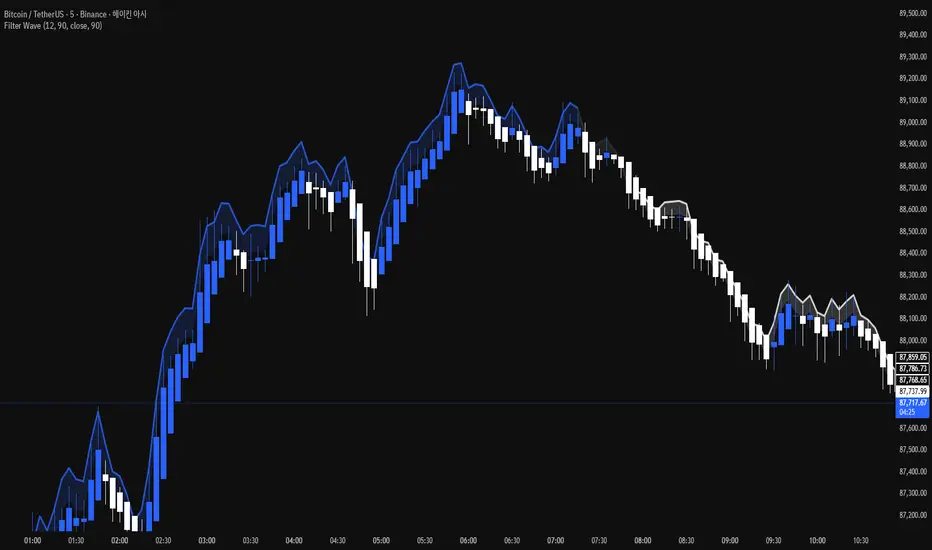
Filter Bar1. Indicator Name
Filter Bar
2. One-line Introduction
A trend-aware bar coloring system that visualizes market direction and strength through adaptive transparency based on regression scoring.
3. General Overview
Filter Bar+ is a minimalist but powerful trend visualization tool that colors chart bars according to market direction and momentum strength.
It analyzes the linear regression trend alignment over a specified lookback period and uses a pairwise comparison algorithm to determine whether the market is in a bullish, bearish, or neutral state.
The result is a "trend score" that gets normalized to reflect trend intensity (0~1).
Bar colors are then dynamically updated using the specified bullish or bearish base colors, where higher intensity results in more opaque (darker) bars, and weaker trends lead to lighter, faded tones.
If no strong trend is detected, bars are shown in gray, signaling indecision or neutrality.
The strength of this indicator lies in its simplicity—it doesn’t draw lines, waves, or shapes, but overlays insight directly onto the chart through smart color cues.
It’s particularly effective as a background filter for price action traders, scalpers, and anyone who prefers clean charts but still wants embedded directional context.
4. Key Advantages
🎨 Adaptive Bar Coloring
Bar color opacity increases with trend strength, offering instant visual confirmation without clutter.
📊 Quantified Trend Direction
Uses a regression-based scoring system to reliably detect uptrends, downtrends, or sideways markets.
⚖️ Customizable Sensitivity
Parameters like lookback period and tolerance percentage give users full control over signal responsiveness.
🧼 Clean Chart Presentation
No lines, shapes, or overlays—just color-coded bars that blend into your existing chart setup.
🚀 Lightweight & Fast
Minimal computational load ensures it works smoothly even on lower-end devices or multiple chart setups.
🔒 Secure Internal Logic
Algorithm is neatly encapsulated and optimized, with no critical logic exposed.
📘 Indicator User Guide
📌 Basic Concept
Filter Bar+ evaluates trend direction and strength using a pairwise comparison of linear regression values.
The result determines whether the market is bullish, bearish, or neutral, and adjusts bar colors accordingly.
It visually amplifies the current market state without drawing any indicators on the chart.
⚙️ Settings Explained
Lookback Period: Number of bars used to compare regression values
Range Tolerance (%): Minimum score required to label a trend as bullish or bearish
Regression Source: Data input used for regression (default: close)
Linear Regression Length: Period for generating the base regression line
Bull/Bear Base Colors: Choose colors to represent bullish or bearish bars
📈 Buy Timing Example
Bars are green (or user-set bullish color) and becoming more vivid
Indicates a strengthening bullish trend; helpful when used alongside breakout confirmation or support zones
📉 Sell Timing Example
Bars turn red (or your custom bearish color) with increasing opacity
Signals growing bearish pressure; acts as confirmation during short setups or breakdowns
🧪 Recommended Use Cases
Combine with volume, RSI, or price action setups for direction filtering
Ideal for clean chart strategies where visual simplicity is preferred
Use as a confirmation layer to reduce noise in sideways markets
🔒 Precautions
This is a visual filter, not a signal generator—use alongside other strategies for entries/exits
In choppy markets, bars may flicker between colors—adjust sensitivity as needed
Works best when you already have a directional thesis and want to validate it visually
Always test settings for your asset/timeframe before applying in live trades
