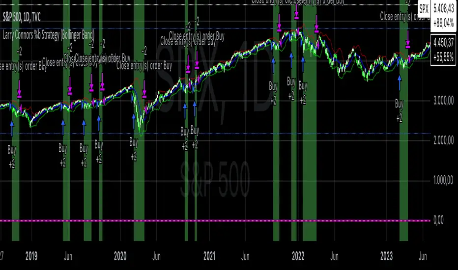
Larry Connors %b Strategy (Bollinger Band)Larry Connors’ %b Strategy is a mean-reversion trading approach that uses Bollinger Bands to identify buy and sell signals based on the %b indicator. This strategy was developed by Larry Connors, a renowned trader and author known for his systematic, data-driven trading methods, particularly those focusing on short-term mean reversion.
The %b indicator measures the position of the current price relative to the Bollinger Bands, which are volatility bands placed above and below a moving average. The strategy specifically targets times when prices are oversold within a long-term uptrend and aims to capture rebounds by buying at relatively low points and selling at relatively high points.
Strategy Rules
The basic rules of the %b Strategy are:
1. Trend Confirmation: The closing price must be above the 200-day moving average. This filter ensures that trades are made in alignment with a longer-term uptrend, thereby avoiding trades against the primary market trend.
2. Oversold Conditions: The %b indicator must be below 0.2 for three consecutive days. The %b value below 0.2 indicates that the price is near the lower Bollinger Band, suggesting an oversold condition.
3. Entry Signal: Enter a long position at the close when conditions 1 and 2 are met.
4. Exit Signal: Exit the position when the %b value closes above 0.8, signaling an overbought condition where the price is near the upper Bollinger Band.
How the Strategy Works
This strategy operates on the premise of mean reversion, which suggests that extreme price movements will revert to the mean over time. By entering positions when the %b value indicates an oversold condition (below 0.2) in a confirmed uptrend, the strategy attempts to capture short-term price rebounds. The exit rule (when %b is above 0.8) aims to lock in profits once the price reaches an overbought condition, often near the upper Bollinger Band.
Who Was Larry Connors?
Larry Connors is a well-known figure in the world of financial markets and trading. He co-authored several influential trading books, including “Short-Term Trading Strategies That Work” and “High Probability ETF Trading.” Connors is recognized for his quantitative approach, focusing on systematic, rules-based strategies that leverage historical data to validate trading edges.
His work primarily revolves around short-term trading strategies, often using technical indicators like RSI (Relative Strength Index), Bollinger Bands, and moving averages. Connors’ methodologies have been widely adopted by traders seeking structured approaches to exploit short-term inefficiencies in the market.
Risks of the Strategy
While the %b Strategy can be effective, particularly in mean-reverting markets, it is not without risks:
1. Mean Reversion Assumption: The strategy is based on the assumption that prices will revert to the mean. In trending or sharply falling markets, this reversion may not occur, leading to sustained losses.
2. False Signals in Choppy Markets: In volatile or sideways markets, the strategy may generate multiple false signals, resulting in whipsaw trades that can erode capital through frequent small losses.
3. No Stop Loss: The basic implementation of the strategy does not include a stop loss, which increases the risk of holding losing trades longer than intended, especially if the market continues to move against the position.
4. Performance During Market Crashes: During major market downturns, the strategy’s buy signals could be triggered frequently as prices decline, compounding losses without the presence of a risk management mechanism.
Scientific References and Theoretical Basis
The %b Strategy relies on the concept of mean reversion, which has been extensively studied in finance literature. Studies by Avellaneda and Lee (2010) and Bouchaud et al. (2018) have demonstrated that mean-reverting strategies can be profitable in specific market environments, particularly when combined with volatility filters like Bollinger Bands. However, the same studies caution that such strategies are highly sensitive to market conditions and often perform poorly during periods of prolonged trends.
Bollinger Bands themselves were popularized by John Bollinger and are widely used to assess price volatility and detect potential overbought and oversold conditions. The %b value is a critical part of this analysis, as it standardizes the position of price relative to the bands, making it easier to compare conditions across different securities and time frames.
Conclusion
Larry Connors’ %b Strategy is a well-known mean-reversion technique that leverages Bollinger Bands to identify buying opportunities in uptrending markets when prices are temporarily oversold. While the strategy can be effective under the right conditions, traders should be aware of its limitations and risks, particularly in trending or highly volatile markets. Incorporating risk management techniques, such as stop losses, could help mitigate some of these risks, making the strategy more robust against adverse market conditions.
Cerca negli script per "band"
Dynamic Bollinger Bands with Momentum and Volume (DBBMV)Overview
The Dynamic Bollinger Bands with Momentum and Volume (DBBMV) indicator enhances the traditional Bollinger Bands by dynamically adjusting their width and position based on momentum and volume. This provides a more responsive and context-aware indication of price volatility and potential reversals.
Key Features
Momentum Adjusted Bands: Adjusts the bands' width based on the momentum indicator, reflecting the rate of change in price.
Volume Weighted Bands: Further adjusts the bands based on trading volume to reflect market activity and price volatility.
Signal Alerts: Provides buy and sell signals based on price action relative to the dynamic bands, helping traders identify entry and exit points.
Customizable Parameters: Allows users to adjust the lookback period, momentum sensitivity, and volume weighting for personalized analysis.
How It Works
The DBBMV indicator starts with the traditional Bollinger Bands, which are calculated using a moving average and standard deviation of the selected price source. The width of these bands is then adjusted based on the momentum of the price, making them more sensitive to price changes. Further adjustments are made based on trading volume, which ensures that the bands accurately reflect current market conditions. This results in a set of dynamic Bollinger Bands that provide more nuanced insights into price volatility and potential reversals.
Usage Instructions
Identify Volatile Periods: Use the dynamically adjusted bands to identify periods of high and low volatility in the market.
Spot Reversals: Look for buy signals when the price crosses above the lower band and sell signals when the price crosses below the upper band.
Adjust Sensitivity: Customize the lookback period, momentum sensitivity, and volume weighting to fine-tune the indicator to your specific trading strategy and market conditions.
Enhance Analysis: Combine the DBBMV indicator with other technical analysis tools for a more comprehensive market analysis.
Volume Confirmation: Use the volume-weighted adjustments to confirm the strength of price movements and potential breakouts.
The Dynamic Bollinger Bands with Momentum and Volume (DBBMV) indicator provides traders with a powerful tool to understand market dynamics better and make informed trading decisions based on adjusted volatility and market activity.

Moving Average Bands with Signals [UAlgo]The "Moving Average Bands with Signals combines various moving average types with ATR-based bands to help traders identify potential support and resistance levels.
It plots moving average bands with upper and lower support/resistance levels based on the Average True Range (ATR) and user-defined settings.Additionally, the script generates buy/sell signals based on price crossing above or below the bands.
🔶 Key Features
Multiple Moving Average Types:
Supports various moving average calculations including Arnaud Legoux Moving Average (ALMA), Exponential Moving Average (EMA), Double Exponential Moving Average (DEMA), Triple Exponential Moving Average (TEMA), Kaufman Adaptive Moving Average (KAMA), Hull Moving Average (HMA), Least Squares Moving Average (LSMA), Simple Moving Average (SMA), Triangular Moving Average (TMA), Volume-Weighted Moving Average (VWMA), Weighted Moving Average (WMA), and Zero-Lag Moving Average (ZLMA).
Customizable ATR Bands:
Integrates the Average True Range (ATR) to calculate dynamic support and resistance bands around the moving average. The multiplier for the bands is user-adjustable, allowing for finer control over the sensitivity and width of the bands.
Signal Generation:
Provides visual signals on the chart when the price interacts with the support or resistance bands. Users can choose between using the wick or the close price to generate these signals, adding an extra layer of customization based on their trading style.
Flexible Input Parameters:
Allows users to input parameters for moving average length, ATR length, band multiplier, and signal type. Additional settings are available for specific moving average types, such as ALMA's offset and sigma, KAMA's fast and slow periods, and LSMA's offset.
🔶 Disclaimer
This script is provided for educational purposes only and should not be considered financial advice.
Trading financial instruments involves substantial risk and can result in significant financial losses.
The script’s performance in the past is not indicative of future results, and no guarantees are made regarding its accuracy, reliability, or performance.

[blackcat] L1 Zero-Lag EMA BandThe Zero-Lag EMA Band is a sophisticated technical analysis tool designed to provide traders with a comprehensive view of market trends. This innovative indicator merges the Zero-Lag EMA, a derivative of the traditional Exponential Moving Average, with Bollinger Bands to create a unique trend indicator that is less laggy and more responsive to market changes.
The Zero-Lag EMA Band is calculated by taking the standard deviation of the price data and adding or subtracting it from the Zero-Lag EMA to create an upper band and a lower band. This process results in a trend band that can help traders identify potential support and resistance levels, providing them with a more accurate assessment of the market's behavior.
The Zero-Lag EMA Band is particularly useful for traders who need to react quickly to market changes. It offers a more timely assessment of potential trend reversals, allowing traders to capitalize on market opportunities and mitigate risk.
The indicator's design is based on the principle of Zero-Lag, which aims to reduce the lag associated with traditional EMAs. This feature makes the Zero-Lag EMA Band a powerful tool for traders who want to stay ahead of the market and make more informed decisions.
In summary, the Zero-Lag EMA Band is a comprehensive and responsive tool for traders looking to identify and capitalize on market trends. It is a valuable addition to any trader's toolkit, offering a more accurate and timely assessment of potential trend reversals and providing a more comprehensive view of the market's behavior.
Certainly! Let's go through the Pine Script code line by line to understand its functionality:
//@version=5
This line specifies the version of Pine Script being used. In this case, it's version 5.
indicator(' L1 Zero-Lag EMA Band', shorttitle='L1 ZLEMA Band', overlay=true)
This line defines the indicator with a title and a short title. The `overlay=true` parameter means that the indicator will be plotted on top of the price data.
length = input.int(21, minval=1, title='Length')
This line creates an input field for the user to specify the length of the EMA. The default value is 21, and the minimum value is 1.
mult = input(1, title='Multiplier')
This line creates an input field for the user to specify the multiplier for the standard deviation, which is used to calculate the bands around the EMA. The default value is 1.
src = input.source(close, title="Source")
This line creates an input field for the user to specify the data source for the EMA calculation. The default value is the closing price of the asset.
// Define the smoothing factor (alpha) for the EMA
alpha = 2 / (length + 1)
This line calculates the smoothing factor alpha for the EMA. It's a common formula for EMA calculation.
// Initialize a variable to store the previous EMA value
var float prevEMA = na
This line initializes a variable to store the previous EMA value. It's initialized as `na` (not a number), which means it's not yet initialized.
// Calculate the zero-lag EMA
emaValue = na(prevEMA) ? ta.sma(src, length) : (src - prevEMA) * alpha + prevEMA
This line calculates the zero-lag EMA. If `prevEMA` is not a number (which means it's the first calculation), it uses the simple moving average (SMA) as the initial EMA. Otherwise, it uses the standard EMA formula.
// Update the previous EMA value
prevEMA := emaValue
This line updates the `prevEMA` variable with the newly calculated EMA value. The `:=` operator is used to update the variable in Pine Script.
// Calculate the upper and lower bands
dev = mult * ta.stdev(src, length)
upperBand = emaValue + dev
lowerBand = emaValue - dev
These lines calculate the upper and lower bands around the EMA. The bands are calculated by adding and subtracting the product of the multiplier and the standard deviation of the source data over the specified length.
// Plot the bands
p0 = plot(emaValue, color=color.new(color.yellow, 0))
p1 = plot(upperBand, color=color.new(color.yellow, 0))
p2 = plot(lowerBand, color=color.new(color.yellow, 0))
fill(p1, p2, color=color.new(color.fuchsia, 80))
These lines plot the EMA value, upper band, and lower band on the chart. The `fill` function is used to color the area between the upper and lower bands. The `color.new` function is used to create a new color with a specified alpha value (transparency).
In summary, this script creates an indicator that displays the zero-lag EMA and its bands on a trading chart. The user can specify the length of the EMA and the multiplier for the standard deviation. The bands are used to identify potential support and resistance levels for the asset's price.
In the context of the provided Pine Script code, `prevEMA` is a variable used to store the previous value of the Exponential Moving Average (EMA). The EMA is a type of moving average that places a greater weight on the most recent data points. Unlike a simple moving average (SMA), which is an equal-weighted average, the EMA gives more weight to the most recent data points, which can help to smooth out short-term price fluctuations and highlight the long-term trend.
The `prevEMA` variable is used to calculate the current EMA value. When the script runs for the first time, `prevEMA` will be `na` (not a number), indicating that there is no previous EMA value to use in the calculation. In such cases, the script falls back to using the simple moving average (SMA) as the initial EMA value.
Here's a breakdown of the role of `prevEMA`:
1. **Initialization**: On the first bar, `prevEMA` is `na`, so the script uses the SMA of the close price over the specified period as the initial EMA value.
2. **Calculation**: On subsequent bars, `prevEMA` holds the value of the EMA from the previous bar. This value is used in the EMA calculation to give more weight to the most recent data points.
3. **Update**: After calculating the current EMA value, `prevEMA` is updated with the new EMA value so it can be used in the next bar's calculation.
The purpose of `prevEMA` is to maintain the state of the EMA across different bars, ensuring that the EMA calculation is not reset to the SMA on each new bar. This is crucial for the EMA to function properly and to avoid the "lag" that can sometimes be associated with moving averages, especially when the length of the moving average is short.
In the provided script, `prevEMA` is used to simulate a zero-lag EMA, but as mentioned earlier, there is no such thing as a zero-lag EMA in the traditional sense. The EMA already has a very minimal lag due to its recursive nature, and any attempt to reduce the lag further would likely not be accurate or reliable for trading purposes.
Please note that the script provided is a conceptual example and may not be suitable for actual trading without further testing and validation.

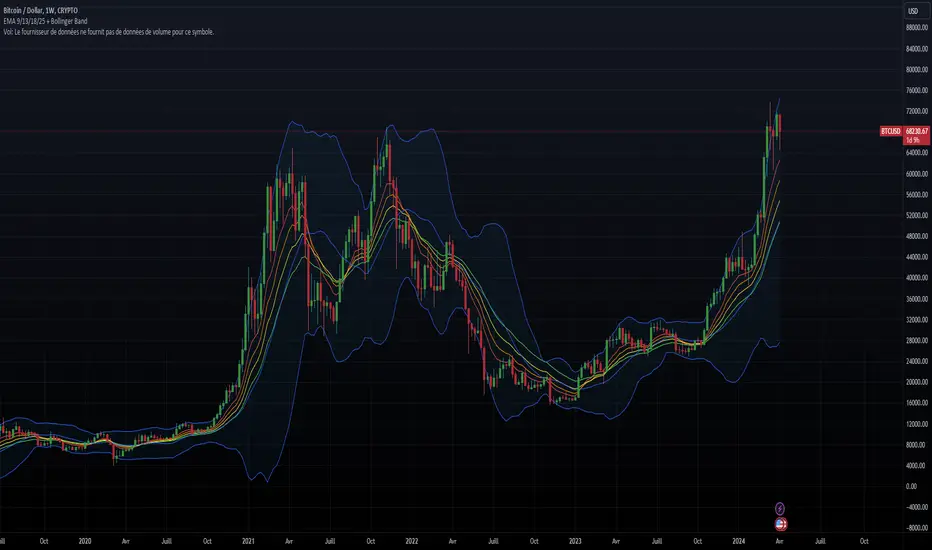
EMA 9/13/18/25 + Bollinger BandThe indicator combines two components: Exponential Moving Averages (EMAs) and Bollinger Bands.
Exponential Moving Averages (EMAs): The indicator calculates four EMAs with different periods: 9, 13, 18, and 25. An Exponential Moving Average is a type of moving average that places a greater weight and significance on the most recent data points. As the name suggests, it's an average of the asset's price over a certain period, with recent prices given more weight in the calculation, making it more responsive to recent price changes.
Bollinger Bands: Bollinger Bands consist of a simple moving average (the basis) and two standard deviations plotted away from it. The standard deviations are multiplied by a factor (usually 2) to determine the distance from the basis. These bands dynamically adjust themselves based on recent price movements. The upper band represents the highest price level reached in the given period, while the lower band represents the lowest price level.
Combining these components provides traders with insights into both trend direction and volatility. The EMAs help identify trends by smoothing out price data, while the Bollinger Bands offer insights into volatility and potential price reversal points. Traders often use the crossovers of EMAs and interactions with Bollinger Bands to make trading decisions. For example, when the price touches the upper Bollinger Band, it may indicate overbought conditions, while touching the lower band may suggest oversold conditions. Additionally, crossovers of EMAs (such as the shorter-term EMA crossing above or below the longer-term EMA) may signal changes in trend direction.
Averaged Moving Average Ribbon with Bollinger BandsThis indicator provides a visual representation of an averaged weighted moving average (WMA) ribbon (default setting) along with Bollinger Bands on a price chart. Pay attention to how the moving average and band expand and contract, as well as where price crosses the Bollinger bands (Green and red) or the basis line (blue). Look for patterns, and exploit them to your advantage to give you another edge in trading.
>> Feel free to suggest changes or other additions in the comments :)
Here's a brief explanation of how this indicator works:
1. **Moving Average Type:** You can select the type of moving average (MA) to use from the dropdown menu. The available options are Weighted Moving Average (WMA), Simple Moving Average (SMA), and Exponential Moving Average (EMA).
2. **Bollinger Bands Deviation:** This input allows you to adjust the deviation for the Bollinger Bands. Higher values increase the width of the bands, while lower values decrease it.
3. **Moving Average Lengths:** The script calculates various moving averages (WMA, SMA, or EMA) with different lengths, ranging from 5 to 100, in increments of 5. These moving averages are used to create the ribbon.
4. **Ribbon Calculation:** The indicator calculates the selected moving average (WMA, SMA, or EMA) for each of the specified lengths. It then averages these moving averages to create a ribbon of MAs. This ribbon represents a smoother and more encompassing view of the underlying price action.
5. **Bollinger Bands:** The script also calculates and plots Bollinger Bands based on the ribbon's average. The upper Bollinger Band (green) and lower Bollinger Band (red) are plotted around the ribbon average. These bands provide insights into potential overbought and oversold conditions.
In summary, this indicator allows traders and analysts to visualize a weighted moving average ribbon with Bollinger Bands to gain a better understanding of price trends, volatility, and potential reversal points in the market. The combination of different moving average lengths and Bollinger Bands can help in making informed trading decisions.

TMA Bands with Break Arrow @ClearTradingMind
The "TMA Bands with Break Arrow" indicator, developed by ClearTradingMind, is designed to provide traders with insights into potential trend reversals based on the movement of price within a channel defined by the Triangular Moving Average (TMA) and its bands. The TMA is a smoothed moving average, and this indicator adds upper and lower bands to visualize potential breakouts.
Key Components:
1. TMA Bands: The indicator plots the upper and lower bands of the TMA channel. These bands represent potential overbought (upper band) and oversold (lower band) conditions.
2. Break Arrows: The indicator generates buy (green triangle up) and sell (red triangle down) arrows when the closing price breaks above the upper band or below the lower band, indicating a potential trend reversal.
3. Background Color: The background color dynamically changes based on the last generated signal. A blue background suggests a recent buy signal, while a red background indicates a recent sell signal. This provides a quick visual reference for the prevailing market sentiment.
Usage:
1. Trend Reversals: Traders can use the buy and sell arrows as signals for potential trend reversals. A buy signal suggests a possible upward trend, while a sell signal suggests a potential downward trend.
2. Channel Breakouts: Watch for price breaking above the upper band (buy signal) or below the lower band (sell signal). These breakouts may indicate the start of a new trend.
3. Volatility Analysis: The width of the TMA channel represents volatility. A widening channel suggests increased volatility, while a narrowing channel suggests decreasing volatility.
4. Background Color: The background color provides additional context. A blue background indicates recent bullish sentiment, while a red background suggests recent bearish sentiment.
Parameters:
- TMA Period: The number of bars used to calculate the Triangular Moving Average.
- ATR Period: The number of bars used to calculate the Average True Range (ATR) for determining the width of the TMA channel.
- ATR Multiplier: A multiplier applied to the ATR to determine the width of the TMA channel.
Note: This indicator is a tool to assist traders in their analysis, and it is recommended to use it in conjunction with other technical and fundamental analysis methods for more comprehensive decision-making.
Disclaimer: Trading involves risk, and this indicator does not guarantee profit. Users should conduct thorough analysis and risk management before making trading decisions.

Fair value bands / quantifytools— Overview
Fair value bands, like other band tools, depict dynamic points in price where price behaviour is normal or abnormal, i.e. trading at/around mean (price at fair value) or deviating from mean (price outside fair value). Unlike constantly readjusting standard deviation based bands, fair value bands are designed to be smooth and constant, based on typical historical deviations. The script calculates pivots that take place above/below fair value basis and forms median deviation bands based on this information. These points are then multiplied up to 3, representing more extreme deviations.
By default, the script uses OHLC4 and SMA 20 as basis for the bands. Users can form their preferred fair value basis using following options:
Price source
- Standard OHLC values
- HL2 (High + low / 2)
- OHLC4 (Open + high + low + close / 4)
- HLC3 (High + low + close / 3)
- HLCC4 (High + low + close + close / 4)
Smoothing
- SMA
- EMA
- HMA
- RMA
- WMA
- VWMA
- Median
Once fair value basis is established, some additional customization options can be employed:
Trend mode
Direction based
Cross based
Trend modes affect fair value basis color that indicates trend direction. Direction based trend considers only the direction of the defined fair value basis, i.e. pointing up is considered an uptrend, vice versa for downtrend. Cross based trends activate when selected source (same options as price source) crosses fair value basis. These sources can be set individually for uptrend/downtrend cross conditions. By default, the script uses cross based trend mode with low and high as sources.
Cross based (downtrend not triggered) vs. direction based (downtrend triggered):
Threshold band
Threshold band is calculated using typical deviations when price is trading at fair value basis. In other words, a little bit of "wiggle room" is added around the mean based on expected deviation. This feature is useful for cross based trends, as it allows filtering insignificant crosses that are more likely just noise. By default, threshold band is calculated based on 1x median deviation from mean. Users can increase/decrease threshold band width via input menu for more/less noise filtering, e.g. 2x threshold band width would require price to cross wiggle room that is 2x wider than typical, 0x erases threshold band altogether.
Deviation bands
Width of deviation bands by default is based on 1x median deviations and can be increased/decreased in a similar manner to threshold bands.
Each combination of customization options produces varying behaviour in the bands. To measure the behaviour and finding fairest representation of fair and unfair value, some data is gathered.
— Fair value metrics
Space between each band is considered a lot, named +3, +2, +1, -1, -2, -3. For each lot, time spent and volume relative to volume moving average (SMA 20) is recorded each time price is trading in a given lot:
Depending on the asset, timeframe and chosen fair value basis, shape of the distributions vary. However, practically always time is distributed in a normal bell curve shape, being highest at lots +1 to -1, gradually decreasing the further price is from the mean. This is hardly surprising, but it allows accurately determining dynamic areas of normal and abnormal price behaviour (i.e. low risk area between +1 and -1, high risk area between +-2 to +-3). Volume on the other hand is typically distributed the other way around, being lowest at lots +1 to -1 and highest at +-2 to +-3. When time and volume are distributed like so, we can conclude that 1) price being outside fair value is a rare event and 2) the more price is outside fair value, the more anomaly behaviour in volume we tend to find.
Viewing metric calculations
Metric calculation highlights can be enabled from the input menu, resulting in a lot based coloring and visibility of each lot counter (time, cumulative relative volume and average relative volume) in data window:
— Alerts
Available alerts are the following:
Individual
- High crossing deviation band (bands +1 to +3 )
- Low crossing deviation band (bands -1 to -3 )
- Low at threshold band in an uptrend
- High at threshold band in a downtrend
- New uptrend
- New downtrend
Grouped
- New uptrend or downtrend
- Deviation band cross (+1 or -1)
- Deviation band cross (+2 or -2)
- Deviation band cross (+3 or -3)
— Practical guide
Example #1 : Risk on/risk off trend following
Ideal trend stays inside fair value and provides sufficient cool offs between the moves. When this is the case, fair value bands can be used for sensible entry/exit levels within the trend.
Example #2 : Mean reversions
When price shows exuberance into an extreme deviation, followed by a stall and signs of exhaustion (wicks), an opportunity for mean reversion emerges. The higher the deviation, the more volatility in the move, the more signalling of exhaustion, the better.
Example #3 : Tweaking bands for desired behaviour
The faster the length of fair value basis, the more momentum price needs to hit extreme deviation levels, as bands too are moving faster alongside price. Decreasing fair value basis length typically leads to more quick and aggressive deviations and less steady trends outside fair value.

EMA bands + leledc + bollinger bands trend following strategy v2The basics:
In its simplest form, this strategy is a positional trend following strategy which enters long when price breaks out above "middle" EMA bands and closes or flips short when price breaks down below "middle" EMA bands. The top and bottom of the middle EMA bands are calculated from the EMA of candle highs and lows, respectively.
The idea is that entering trades on breakouts of the high EMAs and low EMAs rather than the typical EMA based on candle closes gives a bit more confirmation of trend strength and minimizes getting chopped up. To further reduce getting chopped up, the strategy defaults to close on crossing the opposite EMA band (ie. long on break above high EMA middle band and close below low EMA middle band).
This strategy works on all markets on all timeframes, but as a trend following strategy it works best on markets prone to trending such as crypto and tech stocks. On lower timeframes, longer EMAs tend to work best (I've found good results on EMA lengths even has high up to 1000), while 4H charts and above tend to work better with EMA lengths 21 and below.
As an added filter to confirm the trend, a second EMA can be used. Inputting a slower EMA filter can ensure trades are entered in accordance with longer term trends, inputting a faster EMA filter can act as confirmation of breakout strength.
Bar coloring can be enabled to quickly visually identify a trend's direction for confluence with other indicators or strategies.
The goods:
Waiting for the trend to flip before closing a trade (especially when a longer base EMA is used) often leaves money on the table. This script combines a number of ways to identify when a trend is exhausted for backtesting the best early exits.
"Delayed bars inside middle bands" - When a number of candle's in a row open and close between the middle EMA bands, it could be a sign the trend is weak, or that the breakout was not the start of a new trend. Selecting this will close out positions after a number of bars has passed
"Leledc bars" - Originally introduced by glaz, this is a price action indicator that highlights a candle after a number of bars in a row close the same direction and result in greatest high/low over a period. It often triggers when a strong trend has paused before further continuation, or it marks the end of a trend. To mitigate closing on false Leledc signals, this strategy has two options: 1. Introducing requirement for increased volume on the Leledc bars can help filter out Leledc signals that happen mid trend. 2. Closing after a number of Leledc bars appear after position opens. These two options work great in isolation but don't perform well together in my testing.
"Bollinger Bands exhaustion bars" - These bars are highlighted when price closes back inside the Bollinger Bands and RSI is within specified overbought/sold zones. The idea is that a trend is overextended when price trades beyond the Bollinger Bands. When price closes back inside the bands it's likely due for mean reversion back to the base EMA in which this strategy will ideally re-enter a position. Since the added RSI requirements often make this indicator too strict to trigger a large enough sample size to backtest, I've found it best to use "non-standard" settings for both the bands and the RSI as seen in the default settings.
"Buy/Sell zones" - Similar to the idea behind using Bollinger Bands exhaustion bars as a closing signal. Instead of calculating off of standard deviations, the Buy/Sell zones are calculated off multiples of the middle EMA bands. When trading beyond these zones and subsequently failing back inside, price may be due for mean reversion back to the base EMA. No RSI filter is used for Buy/Sell zones.
If any early close conditions are selected, it's often worth enabling trade re-entry on "middle EMA band bounce". Instead of waiting for a candle to close back inside the middle EMA bands, this feature will re-enter position on only a wick back into the middle bands as will sometimes happen when the trend is strong.
Any and all of the early close conditions can be combined. Experimenting with these, I've found can result in less net profit but higher win-rates and sharpe ratios as less time is spent in trades.
The deadly:
The trend is your friend. But wouldn't it be nice to catch the trends early? In ranging markets (or when using slower base EMAs in this strategy), waiting for confirmation of a breakout of the EMA bands at best will cause you to miss half the move, at worst will result in getting consistently chopped up. Enabling "counter-trend" trades on this strategy will allow the strategy to enter positions on the opposite side of the EMA bands on either a Leledc bar or Bollinger Bands exhaustion bar. There is a filter requiring either a high/low (for Leledc) or open (for BB bars) outside the selected inner or outer Buy/Sell zone. There are also a number of different close conditions for the counter-trend trades to experiment with and backtest.
There are two ways I've found best to use counter-trend trades
1. Mean reverting scalp trades when a trend is clearly overextended. Selecting from the first 5 counter-trend closing conditions on the dropdown list will usually close the trades out quickly, with less profit but less risk.
2. Trying to catch trends early. Selecting any of the close conditions below the first 5 can cause the strategy to behave as if it's entering into a new trend (from the wrong side).
This feature can be deadly effective in profiting from every move price makes, or deadly to the strategy's PnL if not set correctly. Since counter-trend trades open opposite the middle bands, a stop-loss is recommended to reduce risk. If stop-losses for counter-trend trades are disabled, the strategy will hold a position open often until liquidation in a trending market if th trade is offsides. Note that using a slower base EMA makes counter-trend stop-losses even more necessary as it can reduce the effectiveness of the Buy/Sell zone filter for opening the trades as price can spend a long time trending outside the zones. If faster EMAs (34 and below) are used with "Inner" Buy/Zone filter selected, the first few closing conditions will often trigger almost immediately closing the trade at a loss.
The niche:
I've added a feature to default into longs or shorts. Enabling these with other features (aside from the basic long/short on EMA middle band breakout) tends to break the strategy one way or another. Enabling default long works to simulate trying to acquire more of the asset rather than the base currency. Enabling default short can have positive results for those high FDV, high inflation coins that go down-only for months at a time. Otherwise, I use default short as a hedge for coins that I hold and stake spot. I gain the utility and APR of staking while reducing the risk of holding the underlying asset by maintaining a net neutral position *most* of the time.
Disclaimer:
This script is intended for experimenting and backtesting different strategies around EMA bands. Use this script for your live trading at your own risk. I am a rookie coder, as such there may be errors in the code that cause the strategy to behave not as intended. As far as I can tell it doesn't repaint, but I cannot guarantee that it does not. That being said if there's any question, improvements, or errors you've found, drop a comment below!
VBE Pro - Advanced Volatility Bands with Zero Lag & PredictionVBE Pro: Zero-Lag Predictive Bands
A next-gen volatility envelope that blends zero-lag smoothing with forward-looking volatility models (EWMA/GARCH/HAR/ML) to keep bands tight in calm markets, responsive in shocks, and adaptive across regimes.
What it does
Builds volatility from multiple methods (ATR, StDev, Parkinson, Garman-Klass, Rogers-Satchell, Yang-Zhang).
Projects near-term vol with your choice of predictor, then blends it via a weight slider.
Applies zero-lag smoothing (ZLEMA/ZLMA/DEMA/TEMA/HMA/JMA/Ehlers/Kalman/T3) to cut delay without over-shoot.
Auto-adapts band width by regime (high/low/normal) and can expand dynamically with price acceleration.
Optional displacement to align with your execution style.
On-chart
Upper/Lower zero-lag bands with optional fill.
Middle line (ZL-smoothed source).
Regime-tinted background (High/Low).
Displacement marker (if used).
Compact top-right info table: current vs predicted vol, regime, squeeze, multiplier, methods, ZL gain, est. lag reduction.
Signals & Alerts
Break↑ / Break↓ when price crosses the bands.
Vol↑ / Vol↓ expansion/contraction sequences.
“Squeeze” when band width compresses vs its ZL average.
“ZL” marker when significant zero-lag is active.
Prediction divergence ⚠ when projected vol deviates > threshold.
Built-in alertconditions for all of the above.
Quick start
Method: ATR or Hybrid for robustness.
Smoothing: ZLEMA, length 5–8, ZL gain 2–3 (push higher only if you accept more projection).
Bands: Multiplier 2.0, Adaptive on, Dynamic off to start.
Prediction: EWMA, weight 0.25–0.35. Move to GARCH in mean-reverty tapes; HAR-RV for mixed regimes.
Regime lookback: 50.

PulseRPO Zero-Lag BandsPulseRPO is a momentum and volatility timing suite built on a zero-lag Relative Price Oscillator. It pairs an RPO (fast vs slow MA spread, in %) with adaptive volatility envelopes that tighten or widen as conditions change, so you can spot true momentum bursts, exhaustion and “quiet-before-the-move” squeezes—without the usual MA lag.
What it shows
Zero-Lag RPO: Choose EMA, SMA, WMA, RMA, HMA or ZLEMA for the base, then apply ZLEMA/DEMA/TEMA/HMA zero-lag smoothing to cut delay.
Adaptive Bands: StdDev, ATR, Range or Hybrid volatility; bands auto-tighten in high vol and widen in quiet regimes.
Dynamic OB/OS: Levels scale with current regime so extremes mean something even as volatility shifts.
Signal & Histogram: Classic signal cross plus histogram for quick read of acceleration vs deceleration.
Squeeze Paint: Subtle background highlight when band width compresses below its average.
Divergences & Triggers: Optional bullish/bearish divergence tags, plus band-cross and signal-cross alerts out of the box.
How to use it (general guide)
Momentum entries: Look for RPO crossing up its signal from below or snapping out of a squeeze; extra weight if it also re-enters from below the lower band.
Trend continuation: RPO riding outside the upper (or lower) band with rising histogram = power move; trail risk on pullbacks to the signal line.
Exhaustion / fades: Taps beyond dynamic OB/OS or band re-entries can mark mean-revert windows—confirm with price/volume.
Risk filter: During squeeze, size down and prepare for expansion; after expansion, respect extremes.
Tweak the MA type, band method and zero-lag strength to match your timeframe. PulseRPO is designed to be a self-contained read: regime → setup → trigger → alert.

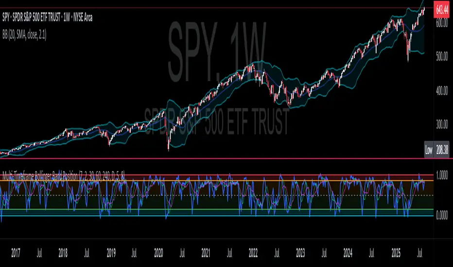
CNS - Multi-Timeframe Bollinger Band OscillatorMy hope is to optimize the settings for this indicator and reintroduce it as a "strategy" with suggested position entry and exit points shown in the price pane.
I’ve been having good results setting the “Bollinger Band MA Length” in the Input tab to between 5 and 10. You can use the standard 20 period, but your results will not be as granular.
This indicator has proven very good at finding local tops and bottoms by combining data from multiple timeframes. Use BB timeframes that are lower than the timeframe you are viewing in your price pane.
The default settings work best on the weekly timeframe, but can be adjusted for most timeframes including intraday.
Be cognizant that the indicator, like other oscillators, does occasionally produce divergences at tops and bottoms.
Any feedback is appreciated.
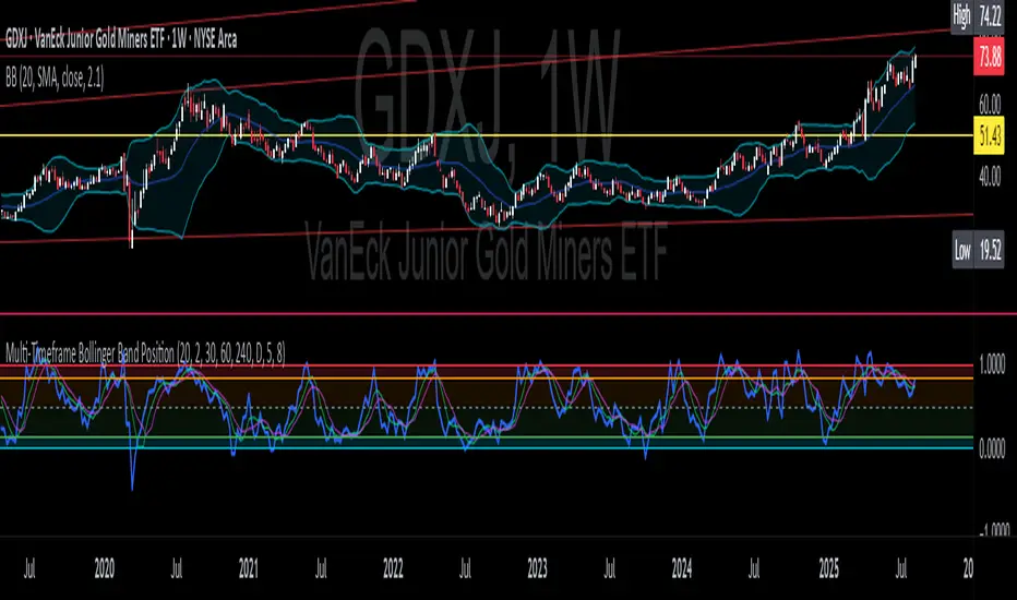
Overview
This indicator is an oscillator that measures the normalized position of the price relative to Bollinger Bands across multiple timeframes. It takes the price's position within the Bollinger Bands (calculated on different timeframes) and averages those positions to create a single value that oscillates between 0 and 1. This value is then plotted as the oscillator, with reference lines and colored regions to help interpret the price's relative strength or weakness.
How It Works
Bollinger Band Calculation:
The indicator uses a custom function f_getBBPosition() to calculate the position of the price within Bollinger Bands for a given timeframe.
Price Position Normalization:
For each timeframe, the function normalizes the price's position between the upper and lower Bollinger Bands.
It calculates three positions based on the high, low, and close prices of the requested timeframe:
pos_high = (High - Lower Band) / (Upper Band - Lower Band)
pos_low = (Low - Lower Band) / (Upper Band - Lower Band)
pos_close = (Close - Lower Band) / (Upper Band - Lower Band)
If the upper band is not greater than the lower band or if the data is invalid (e.g., na), it defaults to 0.5 (the midline).
The average of these three positions (avg_pos) represents the normalized position for that timeframe, ranging from 0 (at the lower band) to 1 (at the upper band).
Multi-Timeframe Averaging:
The indicator fetches Bollinger Band data from four customizable timeframes (default: 30min, 60min, 240min, daily) using request.security() with lookahead=barmerge.lookahead_on to get the latest available data.
It calculates the normalized position (pos1, pos2, pos3, pos4) for each timeframe using f_getBBPosition().
These four positions are then averaged to produce the final avg_position:avg_position = (pos1 + pos2 + pos3 + pos4) / 4
This average is the oscillator value, which is plotted and typically oscillates between 0 and 1.
Moving Averages:
Two optional moving averages (MA1 and MA2) of the avg_position can be enabled, calculated using simple moving averages (ta.sma) with customizable lengths (default: 5 and 10).
These can be potentially used for MA crossover strategies.
What Is Being Averaged?
The oscillator (avg_position) is the average of the normalized price positions within the Bollinger Bands across the four selected timeframes. Specifically:It averages the avg_pos values (pos1, pos2, pos3, pos4) calculated for each timeframe.
Each avg_pos is itself an average of the normalized positions of the high, low, and close prices relative to the Bollinger Bands for that timeframe.
This multi-timeframe averaging smooths out short-term fluctuations and provides a broader perspective on the price's position within the volatility bands.
Interpretation
0.0 The price is at or below the lower Bollinger Band across all timeframes (indicating potential oversold conditions).
0.15: A customizable level (green band) which can be used for exiting short positions or entering long positions.
0.5: The midline, where the price is at the average of the Bollinger Bands (neutral zone).
0.85: A customizable level (orange band) which can be used for exiting long positions or entering short positions.
1.0: The price is at or above the upper Bollinger Band across all timeframes (indicating potential overbought conditions).
The colored regions and moving averages (if enabled) help identify trends or crossovers for trading signals.
Example
If the 30min timeframe shows the close at the upper band (position = 1.0), the 60min at the midline (position = 0.5), the 240min at the lower band (position = 0.0), and the daily at the upper band (position = 1.0), the avg_position would be:(1.0 + 0.5 + 0.0 + 1.0) / 4 = 0.625
This value (0.625) would plot in the orange region (between 0.85 and 0.5), suggesting the price is relatively strong but not at an extreme.
Notes
The use of lookahead=barmerge.lookahead_on ensures the indicator uses the latest available data, making it more real-time, though its effectiveness depends on the chart timeframe and TradingView's data feed.
The indicator’s sensitivity can be adjusted by changing bb_length ("Bollinger Band MA Length" in the Input tab), bb_mult ("Bollinger Band Standard Deviation," also in the Input tab), or the selected timeframes.

Multi-Timeframe Bollinger BandsMy hope is to optimize the settings for this indicator and reintroduce it as a "strategy" with suggested position entry and exit points shown in the price pane.
I’ve been having good results setting the “Bollinger Band MA Length” in the Input tab to between 5 and 10. You can use the standard 20 period, but your results will not be as granular.
This indicator has proven very good at finding local tops and bottoms by combining data from multiple timeframes. Use timeframes that are lower than the timeframe you are viewing in your price pane. Be cognizant that the indicator, like other oscillators, does occasionally produce divergences at tops and bottoms.
Any feedback is appreciated.
Overview
This indicator is an oscillator that measures the normalized position of the price relative to Bollinger Bands across multiple timeframes. It takes the price's position within the Bollinger Bands (calculated on different timeframes) and averages those positions to create a single value that oscillates between 0 and 1. This value is then plotted as the oscillator, with reference lines and colored regions to help interpret the price's relative strength or weakness.
How It Works
Bollinger Band Calculation:
The indicator uses a custom function f_getBBPosition() to calculate the position of the price within Bollinger Bands for a given timeframe.
Price Position Normalization:
For each timeframe, the function normalizes the price's position between the upper and lower Bollinger Bands.
It calculates three positions based on the high, low, and close prices of the requested timeframe:
pos_high = (High - Lower Band) / (Upper Band - Lower Band)
pos_low = (Low - Lower Band) / (Upper Band - Lower Band)
pos_close = (Close - Lower Band) / (Upper Band - Lower Band)
If the upper band is not greater than the lower band or if the data is invalid (e.g., na), it defaults to 0.5 (the midline).
The average of these three positions (avg_pos) represents the normalized position for that timeframe, ranging from 0 (at the lower band) to 1 (at the upper band).
Multi-Timeframe Averaging:
The indicator fetches Bollinger Band data from four customizable timeframes (default: 30min, 60min, 240min, daily) using request.security() with lookahead=barmerge.lookahead_on to get the latest available data.
It calculates the normalized position (pos1, pos2, pos3, pos4) for each timeframe using f_getBBPosition().
These four positions are then averaged to produce the final avg_position:avg_position = (pos1 + pos2 + pos3 + pos4) / 4
This average is the oscillator value, which is plotted and typically oscillates between 0 and 1.
Moving Averages:
Two optional moving averages (MA1 and MA2) of the avg_position can be enabled, calculated using simple moving averages (ta.sma) with customizable lengths (default: 5 and 10).
These can be potentially used for MA crossover strategies.
What Is Being Averaged?
The oscillator (avg_position) is the average of the normalized price positions within the Bollinger Bands across the four selected timeframes. Specifically:It averages the avg_pos values (pos1, pos2, pos3, pos4) calculated for each timeframe.
Each avg_pos is itself an average of the normalized positions of the high, low, and close prices relative to the Bollinger Bands for that timeframe.
This multi-timeframe averaging smooths out short-term fluctuations and provides a broader perspective on the price's position within the volatility bands.
Interpretation
0.0 The price is at or below the lower Bollinger Band across all timeframes (indicating potential oversold conditions).
0.15: A customizable level (green band) which can be used for exiting short positions or entering long positions.
0.5: The midline, where the price is at the average of the Bollinger Bands (neutral zone).
0.85: A customizable level (orange band) which can be used for exiting long positions or entering short positions.
1.0: The price is at or above the upper Bollinger Band across all timeframes (indicating potential overbought conditions).
The colored regions and moving averages (if enabled) help identify trends or crossovers for trading signals.
Example
If the 30min timeframe shows the close at the upper band (position = 1.0), the 60min at the midline (position = 0.5), the 240min at the lower band (position = 0.0), and the daily at the upper band (position = 1.0), the avg_position would be:(1.0 + 0.5 + 0.0 + 1.0) / 4 = 0.625
This value (0.625) would plot in the orange region (between 0.85 and 0.5), suggesting the price is relatively strong but not at an extreme.
Notes
The use of lookahead=barmerge.lookahead_on ensures the indicator uses the latest available data, making it more real-time, though its effectiveness depends on the chart timeframe and TradingView's data feed.
The indicator’s sensitivity can be adjusted by changing bb_length ("Bollinger Band MA Length" in the Input tab), bb_mult ("Bollinger Band Standard Deviation," also in the Input tab), or the selected timeframes.
Multi-Timeframe Bollinger Band PositionBeta version.
My hope is to optimize the settings for this indicator and reintroduce it as a "strategy" with suggested position entry and exit points shown in the price pane.
Any feedback is appreciated.
Overview
This indicator is an oscillator that measures the normalized position of the price relative to Bollinger Bands across multiple timeframes. It takes the price's position within the Bollinger Bands (calculated on different timeframes) and averages those positions to create a single value that oscillates between 0 and 1. This value is then plotted as the oscillator, with reference lines and colored regions to help interpret the price's relative strength or weakness.
How It Works
Bollinger Band Calculation:
The indicator uses a custom function f_getBBPosition() to calculate the position of the price within Bollinger Bands for a given timeframe.
Price Position Normalization:
For each timeframe, the function normalizes the price's position between the upper and lower Bollinger Bands.
It calculates three positions based on the high, low, and close prices of the requested timeframe:
pos_high = (High - Lower Band) / (Upper Band - Lower Band)
pos_low = (Low - Lower Band) / (Upper Band - Lower Band)
pos_close = (Close - Lower Band) / (Upper Band - Lower Band)
If the upper band is not greater than the lower band or if the data is invalid (e.g., na), it defaults to 0.5 (the midline).
The average of these three positions (avg_pos) represents the normalized position for that timeframe, ranging from 0 (at the lower band) to 1 (at the upper band).
Multi-Timeframe Averaging:
The indicator fetches Bollinger Band data from four customizable timeframes (default: 30min, 60min, 240min, daily) using request.security() with lookahead=barmerge.lookahead_on to get the latest available data.
It calculates the normalized position (pos1, pos2, pos3, pos4) for each timeframe using f_getBBPosition().
These four positions are then averaged to produce the final avg_position:avg_position = (pos1 + pos2 + pos3 + pos4) / 4
This average is the oscillator value, which is plotted and typically oscillates between 0 and 1.
Moving Averages:
Two optional moving averages (MA1 and MA2) of the avg_position can be enabled, calculated using simple moving averages (ta.sma) with customizable lengths (default: 5 and 10).
These can be potentially used for MA crossover strategies.
What Is Being Averaged?
The oscillator (avg_position) is the average of the normalized price positions within the Bollinger Bands across the four selected timeframes. Specifically:It averages the avg_pos values (pos1, pos2, pos3, pos4) calculated for each timeframe.
Each avg_pos is itself an average of the normalized positions of the high, low, and close prices relative to the Bollinger Bands for that timeframe.
This multi-timeframe averaging smooths out short-term fluctuations and provides a broader perspective on the price's position within the volatility bands.
Interpretation:
0.0 The price is at or below the lower Bollinger Band across all timeframes (indicating potential oversold conditions).
0.15: A customizable level (green band) which can be used for exiting short positions or entering long positions.
0.5: The midline, where the price is at the average of the Bollinger Bands (neutral zone).
0.85: A customizable level (orange band) which can be used for exiting long positions or entering short positions.
1.0: The price is at or above the upper Bollinger Band across all timeframes (indicating potential overbought conditions).
The colored regions and moving averages (if enabled) help identify trends or crossovers for trading signals.
Example:
If the 30min timeframe shows the close at the upper band (position = 1.0), the 60min at the midline (position = 0.5), the 240min at the lower band (position = 0.0), and the daily at the upper band (position = 1.0), the avg_position would be:(1.0 + 0.5 + 0.0 + 1.0) / 4 = 0.625
This value (0.625) would plot in the orange region (between 0.85 and 0.5), suggesting the price is relatively strong but not at an extreme.
Notes:
The use of lookahead=barmerge.lookahead_on ensures the indicator uses the latest available data, making it more real-time, though its effectiveness depends on the chart timeframe and TradingView's data feed.
The indicator’s sensitivity can be adjusted by changing bb_length ("Bollinger Band MA Length" in the Input tab), bb_mult ("Bollinger Band Standard Deviation," also in the Input tab), or the selected timeframes.
Ethereum Logarithmic Regression BandsOverview
This indicator displays logarithmic regression bands for Ethereum. Logarithmic regression is a statistical method used to model data where growth slows down over time. I initially created these bands in 2021 using a spreadsheet, and later coded them in TradingView in 2022. Over time, the bands proved effective at capturing bull market peaks and bear market lows. In 2025, I decided to share this indicator because I believe these logarithmic regression bands offer the best fit for the Ethereum chart.
How It Works
The logarithmic regression lines are fitted to the Ethereum (ETHUSD) chart using two key factors: the 'a' factor (slope) and the 'b' factor (intercept). The formula for logarithmic regression is 10^((a * ln) - b).
How to Use the Logarithmic Regression Bands
1. Lower Band:
The lower (blue) band forms a potential support area for Ethereum’s price. Historically, Ethereum has found its lows within this band during past market cycles. When the price is within the lower band, it suggests that Ethereum is undervalued.
2. Upper Band:
The upper (red) band forms a potential resistance area for Ethereum’s price. The logarithmic band is fitted to the past two market cycle peaks; therefore, there is not enough historical data to be sure it will reach the upper band again. However, the chance is certainly there! If the price is within the upper band, it indicates that Ethereum is overvalued and that a potential price correction may be imminent.

Dynamic Ray BandsAbout Dynamic Ray Bands
Dynamic Ray Bands is a volatility-adaptive envelope indicator that adjusts in real time to evolving market conditions. It uses a Double Exponential Moving Average (DEMA) as its central trend reference, with upper and lower bands scaled according to current volatility measured by the Average True Range (ATR).
This creates a dynamic structure that visually frames price action, helping traders identify areas of potential trend continuation, overextension, or mean reversion.
How It Works
🟡 Centerline (DEMA)
The central yellow line is a Double Exponential Moving Average, which offers a smoother, less laggy trend signal than traditional moving averages. It represents the market’s short- to medium-term “equilibrium.”
🔵 Outer Bands
Plotted at:
Upper Band = DEMA + (ATR × outerMultiplier)
Lower Band = DEMA - (ATR × outerMultiplier)
These bands define the extreme bounds of current volatility. When price breaks above or below them, it can signal strong directional momentum or overbought/oversold conditions, depending on context. They're often used as trend breakout zones or to time exits after extended runs.
🟣 Inner Bands
Plotted closer to the DEMA:
Inner Upper = DEMA + (ATR × innerMultiplier)
Inner Lower = DEMA - (ATR × innerMultiplier)
These are preliminary volatility thresholds, offering early cues for potential expansion or reversal. They may be used for scalping, tight stop zones, or pre-breakout positioning.
🔁 Dynamic Width (Bands are Dynamically Adjusted Per Tick)
The width of both inner and outer bands is based on ATR (Average True Range), which is recalculated in real time. This means:
During high volatility, the bands expand, allowing for wider price fluctuations.
During low volatility, the bands contract, tightening range expectations.
Unlike fixed-width channels or standard Bollinger Bands (which use standard deviation), this per-tick adjustment via ATR enables Dynamic Ray Bands to reduce false signals in choppy markets and remain more reactive during trending conditions.
⚙️ Inputs
DMA Length — Period for the central DEMA.
ATR Length — Lookback used for ATR volatility calculations.
Outer Band Multiplier — Controls sensitivity of extreme bands.
Inner Band Multiplier — Controls proximity of inner bands.
Show Inner Bands — Toggle for plotting the inner zone.
🔔 Alerts
Alert conditions are included for:
Price closing above/below the outer bands (trend momentum or overextension)
Price closing above/below the inner bands (early signs of strength/weakness)
🧭 Use Cases
Breakout detection — Catch price continuation beyond the outer bands.
Volatility filtering — Adjust trade logic based on band width.
Mean reversion — Monitor for snapbacks toward the DEMA after price stretches too far.
Trend guidance — Use band slope and price position to confirm direction.
⚠️ Disclaimer
This script is intended for educational and informational purposes only. It does not constitute financial advice or a recommendation to trade any specific market or security. Always test indicators thoroughly before using them in live trading.
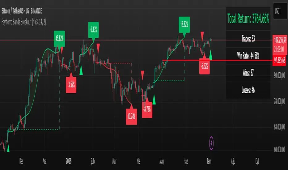
Faytterro Bands Breakout📌 Faytterro Bands Breakout 📌
This indicator was created as a strategy showcase for another script: Faytterro Bands
It’s meant to demonstrate a simple breakout strategy based on Faytterro Bands logic and includes performance tracking.
❓ What Is It?
This script is a visual breakout strategy based on a custom moving average and dynamic deviation bands, similar in concept to Bollinger Bands but with unique smoothing (centered regression) and performance features.
🔍 What Does It Do?
Detects breakouts above or below the Faytterro Band.
Plots visual trade entries and exits.
Labels each trade with percentage return.
Draws profit/loss lines for every trade.
Shows cumulative performance (compounded return).
Displays key metrics in the top-right corner:
Total Return
Win Rate
Total Trades
Number of Wins / Losses
🛠 How Does It Work?
Bullish Breakout: When price crosses above the upper band and stays above the midline.
Bearish Breakout: When price crosses below the lower band and stays below the midline.
Each trade is held until breakout invalidation, not a fixed TP/SL.
Trades are compounded, i.e., profits stack up realistically over time.
📈 Best Use Cases:
For traders who want to experiment with breakout strategies.
For visual learners who want to study past breakouts with performance metrics.
As a template to develop your own logic on top of Faytterro Bands.
⚠ Notes:
This is a strategy-like visual indicator, not an automated backtest.
It doesn't use strategy.* commands, so you can still use alerts and visuals.
You can tweak the logic to create your own backtest-ready strategy.
Unlike the original Faytterro Bands, this script does not repaint and is fully stable on closed candles.
MegaGas Bollinger Bands with Divergence and Circle SignalsIndicator: MegaGas Bollinger Bands with Divergence and Circle Signals
This script provides a powerful combination of Bollinger Bands, RSI Divergence detection, and signal visualization tools. Designed with flexibility and precision in mind, it aims to assist traders in identifying trend reversals, volatility zones, and divergence-based trading opportunities. The script is well-suited for swing trading, momentum trading, and even scalping when adapted to lower timeframes.
How It Works:
Bollinger Bands:
Bollinger Bands are used to detect price volatility and overbought/oversold conditions. The script calculates:
Basis Line: A 34-period Simple Moving Average (SMA) as the core trend line.
Upper Bands: Bands positioned 1x and 2x the standard deviation above the SMA.
Lower Bands: Bands positioned 1x and 2x the standard deviation below the SMA. These levels provide dynamic support and resistance zones, highlighting breakout and reversion opportunities.
RSI Divergence Detection:
The indicator detects bullish divergence (when RSI forms a higher low while price forms a lower low) and bearish divergence (when RSI forms a lower high while price forms a higher high). These divergences often precede significant reversals or momentum shifts.
Bullish divergence is displayed with blue triangles (up).
Bearish divergence is displayed with orange triangles (down).
Buy and Sell Signals:
Circle Signals are generated when price crosses key Bollinger Bands levels:
A green circle appears when the price crosses above the lower band (potential buy signal).
A red circle appears when the price crosses below the upper band (potential sell signal).
These signals help identify potential entry and exit points for trades, particularly in trend-following or mean-reversion strategies.
Trend Reference (Moving Average):
A 50-period Simple Moving Average (SMA) is included as a trend reference, helping traders gauge the overall market direction. Use this to confirm divergence signals and avoid trades against the prevailing trend.
Why This Indicator Is Unique:
This script integrates multiple tools in a meaningful way, emphasizing contextual trading signals. Unlike standalone Bollinger Bands or RSI indicators, it introduces:
Advanced Divergence Analysis: Enhancing traditional RSI with divergence-based alerts.
Dynamic Signal Filtering: Preventing repetitive signals by introducing state-based logic for circles and divergence signals.
Trend Alignment: Combining Bollinger Bands with an SMA to filter trades based on the prevailing trend.
How to Use:
Setup:
Apply the indicator to any chart and timeframe. For swing trading, higher timeframes like 4H or 1D are recommended.
Adjust the RSI, Bollinger Bands, and Moving Average lengths to match your strategy and asset.
Signals:
Look for divergence signals (triangles) as early warnings of trend reversals. Confirm these with price action or other tools.
Use circle signals (green/red) to time potential entries/exits around Bollinger Band extremes.
Confirmation:
Combine divergence and circle signals with the SMA line to avoid counter-trend trades. For example, take bullish signals when the price is above the SMA and bearish signals when it is below.
Chart Clarity:
The script is published with a clean chart for clarity. It visualizes all signals with distinct shapes (triangles and circles) and colors, ensuring they are easily recognizable. Bollinger Bands and the SMA are plotted with transparency to avoid clutter.
Originality:
This script is a thoughtful blend of Bollinger Bands and RSI divergence detection, carefully designed to provide traders with actionable insights. It introduces state-based logic to manage repetitive signals and seamlessly integrates trend filtering, making it a valuable tool for both novice and experienced traders.

Multi-Period % Change Bands (Extreme Dots)Multiple Period Percentage Change Extreme Dots
This indicator visualizes percentage changes across three different timeframes (8, 13, and 21 days), highlighting extreme movements that break out of a user-defined band. It's designed to identify which timeframe is showing the most significant percentage change when prices make notable moves.
Features:
- Tracks percentage changes for 8-day, 13-day, and 21-day periods
- Customizable upper and lower bands to define significant moves
- Shows dots only for the most extreme moves (highest above band or lowest below band)
- Color-coded for easy identification:
- Blue: 8-day changes
- Green: 13-day changes
- Red: 21-day changes
- Includes current values display for all timeframes
Usage Tips:
- Shorter timeframes (8-day) are more sensitive to price changes and should use narrower bands (e.g., ±3%)
- Medium timeframes (13-day) work well with moderate bands (e.g., ±5%)
- Longer timeframes (21-day) can use wider bands (e.g., ±8%)
- Dots appear only when a timeframe shows the most extreme move above/below bands
- Use the gray zone between bands to identify normal price action ranges
The indicator helps identify which lookback period is showing the strongest momentum in either direction, while filtering out normal market noise within the bands.
Note: This is particularly useful for:
- Identifying trend strength across different timeframes
- Spotting which duration is showing the most extreme moves
- Filtering out minor fluctuations through the band system
- Comparing relative strength of moves across different periods

Nami Bands with Future Projection [FXSMARTLAB]The Nami Bands ( Inspired by "Nami", meaning "wave" in Japanese) are two dynamic bands around price data: an upper band and a lower band. These bands are calculated based on an Asymmetric Linear Weighted Moving Average of price and a similarly asymmetric weighted standard deviation. This weighting method emphasizes recent data without overreacting to short-term price changes, thus smoothing the bands in line with prevailing market conditions.
Advantages and Benefits of Using the Indicator
* Volatility Analysis: The bands expand and contract with market volatility, helping traders assess periods of high and low volatility. Narrow bands indicate low volatility and potential consolidation, while wide bands suggest increased volatility and potential price movement.
* Dynamic Support and Resistance Levels: By adapting to recent trends, the bands serve as dynamic support (lower band) and resistance (upper band) levels, which traders can use for entry and exit signals.
* Overbought and Oversold Conditions: When prices reach or cross the bands’ outer limits, it may signal overbought (upper band) or oversold (lower band) conditions, suggesting possible reversals or trend slowdowns.
* Trend Confirmation and Continuation: The slope of the central moving average confirms trend direction. An upward slope generally indicates a bullish trend, while a downward slope suggests a bearish trend.
* Anticipating Breakouts and Reversals: The projected bands help identify where price movements may head, allowing traders to anticipate potential breakouts or reversals based on projected support and resistance.
Indicator Parameters
Source (src): The price data used for calculations, by default set to the average of high, low, and close (hlc3).
Length: The period over which calculations are made, defaulted to 50 periods.
Projection Length: The length for future band projection, defaulted to 20 periods.
StdDev Multiplier (mult): A multiplier for the standard deviation, defaulted to 2.0.
Internal Calculations
1. Asymmetric Linear Weighted Moving Average of Price
The indicator uses an Asymmetric Linear Weighted Moving Average (ALWMA) to calculate a central value for the price.
Asymmetric Weighting: This weighting technique assigns the highest weight to the most recent value, with weights decreasing linearly as the data points become older. This structure provides a nuanced focus on recent price trends, while still reflecting historical price levels.
2. Asymmetric Weighted Standard Deviation
The standard deviation in this indicator is also calculated using asymmetric weighting:
Purpose of Asymmetric Weighted Standard Deviation: Rather than aiming for high sensitivity to recent data, this standard deviation measure smooths out volatility by integrating weighted values across the length period, stabilizing the overall measurement of price variability.
This approach yields a balanced view of volatility, capturing broader market trends without being overly reactive to short-lived changes.
3. Upper and Lower Bands
The upper and lower bands are created by adding and subtracting the asymmetric weighted standard deviation from the asymmetric weighted average of price. This creates a dynamic envelope that adjusts to both recent price trends and the smoothed volatility measure:
These bands represent adaptable support and resistance levels that shift with recent market volatility.
Future Band Projection
The indicator provides a projection of the bands based on their current slope.
1. Calculating the Slope of the Bands
The slope for each band is derived from the difference between the current and previous values of each band.
2. Projecting the Bands into the Future
For each period into the future, up to the defined Projection Length, the bands are projected using the current slope.
This feature offers an anticipated view of where support and resistance levels may move, providing insight for future market behavior based on current trends.

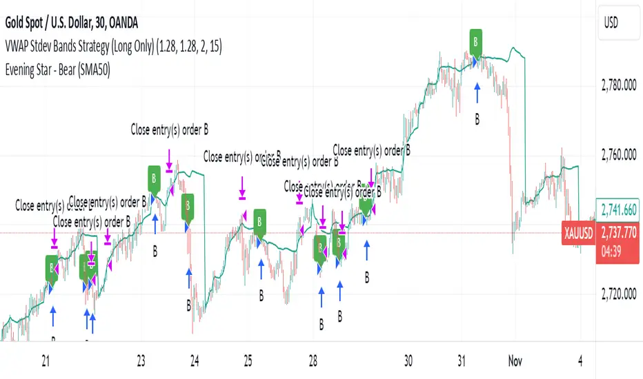
VWAP Stdev Bands Strategy (Long Only)The VWAP Stdev Bands Strategy (Long Only) is designed to identify potential long entry points in trending markets by utilizing the Volume Weighted Average Price (VWAP) and standard deviation bands. This strategy focuses on capturing upward price movements, leveraging statistical measures to determine optimal buy conditions.
Key Features:
VWAP Calculation: The strategy calculates the VWAP, which represents the average price a security has traded at throughout the day, weighted by volume. This is an essential indicator for determining the overall market trend.
Standard Deviation Bands: Two bands are created above and below the VWAP, calculated using specified standard deviations. These bands act as dynamic support and resistance levels, providing insight into price volatility and potential reversal points.
Trading Logic:
Long Entry Condition: A long position is triggered when the price crosses below the lower standard deviation band and then closes above it, signaling a potential price reversal to the upside.
Profit Target: The strategy allows users to set a predefined profit target, closing the long position once the specified target is reached.
Time Gap Between Orders: A customizable time gap can be specified to prevent multiple orders from being placed in quick succession, allowing for a more controlled trading approach.
Visualization: The VWAP and standard deviation bands are plotted on the chart with distinct colors, enabling traders to visually assess market conditions. The strategy also provides optional plotting of the previous day's VWAP for added context.
Use Cases:
Ideal for traders looking to engage in long-only positions within trending markets.
Suitable for intraday trading strategies or longer-term approaches based on market volatility.
Customization Options:
Users can adjust the standard deviation values, profit target, and time gap to tailor the strategy to their specific trading style and market conditions.
Note: As with any trading strategy, it is important to conduct thorough backtesting and analysis before live trading. Market conditions can change, and past performance does not guarantee future results.
Bollinger Bands Mean Reversion by Kevin Davey Bollinger Bands Mean Reversion Strategy Description
The Bollinger Bands Mean Reversion Strategy is a popular trading approach based on the concept of volatility and market overreaction. The strategy leverages Bollinger Bands, which consist of an upper and lower band plotted around a central moving average, typically using standard deviations to measure volatility. When the price moves beyond these bands, it signals potential overbought or oversold conditions, and the strategy seeks to exploit a reversion back to the mean (the central band).
Strategy Components:
1. Bollinger Bands:
The bands are calculated using a 20-period Simple Moving Average (SMA) and a multiple (usually 2.0) of the standard deviation of the asset’s price over the same period. The upper band represents the SMA plus two standard deviations, while the lower band is the SMA minus two standard deviations. The distance between the bands increases with higher volatility and decreases with lower volatility.
2. Mean Reversion:
Mean reversion theory suggests that, over time, prices tend to move back toward their historical average. In this strategy, a buy signal is triggered when the price falls below the lower Bollinger Band, indicating a potential oversold condition. Conversely, the position is closed when the price rises back above the upper Bollinger Band, signaling an overbought condition.
Entry and Exit Logic:
Buy Condition: The strategy enters a long position when the price closes below the lower Bollinger Band, anticipating a mean reversion to the central band (SMA).
Sell Condition: The long position is exited when the price closes above the upper Bollinger Band, implying that the market is likely overbought and a reversal could occur.
This approach uses mean reversion principles, aiming to capitalize on short-term price extremes and volatility compression, often seen in sideways or non-trending markets. Scientific studies have shown that mean reversion strategies, particularly those based on volatility indicators like Bollinger Bands, can be effective in capturing small but frequent price reversals  .
Scientific Basis for Bollinger Bands:
Bollinger Bands, developed by John Bollinger, are widely regarded in both academic literature and practical trading as an essential tool for volatility analysis and mean reversion strategies. Research has shown that Bollinger Bands effectively identify relative price highs and lows, and can be used to forecast price volatility and detect potential breakouts . Studies in financial markets, such as those by Fernández-Rodríguez et al. (2003), highlight the efficacy of Bollinger Bands in detecting overbought or oversold conditions in various assets .
Who is Kevin Davey?
Kevin Davey is an award-winning algorithmic trader and highly regarded expert in developing and optimizing systematic trading strategies. With over 25 years of experience, Davey gained significant recognition after winning the prestigious World Cup Trading Championships multiple times, where he achieved triple-digit returns with minimal drawdown. His success has made him a key figure in algorithmic trading education, with a focus on disciplined and rule-based trading systems.

Uptrick: Logarithmic Crypto Bands
Description :
Introduction
The `Uptrick: Logarithmic Crypto Bands` indicator introduces an innovative approach to technical analysis tailored specifically for the cryptocurrency markets. By leveraging logarithmic transformations combined with dynamic exponential bands, this indicator offers a sophisticated method for identifying critical support and resistance levels, assessing market trends, and evaluating volatility. Its unique approach stands out from traditional indicators by addressing the specific challenges of high volatility and erratic price movements inherent in cryptocurrency trading.
Originality and Usefulness
** 1. Unique Logarithmic Transformation: **
- Innovation : Unlike traditional indicators that often use raw price data, the Uptrick: Logarithmic Crypto Bands applies a logarithmic transformation to the closing prices: logPrice = math.log(close). This approach is original because it reduces the impact of extreme price fluctuations, providing a smoother and more stable price series. This transformation addresses a common issue in cryptocurrency markets where large price swings can obscure true market trends.
- Advantage : The logarithmic transformation compresses the price range, which allows traders to better identify long-term trends and reduce the noise caused by outlier price movements. This results in a more reliable basis for analysis and enhances the ability to detect meaningful market patterns.
**2. Dynamic Exponential Bands :**
- Innovation : The indicator employs exponential calculations to derive dynamic support and resistance levels based on a central base line : baseLine * math.pow(multiplier, n). Unlike static bands that remain fixed regardless of market conditions, these bands adjust dynamically according to market volatility.
- Advantage : The dynamic nature of the bands provides a more responsive and adaptive tool for traders. As market volatility changes, the bands widen or narrow accordingly, offering a more accurate reflection of potential support and resistance levels. This adaptability improves the tool's effectiveness in varying market conditions compared to static or traditional bands.
Detailed Description and Substantiation
**1. Logarithmic Price Calculation :**
- Code : ` logPrice = math.log(close)
- Description : This calculation converts the closing price into its logarithmic value. By compressing the price range, it minimizes the distortion caused by extreme price movements, which can be particularly pronounced in the volatile cryptocurrency markets.
- Purpose : To provide a stabilized price series that facilitates more accurate trend analysis and reduces the influence of erratic price fluctuations.
**2. Moving Averages of Logarithmic Prices :**
- ** Long-Term Moving Average :**
- Code : maLongLogPrice = ta.sma(logPrice, longLength)
longLength = 2000
- ** Description : A simple moving average of the logarithmic price over a long period. This average helps filter out short-term noise and provides insight into the long-term market trend.
- Purpose : To offer a perspective on the overall market direction, making it easier to identify enduring trends and distinguish them from short-term price movements.
- Short-Term Moving Average :
- Code : maShortLogPrice = ta.sma(logPrice, shortLength) shortLength = 900
- Description : A simple moving average of the logarithmic price over a shorter period. This component captures more immediate price trends and potential reversal points.
- Purpose : To detect short-term trends and changes in market direction, allowing traders to make timely trading decisions based on recent price action.
**3. Base Line Calculation :**
- Code : baseLine = math.exp(maShortLogPrice)
- Description : Converts the short-term moving average of the logarithmic price back to the original price scale. This base line serves as the central reference point for calculating the surrounding bands.
- Purpose : To establish a benchmark level from which the exponential bands are calculated, providing a central reference for assessing potential support and resistance levels.
**4. Band Calculation and Plotting :**
- ** Code :**
- Band 1: plot(baseLine * math.pow(multiplier, 1), color=color.new(color.yellow, 20), linewidth=1, title="Band 1")
- Band 2: plot(baseLine * math.pow(multiplier, 2), color=color.new(color.yellow, 20), linewidth=1, title="Band 2")
- Band 3: plot(baseLine * math.pow(multiplier, 3), color=color.new(color.yellow, 20), linewidth=1, title="Band 3")
- Band 4: plot(baseLine * math.pow(multiplier, 4), color=color.new(color.yellow, 20), linewidth=1, title="Band 4")
- Band 5: plot(baseLine * math.pow(multiplier, 5), color=color.new(color.yellow, 10), linewidth=1, title="Band 5")
- Band 6: plot(baseLine * math.pow(multiplier, 6), color=color.new(color.yellow, 0), linewidth=1, title="Band 6")
- * Multiplier : Set at 1.3, adjusts the spacing between bands to accommodate varying levels of market volatility.
- Description : Bands are plotted at exponential intervals from the base line. Each band represents a potential support or resistance level, with the spacing between them increasing exponentially. The color opacity of each band indicates its level of significance, with closer bands being more relevant for immediate trading decisions.
** How to Use the Indicator :**
**1. Identifying Support and Resistance Levels :**
- Support Levels : The lower bands, closer to the base line, can act as potential support levels. When the price approaches these bands from above, they may indicate areas where the price could stabilize or reverse direction.
- Resistance Levels : The upper bands, further from the base line, serve as resistance levels. When the price nears these bands from below, they can act as barriers to price movement, potentially leading to reversals or stalls.
**2. Confirming Trends :**
- Uptrend Confirmation : When the price consistently remains above the base line and moves towards higher bands, it signals a strong bullish trend. This confirmation helps traders capitalize on upward price movements.
- Downtrend Confirmation : When the price stays below the base line and approaches lower bands, it indicates a bearish trend. This confirmation assists traders in acting on downward price movements.
3. Analyzing Volatility :
- Wide Bands : Wider spacing between bands reflects higher market volatility. This indicates a more turbulent trading environment, where price movements are less predictable. Traders may need to adjust their strategies to handle increased volatility.
- Narrow Bands : Narrower bands suggest lower volatility and a more stable market environment. This can result in more predictable price movements and clearer trading signals.
**4. Entry and Exit Points :**
- Entry Points : Consider buying when the price bounces off the base line or a band, which could signal support in an uptrend.
- Exit Points : Evaluate selling or taking profits when the price nears upper bands or shows signs of reversal at these levels. This approach helps in locking in gains or minimizing losses during a downtrend.
**Chart Example:**
Here you can see how the price reacted getting closer to this level. All green circles show a bounce-off. So just from looking at the chart we can see a potential bounce again pretty soon.
** Disclosure :**
- ** Performance Claims :** The `Uptrick: Logarithmic Crypto Bands` indicator is designed to assist traders in analyzing price levels and trends. It is important to understand that this tool provides historical data analysis and does not guarantee future performance. The features and benefits described are based on historical market behavior and should not be seen as a prediction of future results. Traders should use this indicator as part of a broader trading strategy and consider other factors before making trading decisions.
