Implied Volatility Bands"S&P 500" => vol_sym := "TVC:VIX" "BTC" => vol_sym := "DERIBIT:DVOL" // Or use "VOLMEX:BVIV" as alternative "Gold" => vol_sym := "CBOE:GVZ" "Silver" => vol_sym := "CBOE:VXSLV"Indicatore Pine Script®di deerartur4
ATR# ATR Trailing Stop Multi-Strategy v7 with Pivot & GST ## Overview A comprehensive multi-indicator trading strategy that combines multiple technical analysis approaches with sophisticated risk management. The strategy uses a confirmation-based system where trades are executed only when multiple indicators agree on the direction. ## Core Strategy Logic ### Signal Confirmation System - **Entry Condition**: Requires at least 3 confirmation points from different indicators - **Weighted Indicators**: - Dow Theory (Weight: 2 points) - ATR Trailing Stop (Weight: 2 points) - Gaussian Smooth Trend (Weight: 1 point) - KAMA (Weight: 1 point) - VWMA (Weight: 1 point) - Alligator (Weight: 1 point) ### Exit Conditions - **Profit Exit**: When opposite signals achieve 3+ confirmation points - **Stop Loss**: Fixed percentage stop loss (configurable) - **Filter-Based Exit**: Signals from individual indicators when filters are violated ## Technical Indicators ### 1. Dow Theory Filter - Analyzes volume and volatility conditions - Uses SMA 20/50 crossovers for trend direction - Volume must exceed MA by threshold (default: 1.5x) - NATR must exceed threshold (default: 1.0%) ### 2. ATR Trailing Stop System - Three ATR-based trailing lines (Fast/Medium/Slow) - Fast: ATR(5) × 0.5 multiplier - Medium: ATR(10) × 1.5 multiplier - Slow: ATR(20) × 3.0 multiplier - State changes when medium line crosses slow line ### 3. Gaussian Smooth Trend (GST) - Advanced smoothing using DEMA, Gaussian filter, and SMMA - Includes standard deviation bands for volatility filtering - Multiple color schemes available for visualization ### 4. KAMA (Kaufman Adaptive Moving Average) - Two KAMA lines with different lengths (10, 24) - Adaptive smoothing based on market volatility - Signals generated on crossovers ### 5. VWMA (Volume Weighted Moving Average) - Price weighted by volume - Signals on price crossing VWMA ### 6. Alligator Indicator - Three SMMA lines (Jaw/Teeth/Lips) - Standard Williams Alligator settings - Signals based on line alignment and price position ## Entry Block Filters ### ADX Filter (Optional) - Filters trades based on trend strength - Configurable min/max values for long and short positions - Default: ADX between 15-60 ### RSI Filter (Optional) - Additional RSI-based filtering - Separate ranges for long and short positions - Default Long: RSI 20-70, Short: RSI 30-80 ### NATR Filter (Optional) - Filters based on normalized ATR - Ensures minimum volatility for valid signals - Default Long/Short: NATR 0.5-5.0% ## Additional Filters ### CCI Filter - Filters signals based on CCI momentum - Oversold condition for longs: CCI > -100 and rising - Overbought condition for shorts: CCI < 100 and falling ### Volatility Filter - Minimum ATR percentage requirement - Default: 0.3% minimum ATR/price ratio ### Distance Filter - Minimum distance from Alligator lips in pips - Ensures sufficient movement before entry - Default: 10 pips minimum ## Pivot Points Support - Multiple pivot point calculation methods: - Traditional - Fibonacci - Woodie - Classic - DM - Camarilla - Multiple timeframe support (Daily, Weekly, Monthly, etc.) - Visual display of pivot levels and labels ## Risk Management ### Stop Loss - Configurable percentage-based stop loss - Default: 2.5% - Applied immediately on entry ### Position Management - Single position only (no pyramiding) - Position tracking with P/L calculation - Visual exit lines for individual indicator signals ## Visual Features ### Signal Display - Colored arrows for each indicator signal - Entry/Exit labels with price information - Horizontal exit lines for visual confirmation - All indicators can be toggled on/off ### Color Schemes - GST with multiple color modes - Customizable pivot point colors - Consistent color coding across indicators ## Alerts - Entry alerts for both long and short positions - Exit alerts for both profit and stop loss exits - Individual indicator alerts available ## Settings Overview ### Strategy Settings - Dow Theory thresholds (Volume, NATR) - Stop loss percentage - ATR Trailing parameters - Indicator toggles and weights ### Filter Settings - Entry block filters (ADX, RSI, NATR) - CCI parameters - Volatility and distance filters ### Visual Settings - Show/hide indicators - Arrow and label display - Color scheme selection ### Pivot Settings - Calculation method - Timeframe - Level colors and visibility ## Usage Recommendations ### Timeframes - Works on all timeframes - Pivot points automatically adjust to timeframe - Recommended: 15-minutes and above ### Market Conditions - Best in trending markets - Multiple filters help avoid choppy conditions - Volume confirmation adds reliability ### Customization - Adjust confirmation thresholds for more/less aggressive trading - Modify filters based on market volatility - Fine-tune stop loss based on risk tolerance ## Performance Notes - Strategy uses close prices for order execution - Maximum 500 labels to prevent chart clutter - All calculations in real-time - Historical backtesting supported ## Important Notes - Past performance doesn't guarantee future results - Test thoroughly before live trading - Adjust parameters for specific instruments - Consider commission and slippage in backtestingStrategia Pine Script®di gaba_vsa10
BB Upper breakout Short +2% (dr Ziuber)A short position is opened when the price on the 1-hour chart exceeds the Bollinger Bands by more than 2%. The position is closed when the profit reaches 2%.Strategia Pine Script®di dr_Ziuber36
GSS: Gold Swing Sniper [DoNotFollowMeGod]"Inspired by Mean Reversion Theory and Dynamic Volatility Bands (similar to Keltner/Bollinger concepts). Gold (XAUUSD) tends to respect volatility extremes. This script was designed to capture those extremes by combining a Volatility Channel with an ADX Strength Filter. It’s basically a mathematical approach to 'Buying Low and Selling High' in a ranging market." Most traders lose money when the market stops trending. This indicator fixes that by identifying "Range-Bound" conditions using a smart ADX Filter. How it works: Market State Detection: It checks the ADX. If the market is trending strong, it stays quiet. If the market is chopping/ranging, it activates. Sniper Entries: SWING LONG: When price hits the lower band + RSI Oversold + Rejection Candle. SWING SHORT: When price hits the upper band + RSI Overbought + Rejection Candle. Dashboard: A clean Multi-Timeframe table to see if higher timeframes are Trending or Sideways. Disclaimer: This tool is a "Shield" against chop. Do not use it during high-impact news. Based on volatility band logic.Indicatore Pine Script®di FundedLab67
ATR Bands over 50D SMA ($ method)This indicator does NOT conform to Jeff Sun's methodology. It is published for educational purposes only. It is offered as-is, with no warranty of suitability or accuracy. The reality is, this was just a detour that let me to developing my other indicator.Indicatore Pine Script®di Cotton_Dog5
ATR Channels 1-2-3It is an overlay indicator that builds a system of channels around a moving average using ATR as the distance metric. The script first calculates a central moving average of the closing price, which can be either EMA or SMA depending on the selected parameter. This moving average acts as the axis of the channels and is independent of the ATR calculation. Next, it computes the Average True Range using a separate period. The ATR is used directly as an absolute measure of price volatility, without additional smoothing or normalization. Based on the central moving average and the ATR value, three pairs of bands are generated. The first channel is created by adding and subtracting one ATR from the moving average. The second channel is created by adding and subtracting two times the ATR, and the third channel by adding and subtracting three times the ATR. There is no conditional or adaptive logic involved; the distances are linear and strictly proportional to the current ATR value. All lines are recalculated on every bar close. The script does not include signals, filters, or trading logic. It purely visualizes volatility-adjusted price envelopes around a reference moving average. Indicatore Pine Script®di danavillanueva1
Niveles H y P v6 - Fix Finalmarca bollinger bands movimiento en hora al cierre y en el pre mercado Indicatore Pine Script®di StratberryAggiornato 20
Triple Confirmation with Alerts//@version=5 indicator("Triple Confirmation with Alerts", overlay=true) // Confirmation 1: ADX Trend Strength adxlen = input(14, "ADX Length") dilen = input(14, "DI Length") = ta.dmi(dilen, adxlen) trendStrong = adx > 25 uptrend = diplus > diminus and trendStrong downtrend = diminus > diplus and trendStrong // Confirmation 2: Stochastic k = ta.sma(ta.stoch(close, high, low, 14), 3) d = ta.sma(k, 3) stochBullish = k > d and k <= d and k < 80 stochBearish = k < d and k >= d and k > 20 // Confirmation 3: Bollinger Bands bbLength = input(20, "BB Length") bbMult = input(2.0, "BB Multiplier") basis = ta.sma(close, bbLength) dev = bbMult * ta.stdev(close, bbLength) upper = basis + dev lower = basis - dev bbBullish = close > lower and close <= lower bbBearish = close < upper and close >= upper // Generate Signals buySignal = uptrend and stochBullish and bbBullish sellSignal = downtrend and stochBearish and bbBearish // Plot plotshape(buySignal, "Buy", shape.triangleup, location.belowbar, color.green, size=size.small) plotshape(sellSignal, "Sell", shape.triangledown, location.abovebar, color.red, size=size.small) // Alerts alertcondition(buySignal, "Triple Confirmation Buy", "Buy signal generated") alertcondition(sellSignal, "Triple Confirmation Sell", "Sell signal generated")Indicatore Pine Script®di PodaAnjinadhari3
Helicopter Seed Jesus IndicatorTrend reversal tends to follow bands of logarithmic decay indicated by orange blocks. Indicatore Pine Script®di PG_PIPS6
ETHUSDT 4H - Keltner Breakout working nice with ETH above EMA200 Using Keltner bands to prevent get rid off unnecessary noices . Works at safe side Which is fantastic for people who does not want to stick to screen full day , it needs as couple of transactions per month to gain meaningfull profit Do not forget to use it with 4 hr time frame Do not recommend to use it with sh*tcoins, however with a small fine tuning its okay to use it with Top altcoinsStrategia Pine Script®di scantek9
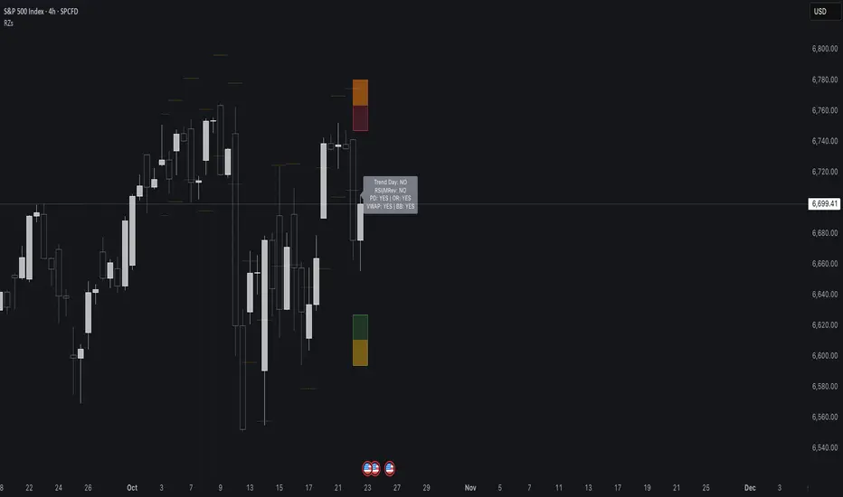
Reversal Zones// This indicator identifies likely reversal zones above and below current price by aggregating multiple technical signals: // • Prior Day High/Low // • Opening Range (9:30–10:00) // • VWAP ±2 standard deviations // • 60‑minute Bollinger Bands // It draws shaded boxes for each base level, then computes a single upper/lower reversal zone (closest level from combined signals), // with configurable zone width based on the expected move (EM). Within those reversal zones, it highlights an inner “strike zone” // (percentage of the box) to suggest optimal short-option strikes for credit spreads or iron condors. // Additional features: // • Optional Expected Move lines from the RTH open // • 15‑minute RSI/Mean‑Reversion and Trend‑Day confluence flags displayed in a dashboard // • Toggles to include/exclude each signal and adjust styling // How to use: // 1. Adjust inputs to select which levels to include and set the expected move parameters. // 2. Reversal boxes (red above, green below) show zones where price is most likely to reverse. // 3. Inner strike zones (darker shading) guide optimal short-strike placement. // 4. Dashboard confirms whether mean-reversion or trend-day conditions are active. // Customize colors and visibility in the settings panel. Enjoy disciplined, confluence-based trade entries!Indicatore Pine Script®di shyTortoise8434130
Institutional Rolling VWAPs • 3 lines + editable σ bands3 rolling vwaps, time stamped, same on htf and lft for high level executionIndicatore Pine Script®di HTK2326
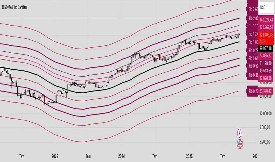
365 DMA Based Multiplier Fibonacci BandsBitcoin Chart 365 DMA Based Fibonacci 1.0 = Long term trend Fibonacci 0.5/0.618 = Long term support Fibonacci 1.618 = Mid term target Fibonacci 2.618 = Long term targetIndicatore Pine Script®di EyeDoctor1136
Bollinger Bands CROW LUCIUS LIBERTASCloser play to the master algo to rebalance the marketIndicatore Pine Script®di enumaelis10
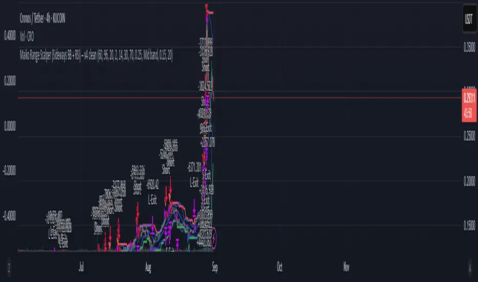
Maiko Range Scalper (Sideways BB + RSI) – v4 cleanPurpose It’s a range scalping strategy for crypto. It tries to take small, repeatable trades inside a sideways market: buy near the bottom of the range, sell near the middle/top (and the reverse for shorts). Core idea (two timeframes) Define the trading range on a higher timeframe (HTF) You choose the HTF (e.g., 15m or 1h). The script finds the highest high and lowest low over a lookback window (e.g., last 96 HTF candles) → these become HTF Resistance and HTF Support. It also calculates the midline (average of support/resistance). Trade signals on your lower timeframe (LTF) You run the strategy on a fast chart (e.g., 1m or 5m). Entries are only allowed inside the HTF range. Entry logic (mean reversion) Indicators on the LTF: Bollinger Bands (length & std dev configurable). RSI (length & thresholds configurable). Optional VWAP proximity filter (price must be within X% of VWAP). Long setup: Price touches/under-cuts the lower Bollinger band AND RSI ≤ threshold (default 30) AND price is inside the HTF range (and passes VWAP filter if enabled). Short setup: Price touches/exceeds the upper Bollinger band AND RSI ≥ threshold (default 70) AND price is inside the HTF range (and passes VWAP filter if enabled). Exits and risk Stop-loss: placed just outside the HTF range with a configurable buffer %: Long SL = HTF Support × (1 − buffer). Short SL = HTF Resistance × (1 + buffer). Take-profit (selectable): Mid band (the Bollinger basis) → conservative, faster exits. Opposite band / HTF boundary → more aggressive, higher RR but more give-backs. Position sizing A simple cap: maximum position size = percent of account equity (e.g., 20%). The script calculates quantity from that cap and current price. Plots you’ll see on the chart HTF Resistance (red) and HTF Support (green) via plot(). HTF Midline (gray dashed) drawn with a line.new() object (because plot() cannot do dashed). Bollinger basis/upper/lower on the LTF. Optional VWAP line (only shown if you enable the filter). Signal markers (green triangle up for Long setups, red triangle down for Short setups). Alerts Two alertconditions: “Long Setup” – when a long entry condition appears. “Short Setup” – when a short entry condition appears. Create alerts from these to get notified in real time. How to use it (quick start) Add to a 1m or 5m chart of a liquid coin (BTC, ETH, SOL). Set HTF timeframe (start with 1h) and lookback (e.g., 96 = ~4 days on 1h). Keep default Bollinger/RSI first; tune later. Choose TP mode: “Mid band” for quick scalps. “Opposite band/Range” if the range is very clean and you want bigger targets. Set SL buffer (0.15–0.30% is common; adjust for volatility). Set Max position % to control size (e.g., 20%). (Optional) Enable VWAP filter to skip stretched moves. When it works best Clearly sideways markets with visible support/resistance on the HTF. High-liquidity pairs where spreads/fees are small relative to your scalp target. Limitations & safety notes True breakouts will invalidate mean-reversion logic—your SL outside the range is there to cut losses fast. Fees can eat into small scalps—prefer limit orders, rebates, and liquid pairs. Backtest results vary by exchange data; always forward-test on small size. If you want, I can: Add an ATR-based stop/target option. Provide a study-only version (signals/alerts, no trading engine). Pre-set risk to your €5,000 plan (e.g., ~0.5% max loss/trade) with calculated qty.Strategia Pine Script®di MaikoWillemsen18
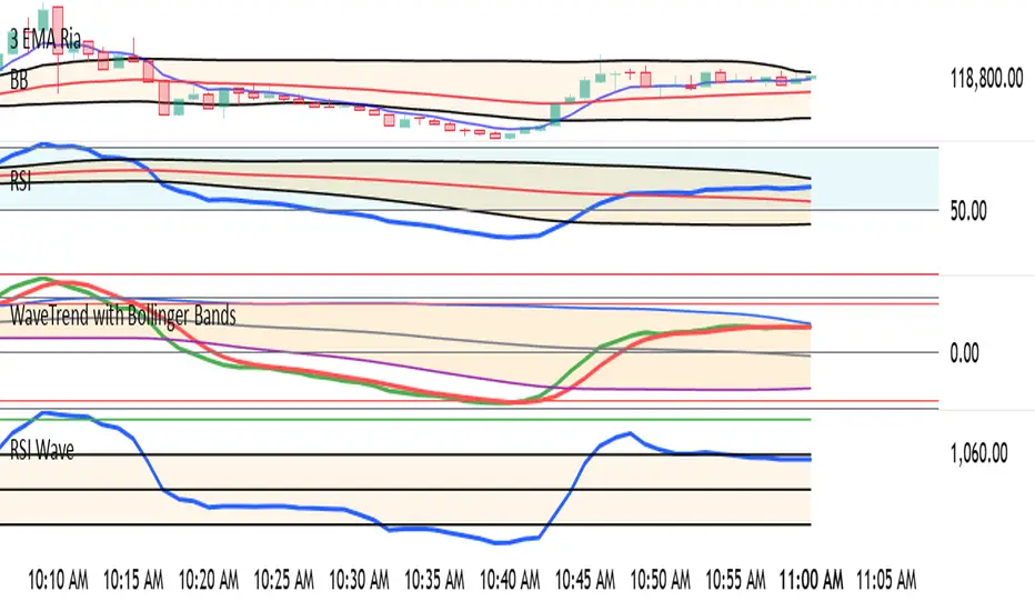
WaveTrend with Bollinger BandsPlots TTM Squeeze momentum histogram (green/red). Plots RSI (blue) in the same pane. Shows squeeze dots and RSI overbought/oversold lines.Indicatore Pine Script®di Ria_Indicators668
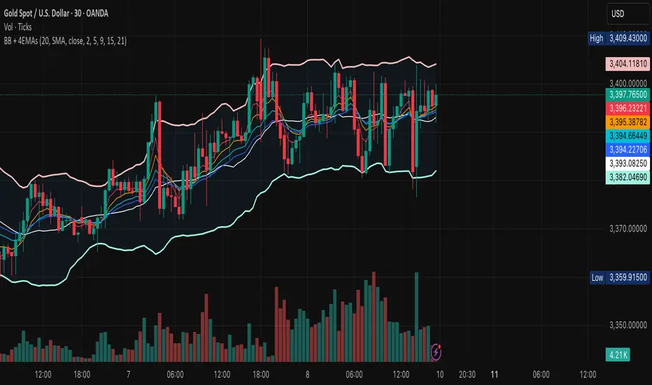
BB + 4 EMAsCustom Bollinger Bands with 4EMAs of your choice. All added in one indicator. Look Before You Leap!Indicatore Pine Script®di syedsaifalicpa9
4 EMAs + BB4 custom EMAs of your choice and the Bollinger Bands in one indicatorIndicatore Pine Script®di syedsaifalicpaAggiornato 2
Keltner Channel Based Grid Strategy # KC Grid Strategy - Keltner Channel Based Grid Trading System ## Strategy Overview KC Grid Strategy is an innovative grid trading system that combines the power of Keltner Channels with dynamic position sizing to create a mean-reversion trading approach. This strategy automatically adjusts position sizes based on price deviation from the Keltner Channel center line, implementing a systematic grid-based approach that capitalizes on market volatility and price oscillations. ## Core Principles ### Keltner Channel Foundation The strategy builds upon the Keltner Channel indicator, which consists of: - **Center Line**: Moving average (EMA or SMA) of the price - **Upper Band**: Center line + (ATR/TR/Range × Multiplier) - **Lower Band**: Center line - (ATR/TR/Range × Multiplier) ### Grid Trading Logic The strategy implements a sophisticated grid system where: 1. **Position Direction**: Inversely correlated to price position within the channel - When price is above center line → Short positions - When price is below center line → Long positions 2. **Position Size**: Proportional to distance from center line - Greater deviation = Larger position size 3. **Grid Activation**: Positions are adjusted only when the difference exceeds a predefined grid threshold ### Mathematical Foundation The core calculation uses the KC Rate formula: ``` kcRate = (close - ma) / bandWidth targetPosition = kcRate × maxAmount × (-1) ``` This creates a mean-reversion system where positions increase as price moves further from the mean, expecting eventual return to equilibrium. ## Parameter Guide ### Time Range Settings - **Start Date**: Beginning of strategy execution period - **End Date**: End of strategy execution period ### Core Parameters 1. **Number of Grids (NumGrid)**: Default 12 - Controls grid sensitivity and position adjustment frequency - Higher values = More frequent but smaller adjustments - Lower values = Less frequent but larger adjustments 2. **Length**: Default 10 - Period for moving average and volatility calculations - Shorter periods = More responsive to recent price action - Longer periods = Smoother, less noisy signals 3. **Grid Coefficient (kcRateMult)**: Default 1.33 - Multiplier for channel width calculation - Higher values = Wider channels, less frequent trades - Lower values = Narrower channels, more frequent trades 4. **Source**: Default Close - Price source for calculations (Close, Open, High, Low, etc.) - Close price typically provides most reliable signals 5. **Use Exponential MA**: Default True - True = Uses EMA (more responsive to recent prices) - False = Uses SMA (equal weight to all periods) 6. **Bands Style**: Default "Average True Range" - **Average True Range**: Smoothed volatility measure (recommended) - **True Range**: Current bar's volatility only - **Range**: Simple high-low difference ## How to Use ### Setup Instructions 1. **Apply to Chart**: Add the strategy to your desired timeframe and instrument 2. **Configure Parameters**: Adjust settings based on market characteristics: - Volatile markets: Increase Grid Coefficient, reduce Number of Grids - Stable markets: Decrease Grid Coefficient, increase Number of Grids 3. **Set Time Range**: Define your backtesting or live trading period 4. **Monitor Performance**: Watch strategy performance metrics and adjust as needed ### Optimal Market Conditions - **Range-bound markets**: Strategy performs best in sideways trending markets - **High volatility**: Benefits from frequent price oscillations around the mean - **Liquid instruments**: Ensures efficient order execution and minimal slippage ### Position Management The strategy automatically: - Calculates optimal position sizes based on account equity - Adjusts positions incrementally as price moves through grid levels - Maintains risk control through maximum position limits - Executes trades only during specified time periods ## Risk Warnings ### ⚠️ Important Risk Considerations 1. **Trending Market Risk**: - Strategy may underperform or generate losses in strong trending markets - Mean-reversion assumption may fail during sustained directional moves - Consider market regime analysis before deployment 2. **Leverage and Position Size Risk**: - Strategy uses pyramiding (up to 20 positions) - Large positions may accumulate during extended moves - Monitor account equity and margin requirements closely 3. **Volatility Risk**: - Sudden volatility spikes may trigger multiple rapid position adjustments - Consider volatility filters during high-impact news events - Backtest across different volatility regimes 4. **Execution Risk**: - Strategy calculates on every tick (calc_on_every_tick = true) - May generate frequent orders in volatile conditions - Ensure adequate execution infrastructure and consider transaction costs 5. **Parameter Sensitivity**: - Performance highly dependent on parameter optimization - Over-optimization may lead to curve-fitting - Regular parameter review and adjustment may be necessary ## Suitable Scenarios ### Ideal Market Conditions - **Sideways/Range-bound markets**: Primary use case - **Mean-reverting instruments**: Forex pairs, some commodities - **Stable volatility environments**: Consistent ATR patterns - **Liquid markets**: Major currency pairs, popular stocks/indices ## Important Notes ### Strategy Limitations 1. **No Stop Loss**: Strategy relies on mean reversion without traditional stop losses 2. **Capital Requirements**: Requires sufficient capital for grid-based position sizing 3. **Market Regime Dependency**: Performance varies significantly across different market conditions ## Disclaimer This strategy is provided for educational and research purposes only. Past performance does not guarantee future results. Trading involves substantial risk of loss and is not suitable for all investors. Users should thoroughly test the strategy and understand its mechanics before risking real capital. The author assumes no responsibility for trading losses incurred through the use of this strategy. --- # KC网格策略 - 基于肯特纳通道的网格交易系统 ## 策略概述 KC网格策略是一个创新的网格交易系统,它将肯特纳通道的力量与动态仓位调整相结合,创建了一个均值回归交易方法。该策略根据价格偏离肯特纳通道中心线的程度自动调整仓位大小,实施系统化的网格方法,利用市场波动和价格振荡获利。 ## 核心原理 ### 肯特纳通道基础 该策略建立在肯特纳通道指标之上,包含: - **中心线**: 价格的移动平均线(EMA或SMA) - **上轨**: 中心线 + (ATR/TR/Range × 乘数) - **下轨**: 中心线 - (ATR/TR/Range × 乘数) ### 网格交易逻辑 该策略实施复杂的网格系统: 1. **仓位方向**: 与价格在通道中的位置呈反向关系 - 当价格高于中心线时 → 空头仓位 - 当价格低于中心线时 → 多头仓位 2. **仓位大小**: 与距离中心线的距离成正比 - 偏离越大 = 仓位越大 3. **网格激活**: 只有当差异超过预定义的网格阈值时才调整仓位 ### 数学基础 核心计算使用KC比率公式: ``` kcRate = (close - ma) / bandWidth targetPosition = kcRate × maxAmount × (-1) ``` 这创建了一个均值回归系统,当价格偏离均值越远时仓位越大,期望最终回归均衡。 ## 参数说明 ### 时间范围设置 - **开始日期**: 策略执行期间的开始时间 - **结束日期**: 策略执行期间的结束时间 ### 核心参数 1. **网格数量 (NumGrid)**: 默认12 - 控制网格敏感度和仓位调整频率 - 较高值 = 更频繁但较小的调整 - 较低值 = 较少频繁但较大的调整 2. **长度**: 默认10 - 移动平均线和波动率计算的周期 - 较短周期 = 对近期价格行为更敏感 - 较长周期 = 更平滑,噪音更少的信号 3. **网格系数 (kcRateMult)**: 默认1.33 - 通道宽度计算的乘数 - 较高值 = 更宽的通道,较少频繁的交易 - 较低值 = 更窄的通道,更频繁的交易 4. **数据源**: 默认收盘价 - 计算的价格来源(收盘价、开盘价、最高价、最低价等) - 收盘价通常提供最可靠的信号 5. **使用指数移动平均**: 默认True - True = 使用EMA(对近期价格更敏感) - False = 使用SMA(对所有周期等权重) 6. **通道样式**: 默认"平均真实范围" - **平均真实范围**: 平滑的波动率测量(推荐) - **真实范围**: 仅当前K线的波动率 - **范围**: 简单的高低价差 ## 使用方法 ### 设置说明 1. **应用到图表**: 将策略添加到您所需的时间框架和交易品种 2. **配置参数**: 根据市场特征调整设置: - 波动市场:增加网格系数,减少网格数量 - 稳定市场:减少网格系数,增加网格数量 3. **设置时间范围**: 定义您的回测或实盘交易期间 4. **监控表现**: 观察策略表现指标并根据需要调整 ### 最佳市场条件 - **区间震荡市场**: 策略在横盘趋势市场中表现最佳 - **高波动性**: 受益于围绕均值的频繁价格振荡 - **流动性强的品种**: 确保高效的订单执行和最小滑点 ### 仓位管理 策略自动: - 根据账户权益计算最优仓位大小 - 随着价格在网格水平移动逐步调整仓位 - 通过最大仓位限制维持风险控制 - 仅在指定时间段内执行交易 ## 风险警示 ### ⚠️ 重要风险考虑 1. **趋势市场风险**: - 策略在强趋势市场中可能表现不佳或产生损失 - 在持续方向性移动期间均值回归假设可能失效 - 部署前考虑市场制度分析 2. **杠杆和仓位大小风险**: - 策略使用金字塔加仓(最多20个仓位) - 在延长移动期间可能积累大仓位 - 密切监控账户权益和保证金要求 3. **波动性风险**: - 突然的波动性激增可能触发多次快速仓位调整 - 在高影响新闻事件期间考虑波动性过滤器 - 在不同波动性制度下进行回测 4. **执行风险**: - 策略在每个tick上计算(calc_on_every_tick = true) - 在波动条件下可能产生频繁订单 - 确保充足的执行基础设施并考虑交易成本 5. **参数敏感性**: - 表现高度依赖于参数优化 - 过度优化可能导致曲线拟合 - 可能需要定期参数审查和调整 ## 适用场景 ### 理想市场条件 - **横盘/区间震荡市场**: 主要用例 - **均值回归品种**: 外汇对,某些商品 - **稳定波动性环境**: 一致的ATR模式 - **流动性市场**: 主要货币对,热门股票/指数 ## 注意事项 ### 策略限制 1. **无止损**: 策略依赖均值回归而无传统止损 2. **资金要求**: 需要充足资金进行基于网格的仓位调整 3. **市场制度依赖性**: 在不同市场条件下表现差异显著 ## 免责声明 该策略仅供教育和研究目的。过往表现不保证未来结果。交易涉及重大损失风险,并非适合所有投资者。用户应在投入真实资金前彻底测试策略并理解其机制。作者对使用此策略产生的交易损失不承担任何责任。 --- **Strategy Version**: Pine Script v6 **Author**: Signal2Trade **Last Updated**: 2025-8-9 **License**: Open Source (Mozilla Public License 2.0)Strategia Pine Script®di signal2trade57
AUD/USD 1-Min Scalping Strategy with LabelsHere’s a complete TradingView Pine Script v5 for the 1-minute AUD/USD scalping strategy we just discussed. This strategy uses: EMA 13 and EMA 26 for trend filtering Bollinger Bands for volatility extremes RSI (4) for momentum confirmationStrategia Pine Script®di Borderrrr946
Double Bollinger Bands - SF2000twin BB's. One bb can be set for , eg 20 period. The other set for - eg - 50 period. compare the channels.Indicatore Pine Script®di strangefish20004
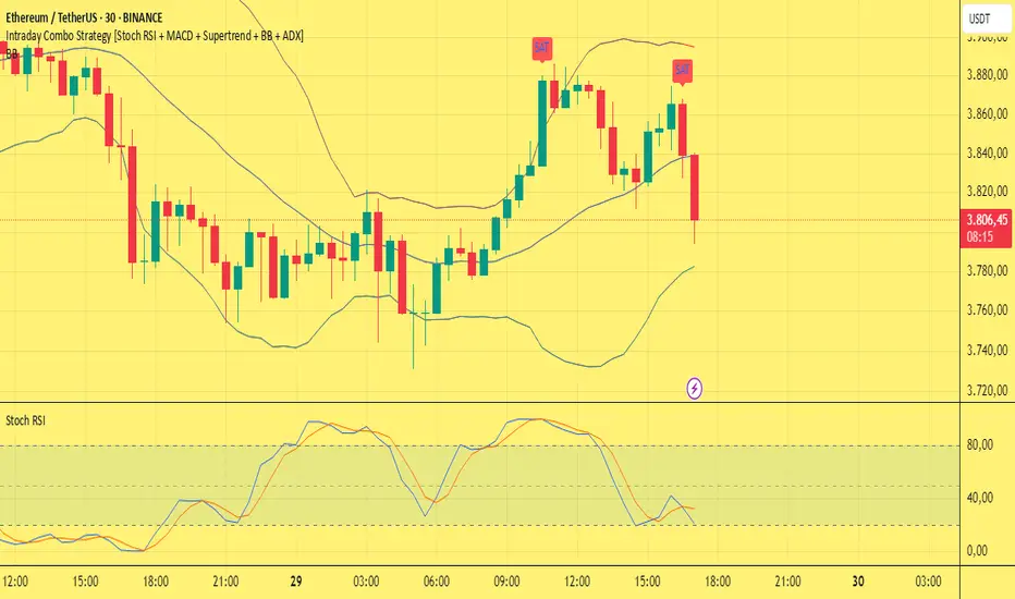
Intraday Combo Strategy HHStochastic RSI Momentum/Reversal quickly identifies overbought/oversold zones MACD Momentum/Trend confirms a trend reversal, a late but powerful signal Supertrend Trend Tracking provides clear and concise buy/sell signals Bollinger Bands Volatility shows price deviation during breakouts/squeezes ADX Trend Strength measures trend strength to filter out false signalsStrategia Pine Script®di hhavsar66
AWR_8DLRC1. Overview and Objective The AWR_8DLRC indicator is designed to display multiple dynamic channels directly on your chart (with the overlay enabled). It creates dynamic envelopes based on a regression-like approach combined with a volatility measure derived from the root mean square error (RMSE). These channels can help identify support and resistance areas, overbought/oversold conditions, or even potential trend reversals by providing several layers of analysis using different multipliers and timeframes. 2. Input Parameters Source and Multiplier The indicator uses the closing price (close) as its default data source. A floating-point parameter mult (default value: 3.0) is available. This multiplier is primarily used for channel 5, while other channels employ fixed multipliers (1, 2, or 3) to generate different sensitivity levels. Channel Lengths Several channels are calculated with distinct lookback lengths: Channel 5: Uses a length of 1000 periods (its plot is commented out in the code, so it is not displayed by default). Channel 6: Uses a length of 2000 periods. Channel 7: Uses a length of 3000 periods. Channel 8: Uses a length of 4000 periods. Custom Colors and Transparencies Each channel (or group of channels) can be customized with specific colors and transparency settings. For example, channel 6 uses a light yellow tone, channel 7 is red, and channel 8 is white. Additionally, specific fill colors are defined for the shaded areas between the upper and lower lines of some channels, enhancing visual clarity. 3. Channel Calculation Mechanism At the heart of the indicator is the function f_calcChannel(), which takes as input: A data source (_src), A period (_length), and A multiplier (_mult). The calculation process comprises several key steps: Moving Averages Calculation The function computes both a weighted moving average (WMA) and a simple moving average (SMA) over the defined length. Baseline Determination It then combines these averages into two values (A and B) using linear formulas (e.g., A = 4*b - 3*a and B = 3*a - 2*b). These values help to establish a baseline that represents the central trend during the lookback period. Slope and Deviation Calculation A slope (m) is calculated based on the difference between A and B. The function iterates over the period, measuring the squared deviation between the actual data point and a corresponding value on the regression line. The sum of these squared deviations is used to compute the RMSE. Defining Upper and Lower Bounds The RMSE is multiplied by the provided multiplier (_mult) and then added to or subtracted from the baseline B to create the upper and lower channel boundaries. This method produces an envelope that widens or narrows based on the volatility reflected by the RMSE. This process is repeated using different multipliers (1, 2, and 3) for channels 6, 7, and 8, providing multiple levels that offer deeper insights into market conditions. 4. Chart Visualization The indicator plots several lines and shaded regions: Channels 6, 7, and 8: For each of these channels, three levels are calculated: Levels with a multiplier of 1 (thin lines with a line width of 1), Levels with a multiplier of 2 (medium lines with a line width of 2), Levels with a multiplier of 3 (thick lines with a line width of 4). To further enhance visual interpretation, shaded areas (fills) are added between the upper and lower lines — notably for the level with multiplier 3. Channel 5: Although the calculations for channel 5 are included, its plot commands are commented out. This means it won’t display on the chart unless you uncomment the relevant lines by modifying the script. 5. Conditions and Alerts Beyond the visual channels, the indicator integrates several alert conditions and visual markers: Graphical Conditions: The script defines conditions checking whether the price (i.e., the source) is above or below specific channel levels, particularly the levels calculated with multipliers 2 and 3. “Mixed” conditions are also established to detect when the price is simultaneously above one set of levels and below another, aiming to highlight potential reversal areas. Automated Alerts: Alert conditions are programmed to notify you when the price crosses specific channel boundaries: Alerts for conditions such as “Upper Channels 2” or “Lower Channels 2” indicate when prices exceed or fall below the second level of the channels. Similarly, alerts for “Upper Channels 3” and “Lower Channels 3” correspond to the more extreme boundaries defined by the multiplier of 3. Visual Symbols: The indicator employs the plotchar() function to place symbols (like 🌙, ⚠️, 🪐, and ☢️) directly on the chart. These symbols make it easy to spot when the price meets these crucial levels. These alert features are especially valuable for traders who rely on real-time notifications to adjust positions or watch for potential trend shifts. 6. How to Use the Indicator Installation and Setup: Copy the provided code into your Pine Script editor on your charting platform (e.g., TradingView) and add the indicator to your chart. Customize the parameters according to your trading strategy: Channel Lengths: Modify the lookback periods to see how the envelope adapts. Colors and Transparencies: Adjust these to fit your display preferences. Multipliers: Experiment with the multipliers to observe how different settings affect the channel widths. Interpreting the Channels: The upper and lower bands represent dynamic thresholds that change with market volatility. A price that nears an upper boundary might indicate an overextended move upward, whereas a break beyond these dynamic boundaries could signal a potential trend reversal. Utilizing Alerts: Configure notifications based on the alert conditions so you can be alerted when the price moves beyond the defined channel levels. This can help trigger entry or exit signals, or simply keep you informed of significant price movements. Multi-Level Analysis: The strength of this indicator lies in its multi-level approach. With three defined levels for channels 6, 7, and 8, you gain a more nuanced view of market volatility and trend strength. For instance, a price crossing the level with a multiplier of 2 might indicate the start of a trend change, while a break of the level with multiplier 3 might confirm a strong trend movement. 7. In Summary The AWR_8DLRC indicator is a comprehensive tool for drawing dynamic channels based on a regression and RMSE-driven volatility measure. It offers: Multiple channel levels, each with different lookback periods and multipliers. Shaded regions between channel boundaries for rapid visual interpretation. Alert conditions to notify you immediately when the price hits critical levels. Visual markers directly on the chart to highlight key moments of price action. This indicator is particularly suited for technical traders seeking to dynamically identify support and resistance zones with a responsive alert system. Its customizable settings and rich array of signals provide an excellent framework to refine your trading decisions.Indicatore Pine Script®di AlwwAl26