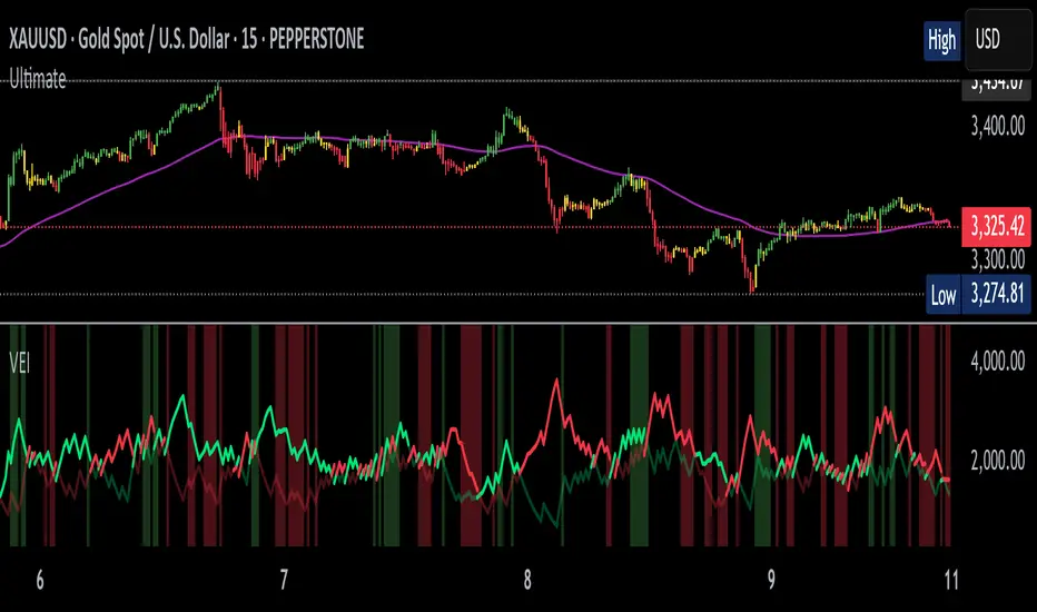
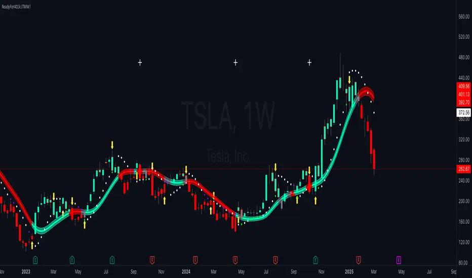
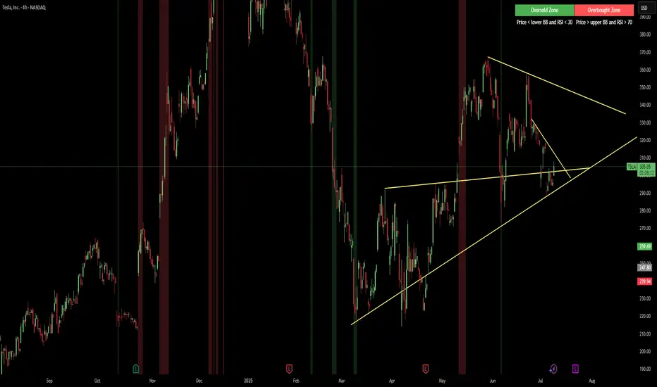
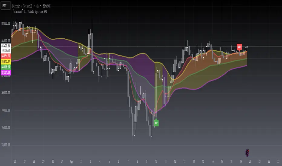
RAINBOW AVERAGES - INDICATOR - (AS) - 1/3
-INTRODUCTION:
This is the first of three scripts I intend to publish using rainbow indicators. This script serves as a groundwork for the other two. It is a RAINBOW MOVING AVERAGES indicator primarily designed for trend detection. The upcoming script will also be an indicator but with overlay=false (below the chart, not on it) and will utilize RAINBOW BANDS and RAINBOW OSCILLATOR. The third script will be a strategy combining all of them.
RAINBOW moving averages can be used in various ways, but this script is mainly intended for trend analysis. It is meant to be used with overlay=true, but if the user wishes, it can be viewed below the chart. To achieve this, you need to change the code from overlay=true to false and turn off the first switch that plots the rainbow on the chart (or simply move the indicator to a new pane below). By doing this, you will be able to see how all four conditions used to detect trends work on the chart. But let's not get ahead of ourselves.
-WHAT IS IT:
In its simplest form, this indicator uses 10 moving averages colored like a rainbow. The calculation is as follows:
MA0: This is the main moving average and can be defined with the type (SMA, EMA, RMA, WMA, SINE), length, and price source. However, the second moving average (MA1) is calculated using MA0 as its source, MA2 uses MA1 as the data source, and so on, until the last one, MA9. Hence, there are 10 moving averages. The first moving average is special as all the others derive from it. This indicator has many potential uses, such as entry/exit signals, volatility indication, and stop-loss placement, but for now, we will focus on trend detection.
-TREND DETECTION:
The indicator offers four different background color options based on the user's preference:
0-NONE: No background color is applied as no trend detection tools is being used (boring)
1-CHANGE: The background color is determined by summing the changes of all 10 moving averages (from two bars). If the sum is positive and not falling, the background color is GREEN. If the sum is negative and not rising, the background color is RED. From early testing, it works well for the beginning of a movement but not so much for a lasting trend.
2-RAINBW: The background color is green when all the moving averages are in ascending order, indicating a bullish trend. It is red when all the moving averages are in descending order, indicating a bearish trend. For example, if MA1>MA2>MA3>MA4..., the background color is green. If MA1 threshold, and red indicates width < -threshold.
4-DIRECT: The background color is determined by counting the number of moving averages that are either above or below the input source. If the specified number of moving averages is above the source, the background color is green. If the specified number of moving averages is below the source, the background color is red. If all ten MAs are below the price source, the indicator will show 10, and if all ten MAs are above, it will show -10. The specific value will be set later in the settings (same for 3-TSHOLD variant). This method works well for lasting trends.
Note: If the indicator is turned into a below-chart version, all four color options can be seen as separate indicators.
-PARAMETERS - SETTINGS:
The first line is an on/off switch to plot the skittles indicator (and some info in the tooltip). The second line has already been discussed, which is the background color and the selection of the source (only used for MA0!).
The line "MA1: TYP/LEN" is where we define the parameters of MA0 (important). We choose from the types of moving averages (SMA, EMA, RMA, WMA, SINE) and set the length.
Important Note: It says MA1, but it should be MA0!.
The next line defines whether we want to smooth MA1 (which is actually MA0) and the period for smoothing. When smoothing is turned on, MA0 will be smoothed using a 3-pole super smoother. It's worth noting that although this only applies to MA0, as the other MAs are derived from it, they will also be smoothed.
In the line below, we define the type and length of MAs for MA2 (and other MAs except MA0). The same type and length are used for MA1 to MA9. It's important to remember that these values should be smaller. For example, if we set 55, it means that MA1 is the average of 55 periods of MA0, MA2 will be 55 periods of MA1, and so on. I encourage trying different combinations of MA types as it can be easily adjusted for ur type of trading. RMA looks quirky.
Moving on to the last line, we define some inputs for the background color:
TSH: The threshold value when using 3-TSHOLD-BGC. It's a good idea to change the chart to a pane below for easier adjustment. The default values are based on EURUSD-5M.
BG_DIR: The value that must be crossed or equal to the MA score if using 4-DIRECT-BGC. There are 10 MAs, so the maximum value is also 10. For example, if you set it to 9, it means that at least 9 MAs must be below/above the price for the script to detect a trend. Higher values are recommended as most of the time, this indicator oscillates either around the maximum or minimum value.
-SUMMARY OF SETTINGS:
L1 - PLOT MAs and general info tooltip
L2 - Select the source for MA0 and type of trend detection.
L3 - Set the type and length of MA0 (important).
L4 - Turn smoothing on/off for MA0 and set the period for super smoothing.
L5 - Set the type and length for the rest of the MAs.
L6 - Set values if using 4-DIRECT or 3-TSHOLD for the trend detection.
-OTHERS:
To see trend indicators, you need to turn off the plotting of MAs (first line), and then choose the variant you want for the background color. This will plot it on the chart below.
Keep in mind that M1 int settings stands for MA0 and MA2 for all of the 9 MAs left.
Yes, it may seem more complicated than it actually is. In a nutshell, these are 10 MAs, and each one after MA0 uses the previous one as its source. Plus few conditions for range detection. rest is mainly plots and colors.
There are tooltips to help you with the parameters.
I hope this will be useful to someone. If you have any ideas, feedback, or spot errors in the code, LET ME KNOW.
Stay tuned for the remaining two scripts using skittles indicators and check out my other scripts.
-ALSO:
I'm always looking for ideas for interesting indicators and strategies that I could code, so if you don't know Pinescript, just message me, and I would be glad to write your own indicator/strategy for free, obviously.
-----May the force of the market be with you, and until we meet again,
Cerca negli script per "bands"
Dynamic Trend RipperThe "Dynamic Trend Ripper" indicator is designed to identify dynamic support and resistance levels based on exponential moving averages (EMA) and the average true range (ATR). It aims to assist traders in identifying potential trading opportunities by visualizing dynamic support and resistance areas on the price chart. Think of it as more of overbought or oversold areas then true support and resistance,
The indicator calculates two sets of EMAs: two for the top cloud and two for the bottom cloud. The lengths of these EMAs are determined by user-defined input parameters. Additionally, the indicator uses the ATR to adjust the EMAs, enhancing their effectiveness as dynamic support and resistance levels.
The top cloud is formed by adding the ATR to the top fast EMA and subtracting the ATR from the top slow EMA. The bottom cloud is formed by subtracting the ATR from the bottom fast EMA and adding the ATR to the bottom slow EMA.
The indicator plots the dynamic OB (Overbought) level, which is the top fast EMA plus the ATR multiplied by the OBOS multiplier. It also plots the dynamic OS (Oversold) level, which is the top slow EMA minus the ATR multiplied by the OBOS multiplier. These levels are visualized using colored lines on the chart.
The top fast EMA, top slow EMA, bottom fast EMA, and bottom slow EMA are also plotted on the chart. The area between the top slow EMA and top fast EMA is filled with a color, forming the top cloud. The area between the bottom fast EMA and bottom slow EMA is filled with another color, forming the bottom cloud. The color of the clouds changes based on the relationship between the top fast EMA and top slow EMA. If the Regular Fast EMA is greater than the Regular slow EMA, indicating a bullish trend, the clouds are displayed in green. Otherwise, if the top fast EMA is less than the top slow EMA, indicating a bearish trend, the clouds are displayed in red.
The indicator can be used to identify potential support and resistance zones where the price may encounter obstacles or reverse its direction. Traders can look for price interactions with the dynamic support and resistance levels, as well as the OB and OS levels, to make trading decisions. For example, a trader might consider entering a short trade when the price approaches the top cloud, or a long trade when the price bounces off the bottom cloud.
By incorporating the ATR, which measures volatility, the indicator adjusts the EMAs to adapt to changing market conditions. Traders can watch for price reactions or reversals near these levels to gauge potential overextension or exhaustion in the price movement. I'm not going to claim this as my own idea, but I will say that I came up with this version myself. I haven't seen anyone else take this approach which is why I think it can be revolutionary to trading.
EXTREME OVERBOUGHT/SOLD BANDS
ATR-ADJUSTED EMA'S
Anchored VWAP (Auto High & Low)OVERVIEW
This script plots, and auto-updates, 3 separate VWAPs: a traditional VWAP, a VWAP anchored to a trends high, and another anchored to a trends low.
VWAP and Anchored VWAPs are commonly used by institutions responsible for the majority of market volume on a given day. Citadel Trading, for example, accounts for approximately 35% of all U.S. listed retail volume , largely executed through program trades over the course of a day, week, or month.
Because VWAP is a prominent market maker tool for executing large trades, day traders can use it to better anticipate trends, mean reversion, and breakouts.
This is most useful on charts with intraday time frames (1 minute, 5 minute etc.) commonly used for day trading. This is not ideal for larger time frames (1 hour or greater) commonly used for swing trading or identifying larger trends.
INPUTS
You can configure:
The size, color, and visibility of 6 different plots (VWAP, High Anchor, Low Anchor, Average of Anchors, Quarter Values, Interim Bands)
How smooth the average displays
INSPIRATION
1. "How To Measure Anything" by Douglas W. Hubbard
2. "Maximum Trading Gains With Anchored VWAP" by Brian Shannon
Better understanding probability and how to analyze risk (first book), as well as the tools market makers use (second book), has completely reframed how I approach day trading.
Machine Learning : Torben's Moving Median KNN BandsWhat is Median Filtering ?
Median filtering is a non-linear digital filtering technique, often used to remove noise from an image or signal. Such noise reduction is a typical pre-processing step to improve the results of later processing (for example, edge detection on an image). Median filtering is very widely used in digital image processing because, under certain conditions, it preserves edges while removing noise (but see the discussion below), also having applications in signal processing.
The main idea of the median filter is to run through the signal entry by entry, replacing each entry with the median of neighboring entries. The pattern of neighbors is called the "window", which slides, entry by entry, over the entire signal. For one-dimensional signals, the most obvious window is just the first few preceding and following entries, whereas for two-dimensional (or higher-dimensional) data the window must include all entries within a given radius or ellipsoidal region (i.e. the median filter is not a separable filter).
The median filter works by taking the median of all the pixels in a neighborhood around the current pixel. The median is the middle value in a sorted list of numbers. This means that the median filter is not sensitive to the order of the pixels in the neighborhood, and it is not affected by outliers (very high or very low values).
The median filter is a very effective way to remove noise from images. It can remove both salt and pepper noise (random white and black pixels) and Gaussian noise (randomly distributed pixels with a Gaussian distribution). The median filter is also very good at preserving edges, which is why it is often used as a pre-processing step for edge detection.
However, the median filter can also blur images. This is because the median filter replaces each pixel with the value of the median of its neighbors. This can cause the edges of objects in the image to be smoothed out. The amount of blurring depends on the size of the window used by the median filter. A larger window will blur more than a smaller window.
The median filter is a very versatile tool that can be used for a variety of tasks in image processing. It is a good choice for removing noise and preserving edges, but it can also blur images. The best way to use the median filter is to experiment with different window sizes to find the setting that produces the desired results.
What is this Indicator ?
K-nearest neighbors (KNN) is a simple, non-parametric machine learning algorithm that can be used for both classification and regression tasks. The basic idea behind KNN is to find the K most similar data points to a new data point and then use the labels of those K data points to predict the label of the new data point.
Torben's moving median is a variation of the median filter that is used to remove noise from images. The median filter works by replacing each pixel in an image with the median of its neighbors. Torben's moving median works in a similar way, but it also averages the values of the neighbors. This helps to reduce the amount of blurring that can occur with the median filter.
KNN over Torben's moving median is a hybrid algorithm that combines the strengths of both KNN and Torben's moving median. KNN is able to learn the underlying distribution of the data, while Torben's moving median is able to remove noise from the data. This combination can lead to better performance than either algorithm on its own.
To implement KNN over Torben's moving median, we first need to choose a value for K. The value of K controls how many neighbors are used to predict the label of a new data point. A larger value of K will make the algorithm more robust to noise, but it will also make the algorithm less sensitive to local variations in the data.
Once we have chosen a value for K, we need to train the algorithm on a dataset of labeled data points. The training dataset will be used to learn the underlying distribution of the data.
Once the algorithm is trained, we can use it to predict the labels of new data points. To do this, we first need to find the K most similar data points to the new data point. We can then use the labels of those K data points to predict the label of the new data point.
KNN over Torben's moving median is a simple, yet powerful algorithm that can be used for a variety of tasks. It is particularly well-suited for tasks where the data is noisy or where the underlying distribution of the data is unknown.
Here are some of the advantages of using KNN over Torben's moving median:
KNN is able to learn the underlying distribution of the data.
KNN is robust to noise.
KNN is not sensitive to local variations in the data.
Here are some of the disadvantages of using KNN over Torben's moving median:
KNN can be computationally expensive for large datasets.
KNN can be sensitive to the choice of K.
KNN can be slow to train.
Linear Regression Channel (Log)The Linear Regression Channel (Log) indicator is a modified version of the Linear Regression channel available on TradingView. It is designed to be used on a logarithmic scale, providing a different perspective on price movements.
The indicator utilizes the concept of linear regression to visualize the overall price trend in a specific section of the chart. The central line represents the linear regression calculation, while the upper and lower lines indicate a certain number of standard deviations away from the central line. These bands serve as support and resistance levels, and when prices remain outside the channel for an extended period, a potential reversal may be anticipated.
I have replaced the Pearson values with trend strength levels to enhance understanding for individuals unfamiliar with Pearson correlation.
SMI Momentum Bollinger Squeeze Signals - TradeUIMomentum Bollinger Squeeze Signals - TradeUI
The Squeeze Momentum Indicator (SMI) uses the principles of the Squeeze Indicator, which is a volatility indicator, and combines them with a momentum calculation to provide a more comprehensive view of the market.
The original Squeeze Indicator uses the relationship between the Bollinger Bands and Keltner Channels to identify periods of low volatility, known as "Squeezes", and potential breakout points. The SMI takes this one step further by adding a momentum calculation, making it a more dynamic tool for trading.
The momentum calculation is based on the rate of change of the asset's price. When the price increases rapidly, it signifies positive momentum, and when the price decreases rapidly, it signifies negative momentum.
Realized PriceBitcoin Realized Price is a metric that determines the value of all bitcoins in circulation by dividing the total purchase price by the number of bitcoins. This provides traders with the average cost basis for all bitcoins in circulation, which is also known as Realized Price.
Unlike the current Market Price that reflects the current value of CRYPTOCAP:BTC , Realized Price shows the average purchase price of all bitcoins in circulation. It is essential to note that Realized Price values each UTXO based on the value when it last moved from one wallet to another, assuming that the movement represents the purchase of the bitcoins.
The significance of Bitcoin Realized Price lies in its ability to provide traders with an overall economic perspective of the Bitcoin market. When the CRYPTOCAP:BTC Market Price exceeds the Realized Price, the market participants are making a profit on average. Conversely, when the CRYPTOCAP:BTC Market Price is lower than the Realized Price, traders are incurring paper losses on average.
It's worth noting that Realized Price is a modification of Realized Cap, created in 2018 by Antoine Le Calvez.
In addition to BTC I have added LTC and ETH
NB!
Script is history data depended - use on charts with most history data
BTC -> BNC:BLX
ETH -> BITSTAMP:ETHUSD
LTC -> BITFINEX:LTCUSD
it plots realized price and its deviation - when price break out from these bands it explodes hard - near the realized price is good to accumulate the coin - it is fair price
Examples
BTC
ETH
LTC
BBPullback1.0.2This is a simple strategy script based on Bollinger Bands pullbacks.
The strategy is simple, as follows:
For LONGS: At the close of any candle, it check to see if this candle is an UP candle where the low broke below the lower Bollinger Band. If so, we call this the trigger candle. For the next bar, we issue a BUY signal if the price breaks above the high of the trigger candle. The stoploss is the low of the trigger candle. We take profit when the price goes above the middle Bollinger Band (the mean/average line).
For SHORTS: At the close of any candle, it check to see if this candle is an DOWN candle where the high broke above the upper Bollinger Band. If so, we call this the trigger candle. For the next bar, we issue a SELL signal if the price breaks below the low of the trigger candle. The stoploss is the high of the trigger candle. We take profit when the price goes below the middle Bollinger Band (the mean/average line).
Trend Bands [starlord_xrp]This indicator uses multiple trendlines to determine the overall trend and trend changes. It also highlights areas of potential pullbacks to entry.
Mora's Compression IndicatorIntroducing Mora's Price Compression indicator.
One of the biggest challenges in trading strategies is to differentiate between zones in which price is consolidated (so called squeezed) and zones of price expansion. Zones of consolidation can indicate traders' indecision or the creation of order blocks, but regardless of their mechanism, most indicators behave differently in those areas as oppose to times when price is trending.
A traditional indicator of consolidation zones is the so call Squeeze, which combines Bollinger Bands and Keltner’s Channels.. although broadly used, its interpretation is not quite straightforward.
Here a new indicator is introduced to identify areas of consolidation or expansion based on current and historical volatility.
Ultimately we know the price is consolidated (current volatility) when it starts raging within a narrower band that we are use to see (Historical volatility), so the ratio of the current to historical volatility becomes a straightforward identification of consolidation zones and that is what this indicator provides.
The indicator is scaled such that values near zero mean price is compressed and values near 100 price is over-extended. The indicators is designed to allow different time-frames, while avoiding repainting.
[Uhokang] Bollinger Band BB EMA SMMA SMA Multy timeframeYou can view indicators from the specified upper timeframe together.
( Bollinger Bands, SMMA, EMA, SMA )
If it is based on a 1-hour bar, you can see indicators for 4-hour bars and 1-day bars at the same time.
=> =>
Minutes
1 => 5 => 30
2 => 10 => 60
3 => 15 => 90
4 => 20 => 120
5 => 30 => 120
6 => 30 => 120
10 => 60 => 240
15 => 60 => 240
30 => 120 => 480
45 => 180 => 450
over Hours
1 => 4 => D
2 => 8 => 2D
3 => 12 => 3D
4 => D => W
D => W => M
W => M => Y
VWAP 3x Session Reset- This VWAP aims to be used with futures and forex.
- The VWAP is reset at the beginning of each session.
- 3 different sessions can be specified.
- The lines are not drawn when there is no active session.
- The upper and lower bands with standard deviation 2 are also drawn.
Info: The time zone of the picture is Europe/Berlin
Band Based Trend FilterSimilar to RelativeBandwidthFilter , this script is also a simple trend filter which can be used to define your trading zone.
🎲 Concept
On contrary to reversal mindset, we define trend when price hits either side of the band. If close price hits upper band then it is considered as bullish and if close price hits lower band, then it is considered bearish. Further, trend strength is measured in terms of how many times the price hits one side of the band without hitting other side. Hit is counted only if price has touched middle line in between the touches. This way price walks on the bands are considered as just one hit.
🎲 Settings
Settings are minimal and details can be found in the tooltips against each parameters
🎲 Usage
This can be used with your own strategy to filter your trading/non-trading zones based on trend . Script plots a variable called "Trend" - which is not shown on chart pane. But, it is available in the data window. This can be used in another script as external input and apply logic.
Trend values can be
1 : Allow only Long
-1 : Allow only short
0 : Do not allow any trades
ka66: Alpha-Configurable EMAAllows directly modifying the Alpha/Smoothing Factor parameter of an EMA. This can allow for very close fits to price movement, instead of the more standard coarse-grained approach of adjusting smoothing via the look-back period.
Furthermore, we allow smoothing this EMA further by passing the original EMA through the EMA function again, and the output of this, yet again, to as many smoothing iterations are desired. For efficiency and practicality, limited to 10 iterations. This is inspired by indicators such as the DEMA.
Finally, we allow producing bands, with a configurable multiplier, around the final EMA. Useful for dynamic S/R levels, e.g. to use as trailing stop zones.
Impulse Alerts - Riccardo Di GiacomoThis is the Impulse indicator that allows you to receive alerts in the case one of the following situation occurs:
1) Buy Setup
- Price above Exponential Moving Average 260
- Moving Average 21 above Exponential Moving Average 260
- Moving Average 9 above Moving Average 21
- RSI(14) above 50
- Stochastic equal or below 20
2) Sell Setup
- Price below Exponential Moving Average 260
- Moving Average 21 below Exponential Moving Average 260
- Moving Average 9 below Moving Average 21
- RSI(14) below 50
- Stochastic equal or above 80
The Bollinger Bands represents another useful information:
- If the price is near the upper band when the first situation occurs, it is another green light, otherwise be careful
- If the price is near the lower band when the second situation occurs, it is another green light, otherwise be careful
Oscillator ExtremesThe Oscillator Extremes indicator plots the normalized positioning of the selected oscillator versus the Bollinger Bands' upper and lower boundaries. Currently, this indicator has four different oscillators to choose from; RSI, CMO, CCI, and ROC.
When the oscillator pushes towards one extreme, it will bring the value of the prevailing line closer to zero. If the bullish or bearish line crosses the zero line, the oscillator is past the extreme of the Bollinger Band.
Example: If the RSI crosses over the upper boundary of the Bollinger, the bullish(green) line will cross under the zero line.
Crossovers of the bullish and bearish lines can indicate a shift in momentum and are a signal. Where the line crossing under, towards zero, is the prevailing trend. The plotted lines will highlight green(bullish) or red(bearish) to show the prevailing trend. This is similar to a DI+- crossover that is commonly associated with the ADX.
We have included an optional normalized ADX to help validate signals. The ADX will change color based on the slope of the ADX. Purple indicates a positive slope and white for a negative slope.
Enterprise Value on Earnings / FCF / FFO Band Enterprise Value per Diluted Share plotted as black line.
Bands start at 5x and stops at 30x, each represents a 5x increment.
Band Options (per Diluted Share, Fiscal Year):
①Free Cash Flow
②Operating Income
③Adjusted Funds from Operations
④Core Earnings
where:
AFfO = FFO - Unusual Income/Expenses + Tax Distortion (dafault 25% tax rate)
Core Earnings = Net Income - Unusual Income/Expenses + Tax Distortion (default 25% tax rate)
These two adjustments are coarse and watered-down, so take them with a grain of salt.
For professional assessments of Core Earnings versus GAAP Earnings you may go to David Trainer at Great Speculations(costs money). I am unaffiliated with these entities.
Tips:
①③ are unapplicable to financials.
③ may work for REIT-like companies whose depreciation is mostly overstated(e.g. hydro-elec utility companies whose dams typically don't wear out in ten years; companies with assets that APPRECIATE in reality but they D&A them anyway).
Probably none works for cyclicals, especially extreme boom-bust cyclicals such as oil, aluminum & shipping etc.
Beware unnaturally low (dividend_payout+buyback)/net_income ratio as some majority shareholders may funnel money to themselves/cronies at the expense of small shareholders.
Disclaimer: Use at your own discretion. No guarantees for any accuracy or usefulness. If you decide to use it, I take no responsibility whatsoever for any consequences. Does not constitute financial advice. Past performance is not Indicative of future results.
Fibonacci Bollinger Band ClusterThis indicator creates moving averages based on Fibonacci numbers (3-233, divided by 10 to average) sourced by high, low, and ohlc4 and plots lines based on these three. The Fib MA High line is either green or red (Fib High < Close), the Fib MA Low line is either lime or orange (Fib Low < Close), and the Fib MA OHLC4 line is constantly white. A cluster or series of Bollinger Bands is then created using the Fib MA OHLC4 line as the basis. Fibonacci-based deviations (1, 2, 3, 5, 8) are then used to create three upper and three lower Bollinger lines.
Colorful Channelwhat is "Colorful Channel"?
it is a overbought - oversold indicator.
what it does?
It fills the area between the upper band of the channel and the price line with green, the area between the lower band of the channel and the price line with red color and applies a transparency to these colors according to the distance of the price from the channel lines. thus allowing users to get an idea of ??the current value of the price.
how it does it?
subtracts the percentage of the price from the lower channel from the transparency ratio of the red color, and the percentage of the price from the upper band from the transparency ratio of the green color. thus, a different transparency value is obtained for each percentile. In addition, the transparency rate can be changed with a multiplier determined by the users.
how to use it?
In the "lenght" section, you select the number of bars that the indicator will base backwards on. For example, if length=100, the indicator determines the upper and lower bands according to the distances from the highest and lowest values ??within 100 bar. so the length part works like donchian channels.
You can change the transparency ratio of the colors in the "transp" section.
1 saat transp
yan trend
4 saat
QQE Student's T-Distribution Bollinger BandsCredit to all of the developers on this project (aka all of the places I got the code from lol) @eylwithsteph @storma @Fractured @lejmer @AlexGrover @Montyjus @Jiehonglim @StephXAGs @peacefulLizard50262 @gorx1 @above-c-level
This script utilizes @above-c-level 's Student's T-Distribution script to give us a great estimation of volatility. I took this idea and apply it to the QQE filter! That being said I have added a boat load of features as to make this script as useful to as many people as possible.
Included averages: 'TMA', 'ALMA', 'EMA', 'DEMA', 'TEMA', 'WMA', 'VWMA', 'SMA', 'SMMA', 'HMA', 'LSMA', 'JMA', 'VAMA', 'FRAMA', 'ZLEMA', 'KAMA', 'IDWMA', 'FLMSA', 'PEMA', 'HCF', 'TIF', 'MF', 'ARMA', 'DAF', 'WRMA', 'RMA', 'RAF', 'A2RMA', 'QQE 1', 'QQE 2','Centroid',"Harmonic Mean","Geometric Mean","Quadratic Mean","Median","Trimean","Midhinge","Midrange","VWAP"
Included Features: Smoothing, Additional Moving Average, Log Space, Mean Momentum via Derivative
Use this just like BB but instead (as long as you are on qqe) you get real prices that are stable! It also shows really valid support and resistance. Use this in combination with the osc version for more power.
Nadaraya-Watson Envelope Alternative [CHE] Super EnvelopeThe problem of the wonderfuls Nadaraya-Watson indicators is that they repainting, so I use a John Ehlers’ 2-pole Butterworth filter “Super Smoother”. With this indicator you are able to make adjustments to the length and using the multiplier out and thus to make the analysis as good as possible.
Settings:
smoothing length: Determines the length of the Super Envelope.
Adjustable multiplier: Multiplier for the bands
Show middle band: On and off center line
Hide Disclaimer: Uncheck to hide the disclaimer
Usage
This tool outlines extremes made by the prices within the selected window size. This is achieved by estimating the underlying trend in the price using Ehlers Super smoothing, calculating the mean absolute deviations from it, and adding/subtracting it from the estimated underlying trend.
We can expect the price to reverse when crossing one of the envelope extremities. Crosses between the price and the envelopes extremities are indicated with triangles on the chart.
I have integrated alerts for this indicator from the crosses between the price and the envelope extremities. However, i do not recommend this tool to be used alone or solely for real time applications.
best regards
Chervolino
Regression Fit Bollinger Bands [Spiritualhealer117]This indicator is best suited for mean reversion trading, shorting at the upper band and buying at the lower band, but it can be used in all the same ways as a standard bollinger band.
It differs from a normal bollinger band because it is centered around the linear regression line, as opposed to the moving average line, and uses the linear regression of the standard deviation as opposed to the standard deviation.
This script was an experiment with the new vertical gradient fill feature.
Asymmetric Dispersion High Lowdear fellows,
this indicator is an effort to determine the range where the prices are likely to fall within in the current candle.
how it is calculated
1. obtain
a. gain from the open to the high
b. loss from the open to the low
in the last 20 (by default) candles and
in the last 200 (10*20 by default) candles
2. perform
a. the geometric average (sma of the log returns) over these gains and losses
b. their respective standard deviation
3. plot from the open of each candle
a. the average + 2 standard deviations (2 by default) of the short window size
b. same for the long window size (which is overlapped)
what it shows
1. where the current candle is likely to move with 95% likelyhood
how it can be interpreted
1. a gauge for volatility in the short and long term
2. a visual inbalance between likelyhood to go up or down according to dispersion in relation to current prices or candle open.
3. a confirmation of crossings of, for instance, support and resistances once the cloud is completely above or below.
in regard to bollinger bands (which are and excellent well proven indicator)
1. it segregates upward moves from the downward ones.
2. it is hardly crossed by prices
3. it is centered on the current candle open, instead of the moving average.
we welcome feedback and critic.
best regards and success wishes.