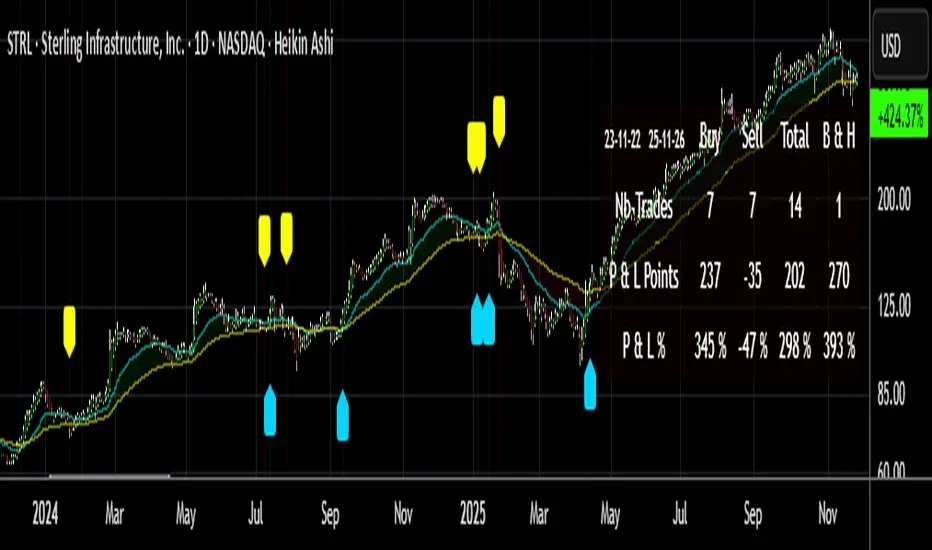
Hull Keltner ChannelThis script is a Keltner Channel that uses a Hull Moving Average as source, instead of the 20-period EMA.
A hull band improves on lag and smoothness to Simple and Exponential Moving Averages.
And ATR based envelop is generated from this improved MA to form the Keltner Channel.
Hull on EHMA source with 180 periods loopback, coupled with a 200 period loopback for the Keltner Channel and 2 and 6 standard deviations, are my fav settings on Bitcoin, but feel free to try new settings.
Use it as you would use a normal Keltner Channel or Bollinger Bands.
Cerca negli script per "bands"
SnakeBand█ Overview.
This indicator is based on a calculation method made using a ichimoku and Fibonacci.
There are two lines, the upper line is the upper limit and the lower line is the lower limit.
These upper and lower limits are drawn ahead of 26 candles, just like Ichimoku.
█ Role.
The characteristic of this indicator is that
When prices reach the upper limit, they usually hesitate or try to fall, and when they reach the lower limit, they usually rebound or hesitate.
In particular, it has an excellent effect on low-point purchases.
Of course, it is often not the case, so you have to observe the speed and movement of the decline carefully, and it can be more effective if applied with the Elliot wave or harmonic.
It can also be more effective if used with rsi or macd bowling bands.
█ Memo.
It applies to all four-hour bong, three-hour bong, one-bong, and main bong.
It is important to keep studying and observing. This can give you the ability to capture the upward transition after hitting the lower limit.
8EMA+BB-SubiProvides the facility to display 8 EMAs along with Bollinger Bands in the same indicator.
Status + BollingersThis combined indicator provides a concise view of the market's current state, volatility, and momentum using key technical metrics displayed on a central dashboard and overlaid on the price chart.
The Bollinger Bands consist of a 20-period Simple Moving Average (SMA) as the middle line, bounded by an upper and lower band (typically $2.0$ Standard Deviations).
Function: Measures volatility.
CRSI (RSI) Red ($>70$), Lime ($<30$) - Indicates Overbought (Red) or Oversold (Lime) pressure, signaling possible reversals.
ADX Orange ($>30$), Gray ($<20$) - Measures Trend Strength, regardless of direction. Orange means strong trend (ideal for trend following); Gray means weak/ranging market.
Volume Status "Bang" (Red) Safe (Green) - Compares current volume to the average. "Patladı" indicates a significant volume spike (momentum confirmation), suggesting institutional activity or a decisive move.
Volatility Aurora [The_lurker]█░░░░░░░░░░░░░░░░░░░ VOLATILITY AURORA ░░░░░░░░░░░░░░░░░░░░█
█░░░░░░░░░░░░░░░ Where Market Energy Meets Visual Poetry ░░░░░░░░░░░░░░░░█
📖 INTRODUCTION
━━━━━━━━━━━━━━━━━━━━━━━━━━━━━━━━━━━━━━━━━━━
The Aurora Borealis occurs when charged particles from the sun collide with gases in Earth's atmosphere, creating mesmerizing waves of colorful light.
𝗩𝗼𝗹𝗮𝘁𝗶𝗹𝗶𝘁𝘆 𝗔𝘂𝗿𝗼𝗿𝗮 applies this elegant concept to financial markets:
⚡ Price Momentum = Charged Particles
🌌 ATR Layers = Atmospheric Layers
🎨 Color Intensity = Energy Magnitude
📐 Layer Expansion = Volatility State
When momentum "collides" with volatility layers, the Aurora illuminates potential market regime changes — often before they fully manifest in price action.
🔬 THE SCIENCE BEHIND IT
━━━━━━━━━━━━━━━━━━━━━━━━━━━━━━━━━━━━━━━━━━━━━━━━━━━━━━━━━━━━━━━━━━━━━━━━━━━━━
Unlike traditional volatility indicators that provide a single value, Volatility Aurora creates a 𝗺𝘂𝗹𝘁𝗶-𝗱𝗶𝗺𝗲𝗻𝘀𝗶𝗼𝗻𝗮𝗹 𝘃𝗼𝗹𝗮𝘁𝗶𝗹𝗶𝘁𝘆 𝗳𝗶𝗲𝗹𝗱 using five distinct ATR layers based on Fibonacci periods:
│ Layer │ Period │ Atmospheric │ Function │
├──────────────────────┼─────────────────┼─────────────────┤
│ Layer 1 │ 5 │ Ionosphere │ Captures immediate vol shifts
│ Layer 2 │ 13 │ Mesosphere │ Medium-term vol response
│ Layer 3 │ 34 │ Stratosphere │ Intermediate vol structure
│ Layer 4 │ 55 │ Troposphere │ Foundational vol baseline
│ Layer 5 │ 89 │ Surface │ Structural, long-term vol
⚡ CORE CONCEPTS
━━━━━━━━━━━━━━━━━━━━━━━━━━━━━━━━━━━━━━━━━━━
𝟭. 𝗟𝗮𝘆𝗲𝗿 𝗘𝘅𝗽𝗮𝗻𝘀𝗶𝗼𝗻 & 𝗖𝗼𝗻𝘁𝗿𝗮𝗰𝘁𝗶𝗼𝗻
Each layer dynamically expands or contracts based on its normalized ATR value:
• 𝗘𝘅𝗽𝗮𝗻𝗱𝗶𝗻𝗴 𝗟𝗮𝘆𝗲𝗿𝘀 → Increasing volatility regime
• 𝗖𝗼𝗻𝘁𝗿𝗮𝗰𝘁𝗶𝗻𝗴 𝗟𝗮𝘆𝗲𝗿𝘀 → Decreasing volatility / Consolidation
• 𝗕𝗿𝗲𝗮𝘁𝗵𝗶𝗻𝗴 𝗘𝗳𝗳𝗲𝗰𝘁 → Natural market rhythm visualization
𝟮. 𝗛𝗮𝗿𝗺𝗼𝗻𝘆 𝗦𝗰𝗼𝗿𝗲
Measures alignment between all five layers:
• 𝗛𝗶𝗴𝗵 𝗛𝗮𝗿𝗺𝗼𝗻𝘆 (>70%) → All timeframes agree → Strong, reliable trends
• 𝗟𝗼𝘄 𝗛𝗮𝗿𝗺𝗼𝗻𝘆 (<30%) → Timeframe divergence → Choppy conditions
𝟯. 𝗘𝗻𝗲𝗿𝗴𝘆 𝗜𝗻𝘁𝗲𝗻𝘀𝗶𝘁𝘆
Quantifies how strongly momentum is "hitting" the volatility layers:
• 𝗛𝗶𝗴𝗵 𝗜𝗻𝘁𝗲𝗻𝘀𝗶𝘁𝘆 → Strong directional conviction
• 𝗟𝗼𝘄 𝗜𝗻𝘁𝗲𝗻𝘀𝗶𝘁𝘆 → Weak momentum, potential reversal
𝟰. 𝗥𝗲𝗴𝗶𝗺𝗲 𝗖𝗹𝗮𝘀𝘀𝗶𝗳𝗶𝗰𝗮𝘁𝗶𝗼𝗻
Based on aggregate layer states:
🟢 𝗖𝗔𝗟𝗠 → Low volatility across all layers
🟡 𝗡𝗢𝗥𝗠𝗔𝗟 → Balanced market conditions
🟠 𝗩𝗢𝗟𝗔𝗧𝗜𝗟𝗘 → Elevated activity
🔴 𝗘𝗫𝗧𝗥𝗘𝗠𝗘 → Maximum volatility state
🎨 VISUAL COMPONENTS
━━━━━━━━━━━━━━━━━━━━━━━━━━━━━━━━━━━━━━━━━━━
🌈 𝗔𝘂𝗿𝗼𝗿𝗮 𝗟𝗮𝘆𝗲𝗿𝘀 (𝗚𝗿𝗮𝗱𝗶𝗲𝗻𝘁 𝗕𝗮𝗻𝗱𝘀)
• Five pairs of symmetrical bands around the price core
• Color gradient from core (bright) to outer (dim)
• Expansion reflects current volatility state
💠 𝗖𝗼𝗿𝗲 𝗟𝗶𝗻𝗲
• Central EMA-based trend line
• Color changes with momentum direction:
🟢 Cyan/Teal = Bullish
🔴 Pink/Magenta = Bearish
🟣 Purple = Neutral
💫 𝗘𝗻𝗲𝗿𝗴𝘆 𝗣𝘂𝗹𝘀𝗲 𝗟𝗶𝗻𝗲𝘀
• Diagonal flow lines showing momentum trajectory
• Thicker lines = Higher energy
• Direction indicates momentum flow
🎵 𝗛𝗮𝗿𝗺𝗼𝗻𝘆 𝗪𝗮𝘃𝗲𝘀
• Vertical dotted lines appear when harmony exceeds 70%
• Signals timeframe alignment — high-probability zones
📊 HOW TO USE
━━━━━━━━━━━━━━━━━━━━━━━━━━━━━━━━━━━━━━━━━━━
📈 𝗧𝗿𝗲𝗻𝗱 𝗙𝗼𝗹𝗹𝗼𝘄𝗶𝗻𝗴
• Enter when Aurora expands in your direction
• Core line color confirms bias
• High harmony = Higher confidence
💥 𝗩𝗼𝗹𝗮𝘁𝗶𝗹𝗶𝘁𝘆 𝗕𝗿𝗲𝗮𝗸𝗼𝘂𝘁𝘀
• Watch for regime shift from CALM to VOLATILE
• Expanding layers signal incoming movement
• Intensity spike confirms breakout strength
↩️ 𝗠𝗲𝗮𝗻 𝗥𝗲𝘃𝗲𝗿𝘀𝗶𝗼𝗻
• EXTREME regime often precedes reversals
• Contracting layers after expansion = Potential pullback
• Low harmony during trends = Weakening momentum
🛡️ 𝗥𝗶𝘀𝗸 𝗠𝗮𝗻𝗮𝗴𝗲𝗺𝗲𝗻𝘁
• Use outer layers as dynamic support/resistance
• Wider Aurora = Wider stops required
• Contracting Aurora = Tighter risk parameters
⚙️ SETTINGS GUIDE
━━━━━━━━━━━━━━━━━━━━━━━━━━━━━━━━━━━━━━━━━━━
🌌 𝗔𝘂𝗿𝗼𝗿𝗮 𝗖𝗼𝗿𝗲
│ Setting │Default │ Description
│ Layer 1-5 │ Fib │ ATR periods (5,13,34,55,89)
│ Expansion Factor │ 2.5 │ Controls layer width multiplier
│ Smoothing │ 5 │ EMA smoothing for visual clarity
⚡ 𝗘𝗻𝗲𝗿𝗴𝘆 𝗙𝗶𝗲𝗹𝗱
│ Setting │ Default │ Description
│ Momentum Length │ 14 │ Period for momentum calculation
│ Energy Lookback │ 21 │ Normalization window
│ Energy Multiplier │ 1.5 │ Amplifies energy display
🎨 𝗩𝗶𝘀𝘂𝗮𝗹
│ Setting │ Default │ Description
│ Language │ EN │ Interface language (EN/AR)
│ Show Aurora │ ✓ │ Toggle layer visibility
│ Show Core Line │ ✓ │ Toggle center line
│ Show Energy Pulse │ ✓ │ Toggle flow lines
│ Show Harmony Waves │ ✓ │ Toggle alignment indicators
🔔 ALERTS
━━━━━━━━━━━━━━━━━━━━━━━━━━━━━━━━━━━━━━━━━━━
⚡ 𝗥𝗲𝗴𝗶𝗺𝗲 𝗦𝗵𝗶𝗳𝘁 — Volatility regime changed
🎵 𝗛𝗶𝗴𝗵 𝗛𝗮𝗿𝗺𝗼𝗻𝘆 — All layers aligned (>85%)
↕️ 𝗗𝗶𝗿𝗲𝗰𝘁𝗶𝗼𝗻 𝗖𝗵𝗮𝗻𝗴𝗲 — Momentum direction reversed
🔥 𝗜𝗻𝘁𝗲𝗻𝘀𝗶𝘁𝘆 𝗦𝗽𝗶𝗸𝗲 — Energy exceeded 80% threshold
💡 TIPS FOR BEST RESULTS
━━━━━━━━━━━━━━━━━━━━━━━━━━━━━━━━━━━━━━━━━━━
1️⃣ 𝗛𝗶𝗴𝗵𝗲𝗿 𝗧𝗶𝗺𝗲𝗳𝗿𝗮𝗺𝗲𝘀 — Aurora works best on 1H+ charts
2️⃣ 𝗖𝗼𝗺𝗯𝗶𝗻𝗲 𝘄𝗶𝘁𝗵 𝗣𝗔 — Use Aurora as context, not signals
3️⃣ 𝗪𝗮𝘁𝗰𝗵 𝗛𝗮𝗿𝗺𝗼𝗻𝘆 — High harmony setups win more
4️⃣ 𝗥𝗲𝘀𝗽𝗲𝗰𝘁 𝗥𝗲𝗴𝗶𝗺𝗲 — Don't fight EXTREME volatility
5️⃣ 𝗟𝗮𝘆𝗲𝗿 𝗖𝗼𝗻𝗳𝗹𝘂𝗲𝗻𝗰𝗲 — Multi-layer bounces = Strong S/R
⚠️ DISCLAIMER
━━━━━━━━━━━━━━━━━━━━━━━━━━━━━━━━━━━━━━━━━━━
This indicator is for educational purposes only. Past performance does not
guarantee future results. Always use proper risk management and conduct your
own analysis before making trading decisions.
█████████████████████████████████████████████████████████████
█░░░░░░░░░░░░░░░░░░░░░ شفق التقلب ░░░░░░░░░░░░░░░░░░░░░░█
█░░░░░░░░░░░░░░░ حيث تلتقي طاقة السوق بالشعور البصري ░░░░░░░░░░░░░░░░█
📖 المقدمة
━━━━━━━━━━━━━━━━━━━━━━━━━━━━━━━━━━━━━━━━━━━
يحدث الشفق القطبي عندما تصطدم الجسيمات المشحونة القادمة من الشمس بالغازات في الغلاف الجوي للأرض، مما يخلق موجات ساحرة من الضوء الملون.
يطبق نفس المفهوم الأنيق على الأسواق المالية
⚡ زخم السعر = الجسيمات المشحونة
🌌 طبقات ATR = طبقات الغلاف الجوي
🎨 شدة اللون = حجم الطاقة
📐 توسع الطبقات = حالة التقلب
عندما "يصطدم" الزخم بطبقات التقلب، يُضيء الشفق التغيرات المحتملة في نظام السوق — غالباً قبل أن تتجلى بالكامل في حركة السعر.
🔬 العلم وراء المؤشر
━━━━━━━━━━━━━━━━━━━━━━━━━━━━━━━━━━━━━━━━━━━
على عكس مؤشرات التقلب التقليدية التي تقدم قيمة واحدة، يُنشئ شفق التقلب 𝗽𝗮𝗾𝗹 𝘁𝗮𝗾𝗮𝗹𝗹𝘂𝗯 𝗺𝘂𝘁𝗮'𝗮𝗱𝗱𝗶𝗱 𝗮𝗹-𝗮𝗯'𝗮𝗱 باستخدام خمس طبقات ATR مميزة مبنية على أرقام فيبوناتشي:
│ الطبقة │ الفترة │ المعادل الجوي │ الوظيفة
│ الطبقة١ │ 5 │ الأيونوسفير │ تلتقط تحولات التقلب الفورية
│ الطبقة٢ │ 13 │ الميزوسفير │ استجابة التقلب متوسطة المدى
│ الطبقة٣ │ 34 │ الستراتوسفير │ هيكل التقلب المتوسط
│ الطبقة٤ │ 55 │ التروبوسفير │ خط الأساس للتقلب
│ الطبقة٥ │ 89 │ السطح │ التقلب الهيكلي طويل المدى
⚡ المفاهيم الأساسية
━━━━━━━━━━━━━━━━━━━━━━━━━━━━━━━━━━━━━━━━━━━
𝟭. توسع وانكماش الطبقات
تتوسع أو تنكمش كل طبقة ديناميكياً بناءً على قيمة ATR المعيارية:
• طبقات متوسعة ← نظام تقلب متزايد
• طبقات منكمشة ← تقلب متناقص / تجميع
• تأثير التنفس ← تصور إيقاع السوق الطبيعي
𝟮. درجة التناغم
تقيس التوافق بين جميع الطبقات الخمس:
• تناغم عالي (>٧٠٪) ← جميع الأطر متفقة ← اتجاهات قوية
• تناغم منخفض (<٣٠٪) ← تباين الأطر ← ظروف متقطعة
𝟯. شدة الطاقة
تحدد مدى قوة "اصطدام" الزخم بطبقات التقلب:
• شدة عالية ← قناعة اتجاهية قوية
• شدة منخفضة ← زخم ضعيف، احتمال انعكاس
𝟰. تصنيف النظام
بناءً على حالات الطبقات المجمعة:
🟢 هادئ ← تقلب منخفض عبر جميع الطبقات
🟡 طبيعي ← ظروف سوق متوازنة
🟠 متقلب ← نشاط مرتفع
🔴 متطرف ← حالة التقلب القصوى
🎨 المكونات البصرية
━━━━━━━━━━━━━━━━━━━━━━━━━━━━━━━━━━━━━━━━━━━
🌈 طبقات الشفق (النطاقات المتدرجة)
• خمسة أزواج من النطاقات المتماثلة حول نواة السعر
• تدرج لوني من النواة (ساطع) إلى الخارج (خافت)
• التوسع يعكس حالة التقلب الحالية
💠 خط النواة
• خط اتجاه مركزي قائم على EMA
• يتغير اللون مع اتجاه الزخم:
🟢 سماوي = صاعد
🔴 وردي = هابط
🟣 بنفسجي = محايد
💫 خطوط نبض الطاقة
• خطوط تدفق مائلة تُظهر مسار الزخم
• خطوط أسمك = طاقة أعلى
• الاتجاه يشير إلى تدفق الزخم
🎵 موجات التناغم
• خطوط عمودية منقطة تظهر عندما يتجاوز التناغم ٧٠٪
• تشير إلى توافق الأطر الزمنية — مناطق احتمالية عالية
📊 كيفية الاستخدام
━━━━━━━━━━━━━━━━━━━━━━━━━━━━━━━━━━━━━━━━━━━
📈 تتبع الاتجاه
• ادخل عندما يتوسع الشفق في اتجاهك
• لون خط النواة يؤكد التحيز
• تناغم عالي = ثقة أعلى
💥 اختراقات التقلب
• راقب تحول النظام من هادئ إلى متقلب
• الطبقات المتوسعة تشير إلى حركة قادمة
• ارتفاع الشدة يؤكد قوة الاختراق
↩️ الارتداد للمتوسط
• النظام المتطرف غالباً يسبق الانعكاسات
• طبقات منكمشة بعد التوسع = احتمال تراجع
• تناغم منخفض أثناء الاتجاهات = زخم ضعيف
🛡️ إدارة المخاطر
• استخدم الطبقات الخارجية كدعم/مقاومة ديناميكية
• شفق أوسع = وقف خسارة أوسع مطلوب
• شفق منكمش = معايير مخاطر أضيق
⚙️ دليل الإعدادات
━━━━━━━━━━━━━━━━━━━━━━━━━━━━━━━━━━━━━━━━━━━
🌌 نواة الشفق
│ الإعداد │الافتراضي│ الوصف
│ الطبقات ١-٥ │ Fib │ فترات ATR (5,13,34,55,89)
│ معامل التوسع │ 2.5 │ يتحكم في مضاعف عرض الطبقات
│ التنعيم │ 5 │ تنعيم EMA للوضوح البصري
⚡ مجال الطاقة
│ الإعداد │الافتراضي│ الوصف
│ فترة الزخم │ 14 │ فترة حساب الزخم
│ فترة الطاقة │ 21 │ نافذة التطبيع
│ مضاعف الطاقة │ 1.5 │ يضخم عرض الطاقة
🎨 العرض البصري
│ الإعداد │الافتراضي│ الوصف
│ اللغة │ EN │ لغة الواجهة (EN/AR)
│ إظهار الشفق │ ✓ │ تبديل ظهور الطبقات
│ خط النواة │ ✓ │ تبديل الخط المركزي
│ نبض الطاقة │ ✓ │ تبديل خطوط التدفق
│ موجات التناغم │ ✓ │ تبديل مؤشرات التوافق
🔔 التنبيهات
━━━━━━━━━━━━━━━━━━━━━━━━━━━━━━━━━━━━━━━━━━━
⚡ تحول النظام — تغير نظام التقلب
🎵 تناغم عالي — جميع الطبقات متوافقة (>٨٥٪)
↕️ تغير الاتجاه — انعكس اتجاه الزخم
🔥 ارتفاع الشدة — تجاوزت الطاقة عتبة ٨٠٪
💡 نصائح للحصول على أفضل النتائج
━━━━━━━━━━━━━━━━━━━━━━━━━━━━━━━━━━━━━━━━━━━
1️⃣ الأطر الزمنية الأعلى — الشفق يعمل بشكل أفضل على ساعة فأكثر
2️⃣ ادمج مع حركة السعر — استخدم الشفق كسياق وليس إشارات
3️⃣ راقب التناغم — إعدادات التناغم العالي تربح أكثر
4️⃣ احترم النظام — لا تحارب التقلب المتطرف
5️⃣ تقاطع الطبقات — ارتداد من طبقات متعددة = دعم/مقاومة قوية
⚠️ إخلاء المسؤولية
━━━━━━━━━━━━━━━━━━━━━━━━━━━━━━━━━━━━━━━━━━━
هذا المؤشر للأغراض التعليمية فقط. الأداء السابق لا يضمن النتائج المستقبلية.
استخدم دائماً إدارة مخاطر مناسبة وقم بتحليلك الخاص قبل اتخاذ قرارات التداول.
█████████████████████████████████████████████████████████████
10% and 23.6% support bandsWhen a share is in momentum and showing lot of strength that relative strength it takes breather at 10% band from new 52 week high and and tends to consolidate at 23.6% from new 52 week high. This forms a higher low and gives opportunity to get in the rally. The volume bars should be taken into consideration as low volume and dry up at the bottom indicate reversal is coming. The stoploss for all entry is 1% below recent base low and entry pont is crossing of weekly high with greater than 20 days volume average.
BTC Price Prediction Model [Global PMI]V2🇺🇸 English Guide
1. Introduction
This indicator was created by GW Capital using Gemini Vibe Coding technology. It leverages advanced AI coding capabilities to reconstruct complex macroeconomic models into actionable trading tools.
2. Credits
Special thanks to the original model author, Marty Kendall. His research into the correlation between Bitcoin's price and macroeconomic factors lays the foundation for this algorithm.
3. Model Principles & Formula
This model calculates the "Fair Value" of Bitcoin based on four key macroeconomic pillars. It assumes that Bitcoin's price is a function of Global Liquidity, Network Security, Risk Appetite, and the Economic Cycle.
💡 Unique Insight: PMI & The 4-Year Cycle
A key distinguishing feature of this model is the hypothesis that Bitcoin's famous "4-Year Halving Cycle" may be intrinsically linked to the Global Business Cycle (PMI), rather than just supply shocks.
Therefore, the model incorporates PMI as a valuation "Amplifier".
Note: Due to TradingView data limitations, US PMI is currently used as the proxy for the global cycle.
The Formula
$$\ln(BTC) = \alpha + (1 + \beta \cdot PMI_{z}) \times $$
Global Liquidity (M2): Sum of M2 supply from US, China, Eurozone, and Japan (converted to USD). Represents the pool of fiat money available to flow into assets.
Network Security (Hashrate): Bitcoin's hashrate, representing the physical security and utility of the network.
Risk Appetite (S&P 500): Used as a proxy for global risk sentiment.
Economic Cycle (PMI Z-Score): US Manufacturing PMI is used to amplify or dampen the valuation based on where we are in the business cycle (Expansion vs. Contraction).
4. How to Use
The indicator plots the Fair Value (White Line) and four sentiment bands based on statistical deviation (Z-Score).
Sentiment Zones
🚨 Extreme Greed (Red Zone): Price > +0.3 StdDev. Historically indicates a market top or overheated sentiment.
⚠️ Greed (Orange Zone): Price > +0.15 StdDev. Bullish momentum is strong but caution is advised.
⚖️ Fair Value (White Line): The theoretical "correct" price based on macro data.
😨 Fear (Teal Zone): Price < -0.15 StdDev. Undervalued territory.
💎 Extreme Fear (Green Zone): Price < -0.3 StdDev. Historically a generational buying opportunity.
Sentiment Score (0-100)
100: Maximum Greed (Top)
50: Fair Value
0: Maximum Fear (Bottom)
5. Usage Recommendations
Timeframe: Daily (1D) or Weekly (1W) ONLY.
Reason: The underlying data sources (M2, PMI) are updated monthly. The S&P 500 and Hashrate are daily. Using this indicator on intraday charts (e.g., 15m, 1h, 4h) adds no value because the fundamental data does not change that fast.
Long-Term View: This is a macro-cycle indicator designed for identifying cycle tops and bottoms over months and years, not for day trading.
6. Disclaimer
This indicator is for educational and informational purposes only. It does not constitute financial advice. The model relies on historical correlations which may not hold true in the future. All trading involves risk. GW Capital and the creators assume no responsibility for any trading losses.
7. Support Us ❤️
If you find this indicator useful, please Boost 👍, Comment, and add it to your Favorites! Your support keeps us going.
🇨🇳 中文说明 (Chinese Version)
1. 简介
本指标由 GW Capital 使用 Gemini Vibe Coding 技术制作。利用先进的 AI 编程能力,将复杂的宏观经济模型重构为可执行的交易工具。
2. 致谢
特别感谢模型原作者 Marty Kendall。他对这一算法的研究奠定了基础,揭示了比特币价格与宏观经济因素之间的深层联系。
3. 模型原理与公式
该模型基于四大宏观经济支柱计算比特币的“公允价值”。它假设比特币的价格是全球流动性、网络安全性、风险偏好和经济周期的函数。
💡 独家洞察:PMI 与 4年周期
本模型的一个核心独特之处在于:我们认为比特币著名的“4年减半周期”背后的真正驱动力,可能与全球商业周期 (PMI) 高度同步,而不仅仅是供应减半。
因此,模型特别引入 PMI 作为估值的“放大器” (Amplifier)。
注:由于 TradingView 数据源限制,目前采用历史数据最详尽的美国 PMI 作为全球周期的代理指标。
模型公式
$$\ln(BTC) = \alpha + (1 + \beta \cdot PMI_{z}) \times $$
全球流动性 (M2): 美、中、欧、日四大经济体的 M2 总量(折算为美元)。代表可流入资产的法币资金池。
网络安全性 (Hashrate): 比特币全网算力,代表网络的物理安全性和实用价值。
风险偏好 (S&P 500): 作为全球风险情绪的代理指标。
经济周期 (PMI Z-Score): 美国制造业 PMI 用于根据商业周期(扩张 vs 收缩)来放大或抑制估值。
4. 指标用法
指标会在图表上绘制 公允价值 (白线) 以及基于统计偏差 (Z-Score) 的四条情绪带。
情绪区间
🚨 极度贪婪 (红色区域): 价格 > +0.3 标准差。历史上通常预示市场顶部或情绪过热。
⚠️ 一般贪婪 (橙色区域): 价格 > +0.15 标准差。多头动能强劲,但需谨慎。
⚖️ 公允价值 (白线): 基于宏观数据的理论“正确”价格。
😨 一般恐惧 (青色区域): 价格 < -0.15 标准差。进入低估区域。
💎 极度恐惧 (绿色区域): 价格 < -0.3 标准差。历史上通常是代际级别的买入机会。
情绪评分 (0-100)
100: 极度贪婪 (顶部)
50: 公允价值
0: 极度恐惧 (底部)
5. 使用建议
周期: 仅限日线 (1D) 或周线 (1W)。
原因: 底层数据源(M2, PMI)是月度更新的。标普500和算力是日度更新的。在日内图表(如15分钟、1小时、4小时)上使用此指标没有任何意义,因为基本面数据不会变化得那么快。
长期视角: 这是一个宏观周期指标,旨在识别数月甚至数年的周期顶部和底部,而非用于日内交易。
6. 免责声明
本指标仅供教育和参考使用,不构成任何财务建议。该模型依赖于历史相关性,未来可能不再适用。所有交易均涉及风险。GW Capital 及制作者不对任何交易损失承担责任。
BTC Price Prediction Model [Global PMI]🇨🇳 中文说明 (Chinese Version)
1. 简介
本指标由 GW Capital 使用 Gemini Vibe Coding 技术制作。利用先进的 AI 编程能力,将复杂的宏观经济模型重构为可执行的交易工具。
2. 致谢
特别感谢模型原作者 Marty Kendall。他对这一算法的研究奠定了基础,揭示了比特币价格与宏观经济因素之间的深层联系。
3. 模型原理与公式
该模型基于四大宏观经济支柱计算比特币的“公允价值”。它假设比特币的价格是全球流动性、网络安全性、风险偏好和经济周期的函数。
模型公式
$$\ln(BTC) = \alpha + (1 + \beta \cdot PMI_{z}) \times $$
全球流动性 (M2): 美、中、欧、日四大经济体的 M2 总量(折算为美元)。代表可流入资产的法币资金池。
网络安全性 (Hashrate): 比特币全网算力,代表网络的物理安全性和实用价值。
风险偏好 (S&P 500): 作为全球风险情绪的代理指标。
经济周期 (PMI Z-Score): 美国制造业 PMI 用于根据商业周期(扩张 vs 收缩)来放大或抑制估值。
4. 指标用法
指标会在图表上绘制 公允价值 (白线) 以及基于统计偏差 (Z-Score) 的四条情绪带。
情绪区间
🚨 极度贪婪 (红色区域): 价格 > +0.3 标准差。历史上通常预示市场顶部或情绪过热。
⚠️ 一般贪婪 (橙色区域): 价格 > +0.15 标准差。多头动能强劲,但需谨慎。
⚖️ 公允价值 (白线): 基于宏观数据的理论“正确”价格。
😨 一般恐惧 (青色区域): 价格 < -0.15 标准差。进入低估区域。
💎 极度恐惧 (绿色区域): 价格 < -0.3 标准差。历史上通常是代际级别的买入机会。
情绪评分 (0-100)
100: 极度贪婪 (顶部)
50: 公允价值
0: 极度恐惧 (底部)
5. 使用建议
周期: 仅限日线 (1D) 或周线 (1W)。
原因: 底层数据源(M2, PMI)是月度更新的。标普500和算力是日度更新的。在日内图表(如15分钟、1小时、4小时)上使用此指标没有任何意义,因为基本面数据不会变化得那么快。
长期视角: 这是一个宏观周期指标,旨在识别数月甚至数年的周期顶部和底部,而非用于日内交易。
6. 免责声明
本指标仅供教育和参考使用,不构成任何财务建议。该模型依赖于历史相关性,未来可能不再适用。所有交易均涉及风险。GW Capital 及制作者不对任何交易损失承担责任。
🇺🇸 English Guide (英文说明)
1. Introduction
This indicator was created by GW Capital using Gemini Vibe Coding technology. It leverages advanced AI coding capabilities to reconstruct complex macroeconomic models into actionable trading tools.
2. Credits
Special thanks to the original model author, Marty Kendall. His research into the correlation between Bitcoin's price and macroeconomic factors lays the foundation for this algorithm.
3. Model Principles & Formula
This model calculates the "Fair Value" of Bitcoin based on four key macroeconomic pillars. It assumes that Bitcoin's price is a function of Global Liquidity, Network Security, Risk Appetite, and the Economic Cycle.
The Formula
$$\ln(BTC) = \alpha + (1 + \beta \cdot PMI_{z}) \times $$
Global Liquidity (M2): Sum of M2 supply from US, China, Eurozone, and Japan (converted to USD). Represents the pool of fiat money available to flow into assets.
Network Security (Hashrate): Bitcoin's hashrate, representing the physical security and utility of the network.
Risk Appetite (S&P 500): Used as a proxy for global risk sentiment.
Economic Cycle (PMI Z-Score): US Manufacturing PMI is used to amplify or dampen the valuation based on where we are in the business cycle (Expansion vs. Contraction).
4. How to Use
The indicator plots the Fair Value (White Line) and four sentiment bands based on statistical deviation (Z-Score).
Sentiment Zones
🚨 Extreme Greed (Red Zone): Price > +0.3 StdDev. Historically indicates a market top or overheated sentiment.
⚠️ Greed (Orange Zone): Price > +0.15 StdDev. Bullish momentum is strong but caution is advised.
⚖️ Fair Value (White Line): The theoretical "correct" price based on macro data.
😨 Fear (Teal Zone): Price < -0.15 StdDev. Undervalued territory.
💎 Extreme Fear (Green Zone): Price < -0.3 StdDev. Historically a generational buying opportunity.
Sentiment Score (0-100)
100: Maximum Greed (Top)
50: Fair Value
0: Maximum Fear (Bottom)
5. Usage Recommendations
Timeframe: Daily (1D) or Weekly (1W) ONLY.
Reason: The underlying data sources (M2, PMI) are updated monthly. The S&P 500 and Hashrate are daily. Using this indicator on intraday charts (e.g., 15m, 1h, 4h) adds no value because the fundamental data does not change that fast.
Long-Term View: This is a macro-cycle indicator designed for identifying cycle tops and bottoms over months and years, not for day trading.
6. Disclaimer
This indicator is for educational and informational purposes only. It does not constitute financial advice. The model relies on historical correlations which may not hold true in the future. All trading involves risk. GW Capital and the creators assume no responsibility for any trading losses.
Forex indicator By petran Elevate your market analysis with this powerful, all-in-one visual toolkit designed for discretionary traders across Forex, indices, and commodities (metals).
Core Features:
Trading Sessions Overlay: Clear visual bands highlighting the Asian, London, and New York trading sessions directly on your chart. Never miss a market open or a session overlap again.
Smart Daily Levels: Automatically plots the most essential reference points from the previous day:
PDH / PDL (Previous Day High/Low) – Key support and resistance.
PWH / PWL (Previous Week High/Low) – Higher timeframe context.
DO (Day Open) – A crucial intraday pivot level.
Motivational Watermark: A unique and customizable text overlay at the top of your screen. Display your favorite trading quote, rule, or reminder to maintain the right mindset during the trading day.
Clean & Customizable: Designed for clarity. Adjust colors, session times, and watermark text to fit your personal trading style and chart aesthetics.
Why Traders Choose This Indicator:
Saves Time: No more manually drawing sessions or calculating yesterday's levels.
Improves Discipline: The visual sessions and watermark help you trade only during your planned times and follow your rules.
Universal Application: Works seamlessly on any liquid market where session activity and daily ranges matter.
Perfect for traders who rely on price action, session-based strategies, and need a clean, informative chart environment.
Adaptive Trend Mapper-ATM (Arjo)Adaptive Trend Mapper (ATM) is a multi-factor trend, momentum, and compression-analysis tool designed to help traders visually map the strength and direction of market pressure.
Instead of simply combining existing indicators, ATM creates a new composite framework that blends momentum imbalance, directional strength, volatility contraction, and adaptive smoothing into a single, unified model.
Originality and usefulness
Adaptive Trend Mapper (ATM) does not replicate any one indicator.
It generates two custom indices— Bull Pressure Index and Bear Pressure Index —derived from a mathematical combination of RSI, inverse-RSI, and ADX. These indices behave differently from traditional oscillators:
They represent directional pressure on a 0–100 scale , not momentum.
They are designed to converge/diverge, forming a basis for the built-in Squeeze Detection Engine.
They can be optionally step-compressed , making the movement easier to read on fast or small charts.
The script also integrates a custom SuperSmoother trend model (not TradingView’s built-in function), which acts as an adaptive trend curve on the chart.
All calculations are combined intentionally—not as a mashup—to create a framework that allows traders to understand trend strength, compression phases, and micro-trend shifts in one place.
How the Indicator Works
1. Bull & Bear Pressure Indices:
These indices measure directional imbalance:
Bull Index = ADX strength weighted against inverse-RSI
Bear Index = ADX strength weighted against normal RSI
This produces two opposing pressure curves that rise or fall depending on whether buyers or sellers dominate.
You can optionally smooth these using:
SMA / EMA / WMA / RMA via the “Smoothing Settings” panel.
2. Squeeze & Compression Detection:
A squeeze is detected when:
ADX stays below a user-defined threshold
Bull–Bear Index difference shrinks
Average difference is falling (convergence)
This is a volatility-contraction model inspired by squeeze logic but applied to directional pressure, not Bollinger Bands/Keltner Channels .
3. Adaptive Trend Curve (SuperSmoother Engine)
The indicator applies a two-pole SuperSmoother filter to the price, then smooths it again using EMA.
The slope color flips between bullish and bearish and is displayed using:
A thin SuperSmoother curve
A thicker band for visual context
4. EMA-50 Trend Context:
An optional EMA-50 helps identify broad directional bias .
5. Step-Based Scaling
You can quantize the Bull/Bear indices using custom step intervals.
This makes the indicator easier to read on noisy intraday charts.
How to Use the Indicator
1. Trend Analysis
A rising Bull Index shows strengthening upward pressure
A rising Bear Index shows strengthening downward pressure
Wide divergence between the indices signals a strong trend
2. Compression / Squeeze Analysis
Yellow background = volatility compression + pressure convergence
Breakouts from this zone often precede directional expansion
3. Trendline Reading
SuperSmoother line color flip = micro trend shift
EMA-50 slope gives macro-trend direction
Perfect for combining trend and momentum maps on the same chart
4. Visual Interpretation
Cyan/teal → strong bullish pressure
Purple/red/orange → various levels of bearish control
Neutral/teal background → weak ADX
Yellow background → squeeze zone
Open-Source Notes
This script uses:
TradingView built-in RSI, ADX/DMI, and smoothing functions
A SuperSmoother implementation based on known DSP filter coefficients
All remaining logic, signal methods, composite indices, and compression model are original developments by ARJO .
The script is published open-source to comply with TradingView’s reuse policy.
Disclaimer
This tool is for educational and analytical purposes only.
It does not generate buy or sell signals.
Always use proper risk management.
Happy Trading (ARJO)
Daily 12/21 EMA OverlayDaily 12/21 EMA Overlay
This indicator projects the daily 12 and 21 EMAs onto any timeframe as a soft, semi-transparent band. It is designed to give a constant higher-timeframe bias and dynamic support/resistance reference while you execute your systems on lower timeframes (4H, 1H, 15m, etc.).
The script uses request.security() to calculate the 12/21 EMAs on the daily chart only, then overlays those values on your current timeframe without recalculating them locally. This means the band always represents the true daily 12/21 EMAs, regardless of the chart you are viewing.
Key Features:
Fixed daily 12/21 EMA band, visible on all timeframes
Faded lines and fill to keep focus on your active intraday tools
Simple, minimal inputs (fast length, slow length, colors, band visibility)
Ideal as a higher-timeframe “backdrop” for systems built around EMA trend, rejections, or liquidity sweeps
How to Use
Add the indicator on any symbol and timeframe
Keep your normal intraday EMAs (e.g., EMA 12/21) for execution
Note: You can change the bands to not just be 12 or 21, you can change them if needed for your own systems or emas that you use.
This tool is intentionally lightweight: it does one job—showing the true daily EMA structure across all timeframes—and leaves trade execution logic to your primary system.
Volume Weighted Average Price - 6 band by buckstrdrstandard VWAP improved to allow 6 bands as standard
Monitor Posición Bollinger Multi-TFThis indicator provides a comprehensive dashboard that allows you to monitor the price position relative to Bollinger Bands across 7 different timeframes simultaneously, without the need to switch charts.
It uses the %B (Percent B) logic to normalize the price position, giving you an instant "Heatmap" view of the market state (Overbought/Oversold) from the 1-minute chart up to the Weekly chart.
Key Features:
Multi-Timeframe Monitoring: Watch 1m, 5m, 15m, 1h, 4h, Daily, and Weekly timeframes in a single panel.
Dynamic Color Coding:
Dark Red: Price breaking above the Upper Band (>100%).
Light Red: Price near the Upper Band (Resistance zone).
Gray: Price in the neutral middle zone.
Light Green: Price near the Lower Band (Support zone).
Dark Green: Price breaking below the Lower Band (<0%).
Trend Arrows: Indicates momentum (▲ or ▼) based on the previous candle's position.
Current Timeframe Highlight: Automatically highlights the row corresponding to your current chart view in orange.
Fully Customizable: Adjust Bollinger settings (Length, Mult), choose your preferred timeframes, and change the table position/size.
Movable Panel: Includes X/Y offset settings to prevent the table from blocking price action or menu buttons.
How to Use:
Add the indicator to your chart.
Use the dashboard to spot confluence across timeframes.
Example: If 15m, 1H, and 4H are all showing Red, the asset is likely overextended to the upside.
Example: If the lower timeframes are turning Green while the higher timeframes remain Gray/Bullish, it might indicate a pullback opportunity.
Settings:
Bollinger Config: Length (20) and Multiplier (2.0) by default.
Timeframes: Select the 7 specific TFs you want to track.
Visuals: Change table position, text size, and offset coordinates.
This tool is essential for scalpers and day traders who need situational awareness across multiple fractals instantly.
Institutional Valuation SuiteStandard volatility indicators often fail on long-term growth charts because they measure volatility in dollars rather than percentages. This causes bands to break or become irrelevant during exponential price moves (e.g., Bitcoin going from $1,000 to $100,000).
The Institutional Valuation Suite solves this by utilising Geometric (Log-Normal) Standard Deviation. This allows the model to adapt to the asset's price scale, providing accurate valuation zones regardless of price magnitude.
The model functions as a mean-reversion tool, visualizing price as an elastic band anchored to a "Fair Value" baseline. It identifies when the asset is statistically overextended (Bubble/FOMO) or undervalued (Deep Discount).
Key Features
1. Log-Normal Math Engine
Geometric Mode (Default): Calculates volatility in percentage terms. Essential for Crypto and Growth Stocks.
Arithmetic Mode: Available for Forex or range-bound assets where linear standard deviation is preferred.
2. Sentiment Heat map
Visualises valuation directly on the candles to remove interpretation bias.
GREEN: Deep Value / Accumulation Zone (< -0.5σ).
ORANGE: Overvalued / FOMO Zone (> 2.0σ).
RED: Speculative Bubble Zone (> 3.0σ).
3. Reversion Signals
"VALUE RECLAIM": Triggers when price re-enters the bottom band from below, filtering out "falling knife" scenarios.
"TOP EXIT": Triggers when price breaks down from the speculative top zone.
4. Statistical Dashboard
Displays the real-time Z-Score to quantify how "stretched" the price is relative to its baseline.
> 3.0: Statistical Anomaly (Top).
< -0.5: Statistical Discount (Bottom).
Optimisation Cheat Sheet
The "Cycle Length" input determines the lookback period for the baseline. Recommended settings:
Crypto Macro: 200 (Approx. 4 Years).
Altcoins: 100 (Approx. 2 Years).
Stocks (S&P 500): 50 (1 Year Trend).
Day Trading: Set "Timeframe Lock" to "Chart".
Technical Note
This indicator uses strict offset logic (`barmerge.lookahead_on`) to ensure historical consistency. The signals displayed on historical bars match exactly what would have appeared in real-time.
*Disclaimer: This script provides statistical analysis based on historical volatility and does not constitute financial advice.*
Filter Ribbon1. Indicator Name
Filter Ribbon
2. One-line Introduction
A trend visualization ribbon that uses linear regression and directional scoring to highlight bullish and bearish strength with intuitive color gradients.
3. General Overview
Filter Ribbon is a minimalistic yet powerful trend visualization tool that leverages linear regression slope ordering to determine directional momentum. It analyzes the ordering of regression values over a defined lookback period and quantifies how consistently the price has been trending upward or downward.
Using a pairwise comparison system, it calculates a trend "score" and compares this to a configurable threshold to determine if a bullish, bearish, or neutral condition exists.
The result is a color-coded ribbon that sits over the chart, changing hue and opacity based on both the direction and strength of the trend. The stronger the directional alignment, the more opaque the ribbon becomes, offering traders a fast, intuitive way to assess market sentiment at a glance.
It also includes an optional linear regression line to further help visualize the central trend.
This indicator is best used in trend-following systems or as a dynamic background layer when combined with signal-based strategies.
Thanks to its efficient design and protected logic, Filter Ribbon offers high-performance visualization without compromising strategy integrity.
4. Key Advantages
🌈 Visual Trend Heatmap
Dynamic color ribbon gives real-time visual feedback on both trend direction and strength.
🔢 Quantified Trend Scoring
Calculates a mathematically sound trend score using pairwise linear regression comparisons.
⚖️ Adjustable Sensitivity
Users can tune lookback and threshold parameters to fit different asset classes and timeframes.
📉 Smooth Ribbon Effect
Plots upper/lower bands around regression line with smooth filling for a professional chart look.
🎯 Precise Trend Confirmation
Acts as a confidence layer for other entry/exit signals by confirming broader trend bias.
🔒 Secure and Minimal Codebase
Core logic is embedded securely with minimal exposure, reducing risk of replication or misuse.
📘 Indicator User Guide
📌 Basic Concept
Filter Ribbon determines trend direction and intensity by comparing the order of linear regression values over time.
It forms a ribbon on the chart that changes color based on trend direction and opacity based on trend strength.
This makes it ideal for identifying clear trending periods vs. uncertain consolidations.
⚙️ Settings Explained
Lookback Period: Number of bars for scoring the trend direction (higher = smoother trend)
Range Tolerance (%): Determines how aggressive the trend classification is (lower = stricter)
Regression Length: Period for calculating the base linear regression line
Ribbon Colors: Customize colors for bullish and bearish conditions
📈 Bullish Timing Example
Ribbon color is green and becomes increasingly opaque
Regression line slopes upward and price remains above it
Can be used as trend confirmation for long trades
📉 Bearish Timing Example
Ribbon color is red with higher opacity
Price consistently below the regression line
Useful for confirming short trade setups or avoiding long entries
🧪 Recommended Use Cases
Combine with breakout indicators to validate if the breakout aligns with broader trend
Use in swing or trend-following strategies as a background filter
Helps filter out trades during unclear, sideways market conditions
🔒 Precautions
Not a signal generator on its own — meant for trend context only
Ribbon may lag slightly during sudden trend reversals; best used with reactive entry tools
Always test ribbon parameters on your specific market/timeframe before applying live
Avoid using solely in low-volatility or flat markets — sensitivity may require tuning
+++
Fractals Trend [BigBeluga]🔵 OVERVIEW
Fractals Trend is a trend-following overlay that leverages fractal swing points to define dynamic support and resistance zones. By storing and averaging recent high and low fractals, it determines trend direction and plots a smooth band that flips depending on market bias—displaying support during uptrends and resistance during downtrends .
🔵 CONCEPTS
Fractal Swings: Fractals are identified using a customizable length. A high fractal forms when the current high is the highest in a range; a low fractal when the current low is the lowest.
Fractal Memory: The indicator keeps a rolling window of recent high and low fractals inside arrays, limited by the user-defined storage quantity.
switch
upperF => FracrtalsUpper.push(high )
lowerF => FracrtalsLower.push(low )
FracrtalsUpper.size() > fCount => FracrtalsUpper.shift()
FracrtalsLower.size() > fCount => FracrtalsLower.shift()
Trend Detection: Price crossing above the average, min/max or median high fractals signals an uptrend; crossing below average, min/max or median low fractals signals a downtrend.
Dynamic Band Plotting: Depending on the trend, the script plots the average of either the upper or lower fractals as a trailing support or resistance line.
Visual Confirmation: Fractal labels appear as triangle markers at highs and lows, providing additional structural context.
🔵 FEATURES
Automatically detects high and low fractals using customizable length.
Stores a defined number of fractals to smooth out noise and reduce false signals.
Flips trend bias dynamically with colored band and smooth transitions.
Plots fractal-based support in bullish trends, resistance in bearish trends.
Triangle markers show real-time fractal highs and lows.
Fully configurable visuals, color themes, and fractal detection logic.
Clean, non-intrusive overlay that works on any market or timeframe.
🔵 HOW TO USE
Use the colored band as a directional filter: green = uptrend (support), orange = downtrend (resistance).
Combine with entry signals or break/retest strategies when price approaches the band.
Use triangle markers to confirm structural swing points.
Adjust Fractals Length to tune sensitivity—shorter values detect quicker shifts, longer values reduce noise.
Change the fractal bands type to adapt trend detection to different market conditions.
Use in conjunction with momentum or volume tools for confluence.
🔵 CONCLUSION
Fractals Trend offers a lightweight, intuitive way to track market bias using price structure alone. Its smart switching logic and clean visuals make it a powerful tool for trend traders seeking structure-based dynamic S/R—without laggy moving averages or overcomplicated signals.
Faraz Perfect Structure Scalper + Long Short (Indicator Alerts)XL/XS = Swing-quality trend continuation signals
Buy/Sell Scalp = TEMA+MACD-based fast scalp entries
Designed for MNQ/NQ but can be used on any instrument.
_______
What this script does
Plots structure-based levels (support/resistance, breakout, stop levels).
Marks perfect trend entries as XL (long) and XS (short) using structure + RSI + MACD + 200 EMA trend.
Marks base Long/Short signals as earlier, more aggressive entries.
Adds scalper signals (Buy Scalp / Sell Scalp) based on a TEMA + MACD momentum engine (inspired by ITG style logic) for fast in–out trades.
________
How I use it
I trade scalps primarily from the Buy/Sell Scalp triangles.
I use XL/XS and the structure bands to understand higher-quality swing entries and where price is likely to react.
I avoid trading when price is in the orange “no-add zone” between structure and breakout.
Warning
Futures are highly leveraged. Backtest and forward-test any setup first.
Scalper signals are designed for quick execution with tight risk management.
ATR STRUCTURE
So I can produce this
🟡 START = 662.63 ✳️ ATR ≈ 8.30 pts (0.5 ATR ≈ 4.15 • 1 ATR ≈ 8.30) 🙂📏
ATR bands (numeric)
🔼 START + 0.5 ATR = 662.63 + 4.15 = 666.78 (upper buffer / shelf)
🔼 START + 1 ATR = 662.63 + 8.30 = 670.93 (breakout band)
🔽 START − 0.5 ATR = 662.63 − 4.15 = 658.48 (near support)
🔽 START − 1 ATR = 662.63 − 8.30 = 654.33 (deeper stop zone)
— Priority level ladder (footprint‑first & ATR alignment) — (emoji = confidence • 🔥 = high • ✅ = footprint confirmed • 🟡 = medium)
🔥🟢 PM_LOW / D1 — ~659.95 → 660.50 ✅ (FOOTPRINT CONFIRMED)
Why: repeated 30m+1h absorption (sold‑into then bought up). DEEP confidence. 🧯🔁
🔥🔴 ORBH / U2 cluster — ~663.98 → 665.87 ✅ (FOOTPRINT SUPPLY)
Why: repeated rejections / sell MaxDelta rows on 30m & 1h. Treat as overhead supply / shelf. 🪓📉
🔥🟦 D3 / ORBL corridor — ~658.64 ✅ (TF confluence: 1h+4h MaxDelta)
Why: single‑row institutional sells map here; structural LVN / open‑range low. 🛡️📌
🟡⭐ START / U1 pivot zone — ~662.63 – 662.70 ✅ (session pivot, 1h absorption)
Why: session magnet—use for intraday bias pivot / quick confirms. 👀⚖️
🟡🔥 U4 / U5 upper HVN band — ~666.7 → 669.3 (ATR UPPER)
Why: strong HVN / stop‑run evidence on higher TFs — needs large buy MaxDelta to flip. 🚧🚀
⚪ D5 lower expansion support — ~654.3–656.7 (deeper target if sellers run)
Why: longer‑TF expansion area; lower immediate probability but high impact if hit. ⚠️📉
VWAP (SIYL) Stdev Bands v2v2 indicator to allow for reversion-to-mean trading via the Stay In Your Lane approach.
NSR - Dynamic Linear Regression ChannelOverview
The NSR - Dynamic Linear Regression Channel is a powerful overlay indicator that plots a dynamic regression-based channel around price action. Unlike static channels, this tool continuously recalculates the linear regression trendline from a user-defined starting point and builds upper and lower boundaries using a combination of standard deviation and maximum price deviations (highs/lows).
It visually separates "Premium" (overvalued) and "Discount" (undervalued) zones relative to the regression trend — ideal for mean-reversion, breakout, or trend-following strategies.
Key Features
Dynamic Regression Line Calculates slope, intercept, and average using full lookback from a reset point.
Adaptive Channel Width Combines standard deviation of residuals with max high/low deviations for robust boundaries.
Auto-Reset on Breakout Channel resets when price closes beyond upper/lower band twice in direction of trend .
Visual Zones Blue shaded = Premium (resistance zone)
Red shaded = Discount (support zone)
Real-Time Updates Live channel extends with each bar; historical channels preserved on reset.
How It Works
Regression Calculation
Uses all bars since last reset to compute the best-fit line:
y = intercept + slope × bar_position
Deviation Bands
Statistical : Standard deviation of price from regression line
Structural : Maximum distance from highs to line (upper) and lows to line (lower)
Final band = Regression Line ± (Deviation Input × StdDev)
Channel Reset Logic
Resets when:
Price closes above upper band twice in an uptrend (slope > 0)
OR closes below lower band twice in a downtrend (slope < 0)
Prevents overextension and adapts to new trends.
Visual Output
Active channel updates in real-time
Completed channels saved as historical reference (up to 500 lines/boxes)
Input Parameters
Deviation (2.0) - Multiplier for standard deviation to set channel width
Premium Color - blue color for upper (resistance) zone
Discount Color - red color for lower (support) zone
Best Use Cases
Mean Reversion - Buy near lower band in uptrend, sell near upper band
Breakout Trading - Enter on confirmed close beyond band + volume
Trend Confirmation - Use slope direction + price position in channel
Stop Loss / Take Profit - Place stops beyond opposite band
Pro Tips
Use on higher timeframes (4H, Daily) for cleaner regression fits
Combine with volume or momentum to filter false breakouts
Lower Deviation (e.g., 1.5) for tighter, more responsive channels
Watch channel resets — they often mark significant trend shifts
Why Use DLRC?
"Most channels are static. This one evolves with the market."
The NSR-DLRC gives you a mathematically sound, visually intuitive way to see:
Where price should be (regression)
Where it has been (deviation extremes)
When the trend is breaking structure
Perfect for traders who want regression-based precision without rigid assumptions.
Add to chart → Watch price dance within the evolving trend corridor.
Pi Toolkit – MAs & Volatility Bands (Label v6 Clean)learning how to code, trying to see if Pi will unlock the secrets of the market!
see if it works for anyone!
thanks again
Corpus Bollinger BandsThis is a copy of the build-in indicator, but as addition, it shows the distance between upper and lower band in percentage.


