Pivot Levels Real-Time Latest Bar (Skip Current, With Zones)ddPivot Levels Real-Time Indicator with Shaded Zones
Author: Ammar Hasan
Overview
The Pivot Levels Real-Time Indicator is a TradingView Pine Script (v5) indicator that plots classic pivot levels using the most recently confirmed bar while skipping the currently forming bar.
It enhances the chart with shaded zones between pivot levels to help visualize potential support, resistance, and price reaction areas.
Key Features
Uses the latest confirmed bar only (no repainting)
Plots Pivot, S1, S2, S3 and R1, R2, R3
Displays shaded zones between levels
Automatically removes old drawings to keep the chart clean
Lightweight and suitable for lower timeframes
No labels for a clean visual layout
Pivot Level Calculations
Pivot (P) = (High + Low + Close) / 3
Support Levels
S1 = 2 x Pivot - High
S2 = Pivot - (High - Low)
S3 = Low - 2 x (High - Pivot)
Resistance Levels
R1 = 2 x Pivot - Low
R2 = Pivot + (High - Low)
R3 = High + 2 x (Pivot - Low)
All values are calculated using the last confirmed candle to ensure stable, non-repainting levels.
Visual Components
Lines
The pivot line is drawn in yellow and slightly thicker for emphasis.
Support lines are drawn in red.
Resistance lines are drawn in green.
Shaded Zones
Resistance Zones
R3 to R2
R2 to R1
R1 to Pivot
Support Zones
Pivot to S1
S1 to S2
S2 to S3
These zones help visualize supply and demand areas and potential price reaction zones.
Use Cases
Intraday trading
Scalping
Support and resistance analysis
Price action confirmation
Notes and Limitations
Levels update once per confirmed candle
Zones are drawn only for a short forward range by default
This indicator is not intended to be used as a standalone trading system
Conclusion
The Pivot Levels Real-Time Indicator with Shaded Zones provides a clean and reliable visualization of key market levels while avoiding repainting. The shaded zones add depth and context, helping traders better understand price behavior around important levels.
Developed by Ammar Hasan
Cerca negli script per "bar"

Print Bar DataThis script print out the recent bar data. You can configure the position, bar numbers, of the data


Al Brooks - Bar CountIndicator Purpose:
This indicator displays bar counts on the chart to help traders identify important time nodes and cycle transitions
Features smart session filtering with automatic futures/stock detection and appropriate trading session counting
Core Features:
Smart asset detection: Auto-detect futures and stocks
Session filter toggle: Choose all-day or session-specific counting
Auto timezone handling: Chicago time for futures, NY time for stocks
Flexible display control: Customizable display frequency and label size
Session Settings:
8:30-15:15 (CT) / Futures mode: Chicago time 8:30-15:15 (CT)
9:30-16:00 (ET) / Stock mode: New York time 9:30-16:00 (ET)
All-day mode: Count from first bar of the day
Timeframe Correspondence:
Multiples of 3: Correspond to 15-minute chart update cycles
Multiples of 12: Correspond to 1-hour chart update cycles
18: Key nodes, important time turning points

Price Action - Bar CountDrawing from Al Brooks' emphasis on session rhythms in his books, this counts bars from market opens, resetting at US (0930-1600 ET), HK (0930-1200,1300-1600 HKT), or London (0800-1630 GMT) if selected. Labels every N bars (default 2) below, with custom colors per session and after-hours gray. Up to 79 in regular color, then faded. Helps track opening range tests and two-legged moves—focus on first hour dynamics for high-probability trades.

Price Action - Trend BarFrom Al Brooks' "Trading Price Action Trends," this indicator colors strong trend bars. Bull trend bars (green body ≥50%, close ≥60% up range, larger than 1.5x average) highlight buyer control, while bear trend bars (red body ≥50%, close ≤40% down range) show seller dominance. Use to identify trend resumption or climaxes. Philosophy: Trends persist until tested—focus on high-probability entries after pullbacks, avoiding barbwire noise.

Price Action - Reversal BarInspired by Al Brooks' "Trading Price Action Reversals," this indicator detects potential bull and bear reversal bars. Bull reversals require a green bar with close above mid-range, small upper tail (≤30%), large lower tail (≥30%), and low below previous low without significant overlap. Bear reversals are the opposite. Triangles mark these setups for early reversal signals in trends or climaxes. Remember, markets test extremes—use with trend lines for confirmation, as single bars are often traps without a second leg.

EMA20 (Cur/1H/D) + 5m Bar CountPlots EMA20 for current TF, 1H, and Daily, plus a 5-minute bar counter starting from 09:30 NY time, showing every Nth bar (default 2).

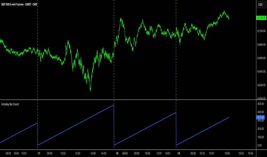
Intraday Bar CounterThis indicator plots a counter on the chart that tracks the number of bars since the beginning of the current day.
The counter resets to zero on the first bar of each new calendar day (midnight). This functionality is provided only on intraday and tick charts.
The indicator is designed to operate on a wide range of symbols without requiring manual adjustments for specific trading sessions.
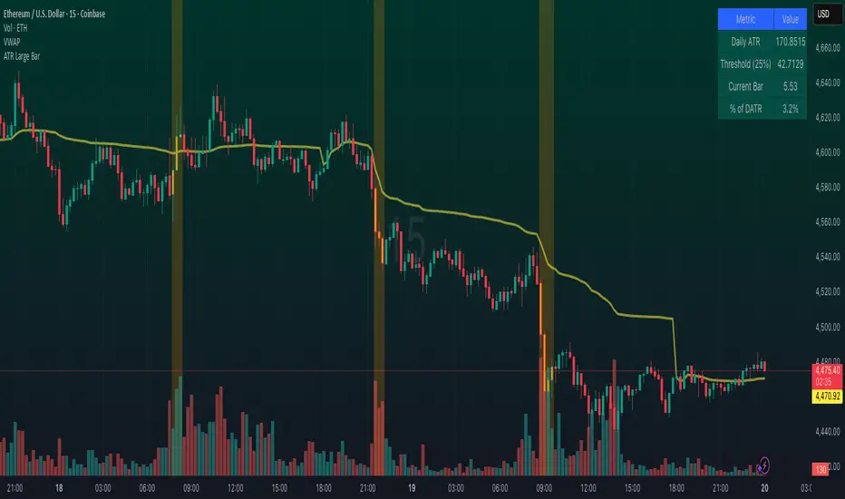
Large Bar ATR HighlighterAn advanced volatility indicator that highlights bars based on their size relative to Daily ATR (Average True Range).
Features configurable lookback periods to detect cumulative volatility across multiple bars, with visual highlighting, background coloring, shape markers, and comprehensive status line data. Perfect for identifying significant price movements and volatility clusters in any timeframe. Includes real-time table with threshold monitoring and alert capabilities.
Double Inside Bar Scanner [Daily]Double Inside Bar Scanner . Captures Double Inside based on last 2 daily Bars
Inside Bar Breakout Alert - RajThis indicator is based on the inside bar strategy it help you to cut down your screen time by giving you constant alerts when a inside bar forms while also gives you alert on bullish and bearish break out of the mother candle.

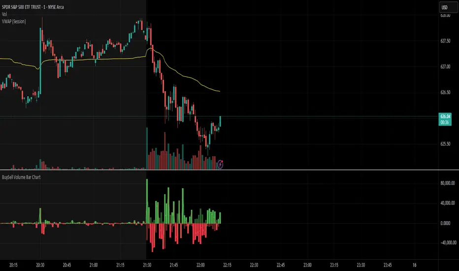
BuySell Volume Bar Chart• Separates estimated Buy and Sell volume per bar using price action logic
• Plots them in a dual-axis format: buy volume goes up, sell volume goes down
• Colors are dynamic — whichever side dominates gets the stronger color, the weaker side is shaded
• Includes a live difference metric (Δ Volume) as a third value in the indicator title
• Automatically filters out flat/no-move bars to avoid misleading spikes
The live difference metric ("Δ Volume") can be controlled.
This metric calculates the difference between the buying and selling volume live, where it takes the Buy Volume - Sell Volume.
This difference is then displayed in either green (BV > SV) or red (SV > BV). You can toggle it on/off by entering the indicator's settings or double tapping the indicator name on the TV chart.
Another pretty cool thing is the modular colors - you can customize your candle colors and shades to your liking within the code!
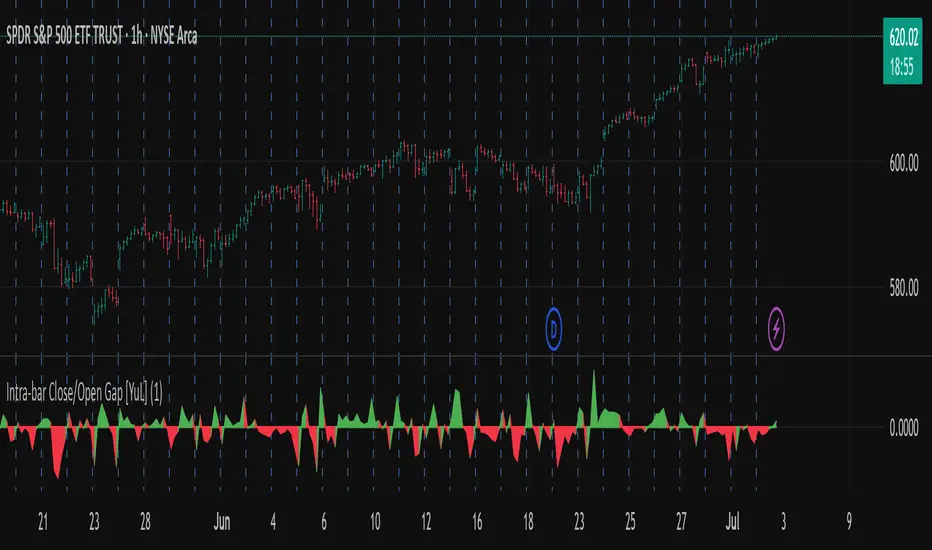
Intra-bar Close/Open Gap [YuL]Just checking one idea: look at gaps between close and open bars on lower timeframe to try to estimate how much slippage exists there that may be a result of buying or selling pressure.
Perhaps it only useful in real time to see if situation of the current bar is changing.
Open to ideas and suggestions.
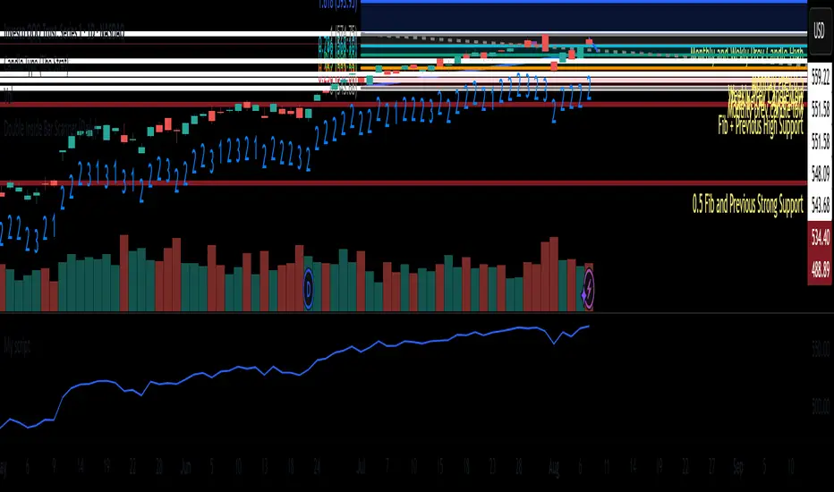
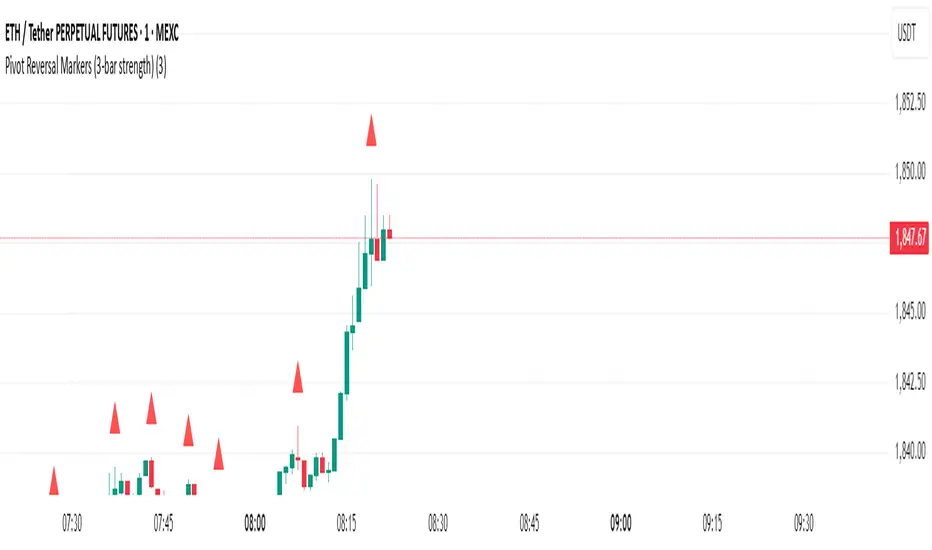
Pivot Reversal Markers (3-bar strength)### Pivot Reversal Markers (3-Bar Strength)
**Overview:**
This indicator identifies and marks pivot high and pivot low reversal points on your chart using a customizable pivot strength. Ideal for traders seeking clear visual signals of potential reversals.
**Settings:**
* **Pivot Strength:** Number of bars checked before and after to confirm a pivot (default = 3).
**Signals:**
* 🔺 **Red Triangle (Pivot High):** Potential short entry or reversal from upward to downward trend.
* 🔻 **Green Triangle (Pivot Low):** Potential long entry or reversal from downward to upward trend.
**Usage:**
Combine these pivot signals with other technical analysis tools or indicators for optimal results.
Pump Detector - EMA 4H + Retest H1 (Valid 10x4H bars)📈 Pump Detector – EMA 12/21 on 4H + Retest on H1
This indicator is designed to detect sudden bullish moves ("pumps") on the 4-hour timeframe, and alert traders of potential retest entry points on the 1-hour timeframe.
🔍 Pump activation conditions (on 4H):
EMA 12 crosses above EMA 21
Current volume exceeds the 20-period SMA of volume (on 4H)
When both conditions are met, a pump alert is triggered and a time window opens.
📉 Retest detection logic (on H1):
For the next 10 bars on the 4H chart (~40 hours), the indicator monitors price behavior on the 1H timeframe
If the LOW of any H1 candle touches or drops below EMA 12 or 21 (on H1), a second alert is triggered
✅ Key Features:
Draws EMA 12/21 from the 4H timeframe directly on the chart
Enforces 4H and H1 timeframes, regardless of the chart the script is applied to
One-time detection per pump window: once the 10-bar window expires, the retest alert is disabled until a new pump is detected
Ideal for capturing momentum breakouts followed by technical pullbacks
⚠️ Recommended for:
Traders looking for scalping or swing trading setups on crypto, forex, or stocks. Helps identify post-breakout entry opportunities using a structured and disciplined approach.

Bollinger Free BarsIdentify Extreme Price Actions with Non-Overlay Visualization
Core Functionality
This indicator detects two types of Bollinger Band breakout patterns without cluttering your chart:
1 ️⃣ Half Breakout Bar (Blue Triangles)
- Triggers when both open & close prices are outside the Bollinger Bands
- Suggests strong directional momentum continuation
2 ️⃣ Complete Breakout Bar (Red Flags)
- Activates when entire price action (including wicks) stays outside the bands
- Signals extreme volatility exhaustion points
Feature Highlights
◾ Smart Band Display
Translucent bands (#2196F3 & #FF9800 with 70% transparency) maintain chart clarity while showing dynamic volatility ranges
◾ Parameter Customization
- Adjustable period (default 20) & deviation multiplier (default 2.0)
- Selectable price source (close/open/high/low)
◾ Statistical Validation
Based on Bollinger Band's 95.4% price containment principle, signals filter out 4.6% extreme market conditions for high-probability scenarios.
Recommended Usage
1. Combine with volume analysis (significant breakout with high volume increases signal reliability)
2. Confirm with trend lines or RSI divergence
3. Adjust transparency via "Style" tab for multi-indicator layouts
Code Safety
- No repainting: All calculations use historical price data only
- No external network requests
- Open-source logic compliant with Pine Script v6 standards
Disclaimer
This tool is for technical analysis education only. Past performance doesn't guarantee future results. Always validate signals with fundamental analysis and proper risk management.

3 Consecutive Inside Bars - RSTInside bars are often used to identify potential consolidation periods or breakout setups.
This will provide tight range for 3 consecutive inside bars.
Remember that inside bar patterns are just one tool, and no indicator is perfect. Always use sound risk management.

My Bar IndexA simple script to display bar index at the bottom of the chart. It will be a handy tool for those who like to do bar counts.

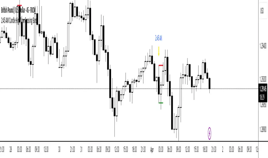
2:45 AM Candle High/Low Crossing Bars2:45 AM Candle High/Low Crossing Bars is an indicator that focuses on the trading view 2:45am NY TIME high and low indicating green for buy and red bars for sell, with the 2:45am new york time highlight/ If the next candle sweeps the low we buy while if it sweeps the high we sell, all time zoon must be the new York UTC time.
Similar Bars Pattern DetecterDescription:
The Similar Bars Pattern Detector is a professional Pine Script indicator designed for TradingView users who want to identify sequences of similar candlesticks in a row. Whether you're looking for bullish or bearish patterns, this tool helps you spot repeating formations based on customizable settings.
Features:
✅ Detects patterns of consecutive similar bars
✅ Works for both bullish and bearish trends
✅ Uses tick-based range filtering for precise detection
✅ Fully customizable: adjust number of candles, trend type, and range
✅ Highlights detected patterns directly on the chart
🔹 Ideal for traders who rely on pattern recognition to confirm trends and price movements.
🔹 Works across all markets and timeframes.
💡 How to Use:
1️⃣ Set the number of candles to detect a repeating pattern.
2️⃣ Choose bullish or bearish trend direction.
3️⃣ Adjust the tick range to fine-tune pattern similarity.
🚀 Enhance your trading analysis with this powerful pattern recognition tool!

Time of Day Background with Bar Count & TableDescription:
This indicator provides a comprehensive overview of market activity by dynamically displaying the time-of-day background and tracking bullish and bearish bar counts across different sessions. It also features a table summarizing the market performance for the last 7 days, segmented into four time-based sessions: Morning, Afternoon, Evening, and Night.
Key Features:
Time of Day Background:
The chart's background color changes based on the time of day:
Evening (12 AM - 6 AM) is shaded blue.
Morning (6 AM - 12 PM) is shaded aqua.
Afternoon (12 PM - 6 PM) is shaded yellow.
Night (6 PM - 12 AM) is shaded silver.
Bullish and Bearish Bar Counting:
It tracks the number of bullish (closing higher than opening) and bearish (closing lower than opening) candles.
The sum of the price differences (bullish minus bearish) for each session is displayed as a dynamic label, indicating overall market direction for each session.
Session Breakdown:
The chart is divided into four sessions, each lasting 6 hours (Morning, Afternoon, Evening, Night).
A new label is generated at the start of each session, indicating the bullish/bearish performance and the net difference in price movements for that session.
Historical Session Performance:
The indicator tracks and stores the performance for each session over the past 7 days.
A table is generated in the top-right corner of the chart, summarizing the performance for each session (Morning, Afternoon, Evening, Night) and the price changes for each of the past 7 days.
The values are color-coded to indicate positive (green) or negative (red) results.
Dynamic Table:
The table presents performance data for each time session over the past week with color-coded cells:
Green cells indicate positive performance.
Red cells indicate negative performance.
Empty cells represent no data for that session.
Use Case:
This indicator is useful for traders who want to track market activity and performance across different times of day and monitor how each session contributes to the overall market trend. It provides both visual insights (through background color) and numerical data (via the table) for better decision-making.
Settings:
The background color and session labels update automatically based on the time of day.
The table updates every day, tracking the performance of each session over the past week.

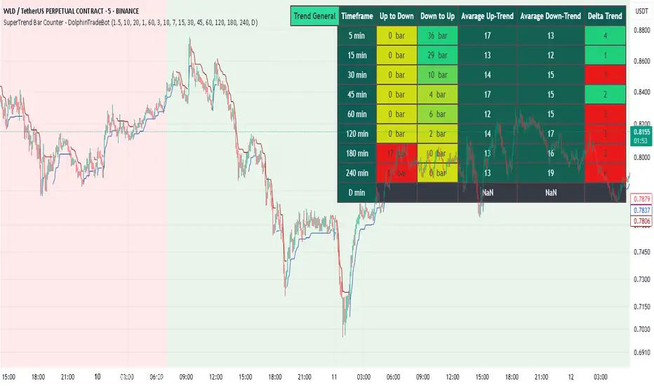
SuperTrend Bar Counter - DolphinTradeBot
OVERVIEW
This indicator calculates the lengths of upward and downward trends based on the specified SuperTrend settings and timeframe. It then takes the average length of the entered number of swings and compares the current trend durations with these averages. The main goal is to anticipate potential reversals in advance.
HOW IS IT WORK ?
The indicator actually contains two different but conceptually similar metrics.
The first part; shows how long the Supertrend stays in an upward or downward trend in real time. Additionally, it analyzes how close the current value is to the average of the Supertrend bar count for the given input.
The second part; aims to provide a different perspective on general trend analysis. It calculates the average duration of upward and downward trends in bars based on the SuperTrend indicator settings within a specified period and timeframe. If, contrary to expectations, downward trends last longer than upward trends, the background is colored green, indicating a prediction that the trend will continue upward.
Explanation of the second part logic: As you know, moving averages or similar approaches that follow the price are often correct when looking back retrospectively, but they cannot serve as leading indicators in real-time trading.That's why, when performing trend analysis, I wanted to introduce a completely different perspective based on price movement, yet still grounded in price action itself.
This phenomenon is partly due to the nature of the SuperTrend itself. After strong price movements, SuperTrend tends to reverse direction much more quickly during pullbacks. Following a strong upward move, a downward trend is detected much earlier and tends to last longer. The indicator provides an alternative perspective by analyzing which directional movement occurs more rapidly and uses this insight for trend prediction.
HOW TO USE ?
It can be used to identify potential price reversals or to assess whether the price is generally cheap or expensive.
In the settings section, you can adjust the SuperTrend parameters and timeframes for the values displayed in the table.
In the second part, you can configure the values used for general trend analysis.
NOTE
Things to be aware of: As the chart's timeframe decreases, pulling data from higher timeframes becomes more difficult. For example, when the chart is set to a 5-minute timeframe, it may fail to retrieve swing periods from the daily timeframe. Similarly, on a 4-hour chart, when calculating the average swing, there might be enough data for only 5 periods instead of 20.
Please keep in mind that this indicator was created solely to provide an idea. It should only be considered as a perspective or a supporting tool that influences your decision by no more than 5% at most.