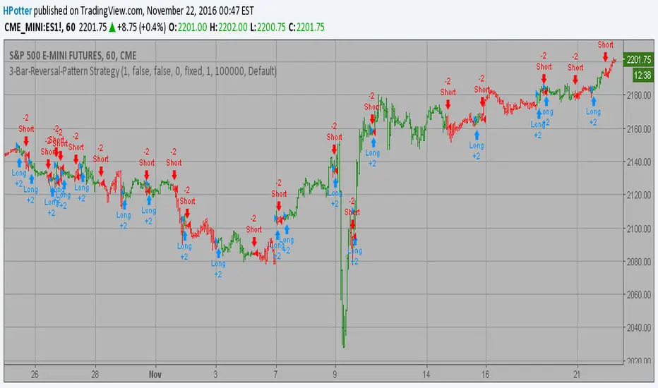
3-Bar-Reversal-Pattern Strategy Backtest This startegy based on 3-day pattern reversal described in "Are Three-Bar
Patterns Reliable For Stocks" article by Thomas Bulkowski, presented in
January, 2000 issue of Stocks&Commodities magazine.
That pattern conforms to the following rules:
- It uses daily prices, not intraday or weekly prices;
- The middle day of the three-day pattern has the lowest low of the three days, with no ties allowed;
- The last day must have a close above the prior day's high, with no ties allowed;
- Each day must have a nonzero trading range.
Please, use it only for learning or paper trading. Do not for real trading.
Cerca negli script per "bar"

HEIKIN ASHI COLOUR CHANGE ALERTThis can be used to trigger an alert if Heikin Ashi bar changes color :)

Franklin ATR Bar highlight by els (robotfarm.ru)Script highlights signal bars for tfc3.ru school trading strategy. Working timeframe D.
Colored Volume Bars with Standard Deviation from the MeanI have updated the indicator to help visualize volume . The percentage scale is based on a 21 period look back average . The colored volume bars represent volumes that exceed specified standard deviation of this 21 period average as indicated in the figure. The deviation bands are based on a the 55sma of the 21 period average (brown line). A 8 period sma of the 21 moving average (red line) is also indicated.

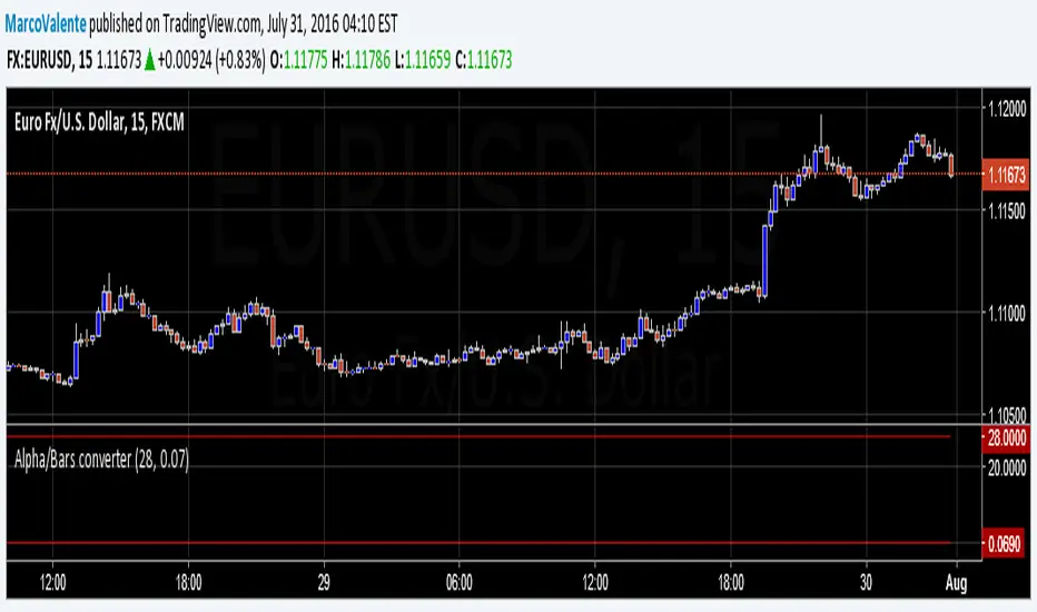
Alpha/Bars converterSimple tool to convert alpha in Bars length period. Often MA period's are express in alpha ratio, and become difficult to visualize the MA length's . Now you can convert alpha in to periods, and periods in alpha

Internal Bar Strength IndicatorThe internal bar strength or (IBS) is an oscillating indicator which measures the relative position of the close price with respect to the low to high range for the same period.
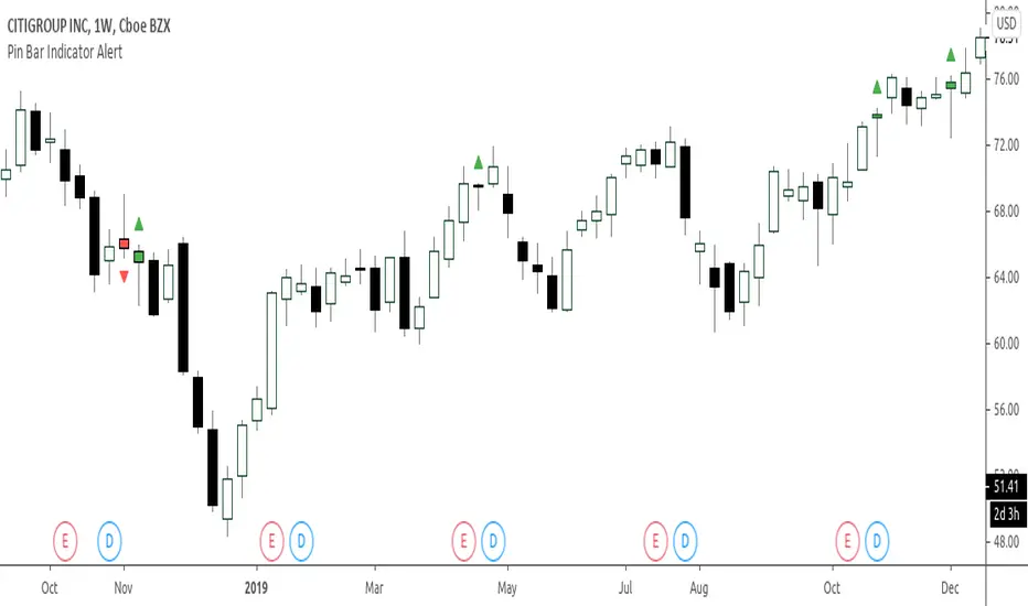
YK Fuller BarsThe script highlights "Fuller's pins" and generates alerts when these bars are appearing

Higher Resolution Bars on Intraday ChartHi everybody!
With new plotbar and plotcandle functions you may plot somewhat "stretched" daily bars over intraday chart. Enjoy!

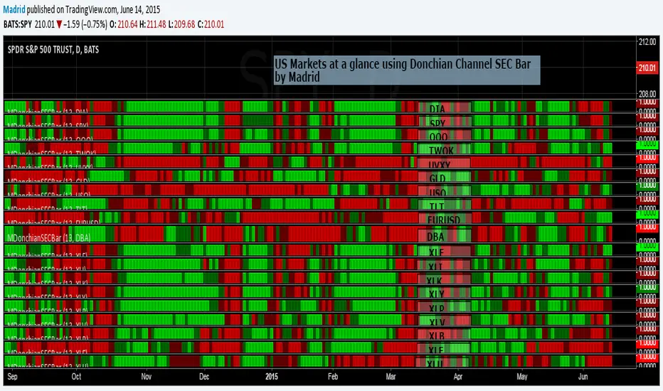
Madrid Donchian SEC barThis study is based on the Donchain Channel Bar indicator but this adds security as a parameter. This allows several instances of this indicator to be used in the same page to create a heat map to take look at a glance at several securities, just like the example where this was implemented.
The only two parameters it requires are the security symbol and the length of the analysis.
Madrid MA Ribbon BarThis study is the companion of the MMAR, displayed here in this publication. This displays the same information as MMAR, but in a linear format. This measures the possibilities of a trend reversal. If the bar fills over 50% of the opposite color from bottom to top then chances are there will be a trend reversal. Otherwise it is just a reentry point.
This study doesn't require but one parameter, and the default is very good. Define if you want to use the standard or the exponential moving average. It is simple, easy to interpret and doesn't require much space on the screen.
It uses only four standard colors
1. Red : A downtrend in progress
2. Green: A short reentry or a trend reversal warning
3. Lime : An uptrend in progress
4. Maroon: A long reentry or a trend reversal warning

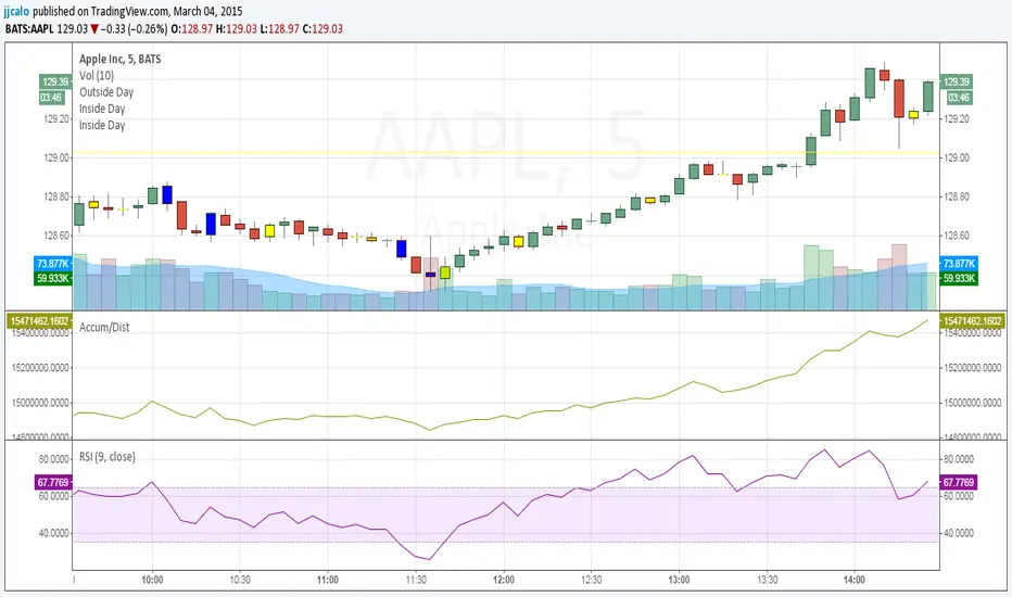
jc-Inside_BarCopyright by jack calo -- v1.0 -- 03/04/2015 -- Paint the bar yellow when it's an inside day. When the full range of a candle is equal or within the full range of the previous bar. Credit to Rob Smith and his In The Black Strategy.
Over ATR Bar highlightScript highlights bars over ATR (20), i use this to look for mazabuzo candles.
FVE Volatility color-coded Volume bar The FVE is a pure volume indicator. Unlike most of the other indicators
(except OBV), price change doesn?t come into the equation for the FVE
(price is not multiplied by volume), but is only used to determine whether
money is flowing in or out of the stock. This is contrary to the current trend
in the design of modern money flow indicators. The author decided against a
price-volume indicator for the following reasons:
- A pure volume indicator has more power to contradict.
- The number of buyers or sellers (which is assessed by volume) will be the same,
regardless of the price fluctuation.
- Price-volume indicators tend to spike excessively at breakouts or breakdowns.
This study is an addition to FVE indicator. Indicator plots different-coloured volume
bars depending on volatility.

Custom Indicator Clearly Shows If Bulls or Bears are in Control!The Two Versions of this Indicator I learned from Two Famous and Highly Successful Traders. This Indicator shows With No Lag Clear Up and Down Trends in Market by Documenting Clearly If Bulls or Bears are in Control. The Version In SubChart 1 Shows Consecutive Closes if the Current Close is Greater than of Less than the Midpoint of the Previous Bar (Why Midpoint Explained in Detail in 1st Post). The Version in SubChart 2 Shows Consecutive Closes that are Greater than or Less Than the Previous Close (Will Discuss Specific Uses in 1st Post). Works on Stocks, Forex, Futures, on All Timeframes.


VWAP filtered MACD Bars with positive MACD histogram value and closing above VWAP are colored, long positions should be taken in areas made of those bars.
Similarly, bars with negative MACD histogram value and closing below VWAP are also colored, short positions should be taken there.
This indicator by default should be a part of your trend following trading system.
In the setting you can change colors
Above grow: positive and rising MACD histogram value
Above fall: positive and falling MACD histogram value
Below fall: negative and falling MACD histogram value
Below grow: negative and rising MACD histogram value
bar color changeThis Pine v5 code allows you to distinguish between candles on the chart. The body/wick/frame of the "live" candle that hasn't yet closed is colored white. When a live candle is present, the body of the immediately preceding candle is colored green with offset = -1. All other candles remain gray (#2e2e2e). plotcandle fixes the wick/frame so that the live and previous candles are selected when following the trend. If there are other conflicting scripts, the most recently added one quickly takes precedence.
