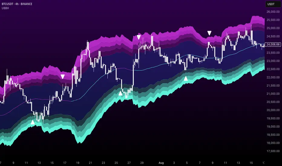
RSI BB StdDev SignalOverview
The RSI BB StdDev Signal Indicator is a powerful tool designed to enhance your trading strategy by combining the Relative Strength Index (RSI) with Bollinger Bands (BB). This unique combination allows traders to identify potential buy and sell signals more accurately by leveraging the strengths of both indicators. The RSI helps in identifying overbought and oversold conditions, while the Bollinger Bands provide a dynamic range to assess volatility and potential price reversals.
Key Features
— RSI Calculation: The indicator calculates the RSI based on user-defined parameters, allowing for customization to fit different trading styles.
— Bollinger Bands Integration: The RSI values are smoothed using a moving average, and Bollinger Bands are applied to this smoothed RSI to generate buy and sell signals.
— Divergence Detection: The indicator includes an optional feature to detect and alert on bullish and bearish divergences between the RSI and price action.
— Customizable Alerts: Users can set up alerts for buy and sell signals, as well as for divergences, ensuring they never miss a trading opportunity.
— Visual Aids: The indicator plots the RSI, Bollinger Bands, and signals on the chart, making it easy to visualize and interpret the data.
How It Works
1. RSI Calculation:
— The RSI is calculated using the change in the source input (default is close price) over a specified period.
— The RSI values are then plotted on the chart with customizable overbought and oversold levels.
2. Smoothing and Bollinger Bands:
— The RSI values are smoothed using a moving average (SMA, EMA, SMMA, WMA, VWMA) selected by the user.
— Bollinger Bands are applied to the smoothed RSI to create dynamic upper and lower bands.
3. Signal Generation:
—Buy signals are generated when the RSI crosses above the lower Bollinger Band.
—Sell signals are generated when the RSI crosses below the upper Bollinger Band.
—These signals are plotted on both the RSI pane and the main price chart for easy reference.
4. Divergence Detection:
— The indicator can detect and alert on regular bullish and bearish divergences between the RSI and price action.
— Bullish divergences occur when the price makes a lower low, but the RSI makes a higher low.
— Bearish divergences occur when the price makes a higher high, but the RSI makes a lower high.
Usage
1. Setting Up:
— Add the indicator to your TradingView chart.
— Customize the RSI length, source, and other parameters in the settings panel.
— Enable or disable the divergence detection based on your trading strategy.
2. Interpreting Signals:
— Use the buy and sell signals generated by the RSI crossing the Bollinger Bands as potential entry and exit points.
— Pay attention to divergences for additional confirmation of trend reversals.
3. Alerts:
— Set up alerts for buy and sell signals to receive notifications in real-time.
— Enable divergence alerts to be notified of potential trend reversals.
Conclusion
The RSI BB StdDev Signal Indicator is a comprehensive tool that combines the strengths of the RSI and Bollinger Bands to provide traders with more accurate and reliable signals. Whether you are a beginner or an experienced trader, this indicator can enhance your trading strategy by offering clear visual cues and customizable alerts.
Note
This indicator is provided with open-source code, allowing users to understand its logic and customize it further if needed. The detailed description and customizable settings ensure that traders of all levels can benefit from its unique features.
Cerca negli script per "bear"

Numerical Volume with Bullish/Bearish Color CodingDescription: This indicator visually represents trading volume with color-coded lines to distinguish between bullish and bearish market conditions. The volume line is colored green for bullish periods (when the closing price is higher than the opening price), red for bearish periods (when the closing price is lower than the opening price), and gray for neutral periods (when the open and close prices are equal). The volume can be displayed with labels at specified intervals, offering a quick reference to the exact volume for each period. This tool helps to analyze volume trends in relation to price action, providing an easy-to-read overview of market sentiment.

Bullish and Bearish Harami DetectorHere’s a description of the script I built for you, designed for a **TradingView public indicator**:
### **Custom Bullish and Bearish Harami Detector with Timeframe Selection**
This custom Pine Script detects **Bullish Harami** and **Bearish Harami** candlestick patterns on the selected timeframe, with configurable settings for how many prior candles to consider for pattern detection.
---
### **Features:**
1. **Timeframe Selection:**
- **Input Field for Timeframe**: The script allows users to choose the timeframe for detecting patterns. For instance, you can set it to 1 hour, 4 hours, or even daily candles, ensuring the detection works as per your chosen market view.
- This is controlled by the `input.timeframe` function, and the user is prompted to select the desired timeframe (e.g., "1h", "4h", "1d").
2. **Enable/Disable Pattern Detection:**
- The user has the flexibility to enable or disable the detection of **Bullish Harami** and **Bearish Harami** patterns.
- The two toggles `detectBullishHarami` and `detectBearishHarami` allow users to turn on/off the detection for each pattern type.
3. **Customizable Bearish Candle Count for Bullish Harami:**
- The user can define how many prior **bearish candles** should be present before a **Bullish Harami** can be detected.
- The input variable `bearishCandleCountBullish` lets you choose how many previous bearish candles to consider for detecting a **Bullish Harami** (for example, the last 3, 5, or 6 bearish candles).
4. **Customizable Bullish Candle Count for Bearish Harami:**
- Similar to the Bullish Harami, the script allows the user to define how many prior **bullish candles** should be present before a **Bearish Harami** pattern is detected.
- The input variable `bearishCandleCountBearish` lets you select how many previous bullish candles to check for **Bearish Harami**.
5. **Pattern Detection Logic:**
- **Bullish Harami**: Detected when a bearish candle (open > close) is followed by a smaller bullish candle (open < close) where the entire body of the second candle is contained within the body of the first candle.
- **Bearish Harami**: Detected when a bullish candle (open < close) is followed by a smaller bearish candle (open > close) where the entire body of the second candle is contained within the body of the first candle.
- Both patterns are subject to the user-defined conditions (number of previous bearish or bullish candles).
6. **Visual Indicators:**
- **Bullish Harami**: A green label is plotted **below the bar** to indicate a **Bullish Harami** pattern.
- **Bearish Harami**: A red label is plotted **above the bar** to indicate a **Bearish Harami** pattern.
- The labels are displayed using the `plotshape` function with custom colors and text.
7. **Additional Settings**:
- The script includes tooltips and descriptions for each input to make the settings clear for users, allowing even those unfamiliar with candlestick patterns to understand and use the indicator effectively.
---
### **How It Works:**
- The script first checks the specified timeframe and identifies the current and previous candlesticks.
- It then applies the user-defined conditions for detecting the **Bullish Harami** and **Bearish Harami** patterns by checking the relative positions and sizes of the candlesticks over the selected number of previous candles.
- Once a pattern is detected, it plots a label on the chart (green for **Bullish Harami** and red for **Bearish Harami**) at the appropriate location (below or above the candle).
- The script updates dynamically as the price action unfolds.
---
### **Use Cases:**
- **Traders**: This script is useful for traders who want to identify reversal patterns like **Bullish Harami** and **Bearish Harami** on their chosen timeframes and adjust the sensitivity by changing the number of prior candles for pattern detection.
- **Customization**: Users can fine-tune the script’s settings based on their specific trading strategy, adjusting both the timeframe and the number of candles for pattern detection.
---
### **Conclusion:**
This indicator is an effective tool for detecting candlestick patterns, specifically **Bullish Harami** and **Bearish Harami**, on **TradingView**. By allowing customization in terms of timeframe and the number of prior candles to consider, users can tailor the script to fit their trading strategy and market conditions.

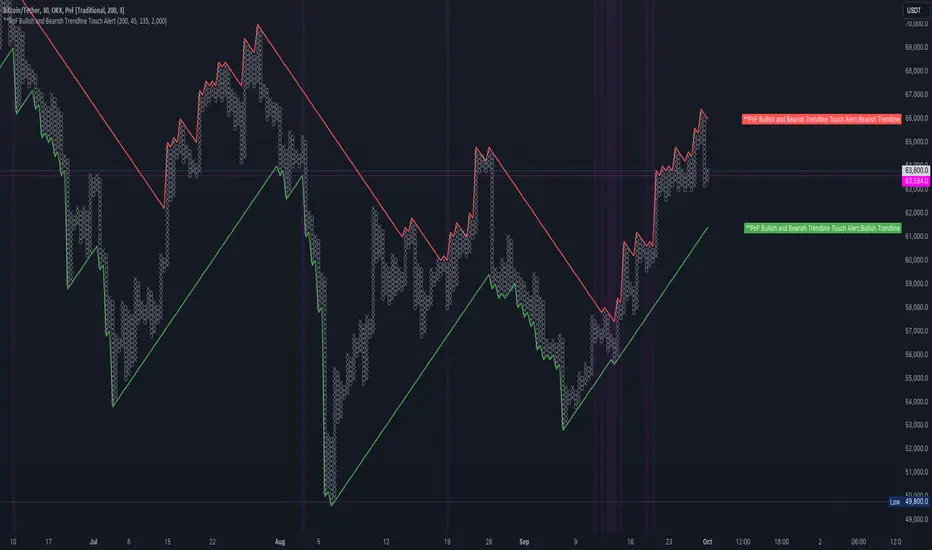
PnF Bullish & Bearish Trend Line Indicator with Proximity AlertThis Pine Script indicator, "PnF Bullish and Bearish Trend line Proximity Alert," overlays on a trading chart to monitor and alert users about interactions with bullish and bearish trend lines derived from Point and Figure (PnF) charting.
Key Features:
Inputs: Users can set parameters such as box size, bullish and bearish angles (in degrees), and a proximity threshold for detecting touches.
Slope Calculation: The script calculates the slopes for bullish and bearish trendlines using the tangent of the specified angles.
Trendline Management:
It initializes and updates trend lines based on price interactions, adjusting their starting points and positions as conditions change.
Proximity Detection: The indicator checks if the current price is close enough to the trend lines and sets conditions for alerts.
Alerts: Users receive alerts when both trend lines are touched, enhancing decision-making for trading strategies.
Visual Feedback: It highlights areas where both trend lines are touched and plots the trend lines in distinct colors for clarity.
This indicator provides an effective way to track key price levels and potential trend reversals in the market.
Bullish and Bearish Triangle PatternsBullish Triangle Detection:
A bullish triangle is identified when the highs are flat or increasing and the lows are rising, signaling an upward trend. The script uses ta.crossover for rising lows.
If a bullish triangle is detected, a green triangle (▲) is plotted above the price.
Bearish Triangle Detection:
A bearish triangle is identified when the highs are falling and the lows are falling as well, signaling a downward trend. The script uses ta.crossunder for falling highs.
If a bearish triangle is detected, a red triangle (▼) is plotted below the price.
Plotting Both Patterns:
The script displays green upward-facing triangles for bullish patterns and red downward-facing triangles for bearish patterns on the chart.
Alerts:
Alerts can be triggered for both bullish and bearish triangle patterns so that you can be notified when they occur.

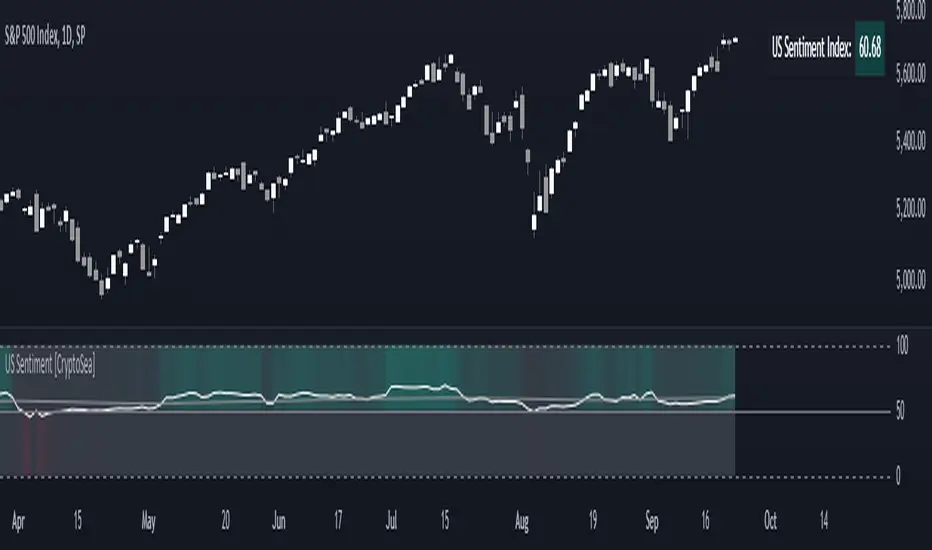
US Sentiment Index [CryptoSea]The US Sentiment Index is an advanced analytical tool designed for traders seeking to uncover patterns, correlations, and potential leading signals across key market tickers. This indicator surpasses traditional sentiment measures, providing a data-driven approach that offers deeper insights compared to conventional indices like the Fear and Greed Index.
Key Features
Multi-Ticker Analysis: Integrates data from a diverse set of market indicators, including gold, S&P 500, U.S. Dollar Index, Volatility Index, and more, to create a comprehensive view of market sentiment.
Customisable Sensitivity Settings: Allows users to adjust the moving average period to fine-tune the sensitivity of sentiment calculations, adapting the tool to various market conditions and trading strategies.
Detailed Sentiment Scaling: Utilises a 0-100 scale to quantify sentiment strength, with colour gradients that visually represent bearish, neutral, and bullish conditions, aiding in quick decision-making.
Below is an example where the sentiment index can give leading signals. We see a first sign of wekaness in the index as it drops below its moving average. Shortly after we see it dip below our median 50 level, another sign of weakeness. We see the SPX price action to take a hit following the sentiment index decrease.
Tickers Used and Their Impact on Sentiment
The impact of each ticker on sentiment can be bullish or bearish, depending on their behaviour:
Gold (USGD): Typically seen as a safe-haven asset, rising gold prices often indicate increased market fear or bearish sentiment. Conversely, falling gold prices can signal reduced fear and a shift towards bullish sentiment in riskier assets.
S&P 500 (SPX): A rising S&P 500 is usually a sign of bullish sentiment, reflecting confidence in economic growth and market stability. A decline, however, suggests bearish sentiment and a potential move towards risk aversion.
U.S. Dollar Index (DXY): A strengthening U.S. Dollar can be a sign of fear as investors seek safety in the dollar, which is bearish for risk assets. A weakening dollar, on the other hand, can signal bullish sentiment as capital flows into riskier assets.
Volatility Index (VIX): Known as the "fear gauge," a rising VIX indicates increased market fear and bearish sentiment. A falling VIX suggests a calm, bullish market environment.
Junk Bonds (JNK): Rising junk bond prices often reflect bullish sentiment as investors take on more risk for higher returns. Conversely, falling junk bond prices signal increased fear and bearish sentiment.
Long-Term Treasury Bonds (TLT): Higher prices for long-term treasuries usually indicate a flight to safety, reflecting bearish sentiment. Lower prices suggest a shift towards riskier assets, indicating bullish sentiment.
Financial Sector ETF (XLF): Strength in the financial sector is typically bullish, indicating confidence in economic conditions. Weakness in this sector can reflect bearish sentiment and concerns about financial stability.
Unemployment Rate (USUR): A rising unemployment rate is a bearish signal, indicating economic weakness. A declining unemployment rate is bullish, reflecting economic strength and job growth.
U.S. Interest Rates (USINTR, USIRYY): Higher interest rates can be bearish, as they increase borrowing costs and reduce spending. Lower rates are generally bullish, promoting economic growth and risk-taking.
How it Works
Sentiment Calculation: The US Sentiment Index combines data from multiple tickers, calculating sentiment by scaling the distance from their respective moving averages. Each asset's behaviour is interpreted within the context of market fear or greed, providing a refined sentiment reading that adjusts dynamically.
Market Strength Analysis: When the index is above 50 and also above its moving average, it indicates particularly strong or bullish market conditions, driven by greed. Conversely, when the index is below 50 and under its moving average, it signals bearish or weak market conditions, associated with fear.
Correlation and Pattern Detection: The indicator analyses correlations among the included assets to detect patterns that might signal potential market movements, giving traders a leading edge over simpler sentiment measures.
Adaptive Background Colouring: Utilises a colour gradient that dynamically adjusts based on sentiment values, highlighting extreme fear, neutral, and extreme greed levels directly on the chart.
Flexible Display Options: Offers settings to toggle the moving average plot and adjust its period, giving users the ability to tailor the indicator's sensitivity and display to their specific needs.
In this example below, we can see the Sentiment rise above the Moving Average (MA). Price action goes on to follow this, although there is an instance where it dips below the MA, it quickly rises back above again as a sign of strength.
Another way you can use this index is by simply using the MA, if its trending up, we know the macro sentiment is bullish.
Application
Data-Driven Insights: Offers traders a detailed, data-driven approach to sentiment analysis, incorporating a broad spectrum of market indicators to deliver actionable insights.
Pattern Recognition: Helps identify patterns and correlations that may lead to market reversals or continuations, providing a nuanced view that goes beyond simple sentiment gauges.
Enhanced Decision-Making: Equips traders with a robust tool to validate trading strategies and make informed decisions based on comprehensive sentiment analysis.
The US Sentiment Index by is an essential addition to the toolkit of any trader looking to navigate market complexities with precision and confidence. Its advanced features and data-driven approach offer unparalleled insights into market sentiment, setting it apart from conventional sentiment indicators.
Bullish/Bearish Volume Indicator ABDJO1- red bars are bearish volume
2- yellow bars are a weakness of bearish volume.
3-green bars are a strong bullish volume.
4-Orange bars are a weakness of bullish volume.
1. Price Movements
The chart does not explicitly show price movements, but the volume bars can give us indirect clues. Typically, a transition from green (strong bullish volume) to red (bearish volume) suggests a potential reversal from an uptrend to a downtrend. The presence of orange bars (weakness of bullish volume) following green bars indicates a decrease in buying momentum, which often precedes a price decline.
2. Trading Volume
Green Bars: Represent strong bullish volume, indicating strong buying interest.
Orange Bars: Indicate a weakening of bullish volume, suggesting that buyers are losing strength or interest at higher price levels.
Yellow Bars: Represent a weakening of bearish volume, which could indicate that selling pressure is decreasing and a potential reversal or stabilization in price might occur.
Red Bars: Signify strong bearish volume, indicating strong selling pressure.
3. Price-Volume Relationship
The transition from green to orange and then to red bars shows a typical pattern where initial strong buying interest (green) is followed by a decrease in buyer enthusiasm (orange), and eventually overtaken by sellers (red). This pattern often corresponds to a peak in prices followed by a reversal to the downside.
4. Technical Indicators
Without specific price data, traditional indicators like MA (Moving Averages), MACD (Moving Average Convergence Divergence), or KDJ (Stochastic Oscillator) cannot be calculated directly. However, the volume pattern itself can be used as a rudimentary momentum indicator, with decreasing bullish volume (orange) and increasing bearish volume (red) suggesting a bearish momentum.
5. Support and Resistance Levels
Support Level: Could be hypothesized near the transition point from yellow to green bars, where buyers previously started to overpower sellers.
Resistance Level: Likely near the transition from green to orange bars, where sellers begin to regain control and buying momentum fades.
6. Overall Trend Patterns
The overall trend, inferred from the volume bars, suggests a bullish phase losing momentum and transitioning into a bearish phase. This is typical of a market top where buying interest wanes and sellers begin to dominate.
7. Future Projections and Recommendations
Given the observed shift from bullish to bearish volume, there is a higher likelihood of a downward price movement in the near term. Investors should consider this a potential sell signal, especially as bearish volume (red bars) increases. Caution is advised for buyers, and it might be prudent for holders to take profits or set stop-loss orders to protect against potential declines.

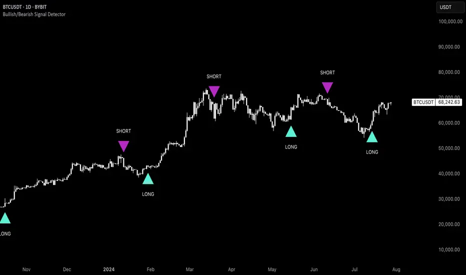
Uptrick: Bullish/Bearish Signal DetectorDetailed Explanation of the "Uptrick: Bullish/Bearish Signal Detector" Script
The "Uptrick: Bullish/Bearish Signal Detector" script is a sophisticated tool designed for the TradingView platform, leveraging Pine Script version 5. This script is crafted to enhance traders' ability to identify bullish (buy) and bearish (sell) signals directly on their trading charts. By combining the power of the MACD (Moving Average Convergence Divergence) and RSI (Relative Strength Index) indicators, this script provides a unique and efficient method for detecting potential trading opportunities. Below is an in-depth exploration of its purpose, features, and functionality.
Purpose
The primary purpose of this script is to assist traders in identifying potential entry and exit points in the market by signaling bullish and bearish conditions. This automated detection helps traders make more informed decisions without the need to manually analyze complex indicators. By overlaying signals directly on the price chart, the script allows for quick visual identification of market trends and reversals.
Uniqueness
What sets this script apart is its dual use of MACD and RSI indicators. While many trading strategies might rely on a single indicator, combining MACD and RSI enhances the reliability of the signals by filtering out false positives. The script not only identifies trends but also adds a layer of confirmation through the RSI, which measures the speed and change of price movements.
Inputs and Features
Customizable Label Appearance:
The script allows users to customize the appearance of the labels that indicate bullish and bearish signals. Users can set their preferred colors for the labels and the text, ensuring that the signals are easily distinguishable and aesthetically pleasing on their charts.
MACD Calculation:
The script calculates the MACD line and signal line using user-defined input values for the fast length, slow length, and signal length. The MACD histogram, which is the difference between the MACD line and the signal line, is used to determine the momentum of the market.
RSI Calculation:
The RSI is calculated using a user-defined input length. The RSI helps in identifying overbought or oversold conditions, which are crucial for confirming the strength of the trend detected by the MACD.
Bullish and Bearish Conditions:
The script defines bullish conditions as those where the MACD histogram is positive and the RSI is above 50. Bearish conditions are defined where the MACD histogram is negative and the RSI is below 50. This combination of conditions ensures that signals are generated based on both momentum and relative strength, reducing the likelihood of false signals.
Label Plotting:
The script plots labels on the chart to indicate bullish and bearish signals. When a bullish condition is met, and the previous signal was not bullish, a "LONG" label is plotted. Similarly, when a bearish condition is met, and the previous signal was not bearish, a "SHORT" label is plotted. This feature helps in clearly marking the points of interest for traders, making it easier to spot potential trades.
Tracking Previous Signals:
To avoid repetitive signals, the script keeps track of the last signal. If the last signal was bullish, it avoids plotting another bullish signal immediately. The same logic applies to bearish signals. This tracking ensures that signals are spaced out and only significant changes in market conditions are highlighted.
How It Works
The script operates in a loop, processing each bar (or candlestick) on the chart as new data comes in. It calculates the MACD and RSI values for each bar and checks if the current conditions meet the criteria for a bullish or bearish signal. If a signal is detected and it is different from the last signal, a label is plotted on the chart at the current bar's price level. This real-time processing allows traders to see the signals as they form, providing timely insights into market movements.
Practical Application
For practical use, a trader would add this script to their TradingView chart. They can customize the input parameters for the MACD and RSI calculations to fit their trading strategy or preferred settings. Once added, the script will automatically analyze the price data and start plotting "LONG" and "SHORT" labels based on the detected signals. Traders can then use these labels to make decisions on entering or exiting trades, adjusting their strategy as necessary based on the signals provided.
Conclusion
The "Uptrick: Bullish/Bearish Signal Detector" script is a powerful tool for any trader looking to leverage technical indicators for better trading decisions. By combining MACD and RSI, it offers a robust method for detecting market trends and potential reversals. The customizable features and real-time signal plotting make it a versatile and user-friendly addition to any trading toolkit. This script not only simplifies the process of technical analysis but also enhances the accuracy of trading signals, thereby potentially increasing the trader's success rate in the market.
BEC (Bearish Elephant Candle)Description:
The Bearish Elephant Candle Indicator is designed to identify and signal potential short entry points based on the Bearish Elephant Candle pattern. This pattern is characterized by a large bearish candle, where the body (difference between open and close) is more than 70% of the entire range (difference between high and low), and the total range is greater than the average true range over a specified period. The indicator also plots a 20-period Exponential Moving Average (EMA) to help visualize the trend.
How It Works:
Bearish Elephant Candle Identification:
The indicator calculates the true range and the average true range (ATR) over a specified period (default is 20 periods).
A candle is identified as a Bearish Elephant Candle if the body is more than 70% of the entire range, and the total range exceeds the average true range.
Short Entry Signal:
When a Bearish Elephant Candle is identified, a short entry signal is plotted on the chart as a red downward label.
Exponential Moving Average (EMA):
A 20-period EMA is plotted on the chart to help users visualize the overall trend. The EMA can serve as an additional filter or exit point for trades.
Pros:
Simplicity: The Bearish Elephant Candle pattern is straightforward to understand and identify.
Visual Signals: The indicator provides clear visual signals for potential short entries, making it easy for traders to spot opportunities.
Trend Visualization: The inclusion of the EMA helps traders stay aligned with the overall trend, potentially improving the effectiveness of the signals.
Cons:
False Signals: Like any pattern-based indicator, it can generate false signals, especially in choppy or sideways markets.
No Confirmation: This version of the indicator does not include additional confirmation signals (e.g., from other indicators like MACD), which may reduce its reliability.
Limited Scope: The indicator focuses solely on bearish signals and does not provide long entry signals.
Best Way to Use It:
Trend Alignment: Use the 20-period EMA to ensure you are trading in the direction of the overall trend. For example, prioritize short signals when the price is below the EMA.
Combine with Other Indicators: Enhance the reliability of the signals by combining this indicator with other technical indicators (e.g., MACD, RSI) for additional confirmation.
Risk Management: Always use proper risk management techniques, such as stop-loss orders, to protect against adverse market movements. Consider placing stop-loss orders above the high of the Bearish Elephant Candle.
Market Context: Be mindful of the broader market context and avoid using the indicator in highly volatile or news-driven environments where patterns may be less reliable.

Bullish/Bearish VolumeThe "Bullish/Bearish Volume" indicator helps traders identify discrepancies between price movement and trading volumes. Sometimes the price trends in one direction while trading volumes indicate opposing intentions among market participants. This indicator aims to identify such divergences, assisting traders in making more informed and balanced trading decisions.
Key features:
1. Directional Volume Differences: The indicator calculates volumes by separating them into two main categories: buying and selling. When the closing price is higher than the opening price, buying volume is shown in green, while selling volume is shown in red when the closing price is lower than the opening price. This accurate classification helps identify which volume type predominates in the current interval.
2. Histograms by Fixed Time Intervals: Collecting data from a fixed time interval (1 minute), the indicator analyzes and sums up buying and selling volumes regardless of the selected chart timeframe. This provides a more detailed market view, allowing traders to accurately gauge sentiment within any chosen timeframe.
3. Total Volume: The indicator aggregates buying and selling volumes, representing total trading activity in gray transparent bars. This gives traders a clear visual representation of overall volume activity in the market for a selected period.
4. Volume Delta and its Moving Average: The volume delta (the difference between buying and selling volumes) is highlighted in blue, allowing for monitoring shifts in the balance of buying and selling power. Additionally, the indicator includes a moving average of the delta, shown as a blue line, to smooth out short-term fluctuations and help traders easily identify long-term trends in volume shifts.
5. Volume Volatility: A histogram representing volume volatility offers insight into trading activity variability, uncovering abnormal spikes or lulls in market dynamics.
Bullish/Bearish Volume is a powerful tool that can break down market flows into understandable signals, enabling traders to better recognize imbalances and make informed decisions.

Uptrick: Bullish/Bearish Highlight -DEMO 1 Indicator Purpose:
• The indicator serves as a technical analysis tool for traders to identify potential bullish
and bearish trends in the market.
• It highlights periods where the closing price is above or below a 50-period simple
moving average (SMA), indicating potential bullish or bearish sentiment, respectively.
2 Moving Averages:
• The indicator calculates a 50-period SMA (sma50) to smooth out price fluctuations
and identify the overall trend direction.
• It also computes an 8-period exponential moving average (EMA), which responds
more quickly to recent price changes compared to the SMA.
3 Bollinger Bands:
• Bollinger Bands are plotted around the SMA, indicating volatility in the price
movement.
• The bands are typically set at two standard deviations above and below the SMA,
representing approximately 95% of the price data within that range.
4 Bullish and Bearish Conditions:
• The indicator defines conditions for identifying bullish and bearish market sentiments.
• When the closing price is above the SMA50, it indicates a bullish condition, and when
it's below, it suggests a bearish condition.
5 Plotting:
• The indicator visualizes the bullish and bearish conditions by changing the
background color accordingly.
• It also plots the SMA50, EMA, and Bollinger Bands to provide a graphical
representation of the market dynamics.
6 User Interface:
• The indicator is designed to be used as an overlay on price charts, allowing traders to
easily incorporate it into their analysis.
Overall, the "Uptrick: Bullish/Bearish Highlight" indicator offers traders a comprehensive view of market trends and potential reversal points, helping them make informed trading decisions.
TIP: When the white line, which is the EMA , crosses above the SMA (the orange line), it is usually a good idea to buy, but when the EMA crosses below the SMA it is a good idea to sell.
Inside Bar + Bullish and Bearish candlestick [Tarun]
Inside Bar Detection:
The function isInsideBar() checks if a bar is an inside bar, meaning its high is lower than the previous bar's high and its low is higher than the previous bar's low.
Inside bars are highlighted with an orange color.
Bearish Candlestick Patterns:
Bearish Engulfing: When the current candlestick's body completely engulfs the previous candlestick's body.
Dark Cloud Cover: When a bullish candle is followed by a bearish candle that opens above the previous bullish candle's close but closes below its midpoint.
Bearish Harami: When a small bullish candlestick is engulfed by a larger bearish candlestick.
Evening Star: A three-candle pattern consisting of a large bullish candle, a small-bodied candle with a gap up or down, and a large bearish candle that closes below the midpoint of the first candle.
Shooting Star: A single candlestick pattern with a small real body near the bottom of the price range and a long upper shadow.
Bearish Marubozu: A candlestick with a long bearish body and little to no upper or lower shadows.
Bearish candlestick patterns are highlighted with a red color and labeled with abbreviated names.
Bullish Candlestick Patterns:
Bullish Engulfing: Opposite of bearish engulfing, where the current candlestick's body completely engulfs the previous candlestick's body.
Piercing Pattern: When a bearish candle is followed by a bullish candle that opens below the previous bearish candle's low but closes above its midpoint.
Bullish Harami: Similar to bearish harami but bullish, where a small bearish candlestick is engulfed by a larger bullish candlestick.
Morning Star: A three-candle pattern opposite to the evening star, signaling a potential reversal from downtrend to uptrend.
Bullish Hammer: A single candlestick pattern with a small real body near the top of the price range and a long lower shadow.
Bullish Marubozu: A candlestick with a long bullish body and little to no upper or lower shadows.
Bullish candlestick patterns are highlighted with a purple color and labeled with abbreviated names.
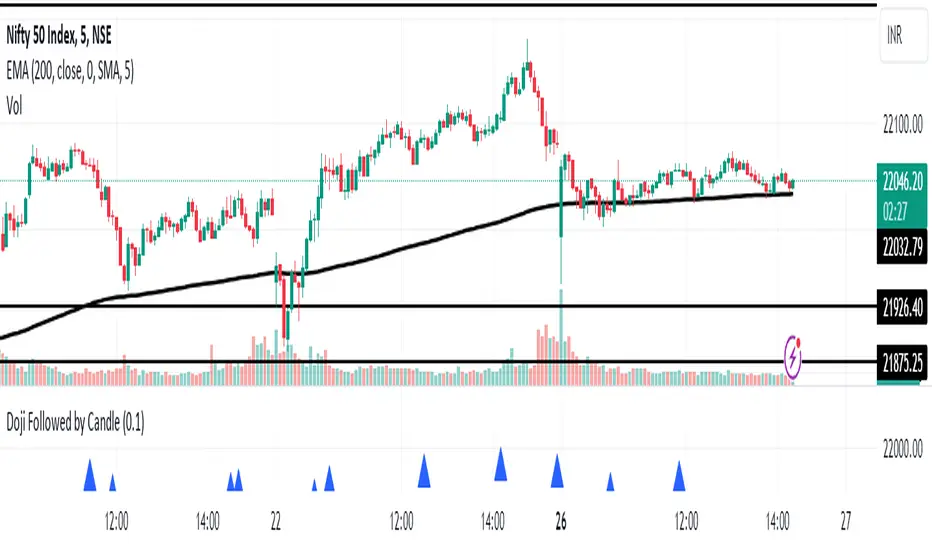
Doji Followed by Bullish or Bearish CandleThis indicator identifies instances where a doji candlestick pattern is followed by either a bullish or bearish candle, indicating potential reversal or continuation signals in the market.
Features:
Doji Detection: Utilizes the concept of doji candlesticks, where the difference between the open and close prices is minimal compared to the candle's overall range.
Candlestick Identification: Determines whether the following candle is bullish (close > open) or bearish (close < open).
Customizable Threshold: Allows users to adjust the sensitivity of the doji detection by modifying the doji body factor parameter.
Alerts: Generates alerts when a doji candle is followed by a bullish or bearish candle, signaling potential trading opportunities.
How to Use:
When a blue triangle appears below a candle, it indicates that a doji candle was followed by a bullish or bearish candle.
Traders can interpret these signals as potential entry or exit points in their trading strategies.
Note: This indicator should be used in conjunction with other technical analysis tools and indicators for comprehensive market analysis.
Bullish vs. Bearish Candle CounterFollowing an exhaustive analysis of the most recent 50,000 candles within a given currency pair, a notable equilibrium between bearish and bullish candles has emerged as a persistent market phenomenon. This equilibrium, indicative of the market's continuous endeavor to establish parity, has spurred the development of the following indicator.
The indicator meticulously scrutinizes the preceding 100 candles, promptly triggering an on-chart marker when either bullish or bearish candle counts surpass the threshold of 60%. This marker serves as an invaluable tool, providing traders with a potential signal for the initiation of a trend reversal.
As such, this indicator serves as a valuable asset in a trader's toolkit, offering insights into shifts in market sentiment and the prospect of emerging trends.
Key Features:
- Customizable Candle Count: Traders can set the number of candlesticks to be analyzed in the input parameters, allowing flexibility in their analysis.
- Bullish and Bearish Percentage: Users can define their desired percentage for both bullish and bearish candles in the indicator's settings. The indicator calculates the percentage of each candle type within the specified range.
- Arrow Signals: The indicator plots arrows above or below the current candle, indicating bullish or bearish conditions based on the defined percentage thresholds. A green arrow signifies bullish sentiment, while a red arrow denotes bearish sentiment.
How to Use:
- Adjust Parameters: In the indicator settings, users can customize the number of candlesticks to be analyzed, as well as set their preferred percentages for both bullish and bearish conditions.
- Interpret Arrows: The indicator generates arrows above or below the current candle, reflecting the prevailing market sentiment. A green arrow suggests a bullish bias, while a red arrow indicates a bearish bias.
- Trade with Confidence: Traders can use this indicator as a tool to gauge market sentiment and make informed trading decisions. It helps identify potential entry and exit points based on the chosen percentage thresholds.
Volume Profile - BearJust another Volume Profile but you can fit into your chart better by moving back and forth horizontally. also note you can fix the number of bars to show the volume by that way you can use a fib retracment to line up high/low volume nodes with fib levels... see where price as bad structure. or just play with the colors to make a cool gradient?
Volume Profile is a technical analysis tool used by traders to analyze the distribution of trading volume at different price levels within a specified time frame. It helps traders identify key support and resistance levels, potential areas of price reversals, and areas of high trading interest. Here's how to read Volume Profile on a trading chart:
1. **Choose a Time Frame**: Decide on the time frame you want to analyze. Volume Profile can be applied to various time frames, such as daily, hourly, or even minute charts. The choice depends on your trading style and goals.
2. **Plot the Volume Profile**: Once you have your chart open, add the Volume Profile indicator. Most trading platforms offer this tool. It typically appears as a histogram or a series of horizontal bars alongside the price chart.
3. **Identify Key Elements**:
a. **Value Area**: The Value Area represents the price range where the majority of trading volume occurred. It is often divided into three parts: the Point of Control (POC) and the upper and lower value areas. The POC is the price level where the most trading activity occurred and is considered a significant support or resistance level.
b. **High-Volume Nodes**: High-volume nodes are price levels where there was a significant amount of trading volume. These nodes can act as support or resistance levels because they represent areas where many traders had their positions.
c. **Low-Volume Areas**: Conversely, low-volume areas are price levels with little trading activity. These areas may not provide strong support or resistance because they lack significant trader interest.
4. **Interpretation**:
- If the price is trading above the POC and the upper value area, it suggests bullish sentiment, and these levels may act as support.
- If the price is trading below the POC and the lower value area, it suggests bearish sentiment, and these levels may act as resistance.
- High-volume nodes can also act as support or resistance, depending on the price's current position relative to them.
5. **Confirmation**: Volume Profile should be used in conjunction with other technical analysis tools and indicators to confirm trading decisions. Consider using trendlines, moving averages, or other price patterns to validate your trading strategy.
6. **Adjust for Different Time Frames**: Keep in mind that Volume Profile analysis can yield different results on different time frames. For example, a support level on a daily chart may not hold on a shorter time frame due to intraday volatility.
7. **Practice and Experience**: Like any trading tool, reading Volume Profile requires practice and experience. Analyze historical charts, paper trade, and refine your strategies over time to gain proficiency.
8. **Stay Informed**: Stay updated with market news and events that can impact trading volume. Sudden news can change the significance of volume levels.
Bullish and Bearish Candlestick Patterns StrategyThe strategy is a combination of candlestick pattern analysis and Fibonacci retracement levels to identify potential buy and sell signals in the market. Here's how the strategy works and how you can trade accordingly:
Candlestick Pattern Analysis:
The strategy looks for specific bullish and bearish candlestick patterns to identify potential trend reversals or continuations. The bullish patterns include:
Bullish Engulfing: This pattern occurs when a bullish candle fully engulfs the previous bearish candle.
Hammer: It is a single candlestick pattern with a small body and a long lower wick, indicating a potential bullish reversal.
Morning Star: This pattern consists of three candles, with the middle one being a small-bodied candle that gaps down and the other two being bullish candles.
The bearish patterns include:
Bearish Engulfing: Similar to the bullish engulfing, but this time, a bearish candle fully engulfs the previous bullish candle.
Shooting Star: A single candlestick pattern with a small body and a long upper wick, suggesting a potential bearish reversal.
Evening Star: This pattern is the opposite of the morning star, with a small-bodied candle that gaps up between two bearish candles.
Fibonacci Retracement Levels:
The strategy uses Fibonacci retracement levels to determine potential support and resistance levels in the market. The main level considered in this strategy is the Fibonacci 0.5 level, which is the midpoint of the previous swing move.
Trading Accordingly:
To trade using this strategy, follow these steps:
a. Observe the Chart: Apply the indicator to your preferred chart, and observe the candlestick patterns and the plotted support, resistance, and Fibonacci 0.5 levels.
b. Buy Signal: A buy signal is generated when any of the bullish candlestick patterns (Bullish Engulfing, Hammer, Morning Star) occur, and the low price of the current candle is above or equal to the Fibonacci 0.5 level. This suggests a potential bullish reversal or continuation of an existing uptrend.
c. Sell Signal: A sell signal is generated when any of the bearish candlestick patterns (Bearish Engulfing, Shooting Star, Evening Star) occur, and the high price of the current candle is below or equal to the Fibonacci 0.5 level. This indicates a potential bearish reversal or continuation of an existing downtrend.
d. Risk Management: Place stop-loss orders to protect your position in case the market moves against your trade. Consider setting the stop-loss below the recent swing low for buy trades and above the recent swing high for sell trades.
e. Take Profit: Set a target for taking profits based on your risk-reward ratio. You can use the recent swing high for buy trades as a potential target and the recent swing low for sell trades.
f. Filter Signals: Keep in mind that not all signals will result in profitable trades. It's essential to filter signals with other technical analysis tools and consider the overall market context.
Remember that no trading strategy guarantees profits, and trading always carries inherent risks. It's crucial to practice proper risk management, use appropriate position sizing, and test the strategy thoroughly in a demo environment before applying it to live trading. Additionally, consider combining this strategy with other indicators or analysis methods to make more informed .

Divergence RSI V2This indicator is based on the concept of divergence. I recommend that you find out and study about this yourself as the concept of divergence will not be explained in depth in this description.
This indicator will show divergences between the asset price and the RSI oscillator. The indicator will look for divergent points between the rising highs and falling lows of the asset; and the rising lows and falling highs of the RSI.
The trend of the asset tends to follow the behavior of the oscillator when a divergence occurs. So if we find a divergence between the two, the price of the asset is likely to follow the trend of the oscillator.
This indicator looks for these types of divergences and will show (based on the RSI) if there is a bullish or bearish divergence.
If it is bullish, it will show a line joining those points in green and if it is bearish in red. In addition, it will show a label where you can see the number of occurrences that have been found from a certain point to another.
Note: this indicator can be complemented with the “Divergence V2” indicator which is also found in my library.
Settings
Backtesting Bars : is the number of bars back that the indicator will check. No more than 1000 is recommended as this will slow down the search.
Tolerance: number of times a divergent line can cross a bar. If you place 0, no bar can be crossed by a diverging line.
Min Bars To detect: will only search for divergences (or lines) that have the minimum number of bars selected in this option. Default option is 30.
Min Bars To detect: it will only search for divergences (or lines) that have the maximum number of bars selected in this option. Default option is 100.
Source Highs: The high points will be based on the close of each bar. You can use as another alternative.
Source Lows: The low points will be based on the close of each bar. You can use as another alternative.
Use squeeze parameter: only look for divergences (bullish or bearish) at times when such an indicator is in favor of the trend or coincides with the corresponding RSI divergence.
Divergence V2This indicator is based on the concept of divergence. I recommend that you find out and study about this yourself as the concept of divergence will not be explained in depth in this description.
This indicator will show divergences between the asset price and the RSI oscillator. The indicator will look for divergent points between the rising highs and falling lows of the asset; and the rising lows and falling highs of the RSI.
The trend of the asset tends to follow the behavior of the oscillator when a divergence occurs. So if we find a divergence between the two, the price of the asset is likely to follow the trend of the oscillator.
This indicator looks for these types of divergences and will show (based on the RSI) if there is a bullish or bearish divergence.
If it is bullish, it will show a line joining those points in green and if it is bearish in red. In addition, it will show a label where you can see the number of occurrences that have been found from a certain point to another.
Note: this indicator can be complemented with the “Divergence RSI V2” indicator which is also found in my library.
Settings
Backtesting Bars: is the number of bars back that the indicator will check. No more than 1000 is recommended as this will slow down the search.
Tolerance: number of times a divergent line can cross a bar. If you place 0, no bar can be crossed by a diverging line.
Min Bars To detect: will only search for divergences (or lines) that have the minimum number of bars selected in this option. Default option is 30.
Min Bars To detect: it will only search for divergences (or lines) that have the maximum number of bars selected in this option. Default option is 100.
Source Highs: The high points will be based on the close of each bar. You can use as another alternative.
Source Lows: The low points will be based on the close of each bar. You can use as another alternative.
Use squeeze parameter : only look for divergences (bullish or bearish) at times when such an indicator is in favor of the trend or coincides with the corresponding RSI divergence.

Trend Reversal Indicator (Bull/Bear)Simple indicator utilising time series momentum to identify secular/cyclical trends in asset classes. Default setting is weekly timeframe - yearly/quarterly. The indicator helps define when in bull/bear market, and corrections/rebounds within larger trends.
Balance of Force (BOF)The script "Balance of Force" is an indicator that aims to provide insight into the bullish and bearish forces present in the market by analyzing the relationship between bullish and bearish true ranges. The indicator first calculates the bearish and bullish true ranges by taking the absolute difference between the open and close prices for each period and summing these values over a user-specified length. It then calculates the ratio of the bullish true range to the bearish true range and takes the natural logarithm of this value, resulting in the "bullish-bearish ratio".
The script then calculates the standard deviation of this ratio over a user-specified length to create a measure of volatility. Using this deviation and the dominant cycle, it then applies an exponential moving average to smooth the ratio. The indicator plots the smoothed ratio, the raw ratio, and the deviation of the ratio multiplied by 1, 2 and 3 in addition to filling the area between the deviation multiplied by 3 and the log(1) with red and green. The user can use the indicator to identify potential bullish or bearish market conditions by analyzing the relationship between the smoothed ratio and the log(1) and the deviation of the ratio.

Rotational Gravity OscillatorMade using elements from two Cheatcountry scripts:
Includes a Bollinger Band for bounds that forms a trend follower based on the 0 point.
Includes CheatCountry color code signals, different color scheme. Bright colors are strong signals, ark are weak, green bull, red bear, the basics.
Switches for Bollinger Band color codes, which can actually be useful signals.
This oscillator can be used for divergences, trends, signal strength, confirmation, volatility readings, you name it.
It is a comparative oscillator, that compares adaptively smoothed, weighted modified Change of Gravity oscillators between 2 symbols and multiple lengths to determine directional momentum as one asset compares to another.
The default uses the Crypto TOTAL market cap to help trade cryptocurrencies. You will notice that BTC will give sell signals in uptrends at times. That is because it is being compared to an index of the total Crypto market cap, and since alt-coins move faster, BTC will lag behind this index.
Give CheatCountry a follow, hes one of the MVPs of Tradingview Pinescripters, constantly giving us access to novel new concepts as they are published by professionals.

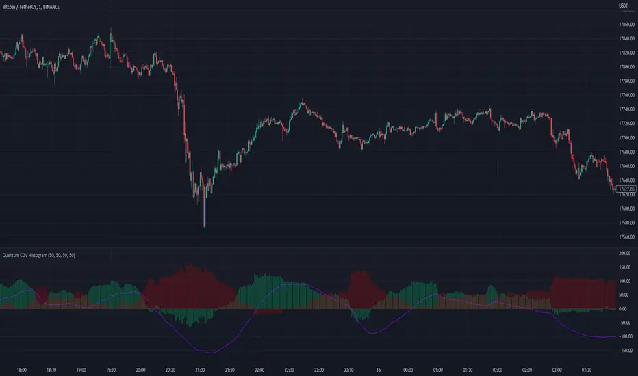
Quantum CDV HistogramThis script is an addition to Fixed Quantum Cdv.
It shows vector cdv ratio in columns.
You can select the length as an input to how many bars to look back for the whole calculation.
The green bars represent the bullish values and the red bars the bearish values.
The green line represents an ema of the bullish value and the red line the ema of the bearish value.
The momentum ema (in purple) represent the cdv ratio (bullish - bearish).
When the momentum ema is at 100% or more it’s a good sell opportunity and when the momentum ema is at or under 100% it’s a good buy opportunity. It is not financial advise. Make sure to make your own analysis. This script help to make entries, but do not enter positions only based on this signal.
In the inputs you can select the emas that you want to display on your histogram.
The original script is the Cumulative Delta Volume by LonesomeTheBlue.
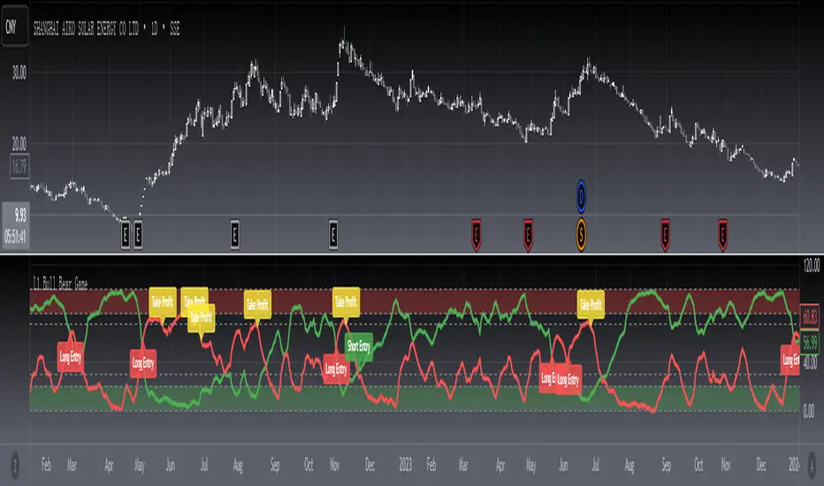
[blackcat] L3 Bull Bear GameLevel 3
Background
A bull bear banker fund game trajectories.
Function
This technical indicator draws a track diagram of the long-short power comparison through a custom trend line. The red curve represents the long line, and the green curve represents the short line. When the red line crosses the green line, it means that the upward momentum is sufficient, the whale is controlling the market, and the rise is imminent, which is a buy signal. When the red line enters the strong zone, it means that the whale is in control of the stock, and the stock is about to enter the stage of pulling up. On the contrary, if the green line turns upwards, it means that the whale is washing or retreating, and we must quickly reduce or clear the position. Sometimes when the indicator sends out a long entry signal, because the whale still has to go through a round of washing, I introduced a golden pit inflection point filter scheme, which can filter out these signals, so only when the signals appear at the same time is a long entry point signal.
Remarks
Feedbacks are appreciated.