S1XP4C Bear Klr 2.1.1BTC|USD 8d
Double EMA and SMA lines with a subtle offset to show bearish and bullish changes on an 8 day chart and a WMA to show extreme lows.
Cerca negli script per "bear"

1x RVOL Bull/Bear Painter v2Relative volume candle indicator registers bull and bear relative volume, at a threshold of 1 or greater. This can be modified to your liking. Use this to enter a strong trend on any time frame.

2 bearish candles above the 8 EMAYou will get a signal when:
Candle n-1 is bearish
Candle n is bearish
Candle n closes above the 8EMA
All on 30-minute timeframe

Absorption — Bullish or BearishAbsorption — Bullish or Bearish Only is a lightweight and minimalistic tool designed to identify pure absorption events in the market.
It highlights only two conditions:
Bullish Absorption
• Volume spike
• Small candle body
• Positive delta behavior (close > open)
→ Indicates potential buy-side absorption at lows
Bearish Absorption
• Volume spike
• Small candle body
• Negative delta behavior (close < open)
→ Indicates potential sell-side absorption at highs
This script intentionally keeps the chart clean by marking only “Bullish” or “Bearish” labels, without any additional visuals, colors, or extra signals.
Ideal for traders who want a simple, non-disruptive absorption confirmation tool.

APXTradez - Swing RSI🔹 APXTradez Swing RSI — Summary & Usage Guide
Purpose
- The APXTradez Swing RSI measures momentum strength and exhaustion in a stock’s price movement.
- It tells you when price is overextended, balanced, or reversing, helping you time entries, exits, and confirmation on swing trades.
This version is tuned for clean visual momentum tracking during 2-to-5-day swings or multi-week trends.
Core Components
-RSI (14-period)
- Uses a standard 14-bar calculation on the closing price (or whichever source you choose).
- Ranges between 0 and 100, showing how strong the recent price push has been.
- Smooth enough for swing trading; reactive enough to catch early turns.
- Color-Coded RSI Line
White = Neutral zone (healthy price action).
Lime = Oversold (< 30) → buying opportunity or short-covering zone.
Red = Overbought (> 70) → profit-taking or potential pullback zone.
Color shifts automatically as RSI crosses key thresholds, so you see sentiment flips instantly.
Horizontal Levels
70 = Overbought (red dashed line)
30 = Oversold (lime dashed line)
50 = Midline (gray dotted line, optional toggle)
These levels frame the RSI’s “zones of strength.”
How to Use It
1️⃣ Identify Momentum Regime
-Above 50 → Bullish Bias
Momentum favors buyers. Use this to confirm call or long positions.
- Below 50 → Bearish Bias
Momentum favors sellers. Confirms put or short setups.
- The 50 midline is your “momentum compass.”
Crosses above or below often precede trend reversals.
2️⃣ Spot Extremes (30 / 70 Zones)
RSI > 70 = Overbought
Price is stretched; risk of pullback or short-term cooling.
→ Good area to trim longs or watch for reversal candles.
RSI < 30 = Oversold
Price is washed out; potential bounce forming.
→ Good area to look for bullish reversal + volume confirmation.
3️⃣ Combine with APX TTM Squeeze and Overlay
- When RSI > 50 and rising + TTM histogram bright teal + Squeeze fires black dot up → high-probability long swing.
- When RSI < 50 and falling + TTM histogram bright yellow + Squeeze fires down → high-probability short swing.
- When RSI flat around 50 → trendless; wait for compression + momentum confirmation.
4️⃣ Divergences (Advanced Use)
- Bullish Divergence: Price makes a lower low, RSI makes a higher low → momentum turning up before price.
- Bearish Divergence: Price makes a higher high, RSI makes a lower high → momentum weakening.
- These signals are strongest when combined with a Squeeze firing or EMA crossover from your Swing Overlay.
Best Timeframes
Daily / 4-Hour: Ideal for swing entries and momentum tracking.
1-Hour: For fine-tuning entries inside larger setups.
- The APXTradez Swing RSI gives you a clean, visual read on who controls momentum and when that strength is fading or reversing.
- It’s not meant to predict exact tops or bottoms — it’s a confirmation and rhythm tool:
Use the 50-line for trend bias.
Use 30/70 for exhaustion.
Use color shifts for quick sentiment reads.
Combine with your APX Squeeze and Overlay for the complete swing-timing system.

PDB - RSI Buy & Sell Zones + SMA (PrintDemBandz)PDB - RSI Buy & Sell Zones
A clean, upgraded version of the RSI with shaded momentum zones to make entries and exits easier to spot. The background is divided into five color-coded zones so you instantly see when the market is shifting from bullish to bearish momentum.
Shaded Zones Explained:
| Zone | RSI Range | Zone Meaning |
| --------------------------- | --------- | ----------------------------------------------------- |
| Strong Buy (Dark Green) | < 30 | Oversold extreme – high probability bounce zone
| Buy Zone (Light Green) | 30–40 | Early accumulation & potential reversal area
| Neutral (Grey) | 40–60 | No edge zone – stay patient and wait for direction |
| Sell Zone (Light Red) | 60–70 | Market heating up – take profit or prepare to short |
| Strong Sell (Dark Red) | > 70 | Overbought extreme – high probability correction zone |
A dashed midline at 50 helps instantly gauge trend bias (above = bullish, below = bearish).
Use this RSI alone or combine with MACD or MA for stronger confirmations.
Search "PDB" in the indicators section for more free indicators.

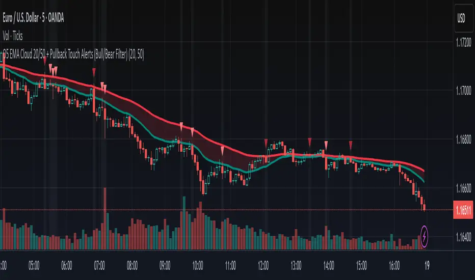
O5 EMA Cloud 20/50 + Pullback Touch Alerts (Bull/Bear Filter)This indicator shows an EMA cloud that is set to Fast=20 and Slow=50 by default, but can be changed.
It features suggested entry signals when price pulls back to either EMA level in both uptrends and downtrends.
Buy signals print only when price pulls back to one of the EMA levels and closes up.
Bearish signals only print when price pulls back to one of the EMA levels and closes down.
Bull vs Bear Volume(Simplified)Bull vs Bear Volume
After experimenting with countless volume-based indicators, I sought a simple way to visualize buying and selling pressure with just two lines—an indicator that stays closely coupled with price action.
I went through endless trial and error, building extremely complex volume indicators, only to find that in live trading, errors kept arising and the tools became more hindrance than help. Yet, to enhance the reliability of price indicators, a trustworthy volume measure is indispensable. Even after testing numerous community-shared indicators, I could not find one that met my needs.
This led me to a simple idea: process volume only when Close > Open for buying pressure, and Close < Open for selling pressure, while cleaning out the noise. By reflecting only the volume contributing to price movement, the indicator remains stable and intuitive.
Implementing this concept, I created an indicator that, among countless volume tools, stands out for its clarity and lack of extraneous functions. Users can freely adjust the sum periods of the Bull and Bear lines, choose line styles, and even enjoy the dynamic color changes when the lines cross.
If this indicator can provide even a little assistance in trading, then my purpose is fulfilled.

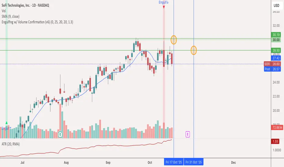
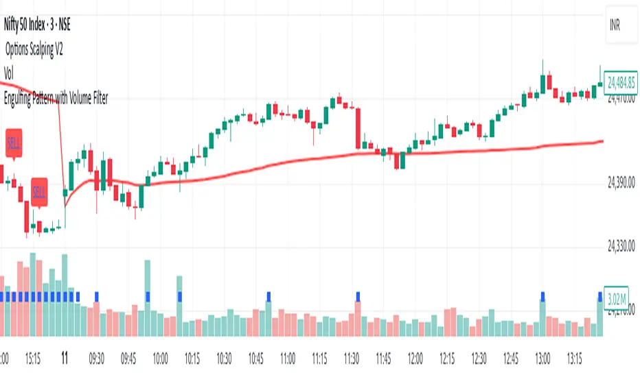
Engulfing bull & bear w/ Volume Confirmation (v6)This script ID's bullish & bearish engulfing bars with volume ≥ SMA (volume, 20) x 1.3 and (optionally) ≥ previous bar's volume.
Parameters adjustable
Engulfing Detector [HASIB]Description:
Engulfing Detector is a clean and powerful candlestick pattern indicator designed to automatically detect Bullish and Bearish Engulfing setups on any chart and any timeframe.
This tool helps traders easily spot reversal zones and potential trend continuation entries by highlighting high-probability engulfing candles with clear visual signals.
🔹 Features:
Detects both Bullish and Bearish Engulfing patterns in real time
Works on all timeframes and all assets (Forex, Crypto, Stocks, Indices)
Customizable color alerts for bullish and bearish signals
Lightweight, fast, and optimized for smooth performance
Perfect for price action traders and candlestick strategy lovers
📈 Created with precision and simplicity by Hasib, for traders who love clarity and confidence in their charts.
Bullish & Bearish Once Bar PainterThe Bullish & Bearish First Bar Marker is a simple yet powerful indicator designed to highlight the first bullish and bearish bars in a sequence, helping traders identify key momentum shifts in the market. It marks:Bullish Bars: The first bar where the high and low are both higher than the previous bar (high > high and low > low ), painted green with a "Bullish" label.
Bearish Bars: The first bar where the high and low are both lower than the previous bar (high < high and low < low ), painted red with a "Bearish" label.
To avoid clutter, consecutive bullish or bearish bars are not marked until a non-bullish or non-bearish bar resets the sequence. This makes it ideal for spotting the start of strong upward or downward price movements.

Moons Bearish Pullback Detector# Moons Bearish Pullback Detector
## Overview
**Moons Bearish Pullback Detector** is a trend following indicator intended to identify bearish trend pullbacks to enter on price continuation.
This indicator is useful for setting watchlist alerts! Configure your pullback rules and have it monitor your watchlist for you. You will be alerted when pullbacks have occurred and are starting to continue in the trend direction.
## How It Works
### Bearish Trend Detection
The indicator identifies a bearish trend based on a configurable MA basis
### Pullback Identification
Once in a bearish trend, the indicator tracks:
Swing Lows: Continuously monitors and updates the lowest point in the trend
Pullback Start: Detects the first green candle after establishing new lows
Pullback Duration: Monitors pullback length (configurable number of bars)
Pullback Depth: Ensures pullbacks don't violate a key moving average (optional)
### Multi-Layer Filtering System
The indicator employs several optional filters to ensure signal quality:
Volume Filter: Set a minimum daily volume to ensure sufficient liquidity
Pullback Duration Filter: Pick a min and max bar count you like to see in a pullback.
Pullback Depth Filter: Monitors that pullbacks don't close above the desired EMA, maintaining trend strength
Validation Filter: Checks higher timeframe moving average for trend confirmation
Context Filter: Analyzes even higher timeframe for broader market context
### Alert System
The indicator generates alerts when:
All filtering conditions are met
Price crosses back below the configured alert line
This signals potential continuation of the bearish trend and gives warning to place potential orders
## Key Features
### Alerts
The indicator is useful for driving a watchlist alert to notify you when a pullback is starting to continue the trend.
### Visual Elements
Bollinger Bands: Optional display of 1 and 2 standard deviation bands
Moving Averages: 20 EMA (basis), 50 EMA, and 10 EMA (pullback filter)
Trend High Line: Yellow line showing current swing low during pullbacks
Alert Line: Entry signal line positioned below swing low
Background Highlighting: Gray for normal pullbacks, red tint when rules aren't met
Labels: Price labels at swing lows and depth violation warnings
Wick Detection: Tags bullish and bearish wicks for helpful spotting in your analysis
### Information Table
Comprehensive status table to show the state of your filters and rules as price plays out.
### Configuration Options
Moving average settings
Display Options
Alert Configuration
Filter Settings
## Best Use Cases
Swing Trading: Identify high-probability entries during trend pullbacks
Trend Following: Stay aligned with strong bearish momentum
Risk Management: Multiple filters help avoid false signals
Multi-Timeframe Analysis: Ensures broader market context alignment
## Trading Applications
This indicator works best when:
Markets are in clear downtrends
Sufficient volume is present
Multiple timeframes align
Used in conjunction with proper risk management
The Moons Pullback Detector provides traders with a systematic approach to identifying and capitalizing on pullback opportunities in strong bearish trends, combining technical rigor with practical usability.
---
*Note: This indicator is for educational purposes. Past performance does not guarantee future results. Always use proper risk management and consider multiple factors when making trading decisions.*

Bull/Bear Lower Volume (vijayachandru)Bull/Bear Lower Volume (HA + Box + ±15 Lines)
This indicator tracks intraday Heikin Ashi candles and highlights the lowest-volume bull/bear candles after 9:25 (IST). When price breaks above/below these candles, a breakout box is drawn with optional ±15 point dashed levels. It plots clear Buy/Sell signals, marks box breakouts, and provides alert conditions for all setups—helping traders spot early intraday breakouts driven by volume shifts

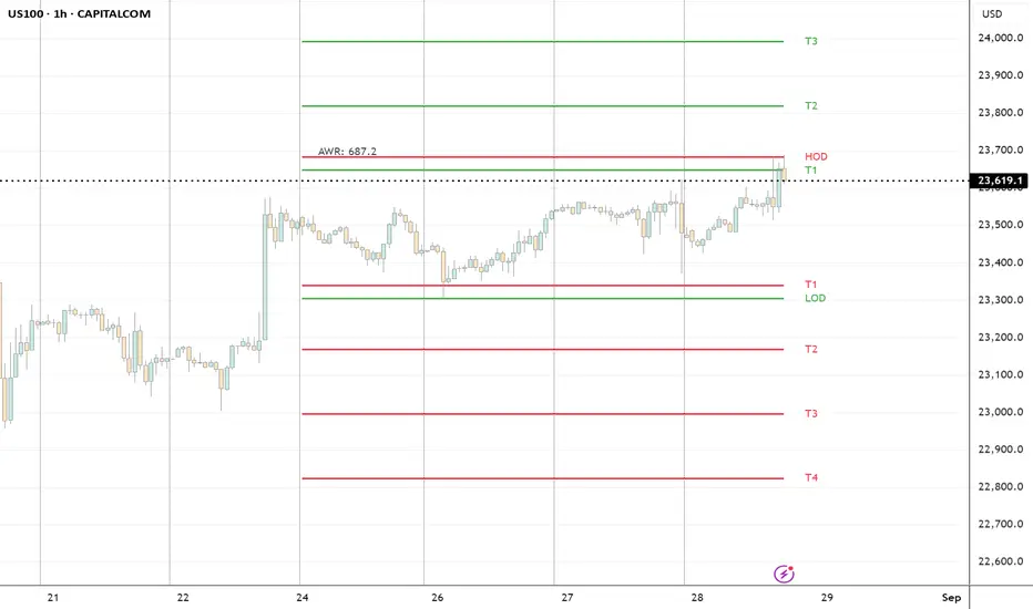
ADR H/L + Bull/Bear TargetsThis indicator calculates the Average Daily/Weekly Range over any given period and plots the Bull and Bear targets for that Session Daily/Weekly or both. Classic targets are calculated at ADR/AWR +/- .50 .75 1.00 1.25. Green is for the + and RED is for the - but colors can been changed to suit.
In 'Settings' there is the ability to toggle:
1. How many sessions you want to plotting on your chart.
2. Switching ON/OFF Bull/Bear targets.
3. Line color/thickness
4. Ability to offset Header for ADR/AWR vertically.
5. I've put in there a FIB option as well as Classic. FIB counts are at .382 .50 .618 1.00 of ADR and labelled as such.
Strong Bullish And Bearish Engulfing PatternCONDITIONS:
🔹 1st Condition — Bullish Engulfing ➜ BUY
Previous Candle (Red): close < open
Current Candle (Green): close > open
Opens below previous red candle’s close: open < close
Closes above previous red candle’s open: close > open
➡️ Plot BUY below the green candle
🔸 2nd Condition — Bearish Engulfing ➜ SELL
Previous Candle (Green): close > open
Current Candle (Red): close < open
Opens above previous green candle’s close: open > close
Closes below previous green candle’s open: close < open
➡️ Plot SELL above the red candle
What this Script Does:
Detects Bullish Engulfing patterns ➜ plots BUY below the green candle.
Detects Bearish Engulfing patterns ➜ plots SELL above the red candle.
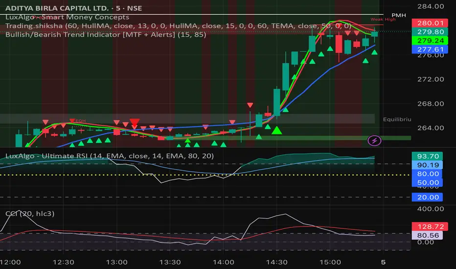
Bullish/Bearish Trend Indicator [MTF + Alerts] by Dow theory Summary of Logic:
✅ Bullish Trend:
Setup Bar: High > Previous High AND Low ≥ Previous Low
Confirmation Bar: High > Highest High of last 3 candles, Low ≥ Setup Bar Low
Trend Continues Until: Latest candle breaks 2nd last candle’s low → then trend becomes Bearish
🔻 Bearish Trend:
Setup Bar: Low < Previous Low AND High ≤ Previous High
Confirmation Bar: Low < Lowest Low of last 3 candles, High ≤ Setup Bar High
Trend Continues Until: Latest candle breaks 2nd last candle’s high → then trend becomes Bullish
RSI with Divergence and Custom Bullish/Bearish RangesRSI indicator with bullish and bearish shaded ranges accounting for:
- tendency of RSI to peak lower than usual and drop lower than usual in bearish trends
- tendency of RSI to peak higher than usual and bottom out higher than usual in bullish trends

ATR % of yesterday close with SMA (Bull/Bear colored)This script visualizes the Average True Range (ATR) as a percentage of a user-selected price point for a quick view of volatility.
ATR % values are plotted as a color-coded histogram. Bullish days (close > prior close) paint the bar green; bearish days (close < prior close) paint it red; unchanged days are gray.
Two simple moving average (SMA) overlays to reveal volatility trends.
Variables:
Histogram bars represent ATR as a % of one of:
- Previous Close (default option)
- Previous Open
- Today Close
- Today Open
Two SMA lines (default: blue for 20-period, orange for 5-period) shown on ATR % for trend/range regime tracking.
Optionally display the ATR % in continuous line (yellow)—hidden by default.
If you find it helpful, feel free to share any feedback and how you incorporate it into your trading strategy with the community!

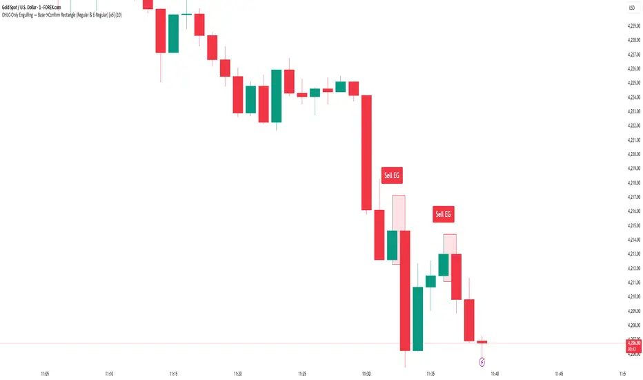
Bullish & Bearish Wick MarkerMarks bullish and bearish engulfing candles
Bullish engulfing candle:
when the low is lower than the previous candle low and the body close is higher than the previous candle body
Bearish engulfing cande:
when the high is higher than the previous candle high and the body close is lower than the previous candle body

All SMAs Bullish/Bearish Screener (Enhanced)All SMAs Bullish/Bearish Screener Enhanced: Uncover High-Conviction Trend Alignments with Confidence
Description:
Are you ready to elevate your trading from mere guesswork to precise, data-driven decisions? The "All SMAs Bullish/Bearish Screener Enhanced" is not just another indicator; it's a sophisticated, yet user-friendly, trend-following powerhouse designed to cut through market noise and pinpoint high-probability trading opportunities. Built on the foundational strength of comprehensive Moving Average confluence and fortified with critical confirmation signals from Momentum, Volume, and Relative Strength, this script empowers you to identify truly robust trends and manage your trades with unparalleled clarity.
The Power of Multi-Factor Confluence: Beyond Simple Averages
In the unpredictable world of financial markets, true strength or weakness is rarely an isolated event. It's the harmonious alignment of multiple technical factors that signals a high-conviction move. While our original "All SMAs Bullish/Bearish Screener" intelligently identified stocks where price was consistently above or below a full spectrum of Simple Moving Averages (5, 10, 20, 50, 100, 200), this Enhanced version takes it a crucial step further.
We've integrated a powerful three-pronged confirmation system to filter out weaker signals and highlight only the most compelling setups:
Momentum (Rate of Change - ROC): A strong trend isn't just about price direction; it's about the speed and intensity of that movement. Positive momentum confirms that buyers are still aggressively pushing price higher (for bullish signals), while negative momentum validates selling pressure (for bearish signals).
Volume: No trend is truly trustworthy without the backing of smart money. Above-average volume accompanying an "All SMAs" alignment signifies strong institutional participation and conviction behind the move. It separates genuine trend starts from speculative whims.
Relative Strength Index (RSI): This versatile oscillator ensures the trend isn't just "there," but that it's developing healthily. We use RSI to confirm a bullish bias (above 50) or a bearish bias (below 50), adding another layer of confidence to the direction.
When the price aligns above ALL six critical SMAs, and is simultaneously confirmed by robust positive momentum, healthy volume, and a bullish RSI bias, you have an exceptionally strong "STRONGLY BULLISH" signal. This confluence often precedes sustained upward moves, signaling prime accumulation phases. Conversely, a "STRONGLY BEARISH" signal, where price is below ALL SMAs with negative momentum, confirming volume, and a bearish RSI bias, indicates powerful distribution and potential for significant downside.
How to Use This Enhanced Screener:
Add to Chart: Go to TradingView's Pine Editor, paste the script, and click "Add to Chart."
Customize Parameters: Fine-tune the lengths of your SMAs, RSI, Momentum, and Volume averages via the indicator's settings. Experiment to find what best suits your trading style and the assets you trade.
Choose Your Timeframe Wisely:
Daily (1D) and 4-Hour (240 min) are highly recommended. These timeframes cut through intraday noise and provide more reliable, actionable signals for swing and position trading.
Shorter timeframes (e.g., 15min, 60min) can be used by advanced day traders for very short-term entries, but be aware of increased volatility and noise.
Visual Confirmation:
Green/Red Triangles: Appear on your chart, indicating confirmed bullish or bearish signals.
Background Color: The chart background will subtly turn lime green for "STRONGLY BULLISH" and red for "STRONGLY BEARISH" conditions.
On-Chart Status Table: A clear table displays the current signal status ("STRONGLY BULLISH/BEARISH," or "SMAs Mixed") for immediate feedback.
Set Up Alerts (Your Primary Screener Tool): This is the game-changer! Create custom alerts on TradingView based on the "Confirmed Bullish Trade" and "Confirmed Bearish Trade" conditions. Receive instant notifications (email, pop-up, mobile) for any stock in your watchlist that meets these stringent criteria. This allows you to scan the entire market effortlessly and act decisively.
Strategic Stop-Loss Placement: The Trader's Lifeline
Even the most robust signals can fail. Protecting your capital is paramount. For this trend-following strategy, your stop-loss should be placed where the underlying trend structure is broken.
For a "STRONGLY BULLISH" Trade: Place your stop-loss just below the most recent significant swing low (higher low). This is the last point where buyers stepped in to support the price. If price breaks below this, your bullish thesis is invalidated.
For a "STRONGLY BEARISH" Trade: Place your stop-loss just above the most recent significant swing high (lower high). If price breaks above this, your bearish thesis is invalidated.
Alternatively, consider placing your stop-loss just below the 20-period SMA (for bullish trades) or above the 20-period SMA (for bearish trades). A significant close beyond this intermediate-term average often indicates a critical shift in momentum. Always ensure your chosen stop-loss adheres to your pre-defined risk per trade (e.g., 1-2% of capital).
Disciplined Profit Booking: Maximizing Gains
Just as important as knowing when you're wrong is knowing when to take profits.
Trailing Stop-Loss: As your trade moves into profit, trail your stop-loss upwards (for longs) or downwards (for shorts). You can trail it using:
Previous Swing Lows/Highs: Move your stop to just below each new higher low (for longs) or just above each new lower high (for shorts).
A Moving Average (e.g., 10-period or 20-period SMA): If price closes below your chosen trailing SMA, exit. This allows you to ride the trend while protecting accumulated profits.
Target Levels: Identify potential resistance levels (for longs) or support levels (for shorts) using pivot points, previous highs/lows, or Fibonacci extensions. Consider taking partial profits at these levels and letting the rest run with a trailing stop.
Loss of Confluence: If the "STRONGLY BULLISH/BEARISH" condition ceases to be met (e.g., RSI crosses below 50, or volume drops significantly), this can be a signal to reduce or exit your position, even if your stop-loss hasn't been hit.
The "All SMAs Bullish/Bearish Screener Enhanced" is your comprehensive partner in navigating the markets. By combining robust trend identification with critical confirmation signals and disciplined risk management, you're equipped to make smarter, more confident trading decisions. Add it to your favorites and unlock a new level of precision in your trading journey!
#PineScript #TradingView #SMA #MovingAverage #TrendFollowing #StockScreener #TechnicalAnalysis #Bullish #Bearish #QQQ #Momentum #Volume #RSI #SPY #TradingStrategy #Enhanced #Signals #Analysis #DayTrading #SwingTrading

RSI Divergence (Nikko)RSI Divergence by Nikko
🧠 RSI Divergence Detector — Nikko Edition This script is an enhanced RSI Divergence detector built with Pine Script v6, modified for better visuals and practical usability. It uses linear regression to detect bullish and bearish divergences between the RSI and price action — one of the most reliable early signals in technical analysis.
✅ Improvements from the Original:
- Clean divergence lines using regression fitting.
- Optional label display to reduce clutter (Display Labels toggle).
- Adjustable line thickness (Display Line Width).
- A subtle heatmap background to highlight RSI overbought/oversold zones.
- Uses max accuracy with high calc_bars_count and custom extrapolation window.
🔍 How It Works: The script applies linear regression (least squares method) on both RSI data, and Price (close) data.
It then compares the direction of RSI vs. direction of Price over a set length. If price is making higher highs while RSI makes lower highs, it's a bearish divergence. If price is making lower lows while RSI makes higher lows, it's a bullish divergence. Additional filters (e.g., momentum and slope thresholds) are used to validate only strong divergences.
🔧 Input Parameters: RSI Length: The RSI period (default: 14). RSI Divergence Length: The lookback period for regression (default: 25). Source: Which price data to calculate RSI from (default: close). Display Labels: Show/hide “Bullish” or “Bearish” labels on the chart. Display Line Width: Adjusts how thick the plotted divergence lines appear.
📣 Alerts: Alerts are built-in for both RSI Buy (bullish divergence) and RSI Sell (bearish divergence) so you can use it in automation or notifications.
🚀 Personal Note: I’ve been using this script daily in my own trading, which is why I took time to improve both the logic and visual clarity. If you want a divergence tool that doesn't clutter your chart but gives strong signals, this might be what you're looking for.

Inside Bar Candle Color with Bullish/Bearish AlertTitle:
Inside Bar Candle Color with Bullish/Bearish Alerts
Description:
This indicator highlights Inside Bars based on candlestick structure and colors them according to bullish or bearish sentiment. It also includes real-time alerts for both bullish and bearish inside bars.
Key Features:
Detects inside bars (including equal highs/lows)
Bullish inside bars are highlighted in green (customizable)
Bearish inside bars are highlighted in red (customizable)
Alerts included:
Bullish inside bar alert
Bearish inside bar alert
Works on all timeframes and instruments
What is an Inside Bar?
An inside bar is a candlestick whose high and low are completely within the range of the previous candle. It often signals market consolidation or a potential breakout setup.
How to Use:
Use inside bars as part of a breakout or continuation strategy
Combine with trend direction, support/resistance, or volume for confirmation
Customize the candle colors to match your chart theme
Note: This indicator does not provide buy or sell signals. It's a visual tool designed to support price action traders in identifying low-volatility zones and potential setups.

Bullish & Bearish Three Line Strike ProHello Traders!
Overview
The **Bullish & Bearish Three Line Strike Pro** indicator pin-points one of the most decisive four-candle reversal formations on any market or timeframe. Whether you trade ranges or follow strong trends, this tool spots exhaustion and offers clear entry and exit guidance.
Key Features :
Precise pattern detection: Detects genuine Bullish and Bearish Three Line Strike setups, screening out look-alikes that fail to perform on the market.
Trend filter (optional): Aligns signals with a user-defined Simple Moving Average (SMA) so you can choose to trade only with, or deliberately against, the prevailing trend.
Visual clarity: Highlights Bullish and Bearish Three Line Strike patterns with customizable colors and shapes, making them easy to spot on the chart.
Filtered-signal display: Let the script reveal which patterns were rejected by the trend filter — an invaluable learning aid.
Bullish Three Line Strike
Three consecutive bearish candles that step lower.
The fourth candle opens below (or at) the last close, then charges upward engulfing all three prior bodies.
Bearish Three Line Strike
Three consecutive bullish candles that step higher.
The fourth candle opens above (or at) the last close, then plunges below engulfing all three prior bodies.
What makes this indicator unique
Precise pattern detection: Detects genuine Bullish and Bearish Three Line Strike setups, screening out look-alikes that fail to perform on the market.
Trend filter (optional): Aligns signals with a user-defined Simple Moving Average (SMA) so you can choose to trade only with, or deliberately against, the prevailing trend.
Visual clarity: Highlights Bullish and Bearish Three Line Strike patterns with customizable colors and shapes, making them easy to spot on the chart.
Filtered-signal display: Let the script reveal which patterns were rejected by the trend filter — an invaluable learning aid.
Nuanced candle analytics: Goes beyond simple price action by considering multiple factors such as candle body ratios, wick lengths, and relative positions to previous candles.
Adaptive learning mode: Display rejected setups to reverse-engineer the logic and refine your discretionary skills.
One-glance decision making: Unified color scheme and label styling make patterns pop, even on cluttered layouts.
How to Trade with this Indicator
Use Three Line Strike Pro to fade exhaustion or re-enter a trend after a healthy pull-back.
Bullish opportunities: Watch for light blue-colored strike candles as potential entry points.
Bearish opportunities: Look for orange-colored strike candles as potential entry points.
Entry: Open the position at the next bar’s open once the strike candle closes.
Stop-loss: 2 ticks beyond the extreme of the complete four-candle pattern.
Aggressive stop-loss: For exceptionally strong strike candles (tiny opposite wick, close near extreme) trail only 2 ticks beyond the strike candle itself.
Take-profit: Aim for 2R (3R for aggressive traders), or trail behind higher lows / lower highs.
Trend Alignment
For a conservative approach, enable "Use Trend Filter" and take only those strikes that agree with the SMA slope. The SMA line is color-coded—lime for up, red for down, yellow for flat—to help you confirm bias at a glance.
Tip: If you want the candle coloring to sit on top of all other studies, drag the indicator to the top of your Object Tree.
