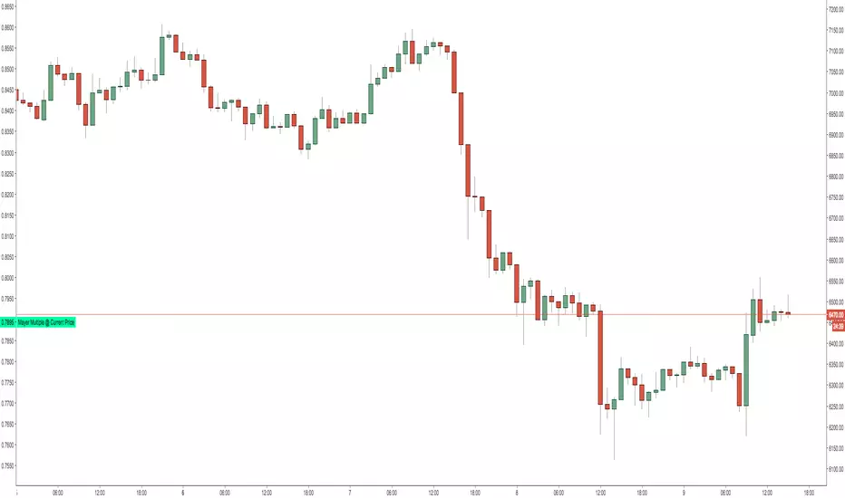
Mayer Multiple @ Current PriceThough this script is by me, the original idea comes from a podcast I heard where Trace Mayer talks about how he does crypto valuation. It is based on current price against the 200 day moving average. This indicator script will simply plot that value as a label overlayed on your trading view chart. Best long term results occur when acquiring BTC when the multiple is 2.4 or less. For more info, google "mayer multiple" This script/indicator is strictly for educational purposes. It is not exclusive to bitcoin.
To get the best look out of your charts I make the following changes.
1.Apply the indicator to your chart.
2. In the tools palette of trading view, when looking at a chart, click "Show Objects Tree" the icon displayed above the trash can.
In the objects tree panel, click the preferences icon for "Mayer Multiple @ Current Price"
Switch "scale" to "scale Left"
3. Then for your chart preferences (right click on chart background and select "Properties", and be sure the following are checked on the "Scales" tab
Left Axis
Right Axis
Indicator Last Value
Indicator Labels
Screenshots are not allowed in this view, so I can't post screenshots, but the view above is what it should look like when you are done.
For anyone who wants to see the code, here is the code of the script:
Use at will, and at your own risk.
//@version=3
// Created By Timothy Luce, inspired by Trace Mayer's 200 Day SMA cryptocurrency valuation method
study("Mayer Multiple @ Current Price", overlay=true)
currentPrice = close
currentDay = security(tickerid, "D", sma(close, 200))
mayerMultiple = currentPrice/currentDay
plot(mayerMultiple, color=#00ffaa, transp=100)
If you want to change the color, change this line: #00ffaa
Cerca negli script per "bitcoin"
HLC3This is a script I wrote years ago. Some people prefer a line instead of candles, the standard tradingview line is too simple, so I copied the line from bitcoinity.org. I added heiken ashi colors to it as well. If you don't want that you can configure that in the options, you get a yellow line instead. You can also configure the source there, you do not have to use hlc3.
BITFINEX BTCUSD shorts vs longsA simple script to get an RSI of BTCUSD SHORTS and LONGS on Bitfinex.
(Forked from an open sourced script)
Moving Average Price MultipleAuthor: Preston Pysh & Trace Mayer
Visit www.MayerMultiple.com to see current charts & explanation
Listen to Preston's Podcast: www.theinvestorspodcast.com
Follow Preston on Twitter: twitter.com
This indicator calculate the Price Multiple from Current Close Price vs 200 Day Moving Average.
Based on Preston's article:
+ The average Mayer Multiple is 1.44 for the history of Bitcoin.
+ Safe Buying Threshold is 2.4

rem sim v0.1every alt-coin has similarity.
cause of bitcoin.
always i want to delete that similarity and read the true(?) value of each coin.
and i made some script for that, but not good enough.
this one is different.
Rem Sim (rs) removes the similarity very effectively.
it make avg WaveTrend from nxt, strat, steem, ...
and that is the similarity
and it show true(?) WaveTrend without similarity.
so if the alt-coin move like other alt-coin, the WT almost 0.
sorry my bad english.
if you dont understand my english. just look at that chart.
also you can see source code.
--------
대부분의 알트가 어느정도 비슷한 차트를 가지는데, 그 유사성을 제거하면 어떤 모양인지 궁금해서 만들었어요.
전에 만들었던 비트코인의 영향력을 제거해주는 아이디어는 실제론 별 효용이 없는데 이건 좀 쓸만해보이네요.
웨이브트렌드의 모양으로 보여줍니다.

UCS Squeeze Momentum Overlay with AlertsAll credit to the great ucsgears. His original indicator is on this page:
I just remixed the visuals and added alerts when price is released from the squeeze. I find it works well on lower timeframes for Forex and Bitcoin. Suggestions for other instruments and timeframes are welcome! When adding alerts use 'On Condition' to get the fastest alerts.
Best used in conjunction with the USC_SQZ_Opt Ooscillator from this page:
Possibly useful tip: the squeeze code here is great for identifying ranging markets, and can be used with other indicators to stop alerts firing in choppy markets.


MAGNUS® CyclesThis indicator will help you if you struggle making any profit in bitcoin.
It generates very few signals with very nice profit potential ( around 100% this year ! ).
Perfect tool for longterm swing traders and new traders that need help figuring out the midterm trend.
Use it with these parameters only:
weekly: 13, 5, 12
daily: 92, 21, 96

RLP V4.3 -Long Term Support/Resistance Levels (Refuges-Shelters)// Introduction //
We have utilized the Zigzag library technology from ©Trendoscope Pty Ltd for Zigzag generation, allowing users the freedom to choose which of the different Zigzags calculated by Trendoscope as "Levels and Sub-Levels" is most suitable for generating ideal phases for evaluation and selection as "most preponderant phases" over long-term periods of any asset, according to its particular behavior based on its age, volatility, and price trend.
// Theoretical Foundation of the Indicator //
Many traditional institutional investors use the latest higher-degree market phase that stands out from others (longest duration and greatest price change on daily timeframe) to base a Fibonacci retracement on whose levels they open long-term positions. These positions can remain open to be activated in the future even years in advance. The phase is considered valid until a new, more preponderant phase develops over time, at which point the same strategy is repeated.
// Indicator Objectives //
1) Automatically find the latest most preponderant long-term phase of an asset, analyzing it on daily timeframe while considering whether the long-term market trend is bullish or bearish.
2) Draw a Fibonacci Retracement over the preponderant phase (reversed if the phase is bullish).
3) The indicator automatically numbers and locates the 3 most preponderant phases, selecting Top-1 for initial Fibo drawing.
4) If the user disagrees with the indicator's automatic selection, they have the freedom to choose any of the other 2 Top phases for the Fibo drawing and its levels.
5) If the user disagrees with the amplitude or frequency of the initially drawn Zigzag phases, they can modify the Zigzag calculation algorithm parameters until one of the Top-3 matches the phase they had in mind.
6) As an experimental bonus, the indicator runs a popularity contest (CP) of "bullseye" daily price (OHLC) matches, subject to user-defined tolerance ranges, against all Fibo levels of the Top 3 selected phases, to verify which phase the market prices are validating as the most popular for placing trades. Contest results are displayed in the POP. CONTEST column of the Top-3 phases table. If the contest detects a change in the winning phase, a switch can be enabled to activate an alert that the user can utilize with TradingView's alert creator to display an alarm, send an email, etc.
7) This indicator was designed for users to find the preponderant long-term phase of their assets and manually record the date-price coordinates of the i0-i1 anchors of the preponderant phase. The Top-1 phase coordinates are shown in the Top-3 phases table where they can be captured. The date-price coordinates of all HH and LL pivots, from all Zigzag phases, can be displayed via a switch. With the pivots, the user can select a different phase than those automatically found by the indicator, according to the conclusions of their own research. Subsequently, the user can forget about this RLP indicator for a while and move on to apply in their normal trading our RLPS indicator (Simplified Long-Term Shelters), in which they can draw and simultaneously track the long-term shelters of up to 5 different assets, simply by entering their corresponding date-price coordinates, previously located with this RLP indicator or through their own observation.
// Additional Notes //
1) As of the this V4.3 publication date (01/2026), the Zigzag generation parameters were adjusted by default to find the long-term preponderant phases for the following assets: Bitcoin, Ethereum, Bitcoin futures BTC1! (all generated due to the 2020-2021 pandemic). It also provides by default the confirmed preponderant phases for the following assets: Apple, Google, Amazon, Microsoft, PayPal, NQ1!, ES1! and SP500 Cash.
2) Prices, phases, and levels shown on the graphic chart correspond to results obtained using daily Bitcoin data from the Bitstamp exchange, BTCUSD:BITSTAMP (popular here in Europe).
3) Any error corrections or improvements that can be made to the phase selection algorithms or the CP phase popularity contest algorithm will be highly appreciated (statistics and mathematics, among many other sciences, are not particularly our strong suit).
4) We sincerely regret to inform you that we have not included the Spanish translation previously provided, due to our significant concern regarding the ambiguous rules on publication bans related to indicators.
4) Sharing motivates. Happy hunting in this great jungle!

ChunkbrAI-NN INDIChunkbrAI-NN INDI: The Neural Network Odyssey
A Native Pine Script Neural Network Research Engine
Welcome to ChunkbrAI-NN 5.3. This is not a standard technical indicator; it is a proof-of-concept Artificial Intelligence engine built entirely from scratch within Pine Script.
Neural Networks typically require iterating over massive datasets, a task that usually times out on TradingView. ChunkbrAI solves this by introducing a novel "Chunking Architecture"—a system that breaks history into digestible learning blocks and trains a Multilayer Perceptron (MLP) using a "Chunking" approach.
It features a living ecosystem where neurons have "genes," grow mature, and adapt to market regimes using a highly sophisticated Context-Aware normalization engine.
-----------------------------------------------------------
The Core Concept: "The Time Wheel"
To bypass Pine Script's execution limits, this script does not train linearly from the beginning of time. Instead, it operates like a spinning wheel of experience.
* The Chunk System: On every bar update, the engine reaches back into history (up to 5000 bars) and grabs random or sequential "Chunks" of data. It treats these chunks as isolated training samples.
* Experience Replay: By constantly revisiting past market scenarios (Chunks), the network slowly converges its weights, learning to recognize patterns across different eras of price action.
-----------------------------------------------------------
Architecture & Modules
A. The Neural Core (MLP)
At the heart is a raw neural network built with arrays:
* Topology: A dense network with a customizable Hidden Layer (Default: 60 Neurons).
* Timewarp (Stride): When enabled, the network uses "dilated" inputs (skipping bars, e.g., 1, 3, 5...). This increases the network's Field of View without increasing computational load.
* Forecasting: The network outputs a standardized prediction which is then de-normalized to project the future price path on your chart.
B. The Context System (The "Eyes")
Raw prices confuse neural networks. A $1000 move in Bitcoin is massive in 2016 but noise in 2024. ChunkbrAI uses a relativistic Context System:
* Regime Detection: It uses a Zero-Lag Moving Average (ZLMA) and Non-Linear Regression to measure the current market "Vibe" (Volatility & Trend).
* Dynamic Normalization: The inputs are scaled based on this context. If the market is volatile, the data is compressed; if calm, it is expanded. This ensures the brain receives consistent signal patterns regardless of the absolute price.
C. The Gene System (Neuro-Plasticity)
This is the experimental "biology" layer. Neurons are not just static math; they have life cycles.
* Maturity: Neurons start "Young" (highly plastic, high mutation rate). As they successfully reduce error, they become "Wise" (stable, low mutation).
* Mutation: If a "Wise" neuron begins failing (high error), it is demoted and forced to mutate. This allows the brain to "forget" obsolete behaviors and adapt to new market paradigms automatically.
* Profiles: You can initialize the brain with different personalities (e.g., Dreamer, Young Chaos, Zen Monk).
D. The Brain Scheduler (Adaptive Learning)
A static Learning Rate (LR) is inefficient. The Brain Scheduler acts as the heartbeat:
* Panic vs. Flow: It monitors the derivative of the error. If the error spikes (Panic), the Scheduler slows down learning to prevent the model from exploding. If the error smooths out (Flow), it accelerates learning (Infinite LR Mode).
-----------------------------------------------------------
Forecasting Modes
The script provides two distinct ways to visualize the future:
1. Direct Projection (Green Line):
The network takes the current window of price action and predicts the immediate next step. If Timewarp is active, it interpolates the result to draw a smooth curve.
2. Autoregression (Cyan Line):
Available in "Auto" mode. The network feeds its *own* predictions back into itself as inputs to generate multi-step forecasts.
* Wave Segmentation: The script intelligently guesses the current market cycle length and attempts to project that specific duration forward.
-----------------------------------------------------------
Operation Manual
The script has two distinct training loops: first, when you add it to a chart, Pine runs through the available historical bars once, and this initial history pass is the main training phase where the network iterates chunk-by-chunk using your configured chunk count/iterations (e.g., if chunk count is 3, it performs 3 chunk updates per step), but pushing chunk count, iterations, or model sizing too high can hit Pine’s execution limits; after that, once real-time candles start printing, the script can either keep training (weights continue updating) or freeze the weights and run inference only, producing predictions from the learned parameters, and if live training is enabled it can also simulate “bars-back” style training during live mode by iterating across prior bars as if doing another history pass—which again can run into limits if chunks/iterations/sizing are too heavy—so when changing parameters to evaluate behavior you change them carefully and individually, because multiple simultaneous increases make it hard to attribute effects and can more easily trigger those execution constraints.
Weight Persistence (Save/Load):
Pine Script can’t write files or persist weights directly, so ChunkbrAI uses a library-based workaround that’s honestly tricky and kind of a pain: you enable the weight-export alerts so the script emits the weights (W1/W2/biases etc.) as text, and those payloads are chunked as well; then, outside TradingView, I use a separate Python script to parse the alert emails, reconstruct and format the chunked weights properly, and generate the corresponding library code files; after that, the libraries have to be published/updated, and only then can the main script “restore” by reading the published lib constants on chart load, effectively starting with the pre-trained weights instead of relying purely on the fresh history-run training pass. I don’t recommend this process unless you really have to—it’s fragile and high-effort—but until TradingView implements some simple built-in data storage for scripts, it’s basically the only practical way to save and reload your models.
-----------------------------------------------------------
Limitations & Notes
* Calculation Limits: This script pushes Pine Script to its absolute edge. If you increase Chunk Size or Hidden Size too much, you WILL hit execution limits. Use the defaults as a baseline.
* Non-Deterministic: Because the "Wheel" picks random chunks for training, two instances of this script might evolve slightly different brains unless you use the Restore Weights feature.
* Experimental: This is a research tool designed to explore Neural Networks and Genetic Algorithms on the chart. Treat it as an educational engine, not financial advice.
Credits: Concept and Engineering by funkybrown.

Neeson Mayer MultipleIntegrating the Mayer Multiple Indicator: A Practical Guide for Market Analysis
Introduction
The Mayer Multiple indicator is a specialized tool designed to assess asset valuations relative to their long-term historical trends. By comparing current price action against a long-term simple moving average, this indicator provides a quantitative framework for identifying potential overbought and oversold conditions. This article explains the rationale behind its design, operational mechanics, practical applications, and unique value proposition.
Purpose and Functionality
The primary function of the Mayer Multiple indicator is to measure how far current prices deviate from a long-term moving average, expressed as a ratio. This measurement helps traders and investors identify:
Extreme valuation levels that may signal potential reversal points
Long-term trend strength and sustainability
Market psychology shifts between fear and greed cycles
Originally popularized in Bitcoin analysis, the indicator's principles apply to any volatile asset class where mean reversion tendencies exist alongside strong trend characteristics.
Operational Principles
The indicator operates through several interconnected components:
Core Calculation Mechanism
At its heart, the indicator calculates the Mayer Multiple by dividing the current closing price by a configurable simple moving average (default: 200 periods). This ratio represents how many times the current price exceeds its long-term average, providing an immediate visual reference for valuation extremes.
Multi-Level Threshold System
Four configurable thresholds create distinct market condition zones:
Optimal Buy Zone (default: 0.7) - Historically extreme undervaluation
Undervalued Zone (default: 1.0) - Moderate undervaluation
Overvalued Zone (default: 2.4) - Moderate overvaluation
Optimal Sell Zone (default: 3.5) - Historically extreme overvaluation
These thresholds create a graduated scale of market conditions rather than binary signals.
Visual Signal Hierarchy
A sophisticated color-coding system prioritizes different signal types based on their significance:
White/Gray: Neutral territory (between undervalued and overvalued thresholds)
Aqua: Entering undervalued territory (potential accumulation zone)
White: Reaching optimal buying conditions (historically rare opportunities)
Yellow: Entering overvalued territory (potential distribution zone)
Orange: Reaching optimal selling conditions (historically rare extremes)
Green: Emerging from optimal buying conditions (momentum shift confirmation)
Red: Retreating from optimal selling conditions (momentum reversal confirmation)
This hierarchy helps users distinguish between entry signals, exit signals, and confirmation signals.
Integration Rationale
The integration of these components follows a logical progression:
Mathematical Foundation
The moving average provides a stable reference point that filters out short-term noise while maintaining sensitivity to long-term trend changes. The ratio format normalizes values across different price levels and timeframes, enabling cross-asset comparisons.
Behavioral Finance Alignment
The threshold system corresponds to documented market psychology patterns. The extreme thresholds (optimal buy/sell) represent points where fear or greed typically reach maximum intensity, while the moderate thresholds represent early warning levels.
Progressive Signal Detection
The indicator tracks both threshold breaches and retreats from extreme zones. This dual-tracking approach captures not only when conditions become extreme but also when they begin to normalize—often the most actionable moments for position adjustments.
Component Synergy
The indicator's components work together through a continuous feedback loop:
Calculation Engine: Continuously computes the core ratio, serving as the foundation for all subsequent analysis.
Threshold Comparator: Compares the current ratio against user-defined thresholds, categorizing market conditions in real-time.
Signal Generator: Identifies specific events (threshold crossings, zone entries/exits) and assigns appropriate visual representations.
Visual Renderer: Displays the information through colored histograms, reference lines, and data tables, creating an intuitive interface.
Alert System: Monitors for predefined conditions and notifies users of significant developments without requiring constant screen monitoring.
This integrated approach transforms raw price data into structured, actionable information while maintaining mathematical rigor and visual clarity.
Practical Application Guidelines
Parameter Customization
Users should adjust parameters based on:
Asset volatility (higher volatility assets may require wider thresholds)
Timeframe (longer timeframes may benefit from longer moving averages)
Personal risk tolerance (conservative traders may use tighter thresholds)
Signal Interpretation Framework
Zone-Based Analysis: Focus on which zone the indicator occupies rather than chasing individual data points
Confirmation Seeking: Use extreme zone signals (white/orange) as alerts for further analysis rather than automatic trade triggers
Momentum Assessment: Observe how quickly the indicator moves between zones as a measure of trend strength
Complementary Tools
The Mayer Multiple works best when combined with:
Volume analysis to confirm participation during extreme readings
Momentum indicators to identify potential divergence
Support/resistance levels for precise entry/exit timing
Fundamental analysis for context validation
Distinctive Attributes
Original Implementation Features
Progressive Color System: Unlike binary indicators, this implementation provides graduated signals through a carefully prioritized color hierarchy.
Dual-Signal Detection: The indicator captures both threshold breaches and retreats, offering insights into momentum shifts rather than just static levels.
Contextual Display: The integrated data table provides immediate access to key metrics without cluttering the chart space.
Customizable Framework: All thresholds and calculation periods are adjustable, allowing adaptation to different market regimes and trading styles.
Practical Innovation
The indicator's design emphasizes usability through:
Immediate visual comprehension via color coding
Clear separation between alert conditions and confirmation signals
Balanced information density (sufficient data without overload)
Flexible integration with existing trading workflows
Responsible Usage Considerations
Empirical Perspective
Historical analysis suggests that assets frequently revert toward their long-term moving averages, but the timing and extent of such reversions vary significantly. The indicator identifies statistical extremes rather than predicting immediate price movements.
Risk Management Integration
Users should:
Treat extreme readings as risk management triggers rather than directional forecasts
Consider position sizing based on distance from the moving average
Implement stop-loss strategies regardless of indicator readings
Avoid allocating excessive weight to any single indicator
Performance Realism
The indicator does not guarantee profitable outcomes. Its value lies in providing structured information about valuation extremes, which must be interpreted within broader market context and individual risk parameters.
Conclusion
The Mayer Multiple indicator represents a thoughtfully integrated approach to long-term valuation analysis. By combining mathematical rigor with behavioral insights and practical visualization, it provides traders with a structured framework for assessing market extremes. Its modular design allows customization while maintaining core analytical integrity, and its emphasis on graduated signals helps avoid the oversimplification common in technical indicators. When used as part of a comprehensive trading methodology with appropriate risk management, it can contribute valuable perspective to the decision-making process.

Supply Demand Zones ProSupply Demand Zones PRO
Version: 1.0
Built with: Pine Script v6
________________________________________
🧭 HOW TO USE Start Here
🧠 What it does default behavior
• ✅ Automatically identifies Supply & Demand zones on your chart
• ✅ Automatically ranks each zone from 0 to 10 higher = stronger
• ✅ Works across most TradingView symbols and timeframes with default settings
⚙️ Default settings recommended for most instruments
Use the default settings for:
• 💱 Forex
• 🪙 Crypto
• 📊 Indices
• 🛢️ Commodities
• 🏛️ Stocks
Defaults are tuned to provide a balanced mix of quality zones + clean charts.
🎯 How to trade with it high-level workflow
1. 🥇 Prioritize strong zones
o Focus on higher scores commonly 7–10 for best reversal potential.
2. 🔄 Wait for a reversal setup at the zone
o Example triggers: rejection wick, engulfing candle, strong reaction candle, structure shift.
3. ✅ Confirm with other indicators before entering
o Use confirmation tools (your choice), such as:
📈 Trend filter (MA / market structure)
🧪 Momentum (RSI / Stoch / MACD)
📉 Volume / volatility tools
o Then take BUY from demand or SELL from supply *only when confirmation aligns
🧩🖤 Executive Summary: PRO Features Overview
The Supply Demand Zones PRO indicator is a professional-grade tool built on the latest Pine Script v6, designed to automatically identify and score high-probability supply and demand zones.
It moves beyond simple zone plotting by incorporating a suite of advanced features that provide a deeper, more actionable market context. This helps traders filter out noise, focus on significant levels, and make more informed decisions.
The indicator is universally compatible and works seamlessly across all major asset classes and timeframes:
• Forex: EURUSD, GBPUSD, USDJPY
• Commodities: Gold/XAUUSD, Silver, Oil
• Indices: NQ, ES, DAX, FTSE
• Cryptocurrencies: Bitcoin, Ethereum, Altcoins
• Stocks: Individual equities
Most symbols available on TradingView are fully supported.
Notice on repainting 🕯️⬛
Active zones won’t repaint unless they are invalidated. Gray/Historic zones may repaint, and that’s fine—this script only displays the most recent and stronger historic zones (if historic zones are enabled).
________________________________________
⬛🛠️Key PRO Features Overview
⚙️ Feature 📌 Description
Zone Strength Ranking ||| Each zone is dynamically scored from 1–10 based on its age and number of retests. Fresher, less-tested zones are stronger, helping prioritize high-impact levels.
Real-Time Distance ||| Each active zone’s info label shows the exact distance (in pips) from current price to the zone edge for quick risk/opportunity assessment.
Trading Session Tracking ||| Zones are tagged by formation session (Asian / London / New York) for added context—high-volume session zones often matter more.
Automated Retest Markers ||| The script tracks retests and places an “R” marker for each retest, giving a clear visual history of price interaction.
Advanced ATR Filtering ||| Volatility-based filters control zone quality: set min/max zone height and optionally enforce a consistent zone height using ATR.
Minimum Zone Distance ||| Reduces clutter by requiring a minimum number of bars between new zones, ensuring zones are distinct and well-separated.
Dual Label Controls Independently toggle info labels for Active vs Historic zones to keep charts clean while preserving key detail.
Built on Pine Script v6 ||| Uses the newest Pine Script version for better efficiency, reliability, and smoother handling of complex logic/drawings.
________________________________________
Detailed Feature Breakdown ⬛
Zone Strength Ranking ⬛
The strength score is a proprietary calculation that helps traders instantly gauge the potential of a supply or demand zone. It is calculated in real time using:
1. Age of the Zone: As zones age, they may lose relevance. Strength decreases as the number of bars since creation increases.
2. Number of Retests: The first test is often the highest-probability reaction. Each retest reduces strength as liquidity is absorbed.
✅ A high score (7/10+) indicates a fresh, less-tested zone that may produce a strong reaction.
⚠️ A low score suggests a zone is old and/or heavily tested—use extra caution.
________________________________________
🧱⬛Invalidation & Historic Zones
A zone becomes invalidated broken when price closes beyond its outer boundary or wicks beyond it, depending on settings. Once broken, it becomes a Historic Zone and turns gray.
This matters for structure: a broken supply zone can become future demand a flip zone, and vice versa.
________________________________________
🧪⬛Advanced Filtering Explained
Three ATR-based filters control zone quality:
• Max Zone Height (ATR Multiplier): Blocks zones that are too large to trade effectively. Example: 1.0 ignores zones taller than 1× ATR.
• Min Zone Height (ATR Multiplier): Filters out zones that are too thin and likely noise. Example: 1.0 rejects zones smaller than 1× ATR.
• Force Zone Height (ATR Multiplier): Normalizes zone heights by expanding smaller valid zones up to the minimum ATR target. Example: 1.0 expands zones to at least 1× ATR.
________________________________________
🧾⬛Configuration Guide
⚙️⬛Zone Detection
⚙️ Setting 🔧 Default 📝 Description
Swing Length (Sensitivity) 12 Lookback bars for pivot high/low detection. Higher = fewer, stronger zones.
Max Zones to Display 10 Max number of active Supply + Demand zones shown.
Max Zone Height (ATR) 1.0 Rejects zones taller than this ATR multiplier.
Min Zone Height (ATR) 1.0 Rejects zones smaller than this ATR multiplier.
Force Zone Height (ATR) 1.0 Expands valid zones to be at least this ATR multiplier.
Min Distance Between Zones 44 Minimum bars required between consecutive zones of the same type.
________________________________________
🧱⬛Zone Settings
⚙️ Setting 🔧 Default 📝 Description
Zone Invalidation Close “Close” = candle must close past zone; “Wick” = wick past zone breaks it.
Show Historic Zones On Toggles visibility of broken (historic) zones.
Active Zones Lookback 1000 Hides active zones older than this many bars.
Historic Zones Lookback 1000 Hides historic zones older than this many bars.
________________________________________
🖥️⬛Display
⚙️ Setting 🔧 Default 📝 Description
Show Active Zone Info On Toggles text labels for active (unbroken) zones.
Show Historic Zone Info Off Toggles text labels for historic (broken) zones.
Label Size Small Adjusts the font size of zone info labels.

ALT FINAL ABCD PRO V62. Key Improvements and Performance Optimization of Version v6
Faster Large-Scale Computation: The v6 engine processes large-scale computations more quickly and minimizes delays that occur when pulling Bitcoin and dominance data simultaneously.
Enhanced Repainting: By using the f_secure_data function to check Bitcoin trends, I eliminated 'future reference errors' at the source, ensuring that backtest returns match actual trading results.
Automation of Risk-Reward (R:R): Utilizing ATR multiples, I configured the stop loss to be short (0.8x) and the take profit to be long (1.5x), allowing for automatic responses to the volatility of altcoins.
3. Supplementary Guide for Trading Altcoins
Meaning of VWAP Sweep: In the crypto market, when the price briefly dips below the VWAP and then recovers, it is interpreted as a signal that institutions are absorbing the stop-loss volumes of retail investors. This indicator captures that moment and helps traders enter at the most favorable price level.
Utilizing the Dominance Filter: An altcoin buying signal occurs only when Bitcoin's dominance is below the moving average. This mechanism ensures trading only in 'tailwind' situations where the flow of funds is directed towards altcoins.
Time Zone Focus: The U.S. session (22:30–01:30), marked in orange, is when global liquidity is at its highest. Outside of this time frame, the reliability of patterns decreases, so it is recommended to refrain from trading as much as possible.

Smart Money Structure FilterEnglish Description
Overview
Smart Money Structure Analyzer is a professional trading tool that implements Smart Money Concepts (SMC) to identify key market structure shifts, Break of Structure (BOS), and Change of Character (CHoCH) patterns. This indicator helps traders follow the "smart money" flow by detecting institutional order flow patterns on any timeframe.
Key Features
Swing Point Detection - Identifies significant highs and lows using fractal-based logic
Market Structure Analysis - Classifies market conditions as Uptrend, Downtrend, or Consolidation
Break of Structure (BOS) - Detects when price breaks key structural levels
Change of Character (CHoCH) - Identifies potential trend reversals
Mitigation Levels - Shows potential retracement targets after structure breaks
How It Works
The indicator analyzes price action through several layers:
Swing Detection Algorithm
Uses a configurable swing period (3-21 bars)
Identifies valid swing highs and lows that are confirmed by surrounding price action
Stores the last 20 swings for structure analysis
Structure Determination
Uptrend: Higher Highs (HH) + Higher Lows (HL)
Downtrend: Lower Lows (LL) + Lower Highs (LH)
Consolidation: Mixed structure or ranging market
Break of Structure (BOS) Logic
Bearish BOS: Price closes below the last confirmed Higher Low (HL)
Bullish BOS: Price closes above the last confirmed Lower High (LH)
Change of Character (CHoCH) Logic
Bearish CHoCH: After a bearish BOS, price forms a Lower Low (confirms trend reversal)
Bullish CHoCH: After a bullish BOS, price forms a Higher High (confirms trend reversal)
Mitigation Levels
Calculates potential retracement levels after BOS (typically ±0.2% from broken structure)
Visual Elements
Fractals: Swing points (optional display)
Structure Lines: Last Higher Low (blue) and Last Lower High (purple)
BOS Signals: Triangles marking structure breaks
CHoCH Signals: Circles confirming trend changes
Mitigation Levels: Dotted orange lines for potential retracements
Info Label: Real-time structure status and key levels
Alerts
The indicator provides alerts for:
Break of Structure (BOS) events
Change of Character (CHoCH) confirmations
Settings
Swing Period: Sensitivity of swing detection (default: 3)
Show Fractals: Toggle swing point markers
Show Structure Lines: Display key structure levels
Show Break of Structure: Display BOS signals
Show Change of Character: Display CHoCH signals
Show Mitigation Levels: Display retracement levels
Best Practices
Use on higher timeframes (1H+) for more reliable signals
Combine with volume analysis for confirmation
Wait for CHoCH confirmation before entering trades
Use mitigation levels as potential entry zones
Русское описание
Обзор
Smart Money Structure Analyzer - профессиональный торговый инструмент, реализующий концепции Smart Money (SMC) для определения ключевых сдвигов рыночной структуры, Break of Structure (BOS) и Change of Character (CHoCH). Индикатор помогает отслеживать поток "умных денег", выявляя паттерны институционального ордерного потока на любом таймфрейме.
Ключевые возможности
Определение свингов - Выявляет значимые максимумы и минимумы с помощью фрактальной логики
Анализ структуры рынка - Классифицирует состояние рынка: Восходящий тренд, Нисходящий тренд или Консолидация
Break of Structure (BOS) - Обнаружение пробития ключевых уровней структуры
Change of Character (CHoCH) - Определение потенциальных разворотов тренда
Уровни митигации - Показывает потенциальные цели отката после пробоя структуры
Принцип работы
Индикатор анализирует ценовое действие через несколько уровней:
Алгоритм определения свингов
Использует настраиваемый период свинга (3-21 свечи)
Определяет валидные максимумы и минимумы, подтвержденные окружающим движением цены
Сохраняет последние 20 свингов для анализа структуры
Определение структуры
Восходящий тренд: Higher Highs (HH) + Higher Lows (HL)
Нисходящий тренд: Lower Lows (LL) + Lower Highs (LH)
Консолидация: Смешанная структура или флет
Логика Break of Structure (BOS)
Медвежий BOS: Цена закрывается ниже последнего Higher Low (HL)
Бычий BOS: Цена закрывается выше последнего Lower High (LH)
Логика Change of Character (CHoCH)
Медвежий CHoCH: После медвежьего BOS формируется Lower Low (подтверждает разворот)
Бычий CHoCH: После бычьего BOS формируется Higher High (подтверждает разворот)
Уровни митигации
Расчет потенциальных уровней отката после BOS (обычно ±0.2% от сломанной структуры)
Визуальные элементы
Фракталы: Точки свингов (опционально)
Линии структуры: Последний Higher Low (синий) и последний Lower High (фиолетовый)
Сигналы BOS: Треугольники, отмечающие пробой структуры
Сигналы CHoCH: Круги, подтверждающие изменение тренда
Уровни митигации: Пунктирные оранжевые линии для потенциальных откатов
Инфо-метка: Статус структуры и ключевые уровни в реальном времени
Оповещения
Индикатор предоставляет алерты для:
Событий Break of Structure (BOS)
Подтверждений Change of Character (CHoCH)
Настройки
Период свинга: Чувствительность определения свингов (по умолчанию: 3)
Показывать фракталы: Включение/выключение маркеров свингов
Показывать линии структуры: Отображение ключевых уровней структуры
Показывать Break of Structure: Отображение сигналов BOS
Показывать Change of Character: Отображение сигналов CHoCH
Показывать уровни митигации: Отображение уровней отката
Рекомендации по использованию
Используйте на старших таймфреймах (1H+) для более надежных сигналов
Комбинируйте с анализом объема для подтверждения
Ждите подтверждения CHoCH перед входом в сделку
Используйте уровни митигации как потенциальные зоны входа
Технические особенности
Максимальное количество меток: 500
Работает на любых таймфреймах
Не перерисовывает прошлые сигналы
Эффективно использует ресурсы благодаря ограничению хранения свингов
Индикатор предназначен для трейдеров, работающих с Price Action и концепциями Smart Money, и помогает систематизировать анализ рыночной структуры в соответствии с подходами институциональных трейдеров.

Gold Timing Composite (EURUSD + DXY + US02Y)Here's the publication-ready description for TradingView:
Gold Timing Composite Indicator - 3-Component Model
Overview
A precision-engineered multi-component oscillator designed specifically for intraday gold trading. This indicator synthesizes three critical market drivers—EUR/USD dynamics, broad US Dollar strength, and Treasury yield movements—to isolate genuine gold price catalysts from market noise, delivering high-probability timing signals through triple-layer confirmation.
Components & Methodology
The indicator employs z-score normalization (default 20-period lookback) to harmonize three distinct but correlated market signals into a unified composite reading:
Fast Price Discovery Signal (40%):
EURUSD (40%) - EUR/USD captures rapid USD repricing with the deepest FX liquidity globally
Broad USD Strength Confirmation (35%):
-DXY (35%) - Inverted US Dollar Index measures comprehensive USD strength across six major currencies (EUR 57%, JPY 14%, GBP 12%, CAD 9%, SEK 4%, CHF 4%)
Real Yield Proxy (25%):
-US02Y (25%) - Inverted 2-Year Treasury yield captures Fed policy expectations and real rate dynamics
Key Features
✅ Dual USD Validation - EURUSD (speed) + DXY (breadth) filter EUR-specific moves from true USD weakness
✅ Real Yield Sensitivity - US02Y isolates rate-driven gold moves from pure currency effects
✅ Triple Confirmation System - Visual alignment dots when all three components agree simultaneously
✅ Mean-Reversion Zones - Overbought/oversold thresholds at ±1.5 standard deviations
✅ Clean Visualization - Candle-based display (no wicks) for rapid pattern recognition
✅ EUR/USD Divergence Detection - Identifies when EURUSD moves are EUR-specific vs broad USD moves
How to Use
Basic Signals:
Green candles = Bullish gold pressure (USD weakening / yields falling)
Red candles = Bearish gold pressure (USD strengthening / yields rising)
Above +1.5 = Overbought zone → look for mean-reversion shorts
Below -1.5 = Oversold zone → look for mean-reversion longs
High-Confidence Setups (Alignment Dots):
Lime dot at top = All 3 components bullish → maximum gold long confidence
Magenta dot at bottom = All 3 components bearish → maximum gold short confidence
No dots = Components diverging → reduce position size or wait for clarity
Divergence Trading:
Gold makes new high but composite doesn't confirm → potential reversal down
Gold makes new low but composite doesn't confirm → potential reversal up
Understanding Component Interactions
Normal Correlation (High Confidence):
EURUSD ↑ + DXY ↓ + US02Y ↓ → Broad USD weakness + falling yields → Strong gold bull signal
EURUSD ↓ + DXY ↑ + US02Y ↑ → Broad USD strength + rising yields → Strong gold bear signal
EURUSD/DXY Divergence (Critical Filter):
EURUSD ↑ but DXY flat/up → EUR-specific strength (ECB, Eurozone news) → Weak gold signal
DXY flat = USD not actually weak, just EUR strong → Gold may not follow EURUSD
EURUSD flat but DXY ↓ → Broad USD weakness (JPY, GBP, CAD all strong) → Strong gold signal
True USD weakness beyond just EUR → High-probability gold long
FX vs Yields Divergence:
EURUSD ↑ + DXY ↓ but US02Y ↑ → USD weak in FX but yields rising → Mixed signal
Hawkish Fed repricing vs currency weakness → Medium confidence, smaller size
EURUSD ↓ + DXY ↑ but US02Y ↓ → USD strong but yields falling → Conflicting drivers
Could be risk-off (safe haven bid to Treasuries) → Analyze broader market context
Best Practices
Timeframes: 5-minute to 15-minute charts for intraday trading
Session Focus: London fix (10:30 AM GMT) and New York open (8:20 AM EST) for peak gold liquidity
Pair With:
Key gold technical levels (round numbers, previous highs/lows)
COMEX gold futures volume profile
Real yield charts (when available)
VIX for risk sentiment context
Risk Management:
Full position: When alignment dots appear (all 3 components agree)
Half position: When 2 of 3 components align
Wait/reduce: When all three components diverge
Weight Adjustments:
Fed announcement days (FOMC, CPI, NFP): Increase US02Y to 35%, reduce EURUSD to 35%
ECB policy days: Monitor EURUSD/DXY divergence closely (EUR-specific moves may not affect gold)
Geopolitical events: DXY and yields may diverge (safe-haven flows) → Focus on DXY + yields, reduce EURUSD weight
Asian session: EURUSD less reliable (lower liquidity), consider increasing DXY weight to 45%
Technical Details
Calculation Method: Z-score normalization with configurable lookback period
Default Weights: EURUSD 40% | -DXY 35% | -US02Y 25%
Extreme Threshold: ±1.5 standard deviations (adjustable)
Alignment Trigger: All 3 components in unanimous agreement
Customizable Parameters:
Z-score lookback period (default: 20)
15-20: Faster, more sensitive (intraday focus)
30-50: Slower, smoother (swing trade context)
Individual component weights
Extreme threshold levels (1.3 for more signals, 1.8 for extremes only)
Alignment indicator toggle
Advantages Over Simple Indicators
Unlike single-instrument or DXY-only indicators, this composite:
Filters EUR-specific noise - When EURUSD moves but DXY doesn't confirm, gold often doesn't follow
Combines speed + breadth - EURUSD for fast entries, DXY for broad confirmation
Isolates real yield drivers - US02Y separates rate-driven moves from pure FX effects
Identifies regime shifts - When FX and yields diverge, signals changing market dynamics
Adaptable weighting - Adjust for different sessions, events, or market regimes
Real-World Signal Examples
Example 1: High-Confidence Long (All Aligned)
Fed dovish surprise → US02Y falls sharply
USD sells off → EURUSD rises + DXY falls
Composite surges, lime dot appears
Action: Full position gold long
Example 2: False Signal (EUR-Specific)
ECB hawkish statement → EURUSD rallies
But DXY unchanged (JPY, GBP, CAD not moving)
US02Y also unchanged
Composite rises but no alignment dot
Action: Small/no gold position (move is EUR-specific, not USD weakness)
Example 3: Mixed Signal (FX vs Yields)
Strong US jobs data → US02Y spikes (bearish gold)
But USD sells off in FX → EURUSD up + DXY down (bullish gold)
Composite shows divergence, no dots
Action: Wait for clarity or trade with tight stops
Example 4: Divergence Entry
Gold makes new intraday high
But composite fails to confirm (makes lower high)
Bearish divergence forms
Action: Short gold on next pullback
Suggested Complementary Analysis
Fundamental:
Fed vs ECB policy divergence and forward guidance
Real yield trends (10Y TIPS when available)
Inflation expectations (breakevens)
Central bank balance sheet changes
Geopolitical risk premium
Technical:
Gold futures COT (Commitment of Traders) positioning
COMEX gold open interest
Gold/Silver ratio
Mining stock performance (GDX, GDXJ)
Intermarket:
US equity market performance (risk-on/risk-off context)
Crude oil (inflation proxy)
Copper (growth expectations)
Bitcoin correlation (alternative store of value narrative)
Limitations & Considerations
When the Indicator Struggles:
Flash crashes or circuit breakers - Extreme events can break normal correlations temporarily
Asian session gaps - Lower EURUSD liquidity can cause false signals
Central bank interventions - SNB or BOJ FX intervention distorts DXY temporarily
Geopolitical shocks - Gold can decouple from USD/yields during wars, crises (safe-haven bid)
Quarter-end flows - Rebalancing can create temporary USD moves unrelated to fundamentals
Best Used When:
Normal market conditions (liquid sessions, no major shocks)
Clear trending or mean-reverting environment
Components showing consistent correlations
Combined with price action and volume confirmation
Performance Optimization Tips
Backtest your timeframe - Test 15-25 lookback periods to find optimal sensitivity
Session-specific weights - Use different weight profiles for London vs New York vs Asia
Combine with price action - Don't trade composites alone; wait for gold to confirm with candle patterns
Monitor component correlations - If EURUSD/DXY correlation breaks down, reduce both weights temporarily
Use with stop-loss discipline - Composite extremes suggest mean-reversion, but trends can extend
Disclaimer
This indicator is a technical analysis tool and does not guarantee profitable trades. Gold markets are influenced by numerous factors including geopolitics, central bank policy, inflation, and market sentiment that cannot be fully captured by any indicator. Always employ proper risk management, position sizing, and stop-losses. Backtest thoroughly before live implementation. Past performance is not indicative of future results.
Credits
Developed for intraday precious metals traders seeking multi-factor confirmation for gold timing decisions. Built on intermarket analysis principles combining currency dynamics, interest rate differentials, and statistical normalization for robust signal generation. Designed to filter EUR-specific noise and isolate true USD weakness—the primary driver of gold price movements.
Version: 1.0
Pine Script Version: 6
Asset Class: Precious Metals (Gold, Silver)
Category: Oscillators, Multi-Timeframe Analysis, Intermarket Analysis
Use Case: Intraday mean-reversion and momentum timing for gold (XAUUSD, GC futures)
Trading gold with this indicator? Share your results, questions, or improvement suggestions in the comments!

BTC Correlation multiframesBTC Correlation indicator for scalping. Shows real-time correlation between the current asset and Bitcoin across three timeframes (30m, 1H, 4H), regardless of the chart timeframe you're viewing.
Green indicates strong positive correlation (asset follows BTC), yellow shows independence (ideal for scalping without BTC influence), and red indicates inverse correlation. Perfect for quick identification of whether your scalping target is moving independently from Bitcoin's price action.
The indicator compares percentage changes of the current candle in each timeframe, providing instant visual feedback on correlation strength through color-coded values.

GLOBAL 3H SCALPING (BTC FILTER)글로벌 멀티 세션 & BTC 필터 고강도 스캘핑 알고리즘 기술 보고서
파인 스크립트 v5의 기술적 패러다임과 알고리즘 트레이딩의 진화
금융 시장의 디지털화가 가속화됨에 따라 개인 트레이더와 기관 투자자 모두 정교한 알고리즘을 활용하여 시장의 비효율성을 포착하려는 시도를 지속하고 있다. 파인 스크립트 v5는 네임스페이스 기반 아키텍처를 도입하여 코드의 가독성과 실행 효율성을 극대화하였습니다. 본 보고서에서는 기존 코드의 구문 오류를 수정하고, 아시아·유럽·미국 세션 및 비트코인(BTC) 커플링 필터를 포함한 최적화된 스크립트를 제공합니다.
🚀 GLOBAL 3H SCALPING (BTC FILTER) 전체 코드
이 코드는 모든 세션(아시아/유럽/미국)의 3시간 골든 아워를 포착하며, 비트코인의 추세가 알트코인과 일치할 때만 신호를 생성하는 '커플링 필터'가 내장된 최종 버전입니다.
Pine Script
//@version=5
indicator("GLOBAL 3H SCALPING (BTC FILTERED)", overlay=true, max_lines_count=300, max_labels_count=100)
//────────────────────
// ⏰ 세션 정의 (한국 시간 KST 기준)
//────────────────────
string tz = "Asia/Seoul"
string asiaSess = "0900-1200"
string euSess = "1600-1900"
string usSess = "2300-0200"
f_getFocus(sessionStr) =>
inSess = not na(time(timeframe.period, sessionStr, tz))
start = inSess and not nz(inSess , false)
float tfInSec = timeframe.in_seconds()
int bars3H = math.max(1, math.round(10800 / tfInSec))
int barsSinceStart = ta.barssince(start)
bool focus = inSess and (not na(barsSinceStart) and barsSinceStart < bars3H)
focus
bool asiaFocus = f_getFocus(asiaSess)
bool euFocus = f_getFocus(euSess)
bool usFocus = f_getFocus(usSess)
bool totalFocus = asiaFocus or euFocus or usFocus
bgcolor(asiaFocus? color.new(color.green, 92) : na, title="Asia Focus")
bgcolor(euFocus? color.new(color.blue, 92) : na, title="EU Focus")
bgcolor(usFocus? color.new(color.red, 92) : na, title="US Focus")
//────────────────────
// 🟠 BTC 커플링 필터 (BTC Trend Filter)
//────────────────────
// 비트코인의 추세를 실시간으로 가져와 알트코인 매매의 안전장치로 활용함
float btcPrice = request.security("BINANCE:BTCUSDT", timeframe.period, close)
float btcEMA = request.security("BINANCE:BTCUSDT", timeframe.period, ta.ema(close, 200))
bool btcBullish = btcPrice > btcEMA
bool btcBearish = btcPrice < btcEMA
//────────────────────
// 📈 기술적 지표 (Altcoin 자체 지표)
//────────────────────
float ema200 = ta.ema(close, 200)
plot(ema200, title="EMA200", color=color.new(color.yellow, 0), linewidth=2)
float vwapVal = ta.vwap(hlc3)
plot(vwapVal, title="VWAP", color=color.new(color.aqua, 0), linewidth=2)
float volMA = ta.sma(volume, 20)
bool volOK = volume > volMA
bool longVWAP = low <= vwapVal and close > vwapVal
bool shortVWAP = high >= vwapVal and close < vwapVal
//────────────────────
// 🚀 진입 조건 (BTC 필터 통합)
//────────────────────
bool longCond = totalFocus and close > ema200 and close > vwapVal and longVWAP and volOK and btcBullish
bool shortCond = totalFocus and close < ema200 and close < vwapVal and shortVWAP and volOK and btcBearish
plotshape(longCond, title="LONG", location=location.belowbar, style=shape.triangleup, size=size.small, color=color.lime, text="LONG")
plotshape(shortCond, title="SHORT", location=location.abovebar, style=shape.triangledown, size=size.small, color=color.red, text="SHORT")
//────────────────────
// 🧠 실시간 통합 대시보드
//────────────────────
var label infoLabel = na
if barstate.islast
label.delete(infoLabel)
string sessName = asiaFocus? "ASIA" : euFocus? "EUROPE" : usFocus? "US" : "WAITING"
string labelText = "GLOBAL ALGO (BTC FILTERED) 🌍\n" +
"--------------------------\n" +
"Active Session: " + sessName + "\n" +
"BTC Trend: " + (btcBullish? "BULLISH 🟢" : "BEARISH 🔴") + "\n" +
"Alt Trend: " + (close > ema200? "BULLISH" : "BEARISH") + "\n" +
"Volume: " + (volOK? "STRONG" : "WEAK")
infoLabel := label.new(
x = bar_index,
y = high,
text = labelText,
style = label.style_label_left,
color = color.new(color.black, 20),
textcolor = color.white
)
📘 Comprehensive User Manual (EN/KR)
1. English: Multi-Session & BTC Filtered Scalping Guide
Core Philosophy
The "Golden Hours" strategy focuses on the first 3 hours of global market openings when volatility and liquidity are at their peak . By filtering altcoin signals with the Bitcoin (BTC) trend, we ensure high-probability entries aligned with the overall market momentum .
Session Schedule (Korea Standard Time - KST)
The indicator highlights three major trading windows :
Asia Focus (Green): 09:00 – 12:00 KST (Tokyo/Seoul opening).
Europe Focus (Blue): 16:00 – 19:00 KST (London opening).
US Focus (Red): 23:00 – 02:00 KST (New York opening).
Trading Rules
Long (Buy) Entry Conditions:
Zone: Price must be within one of the colored Focus Zones.
BTC Filter: BTC must be trading above its EMA 200 (Market Sentiment: Bullish) .
Alt Trend: Altcoin price must be above its own EMA 200.
Value: Price is above VWAP.
Reaction: Candle low touches or dips below VWAP, then closes above it (Pullback) .
Volume: Current volume is higher than the 20-period average.
Short (Sell) Entry Conditions:
Zone: Price must be within one of the colored Focus Zones.
BTC Filter: BTC must be trading below its EMA 200 (Market Sentiment: Bearish).
Alt Trend: Altcoin price must be below its EMA 200.
Value: Price is below VWAP.
Reaction: Candle high touches or goes above VWAP, then closes below it (Rejection).
Volume: Current volume is higher than the 20-period average.
Professional Risk Management
1% Rule: Never risk more than 1% of your total capital on a single trade .
Leverage: Use 1x–5x for beginners, and 5x–20x for advanced traders only with tight stop-losses .
Stop-Loss: Place stop-losses 0.1%–0.5% away from the entry point or at the most recent swing high/low .

[RoyalNeuron] Supertrend [Medusa v1.0]Hey everyone, 👋
This is Medusa Supertrend v1.0.
Proper Supertrend logic using ATR with trend continuation rules.
Optimized default settings for BTC 30 minute charts, but fully adjustable to you liking.
Optional BUY and SELL labels only when the trend actually flips
Soft trend highlighting so you can see regime shifts without blinding your chart
Quick way to use it:
Green Supertrend with bullish fill means bias stays long and you look for continuation setups
Red Supertrend with bearish fill means bias stays defensive or short.
BUY and SELL labels mark trend changes.
It works best when combined with momentum or volume tools like WidowMaker to time entries with the trend instead of fighting it.
Use it, break it, tell me what you’d improve. More Medusa iterations and free tools coming.
Cheers,
RoyalNeuron 👑
Supertrend, Trend, ATR, Directional Bias, Buy Sell, Bitcoin, BTC, Clean Charts. Free, Alerts

Right-Side Master Pro: Adaptive Trend SystemHere is a professional English introduction for your strategy, tailored for a TradingView description, portfolio presentation, or documentation.
I have provided two versions: a Concise Summary (for quick reading) and a Detailed Technical Breakdown (for in-depth explanation).
Option 1: Concise Summary (Best for TradingView Description)
Strategy Name: Right-Side Master Pro: A Systematic Trend-Following System
Description: Built on the timeless principles of trading legends like Jesse Livermore, William O'Neil, and Mark Minervini, the Right-Side Master Pro is a pure trend-following system designed to prioritize confirmation over prediction.
This strategy does not guess bottoms; it waits for specific momentum breakouts (Donchian Channels) aligned with institutional moving averages. Its core edge lies in its "Market Regime Filter," which restricts long positions on altcoins unless Bitcoin is in a confirmed uptrend (above the 200 EMA), effectively shielding capital during bear markets.
Key Features:
The "M" Filter: Automatically filters out bad market environments by tracking BTC trend health.
Hybrid Exit Strategy: Secures wins by closing 50% of the position at a 2R (Reward/Risk) target, while letting the remainder ride the "fat tail" trends with a dynamic trailing stop.
Capital Efficiency: Implements a "Time Stop" to cut stagnant trades that fail to launch within 5 bars, keeping capital active.
Volatility Sizing: Dynamically adjusts position size based on ATR, ensuring consistent risk exposure regardless of market volatility.
Option 2: Detailed Technical Breakdown (Best for Documentation)
Title: The Right-Side Master Pro Edition
Overview The Right-Side Master Pro is a sophisticated algorithmic trading strategy engineered for the cryptocurrency markets. It automates the "Right-Side Trading" philosophy, focusing on entering established trends during high-momentum breakouts while maintaining strict defensive protocols.
Core Logic & Mechanisms
1. Trend & Environment Filtering (The "M" Factor) Following O'Neil's CAN SLIM principle on Market Direction, this strategy incorporates a Bitcoin Regime Filter.
Logic: It monitors Bitcoin’s price relative to its 200-period EMA.
Effect: If BTC is bearish, the strategy disables all long signals for altcoins, preventing "catching falling knives" during systemic corrections.
2. Precision Entry (Momentum)
Trigger: Utilizes a Donchian Channel Breakout (20-period high) to identify genuine strength.
Trend Template: Entries are only valid if the short-term EMA (20) is above the long-term EMA (50), confirming a Stage 2 uptrend structure.
3. Advanced Risk Management
Volatility Sizing: Position size is calculated mathematically using Risk % / (2 * ATR), ensuring that high-volatility coins receive smaller allocations and stable coins receive larger ones.
Time Stop: Adhering to the "Time is Money" principle, the strategy forces an exit if the price fails to move away from the cost basis within 5 candles, eliminating dead money.
4. Hybrid Execution (The "Free Roll")
Take Profit 1 (TP1): Automatically liquidates 50% of the position when the price hits a 2:1 Reward-to-Risk ratio. This banks profit and reduces psychological pressure.
Trailing Stop: The remaining 50% is managed with a loose ATR-based trailing stop, designed to capture outlier trends (100%+ moves) without being shaken out by intraday noise.
Recommended Configurations
Daily Timeframe (1D): For conservative, high-win-rate growth using leverage (2x-3x).
4-Hour Timeframe (4H): For aggressive, high-turnover growth using spot or low leverage (1x).

Unreached Highs/Lows Oscillator [LuxAlgo]The Unreached Highs/Lows Oscillator highlights the amount of unreached high/low prices as a percentage over time, helping visualize trend strength and momentum from bullish and bearish market participants.
🔶 USAGE
This indicator measures the strength of directional price movements, helping traders visualize the strength of both the bullish and bearish market participants.
When prices are moving up with strength, the price structure will not come back to retest previous lows. Therefore, unreached lows keep adding up.
When prices are moving down with strength, they will not retest previous highs; therefore, unreached highs keep adding up.
As we can see on the chart, high readings of unreached highs (red) and low readings of unreached lows (green) are considered bearish, and a downtrend in price confirms this bias. Conversely, high readings of unreached lows and low readings of unreached highs are considered bullish. On the chart, this is reflected as an uptrend.
Additionally, the oscillator can reveal significant breakouts on the chart, with unreached highs or lows decreasing rapidly indicating that a large number of highs/lows have been reached.
Due to the oscillator being normalized, overbought and oversold levels are included.
In this gold chart, we have different examples of how to use the tool in conjunction with price behavior to understand the market. Let's dissect it step by step:
1. Uptrend: Bullish readings are above 80, and bearish readings are below 20. The market is trending up.
2. Range: Mixed readings around 50 for both bullish and bearish; the market is ranging.
3. Uptrend: The same as before. Bullish above 80 and bearish below 20.
4. Pullback: A bullish dip below 80 to 50 and a bearish reading below 20 indicates a pullback.
5. Range: Mixed readings. In this case, it is bullish above and below 80 and bearish above and below 20. The market is ranging.
6. Uptrend: Bullish above 80 and bearish below 20; the market keeps moving up.
7. Pullback: Bullish dips below 80 and bearish rises to 50 indicate a pullback.
8. Uptrend: As before, bullish is above 80 and bearish is below 20; the market is trending up.
This Bitcoin chart shows how to use extreme readings of 0 and 100 to detect potential reversals. When both readings are at extreme opposites, we set the threshold level at 100 and 0 instead of the default levels of 80 and 20 to better identify these areas.
As we can see, extreme readings at points 1 and 5 identify major reversals that lead to a change in trend. Extreme readings at points 2, 3, 4, and 6 identify minor reversals that do not lead to a change in trend.
From the settings panel, traders can adjust the length parameter. A smaller value measures smaller price movements, while a larger value measures larger price movements. A length value of 20 is used by default.
The chart shows how different values affect bullish and bearish measures.
🔶 SETTINGS
Length: Select the maximum number of highs and lows to be used.
🔹 Style
Bullish: Select a color for unreached lows.
Bearish: Select a color for unreached highs.
Top Threshold: Select the top threshold level and color. Enable the Auto feature to choose the default color.
Bottom Threshold: Select the bottom threshold level and color. Enable the Auto feature to choose the default color.

UT Bot Alerts [2026 Elite Edition]🚀 Overview
The UT Bot 2026 Elite Edition is the ultimate evolution of the legendary volatility trading system originally conceptualized by QuantNomad. While the original tool revolutionized trend following, this "Elite Edition" introduces Asymmetric Sensitivity—a professional feature that acknowledges a fundamental market truth: Assets do not fall the same way they rise.
This script allows you to decouple your Long and Short strategies, offering surgical precision for both bull runs and bear crashes, all while monitoring trade health via a new real-time Safety Dashboard.
🧠 The Logic: Why "Elite"?
Most trailing stop systems use a single setting (e.g., Key: 2, ATR: 10) for both buying and selling. This is efficient but often suboptimal.
Bull Markets often grind up slowly (requiring looser stops to avoid shakeouts).
Bear Markets often crash quickly (requiring tighter, faster stops to protect capital).
The Dual-Engine Solution: This script runs two separate calculation engines simultaneously:
The Buy Engine (Ceiling): Calculates the resistance ceiling using its own Sensitivity (Key) and Smoothness (ATR) settings.
The Sell Engine (Floor): Calculates the support floor using entirely different settings.
This means you can have a "Slow & Steady" settings for buying Bitcoin, but a "Fast & Aggressive" setting for shorting it, all within the same indicator.
✨ Key Features
1. Asymmetric "Dual-Key" Sensitivity
Buy Key & ATR: Tune your entry sensitivity for long positions.
Sell Key & ATR: Tune your short parameters independently.
Why this matters: You can now set a wide stop for trending up, but a tight stop for trending down to capture profit instantly when momentum breaks.
2. The Safety Dashboard (HUD) A professional Heads-Up Display (HUD) located in the top-right corner. It provides critical "Flight Data" that simple buy/sell labels hide:
Status: Instantly see if you are net Long or Short.
Stop Price (The Kill Level): The exact price where the trend will flip. Use this for your hard Stop Loss orders.
Active ATR: Displays the current volatility width. High ATR = High Volatility (Wide Stops). Low ATR = Consolidation (Tight Stops).
3. Heikin Ashi Smoothing
Includes a built-in toggle to calculate signals based on Heikin Ashi candles while viewing standard candles. This filters out "noise" and wicks, often keeping you in a trend longer.
4. Pine Script v6 Optimization
Refactored for the latest Pine Script v6 standards, ensuring faster execution and compatibility with the latest TradingView features.
🛠️ How to Use (Best Practices)
For Scalping (1m - 5m Timeframes):
Suggestion: Set Sell Key lower (e.g., 1.5) and Sell ATR lower (e.g., 5) to react quickly to drops. Keep Buy Key higher to avoid choppy fake-outs. I personally use the default settings on the 3M time frame with Gold and NQ with a high rate of success.
For Swing Trading (4h - Daily):
Suggestion: Increase Buy ATR (e.g., 30-100) to smooth out the noise of daily fluctuations.
The Dashboard:
Always check the Stop Price on the dashboard before entering. If the Stop Price is too far away from the current price, your risk might be too high for the trade size.
🙏 Credits & Appreciation
This script stands on the shoulders of giants.
Original Logic: Huge props and credit to QuantNomad for the original UT Bot strategy. His work laid the foundation for volatility-based trailing stops on TradingView.
Concept: Based on the "Ceiling/Floor" volatility theory.
Development: Enhanced and refactored by for the 2026 market environment.
Disclaimer: This tool is for information purposes only. Past performance does not guarantee future results.

BTC Spot Premium Index (Coinbase - Binance )Overview
This indicator measures the price difference between Bitcoin (BTC) on Coinbase and Binance, providing insights into the buying pressure from US-based investors versus the global market. A positive premium suggests stronger buying activity on Coinbase, which is often interpreted as a bullish signal for BTC.
Key Features
•
Premium Calculation: The core of the indicator is the formula: Coinbase BTC Price - Binance BTC Price.
•
Visual Representation: The premium is plotted as an oscillator with a zero line. Positive values are colored green, and negative values are red, making it easy to identify the prevailing market sentiment.
•
Moving Average: A customizable moving average (default is a 20-period SMA) is included to help identify the trend of the premium. The MA line is displayed in white.
•
Adjustable Parameters: You can adjust the moving average length and type (SMA, EMA, WMA, RMA) to fit your trading style.
How to Use
1.
Identify US Market Sentiment: A sustained positive (green) premium suggests strong buying interest from the US market, which can be a precursor to price appreciation.
2.
Spot Trend Reversals: A crossover of the premium line above the zero line can signal a shift from bearish to bullish sentiment. Conversely, a cross below the zero line may indicate weakening US demand.
3.
Confirm with Moving Average: When the premium line crosses above its moving average, it can signal strengthening momentum. A cross below the MA may suggest a potential slowdown.
Interpretation
•
Green Area (Positive Premium): Indicates that BTC is trading at a higher price on Coinbase than on Binance. This is generally considered a bullish sign, as it reflects strong demand from US investors.
•
Red Area (Negative Premium): Indicates that BTC is trading at a lower price on Coinbase. This may suggest weaker demand in the US market or stronger selling pressure.
•
White Line (Moving Average): Helps to smooth out the premium data and identify the underlying trend. Use it as a dynamic support or resistance level for the premium itself.
This indicator is a powerful tool for gauging market sentiment and can be a valuable addition to any BTC trader's toolkit. However, it should be used in conjunction with other technical analysis tools and not as a standalone signal for making trading decisions.

Auto Fibonacci Lines Depending on ZigZag %In the world of technical analysis, few tools are as powerful—or as misused—as Fibonacci Retracements. The Auto Fibonacci Lines Depending on ZigZag % is not just an indicator; it is a complete, automated trading system designed to eliminate subjectivity and bring institutional-grade precision to your charts.
This script automates the identification of significant market structures using a ZigZag algorithm. Once a market swing is mathematically confirmed (based on your deviation settings), it instantly projects a complete suite of Retracement and Extension levels. This allows you to stop guessing where to draw your lines and start focusing on price action.
🧠 The Logic Behind the Indicator
Understanding how your tools work is the first step to trusting them. This script operates on a three-step logic loop:
ZigZag Identification:
The script continuously monitors price action relative to the last known pivot point. It uses a user-defined Deviation % to filter out market noise. A new "Leg" is only confirmed when price reverses by this specific percentage. This ensures that the Fibonacci lines are only drawn on significant market moves, not random chop.
Automated Anchor Points:
Once a downward trend is confirmed (e.g., price drops 30% from the top), the script automatically anchors the Fibonacci tool to the Swing High (Start) and the Swing Low (End). It does this without you needing to click or drag anything.
Dynamic Cleanup:
Markets evolve. A key feature of this script is its self-cleaning mechanism. As soon as a new trend leg is confirmed, the script automatically deletes the old, invalidated Fibonacci lines and draws a fresh set for the new structure. This keeps your chart clean and focused on the now.
🎓 How to Trade This System
This indicator is color-coded to simplify your decision-making process. It moves beyond standard "rainbow" charts by categorizing price levels into three distinct actionable zones.
1. The "Reload Zone" (White Lines: 0.618 - 0.786) ⚪
Role: High-Probability Support / Entry
In institutional trading, the 0.618 (Golden Ratio) to 0.786 region is often where algorithms step in to defend a trend.
Why it works : This is the "discount" area where smart money re-accumulates positions before the next leg up.
2. The "Decision Wall" (Blue Lines: 1.382 - 1.5) 🔵
Role: Strong Resistance / Trend Check
This is a unique feature of this suite. The 1.382 and 1.5 levels often act as a "ceiling" for weak breakouts.
Strategy : If you entered in the White Zone, the Blue Zone is your first major hurdle. If price stalls here, consider securing partial profits.
Warning : A rejection from the Blue Lines often leads to a double-top formation. However, a clean break above the Blue Lines usually signals a parabolic move is beginning.
3. The "Extension Zone" (Yellow, Red, Purple > 1.618) 🟡🔴
Role : Take Profit / Exhaustion
Levels above 1.5 (starting with the 1.618 Golden Extension) are statistical extremes.
Strategy : These are Strict Take Profit levels. Do not FOMO (Fear Of Missing Out) into new long positions here. The probability of a reversal increases drastically as price climbs through these levels (2.618, 3.618, 4.618).
📐 The Mathematical Edge: Logarithmic vs. Linear
One of the most critical features of this script is the ability to toggle between Logarithmic and Linear calculations.
Why use Logarithmic?
If you are trading Crypto (Bitcoin, Altcoins) or high-growth Tech Stocks, linear Fibonacci levels are mathematically incorrect over large moves. A 50% drop from $100 is different than a 50% drop from $10.
This script calculates the percentage difference (Log Scale), ensuring your targets are accurate even during 100%+ parabolic runs.
Why use Linear?
For mature markets like Forex (EURUSD) or Indices (SPX500) where volatility is lower, Linear scaling is the industry standard.
🛠️ Configuration & Best Practices
Deviation % : This is the heartbeat of the indicator.
Swing Trading : Set to 20-30%. This filters out noise and only draws Fibs on major macro moves.
Scalping : Set to 3-5%. This will catch smaller intraday waves.
Text Place : Keeps your chart clean by pushing labels to the right, ensuring they don't overlap with the current price action.
👤 Who Is This Indicator For?
The Disciplined Trader : Who wants to remove emotional bias from their charting.
The Crypto Investor : Who needs accurate Logarithmic targets for long-term holding.
The Confluence Trader : Who combines these automated levels with Order Blocks, RSI, or Volume to find the perfect entry.
⚠️ RISK DISCLAIMER & TERMS OF USE
For Educational Purposes Only:
This script and the strategies described herein are provided strictly for educational and informational purposes. They do not constitute financial, investment, or trading advice. The "Auto Fibonacci Lines" indicator is a tool for technical analysis and should not be used as the sole basis for any trading decision.
No Guarantees:
Past performance of any trading system or methodology is not necessarily indicative of future results. Financial markets are inherently volatile, and trading involves a high level of risk. You could lose some or all of your capital.
User Responsibility:
By using this script, you acknowledge that you are solely responsible for your own trading decisions and risk management. The author assumes no liability for any losses or damages resulting from the use of this tool or the information provided. Always consult with a qualified financial advisor before making investment decisions.
