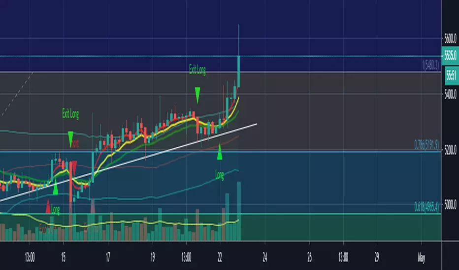
Crypto 1 hourSimilar to indicator stock 4 hour
this bot design for crypto 1 hour chart (i find this time frame as the best one for it)
two versions of operation
1. non repainted as suggested by pine coders LucF
2. the other one is repainted with my supress repaint mechanism
the repainted version work fine but be aware that repaint may occur so it not perfect
if you decide to use the repainted one just know it not perfect even if i try my best to remove all repaint issue
alerts included
one way to check for repainting signals is by using bar repaly
the other way to see is to convert from repaint mode to unrepaint mode
if signal move 1 mtf forwrd and stay by similar order you saw before ' you can say that it was a true signal
normaly when we do this the repaint ones need to dissaper when we covert them to non repaint mode
if they move 1 mtf ahead then they were true when they were on the unrepainted version
system is very similar to ECG MACD strategy with some minor changes that I made in the buy and sell but this not so imprtant .
the daily candels are non repainting MTF candles. it just to make the atudy more preety . but it has no relation to buy and sell operation
The way i sugeest to use the repainted model is not automatic since there is repaint sometime
i suggest to use semi automatic mode
meaning the algo send alert . you just need manualy to check if the alert was true or not
since it buy and sell very slowly ,you have enough time to enter trades manualy for it.
if you find this manuver not needed and it working fine live . only if you are sure in that then move this indicator to act as real bot and make it full automatic
why i use repaint mode?
becosue the correction of repaint move the signal 1 mtf ahead. so most of time the repainted version send signals at more true postition. sometime due to repaint which can be we may get bad signal. but overall the system us design to work better at repaint mode.
so let me know what you think
in future i will try to make my anti repaint system to ne better I hope:) ?
so be wise when you put your money to something. use your decision wisely
treat this indicator as helper but it your job to monitor when there is a repaint or not..
Cerca negli script per "bot"

LoFi Trend Version 1.0Lofi Trend v. 1.1 - confirmation to be used with Lofi Trend. (version 4.0 pine)
The goal of this indicator is to plot rsi , ema values on any chart. You can also adjust it for larger time frames. Repainting issues have been fixed and updated to pine version 4.0
The script is currently under development and additional updates will be added based on performance from a 24/7 active bot that is using this on 1hr, 4hr, 12hr and daily time frames. The output may vary slightly between different chart time frames for the same indicator settings.
This is an "Invite Only" script. Contact me for details.
User Interface/Detail Description:
- Green Bar= Buy
- Red BAR = Sell
This indicator can be easily used with popular bot trading platforms. Feel free to contact me for details.
Can be used for all Charts

LoFi EMA version 1.3aLoFi EMA version 1.3a
The goal of this indicator is to plot rsi , ema values on any chart. You can also adjust it for larger time frames. Repainting issues have been fixed and updated to pine version 4.0
The script is currently under development and additional updates will be added based on performance from a 24/7 active bot that is using this on 1hr, 4hr, 12hr and daily time frames. This can also be used for degen trading on the 2 min chart. The output may vary slightly between different chart time frames for the same indicator settings.
This is an "Invite Only" script. Contact me for details.
User Interface/Detail Description:
- Green Bar= Buy
- Red BAR = Sell
This indicator can be easily used with popular bot trading platforms. Feel free to contact me for details.
Can be used for all Charts
Basic Entry Chart Layout:
BITMEX:
BITCOIN:
FOREX:
LEGACY:/ STOCKS:

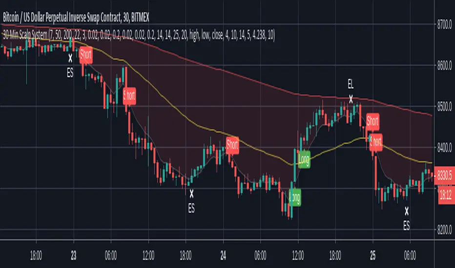
30 Min Scalp SystemA scalping script for the 30 min chart that is designed and tuned to be used with trading bots such as ProfitView or Autoview. I personally trade with this on Bitmex.
This trading system is built upon 4 established trading indicators that compliment each other. All signals are filtered in a number of ways to avoid chop and only trigger when a strong trend or crossover is identified.
Alerts are included for longs, shorts and exits in both directions.
Recommended setup:
- Trade with leverage and take 75%-80% out at 0.5% profit, leaving the rest to run
- Initial stop-loss of 1%, initiating a trailing stop of 0.75% when TP is hit
- Ensure bots are set to ignore open orders in the same direction
I use this in conjunction with ProfitView where I run three custom scripts to manage my position entries, monitor profit levels, dynamically move my stop and then exit positions where appropriate.
Note: Exit signals are show here even when trades aren't open because it's only possible to hide these when using a strategy script. This is coded as an indicator so that alerts can be sent to your chosen bot.
Disclaimer: The signals aren't perfect but no script is. The above cannot be considered financial advice and I take no responsibility from any losses incurred. A test account is recommended to verify the win rate before trading on a live platform.
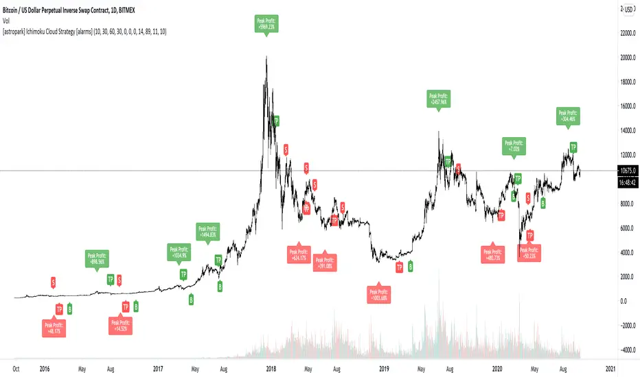
[astropark] Ichimoku Cloud Strategy [alarms]Dear Followers,
today a Great Swing Trading Strategy , runnable on a bot , which works great on High Timeframes (1D is suggested!) but also even better on 1m Renko chart.
If you are a scalper, you will love suggested entries for fast profit. You can run it on 1h timeframe (below is not suggested) if you are used to scalp trading and close each trade whenever you feel happy (a proper trailing stop strategy is suggested anyway).
This strategy is based on the Ichimoku Cloud Indicator and let's you set a lot of settings:
works on all timeframes (but 1D and above is suggested on normal candlesticks chart)
you can run this indicator on 1m Renko chart (be sure to enable the "USING RENKO CHART? ENABLE THIS OPTION" setting)
you can use 4 kind of Ichimoku Cloud (Custom, Slow, Standard and Fast - keep only one enabled)
you can make the Ichimoku Cloud show or not
you can enable showing the possibile re-entries
you can enable an heiking ashi analysis
you can enable a trailing stop strategy ("Auto Trailing Stop Loss" and "Close Trade When Price Breaks Above the Ichimoku Cloud" are two options very much suggested to keep enabled, especially on bot trading)
you can create your own trailing stop stategy and take profit strategy
you can enable a simple take profit strategy based on RSI Overbought and Oversold levels
This strategy only trigger 1 buy or 1 sell, but if you missed the possibility to open your long or short position don't get mad, but just enable the "show re-entry signals" option, so yout will be able to enter again (be sure to always use a proper money management ).
By the way, you can set any alarms you like in order to get notified when any kind of signal is triggered (you need to use the "alarms" version for this).
Strategy results are calculated on the timeframe from May 2017 to now, so on 2 years and half, using 10000$ as initial capital and working at 1x leverage (so no leverage at all! If you like to use leverage, be sure tp use a safe option, like 3x or 5x at most in order to have liquidation price very far).
This is not the "Holy Grail", so use a proper risk management strategy.
This script will let you set all notifications you may need in order to be alerted on each triggered signals (there is also an "ALL-IN-ONE" option for free tradingview users.
The backtesting version of this indicator, which will let you backtest how the indicator will perform on any chart you may test, can be found by searching for "Ichimoku Cloud Strategy" and then choosing the astropark indicator with "red and green arrows" at the end of the name. You can find it here below too:
This is a premium indicator , so send me a private message in order to get access to this script.
HeiKin Crossover With Alerts [Lofi]HeiKin LoFi - Crossover With Alerts
The goal of this indicator is to plot stoch, rsi, ema values "as if" the chart is a true price action based on a Heiken-Ashi Chart. It can also be used on a regular candle stick setting or the original Heikin Ashi chart.
The script is currently under development and additional updates will be added based on performance from a 24/7 active bot that is using this on 1hr, 4hr, 12hr time frames. The output may vary slightly between different chart time frames for the same indicator settings. A bad setting would be something like a sub 10-15 minute chart with BTCUSDT binance although some progress has been made on lower time frames. I have added an adjustable setting window for user tuning.
This is an "Invite Only" script. Contact me for details.
User Interface/Detail Description:
- Green Arrow = Buy
- Red Arrow = Sell
- Purple Arrow = High Risk Long
- Yellow Arrow= High Risk Short
This indicator can be easily used with popular bot trading platforms. Feel free to contact me for details.
Can be used for all Charts
Basic Entry Chart Layout:
BITMEX:
BINANCE:
FOREX:
I allow users to tune functions for almost any time interval. example 5 Second Chart:
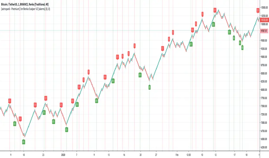
[astropark - Premium] 1m Renko Scalper V2 [alarms]Dear Followers,
today a new Scalper Tool , which works great on 1 minute timeframe , which is the best and more secure timeframe to use on a Renko chart, besides it works great up to 15m (I don't suggest to use a renko chart over 15m timeframe)!
It is an upgraded version of Bitmex Renko Scalper that you can find in my tradingview script page.
This tool has some cool features:
it works on 1 minute timeframe : so you can enjoy high-frequency trading by using a 24/7 running bot;
wait bricks optional mode : you may like to make script wait for triggering a new signal by waiting 1 or 2 more confirmation bricks
trailing stop : you can set a trailing stop in trade, so script will alert you if it will be reached in chart
This strategy can trigger till 5 buy or 5 sell signals in a row before reverting, so use a proper money management .
Strategy results are calculated on the timeframe from july to now, so on about 4 months, using 10000$ as initial capital and working at 3x leverage (very safe leverage!).
The user who wants to use this strategy, especially via an automated bot, must always set a stoploss at 5% from entry point or use a proper risk management strategy .
This is not the "Holy Grail", so use it with caution.
This script will let you set all notifications you may need in order to be alerted on each triggered signals.
The backtesting script version of this indicator, which will let you backtest this script and find best settings for your preferred market, can be found here below:
On Bitmex XBTUSD chart best settings is Traditional Renko chart with 10$ box size.
This is a premium indicator , so send me a private message in order to get access to this script .
TrendMaster ProTrendMaster Equilibrium X
TrendMaster Equilibrium X is a composite of TrendMaster, MokuMaster and KishokuMaster in one indicator. It is designed to be a drop-in replacement of our flagship indicator, TrendMaster, allowing the user to examine all three indicators on a single chart. The purpose of TrendMaster Equilibrium X is to provide a sentiment filter when assessing possible Trendmaster entries. When all three indicators align, we have equilibrium and can feel confident to take the trade. The indicator is optimised for weekly, daily and 4-hour candlesticks and can be used for all trending markets. It is exclusively available to our Pro tier members.
MokuMaster
MokuMaster is based on Ichimoku and its colours are derived from Ichimoku's depiction of trend conditions. When examining charts for directional bias you can simply check the colour of MokuMaster.
Bright Green - Resolutely Bullish
Green - Bullish
Blue - Neutral
Pink - Bearish
Red - Resolutely Bearish
These categories represent the interactions between Price, the Tenkan-sen, the Kijun-sen, the Kumo and the Chikou Span. This can be overwhelming if you are not an accomplished Ichimoku trader. MokuMaster allows you to view these interactions without the difficulty of interpreting what they mean.
KishokuMaster
KishokuMaster is a very simple indicator designed to provide an immediate representation of the ‘mood’ of the market. It provides an optimal balance of lag and smoothing to help traders establish a Bullish or Bearish bias. The underlying logic is based on Alan Hull's weighting techniques. KishokuMaster generally gives an early warning of a trend reversal.
Confluence
When assessing a TrendMaster entry, you can use TrendMaster Equilibrium as a simple checklist as shown in the annotated chart below. By taking entries that satisfy all criteria, you increase your likelihood of a successful outcome.
How to get it?
If you would like to use TrendMaster Equilibrium or any of our other Indicators, please visit my site. Here you can purchase one of our packages which include indicators, market scanner bots and a large Discord community. You will also find educational content and how to guides for our indicators.
Our Story
Founded in 2018 by IchimokuScholar and C00kie, TrendMaster is a team that produces technical analysis indicators with an emphasis on simplicity and noise reduction. We support a large community with educational content, automated market scanners and mentoring in our private chat rooms. We produce technical analysis indicators geared primarily towards the emerging Cryptocurrency asset class. We provide educational material to assist trader development and host a large online trend following community. All of our products are designed to help traders distinguish relevant information from background noise. Our indicators encourage disciplined trade management to maximise the opportunity captured while minimising losses.
IchimokuScholar
IchimokuScholar – In 2017 I retired from a career in higher education to focus on Trading. I like to trade long term trends, focusing primarily on continuation setups. I am dedicated to sharing my knowledge of trading and take great pleasure in simplifying technical analysis for newer traders.
C00kie
I started trading crypto in 2017 and immediately started coding a bunch of tools to improve my quality of life. Some definitely worked out better than others. Like to trade the higher timeframes and drawing horizontal lines on charts. I am also pretty much obligated to like cookies. Indicators. Here you can purchase one of our packages which include indicators, market scanner bots and a large Discord community. You will also find educational content and how to guides for our indicators.

Momentum Signal Moving AverageThis is a script with one modified indicator that mainly tracks and executes positions openings by calculating volume and "enthusiasm" from the exchanges coin pairs. I recommend that it is used on a 15m chart.
When it is a bullish trend it is configured to take profit, but this is of course something you can set values or disable. In bearish trends, the script opens bigger positions, and when a bounce happens the script starts taking profit.
In stagnation, the script used to be week, and made losses. However, with the added scalping feature it seems to at least even it out, or even make profit as I have seen now.
It's still a very 1.0 script and will get updated to make sure the profit keeps getting higher percentage.
I use the Alerts Trader extension to execute orders from Tradingview in Chrome via Bitmex API.
I use it on Bitmex, but surely you can use it on other exchanges that are supported in the Alerts Trader extension, which is extensive.
Important : You will be able to add this script to your chart, but you won't be able to se the source code, so to make it work you need to set the alerts right, with correct code for it to work.
Here is where I come in:
I'll give each user 3 day trial, and after that, if you are satisfied and want to run it longer, you can subscribe for $49/month.
And if you have bigger capital, I will install it and configure it to match the amount of contracts you wish to have.
If you are a person with big capital, you can get 1 week of trial.
And for people with big capital, you can get personal support from me when needed to alter settings or create new alerts. This will cost $50 each time.
But remember, you can also run the trial on the Bitmex testnet, but the volume is very low there so the bot does not preform as well on the testnet as it does on the mainet with big volume.
I am willing to let someone, a 3rd party, with good reputation test it for a few days and make an honest review after.
Disclaimer: I cannot guarantee that this script will make you rich, but after a week of testing, both on testnet and mainnet, the results are good enough for me. (I am no financial expert or professional trader. Any losses from the algorithm is not my issue, use it at your own risk. Always run the script/bot with money you can afford to lose)
All payments to me are made in bitcoin.

BitMEX Swing Trader MillionaireA bitcoin ATM machine on the 4hr
stick .25 bitcoin in an account set it up with an api bot like Autoview, alerts traders or even my very own api bot and avoid paying monthly sub..
ping me for details
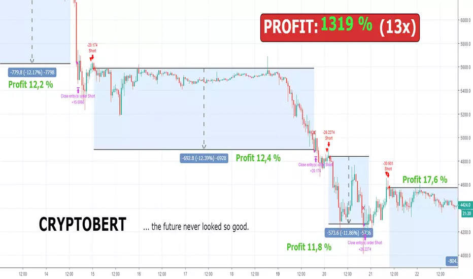
Bert LONG BTC Study (Alerts) - Profit 2018: 1319 % (no leverage)Bert LONG Term BTC study (BITMEX) - script for setting alerts and trading bots
This is a revolutionary strategy for bitcoin (XBT) trading. The strategy is perfectly configured for trading on the Bitmex exchange. No further configuration and setup is required.
The strategy itself recognizes a volatile period or whether the market is in downtrend, uptrend or sideways. Accordingly, it applies the appropriate orders to reach maximum profit.
The strategy can be handled manually, you can receive alerts (popup, email, sms) or can be fully automated by bot (works with: Autoview, Gunbot, Profitview, Jubot and others) without any manual intervention.
What is the minimum and maximum capital I can trade with?
You can trade with 0.0001BTC – 1000BTC. That is one of many advantages of using this strategy on XBT. There is enough liquidity to execute the order for the market price with a big investment amount.
What is the recommended setting?
Timeframe: 45m
Chart: Bitcoin/USD Dollar Perpetual Inverse Swap Contract (XBT)
Leverage: 2x
Orders: Long and Shorts
Why was this strategy created?
You have basically two option how to make money in crypto market. HODL (buy the coin and believe it will rise to the moon) and TRADING (only 3-5% traders are profitable, most of them are full time traders with 5+ years of experience in trading).
If you HODL btc in this year, you are -70 % this year
If you are TRADING, the results depend on how good you are (think about this, if you decide to be a heart surgeon, rocket star or NBA player, do you think you can be? Yes, you can but the chances are very small. The same probability you have that you will be in the 3-5% profitable traders 😊). It takes time, you need experience and still 96% all of you will never be a profitable traders!
If you use Bert BTC long term strategy, you are + 1319 % this year
How well the Bert BTC strategy performs?
Profit in 2018 was 1319 % / 13x (without leverage)
Profit in 2018 was 11 477 % / 115x (with leverage 2)
If you invested (with leverage 2) 1 000 USD you have now 114 766 USD
If you invested (with leverage 2) 10 000 USD you have now 1 147 660 USD
Detailed trades report for 2018 (you can calculate your own profit with specific investments and leverage) – download excel here
Notes:
You will hardly find better strategy on the market which achieves similar results with minimal risk and can operate in any market condition (downtrend, uptrend, sideways).
We guarantee the strategy does not repaint, and we use real candles (not heikin ashi or renko which does not reflect real prices).
We wish you to become financially independent and all your secret wishes to be fulfilled.
And in case if you still want to HODL or you want to be TRADING all the days watching to your monitors, consider to try our strategy at least with a minimum capital invested, you will see that you will not regret in long run. Be patient and the money will come to you!
For access to this strategy visit website: www.cryptobert.io
inwCoin HMA AlertSimple alert to go along with the inwCoin HMA Strategy
Please not that the alerts are persistent 2.70% , if you already enter the position,
just ignore the rest of the same alert until the opposite alert show up
( long then short / or short then long , if change, just close and enter opposite position )
You can set the alert and let it tell you to iOS app via TradingView app ( yey! )
Please note that, if you don't have bot to track your trailing start/stop. you have to enter the TP/SL manually ( also tracking the position )
So... be careful to follow this alert. just try it with small amount of money first.
and make sure to set stop loss every time because OKEX is a portfolio killer if you don't have any stop loss.
** if you cannot trailing stop bot, just uncheck the "Aggressive Strategy" in both strategy and alert to reduce alert to minimum level.

Most Profitable HelloEpicWorld v2.0[Eric] This is the most profitable un-repaint fully support auto trading Algo on earth.
Usage:
Buy and Sell && Stop Loss
1. When it shows buy, you can buy it immediately or wait for a small dump to buy it, stop loss at the red cross below.(Both buy and stop signal support alert autoview bots auto trading)
2. When it shows sell, you can sell it immediately or wait for a small pump to sell it, stop loss at the green cross above.(Both buy and stop signal support alert autoview bots auto trading)
Background Color:
It can be turn on and off in the settings. When it is green, you have a 78% probability to get a win trade on buying the pullback. And a 73% probability to get a win trade on selling the pullback when it's red. So, even missed the buy and sell signal, you can still open a trade in the middle, but I don't recommend this kind of trades, it's no good for Risk/Reward ratio. The best ratio is when the signal show up. Background color is more suitable using to hold your trades after entering.
Forex:
Bitcoin:
Altcoin:
MarketSpeed:
RSIC:

MACs EasyMoney - LongTermSignalsIntroducing " MACs EasyMoney - LongTermSignals " Indicator. Specially designed for weekly and 1 Month duration charts . Picks the calls perfectly :)
Latest other updates:
BOT Trading Integration is completed for the following indicators,
1) MACs EasyMoney - Swing Trade Signals
2) MACs EasyMoney - Scalp Trade Signals
Strategy Test Report for the BOT script shows the following results,
* Profitable Percent = 99.42%
* Profitable Factor = 93.76
Thanks,
Mac.
Pharoceus PT-V2 CryptoScalper RSI+BB+SRSI+Stochastic IndicatorThis is the updated Version of the ProfitTrailerV2 RSI+BB+StochRSI+Stochastic Oscillator Signal+Alerts
Description
This is an all-in-one indicator with alerts that most people call signals and it's designed for Cryptocurrency leverage trading. This indicator features, the most popularly used indicators in technical analysis and are the basic technical analysis indicators any successful trader should master before going into more advance technical analysis tools. The Pharoceus ProfitTrailerV2 CryptoScalper RSI+BB+SRSI+Stochastic Oscillator Signal+Alerts features the Bollinger Bands, Relative Strength Index, Stochastic RSI and Stochastic Oscillator, and it was designed for use with Pharoceus ProfitTrailerV2 CryptoScalper and can also be used with all other trading bots or on its own as a powerful market leveraging and trading indicator using alerts.
The ProfitTrailerV2 RSI+BB+SRSI+Stochastic Oscillator Signal+Alerts can be customized to any trader specific trading patterns and offers the ability to choose a combination of indicators from the featured ones to use. With the Buy and Sell Signal feature, trading on any cryptocurrency exchange can be automated and with the alerts feature, the Pharoceus ProfitTrailerV2 CryptoScalper RSI+BB+SRSI+Stochastic Oscillator Signal+Alerts will automated buying and selling signals for any crypto trading bot but I'll always recommend using for making buys only when using with any bot. This indicator/script can be used with any base pair; BTC, ETH, and USD or USDT.
As mentioned above, all four indicators can be combined to find a very safe and secure buy and profitable sell signals, which maximizes your profit margins and overall earnings over time. Also, 2 or 3 could be combined as well, depending on the traders knowledge on how to use each indicator independently to find its best settings. My recommendation would be to test all independently and or together with very little capital to find what works best for you. I recommend this because the cryptocurrency market in a very volatile market and unpredictable, some combination of indicators would work for some certain coin pairs and not all, while others would work better with a different setting and a particular coin pair.
As with all script use at your own risk and only trade what you can afford to lose, while this indicator isn't designed to lose you money and I will not be held liable for any losses due to misuse. I am also not a financial advisor and the ProfitTrailerV2 RSI+BB+SRSI+Stochastic Oscillator Signal+Alerts will be made available soon as it's still undergoing rigorous testing and it's in no way and manner affiliated with any group of individuals or bot.
Trade Smart and with only what you can afford. Donations are also welcome to encourage my work, This is a totally free to use script to help traders, small time or big time that works towards making the indicator sharing world accessible to all who will not definitely be ripped-off and support a community of sharing.
discord.gg
BTC: 199qMzu4gvr3bUXWEpLG5uS6TEKKvw5pbe
ETH: 0xf8339952a224a228f2f8c58a5666a8ffleddebfb
BCH: qqmmds8u3f8m6ek387jtefg07525dvaxzqrshd86gz

ProfitTrailerV2 RSI+BB+SRSI+Stochastic Oscillator Signal+AlertsThis is an all-in-one indicator with alerts that most people call signals and it's designed for Cryptocurrency leverage trading. This indicator features, the most popularly used indicators in technical analysis and are the basic technical analysis indicators any successful trader should master before going into more advanced technical analysis tool. The ProfitTrailerV2 RSI+BB+SRSI+Stochastic Oscillator Signal+Alerts features the Bollinger Bands, Relative Strength Index, Stochastic RSI and Stochastic Oscillator, and it was designed for use with ProfitTrailer V2 and can also be used with all other trading bots or on its own as a powerful market leveraging and trading indicator using alerts.
The ProfitTrailerV2 RSI+BB+SRSI+Stochastic Oscillator Signal+Alerts can be customized to any trader specific trading patterns and offers the ability to choose a combination of indicators from the featured ones to use. With the Buy and Sell Signal feature, trading on any cryptocurrency exchange can be automated and with the alerts feature, the ProfitTrailerV2 RSI+BB+SRSI+Stochastic Oscillator Signal+Alerts will automated buying and selling signals for any crypto trading bot but I'll always recommend using for making buys only when using with any bot. This indicator/script can be used with any base pair; BTC, ETH, and USD or USDT.
As mentioned above, all four indicators can be combined to find a very safe and secure buy and profitable sell signals, which maximizes your profit margins and overall earnings over time. Also, 2 or 3 could be combined as well, depending on the traders knowledge on how to use each indicator independently to find its best settings. My recommendation would be to test all independently and or together with very little capital to find what works best for you. I recommend this because the cryptocurrency market in a very volatile market and unpredictable, some combination of indicators would work for some certain coin pairs and not all, while others would work better with a different setting and a particular coin pair.
As with all script use at your own risk and only trade what you can afford to lose, while this indicator isn't designed to lose you money and I will not be held liable for any losses due to misuse. I am also not a financial advisor and the ProfitTrailerV2 RSI+BB+SRSI+Stochastic Oscillator Signal+Alerts will be made available soon as it's still undergoing rigorous testing.

PT Magic Triggers So its me again. I have decided to create Trend Trigger Script for PT Magic addon for a trading bot Profit Trailer. If you do not own this bot and Addon the following explanation will not help you.
For each Trend you define number of minutes and it then calculates the percentage change between the close price now and X candles before.
Same calculation is for all 6 Triggers i beleive that is all you need :)
Hope it helps you all.
LTC: LYHj4WDN7BPu5294cSpqK3SgWSWdDX56Qt
BTC: 1NPVzeDSsenaCS9QdPro877hkMk93nRLcD

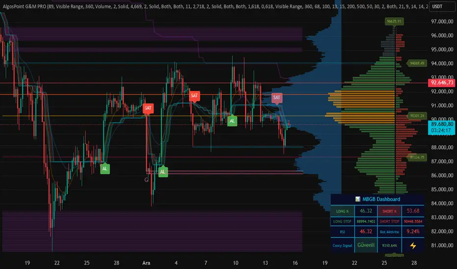
AlgosPoint G&MPoint Breaking 2025 (MB&GB Breaking Point Pro)
What It Does:
A comprehensive TradingView indicator that combines multiple technical analysis tools to identify key market breakout points, support/resistance levels, and trading opportunities. It integrates Volume Profile analysis, AlphaTrend signals, and custom risk assessment metrics.
Key Features:
Volume Profile Analysis: Displays Point of Control (POC), Value Area High/Low (VAH/VAL), and volume distribution
Support & Resistance Detection: Automatically identifies key price levels based on volume or price action
AlphaTrend Signals: Generates BUY/SELL signals with visual labels on chart
Volume Spike Detection: Highlights unusual volume activity indicating potential exhaustion or breakout
High Volatility Alerts: Marks periods of increased market volatility using ATR
Risk Assessment Dashboard: Real-time panel showing:
Long/Short percentages (RSI-based)
Stop levels for both directions
Bot activity percentage
Csocy Signal status (Safe/Undecided/Risky)
How to Use:
Add to Chart: Apply indicator to any timeframe (works best on 15m-4H)
Configure Settings: Adjust parameters in grouped sections:
📊 General Settings (lookback periods)
🎯 Support & Resistance (line styles/colors)
💥 Volume Spike (threshold sensitivity)
⚡ High Volatility (ATR multiplier)
📈 Volume Profile (display options)
🔥 AlphaTrend (signal sensitivity)
Read Signals:
BUY label = Potential long entry when AlphaTrend crosses up
SELL label = Potential short entry when AlphaTrend crosses down
Dashboard colors: Green = bullish, Red = bearish, Yellow = neutral
Set Alerts: Built-in alerts for price crosses, volume spikes, and signal confirmations
Risk Management: Use displayed stop levels and Csocy Signal status to manage position sizing
Best For:
Day traders and swing traders
Crypto, Forex, and Stock markets
Identifying high-probability breakout zones
Volume-based trading strategies
ALFA BUY IndikatorThis indicator is an improved version of the Mucip + Yağız indicator. I have been using it smoothly for the past 3 months.
I use it on futures markets for the three major coins such as BNB/USDT, BTC/USDT, and ETH/USDT.
My usage logic is as follows: on average, it generates around 2 signals per coin per day.
For each trade, I enter positions using 4–5% of my total capital.
I use 25x leverage on ETH and BNB, and 50x leverage on BTC.
My take-profit levels are 0.25% for BTC and 0.5% for the others, which results in approximately 10–12% profit per trade.
Overall, the average daily capital growth is around 2–3%.
Note: I use a trading bot for executions, because the indicator is designed for 2-minute charts, and it is almost impossible to catch the signals manually.
So far, everything has been working flawlessly, and it performs best on 2-minute timeframes.

Vhenom ORB A+ (Professional)Vhenom ORB A+ (Professional)
Advanced Opening Range Breakout System with A+ Momentum & Failure Detection
What This Indicator Is
Vhenom ORB A+ (Professional) is a precision-built Opening Range Breakout system designed for active index futures traders who want early entries, objective confirmation, and protection against false breakouts.
This is not a generic ORB clone.
It is a multi-session, momentum-aware, reversal-aware trading framework built specifically to handle:
Explosive breakouts
Failed breakouts
Intraday continuation
Reversals back into range
Real-time decision-making (not just candle-close hindsight)
Core Philosophy
Most ORB indicators fail because they:
Only work at candle close
Treat all breakouts the same
Ignore volatility context
Provide no framework for failed moves
Vhenom ORB A+ solves all of that.
It does not tell you what to trade.
It tells you when conditions are objectively favorable.
🔹 Key Features
1️⃣ Multi-Session ORB Engine (NY Time)
Define ORBs across multiple intraday windows, not just the cash open:
NY Cash Open (09:30–09:45)
Midday Expansion
Power Hour
Evening Session
Overnight Sessions
Fully customizable ORB windows
Each ORB:
Draws High / Low / Midline in real time
Freezes when complete
Automatically rolls forward into the next session
No repainting of historical ORBs.
2️⃣ Real-Time Breakout Detection (Live Preview)
Unlike most indicators, Vhenom ORB A+ can signal intrabar:
Signals flicker live as price breaks the ORB
Signals confirm on candle close
If price re-enters the range, the signal disappears
This allows:
Earlier entries for aggressive traders
Confirmed entries for conservative traders
You choose.
3️⃣ A+ Momentum Engine (ATR-Based)
Not all breakouts are equal.
The A+ Engine measures candle expansion relative to ATR to identify true momentum breakouts.
When an A+ breakout occurs:
The candle is highlighted
The label upgrades to A+ Buy / A+ Sell
Optional filtering: require A+ for signals or use it as a visual upgrade
This helps eliminate:
Chop
Low-energy fake moves
Weak breakouts that stall immediately
4️⃣ Failure Mode (Reversal Detection)
This is where most ORB tools fall apart.
Vhenom ORB A+ actively monitors failed breakouts.
If price:
Breaks out of the ORB
Fails to hold
Re-enters the range within a defined window
The indicator generates:
R Buy (failed downside breakout)
R Sell (failed upside breakout)
With:
Acceptance-by-close logic
Minimum bar delay (no same-candle chaos)
Optional live preview
This allows traders to:
Capture reversals
Avoid chasing failed breakouts
Trade against trapped participants
5️⃣ Conflict Protection (No Mixed Signals)
The logic explicitly prevents:
Buy and Sell on the same candle
Breakout and reversal on the same bar
Overlapping signal noise
If a conflict ever exists:
Sell wins (conservative bias)
The system is intentionally opinionated to reduce indecision.
6️⃣ Candle Coloring for Immediate Context
Candle colors provide instant visual feedback:
A+ Breakout candles
Failed breakout reversal candles
Priority rules ensure clarity (Reversal > A+)
You can glance at the chart and know what just happened.
🔹 Designed For
This indicator is ideal for:
NQ / ES / MNQ / MES traders
GC / MGC traders
ORB, momentum, and reversal traders
Traders who scale quickly and manage stops tightly
Traders who want structure, not guesses
It works on any symbol or timeframe, but is optimized for index futures.
🔹 What This Is NOT
❌ Not a signal bot
❌ Not a “win every trade” system
❌ Not meant for set-and-forget trading
This tool gives high-quality decision points — execution is up to you.
🔹 Basic vs Professional
Basic Version
NY Cash Session ORB only
ORB lines only
No momentum logic
No reversals
Professional Version (This)
Multiple ORB sessions
Live breakout preview
A+ momentum detection
Failure / reversal detection
Advanced filtering & controls
Designed for real trading, not hindsight
🔹 Final Notes
This indicator was built by a trader, refined through real market behavior, and designed to expose opportunity and risk at the same time.
If you understand:
Opening ranges
Volatility
Acceptance vs rejection
Risk management
Vhenom ORB A+ gives you an edge — not a crutch.

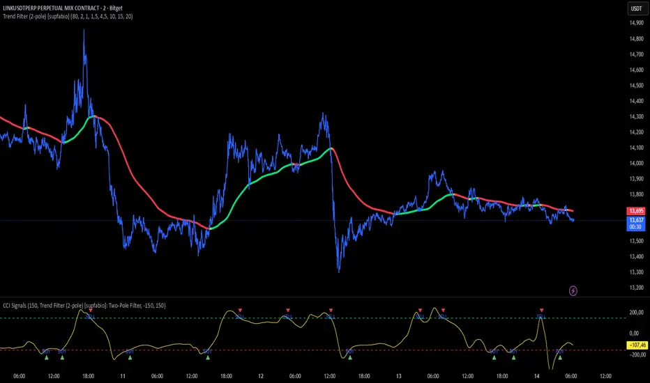
Supfabio Break-Return BandsSupfabio Break-Return Bands (B3 & B4 • 3-Candle Confirmation)
Supfabio Break-Return Bands is a volatility-based price action indicator built on top of a Two-Pole smoothing filter combined with ATR-derived dynamic bands.
It is designed to highlight price exhaustion, rejection, and potential reversal zones, with a strong emphasis on structural confirmation rather than immediate breakouts.
Core Concept
The indicator plots four volatility bands (Band 1 to Band 4) above and below a smoothed Two-Pole filter.
Signals are intentionally restricted to the outer bands, where price behavior is statistically more likely to show:
Volatility expansion
Liquidity grabs (stop runs / false breaks)
Strong rejection or mean-reversion behavior
Signal Logic
Band 4 (Primary Extreme Zone)
BUY and SELL signals are generated when:
Initial trigger (first candle)
Price either crosses the Band 4 level or
Touches and rejects the band (wick / pin behavior)
Confirmation on the 3rd candle (t + 2)
The confirmation candle:
Must not touch the same band again
Must close on the correct side of the band
Confirms that the initial break or pin was rejected
This delayed confirmation helps filter false breakouts and impulsive entries.
Band 3 (Secondary Setup)
On Band 3, signals are intentionally more selective:
Pin / rejection only
No direct cross signals
Uses the same 3-candle confirmation logic
This allows Band 3 signals to act as deeper pullback or early exhaustion setups.
Confirmation Mechanism
The script uses an internal state-based logic to:
Track the exact bar where the trigger occurred
Confirm signals only on the correct third candle
Prevent duplicate or consecutive signals from the same setup
Ensure pin-based triggers are not missed
Visual Elements
Main Two-Pole filter plotted as a thick continuous line
Volatility bands plotted with progressive line thickness
Band line styles (dotted / dashed) can be customized manually in the Style tab
Clear BUY and SELL labels plotted directly on the confirmation candle
Optional candle coloring based on filter direction
Alerts & Automation
Built-in alertcondition() for BUY and SELL
Alerts are suitable for webhook automation
Compatible with external systems and trading bots
Intended Use
This indicator is suitable for:
Reversal and exhaustion analysis
Mean-reversion strategies
Liquidity and rejection-based setups
Manual trading or automated execution
Intraday and higher-timeframe analysis
Notes
This script is intended as an analytical tool, not as a standalone trading system.
Signals should be used in combination with market structure, trend context, and proper risk management.

CCI + Buy/Sell Cross (supfabio)This indicator is an enhanced version of the Commodity Channel Index (CCI) designed to generate clear BUY and SELL signals based on customizable level crossovers, with built-in support for webhook automation and external trade execution.
🔹 Signal Logic
BUY Signal:
Triggered when the CCI crosses upward (from below to above) the user-defined BUY level (red line).
SELL Signal:
Triggered when the CCI crosses downward (from above to below) the user-defined SELL level (green line).
Signals can optionally be configured to trigger only on candle close, reducing real-time noise and false signals.
🔹 Key Features
✅ Original CCI calculation (standard formula preserved)
✅ Fully configurable BUY and SELL levels
✅ Optional display of signal level lines
✅ Visual BUY / SELL markers plotted on the CCI panel
✅ Support for moving average smoothing and Bollinger Bands applied to the CCI
✅ Dynamic alerts using alert(), ideal for:
Webhook integrations
Trading bots
External servers and automated execution systems
🔹 Alerts & Webhook Integration
The indicator sends dynamic alert messages containing:
Action type (BUY / SELL)
Symbol
Closing price
Timestamp
To use:
Add the indicator to your chart
Create an alert and select “Any alert() function call”
Enable Webhook URL and configure your endpoint
Done — signals will be sent automatically
🔹 Best Use Cases
Traders who use CCI as a primary entry trigger
Momentum or mean-reversion strategies
Automated trading systems
Visual backtesting and signal validation
⚠️ Disclaimer
This indicator is not a complete trading system and does not replace proper risk management. Always use it in combination with market context, confirmation tools, and sound position sizing.
Star V12⭐ Star Engine — Multi-Component, Multi-Timeframe Trade Execution System
The Star Engine is a stateful trade execution and analytics system designed to transform indicator confluence into structured, measurable trade runs. Rather than producing isolated buy/sell signals, the engine decomposes market behavior into pressure, confirmation, event grouping, and trade lifecycle management. Each component plays a specific role, and no single component is sufficient on its own. Below is a detailed breakdown of each subsystem and why it exists.
💣 Bomb Engine — Directional Pressure Measurement
The Bomb Engine is responsible for identifying directional pressure in the market. It evaluates whether price action exhibits sustained momentum in one direction, independent of whether that direction is immediately tradable.
What Bomb Uses
Bomb aggregates momentum- and trend-oriented inputs such as MACD-based momentum direction, momentum persistence and continuation logic, directional bias filters, and impulse strength evaluation. All inputs are evaluated across multiple timeframes, with each timeframe contributing independently.
How Bomb Works
Each timeframe produces a directional contribution (bullish, bearish, or neutral). Contributions are aggregated into a net Bomb total. The total is mapped into discrete tone buckets (blue, green, red, black, etc.). Higher totals indicate stronger directional dominance.
What Bomb Tells You
Bomb answers one question: Is there directional pressure building or persisting? It does not determine entry timing, exhaustion, or trade quality. Bomb is context, not execution. This allows Bomb to be early without being responsible for precision.
✨ Golden Engine — Structural Confirmation & Regime Filtering
The Golden Engine evaluates whether the directional pressure detected by Bomb is structurally supported. Golden exists to prevent entries during momentum exhaustion, conflicting timeframe regimes, and counter-structure moves.
What Golden Uses
Golden relies on a different indicator stack than Bomb, focused on confirmation and balance, including RSI regime classification (not simple overbought/oversold), momentum agreement vs divergence, trend-following vs counter-trend positioning, overextension detection, and compression and rotational behavior. Each timeframe is evaluated independently using the same logic.
The Role of RSI in Golden
RSI in Golden is used to identify regimes, not signals. It answers questions such as: Is momentum expanding or decaying? Is the move early, mid-structure, or extended? Do multiple timeframes share compatible RSI states? If RSI regimes conflict across timeframes, Golden will not confirm. This is one of the main mechanisms that makes Golden selective.
Momentum & Alignment Logic
Golden evaluates whether momentum supports continuation, is fragmenting, is diverging from price, or is contradicting higher-timeframe structure. If lower-timeframe impulses are not supported by higher-timeframe structure, Golden suppresses confirmation — even if Bomb remains strong.
What Golden Guarantees
Golden does not guarantee profitable trades. Golden guarantees that the detected directional pressure is not internally contradictory across RSI regimes, momentum behavior, and timeframe structure. This replaces vague terms like “clean” with explicit structural conditions.
🔗 Multi-Timeframe Aggregation (MTF)
Both Bomb and Golden operate on a multi-timeframe voting system. Lower timeframes capture early impulses, higher timeframes enforce structural context, each timeframe votes independently, conflicts weaken totals, and alignment strengthens totals. This creates temporal confluence, not just price-based confluence.
⭐ Star Events — Qualified Market Impulses
A Star (⭐) is created only when Bomb is active, Golden is active, both agree on direction, and all gating rules pass (thresholds, time filters, modes). A Star represents a qualified impulse, not a trade. Stars are atomic events used by the execution layer.
⏱ Star Clusters — Trade Run State
The Star Cluster groups Stars into runs. The first Star starts a cluster, anchor price, bar, and time are recorded, each additional Star increments the cluster count, and all Stars belong to the same run until exit. This prevents duplicate entries, signal spam, and overtrading in volatile conditions.
⛔ Reset Gap Logic — Temporal Control
To prevent rapid re-entry, a minimum time gap is required to start a new run. Stars occurring too close together are merged. Reset does not terminate active runs. This enforces time-based discipline, not indicator-based guessing.
1➡️ Entry Logic — Confirmation-Based Execution
The engine never enters on the first Star. Instead, the user defines 🔢 N (Entry Star Index). Entry occurs only on the Nth Star, and that bar is marked 1➡️🔢N. This ensures entries occur after persistence, not detection. At ENTRY, Best = 0.00 and Worst = 0.00. Statistics measure real trade performance, not early signal noise.
📊 STAT Engine — Live Trade Measurement
Once entry is active, the STAT engine tracks ⏱ run progression, 🏅 maximum favorable excursion, and 📉 maximum adverse excursion. Mechanics: uses highs and lows, not closes; updates every bar; entry bar resets stats; historical bars marked 🎨. This creates an objective performance envelope for every trade.
🛑 Exit Engine — Deterministic Outcomes
Trades are exited using explicit rules: 🏅 WIN → profit threshold reached, 📉 LOSE → risk threshold breached, ⏱ QUIT → structural or safety exit.
Safety Exits
🐢 Idle Stop — no Stars for N bars.
🧯 Freeze Failsafe — STAT inactivity.
QUIT is a controlled termination, not failure. Each exit is recorded with a short cause tag.
🧾 Trade Memory & Journaling
Every trade produces immutable records. Entry: time, price, side, confirmation index. Exit: time, price, PnL, result, cause. These records power tables, alerts, JSON output, and external automation.
📊 Time-Block Performance (NY Clock)
Performance is grouped by real time, not bar count. Rolling NY blocks (e.g. 3 hours). Independent statistics per block. Live trades persist across block boundaries. This enables session-based analysis.
🔔 Alerts & Automation
Alerts are state-based: Entry confirmed → Long / Short alert. Trade closed → Exit alert. Optional JSON output allows integration with bots, journals, and dashboards.
Summary
The Star Engine is a component-based trade execution system, where Bomb measures pressure, Golden validates structure, Stars qualify impulses, clusters define runs, entry is delayed by confirmation, stats measure reality, exits are deterministic, and results are time-aware. It is not designed to “predict the market”, but to control how trades are formed, managed, and evaluated.
