ICT Killzones Toolkit [LuxAlgo]The ICT Killzones Toolkit is a comprehensive set of tools designed to assist traders in identifying key trading zones and patterns within the market.
The ICT Killzones Toolkit includes the following Price Action components:
ICT Killzones with Pivot Highs/Lows
Order Blocks
Breaker Blocks
Fair Value Gaps
Market Structure Shifts
By combining these components, the ICT Killzones Toolkit provides traders with a comprehensive framework for analyzing the market and identifying setups of interest. Leveraging these tools effectively can enhance traders' decision-making process and improve killzones interpretability.
🔶 USAGE
In forex/futures trading, timing is crucial. ICT Killzone are specific periods when there's a higher chance of finding setups of interest. Mastering these time intervals can offer significant advantages to traders who know how to use them effectively.
The image above highlights a potential setup of interest when using the ICT Killzones Toolkit.
As another example for utilizing the ICT Killzones Toolkit, we can see in the image above when price retests setups generated from killzones such as Order Blocks or Fair Value Gaps, a potential strategy could be to look for entries on those & take profits as the next killzone appears.
🔹 Order Blocks
Order Blocks are sections on a price chart where notable buying or selling activity has occured, often signaling interest zones for institutional traders. This toolkit's Order Blocks component pinpoints these areas within the Killzone, which may act as potential support or resistance levels.
🔹 Breaker Blocks
Breaker Blocks are zones built from mitigated order blocks, and highlight zones on the chart where price has previously stalled or reversed. These areas may act as significant barriers to price movement in the future, and the Breaker Blocks component helps traders identify them for potential trading opportunities.
🔹 Fair Value Gaps
Fair value gaps are especially favored by price action traders and arise from market inefficiencies or imbalances, typically when buying and selling are unequal. These gaps often attract price movement before resuming in the same direction. the Fair Value Gaps component of the toolkit helps traders identify and analyze them.
🔹 Market Structure Shifts
Market Structure Shifts refer to significant changes in the overall structure of the market, such as shifts in trend direction, volatility, or trading activity. These shifts can provide valuable insights into market sentiment and potential trading opportunities, and the Market Structure Shifts component helps traders identify and interpret them.
Overall, the ICT Killzone Toolkit combines these components to provide traders with a comprehensive framework for analyzing the markets and identifying high-probability trading setups.
🔶 SETTINGS
🔹 ICT Killzones
Asian, London Open, New York, and London Close: toggles the visibility of specific Killzones, allowing users to customize time periods and Killzone colors.
Killzone Lines : Top/Bottom, Mean and Extend Top/Bottom: toggles the visibility of the Killzone's pivot high and low lines, mean (average) line, and allows users to extend the pivot lines.
Killzone Labels: Toggles the visibility of the Killzone labels.
Display Killzones within Timeframes Up To: Toggles the visibility of the Killzones up to selected Timeframes.
Open Price, Separator, Label, and Color: toggles the visibility of the open price of the Killzones or for the day, week, or month. If the day, week, or month is selected, a separator will be displayed to highlight the beginning of each respective period. Additionally, users can customize the color and toggle the label as needed.
🔹 Order Blocks & Breaker Blocks
Order Blocks | Breaker Blocks: toggles the visibility of the order blocks & breaker blocks.
Swing Detection Length: lookback period used for the detection of the swing points used to create order blocks & breaker blocks.
Mitigation Price: allows users to select between closing price or wick of the candle.
Use Candle Body in Detection: allows users to use candle bodies as order block areas instead of the full candle range.
Remove Mitigated Order Blocks & Breaker Blocks: toggles the visibility of the mitigated order blocks & breaker blocks.
Extend Order Blocks & Breaker Blocks: enables processing of the order blocks & breaker blocks beyond the boundaries of the killzones.
Display Order Blocks & Breaker Blocks: enables the display of the first, last, or all occurrences of the order blocks & breaker blocks.
Order Blocks : Bullish, Bearish Color: color customization option for order blocks.
Breaker Blocks : Bullish, Bearish Color: color customization option for breaker blocks.
Show Order Blocks & Breaker Blocks Text: toggles the visibility of the order blocks & breaker blocks labels.
🔹 Market Structure Shifts
Market Structure Shifts: toggles the visibility of the market structure shifts.
Detection Length: market structure shift detection length.
Display Market Structure Shifts: enables the display of the first, last, or all occurrences of the market structure shifts.
Market Structure Shifts : Bullish, Bearish Color: color custumization option for market structure shifts.
Show Market Structure Shifts Text: toggles the visibility of the market structure shifts labels.
🔹 Fair Value Gaps
Fair Value Gaps: toggles the visibility of the fair value gaps.
Fair Value Gap Width Filter: filtering threshold wile detecting fair value gaps.
Remove Mitigated Fair Value Gaps: removes mitigated fair value gaps.
Extend Fair Value Gaps: enables processing of the fair value gaps beyond the boundaries of the killzones.
Display Fair Value Gaps: enables the display of the first, last, or all occurrences of the fair value gaps.
Bullish Imbalance Color: color customization option.
Bearish Imbalance Color: color customization option.
Show Fair Value Gaps Text: toggles the visibility of the fair value gaps labels.
🔶 RELATED SCRIPTS
Smart-Money-Concepts
Order-Blocks-Breaker-Blocks
Thanks to our community for recommending this script. For more conceptual scripts and related content, we welcome you to explore by visiting >>> LuxAlgo-Scripts .
Cerca negli script per "break"

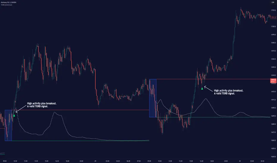
Timely Opening Range Breakout Strategy [TORB] (Zeiierman)█ Overview
The Timely Opening Range Breakout (TORB) indicator builds upon the classic Open Range Breakout (ORB) concept. The ORB strategy is a popular trading setup used to identify trades around the opening range of an asset. It's based on the idea that the first few minutes (15-60 minutes) of trading often set the tone for the rest of the day, with breakouts above or below the opening range signifying potential trends.
TORB refines the concept by stating that a trade is only valid if there is sufficient market activity. This means a breakout beyond the upper or lower range is only of interest during the most active trading hours, as defined by PMMV (Per-Minute Mean Volume)
█ How It Works
ORB
The indicator works by first defining a session's opening range based on user-specified settings, including the session's start and end times and the applicable time zone. During this session, it calculates the high and low price points, which form the basis for identifying potential breakout levels.
PMMV
PMMV (Per-Minute Mean Volume) provides a snapshot of the market's activity level at each minute of the trading day. PMMV is calculated by averaging the trading volume in a one-minute interval over a specified number of trading days. This script uses the average volume over the last N periods to determine the PMMV value. This average volume provides a smoother representation of volume activity compared to using a single volume value. It considers the volume over a broader timeframe, filtering out short-term fluctuations and potentially offering a more reliable indicator of underlying market activity.
TORB
TORB works by integrating the Opening Range Breakout (ORB) highs and lows with the Per-Minute Mean Volume (PMMV) metric to assess the validity of breakouts. The objective is to identify breakouts from the opening high and low levels during periods of heightened market activity, as indicated by PMMV.
█ How to Use
To effectively utilize the Timely Opening Range Breakout (TORB) strategy, follow these steps:
Identify Active Hours: Employ PMMV to pinpoint periods of peak activity within the trading day.
Apply Basic ORB Rules: If the price surpasses the upper range (resistance), buy; if it breaches the lower range (support), sell.
Breakouts
The TORB strategy identifies breakout signals when the price moves beyond the established range, supported by volume exceeding a set threshold. This technique aims to eliminate false signals, focusing on price movements during high market activity.
█ Settings
Session
Trading Session: Customize the trading session's start and end times.
Volume
Volume analysis is integral to the TORB strategy, as it uses volume data to confirm the strength and validity of breakout signals.
Period: Sets the number of periods (or bars) to calculate the average volume, which is then used to assess market activity level.
Sensitivity and Significance: Adjusts how responsive the volume analysis is to changes in trading volume. By adjusting the sensitivity, traders can decide how much emphasis to place on volume spikes, potentially reducing false breakouts and focusing on those supported by significant trading activity.
Breakout Threshold
This setting establishes a criterion to identify when the price movement is significant enough.
Threshold: Traders set a threshold level to identify high market activity. If the PMMV is greater than or equal to this threshold, it indicates significant market activity.
Setting the correct threshold is key to balancing sensitivity and specificity. Too low of a threshold may lead to many false positives, while too high of a threshold might filter out potentially profitable breakouts. This setting helps in pinpointing when market activity indicates a strong move, thereby aligning trade entries with moments of heightened market momentum.
-----------------
Disclaimer
The information contained in my Scripts/Indicators/Ideas/Algos/Systems does not constitute financial advice or a solicitation to buy or sell any securities of any type. I will not accept liability for any loss or damage, including without limitation any loss of profit, which may arise directly or indirectly from the use of or reliance on such information.
All investments involve risk, and the past performance of a security, industry, sector, market, financial product, trading strategy, backtest, or individual's trading does not guarantee future results or returns. Investors are fully responsible for any investment decisions they make. Such decisions should be based solely on an evaluation of their financial circumstances, investment objectives, risk tolerance, and liquidity needs.
My Scripts/Indicators/Ideas/Algos/Systems are only for educational purposes!
ICT Unicorn Model [LuxAlgo]The ICT Unicorn Model indicator highlights the presence of "unicorn" patterns on the user's chart which is derived from the lectures of "The Inner Circle Trader" (ICT) .
Detected patterns are followed by targets with a distance controlled by the user.
🔶 USAGE
At its core, the ICT Unicorn Model relies on two popular concepts, Fair Value Gaps and Breaker Blocks. This combination highlights a future area of support/resistance.
A Bullish Unicorn Pattern consists out of:
A Lower Low (LL), followed by a Higher High (HH)
A Fair Value Gap (FVG), overlapping the established Breaker Block
A successful re-test of the FVG which confirms the pattern.
A Bearish Unicorn Pattern consists of:
A Higher High (HH), followed by a Lower Low (LL)
A Fair Value Gap (FVG), overlapping the established Breaker Block
A successful re-test of the FVG which confirms the pattern
The pattern detection depends on detected swings, which can be controlled by the Swing setting. Using higher values of this setting will return longer-term breaker blocks.
🔹 Using Risk/Reward Targets
A confirmed Unicorn pattern will show a blue ( Target ) / grey ( Stop Loss) "Risk/Reward" areas (RR).
When the Stop Loss or Target is hit, a white line is shown on the concerned side.
The Risk/Reward ratio can be adjusted in the "Targets" settings.
🔹 Trailing Stop
As seen in the previous snapshots, besides the RR areas, this indicator also includes an optional Trailing Stop .
This can be helpful to lower your risk, by exiting earlier than if you would wait until the Stop Loss is hit.
This example shows a successful bullish and bearish Unicorn Pattern . In this scenario, the Trailing Stop could be used for partial Take Profit.
The goal of this publication is to show confirmed Unicorn Patterns . To increase the chance of success, it is important to evaluate the bigger picture & use this in confluence with your price action analysis. For example, look for potential areas of liquidity, consider this pattern only during certain market sessions, avoid trading during heavy impact news, &/or incorporate other aspects of technical analysis rather than just following this pattern blindly.
🔶 DETAILS
🔹 Combine
When disabled, all potential Unicorn Patterns will delete previous unconfirmed patterns:
Enabling Combine ensures the last Unicorn Patterns in the opposite direction will remain.
While the latter bullish pattern became invalid, another one formed.
The combination of the previous bearish pattern, and looking at the big picture, the bullish pattern did not have much chance to be successful.
While disabling 'combine' helps minimize clutter, enabling this feature can give a pattern more chance to hit the SL/Target level.
🔹 Mitigated FVG
Users can determine if a pattern becomes invalid due to a mitigated FVG, causing the pattern to be deleted.
🔹 New pattern detected
When a new pattern is detected, the previous unconfirmed pattern in the same direction (bullish - bullish or bearish - bearish) will be deleted. This will always be the case, whether "Combine' is enabled or disabled.
When the previous pattern was confirmed but no SL or Target level was hit, this pattern will stop updating.
🔶 SETTINGS
🔹 Unicorn
Swings: This sets the length of swings, used for the underlying ZigZag and Unicorn Patterns detection.
Bull: Enable/disable Bullish patterns, and set the color of FVG box and Trailing Stop .
Bear: Enable/disable Bearish patterns, and set the color of FVG box and Trailing Stop .
Combine: When enabled, patterns in opposite directions (bullish/bearish) can exist at the same time. disabling this feature tends to give less clutter. See the "Usage" section for more information.
🔹 Targets
Risk/Reward: Sets the Risk/Reward ratio.
Trailing Stop: Set the length of small swings, which is used for the Trailing Stop .

Trend Lines [LuxAlgo]Our new "Trend Lines" indicator detects and highlights relevant trendlines on the user chart while keeping it free of as much clutter as possible.
The indicator is thought for real-time usage and includes several filters as well as the ability to estimate trendline angles.
🔶 USAGE
Trendlines can act as support/resistance, with a higher number of tests indicating a more significant support/resistance role.
A broken TrendLine can be indicative of a potential trend reversal. The script highlights breaks with a label.
Users can additionally filter trendlines, only showing trendlines whose angles fall within a user set range:
This allows for the removal of potential clutter from the chart but also helps keep steeper or more horizontal trendlines.
🔶 DETAILS
When a swing (pivot point) is found, a Trendline is drawn when certain conditions are fulfilled.
An essential condition is that a Bearish Trendline (red) always occurs on a lower high, while a Bullish Trendline (blue) occurs on a higher low.
Our implementation will first show an initial dotted-styled TrendLine on confirmation, after which a solid-styled secondary TrendLine will develop. The latter will be used for the real-time detection of breaks at that line:
Furthermore, the script allows you to add more conditions:
🔹 Length (Swings)
A swing develops when a high/low is the highest/lowest against x highs/lows on the left AND right of that bar. x can be set by "Length" in settings.
The following images clarify this. The script confirms a swing where the yellow flag is shown; the high (here visualized with a purple label) is the highest point against x bars left and right of that point.
At that moment, this swing is checked against the previous swing. If all conditions are fulfilled, an initial TrendLine is drawn on confirmation.
After that point, a secondary thicker solid line is seen which keeps progressing bar after bar, until:
• a new TrendLine is formed
• the TrendLine is broken
🔹 Breaks between Swings
Once there is confirmation that a TrendLine can be drawn, the script allows you to filter for breakthroughs on that line. This can be set with "Check breaks between"
Disabled : the initial TrendLine is allowed to be pierced:
Check breaks between point A - point B : no breaks are allowed between both Swing points:
Point A - Current bar : no breaks are allowed between the first Swing point and the point of confirmation ('current' bar):
🔹 TrendLine breaks
As mentioned, the secondary TrendLine (solid line) progresses bar after bar until a new TrendLine is formed or the TrendLine is broken. When a TrendLine is broken, the TrendLine stops progressing, but if there isn't a new TrendLine and price return back, the TrendLine will re-appear, potentially giving several signals when the TrendLine is broken again.
Minimal bars allow you to regulate the amount of signals when the TrendLine is broken.
-> The secondary TrendLine must be uninterrupted for at least x bars before a potential break can be considered.
The following example shows 1 signal against 3 by adjusting this setting from 2 to 5:
🔹 Angles
Angles should normally be calculated when the units of the X and Y axis are the same. However, on our charts, the unit of the X-axis is bar_index (bars), and on the Y-axis the unit is price (¥, €, £, $,...).
It is not easy to normalize and create reasonably valid angles. Often certain angle calculations can differ through price changes or volatility.
Our calculate_slope() function tries to make corresponding angles through all bars.
We do this by calculating the difference between the highest/lowest price values in a certain bar range. The bar range is our X-axis, and the price difference is our Y-axis.
Zooming in/out will not change the amount of bars or the price. Since it does change our view on the chart, and thereby how we see the angles, we have included a setting where you can personalize the ratio between X and Y-axis (Angles -> Ratio X-Y axis).
Settings: Angles - Ratio X-Y axis:
🔶 SETTINGS
🔹 Swings
Length: Lookback period for the detection of swing points.
🔹 Trendline validation
Check breaks between :
Disabled : the initial TrendLine is allowed to be pierced
Check breaks between point A - point B : no breaks are allowed between both Swing points
Point A - Current bar : no breaks are allowed between the first Swing point and the point of confirmation ('current' bar)
Source (breaks) : Source which invalidates TrendLine, default: close
🔹 TrendLine breaks
Minimal bars : The secondary TrendLine must be uninterrupted for at least x bars before a potential break can be considered.
🔹 Angles
Show : Toggle labels.
Ratio X-Y axis : Every user has his preferences regarding zoom, chart layout,...
If the shown angles are not according to your expectations, you can adjust this number.
Only TrendLine between : Only allow TrendLines between the minimum and maximum degrees. Set only the minimal and maximum values above 0.

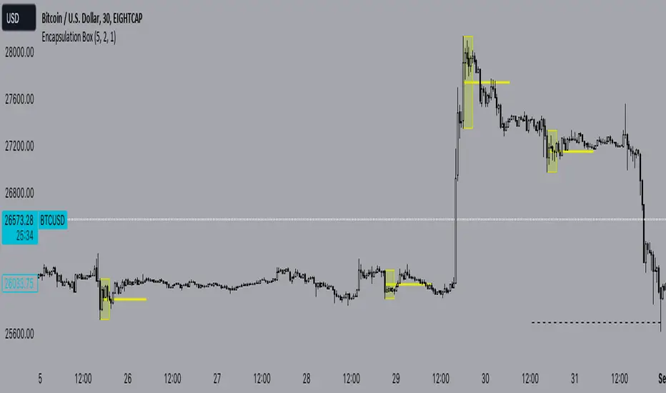
Encapsulation BoxThe “Encapsulation Box” indicator is designed to locate areas of the chart where the highs and lows of candlesticks are “embedded” or enclosed within the body of a previous candlestick. This setup indicates a significant contraction in the market and can provide important trading signals. Here's how it works in more detail:
Detecting contraction: The indicator looks for situations where the price range of the candles is very narrow, i.e. when subsequent candles have highs and lows that are contained within the range of a previous candle. This condition indicates a contraction in the market before a possible directional move.
When a contraction is detected, the indicator draws a rectangle around the area where the highs and lows of the candles are embedded. The rectangle has its upper vertex corresponding to the maximum of the candles involved and its lower vertex corresponding to the minimum. The width of the rectangle is defined by can be customized by the user.
A key feature of this indicator is the horizontal line drawn outside the rectangle. This line is positioned in the middle of the rectangle and represents 50% of the range of the rectangle itself. This line acts as a significant support or resistance level depending on the direction the contraction breaks.
The indicator can generate buy or sell signals when a break in the rectangle or horizontal line occurs. For example, if the price breaks above the rectangle and the horizontal line, it could generate a buy signal, indicating a possible uptrend. Conversely, if the price breaks below the rectangle and the horizontal line, it could generate a sell signal, indicating a possible downtrend.
Consolidation Spotter Multi Time FrameThis tool is designed for traders looking to spot areas of consolidation on their charts across various time frames. It highlights these consolidation areas using visually appealing boxes, making it easier to identify potential breakout or breakdown zones.
How To Use:
Spotting Consolidation: When you see a box form on your chart, this represents a consolidation zone. Within this zone, the price is moving sideways without a strong upward or downward trend.
Anticipating Breakouts & Breakdowns: Watch the price as it approaches the edges of the box. A movement outside the box can signal a potential breakout (if above the box) or a breakdown (if below the box). This is where momentum shifts can happen.
Momentum Confirmation: Once the price clearly moves out of the box, it indicates a momentum shift. If the price moves upwards out of the box, this can be seen as bullish momentum. Conversely, if the price moves downwards out of the box, this can be seen as bearish momentum.
To use the tool effectively, adjust the settings to suit your trading style, choose your preferred visual theme, and watch as the script highlights key consolidation areas on your chart.
Tip: To visualize fractals, consider using multiple instances of the "Consolidation Spotter" indicator, each set to a different timeframe. This approach allows you to observe consolidations nested within larger consolidations, offering deeper insights into market structures. 😉
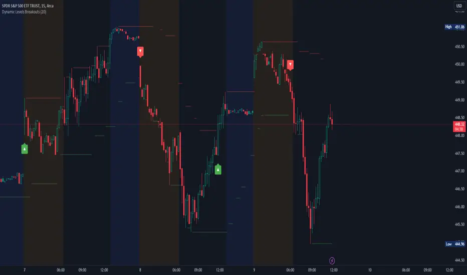
Dynamic Levels Breakouts [Angel Algo]INTRODUCTION
The Dynamic Levels Breakouts indicator is a powerful tool designed to identify dynamic support and resistance levels in the price action. It plots these levels on the chart and provides visual signals for bullish and bearish breakouts.
FEATURES
1. Dynamic Support and Resistance Levels.
The indicator calculates the maximum (resistance) and minimum (support) price levels within the defined rolling window. The highest high and lowest low are used to identify dynamic resistance and support levels, respectively.
2. Coloring Conditions
The indicator uses conditional coloring to highlight potential support and resistance levels. When a significant level is detected, it will be colored with a transparent overlay. Red color indicates potential resistance (max_level), and green color indicates potential support (min_level).
3. Bullish and Bearish Breakouts
The indicator also identifies potential bullish and bearish breakouts from the dynamic levels. A bullish breakout occurs when the closing price crosses above the dynamic resistance level (max_level). A bearish breakout occurs when the closing price crosses below the dynamic support level (min_level). The breakout signals are marked with arrow symbols (▲ for bullish and ▼ for bearish) below and above the respective bars.
4. Market Regime
To prevent multiple signals within a short period, the indicator considers the current market regime. If a bullish breakout has occurred recently, it will not generate a new bullish signal until a bearish breakout occurs, and vice versa.
HOW TO USE
The Dynamic Levels Breakouts indicator can be used to identify potential breakout trading opportunities. A bullish breakout signal (▲) suggests a potential long entry or an increase in buying pressure. A bearish breakout signal (▼) indicates a potential short entry or an increase in selling pressure. Traders can use these signals as a reference and combine them with other technical analysis tools and strategies for confirmation.
SETTINGS
Period (length): The user can adjust the "Period" input to define the rolling window for calculating the maximum and minimum price levels. The default value is 20, but it can be set anywhere between 2 and 30. A higher value may yield more significant levels but can also result in delayed signals
Traffic Light Signal - POSTraffic Light Signal (TLS) is simple and most easy setup to trade.
How The Traffic Light Signal Works ?
First You have to find a Green and red candle pair or red and green candle pair then mark there highest high and lowest low with the help of line tool. if High breaks go for Buy and when low breaks go Sell. Avoid Doji candle Pair to get better result.
Additonal Indicator Used :
Relative Strength Index : To find Overbought and Oversold Zones
How to Take trade with The help of TLS indicator :
The Indicator detects the Pair candle and detect whether the pair bar high or low cross over or cross under and display the signal over the chart.
if Triangle UP Shape Appears on chart , Once the high of the signal candle breaks take entry for buy side StopLoss will be low of the signal candle.
if Triangle Down Shape Appears on chart, once the low of the signal candle breaks take entry for Short side StopLoss will be low of the signal Candle.
Always Try to take profit 1:2 or as per your risk rewards.
Note :
if you are scalping then avoid first and Last Bar of day in 1 min and 3 min timeframe only
if you are Intraday Trader Use 5 Min and 15 Min max for this strategy.
if your are positional Trader use 1hr or 1 day Timeframe to trade.
No more than 3 trades to trade on this indicator.
Use Additional Indicator for Accuracy
Indicator works on Crypto , Equity , Futures , Options.
Hope you like this if any issue with this indicator ask below or message me.
Thanks and Regards,
TradingTail

Box Range AlertSimple Script for getting alerts on the crossing of Upper & Lower levels either way.
Good for Free users as they can only use 1 alert at a time. So this indicator will be useful to get alerts on both Breakout Or Breakdowns.
Just add input Price manually and set alerts.

Multi Time Frame Candles with Volume Info / 3DHello Traders,
This is my second Multi Time Frame Candles script but with this new one, you will have some new features such volume info, remaining time to close of higher time frame candle and also developed using new features of Pine such array of lines. also I tried to make it 3D for better visualization ;) also it shows new highs/lows / breakouts.
I tried to make many things optional, so you can change almost everything using options.
What you can change using options:
- Higher time frame
- Number of Candles
- Candle Colors Up/Down
- Wick Color
- Volume colors Up/Down
- Text color of Remaining Time
- Shadow Color
- Background color
- Start bar of the candles (so you can see many higher times frame candles in same window)
- 3D effect, by default it's enables but you can disable 3D view
Lets see some examples:
Remaining time:
Breakouts:
You can combine different higher time frames:
if you don't want 3D view then combining different higher time frames:
You can change background color:
Enjoy!

72s: Adaptive Hull Moving Average+One challenging issue for beginner traders is to differentiate market conditions, whether or not the current market is giving best possibility to stack profits, as earliest, in shortest time possible, or not.
On intraday, we've seen some big actions by big banks are somewhat can be defined --or circling around-- by HMA 200 . I've been thinking on to make the visuals more conform to price dynamics (separating major movement and minor noise) to get clearer signs of when it starts to happen. So it will be easier to see in a glance when the strength starts really taken place, with less cluttered chart.
This Adaptive HMA is using the new Pine Script's feature which now support Dynamic Length arguments for several Pine functions. ( read: www.tradingview.com). It hasn't support the built-in HMA() directly, but thankfully we can use its wma() formula to construct. (Note: I tweaked a bit HMA formula already popular here by using plain int() instead of round() on its wma's length, since I find it precisely match tradingview's built-in HMA).
You can choose which aspect the Adaptive HMA period will adapt to.
In this study I present it with two options: Volume and Volatility . It will "moves" faster or slower depends on which situation the aspect is currently into. ie: When volume is generally low or volatile readings is not there, price won't move very much, so the adapting MA will slow down by dynamically lengthen the lookback period, and vice versa, and so on.
Colour-markings in the Adaptive resembles which situation explained above. In addition, I also combine it with slope calculation of the MA to help measuring trend-strength or sideway/choppy conditions.
This way when we use it as dynamic support/resistance it will be more visually-reliable.
Secondly, and more important, it might help us traders with better probability info of whether or not a trade should even worth to be made . ie: If in the mean time market won't give much movement, any profit would also only as much. In most cases, we might better save our dime for later or place it somewhere else.
HOW TO USE:
Aside from better dynamic support/resistance and clearer breakout confirmation, MA is coloured as follow:
YELLOW:
Market is in consolidation or flat. Be it sideways, choppy, or in relatively small movements. If it shows up in a trending market, it may be an earlier sign that current trend might about to change its direction, or confirming a price broke-out to another side.
LIGHT GREEN or LIGHT RED:
Tells if a trend is forming but still relatively weak (or getting weaker), as it doesn't have volume or volatility to support.
DARKER GREEN ot DARKER RED:
This is where we can expect some good and strong price movement to ride. If it's strong enough, many times it marks a start of new long-lasting major trend.
SETTINGS:
Charger:
Choose which aspect your HMA should plug itself into, thus it will adapt to it.
Minimum Period, Maximum Period:
172 - 233 is just my own setting to outmatch the static HMA 200 for intraday. I find it --in my style of trading-- best in 15m tf in almost any pair, and 15m to 1H for some stocks. It also works nicely with conventional EMA 200, sometimes as if they somewhat work hand-in-hand in defining where the price should go. But you can, ofcourse, experiment with other ranges, broader or narrower. Especially if you already have an established strategy to follow to. As you might do with:
Consolidation area threshold:
This has to do with slope calculation. The bigger the number means your MA needs bigger degree to define the market is out of flat (yellow) area. This can be useful if needed to lighten up the filter or vice-versa.
Background colouring:
Just another colouring to help highlighting the difference in market conditions.
ALERTS:
There are two alerts:
Volume Break: when volume is breaking up above average, and
Volatility Meter: when the market more likely is about to have its moment of the big wiggling brush.
USAGE:
Very very nice BUY entry to catch big up-movement if:
1. Price is above MA. (It is best when price is also not to far distance from the MA, or you can also use distance oscillator to help out too)
2. HMA's color is in darker green. Means it's on the charging plug with your chosen aspect.
3. RSI is above 50. This is to help as additional confirmation.
Clear SELL entry signal is same as above, just the opposite.
-------------------------------------------------------
Note:
Lower timeframe of course means more noise to be filtered. Depends on the instrument, you might need to tweak the settings a bit till it conform nicely and shows lots of good trades in history. Here's another example on GBPUSD 5m timeframe:
For exit/take-profit point, you can use a second faster period static HMA. Or you can also use RSI. Here's an example:
Don't get me wrong, on few occasions I found it's still best using static MA to spot fakeouts, breakouts, etc, especially ones that's been already use widely. If that's the case or price actions seems suspicious, simply put the same value for minimum and maximum period settings, and there you have the original HMA with extra features.
For developer, check in the code if you need to customise your own charger.
-------------------------------------------------------
That's it. Hopefully this Adaptive HMA+ could at least be a good sidekick to your own strategy, as it does mine. ;)

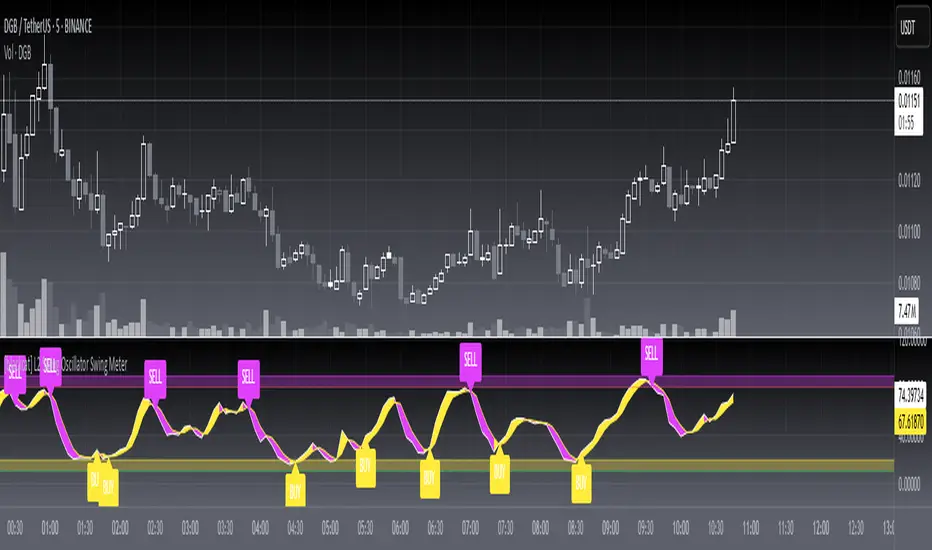
[blackcat] L2 Swing Oscillator Swing MeterLevel: 2
Background
Swing trading is a type of trading aimed at making short to medium term profits from a trading pair over a period of a few days to several weeks. Swing traders mainly use technical analysis to look for trading opportunities. In addition to analyzing price trends and patterns, these traders can also use fundamental analysis.
Function
L2 Swing Oscillator Swing Meter is an oscillator based on breakouts. Another important feature of it is the swing meter, which confirms the top or bottom's confidence level with different color candles. The higher of the candles stack up, the higher confidence level is indicated.
Key Signal
absolutebot ---> absolute bottom with very high confidence level
ltbot ---> long term bottom with high confidence level
mtbot ---> middle term bottom with moderate confidence level
stbot ---> short term bottom with low confidence level
absolutetop ---> absolute top with very high confidence level
lttop ---> long term top with high confidence level
mttop ---> middle term top with moderate confidence level
sttop ---> short term top with low confidence level
fastline ---> oscillator fast line
slowline ---> oscillator slow line
Pros and Cons
Pros:
1. reconfigurable swing oscillator based on breakouts
2. swing meter can confirm/validate the bottom and top signal
Cons:
1. not appliable with trading pairs without volume information
2. small time frame may not trigger swing meter function
Remarks
This is a simple but very comprehensive technical indicator
Readme
In real life, I am a prolific inventor. I have successfully applied for more than 60 international and regional patents in the past 12 years. But in the past two years or so, I have tried to transfer my creativity to the development of trading strategies. Tradingview is the ideal platform for me. I am selecting and contributing some of the hundreds of scripts to publish in Tradingview community. Welcome everyone to interact with me to discuss these interesting pine scripts.
The scripts posted are categorized into 5 levels according to my efforts or manhours put into these works.
Level 1 : interesting script snippets or distinctive improvement from classic indicators or strategy. Level 1 scripts can usually appear in more complex indicators as a function module or element.
Level 2 : composite indicator/strategy. By selecting or combining several independent or dependent functions or sub indicators in proper way, the composite script exhibits a resonance phenomenon which can filter out noise or fake trading signal to enhance trading confidence level.
Level 3 : comprehensive indicator/strategy. They are simple trading systems based on my strategies. They are commonly containing several or all of entry signal, close signal, stop loss, take profit, re-entry, risk management, and position sizing techniques. Even some interesting fundamental and mass psychological aspects are incorporated.
Level 4 : script snippets or functions that do not disclose source code. Interesting element that can reveal market laws and work as raw material for indicators and strategies. If you find Level 1~2 scripts are helpful, Level 4 is a private version that took me far more efforts to develop.
Level 5 : indicator/strategy that do not disclose source code. private version of Level 3 script with my accumulated script processing skills or a large number of custom functions. I had a private function library built in past two years. Level 5 scripts use many of them to achieve private trading strategy.
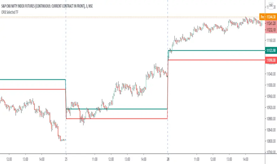
ORB Current TimeframePlot high and low of first candle from the current timeframe.
The levels are adjusted automatically when the timeframe is changed.
Trade breakout in either direction with other as a stop loss.
Can be used for any instrument.
ALT_FLAMES00.00 - alt-flames
component breakdown:
a) various combinations of EMA crossovers taken from the primeval_series to create a complete sequence of background colored-lines that subdivide into a bullish portion
and a bearish portion for directional identification
b) specific macd crossovers for predictive power in the form of directional flames located directly above the chart price (navy & yellow flames)
c) unique fast & slow rsi combinations for momentum + strength in the form of power flames located directly above the chart price (orange, red, green, & lime flames)
when the alternation of flames are used in concert with the sequence of background colors, one can identify impending explosive price action, can better navigate through periods of slower activity, identify where they are currently in the trend's lifecycle and, MOST IMPORTANTLY, improve the TIMELINESS of entry and exit strategies
00.01 - primeval_series - overview
the primeval_series is a group of transformed universally-renowned mathematical constants that have been transformed and embedded into a series of EMAs
each of these EMAs relates in some meaningful way to the "original wave' or 'wave_0': i.e. the wave that began at t=0, when humanity first made technological progress
the transformations made ensure that the inherent linkages to the original wave remain intact while being applicable to the structures inherent to indicator development
for the purposes of the alt-flames indicator, certain numbers selected from the primeval_series exist and are the basis of each ema , MACD and RSI calculation made herein
00.02 - alt-flames - best practices, and ideal targets
for best use: start with the daily timeframe for broad pattern, then use hourly going forward
ideal for swing trades, shorter-term options, and stocks that already have well-established uptrends, but have also started consolidating for 1+ week
patience is required to catch the ideal break, so best to use mildly OTM calls with at least 2 weeks on them before expiry.
for great use: pick out stocks that have recently broken out heavily from their pivot . Do not enter until the retracement from the top has a defined local low
for average use: any sort of intraday play. this tool is meant for swing trades and sustained breakouts. picking out significant bottom reversals.
the MACD portion is not geared for big reversals here. Rather, it is complementary to the EMA sequences, which are at the core of the indicator
not useful for: shorting stocks that are trending downward or that are in sideways trends

AUTO FIB PRO - VWAP Bias and Retrace Breakouts (DAX NQ) v6AUTO FIB PRO by funnelzon automatically detects swing points (pivot highs/lows), draws dynamic Fibonacci levels, highlights the key retracement area (0.236–0.618), and prints continuation-style BUY/SELL signals after a retrace. It also includes VWAP + VWAP zone (ATR-based), a configurable trend filter (EMA200 / HTF EMA200 / VWAP / combined “BEST”), session & volatility filters, a CHOP blocker, a top-right “traffic light” status panel, and optional manual R/S zones (R1–R4 & S1–S4) with width presets and background highlighting.
1) Auto Swing → Auto Fibonacci
The script detects swing points using pivot highs/lows.
Once two valid swing points are available (P1 → P2), it plots Fibonacci levels:
0.236 / 0.382 / 0.500 / 0.618 / 0.786 / 1.000
Lines extend to the right and update automatically with new swings.
2) Retracement Box (0.236–0.618)
The yellow retracement box marks the key pullback area between 0.236 and 0.618.
Optional ATR padding can slightly widen the box (helps with “near touches”).
3) VWAP + VWAP Zone + VWAP Bias Label
VWAP line is optional.
VWAP zone is an ATR-based band around VWAP.
Bias label shows: BULL / BEAR / NEUTRAL, placed outside the chart (left/right selectable).
4) Filters (to avoid low-quality market phases)
Session Filter (DAX / NQ sessions in CET)
ATR-Min Filter (blocks low volatility)
CHOP Filter (blocks markets that get “stuck” inside the retracement zone for too long)
5) Signals (Continuation After Retrace)
Default behavior (Continuation ON):
Retracement zone must be touched first (setup becomes “armed”).
Signal triggers only when price breaks out across the box edge:
BUY: crossover above retrace top + bullish candle + filters OK
SELL: crossunder below retrace bottom + bearish candle + filters OK
Alternative (Continuation OFF):
More aggressive signals can trigger already inside the retracement box.
6) Signal Quality Modes
MORE Trades: looser rules, more signals (optional counter-trend allowed)
A+ ONLY: stricter rules (RSI + EMA slope + trend alignment)
7) Traffic-Light Panel (Top Right)
Shows in real time:
Auto preset type (DAX/NQ + Scalp/Swing + FAST/STABLE)
STATUS: TRADE OK / NO TRADE (and the reason)
Direction: LONG / SHORT / WAIT
Selected trend filter mode
VWAP bias
Pivot length
8) Manual Support/Resistance Zones (R1–R4 & S1–S4)
8 zones as price “areas” (boxes), extended left/right in time
Width presets: Narrow / Normal / Wide or Manual (Points/ATR)
Optional background highlighting when price is inside a zone
Key Features
Auto Swing Detection (Pivot High/Low) → builds P1 → P2 swing
Auto Fibonacci Levels: 0.236 / 0.382 / 0.500 / 0.618 / 0.786 / 1.000
Retracement Box: 0.236–0.618 (+ optional ATR padding)
VWAP Line + VWAP Zone (ATR-based)
VWAP Bias Label: BULL / BEAR / NEUTRAL (outside the chart)
Trend Filter Modes: OFF / EMA200 / HTF EMA200 / VWAP / HTF EMA200 + VWAP (BEST)
Trade Quality Modes:
MORE Trades (looser, more signals)
A+ ONLY (stricter: RSI + EMA slope + trend alignment)
Gate Filters:
Session filter (DAX / NQ CET sessions)
ATR-min filter (blocks low volatility)
CHOP filter (blocks extended sideways inside retrace zone)
Traffic Light Panel (Top Right): STATUS, DIR, FILTER, VWAP BIAS, PivotLen
Manual Zones (R1–R4 / S1–S4):
Width presets: Narrow / Normal / Wide (or Manual via Points/ATR)
Optional background highlight when price is inside a zone
Signals (Logic)
Default (Continuation ON):
Setup becomes “armed” after retracement zone touch
Signal triggers only on breakout:
BUY: close crosses above retrace top + bullish candle + filters OK
SELL: close crosses below retrace bottom + bearish candle + filters OK
Continuation OFF: more aggressive signals can trigger already inside the retracement box.
Recommended Setup (Quick Presets)
Clean & Reliable (recommended)
Auto Presets: ON
Mode: AUTO / SCALP (1/5/15)
Auto Fib Mode: STABLE
Quality: A+ ONLY
Continuation: ON
Trend Filter: HTF EMA200 + VWAP (BEST)
Session filter: ON
ATR-min: ON
CHOP filter: ON
More Trades
Auto Fib Mode: FAST
Quality: MORE Trades
Trend Filter: VWAP or EMA200
FAQ (Quick)
Q: Why do I see “NO TRADE” in the panel?
A: One of the gate filters blocks signals (outside session, ATR too low, or CHOP detected).
Q: Why no signals even though price is moving?
A: A valid swing (P1→P2) must exist, retrace zone must be touched (Continuation ON), and trend/quality filters must pass.
Q: What does CHOP mean here?
A: Price stayed inside the retracement zone for too many bars → higher noise → signals disabled until conditions improve.
Q: DAX vs NQ feels different — what should I change first?
A: Start with Market Preset, then adjust VWAP zone ATR mult and CHOP bars limit.
Disclaimer
Educational/analytical tool only. Not financial advice. Use risk management and confirm signals with market context.

Consolidation zones + BreakoutThis Pine Script v6 indicator is designed to detect consolidation zones and mark breakout entries (long or short) when price exits those zones.
Indicator purpose
Identify periods where price moves in a tight range for several consecutive bars (consolidation).
Highlight those zones on the chart with a yellow shaded area between the local high and low.
Mark potential LONG and SHORT entries when price breaks out of a consolidation zone.
Core consolidation logic
The indicator measures whether the market is “compressed” by comparing the price range of recent bars with volatility measured via ATR:
It computes the highest high and lowest low of the last lookback bars:
rangeHigh = ta.highest(high, lookback)
rangeLow = ta.lowest(low, lookback)
It calculates the current range:
rng = rangeHigh - rangeLow
It calculates ATR over atrLen bars as a volatility benchmark:
atrVal = ta.atr(atrLen)
It defines a compressed range (base consolidation) when the range is smaller than a multiple of ATR:
baseConso = rng < atrVal * atrMult
Here, atrMult controls how tight the range must be. Lower values (0.8–1.0) require strong compression; higher values (1.5–2.0) are more permissive.
Minimum bars in consolidation
To avoid calling a very short pause a consolidation, the script enforces a minimum duration:
It uses ta.barssince(not baseConso) to count how many bars have passed since the last time the consolidation condition was false.
If that count is greater than or equal to minBars, the market is considered to be in consolidation:
text
isConsolidating = ta.barssince(not baseConso) >= minBars
This prevents 2–3 sideways bars from being treated as a full consolidation zone. The minBars input lets you adapt the duration to your timeframe and trading style.
Plotting the consolidation zone
When isConsolidating is true, the script shades the consolidation area:
It plots two invisible series for the zone’s high and low:
text
pHigh = plot(rangeHigh, display = display.none)
pLow = plot(rangeLow, display = display.none)
It creates a yellow semi‑transparent fill between those lines only while in consolidation:
text
fillColor = isConsolidating ? color.new(#ffeb3b, 80) : color.new(#ffeb3b, 100)
fill(pHigh, pLow, color = fillColor, title = "Consolidation Zone")
Outside consolidation, the color becomes almost fully transparent so the shaded zone disappears. This keeps the chart clean and focuses attention on the actual ranges.
Breakout detection (LONG / SHORT)
The script then looks for breakouts when price leaves a consolidation zone:
It checks if the previous bar was inside consolidation:
wasConso = isConsolidating
A bullish breakout (LONG) occurs when:
The current bar is no longer in consolidation (not isConsolidating).
The previous bar was in consolidation (wasConso).
The close breaks above the previous consolidation high (close > rangeHigh ):
text
breakLong = not isConsolidating and wasConso and close > rangeHigh
A bearish breakout (SHORT) occurs when:
The current bar is no longer in consolidation.
The previous bar was in consolidation.
The close breaks below the previous consolidation low (close < rangeLow ):
text
breakShort = not isConsolidating and wasConso and close < rangeLow
On each breakout, a label is drawn at the breakout bar:
text
if breakLong
label.new(bar_index, low, "LONG",
style = label.style_label_up,
textcolor = color.white,
color = color.new(color.teal, 0),
size = size.tiny)
if breakShort
label.new(bar_index, high, "SHORT",
style = label.style_label_down,
textcolor = color.white,
color = color.new(color.red, 0),
size = size.tiny)
These labels highlight where price transitions from sideways action to a potential directional move.
User inputs and tuning
lookback (Bars for range)
Number of bars used to compute the consolidation high/low. Higher values produce wider, less frequent zones; lower values detect shorter consolidations.
minBars (Minimum bars in consolidation)
Minimum number of consecutive bars that must meet the compression condition. On 15‑minute charts, values between 6 and 12 often work, but this depends on the asset.
atrLen and atrMult
Control how strict the compression rule is.
atrLen: ATR period.
atrMult: maximum allowed range as a multiple of ATR.
Increasing atrMult finds more zones; decreasing it makes the filter stricter.
showText
Optional helper label with a short description, useful when sharing the script with other users on the TradingView community.
Practical usage
Apply the indicator to your preferred timeframe (for example, 15‑minute crypto charts).
Tweak lookback, minBars, and atrMult until the yellow zones match the consolidations you would mark manually.
Use the LONG and SHORT labels as areas of interest for studying range breakouts and building your own entry/exit rules, always combining them with risk management and a complete trading strategy.
This way, the script turns a visual concept—sideways consolidation followed by breakout—into a systematic, testable signal in Pine Script v6.

Engulfing Breakout StructureEngulfing Breakout Structure (EBS)
" Identify High-Probability Market Structures, Not Just Patterns. "
The E ngulfing Breakout Structure (EBS) is a professional-grade analysis tool designed to filter market noise and identify the true origins of significant price movements. While standard Engulfing patterns occur frequently, many lead to "fakeouts" within a range. EBS solves this by treating an engulfing candle as a potential "structure" that is only validated once a decisive Break-away occurs.
How it Works: The EBS Logic
Unlike traditional indicators that plot signals immediately, EBS follows a strict confirmation process:
Structure Formation (Invisible): The script internally tracks "Candidate" engulfing candles.
Break-away Validation: The structure is only drawn on the chart after price aggressively breaks out of the engulfing range, accompanied by a Fair Value Gap (FVG).
Historical Anchoring: Once confirmed, the block is plotted back to its origin, highlighting the exact zone where the market imbalance was created.
Key Features
Break-away Filter: Eliminates low-probability signals by ensuring price has left the "zone of indecision."
Dynamic Structure Plotting: Automatically draws the supply/demand blocks that acted as the catalyst for the breakout.
Smart FVG Integration: Detects and highlights the gaps created during the breakout, providing additional confluence for entry.
EBS Break-away Confirmed: Triggered the moment a new structure is validated by a decisive price breakout. This alert signals that a new supply or demand zone has been established.
EBS Structure Tested (Mitigation): Triggered when price returns to touch a previously confirmed EBS block. This "Mitigation" often presents the highest risk-to-reward entry opportunity as it tests the origin of the breakout.
Trading Strategy
The Breakout (Aggressive): Enter as soon as the EBS block and FVG appear, following the momentum.
The Retest (Conservative): Wait for price to return and "mitigate" the EBS block. This retest of a confirmed breakout structure is a classic institutional entry pattern.

SilverHawk Trendline BreakoutsSilverHawk Trendline Breakouts
This indicator automatically draws trendlines from recent pivot highs and lows, projecting them forward to identify potential breakouts.
Features:
• Dynamic trendline zones based on pivot points (wicks or body option)
• Breakout signals when price crosses the projected line
• Volatility-adjusted target (TP) lines
• Built-in alerts for bullish/bearish breakouts, TP hits, and SL hits
Settings:
• Period: lookback length for pivot detection (default 10)
• Type: Wicks or Body for pivot calculation
• Extend: projection length in bars (25, 50, or 75)
• Show Targets: toggle TP lines on/off
Best suited for H1 to H4 timeframes on Forex pairs or indices for trend continuation setups. Use with proper risk management and confirmation.
Educational tool only. Not financial advice. Trading involves risk.

FX Momentum Breakout Detector# FX Momentum Breakout Strategy
A TradingView Pine Script indicator that detects momentum breakouts in forex pairs and automatically executes trades via SignalStack integration. The strategy uses EMA crossovers, swing structure breaks, and Fibonacci retracement levels for entry, stop loss, and take profit placement.
## Overview
This strategy identifies bullish and bearish momentum breakouts by combining:
- **EMA (Exponential Moving Average)** for trend direction
- **Swing High/Low** structure breaks for entry signals
- **Fibonacci retracement levels** for stop loss and take profit
- **Volume and time filters** to improve signal quality
- **Dynamic position sizing** based on Fibonacci stop distance and risk percentage
### Key Features
- ✅ **Automated Order Execution**: Direct integration with SignalStack for hands-free trading
- ✅ **Risk-Based Position Sizing**: Automatically calculates lot size based on stop distance and account risk
- ✅ **Fibonacci-Based TP/SL**: Uses Fibonacci 0.5 levels for take profit and stop loss
- ✅ **Time Window Filter**: Only trades during active market hours (7AM-7PM Japan Time)
- ✅ **Volume Filter**: Requires volume above 10-day moving average
- ✅ **Single Alert System**: One alert handles both long and short signals
## Strategy Logic
### Entry Conditions
**Long (Buy) Signal:**
- Price crosses above EMA 20, OR
- Price breaks above swing high structure
- AND: Minimum 3 consecutive bull bars (strong momentum)
- AND: Price is above EMA 20 (if EMA filter enabled)
- AND: Volume is above 10-day MA
- AND: Time is within 7AM-7PM JST window
**Short (Sell) Signal:**
- Price crosses below EMA 20, OR
- Price breaks below swing low structure
- AND: Minimum 3 consecutive bear bars (strong momentum)
- AND: Price is below EMA 20 (if EMA filter enabled)
- AND: Volume is above 10-day MA
- AND: Time is within 7AM-7PM JST window
### Stop Loss & Take Profit
- **Long Positions:**
- Take Profit: Fibonacci 0.5 level above entry (`fib_up_0_5`)
- Stop Loss: Fibonacci 0.5 level below entry (`fib_dn_0_5`)
- **Short Positions:**
- Take Profit: Fibonacci 0.5 level below entry (`fib_dn_0_5`)
- Stop Loss: Fibonacci 0.5 level above entry (`fib_up_0_5`)
### Position Sizing
Position size is calculated dynamically based on:
1. **Account Balance**: Your account size in USD (default: $125,000)
2. **Risk Percentage**: Risk per trade (default: 1.0%)
3. **Stop Loss Distance**: Distance from entry to Fibonacci stop level (in pips)
**Formula:**
```
Risk in Dollars = Account Balance × (Risk % / 100)
Stop Loss (pips) = |Entry Price - Stop Loss Price| / Pip Size
Position Size (lots) = Risk $ / (Stop Loss (pips) × $10 per pip per lot)
```
The strategy rounds to 0.01 lot increments (micro lots) for precise position sizing.
## Setup Instructions
### Prerequisites
1. **TradingView Account**: Pro plan or higher (required for webhook alerts)
2. **SignalStack Account**: Active account with connected broker (e.g., OANDA)
3. **SignalStack Webhook URL**: Get this from your SignalStack dashboard
### Step 1: Add Strategy to TradingView
1. Open TradingView and navigate to your chart
2. Click "Pine Editor" (bottom panel)
3. Copy the code from `v2.0_fx_breakout_strategy.md`
4. Paste into Pine Editor
5. Click "Save" and then "Add to Chart"
### Step 2: Configure Strategy Inputs
In the strategy settings panel, configure:
**Technical Parameters:**
- **EMA Length**: Default 20 (trend filter)
- **Swing High/Low Lookback**: Default 7 bars
- **Min Consecutive Bull/Bear Bars**: Default 3 (momentum requirement)
- **Require EMA Filter**: Default `true` (price must be on correct side of EMA)
**Risk Management:**
- **Account Balance (USD)**: Your account size (default: 125,000)
- **Risk Per Trade (%)**: Risk percentage per trade (default: 1.0%)
- **ATR Length**: Default 14 (for informational ATR display)
**Filters:**
- **Volume MA Length**: Default 10 (volume filter period)
- **Enable Webhook Alerts**: Set to `true` for automated trading
- **Alert Frequency**: `once_per_bar_close` (recommended)
- **Asset Label**: Leave empty to use chart symbol, or override if needed
### Step 3: Create TradingView Alert
1. Click the "Alerts" icon (bell) at the top of the chart, or press `Alt+A` (Windows) / `Option+A` (Mac)
2. Click "Create Alert" or the "+" button
3. Select the chart with your strategy
**Alert Configuration:**
**Condition Tab:**
- **Condition**: Select "FX Momentum Breakout Detector" (your strategy name)
- **Trigger**: "Once Per Bar Close" (matches strategy setting)
- **Expiration**: Set as needed (or leave unlimited)
**Notifications Tab:**
- **Webhook URL**: Paste your SignalStack webhook URL
- **Message**: Leave as default (strategy generates JSON automatically)
4. Save the alert with a descriptive name (e.g., "EURUSD Breakout SignalStack")
### Step 4: Verify SignalStack Connection
1. Check your SignalStack dashboard for incoming webhooks
2. Verify the broker connection is active
3. Test with a paper trading account first
For detailed SignalStack setup, see (./SIGNALSTACK_SETUP.md).
## Webhook Payload Format
The strategy sends a JSON payload in SignalStack format. Primary fields:
```json
{
"symbol": "EURUSD",
"action": "buy",
"quantity": 2.78,
"take_profit": 1.0895,
"stop_loss": 1.0805,
"ticker": "EURUSD",
"ticker_id": "OANDA:EURUSD",
"base": "EUR",
"quote": "USD",
"timeframe": "15",
"price": 1.0850,
"ema20": 1.0820,
"range": 0.0050,
"breakout_price": 1.0850,
"fib_up_0_5": 1.0895,
"fib_dn_0_5": 1.0805,
"atr_pips": 25.0,
"stop_loss_pips": 45.0,
"position_size_lots": 2.78,
"risk_dollars": 1250.0,
"signal": "bullish momentum breakout",
"bar_time": "2024-01-15T10:30:00"
}
```
**SignalStack Required Fields:**
- `symbol`: Trading symbol
- `action`: "buy" or "sell"
- `quantity`: Position size in lots
- `take_profit`: Take profit price
- `stop_loss`: Stop loss price
## Testing
Use the included test script to verify webhook integration:
```bash
# Test both Discord and SignalStack
python test_webhook.py
# Test Discord only
python test_webhook.py --discord
# Test SignalStack only
python test_webhook.py --signalstack
```
The test script sends sample payloads matching the strategy format and verifies webhook delivery.
## Configuration Examples
### Conservative Setup (Lower Risk)
- Account Balance: 125,000 USD
- Risk Per Trade: 0.5%
- EMA Length: 20
- Min Bull/Bear Bars: 4
- Require EMA Filter: `true`
### Aggressive Setup (Higher Risk)
- Account Balance: 125,000 USD
- Risk Per Trade: 2.0%
- EMA Length: 15
- Min Bull/Bear Bars: 2
- Require EMA Filter: `false`
### Multiple Currency Pairs
To trade multiple pairs:
1. Add the strategy to each chart
2. Create a separate alert for each pair
3. Use the same SignalStack webhook URL for all alerts
4. SignalStack routes orders based on the `symbol` field
## Time Window Filter
The strategy only trades during **7AM-7PM Japan Time (JST)**, which corresponds to:
- **UTC**: 22:00 (previous day) to 10:00 (same day)
- This covers the Asian and early European trading sessions
To modify the time window, edit the `timeWindowFilter` calculation in the strategy code.
## Position Sizing Examples
### Example 1: EURUSD Long
- Account Balance: $125,000
- Risk: 1.0% = $1,250
- Entry Price: 1.0850
- Stop Loss (fib_dn_0_5): 1.0805
- Stop Distance: 45 pips
- Position Size: $1,250 / (45 pips × $10) = **2.78 lots**
### Example 2: GBPUSD Short
- Account Balance: $125,000
- Risk: 1.0% = $1,250
- Entry Price: 1.2650
- Stop Loss (fib_up_0_5): 1.2700
- Stop Distance: 50 pips
- Position Size: $1,250 / (50 pips × $10) = **2.50 lots**
## Troubleshooting
### Alert Not Triggering
1. **Check Strategy Settings:**
- Ensure "Enable Webhook Alerts" is `true`
- Verify time window (7AM-7PM JST)
- Check volume filter (must be above 10-day MA)
2. **Check Alert Settings:**
- Verify webhook URL is correct
- Ensure alert is active (not expired)
- Check alert frequency matches strategy setting
### Webhook Not Received by SignalStack
1. **Verify URL:**
- Check SignalStack dashboard for correct webhook URL
- Ensure URL is complete (no truncation)
2. **Check Payload Format:**
- SignalStack expects `symbol`, `action`, `quantity`, `take_profit`, `stop_loss`
- Verify these fields are present in the payload
3. **Test Webhook:**
- Use TradingView's "Test Alert" feature
- Check SignalStack logs for incoming requests
- Run `test_webhook.py` to verify format
### OANDA Authentication Error
If you receive a 401 Unauthorized error:
1. **Check OANDA API Token Permissions:**
- Log in to OANDA
- Go to "My Account" > "My Services" > "Manage API Access"
- Ensure token has **Trading** permissions (not just read-only)
2. **Update SignalStack Configuration:**
- Go to SignalStack dashboard
- Navigate to OANDA broker connection settings
- Update API token with a token that has trading permissions
- Verify account ID matches your OANDA account
For detailed troubleshooting, see (./SIGNALSTACK_SETUP.md).
### Position Size Issues
1. **Check Account Balance Input:**
- Verify account balance matches your actual account size
- Ensure risk percentage is appropriate (1% recommended)
2. **Verify Stop Loss Calculation:**
- Stop loss is based on Fibonacci 0.5 level
- Position size automatically adjusts to maintain risk percentage
- Check that pip size is correct for your currency pair
## Files
- **v2.0_fx_breakout_strategy.md**: Pine Script strategy code
- **test_webhook.py**: Python test script for webhook validation
- **SIGNALSTACK_SETUP.md**: Detailed SignalStack configuration guide
- **design.md**: Strategy design notes and considerations
## Risk Disclaimer
⚠️ **Trading forex involves substantial risk of loss. This strategy is provided for educational purposes only.**
- Always test with paper trading before using real funds
- Past performance does not guarantee future results
- Use appropriate risk management (1-2% risk per trade recommended)
- Monitor positions and adjust stop losses as needed
- This strategy does not guarantee profits
## Support
- **SignalStack Documentation**: Check SignalStack's official docs for webhook requirements
- **TradingView Support**: For alert/webhook issues in TradingView
- **Strategy Issues**: Review the strategy code comments for configuration options
## License
This strategy is provided as-is for personal use. Modify and adapt as needed for your trading requirements.

ORB (x2) by jaXn# ORB (x2) Professional Suite
## 🚀 Unleash the Power of Precision Range Trading
**ORB (x2)** isn't just another breakout indicator—it is a complete **Opening Range Breakout workspace** designed for professional traders who demand flexibility, precision, and chart cleanliness.
Whether you are trading Indices, Forex, or Commodities, the Opening Range is often the most critical level of the day. This suite allows you to master these levels by tracking **two independent ranges** simultaneously, giving you a distinctive edge.
## 🔥 Why choose ORB (x2)?
Most indicators force you to choose one specific time. **ORB (x2)** breaks these limits.
### 🌎 1. Multi-Session Mastery (London & New York)
Trade the world's biggest liquidity pools. Set **ORB 1** for the **London Open** (e.g., 03:00–03:05 EST) and **ORB 2** for the **New York Open** (09:30–09:35 EST). Watch how price reacts to London levels later in the New York session.
### ⏱️ 2. Multi-Strategy Stacking (The "Fractal" Approach)
This is a game-changer for intraday setups. Instead of two different times, track **two different durations** for the *same* open.
* **Setup:** Configure **ORB 1** as the classic **5-minute range** (09:30–09:35).
* **Setup:** Configure **ORB 2** as the statistically significant **15-minute or 30-minute range** (09:30–10:00).
* **Result:** You now see immediate scalping levels *and* major trend reversals levels on the same chart, automatically.
### 🎯 3. "Plot Until" Tech: Keep Your Chart Clean
Sick of lines extending infinitely into the void?
Our exclusive **"Plot Until"** feature separates the signal from the noise. You define exactly when the trade idea invalidates.
* *Example:* Plot the 09:30 levels only until 12:00 (Lunch).
* The script intelligently cuts the lines off at your exact minute, ensuring your chart is ready for the afternoon session without morning clutter.
### ⚡ Precision Engine
We use a dedicated "Precision Timeframe" input. Even if you are viewing a 1-hour or 4-hour chart to see the big picture, ORB (x2) can fetch data from the **1-minute** timeframe to calculate the *exact* high and low of the opening range. No more "repainting" or guessing where the wick was.
## 🛠 Feature Breakdown
* **Dual Independent Engines:** Fully separate Color, Style, Time, and Cutoff settings for both ORB 1 and ORB 2.
* **Absolute Time Cutoff:** Lines obey day boundaries perfectly. A cutoff at 16:00 means 16:00, not "whenever the next bar closes".
* **Style Control:** Visually distinguish between your "Scalp" ORB (e.g., Dotted Lines) and your "Trend" ORB (e.g., Solid Thick Lines).
* **Performance Mode:** Adjustable "Lookback Days" limits history to keep your chart lightning fast.
## 💡 Configuration Examples
**The "Double Barrel" (Standard Stock + Futures)**
* *ORB 1:* `0930-0935` (5 min) - The immediate reaction.
* *ORB 2:* `0930-1000` (30 min) - The institutional trend setter.
**The "Transatlantic" (Forex/Indices)**
* *ORB 1:* `0800-0805` (London Open) - European liquidity.
* *ORB 2:* `1330-1335` (NY Open) - US liquidity injection.
## ⚠️ Disclaimer
Trading involves substantial risk. This tool helps visualize critical price levels but does not guarantee profits. Always combine with proper risk management and your own analysis.

Inside Bar False Breakout (IBFB)The Inside Bar False Breakout (IBFB) is a price action tool that identifies high-probability reversal setups by detecting false breakouts from inside bar patterns. This strategy is widely used by traders to catch market traps and potential trend reversals.
What is an Inside Bar False Breakout?
An Inside Bar occurs when a candle's high and low are completely contained within the previous candle's range. A False Breakout happens when price initially breaks above or below this range but then closes back inside it, indicating a failed breakout and potential reversal.
How It Works
Step 1: Inside Bar Detection
Identifies candles where high < previous high AND low > previous low
Marks consolidation zones where market indecision occurs
Step 2: False Breakout Recognition
Bullish IBFB: Price breaks below the inside bar's low but closes back inside the range (bullish reversal signal)
Bearish IBFB: Price breaks above the inside bar's high but closes back inside the range (bearish reversal signal)
Step 3: Signal Confirmation
Applies a cooldown period (default 5 bars) to filter out noise and prevent signal clustering
Key Features
✅ Visual Signals
Color-coded bars (green for bullish, red for bearish IBFB)
Free-floating arrow markers (⬆ bullish, ⬇ bearish) without label boxes
Clean, minimalist design that doesn't clutter your chart
✅ Signal History Table
Displays the last 5 IBFB signals in real-time
Shows date/time, signal type, and price level
Color-coded for quick reference
✅ Customizable Settings
Enable/disable bullish or bearish signals independently
Adjustable cooldown period (1-100 bars) to control signal frequency
Customizable colors for both signal types
Toggle arrows and history table on/off
✅ Alert System
Built-in alert conditions for both bullish and bearish IBFB patterns
Fires once per bar close to avoid false alarms
Perfect for automated trading or notifications
✅ Universal Compatibility
Works on ANY timeframe (1m to 1M)
Lightweight and efficient - won't slow down your charts
No repainting - signals appear only on confirmed bar close
Best Use Cases
a.Scalping & Day Trading: Catch intraday reversals on lower timeframes (5m, 15m)
b.Swing Trading: Identify multi-day reversal patterns on higher timeframes (4H, D)
c.Trend Confirmation: Combine with trend indicators to filter trades in the direction of the main trend
d.Support/Resistance: Works exceptionally well near key S/R levels where false breakouts are common
Trading Tips
Confluence is Key: Combine IBFB signals with support/resistance zones, trendlines, or Fibonacci levels
Volume Matters: Look for decreasing volume on the false breakout for stronger confirmation
Risk Management: Place stop-loss just beyond the false breakout wick; target the opposite side of the inside bar range
Trend Alignment: Best results when trading in the direction of the higher timeframe trend
Cooldown Period: Increase the cooldown on lower timeframes to reduce noise; decrease on higher timeframes for more signals
Settings Explained
Signal Settings
Show Bullish/Bearish IBFB: Toggle each signal type independently
Cooldown Period: Minimum bars between signals (prevents over-trading)
Visual Settings
Show Arrows: Display ⬆⬇ markers on chart
Show Last 5 Signals Table: Display signal history panel
Bullish/Bearish Color: Customize signal colors
Alert Settings
Enable Alerts: Turn on/off automatic alert notifications
Why This Indicator?
Unlike many indicators that lag behind price action, the IBFB indicator identifies real-time market manipulation and traps. False breakouts often indicate:
Stop-loss hunting by institutional traders
Exhaustion of buying/selling pressure
Potential trend reversals or strong counter-moves
This makes it an excellent tool for contrarian traders and those looking to fade false moves.
Performance Notes
Signals confirm at bar close (no repainting)
Optimized for speed and efficiency
Works alongside other indicators without conflicts
Suitable for manual and automated trading strategies
Suitable for any instrument & market
Disclaimer: This indicator is for educational purposes only. Always practice proper risk management and combine with your own analysis before making trading decisions. Happy trading.

4 EMA Perfect Order + Strength + MTF + Breakdown Alerts (v6)🇯🇵 日本語説明文
📌 スクリプト概要
このスクリプトは、EMA10・20・40・80 を使用して「パーフェクトオーダー(PO)」を判定し、
PO が確定した瞬間と、PO が崩壊した瞬間の両方を自動で検知して通知します。
さらに、PO の強さ(短期と長期 EMA の乖離率)を数値化して表示し、
上位足(MTF)でも同様の判定と強さ表示が可能です。
トレンドの「始まり」と「終わり」をどちらも捉えることができる、
トレンドフォローに最適化されたインジケーターです。
🔧 機能一覧
• EMA10/20/40/80 のライン表示(黒・赤・オレンジ・青)
• パーフェクトオーダー(Bull/Bear)の自動判定
• PO確定時に矢印(▲/▼)を表示
• PO崩壊(Break)を検知してシグナル表示
• POの強さ(乖離率)をリアルタイム表示
• 上位足(MTF)での PO 判定と強さ表示
• アラート条件付き
• Bull PO 確定
• Bear PO 確定
• Bull PO 崩壊
• Bear PO 崩壊
• 背景は白で視認性を重視
📈 パーフェクトオーダーとは?
• Bull PO(上昇トレンド)
EMA10 > EMA20 > EMA40 > EMA80
• Bear PO(下降トレンド)
EMA10 < EMA20 < EMA40 < EMA80
PO が確定したバーで矢印とアラートが発生し、
PO が崩れた瞬間にもアラートが発生します。
🧠 活用例
• トレンドの勢い(強さ)を数値で把握
• 上位足のトレンドと一致しているか確認
• トレンドフォロー戦略のフィルターとして利用
• PO崩壊を使って利確・撤退の判断材料に
• MTFと組み合わせて精度を向上
🇺🇸 English Description
📌 Overview
This script detects “Perfect Order” (PO) conditions using EMA10, EMA20, EMA40, and EMA80.
It alerts you both when a PO is confirmed and when it breaks down, allowing you to capture the beginning and the end of a trend.
The script also calculates PO strength (based on EMA divergence) and supports multi‑timeframe (MTF) analysis.
This indicator is designed for traders who want to track trend momentum and identify early signs of trend reversal.
🔧 Features
• Displays EMA10/20/40/80 with color coding (black, red, orange, blue)
• Detects Bull and Bear Perfect Order conditions
• Shows arrows (▲/▼) when PO is confirmed
• Detects PO breakdown and displays a signal
• Displays PO strength as a percentage (EMA10 vs EMA80 divergence)
• Supports MTF PO detection and strength display
• Includes alert conditions:
• Bull PO confirmed
• Bear PO confirmed
• Bull PO breakdown
• Bear PO breakdown
• Clean white background for better visibility
📈 What is a Perfect Order?
• Bull PO (Uptrend): EMA10 > EMA20 > EMA40 > EMA80
• Bear PO (Downtrend): EMA10 < EMA20 < EMA40 < EMA80
Alerts are triggered both when the PO is newly confirmed and when it breaks.
🧠 Use Cases
• Measure trend momentum using PO strength
• Confirm alignment with higher timeframe trends
• Use as a trend‑following filter
• Detect early signs of trend reversal using PO breakdown
• Improve accuracy by combining MTF and PO logic

ORB Session BreakoutORB Session Breakout
Overview
The ORB Session Breakout indicator automatically identifies Opening Range Breakouts across multiple trading sessions (Asia, London, and New York) and provides visual trade setups with entry, stop loss, and take profit levels.
Opening Range Breakout (ORB) is a classic trading strategy that captures momentum when price breaks out of an initial trading range established at the start of a session. This indicator automates the entire process - from detecting the opening range to plotting trade setups when breakouts occur.
🎯 Key Features
Multi-Session Support
Asia Session - Captures the Asian market open (default: 19:00-19:15 NY time)
London Session - Captures the London market open (default: 03:00-03:15 NY time)
New York Session - Captures the NY market open (default: 09:30-09:45 NY time)
Each session is fully customizable with independent time windows and colors
Enable/disable individual sessions based on your trading preferences
Automatic Trade Visualization
Entry Level - Marked at the breakout candle close
Stop Loss Zone - Configurable as ORB High/Low or Breakout Candle High/Low
Take Profit Zone - Calculated automatically based on your Risk:Reward ratio
Visual zones make it easy to see risk/reward at a glance
Smart Breakout Detection
Detects breakouts on the exact candle that closes beyond the ORB range
Supports direction changes - if price breaks one way then reverses, a new trade is signaled
Configurable max breakouts per session (1-4) to control trade frequency
Tracking hours setting limits how long after the ORB to look for entries
Futures Compatible
Special detection logic for futures markets where session times may fall during market close
Works reliably on instruments with non-standard trading hours
📊 How It Works
Opening Range Formation
At the start of each enabled session, the indicator tracks the high and low of the first candle(s)
This range becomes your ORB box (displayed in the session color)
Breakout Detection
When a candle closes above the ORB High → LONG signal
When a candle closes below the ORB Low → SHORT signal
The breakout candle is highlighted in yellow (customizable)
Trade Setup Visualization
Entry line drawn at the breakout candle's close price
Stop Loss placed at ORB Low (longs) or ORB High (shorts) - or breakout candle extreme
Take Profit calculated as: Entry + (Risk × R:R Ratio) for longs
Direction Changes
If you're in a LONG and price closes below the ORB Low, the indicator signals a SHORT
This counts as your 2nd breakout (configurable up to 4 per session)
💡 Trading Tips
Best Practices
Wait for candle close - The indicator only signals on confirmed closes beyond the ORB, reducing false breakouts
Use with trend - ORB breakouts work best when aligned with the higher timeframe trend
Respect the levels - The ORB High/Low often act as support/resistance throughout the session
Monitor multiple sessions - Sometimes the best setups come from Asia or London, not just NY
Recommended Settings by Style
Conservative: Max Breakouts = 1, R:R = 2.0+, SL Mode = ORB Level
Aggressive: Max Breakouts = 3-4, R:R = 1.5, SL Mode = Breakout Candle
Scalping: Shorter tracking hours (1-2), tighter R:R (1.0-1.5)
What to Avoid
Trading ORB breakouts during major news events (high volatility can cause whipsaws)
Taking every signal without considering market context
Using on timeframes higher than 1 hour (the ORB concept works best intraday)
🔔 Alerts
The indicator includes built-in alerts for:
Entry Signal - When a breakout is detected (LONG or SHORT)
Take Profit Hit - When price reaches the TP level
Stop Loss Hit - When price reaches the SL level
To set up alerts: Right-click on the chart → Add Alert → Select "ORB Session Breakout"
📝 Notes
This indicator is designed for intraday trading on timeframes up to 1 hour
Session times are based on the selected timezone (default: America/New_York)
The indicator works on all markets including Forex, Futures, Stocks, and Crypto
For futures with non-standard hours, the indicator includes special detection logic
