Fibonacci RepulseFibonacci Repulse with Trend Table 📉📈
Description: The "Fibonacci Repulse" indicator for TradingView combines Fibonacci retracement levels with dynamic support/resistance detection, providing real-time price action insights. 🔄 This powerful tool plots critical Fibonacci retracement levels (23.6%, 38.2%, and 50%) based on the highest and lowest swing points over a user-defined lookback period. The indicator automatically detects bullish retests, alerting you when the price touches and closes above any of the Fibonacci levels, indicating potential upward momentum. 🚀
Key Features:
Fibonacci Retracement Levels 📊: Plots key levels (23.6%, 38.2%, 50%) dynamically based on the highest and lowest price swings over a customizable lookback period.
Bullish Retests Alerts ⚡: Identifies and marks bullish retests when the price touches the Fibonacci levels and closes above them, signaling potential upward movement.
Real-Time Trend Detection 🔍: Displays the current market trend as "Bullish," "Bearish," or "Sideways" in a clear, easy-to-read table in the bottom right corner of the chart. This is determined based on the price's position relative to the Fibonacci levels.
Customizable Settings ⚙️: Adjust the lookback period and label offsets for optimal visual customization.
How It Works:
The indicator calculates the Fibonacci retracement levels between the highest high and the lowest low within a user-defined period. 🧮
It draws extended lines at the 23.6%, 38.2%, and 50% retracement levels, updating them as the chart moves. 📉
When the price touches a Fibonacci level and closes above it, a "Bullish Retest" label appears, signaling a potential buy opportunity. 💡
A real-time trend status table updates automatically in the chart's bottom-right corner, helping traders quickly assess the market's trend direction: Bullish, Bearish, or Sideways. 🔄
Why Use It: This indicator is perfect for traders looking for a clear and visual way to incorporate Fibonacci levels into their trading strategies, with real-time feedback on trend direction and price action signals. Whether you are a novice or an experienced trader, "Fibonacci Repulse" provides a powerful tool for identifying potential reversal points and confirming trends, enhancing your trading strategy. 📈💪
Cerca negli script per "chart"

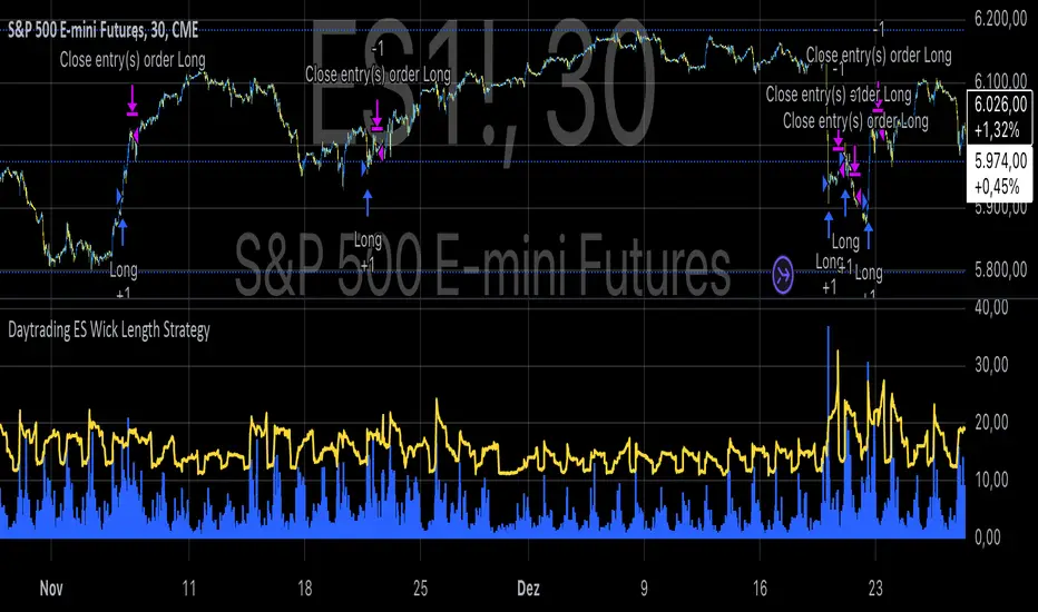
Daytrading ES Wick Length StrategyThis Pine Script strategy calculates the combined length of upper and lower wicks of candlesticks and uses a customizable moving average (MA) to identify potential long entry points. The strategy compares the total wick length to the MA with an added offset. If the wick length exceeds the offset-adjusted MA, the strategy enters a long position. The position is automatically closed after a user-defined holding period.
Key Features:
1. Calculates the sum of upper and lower wicks for each candlestick.
2. Offers four types of moving averages (SMA, EMA, WMA, VWMA) for analysis.
3. Allows the user to set a customizable MA length and an offset to shift the MA.
4. Automatically exits positions after a specified number of bars.
5. Visualizes the wick length as a histogram and the offset-adjusted MA as a line.
References:
• Candlestick wick analysis: Nison, S. (1991). Japanese Candlestick Charting Techniques.
• Moving averages: Brock, W., Lakonishok, J., & LeBaron, B. (1992). “Simple Technical Trading Rules and the Stochastic Properties of Stock Returns”. Journal of Finance.
This strategy is suitable for identifying candlesticks with significant volatility and long wicks, which can indicate potential trend reversals or continuations.
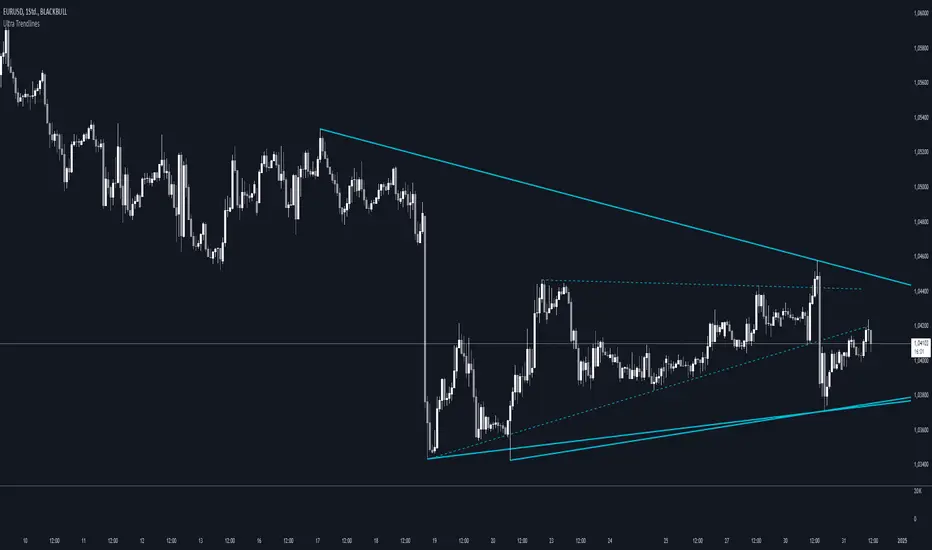
Ultra TrendlinesThis indicator automatically draws trendlines based on every pivot point, helping traders visualize key support and resistance levels. It dynamically adjusts as new pivots are detected and validates the trendlines against price movement.
Introduction
The Ultra Trendlines indicator is designed to help traders identify and track significant trendlines on their charts. By automatically detecting pivot points (both highs and lows), it draws trendlines that highlight key market movements. These trendlines are valuable for understanding the broader trend and for making informed trading decisions.
Detailed Description
The indicator analyzes price data to find pivot points highs and lows over a user-defined lookback period. Once a pivot is detected, it draws trendlines between the pivot points.
.........
Accuracy
To ensure accuracy, the indicator only keeps trendlines that are confirmed by price action. It checks if the price crosses the trendline and deletes invalid lines.
Additionally, it checks if the trendlines stay within predefined price thresholds, filtering out irrelevant lines that are too far from current price action.
The indicator also has an option to only show "rising lows" and "falling highs" trendlines, offering further precision in trend direction.
As new pivots are detected, older trendlines that fall outside the lookback period are removed, ensuring the chart remains clean.
.....
Style
The trendlines can extend forward (infinite and userdefined), backward, both or none. The lines are drawn with a customizable style (solid, dotted, or dashed), color, and width.
.........
Summary of Key Points
The indicator automatically detects pivot points (highs and lows) and draws trendlines based on them. It allows you to customize the style, color, and width of the trendlines. The indicator filters out invalid trendlines by checking if they are still relevant based on price action and price thresholds. Additionally, you can choose to only display rising lows and falling highs for more accurate trend analysis. It also removes outdated trendlines to keep the chart clean.
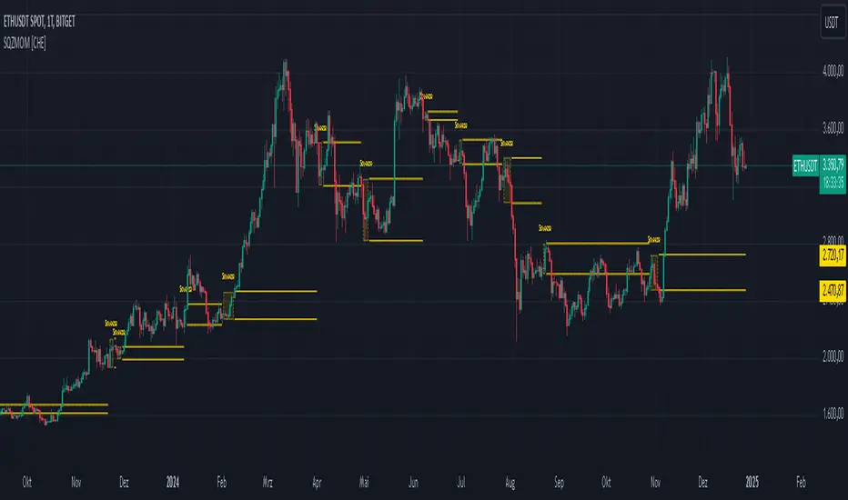
Squeeze Momentum Indicator [CHE] Squeeze Momentum Indicator
The Squeeze Momentum Indicator is an improved and simplified version of the classic Squeeze Momentum Indicator by LazyBear. It focuses on precise detection of squeeze phases without relying on Keltner Channels (KC) or complex momentum calculations. Instead, it emphasizes the dynamic analysis of Bollinger Band widths and their distance changes to provide clear and intuitive signals.
What is the Squeeze Momentum Indicator ?
This indicator helps you identify periods of low volatility (squeeze phases) when the market is often poised for significant moves. With its clear visualization and innovative methods, it enables traders to spot breakout opportunities early and trade strategically.
Differences from the Original LazyBear Indicator
1. Use of Bollinger Bands (BB):
- LazyBear Indicator combines Bollinger Bands with Keltner Channels. A squeeze is detected when the Bollinger Bands fall inside the Keltner Channels.
- CHE Indicator relies solely on Bollinger Bands and an additional analysis of their width (distance between the upper and lower bands). This makes the calculation more straightforward and reduces dependency on multiple indicator families.
2. Squeeze Detection:
- LazyBear: A squeeze is defined based on the relationship between Bollinger Bands and Keltner Channels. It has three states: “Squeeze On,” “Squeeze Off,” and “No Squeeze.”
- CHE: A squeeze is detected when the width of the Bollinger Bands falls below the lower "Distance Bollinger Bands." It only has two states: Squeeze Active and No Squeeze.
3. Momentum Calculation:
- LazyBear: Uses linear regression (LinReg) to calculate momentum and displays it as color-coded histograms.
- CHE: Does not include momentum calculations. The focus is entirely on volatility visualization and squeeze detection.
4. Visualization:
- LazyBear: Displays momentum histograms and horizontal lines to signal different states.
- CHE: Visualizes the width of the Bollinger Bands and their Distance Bollinger Bands as lines on the chart. The chart background turns green when a squeeze is detected, simplifying interpretation.
What Is Plotted?
1. Bollinger Band Width:
- A line representing the distance between the upper and lower Bollinger Bands, measuring market volatility.
2. Distance Bollinger Bands:
- Two additional lines (upper and lower Distance Bollinger Bands) based on the Bollinger Band width, defining thresholds for squeeze conditions.
3. Session-Specific Box:
- A dynamic box is drawn on the chart during a squeeze phase. The box marks the high and low of the market for the squeeze duration. It visually frames the range, helping traders monitor breakouts beyond these levels.
4. Max/Min Markers:
- The indicator dynamically updates and marks the maximum and minimum price levels during a squeeze. These levels can serve as breakout thresholds or critical reference points for price action.
5. Background Color:
- The chart background turns green when a squeeze is active (Bollinger Band width falls below the lower Distance Bollinger Bands). This highlights potential breakout conditions.
How to Use the CHE Indicator
1. Add the Indicator:
- Add the indicator to your chart and customize settings such as Bollinger Band length (`sqz_length`) and multiplier (`sqz_multiplier`) to fit your strategy.
2. Identify Squeeze Conditions:
- Watch for the green background, which signals a squeeze—indicating a period of low volatility where significant market moves often follow.
3. Monitor the Box and Max/Min Levels:
- During a squeeze, the box outlines the trading range, and the maximum and minimum levels are updated in real time. Use these as breakout triggers or support/resistance zones.
4. Session-Specific Analysis:
- The indicator can highlight squeezes during specific trading sessions (e.g., market open), allowing you to focus on key time frames.
5. Additional Confirmation:
- Combine the CHE Indicator with price action analysis or momentum tools to determine the direction of potential breakouts.
Why Use the Squeeze Momentum Indicator ?
- Simplicity: Clear visualization and reduced complexity by eliminating Keltner Channels and momentum calculations.
- Flexibility: Suitable for all markets—stocks, forex, crypto, and more.
- Enhanced Visualization: The box and max/min markers provide real-time visual cues for range-bound trading and breakout strategies.
- Efficiency: Focuses on what matters most—identifying volatility and squeeze phases.
With the Squeeze Momentum Indicator , you can take your trading strategy to the next level. Thanks to its clear design, dynamic range visualization, and innovative methods, you’ll recognize breakout opportunities earlier and trade with greater precision. Try it out and experience its user-friendliness and effectiveness for yourself!
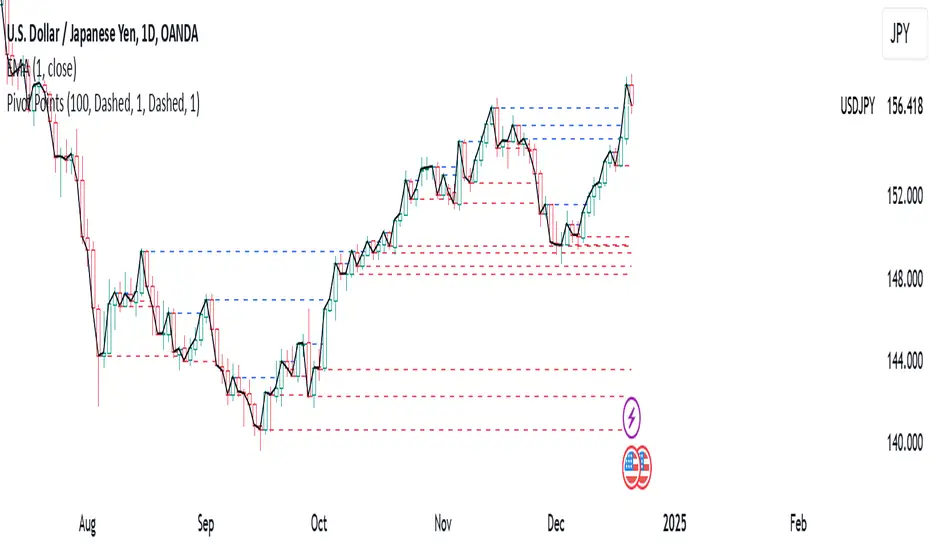
Pivot PointsPivot Points Indicator
The Pivot Points indicator highlights areas on the chart where candles close in opposite colors. These points occur when the price shifts from bullish to bearish, or vice versa, indicating potential reversals or continuation patterns. These points are more easily seen on a line chart and represent areas where the price changes direction to create peak formations.
Foundational Concepts
Before diving into the indicator, it’s important to understand a few key concepts:
When price is trending upward, it creates higher highs and higher lows. Each high or low acts as a pivot point. In an uptrend, the price is more likely to break the previous high (pivot point) and continue higher. You can enter a buy trade when the price breaks the previous high, anticipating the continuation of the trend.
When price is trending downward, it creates lower lows and lower highs. Each high or low is also a pivot point. In a downtrend, the price is more likely to break the previous low (pivot point) and continue lower. You can enter a sell trade when the price breaks the previous low, anticipating the continuation of the trend.
For reversal trades, it’s helpful to be familiar with chart patterns like double tops, double bottoms, and head and shoulders. The Pivot Points indicator can assist in identifying these patterns, helping you determine entry points, as well as where to place your stop loss.
Recommended Setup
It’s recommended to have two charts open side by side: one displaying a line chart and the other showing a candlestick chart, with the Pivot Points indicator applied to both. This setup allows you to easily identify the market structure and price action as it approaches these levels. You can also add a 20-period Simple Moving Average (SMA) to both charts to help identify the overall trend. Additionally, consider adding the Relative Strength Index (RSI) to the line chart to confirm overbought or oversold conditions.
This approach can be used on any timeframe.
Contributing
If you have suggestions, improvements, or bug fixes, I encourage you to submit pull requests. Collaboration helps make the indicator more versatile and useful for everyone.
Disclaimer
Any trading decisions you make are entirely your responsibility.
The MetaTrader 5 version of this indicator is available on my GitHub repository: roshaneforde/pivot-points-indicator
BRT Cluster VolumeTitle and Purpose
BRT Cluster Volume is a powerful market analysis tool designed to identify key support and resistance levels, cluster volumes, and breakout signals. This script is highly beneficial for traders who aim to gain deeper insights into market trends and pinpoint zones of interest for buyers and sellers.
Key Features
1. Support and Resistance Levels:
- The script automatically detects chart extremums by analyzing a specified number of bars on the left and right to form levels. This approach effectively identifies local highs and lows.
- The uniqueness of this implementation lies in its dynamic data processing. For each extremum, the "channel width" is calculated, allowing insignificant levels to be filtered out based on a user-defined minimum width. This method eliminates noise and ensures focus on critical levels.
- Extremum lines can be extended to the right (when enabled), allowing traders to track current price movements relative to historical levels.
2. Cluster Volume:
- The cluster analysis is based on lower timeframe data, providing precise identification of key zones of market participant activity. The script dynamically requests close prices and volumes from lower timeframes, calculates the average volume, and identifies levels where volumes exceed a defined threshold.
- The visualization of cluster volumes is unique: volumes exceeding the threshold are displayed as candles with customizable colors and markers. These indicators help traders identify zones of significant interest.
- Cluster volume is only displayed when it interacts with support or resistance levels, ensuring that the visualization remains precise and relevant for market analysis.
3. Breakout Signals:
- The script evaluates "breakout strength" for each breakout of support or resistance levels by comparing the current price with the level. This helps filter false breakouts and focus on significant price movements.
- Traders can select the source for breakout signals (close price or high/low), offering flexibility for various trading styles and strategies.
- By incorporating the concept of "maximum breakout strength," the script highlights only meaningful breakouts, ignoring minor fluctuations.
4. Integration of Trading Sessions:
- Extremum levels for major trading sessions (Asia, Europe, USA) are identified and labeled on the chart. This allows traders to see when significant price levels were formed during the day.
- The script uses timestamps to automatically detect session times, ensuring accuracy and minimizing manual adjustments.
5. Dynamic Data Updates:
- The script dynamically updates support and resistance levels in real time as new data becomes available. This feature is crucial for traders working in fast-moving markets.
- Outdated information (such as obsolete levels) is automatically removed to keep the chart clean and focused on relevant data.
6. Visualization of Activity Zones:
- Trend direction is visualized using color-coded candles based on cluster volumes. For instance, candles with volumes exceeding the average are highlighted with specific colors, helping traders quickly identify areas of heightened activity.
- The unique aspect of this visualization is that cluster volumes appear only in zones where they interact with breakout levels, providing an intuitive and streamlined presentation of critical data.
Usage
- Support and Resistance: Adjust the "Left Bars" and "Right Bars" settings to determine extremums. Use the "Channel Min Width" setting to filter out insignificant levels.
- Cluster Volume: Customize the analysis period and volume threshold to identify high-activity zones. Enable breakout clusters to see how volumes interact with breakouts.
- Session Extremums: Highlight significant levels for Asia, Europe, and US trading sessions to gain insights into market dynamics across different time zones.
- Breakout Signals: Configure the breakout strength and source (close or high/low) for precise signal detection.
Parameter Details
1. Support & Resistance:
- `Left Bars` / `Right Bars`: Number of bars to consider for determining extremums.
- `# of Lines`: Maximum number of support/resistance lines to display.
- `Channel Min Width`: Minimum channel width to filter insignificant levels.
2. Breakout:
- `Show Breakouts`: Toggle breakout signal display.
- `Max breakout strength`: Maximum strength for valid breakouts.
- `Breakout source`: Data source for breakouts (close or high/low).
3. Cluster Volume:
- `Lookback`: Number of bars to analyze for cluster volumes.
- `Threshold`: Volume threshold (percentage above the average).
- `Cluster Volume Timeframe`: Timeframe for cluster volume analysis.
- `Breakout Cluster`: Display cluster volumes only for breakout-related zones.
4. Visual Settings:
- `Extend extremum lines to the right`: Extend support/resistance lines to the right.
- `Show ASIA/EU/US Session Extremums`: Display extremums for trading sessions.
Features and Benefits
- The script provides flexible parameter customization, allowing it to adapt to different trading styles and timeframes.
- The visualization is designed to be clean and intuitive, ensuring users can easily interpret the data.
- Suitable for all timeframes, making it ideal for both intraday and long-term market analysis.
Limitations
- The script is not suitable for analysis on non-standard chart types (e.g., Heikin Ashi, Renko, Kagi).
- To ensure accurate performance, realistic data for commission and slippage should be used.
Warnings
- The script relies on historical data for calculations, which may cause discrepancies in real-time conditions.
- Users should fully understand the functionality of cluster analysis and breakout signals before using the script in live trading.
This script combines advanced data processing logic, dynamic level adjustments, and unique visualization approaches, making it an indispensable tool for market analysis and trading decision-making.

IPO Lifecycle Sell Strategy [JARUTIR]IPO Lifecycle Sell Strategy with Dynamic Buy Date and Multiple Sell Rules
This custom TradingView script is designed for traders looking to capitalize on dynamic strategies for IPOs and growth stocks, by implementing several sell rules based on price action and technical indicators. It provides a set of sell rules that are applied dynamically depending on the stock's lifecycle and price action, allowing users to lock in profits and minimize drawdowns based on key technical thresholds.
The four sell strategies incorporated into this script are inspired by the book "The Lifecycle Trade", a resource that focuses on capturing profits while managing risk in different phases of a stock's lifecycle, from IPO to high-growth stages.
Key Features:
Buy Price and Buy Date: You can either manually input your buy price and date or let the script automatically detect the buy date based on the specified buy price.
Multiple Sell Strategies: Choose from 4 predefined sell strategies:
Ascender Rule : Captures strong momentum from IPO stocks by selling portions at specific price levels or technical conditions.
Midterm Rule : Focuses on holding for longer periods, with defensive sell signals triggered when the stock deviates significantly from peak price or key moving averages.
40 Week Rule : Designed for long-term holds, this rule triggers a sell when the stock closes below the 40-week moving average.
Everest Rule : Aggressive strategy for selling into strength based on parabolic moves or gap downs, ideal for high momentum stocks.
Interactive Features:
Horizontal Green Line showing the buy price level from the buy date.
Visual Sell Signals appear only after the buy date to ensure that your analysis is relevant to the stock lifecycle.
Customizable settings, allowing you to choose your preferred sell rule strategy and automate buy date detection.
This script is perfect for traders using a strategic, systematic approach to IPOs and high-growth stocks, whether you're looking for quick exits during momentum phases or holding for longer-term growth.
Usage:
Input your Buy Price and Buy Date, or allow the script to automate the buy date detection.
Select a Sell Rule strategy based on your risk profile and trading style.
View visual signals for selling when specific conditions are met.
Frequently Asked Questions (FAQs):
Q1: How do I input my Buy Price and Buy Date?
The script allows you to either manually input the Buy Price and Buy Date or use the automated detection. If you choose automated detection, the script will automatically assign the buy date when the price crosses above your set Buy Price.
Q2: What is the purpose of the "Sell Rules"?
The script offers four sell strategies to help manage different types of stocks in varying phases of their lifecycle:
Ascender Rule: Targets IPO stocks showing positive momentum.
Midterm Rule: A defensive strategy for stocks in a steady uptrend.
40 Week Rule: Long-term hold strategy designed to ride stocks through extended growth.
Everest Rule: Aggressive strategy to capture profits during parabolic price moves.
Q3: What is the significance of the Green Line at Buy Price?
The Green Line represents your entry point (Buy Price) on the chart. It will appear from the buy date onwards, helping you track the performance of your stock relative to your entry.
Q4: Can I customize the Sell Strategy?
Yes! You can choose from the available Sell Rules (Ascender Rule, Midterm Rule, 40 Week Rule, Everest Rule) via an input option in the script. Each strategy has its own unique triggers based on price action, moving averages, and time-based conditions.
Q5: Does this script work for stocks and crypto?
Yes, this script is designed for both stocks and cryptocurrencies. It works on any asset where price data and timeframes are available.
Q6: How do the Weekly Moving Averages (WSMA) work in this strategy?
The script uses weekly moving averages (WSMA) to track longer-term trends. These are essential for some of the sell rules, such as the Midterm Rule and 40 Week Rule, which rely on the stock's movement relative to the 40-week moving average.
Q7: Will the script plot a Sell Signal immediately after the Buy Date?
No, sell signals will only be plotted after the Buy Date. This ensures that the sell strategy is relevant to your actual holding period and avoids premature triggers.
Q8: How do I interpret the Sell Signal?
The script will plot a Red Sell Signal above the bar when the sell conditions are met, based on the selected strategy. This indicates that it may be a good time to exit the position according to your chosen rule.
Q9: Can I use this strategy on different timeframes?
Yes, you can apply the script to any timeframe. However, some sell strategies, like the Midterm Rule and 40 Week Rule, are designed to work best with weekly data, so it's recommended to use these strategies with longer timeframes.
Q10: Does this script have any alerts?
Yes! The script supports alert conditions that will notify you when the sell conditions are met according to your selected rule. You can set up alerts to stay informed without needing to watch the chart constantly.
Q11: What if I want to disable some of the sell rules?
You can select your preferred sell rule using the "Select Sell Rule" dropdown. If you don’t want to use a particular rule, simply choose a different strategy or leave it inactive.
------------------------------
Disclaimer:
This strategy is intended for educational purposes only. It should not be considered financial advice. Always perform your own research and consult with a professional before making any trading decisions. Trading involves significant risk, and you should never trade with money you cannot afford to lose.

ATR/DTR with Custom Percentage DisplayThis Pine Script indicator provides a detailed view of the Average True Range (ATR) and Daily True Range (DTR), along with additional calculated metrics to assist in analyzing price volatility. The key features of the indicator include:
ATR Calculation:
The ATR is calculated over a user-defined timeframe, allowing traders to assess average market volatility over a specific period.
DTR Calculation:
The DTR represents the absolute range (high - low) of the current or chosen timeframe, providing insights into the day's price movement.
ATR/DTR Percentage:
This metric calculates the DTR as a percentage of the ATR, showing how the daily range compares to the average range, with dynamic coloring to highlight when it exceeds a user-defined threshold.
Custom Percentage of ATR:
Users can input a custom percentage to calculate and display a corresponding value of the ATR. For example, entering 15% will compute and display 15% of the ATR in the indicator’s table.
Dynamic Table Display:
The indicator outputs all these metrics in a well-organized table that is overlaid on the chart. The table includes:
ATR
DTR
ATR/DTR percentage
The user-defined percentage of ATR
Customizable Features:
Color Coding: The table dynamically changes its background color when the ATR/DTR percentage exceeds a user-defined threshold.
Placement Options: The table's position on the chart can be adjusted (e.g., bottom-right, top-center) for optimal visibility.
Use Case:
This indicator is ideal for traders who want a deeper understanding of market volatility and prefer visual representation of how current price movements compare to historical averages. It is especially useful for:
Setting volatility-based stop-loss levels.
Identifying high-volatility trading opportunities.
Tailoring strategies around price movement patterns.

Drawdown from All-Time High (Line)This Pine Script is a **Drawdown Indicator from All-Time High** for TradingView. It calculates and plots the percentage drawdown from the highest price the asset has ever reached (the all-time high). Here's a breakdown of what this script does:
### Description:
- **Drawdown Calculation**:
- The drawdown is calculated as the difference between the current price (`close`) and the all-time high, divided by the all-time high, and multiplied by 100 to express it as a percentage.
- If the current price is higher than the previous all-time high, the all-time high is updated to the current price.
- **All-Time High Tracking**:
- The script tracks the highest price (`allTimeHigh`) that the asset has ever reached. Each time a new high is reached, the `allTimeHigh` value is updated.
- **Line Plot**:
- The drawdown percentage is then plotted as a line on the chart, with a color of **blue** for easy visualization.
- The line shows how much the price has dropped relative to its all-time high.
- **Zero Line**:
- A horizontal line is added at the **0%** level to act as a reference point, which is helpful to identify when the asset has fully recovered to its all-time high.
### Key Features:
- **Track Drawdown**: The indicator helps visualize how far the current price has fallen from its highest point, which is useful for understanding the depth of losses (drawdowns) during a period.
- **Update All-Time High**: The indicator automatically updates the all-time high whenever a new high is detected.
- **Visual Reference**: The 0% horizontal line provides a clear indication of when the asset is at its all-time high, and the drawdown is at 0%.
### How it Works:
- If the current price surpasses the all-time high, the script will reset the all-time high to the new price.
- The drawdown percentage is calculated from the current price relative to this all-time high, and it is displayed as a line on the chart.
### Visuals:
- **Drawdown Line**: Plots the percentage of the drawdown, which is the drop from the all-time high.
- **Zero Line**: A dotted horizontal line at 0% marks the level of the all-time high.
This indicator is valuable for understanding the extent of price corrections and potential recoveries relative to the historical peak of the asset. It is especially useful for traders and investors who want to assess the risk of drawdowns in relation to the highest price achieved by the asset.

Alerts and symbolswhat is "Alerts and symbols"?
It is an indicator that allows you to watch more trading pairs and add alarms to them.
what it does?
It allows you to set a total of 20 different intersection alarms, 2 in each pair, for 10 different trading pairs at the same time.
It draws the candlestick chart of a pair you choose among 10 trading pairs and the alarm lines you created for this trading pair on the chart.
It also allows you to see the prices of 10 different trading pairs at the same time, thanks to the table it creates.
how to use it?
First, select the alarm pairs you want to use, for example, BTCUSDT pair is the default value for "pair 1". You can choose 10 different trading pairs as you wish. Just below each trading pair, there are two different sections titled "line 1" and "line 2" so that you can set an alarm. Type here the price levels at which you want to be alerted in case of a price crossover.
You can use the "candle source" section to examine the candlestick charts of trading pairs. The indicator draws the candle chart of the trading pair selected in the "candle source" section.
Check the "show alert lines on chart" box to see the levels you have set an alarm for.
When everything is ready, first click on the three dots next to the indicator's name and then on the clock icon. then create an alarm and that's it.
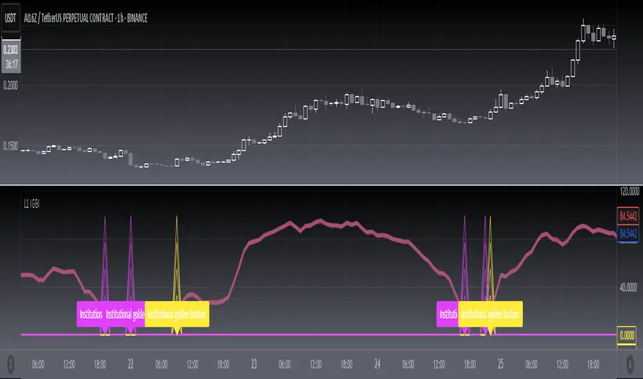
[blackcat] L1 Institutional Golden Bottom Indicator█ OVERVIEW
The script " L1 Institutional Golden Bottom Indicator" is an indicator designed to identify potential institutional buying interest or a "golden bottom" in the market. It calculates a series of values based on price movements and plots them on a chart to help traders make informed decisions.
█ LOGICAL FRAMEWORK
The script is structured into several main sections:
1 — Function Definitions: Custom functions xsa and calculate_institutional_golden_bottom are defined.
2 — Input Parameters: The user can set a threshold value for institutional interest.
3 — Calculations: The script calculates various indicators and conditions, including the institutional buy signal.
4 — Plotting: The results of the calculations are plotted on the chart.
5 — Labeling: When a golden bottom is detected, a label is placed on the chart.
The flow of data starts with the input parameters, proceeds through the calculation functions, and finally results in plotted outputs and labels.
█ CUSTOM FUNCTIONS
1 — xsa(src, len, wei)
• Purpose: To calculate a weighted moving average.
• Parameters:
– src: Source data (e.g., price).
– len: Length of the moving average.
– wei: Weighting factor.
• Return Value: The calculated weighted moving average.
2 — calculate_institutional_golden_bottom(close, high, low, threshold)
• Purpose: To determine the institutional golden bottom indicator.
• Parameters:
– close: Closing price.
– high: Highest price.
– low: Lowest price.
– threshold: User-defined threshold for institutional interest. By tuning the threshold value the user can properly identify the institutional golden bottom of the instrument. So, I can say this parameter is used to tune the "sensitivity" of this indicator.
• Return Value: An array containing the institutional indicator, golden bottom signal, and additional values (a1, b1, c1, d1).
█ KEY POINTS AND TECHNIQUES
• Weighted Moving Average (WMA): The xsa function implements a weighted moving average, which is useful for smoothing price data.
• Crossover Detection: The script uses a crossover condition to detect when the institutional indicator crosses above the threshold, indicating a potential buying opportunity.
• Conditional Logic: The script includes conditional statements to control the output of certain values only when specific conditions are met.
• Plotting and Labeling: The script uses plot and label.new functions to visualize the indicator and highlight significant events on the chart.
█ EXTENDED KNOWLEDGE AND APPLICATIONS
• Modifications: The script could be enhanced by adding more customizable parameters, such as different lengths for the moving averages or additional conditions for the golden bottom signal.
• Extensions: Similar techniques could be applied to other types of indicators, such as momentum oscillators or trend-following systems to identify market turning points.
• Related Concepts: Understanding weighted moving averages, crossover signals, and conditional plotting in Pine Script would be beneficial for enhancing this script and applying similar logic to other trading strategies.
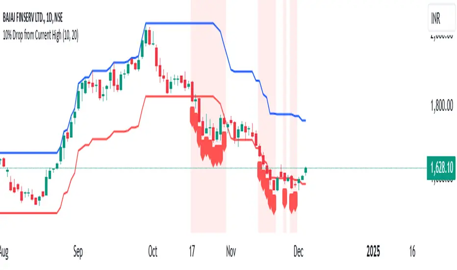
10% Drop from Current High - Akshay10% Drop from Current High TradingView Indicator
Description:
The "10% Drop from Current High" indicator dynamically tracks the highest price within a user-defined period and highlights when the current price drops by a specified percentage. This tool is invaluable for traders looking to monitor significant pullbacks or corrections from recent highs.
Key Features:
Customizable Drop Percentage:
Allows users to set the percentage drop to track, with a default value of 10%.
Configurable via an input field to suit different trading strategies and market conditions.
Lookback Period:
Tracks the highest price over a user-defined lookback period (default is 20 bars).
This ensures the indicator adapts to short-term or long-term market conditions based on user preferences.
Dynamic Levels:
Current High Level: Plots the highest price within the lookback period in blue.
Drop Level: Plots the calculated drop level (e.g., 10% below the current high) in red.
Visual Alerts:
Background Highlighting:
A translucent red background appears when the current price is at or below the drop level, signaling a significant pullback.
Shape Marker:
A downward label is plotted below the bar when the price touches or falls below the drop level, providing cSet Alerts:lear visual feedback.
Overlay on Price Chart:
The indicator is plotted directly on the price chart (overlay=true), ensuring seamless integration with other technical analysis tools.
Use Case:
This indicator is designed for traders who want to:
Monitor Pullbacks:
Identify when the price of an asset experiences a defined percentage drop from its recent high, signaling potential reversal zones or buying opportunities.
Use visual cues to react quickly to price movements.
Analyze Trends:
Combine with other indicators to assess the strength of trends and corrections.
Customization Options:
Drop Percentage: Adjust the percentage drop to track based on asset volatility and trading strategy.
Lookback Period: Modify the lookback period to focus on short-term (e.g., 5 bars) or long-term (e.g., 50 bars) price highs.
This indicator provides a flexible and intuitive way to track price pullbacks, helping traders make informed decisions and stay ahead in dynamic market conditions.
RagiBaba's 3:1 Risk-to-Reward Tool with LeverageThis indicator allows you to visualize a 3:1 risk-to-reward ratio for your trades on the chart. It automatically calculates and displays the Stop Loss and Take Profit levels based on your input for:
Entry Price
Trade Amount ($)
Risk Amount ($)
Leverage (x)
You can adjust the following settings:
Trade Direction: Choose between a Long or Short position.
Leverage: Enter the leverage value (e.g., 25x).
Entry Price: Set the price at which you plan to enter the trade.
Risk and Reward: Input the amount of money you're willing to risk and the desired reward (automatically calculated as 3 times your risk).
Label Position: Choose the label position for Entry, Stop, and Target (left, center, or right on the chart).
Each line has a corresponding label showing the price for Entry, Stop Loss, and Take Profit. The labels can be positioned on the left, center, or right side of the chart for better readability.
This tool helps you manage your trades by giving you clear visual cues for your entry, stop loss, and take profit levels with the option to adjust for leverage.

Pairs trading[Maxxxz7]Pairs Trading
This script is designed to analyze and visualize the divergence or convergence of two selected financial instruments, making it an excellent tool for implementing a pairs trading strategy. Developed for the TradingView platform, it offers extensive customization options for analysis.
Key Features:
Asset Selection:
The first asset can be taken directly from the chart or specified manually.
The second asset is always selected manually.
Data Normalization:
Calculates the percentage change of both assets relative to their initial prices.
Includes an offset for better visual interpretation.
Visualization:
Plots normalized price charts for both assets.
Highlights crossovers between the assets.
Displays the spread (difference between normalized prices) graphically.
Alerts (Works only on the 30-minute timeframe):
Configurable thresholds to trigger alerts (e.g., when the difference is smaller or larger than a set value).
Alerts for crossovers of prices and exponential moving averages (EMA).
Dynamic Labels:
Automatically adds labels to mark key events: crossovers, critical spread values, and current price information.
EMA and Deviation Analysis:
Calculates EMA for each asset.
Alerts for EMA crossovers.

New Bar AlertThis is probably the simplest indicator on Tradingview, it generates an alert on every new bar.
Useful for strategies where you only need chart attention at the new bar, see if you have a setup.
Helps not having to stare at the charts, the alert will tell you when it's time to take a look.
Works on all timeframes but in order to keep your sanity, best used on higher timeframes, 5mins and up.
Asset MaxGain MinLoss Tracker [CHE]Asset MaxGain MinLoss Tracker – Your Tool to Discover the Best Trading Opportunities
Introduction
Hello dear traders,
Today, I'd like to introduce you to a fantastic tool: the Asset MaxGain MinLoss Tracker . This indicator is designed to help you identify the best trading opportunities in the market by analyzing the maximum gain and adjusted maximum loss potentials of various assets.
Why Use This Indicator?
1. Time-Saving Analysis
Instead of spending hours sifting through different charts, this indicator provides you with key metrics for up to 10 assets at a glance.
2. Compare Multiple Assets Simultaneously
Monitor and compare multiple assets to discover which ones offer the highest profit potential and the lowest risk of loss.
3. Customizable Settings
Adjust the observation period and select the assets you want to analyze according to your trading strategy.
4. Clear Visual Representation
Data is presented in an easy-to-read table directly on your chart, highlighting assets with the highest maximum gain and the lowest adjusted maximum loss.
How to Use It in Everyday Trading
Step 1: Setting Up the Indicator
Select Your Assets: Choose up to 10 assets you wish to track. These can be cryptocurrencies, stocks, forex pairs, etc.
Configure the Trading Period Length: Set the number of bars (candles) over which you want to calculate the maximum gain and adjusted maximum loss. This allows you to tailor the analysis to your preferred time frame, whether it's short-term trading or long-term investing.
Step 2: Interpreting the Results
Maximum Gain (%): This value shows the potential upside of each asset over the selected period. A higher percentage indicates a greater potential for profit if the asset's price moves upward.
Adjusted Maximum Loss (%): This figure represents the potential downside risk, adjusted to give a more accurate reflection of loss potential. A lower percentage means less risk of significant loss.
Category Highlighting: Assets are categorized based on their performance:
High Gain & Low Loss: Assets that have both the highest max gain and the lowest adjusted max loss.
High Gain: Assets with the highest max gain.
Low Loss: Assets with the lowest adjusted max loss.
Step 3: Making Trading Decisions
Identify Opportunities: Focus on assets categorized as High Gain & Low Loss for the most favorable risk-to-reward scenarios.
Risk Management: Use the adjusted maximum loss to assess and mitigate potential risks associated with each asset.
Portfolio Diversification: Allocate your investments across assets with varying levels of gain and loss potentials to diversify your portfolio effectively.
Practical Example
Imagine you're monitoring the following assets:
Asset 1: BTCUSD
Asset 2: ETHUSD
Asset 3: ADAUSD
Asset 4: XRPUSD
After applying the indicator:
BTCUSD shows a high maximum gain but also a high adjusted maximum loss.
ETHUSD has both a high maximum gain and a low adjusted maximum loss, categorizing it as High Gain & Low Loss.
ADAUSD indicates a low maximum gain but the lowest adjusted maximum loss.
XRPUSD reflects moderate values in both categories.
Decision Making:
Primary Focus: ETHUSD may be your top choice due to its high reward and lower risk.
Risk-Averse Option: ADAUSD could be considered if you prioritize minimizing losses.
Balanced Approach: Diversify by investing in both ETHUSD and ADAUSD.
Understanding the Core Functionality
While you don't need to delve deep into the code to use the indicator effectively, understanding its core function can enhance your confidence in the tool.
The Main Function: Calculating Max Gain and Adjusted Max Loss
The heart of the indicator is a function that calculates two critical metrics for each asset:
Maximum Gain (sym_MaxGain):
Purpose: Measures the highest potential profit over the selected period.
How It Works: It finds the lowest price (sym_minlow) within the period and calculates the percentage increase to the current high price. This shows how much you could have gained if you bought at the lowest point.
Adjusted Maximum Loss (sym_AdjustedMaxLoss):
Purpose: Provides an adjusted measure of the potential loss, giving a more realistic risk assessment.
How It Works: It identifies the highest price (sym_maxhigh) within the period and calculates the percentage decrease to the current low price. This value is adjusted to account for the diminishing impact as losses approach 100%.
Simplified Explanation of the Function
Data Retrieval: For each asset (sym), the function retrieves the high and low prices over the specified timeframe.
Calculations:
Find Highest and Lowest Prices: Determines sym_maxhigh and sym_minlow within the tracking period.
Compute Max Gain: Calculates the potential gain from sym_minlow to the current high.
Compute Max Loss: Calculates the potential loss from sym_maxhigh to the current low.
Adjust Max Loss: Adjusts the max loss calculation to prevent distortion as losses near 100%.
Output: Returns both sym_MaxGain and sym_AdjustedMaxLoss for further analysis.
Benefits of Understanding the Function
Transparency: Knowing how these values are calculated can increase your trust in the indicator's outputs.
Customization: If you're familiar with coding, you might tailor the function to suit specific trading strategies.
Enhanced Analysis: Understanding the underlying calculations allows you to interpret the results more effectively, aiding in better decision-making.
Conclusion
The Asset MaxGain MinLoss Tracker is a powerful tool that can significantly enhance your trading efficiency and effectiveness by:
Providing Quick Insights: Save time by getting immediate access to essential performance metrics of multiple assets.
Assisting in Risk Management: Use the adjusted maximum loss to understand and mitigate potential risks.
Supporting Strategic Decisions: Identify assets with the best risk-to-reward ratios to optimize your trading strategy.
Take advantage of this indicator to elevate your trading game and make more informed decisions with confidence.
Thank you for your time, and happy trading!
Disclaimer:
The content provided, including all code and materials, is strictly for educational and informational purposes only. It is not intended as, and should not be interpreted as, financial advice, a recommendation to buy or sell any financial instrument, or an offer of any financial product or service. All strategies, tools, and examples discussed are provided for illustrative purposes to demonstrate coding techniques and the functionality of Pine Script within a trading context.
Any results from strategies or tools provided are hypothetical, and past performance is not indicative of future results. Trading and investing involve high risk, including the potential loss of principal, and may not be suitable for all individuals. Before making any trading decisions, please consult with a qualified financial professional to understand the risks involved.
By using this script, you acknowledge and agree that any trading decisions are made solely at your discretion and risk.
This indicator is inspired by the "Max Gain" indicator. A special thanks to Skipper86 for his relentless effort, creativity, and contributions to the TradingView community, which served as a foundation for this work.

Prometheus Markov ChainThe Prometheus Markov Chain Indicator is a custom-built tool designed to predict potential future price movements using a Markov Chain approach. A Markov Chain is a statistical model that assumes the probability of moving to a future state depends solely on the current state. In this indicator, states represent price movement classifications—bullish, bearish, or neutral—and are determined based on historical price changes (percentage returns). The indicator builds a transition matrix to calculate probabilities of transitioning from one state to another, enabling traders to identify patterns and forecast likely price actions.
Core Functionality and Transition Matrix
The transition matrix is the backbone of the Markov Chain. It captures the frequency of transitions between states in the historical price data and normalizes these counts into probabilities. For example, if the price was in a bearish state and transitioned to a bullish state 3 out of 10 times, the probability of transitioning from bearish to bullish would be 0.3. The matrix is created dynamically using the stateFunc function to classify states, which can use either dynamic thresholds (highest and lowest returns over a lookback period) or a user-defined percent return threshold. Below is the snippet that updates the transition matrix:
transitionMatrix = matrix.new(dimension, dimension, 0.0)
for i = 0 to array.size(vec) - 2
fromState = array.get(vec, i)
toState = array.get(vec, i + 1)
transitionMatrix.set(fromState, toState, transitionMatrix.get(fromState, toState) + 1)
for i = 0 to dimension - 1
rowSum = 0.0
for j = 0 to dimension - 1
rowSum += transitionMatrix.get(i, j)
for j = 0 to dimension - 1
prob = transitionMatrix.get(i, j) / rowSum
transitionMatrix.set(i, j, prob)
This snippet iterates through historical price movements, counts state transitions, and then normalizes each row of the matrix so that the sum of probabilities for all possible transitions from a given state equals 1.
How the Indicator Predicts Future States
After constructing the transition matrix, the indicator calculates the current state of the price based on the latest percentage return and then uses the matrix to compute probabilities for transitioning to other states. The state with the highest probability is predicted as the next state, which is displayed on the chart using color-coded labels: green for bullish and red for bearish. The following snippet demonstrates how the current state and predictions are calculated:
current_chng = (close - close ) / close
var int current_state = na
if not use_custom_thresh
highest_chng = ta.highest(current_chng, int(size) * 2)
lowest_chng = ta.lowest(current_chng, int(size) * 2)
current_state := stateFunc(current_chng, highest_chng, lowest_chng)
else
current_state := stateFunc(current_chng, custom_thresh)
predicted_probs = array.new(dimension, 0.0)
for j = 0 to dimension - 1
array.set(predicted_probs, j, transitionMatrix.get(current_state, j))
The indicator evaluates which state has the highest transition probability (highest_prob) and places corresponding labels on the chart. For example, if the next state is predicted to be bullish, a green "Bullish" label is placed below the current bar. This predictive functionality helps traders anticipate potential reversals or continuations in price trends based on historical behavior patterns.
Usage:
Here we see the indicator at work on $PLTR. The states predicted are bullish then bearish. In this example we then see price move in a way that verifies those predictions.
On this 4 Hour NASDAQ:AMZN chart we see predictions play out in a short trade style. States quickly move from one to another but not without giving traders a way to take advantage.
This is the perspective we aim to provide. We encourage traders to not follow indicators blindly. No indicator is 100% accurate. This one can give you a different perspective market state. We encourage any comments about desired updates or criticism!

Buy and Sell Signal at 50% Retracement, Based on MANDO MODELthe sell is taking out a previous high. leave some runners and practice safe trading.
Explanation of Behavior:
When the price retraces 50% of the defined range (from the low to high), a Buy signal is triggered.
After the Buy signal, if the price moves above the previous high (after retracement), a Sell signal is triggered.
Once a Sell signal is triggered, the range is reset, and a new range needs to form before another signal can be triggered.
Test this:
Apply the script to your chart.
Check for Buy signals when the price crosses the 50% retracement level.
Sell signals will trigger once the price breaks above the previous high after the retracement phase.
Ensure that the signals are plotted as arrows on the chart and that the background color changes to indicate Buy or Sell.
Alerts Setup:
To set up alerts:
Right-click on the chart and select Add Alert.
For Buy Signal: Choose the condition Buy and Sell Signal at 50% Retracement with Top Break > Buy Signal.
For Sell Signal: Choose the condition Buy and Sell Signal at 50% Retracement with Top Break > Sell Signal.
Set your preferred alert type (popup, email, etc.).
Click Create to set the alert.

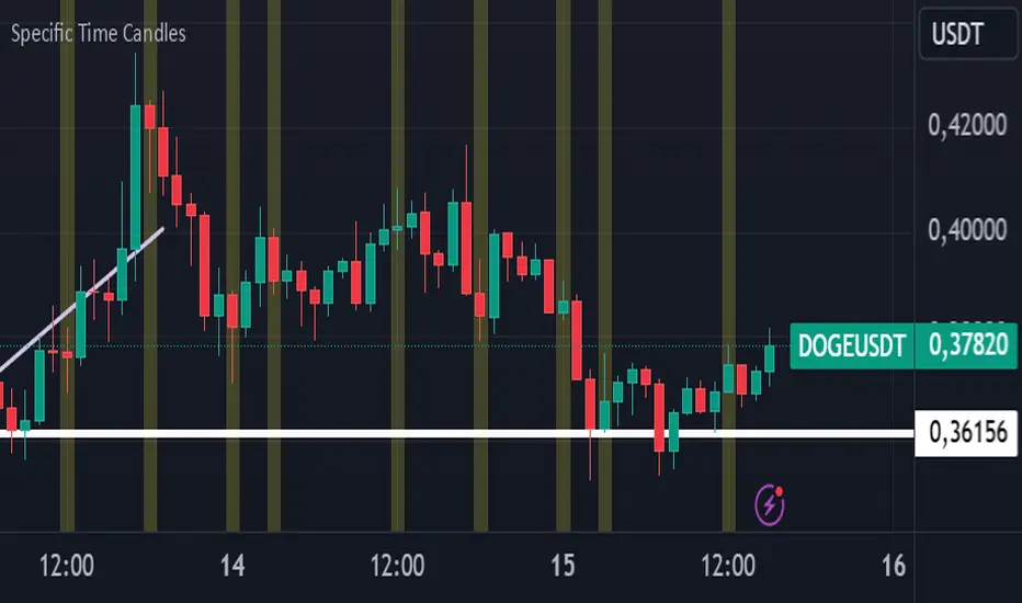
Specific Time CandlesSpecific Time Candles Indicator
The Specific Time Candles indicator is a powerful tool designed for traders who want to focus on specific time intervals within their charts. This custom indicator allows you to highlight and analyze price action during user-defined time periods, providing clarity and precision in your trading strategy.
Key Features:
Custom Time Intervals: Select any start and end time to create candles that focus on your preferred trading hours. This is particularly useful for traders who want to concentrate on market sessions, such as the London or New York session, or any other specific time frame relevant to their trading plan.
Enhanced Visualization: By isolating specific time periods, this indicator helps reduce noise and provides a clearer view of market movements during key trading hours. This can be beneficial for identifying trends, reversals, and potential breakout opportunities.
Flexible Configuration: Easily adjust the indicator settings to match your trading schedule. Whether you are a day trader, swing trader, or scalper, you can customize the time frames to suit your needs.
Compatibility: The indicator is compatible with multiple asset classes, including forex, stocks, commodities, and cryptocurrencies, making it a versatile tool for any trader.
User-Friendly Interface: Designed with simplicity in mind, the Specific Time Candles indicator is easy to set up and use, even for those who are new to TradingView.
How to Use:
Add the indicator to your chart from the TradingView library.
Set your desired start and end times in the indicator settings.
Observe the newly formed candles that represent the specified time intervals.
Use these candles to make informed trading decisions based on the focused analysis of market activity during your chosen periods.
Benefits:
Precision Trading: Focus on the most relevant market data, eliminating distractions from other time periods.
Improved Decision-Making: Gain insights into market behavior during critical times, enhancing your ability to make strategic trades.
Time Management: Efficiently manage your trading by concentrating on specific times, allowing for better planning and execution.
The Specific Time Candles indicator is a must-have for traders looking to refine their strategies by concentrating on precise market windows. Whether you are targeting high-volatility periods or specific trading sessions, this indicator provides the tools you need to succeed.
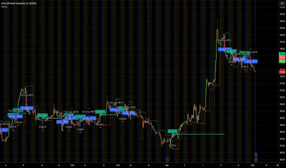
TFMTFM Strategy Explanation
Overview
The TFM (Timeframe Multiplier) strategy is a PineScript trading bot that utilizes multiple timeframes to identify entry and exit points.
Inputs
1. tfm (Timeframe Multiplier): Multiplies the chart's timeframe to create a higher timeframe for analysis.
2. lns (Long and Short): Enables or disables short positions.
Logic
Calculations
1. chartTf: Gets the chart's timeframe in seconds.
2. tfTimes: Calculates the higher timeframe by multiplying chartTf with tfm.
3. MintickerClose and MaxtickerClose: Retrieve the minimum and maximum closing prices from the higher timeframe using request.security.
- MintickerClose: Finds the lowest low when the higher timeframe's close is below its open.
- MaxtickerClose: Finds the highest high when the higher timeframe's close is above its open.
Entries and Exits
1. Long Entry: When the current close price crosses above MaxtickerClose.
2. Short Entry (if lns is true): When the current close price crosses below MintickerClose.
3. Exit Long: When the short condition is met (if lns is false) or when the trade is manually closed.
Strategy
1. Attach the script to a chart.
2. Adjust tfm and lns inputs.
3. Monitor entries and exits.
Example Use Cases
1. Intraday trading with tfm = 2-5.
2. Swing trading with tfm = 10-30.
Tips
1. Experiment with different tfm values.
2. Use lns to control short positions.
3. Combine with other indicators for confirmation.
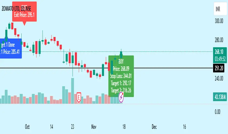
Bewakoof stock indicator**Title**: "Bewakoof Stock Indicator: Multi-Timeframe RSI and SuperTrend Entry-Exit System"
---
### Description
The **Bewakoof Stock Indicator** is an original trading tool that combines multi-timeframe RSI analysis with the SuperTrend indicator to create reliable entry and exit signals for trending markets. This indicator is designed for traders looking to follow strong trends with built-in risk management. By filtering entries through short- and long-term momentum and utilizing dynamic trailing exits, this indicator provides a structured approach to trading.
#### Indicator Components
1. **Multi-Timeframe RSI Analysis**:
- The Relative Strength Index (RSI) is calculated across three timeframes: Daily, Weekly, and Monthly.
- By examining multiple timeframes, the indicator confirms that trends align over short, medium, and long-term intervals, making buy signals more reliable.
- **Buy Condition**: All three RSI values must meet these thresholds:
- **Daily RSI > 50** – indicates short-term upward momentum,
- **Weekly RSI > 60** – signals medium-term strength,
- **Monthly RSI > 60** – confirms long-term trend alignment.
- This filtering process ensures that buy signals are generated only in stable, upward-trending markets.
2. **SuperTrend Confirmation**:
- The SuperTrend (20-period ATR with a multiplier of 2) acts as a trend filter and trailing stop mechanism.
- For a buy condition to be valid, the closing price must be above the SuperTrend level, verifying that the market is trending up.
- The combination of RSI and SuperTrend helps to avoid false signals, focusing only on well-established trends.
#### Trade Signals
- **Buy Signal**: When both the multi-timeframe RSI and SuperTrend conditions are met, a buy signal is triggered, indicated by a “BUY” label on the chart with details:
- **Entry Price**,
- **Initial Stop-Loss** (set at the SuperTrend level for risk control),
- **Target 1** – calculated with a 1:1 risk-reward ratio based on the initial stop-loss,
- **Target 2** – calculated with a 1:2 risk-reward ratio based on the initial stop-loss.
- **Exit Signals**: This indicator provides two exit strategies to protect profits:
1. **Fixed Stop-Loss**: Automatically set at the SuperTrend level at the time of entry to limit risk.
2. **Trailing Exit**: Exits are triggered if the price crosses below the SuperTrend level, adapting to potential trend reversals.
#### Labeling & Alerts
The **Bewakoof Stock Indicator** offers intuitive labeling and alert options:
- **Labels**: Buy and exit points are clearly marked, showing entry, stop-loss, and targets directly on the chart.
- **Alerts**: Custom alerts can be set for:
- **Buy signals** when both conditions are met, and
- **Exit signals** triggered by the stop-loss or trailing exit.
#### Use Case and Benefits
This indicator is ideal for trend-following traders who value risk control and trend confirmation:
- **Stronger Trend Signals**: By requiring RSI alignment across multiple timeframes, this indicator focuses only on trades with strong trend momentum.
- **Dynamic Risk Management**: Using both fixed and trailing exits enables flexible trade management, balancing risk and potential reward.
- **Simple Trade Execution**: The chart labels and alerts simplify trade decisions, making it easy to enter, manage, and exit trades.
#### How to Use
1. **Add** the Bewakoof Stock Indicator to your chart.
2. **Watch** for the "BUY" label as your entry point.
3. **Manage the trade** using the labeled stop-loss and target levels.
4. **Exit** on either a stop-loss hit or when the price crosses below the SuperTrend for a trailing exit.
The **Bewakoof Stock Indicator** is a complete solution for trend-following traders, combining the strength of multi-timeframe RSI with the SuperTrend’s trend-following capabilities. This systematic approach aims to provide high-confidence entries and effective risk management, empowering traders to follow trends with precision and control.
No Trade Zone Indicator [CHE]No Trade Zone Indicator
The "No Trade Zone Indicator " is a powerful tool designed to help traders identify periods when the market may not present favorable trading opportunities. By analyzing the percentage change in the 20-period Simple Moving Average (SMA20) relative to a dynamically adjusted threshold based on market volatility, this indicator highlights times when it's prudent to stay out of the market.
Why Knowing When Not to Trade Is Important
Understanding when not to trade is just as crucial as knowing when to enter or exit a position. Trading during periods of low volatility or uncertain market direction can lead to unnecessary risks and potential losses. By recognizing these "No Trade Zones," you can:
- Avoid Low-Probability Trades: Reduce the chances of entering trades with unfavorable risk-to-reward ratios.
- Preserve Capital: Protect your investment from unpredictable market movements.
- Enhance Focus: Concentrate on high-quality trading opportunities that align with your strategy.
How the Indicator Works
- SMA20 Calculation: Computes the 20-period Simple Moving Average of closing prices to identify the market's short-term trend.
- ATR Measurement: Calculates the Average True Range (ATR) over a user-defined period (default is 14) to assess market volatility.
- Dynamic Threshold: Determines an adjusted threshold by multiplying the ATR percentage by a Threshold Adjustment Factor (default is 0.05).
- Trend Analysis: Compares the percentage change of the SMA20 against the adjusted threshold to evaluate market momentum.
- Status Identification:
- Long: Indicates a rising SMA20 above the threshold—suggesting a potential upward trend.
- Short: Indicates a falling SMA20 above the threshold—suggesting a potential downward trend.
- No Trade: Signals when the SMA20 change is below the threshold, marking a period of low volatility or indecision.
Features
- Customizable Settings: Adjust the ATR period and Threshold Adjustment Factor to suit different trading styles and market conditions.
- Visual Indicators: Colored columns represent market status—green for "Long," red for "Short," and gray for "No Trade."
- On-Chart Table: An optional table displays the current market status directly on your chart for quick reference.
- Alerts: Set up alerts to receive notifications when the market enters a "No Trade Zone," helping you stay informed without constant monitoring.
How to Use the Indicator
1. Add to Chart: Apply the "No Trade Zone Indicator " to your preferred trading chart on TradingView.
2. Configure Settings: Customize the ATR period and Threshold Adjustment Factor based on your analysis and risk tolerance.
3. Interpret Signals:
- Green Columns: Consider looking for buying opportunities as the market shows upward momentum.
- Red Columns: Consider looking for selling opportunities as the market shows downward momentum.
- Gray Columns: Refrain from trading as the market lacks clear direction.
4. Monitor Alerts: Use the alert feature to get notified when the market status changes, allowing you to make timely decisions.
Conclusion
Incorporating the "No Trade Zone Indicator " into your trading toolkit can enhance your decision-making process by clearly indicating when the market may not be conducive to trading. By focusing on periods with favorable conditions and avoiding low-volatility times, you can improve your trading performance and achieve better results over the long term.
*Trade wisely, and remember—the best trade can sometimes be no trade at all.*
Disclaimer
The content provided, including all code and materials, is strictly for educational and informational purposes only. It is not intended as, and should not be interpreted as, financial advice, a recommendation to buy or sell any financial instrument, or an offer of any financial product or service. All strategies, tools, and examples discussed are provided for illustrative purposes to demonstrate coding techniques and the functionality of Pine Script within a trading context.
Any results from strategies or tools provided are hypothetical, and past performance is not indicative of future results. Trading and investing involve high risk, including the potential loss of principal, and may not be suitable for all individuals. Before making any trading decisions, please consult with a qualified financial professional to understand the risks involved.
By using this script, you acknowledge and agree that any trading decisions are made solely at your discretion and risk.
best regards
Chervolino
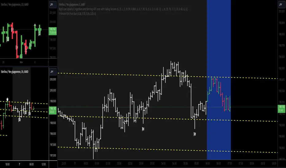
5-Minute YEN Pivot Bars 1.0The 5-Minute YEN Pivot Bars indicator is designed to identify and highlight low-range pivot bars on 5-minute charts, specifically tailored for Yen-based pairs (e.g., GBPJPY, USDJPY). By focusing on precise pip thresholds, this tool helps traders detect potential pivot points within specific trading sessions, while avoiding inside bars and other noise often seen in low-volatility conditions. This can be particularly useful for trend traders and those looking to refine their entry points based on intraday reversals.
Key Features:
- Customized Pip Thresholds for Yen Pairs:
The indicator is pre-configured for Yen pairs, where 1 pip is typically represented by 0.01. It applies these thresholds:
- Limited Range: 4 pips or less between open and close prices.
- High/Low Directionality: At least 3 pips from the close/open to the bar's high or low.
- Open/Close Proximity: 4 pips or less between open and close.
- Inside Bar Tolerance: A tolerance of 3 pips for inside bars, helping reduce false signals from bars contained within the previous bar's range.
- Session-Specific Alerts:
- The indicator allows you to enable alerts for the European Session (6:00-12:00), American Session (12:00-17:00), and London Close (17:00-20:00). You can adjust these times based on your own trading hours or timezone preferences via a time-shift setting.
- Receive real-time alerts when a valid bullish or bearish pivot bar is identified within the chosen sessions, allowing you to respond to potential trade opportunities immediately.
- Time Shift Customization:
- Adjust the "Time Shift" parameter to account for different time zones, ensuring accurate session alignment regardless of your local time.
How It Works:
1. Pivot Bar Identification:
The indicator scans for bars where the difference between the open and close is within the "Limited Range" threshold, and both open and close prices are close to either the high or the low of the bar.
2. Directional Filtering:
It requires the bar to show strong directional bias by enforcing an additional distance between the open/close levels and the opposite end of the bar (high/low). Only bars with this directional structure are considered for highlighting.
3. Exclusion of Inside Bars:
Bars that are completely contained within the range of the previous bar are excluded (inside bars), as are consecutive inside bars. This filtering is essential to avoid marking bars that typically indicate consolidation rather than potential pivot points.
4. Session Alerts:
When a valid pivot bar appears within the selected sessions, an alert is triggered, notifying the trader of a potential trading signal. Bullish and bearish signals are differentiated based on whether the close is near the high or low.
How to Use:
- Trend Reversals: Use this indicator to spot potential trend reversals or pullbacks on a 5-minute chart, especially within key trading sessions.
- Entry and Exit Points: Highlighted bars can serve as potential entry points for traders looking to capitalize on short-term directional changes or continuation patterns.
- Combine with Other Indicators: Consider pairing this tool with momentum indicators or trendlines to confirm the signals, providing a comprehensive analysis framework.
Default Parameters:
- Limited Range: 4 Pips
- High/Low Directionality: 3 Pips
- Open/Close Proximity: 4 Pips
- Inside Bar Tolerance: 3 Pips
- Session Alerts: Enabled for European, American, and London Close sessions
- Time Shift: Default 6 (adjustable to align with different time zones)
This indicator is specifically optimized for Yen pairs on 5-minute charts due to its pip calculation.