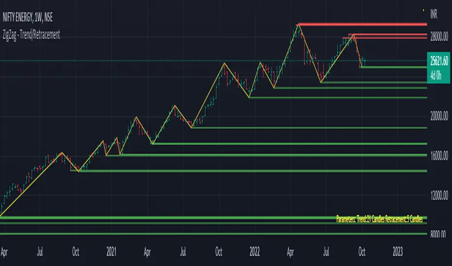
Trend/Retracement - ZigZag - New wayZigZag for Trend and Retracements - New way
It's another way to plot ZigZag based on lookback period for trend and % of trend lookback period to plot retracements.
█ OVERVIEW
Plot ZigZag, Trend lines, Retracements, Support levels, Resistance levels
█ Objective:
Draw ZigZag lines along with unbroken support and resistance levels. ZigZag lines are drawn for main trend and the retracements.
Main Trend – This is calculated based on lookback period.
Retracements – Retracements are calculated as 25% of main trend.
Support and Resistance line: The indicator draws 2 types of support and resistance lines
1. Un-broken – Once formed (plotted), these are the support and resistance which are not yet broken
2. Tested – One can also choose to see support and resistance lines which are tested but not broken. Tested support/resistance are those levels which are touched by high/low price but close price has not crossed the level.
█ How main trend point is calculated:
E.g.
Chart timeframe = 15m
Lookback period = 250
Retracement = 25% of main trend ( 25% of 250 = 62 )
A price point on a chart is considered as trend point if distance between current price and previous highest price is 250 candles
A price point is considered as a retracement if distance between current price and previous highest price is 62 candles. Please note retracements are calculated only after finding a main trend point.
█ Input parameters:
Zigzag Parameters
Use predefined Lookback – If checked pre-defined timeframe-based lookback parameters are used.
Trend lookback candles – If ‘Use predefined Lookback’ is unchecked then this value is used as lookback period.
Retracement % of look back candles– If ‘Use predefined Lookback’ is unchecked then this value is used for calculating retracement lookback period
Mark retracements – If unchecked only main trend lines are plotted
Plot support/resistance – To plot support/resistance levels
Show support/resistance tested lines – If checked tested support/resistance liens are shown on the chart
█ TF based Lookback period config (Defaults are set as specified below, One can change these defaults to use different lookback periods)
The defaults set here are used based on the chart timeframe. e.g. if chart timeframe is changed from say 15m to 60m then 60m chart defaults (i.e. trend lookback = 90) are used to plot the trend and the retracements. At the bottom-right of the chart, parameters used for plotting are displayed all the time.
Timeframe in minute – Default = 5m
Trend lookback candles – Default = 375 (~ 5 days of data)
Timeframe in minute – Default = 15m
Trend lookback candles – Default = 250 (~10 days of data)
Timeframe in minute – Default = 60m
Trend lookback candles = Default = 90 (~ 15 days of data)
Trend lookback candles for timeframe 'D' – Default = 30 (~1 month data)
Trend lookback candles for timeframe 'W' – Default = 21 (~6 months data)
Trend lookback candles for timeframe 'M' – Default = 12 (~1year data)
Retracement % of look back candles – Default = 25%
█ When and where one can use this indicator (Refer to chart examples)
To view support and resistance based on lookback period
To view ZigZag lines
One can use it to find chart patterns easily
Trend and retracement lines can help in drawing Elliott waves.
█ Chart examples:
1. Chart patterns can be easily identified - One can disable the candle charts which will help to identify and draw chart patterns easily
2. Trend and retracement lines can also help is analyzing charts (e.g. Elliott Waves can be marked based on trend lines)
3. Tested but not broken support and resistance lines can be viewed
4. You can select 'NOT' to plot tested support and resistance lines
5. Uncheck the Mark retracements to plot main trend lines (Retracements are not marked)
Cerca negli script per "chart"
3 EMAs: Daily fixed and custom timeframe (cajole)Simply adds 3 exponential moving averages (EMAs) to the chart. Two are fixed to the daily scale (e.g., 200 and 50 days) and one adjusts to the chart's scale (e.g. 8 bars).
To use the 8-EMA as a trail stop, you can enable labels on the plot or on the price axis.
Heikin Ashi Smoothed Buy Sell (Sunseeder) I like to use it on the daily. This helps with indicating buy signals on the DXY, BITCOIN and ETH charts. You're able to customize the colors of the buy signals etc. Enjoy!
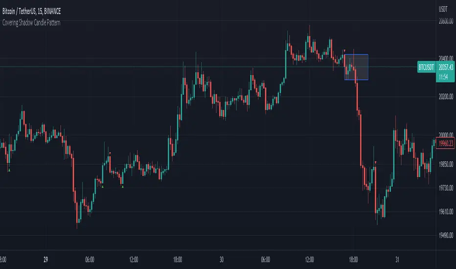
Covering Shadow Candle PatternThis indicator shows 3 types of objects on chart:
1. downward red triangle above a candle: 3 green candles followed by a fourth red candle of which the low price is lower than the low of the 3 previous green candles, this is usually the sign of reversal from upward movement to a downward one.
2. 1. upward green triangle below a candle: 3 red candles followed by a fourth green candle of which the high price is higher than the high of the 3 previous red candles, this is usually the sign of reversal from downward movement to a upward one.
3. boxes: these boxes are drawn when the patterns of cases 1 and 2 fails to perform as expected which means we have some important areas at that level so it can be a resistance or support zone .
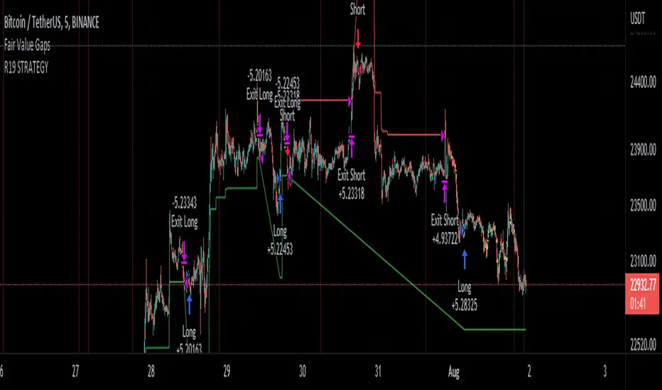
R19 STRATEGYHello again.
Let me introduce you R19 Strategy I wrote for mostly BTC long/short signals
This is an upgrated version of STRATEGY R18 F BTC strategy.
I checked this strategy on different timeframes and different assest and found it very usefull for BTC 1 Hour and 5 minutes chart.
Strategy is basically takes BTC/USDT as a main indicator, so you can apply this strategy to all cryptocurrencies as they mostly acts accordingly with BTC itself (Of course you can change main indicator to different assets if you think that there is a positive corelation with. i.e. for BTC signals you can sellect DXY index for main indicator to act for BTC long/short signals)
Default variables of the inticator is calibrated to BTC/USDT 5 minute chart. I gained above %77 success.
Strategy simply uses, ADX, MACD, SMA, Fibo, RSI combination and opens positions accordingly. Timeframe variable is very important that, strategy decides according the timeframe you've sellected but acts within the timeframe in the chart. For example, if you're on the 5 minutes chart, but you've selected 1 hour for the time frame variable, strategy looks for 1 hour MACD crossover for opening a position, but this happens in 5 minutes candle, It acts quickly and opens the position.
Strategy also uses a trailing stop loss feature. You can determine max stoploss, at which point trailing starts and at which distance trailing follows. The green and red lines will show your stoploss levels according to the position strategy enters (green for long, red for short stop loss levels). When price exceeds to the certaing levels of success, stop loss goes with the profitable price (this means, when strategy opens a position, you can put your stop loss to the green/red line in actual trading)
You can fine tune strategy to all assets.
Please write down your comments if you get more successfull about different time zones and different assets. And please tell me your fine tuning levels of this strategy as well.
See you all.
Candle Stick UpdateHeikin ashi chart so powerful that you can understand trend direction easily. But sometimes, this type of chart doesn't update properly and make no sense on real time. So I made this script. You can now change candle stick style default to heikin ashi (default / modified version) on the real time default chart without switching heikin ashi chart. Enjoy traders!!! And don't forget to press the like button :)

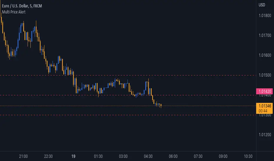
Multi Price AlertSometimes you need set some alert at specific price levels on a chart.
Now you able to set ten different price levels to get alert at this prices.
With this Indicator also Basic Accounts can set more than one alert at price levels.
How to Use :
1- Enable Indicator on your Chart
2- Input your prices on Indicator Settings
3- Active Indicator Alert on 1m Chart (Select Multi Price Alert on Conditions Menu & Once Per Bar on Options)
5- Enjoy !
Notice : If change at prices, you should remove and reset Alert again.
Good trading to all ...
J2S Backtest: 123-Stormer StrategyThis backtest presents the 123-Stormer strategy created by trader Alexandre Wolwacz "Stormer". The strategy is advocates and shared by the trader through his YouTube channel without restrictions.
Note :
This is not an investment recommendation. The purpose of this study is only to share knowledge with the community on tradingview.
What is the purpose of the strategy?
The strategy is to buy the 123-Stormer pattern at the bottom of an uptrend and sell the 123-Stormer pattern at the top of a downtrend, aiming for a short stop for a long profit target.
To which timeframe of a chart is it applicable to?
Recommended for weekly and daily charts, as the signals are more reliable, being that strategy a good option for swing and position trading.
What about risk management and success rate?
The profit target is established by the author as being twice the risk assumed. Also according to the author, the strategy is mathematically positive, reaching around 65% of success rate in tradings.
How are the trends identified in this strategy?
Two averages are plotted to indicate the trend, a fast EMA average with an 8-week close and a slow EMA average with an 80-week close.
Uptrend happens whenever the fast EMA is above the slow EMA and prices are above the fast EMA. In this case, we should start looking for a LONG entry based on the signal of the 123-Stromer pattern to buying.
On the other hand, downtrend happens when the fast EMA is below the slow EMA and prices are below the fast EMA. In this case, we should start looking for a SHORT entry based on the signal of the 123-Stromer pattern to selling.
How to identify the 123-Stormer pattern for a LONG entry?
This pattern consists of three candles. The first candle has a higher low than the second candle's low, and the third candle has a higher low than the second candle's low. In this pattern, we will buy as soon as a trade occurs above the third candle's high, placing a stop as soon as a trade occurs below the second candle's low, with profit target twice the risk assumed. In another words, the amplitude of the prices of the three candles from the third candle’s high upwards. (you can use fibonacci extension to determine your stops and profit targets).
Importantly, the low of the three candles must be above the fast EMA average and in an uptrend.
How to identify the 123-Stormer pattern for a SHORT entry?
This pattern consists of three candles. The first candle has a lower high than the second candle's high, and the third candle has a lower high than the second candle's high. In this pattern, we will sell as soon as a trade occurs below the third candle's low, placing a stop as soon as a trade occurs above the second candle's high, with profit target twice the risk assumed. In other words, the amplitude of prices of the three candles from the third candle’s low down (you can use fibonacci extension to determine your stops and profit targets).
Importantly, the high of the three candles must be below the fast average and in a downtrend.
Tips and tricks
According to the author, the best signal for both LONG or SHORT entry is when the third candle is a inside bar of second candle.
Backtest features
Backtest parameters are fully customizable. The user chooses to validate only LONG or SHORT entries, or both. It is also possible to determine the specific time period for running the backtests, as well as setting a threshold in candels for entry by the 123-Stormer pattern.
Furthermore, for validation purposes, you can choose to activate the best signal of the pattern recommended by the author of the strategy, as well as change the values of the EMA averages or even deactivate them.
Final message
Feel free to provide me with any improvement suggestions for the backtest script. Bear in mind, feel free to use the ideas in my script in your studies.

Chart VWAP█ OVERVIEW
This indicator displays a Volume-Weighted Average Price anchored to the leftmost visible bar of the chart. It dynamically recalculates when the chart's visible bars change because you scroll or zoom your chart.
If you are not already familiar with VWAP, our Help Center will get you started. The typical VWAP is designed to be used on intraday charts, as it resets at the beginning of the day. Our Rolling VWAP , instead, resets on a rolling time window. You may also find the VWAP Auto Anchored built-in indicator worth a try.
█ HOW TO USE IT
Load the indicator on an active chart (see the Help Center if you don't know how). By default, it displays the chart's VWAP in orange and a simple average of the chart's visible close values in gray. This average can be used as a companion to the VWAP, since both are calculated from the same set of bars. The script's settings allow you to hide it.
You may also use the script's settings to enable the display of the chart's OHLC (open, high, low, close) levels and the values of the high and low. These are also calculated from the range of visible bars. You can complement the high and low lines with their price and their distance in percent from the chart's latest visible close . You can use the levels to quickly identify the distances from extreme points in the visible price range, as well as observe the visible chart's beginning and end prices.
█ NOTES FOR Pine Script™ CODERS
This script showcases three novelties:
• Dynamic recalculation on visible bars
• The VisibleChart library by PineCoders
• The new `anchor` parameter of ta.vwap()
Dynamic recalculation on visible bars
This script behaves in a novel way made possible by the recent introduction of two new built-in variables: chart.left_visible_bar_time and chart.right_visible_bar_time , which return the opening time of the leftmost and rightmost visible bars on the chart. These are only two of many new built-ins in the `chart.*` namespace. See this blog post for more information, or look up them up by typing "chart." in the Pine Script™ Reference Manual .
Any script using chart.left_visible_bar_time or chart.right_visible_bar_time acquires a unique property, which triggers its recalculation when traders scroll or zoom their chart, causing the range of visible bars to change. This new capability is what makes it possible for this script to calculate its VWAP on the chart's visible bars only, and dynamically recalculate if the user scrolls or zooms their chart.
This script is just a start to the party; endless uses for indicators that redraw on changes to the chart will no doubt emerge through the hands of our community's Pine Script™ programmers.
The VisibleChart library by PineCoders
The newly published VisibleChart library is designed to help programmers benefit from the new capabilities made possible by the fact that Pine Script™ code can now tell when it is executing on visible bars. The library's description, functions and example code will help programmers make the most of the new feature.
This script uses three of the library's functions:
• `PCvc.vVwap()` calculates a VWAP for visible bars.
• `PCvc.avg()` calculates the average of a source value for visible bars only. We use it to calculate the average close (the default source).
• `PCvc.chartXTimePct(25)` calculates a time value corresponding to 25% of the horizontal distance between visible bars, starting from the left.
The new `anchor` parameter of ta.vwap()
Our script also uses this new `anchor` parameter to reset the VWAP at the leftmost visible bar. See how simple the code is for the VisibleChart library's `vVwap()` function.
Look first. Then leap.

Lower time frame Intrabar CandlesI was looking for an indicator to show me what a lower time frame is doing at the start, middle, and end of the candle, but I couldn't find one, hench,
I made my own using Tradingview latest capabilities to fetch a lower time frame from a higher time frame chart.
For example, if your chart is 1 hour and this indicator is set to a lower time frame of 15 minutes, then the Start, Middle, or End (Select which in settings) of the 15min candle will be displayed overlaying the 1-hour candle.
This will always show you what the lower time frame candle is currently doing without the need to open an additional lower time frame chart. How cool is that?
Remember to select a lower time frame in the settings than the chart time frame for it to work as expected.
Enjoy :)
-=== Notes ===-
* The lower time frame candles BORDER is set to WHITE by default, however, you can adjust the color of the candle (wicks, body, and border) of the 'LTF Candle' indicator inside its Settings -> Style
* Suitable for candles and designed to work in historical and real time.
* Added optional label to show lower time frame values (can be disabled via indicator settings).
* You can adjust the visuals of the chart candles at Chart Settings -> Symbol -> Body, Borders, or Wicks to visually see better the lower time frame candles.
There is also a similar concept volume-based using histogram, stay tuned.
Like if you like and follow: www.tradingview.com

Magnifying Glass (LTF Candles) by SiddWolf█ OVERVIEW
This indicator displays The Lower TimeFrame Candles in current chart, Like Zooming in on the Candle to see it's Lower TimeFrame Structure. It plots intrabar OHLC data inside a Label along with the volume structure of LTF candle in an eloquent format.
█ QUICK GUIDE
Just apply it to the chart, Hover the mouse on the Label and ta-da you have a Lower Timeframe OHLC candles on your screen. Move the indicator to the top and shrink it all the way up, because all the useful data is inside the label.
Inside the label: The OHLC ltf candles are pretty straightforward. Volume strength of ltf candles is shown at bottom and Volume Profile on the left. Read the Details below for more information.
In the settings, you will find the option to change the UI and can play around with Lower TimeFrame Settings.
█ DETAILS
First of all, I would like to thank the @TradingView team for providing the function to get access to the lower timeframe data. It is because of them that this magical indicator came into existence.
Magnifying Glass indicator displays a Candle's Lower TimeFrame data in Higher timeframe chart. It displays the LTF candles inside a label. It also shows the Volume structure of the lower timeframe candles. Range percentage shown at the bottom is the percentage change between high and low of the current timeframe candle. LTF candle's timeframe is also shown at the bottom on the label.
This indicator is gonna be most useful to the price action traders, which is like every profitable trader.
How this indicator works:
I didn't find any better way to display ltf candles other than labels. Labels are not build for such a complex behaviour, it's a workaround to display this important information.
It gets the lower timeframe information of the candle and uses emojis to display information. The area that is shown, is the range of the current timeframe candle. Range is a difference between high and low of the candle. Range percentage is also shown at the bottom in the label.
I've divided the range area into 20 parts because there are limitation to display data in the labels. Then the code checks out, in what area does the ltf candle body or wick lies, then displays the information using emojis.
The code uses matrix elements for each block and relies heavily on string manipulation. But what I've found most difficult, is managing to fit everything correctly and beautifully so that the view doesn't break.
Volume Structure:
Strength of the Lower TimeFrame Candles is shown at the bottom inside the label. The Higher Volume is shown with the dark shade color and Lower Volume is shown with the light shade. The volume of candles are also ranked, with 1 being the highest volume, so you can see which candle have the maximum to minimum volume. This is pretty important to make a price action analysis of the lower timeframe candles.
Inside the label on the left side you will see the volume profile. As the volume on the bottom shows the strength of each ltf candles, Volume profile on the left shows strength in a particular zone. The Darker the color, the higher the volume in the zone. The Highest volume on the left represents Point of Control (Volume Profile POC) of the candle.
Lower TimeFrame Settings:
There is a limitation for the lowest timeframe you can show for a chart, because there is only so much data you can fit inside a label. A label can show upto 20 blocks of emojis (candle blocks) per row. Magnifying Glass utilizes this behaviour of labels. 16 blocks are used to display ltf candles, 1 for volume profile and two for Open and Close Highlighter.
So for any chart timeframe, ltf candles can be 16th part of htf candle. So 4 hours chart can show as low as 15 minutes of ltf data. I didn't provide the open settings for changing the lower timeframe, as it would give errors in a lot of ways. You can change the timeframe for each chart time from the settings provided.
Limitations:
Like I mentioned earlier, this indicator is a workaround to display ltf candles inside a label. This indicator does not work well on smaller screens. So if you are not able to see the label, zoom out on your browser a bit. Move the indicator to either top or bottom of all indicators and shrink it's space because all details are inside the label.
█ How I use MAGNIFYING GLASS:
This indicator provides you an edge, on top of your existing trading strategy. How you use Magnifying Glass is entirely dependent on your strategy.
I use this indicator to get a broad picture, before getting into a trade. For example I see a Doji or Engulfing or any other famous candlestick pattern on important levels, I hover the mouse on Magnifying Glass, to look for the price action the ltf candles have been through, to make that pattern. I also use it with my "Wick Pressure" indicator, to check price action at wick zones. Whenever I see price touching important supply and demand zones, I check last few candles to read chart like a beautiful price action story.
Also volume is pretty important too. This is what makes Magnifying Glass even better than actual lower timeframe candles. The increasing volume along with up/down trend price shows upward/downward momentum. The sudden burst (peak) in the volume suggests volume climax.
Volume profile on the left can be interpreted as the strength/weakness zones inside a candle. The low volume in a price zone suggests weakness and High volume suggests strength. The Highest volume on the left act as POC for that candle.
Before making any trade, I read the structure of last three or four candles to get the complete price action picture.
█ Conclusion
Magnifying Glass is a well crafted indicator that can be used to track lower timeframe price action. This indicator gives you an edge with the Multi Timeframe Analysis, which I believe is the most important aspect of profitable trading.
~ @SiddWolf

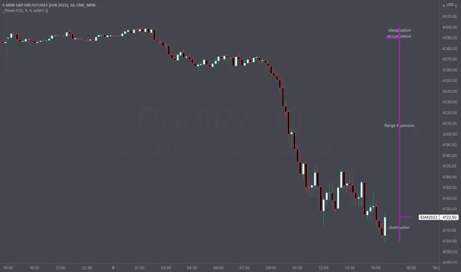
Intraday Power 3 VisualDescription
This indicator draws a dynamic "Open High Low Close" type visual on intraday charts so the trader can easily keep track of the daily/weekly movement. This indicator was inspired by the Inner Circle Trader’s (ICT) “Power 3” concept, which is Accumulation, Manipulation, and Distribution of price on a daily timeframe.
Visual
This indicator plots the chosen timeframes opening price along with a live line for the current price. This makes it very easy to identify the daily/weekly range along it’s open. And the user can combine this indicator with my other indicator “Futures Exchange Sessions” to plot the midnight EST & 8:30 AM EST lines to get a great summation of over night price action.
Inputs and Style
In the Input section the user can dynamically switch between Daily and Weekly timeframes. Built in ability to move the entire Visual to the right makes preventing indicator overlap a breeze. All of the lines can be configured: color, style, and width. Independently toggle ON/OFF the Power 3 labels (Accumulation, Manipulation, Range Extension, Distribution) and can change labels color. The labels dynamically move and switch positions based upon bear or bull daily/weekly range.
Special Notes
The Futures market is open 23/5. It is closed everyday for 1-hour at 5pm EST and closed over the weekends. Because this Intraday Power 3 Visual is drawing in the 'future' on the users TradingView chart, when the visual is close or in a time when the market is closed, the visual doesn't behave properly. This is because TradingView doesn't display times when the Market is closed, thus the drawings cannot be displayed during those times. There is nothing wrong with the script. Please wait until the Market is open and the visual will be drawn normally.
This indicator is intended for use in the Futures Market
Bart Pattern [LuxAlgo]As a sequel to our 'meme indicator' series... The Bart Pattern Detector identifies confirmed regular and inverted Bart patterns using edge detection.
Settings
Median Lookback: Lookback period of the median filter used for the edge detection, with a shorter period allowing to detect shorter-term and less spaced patterns.
Edge Detection Sensitivity: Sensitivity of the edge detection method, with higher values making the method less sensible to edges of low magnitude.
Range To Edges Threshold: Threshold for the range to edges ratio, with lower values detecting Bart patterns with flatter ranges between the edges.
Show Inverted Barts: Show inverted Bart patterns.
Mode: Determines how detected Bart patterns are displayed.
Usage
This indicator can be used to study past Bart patterns and how the market responded to them. Their detection is not done in real-time. Additionally detected edges are used to indicate the current market sentiment.
If you don't want a meme on your chart, you can also use the simple mode - but don't worry, we won't judge you if you don't...
Details
The origins of Bart patterns can be hard to pinpoint but most likely originate from social media around 2018. This pattern has been mostly covered in the cryptocurrency market similarly to how the McDonald's Pattern became a popular meme within the community. See our McDonald's Pattern Indicator that was created by us as our first 'meme indicator' in the series
The Bart pattern as its name suggests occurs when price forms a structure resembling the head of the Simpson character "Bart Simpson". This is characterized by a rectangular structure, which is a sideways market delimited by sharp volatile edges.
The Bart pattern is sometimes traded before completion, waiting for a breakout of a support/resistance located within the sideway part of the pattern.
The cause of this pattern is still discussed by traders, with some attributing it to over-leveraged market participants and while others attributing it to exchanges themselves through spoofing.
Notes
Barts patterns are very volatile structures, characterized by sudden price jumps, be careful when trading them.
Shout to the famous alien @lilmayo and our good pal @scheplick for the suggestion to create this work of art.
And don't forget to eat your shorts.

Symbol ViewerView another symbol!
Symbol Viewer allows you to display a ticker of your choice in an indicator box below your current chart.
You no longer need to split your layout to view 2 (or more) tickers at the same time!
The data from your symbol of choice is accurately displayed and updated live.

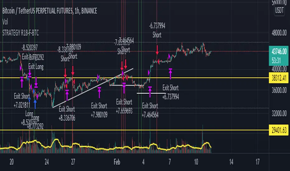
STRATEGY R18-F-BTCHi, I'm @SenatorVonShaft
Just finished the strategy "STRATEGY R18-F-BTC" for trading on #bitcoin and other cryptocurrencies.
As any strategy on TradingView, R18 opens Long/Short positions (with no leverage) on certain price points for assets in the chart. But I intentionally make this strategy for Bitcoin . Strategy is effective with 1h chart and it has %36 winning trade ratio for #bitcoin trade. As strategy uses approximately 1/3 ratio of SL/TP levels, gross profit for 1 year backtest is above %200 (I mean above 3x for only BTC )
Strategy is built on combination of:
- MACD
- RSI
- FIBONACCI levels
- BTCUSDT price itself as indicator (for different crypto assets and BTCUSDTPERP trading. You can select different assets you like for indicator (it's BTCUSDT:Binance by default))
I fine-tuned all levels of indicators above accordingly (it has more than 10 variables that effects strategy itself).
You can find out your own strategy levels by adjusting long/short tp&sl variables as well as initial capital ratio variable.
Reverse option open reverse positions of the strategy
Charting the US02Y-US10YPutting together a script that charts the US02Y - US10Y in visual format. First script I've ever written and would like some feed back as to how I could improve. Also currently have to turn on "Indicator Last Value Label, and Indicator Name Label" if you would like data to appear on the chart. Works best when the US02Y-US10Y chart is being displayed!

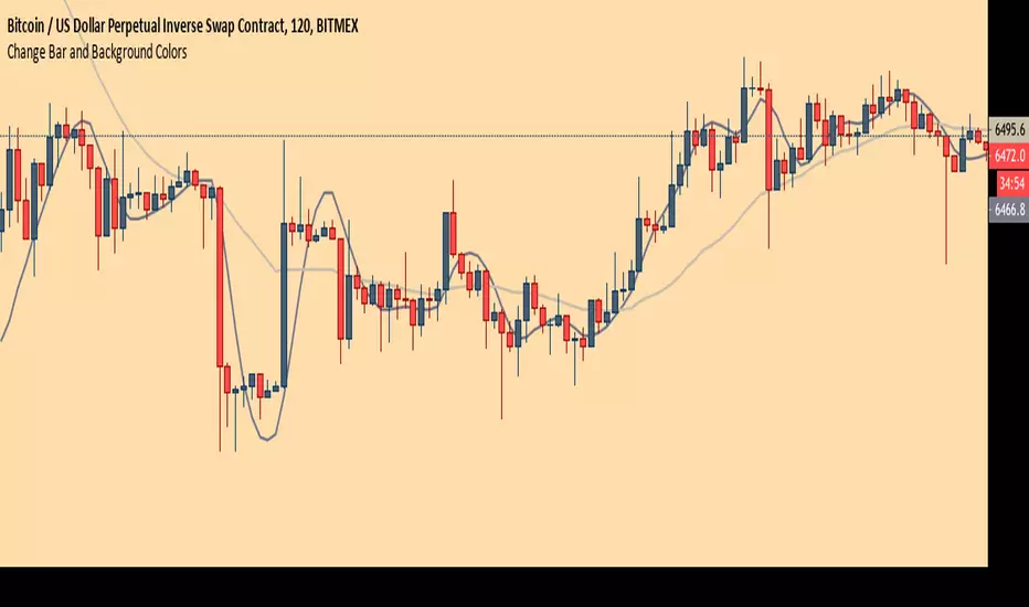
Chart Theme - Change Bar and Background Colors using HEX #sAdds aesthetic ability to charts by allowing the trader to change the color of the bars, background, and plots using HEX colors, rather than TradingView's limited color selector box. This makes for easy application of color palettes to charts. The color palettes can be saved as indicators and applied quickly, as desired.
MRG Session High/LowMRG Session High/Low - Indicator Description
📊 Overview
This Pine Script indicator automatically displays key levels from Asian and London trading sessions on your TradingView chart. It plots the high and low points of each completed session, allowing you to quickly identify important support and resistance zones for your trades.
🎯 Key Features
Detected Sessions (New York Timezone)
Asian Session: 18:00 - 03:00 (6pm - 3am)
London Session: 03:00 - 09:00 (3am - 9.30am)
Plotted Levels
Session High: The highest point reached during the session
Session Low: The lowest point reached during the session
Start Lines: Vertical dashed lines marking the beginning of each session (optional)
⚙️ Customizable Settings
Display Options
✅ Show/hide Asian Session
✅ Show/hide London Session
✅ Show/hide session start lines
Style Options
🎨 Asian Color: Orange by default
🎨 London Color: Blue by default
🎨 Start lines color: Red by default
📏 Line thickness: Adjustable from 1 to 5
🔍 How It Works
Automatic Detection: The indicator automatically detects when a new session begins
Level Calculation: During each session, it continuously records highs and lows
Line Plotting: At the end of each session, it draws two horizontal lines:
One line at the session high level
One line at the session low level
Extension: Lines extend to the right for easy future identification
📈 Strategic Usage
For Breakout Trading
Trade breakouts of Asian and London session highs/lows
Breakouts from these levels often signal the beginning of significant moves
For Support and Resistance
Use these levels as key support and resistance zones
Prices often come back to test these levels during the New York session
For Multi-Timeframe Analysis
Identify consolidation during Asian/London sessions
Anticipate volatility at New York open
💡 Advantages
✨ Clear and automatic visualization of session levels
⏱️ Time-saving: no need to manually draw levels
🎯 Precise levels based on actual highs/lows of each session
🔄 Automatically updates daily
📱 Compatible with all timeframes (recommended: M5, M15, H1)
🎓 Ideal For
Forex traders (especially XAUUSD, EUR/USD, GBP/USD)
Scalpers and day traders
Session breakout strategies
Trading around New York open
Liquidity zone analysis
📌 Important Note
The indicator uses New York timezone (America/New_York) to ensure session time accuracy, regardless of your local timezone.

Candle Countdown TimerCandle Countdown Timer - Real-Time Bar Close Indicator
Stay ahead of the market with this elegant countdown timer that shows exactly how much time remains until the current candle closes. Perfect for scalpers, day traders, and anyone who needs precise timing for their trading decisions.
✨ Key Features:
Universal Timeframe Support - Automatically adapts to any chart timeframe (1m, 5m, 15m, 1h, 4h, 1D, etc.)
Smart Positioning - Choose between two display modes:
Candle High/Low: Displays above bullish candles, below bearish candles
Current Price: Shows at the closing price level for easy reference
Color-Coded Display - Timer automatically matches your chart's candle colors (green for bullish, red for bearish) for instant visual clarity
Fully Customizable - Adjust font size (8-50), opacity (0-100), and placement to match your trading style and chart setup
Clean, Non-Intrusive Design - Minimal interface that provides critical information without cluttering your chart
📊 Perfect For :
Timing precise entries and exits
Scalping strategies requiring exact candle close timing
Multi-timeframe analysis
Managing time-sensitive trade setups
Avoiding last-second candle close surprises
🎯 How to Use :
Simply add the indicator to your chart and customize the settings to your preference. The countdown automatically updates in real-time, showing hours, minutes, and seconds remaining until the current bar closes.
⚙️ Settings:
Font Size: Numeric input (8-50) for precise size control
Text Opacity: Control visibility from 0 (solid) to 100 (invisible)
Placement: Choose "Candle High/Low" or "Current Price" positioning
💡 Pro Tip:
Use the "Current Price" placement mode when trading on multiple timeframes to keep the countdown at a consistent price level, making it easier to track across different chart configurations.


Open Range BreakoutOpen Range Breakout is a volatility harvesting tool designed to exploit directional expansion following major market opens. It isolates price action during initial liquidity injections to project institutional-grade zones that define a session's structural bias.
Core Methodology
The script uses a time-anchored engine to map critical supply and demand boundaries:
Anchor Identification: The algorithm captures the absolute High and Low within a user-defined window at the start of Tokyo, London, or New York sessions.
Structural Projection: It generates a Neutrality Box. A breach via candle close signals the transition from consolidation to expansion.
Mathematical Risk Modeling: Upon breakout, it calculates a 3:1 Risk-Reward framework based on fixed percentage volatility.
Session Dynamics
The system is optimized for the global liquidity cycle:
Session 1 (Asia): Maps early-day consolidation and range-bound liquidity.
Session 2 (Europe): Captures the London Move to identify the trend.
Session 3 (US): Analyzes high-volume New York opens for maximum momentum.
Key Features
Dynamic Price Mitigation: TP/SL zones stop extending the moment price touches the target or invalidation level to keep charts clean.
Volatility-Adjusted Levels: Stop Loss parameters are normalized to price percentage for consistency across Indices, Forex, or Crypto.
Minimalist Interface: Professional aesthetic with high-contrast visual cues for instant scannability.
Use Cases
Momentum Trading: Identifying the Origin of the Move post-open.
Mean Reversion: Recognizing failed breakouts when price returns inside the range.
Quantitative Backtesting: Benchmarking 3.0 RR targets across different session anchors.

eBacktesting: MultieBacktesting: Multi is an all-in-one chart toolkit built for structured day-trading study: multi-timeframe levels, “clean” movement zones, session context, bias, candle normalization, gaps, and a powerful alert system — all from one indicator.
What it can show on your chart
1) Multi-timeframe Support/Resistance (S/R) markup
- Detects and plots S/R levels from up to 8 configurable timeframes (mix HTF + LTF).
- Optional labeling styles: Simple, Type (S/R), or Directional.
- Optional price labels next to levels.
- Levels cleanup (decongestion): hides clustered levels to keep the chart readable
- Grouping: can group timeframes that share the same level into a single line.
- Level invalidation: levels can disappear after X passthroughs (with a “getting weaker” dashed style when close to invalidation).
2) Psychological levels (round numbers)
- Automatically draws round-number lines at a practical interval (with optional manual interval control).
- Has smart defaults for common markets (e.g., indices, BTC, metals).
3) Levels heatmap
- Shows level density as shaded “pressure areas”: areas where an agglomeration of S/R levels are present
- Can be simple or persisted (so you can study where price repeatedly reacts)
4) Repeated levels highlight
- Highlights “same area again” levels using a tolerance setting.
- Can require same direction (support with support / resistance with resistance) or allow any direction.
5) LTAs (Low Traffic Areas)
- Marks “air pockets” between levels where price can travel fast.
- Can be built from:
- S/R spacing (between detected levels), or
- Candle sequences (clean directional runs).
- Optional filters:
- By how “untouched” the boundary levels are (passthrough filter)
- By number of candles
- By size (points)
6) Clean zones (candle-based)
- Detects strong same-direction runs and boxes them as “clean zones” for study and backtesting practice.
7) Session Bias
- Computes a bias score from selected timeframes and shows it as a %.
- Can be weighted, inverted weight, or not weighted across timeframes (e.g. HTF candles having more weight towards bias calculation).
- Optional color coded “bias candles” overlay + option to dim weak candles so the signal is clearer.
- Alert when bias flips bullish/bearish/neutral.
8) Candles tools
- Smooth candles: removes candle gaps by drawing candles with open = previous close (useful for price action analysis).
- Ghost current candle: de-emphasizes the still-forming candle until it’s near completion (useful for not going in FOMO).
- Highlight no-wick candles: helps spot strong displacement / clean opens/closes.
- Snap candles: rounds candles to a chosen interval (ATR % or fixed), for cleaner structure reading.
- Optional candle stats: ATR & Average candle size
- Candle score: rates the last candle’s strength (body/wicks/size + context), useful for quick quality checks.
- Gaps: highlights unfilled gaps and optionally removes them once filled.
9) Sessions
- Up to 4 customizable sessions, each with its own color and optional background highlight.
- Option to hide candles outside session hours (great for focused session study).
10) Notifications
- Before session start alerts (X minutes early).
- Before session end alerts (X minutes early).
- Closing beyond detected S/R levels
- Closing beyond custom prices: type your prices (one per line)
- Proximity allowance + “advance notice” option for getting notified 30s/1m/5m before the candle closes based on your preferences
- Timer alerts (“check chart every X minutes”) with a custom message template.
eBacktesting integration (the important part)
This indicator fully integrates with the eBacktesting extension to automatically detect “important moments” during backtesting, so it can auto-pause, tag, and allow you to practice them step-by-step.
- When bias changed
- When a candle closed beyond an automatically detected S/R level
- When a candle closed beyond your custom price
- When new LTAs & clean zones are detected or invalidated
These indicator is built to pair perfectly with the eBacktesting extension, where traders can practice these concepts step-by-step. Backtesting concepts visually like this is one of the fastest ways to learn, build confidence, and improve trading performance.
Educational use only. Not financial advice.

TTB 8 + 9 simpleMarks Sequential 8 and 9 exhaustion counts on your chart. Green labels = potential buy reversals, red labels = potential sell reversals. Includes alerts and toggles for buy/sell signals. Lightweight script with no external dependencies.
