The Killer Whale - Multiple Keltner Channels by JoeFinally, after centuries of pain and suffering, the good townsfolk of TradingView have been given a single Keltner Channel indicator that will grant them FREE access to MORE THAN ONE Keltner Channel.
With "The Killer Whale" indicator, Joe has once again saved all the peasants—those who cannot add 10,000 indicators to our charts—from the dirty tyrants who arrogantly rule over us with disdain.
And, now, not only can you have more than one Keltner Channel with this single indicator, but you can have UP TO FOUR! For FREE!
Yes, I know, it seems too good to be true. But, install and enjoy your newfound freedom!
Options:
Keltner Channel length and source
Multiplication Factor for each channel
SMA or EMA
ATR Length
Border and fill colors for each channel
Now, go, therefore, and Keltner to your heart's content. May The Killer Whale be with your charts forever!
Cerca negli script per "crypto"

The Hummingbird - MA Ribbon by Joe (EMA, SMA, SMMA, WMA, VWMA)Tired of having to add multiple moving average indicators to your chart? Well, stop doing that. No, really. Listen. Adding duplicate indicators is totally not cool. And, it won't go over well at the next HOA meeting if you keep doing it.
Here's the sweet moving average ribbon you've been waiting for (with 1-10 moving average lines!). It will make your charts look much cooler 😎. And you'll gain the respect of all your neighbors if you add it to your charts.
In all seriousness, this is a slimmed-down version of my other super-awesome script with a stupid name, "Joe's Ultimate MA Ribbon (w/ Crossover Triggers)."
Basically, I removed the crossover signals from it and changed the name to a much superior name, "The Hummingbird."
Yeah. Right on. So, if you don't want or need the crossover signals, go right on humming with "The Hummingbird."
Enjoy, friends. 🍻
If you still want the original ribbon with crossover signals, get it here .
Options:
Show/Hide MA Lines: Only show the lines you wanna see. No more. No less.
MA Type (can be different for each line!): EMA , SMA , SMMA (RMA), WMA , VWMA
MA Source (for each line): open, close, high, low, hl2 , hlc3, ohlc4, hlcc4
MA Length (for each line): any number between 1 and 4999
Line Colors: Ooh, pretty.
Crypto Breakout IndicatorHey Guys,
The idea of the script is that accumalation and small pumps do happen before the big ones, therefore, i tried to create a breakout indicator that can tell that:
the script components are:
1- Price to consolidate within 15% range between the highest of 6 candles and lowest of 6 candles
2- Price needs to breakout with minimum of 1% and maximum of 20%
3- Price needs to have sufficient volume, hence volume of current bar needs to be higher than previous one with 10% at least
4- RSI needs to be between 50 and 75
5- Bollinger Bands Percentage needs to be equal or lower than 1
6- Price is closing above EMA200
I tried to make all these numbers to be available for you guys through settings so you can tell me about any better settings!

Crypto VCR Vector Candles are the candles having Volume . It helps us to understand on Which candle high volume is being traded
Joe's Ultimate MA Ribbon (w/ Crossover Triggers)Tired of having to add multiple moving average indicators to your chart? Well, stop doing that.
Here's a sweet moving average ribbon (with 1-10 moving average lines!) that will make your charts look much cooler 😎.
Not only that, it also includes triggers for MA crossovers. So, yeah...you can pick which MA crossovers trigger for longs and shorts separately. Yup, you read that right.
Options:
Show/Hide MA Lines: Only show the lines you wanna see. No more. No less.
MA Type (can be different for each line!): EMA, SMA, SMMA (RMA), WMA, VWMA
MA Source (for each line): open, close, high, low, hl2, hlc3, ohlc4, hlcc4
MA Length (for each line): any number between 1 and 4999
Line Colors: Ooh, pretty.
Triggers: On or Off
Crossover Long Triggers: When _______ crosses over _______ on timeframe _______
Crossover Short Triggers: When _______ crosses over _______ on timeframe _______
Trigger Characters and Location

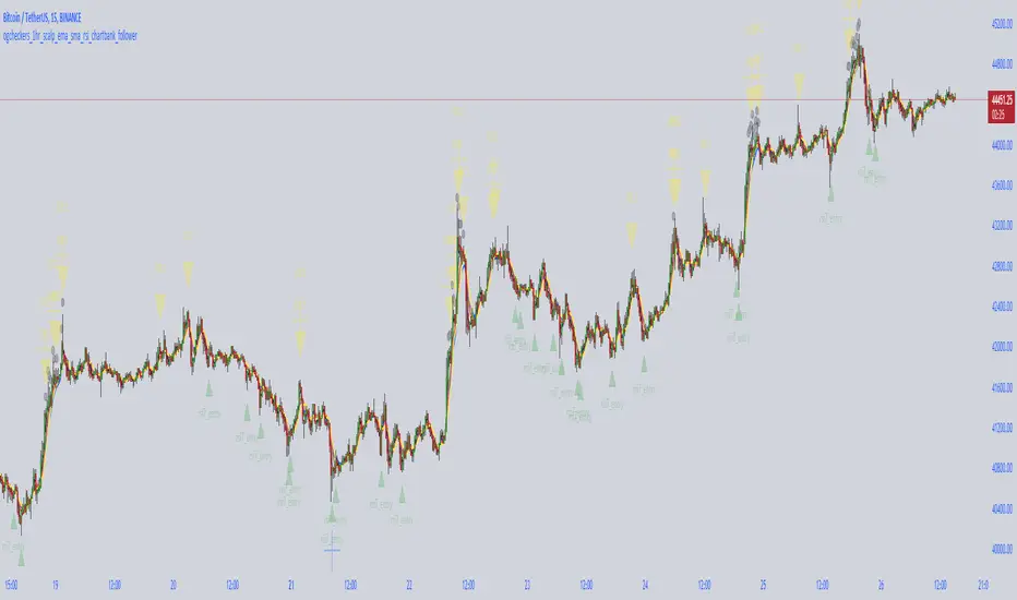
crypto futures hourly scalping with ma & rsi - ogcheckershi to all lovable traders,
hereby i want to share a combination of trade ideas for scalping
i've chosen hourly timeframe
indicators used: moving averages and rsi
moving averages:
ema 3, ema 5, ema 7
sma 3, sma 5, sma 7
daily_ema_3, daily_ema_5
daily_ema_5, daily_sma_5
rsi:
rsi 7, rsi 14, rsi 26
daily_rsi_7, daily_rsi_14, daily_rsi_26
as per the analysis over moving average behavioral patterns & rsi movements, useful points are given below which will be helpful while choosing good entry points & exit points,
strategical points for LONG:
* when ema3 crosses above sma3 - green candles start to form
* it's followed by ema5 > sma5 and ema7 > sma7
* when ema3 crosses down sma3 - it's considered as an indication of exit
* if rsi supports then can wait for ema5 crossing down sma5
* as similar, when daily_ema_3 crosses above daily_sma_3, its an higher timeframe bullish indication, so the lower timeframe entries inside this higher timeframe is a sure shot confident entry
* for LONG always take entries when rsi_14 < 30 or 25 else check rsi_7 < 25 or below
* as along the above, bullish CANDLE patterns like bullish engulfing , morning star is been used for entry at lower levels
* so here i've used OPEN as rsi_source in majority
* exit points also indicated at high_rsi and moving average crossunders or reverse crossovers
* for SHORTING, the above said ideas can be used in viceversa
* inputs in the indicator were tailored for users needs so that you will enjoy the magics of customization
if i am wrong in anyways regarding the above indicator strategy, please forgive me and help me improve in this aspect by commenting.
after few more studies and analysis and mainly QUERIES & COMMENTS, i'm planning to backtest these strategies here in tradingview.
also if these strategies are coded in python, we can link it to Binance Futures Algo or Bot Trading.
thankyou for this opportunity,
thanks to tradingview and pinecoders
thanks to Pranab (for 365MA)
thanks to Gandalf (for inspiring)
Special Thanks & Love to Chartbank for Everything
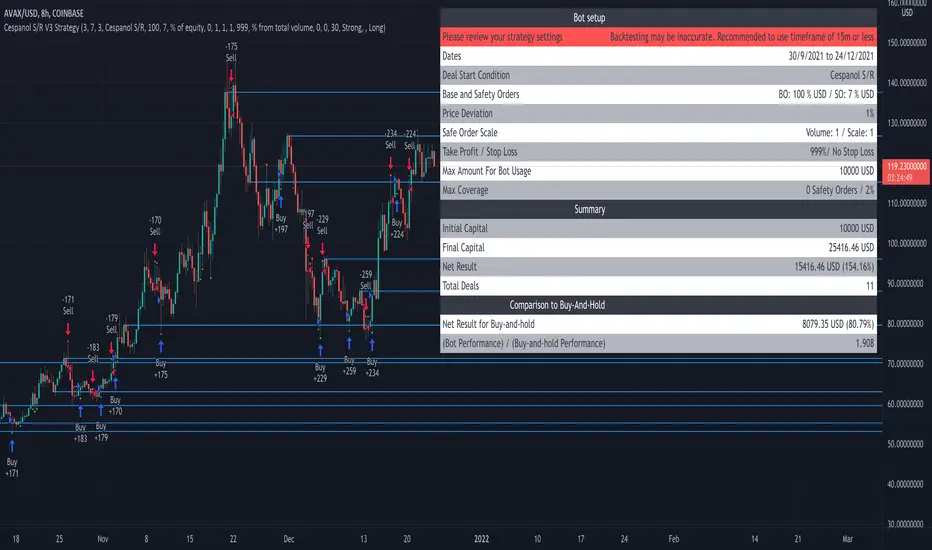
Crypto MF S/R Strategy - cespanolThis strategy uses the Crypto_MF SR indicator to autogenerate horizontal support/resistance lines. The strategy involves alerts for buying when price tests support lines and selling when price tests resistance lines. The time filter was added to backtest specific dates and fine tune the inputs for best results.
Credit to Crypto_MF for original source code and Bjorgum for the time filter.
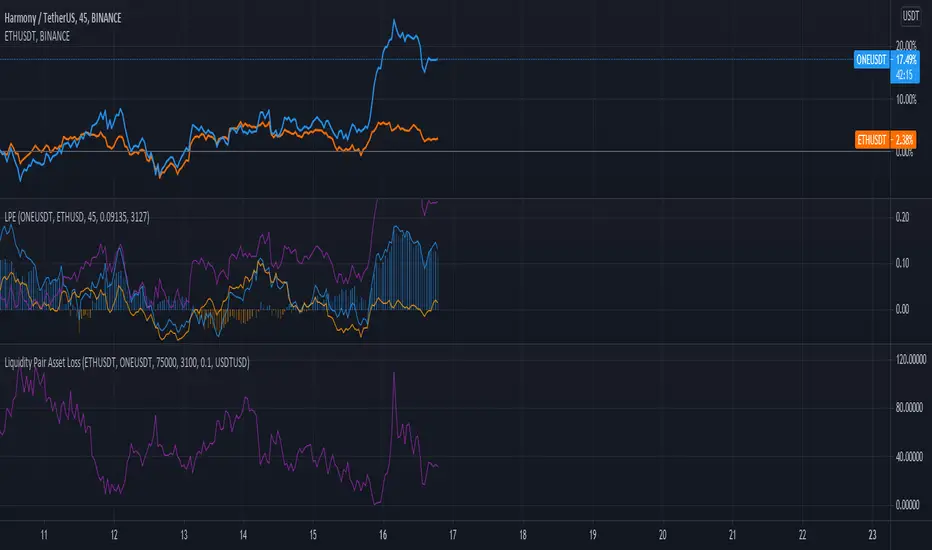
Liquidity Pair Impermanent Asset LossWith limited tracking of impermanent loss for liquidity pairs across all chains, I wanted a very simple display of live dollar value loss in an asset pair. This should allow you to set alerts based on how much you are down and take action if needed. The output column is by default set to show your losses in USD. For those that need it, I also setup an option to track the output in something other than USDT, e.g., GBP or ETH, etc..
crypto EMAs - @rlvsThere are lots of indicators to show EMAs.
This one is different because it shows EMAs 12 and 26 for the current timeframe, and, the same EMAs for the next timeframe.
Following this sequence: 1' -> 5' -> 15' -> 1h -> 4h -> 1d -> 1w -> 1 month
CRYPTO 3EMA Strategy with Take Profit & Stop Loss based on ATRSimple 3 EMA Strategy with plotted Take Profit and Stop Loss
Entry condition:
- Middle EMA cross above the Slow EMA
- Set take profit and stop loss exit conditions based on ATR Indicator
Exit condition:
- Fast EMA cross below the Middle EMA

Crypto Bands with ToolsThis indicator has 3 bands
1. Upper Band
2. Middle Band
3. Lower Band
1. Upper Band
Average of Moving Average of the Close (add Standard Deviations) and Highest price reached in the prior period
2. Middle Band
Average of upper and middle bands. And middle band also has BUY-SELL function. If middle band is blue you can BUY and if the middle band colored red you can SELL
3. Lower Band
Average of Moving Average of the Close(subtract Standard Deviations) and Lowest price reached in the prior period
Upper and Lower bands can be used for BUY&SELL strategy.
You can buy when price touches the lower band
You can sell when price touches the upper band
Indicator can work with long and short positions aswell
As you can see when price touches the lower band you can be LONG
and when the price touches the upper band you can be SHORT
When stock prices continually touch the upper DMR Band, the prices are thought to be overbought; conversely, when they continually touch the lower band, prices are thought to be oversold, triggering a buy signal. When using DMR Bands, designate the upper and lower bands as price targets.
indicator has ichimoku and some moving averages for checking the support and resistances.
TemaI have found that such simple crossover can show good results. Basically it has only 2 TEMA and nothing more. I don't know what else to write here. The code is simplest and has only one filter, which take into consideration the direction of chart.

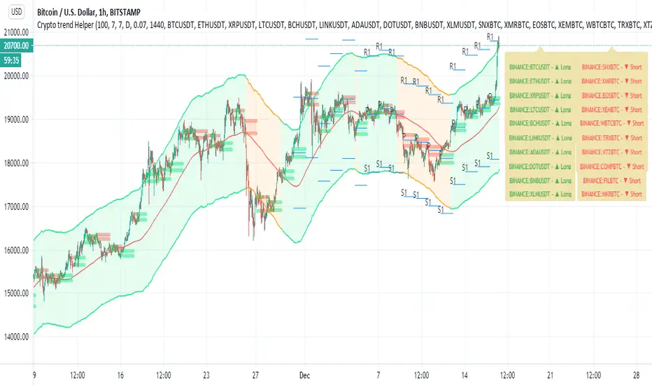
Crypto trend HelperThis is a good tool for chart 2 hours and bellow
the screener script taken from //script taken from with his consent.
long and short determine by my script Trend M version 1
it set up to daily MTF so if it above the mean it green or buy,bellow it it sell
R1 and S1 by percentage from mean set to 7 % or 0.07
the channel is percentage channel set to 7 % up or low
the color of this channel set by
it function to see long trends
you can modify the alts inside the script or in menu\
thanks for Zekis for it help in the screener
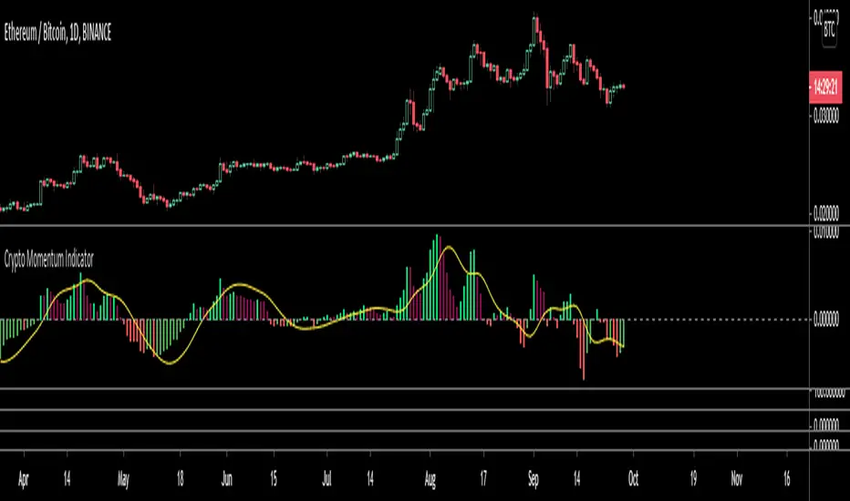
Crypto Momentum IndicatorThis oscillator uses a bitcoin weighted moving average as a reference point, its set up to be run on a day chart with weekly, monthly, three monthly and yearly inputs.
It is also has a volatility multiplier for the period chosen
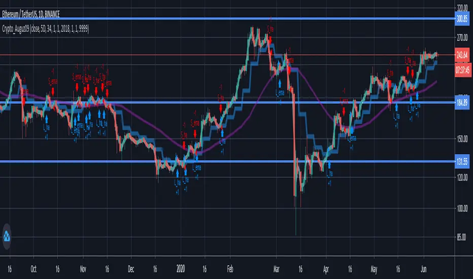
Tan_Aug09Crypto pairs: ETH/USDT
Time-frame: D1
Based on Heikin Ashi Candle and Exponential Moving Average Indicators
Crypto pick: 5D
Stock pick: 8D
Best work in strong trend.
Recommend using with trend line .
CryptOli 3 MAs long/short Backtest// this is an educational Script - basicly its very simple - you can see how minimal changes impact results, thats why i posted it
// Credits to Quantnomad to publish tons of free educational script
// this Script is based on Quantnomads Ultimate MA Indicator
// HA - Option for calcultion based on HA-Candles (very famous recently)
// Source Input - Option (Candletype for calculation, close, ohlc4 ect.) --- there are huge differences --- try it by your own

Golden Ratio Multiplier: Multiplied Moving AveragesThe script for plotting DMAs from the study made by @PositiveCrypto (twitter)

Golden Ratio Multiplier: Multiplied Moving AveragesMultiplied moving averages script visualizing the study made by @PositiveCrypto (twitter).

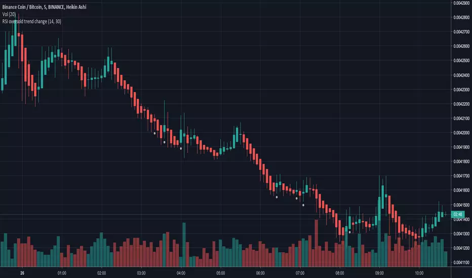
RSI oversold trend changeSimple script that will plot a circle indication on the chart when RSI returns above 30 from oversold position.
Also allows you to create a custom alert.
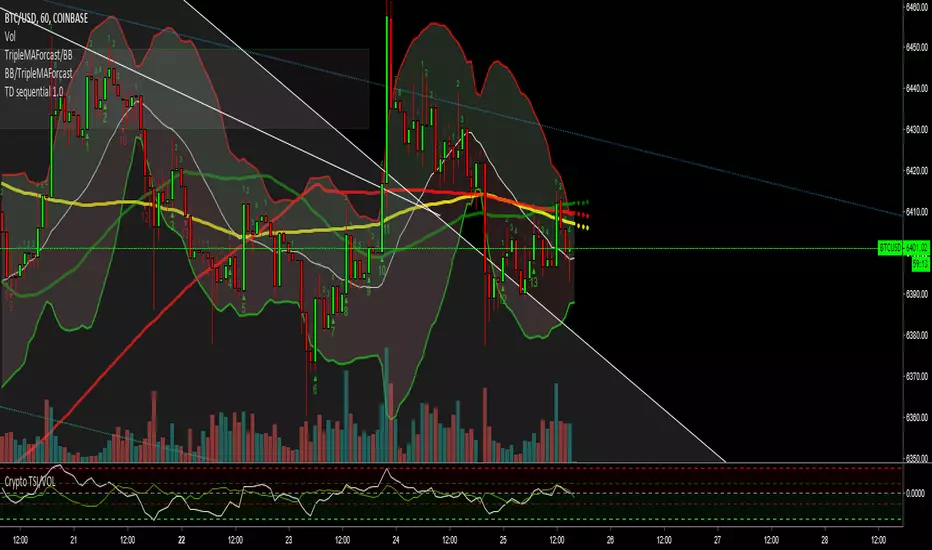
Crypto TSI/VOLSo guys i added the vol to this indicator and i have started to notice patterns in the two duing big moves check it out let me know your thoughts