Crypto Tripple RSIGives an ability to compare 3 RSIs:
current altcoin + BTC (e.g. ADABTC) - green by default
current pair (e.g. ADAUSDT) - blue by default
BTC (e.g. BTCUSDT) - yellow by default
It helps to understand the cause of price change - whether BTC provokes price change or not. Also it shows performance of an altcoin - the bigger gaps between RSIs, the stronger (RSI of BTC is on the bottom)/ weaker (RSI of BTC is on the top) altcoin is.
Cerca negli script per "crypto"
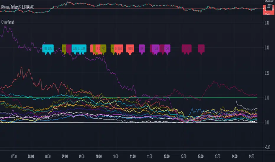
Crypto Market VolatilityCross market look at different Crypto markets ans their growth from the lowest value in 6 hours.
Green = +10% growth
Orange = 0 001- 9.99% growth
red = lowest price in last 6 hours
Use 1 minutes candles.Orange lines signify less volatility for bots.
Crypto Cross MarketCross market look at Crypto currencies under and arround 1USDT and their percentage increase in a 6 hour period.
CRYPTO HA Strategy money maker long termToday I bring you another amazing strategy.
Its made of 2 EMA in this case 50 and 100.
At the same time, internaly for candles we calculate the candles using the HA system ( while still using in live the normal candles). This way we can assure that even if we use HA candles, we avoid repainting, and its legit.
We first calculate the HA candles based on the EMA 50 values, and after that , we use that candle properties to apply to EMA 100.
Once we have that, for entries we have the next conditions :
sell = o2 > c2 and o2 < c2 and time_cond
buy = o2 < c2 and o2 > c2 and time_cond
For sell : Our open from HA 100 is bigger than Close from ha 100, and the previous open is smaller than previous close
For long : Our open from ha 100 is smaller than close from ha 100 and the previous open is bigger than previous close.
Then we have 2 options :
If we wnat to go only long , which is my prefered version ,or the original one where we go both long and short.
I found that the best results are in general around bigger timeframes, 1h+ , 3h works the best so far on my tests.
For exit we have 2 versions :
1 lets say we had a long signal, as soon as we have a short signal we close the trade. Viceversa for short.
2. Is based on price % movement. In this case I use 7.5% price movement of asset.
We have no TP in use for this system.
For the purpose of this test I use 10.000 $ account. For test I use 100% of it, without any leverage.
I use the SL based on price movement , which is a very risky tool, since it can fluctuate even at 20-30% of our capital.
For comission I used 0.1% for each deal, and a slippage of 5 points.
Be cautious with this system !
If you have any questions , message me.

Crypto Trading Hours UTC based on Berlin time (UTC +2)Although crypto markets trade 24/7, there are spikes in volume according to the general hours at which different parts of the world do the majority of their trading.
This Script highlights the US, European and Asian markets when they are most active. The normal market hours are always from 08:00 to 16:30 local time.
US market opens at 8:00 Silicon Valley local time, and closes at 16:30 New York local time.
European market opens at 8:00 London local time, and closes at 16:30 Frankfurt local time.
Asian market opens at 8:00 Hong Kong local time, and closes at 16:30 Sydney local time.


CryptoJJ - SSL indicatorThe SSL indicator with colour change. Tool for spotting trends and finding good entry points. I recommend using it for higher timeframes, from 4h to 1D.
Play with the settings, you can change the moving avarage type, its length, if you prefer having the default
bar colours in your chart, disable the colouring function in the script.
Good luck crypto traders!
CryptoJJ

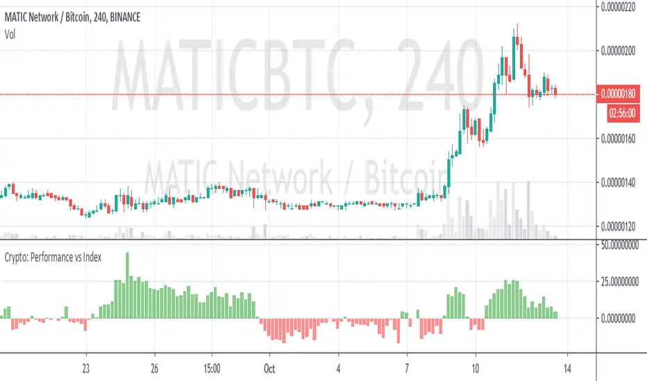
Crypto Performance vs IndexQuickly shows you if an altcoin is outperforming or underperforming it's peers. You can compare again indexes of high cap, mid cap and low cap indexes, which are provided by FTX.com. I intend to add some more features but am currently a bit busy so wanted to get it published as I've been finding it useful
Crypto - Candle Price Info PanelInfo Panel that displays difference in percentages between current candle open value and highest/lowest wick values in past "X" number of candles
Quickly glance at a simple and recent price action range. Due to displayed difference in percentages more useful on Crypto, stocks etc. than Forex
Put together as a learning project with help, code and advice from @jhanson107, @Zekis.


Krown Trading Moving AveragesKrown Trading 4 Exponential Moving Averages and 2 Simple Moving Averages as displayed on Krown's Crypto Cave YouTube Channel.

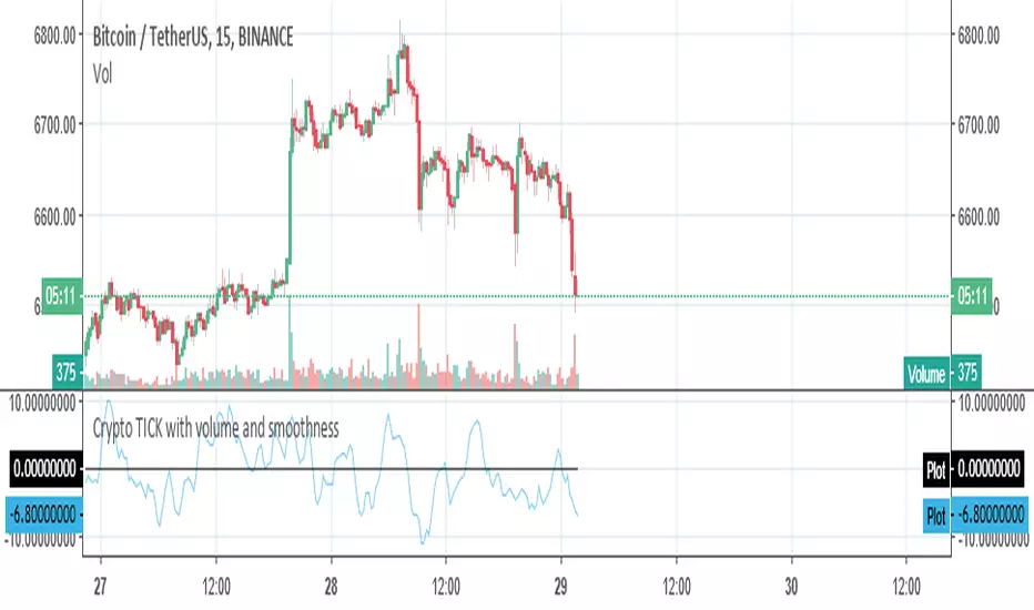
Crypto TICK with volume and smoothnessThis is more or less the TICK index calculated for the cryptos related to USDT pairs in binance. You can change the coins listed in the coins for the ones you want to use. I STRONGLY recommend you leave the default ones or use pairs against USD instead of BTC.
You can see volume ticks and price ticks together or separately and you can smooth both the base data and the indicator.
Crypto Boston MethodThis is one update to the EMA cross+future triggers
It follows the Travis Swing Method, with the next prices for the EMA crosses, green for the 1st in, blue for the 2nd in, and silver -0.64% for the all in.
Red for the sell price, orange is others (actually the sell price for second in and all in)
Update:
I added the cross price for the next day, it shows what will be the next cross price for Sell (red cross), green for 1st in (green cross), blue for the 2nd in (blue cross) and silver -0.64% for the all in ( silver -0.64% cross).
The difference is this indicator is dynamic and depends on the actual price, the first indicator relay only on the price of the candles before, this indicator gives you the info based in the actual price.
Also the Title was updated
Thanks to Travis and Hanaan for their great work!
//Tip Jar for the Author:
//ETH/ERC20 wallet: 0xb01159a43cc4cc11d9751ae12c340b5dd493ac35
//BTC: 1AnaZMNRJWPtkLC6NQvgBzyqXBnL3DXEa6
//BCC: 1AnaZMNRJWPtkLC6NQvgBzyqXBnL3DXEa6
//LTC: LZwzgQRezaYHpae9c8ZSWYHyheadtyutqA

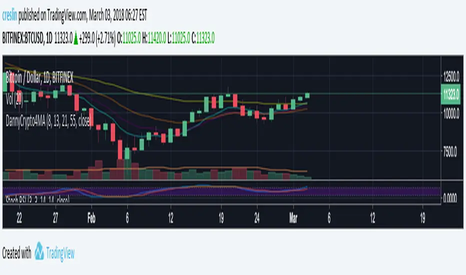
Crypto Quad EMA 8,13,21,55Displays 8,13,21,55 EMAs on a single indicator.
Useful for Crypto trading and reduced the number of indicators needed to view multiple EMAs
When shorter EMAs cross over the longer its a good sign of Bullish/Bearish reversal.
This sentiment is more true at longer timeframes, such as daily candles, as the trend has more momentum.
Crypto Altcoin USD Equivalent Value [anuva]Simply shows Altcoin/BTC pairs equivalent USD value on the left axis. Uses price from Bitstamp

Crypto-Optimized Ichimoku Cloud [Public]Made public and open since I didn't really do anything unique here.
Uses 'Double Crypto' ichimokou settings, and adds a couple new visual features over regular ichimokou.
Made the leading spans' cloud much more visible, and added a new cloud between the base and conversion lines hinting at the trend as well as resistance/support.

BTC Dominance Excluding StablecoinsBTC Dominance Excluding Stablecoins
Description:
The "BTC Dominance Excluding Stablecoins" indicator calculates Bitcoin's dominance as a percentage of the total cryptocurrency market capitalization, excluding the market caps of major stablecoins (USDT and USDC). Unlike the standard BTC.D ticker, which includes stablecoins in the total market cap, this indicator provides a clearer view of Bitcoin’s dominance relative to the "non-stable" crypto market. This can be useful for traders and analysts who want to assess Bitcoin’s strength without the influence of stablecoin market caps, which often skew dominance metrics during periods of high stablecoin usage.
How It Works:
Bitcoin Market Cap: Fetches Bitcoin’s market capitalization using CRYPTOCAP:BTC.
Total Market Cap: Retrieves the total cryptocurrency market cap via CRYPTOCAP:TOTAL.
Stablecoin Adjustment: Subtracts the market caps of USDT (CRYPTOCAP:USDT) and USDC (CRYPTOCAP:USDC) from the total market cap.
Dominance Calculation: Computes Bitcoin’s dominance as (BTC Market Cap / Adjusted Total Market Cap) * 100, where the adjusted total excludes stablecoins.
Output: Plots the resulting dominance percentage as a line chart.
Features:
Displays Bitcoin dominance excluding stablecoins on any timeframe.
Customizable line color and thickness for better visualization.
Provides a more accurate representation of Bitcoin’s market share in the volatile, non-stablecoin crypto ecosystem.
Usage:
Add this indicator to your TradingView chart to compare Bitcoin’s dominance against the broader altcoin market, free from stablecoin distortions. Use it alongside other indicators like BTC.D or price charts to analyze market trends, especially during periods of high stablecoin inflows or outflows.
Notes:
The indicator currently excludes USDT and USDC, the two largest stablecoins by market cap. Additional stablecoins (e.g., DAI, BUSD) can be added by modifying the script if desired.
Data is sourced from TradingView’s CRYPTOCAP symbols, which may have slight delays or variations depending on exchange data feeds.
Best used on daily or higher timeframes for smoother, more reliable results.
Author:
Created by K Du₿
Version:
Pine Script v5

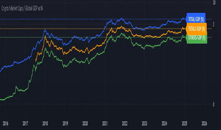
Crypto Market Caps / Global GDP %This indicator compares the total market capitalization of various crypto sectors to the global Gross Domestic Product (GDP), expressed as a percentage. The purpose of this indicator is to provide a visual representation of the relative size of the crypto market compared to the global economy, allowing traders and analysts to understand how the market is growing in relation to the overall economy.
Key Features
Crypto Market Caps -
TOTAL: Represents the total market capitalization of all cryptocurrencies.
TOTAL3: Represents the market capitalization of all cryptocurrencies, excluding Bitcoin and Ethereum.
OTHERS: Represents the market capitalization of all cryptocurrencies excluding the top 10.
Global GDP -
The indicator uses a combination of GDP data from multiple regions across the world, including:
GDP from the EU, North America (NA), and other regions.
GDP data from Asia, Latin America (LATAM), and the Middle East & North Africa (MENA).
Percentage Representation -
The market caps (TOTAL, TOTAL3, OTHERS) are compared to the global GDP, and the result is expressed as a percentage. This allows you to easily see how the size of the cryptocurrency market compares to the entire global economy at any given time.
Plotting and Visualization
The indicator plots the market cap to global GDP ratio for each category (TOTAL, TOTAL3, OTHERS) on the chart.
You can choose which plots to display through user inputs.
The percentage scale makes it easy to compare how much of the global GDP is represented by different parts of the crypto market.
Labels can be added for additional clarity, showing the exact percentage value on the chart.
How to Use
The indicator provides a clear view of the cryptocurrency market's relative size compared to the global economy.
Higher values indicate that the crypto market (or a segment of it) is becoming a larger portion of the global economy.
Lower values suggest the crypto market is still a smaller segment of the global economic activity.
User Inputs
TOTAL/GlobalGDP: Toggle visibility for the total market capitalization of all cryptocurrencies.
TOTAL3/GlobalGDP: Toggle visibility for the market cap of cryptocurrencies excluding Bitcoin and Ethereum.
OTHERS/GlobalGDP: Toggle visibility for the market cap of cryptocurrencies excluding the top 10.
Labels: Enable or disable the display of labels showing the exact percentage values.
Practical Use Cases
Market Sentiment: Gauge the overall market sentiment and potential growth relative to global economic conditions.
Investment Decisions: Help identify when the crypto market is becoming more or less significant in the context of the global economy.
Macro Analysis: Combine this indicator with other macroeconomic indicators to gain deeper insights into the broader economic landscape.
By providing an easy-to-understand percentage representation, this indicator offers valuable insights for anyone interested in tracking the relationship between cryptocurrency market cap and global economic activity.
Crypto Market Pulse: Dom vs Vol AnalyzerConcept & Methodology
The core logic of this indicator is based on the "Money Flow" theory. It aggregates data from multiple sources (CRYPTOCAP:TOTAL, BTC.D, BINANCE:BTCUSDT) to provide a comprehensive market overview in a single panel.
Key Calculations:
Total Market Cap & Volume: Fetches real-time data to determine the overall health of the market.
Inverse Dominance Logic: Unlike standard indicators, this script applies inverse color coding to Bitcoin Dominance (BTC.D).
When BTC Dominance drops, it is colored Green (indicating liquidity flowing into Altcoins).
When BTC Dominance rises, it is colored Red (indicating risk for Altcoins).
Volume Delta: Compares the current timeframe's volume against the previous candle to calculate the percentage change, highlighting sudden liquidity injections.
█ Features
Real-time Dashboard: Displays Cap, Volume, BTC Price, and BTC Dominance.
Altcoin-Focus Coloring: Automatically interprets data to favor Altcoin traders (Green Signals = Good for Alts).
Dynamic Alerts:
Volume Surge Alert: Triggers when volume exceeds a user-defined threshold (default +50%), signaling potential breakout activity.
Dominance Drop Alert: Triggers when BTC Dominance falls significantly, signaling the start of potential Altcoin movement.
█ How to Use
Look for Confluence: The ideal "Altseason" signal is when the Total Cap is Green (Market up) AND BTC Dominance is Green (Dominance down). This indicates money is moving from BTC to Alts.
Volume Confirmation: Use the Volume row to confirm the strength of the move. A price rise without volume is often a fakeout.
Customization: You can adjust the table position and text size from the settings menu to fit your screen setup.

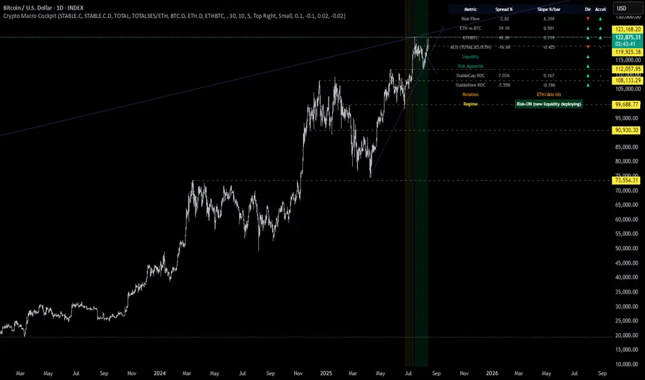
Crypto Macro CockpitCrypto Macro Cockpit — Institutional Liquidity Regime Detection
🔍 Overview
This script introduces a modern macro framework for crypto market regime detection, leveraging newly added stablecoin market data on TradingView. It’s designed to guide traders through the evolving institutional era of crypto — where liquidity, not just price, is king.
🌐 Why This Matters
Historically, traditional proxies like M2 money supply or bond yields were referenced to infer macro liquidity shifts. But with the regulatory green light and institutional embrace of stablecoins, on-chain fiat liquidity is now directly observable.
Stablecoins = The new M2 for crypto.
This script utilizes real-time data from:
📊 CRYPTOCAP:STABLE.C (Total Stablecoin Market Cap)
📊 CRYPTOCAP:STABLE.C.D (Stablecoin Dominance)
to assess dry powder, risk appetite, and macro regime transitions.
📋 How to Read the Crypto Macro Cockpit
This dashboard updates every few bars and is organized into four actionable segments:
1️⃣ Macro Spreads
Metric --> Interpretation
Risk Flow --> Measures capital flow between stablecoins and total crypto market cap. → Green = risk deploying.
ETH vs BTC --> Shift in dominance between ETH and BTC → rotation gauge.
ETHBTC --> Price ratio movement → confirms leadership tilt.
ALTs (TOTAL3ES) --> Momentum in altcoin market, excluding BTC/ETH/stables → key for alt season timing.
2️⃣ Liquidity & Risk Appetite
Metric --> Interpretation
Liquidity --> Directional change in stablecoin cap → more stables = more dry powder.
Risk Appetite --> Inverse of stablecoin dominance → falling dominance = capital rotating into risk.
3️⃣ Stablecoin Context
Metric --> Interpretation
StableCap ROC --> Growth rate of stablecoin market cap → proxy for fiat inflows.
StableDom ROC --> Change in stablecoin dominance → reflects market caution or aggression.
4️⃣ Composite Labels
Label --> Interpretation
Rotation --> Sector tilt (BTC-led vs ETH/Alts)
Regime --> Synthesized macro environment → "Risk-ON", "Caution", "Waiting", or "Risk-OFF"
Background Color --> Optional tint reflecting regime for quick glance validation
All metrics are evaluated with directional arrows (▲/▼/•) and acceleration overlays, using user-defined thresholds scaled by timeframe for precision.
🔔 Built-in Alerts
Predefined, non-repainting alerts include:
Regime transitions
Sector rotations
Confirmed ETH/ALT rotations
Stablecoin market cap spikes
Risk Flow acceleration
You can use these alerts for discretionary trading or automated system triggers.
⚠️ Disclaimer
This script is for educational and informational purposes only. It does not constitute financial advice. Trading cryptocurrencies involves risk, and past performance does not guarantee future results. Always do your own research and manage risk responsibly.
✅ Ready to Use
No configuration needed — just load the script
Works on all timeframes (optimized for 1D)
Thresholds and smoothing are customizable
Table positioning and sizing is user-controlled
If you find this helpful, feel free to ⭐️ favorite or leave feedback. Questions welcome in the comments.
Let’s trade with macro awareness in this new era.