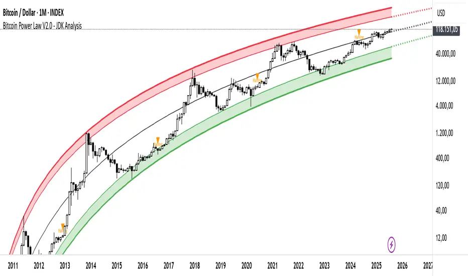
Bitcoin Cycle Log-Curve (JDK-Analysis)Important: The standard parameters provided in the script are specifically tuned for the TradingView Bitcoin Index chart on a monthly timeframe on logarithmic scale, and will yield the most accurate visual alignment when applied to that dataset. (more below)
This very simple script visualizes Bitcoin’s long-term price behavior using a logarithmic regression model designed to reflect the cyclical nature of Bitcoin’s historical market trends. Unlike typical technical indicators that react to recent price movements, this tool is built on the assumption that Bitcoin follows an exponential growth path over time, shaped by its fixed supply structure and four-year halving cycles.
The calculation behind the curved bands:
An upper boundary, a lower boundary, and a central midline, are calculated based on logarithmic functions applied to the bar index (which serves as a proxy for time). The upper and lower bounds are defined using exponential formulas of the type y = exp(constant + coefficient * log(bar_index)), allowing the curves to evolve dynamically over time. These bands serve as a macro-level guide for identifying periods of historical overvaluation (upper red curve) and undervaluation (lower green curve), with a central black curve representing the geometric average of the two.
How to customize the parameters:
The lower1_const and upper1_const values vertically shift the respective lower and upper curves—more negative values push the curve downward, while higher values lift it.
The lower1_coef and upper1_coef control the steepness of the curves over time, with higher values resulting in faster growth relative to time.
The shift_factor allows for uniform vertical adjustment of all curves simultaneously.
Additionally, the channel_width setting determines how far the mirrored bands extend from the original curves, creating a visual “channel” that can highlight more conservative or aggressive valuation zones depending on preference.
How to use this indicator:
This indicator is not intended for short-term trading or intraday signals. Rather, it serves as a contextual framework for long-term investors to identify high-risk zones near the upper curve and potential long-term value opportunities near the lower curve. These areas historically align with cycle tops and bottoms, and the model helps to place current price action within that broader cyclical narrative. While the concept draws inspiration from Bitcoin’s halving-driven market cycles and exponential adoption curve, the implementation is original in its use of time-based logarithmic regression to define dynamic trend boundaries.
It is best used as a strategic tool for cycle analysis, macro positioning, and trend anchoring—rather than as a short-term signal provider.
Cerca negli script per "curve"
Triple Coppock CurveThe Coppock Curve is a zero-centered momentum oscillator that relies primarily on rate of change calculations. The Coppock Curve in its most basic form is already a great indicator, especially for spotting shifts in momentum. But, we wanted to see how we could modify it to get some better performance out of it.
As the ‘cop’ function demonstrates, the Coppock Curve has a pretty simple calculation. The first step is to calculate the rate of change at a longer and shorter window length. Next, the sum of the two rate of change values is calculated and finally a weighted moving average of a user defined length is calculated(this is the Coppock Curve).
The ‘cop()’ function set the foundation to allow us to implement our modifications. As you can see in the graph, there are 3 different lines (2 histogram and 1 normal line) comprising the Coppock values based on the rate of change of high, low, and closing prices. We liked this layout because it allows traders to easily identify the curve’s pivots and the balance of negative vs. positive momentum.
The Coppock Curve based on high prices is plotted as the teal histogram, wile the pink histogram represents the Coppock Curve of low prices. The curve based on closing prices is the red and green alternating line plotted on top of the two histograms.
We included some notes on the chart to help with interpreting the three curves.
There are two common approaches traders can take when trading with the indicator:
1. Trade based on closing price curve: Go long when line changes from bearish(red) to bullish(green). Then, go short when same line changes from bullish to bearish.
2. Trade based on crossings of the zero-line. This could be based on the high, low, or closing price curves, but closing price is the safest bet. So, go long when it crosses from negative into positive territory and short when it crosses under the zero line from positive into negative territory.

BAVC (Clone) Rolling Curves, Peak MarkersBAVC (Clone) — Rolling Curves + Peak Markers
BAVC (Clone) is a volume-based momentum and participation indicator designed to visualize aggressive buying vs aggressive selling pressure using rolling volume curves and structural peak detection.
This script is a functional clone of a Bid/Ask Volume Curve concept, implemented using approximated volume splitting (uptick/downtick or close vs open) so it works on standard TradingView data without requiring true bid/ask feeds.
What the Indicator Shows
1. Rolling Buy & Sell Volume Curves
Volume is split into Buy (aggressive buyers) and Sell (aggressive sellers) using a selectable approximation method.
Each side is accumulated over a configurable lookback window.
Optional EMA smoothing is applied to reduce noise and highlight participation trends.
Interpretation:
Rising Buy Curve → increasing buyer dominance
Rising Sell Curve → increasing seller dominance
Expanding separation → stronger directional conviction
Convergence / flattening → balance, absorption, or transition
2. Adaptive Color Intensity (Optional)
Curve opacity can remain fixed or
Automatically adapt based on relative dominance strength
Stronger imbalances visually stand out without adding extra indicators
3. Structural Peak & Trough Detection
The script identifies significant local extremes in both curves:
Buy-side peaks & troughs
Sell-side peaks & troughs
Each peak is filtered using:
Swing width (bars left/right)
Relative strength vs recent maximum
Minimum depth for troughs
Markers can be displayed as:
Circles directly on the curves, or
Minimal labels (▲ / ▼)
Interpretation:
Buy-side highs → possible exhaustion or distribution
Buy-side lows → loss of initiative / absorption
Sell-side highs → aggressive selling climax
Sell-side lows → selling pressure weakening
4. Alerts
Optional alerts fire when:
A significant Buy-side peak forms
A significant Buy-side trough forms
A significant Sell-side peak forms
A significant Sell-side trough forms
These are intended as contextual signals, not standalone trade triggers.
5. Status Line Helper
An optional real-time status label displays:
Lookback settings
Current rolling Buy and Sell volume sums
This is useful for quick confirmation without opening the settings panel.
Important Notes
This indicator uses volume behavior, not price.
It is best used as a confirmation tool alongside:
Structure
Time-based context
VWAP / trend filters
It does not generate buy or sell signals by itself.
Best Use Cases
Spotting institutional participation
Confirming trend strength or exhaustion
Identifying absorption before reversals
Filtering low-quality entries during choppy periods

Equity Curve Trading with EMAWhat Is Equity Curve Trading?
In equity curve trading, traders apply a moving average to the curve. The idea is when the equity curve drops below the moving average, the strategy is put on hold. This is done to stop losses when either the hopes of the plan working start dimming or when the trader knows he cannot afford more losses on a strategy. The trader can resume trading this particular strategy when the equity curve is above the moving average.
Equity Curve Trading puts an investor at the ease of knowing that his investment is covered even when he is not actively tracking his strategy. When the equity curve dips below a level investor is comfortable with, it can be paused until such time that the equity curve is back above the determined moving average.
Example:
Equity Curve Trading Example
Trading Strategy
I choosed the SuperTrend strategy for BTCUSDT on 4 hour time frame. That shows nice equity curve with default settings. Let's find out and check can we improve the equity curve with this modern money management trade method?
Some shift is exist in original equity curve relatively to filtered equity curve, because of array usage, but it is not affected on calculations.
Conclusion
I tested a different time frames, settings and equity curves shapes, but it not gives advantages in equity curve. You can look at the table on the top right corner of the strategy with equity curve and you will see some statistic information for the original strategy and for the modified equity curve trade strategy. In most cases we have lower Win Rate and lower Net Profit after turning on Equity curve trading method. In some cases this can be help if you have the equity curve looks like at the picture above, but this equity curve is really bad for choosing this strategy to trade. I found that EMA works better than SMA, and RMA works better then EMA applied to Equity Curve. You can test your strategy with this trade method if you want, I make the source code opened for it. Please share your results, I hope it will helps.
Conclusion 2
Equity Curve Trading definitely has its proponents in the industry, some of them quite vocal. But, the overall efficacy of the approach is certainly not crystal clear. In fact, what is clear is that it is relatively easy to take a good strategy, and significantly degrade its performance by employing equity curve trading. While the overall objective of equity curve trading is unquestionable – cease trading poor performing strategies - it is probable that there are better ways of accomplishing that goal. From this study, the conclusion is equity curve trading with simple indicators has more downside than upside.

Cubic Bezier Curve RSI [CBCR]Overview :
Introducing the Cubic Bézier Curve RSI – an innovative approach to smoothing the traditional RSI using cubic Bézier curves. This indicator provides traders with a smoother, adaptive version of the RSI that can help filter out noise and better highlight market trends.
Key Features:
Bézier Curve : the script uses cubic Bézier curves to create a smoothed version of the RSI, offering a more visually appealing and potentially more insightful representation of market momentum.
Customizable Settings: Users can adjust the Bézier Curve Length, Impact Factor, and color modes, allowing full customization of the smoothing effect and visualization.
Color-coded Trend Indicator: The smoothed RSI is displayed with colors that indicate potential bullish or bearish trends, helping traders quickly assess market conditions.
Overbought/Oversold Lines: Option to display overbought and oversold levels for better identification of market extremes.
Parameters:
RSI Length: Set the length for the traditional RSI calculation (default is 14).
Bézier Curve Length: Adjust the length of the Bézier curve used to smooth the RSI (default is 20).
Impact Factor: Control the influence of the Bézier smoothed values versus the original RSI values (default is 0.5, ranging from 0.0 to 1.0).
Overbought/Oversold Lines: Option to show overbought (default: 70) and oversold (default: 30) lines for easier identification of extreme conditions.
Color Mode: Choose between "Trend Following" and "Overbought/Oversold" modes for line color indication.
Display Settings: Color customization for bullish and bearish phases allows better visual differentiation.
How It Works:
The CBCR uses four control points derived from historical RSI values over a user-defined length. It then applies the cubic Bezier formula to generate a sequence of points representing a smoothed version of the RSI over this range.
The Bezier curve is recalculated each time a specific number of bars (as defined by the Bezier Curve Length) have passed, helping reduce noise while retaining key trend information.
The result is a smoothed RSI that combines the adaptability of cubic Bezier curves with the familiar oscillation of the RSI, making it potentially more robust for identifying shifts in market sentiment.
Visuals:
Smoothed RSI Line: Plotted on the indicator pane, the line changes color depending on the chosen color mode:
Trend Following Mode: Color changes based on whether the smoothed RSI is above or below the 50-level.
Overbought/Oversold Mode: Color changes based on whether the smoothed RSI is above the overbought level or below the oversold level.
Bullish Color: Configurable (default: cyan).
Bearish Color: Configurable (default: red).
Overbought/Oversold Lines: Horizontal lines at user-defined levels (default: 70 for overbought, 30 for oversold) for easy identification of market extremes.
Usage:
The CBCR can be used like a traditional RSI but with a smoother output that may help traders avoid false signals generated by sudden price spikes. For instance:
Look for crossovers around the 50 level as a signal for changing momentum.
Use the overbought and oversold levels to identify potential reversal zones.
Observe the color change of the line for an immediate visual cue on current sentiment.
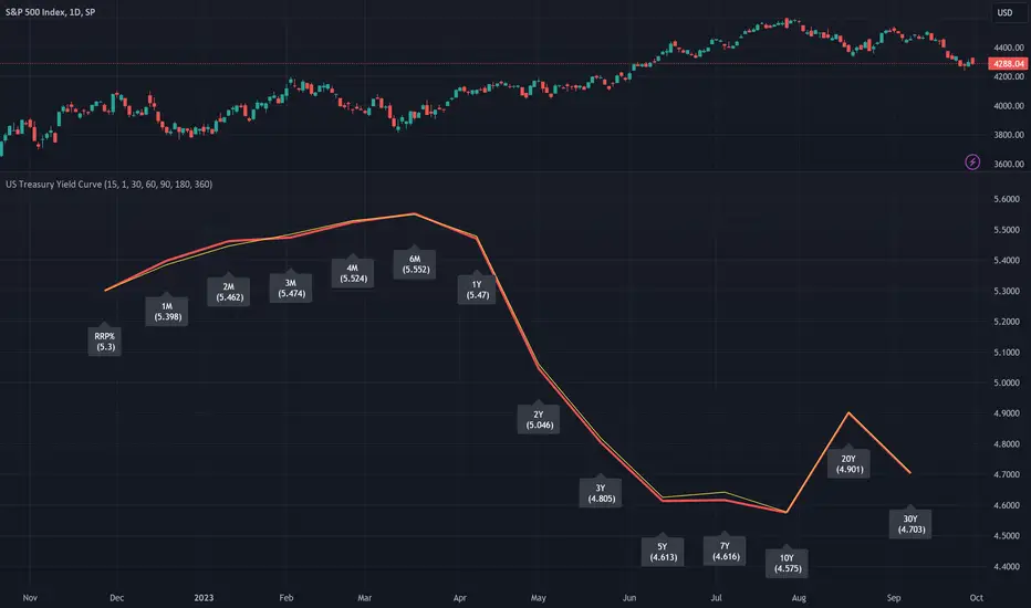
[dharmatech] U.S. Treasury Yield CurveThis indicator displays the U.S. Treasury Securities Yield Curve.
This is a fork of the US Treasury Yield Curve indicator by @longflat. Thank you for sharing your work!
There are already so many yield curve indicators on TradingView.
What makes this one different?
Update to version 5 of Pine Script
Add RRP%
Add 4 month
Add 20 year
Show previous day's yield curve
Options for prior yield curves
The thick red line shows the latest yield curve.
The yellow line shows the yield curve 1 bar ago.
So, if your timeframe is set to 1 day, the yellow line will show yesterday's yield curve.
OverUnder Yield Spread🗺️ OverUnder is a structural regime visualizer , engineered to diagnose the shape, tone, and trajectory of the yield curve. Rather than signaling trades directly, it informs traders of the world they’re operating in. Yield curve steepening or flattening, normalizing or inverting — each regime reflects a macro pressure zone that impacts duration demand, liquidity conditions, and systemic risk appetite. OverUnder abstracts that complexity into a color-coded compression map, helping traders orient themselves before making risk decisions. Whether you’re in bonds, currencies, crypto, or equities, the regime matters — and OverUnder makes it visible.
🧠 Core Logic
Built to show the slope and intent of a selected rate pair, the OverUnder Yield Spread defaults to 🇺🇸US10Y-US2Y, but can just as easily compare global sovereign curves or even dislocated monetary systems. This value is continuously monitored and passed through a debounce filter to determine whether the curve is:
• Inverted, or
• Steepening
If the curve is flattening below zero: the world is bracing for contraction. Policy lags. Risk appetite deteriorates. Duration gets bid, but only as protection. Stocks and speculative assets suffer, regardless of positioning.
📍 Curve Regimes in Bull and Bear Contexts
• Flattening occurs when the short and long ends compress . In a bull regime, flattening may reflect long-end demand or fading growth expectations. In a bear regime, flattening often precedes or confirms central bank tightening.
• Steepening indicates expanding spread . In a bull context, this may signal healthy risk appetite or early expansion. In a bear or crisis context, it may reflect aggressive front-end cuts and dislocation between short- and long-term expectations.
• If the curve is steepening above zero: the world is rotating into early expansion. Risk assets behave constructively. Bond traders position for normalization. Equities and crypto begin trending higher on rising forward expectations.
🖐️ Dynamically Colored Spread Line Reflects 1 of 4 Regime States
• 🟢 Normal / Steepening — early expansion or reflation
• 🔵 Normal / Flattening — late-cycle or neutral slowdown
• 🟠 Inverted / Steepening — policy reversal or soft landing attempt
• 🔴 Inverted / Flattening — hard contraction, credit stress, policy lag
🍋 The Lemon Label
At every bar, an anchored label floats directly on the spread line. It displays the active regime (in plain English) and the precise spread in percent (or basis points, depending on resolution). Colored lemon yellow, neither green nor red, the label is always legible — a design choice to de-emphasize bias and center the data .
🎨 Fill Zones
These bands offer spatial, persistent views of macro compression or inversion depth.
• Blue fill appears above the zero line in normal (non-inverted) conditions
• Red fill appears below the zero line during inversion
🧪 Sample Reading: 1W chart of TLT
OverUnder reveals a multi-year arc of structural inversion and regime transition. From mid-2021 through late 2023, the spread remains decisively inverted, signaling persistent flattening and credit stress as bond prices trended sharply lower. This prolonged inversion aligns with a high-volatility phase in TLT, marked by lower highs and an accelerating downtrend, confirming policy lag and macro tightening conditions.
As of early 2025, the spread has crossed back above the zero baseline into a “Normal / Steepening” regime (annotated at +0.56%), suggesting a macro inflection point. Price action remains subdued, but the shift in yield structure may foreshadow a change in trend context — particularly if follow-through in steepening persists.
🎭 Different Traders Respond Differently:
• Bond traders monitor slope change to anticipate policy pivots or recession signals.
• Equity traders use regime shifts to time rotations, from growth into defense, or from contraction into reflation.
• Currency traders interpret curve steepening as yield compression or divergence depending on region.
• Crypto traders treat inversion as a liquidity vacuum — and steepening as an early-phase risk unlock.
🛡️ Can It Compare Different Bond Markets?
Yes — with caveats. The indicator can be used to compare distinct sovereign yield instruments, for example:
• 🇫🇷FR10Y vs 🇩🇪DE10Y - France vs Germany
• 🇯🇵JP10Y vs 🇺🇸US10Y - BoJ vs Fed policy curves
However:
🙈 This no longer visualizes the domestic yield curve, but rather the differential between rate expectations across regions
🙉 The interpretation of “inversion” changes — it reflects spread compression across nations , not within a domestic yield structure
🙊 Color regimes should then be viewed as relative rate positioning , not absolute curve health
🙋🏻 Example: OverUnder compares French vs German 10Y yields
1. 🇫🇷 Change the long-duration ticker to FR10Y
2. 🇩🇪 Set the short-duration ticker to DE10Y
3. 🤔 Interpret the result as: “How much higher is France’s long-term borrowing cost vs Germany’s?”
You’ll see steepening when the spread rises (France decoupling), flattening when the spread compresses (convergence), and inversions when Germany yields rise above France’s — historically rare and meaningful.
🧐 Suggested Use
OverUnder is not a signal engine — it’s a context map. Its value comes from situating any trade idea within the prevailing yield regime. Use it before entries, not after them.
• On the 1W timeframe, OverUnder excels as a macro overlay. Yield regime shifts unfold over quarters, not days. Weekly structure smooths out rate volatility and reveals the true curvature of policy response and liquidity pressure. Use this view to orient your portfolio, define directional bias, or confirm long-duration trend turns in assets like TLT, SPX, or BTC.
• On the 1D timeframe, the indicator becomes tactically useful — especially when aligning breakout setups or trend continuations with steepening or flattening transitions. Daily views can also identify early-stage regime cracks that may not yet be visible on the weekly.
• Avoid sub-daily use unless you’re anchoring a thesis already built on higher timeframe structure. The yield curve is a macro construct — it doesn’t oscillate cleanly at intraday speeds. Shorter views may offer clarity during event-driven spikes (like FOMC reactions), but they do not replace weekly context.
Ultimately, OverUnder helps you decide: What kind of world am I trading in? Use it to confirm macro context, avoid fighting the curve, and lean into trades aligned with the broader pressure regime.

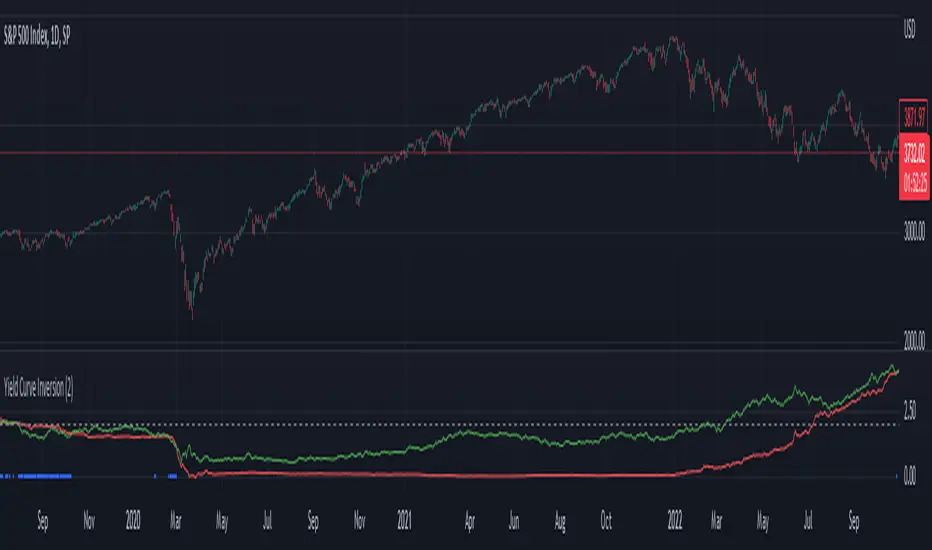
Yield Curve Inversion IndicatorIntroduction
The last time (as of this publishing) that this indicator detected an inverted interest rate yield curve was on February 20th, 2020 at 12:30pm EST, the afternoon before the S&P500 began one of its largest crashes in US history. The vast majority of major economic recessions since the 1950's have been preceded by an interest rate yield curve inversion. I created this indicator originally as an input to study the impacts of more conservative risk management on quantitative trading strategies following a yield curve inversion event. It is being shared with the community as a quick indicator to check to see the comparative status of short term and long term interest rates, and as an indicator where you can easily check to see if we are experiencing an inverted yield curve in real-time.
Background of the significance of an inverted yield curve:
"What an inverted yield curve really means is that most investors believe that short-term interest rates are going to fall sharply at some point in the future. As a practical matter, recessions usually cause interest rates to fall. Historically, inversions of the yield curve have preceded recessions in the U.S. Due to this historical correlation, the yield curve is often seen as a way to predict the turning points of the business cycle. When the yield curve inverts, short-term interest rates become higher than long-term rates. This type of yield curve is the rarest of the three main curve types and is considered to be a predictor of economic recession. Because of the rarity of yield curve inversions, they typically draw attention from all parts of the financial world." (www.investopedia.com)
Settings and Usage
This indicator pulls in pricing data from tickers that represent short term and long term interest rates, and compares them. The red line represents short term interest rates, and the green line represents long term interest rates. When the red line is above the green line, it indicates that we are experiencing a yield curve inversion. Small blue crosses also appear on the bottom of the indicator during an inversion to further highlight the event visually. This indicator pulls in the same information on the same two interest rate tickers regardless of what chart it is applied to.
Other Thoughts
This script uses the f_secureSecurity function as a best practice. For those that are versed in PineScript, code from this indicator could be adapted to be applied to an interest rate chart that allows custom alerts to be created the moment that there is an inverted interest rate yield curve.
Yield Curve Widget (Nasdaq) 📊 Yield Curve Risk Widget — Nasdaq (MNQ)
🔍 What this indicator does
This indicator is a macro risk widget designed for Nasdaq (MNQ) traders.
It combines the US Treasury yield curve (10Y vs 2Y) with price confirmation from Nasdaq itself to provide a directional bias.
⚠️ This is NOT an entry signal.
It is a context and risk filter to help you decide which side of the market to prioritize.
🧠 What each element means
🔹 10Y (e.g. 4.17)
The 10-year US Treasury yield, expressed as annual percentage (%).
Tech stocks and Nasdaq are highly sensitive to the 10Y
Falling 10Y → supportive for Nasdaq
Rising 10Y → pressure on Nasdaq
🔹 2Y (e.g. 3.54)
The 2-year US Treasury yield, closely tied to Federal Reserve expectations.
🔹 Spread (10Y − 2Y)
Represents the slope of the yield curve.
Spread expanding → curve normalizing → healthier macro environment
Spread contracting → curve flattening or inverting → higher risk
🔹 10Y slope / Spread slope (▲ ▼ •)
Shows the recent direction of movement:
▲ Rising
▼ Falling
• Flat / neutral
👉 Direction matters more than absolute level.
🔹 Regime (BULL / BEAR / NEUT)
Structural interpretation of the yield curve:
BULL → rates favor risk assets
BEAR → rates pressure risk assets
NEUT → mixed macro signals
🔹 RISK ON / RISK OFF / NEUTRAL
Combination of macro (yield curve) and price confirmation (Nasdaq trend):
RISK ON
→ Favorable curve and Nasdaq above its trend EMA
RISK OFF
→ Unfavorable curve and Nasdaq below its trend EMA
NEUTRAL
→ No confirmation
🔹 Intensity (0–100)
Measures the strength of the current regime.
0–40 → weak / noisy environment
40–60 → transition phase
60–100 → strong macro regime
🔹 Trade Bias (BUY / SELL / WAIT)
This is the practical conclusion of the indicator:
BUY NASDAQ
→ Risk ON confirmed + intensity above threshold
SELL NASDAQ
→ Risk OFF confirmed + intensity above threshold
WAIT
→ Mixed conditions, no clear edge
⚠️ This is NOT a trade trigger, only a directional filter.
🎯 How to use it (the right way)
✅ Use it as a FILTER
BUY NASDAQ → prioritize long setups only
SELL NASDAQ → prioritize short setups only
WAIT → trade only A+ setups or stay flat
❌ What NOT to do
Do not enter trades solely because BUY/SELL appears
Do not ignore your own risk management rules
Do not rely on it during major news events (CPI, FOMC, NFP)
⚙️ Suggested settings (MNQ)
Day Trading (1m / 5m)
MNQ Trend EMA: 200
Slope lookback: 5–10
Min Risk Intensity: 55–65
Intraday / Swing
Yields TF: 15m or 60m
Min Risk Intensity: 60–75
🧩 Quick summary
📉 Falling rates → Nasdaq tends to rise
📈 Rising rates → Nasdaq tends to fall
🧠 Yield curve + price confirmation = directional edge
🎯 Use as a filter, not as an entry signal
Disclaimer:
This indicator provides macro context only. Always combine it with your own technical setups, execution rules, and risk management.

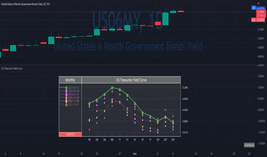
US Treasuries Yield CurveNews about the yield curve became pretty crucial for all the trades in the last year.
So in the team, we decided to implement a nice widget that will allow you to track the current yield curve in your chart directly.
It's possible to compare the current yield curve with past yield curves. You can choose to display the number of curves weeks, months, and years ago. So you can see the dynamics of the yield curve change.
When the Y2 > Y10 curve is considered invested, so you'll see an "Inverted" notification on the chart.
Thanks to @MUQWISHI for helping code it.
Disclaimer
Please remember that past performance may not indicate future results.
Due to various factors, including changing market conditions, the strategy may no longer perform as well as in historical backtesting.
This post and the script don’t provide any financial advice.
EURUSD | Yield Curve Flip Strategy (2s10s State Flips)Strategy Core (Concept)
The strategy trades EURUSD exclusively when the US yield curve regime (2Y/10Y) flips into a new, clearly bullish or bearish regime. The core assumption is that re-pricing in the US yield curve (rather than individual data points) is a robust driver of USD strength or weakness and can act as a structural trigger for trend changes.
⸻
Data Basis
• Uses US 2Y Yield (TVC:US02Y) and US 10Y Yield (TVC:US10Y).
• The 2s10s curve is calculated as:
curveUS = US10Y – US2Y
• Regime assessment is based on the N-day change (default: 5 days), calculated on true rates bars (not intraday noise).
⸻
Regime Detection (Correct Bond Logic)
First, the strategy checks whether the curve has significantly steepened or flattened over the lookback period:
• Steepener if Δ(2s10s) > thrCurve (default: +0.10 percentage points = 10 bp)
• Flattener if Δ(2s10s) < −thrCurve
Next, a leg confirmation determines the specific type of steepener/flattener (default thrLeg = 5 bp):
Bull Steepener
• Curve steepens because yields fall, with the 2Y falling more (risk-off / rate-cut pricing)
Bear Steepener
• Curve steepens because yields rise, with the 10Y rising more (reflation / term-premium move)
Bull Flattener
• Curve flattens because yields fall, with the 10Y falling more (growth shock / long-end rally)
Bear Flattener
• Curve flattens because yields rise, with the 2Y rising more (hawkish repricing / front-end up)
Important: By default, a Bear Steepener is not treated as a bearish signal, unless allowBearSteepForShort is enabled.
⸻
State Machine (Memory + Flip Triggers)
The strategy maintains a persistent state variable curveState:
• +1 = bullish
• −1 = bearish
• 0 = neutral
The state is updated only on a new rates bar (daily rates when tfRates = "D"), avoiding intraday noise.
A trade is generated only on a true regime flip:
• flipToBull: new state turns bullish and the previous state was bearish (or neutral, if allowed)
• flipToBear: new state turns bearish and the previous state was bullish (or neutral, if allowed)
The option enterFromNeutral controls whether the first clear regime emerging from neutral is traded.
The option onlyOnNewRatesBar ensures signals occur only when a new rates bar is printed, providing clean timing.
⸻
Trading Rules (Entry / Exit)
There are no stops, targets, or trailing mechanisms. The strategy is a pure regime-switching / reversal system:
• On flipToBull
• Close short (“S”)
• Open long (“L”)
• On flipToBear
• Close long (“L”)
• Open short (“S”)
Positions are therefore held until the next regime flip.
⸻
Parameter Interpretation
• N: Smoothing / inertia. Smaller = faster but noisier; larger = more stable but later.
• thrCurve: Minimum curve move required to define a regime.
• thrLeg: Minimum move of the confirming leg (2Y or 10Y) to reduce misclassification.
• allowBearSteepForShort: Makes the system more aggressive (more bearish signals), but represents a different macro case.
• enterFromNeutral: Increases trade frequency by trading the first regime impulse.
⸻
What You See on the Chart
• Background shading:
• Green for bullish state
• Red for bearish state
• The curve and Δ-curve are plotted but hidden (display=none), mainly for debugging and analysis.

TurntLibraryLibrary "TurntLibrary"
Collection of functions created for simplification/easy referencing. Includes variations of moving averages, length value oscillators, and a few other simple functions based upon HH/LL values.
ma(source, length, type)
Apply a moving average to a float value
Parameters:
source : Value to be used
length : Number of bars to include in calculation
type : Moving average type to use ("SMA","EMA","RMA","WMA","VWAP","SWMA","LRC")
Returns: Smoothed value of initial float value
curve(src, len, lb1, lb2)
Exaggerates curves of a float value designed for use as an exit signal.
Parameters:
src : Initial value to curve
len : Number of bars to include in calculation
lb1 : (Default = 1) First lookback length
lb2 : (Default = 2) Second lookback length
Returns: Curved Average
fragma(src, len, space, str)
Average of a moving average and the previous value of the moving average
Parameters:
src : Initial float value to use
len : Number of bars to include in calculation
space : Lookback integer for second half of average
str : Moving average type to use ("SMA","EMA","RMA","WMA","VWAP","SWMA","LRC")
Returns: Fragmented Average
maxmin(x, y)
Difference of 2 float values, subtracting the lowest from the highest
Parameters:
x : Value 1
y : Value 2
Returns: The +Difference between 2 float values
oscLen(val, type)
Variable Length using a oscillator value and a corresponding slope shape ("Incline",Decline","Peak","Trough")
Parameters:
val : Oscillator Value to use
type : Slope of length curve ("Incline",Decline","Peak","Trough")
Returns: Variable Length Integer
hlAverage(val, smooth, max, min, type, include)
Average of HH,LL with variable lengths based on the slope shape ("Incline","Decline","Trough") value relative to highest and lowest
Parameters:
val : Source Value to use
smooth
max
min
type
include : Add "val" to the averaging process, instead of more weight to highest or lowest value
Returns: Variable Length Average of Highest Lowest "val"
pct(val)
Convert a positive float / price to a percentage of it's highest value on record
Parameters:
val : Value To convert to a percentage of it's highest value ever
Returns: Percentage
hlrange(x, len)
Difference between Highest High and Lowest Low of float value
Parameters:
x : Value to use in calculation
len : Number of bars to include in calculation
Returns: Difference
midpoint(x, len, smooth)
The average value of the float's Highest High and Lowest Low in a number of bars
Parameters:
x : Value to use in calculation
len
smooth : (Default=na) Optional smoothing type to use ("SMA","EMA","RMA","WMA","VWAP","SWMA","LRC")
Returns: Midpoint
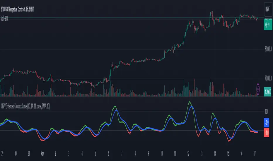
CDZV Enhanced Coppock CurveThis indicator is a part of the CDZV toolkit (backtesting and automation)
The Enhanced Coppock Curve is an upgraded version of the classic Coppock Curve indicator. It incorporates several additional features for greater flexibility and analysis capabilities. This indicator is used to analyze market trends by plotting a weighted moving average (WMA) of the sum of two Rate of Change (ROC) values.
Key Features of the Indicator:
Base Calculation of the Coppock Curve:
The Coppock Curve is calculated as a weighted moving average (WMA) of the sum of two ROC values (long and short periods).
The source for the calculation is customizable (default is close).
Added Custom Moving Average:
The indicator supports three types of moving averages:
EMA (Exponential Moving Average),
SMA (Simple Moving Average),
HMA (Hull Moving Average).
Users can choose the type and length of the moving average via input settings.
The selected moving average values are displayed in the Data Window for easier analysis.
Dynamic Coloring of the Coppock Curve:
The Coppock Curve line changes color based on its value:
Green if the value is positive,
Red if the value is negative.
The line's color is also displayed in the Data Window as a numeric value:
1 for green (positive),
-1 for red (negative).
Data Window Output:
The values of the selected moving average are displayed in the Data Window.
The Coppock Curve line's color state (1 or -1) is also shown in the Data Window.
Visual Representation:
The Coppock Curve is plotted with dynamic color coding.
The selected moving average is overlaid on the Coppock Curve for deeper trend analysis.
Usage Instructions:
Add the indicator to your chart on TradingView.
Configure the inputs:
Smoothing length for the Coppock Curve,
Long and short periods for ROC,
Type and length of the moving average.
Analyze the chart:
A green Coppock Curve line indicates a bullish trend, while a red line signals a bearish trend.
The selected moving average helps further filter and confirm signals.
Use the Data Window to view numeric values for the moving average and the Coppock Curve line color.
Applications:
This indicator is ideal for assessing trend direction and strength. The added customization options and additional data make it a versatile tool for traders, enabling them to tailor the Coppock Curve to their strategies.
Yield Curve Version 2.55.2Welcome to Yield Curve Version 2.55.2
US10Y-US02Y
* Please read description to help understand the information displayed.
* NOTE - This script requires 1 real time update before accurate information is displayed, therefore WILL NOT display the correct information if the Bond Market is Closed over the Weekend.
* NOTE - When values are changed Via Input setting they do take a bit to display based off all the information that is required to display this script.
**FEATURES**
* Input Features let you view the information the way YOU like via Input Settings
* Displays Current Version Title - Toggleable On/Off via Input Settings - Default On
* Plots the Yield Curve of the Bonds listed (Middle Green and Red Line)
* Displays the Spread for each Bond (Top Green and Red Labels) - Toggleable On/Off via Input Settings - Change Size via Input Settings - Default On
* Displays the current Yield for each Bond (Bottom Green and Red Labels) - Toggleable On/Off via Input Settings - Change Size via Input Settings - Default On - Large Size
* Plots the Average of the Entire Yield Curve (BLUE Line within the Yield Curve) - Toggleable On/Off via Input Settings - Default On
* Displays messages based off Yield Inversions (Orange Text) - Toggleable On/Off via Input Settings - Default On if Applicable
* Displays 2 10 Inversion Warning Message (Orange Text) - Toggleable On/Off via Input Settings - Default On if Applicable
* Plots Column Data at the Bottom that tries to help determine the Stability of the Yield Curve (More information Below about Stability) - Toggleable On/Off via Input Settings - Default On
* Plots the 7,20 and 100 SMA of the STABILITY MAX OVERLOAD (More information Below about Stability Max Overload) - Toggleable On/Off via Input Settings - Default On for 100 SMA , 20 SMA and 7 SMA
* Ability to Display Indicator Name and Value via Input Settings - Default On - Displays Stability Max Overload SMA Labels. Toggleable to Non SMA Values. See Below.
**Bottom Columns are all about STABILITY**
* I have tried to come up with an algorithm that helps understand the Stability of the Yield Curve. There are 3 Sections to the Bottom Columns.
* Section 1 - STABILITY (Displayed as the lightest Green or Red Column) Values range from 0 to 1 where 1 equals the MOST UNSTABLE Curve and 0 equals the MOST STABLE Curve
* Section 2 - STABILITY OVERLOAD (Displayed just above the Stability Column a shade darker Green or Red Column)
* Section 3 - STABILITY MAX OVERLOAD (Displayed just above the Stability Overload Column a shade darker Green or Red Column)
What this section tries to do is help understand the Stability of the Curve based on the inversions data. Lower values represent a MORE STABLE curve. If the Yield Curve currently has 0 Inversions all Stability factors should equal 0 and therefore not plot any lower columns. As the Yield Curve becomes more inverted each section represents a value based off that data. GREEN columns represent a MORE Stable Curve from the resolution prior and vise versa.
(S SO SMO)
STABILITY - tests the current Stability of the Curve itself again ranging from 0 to 1 where 0 equals the MOST Stable Curve and 1 equals the MOST Unstable Curve.
STABILIY OVERLOAD - adds a value to STABLITY based off STABILITY itself.
STABILITY MAX OVERLOAD - adds the Entire value to STABILITY derived again from STABILITY.
This section also allows us to see the 7,20 and 100 SMA of the STABILITY MAX OVERLOAD which should always be the GREATEST of ALL STABILTY VALUES.
*Indicator Labels How to use*
Indicator Labels by default are turned On and will display Name and Value Labels for Stability Max Overload SMA values. To switch to (S SO SMO) Labels, toggle "Indicator Labels / SMO SMA Labels", via Input Settings. This button allows you to switch between the two Indicator Label Display options. You must have "Indicators" turned On to view the Labels and therefore is turned On by Default. To turn all of the Indicator Labels Off, simply disable "Indicators" via Input Settings.
Remember - All information displayed can be tuned On or Off besides the Curve itself. There are also other Features Accessible Via the Input Settings.
I will continue to update this script as there is more information I would like to gather and display!
I hope you enjoy,
OpptionsOnly

Yield Curve Version 2.41Welcome to Yield Curve Version 2.41
* Please read description to help understand the information displayed.
* NOTE - This script requires 1 real time update before accurate information is displayed, therefore WILL NOT display the correct information if the Bond Market is Closed over the Weekend.
* NOTE - When values are changed Via Input setting they do take a bit to display based off all the information that is required to display this script.
**FEATURES**
* Input Features let you view the information the way YOU like via Input Settings
* Displays Current Version Title - Toggleable On/Off via Input Settings - Default On
* Plots the Yield Curve of the Bonds listed (Middle Green and Red Line)
* Displays the Spread for each Bond (Top Green and Red Labels) - Toggleable On/Off via Input Settings - Change Size via Input Settings - Default On
* Displays the current Yield for each Bond (Bottom Green and Red Labels) - Toggleable On/Off via Input Settings - Change Size via Input Settings - Default On - Large Size
* Plots the Average of the Entire Yield Curve (BLUE Line within the Yield Curve) - Toggleable On/Off via Input Settings - Default On
* Displays messages based off Yield Inversions (Orange Text) - Toggleable On/Off via Input Settings - Default On if Applicable
* Displays 2 10 Inversion Warning Message (Orange Text) - Toggleable On/Off via Input Settings - Default On if Applicable
* Plots Column Data at the Bottom that tries to help determine the Stability of the Yield Curve (More information Below about Stability) - Toggleable On/Off via Input Settings - Default On
* Plots the 7,20 and 100 SMA of the STABILITY MAX OVERLOAD (More information Below about Stability Max Overload) - Toggleable On/Off via Input Settings - Default On for 100SMA Off for 7 and 20 SMA
**Bottom Columns are all about STABILITY**
* I have tried to come up with an algorithm that helps understand the Stability of the Yield Curve. There are 3 Sections to the Bottom Columns.
* Section 1 - STABILITY (Displayed as the lightest Green or Red Column) Values range from 0 to 1 where 1 equals the MOST UNSTABLE Curve and 0 equals the MOST STABLE Curve
* Section 2 - STABILITY OVERLOAD (Displayed just above the Stability Column a shade darker Green or Red Column)
* Section 3 - STABILITY MAX OVERLOAD (Displayed just above the Stability Overload Column a shade darker Green or Red Column)
What this section tries to do is help understand the Stability of the Curve based on the inversions data. Lower values represent a MORE STABLE curve. If the Yield Curve currently has 0 Inversions all Stability factors should equal 0 and therefore not plot any lower columns. As the Yield Curve becomes more inverted each section represents a value based off that data. GREEN columns represent a MORE Stable Curve from the resolution prior and vise versa.
STABILITY tests the current Stability of the Curve itself again ranging from 0 to 1 where 0 equals the MOST Stable Curve and 1 equals the MOST Unstable Curve.
STABILIY OVERLOAD adds a value to STABLITY based off STABILITY itself.
STABILITY MAX OVERLOAD adds the Entire value to STABILITY derived again from STABILITY.
This section also allows us to see the 7,20 and 100 SMA of the STABILITY MAX OVERLOAD which should always be the GREATEST of ALL STABILTY COLUMNS.
Remember - All information displayed can be tuned On or Off besides the Curve itself. There are also other Features Accessible Via the Input Settings.
I will continue to update this script as there is more information I would like to gather and display!
I hope you enjoy,
OpptionsOnly

Historical US Bond Yield CurvePreface: I'm just the bartender serving today's freshly blended concoction; I'd like to send a massive THANK YOU to all the coders and PineWizards for the locally-sourced ingredients. I am simply a code editor, not a code author. Many thanks to these original authors!
Source 1 (Aug 8, 2019):
Source 2 (Aug 11, 2019):
About the Indicator: The term yield curve refers to the yields of U.S. treasury bills, notes, and bonds in order from shortest to longest maturity date. The yield curve describes the shapes of the term structures of interest rates and their respective terms to maturity in years. The slope of the yield curve tells us how the bond market expects short-term interest rates to move in the future based on bond traders' expectations about economic activity and inflation. The best use of the yield curve is to get a sense of the economy's direction rather than to try to make an exact prediction. This indicator plots the U.S. yield curve as maturity (x-axis/time) vs yield (y-axis/price) in addition to historical yield curves and advanced data tickers . The visual array of historical yield curves helps investors visualize shifts in the yield curve that are useful when identifying & forecasting economic conditions. The bond market can help predict the direction of the economy which can be useful in crafting your investment strategy. An inverted 10y/2y yield curve for durations longer than 5 consecutive trading days signals an almost certain recession on the horizon. An inversion happens when short-term bonds pay better than longer-term bonds. There is Federal Reserve Board data that suggests the 10y3m may be a better predictor of recessions.
Features: Advanced dual data ticker that performs curve & important spread analysis, plus additional hover info. Advanced yield curve data labels with additional hover info. Customizable historical curves and color theme.
‼ IMPORTANT: Hover over labels/tables for advanced information. Chart asset and timeframe may affect the yield curve results; I have found consistently accurate results using BINANCE:BTCUSDT on 1d timeframe. Historical curve lookbacks will have an effect on whether the curve analysis says the curve is bull/bear steepening/flattening, so please use appropriate lookbacks.
⚠ DISCLAIMER: Not financial advice. Not a trading system. DYOR. I am not affiliated with the original authors, TradingView, Binance, or the Federal Reserve Board.
About the Editor: I am a former FINRA Registered Representative, inventor/patent holder, futures trader, and hobby PineScripter.

Universal logarithmic growth curves, with support and resistanceLogarithmic regression is used to model data where growth or decay accelerates rapidly at first and then slows over time. This model is for the long term series data (such as 10 years time span).
The user can consider entering the market when the price below 25% or 5% confidence and consider take profit when the price goes above 75% or 95% confidence line.
This script is:
- Designed to be usable in all tickers. (not only for bitcoin now!)
- Logarithmic regression and shows support-resistance level
- Shape of lines are all linear adjustable
- Height difference of levels and zones are customizable
- Support and resistance levels are highlighted
Input panel:
- Steps of drawing: Won't change it unless there are display problems.
- Resistance, support, other level color: self-explanatory.
- Stdev multipliers: A constant variable to adjust regression boundaries.
- Fib level N: Base on the relative position of top line and base line. If you don't want all fib levels, you might set all fib levels = 0.5.
- Linear lift up: vertically lift up the whole set of lines. By linear multiplication.
- Curvature constant: It is the base value of the exponential transform before converting it back to the chart and plotting it. A bigger base value will make a more upward curvy line.
FAQ:
Q: How to use it?
A: Click "Fx" in your chart then search this script to get it into your chart. Then right click the price axis, then select "Logarithmic" scale to show the curves probably.
Q: Why release this script?
A: - This script is intended to to fix the current issues of bitcoins growth curve script, and to provide a better version of the logarithmic curve, which is not only for bitcoin , but for all kinds of tickers.
- In the public library there is a hardcoded logarithmic growth curve by @quantadelic . But unfortunately that curve was hardcoded by his manual inputs, which makes the curve stop updating its value since 2019 the date he publish that code. Many users of that script love using it but they realize it was stop updating, many users out there based on @quantadelic version of "bitcoin logarithmic growth curves" and they tried their best to update the coordinates with their own hardcode input values. Eventually, a lot of redundant hardcoded "Bitcoin growth curve" scripts was born in the public library. Which is not a good thing.
Q: What about looking at the regression result with a log scale price axis?
A: You can use this script that I published in a year ago. This script display the result in a log scale price axis.
Equity Curve with Trend Indicator (Long & Short) - SimulationOverview:
Market Regime Detector via Virtual Equity Curve is a unique indicator that simulates the performance of a trend-following trading system—incorporating both long and short trades—to help you identify prevailing market regimes. By generating a “virtual equity” curve based on simple trend signals and applying trend analysis directly on that curve, this indicator visually differentiates trending regimes from mean-reverting (or sideways) periods. The result is an intuitive display where green areas indicate a trending (bullish) regime (i.e., where trend-following strategies are likely to perform well) and red areas indicate a mean-reverting (bearish) regime.
Features:
Simulated Trade Performance:
Uses a built-in trend-following logic (a simple 10/50 SMA crossover example) to simulate both long and short trades. This simulation creates a virtual equity curve that reflects the cumulative performance of the system over time.
Equity Trend Analysis:
Applies an Exponential Moving Average (EMA) to the simulated equity curve to filter short-term noise. The EMA acts as a trend filter, enabling the indicator to determine if the equity curve is in an upward (trending) or downward (mean-reverting) phase.
Dynamic Visual Regime Detection:
Fills the area between the equity curve and its EMA with green when the equity is above the EMA (indicating a healthy trending regime) and red when below (indicating a mean-reverting or underperforming regime).
Customizable Parameters:
Easily adjust the initial capital, the length of the equity EMA, and other settings to tailor the simulation and visual output to your trading style and market preferences.
How It Works:
Trade Simulation:
The indicator generates trading signals using a simple SMA crossover:
When the 10-period SMA is above the 50-period SMA, it simulates a long entry.
When the 10-period SMA is below the 50-period SMA, it simulates a short entry. The virtual equity is updated bar-by-bar based on these simulated positions.
Equity Trend Filtering:
An EMA is calculated on the simulated equity curve to smooth out fluctuations. The relative position of the equity curve versus its EMA is then used as a proxy for the market regime:
Bullish Regime: Equity is above its EMA → fill area in green.
Bearish Regime: Equity is below its EMA → fill area in red.
Visualization:
The indicator plots:
A gray line representing the simulated equity curve.
An orange line for the EMA of the equity curve.
A dynamic fill between the two lines, colored green or red based on the prevailing regime.
Inputs & Customization:
Initial Capital: Set your starting virtual account balance (default: 10,000 USD).
Equity EMA Length: Specify the lookback period for the EMA applied to the equity curve (default: 30).
Trend Signal Logic:
The current implementation uses a simple SMA crossover for demonstration purposes. Users can modify or replace this logic with their own trend-following indicator to tailor the simulation further.

hayatguzel curveENG
When the support resistance study is performed on the hayatguzel indicator, we see that these levels, which are actually horizontal in hayatguzel, are curvilinear when they are plotted on the chart, this is because the hayatguzel indicator uses moving average EMAs.
We can understand the chart more easily by shaping the resulting table in hayatguzel indicator in our minds more easily and seeing these horizontal levels in hayatguzel as curvilinear on the graph.
Let me explain what needs to be done with an example:
The indicator value on top of the yellow box is 13.58 and below of the yellow box of the hayatguzel indicator 5.83. The curves that will occur when we add these values to the hayatguzel curve indicator are shown in green. With the same logic, if we want to see this level, which is the upper blue resistance box on the hayatguzel indicator and coincides with the 67 level, on the graph, we enter 67 for both of the coefficients in the hayatguzel curve indicator. ( Which ema is used in hayatguzel, the same ema value must be entered in hayatguzel curve, ema200 is used in this example )
The result is that the hg curves drawn in green act as support and when the upward movement comes, the hg curve drawn in blue now passes through the 2700s. In other words, we can see that the position is in support and where its target is.
I'd like to show all this in one hayatguzel indicator, but pinescript doesn't make it possible. That's why I had to write this code separately.
TR
Hayatguzel indikatöründe destek direnç çalışması yapıldığında aslında hayatguzel'de yatay olan bu seviyelerin grafiğe atıldığında eğrisel olduğunu görüyoruz, bunun nedeni hayatguzel indikatörünün hareketli ortalama olan ema'ları kullanmasıdır.
Hayatguzel indikatöründeki ortaya çıkan tabloyu kafamızda daha rahat şekillendirmek ve hayatguzel'de yatay olan bu seviyeleri grafik üzerinde eğrisel olarak görerek grafiğe daha çok hakim olabiliriz.
Yapılması gereken şeyi bir örnekle anlatayım:
Hayatguzel indikatöründeki sarı kutunun üstünde indikatör değeri 13.58 ve altında 5.83. Biz bu değerleri hayatguzel curve indikatörüne eklediğimiz zaman oluşacak eğriler yeşil ile gösterildi. Aynı mantıkla hayatguzel indikatöründeki üstteki mavi direnç kutusu olan ve 67 seviyesine denk gelen bu seviyeyi grafikte görmek istiyorsak hayatguzel curve indikatöründeki katsayıların ( coefficient ) ikisine de 67'yi giriyoruz. ( hayatguzel'de hangi ema kullanıldıysa hayatguzel curve'de de aynı ema değeri girilmeli, bu örnekte ema200 kullanıldı )
Burdan ne sonuç çıkıyor peki ?
Çıkan sonuç yeşil ile çizilen hg eğrilerinin destek görevi gördüğü ve yukarı doğru hareket geldiğinde mavi ile çizilen hg eğrisinin şu an 2700 lerden geçtiğidir. Yani hem pozisyonun destekte olduğunu hem de hedefinin neresi olduğunu görebiliyoruz.
Bütün bunları tek bir hayatguzel indikatörünün içinde göstermek isterdim ama pinescript bunu mümkün kılmıyor. O nedenle bu kodu ayrı olarak yazmak zorunda kaldım.

Coppock Curve
The Coppock Curve is a long-term momentum indicator, also known as the "Coppock Guide," used to identify potential long-term market turning points, particularly major downturns and upturns, by smoothing the sum of 14-month and 11-month rates of change with a 10-month weighted moving average.
Here's a more detailed breakdown:
What it is:
The Coppock Curve is a technical indicator designed to identify long-term buy and sell signals in major stock market indices and related ETFs.
How it's calculated:
Rate of Change (ROC): The indicator starts by calculating the rate of change (ROC) for 14 and 11 periods (usually months).
Sum of ROCs: The ROC for the 14-period and 11-period are summed.
Weighted Moving Average (WMA): A 10-period weighted moving average (WMA) is then applied to the sum of the ROCs.
Interpreting the Curve:
Buy Signals: A buy signal is often generated when the Coppock Curve crosses above the zero line, suggesting a potential transition from a bearish to a bullish phase.
Sell Signals: While primarily designed to identify market bottoms, some traders may interpret a cross below the zero line as a sell signal or a bearish warning.
Origin and Purpose:
The Coppock Curve was introduced by economist Edwin Coppock in 1962.
It was originally designed to help investors identify opportune moments to enter the market.
Coppock's inspiration came from the Episcopal Church's concept of the average mourning period, which he believed mirrored the stock market's recovery period.
Limitations:
The Coppock Curve is primarily used for long-term analysis and may not be as effective for short-term or intraday trading.
It may lag in rapidly changing markets, and its signals may not always be reliable.
Coppock Curve w/ Early Turns [QuantVue]The Coppock Curve is a momentum oscillator developed by Edwin Coppock in 1962. The curve is calculated using a combination of the rate of change (ROC) for two distinct periods, which are then subjected to a weighted moving average (WMA).
History of the Coppock Curve:
The Coppock Curve was originally designed for use on a monthly time frame to identify buying opportunities in stock market indices, primarily after significant declines or bear markets.
Historically, the monthly time frame has been the most popular for the Coppock Curve, especially for long-term trend analysis and spotting the beginnings of potential bull markets after bearish periods.
The signal wasn't initially designed for finding sell signals, however it can be used to look for tops as well.
When the indicator is above zero it indicates a hold. When the indicator drops below zero it indicates a sell, and when the indicator moves above zero it signals a buy.
While this indicator was originally designed to be used on monthly charts of the indices, many traders now use this on individual equities and etfs on all different time frames.
About this Indicator:
The Coppock Curve is plotted with colors changing based on its position relative to the zero line. When above zero, it's green, and when below, it's red. (default settings)
An absolute zero line is also plotted in black to serve as a reference.
In addition to the classic Coppock Curve, this indicator looks to identify "early turns" or potential reversals of the Coppock Curve rather than waiting for the indicator to cross above or below the zero line.
Give this indicator a BOOST and COMMENT your thoughts!
We hope you enjoy.
Cheers!
Equity CurveAn equity curve is a graphical representation of the change in the value of a trading account over a time period. The equity curve is a direct reflection of a trading strategy's effectiveness. A consistently upward-trending equity curve indicates a successful strategy, while a flat or declining curve may signal the need for adjustment.
This indicator takes traders daily account values as a comma separated list, and creates an equity curve and simple moving average of the equity curve. This serves as a mirror reflecting the outcome of past actions and decisions, guiding traders in fine-tuning their strategies, managing risk more effectively, and ultimately striving towards a consistently profitable trading journey.
New equity values should be added to the end of the current list. A space or no space after the comma has no effect.
Importance of the Equity Curve
Strategy Evaluation: The equity curve is a direct reflection of a trading strategy's effectiveness over time. A consistently upward-trending equity curve indicates a successful strategy, while a flat or declining curve may signal the need for adjustment.
Risk Management: Monitoring the equity curve helps traders to see the impact of their risk management practices. Sudden drops in equity could highlight instances of excessive risk-taking or inadequate stop-loss settings.
Performance Benchmarks: Comparing the equity curve against benchmarks or desired performance goals allows traders to assess if they are meeting, exceeding, or falling short of their trading objectives.
Psychology: Trading is as much about psychology as it is about strategy. A visual representation of one's equity curve helps maintain discipline, encouraging adherence to a trading plan during downturns and preventing overconfidence during upswings.
Having this data visually allows traders to see which category of trader they fall into.
Unprofitable
Boom or Bust
Profitable
Statistical Data
The indicator not only plots the equity curve and moving average, but includes the option to display the highest value reached by the equity curve, the percentage difference from the peak, and performance over selected periods (All Time, YTD, QTD, MTD, WTD).
Historical Analysis
The Equity Curve Indicator is not just a tool for real-time monitoring of trading performance; it also serves as a powerful instrument for conducting historical analysis. By analyzing the equity curve in conjunction with historical market conditions, traders can identify patterns or triggers that resulted in significant gains or losses.
For example, the chart below shows the equity curve overlaid on periods of net new highs / lows. The equity curve experienced declines while the market was showing net new lows or choppy periods (represented by a red or white background), while most of the equity gains were made while net new highs were present (green background).
This retrospective analysis helps in understanding how different market conditions impact trading strategies and performance.
Trading the Equity Curve
All trading strategies produce an equity curve that has winning and losing periods. In the example above, the trader could introduce a simple rule to lighten up on long positions or move to cash during periods of net new lows.
Another simple rule could be introduced to stop trading if the equity curve falls below the moving average, until favorable market conditions return again.
This indicator is intended to be used on the daily timeframe.

Elliptic Curve SAROverview
The Elliptic Curve SAR indicator is an innovative twist on the traditional Parabolic SAR. Instead of relying solely on a fixed parabolic acceleration, this indicator incorporates elements from elliptic curve mathematics. It uses an elliptic curve defined by the equation y² = x³ + ax + b* along with a configurable base point, dynamically adjusting its acceleration factor to potentially offer different smoothing and timing in trend detection.
How It Works
Elliptic Curve Parameters:
The indicator accepts curve parameters a and b that define the elliptic curve.
A base point (x_p, y_p) on the curve is used as a starting condition.
Dynamic Acceleration:
Instead of a fixed acceleration step, the script computes a dynamic acceleration based on the current value of an intermediate variable (derived via the elliptic curve's properties).
An arctan function is used to non-linearly adjust the acceleration between a defined initial and maximum bound.
Trend & Reversal Detection:
The indicator tracks the current trend (up or down) using the computed SAR value.
It identifies trend reversals by comparing the current price with the SAR, and when a reversal is detected, it resets key parameters such as the Extreme Point (EP).
Visual Enhancements:
SAR Plot: Plotted as circles that change color based on trend direction (blue for uptrends, red for downtrends).
Extreme Point (EP): An orange line is drawn to show the highest high in an uptrend or the lowest low in a downtrend.
Reversal Markers: Green triangles for upward reversals and red triangles for downward reversals are displayed.
Background Color: A subtle background tint (light green or light red) reflects the prevailing trend.
How to Use the Indicator
Input Configuration:
Curve Parameters:
Adjust a and b to define the specific elliptic curve you wish to apply.
Base Point Settings:
Configure the base point (x_p, y_p) to set the starting conditions for the elliptic curve calculations.
Acceleration Settings:
Set the Initial Acceleration and Max Acceleration to tune the sensitivity of the indicator.
Chart Application:
Overlay the indicator on your price chart. The SAR values, Extreme Points, and reversal markers will be plotted directly on the price data.
Use the dynamic background color to quickly assess the current trend.
Customization:
You can further adjust colors, line widths, and shape sizes in the code to better suit your visual preferences.
Differences from the Traditional SAR
Calculation Methodology:
Traditional SAR relies on a parabolic curve with a fixed acceleration factor, which increases linearly as the trend continues.
Elliptic Curve SAR uses a mathematically-derived approach from elliptic curve theory, which dynamically adjusts the acceleration factor based on the curve’s properties.
Sensitivity and Signal Timing:
The use of the arctan function and elliptic curve addition provides a non-linear response to price movements. This may result in a different sensitivity to market conditions and potentially smoother or more adaptive signal generation.
Visual Enhancements:
The enhanced version includes trend-dependent colors, explicit reversal markers, and an Extreme Point plot that are not present in the traditional version.
The background color change further aids in visual trend recognition.
Conclusion
The Elliptic Curve SAR indicator offers an alternative approach to trend detection by integrating elliptic curve mathematics into its calculation. This results in a dynamic acceleration factor and enriched visual cues, providing traders with an innovative tool for market analysis. By fine-tuning the input parameters, users can adapt the indicator to better fit their specific trading style and market conditions.